Transcripts
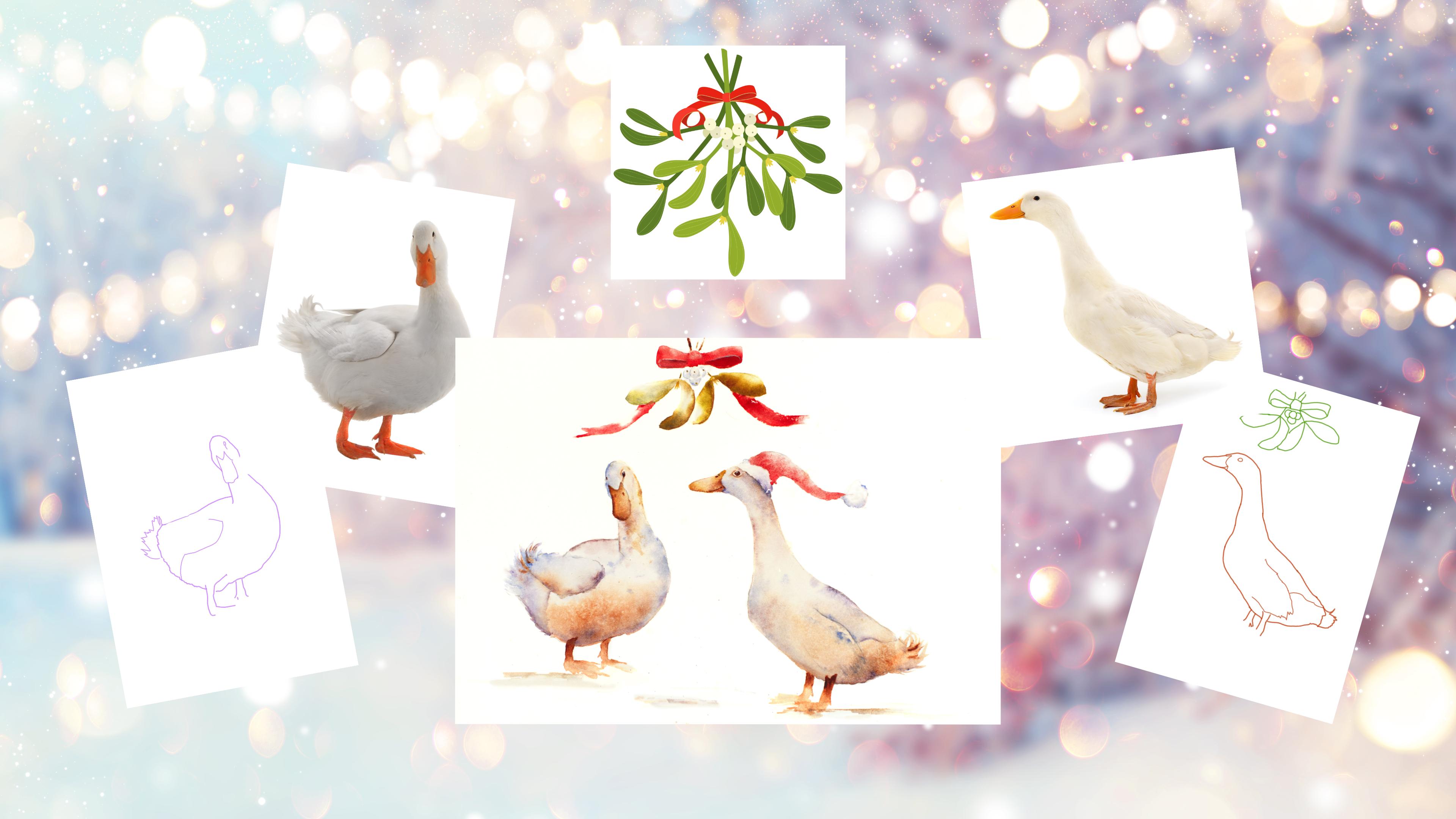
1. Introduction: Hello and welcome to this
intimated watercolor class. Today, we're going
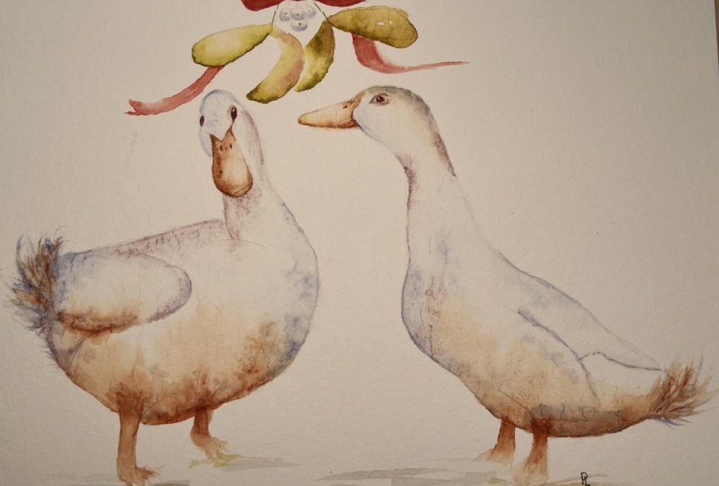
to be painting these fabulous pair of ducks. [MUSIC] Now these two
should get you into the Christmas spirit with these easy but
effective techniques. Now don't be put
off by the theme. You can easily switch out
the hat and mistletoe. I'd love to see
something else creative. I'm Jane Davis. I live, paint, teach, and walk my lovely spaniels in the beautiful South Downs
National Park, England. Over the last fifteen years, I've taught myself the
free flow technique that you see today. Not having been to art school, finding my own way has been
fun and sometimes daunting, but it has allowed me to
develop my own style. This has led me to
teach the others, either on a one-to-one
basis or as part of a group in a wonderful studio in the heart of the South Downs. I also run a successful
commission-based business, painting pet portraits and wildlife art in my
own home studio. In all my classes, you will follow along in real time where I
can guide you to keeping your work loose and
fresh without over fussing. I have over twenty classes
available on Skillshare now. If you're just starting out, my three beginner
classes will guide you. Then you'll find over
twenty masterclasses covering a wide range
of beautiful subjects. In each one, I shared the techniques that I use in
my own professional work. We'll have a lot of fun together and you'll gain the
understanding and confidence to
incorporate everything you learned into your own work. Plus I'll share a few of my tips and tricks
along the way too. [MUSIC] As ever, I
have provided you with some lovely reference
photos of these two, along with downloadable
templates for you to print out. The templates give you a stress-free drawing so you
can just enjoy painting. I'll be showing you the joy
and simplicity of placing paint onto wet paper and
allowing it to work its magic. I'll be guiding you
through sectioning areas off and adding colored
layers to create depth. Of course, I will share many
of my professional tips, tricks and musings as we work
our way through this class. If you'd like to learn
more about me or my work, please pop over to my website at Jane Davis
watercolors.com.uk. This can be found
on my profile page, along with links to my
Instagram and Facebook pages. I'm very active on my social media pages where
I love sharing my art, especially on stories
with many ideas, or works in progress and
tales of studio life. I really hope you will share all your paintings
on the projects and resources pages as I love
seeing your most pieces. Don't forget, I'm
here to help if you get stuck or have any questions. I want you to experience
that buzz of painting in his liberating wet on
wet, loose style. Come and join me. [MUSIC]
2. Materials: Welcome along to this really
little light-hearted subject we're going to be
painting together. Explains a nice way of building up white
subjects using color. As we're talking colors, let
me run through my materials. Starting with my colors, these are a lovely selection of, as usual, my Daniel Smith paint. I've got lavender, and I've got a rich gold green. I've got ultramarine violet,
quinacridone burnt orange. Nice color, I like that. I've got a cadmium
yellow deep hue, Potter's Pink, and
I've got a scarlet. Lastly, here just a little
bit of white gouache. That's just for doing
the tiny little dots, catch lights on the eyes. Now, I don't think there's
any particular color that you couldn't swap out
for the colors I've chosen. It's a very
light-hearted subject. Again, choose the
colors you like. These, they're not specific, so have a rummage, choose the ones that you're
drawn to and you enjoy using and go with that. Somebody suggested, I will
do a little color swatch in the projects and
resources page, so that is going to be
a little extra for you because rightly so, if
I'm using these colors, it's not always obvious what
they actually look like, and it will give
you an opportunity to find colors that are similar if that's what you want to do. I think I've covered that. [LAUGHTER] I've got a hot
press paper actually today and that's an arches. That's actually been stretched. I've got my pot of water, a little bit of salt,
and I've ground that up, it's quite a fine ground. Paper towel, my
rather small rubber. [LAUGHTER] I've a pencil, and I've got, how many?
Four brushes today. I mainly use the large eight. I've got a very, very
tired flat brush. It's not something I use. It's a very old one,
my dad's actually, and that's just
to do the ribbon, the only time I use it. If you've got a flat brush,
which you will likely have, probably will look slightly
[LAUGHTER] nicer than mine. I've got, again, my
little eradicated brush which I always use, and that's great for
taking color out. I've got a number size naught, maybe a touch too small, but it was nice for doing
the details on the eyes. [NOISE] Then I have used
a hairdryer, again, that's just for drawing
the very last stages and it allows us to move
on a little bit quicker. As ever, there's
downloadable templates of these two ducks. I'll pop on a little
template of the mistletoe if that's any help to you. But I should do that. What else was there
to explain to you? No. I think that's it. Let's go and sketch
these guys out.
3. Sketching Out: As you can see, I've already sketched my
little ducks out, but I shall give you just a
few hopefully helpful tips on how best to replace
your templates and arrange your ducks. Obviously, this is a
Christmasy time of year, I'm actually filming this,
so I put a Santa hat but obviously, if you're
painting this in July, you may not want the Santa hats. You can swap all
these elements out and leave out what
you don't want. Obviously, the mistletoe
is quite a seasonal thing and the Santa hat. You may want to do one duck, you may want to incorporate
something else. Pick and choose and use the
elements that you want. But as ever, the little
templates are there for you to use and download and
go around and, as I say, I know I repeat this in all
the classes if you follow me, so bear with me if I sound like I'm just going over
the same things. But for you that maybe
haven't joined me before, I'm just going to run through all the things I normally say. But if you put a template
down and you draw around, you will find you
get some blunt end. Once you lift that
template away, have a look at your
reference photo and just check you've
got the lines right, and they're not too rounded off because all my work
is quite loose and it depends quite heavily on having the sketch
right in the first place. If your sketch is a little off or you haven't taken the time
to get nice crisp details, you'll find all that
looseness of the watercolor and the fact maybe your
sketch isn't quite right, you'll find your overall piece
will look a little messy. Again, you can place
those how you wish, mistletoe you can do the same. I probably don't need to
tell you much more about it other than just
yeah, take your time and get a nice sketch
you're happy with.
4. Duck One Body: It's onto the painting. Pick up your bigger brush, and we're going to get
your brush nice and wet, wake it up and we're
going to wet down. I'm going to call this number
1 duck and number 2 duck. Not trying to sex them
or give them names, entirely up to you
how you do it. I will probably default into
calling one a he or a her, but for time being, this is number 1 duck and number 2 duck. We want to wet down
number 1 duck, and you don't want
to go too close. You can see where these little
tail feathers flick up. We don't want to go
into the tail area. We just want to round it
off. That makes sense. A little bit helpful, more helpful to actually
sketch out that little bit in. I didn't, sorry. All around. We're not doing the
feet. Meeting them out, we're just doing the body really and then
we're going to go round the bill over
the top of the head. Make sure you get
that nice V wet. This one goes into the bill. Sweet round, stay
within your lines, and probably what
I should have said in the sketching out part, make sure your pencil marks are fairly light because
this is a white subject. You ideally want to be
able to rub them out. So if they're very heavy, they will be hard to move
and hard to get out. I can already see my
lovely stretched paper is bracketing a little bit, but never mind.
That's nice and wet. Note it's sitting in a puddle, but almost because we really going to rely
on that paper being lovely and wet and
pushing so the paint has lots of water to move into. It's sitting in a puddle, you'll find the paint it
won't allow it to move. It's getting the timing right, but we want it nice and wet. Within down to duck
your head up and down. Oh, there's a pun
there, isn't it? With duck. Make sure it's really nice and
wet. Make myself enough. We're going to
pick up the orange and a little bit
of the lavender. Make sure my brushes through. It's wet, just made
sure probably habit, but I make sure it's clean. Then I'll take a little bit of excess moisture up just by
tapping on the kitchen roll. Because what you don't
want to do is to add too much water or it's just a balance of
getting that right. But if you keep
cleaning your brush and not taking the
excess moisture, you'll find you're adding
too much water then. We're going to simply
just underneath, obviously it's a white subjects. We don't want to get
to bold, go lightly. Don't add too much. Worried a little bit
more water if it's not moving, add a
little bit more. That's probably enough color. Don't want it too bulk
because obviously, we're working on a white subject using just a little bit of lavender just to
break up that orange. Just be guided. Have a look, see what she looks like. She's told you a default
back to giving them a six and see what it looks like and what
you're happy with. We just wanted to, just
allow that to move up. I'm going to put a little
bit more lavender over here. Say go easy with your colors. If you're bold person, use a lot of color. Try num, rain yourself
back a little bit because we don't want
too much color on this. Let's have a little
bit of pink as well. All about just adding
a little bit of extra, just some different colors. Something pretty little
bit along the back here. If you find that it's moving too much and give it a little tilt to actually give them put my little, follow me regularly. You know, I have a
little wooden heart but didn't think I
needed much of a tilt. But what I'm going to do is
just put my rubber underneath there and just allow
that to move back down. I don't want that coming
too far up the page. You can always
control your paint by tilting paper around. Because I've got a buckle
here you can see it's not helping me particularly
flowing back cut me. Before the top of the
head dries which it started to if it does and you got little dry patch as long as the majority of
your paper is wet, you can just re-wet an area. You see I've got some color on my brush then it's tainted
already, hasn't it? Said we just want to put
a little bit of lavender. The left-hand side, sorry,
concentrating this. Just swing that down there. Take your hand away and
see what it looks like. Say look at your
reference photo. If you squint your eyes, you can see whether they're
a little bit of shadowing. I'm going to put a little
bit of pigment underneath this bill here that
run down as well. I do want to add some salt, so I'm going to keep
mindful of how things dry. It just needs to be popped on at the right stage and
that's just when it starts to go tacky. It's not dry obviously pretty and it's
obviously not too wet. If you're unsure about salt, it's worth doing a
little spreadsheet, popping some paint down
and allowing it to dry at different times
and popping your salt on. It will give you a good
to the eyeball of when's the right time to
place your salt. This line here you can see
in your reference photos, just a little line down there. We will go over this wing
again in another layer. Don't worry too much if you haven't got much
color on there. Oh, I think, let's have a little why not one more color. Let's have a little
bit of the violet, pop a little bit over there just saying, I just like color. I do tend to add quite a lot. Pop a little bit down there. We're not doing
anymore layers over this body so bear in
mind if it's something you want a little bit stronger than pop it on now because
we won't do another one. Or at least not on this
book, parts of the body. I just want to put a little
bit of strength down there. If I squint my eyes away, that's given her or giving
it a little bit of depth. I think that's probably enough. Actually, I don't want
to do too much always we end up with a
multi-colored duck, we just need to let that
dry but before it dries, we just need to add that salt. Now, mine is a little bit wet because I can see it's taking
a bit of a puddle here, a little bit of a puddle here. But actually this
is probably okay, so I'm going to sprinkle
it on just now. But say, be mindful of your own piece and get that
stock down at the right time. Just wanted a little
bit over the body. This gives us a marks
and that will do me.
5. Duck One Wing: Once your body is
really lovely and drawn and to say be really cautious, this soak, because it
takes a lot longer to dry. I'm just going to brush
a little bit away from my wing area. I want to leave that on there just to make sure
it is properly dry. I'm going to pick up my bigger brush and we're going
to wet this wing and a little bit of
this back of the body. Again, we're just going to, I'll tell you what sure didn't do last time which I
think is helpful for you. I'm going to add a
little bit of color but this is just for you to see where I'm wetting down. It's not much color there is it? It's not being overly helpful now. Hopefully you get the gist. It's over the wing and down a little bit of
the back of the bottom. Should be shaped just nice. All we're going to do
is just to strengthen some little bits of areas out. Again, we don't want
to add too much color. It's very easy to do. Just going to use a little bit of quinacridone, the orange. Put a little bit down there. It's not moving very well is it? Different paper and
I'm not as familiar using hot pressed though
I'd give it a go. It's different than I'm used to. Have a little bit of pink. Break that with the pink
and get that moving. Sometimes you can use paint
for its ability to react with other paints well and
then the actual color itself. Let's add a little
bit of lavender. No I'm sorry, ultramarine
lavender sorry. I just want that you can see the really hard
edge along there. I just want to try and
get a little bit of that. There's a bit of definition. Again, just wing a little
bit down beyond that tail, that's all being
feather to strengthen some of the little
back of the body. I want to do a few flicks just to get those
tail feathers out. I'm actually going to use
the lavender as well. Pop a little bit of lavender to give us something
to work with. Just like that but it's down. Pick up your little brush. Try and get your right angle. We want to flick
some of these out. Again, that's a
little bit lighter so it needs to be done
at the right time. If it's too dry, it will look like
it's been stuck on. Then start a little by
in and then flick out. If you flick from the very edge, you're quite likely to
make it larger and larger. If you come in into the body a little
bit and then flick out, be careful because there's only a little
bit of texture here. It's got too much there
is there so if we do too much it's going to alter the
shape of the body as well. Back to my bigger brush. Now, try and keep everything
as loose as you can. Hopefully I can. Don't say you can see
another obscure things. We want to flick out. See a little bit of color, stabilize my hand a little bit. Still see, can't you? Working a bit of
odd angle here now. Now then color out. Keep an eye on that
reference photo. You can see the shape and size. That looks okay. Again, be careful because
it is a white subject, we don't want to
get too much color. I just want to add a
tiny touch of pink just to break up that lavender. That looks okay. Just going to pick up
my little brush again. With the roll I just
want to strengthen that little area there just along that just
to get that line. We have a defined area
where the wing is because that's
quite a strong line isn't on that reference photo. I think that's about there. A few more flicks with
some more of brush should give you a
little bit more, some different shape
to your flicks. Take your brush away, have
a look if you're sitting, just sit up for
method to a maybe don't necessarily move your
board or your paint paper because you want
to leave it flat. But just try and get away
from it for a minute just to see from above as it were
and see what it looks like. I'm pretty pleased with that so I'm going to
put my brush down and I'm going to
allow it to dry.
6. Duck One Feet: Again, once this layer is dry, you could carry
on with the feet. But I always like
little areas to dry just you don't smudge them. Onto the feet. Pick
up your picker brush, and then pick up your orange. What we're going to do, we're just going to
literally paint the leg in, back and front. This one just goes
in a little bit, it doesn't enter the body. You can see that give you a nice perspective
about the body is. Clean your brush.
It's nice and clean. Again, take a little bit
of excess moisture off. You can see that color, and then we're going to just
pull using this paint, that's halfway down the leg. We're just going to
pull out some feet. I just want this to be loose, so I don't want this
to be too defined. I don't want to make too much of these legs, feet, even. That's probably enough. Again, same with the back. Just as a hint to
anymore than it is. Being very exact. Just going to pick up
my tiny little brush, just to make sure
I've got those. Next test. The right shape. If you're very good at feet, make them more awesome, better. Probably my weak part is
where with this feet, so I tend not to make
too much of them. But if you'd like a big
foot, then go for it. I'm going to leave
it there because I know I'm not good with feet. Again, let that dry, and
then we can move on.
7. Duck One Bill and Eyes: Again, once you're
little feet are dry, we're going to pop the
bill and the eye in. Pick up your bigger brush
[NOISE] and we're going to carefully wet down the bill. Make sure you get right
into those little corners. I'm going to actually pick up my little brush and get
right up into those corners. Again, you want it
nice and wet but not sitting in a big
puddle. Take your time. I can see I've got a little
bit too much water so I can just gently touch my brush into the puddle and
it should suck it up. Perfect. I might stay
with my bigger brush, and we're going to
pick up the orange. We're just going to
run it down this side. The left-hand side, sorry. A little bit round so that
we get that nice fin, because I think that's
quite important part. We're just going to allow
it to run the other side. I'm just going to pop a
little bit of wash in there just to see if we could allow that to be a little bit
more space to move in. Just by popping it
little bit more water, I've just allowed the paint
a little bit more area, a little bit more space
to go in and find accent. We'll continue to creep. Just keep your eye on it, and you can always just push it back slightly if it feels like
you're going over too far. Pop that down. I'm going
to pick up my lavender. I just wanted the most tiny little bit right
at the very end, right at the tip of the bill. You can see that little
mark there, isn't it? Just tidy up. Make sure
it's nice and neat. We're back with
the orange again. Just want to make sure
that's a nice sharp edge. I think that's drawing nicely. Pop it down. Now, the
eye is terribly simple. I'm just going to again pick up the orange and your violet. Well, you can mix
this on a little. If you're used to mixing, then you can mix these two. You just got to dark color. All we're going to
do just a little. It's nothing very
complicated too, is there? We will put a tiny
little catch light in. I'll do that on the
finishing off stage, but just get the nice
shape just like that. Clean your brush. Very carefully just touch the
corner of the eye, and then we're just going
to join up with the bill. It should just give us
a nice bit of softness. Of course, if you've
done this a lot larger, you could then elaborate a little bit more
on the eye and you can put a little
bit of brown in, but to this there's
just not enough room. It's just a little duck. Actually, if I put those down. We need to do the left hand eye. You could only see again, that is a minute
this little dot. Don't try to do too
much, just a suggestion. That is actually
probably enough. Don't be tempted
to overwork those. Actually, I can see this
is now moving over. I'm a little unused to
this paper and it's not quite for me how I
had wished it to. I'm just going to pop
a little bit of water in there on the right-hand side, and that will hopefully
push that pigment back into the
right-hand side or give us some texture as well. We'll leave that to dry. I'm just making sure I'm safe. As ever, I'm a little
away behind this painting so you don't get to see my head. I can't always see these
very precise more parts. That's better. [NOISE] Again, that needs to dry and we can
start on a Number 2 duck.
8. Duck Two Body First Layer: Okey-dokey. Onto Number 2 duck. Now, same again really, we're going to wet all the
body down a whole lot, missing out the bill
and we're actually going to go around
the eye as well. Let's try and remember
to do this, this time. This is for me to be able to show you
the area of wet down, so don't put the
lavender on yet. Yet or not at all, should I say? I'm going to pick
up a little brush. [NOISE] Its got a little
bit of orange in there. Last one, so I'm going to make sure
I've gone around there, underneath the bubble hat. Pop that down again and we're going to run all
the way down the body. Stay within your lines. I've put a little bit of
lavender on again so you can see [NOISE] [inaudible]
scorching everywhere. Nice for a curve, just a slight curve is no
[inaudible] Make sure you have all those nice of elements
in this too, nice shapes. Hopefully, you would have done obviously with the
sketching out. Make sure it's all filled in. Just bubble your head up and down then you
could see if you've left any dry patches,
it's easy done. Hopefully, you can see that
and where I've wet down. I'm just going to leave out the tail little
like Number 1 duck. I've left out the
tail just so we can do a nice lot
of sort of flicks. Again, make sure
it's nice and wet. Not puddling, just right [LAUGHTER] We're just going to use it over a combination
of sweet colors again, similar to Number 1 duck. Again, I'm going to go
underneath that body first. I've picked up my lavender, violet, and the orange. Ducks go mainly with orange. Lavender on the same
brush at the same time. I'm again just touching, just allow that to one. We don't want it
too heavy because obviously some white subjects. It's always quite tricky
of white subject. Just enough color
to give some body. Again, be a [inaudible]
to your own piece. If you've added too much
orange or it's even, put a little bit more violet somewhere else and vice versa. We're just adding
just a little hint and just real softness. That's a little bit of the
lavender on the chest area, a bit more. Let's have a little
bit of violet underneath on top
of that orange. Nice wing strength under here. I'm going to allow that to move how almost however
it's moved on its own, just allow that to be. I'm going to pop tiny
little bit of violet back, probably a little bit too much. I can clean my brush,
take the excess. Don't keep adding
water to your piece, just clean your brush deeply on your kitchen
roll or paper towel. You need to be mindful, we need to hopefully
use this paint here to flick out
that tail feathers. I've just had a duck my head in it [LAUGHTER] I'm going to use this a lot today, aren't I? Ducking. I've bubbled my head up and I can see that's probably
about right actually. This isn't really wet for mine and this is
actually starting to dry so you have to juggle it and judge how your
pieces are drawing. Again, using my bigger brush, try and keep it loose. Hold it up at the end and we're going to start
somewhere here [LAUGHTER] I think it starts to dry too much
[NOISE] Let me do that again. It started to dry here. Pop a little bit more color on. It wasn't very
successful, was it? As I was saying, just pop
it down there and flick. Pop a little bit of
[inaudible] underneath there just to give it a
little bit of strength. You can always use
a little brush. At this stage again, you
can do another fill. A nicer little flick around, is in there. That's quite cute. Again, we want just again, just take a tiny
little bit of feather. You see this one hasn't
really got much, has it on the reference photo. But it's quite nice to do a few little flicks just
to break up the line, but be careful you don't
go too mad with it. Actually, I'm going to put
a little bit of short. I meant to say on this one
when I finish this layer, when I actually turn
the camera off. It just needed a
little bit more humf. Again, its something that
I'm going to do now. l just put a little
bit more on my brush, just a little bit in
there. Just like that. That's probably enough. So just pop your head up, have a look, see what
it looks like from a little bit from a
far if you're sitting. We can start on the head. Quite nice to get a little bit of strength underneath there. What would be the or will be the hat so let's have a
little bit of the violet. A little bit of orange again
and then touch that down. Just allow that to run. Again, you can always
tell things if you feel you needed
a little tilt, if you want something to run. I'm going to keep this
flat because I can see I've got a little bit of a dip and that's
sitting in there. It's not necessarily
going to be a bad thing, it will leave me
with some patterns. If you've got something similar, you can always just suck up
any water that's sitting in a pool or a reservoir of water. I will have a
little bit of pink. I feel I have gone
off colors going on. Put a little bit of
pink under here. I'm not picking colors for any particular
warmth or coolness, I'm just seeing what I like. If I'm honest, I just like the strength
underneath there and the orange, I like the pink. I'm not really being mindful
of cooler or warmer shades. But you could be, but I'm not. Keep it nice and simple, just what you like. Let's have a little bit
of strength under here, starting with the neck. I think I need to
be careful because I can see I'm starting to add too much color. I've also got the little bit
of a lavender wash. Well, I put the color down
so you can see it. Mindful I'm starting
on a lavender rebase. Now, I'm just lifting my
head up, have a look. Again, I want to
put some salt in. This is probably getting
to the right stage. I probably need
to pop some down. Again, wherever you
decide to put your salt. If you do, then just be a judge of where your paper is drawing. Let's put all that down [NOISE] so I add a
little bit of salt. This little area isn't
having another layer so I'm going to actually
stick into my fingers. I'm going to put
that salt there. I'm not going to worry anywhere
else because actually, I might put that on
the second layer. If I do, see if that works. I'm not sure if
this paper is quite performing how I
had wished it to, so we'll see whether that
makes a salt mark on mine. But obviously, if you're
familiar with your paper, you'll probably know exactly
how it's going to behave. I think that needs to dry. Just allow it to dry, a hairdryer is handy. But if it's at all wet, you'll find the action of the hot air will
blow pigment around. It's really only helpful
the hairdryer when its just starting to go off and you just want to get on
really, don't you? Be cautious with
using your hairdryer.
9. Duck Two Body Second Layer: Once this is nice and dried, we're going to do
a second layer. Now, just a word of caution, if your first layer has been
really nice and strong and you're happy with
it and you like the marks you've
got and you think, I think I'm done, don't
do the second layer. But if you've gone
a little light, it's fun to do another one. I'm going to explain, I suppose, and just do another one
and we're going to segment the area up a little bit so we can have a
little bit of detail. What we're going to
do, we're going to wet around the head
again, missing the eye. Go in carefully underneath
the hat down and we're going to run right down the
chest and we're going to, [NOISE] excuse me,
miss out the wing. You can see the line here. Run it down to there. We're not going to go into this tail area where
we put the salt. We are just going to fill it in. Now if you decided
you're not doing another layer and you want
to define some of that wing, all we need to do really to put a little line of water here, pop a little bit of paint on, and then just gently
soften it out and that will just give you
a little bit of wing detail if you feel
you've done enough. If not, you can just join
along with me as they say. Make sure it's nice and wet throughout
underneath that wing. Make sure it's all filled in, no little dry patches. Now, just because
I've wet an area down doesn't mean to say we have
to put color everywhere. I just want to just
give a little bit of definition around
here underneath. A little bit of strength
may be at the chest area. So it doesn't have
to go everywhere, it just allows everything to be soft by wetting
the areas down. We're actually going to drag little bits into
the wing as well. I quite like my back. I
don't think I need anymore, I just want to put a little
bit of strength underneath. I like this lavender. I'm going to put a
bit of lavender in. At this stage when I'm
doing white animals I quite often grab
other colors as well. So if you've got
other colors you particularly like you
can always add those. It's just I try to
confine myself to just a few shades but you
could have another blue maybe. I did have lapis
lazuli at one point. But yes, I didn't want
to bombard you with too many colors. Add
a little bit of pink. If you squint your eyes you
can see where the little bit of strength currently was
because strength is needed. Just tap that in. Try not to do any brushstrokes,
you're just tapping. It's very delicate and you don't need to be
heavy-handed at all. So if you're a light
painter and you're quite delicate this
will suit you well. If you tend to be
a bit more heavy, you'll find this a little more
challenging but it's good. It's good to be challenged,
isn't it? As they say. Let's have a little bit
of violet because I want. Actually, I'm going to
put my bigger brush down and pick up my smaller one. Let's say I want to define
some of these edges, you don't have to go
all the way along. You can just do little
segments at just enough for the eye to see that it's been
broken up a little. A little bit of lavender to just go along this wing a bit. So it just touches
here and there. I don't need any more strength
around the head area, but again if you
needed that, you can. I'm jumping around as I do. You can put [inaudible].
I'm forgetting I'm not painting just by myself. That's looking nice. What
we can do is put it down. [NOISE] Now, with your brush just take the excess moisture
off again and we can just pull in
some little bits. Just putting some of this
slight color into that wing. If you feel you needed
any bit of detail. Let's pick this color up. There is a little bit
there, isn't there? [NOISE] Just a little
mark and then we can soften the edge of that. Terribly delicate. Let's pick up the
little brush again. I can use some of
this paint here. Just pause just to
get that wing lining. Put that down and that
down. I'm touching things. I just want to put a little bit of strength
over here so we can then push some color up
to that wing as well. I'm not sure if I want any
more color, particularly. Put a little bit
more water in there. Let's have a little
bit lavender, just something to
work into that wing. Just a few little flicks. Careful not to outline the
wing completely because it can then look like
you've stuck it on. Just little here and
there, just a little hint. Then again as ever
just have a look, see what it looks like from
a distance. Scoop that out. You have to be a bit of a
judge on your own piece but, you can always stuff
in and you're always taking marks out if
you don't like them. Make sure you've
got a nice shape. If you've got any of
your shapes looks a bit ragged you can
always make sure you just got those nice shapes. Nice and rounded. I
think that one's done. I don't think I need
to fiddle anymore. I think once it's
dried you'll be able to see that there's just a little bit more
depth than the one layer. Better. I don't think I
need to do anymore then. Again. Just need to let that dry and then
we can do the feet.
10. Duck Two Feet: Okie dokie on with the feet. I can barely see my back
foot today on this. Let me just pencil
my little lines in so I can see what I'm doing. It helps. That's it. Big brush. [NOISE] Always give
it a clean, make sure it's not contaminated
with previous paint. Take the excess moisture off, then use the orange exactly like we did
with number 1 duck. I'm going to paint on. She's actually painting
inside the body. It looks like it's stuck on. Then this back one needs to run. It looks like it's behind. It needs to run along
that body line. Clean your brush, you
can put the orange down. You got a nice point. I'm just going to use
that color from the top of the leg and then pull it out. Like I say, we number 1 duck, if you love doing feet, then I know I'm going to see some brilliant projects
with some feeting. Probably my weak thing. Gangnam, same in the back. That's way the front,
just do the back of the same beam. Join them up. Doesn't matter. I'm just
going to do a real hint. It looks he's got some legs. I'm not going to
elaborate at all, but please, if you like
doing feet, go for it. I'm going to leave it there.
11. Duck Two Bill and Eyes: Make sure your feet are dry
because it's so easy to do that and smear to
cost your painting. He's on with a big beak. Bigger brush that we'll use my little one just to
get into the corners as well but let's start with the big one and we're
going to wet it down. I think the bulk of it, the big brush, and then the little brush
we can make sure we get. It's got some color
in there already right into the, all edges. Make sure that the
shapes just spot on. Then we're going to pick
up the orange and I have actually just grabs a yellow, so I've got cadmium
yellow deep hue. Again, I can't help myself, I just end up picking colors up but we're going to
start with the orange. Now we deal with
the number 1 duck, and we are good to just
put that into the bottom. Then with my yellow, excuse the state of the tube, all these get a
little bit cleaned off before I start filming. But as I've grabbed the yellow, it hasn't had its little clean. We're going to pop a little
bit of the yellow on the end of that beak. To be mixing them up there's
a little bit to yellowy, pop a little bit of
orange and vice versa. Let's print a little bit
of the yellow up there and I might even go back
over her in a minute. Just to be nice and random, shall we bend the editor. My lovely husband does with
the editing side of it and he's not a random
person like me. Just looking away at it, I think I need to, that shape it's not quite right, and it just needs a little
bit of swinging down. You can always adjust the shape a little
bit if you haven't. Maybe got that dead
right and you're sketching out part,
there, that looks nice. I'm going to quick
you're going to do, now I'm going to leave
that to the finishing off. That's going to make
it a bit confusing. Let's pop that down, it's going to be the
way and that's done. I don't think I need to
do anymore as it say, if you find your page creeping
up a little bit too much, you can even give
it a little tilt, pop a little bit of water like
we did with number 1 duck. You say there's always ways to pull back your colors
either by tilting, pushing, or sucking
color up, that's fine. Again, I'm just going
to use the yellow, orange and the
violet for the eyes. But if you've got
a nice rich brown, you want to use
that, that's fine, or you're painting a
little larger then you can make the eye a little bit bigger, and it
can be a bit more prominent. For what we're going to do, I'm just going to wet
down little circle. I'm just going to pop
the two colors on. Again, you could mix these
in a little plate or however if you mix paint and
get it all nice and mixed, you don't have to straight
out the tube like me. I'm desperate trying to squint from a distance
and see if that looks right. That looks okay. That's it really,
you don't need to do anymore it's the
eye at this stage, just that needs to dry. Once it's dried again
really get brush, lets use the violet. I just want a little bit of
strength if we're ready, I just want it a
little bit darker, it's little bit too pale. Also got a nice line and it
goes on around, doesn't it? Let's try and get that in, took all my brush at the same time. This would be really
helpful. I could get a little bit closer, but it's a lovely thing
to be sitting down doing. You can see I've just done a quite an obvious
line around that. Then again ways down, I can then just gently soften that line again with
the top as well. Lovely. Let's just give it a little bit more
character, isn't it? I'm just going to put back down. I'm going to hang on
to it for a minute. There's is a lovely line. Always gives it a
smile, doesn't it? Just always paint that in and makes more
difference, doesn't it? I will take a little bit
of color out in a minute. But we can also shape pop
on that little nostril. It's only a little
hint. Put that down. That needs to dry for a second. I'm going to pick up my
lower eradicated brush, give it a little wake up. I don't want these wet. I've just woken it
up. I'm going to make sure it's got
a nice point to it. Now I want to take the color out from over the top of that
line we've just put in. Very carefully, we need a bit of kitchen motor lift it out. Can you see that? You probably can't
see that. Can you? I'm just trying to find
an angle where you can?. 'm just contorting myself. But I'm just taking
that line out. I can't quite do it
from that angle. But you can see that, can you? Now I've managed to
take the line out. This paper is just not behaving
itself like I'm used to. You get the gist.
[LAUGHTER] I've just had to put my
line back in the game, but you want just to take
that little line out above. What we will do, I'm
going to pick up my little boy and
just put the catch light on, on this one. That she might have to pop the catch light on number 1 duck as well because I just have to. I know it's out of order. It's Christmas. I'm
allowed to be naughty. Just a tiny little
dot right there. You see you want it at the
top and to the point into number 1 duck. Again nice point. Tiny little eye. It's made
a difference, isn't it? Again, with number 1 duck, I'd probably go top. There, it makes all the
difference. I'm happy now. Put your brushes down, put
your paint down and we are done for this
layer or this lesson.
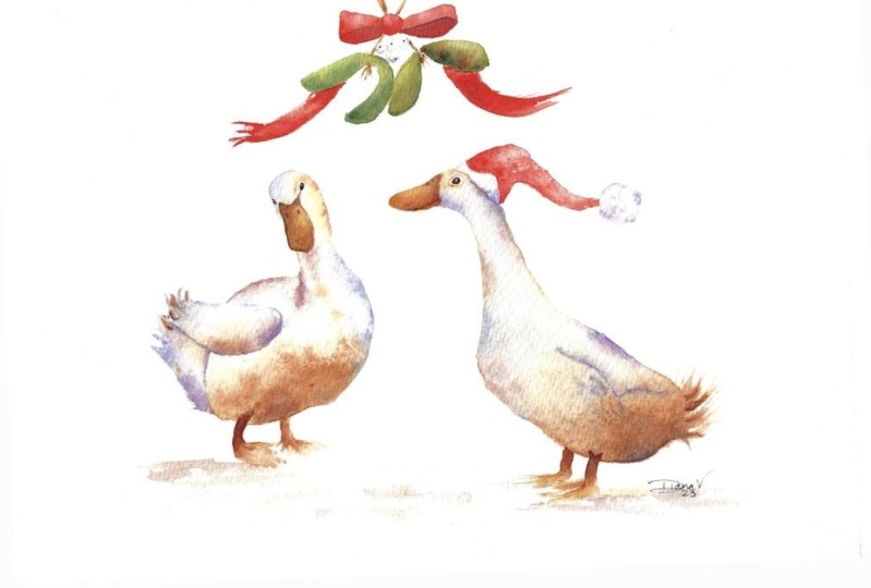
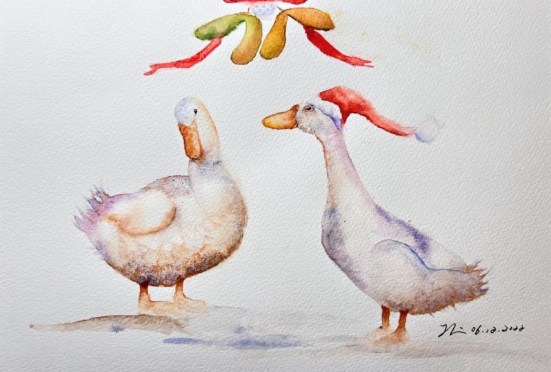
12. Santa Hat Part One: On with a Santa hat. So again, pick up
your big brush, give it a nice clean, take the excess moisture off, and we're just
going to wet down. Let me pick up the
violet so you can see. We're just going to
wet down the hat, the actual hat
part, the red part. I don't think I need to probably explain it
any more than that. Put that down. Pick up your red. We're just going to simply
put it the bottom part, all the way on the bottom
and just allow that to move. We shouldn't need
to do much else actually and if you find that's moving up there too quickly, you can again tilt that way or if you find
this part not moving, you can tilt it the
other way, as it were. I think that's going
to work beautifully. I don't think I
need to do anymore, but it needs to dry before we can add a little
bit of detail to the bubble on the third top.
13. Santa Hat Part Two: Once your red is dry on
your hat, then again, pick up your bigger brush,
wet down the bubble, and touch the very
base of the hat. You'll find it might
bleed a little bit depending again, on your paper. I would expect mine to have done that on a different piece. Let's have the lavender
and have a little bit of the violet as well. All I'm going do is pop a tiny
little bit to the bottom. Just allow that to move up. Again, we'll do exactly the same with the lining of the fur top. Then wet that down, touching the top of the red. [NOISE] I'm just going to use my little brush with
a little bit more control. Again I'm just going to use
the violet and the lavender. I'm just going to put a
little bit to the bottom. Only needs a touch. It should just gently move. In fact, sorry,
I've got my board on a little bit of tilt because my red was moving quite
quickly to the top. That she's still wet on the tip. In theory, it should be stopping it from
climbing too much. The minute you put a
little bit of paint down and it looks like, just take your brushes away. Stop, have a look, and you may be surprised. It's probably enough. I'm going to do just type
those tiny little bit, just the very top. Just so when we rub
the pencil marks out, you can get a suggestion
that there's a top. Again, I will do the same
with the top of the fur. I don't want to add too much. Just the merest of touches. Because it's a white subject
you just don't need a lot. You just need a suggestion. I think that looks good. Let's put those down and
let's let that dry. [NOISE]
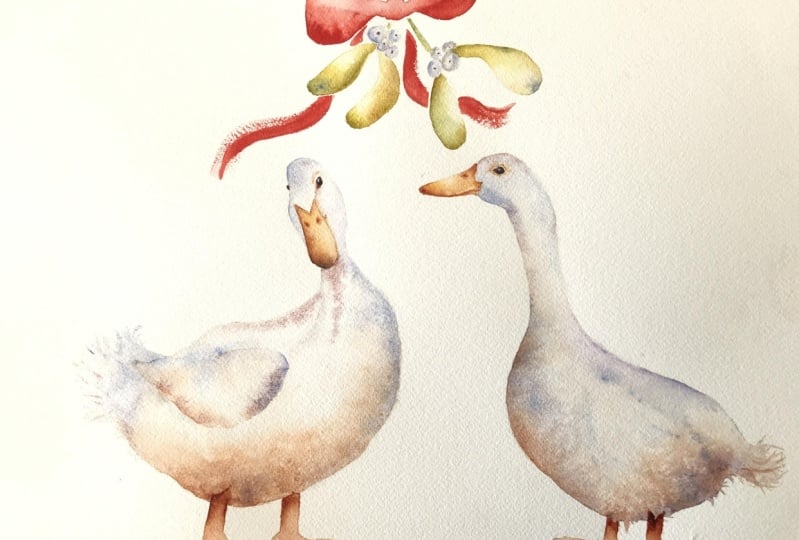
14. Ribbon and Mistletoe: Making sure all your
hat area is dry. We're going to do the
ribbon and mistletoe next. I'm going to be using
the ventricle obviously, and then pick up the big
brush and we're going to wet all this
ribbon area down. Let's put a little bit of color. Color is really,
that's quite strong, is really just for you to
see where I've wet down. This should be nice clean, clear water for you. Making sure you stay
within the lines, making sure it's
lovely and neat. A little like say the hat. I've laid my board flat
at this stage now. It was on a slight tilt doing
the hat and it's now flat. We're just going to
add color underneath. Sorry mine is already
tinted, isn't it? With the colors for
others being helpful. I'm not sure if I am actually. It should almost cover
the whole thing really. You could have almost
painted this in, but I don't think it gives
quite the same effect. I'm just trying to
square off what would be the middle part of that board. Lovely, and we just need to let that move and dry on its own. [NOISE] I need to clean the
brush, put the red down. We can work on these
mistletoe foliage now. I don't want to do
the stems because we don't really want to
join the stems up and get mucky with
the bow area so we need to stay clear of
touching that bow. We're just going to wet. We'll do one at a time. We're going to wet one
piece of the leaf down. I'm going to pick up our green. Do you have a green
you've chosen? Again, you can add,
and I probably will, add some other
colors on top of it, but we're just going to work a bit of a theme in this class. I'm just going to work
underneath and then just allow that to blend up on its own. Never looks like it's
going to quite make it, but it generally does so give
it a little bit of time. If it doesn't, you
can always go and do another layer and
add the color in. But if it's harder to take it out then
needs to add more into. It's nicer if you
can just allow that. We're going to actually touch a tiny little bit of that
top of that number one part. A little bit too
much water here on my brush, stroking that around. Just by touching that
first one we've done, it just allow some
of that color. It just keep it all
nice and soft and stops and you can do the stalk. You're going to add a little
bit of color at the bottom. [NOISE] I'm going to
use my tiny brush. I think I'm picking
up too much water. Let's get rid of the lavender. Have a little bit of orange. Again, you could
be mixing all of these on a little pallet
somewhere and getting the colors just right.
The colors you like. I tend to drop the colors
on top of one another on the wet paper. No
right or wrong there. You just make sure
your shapes are nice. Pick that lavender up again. We might have made
a bit orange here. Jumping around again
onto this. I think I do. I think a lot so I don't really realize I'm doing when
I'm painting for myself, but I'm here guiding you. I've realized how much
I do jump around. Hopefully. That will
do that, nicely. Obviously I can't do
this one because it's touching the number two part. I can do this one.
Swap brushes again. [NOISE] This is what I mean about making
sure your brush is nice and clean before you start. You want it nice and wet. I'm going to use my
little brush again. I just feel I have a little
bit more control and I'm more likely to pick up
as much water either. Let's go back in with the green. Let's get rid of the lavender. Let's pick up the violet colors together. A little
bit of orange. It's definitely
different. [NOISE] I think I might be
losing the green element to the mistletoe, but you get the gist. A little bit more green. If you've got a lovely
green that you like, then the sea green
is a lovely green. You've got Daniel Smith's paint. We wait. That all needs to dry because this needs to dry
completely because it's very hard working on tacky
watercolor paper and paint it. It would just go wrong so
you need to let that dry. This is again, that
sort, that's too wet. If I try and join this up, it's going to go a bit messy so I just have to be patient, which is always not
that easy, is it? And allow that to dry. Once it's beautifully dry, we're going to just put that darker area
underneath the bow. I'm going to use again,
use my little brush. You got something a tiny bit but bigger
than a number note. It might help you, but I'm just sticking with my number note. I'm going to pick up
my red and the violet. Again, you could
have mixed this. I'm going to actually
just wet this down a little bit or we can just paint it straight
in, doesn't really matter. I'm just going to get that deeper color to the
impression of that bow, the dark shadow
underneath the bow. In the other side, I'm going to wet it down or paint it in, doesn't
really matter. I always like wetting stuff down and just
allowing the paint to be. There's no right or wrong,
particularly on that, Let's say the minute
you think that it looks nice, then leave it. Let's put that down because
that's worked out okay. Now I'm going to just
going to do that. So what would need
number 3 I suppose? A bit of mistletoe. I'm going to wet it down using
my little brush. Right roll up against the
edge of that Number 2 piece. I'm actually going to drop
color at the top actually allowing that to
run down that side. Let's have the green, so I go with the pink. It just moved down. It's not tilted at the moment,
but it still should move. I'm going to form
a yellow again. I don't want to
get too detailed, but just a little flicks
in the center there. Perfect. Now we need to
just to the ribbons. I'm sure you will have
a nicer flat brush. I never use flat
brushes and this is actually a really
old brush of my dad. But I think he might have liked to shape or to do a sweep. If you've got a lovely
flat brush, then use that. I'll show you what we'll do. We'll do two ways of doing it. Using this conventional way, let's wet a strand down. Again you don't
want it bubbling, you want it nice and wet but
not sitting in a puddle. I'm going to pick
up a bit of red. I'm just going to
drop that at the top. I'll just guide it
a little bit down and clean that. What I'm going to
do with this brush, or a very tight brush. I'll get this nice and wet. Then we're going to
put some paint on it. Hold it nice and loosely. We're going to put
it coming out here. Just a quick sweep like that. Again, you can just fill
that in a little bit. Probably better done
with my little brush. There's two ways for you
to have a little play at. Let's say you probably got a much nicer
flat brush than me; that is not a brush I
ever use in my work. I think it's done an
okay job, bless it. Lovely. It's just a
little buried really now. Again, another white
subject so we just want to do tiny hint. Sorry, I've got a bottle of
water to run off my brush. I do that. We just want to wet them down individually so
they're touching. You're going to have to
wait for them to dry. Just want a tiny bit of a
hint of color at the bottom. It's just dropping color at
the bottom and allowing. Really you need to do them one at a time and let's
say you've got them spaced but they don't touch
one another. Patience Jane. Even it up up a little bit. What we can do while
we're waiting for that to dry is actually
take a little bit of light out of that top of that bow
so where the knot is we can just scrub a little
bit of color away. A bit more resistance for
the mood, doesn't it? Just about lifted a little bit. Again, want to wet those down. I just drop a little
color underneath. You can alternate the color
you use to drop underneath, do a bit of cheating here. Ideally, I need to let this
dry, but I'm cheating. I want to just draw a little
line. It'll be just enough. Just be careful not to
add too much color. They're quite
small, aren't they? Again, a white subject. But what's quite nice is
to put the tiny little dot in the center so I'm actually
going to use my green. I'll just put a little dot. I'm just going to
use my larger brush. We're running out
of all the inks. Let me get to the yellow. A little bit of orange,
a little bit of green. Just use my little brush. I just want to do
a hint of stem. I haven't got much stem
really showing and I haven't done many pieces of mistletoe, but you can put the stems
on to join those up. I have the paint. Just a couple have come out since they look like they're actually attached. Really, that's your
mistletoe. Done.
15. Finishing Off: Now once everything is
really nice and dry, and we can use the rubber and get some of
those pencil marks out. But really make sure
that's nice and dry. But you can out the salt
first, let's get rid of that. I think it's worked overly well. [NOISE] Little disappointed, my paper hasn't performed
how I'd hope to do better. Hopefully, you would have
got some nice marks on it. I can show you a couple of the practice pieces where it's salty, they're a
little bit better. But anyway, I'm going to
rub out the pencil marks. If you kept your picture
box nice and light, find our dark sort. I'm giving you some noise. [NOISE] He loses
the restraint of the pencil marks and you get a little bit lost
and found look, so cautious always
think I'm going to rub quite a bit
of white paint. I was a little bit heavy
when my pencil marks mode, so you can see where
my sketching is worth. But if you were nice and
light, you'd have found. Now, this head done with disappeared side of
the head. Then there. [NOISE] Hopefully.
Straight. Feminist. Always, I love when the pencil marks
go because it's [NOISE], especially on what subjects say blends a little bit heavy here that should have lifted really, but it hasn't quite. We're just going to finish off, do any little tweaks that
need doing any light that knee is lifting,
any tiding this. I'm going to just color that. Billing was night and add a
tiny little bit of color. Again, let's start with number 1 duck as we started with that one first.
Wet my brush. I'm going to wet this, [NOISE] slight
tinge green on it. Stressing you should have
your brush nice and clean. Just, again, I don't want to go onto that
right-hand side. I am just going to drop color
onto the left-hand side. Just give us a little
bit more depth, I think. I think that's nice.
[NOISE] That is the way. Now probably when you've
taken your pencil mark out, you will still find that
neck has almost disappeared. What we're going to do
with a little brush, pick up the pink, make
a paint, a little line. Then we're just going
to clean the brush, make sure it's nice and clean, and we're just going
to, soften that edge. You see it just given a little bit of definition
there, without too much. You will use your finger
which really good fit to just softening edges. Didn't get a watermark. I think had a tiny bit of green on there are
brushes [NOISE] that are contaminated with green,
pink would be nicer. That should be enough just
to give enough definition. Again, we can lead out this one. You can almost do a tiny
line in a little place. Right at the very top, again, just soften that top line. Just the tiny little
details, isn't it? Paint, moving a little bit too much for my liking
across that were inside. Push it back. It's amazing how the different papers
change how you work. It's very different
though is phonics, but it is really fun playing
with different papers. You'll find one that
really resonates with you. That's nice, got
some nice qualities. Just not what I'm used to. Just working around her, or it. Again, I'd quit that line, although I can see a
pencil line, I didn't. I'm going to put a little
bit of a line there, using the pink shifting
better as pink, use the bigger brush. Just going to soften that again. Just a little bit of
definition that just puts her head and the neck into
the body, doesn't it? Perfect. Now, I just want to this is a
little bit lining here, so I'm just going to gently
can keep these so looser. Just wanted to take a little bit of time to take that
line out a little bit. Not lifting quite as
well as I'd hoped. We go. Welcome again. I'm happy with the feet so
that any tiny little bits, this where you've gone
over your pencil marks. I have again, you
can tidy those up. It's going to get the theory, you just go around
and clean them up. This duck. I'm pleased
with this one. I don't think there's
much that needs doing, you can see the difference
in between the two. That's obviously had two layers, is wondering you
only had one on, at least on this main
part of the body. You can just see
there's a little bit more depth there, isn't it? Just where we've purely
by wetting it down again, the paint has spread
again and giving us a little bit more color without actually
adding more color. That makes sense, it's probably nice doing two layers than one on a white subject, but they're not
necessarily all depends on or little depends
on your paper, and how your paint
has performed really. Around here, me taken out you can take little
bits of paint out here and on the back of the neck,
that's always quite nice. That out. Again, top of the hat, you can take little bits off the
top of the hat. If your paint went up
a little bit long. Thought that again,
if your paint moves a little bit too far, the hat, you can just gently take little
bits of color out. We again, we can put a
little bit of ground on some of the practice, Pizza did some, I didn't, so I suppose I shoot. You can see what a little
bit ground would look, but if you like that look, then obviously you
don't have to. I'm going to use a
little bit of lavender. Let's use just a tiny
bit of the orange, color on my brush at same time,
keeping everything loose, making sure that
the brush is wet. Just a hint of color. I'm going put this on the
number 1 duck and just, that might even be enough
just a little bit. Just a ground a little
bit, doesn't it? Do that the same
with number 2 duck. Just a few, just sweep
through the brushes. It's no more than that. Job done as they may say. That's the ground, and they say you can choose
taught to or not to add that. [NOISE] Just waiting for that I quite unwanted but there's
little nostrils in that number 1 duck sided. Looks it's dry to me, I'm going to pick
up my little brush. Just going to paint them on, to be a bit too strongly noise would be squished in the middle
of your finger. Put my brushes down and I'm
going to have a little look , and I'm pleased. I don't think there's
anything else that needs doing for this particular piece. It's just a case of going
round your own work, taking the light out, adding any little lines, just thought we did with
the around the eye. I'm just softening
being aligned down, softening the edge out. No, I don't think there
is any more elements. I want to think
with this and say, it's always worth looking
at your own piece. As I always say, popular way, get it out next day and
see what you think. There'll be glaringly obvious
bits if they're already, and you go, why did
I not see that? Or another tip is
to actually take a photo of your work
and then look at your piece on your
phone or camera. You can often see that through a slightly
different idea as well. I quite often finished
my pet portraits by taking a picture of my work, looking at it on my phone, and then adjusting, almost looking on my phone and
adjusting any bits. That's a little bit looking
at the next day I suppose. But anyway, I feel I'm
starting to waffle, so I should end that there. I hope you enjoyed these two, and it's got you into
their Christmas swing. If you're listening
to Christmas, if not, then obviously dispersed
to the hat, if you will, doing this in
August, and as ever, please do share these on the projects and
resources pages, because I think
there's going to be a quite a diverse collection of what you add on
what you don't add. It times the season you
actually painting this though. Yes, please do share them
because I loved that part. Thank you for joining me as Eva.
16. Final Thoughts: [MUSIC] I hope you
enjoyed this class. These two got you into
the Christmas spirit. They were lovely bit of fun, and I hope they made you smile. I hope you enjoyed adding
the hints of color. You don't need a lot, do you? Did you enjoy painting the mistletoe hat or
did you keep it simple? As always, it's worth
stepping away for a couple of hours and looking at them
with a fresh pair of eyes. It's amazing what you see. We look forward to seeing
you in the next class.
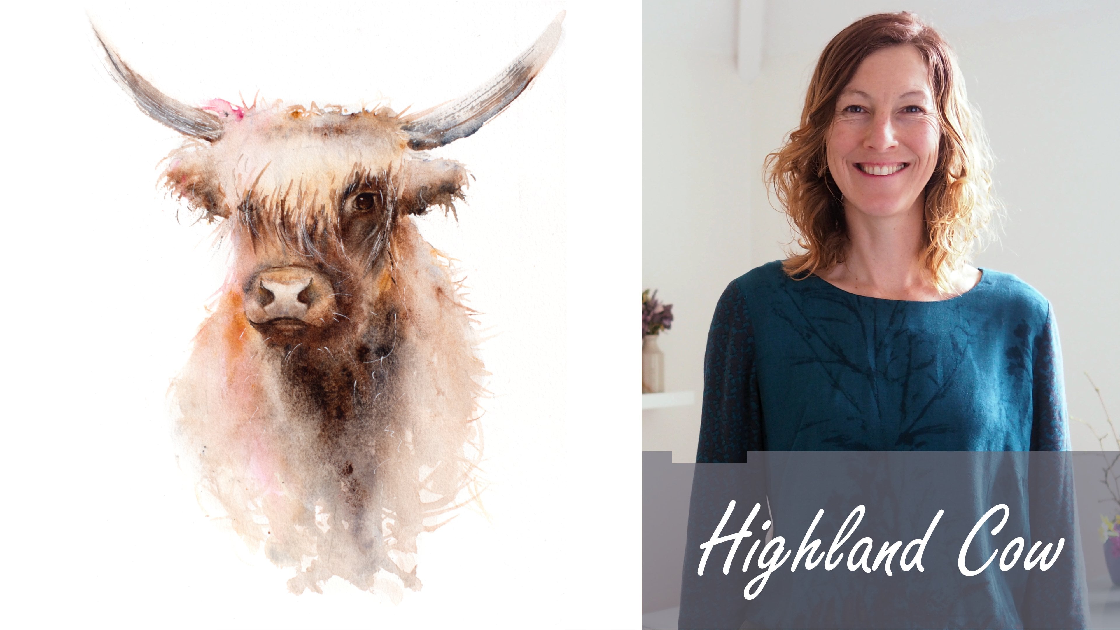
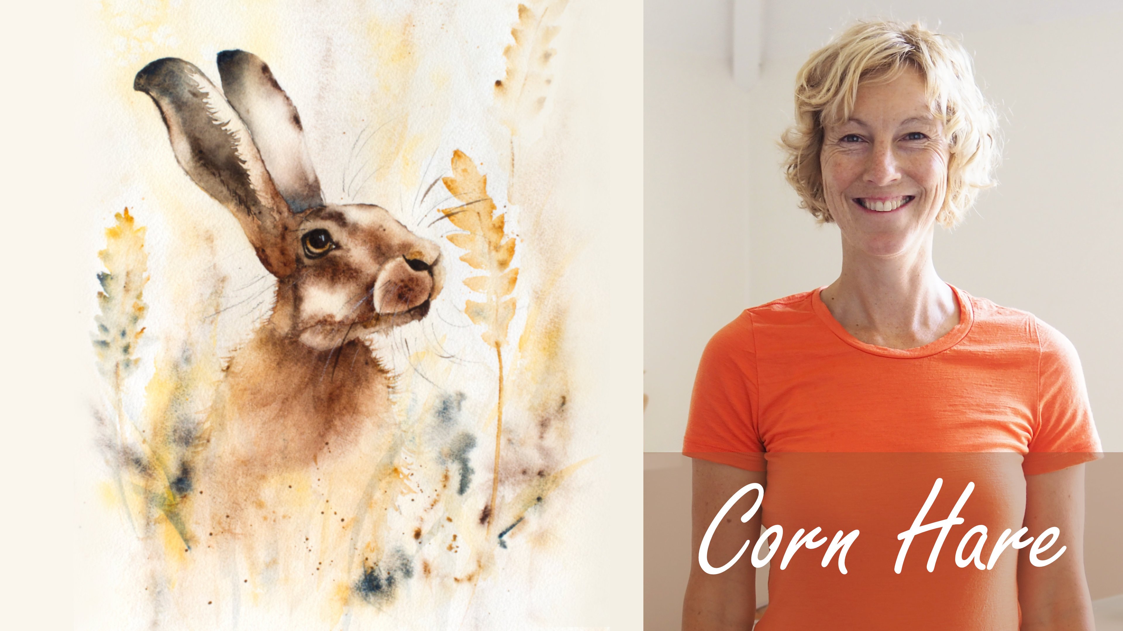
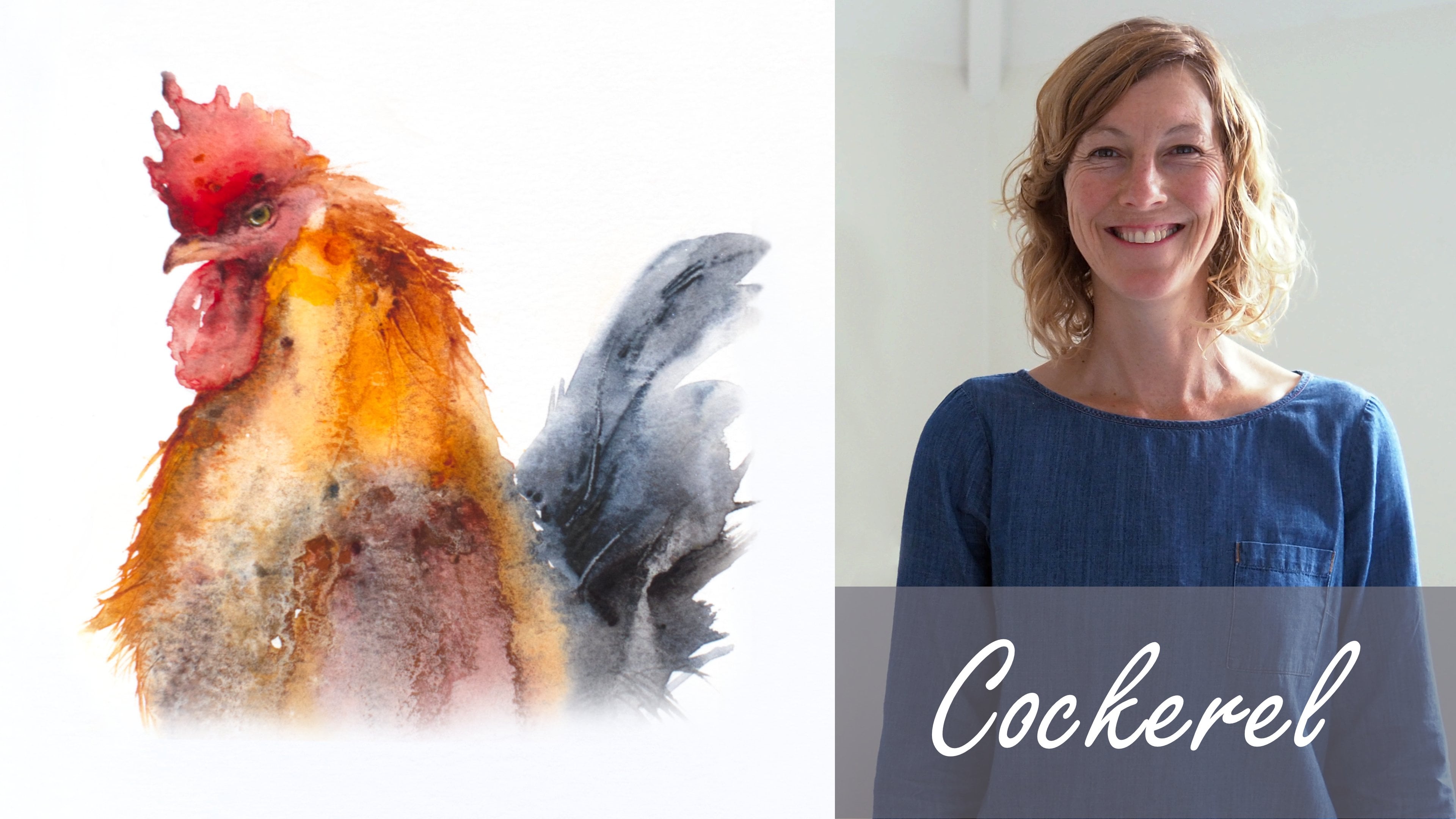
 Jane Davies, Professional Artist and Teacher