Transcripts
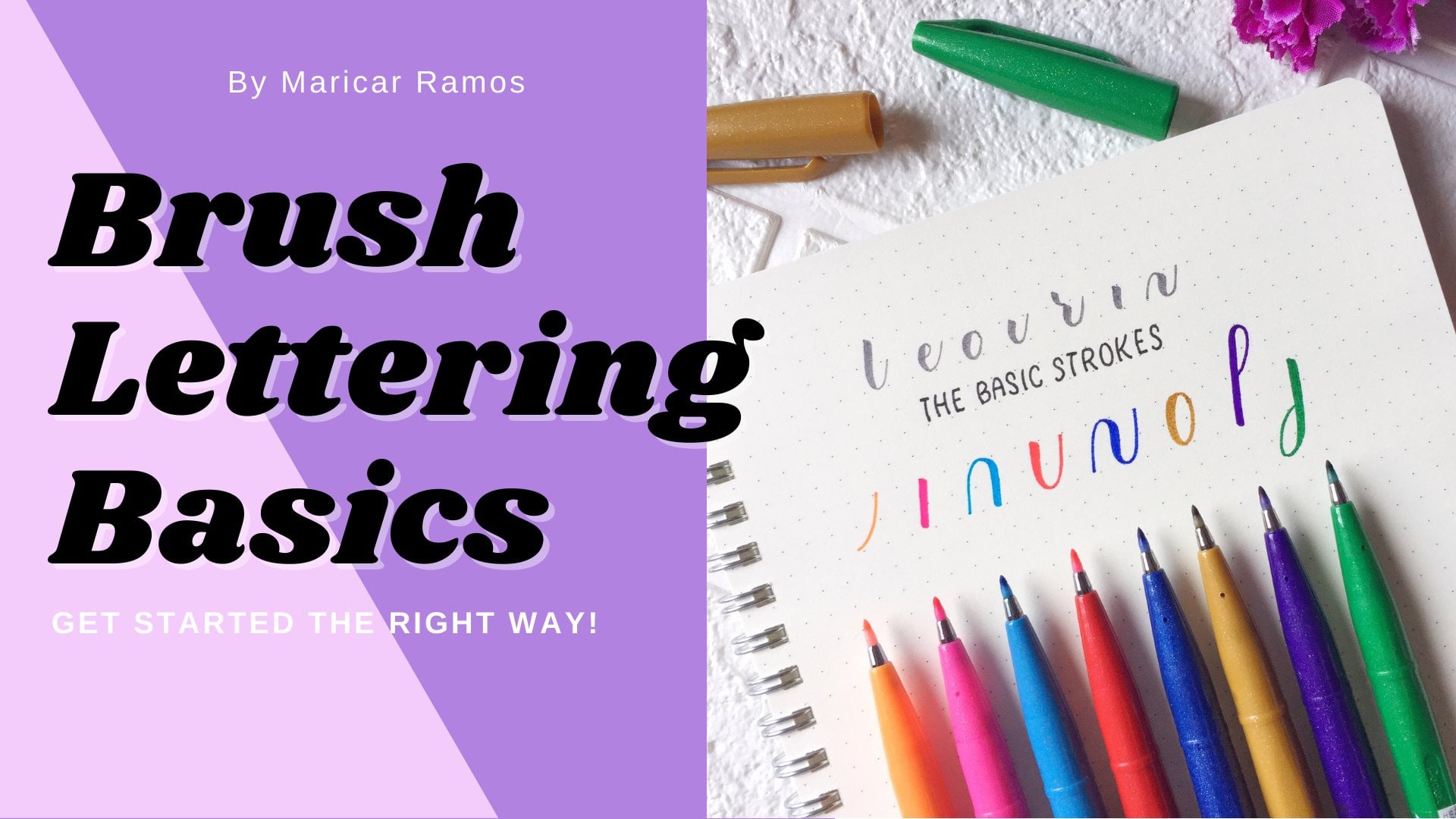
1. Introduction: There are thousands of beautiful lettering out there and looking into those you might be pass. Aled, how these people made such occasions. Should you be an expert in living soul? Well, you've got the red class today as people together discover creativity with you and prove that you have what it takes to be a calligraphy artists without any fancy too. Hi, My name is Mari Card from seven brush strokes. I've bean into modern calligraphy for two years now and I love teaching people this kind of art. In this class, we will discuss what for calligraphy is how are we going to imitate really calligraphy with just a regular pan and discover the fundamentalist strokes to ensure that we will achieve the best results. Join me in this class and this over. Your Katie did it today. You're the art of people, right?
2. Supplies and Guidelines: for this class, you can grab a pen, seal, a fine liner, been or any regular ben. You can use any regular paper, but they suggest that you choose a paper with guidelines so that you're writing will be consistent. You can also browse for the resources section of this class to download your free blank lines and have it printed. When we learned how to write in grade school, we were thought about guidelines that help our letters to be straight and off the same size as a beginner in calligraphy, it's important to write with guidelines to build consistency. The cup height is the height of all capital letters, some army of this line and make it the same as the Ascender line. Either way is a king a personally make makeup hype the same as the Ascender line. The sender line is the bottom part of the lower case letters like the letter G B and why, in this word, this usually goes below the baseline. The sender line is an extension that goes above the waistline and generally found its some letters like the leather out and age. In this example, the waistline marks the top edges of the lower case letters, while the baseline is the guideline that keeps our letters straight. Majority of the leather seat on this line unless the letter has a descending line like G g R P. The X height is the height of the main body off a lower case letters, not including a senders and the sender's. You don't have the memorize all these technical terms, but just be familiar to keep your letter forms a straight and consistent a sealer in calligraphy.
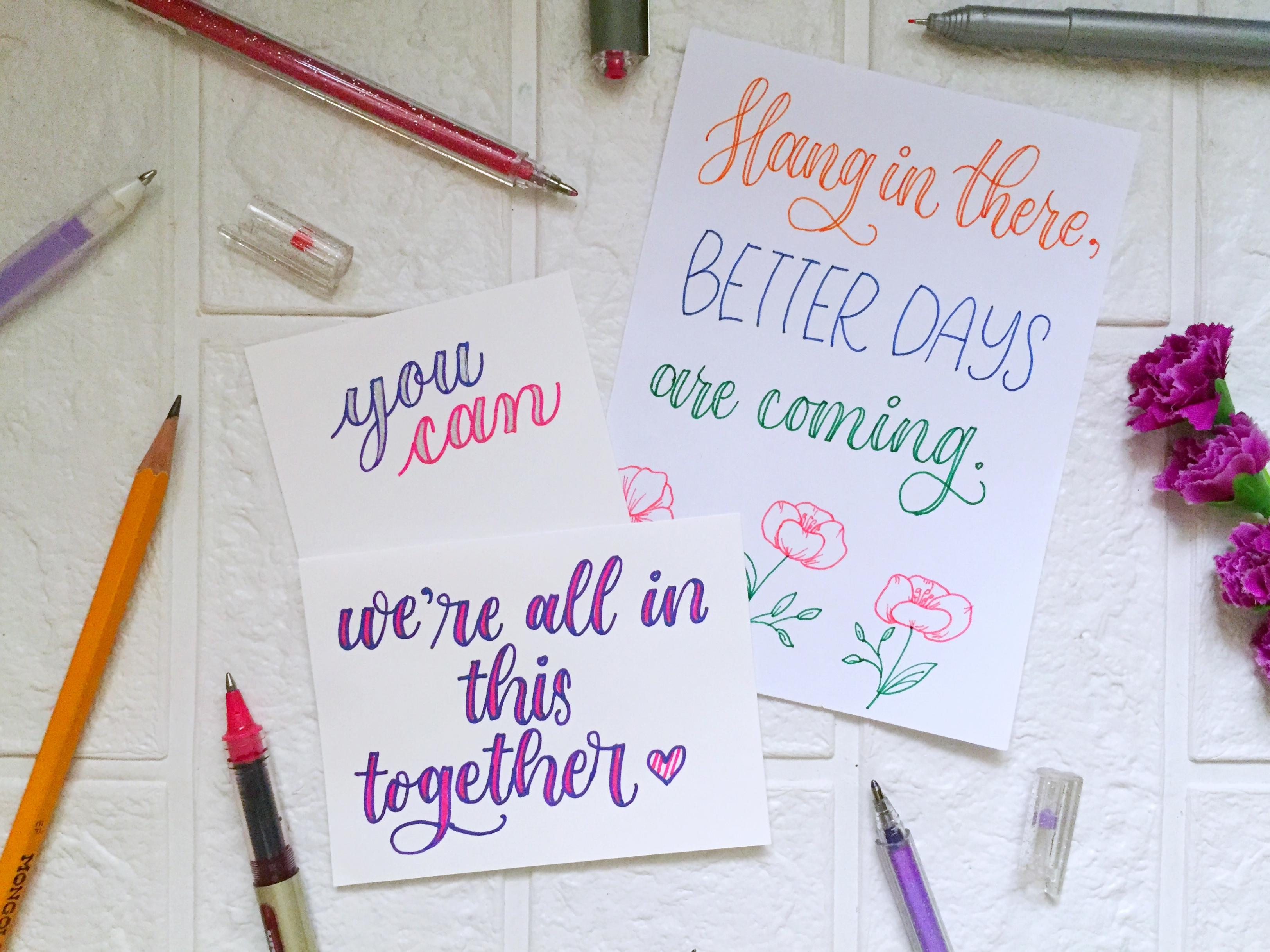
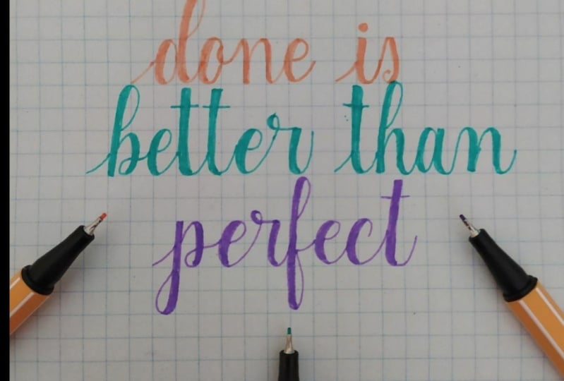
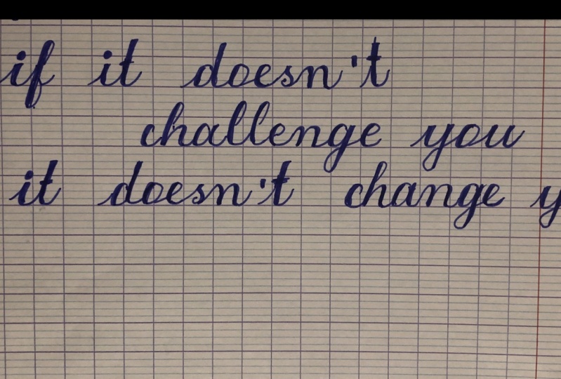
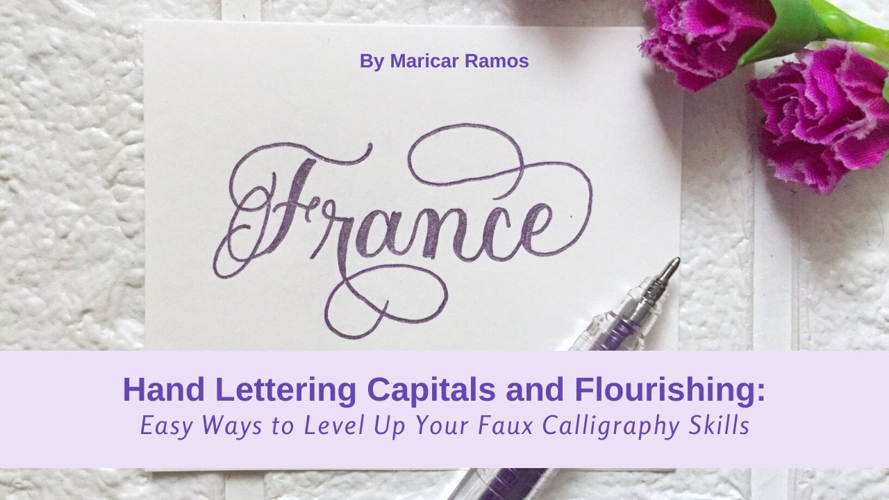
3. What is Faux Calligraphy?: before we jump into the actual writing, it is important first, to know what we're going to create. A day in this video, I will show you the difference between irregular cursive writing, a brush, calligraphy and focal geography. For example, I like to write the word Hello in person. This is how a normally write in cursive and see that even if you have a terrible handwriting, it doesn't matter because in calligraphy you break down each letter into a series of basic strokes. Now this is how the word hello look like in calligraphy. Calligraphy is an art off beautiful writing observed how I wrote it slowly and I left that night. Then, after each is true, since we're doing faux calligraphy, we have to anything, the thing and pick strokes that we see in this word. Hello, Now this is an example of a brush. It's not like a regular plan because the tip is flexible, allowing you to create things and taking strokes. When I write the leather, it is changing the amount of pressure that I'm applying to the fifth of this brush been, gives me pain and take its chokes in just one motion now info. Calligraphy. Since we only have a monoline T, we have to for eight. Fake is strokes manually. If I'm going to copy the letter a info calligraphy I should have as a finished job on over shape and then followed by a U shape and to make it look like calligraphy. I was taking the part where my pan moved in a downward motion and then add Shamed. Now this is the brush calligraphy and this is the focal geography. Focal Geography is a technique we do to imitate brush man appointed pen calligraphy without the use off any fancy tools. You just need a regular pen and paper and learn some basic rules to make sure that your results will look great like a really calligraphy. In order to create calligraphy, you have to remember that all Obst robes are thin and all your down strokes are thick. Remember that any word that your band moves in an upward direction is thin and anywhere that your pen moves in a downward direction should be fake traditional photography records and basically troops that we're going to stick together to form the lower case letters and same goes with four calligraphy
4. The Fundamental Strokes: In this video, we will start to build our muscle memory by practicing the basic shapes and master where to add weight to the down strokes. So let's start. The first basic is true is an abstruse and remember all the AB strokes are thin on upstroke . It starts from the baseline to the waistline with a slight through and since the then moved in an upward directions, we just let it be. A pain is true from baseline to baseline. Move your pan nice and slow. And don't lick your pen like this because we don't want to create an inconsistent is strokes like this. And also don't overdo your curve like this. You don't want to create that kind of upstroke. Also, all you need to do is to make sure that from the bottom, the top, the pen is touching the paper and you're just going nice and flew. You can practice a rule for the shape just to be with their muscle memory. Now let's move on it it downstream. Remember, all down strokes should be take and since we're using a monoline pen, we have the manually add weight of this truth down. Stroke it starts from the waist line to the baseline, and we will add a little resentful line, taken this down stroke and then feel in this case it's like droving erect angle, and just feeling in this space under Turness stroke is like you. She it starts from the waistline through to the right and then move up. This is where my fan moves downward, and this is where depend. Move, appoints. Make sure that thesis lines are parallel with each other, meaning that they are going in the same direction. And you're not going to create like this. Or maybe like this. We don't want to eat this do shapes now observed where the fan moved in downward motion. So I'm going to think and decide like this. It doesn't matter which side you'd like to add wave. You can also add the weight from the outside like bits. Think free to experiment, to know which will work best for you. If you want to do it this way or this way, then they're both okay. One thing to note when adding the way, it's not just simply adding in straight line. Make sure that you're following the curve. Nike face and you're not just throwing a straight line inside like this. Next we have an overturned is true. This one is starts from the baseline up and curb and come back down. So we moved up from here and moved down in the site. So now I want to speak in this side as May dance troupe again. Follow the curve and adding weight to the dance troupe. So you can either start from the center right here and then follow the curve. The chicken, your dance troupe like this. Don't just add a straight line in the inside like this. You want to follow the current and again, if you're comfortable adding the shade from the outside, then that's a key. If this is the way that you would like to do now, a compound curve is a combination often overturn and under 30 is true. It's like a way that starts from the baseline, uh, down and then up again. Now let's analyze word. The pen moved downwards, so I'm going to begin this middle part when the eating a compound bird. You also want to make sure that this lines are parallel with each other. They're not going in different directions like this. You want to make sure that the lines are going on the same direction. And, of course, the space here are approximately equal with each other. Now let's try to add weep through our dance troupe and going to add weight to the boat off the side to make sure that the space here and the space here are still equals. And now I am going to shape. If you're having a hard time going it like this, you can also choose the Y than one of the curves like this and then at the weight on the UAE there part. Remember to follow the current as you add the week now, I'm going to show adding weight on the inside like this and following the curb and not just droving e straight line to either of this stream are okay. Feel free to do what works best for you. Our next shape would be reverse compound, various compound curb. It starts from the top down like this. In this shape, we now have two downs jokes. Let's repeat it again, down up them and then add weight in here and another wait in here, you can always adjust the size of your think is troops because you're just doing it manually. And remember that these tree lines to the parallel village other and the spaces are equal. Let's try adding the shade from the outside. Now let's move on to the over machine. Over shape is a tricky basic stroke in brush calligraphy, but this will be easily achieved. Info. Calligraphy, Since we're just drawing the shape, you have two options when, during overalls, you can first start from this point and then close the loop like this. Or you can also start right from the top and e and over. If they're comfortable doing the oval that starts from the top than they're free to do so. So we go up from here and then down here. And then this said, also is going downwards, and this one is going upwards. I'm following the curve as they haven't tweet, and then I'm going to add in the shape seen who's when you choose to create the overall from the top. Not this that I'm following the curve as I speak in the down stroke, and I'm not just doing a straight line like this. We want toe me over for calligraphy, like real calligraphy. So when doing your shade and beginning you're down strokes, you have to follow the curve to make it look more natural. Ascending its stem Look issues for letters B, B and the light. Now here we have to double the size off. The basic shape, if you've not, is with our previous basic shapes. I'm just using one unit of the guidelines. But now I wanted to use two units. Even if you're just using irregular Lang notebook, our papers ascending is time, Luke. Start from the middle Great eagle and then it Downward motion. So we start to move up to eat, look, and then move our fan downwards. You can also leave the loop open if you want to add your shade from the inside like this in this week, If you've decided not to fill in the space of this thickest chilled, then you don't have this Extra is choked inside that we don't like. But if Boris you can choose to create it this way, if you're going to add shade through your dance troupes, you can also prefer having the shade from the outside so you can close your look like this and then underweight from the outside like fix. There are so many ways that you can add weight to your down strokes, info, calligraphy. So just experiment and build this over your personal style and technique. Now, let's do the descending stem loop. The senate is them. Look occupies two units again, and this time it starts from the top 80. Luke, then like this. Now this is word. A pen moves in a downward direction and this is where it moved upwards again. If you don't want to feel in the space of your dance troupes, then failed three toe open the slope like days and other weight from the inside. But you can also close it like this and add your loop from the outside. Either of the two ways are both okay. And last but not least, I have this modern shape that I call the fish. Look, this is not really a part of the basic strokes, but they like the Eustis on the letter speed. And so you'll just be eat a loop like days and then curved to the right like fix. Now we start up, move down and then come back up again. Now we want to began this part right here. You can choose to open. They look like thes. And then, as in your weight in there and then continue with an upward curve like this, These are the basic strokes that you need to be familiar with to be able to achieve consistent leather firms in calligraphy, so get practicing.
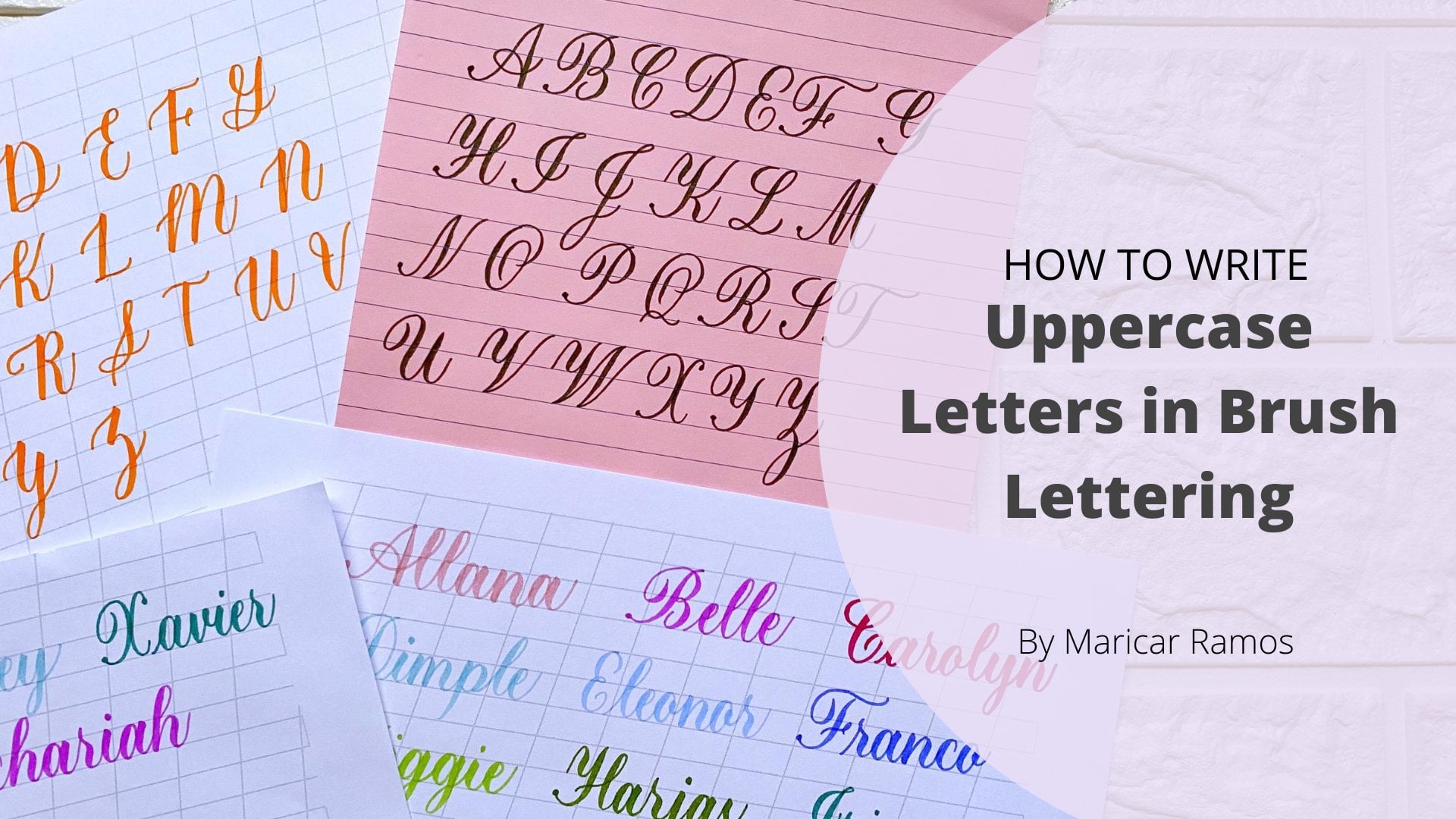
5. The Lowercase Alphabet: remember in calligraphy you're not doing cursive writing. Even if you can write a beautiful received and just add weight and shape, it won't give the same result as what we're doing right now. So I will be demonstrating the lower case from A to Z and break down each of those jokes so you can see how to properly form the lower case alphabet. They could also that you have to leave depend after each is choke the leather A has an abstruse and over shape and an under during his troops. I'm not adding the weight yet. I'm just showing first the basic strokes that composed the letter A. Now, if you combine this together, we haven't abstruse over in shape. And then under Turness truth, the one thing that I want you to know is that every time you're connecting an upstroke doing over, you have the shirt and the upstroke finish it earlier than usual. Don't go up to the top so you wouldn't have an extra stem is speaking out like this. Now let's try to shorten our upstroke as we connect our over shape. I'm shortening my upstroke and not finishing a right at the top and then I'm going to attach my overall add in the week and then shape and then attach My under 30 is true. He can the down stroke and then at the week again for the letter eight it has a shortened upstroke were not finishing it to the top because the next ship is an oval at that Sure over. She speaking your down stroke As you pull Lisa defend. Attaching under turn is true. The letter B is composed of a nab stroll and ascending is them look And then this fish look , it's attaching them together we have an upstroke and then I'm going to keep my ascending Islam look open as I add my weight inside and then attach my fish look like this and keeping it open because I'm going to add in the shade like this. So this is the letter B. Don't forget to leave your band after each is troops Remember we're not doing persons, so you have to leave your letter c has an oval shape so we need the finish early. Are upstroke like this? Then you eat. We start from this point for even over shape and then go outside the loop for just eating a leather, see as we normally do. But we're going to see where the pen moves downwards. So is short and upstroke like this and irregular scene. And in the week some of you might struggle connecting an upstroke went over. But you have to do your best to make them attached together If they some practice, but you can do it and up stroll and then go is slow to make sure that they're going to attach with each other. The letter D has a short and obstruct also because we have an oval shape coming next and then we have these ascending is stem loop that turned into an under turns to so is short and upstroke because in over shape is coming next and then take under down stroke as you go so you won't forget where your pen moved in downward motion and then a Thatcher ascending stem loop that third in tow on under turn shape and then add your weight. Leather e has a short than upstroke and then win create irregular e like this. Now I'm going to keep my loop open because I'm used to having the down stroke on the inside of the lever, but feel free to close the loop. If you're just going to shade your dance, jerks, you can also add from the outside like this. But for me, this is harder to create. So I'm adding my shade from the inside Cooper et leather af we have on upstroke and then you will be eat east. Then look ascending a stem loop that turned into a reverse descending stem loop. So it occupies three units and then we're going to attach and the other apps Truth. You want to make sure that you're going nice and this low so that your shapes are attaching together and again I'm leaving my loops open like this because I'm being my shade from the insight the letter G has again another short and upstroke because the next ship isn't over . And then we have these descending stem loop and end we've and upstroke short and upstroke uber she now you want the taking your dance troupe as you go or add in the wave And then if that's your the sending a stem Look, add your weight from the outside and then a touch your upstroke. Next we have another H. Don't forget. Believe your pen after each is choke. And don't forget the basic strokes that well during early years. And that's true. Ascending stem loop e compound. Now we have the leather each. Now let's move on to the letter I I has an upstroke and under Turness chilled and then just add your dot like here. Obstruct. Leave the pen and then we eat your under Turness truth. Basically, the lower case letters are just composed of this basic shapes, a patching them together. So it's really important that that you learn how to properly form the basics chokes. Now let's move on to the letter gene an upstroke, the sending its stem loop and then another substitute and upstroke the sending spend. He can dance troupe as you go and then attach another ups. Truth number K is one of the letters that I think most of us don't like. But the way that I do my letter key in calligraphy is on upstroke and ascending Stemmle. And then I'm going to create a small look like this like a leather and then attached kiss like a slanted half under during is true. So when I attached them together, my personal preference is that I don't add shade on all the down strokes that I have in here because I feel like it's hard to see where my ob strokes are. But if you prefer as bean shades in here and in here, then feel free to do so. But for me, I just like believe it like this. But I'm going to show you how it looked like if I'm going to add shade toe all my dance troupe, I'm going to add shape and then shade again. So filled with the experiment, which letter form do you like best? Because there are so many operations in during the lower case letters. Next we have the letter L. So l has a nap stroke and again we have faced ascending a stem look that turned into an under turns truth the leather and has to over 13 stroke and then one compound. Kurtz. They have do over thirds and one compounds herds. Now, in attaching this basic shapes, I don't want you to create a short got informing the overturn and compound curves. I wanted to really create these three basic shapes, as you would normally do when you first learned it, so you have to start from the bottom, then add your shades. Then it starts again from the welcome at the shame and then add your compound curve. What I don't want you to do, ease the short. Then you're under Turness jokes like this. A lot of my students do it like this so they would eat in normal over three years, and when they add another overturns, they would start from huge and then attaching their compound for it's starting again from here. So I don't want you to do the same. You have to start from the bottom because that's how we learn doing the overturns stroke and the compound for we started from the bottle. Now let's take a look at the letter, and so N has one over Eastern and one confound over thurn that of the week and then add your compound. I'm starting right from the bottom and not from here as a matchmaker on bond. Now we have the leather Oh, so we need to shorten our ob stroll as the next shape isn't over. And then add your little perv like face the leather. He has an upstroke and then the sending is look and then we have these fish look again abstruse to send these same loop and then taken first your the sending them Look before you attach the fish look so that you have enough space for the dying strokes. Then a catch your fish food in here. Now that the letter u has again he shortened up, stroll over shade and then he reversed the sending his family place fix and another abstruse forming them together we have a shortened up stroll overall shape and then don't forget the peak in your dance troupe as you cool to eat reverse sending stem look like peace and in keeping me loops open because I'm going to add my shade or wait but this side Then attach my upstroke. The letter R starts from the bottom Then we eat a loop like please this is just one is choked and then add And under 30 his troops start from the bottom and eat like a not like that and then add your under turn is true. You can also make the look bigger. Make this and wave in here. Either of the two looks good. So it's just depend on your first allowed reference for the letter s. I'm going to show you two different styles, so you can choose which one you prefer. The first ease. That's true. And then you just have to create a perv like face. Then that on the inside. Then again, your apps. Truth ab, stroke, please defend. Okay. And that on the inside, speaking this far. So, Dan, or you can also make e like, e shortened up stroll. And they just feed your normal is like this and then speak. And this part the letter earthy has an abstruse and then an extended under three. So we have an extended down stroke that turn it doing under third and then on your crossbar Can this part And then you're crossing leather, you and upstroke and under during his troops and then another under his truth. Now let's touch them together. Ups true under it during he can this part. Then a touch another under the letter V has a nup stroke and then a new shape like this downward. And then we eat. It looked like this so that we have on abstruse and then this shape right here and then re going through thick and this part as we moved down to make that So again, this is a modern shape. You're free decree. Eat another version of your letter B. That's how you would like it to be. You can also choose to think in this part right here, or the pen moved downwards. But for me, I like it better as a finish stroke right here. The leather double, new as an obstruction and under third. And then we'll add this shape again, speaking as you go and then at this shape Now it's completely up to you. If you want to think in this part right here, I'm just going to show you how it would look like. So let's speak in this fart. She this so you can be relies so you can make your w like face. During this. The leather eggs is composed off he's compound through, and they a simple upstroke like that, and then we can attach them together. A simple as you seem so you have your other eggs, then let their way. We have enough stroll and under during his truth. The sending is Stan Look and then upstroke. So we have prenups true under three at the week that you're descending stem loop at the week and then add another ups truth. And last but not least, we have the letters e so you have on under thoroughness. True. And then this shaped like a number two. That's true.
6. Connecting Letters: Now that we know how to form the lower case letters, it's time to connect them and create some brie there. Three things that we want to remember When connecting letters form words, the 1st 1 is a standard connection. The 2nd 1 is shortening the upstroke when the next ship isn't over wild, and the third is completely changing the shape and coming up with new sheet. The first example east the letters A and each to connect the leather aid, the leather age. We have to let go off the upstroke of the letter age and then used this under turn of the end to connect with the eighth, meaning the endpoint off this leather E will be the starting point off your letter each. Generally speaking, that's how you would join letters together. Then we will connect. The ascending is time. Look off age from here, the Italian connect and in through an H. It's important to always think ahead off What letter is coming next so you can adjust your exodus troves or your letter connected. Like what I mentioned, it's important to always think ahead of what letter is coming next so you can adjust your exit, the strokes or letter connector, for example. They're connecting leathers A and G. What we have learned earlier is that every time we're connecting and over toe on abstruse, we need the short than our upstroke. Now, instead of finishing my under third right to the top, I'm just shortening the upstroke off. My under turn is true right here so that I can connect my overall shape to my without having an extra stem is sticking out from here. And you remember, you have the least your fan. After droving each shape you're not moving curry save If you finish right it, Bob, you'll be have bean this extra stand right here. And sometimes when they're connecting creek a letters like a and M, you have to completely change the form off the basic sheet. Now we can see here that the letter and starts from the bottom within overtones, truth and then your letter A ends with an under turns stroke that finishes at the top. Now what we can do to join them together is to create another shape which will be a combination off on under turn stroke and on overturning is true now the letter A and within under thurn, and the Amis starts with an overturned so we can now have on their third and over three. So it resulted with e compound curves, and then you just have the finish. Your Emma's use well. Now you have the leather H and M joined together and the practice attaching different letters together and you'll be able to feel more comfortable forming the roots.
7. Forming Words: Now let's take a look at the word is strength and let's see how we can connect them all together. The first rule that we have learned when connecting letters to each other is just let go of the and transistor off the next letter and just use the active is stroke off the first letter. So connecting s and eat together. I'm just extending my upstroke to connect my letter t. Now let's think ahead. What is the letter coming next to the leather? And we know that it is on R and r Spartz from the bottom and creating a look like base. So what they want to do is to let go of this is true right here and then changed The shape of the under 13 is true into the first shape off the arms. So now we have the shape Make that so this is our key, and this is the start. Off the lever are and then thinking ahead. We know that the next letter isn't and it has an oval shape. So we're going to finish the under Turness trove off the army. So instead of coming, righted a pop at this point we're just finishing it or a leak right here and now we know that the next letter to E isn't end and it starts from the bottom. Now what we want to do is to change. The exit is choke off the letter e into the beginning shape off the end. So now we have something like this. This is now the starting point off your leather end. Since the next shape again isn't over, we want the finish, the exodus joke off end to make space for our over sheep. And then I'm just living my G s. Use one and then extending this right to the top because I don't have any over shape coming next and the same with the letter t because the next shape is just an ascending stem loop. So I'm letting go of the entrances stroke off the age and connecting my ascending stem loop . The exit is choked off. So you now have the word is strange. Rethink info, calligraphy
8. Bonus! Ways to Thicken the Downstrokes: - way .
9. Class Project: for your last project. You can leather any favorite word of yours For short. Feel free to add in some details. Like what you've seen from the bonus video. If you need inspiration before getting started, you can watch this video then work on your project. - I know this a year work, I encourage Everyone would join this class, upload your final project on the project, gather so that I can check them out and provide helpful feedback. They improve your skills or if you have an INSTAGRAM account, you can also share their and Bagni seven Burgess jokes and use the hashtag s, the s class I did for work the creations.
10. Final Thoughts: congratulations and a new skill you learned today. Crafty snakes. Progress always remember that. No need to compare yourself to others as there is a unique artist with you. If you've enjoyed and learned from this class please living back and recommend this last others. This will leave a lot to me and help me stay motivated in providing learning resources for you. Thank you so much for watching. You can also follow me on skill shirt so that she'll be notified every time I am losing. Plus enjoy the learning process and have fun. Let me see you on my next last.
 Seven Brush Strokes Maricar Ramos, Calligraphy & Watercolor Enthusiasts