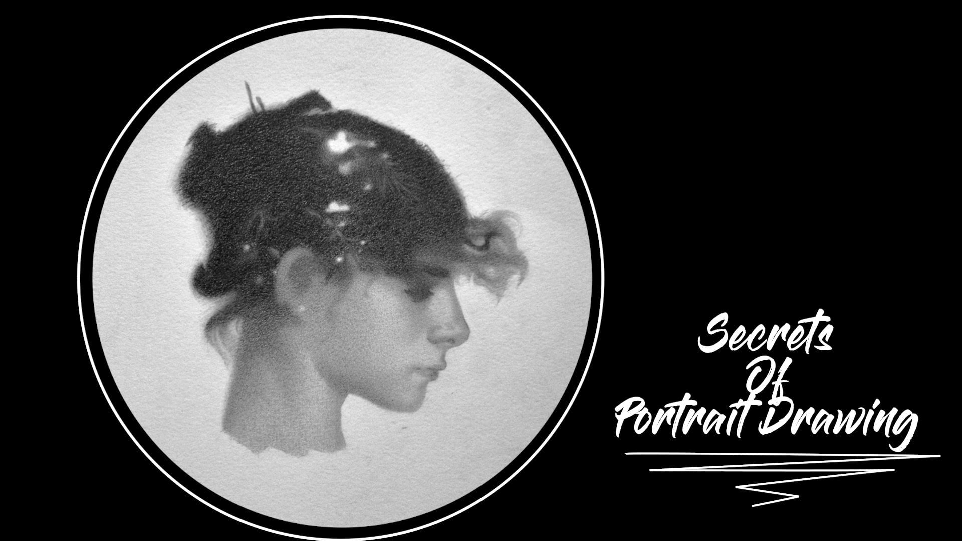
Transcripts
1. Introduction: What is up guys? Welcome
back to another class. This one is going to be
all about how you can get an elegant looking portrait in as little time as possible. By forming the principles
laid out in this class, you can get your portraits
from looking more like this to more
like that dally. This class is for beginners,
but if you're not one, you're more than welcome to
stay at home for the ride. I'm going to optimize the
speed and everything from my choice of paper
to draw materials, to my technique on how I
start and end the drawing. All in all this drawing
take me a couple of hours, but with enough practice these times to potentially
be even lower. The materials used
in this class will include a set of standard
graphite pencils, a few different
kinds of erasers, some graphite powder, water, a sharp in tool,
and a paintbrush. Nothing extravagant, expensive. All items you can get in your local art store
with little hassle. The focus of this class
will be cultivating your observational skills and experimenting with the
medium we have to work with. I'm not necessarily
concerned with the final outcome as
much as I am with you enjoying the process
and learning how to do things in a
slightly different way. It's going to be off for
now. Let's get drawing.
2. Class Materials: The first and most
important material is of course, your pencils. I'll be using primarily
graphite pencils from Stadler, and in particular my HB, to forage pencils to maximize
their effectiveness, you want to keep them very
sharp with a nice long taper. Next I have my trustee
needed eraser. Put simply tomaloble eraser that gives you added
flexibility in erasing because of the variety of shapes you can mold it into. This one is from Faber Castell. The items on screen is
a regular robie asa, as I'm sure most of
you already know, you can find it in
any stationary store. It's great for erasing
large areas of the picture. My pencil sa I use when I'm trying to erase
more precisely, and when it gets
to be this small, I combine it with a
pencil extender to give me more control
for sharpening. I use a combination
of my exact knife and this sharpening
block by neutron. Once I have some of the
lead of the pencil exposed, I roll it over the
sharpening block like I'm demonstrating here till
I have a fine point. Next material will be very
important in this class, and that is graphite powder. This one is by
crytic color and we will be mixing it with
water later on to create liquid graphites That a byrupsd our materials.
So let's get drawing.
3. Value Block-In: In this portrait tutorial, we're going to be focused
on rendering the portraits. In other words, turning these two D lines into
something three dimensional. For this one, I trace
the outline onto paper, but you can free hand
or use a grid as you see fit at the start. I want to mass in my darks. There are a few different
ways to do this. In this particular drawn, I'll be using a combination
of my brush and graphite powder and
then some graphites mixed with water later on. For that last part,
you want to use heavyweight drawn paper or painting paper to
prevent buckling, I recommend 300 GSM
or thereabouts. The idea here is to feel in
the white of the paper and stay within the bounds of the
outline as much as I can. I'm using the polygraphites only in the darker
series of the picture, such as the hair, clothing,
and shadows on the face. After that, I'll
get my six pencil and go over those same areas, increasing the darkness and
adding a bit of texture. Keep your pencil sharp
often and vary up the angles of your strokes to really feel in the
tooth of the paper. As I move into the
facial features, I am identifying
the large masses of value and developing them
slowly and methodically. I'm not concerned with details like eyelashes or highlights, only the big shapes. It's helpful here
to squint your eyes and focus on the angle B you see in the nose, we have a cast
shadow and a form shadow, both of which are
very close in value. Be careful not to exaggerate
this difference by staring too deeply
into that area. Point is one I will
stress very often because it's much more
likely, as a beginner, that you're going to exaggerate differences in value than you're going to actually capture how subtle things are in nature. Right there, I'm indicating
this light shape surrounded by shadow
using my pencil orsa. Before moving down to
the right shoulder and adding value to
this dark Halton Shep. I like to build my
values through cross hatching for the
sake of uniformity, sometimes by Scribble as well. Central to getting
even values is consistency in your
value application. You really don't want to be zigzagging all over
the place with a pencil unless chaos is the look you're after
In this moment, our value structure
is very simple. We have a light shape, in dark shape, and some half tones. However, we must still group
our values appropriately. The half tone values
we have sketched thus far are lighter
than our shadows, and this is a reality we must preserve to p up this video, I'll re establish some
details like the earrings, after which I'll migrate to the left shoulder to
create that sense of the form turning by darkening the values
towards the edges. That's it for this
one. I will see you in the next video. Bye bye.
4. Shading the features Pt.1: The blocking is officially over and the marks
that will make henceforth will have the finish
of the portrait in mind. I'll start by mixing
some powdered graphites with water into a bowl. The ratio of graphite
to water will depend on how dark you
want the values to be. Experiment. To find
what works for you, I'll use my paint brush and darken the
values in the hair. My goal is to have one
solid mass of dark value. With expressive strokes that indicate the presence of
flowing hair strands. As I move away from the
hair and into the clothing, I'll sometimes use the
end of the paint brush on my fingers to move the graphite
around before it dries. For some variation in
the pictures aesthetic, it's almost impossible to
erase this stuff when it, so make sure to leave
light areas like the earrings and skin as
the white of the paper. There is a temptation to relax
and not pay much attention to your reference image when working in an
area of the drawing. Simple, don't fall
into the trap. At every moment of the drawing, you must be conscious of the marks you're
making and whether or not they are adding or detracting from the
beauty of the piece. In this moment, I've
dialected some of my graphite mixture with more
water to add somewhat of a design element to
the background to these strokes and the spatter effects I'll create later on. To do this spata, just dip
your brush in the mixture. Place the brush
horizontally in front of your paper and strike
it with your pencil. It's pretty easy
to do and can make the piece a bit more
interesting to look at. Putting the brush
down for a minute, I'll start in the face
by the right eye. Putting up the shadow values
first with my B pencils. The attempting to increase the specificity of
the contours AK, the outline of the eye shape. I'll purposely leave
certain areas untouched, like where the
eyelashes are catching lights and of course
the square of the eyes, also known as the
wight of the eyes. The eyebrows are a large
mass of hair strands, but I will focus more on
the value and shape and not worry so much about the
details of it till later on. However, you should endeavor
to follow the direction of the hair as you shade it for
a more natural appearance. The left eyebrow
is substantially lighter than the right eyebrow, so make sure to highlight
that difference. In addition, keep track of your alignment
using plumb lines. So to ensure you don't
create asymmetries as you go in the left eye, the process is the same. Define the overall dark shape. Pull out the highlights
of your knee, Teresa. And progressively
define your half turn shapes from the
darkest, lightest ones. Let's make a detour to the
lower half of the face and connect the shadow values
from the torso to the head. The shadow from this part
of the face connected to the mouth is approximately
the same value. So I'll make them the same
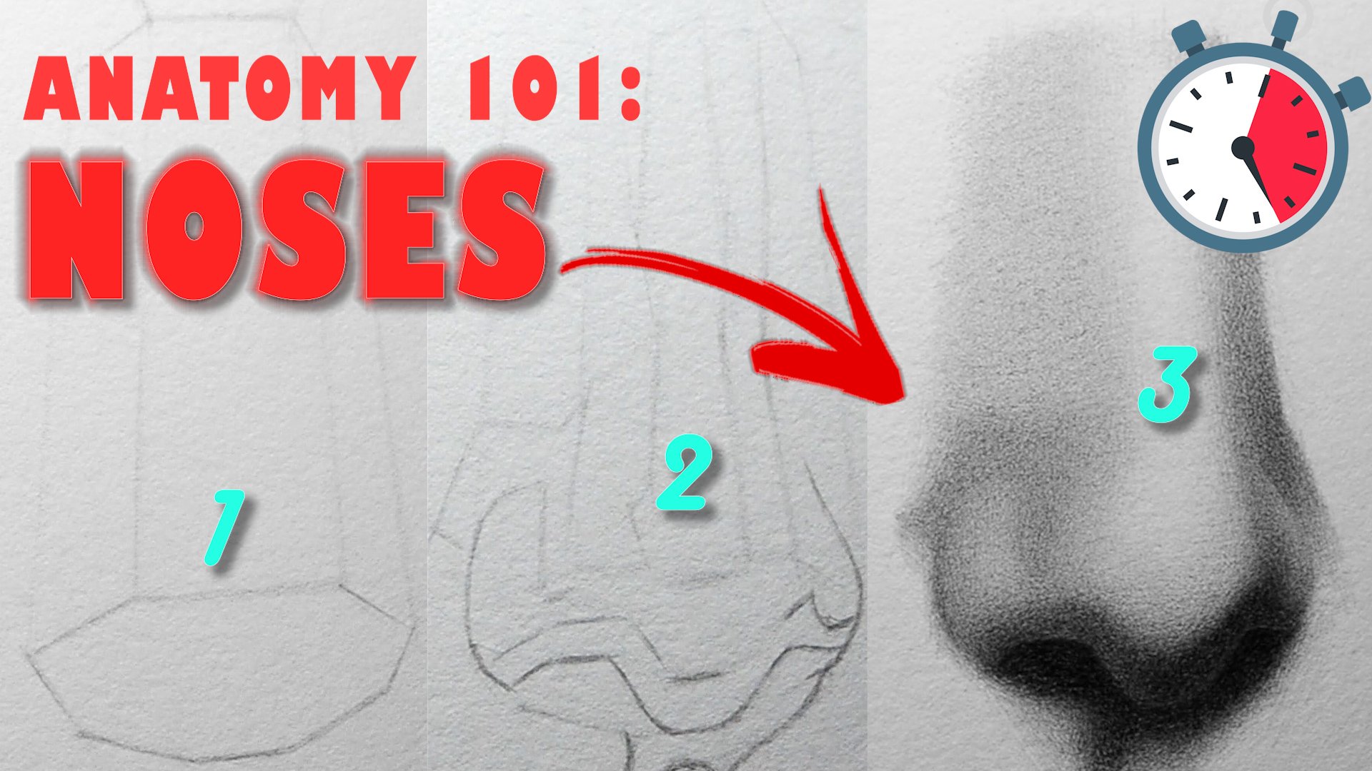
for the sake of simplicity. In the nose, the cache shadow
will be established first. As I darken that shape,
I will also modify the outlines to better resemble the actual shape of
the motto's nose. The edge of the
cache shadow is one of the sharper
edges in the face. So I will only soften it slightly with my
lighter pencils. Moving on to the form shadow, I want to achieve a few things. First, it must be lighter
than the cache shadow. Its edges, on
average, are softer, and the shape must be precise to capture the essence of
this particular nose. The lips together
are a convex form, protruding out from the face. The lower lip is catching more
light than the upper lip, and so its values
will be less dark. In comparison, the upper lip, not including the shadow, is
composed of two main values. A dark band of half tone, and these smaller lights are halftone shapes on the inside. Be careful not to make the values in this
region too dark. Our light and shadow families
more separate at all times. And halftone that encroach on
our shadow will ruin this. The lower lip is
basically two values, a shadow and a light shape. Towards the edges of the
lip, the values get darker. And in the center we
have the high lights. Now of course, there is a lot
of contrast in this region. And on the bedbug line, we need an intermediate value to soften the transition
between shadow and light. For me, a combination
of my two B and B pencils get the job done. Returning back to the eyes, I will begin working on the
ha tones inside the sclera. Although it is
white technically, it should not be wide
in the draw part of it closer and further
away from the light source. Pay attention to
those differences as you sheet on the inside
of your eyeball. Start off with your
lighty pencils and build your values gradually to
avoid going too dark. Too quickly with the
eyelashes, Loose chest marks. Well, you have to draw with your whole arm, and
not your wrist, with a focus on
brisk pencil strokes that resemble C curves. You don't want to
connect three lines to form a curve if
you can help it. You also don't
need 100 eyelashes to convey their presence. Less sometimes is
more in the left eye. Am rounded out the form
with some light half tones. As you see, this is a
very deliberate process which is belied by the
speed of this time lapse. I'm constantly looking around
my portrait to compare the values that I'm creating with the values
that already exist. My approach to the eyelashes is the same curves in varying directions and
bold confidence strokes. Now I'm ready to
use my eraser to add some variety
to the eyebrows. I'm trying to create
the illusion of hair strands as
efficiently as I can, and the pencil si is
perfect for doing that. I'm sure you'll notice that this light shape has
gotten lost in the fog, meaning it got too dark. So I'll lighten that area again and work on the
edge surrounding it so it sits back in space without
appearing like a shadow. This is the end of
the first stage of rendering this portrait. We've established
all of our shadows, some half tones in
the eyes and mouth, and our outlines are
looking as they should. The next stage, we'll begin to expand into a full range of values and draw nearer to
a realistic portraits. I'll see you soon, bye bye.
5. Shading the features Pt 2: At this juncture
in the portraits, I'm ready to develop the
lighter values in the face. I like to create
a base value with the twitch pencil and work
my way from that base value. In addition, I'll
use my brush to spread the graphite
around for a more even finish returning
briefly to the eye socket, I will darken the values
around the eyes to increase the sense of roundness before migrating into the cheek. And adding some darker
half tones to turn the form from shadow to
light along the bed pot line under D in the forehead. I've identified this
half tone shape which is darker than
the surrounding values. Keying this value will
enable me to better judge everything else in
and around the forehead. As I work on the values here, I will pay close attention to the edges connecting
to the hair. You want to keep
those edges soft in general and perhaps
lost in some areas. Use your for pensive to pull
out some indications of hair to make that transition
appear more natural To under, under, dot, under, under, under. I'll go over the
entire face again and darken that as
value to make it appear more natural and allow the lights in the eye
to stand out even more. With the solid
foundation to work from, I'll pull out the hand, life in the forehead by Pansy Leresa. Do my best to emanate
the shapes and edges. I see my reference. You can get creative here by cross hatching or scribbling
in the highlights. Fish remember to soften the transition between it
and the rest of the case. The idea is the
same in the nose. The highlight runs along the
bridge of the nose and into the hide plane almost connecting to the high light on the left side of the cheek. Paco's attention to where
this high light starts and ends to ensure the nose
doesn't look out of sorts. On the right side of
the nose, we have this dark hat on shape that's similar in
value to this part of the forehead and indicates to us a downward facing plane
relative to the light source. So make sure to acknowledge that value ship on the nose. I've noticed the transition from the form shadow to the
light is too sharp, so I will round the form using the value in between
the both of them. All the while keeping
in mind the shape of the nose and the subtlety
of transition that is required in the next video will continue to build
upon this layer and finalize the major aspects
of the rendering fees. Thanks for watching. Bye bye.
6. Shading the features Pt 3: In this stage, we're
going to continue finding those value and edge relationships
we laid down earlier. Right here I'm
alternating between using my pencil and eraser to soften the transition between
the form shadow and the half tones in the
bottom plane of the nose. Once I'm done here, I'll proceed to the chin to do
much the same thing. The key to good
transitions is using the right pencil and keeping
a light hand while doing so. All the while losing
track of the contours in that region by extending the
value beyond its bounds. This will require some practice. Ultimately, to perfect
in the left eye, I'll use my erasers to call out the highlights and
go over that section with my two H and forged pencils to adjust its shape and edges. We have the triangular
highlights on the left cheek. It's about the same value as all the other highlights and has around its fairly soft edges. Take your time to carve
out the ship correctly and integrate its edges
with the rest of the face. Below the nose, we
have the thotrum, which is a depressed
vertical groove. You don't need to do much
here other than indicate the highlights
around its borders and your brain will
fill in the rest. Even a unified tone is important for
realistic looking skin. Periodically go
around your drawing, remove dark spots with you
need s and fill in the white of the paper with a light pencil to harmonize your values better. You want to maintain
an attitude of dissatisfaction throughout
the drawing process, so don't be shy about
going over areas you previously worked on and
changing them drastically. If you feel like there
is room for improvement, it won't always translate
to something better, but you will not know
if you don't try this file to the
drawing. I'll sometimes hop around different
parts of the picture, altering things that call my attention as in
need of fixing. It's very important to step back often and squint your
eyes so you can see the portrait as a whole
and notice errors that might escape your vision. When you're close up, we are
always moving from defining our larger forms to our medium forms and
ultimately our smaller forms moving away from the face
on the left shoulder. The average value of this
region is like two steps, two steps darker on
the value scale than the average value of the face even though the values
are compressed here, meaning the difference
between the darkest and lightest
areas is small. We still have ingredient from the outside to the
inside of the form. I'm doing a lot of crosst, trying to smooth out my
values and suffer edges, especially as you move out from. I'm also darkening the
values in the hair and modifying the shapes of the earrings to
appear more natural. Refinement is the end goal. Scan your eyes across your
reference and your drawing, Look for areas of incongruency and make those corrections
as you see fit. If there is a problem, it
will likely be an issue with the proportions, edges or value. So be patient and
trust the process.
7. Shading the features Pt 4: Right now I'm adding
some highlights to the jewelry and re establishing the presence of the necklace the
model is wearing. As you can see, the reference
is all pretty blurry. So you don't want to make those
marks stand out too much. Keep the contrast
in that region low. I'll continue to soften
transitions in the face, especially along
the cheek and nose. Using my lighter pencils
to reduce some of that grain and give the
portrait nye sheen. Not much will appear to
be happening on screen, but it's micro adjustments like these that can take your
portraits to a new level. So be patient and take
the time to go through the entire phase and find
areas in need of improvements. On the right shoulder, we
have the shadow shape. That's a continuation of the shadows we
sketched in earlier. The borders of the shape have
already been established, so all you need to do
is build up its layers till it's dark enough that
when you squint your eyes, it sits back in space and
merges with the other shadows. Also, don't forget
the hoop earring, which is casting an oval
shadow in that same area. The earring itself is
an elongated C curve that moves from light to dark, emanating from the center with the highlights
in the middle. Its edges also move
from sharper to softer, fall on the same pattern, sharper in the middle, and
softer towards the ends. The happens in this
section are some of the darkest in
the entire picture. So make sure to cross
reference the rest of your drawing in relations
to what you put down here in the background. I'm trying to create
some attractions to my new Teresa to add some variety to the
marks already present. There's no procedure here, just me moding my Teresa
in different forms. I see how that affects
the background. We finally made it to
the end of this draw. While this was
intended as a sketch, the fundamentals of good
drawings still apply. The journey is a continuous
process of trial and error, repetition and long hours
at the easel to get ourselves to a competent
place and eventually mastery. Take a day off looking
at this drawin, put it aside and return back with fresh eyes and see
what else you can improve. For me, this would
be the eyebrows, particularly the right eyebrow, which I feel are
not well designed. And the shape of the nose, which lost some of its character
in the rendering phase. That's it for this
video. Thanks for watching and I'll see you
on the next one. Bye bye.
8. Class project: Your class project for
this one is very simple. Create a portrait of a man or woman with a single
dominant light source. Using the techniques you learned over the course of this lesson, your reference photo
should be well lit with a clear light and
shadow distinction, high resolution and
properly exposed. Take the drawing one
stage at a time. First completing the
initial blocking. Adjust your pencil,
and then introducing the liquid graphite in
your darker shadows. I suggest using paper
with a good amount of texture and a bristle
brush for your choice of brush in this drawing should endeavor to always
go from dark to light as you build your
values and keep in mind the overall light
effect as you do so. But that said, like
all good things, practice is key, but
not just practice, deliberate practice,
analyze your work after the fact and make sure to note areas for further improvements. Thank you all for spending
this time with me. Best of luck and I'll
see you in the next one.
 Terence Zulu, Fine Artist & Teacher