Transcripts
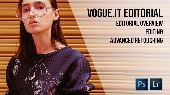
1. Vogue .it Editorial - The Red SAFW Showcase: Intro: Hello, everybody. My name is Andrew Biryani in Fashion Photographer, based in Milan, Italy. I'll be uploading one video every other Friday covering editing and retouching photos, and was shut for actual clients this week. We'll be looking at another editorial I did for Bugged Out I t. For this ever did for them. Actually on we go through understanding the editorial editing and choosing the pictures and carefully retouching one of them.
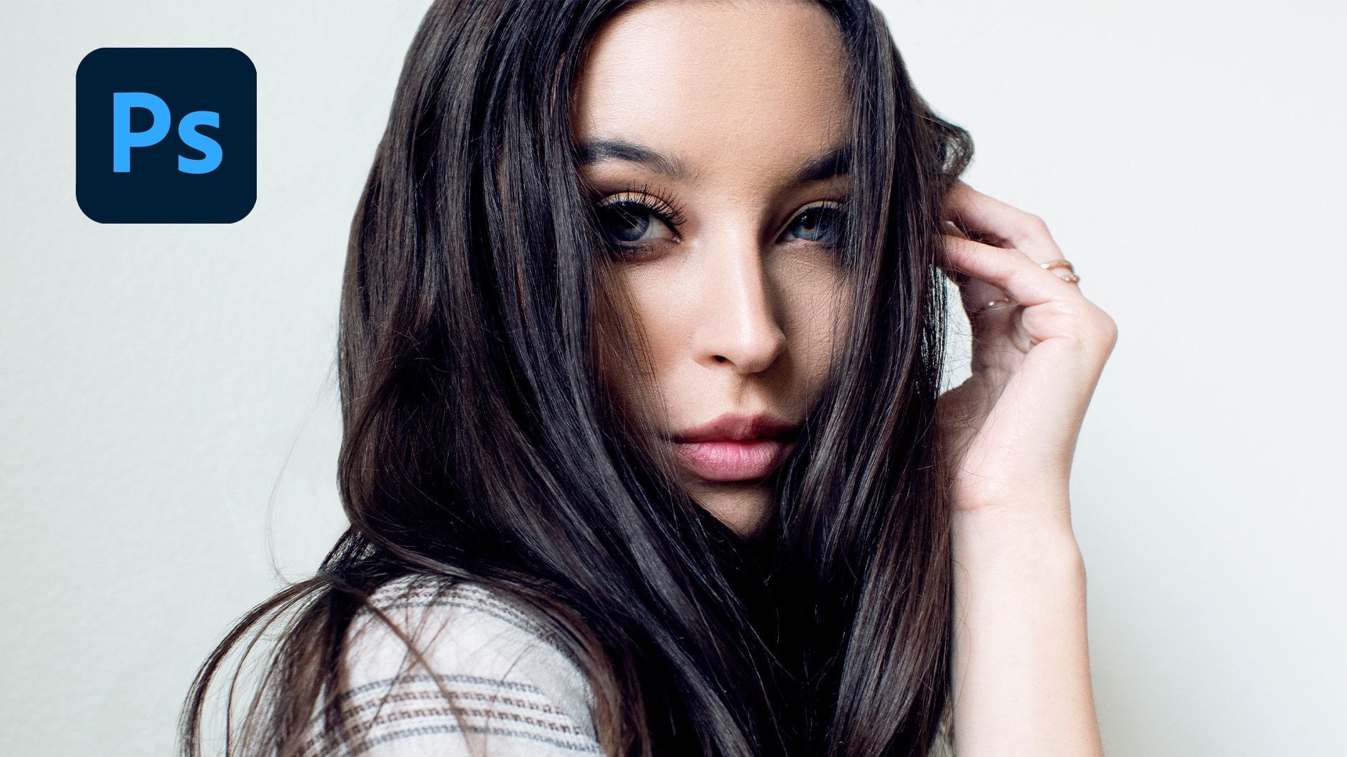
2. Vogue .it Editorial - The Red SAFW Showcase: Editorial Overview: same as last time. Let's start from the full editorial. As you can see, the main team this time as well was color, although color here unifies every picture and outfit as one single tent, which is pretty much obviously red. This was done in order to give a coherent vision of this very different outfits from different fashion designers, and his last time we saw how color can unified them by working with colored backgrounds or house fits. This time is just one color repeated throughout the whole editorial. We will now see how one of the pictures were selected and what were the alternatives.
3. Vogue .it Editorial - The Red SAFW Showcase: Choosing the picture: So here's some choices for the picture. We will be retouching the 1st 1 as an interesting body position, and there's some movement address as well. As you can see, it's flowing from one side to the other. So overall a good picture. I think the 2nd 1 is a rather awkward body position, with lots of straight lines. And although original isn't well suited for this editorial, the 3rd 1 is a bit too stiff for me. Other. They had helps, and that's movement. I really like the 4th 1 which is a mix of static and moving elements. And I really like the 5th 1 as there's some great things going on with the model's body, an escape from the side as well as an interesting lines on her heart fit. The 61 looks a bit too cramped, and although it could possibly work in another kind of editorial, it doesn't feel like it belongs here Now. The 7th 1 is interesting because it was shot from below and the raised arm creates two different planes that is to say, one preached by a legs and torso and one by your harm and head back. Com, which is older way to decide as well, creating a new point of interest where the viewer might not expand it. The last one seems to Stephen cramped, so I don't think it would work that well in the final. Add it as it can see here the dresses really bulky and feels the bottom part of frame too much so going backwards. I think that the eight wants to know the 7 20 Yes, very strong. Yes, the 6th 1 is and no, the 1st 1 is a yes. The second of the 3rd 1 or a no. And the 4th 1 is a yes citizens. Interesting. Because originally, I would have chosen the fourth of the quit one. But my editor really liked the 7th 1 So we picked 7th 1 in the end. Now we'll move on to retouching the 7th 1 in both lights room and for the shop
4. Vogue .it Editorial - The Red SAFW Showcase: First retouching in Lightroom: this is the picture as it was imported from camera on camera, it looked a lot more red, but usually when important pictures I take with my like the colors a bit off. We'll start by adjusting the tent and temperature a bit in order to restore the reds. And then we'll lowered exposure in the contrast. A bit as I feel like this picture is too light, then will up the shadows in order to recover some them and lower the blacks to restore a bit of depth as well as up in the eye lights a bit and recovering the whites on her forehead as well, by lowering them will up the vibrance a bit us. Well, in order for the collars to really pop out and is is it for the starting adjustments in light trim? And now we move on to photo shop for more advanced retouching
5. Vogue .it Editorial - The Red SAFW Showcase: Photoshop Intro: all right, Here's the starting picture and photo shop, and now I'll show you what we're going to fix this time were fixed the background. So the corn over here as well as decide here and the bottom left portion, which is the model shadow on the backdrop. We'll fix the clothing as well as there are some fringes increases that un really like. So you can see this. Friends here on a ballet will just retouch them out. Then we move on to a skin so small imperfections and shadows all around the face in order to smooth that out without being too intrusive. So basically all around hires for hat around the nose and mouth. Lastly, we'll move on to a body position, as I feel like shooting from below as giving me a nice, interesting bows. But the legs are obits, two prominent, so we'll adjust the perspective with the puppet warp tool, and this is it for the intro. Now we'll move on to fix into fabric and photo shop
6. Vogue .it Editorial - The Red SAFW Showcase: Retouching fabric in Photoshop: this time, countries what we did last time, we'll start with the fabric. There's some strands of fabric over a skin, so I'd rather start with removing them before we start fixing her skin. For this kind of fabric retouching, that is, the spot healing brush is in the frequency. Separation technique would be too time consuming, and photo shop usually easily understands what we're trying to do here while using the spot healing brush. So just select spot here and brush and using a small enough brush, just paint over the spots you'd like to remove. If Father Shop doesn't understand what you're trying to do exactly and do and try again. Oh, so keep an eye out for artifact some text syrup, but scan and fabric as Photoshopped can mix. There's up sometimes, and I will just spit it up a bit for years, as it can see. Sometimes photo Shop doesn't do a really good job. It understanding kind lights and shadows. So we'll just fix the different tones we have created by using the close them to either set darker or lighten according to whether we'd like to darken the light in the spot on brush over the spot would like to fix, as always, uses more enough brush but not too small and set your flow at a low level. Say around 15 to 20%. And this is it. So now we move on to fixing all the other fabrics friends around the body, and then we move on to the creases. What we want to do now it's fixed the crazies on address so we'll use the frequency. Separation technique will duplicate the base layer three times and hide background layer renamed the third layer to low pass and the fourth to high pass. Then apply a gushing blur to the low past layer for a number of pixels that feels adequate to blend fabric imperfections. This time I'll go with 12 then select the high pass layer and go to filters. Other high pass and set the number of pixels to the same as the gushing blood we just applied. Now select in the high pass layer set diffusion mode to linear light, and you pass it to 50%. What this does is it creates a perfect copy off the base layer with the high pass and low best layer combined then, when you want to act on tones and colors without working into details, you work on the low bass layer, and for the opposite you work in the high pass layer, which acts on the finer details. Only now we'll use the close down tool and switching between darkened and lightened with work on both the low best any high pass layer in order to flatten crazes. So basically, whenever you want to darken a lighter spot without much veto working the low pass layer with the clone stamp tool set to darken for darker spots. Set it to lighten. And whenever you'd like to remove details, working the I pass layer in the same exact way. So as you can see, I've been switching back and forth between the high pass and low pass layer between dark and light. And so now that we've finished it, that's collapsed layers and take a look into before and after. And as you can see, the crazies are mostly gone, and you can still see the text thereafter. Fabric. Now when did the same thing again for the remaining parts of the dress so duplicate the base leg three times? Rename the two top players through high pass and low pass. Apply your gushing blood, the low pass layer and the high pass filter to the high pass layer. Set it to linear light and capacity 50% and work your way through the creases. If you're in a hurry or you don't want to spend too much time working with this technique, you can simply duplicate the base layer and work your way through the craziest by using the clone stamp tool without creating a low pass and a high pass layer. Keep in mind does that. If you do so, you lose much more detail. Aspira Steps to Go Now that we've finished, let's collapse older layers into one on Let's take a look at what we did up until now. Next, we'll move on to fix in the background
7. Vogue .it Editorial - The Red SAFW Showcase: Retouching background in Photoshop: So now we're going to work on the background, will duplicate the base layer and for this kind of background, will select the corner with the lasso tool, and we'll go to add it. Fill content Aware. Usually photo shopped does understand. Well, what is the content to feel and will merge it with the surrounding? We'll do it this way because we have a clear, flat background. But don't expect it to work with more complicated backgrounds, such as the one from the previous video. Now we will did saying for that shadow on the left side of the frame. So once again, lesser, too good to add it. Feel content aware Now, in order to fix the shadow on the bottom left side of the frame, will duplicate the layer and will use the close stamp tool set to light and and would paint over the shadow. Don't fret about going over the models frame or over the outfit as you can just undo, or you can apply a mass to the level and paint over the areas. You don't want to fade into the background. Start by using a wider brush and reduce it to a smaller brush as you go on as needed. I usually start with a very fuzzy brush and reduce the fuzziness once they get close to the edges of the area that I want to pay in tone. I used this method whenever the background doesn't have a defined texter his otherwise, you lose whatever texted that might have been in the first place. If your background does have attacks, the consider using the frequency separation technique we have seen in the previous part of this glass regarding fabric. As you can see, the color is starting to look a bit off next city area we haven't painted on. This is because the color with first picked US bases in the clan is stamp. Tool was father out of frame and does darker. We will have to match this two collars. Then, as there is clear line separating the two of them in order to match, the colors will get to image adjustments, replace color with select the area we want to change, and we'll set the hue, lightness and saturation to match the area we have painted on just now with the clone stamp tool. Don't be afraid to play around with the settings a bit in order to get failing off. What happens when you change one, as it might be a bit hard to match the two colors, and now that with more most matched, it will use the clone stamp tool again to paint over the small imperfections that might have been created by the place collar, too. And this is it. So you can see her before and after we'll move on to the finishing touches for the background as my camera and a couple of specks of dust under sensor, so were removed them in order to remove them. Either use the spotting brush if we're working on a clear, easy background, like there's or the clone stamp tool. If you're working with the more difficult and uneven background, yes, sometimes it's packs are hard to locate. You can add an adjustment layer and lighting up the picture a bit in order to see them better. Now we move on to touching the skin
8. Vogue .it Editorial - The Red SAFW Showcase: Retouching skin in Photoshop: all right, so now we'll take care of the skin in order to retouch the skin. We're going to use the frequency separation technique the same one of use for the creases on the clothing, so we'll start by duplicating the base layer three times, naming the top two layers, high pass and low pass, then selected low pass layer will add a Goche Ambler for a number of pixels that gave him smooth texture to the skin. This time I'll go with nine. Then we'll select the high pass layer and good filters. Other high pass on dial in the same number of pixels as the Goche Ambler we just supplied now selecting the high pass layer good to diffusion. Merge for the layer and select linear light and dial down capacity to 50%. It's the same as before, said to top players merging together give as a result, the base layer now selected clone stamp tool and brush over the imperfections, switching between darken and lighten and between the low past layer and the high pass layer . If you'd like to remove details, work on the high pass L area if you'd like to. Even the terms and the colors work on the low pass layer. I advise you to always use this technique when you are dealing with skin as a taxer is quite unique, and it's easy to tell if it's been retouched. If you only use the clone stamp tool on a duplicate layer without separating the low pass layer and the high pass layer, so always try to keep the texture of the skin visible is it still needs to look natural after the retouching. Now the amount of retouching obviously depends on your style, and your client needs So. For example, Vote doesn't like affiliated pictures, and I usually dial the retouching down a bit. This is what we did for lag you can see now, before and after, and then we move on to retouching what's visible of a Tosa and on our face. As always, switch between the dark and light and modes under clone stamp tool and use a big enough brush in order not to live in traces of your brush strokes. If you feel like you have overly retouched a spot, don't worry and start over. It's usually better than just painting over and over the same spot again. Keep in mind the bone structure of the model as well. Moreover, if you're a touching the face as it's quite easy to alter the model's features by over retouching, the cheek burns, the mouth, the nose or the forehead. And this is it. You're going to see how much work we have done on the skin. It's much smoother now without looking fake. I think the secret is always work with whatever light you have available and not going in another direction. Simply pit Hannan's what he already have at your disposal. So now we move on to the retouching off, oppose.
9. Vogue .it Editorial - The Red SAFW Showcase: Using the Puppet Warp tool in Photoshop: now we're going to fix her powers in order to give it a bit more movement. In order to do so, we'll use the puppet warp tool, which, although extremely versatile, can be hard to master. What it does is it creates, um, mesh over the entire picture, and we're going to add key points to her body, basically wherever joints are so on her elbow on her shoulder, where the other show that should be at the base of the neck, on her chin, on her forehead, on both were hips on her legs and on the hand. Now we can click on this key points and tracking Zan. We can readjust the position off a body while having all the other key points still in their place. You can see, however, that if you don't place enough key points, that might be some parts of the body that are going to be changed even if you wouldn't like them to walk. The solution here is adding more key points to the areas we don't want to walk, effectively isolating them. So in this case we don't want a face toe warp and will add key points around the face in order to keep it still. And as you can see now, it doesn't warp anymore. We will do the same for the other side of the face. A swell as moving the far shoulder with the result in a face towards us. Well, now what I'd like to do here is pushing a hips up a bit and elects down as well in order to Ellen Gator body a bit more. So push the key points on a hips up and key points on Alexe down a bit. We will also push me hand up a bit in order to make it a little bit more prominent and will move the shoulder a little bit closer to a chest in order to exaggerate the movement. And it is is the before and after. Always be wary when using this tall as you can only apply so much warp toe one body before the joints feel completely displaced. Now what the tool does is it also warps the background. So we'll have to feel the blank sports in the corners, either by using the content aware field or by using the clone stamp tool. And this is the fun of result. Now I will show you a small trick did out me and visualizing where I should put the key points when using the puppet warp tool to try to imagine the model skeleton and throw some lines and places joints wherever they should be. Those are the spots where the key points are an absolute necessity so he can see the face, the shoulders with joints, the hip with the joints and relax and knees on the torso. And basically, wherever you feel like that should be a key point. What you end up with is basically a constellation off the models joint and over those joints. You should place key points cities. Is it for the heavy retouching a photo shop. So now we'll move onto turns and collars here and photo shop and then move on to light shrimp for the final touches.
10. Vogue .it Editorial - The Red SAFW Showcase: Tones and colors in Photoshop: All right, So now let's take care of tones and colors. We're sort of replicating the base layer and add some new adjustment layers. So go to the adjustments panel and select brightness contrast. Since the speech of feels a little bit too bright for my tastes, I low above the brightness and contrast, but we're talking about personal preferences at this point. Then we'll add a levels adjustments layer and will push the MIT dance a bit towards the right in order to dark and them a bit, but pushed the blacks as well in order to give a bit more depth Today. Image. It feels celibate, borderline so. We might want to adjust the overall exposure later in light room, but it will do for now. I want to push the white as well, the said. Unwanted highlights and a forehead to become more prominent. I'll collapse the new layers into one and other just capacity of the resulting layer to blend it with the base layer. I'll usually go for a capacity that goes from 80 to 90% now. We'll use the same technique from the previous video in order to enhance the wives and the blacks to replicate the base layer and add to empty layers with the brush tool set to the fort White color printer. White circle over dark area off the image. Now go to select color range and click on the white circle. This would allow you to select the whites and the highlights as alike by adjusting the fuzziness indicator. So what you're basically seeing is a black and white image weather wise, the only visible part of the highlights. Now select paint bucket tool and fill a selection with white and remember to erase the white circle you're paying to dirtier. The result is a lay it. It's really pushes white, so if you feel like it's too much, either adjust capacity off the layer or change diffusion mode. Too soft light. I usually keep the fusion most normal and just adjust capacity a bit. As you can see, this method keeps and details of the texture intact, so I prefer it to others. Now we're going to do the exact opposite, so we're select the underlying empty layer, and with the brush to set to unfold, Black will paint a black daughter in a lighter area, and we go to select color range and select whatever area would like to darken by adjusting the first nous indicator. Please note that, at least for my pictures, as they tend to be a bit dark, the shadow selection is usually a lot wider than the highlights one. So I just the fuzziness. Accordingly, use the paint bucket soul to fill the selection with black and remember to erase black thought and same as before, adjusting layers a passivity or change diffusion mode for the black layer I usually dialled down capacity. Down to 20 to 30% will merge. Lay is, and you can see the difference here as the model is really bopping out now. So just capacity. And that's it When move wanted in accepts for the colors. What I'd like to do now is changing the portions of the background. They're still a bit brownish toe. A more red look so will duplicate the layer and get to image, replace collar and adjust the hue, lightness and saturation in order to switch the collars toe a more red hue. We'll just play around with the controls in order to get a feel of what changes we need to apply as the replace collar to is usually not that intuitive when we feel like we obtained , the desired result will just apply to change and adjust capacity off the layer in order to blend it with the base leg. The last thing we're going to retouching photo shop are the highlights, as I feel like they're a bit too white and I'd like them a bit more radish in order to have a more coherent caller range throughout the picture, so will replicate the base layer. Go to select color range and pick T. Highlights done while the selection is active will add a mastered level and will create a new empty layer right click on it and select Create clipping mask. Now with the color picker tool will pick a red from the background. I will fill the empty layer with that, using the pains bucket tool. This way, the changes we're going to make on exam Celia will affect only the duplicate layer where the mask is applied. As you can see, the result is pretty far from desirable. But we'll go to the fusion modes on the red layer and select been light and dial down capacity until the red blends in with the highlights, and this is the result. You can adjust capacity a bit more if you want, or you can just collapse all the layers into one. Now I'm realizing that the upper left corner is a bit brownish, so we're going to fix that by duplicating the layer, going to image, replace color and work on the hue, lightness and saturation until it speaks, same as we did before. And this is it this far, this photo shop is concerned. We'll move on to light room for the finishing touches now.
11. Vogue .it Editorial - The Red SAFW Showcase: Final touches in Lightroom: I feel like the picture ended up being a bits too dark, so we'll adjust the exposure up the shadows and blacks a bit will up the highlights, just Sabet and dial down the white as up in both the exposure and the highlights have made them a bit too light will push the vibrance as well, because I really like the colors to pop out in this picture. We're just the rats and the oranges. Here's a bit, but that's simply up to your own taste. I think at this point, and that's it. Now we'll compare before and after, and that will be done.
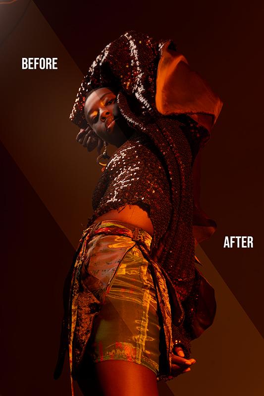
12. Vogue .it Editorial - The Red SAFW Showcase: Final Overview / Before and after: So here's the final before and after pretty much obvious before on the left. After on the right, we every touched the background throughout the whole picture, as well as the skin on a leg. Waste and face were fixed creases and strands on a clothing, and we have learned how to use the puppet warp toe while taking a brief look at where you should always place key points on the models frame. I hope you like this lesson, and, as always, please let me know what you think of it and what you change. Going forward. I'm Andrew biryani, and if you would like to see more of my work, so reach out, you can find me on instagram at Reasonable she or write an email at Andrea dot by oniy dot ph at gmail dot com. Thank you for watching
 Andrea Baioni, Fashion Photographer