Transcripts
1. Introduction: Hi, everybody. Welcome to fashion design. Siri's mood boards. I'm hot. And in this class we're going to learn how to create awesome mood boards in photo shop to inspire our designs will explore inspiration boards and will begin the design process. The project for this class is to simply create one mood board and one inspiration board and to prepare for the next part of the series, which is fabric exploration and designing of the garments. This Siri's has four parts, and the parts that will follow fabric and design will be flats and rendering. And then finally, we're gonna put everything together for presentation or portfolio, so let's get started.
2. What is a Mood Board: Okay, so let's dive right in. What is a mood board? A mood board is basically our visual story where we're going to lay out our inspiration. Our color story are images that will help us design a fashion collection. In this case, mood boards aren't limited to fashion design. We see them in interior design. We see them in art. We see them in all sorts of creative projects, and it helps us kind of focus our ideas, our direction and set the mood literally for what we are trying to achieve. Looking at some examples that you can easily find online, there are various ways to lay out a mood board. It's a collage. It has layers. It could be an actual bored with physical objects that can really highlight texture and feeling. I like to layer in photo shop when I create my mood boards. That's where I like to do it. I like to source various images and kind of create a story that brings it all together. So we will explore that For this project, we will learn about an inspiration board pulling images together and creating our final mood board
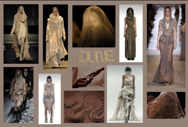
3. What is an Inspiration Board: Okay, so we've covered what a mood board is and how that will help us in our design process and another element that I like to add for myself when designing when researching for design, preparing to design a collection. I like to also have an inspiration board. And the Inspiration Board serves almost is in addition or an expansion on what the mood board provides. The mood board gives us that initial inspiration sets us into the mindset of the collection , the story we're trying to tell the mood, pulling all those colors and together. It's a very visual piece that I like to get creative with and really express kind of story off the girl we're designing for whoever it is and bring that all together in one piece. My inspiration board, on the other hand, is a collection of reference images that speaks to the color, the vibe, the feel, the look of the collection that I'm going for. It's gonna help me tell the story of the collection. It's gonna help me focus on who I'm designing for, and narrow kind of my direction of the collection so that I'm not all over the place. You could include on it images that are not just of your inspiration source in this case, the film's Mad Max. But also since I'm looking at a couture collection, what is going on right now in the couture shows? And that's kind of what I will explore with This Inspiration board is giving myself just a few more sources that I can look to really inspire me, really help me communicate and translate the ideas in my mind to the page. So where I like Teoh go for all my research and my image pulling is Pinterest and I have multiple boards that I am always adding to. Even if it's just for one collection idea, I'll return to it and add to it. As you can see, I've got a wide selection here of various topics for this'll Project. I've decided to return to a collection I started inspired by the films of Mad Max, past and Present, and I had started a board here that has just tons of images that are kind of inspired by it or from the actual films. If it's Tina Turner or shortly Sione and thes really cool, you know, post apocalyptic looks that I just think are fantastic and can be really great foreign for designing a couture collection. And there's just so much detail in texture in all these images, which is kind of the vibe ongoing for which is something that I'm thinking about as I'm looking through and adding photos to this board. Think about what you're drawn to in the focus and the target, the parameters that you have defined for yourself for this collection. If it's in my case, Mad Max, the film, you might have book, you read, and you really like the story and the characters, and you want to kind of try and translate that, or maybe something futuristic or something from the past, like you can pick whatever source of inspiration. You want to focus your collection on in the story that you want to tell, and then once you pick your season, you can narrow it down even more so with a fall couture collection. I'm gonna have a little fun with some dramatic pieces. What I like about Mad Max is all the texture, one of the great things on Pinterest that I find really useful and I'm gonna point you guys , too. And it's recent, as far as I can tell, is that more ideas tab there when you're on the app or on the computer on your desk top, where you can just quickly go in and recommend stuff based on other images you've already pinned. And you could pin that much faster, stuff that you want to add to your board so I can just go through here real quick and add a bunch of new images that maybe I wouldn't come across if I'm just searching Mad Max. But this is kind of because I have already pinned similar images. So I go on about this in my other classes. I love Pinterest. It's super helpful, and it is a great tool for research and inspiration. Another way to find, of course, more images to add to your board. Well, little pull for Inspiration board and our mood board is just searching. In this case, I just type in Mad Max, see what comes up. Here's one from with the original films with Mel Gibson, and I'm gonna add that to my board. Even though I'm not doing a menswear collection for this project. Just the images in terms of color and five and ideas of fabric and textures and so like that can work and inspire you in ways you might not realize until you sit down to design a collection. So whatever it is, if you like it if it jumps to you for any one of those reasons added to your board, there's fantastic ways of getting inspired by an image it could be, Oh, I love the color. I love the layout, the composition. Maybe the font is something that you're drawn to. And you want to incorporate that into any kind of graphic tees or such that you might incorporate into your design. So looking at all of that is something that is important to keep in mind as you're researching. So I go back to my board here, and I've added a few more items, which I think I'm gonna use for my inspiration board. What kind of to get started? Uh, you've got a variety of images to pull from, and it's good to just look back and go through and say, OK, so I want to add more how I feel. You want to start with at least 20 pins. Some of these were also going to use in our mood board, and some will be just on the inspiration board. So the more the merrier. Obviously, in Pinterest, this is an inspiration board that you can return to and have up on your iPad or your phone or whatever it is when you sit down to design. But I also like to have a separate 11 that I will print, one that I will kind of structure and put together and design a layout in photo shop for myself as a reference side by side with the mood board. So that's something you have to find what works for your group. Where are you comfortable with? You just want it on the screen here and scrolling. That's one way an actual board to print out or just have up on the screen as well. Even if it's a photo shop that's a little more focused is also, I think, really helpful in the design process. Other boards to consider creating for future projects and for this project is one that is specific to the design season that you're going with. So in my case, I'm going with couture collection specifically fall, but Michael two aboard is mixed with both spring and fall, Since there aren't as many designers that show, I like to put it all in one board, so it is a full rich bored of beautiful couture items. But I'm just looking at recent trends in couture design and stuff that pulls me, and I kind of think fits with this desert post apocalyptic mad Max vibe. And I'm already thinking, OK, some of these looks I'm gonna also incorporate into my inspiration board, not for the mood board. Don't think it's necessary to have runway looks on my mood board. I like him on my inspiration board because it's more for the garments. If it's the style, fabrics, materials, whatever it is that I'm drawn to its texture shape again, something to reference to something to get inspired by and to look back on as you're going through the design process. It's always really helpful, I think, to kind of get a peek at what other designers air doing and kind of what are the trends that are out there, Even though you might just be designing for your portfolio, it's always good to be aware and think of those things. I could look back at my current spring 2019 board that I'm adding to. And if you're designing for that season, feel free to come and check out any one of my runway boards for references. But definitely use that Vogue runway app pin away. There is so much to go through and to get inspired by and to help in your design process and just learning to look at how close hang because all this plays in together when were actually designing the garments on our templates. So that's kind of the initial, uh, step for our inspiration board. And from here we can get started on honing and more on our theme and season, and putting together both are inspiration and our mood boards.
4. Choosing Design Group Season & Theme: all right. So before we can get started on creating or inspiration and mood boards, we need to determine what our design group is, and the options that we have for that are womens wear or menswear, Childrens wear and junior where and with this, I recommend starting with something that you're passionate about or you enjoy designing you connect with. It will make it that much easier when we're putting this collection together. Next we have to decide what is. This season we have fallen winter, which is ready to wear spring and summer, which is also ready to wear for women. Specifically, we also have resort, which is a ready to wear collection and preform, which is also ready to wear. And then the final two, which are my favorite or spring couture and fall couture. In these collections, you can kind of expand and try more dramatic, adventurous looks. When it comes to the theme we need to think about what is our inspiration source. Where are we going with the creative direction of this collection? What trends? We might incorporate the color story. What is the focus point that's gonna bring all of this together for my project in this class, I will be designing a womens wear collection I will be designing for full. And my inspiration is the Mad Max films, so let's get started.
5. Create Inspiration Board in Ps: Okay, so now that we're a little familiar with what a mood board is, what an inspiration board is, we know what about theme and season and our demographic. We can start with creating first or inspiration board. So in photo shop, we're gonna create a document that is 17 inches wide and 11 inches tall. The reason I'm switching Teoh inches and not staying in pixels as you usually do, is because we want a specific sizes gonna fit in a portfolio. So I'm going with the standard size 17 by 11 leaving it 300 pixels per inch and rgb so in a photo shop. And you could do this an illustrator as well. The reason I'm focusing on photo shop is because it's also where we're going to create our mood board. But what we're doing here first and foremost what I always do when I first created document as I save it. So let's get that out of the way and immediately save our inspiration board before we add anything to it. And as as we're adding things to it, I constantly command s or control us. If you're on a PC, I'm constantly saving my work. It is so easy for it to crash on you and you lose everything you've done. And that's a bummer. So going back toothy images we had pulled in the previous video for the Inspiration Board. I'm just gonna open them all in photo shop as well. And with this we can go pretty quickly once we get started. But if you're not familiar or too comfortable with with photo shop, I'll go slowly first with how I just basically copy paste from the files into the border. Just created. So using my marquee tool, the shortcut is the letter M. I just dragged from the corner and mark the entire image selection. Copy it and paste it onto my board. So command, see short cut for copying or control, see and then command V or Control V to paste. And once I'm in my selection tool, my V is the short cut. I can just extend from the corner to make the image bigger, and if it's from the corner it's going to do in proportion is in the newer version of photo shop. We step to hold down the shift key don't seem to need to do that anymore. So going through quickly, it's grab Tina Turner same thing with my marquee tool from the corner. I just drag it to select the entire image. I copy it and paste it into my inspiration board, sizing it here and again, always from the corner. So it's in proportion, so our image doesn't get distorted, and then I'm just gonna drag it over here and always hit that check marker hit Enter. Once you've finished modifying the size and will prompt you to do that as well and quickly as I'm going through, I like to close out of the files I've already used. Get them out of the way. I know. I've put it on my board. Gonna go through and select the next one kind of Go quickly here. Would you get the hang of it? Well, speed through the rest of the images and play a little bit with layout. Okay, - so I've played a little bit with the layout and realized any two more images for my mood board . So I'm going back into Pinterest, and right away I see to that I think will work really well. So I'm just gonna quickly grab him here. We've already done this process. I won't bore you with that again Gravelly to other images that I'm gonna add and play with them on my board. Here is Well, so the same thing. I just opened them again. Marquee tool, copy, paste. Tweak it here and make it work on the board the way I like it. Okay, so I'm just wrapping up my final sizing. And next I'm going to add a title. So I add a layer and I go to my text tool hit t when you keyboard. And before I place it, I realized my stroke or Phil is in red, so I'm going to change that real quick. So I'm not typing and red. That's gonna be too right. And I think I'm gonna pick up a color from one of the looks here. I really like this properly blue. And now I could just type my title my inspiration Mad Max and keeping the title Mad Max for this as well. And now I'm just gonna play around with size and font. Super important to find a font that fits with the theme and the mood and the vibe of your collection. It will complete and channel it that much better and communicate what you're trying to get across with your collection. And this will help you as an inspiration board to stay focused and kind of absorb that energy. So here I'm just playing around. Still with size and layout. This spot is cool, but it's not really appropriate. So I'm going to quickly go through here and pick a different front. Okay, so I have my font selected. I'm making the last suggestion adjustments for size and placement and my inspiration board is ready. I'm ready to get started on my mood board.
6. Create Mood Board in Ps: all right, So we have our inspiration board and now we can get to the fun of it, creating our mood board. One of the first things I want to do before we get started is get myself some background images that will really set the stage in the mood for the smooth board, which I didn't originally due in my Pinterest board. And I'm kind of looking at some desert landscape, obviously taking from that Mad Max vibe. I want something that will translate well into that story. So with this, because I want larger images, I'm going into Google images, and I'm getting myself some cool desert sand landscape kind of pictures that I will then incorporate with the images from Pinterest. So right away we already know we can just start our mood board and photo shop 17 by 11. I'm saving the preset so I can always do that again, and I find it's really helpful to save that so that I can quickly retrieve that size again right away I'm gonna open the different images that I've saved from Google images and from Pinterest that I want for my mood board and open them all Photoshopped as well. So I have my images open, and I'm gonna use my marquee tool to select the first background image and simply copy, paste command, see or control C. And before I even pasted into my new document, I'm going to save this mood board so that moving forward, I can just automatically command or control s the board and keep saving routinely. So command v Orc Control V to Paste. And we're going to just just a selection. Pull it from the corner, so it's in proportion. And now let's review some of the other images and you can quickly, just once you've done one, you can throw in the rest from the open documents. So I've laid out all the images have selected for this mood board and the first background already have, and I'm happy with it. And I'm going to start with this really cool image of this woman with these intricate jewellery that I just see somehow wanting to blend into the sky. I'm not quite sure yet what I want to do with it. I'm playing around with size, just looking, trying to get a feel for it. But I will probably have to come back to it once I've played a little more with my background and the landscape of the scene of the mood board. I really like to layer and play with blending options to create a more intricate and unique environment for the mood board. And that can be with playing with opacity, blending options where everything is laid on the board. Who, what's ahead of it, what's behind it in front of it, kind of a thing and see where I get the effects that I want. When you go through the blending options, as you can see, there are many. And the effects that you can create are endless because it is just a matter of what you're merging with different layers how the colors react. How are you playing with opacity? And with this, I would say, Take your time and just play with the's layers, adding different colors and textures just by using the blending options. If you're subtracting, if your color burning may be your only playing with opacity at the normal level, but you can kind of figure out what translates well with the story you are trying to tell. I want a very dusty, sandy desert vibe t to really channel that Mad Max feel. But I also wanted to make it unique to my design style, my design aesthetic and the colors that I'm drawn to with the images that I have pulled so far. So once you start playing with that, you might get kind of a sense, and you might like what you're looking at in this case. I want to flip this image. I've been staring at it for a while. It was to the right, and I actually wanted on the other side, because I want to be able to blend in with smoke that I have from the other. Image was also on the right, so I don't want it to be too right heavy and kind of create a nice balanced image. As you can see, I have not determined yet exactly what each one's settings are, but I keep playing with it. My background. I've decided to use that same midnight purple e blue that I used for the font in my inspiration board as again, another way to bring in more color and to make this a more moody kind of desert environment and play with the colors get to create my own linear burn is great, and I will. We use that in this color scheme. I like what's happening here. I like this progression of colors, this hombre of from reds to the blues. And now I'm ready to play with the face of this girl with the cool jewels and kind of play around with it on the board again with this layers are your best friend here because you could move them around and you can play with the order and you can figure out what really gets the sense of the story and the girl that you are going to be designing for, or the guy or the child, whoever you've decided in your demographic, but really to create for yourself a space that tells the story. I like to go very theatrical, almost. I'm very drawn to those kinds of styles and elements, and since I am drawing inspiration from film, I want to add that to my mood board that much more playing here again with how we're gonna blend her end of lowered her in the order of the layers so that she's kind of sandwiched in between and because of some of the other fact effects already have going on and the levels of opacity. I'm getting this really cool effect like she's in the distance. I'm going to double her up twice, and I'm going to play with mirroring or flipping horizontally, the image so that I can create kind of a pattern that continues in the background playing on the mountains. But she's kind of looking on on this environment, the scene, this landscape and just adds this more sensual moodiness to the mood board and create kind of an interesting story. She's looking on just looking off from the distance, those eyes air so intense there, so inspiring and kind of a cool effect. So I simply double duplicated my layer that I moved it over to be next to the other one, and I'm gonna duplicate it again, simply right click to book it layer and then dragged that guy to the other side and make sure everything is nice and aligned. And you can do that also with the A line tools. So I'm gonna flip that layer horizontally and to do the same on the other side. So instead of it being continuing, I like this. I mirrored idea. So it's almost creating its own little pattern. And I've got those three layers and I'm select all three using this shift tool. And so together I'm going to reduce opacity. So don't do individually do it all at once for all three because all three are selected. So I just click with the mouse and hold the shift key down to select all three. So playing here a little bit with that opacity again, it's blending. It's becoming part of the scenery. Her eyes were in the sky that face the jewels, adding, all this texture really like what's going on here and next? What needs to happen is I want to really make it seem like it's kind of behind the mountains, and we're getting too much texture from the jewels in the front. So I'm just gonna go through any race on the layer of the copy with the girl image, and we have three of whom number is gonna quickly go through any race. There's different ways to do this. For the purpose of this mood board, I am simply gonna go through and just follow the mountain lines and just erase board and go through each layer. And there I did a little too much. So I just undo kind of come down. I want to make sure it's just behind the mountains and then get rid of it from the road from the red. So it's not too muddy and it's kind of more intentional there. And I've got that smoke coming into her eyes that we got from the other layer of background and I go to my last one and I went too much. So I'm gonna get a little closer, clean up the texture over there, get it off of sand, and then just gently make sure look back. Okay, so next I'm gonna add a layer to my board, and what I want to add is the title. Just as we have it in the inspiration board. I like to also have it on my mood board. So having my inspiration board still open, we're just gonna go in so, like that layer mark my title and control, see or command see to copy it and on the nuclear have created, I'm just going to place it and again command V or control the to paste it and I already have it in that color. The It's on normal, but I'm gonna play a little bit with blending options and gonna go with divide. So we actually are not using the same purple, but it creates only we are using the same purple. But with the divide blending option, it really gets this cool burnout effect on the dirt road that just makes it more fiery. And I think kind of cool, and I made sure it's centered. I'm raising it a little bit here again. With us play around, You can decide that you don't want a title on your board. Or maybe you want it on the right corner, at the bottom or on the left center. That again to create the idea and the image that is most inspiring to you that when you sit down to design, it will take you in. And you can tell that story for my last step. I'm gonna mute down the board a little bit by just adding a black and white adjustment layer above the layers that I'm working with to just tone it down a little bit. And there we are. That's my mood board
7. Getting Ready to Design: Okay, So now that we've gathered our inspiration images, we have that beautiful inspiration board. We have our amazing mood board that's really going to get us into the mood to design this mini collection. You want to make sure you have that either printed out or on a screen in front of you. Wherever your set up is, you're gonna have your templates with you or your fashion Eri sketchbook, whatever you prefer and gather pens and pencils, whatever you're comfortable with designing. And we can start exploring fabric and designing our collection, which will be the second part of this Siri's. So I look forward to seeing you there.
8. Final Thoughts : All right, everybody, that concludes. Fashion design. Siri's Mood Boards Part one of my four part series where I walk you through the fashion design process. I look forward to seeing your beautiful mood boards and inspiration boards in our project gallery. If you have any questions for me, feel free to post him in the discussion boards or reach out directly. I'm here to help, and I look forward to seeing you in the next part of this Siri's where we get to explore fabric and design our garments. I'll see you next time.
 Michal Cohen, Artist