Transcripts
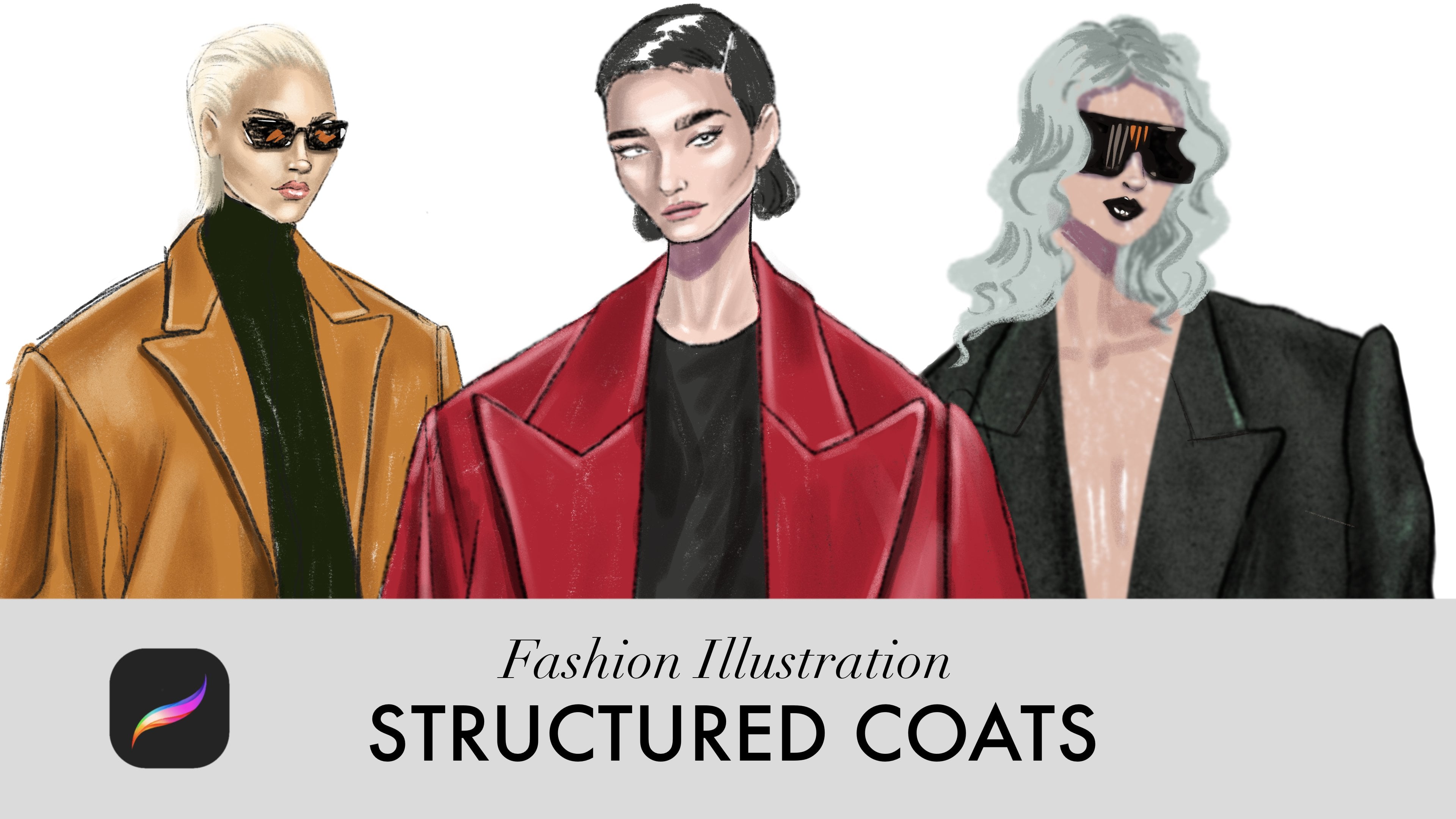
1. Introduction & Class Overview: Hi, everyone, and
welcome to the class dedicated to drawing a
female fashion figure. And I try to make this technique as simple and
straightforward as possible. We will base fashion figure
on three simple shapes, and I'll show you how to manipulate them to change
the body positions, and I'll show you some
cool techniques to build an interesting body composition that is full of
energy and balance. The second part of this class, I'll teach you how to rent
the different skin tones, dark one and light one, and how to apply this technique
to render any skin tone, even some experimental one, like a blue skin tone. I'm looking forward to see you works in the project gallery, and let's get started.
2. Tools & Setup: So first, let's
quickly go through the pro creols we'll be
using in this class. So I have four drawings
on different layers, and let's say I want
to select L three, it says empty layer. Why? Because I'm
now on layer four, so I need to go to layer three, and now I can select L three and move it and
do anything with it. When you tap on a layer, you can rename it and perform
many different actions. Here, where you see
this capital letter N, you can change the mode. Now it's N because
it's in a normal mode. I can also drag a layer to the right to select
multiple layers at once and I can move and transform everything
that belong to those layers. I also can group several layers. Close the group. And now I'm working with everything that belongs to all
these layers in one group. So here's our group. You can also rename it. You can duplicate it by
dragging it to the left. When I tap this checkbox, I hide the selected
layers or groups. If I want everything inside a group to become
one single layer, I can tap flatten. Now it's not a group anymore, it's one single layer. I'll delete that layer
and show the group again. If I tap on it and choose group, all the layers inside
become separate again. Now, for example, if I have
layer four above layer three, I can choose merge down. These two layers then
become one layer. Now let's talk about how
we'll usually organize our layers when
drawing and rendering faces, bodies, garments, later. So first layer that I have at the very base is a base
layer of base color. Above it, I create a
layer called shadows. Above the shadows
will have highlights. Usually above that
will be the linework. Then I click plus icon and create one more layer
and cool it details. It's for anything extra, we want to add to the sketch. As you can see, most
of these layers are set to normal blending mode. We'll change shadows
layer to multiply mode and highlights
layer to screen mode. Very often the shadows
layer will also be clipped to the base layer. It's above the base layer
and I click clipping mask. I do the same for the
highlights layer. It's very important that they
are above the base layer. Let me show you what that means. I'm now working on
the base layer. I create this circle selection. When holding my
finger on the screen, the circle becomes
a perfect circle. Then fill it in with color by dragging the
color into the selection. Now I switch to
the shadows layer. Which is clipped
to the base layer. When I draw this clipped layer, I can't draw outside the
shape of the base layer. When I try to draw anything, I draw within that circle only. This is extremely handy when
you want to work only on a specific surface
like skin or fabric. It works in the same
way for highlights because highlights
also clipped layer. If I drawn a layer that is not clipped like layer
three or layer four, you'll see that the stroke appears even outside the circle. Next, let's look at how to
activate the drawing guide. I go to Actions menu, Canvas drawing guide, and usually by default,
we have a grid. So I tap Edi drawing guide because we need a symmetry tool. I click on symmetry and I get this vertical line that
I can move around. So what this tool gives me? Now I go to layers and my base layer is assisted.
I don't need that. I use base layer for color only, so I deactivate the
assist and I go to, for example, linework
layer and click assist. Now, when I draw anything
on a linework layer, the drawing gets mirrored on
the other side of the line. This is very useful
for things like nose bridge or eyebrows that need to be
mostly symmetrical. To deactivate it, I
simply go back to the layer and turn the
drawing assist off. You'll immediately see that my drawing is no
longer mirrored. I also turn the drawing guide
off from the actions menu. We only use a few
brushes in this class. The first one is a six B
pencil from the sketching set. The second is Jasinski
brush from the inking set. We'll also use a monoline
brush from calligraphy. Finally, we'll have
a shadow brush, so I created in the drawing set. In a stroke path, I change
the space into 10%. Then I go to grain, tap edit, choose import, source library, and pick B noble. Then I tap done. Next, I go to scale
and reduce it to 13%. In wet mix, I change the
grade to minus four. And that's it. You can tap and hold the brush to open the
menu and rename it. I call mine simply shadow brush. We'll be working with four
colors for each skin tone. Bye skin color, shadow color, transitional red,
and highlight color. This structure stays the
same four skin tones. I already have these
palettes prepet. So this is base cool
light skin tone, then shadows, transitional
red and highlights. Here we have the palette
for dark cool skin tone. This is warm light skin tone. And warm dark skin tone. All four of them are here. So you click Plus, and then you upload
from the folder. Usually, it's a
downloads folder if you download the palette
using your iPad. Another very handy tool
is the color picker. It's located right between the brush size and
brush opacity controls. And there are other ways
of selecting colors. You can explore a
bit procreate and find many useful features. Next, let's look at
the selection tool. This is a freehand selection, and it's extremely
useful when you want to recolor or just a
very specific shape. For example, if I want
to recolor your lips, I select them using the
freehand selection. Then I go to adjustments, choose hue saturation
brightness, and here I can change the hue. And here I control
the saturation, and I also can adjust
the brightness, making a daka or lighter. You can also make
selections using a rectangle or an ellipse. Another very useful option
here is the add function. For example, I
select one object, then tab ad, select
another object, and add another one. Then I have all
of them selected. Let's talk about
transformation tool. I select your head. If uniform is activated, the object scales
proportionally. If I switch to free form, I can transform it in one direction only
horizontally or vertically. I can also flip
objects horizontally. Another tool we'll be
using is a smudge tool. I can make a stroke, then switch to smudge
and work with the edges. This tool is very
important when you're shaping forms and blending
shadows and highlights. The eraser tool is also more
versatile than it seems. You can use different
brushes as eraser. For example, Jasinski ink and create this
interesting edge. Now a few useful
finger gestures, two finger taps to undo, three finger taps to redo, and a three finger swipe
opens a quick menu. You can customize it in
settings. And that's it. These are all the tools we'll
be using in this class. You don't need to memorize
everything right now. I'll remind you of each tool
exactly when we need it. For now, just make sure
your color palette is imported and your shadow
brush is created. I'll see you in the next video.
3. The Static Body as a Base Structure: Let's start by creating
an A for Canvas, go to Actions Menu Canvas, turn on drawing guide, and tap Edit Drawing Guide
and then choose symmetry. Now I'm going to
the calligraphy set of pens and selecting monoline, the most solid one. I keep the opacity at 100% and pick a bright color so the
structure is easy to see. First, I draw an egg shape. This will be the head. So make sure that you close the lines so you don't
fill in all the space. We need three main shapes, the egg for the head, one shape for the chest
and one for the hips. Now I draw the chest shape. The upper line
defines the width of shoulders and lower line
defines the width of the waist. Let's find the center
of the canvas. We'll try to keep the body a
bit above the central line. Here I'm using a free
form transform to make the shape slightly
taller or wider. If you want to adjust
a specific area, you can use warp transformation. Here, for example, if you want
to make shoulders flatten, you can use the warp tool, you can drag these points
or drag the rectangles. Now I draw the neck. For now, it's just a simple tube connecting the head
and the chest. It's important that it's connected in the middle
of the shoulders. Soften and curve
that connection. Next, I connect the
chest and the hips. At this point, I lower the opacity of this layer
and create a new one. I also turn on assisted
drawing for this layer. You just click on it and
click Drawing Assist. I get the symmetry on
this layer as well. Now I'm using six B
pencil in size ten, and I have a separate class
dedicated to drawing phase. So if you want to learn that in details,
you can watch it. Here I'm just
showing the process. Now in the middle of the face, I'm drawing your eyes,
adding eyebrows. Next, I draw the nose
and just below it, I draw your lips. At the eye level, I
start drawing your ears and also I want to soften her jaw line because her facial features
are quite soft. Now I follow the shape of
the neck into the shoulders. This is a moment where you can really feel the proportions. If the shoulders
seem too wide or too narrow, adjust them freely. I add the collar bones, stretching them
from the shoulders toward the center
where they meet, you get the jugular
point, this indentation. From there, these lines can extend slightly upward
toward the jaw. Now for the torso, in the lower half of the chest, I draw two circles. The size of the circles defines
the size of the breast. Any size works, of course, it's entirely your choice. Looking at this, I feel the
chest is a bit too wide, so I go back to my
structure layer. I select the chest and then use the warp tool and transform the chest, so
it's not that white. Back on the sketch layer, I connect the armpits
to the breast using a soft S shaped line. A little below the waist, we place the belly button. Then I follow the rounded
shape of the hips. If you want a more bony look, you can emphasize it with
a sharp lines instead. Next, I define the approximate
position of the feet. The knees are placed slightly above the midpoint of the legs. For the knee, I draw a
bracket like curve on the inner side and a straight
line on the outside. On a slim body type like this, the inner thigh curves
outward just below the hips, then curves inward
above the knee. On the outside, the thighs are fuller
in the upper half more curved and flatter as
they approach the knees. Let's make a nice
good curve here. I think I will keep the
more curve type of hips. It will look better in
this case, I think. I draw the circles for the ankles a bit closer
and then connect knee circles with ankle
circles with line that is a bit more curved
in the upper half. Then I draw these bones
at the knee caps. They help with highlights later. On the outside in
the upper half, the line is more
curved and there is a small indentation under
the knee on the inside. Line becomes flat on both
sides on the outside and on the inside as it
approaches the ankle. When connecting the feet, remember the inner ankle bone sits slightly higher
than the out one. Then I draw feet. They look a bit
maybe a little bit like piers now let's
move to the arms. Below the elbow, the arm
changes angle slightly. It's not one straight line. The lower half tilts
outward a bit. Then I draw this carrot shape. And the upper arm is
more rectangular, but notice how the flesh come slightly closer to
the bone in the middle. It's thicker at the shoulders
and wider at the elbow. It's very helpful to
keep reference images of female bodies at
different angles nearby. I've included reference images
in the class resources, so feel free to print them
and keep them on your desk. You can always use transform tools for
selecting any part and then just changing its
position or transforming it. For the hands I start by
building the structure. The thumb and the first joint of the other finger sit at
roughly the same level. I draw them first as lines. Here's our thumb. Then I draw half of each
finger first because that half is where that middle joint is at
the same level as a thumb. Then I extend that finger. I simplify the fingers and skip some joints to keep the
drawing clean and fluid. Finally, don't be afraid
to adjust proportions. You can shorten or
lengthen the neck, move limbs or resize any part
using the transform tools. You can build the post first digitally for your
paper drawings as well.
4. Balance & Stability in a Pose: So let's start by creating
a new A four Canvas. I go to Actions Canvas, turn on the drawing guide, tap edit drawing guide,
and choose symmetry. I'm building the structure using three main shapes
that we made before. I select the monoline
pen from the calligraphy set and keep the
opacity to 100%. I have a blue color picked. I just pick some bright color. First, I draw an egg shape
for the head and fill it in. Then I draw the chest
and fill it in. And finally, the hips. I'm already making the
way slightly narrower. This line here is
the center line. My goal is to place
more of the body above this line so the
legs appear longer. Now I select the hips
and the chest and use free form transform to
squeeze them slightly. Okay. So let's put it here. Next, I want to adjust
the chess shape, so I select it separately. I choose warp transform, which allows me to
manipulate specific areas. So I want to flatten
her shoulders a bit. This makes them easier
to work with later. Okay, so I also want to flatten the chest
on the sides a bit. Now I deactivate the drawing
guide first on the layer, then in the canvas settings. Next, I transform all the
shapes together them. I tilt the chest to the right
and the hips to the left. The hips can usually tilt a
bit more than the upper body, and this adds movement. I create one more layer. Now you see this is our first
way of adding dynamics, altering the tilts of
different body parts. Heap to one side, chest to another side, and we can either tilt
the head or turn it to the other side and it will make our pose
more interesting. I connect the neck to your shoulders right in the middle and connect
to your head as well. You can move the head if it's not exactly
where it should be. And then I connect the
chest with your hips. Close the shape and fill it in. Next, I draw one straight leg. It's overall tilt is opposite
to the tilt of the hips. You can see that
this line leans more to the right while the
hips lean to the left. I finish the food. This is a simple
high heel food shape with slightly pointed toes. I just turned her foot
a bit to the inside. That's why the inner
line is more sloped. I place the knees a little higher than the
midpoint of the legs. You can place them
exactly in the middle. If that feels better,
both options work. Now I switch to a
bright magenta. You can see the connection
of two bones at the knee. I draw a bracket like
curve on the inside of the knee and a straight
line on the outside. Again, the out thigh is more curved at the top and
flatter near the knee. On the inner side, the
curve is stronger under the crotch and turns
inward about the knee. For the lower legs, I show the indentation under the kneecap and then
the cuff and again, the line becomes flatted
toward the foot. Look at the spine here. It's curved as if something
is pulling her to the left. Without enough
support on that side, she would lose balance and fall. To fix this, I can build the leg along this direction
and use it as support. At this stage, it's very important to trust
your intuition. If a pose feels unstable, you'll sense it immediately. Our brain naturally
recognizes imbalance. It will feel as if
it's unstable, really. Now I stretch the supporting leg and rotate the foot slightly. I drew the upper
hips the same way. One of the reasons I love
this post building method is that you can select and
adjust limbs individually. For example, if I put
her leg like this, this feels unstable. She's clearly falling. But once I adjust the
leg and arm positions, the pose becomes
much more grounded. Now let's look at the
second way of adding dynamics, balancing
prominent parts. Your right side feels flat and your left leg is very prominent. To make the pose
more interesting, we can balance this
by adding emphasis on the upper body on the right side where we
have a straight leg. So for example, if the
leg is flat on one side, we can make the arm on
that side more prominent. She could be holding
a back there, so like this or having some accessories stretched in that direction like a scarf. And on the other side, I make more straight arm. Or we could rest your
hand on her hip. In this case, your arm is
more prominent on the top. On the other side where
the leg is more dynamic, I keep the arm
simpler and flatter. This contrast creates
balance and visual interest. Here are three ways
of adding energy to your drawings using
altering tilts, balancing top with bottom,
and using diagonals.
5. Dynamic Pose from Reference: I now we're going to build a post based
on a reference image. I start by creating
an A for Canvas, then I go to actions, Canvas, reference, and import
an image from my photos. Here it is, you can resize or stretch the
reference slightly if needed. Before drawing, let's
analyze the pose. We can see that the
left side leg is bend, which reduces support
on that side. As a result, your hips
tilt to the left side. And on the other side, we have a straight
leg, the main support. Next, look at the chest. It tells in the
opposite direction again, but more subtly. Here is a spine and it looks
like S shape a little bit. Here are directions
of the tilt and her head turns away
from the chest tilt, adding another
change in direction. These altering tilts left are what create movement
and dynamism in the pose. Your head is also slightly
tilted to the left, which reinforces this flow. Now notice the arms. You legs are placed quite
close to each other, so they aren't very prominent. The arms help balance the pose and make the silhouette
more interesting. Okay, so let's start
building the structure. I activate the
symmetry drawing guide and begin drawing my
three basic shapes, the g for the head, the chest, and the hips. Don't worry about
perfection at this stage. Everything can be adjusted
later during sketching. Okay, so This line here marks the center
of the canvas. I want most of the body to sit
slightly above the center. You can also experiment with different transform
tools like distort or free transform to
see which one feels more comfortable for
adjusting specific areas. Here I use free transform to gently squeeze the
chest and hips. Now I deactivate
the drawing guide both on the layer and
in the canvas settings. Next, I start
tilting the shapes. I begin with the chest, tilting it slightly
to the right. Let's move it below her
head right in the middle. Then I select the
hips and tilt them in the opposite direction and
I can tilt them a bit more. Now I draw the neck, placing it in the center
of the shoulders. Okay. Now I connect the chest to
the hips with a smooth line. Next, let's work on the legs. One leg is bent. And the other legs
straight but tilted a bit in the opposite direction from the hips, just like this. I lift the knee slightly and add a simple carrot like
shape for the upper legs. They rounded at the top and narrower and flatter
toward the bottom. I feel everything in with color. So for the lower legs, I draw a shape that's more rounded at the top
for the calves. So it looks and then I flip it
horizontally and put it just so they really
fit the calf shape. Um, if you want to
reduce some volumes, you can just cut them out using a free selection tool and then go into actions
and just cutting. On the other side, the leg
turns slightly inward, we see more of the
back of the calf, so I draw this side
more round it. At this stage, don't
overthink anatomy, focus on the silhouette balance
and stability of the pose because we can refine the body shape at
the sketching stage. Now, I refine the neck, rounding it, and adding
a hint of muscle. Now let's add the arms. As a guideline, the elbows usually sits around
the waistline. I draw this soft rectangle that is a bit narrower
in the center. The forearm is roughly the
same lens as the upper arm. I just draw in the same lens
at this upper arm and move it and then draw the carrot. Because both arms are on a similar plane and
not pulled backwards, their proportions
stay almost the same. I copy one arm, paste it, just rotate it. And once the position is right, I just connect it. I'm drawing the armpits. Okay and I can copy this carrot shape as well. Let's merge down that arm that
I pasted, then copy paste. I position it where I need it. Again, I'm merging
down this piece. Everything is on one layer. Next, I play simple shapes
to indicate the pumps. Now let's draw the feet. I use a peer like shape with
a flat bottom on both sides. Finally, I take a step
back and analyze the pose. Does it feel stable? Does it look balanced? For me, it doesn't
look stable honestly. I'll try to move a bit this lower half of the
leg, bend it more. I adjust the til below the knee. And then just
connect everything. So I also want to move the
entire leg a bit to the side. I think this looks better. Okay, so now I rotate
it just a bit. Yes, this feels right. At this stage, you only
need small refinements. Once the pose feels
stable, natural, it's ready to be used as
a base for your sketch. You can even print this pose out and use it as your reference
whenever you need it.
6. Structure into a Clean Sketch: Now that the pose is ready, I'll use three fourth
body reference to refine the drawing. I create an extra layer
and it feels to me that the upper body is
turned slightly to the left. That's why I'm going
to use this reference. Through the center
of the chest, neck, and crotch, I draw a
gentle curved line. This helps me position the jugular point
just in the middle. Here we have the collar bones. In the lower half of the chest, I draw two circles on
either side of this line to place the breast next, I switch to a six B pencil and draw along the sides of the
breast to define the armpits. I connect everything
smoothly into the arms. At this angle, the
back appears flat. Actually, we see the
back at this angle. I go back to my structure and with a
free hand selection tool, I select this area
that I don't need, go to Actions menu and cut it. Then I go back to my
layer, the top layer. I draw the armpits on the other side and connect
them to the breast. At three fourth angle, one breast appears
more prominent. I draw the chest
underneath accordingly. Again, if there is any
extra colored area, I simply cut it out
on the layer below. We don't need the central
guideline anymore. I erase it and keep only the
lower outline of the breast. I don't need the full
circles anymore. Let's refine your hips a bit. Then I merge down
those details with the main structure and reduce the opacity
of the structure. Then I create a new layer, pick the six B pencil and
choose the black color. Now we stab the sketch. I follow the reference closely observing
the jaw line shape, then sketch the nose and lips. I have a separate class fully
dedicated to face drawings, so I won't go into detail here. If you want to improve
your face drawing, start with simple angles and gradually move to
more complex ones. Start drawing front face, side, face and then it will
be easier to draw from a references that
might seem more difficult. With practice, everything
becomes much easier. I draw the tip of the nose and then add a small
triangle underneath, add nostrils on the sides. Then following
that central line, I draw the nose bridge and then add eyebrows
below add the eyes. So I want to refine your nose bridge because this
is the view at the angle, this nose bridge to
be also at the angle. It's not the front view. I'm drawing the other eye. And I want to refine
your jaw line. At a distance more than
the width of one eye, I add the cheek bone
and then draw your ear. I want to reposition your eye and eyebrow
on the left side, and then I just refine
the outline of her face. Next, I draw the hair. I just draw this big strands of hair and then I draw your neck. I add the jagular point, the small indentation
above the collar bones, and slightly more prominent shoulder muscles where
the arm is lifted. For outlining, I like using a six B pencil in this size ten. If you prefer cleaner lines, you can use Jasinski ink or
any other brush from inset. Personally, I enjoy combining pencil outlines with
chalk for coloring. It creates a textured hand drawn feel even if
it's a digital work. Now let's look at the hips. If you run them more, the body appears fuller
on the reference image. If you flatten the line
slightly and suggest that bone just a bit lower
than your waistline, then the body looks less full. This depends entirely on the type of model that
you want to draw. This is not a final outline. You lines don't
have to be perfect. This is more this is the first sketch based
on the structure, and then you can create extra layer with
more refined lines. To draw the pum, I first
build a structure. I draw a curved line
where the wrist begins and then where most
of the fingers attach. The thumb is more or
less in the middle or maybe a bit higher in
the middle of this shape. I just try to locate everything. Maybe thumb starts here. Notice that the thumb aligns roughly with
the middle joint of the fingers while the lower finger joint
sits slightly lower. I'm redrawing that lower joint, and here I add the other half and draw my simplified
versions of fingers. So finally, I move
to the other arm and simply outline the carrot like shape of the arm structure. Now, let's work on the hand. Again, I start by drawing a part that's easy
for me to locate. I usually begin with the area that includes the
two main joints. A any reference point that
feels clear to you works here. Next, I draw the
thumb and end it at roughly the same level as the middle joint of the fingers. After that, I add the fingers. And I slightly curve this line inward and also adjust the angle until it
feels more natural. Now I move on to outlining
the legs and feet. This is still a sketch, so I allow myself
to be less precise. Here I sketch the bones
that meet at the knees. You can erase parts lightly, but try to keep the
small triangular shape. It's very useful later
when you add highlights. So so I draw the toes, keeping them slightly
shorter and simplified. The design of this dress
allows me to add diagonals. The third way of adding
energy to your drawing. I add diagonal
lines to the dress, including the low back part. At this point, I feel there isn't enough space
for your headwear. Even if I move your downwards. I select the lower part of the body and
squeeze it slightly. You can also squeeze the upper body if you
want longer legs. For example, select the
area below the chest, move it upward, and then quickly
sketch the legs back in. Once again, I add diagonals
drawing your headwear. Our sketch is ready. Let's go to the step
of rendering the skin.
7. Rendering Light Skin: Now that the sketch is finished, we can move on to
coloring the skin. At the beginning of this class, we uploaded skin tone palette. Each skin tone includes four colors and we'll be
using them step by step. I pick the first color
for light cool skin tone. I create a new layer and then rename the sketch
layer as sketch. That new layer below, I rename it as a base. Above the base layer, I create another layer, set it to multiply mode, clip it to the base layer, and rename it shadows. Next, I create one more
clipped layer above, set its mode to screen, and rename it highlights. Now, let's start
with the base layer. I've already selected
my skin tone. I choose the chalk brush
from the calligraphy set, set the opacity to 100%, and use a brush size of ten. I color all the
visible skin areas. I personally love chalk
because of its texture. It gives a hand
drawn organic feel. If you prefer something
faster and more solid, you can use the monoline
pen at 100% opacity, outline all the skin areas and simply drag the color
in to fill them in, just as we did when we
drew the body structure. Next, I move to
the shadows layer. I select the second color
from the skin tone palette. This is my shadow color. I begin adding
shadows to the face. You can use the
shadow brush that we created in the tools video. But here I'm just
experimenting with the chalk. As I observe, chalk
works nicely as a base, but for shadows, it
can feel a bit rough. I switch back to
the base skin tone and apply it on
this shadow layer. This creates soft pinky
shadows which I really like. I add shadows along the
sides of the forehead, along both sides of
the nose bridge, and softly on the
sides of the face. This is how it works. I left the middle of your nose, middle of your forehead. But on the sketch layer, I want to add some
hair because I think that your forehead
is unnaturally open. Then I just add some eyelids. Then I return to chalk
and on the shadows layer, increase the opacity bit
to add stronger shadows, especially along the
nose bridge near the headline and on
the sides of the face. So I leave a small
triangular highlight area, the Rem Bron triangle and make the far side of
the face slightly darken. Okay, so here I add shadows. I cover those shadows
with skin tone, so it's more pink Next, I add shadows on the neck, especially in the
indentation above the collar bone in
the juggler point, on the sides of the neck. I use a bit of gray to
softly define the jaw line. It's the shadow
color that we have. Basically, shadow color is less saturated skin tone
for the light skin. Now I go back to the sketch
layer to add eyeliner. I do that with six B pencil. Then on the other side, just make the
nostrils darker and then draw pupils and iris. Here and on the other side. And then add the eyelashes. To color the lips, I create a new layer
below the sketch and choose the third color from
the skin tone palette. I color the lips on the
separate layer so I can easily change the lip
color light if I want to. For lip shadows, I simply
use a dark tone and add shadows along the lower lip and the bottom edge
of the upper lip. Back on the shadows layer, I decide to shift the shadows
to a more pinkish tone. I just pick the skin tone and work on the top
of those shadows. I just feel that
with a chalk that gray shadows look
like a facial hair. Pinkish tones give a much
softer and cleaner result. But you can work with the
shadow brush that we made. It will give a different effect. And on the sketch layer, I also want to transform this facial outline and make
the face a bit narrower. I go back to shadow layer, and now I switch to
the shadow brush. I start defining the body, shadows under the breasts in the armpits and along the torso. This brush creates much
softer more natural shadows. So from this point on, I'm going to work with it. I add very subtle shadows below the collar bones and
continue defining the form. When shading the limbs, I keep the shadows that are closer to the
body, a bit wider. If this is in outline of the arm that
is closer to the body, then I make it dark and whiter. If there is anything more horizontal like this lifted arm, anything that is below the bottom is darker and with
wider shadows than the top. The same logic
applies to the legs. Inner shadows are wider and darker than those
along the out edges. Around the knee, I use a narrower brush to define
the bone structure. And then switch to white
brush to shade the cufs. On the other side, the leg
is slightly turned inward, so I place more shadows
toward the back of the leg showing the
bone only on one side. In the lower leg, this bone is more
highlighted in the middle. Now I move to the
highlights layer. I pick the forest color from my skin tone palette and
start adding highlights. I place them between the
breast on the top of the breast and on any area
that catches more light, muscles, ribs, and bones
that are more prominent. You can emphasize those
parts with highlights. But much too many
highlights can also give the wet effect as if the body is wet
or covered with oil. Here I need more shadows. I go back to the shadows layer and I feel we need a
bit more depth here. Don't hesitate to move back and forth between layers and
make small adjustments. Those fingers inside
need to be docu. Now I pick that third color in my palette and on
the shadows layer, I lower the opacity so the color doesn't
become too strong. I use this tone along
the borders between light and dark areas and also slightly over
the darker shadows. This reddish tone adds
warmth and life to the skin. I apply it softly on
the shadowed areas. You can also use
it to add a blush. Next, I pick a soft purple tone and create a new layer
above the shadows layer. Also clipped. I add gentle
shadows under the jaw line. I do it on a separate layer
just in case I don't like it, so I can easily just delete
the layer or change its hue. That's it. We finished
coloring light cool skin tone.
8. Quick Pose Study from Reference: Now let's work with
another reference pose. I go to Canvas, tap reference, and import
an image from my photos. This video will be a bit faster. By now, we are more experienced, so let's jump right in. Here is my reference image. And let's create so I have a layer with all
these three shapes that are needed to build the pose and I'm creating a new layer and picking some magenta color,
just different color. In this reference, the neck tilts in the same
direction as the chest. I'm drawing the neck
on the layer below, I select the chest. And position it with the same tilt as on
the reference image, and I position it so the neck is in the center
of the shoulders. Next, I select the lower
body and tilt it even more adjusting its position so it connects
naturally to the chest. The chest and hips are relatively rigid parts while the belly area is
the most flexible. I marks the center
points of each section and connect them with a curved line that bends
the most at the belly. This creates a natural
flow through the body. In the lower half of the chest, I draw two circles
to place the breast. Then I connect the neck
to the shoulders using soft curves to here
we have the muscles. I connect the upper
body to the lower body, then close the shape and
fill it in with color. Just like that, the upper
body is built very quickly. Now I draw a leg
line that tils in the opposite direction
from the hips. At the foot. So here
we have the foot. Then I locate the knee
and sketch the hips, remembering that they
are more rounded at the top and flatter
closer to the knee. For the lower legs, I use simple shapes that
resemble soft rounded forms. With a free hand selection tool, I select your foot
and narrow it a bit. Well, now we clearly see that she needs more
support on the left side. I draw a baby carrot
shape for her hip. She has strong tilt on one side, so it implies that your
leg there is bent. When drawing the lower
leg from this angle, one side appears flatter because we're seeing
it more from the side. That's actually a bone. And at the back, we're
drawing the calf. I'm adding the food. At this stage, everything
is very schematic. This step is about
composition, not details. Next, I draw the arms
following the reference. E. So the second arm. I can also tilt the
head like this in the opposite direction to
add even more movement. By shifting tilts,
adding diagonals, and balancing top and bottom, left and right side,
we increase the energy of the pose and make the
composition more interesting. So on the side where
the leg is flattened, I balance it by adding
visual interest. For example, a back that
is positioned diagonally. You can also
introduce a diagonal in opposite direction with
the design on the skirt. Just like that, we've built
a new pose from a reference. In the next video, we're going to
create a sketch and then we'll learn how
to run the dark skin.
9. From Structure to Expressive Sketch: Now I have my pose ready. I reduce its opacity and
create a new layer above it. Using a six B pencil, I start drawing the face. I found a model photo on Pinterest and use
it as a reference, but I'm not copying
the face exactly. I'm more interested
in the position of facial features and on the
shadows and highlights. I first draw all
the guiding lines that help me place the
features correctly. I also have a separate class
dedicated to face drawing. If you follow that one, this
step will fill much easier. I just drew your lips and now
I continue with the nose. I don't show much
of the bottom plane since her head is a
bit tilted downwards. You can see the rounded tip, the wings of the nose, and the general outline. This lower outline of the nose very often resembles
me, the bicycle handle. Next, I indicate the nose
bridge and the eyebrows. Working digitally, I try
not to increase the face, not to zoom in too much when
drawing facial features. I usually try to keep it closer
to the size that it would be on actual real A four paper. Why I do so because working at this scale prevents the drawing from becoming overly precise. Here, I'm drawing at a bigger scale so you
can see the details. Otherwise, everything
would be too small. So if you zoom in too much
and work on tiny details, the face can start to look almost photographic at the end, which feels strange
in a fashion sketch, especially when the body
and the clothing are drawn more loosely and faster. So I'm adding the iris. When I draw dark eyes, I just keep the highlights
on the colored. At a distance more than
the width of one eye, I draw cheek bones, then I continue with the jaw
line and then add her ears. Next, I'm marking your hairline. Next, I draw the neck as two parallel lines and then curve them
toward the shoulders. You can use a Jasinski ink pen for a clean final
outline if you prefer. But for both sketching
and outlining, I personally like working
with a six B pencil. I intentionally leave
some imperfect strokes because they create a more
natural paper like fill. Here is a middle line, I need to draw this jugular
point and then I draw the collar bones and I connect the neck and
shoulders with a soft line. So I feel like my
collar bones and the shoulder are a bit lower, so I rotate them and lift a bit and then
connect everything. Since your body is
mostly facing forward, both shoulders should have
roughly the same length, so I copy one shoulder, paste it, flip horizontally. If the body were
turned at an angle, the far shoulder
would appear shot. But in this case,
symmetry works better. Now I draw the arms. I keep them thicker near the shoulders where the
muscles are larger. And then they become
thinner and again, and then they widen
at the elbow. Next comes the chest. Okay, here I need
the central line. Then place the breast in the lower half of the chest
on each side of that line. Okay. So here I will just reduce the size of
the chest a little bit. I continue the central curve
down toward the crotch, keeping the flow of
the body consistent. Because her leg is turned
slightly to the side, we can see more of
the back of the hip. And this is how it
looks at the back. So it's curved
below the buttock, and then it's curved
inwards towards the knee. And on the front of the
leg, it's curved outwards. So I reflect that
in the drawing. I return to the
structure and adjust the leg position,
increasing its tilt. I select your leg
on the right side. Your hips have very strong tilt, so I want to increase the tilt in the opposite
direction of this leg. I think it will look
more balanced like that. I draw the leg, and I show
these bones at the knee, the way they connect. I draw this bracket shape on the inside and flat
line on the outside. The hips are more curved at the top and flat closer to the knee. I define the cuffs, adding a small indentation just under the knee
on the inside, and flat lines toward the
ankles on both sides. Remember that the ankle bones
sit at different heights. The inner bone is higher
and the outer one lower. Now I look at the
reference image to drop your foot in high heels. I keep the same shoe design and focus on the angles
and proportions. Pay attention to how the
lines relate to each other. Does one line end
before another? Is the bottom line horizontal
or is it slightly angled? Treat each line individually, but also check how it works in relation to the
rest of the shoe. I I'm making the heel more curved and
adding the strap. At this point, the
left foot feels a bit too long compared
to the right one, so I slightly compress it. I want both feet to
be the same size, so the heel sit at
the same level. This is sketching part, it's not a clean outline stage. Next, I move on to the arms. Go. Both arms are on the
same plane here. That means the upper
and lower parts of each arm can have roughly the
same length on both sides. I can roughly measure each
part and make them the same. Now I'm drawing the hand. I start drawing it by
blocking in the pump first, then adding the fingers. This hand feels a bit
awkward in its position. I rotate it slightly. That already improves
the gesture. You can also transform
the pum if it feels too long or
out of proportion. Now let's close this line. For the second hand, I follow
the reference more closely. The thumb sits
around the level of the joint of the fingers, like the middle joint. Then I add the
remaining fingers. That's it for this step. In the next lesson,
we'll move on to rendering a dark cold skin tone.
10. Rendering Dark Skin: Now that the sketch is ready, I turn off the construction
shapes we used to build it. I create a new layer below
the sketch and name it base. I rename the sketch
layer to sketch or outline depending
on how refined it is. Next, I create a layer above
the base, name it shadows, set it to multiply mode, and activate the clipping mask. Then I add another
clipped layer above it, name it highlights, and
change its mode to screen. Okay. Now I move
to the base layer. You can download the color
palette for the skin. I pick the first color for
the cool dark skin toe. I choose the chalk brush, set it to 100%
opacity in size ten, and color all the skin. If you want a faster work
throw with less texture, you can use a monoline brush, outline the areas
with 100% opacity, outline the areas and simply
drag the color to fill them. But here I prefer to work more slowly and build
texture with chalk. Once the skin is filled, I color your linger in black and choose a deep burgundy
tone for her lips, slightly darkened, more
reddish than the skin. Next, I switch to
the shadow brush. You can find it in
the downloads and I also explain how to create
it in the tools lesson. I pick the second color
in the skin palette. I add shadows along
her jaw line, and then I begin adding
shadows to her face. With a narrower brush, I define the nose bridge
and the lower eyelids. Then I increase the brush size and shade the further
side of the face, leaving a triangular
highlight under the eye. I soften the shadows as they approach the
center of the face. Dak on the sides, light touch, less opacity
closer to the center. I add shadows along
the cheek bones, the sides of the face,
and the forehead. And add shadows very gently
between the eyebrows. Whenever the shadows feel too
harsh or overlap awkwardly, I use the smudge tool with the same shadow brush to soften the edges and blend
everything smoothly. So I'm smudging all these
shadows to make them softer. Now I pick the third color, which I call transitional red, lower the opacity and
add subtle warmth. I use it on a darker areas and along the bodice
between light and shadow to bring life and a sense of blood
flow to the skin. Going back to the shadow color, the second one in the palette, I slightly increase the opacity
and move on to the body. I add shadows in the
triangular indentation above the collar bones at the jugular point and
along the sides of the torso. I define the shape
of the breast. And add very subtle shadows
under the collar bones, very, very softly,
especially in the middle. On the shoulders, I add the
stretched triangular shapes, then add shadows in the armpits. Along the limbs, shadows are wider and darker on
the inner sides, then on the outer edges. Anything that is
closer to the body, I make those shadows
like wider and darker. Showing your ribs, adding shadows on the sides
of your belly. It's very helpful to work
with body references of different shapes to understand where shadows and highlights
naturally appear. Adding shadows on the
sides of your hips, So I reduce the size of the
brush and show those bones. Then work with lower
part of the legs, making the fingers inside daka Okay, so I return to the transitional
red, the third color, and gently layer it
over dark areas and along transitions to keep
the skin vibrant and alive. Make sure that opacity is low. This red is not too strong. Now I move to the
highlights layer. I originally chose a warm
highlight for the contrast. But for a fully cool palette, I switch to bluish white. You just pick here. I keep the opacity
low around 25, 30%. And add highlights only to
the most prominent parts, bones, muscles, and
areas with more volume. Be careful not to overdo it so the skin
doesn't look oily. But if you even do, you can select the layer,
go to adjustments, pick hue saturation
brightness and reduce the brightness or select some area that is too bright
and do the same thing. So I'm showing these
bones on her knees. Then I pick the
smudge tool and I'm smudging all these highlights
to make them softer, to stretch them more. I add highlights
to the face with a bit larger brush and then use a smaller
brush for the nose breech, the tip of the nose on
the eyelids a little bit and along the
contour of the face. With Jasinski ink pen, I add very bright highlights to the lips to show the gloss. Next, I create a new layer above the sketch layer and
name it details, just like we did in the
face drawing class. Now I start by adding
more contrast to her Irises using you can use six B pencil or
Jasinski ink in black. Then I draw the eyeliner
and the eyelashes. On the highlights layer, I place small highlights in the inner corners
of your eyes. Then I switch to the shadows
layer and using the reddish brown or transitional red
or slightly higher opacity, I add stronger shadows under
her nose and under her lips. I go back to the detailed
layer and continue refining the eyeliner just making
a bit bit more visible. Next, I return to the
highlights layer and add a few more highlights
along her face. And a bit on her shoulders. With a wide brush, I apply very soft subtle
highlights on the bright side of her face and show some on
the cheekbne and temple. I lightly smash them so
the brush strokes don't stand out and everything
feels smooth and natural. O. Now using the
transitional red again, I add more saturated
shadows along the jaw line and
inside the armpits. With a slightly
lighter pinkish tone, I layer in extra shadows to
keep the skin warm and alive. At this stage, you can
continue refining details, working on the eyebrows, shoes or any small accents
you want to enhance. For this lesson, my goal was to show you how to rend
the dog's skin tone, and at this point, the
body is fully rended.
11. Final Project: Congratulations. You reached the final step of this class, which is a final project. For that, you need to create an A four size Canvas in Procreate and draw a
female fashion figure. You can draw it from
your imagination or base it on a reference. If you use a reference, please upload it along with
your drawing because it's very interesting to see how you translated that
reference into a sketch. If you have any troubles
with drawing faces, please check my other class
dedicated to drawing faces and combine your new skills and draw a complete
fashion figure. I'm looking forward
to seeing your works, and thank you for
taking this class.
 Aliya Uten, teaches fashion drawing