Transcripts
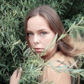
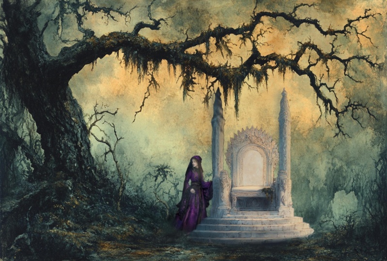
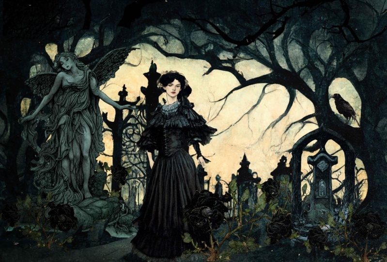
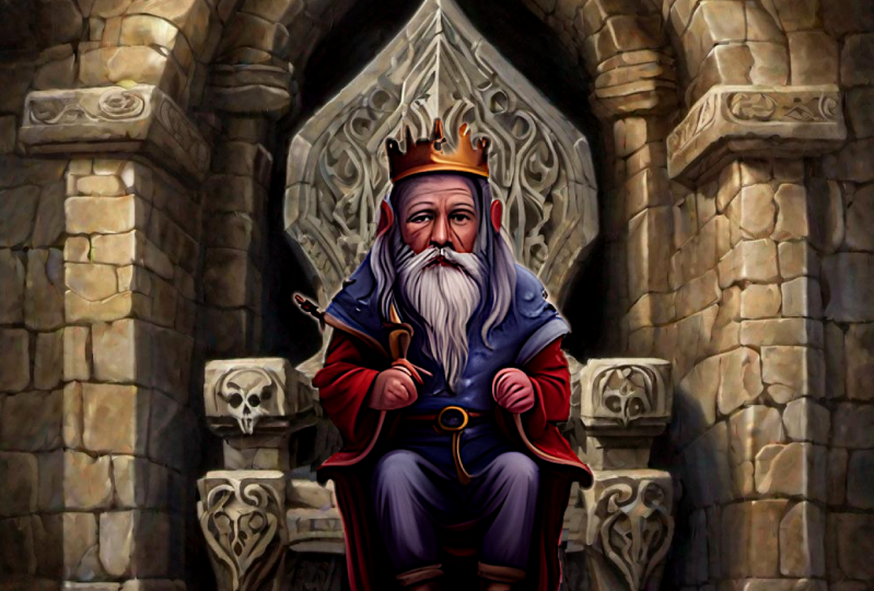
1. Introduction to Fantasy Art with Midjourney: Hi, I'm Vanessa. Welcome to my Skillshare course, fantasy illustration
with men journey. Now I know what you're thinking. Doesn't mid journey just
make the images for you? The answer is yes. But if you want the
best images possible, the ones that you were actually
imagining in your head. It's not likely that mid journey will render
exactly what you want. And so this course is to teach you how to use
mid journey more as a tool to get to the final
result that you truly desire. Or maybe you're not even
sure what mid journey is because this is
new technology and MIT journey is a
chat bot through discord that generates
art via text prompts. You sign up for this service. You get your own private
chat room and you can type in the image
you want e.g. a. Ferry sitting on a
mushroom and then mid journey will generate
to the best of its ability, what it thinks you're after. Cool, right? The problem with mid journey is, well, there's multiple problems. But maybe the first one
that you'll come across is that it is a computer and it doesn't completely understand things the way that we do. So quite often, it will generate things that
don't really make sense. People with strange proportions, hands are really blobby. Eyes tend to be kind of weird, and so on and so forth. So you can literally
sit for hours and tweak your prompt to try and generate a good image that
you can use on its own. But it's very difficult, especially if you're looking to make a fantasy illustration with many details and
setting, wardrobe. Another problem with my journey, because technology is there's issues around copyright
and as an artist, That's a big deal. So basically right now, they're saying that you
pay for the subscription. You own that the
images to do with, as you will, however, that doesn't necessarily grant nude the copyright because you did not physically paint
the image yourself. There was in the court's
eyes, very little, little minimal human inputs
into that piece of artwork. Well, that's kind of getting developed on the
cord side of things. It makes the usage of what
we generate difficult. I myself like to submit a lot
of work to stock agencies. Stock agencies aren't
readily accepting AIR. I'm not sure around the usage terms of any of
the other art generators, but I do know that
mid journey gives the images to you if you
are a paid subscriber. So that does mean that
there is a free trial. You can generate, I
think it's 200 images, which sounds like a lot, but it's really not due to
the way that journey works. And then it goes
up from there to a ten dollar a
month subscription, 30 dollar a month
subscription and so on. So in this course, essentially what I'm
going to be teaching you to do is to render multiple different elements for your fantasy illustration and combine them in a
photo editing app. I will be using Photoshop, but if you have a
different editing app, a lot of them will work. So here you can see some
examples of what was rendered and what I created with these rendered
elements afterwards.
2. Rendering your Images in Midjourney : The first step in creating our fantasy illustration
is to actually render the elements that we
want to use in mid journey. So here you can see
that I have brought up my image journey
chat in this chord, and I'm going to share
my settings with you. These might vary
depending on what particularly you are working
on and your preferences. But I have the MJ version three, style, high, high-quality,
two times the cost. However, most of the time
I'm usually in relaxed mode, so that's not a problem. Fast mode for this
video because it can take quite awhile when
you're in a relaxed mode. Regular upscale public mode, because it costs more money
to have a private chat, as well as the re-mix mode, which you probably
will want to have enabled because
it will make this go so well and help you keep the consistency
in your elements. So to begin generating
our images, we have to first type
four slash imagine. And that will create
a prompt box. First to type in what it
is we're looking for. Now you can do this in
any order that you want. I prefer to kind of set the stage by prompting
my setting first. So let's say that I want to create a evil fairy,
deepen the woods. So my setting will
be deepen the woods. And I can add whatever
details I think I want to that and start
crafting my prompt. Now when I'm at the
end of the prompt, there's going to be a section that I recommend you add
to all of your prompts. And that's going to be
your stylization or specific prompts to help keep each generated element
consistent with the style. So you're not going
to have something that's a pencil sketch over here and something that
looks like water or painting or oil
painting over there. And you're trying to
mix them together. That might be cool. But for this, we're trying
to keep it the same. Which can be difficult with my journey because
it can be so random. I will teach you how to do
that and my tips for keeping your elements consistent when we get to the end of the prompt. So I am looking for and illustration of, let's say, the enchanted forest. Then it knows that we're looking
for something magically. I also do start my prompt, usually with an illustration or a painting or a photograph, depending on what I'm
trying to create, as well as ending
it with the same, then everything in the
middle just kind of changes. But we want it to be spooky. Read be hanging
moss, dark, damp. Now, here's the part
where we put in some prompts to help us keep it consistent
when we move forward. And what I'm going to
write here is I'm going to type in muted colors so that the image will pop up with subtle colors and not
bright vibrant colors. And I will put that on all of my images and
it just kinda gives it the color directions so that when I want to put
these pieces together later, I have less color
correction to do in my photo editing
app, muted colors. And the next thing
that I want to do that I've already mentioned
that it's illustrated. But one thing that you
can do with mid journey is you can reference
other artists. And it will try to create the image to look like it was created
by that artist, e.g. now, this can be problematic. I know for sure and I'm sorry, I can't remember the name
off the top of my head. But there is an
artist that a lot of his work is being used
to teach mid journey. And lots of majority
proctors like to put his name in there
prompt and they get very similar
images to his work. So I think he's actively trying to do
something about this. And ethically That's
kind of up in the air, how people were going to land. So my advice here is to use an artist that has
passed away, long gone. The artist that I like to
use for this reference is an actual fantasy
Illustrator. His name is Arthur Rackham, and I love his work, but the most important
thing here is that his work is so old that now
it is in public domain, which means that essentially. I think anything created after a certain date
every year it changes, but it's somewhere
in the 1920s now things that were created
before the 1920s become public domain and are accessible to other
people to use and remix and whatever without
any copyright issues. If I want to reference work
that was created pre 1920s, There's not going to be
any legal issues there in the coming years because of
developing copyright laws. Around mid journey. You can follow that
advice or not. That is just what I do for
myself because I don't know what's coming in the
legal realm of generating art. And I want to keep it as
clean as possible for myself. So I will be using Arthur
Rackham as my reference point. You can use him as
well if you'd like, or you can find another
artist that suits your needs. Alright, so now I take
in the style of Arthur. Welcome. And here's where I
type in my ratio. Typically I'd like to make my background's
horizontal landscape and that will give me
more of a stretch. I feel like composition wise, mid journey knows how to
lay out a scene better. If I give it the length wise, I can always crop it later. It's just a preference. But to do that, dash, dash AR, this is for the ratio 32. I'm going to hit Enter on that. Now, mid journey works in steps. A lot of steps. If you're trying to
render, I don't know, eight or ten elements
for your images. You're gonna go through quite
a few different renders, quite a few different steps. This is not as instant the Internet would
like to make you believe. But we're getting started here. As we can see, we have some deep dark
forests rendering. And although they're blurry
as they start to come in, I'm already liking what I see, the color tones than moodiness. It's all going very much in the direction that
I wanted it to. Now we can render more
than one thing at a time. It does kinda make it slow
or put things in queue. But while that's rendering, we can start to
think about, Okay, what's the next thing that we want to have in our
deep dark forest. And so I'm thinking
an evil fair eight, but we don't want to just have an evil fairy want to
really paint the scene. So let's say that she's
like the evil fairy queen. The queen needs a throne. So let's go ahead and try to prompt a throne fit for
an evil fairy queen. Again, imagine, I'm going to start
writing my description. Illustration of a
throne made out of, I mean, we could go all Game of Thrones and make it
swords or something, but I really want to
keep this natural. So let's go with like say, Well I'm thinking trees, but that might blend too
much in the background. Let's go Stone,
made out of stone. Let's describe it a
little bit further. Let's say it's ornate, detailed skull did symmetrical. What color should we make
this dome? Let's make it pop. Let's make it a whites, because everything else
is gonna be pretty dark. Weight. Ornate, detailed,
sculpted, symmetrical weights. Rock in the shape of a chair just to double makes sure that
it knows what we want. And also in the style
of Arthur Rackham. Now, because I'm trying
to prompt a throne which typically is more of this
shape than this shape. I'm going to change the aspect ratio so
that mid journey has the appropriate ratio for the composition that I want
it to try and create in. None of this really matters because we're going
to be changing. The image to be whatever
ratio will be one later on, It's just that when it's
trying to lay out its images, trying to prompt a throne
that goes this way into a aspect ratio
that's lengthwise. It just doesn't work as well. So I switched back and forth depending on the element
that I'm rendering. So now that we've
hit render on that, let's take a look at what we
have for these backgrounds. And I love all of them, but I'm trying to envision pieces like I'm putting
stuff in there so I don't want it to be
too busy or I want areas that are gonna make sense
if I put something there. And two of them look like they
have paths in the middle. And I like that
because that would be a natural spot to maybe
put a fairy queen. Whereas the other ones don't so much look like
it's got a natural spot, so I've already narrowed
it down to two. Now, between these two, I can't really tell
which one I like best. I think I'm going to
render both of them and then that will give me
options moving forward. So I'm going to go with 2.3 and I'm going to upscale those two and
we'll see what we get. We have Thrones that are
already starting to render. Now, these don't really have any colors to them
and that's okay. Remember I didn't, I didn't put in this prompt muted colors. If I hadn't, maybe it would try to fill it more with colors. However, I wanted the stone itself to be mostly at neutral. And because I'm not using any of the background elements
of these Thrones. It doesn't really matter
that these stones turned out to be
neutral renders. Now the bottom corner one
is not a full thrown. So I think that one's
out already because I'm going to want the full
thrown to be in image. I'm leaning towards
the first one. Alright, so we have our
throne and we have our. So I'm thinking
maybe what we can render now is our evil fairy. Now I typically
rendered the person separately from the
outfit or dress. Because I find that when I
tried to render both together, I either get a really
good face and mushy, weird kind of blobby outfit or a really cool outfit and
mushy, weird blobby face. So let's start with the outfit. And if I describe
a specific dress, like if I want to type in historical Victorian level blah, it will do a pretty good job rendering something
along those lines. So before I type that in, I think I am going to do a
quick Google search just to get some prompt words that will help along the
lines of creating a dress that is
actually stylized, something that I like rather
than a random blobby dress. Alright, so I found
here a curdle dress, which is something that
I've never heard of before. But taking a look at it, it's very medieval
fantasy looking. So I'm going to try
this in my prompt and we'll see if it does a pretty good job
creating a curdle dress. An illustration of a hurdle, medieval curl dress. Okay. What color do we
want to dress to be? Detailed? Texture and deep purples. In the style of Arthur Rackham. Dash, dash again, address
vertical ratio 233. Okay, Well that is
rendering our dress. Now it's time to take a look at what we have happening with our setting and are thrown and, or thrones are completely done. They look kinda funky. But let's scale that one. And we have both of our
backgrounds, our upscaled. So now we have the option
to premaster them. Now while I actually just
liked them as they are, but I always hit
remastered just to see what else it comes up with. It might be something better. I don't always love the premaster option when I'm trying to create illustrations because sometimes it takes it more into a
photorealistic realm, but it's worth checking out. So we have our remastered
backgrounds, we're rendering. We have our stone
upscale rendering, and we have our, we have our girdles rendering. One of our backgrounds
is done re mastering. And I have to say,
well, it's cool. It actually has less color and
stuff then the other ones. So I don't think that
I'm gonna go with the remastered option
for this background, but we'll see with the
second one looks like. Alright, here's our
second background. This one is starting to
look a little bit swampy. We again have lost
quite a bit of color. It looks very neutral
and our path is gone. It looks like water. I think I'm gonna
go back and look at the remastered images and decide between the two which
ones I want you to use. And I will upscale
them to the max. I decide on this one. I like this one. It looks like it's
got some thorn bushes happening in the background. It has our path. It looks very much in the
style of Arthur Rackham, which for consistency reasons
It's important to stick with that has more color
than the remastered version. So we have our setting
figured out and it's upscaling to the max setting
is done, are thrown. We can also try to remastered. So let's check out what
the throne looks like. Well, it's remastered and
decide between those two, which one we want to use
in the final illustration. Now our curdle dresses
are ready to pick. Let's take a look here. Three out of four of
them are full length, which is what we're
looking for because we don't want to have
to proper image. The third image in the
four is very close up. It just looks like fabric, so we're definitely not
going to pick that one. We can upscale all
three of the ones that are full length and go from
there to see what we get. I do really like the
purple color of these. They were not too dark, which is good because
we're going to want our various stand out against
the dark background. Okay, we have our
remastered throne and I actually like it
better than the other ones. So we are going to go for the remastered
image on this one. So I'm going to upscale that one and our throne will be done. So now we can actually
start thinking about our fairy queen herself. Now when I think of Evil Queen, she's gonna have like long black raven hair and kind of moody
mysteriousness about her. Now we don't need the
full length of hurt. We want MID journey focus on
her face and her features. Rather than trying to
render a full body, we want something
that will be able to combined with the full
body of the dress. So I'm just going to be
aiming for like a portrait. Maybe chest up, maybe
even shoulders up, is all we really need for the Faerie Queene
so that we can get a high detail in the face
for our illustration. Now while we craft that prompt, we can really master these
purple dresses and see what we get with those. Alright. Imagine. I just wanted to note that if you want to make it
easier on yourself, you can render your person to have short hair or
Heron and up do. It makes it easier
to cut out later. Midtone does like to do a
lot of the flying around hairs which can be a pain in the butt
to try and crop out. It's a preference thing. Just letting you know tip. If you don't want to spend
a ton of time masking out hair to request
that has their hair up. Let's give her purple
eyes to match her dress. Now I can't guarantee that mid journey will
follow this instruction, but we can try mysterious
purple eyes and long black hair and steely in the style parser rock. Let's start beautiful
in there somewhere. Portrait of a
beautiful fairy queen. It just makes it pay a little bit more attention
to what we're asking. If we want it to be
beautiful versus nothing, It might think that we don't care what that
element looks like. So now we can take a look
at our remastered dresses. I actually think that this
time re mastering the dresses made them look more illustrative
than the other ones. So that's kind of interesting. Either way. One of them's kinda cut
off at the shoulder, so that would be
difficult to use. We have to redraw
in or clone stamp in the top of the dress
so that one's a Nobel. This one I actually loved. She's standing to the side. It she'd got as you can see, we'll just open
this right up here. She's got a little
bit of a head there, but it's a perfect example
of how the dress looks gray. There's buttons, There's
callers, there's lace, but her face is just not right. So this is what I mean
by by it can do a lot, but it just tends to not
do everything all at once. It can only seem to pick one element and really
put focus on there. So this one's
definitely contender. Even the hands
aren't too Too bad. She's holding something which
means that we will have to render something
for her to hold. That that makes
sense in the image, but that's totally okay with me. So this one is a maybe. Let's take a look
at the next one. The next one, it has the
full dress in the image. It's not cut off. Her hands are up and down her, she's got one leg. It's not the end of the Worlds. I can add a second leg by copying and pasting
that one length there. I think I like the
first one best. She's holding some kind
of basket she doesn't really have hence
for us to work with. And it's just not quite as lovely and detailed
as the other ones. So the second one is gonna be our dress, upscale that one. So now that we've
chosen our dress, this is going to
dictate which image of the fairy queen
herself we're going to be able to use the dress, has her facing to the side, so it's not going to make
sense if we use a straight on illustration of
a face because, I mean, unless we're trying
to go for the creepy has her head turned
in weird directions. But for the most part, I'm not trying to do that. So keeping that in mind, It's going to be part of what I take into
consideration when I'm choosing the image of
the fairy queen herself, the ongoing to use. Here we go. We have our fairy queen. But like I said, she's mostly facing
forward in these images. And that doesn't
work for us now that we've chosen a side
profile dress. So I'm going to have
to re-mix the prompt, which is great because you
get to see how to re-mix. Now, looking at D's, I feel that the first one might be the best as far as
trying to get her to turn her head because it's a
little bit tilted already. Re-mix lets you
change the images. But it doesn't change
it a whole lot. To go with the closest one
already is the best option, depending on what we
can get this to do, we might have to just
completely start again with the prompt and try to have are facing to the side. But we'll see what we
can do with re-mix. To use the re-mix option, we're going to click on B1, which is going to
create variations of our first image there. And it brings up the prompt. Now we can rewrite the
prompt as much as we want. Add things, take things away. And it will still try to keep the output similar to the
first image that we have. So for this example, we really just want her
face into the side. So instead of saying an
illustration of a portrait, we're going to change
that to illustration of a profile so that maybe we
get that profile shots. Illustration of a profile of a beautiful, beautiful
fairy queen. And now we want to
have her again. We want to add as
much as we can to try and demonstrate that we want
her facing the other way. So we're gonna say
facing the other way. Looking to the side. Magical looking woman replies, bubble blah, all
that still good. Let's see if it
understands what we want. We hit submit, and
now it's going to render some new versions
of that first image. Again, she's still not
really looking to the side. It's a little bit
tilted to the side. But taking a look at that and
taking a look at the dress, I think we want her
turned a little bit more. It's not the end of the world. Like we could probably
make it look like she's standing to the side
and turning your head. But I think we would be
better off if we could get it nudged just a little bit. Because this tries to make it so much the same
as the versions. I think instead of using
the re-mix option, I'm going to type an
entirely new prompt with the profile looking away all these things and
see what we get. Matching. An illustration of the
profile of a beautiful. Let's skip beautiful
because now we don't want it to focus
so much on her face. We want it to be from the side. So let's get the beautiful and just say I'm a fairy queen. Looking the other way. Facing the side,
turned to the left. It doesn't matter. We can flip it either way. Then we'll add our descriptions
of what she looks like. I'm trying to put that
at the front because right now we're really
focused on that. And that's kinda
the important piece is to get the direction right. And then it will focus
on what she looks like. Magical woman. I'm going to leave up the
mysterious purple eyes. Again. We don't necessarily
want to see her eyes. So I'm going to leave
that off and it might make it easier
for mid journey to understand that we don't want
to see her face directly, that we want to see
it from the side. Long black hair though.
Long black hair. And see Lee in the
style of rock. Alright, it's blurry,
but I think we got some that are facing
towards the side. So we're gonna be able
to work with that. That is so weird. It was almost done and then it disappeared and
started over again. It might, I've never seen
my journey do that before. Why is it doing? I guess it didn't
like those ones. It's just like I
got to try again. It's too bad. I was going to pick
the fourth one. So weird. I was all prepared to
pick the third one. And then it said it was
100% done and then it spits out completely
different images. This is really weird. I've never seen mentioning did this before. I'm new technology. Okay. I don't love these, but I think two is the closest. So I think that I'm going
to just versions too. I don't need to change anything. I'll just submit and it will try to give me different
versions of that one. That was really bizarre. Really bizarre. I'm so glad I got that recorded because I've seen that before. Really likes free,
She's beautiful. Then the new changer. Okay, well, I'm gonna
remastered three. I'm going to upscale this
and remastered three and it might be what I want, but I might have to keep going. This is the problem
with men journeys. Don't always get what you want. And this is why I
tried to Photoshop and edit things to work well, but still it could
take some time. So if that ends up happening, I will stop the video and
render as much as I need to render and switch around my prompts until I get
something that works. Especially because it
seems to be acting very strange this afternoon and unpredictable and just changing the image is
at the last second. So I don't really know
where we're at with that, but we'll move forward when I finally get our
evil fairy queen. Now taking a look at the image that we
chose for the dress. Now her pose has her
holding something. I'm not really sure what it's supposed to be in this image, but I'm going to want to change
that into what I choose. I'm taking a look at
this and trying to decide what I think could possibly fit
into the same pose. And I don't know, I think maybe we
should try a sword. So I'm going to try and render an illustration of a sword. And if I feel like
that doesn't work, then I might try
some other prop, prop ideas until I finally get something
that's going to work. Basically Record
every step of this. You guys get the gist of it. I'm going to continue
rendering with the same in the style of Arthur Rackham
with the illustration, maybe add muted color if I feel like I need to add
that to the prompt to keep things consistent and remixed three role until
I get what I want. I continued on to also render some wings for our
ferry character. And now I have all of
my elements rendered. They are two ways to save
this to your computer. Click on your image and discord. It brings it up. It
says open original. You open the original. You can right-click
and save image as it tries to save it as a
web file rather than a PNG, which is typically what you're going to
want it to save us. And I don't know
why it does that. So fail proof way of
going to your images is to go to the mid journey website and
take a look at your gallery. So we're going to
go mid journey.com. We're going to look at
our own personal gallery. And we can sort these two
only see the upscale. So here we can find all of
our pieces in our gallery. And we're gonna go through and click on the
ones that we want. And there's a little save icon. And you save that and it will just download right
onto your computer. These save as a PNG file. It's just an image file. I'm not really sure
why they save as PNG rather than JPEG, which seems to be more common,
doesn't really matter. So don't get too
hung up on that. Here I have all of my elements
for you to take a look at. I've got my prompts with the, it looks more like a
dagger than a sword. And the throne. We have our setting and our
pieces for our character. These are gonna be all of the elements that
we will assemble in photo editing to create
our final image.
3. Upscaling your Images : There are different of
scalars on the Internet. I like to use tiny wag.com. I have just never had
any problems with it and never had any reason to
try and find a different one. So that's what we are
going to use today. Tiny well does have
an issue where sometimes if an image is
larger than 2000 pixels, it will tell us to resize it. So you can then go into
photo editing app, resize it to the longest length of being 2000 pixels while
keeping the ratio proper. So it doesn't get all weird and stretchy and then bring
it back into tiny well, so we might run
into that problem. And I'm doing this one
first because I think I suspect this one
might do it exactly. Error. Images over
2000 pixels in height and width are currently
not supported. So I'm going to click Okay, I'm going to just minimize this because it's
going to take me literally seconds in
Photoshop to fix this. I think while I'm there, I'm going to check all of the
other images that I need. Make sure that they are
also under 2000 pixels. I don't suspect that
our background setting will be because if you remember, I chose the remastered version. So this file should actually be smaller than what we saw those wings that, but
let's take a look. Image size. I'm correct. The largest of the two, the width is 1,536 pixels. So this one's actually okay. I can just click and close that because we're not going to
have a problem up sizing them. Now this one is a
remastered one, so it probably will need to be resized image size. Correct? The height is 2,432. So since this is locked here, I'm not going to have
a problem if I just go back and zeros, zeros 00, it resizes, it keeps the proportions proper. I click Okay, and it's
just tiny bit smaller. So control save is going to save it in the file
location that it was. It's not going to
create a new file, is overwriting that one. And that one's done. Now I'm gonna do the same
thing to the other ones, just making sure that
the largest side, whichever whether
it's width or height, it's locked, it gets changed
to 2000 pixels exactly. Say, this is something
that you do a lot. You can create an
action on re-sizing. I would recommend that you do a different action depending on each ratio because you don't
want to skew anything. If, say, e.g. it's a square and
you try to resize it to something that
is a different ratio, that action might not work well, but you can go ahead and
create an action and that will even speed
up the process faster. Now that we've resized our images to be compatible
with tiny while, we know that we
can bring them all back in and use the up scalar. It uploads the file. And now you have the
option of upscaling it two times or upskilling
it four times. Now, depending on
what the image is, I would recommend maybe
up-scaling your prompts to only be about two times because they don't
need to be super huge. They're going to be a small
element in your image. Whereas say e.g. the setting, the background layer,
you're going to probably want to increase
that by four times. So these wings are
a medium-sized, but I think two times will probably be okay for this image. And now we can click Download. And it will save to our
device under a new name, which is the old file
name was tiny wow, added to the front of the file. And then we click start over. We do this for all
of our elements until all of our elements
have been up-scaled. Unless you're doing
the method where you have combined them
before upscaling, and then you only need to
upscale your final image.
4. Assembling Elements in Photoshop: Congratulations, you've
completed the second step of making your fantasy
illustration with MIT journey. Now it's onto the
third step and this is assembling the image in your
photo editing software. I'm using Photoshop,
but I've also done this exact same thing
with procreate. It will help you if
you have skills with photo editing software that
will make it a lot easier. But I'm gonna do my
best to keep it simple. For those of you
who maybe are not super savvy with Photoshop. Now the main things that you're
going to need to do with Photoshop is be able
to mask your items, which is essentially
adding a layer, draw or paint on that will
hide pieces of the image. So this is how we're going to essentially cut out our pieces. And this is the first step in
Photoshop, is the assembly. And when we're done
that you might say, it doesn't look quite right. It's still looks
not very cohesive. And that's the part
where we start to get into maybe
color adjustments, adjustments and stuff like that to tweak it to perfection. I'm also going to show you
guys how to fix or remove items that maybe you don't want there just to clean
up the image a little bit. And we'll be using clone
stamp tools, healing brush, and probably even the
patch tool for that. Here I've brought in all of my images that have been upscaled from tiny
wow, into Photoshop. I will begin by copying and pasting my
elements onto the setting. Here I have copied and pasted the throne element onto
the background setting. If you're using the latest
version of Photoshop, you can go to the Properties panel and
hit Remove Background. And it will
automatically try to cut out the item from
the background. It usually does a
pretty good job. But as you can see here, some of the background
is still in the center. And there's, I'm shadowing that was left
down by the legs here. So these are things that I'm
going to have to take out and mask myself on
the Layer Mask here. This is the layer mask. And what you do is you can color on it with
the brush and either black or white to hide and
remove parts of the image. So it's not necessarily
erasing anything, it's just hiding it,
it's masking it. So that's what a
layer mask does. For this item. If I want to start
taking out some of the pieces that the
remove background missed, I would have my brush tool and I'd be on black because
black is hiding it. And I just go in with my
brush tool and I paint over the areas that
I want to erase out. So now that I have one of my
items completely masked out, I can now drag it around and try to get an idea of the placement that I
want for this image. Also by moving it, I can see a couple areas that I need to fix on the
masking, but that's okay. Now if you link together at
the top there, the sizing, you can change the sizing, play with the size, play with the movement of
where you want it to go and start arranging things
as you continue your image. This time because the
background is much busier and it's not
a blank background. The Remove Background
options not going to work. I'm going to add a layer mask
by clicking that icon there with a little circle in it
down on the layers panel. And this creates a layer mask. And since it's all white, it is showing everything
on the image. So when I want to start
erasing away, again, I use the brush tool on
black and I can start erasing away the pieces
that I do not want to show. While you're working
with your Layer Mask, you might want to turn
off the other layers. You've just click on the little eyeballs on the side there. And you can start to see where there are pieces
that you missed. It can be easier if you fill an empty layer with a super
bright color that will help show up any little
spots that you're missing that you
maybe want to take care of with your layer mask. You don't keep this
crazy blue layer or whatever color it is. It's just there to help
you see what's happening. Here. I've gone into
Filter, Neural Filters. In here there is Smart Portrait, so I'm going to click this on. And it will give us
different options here. And if I just tweak the
I direction by even one, it will basically create brand new eyes and try
to make it look good. So sometimes this
is a quick fix, but it doesn't always work. And with other
programs, like say e.g. when I'm doing this
with Procreate, I don't have that option. So i'll I'll show you
also what else I would do if I don't have the option
to use this neural filter. My image, which is good because it didn't do a
super good job with this. Let's up it a little bit. She looks a little one eyes forward when I was kinda
still to the side, but let's see, I
still didn't do much. Okay, so we're
gonna cancel that. And I find that most of the time when I'm working
with midtone images, one eye is better
than the other. So sometimes what
I like to do is I will go to the last sue, click on the image
that I'm working on, make sure I'm on the actual
image and not the mask. I will select, the better I will Control C copy,
control V paste. And now I can move that
copy over here and Control T for transform and
start changing the size. I can flip it. I can do whatever I need
to do to make that I match a little bit more
and enjoy her face. So let's see that I
liked it like that. Now I can add another
layer mask to this eyeball and
start blending it in. And there you can
see that now I have two eyeballs that looked a
little bit more similar. If I really like how
that looks and I'm satisfied and I don't
need to make any changes. I can merge this layer
down onto the layer of her face just to keep my layers a little bit
more clean and tidy, but that's a preference. Okay. So looking at her head, we fix we have fixed the one issue of her
strange eyeball, and now we still have a couple
other issues to look at, which is the top of
her head has been cut off, a piece of hair. And then the issue of I did not mask out the entire
bottom of her hair. So let's start with the top
of the head and the hair. Now looking at this, I still have my mask here. And let's just pretend that
I'm super happy with my mask. I don't need to make
any adjustments. I'm going to right-click and I'm going to apply a layer mask. Now the reason why I'm doing
this is just so that when I move on to the next step
of filling in her head, I don't have to remember where the layer
mask is or isn't. Because maybe I'm
cloning something, but the layer mask is been colored there
and it's hiding it. This way. I'll know that
it's actually really Philly actually filling in properly there and that I'm not
having any issues. As well as now I will
have the option of masking anything that I
clone stamp into this layer. For this particular image, there's different options
you can go with here. But for this particular image
and these particular areas, I'm going to be using
the clone stamp tool. It gives me a lot of control. And I'm basically
just going to clone, stamp the area out
and taper it a little bit nicer so it doesn't
look so chopped off. Okay, so now that
I've added a bit of length to that piece, this is where I can now add a fresh layer mask and go with my black brush and give it a better shape
because it's still does kinda just
look like a chunk. I don't super love how
straight this has turned out. So something else that I can do is I can add this layer mask. I'm just going to select
this specific area. Then I'm going to go
into Free Transform. And I'm going to click
this little icon up here for warping options. And now I can just grab
one of these points. Drag it a little bit to give
it more movement rather than just a chunky piece of hair. They don't want to move
it too much because the edges will
start to separate. But I will purposely
leave this separated and show you how to fix
that if that happens. So this is looking like a little bit more
natural of a wave, right? Okay, Let's say yes. Now we de-select that. Oops, I've got this
weird piece missing. I'm going to again use the
layer or the last sue tool. Select this area as
closely as I can, making sure that I'm
on the correct layer. I'm going to right-click
within the area fill. And I'm going to fill
with content aware. And that will usually do a pretty good job of just
kinda connecting the dots. It's a little skewed here. But on the whole, I can fix that with clone
stamping and stuff. But on the whole of things, once this image is done, this tiny little piece
of hair is going to be completely on noticeable, especially given the texture
of the regular hair. It's fine. We zoom out. Now this piece of
hair is more of a flow rather than
a straight trunk. Now I want to rebuild
the top of her head. Before I do that, I'm not actually crazy about this hair piece that she has. So I'm going to take
that out before I rebuild the curvature
of her head. And to do that, we can do the exact same thing as we did with the blue line. We can select it and we
can Content Aware Fill. I love doing that when
it's larger piece or it's a piece that needs lots of
lining up like this did. If it was a small piece, something like clone stamp, or even if it was just one line, the Healing Brush Tool could
also do the same thing. So it kinda messed up. I maybe I didn't catch
it when I did it. It's got a little corner here. I can use multiple things. Again, the healing brush tool, the clone stamp tool, and this is the Patch Tool. I'm going to use it this time. If I'm trying to preserve texture like there's
texture in this hair, I might use the Patch Tool over something like the
Healing Brush tool, which I find creates
a softer results. So now we've gotten rid of her hair piece and we can
start filling this in. And I'm going to
just do that with the clone stamp because
it's kinda like drawing with the texture
and color of your image. So I'm just going to
draw in a curved area. We already got a little bit of curved area when
we did the clones, are the Content Aware. Now this edge is not as harsh or as strong
as the other edges. So I'm going to up the
hardness a little bit and just kinda go over the edge again
to make it a little bit cleaner of a edge. And that's looking more natural. Now you're wondering
about the bottom here. Now this is only going to work because her
hair is so dark. If I had rendered
this exact woman with this color background and
she had silver hair e.g. or blonde hair e.g. what I'm about to do
right now will not work. And essentially I'm going
to be using a blend layer. Let's get rid of these
and bring up this. Our background layer
is pretty dark. It's darker than this
paper color here, but it's not totally
as dark as her hair. So if we create a copy of this section by last
suing that area, control C, control V. Let's turn this woman
off for a second. Now with this layer, we can set it to darken. And as soon as we hit darken, you can tell that
it's not perfect, but it's pretty close. It will only darken the hair areas and we can't see where the
lightened areas are. So I'll do that
again, Normal darken. So instead of having one
layer of this woman, I'm actually going to combine this bottom half
with the top half of her. If I line this up properly. We've lined it up properly. And now we create a
clipping mask for this. And we start to erase out
the white areas where the, I don't know,
creamy paper color. With our mask. We should only start to
see this showing up. Now, like I said,
this is only working because I chose a
ferry with dark hair. Don't go too far
and make sure that you have that as well. So now I have her on two layers. We're going to want
to link these layers so that when we move her, the hair doesn't get
separated from the body. E.g. we want these
to stay together. So I'm going to
click on the layer, shift, click on that one. So now I've selected both
of these, right-click. And I want to, we can
either link layer. Yeah, let's link layers. I was going to create
a separate group, but that's not necessary.
We can just link them. And now these will act as
one layer wherever they go, even if you want to
control T, transform them. We have our woman with
her more faded hair. So it's not perfect. Let's zoom in and take a look. Especially depending on
where she is in the image. Because the trees are
darker than the hair, so it starts to look like that. However, we will leave that for now and fix it if it becomes
an issue in the future. When we look at this, ideally, her head is going
to be on her body. So let's flip this
image to face the head. And we're going to
shrink it down. And as long as the
hair is darker than the dress should blend. Okay. So that actually fits
pretty good together. You would never
know that that had was not originally part of the body aside from maybe
the skin color on the hands, but we can fix that later. So I'm gonna leave
that the way that it is and move on to
something else. Now, I've layer mask all of my elements and now I'm ready
to start arranging them. As you can tell, I've already
put together my fairy. She has her wings, she's holding her sword. Her head is on her body. She's looking pretty good. And I've got the throne in the background on the
thrones way too big. So we're going to Control T
and transform thrown size. So we just want it to
look like something that she can sit on properly. I did want it over in
this background area. Kind of wanted it to
look like it fits. Okay, she's covering it. So what I can do
now is instead of just linking the
head and the body, I can link her with her wings and her sword and everything and move
her as one piece. So let's see, this is our sword. That's her bottom hair. It's her head dress. And the wind pieces. I did a similar thing with the wings to get a
darker tail on them. So I'm going to click and
select all of these pieces. And then I'm going
to link layers. And this is our ferry. So now we can move
her as one piece. I can hover over here walking
towards say, her throne. Or I can hover on
the other side. This is where I can play with
composition a little bit, or even decide if maybe there's something
else I want to add, like looking at this
the way that it is, I'm thinking it might
be cool to maybe create a Fairey Prints and have him standing on the
other side, e.g. or anything else
that comes to mind. But right now, I'm just going to decide on a composition
for these elements. And I really do like the
throne in the middle. I want this path to look like it's coming
up to the throne. So we're going to
leave that there. And now we're going to decide
where we want to put her. Also, I can flip her. So let's go ahead
and flip her facing the other way and see if
we like that as well. Looks like she's maybe
walking away from her throne. Her sword, kind of
just standing nearby. I kinda like this. Another
thing that I like to add to these images is I like to have an
animal companion. So that might be another
item that I have over there. If I felt like I wanted
to add more things, I could also add more trees or mushrooms or details into
the setting as well. But for this, I'm not going
to go back into MIT journey. We're just going
to keep it as is. And now we have our
assembly complete. However, we're not
completely done. Taking a look at these images,
we're going to zoom in. Now the first thing I want to do actually is fixed her sword. Because their sword
is just kind of. Sitting right on
top of our hands. And what I want it to look like, if we close eyes on this
sword, there we go. This hand is a little weird. This one does look like
it's gripping something. So what I'm going to do
is I'm going to mask the sword so that it's still
lays over top of this hand. But it looks like she's
holding it with that hand. That is a little fix
that we are going to do. I'm just going to erase
it away so I can see the hand and then fill it
back into the little lines. It looks good. Okay, so now she's holding this word rather than just
having it float there. I like her being
clear and sharp. This throne is supposed to be a little bit
in the background, and it's much more clear
than the actual settings. So I'm going to actually
blurred this, just a touch. I forgot to go in and
erase this corner. So I'm gonna do that first. I'm going to take a
close look at what's happening on the side here and tried to get it somewhere
in-between here. Her because it's going to
be mid-range in depth as far as I'm concerned in
regards to this image filter, we're going to go to
Blur, Gaussian Blur. And there's a slider here. So it went to 5.6, which must have been the
last one that I did. And it is much too blurry. It's blurrier than
the background. We don't want that, so we're
going to bring that down. And we're just going to keep bringing it down until we feel like it's a little bit
cleaner than the background, but not as sharp as her. So to 5.5 is looking okay. Let's try just to go with 1.5. Still feel like that
was too blurry. Now what you can
see happening here, and this is my bad, is you can start to see
some edges pop up again. So I'm going to hit Cancel. And I'm going to apply my layer mask because
what's happening is it's ignoring the layer mask and it's pulling in the edges from
underneath the black. So if I apply the layer mask
and now I go do my blur, we're not going to have that
problem around the edges. The edges are nice and just regular blurry like
the rest of the chair. So that's how you fix that. That's 2.2. Let's try. I don't know, 1.81, 0.8 is looking to me like on par with
the background blurs. So actually, no, I think it's okay because
it's highly detailed. 1.8. I'm happy with that. Okay. I'm pretty happy with this. The chair doesn't
look super blended, so I might want to go in and
add some shadow underneath here because it
does look a little bit like it's just
been of cut and paste. I'm going to create
an empty layer. There's multiple ways
you can do this, but this is just one, Just like anything I'm
showing you rarely, this is just one of the ways that you could go about this. I'm going to color pick maybe one of the
background bottom layers. Let's go with this dark green. I'm going to bring
the opacity way down. I'm going to make sure
that it's a soft brush. And I'm going to play
with the blending modes. I'm going to paint
it in first and then choose the blending modes
that I liked the most. Let's go a little bit higher just to kinda create a shadow. But we still want to
see the texture and the details in the illustration of the setting background. Because if we just haven't on, say normal, let's pull
this all the way up. We just have it on normal. We all sudden have a smoothness that is not
in the rest of the image. So by changing the blending
mode up here to say multiply or maybe overlay, or something like that, we'll start to see more
of the image underneath. Now, even though I did
this in 100% brush, we can now bring the
opacity down here, instead of using opacity
on the brush and fading it to a more suitable range. I like to do this well, it's
zoomed out so that I can get an overall look of
how the shadows should look compared to
the rest of the image. Now I did that quickly. I don't love the shape. So I'm going to lay your
mascot and I'm going to tweak the shadows a bit. This piece kinda looks like
a root that's jetting up. So that would come up
in front of the shadow. Line that up nicely. So sometimes just
adding a simple shadow into your illustration
where you have put an element will help make
it blend so much more than it just kind of randomly
floating in the image. I'm happy with that her dress
is long enough that if we needed a shadow for her, it will mostly just kind of be really underneath the image. So let's go like this. They're like, It's really easy when you're
just using a dress, you just darken the bottom, underneath just to touch. Now the other thing
that I want to do, because I've made no
color adjustments or lighting adjustments
at all to this image. These images are how they
came out in mid journey is I wanted her to be purple. And I did the dress first. And I would say
that this dress is more of a magenta color, but I actually like it
more than say, the wings. But I don't love them together. So I want to tweak the wings
to look more like the dress. So here's my main wing image. And if I go down
here to this icon, which is like a half
filled-in circle. I will get all these
adjustment layer options. I'm going to go into
the hue saturation. And then up here in layers, I'm going to clip
that to this layer. So it's only changing the wings. If I didn't clip it, it would change everything beneath it. Then here I can just pull on this slider and get a tone that is much closer to the dress so that it
doesn't blends better. There's also saturation
and lightness in here. I don't typically
like to use this to adjust the darkness and
lightness of an image. But I don't mind using the
saturation a little bit. So let's say it
was too saturated and I needed to bring it down. So it came up like
that for some reason. Then while I'm making
my color adjustments, I can also play with this here. But because we did certain things in mid journey to get very consistent style, there probably will
not be a lot of color and tone adjustments
and needed because it will render it in a consistent style using
the prompt that we gave it. One other thing is I
feel like this throne. I did want it to be brighter and be able to
stand out a little bit. But I think I might play with the tones and maybe
colours of that too, just to change how
this is looking. So let's add some layer
adjustments to this. And I don't specifically
know what I wanna do here, but I just know that I
want to do something. So experiment. Oh, I forgot to clip mask that. This is what I'm
talking about when you don't add a clipping mask. There we go. So now I've
clicked it just to the chair. If I pull the saturation down, I actually like it
less saturated. It makes it more different. The yellow backgrounds. And like I said, you can change the lightness
and darkness here, but I find that it does
it in a very flat way, which I don't like. So I think I'm just gonna do one kind of test on this and see if I like
it in another color. I think if we have a slight I don't want it yellow
like the background. If we have a slightly
red tone like her dress, she kinda matches
it a little bit. But red is also opposite on
the color wheel of the green. So it does make it
pop a little bit more even though it's faint because we've brought the
saturation down. I've adjusted the
saturation and the hue, but now I want to play
a little bit with the lightness and darkness. We could do brightness and
contrast levels, curves. It's really a preference here. I really do like to use levels because it's
a sliding scale. I find it easier
than the curves, which is like the
kind of graph style. This is your mid tones. Again, we need to
layer, layer clip it. This is your mid tones, highlights and your dark tones. So we don't want to
go too dark with things because it
won't match the image. You can see that the blocks in this illustration are not true, true blacks there, a flat black. So we're going to keep
that kind of low. But as far as the mid tones go, we can bring those up. We just don't want
to surpass anything that's already
highlighted in the image. And we also don't want to get so low that it also starts affecting the blocks
again, like I said. In this way, you can
have a lot more control over the lightness and the darkness and the
mid tones of the image. Without that flat look
that I get when I use the brightness or whatever in the hue
saturation layer. So I like this a little bit
dark, but as you can see, it is bringing the blacks
a little bit too dark. So down here, we also
have the option to kinda flatten things
out just to touch. And that will make it
blend more with the rest of the image. It's
all to the eye. There is no specific number
outputs that I can tell you. It's just eyeballing it
really and trying to get something that looks good
with the rest of the image. So I'm gonna go with that. Even though I've darkened it up. And I also added a color, is still stands out
because the color I chose is in contrast to the
green dark into that. But I put it in kind of a light area so it
still stands out. And I'm okay with that. Now I'm really starting
to like this image. It's coming together nicely. However, I do feel like I've got too much space over here, so I am going to crop it just a touch and really
using the rule of thirds here. So I want her, she's
our main focus. I want her to be in a spot that's going
to grab our attention. So let's go with this
cropping. I like that. Now there's really
nothing else that I'm wanting to change to this image in regards
to the assembly of it. So one thing that I like to do to help give these images a little bit more of
a consistent feel because as you can tell, they don't have
the same textures. This is quite a bit
smoother than say this. This has texture, but
it's a little bit bigger. And in an effort to make it
blend a little bit better, I like to add layers
of textures to the final assembly
just to give it a little bit more
consistency overall, you can find different
textures online. Places like pixabay.com has free images that you can use and you can type in textures. You can try to generate them. In MIT journey if you want, you can go to my gum road shop and
purchase some, if you like. There's so many
ways that you can get your hands on
different textures. These are just ones
that I've created. So I'm going to pick a
watercolor texture here, and yes, they are colored. But if I D saturate
it and turn it black and white in Photoshop, then I will not have any
issues with color changing, but you never know you might
also like the color change. So let's select all of
that copy or Control a, Control C to copy it, and Control V to put it on top, Control T to transform. Let's zoom out. Let's move this guy around. Okay? And we can start
playing with blending layers. So let's put it on soft light. As you can see, it just
adds to the whole image. Now I haven't changed the color. So if we like this, it's kind of giving it more of a Twilight feel because it's added a lot of blue,
which is interesting. If we'd like this, we can
leave it or we can change this image to be black and
white and just get texture. And a little bit of tone variation as far
as lights and darks go. Different. Presets and
the black and white thing will give you different
effects as well. I usually just go for
either high contrast read to get the full
effect of this one. Or high contrast blue, which will usually do the
opposite of what the red did, or defaults, which is
keeping a neutral. So I kind of like this, it darkens it up quite a bit, but we can pull the opacity
to a different percentage. And if we zoom in, now it's not gonna do much. I typically do multiple
layers of different textures. And eventually we'll start to
see more texture happening. But if we flip this on and off, we'll start to see it blending
things a little bit more. Let's find one that has
really good, strong texture. Because the watercolor,
it's got some texture, but it wasn't really strong. Okay, this is an image of a
canvas board that I painted. And then I've already converted it back to black and white. And if we zoom in, you can see brushstrokes and the
board texture underneath. And if we want to make
that even stronger, we can go into sharpen,
smart, sharpen. And this gives us the ability to play with these sliding tools
and decide what we want. So let's sharpen it a lot. You can go a little bit
strong here because this is just going to be a see-through layer eventually
on top of our image. And therefore, a little bit strong will
make it more noticeable, which is what we're
trying to do. So I really liked this, the sharpened it a lot.
Let's try it like this. I've added are
sharpened texture to our image and I'm ready to try out some different
blend modes. You can see already
having it on multiply, that there is lots more
texture happening in here, which is applying across the entire image and
adding some consistency. But I don't want it that darks. I'm really loving this. It's giving us more texture, but it's not overpowering. Now, looking at this though, I've realized that one
thing I didn't fix his her hand color doesn't
match her face color. So because I've left
everything in layers, I can go back and fix that. So here we have her dress layer. I'm going to add a hue
saturation adjustment layer, clip it to the dress layer. And I'm going to just
look at the hand. I'm not going to pay
attention to anything else. And I'm trying to match this. D is more softer yellow
tones of her face. This is closer.
I'm also going to bring the saturation
down a little bit. Not much. Doesn't have to be perfect. I think this matches closer
than what it was anyways. Okay. So now I realize I've changed
her whole dress color, but we're going to
do the layer mask. And again, except
this time instead of coloring out this whole area, we're going to click
on the Layer Mask. We're going into
the Properties tab, invert, and it will
hide everything. And now with a white brush, we will go in and
just paint the hand. And they're still looking
a little bit yellow. So we can go back
into our properties and bring the saturation
down a little bit. I bring the lightness
up on those attached. It all depends on if
I like it or not. Let's zoom out, see
what that looks like. It's a little too yellow. We want it a little
bit more orange async. Okay. I like that. I'm happy with that. And then just fix a little
bit of masking. I have to say though, zooming
in on this specific thrown, I'm still not getting
texture that I love. So I think I'm going
to add just texture to just the throne. Here we are. I'm going to find myself
a texture in my files. It's just being like a paper texture because
really this is what the illustration texture
is looking like. So we're going to
find some paper. Nice craft paper. If we zoom in here, this looks
more like an illustration, so we're going to sharpen it a little bit and make
it black and white. And then we will be good to go. I've also up to the
contrast of this to give it more of a punch. So we're going to control a
to select the whole thing, Control-C to copy
the whole thing. And now we're going to
make sure that we're selected the throne layer. And we are going
to paste it there. Now because there's already
other clipping masks there, it will assume that
we want this clip to our throne, which we do. Taking a look at this, I want to try and match
it with her texture. Looks a little bit more on
well, it's pretty close, a little bit on the small side,
so we'll just bring it up to try and get a texture
size that matches. I'm okay with that. Now what we're going to do
is we're going to change the blend mode on it
and it should give, just are thrown a little bit
more of its own texture. See that? It's not looking as
smooth as it did before. And now we're good. And again, you can change your different blend modes to find one that
you like them all. We have completed our image. Now in case you did not complete your image while
you were working on it, I'm going to show
you how to save it in a way that keeps
all of your layers, all of your progress. It's not going to flatten
it down into a solid image, and that's to save it
as a Photoshop file. So we're going to
hit Control Shift S. And because we haven't flattened
it and it isn't layers, it's going to automatically assume that we want to save it as a Photoshop image
so we can title this, whatever we want,
title of your image, title of your image. And then let's go WIP,
work in progress. So we can save this as
a work in progress. However, I am done. I'm not planning on working
on this again later. So I'm going to go
layer flattened image, discard hidden layers
because the hidden layer is that bright blue one that I was using just to check my masking. And now I have my image
complete and done. Now, while mid journey
was giving us PNG images, I prefer to save my
images as jpegs. And the reason for that is
because I typically work with stock agencies and a lot
of them only accept jpegs. There are a lot
of stock agencies aren't accepting this now, but if they do in the future, then it will be in a format
that is ready to go. So evil fairy queen. I'm saving it as a JPEG. I'm saving it the
full max quality. And we're done.
5. Conclusion : Now that we've completed
our evil fairy image, let's just for fun, hop back into discord
and type in a prompt describing our image and see how close my journey
can actually get. Creating what we did with
pieces that it created. Imagine an illustration of a, an evil fairy queen holding an or. Let's go with dagger.
Because really it didn't look too much like
a storage dagger. Made out of steel. Standing in the dark in Shan did forest with a stone thrown in the middle.
What else do we have? Oh, she has that
dress called curdle. Curdle dress. She is wearing
a purple curdle dress. Has large purple fairy wings and long black hair. Oh, we forgot in the
style of Arthur Rackham. It hasn't rendered yet. But I'm pretty sure
it's not gonna look anything like what we
created here today. And even though each
individual piece was created in mid journey, because we took the time to create the pieces individually. It was able to put more time
and effort into each piece. And therefore, the quality of the image
is gonna be a lot better. We also got control over
things like the layout, the exact colors that we
wanted to mix and match. I don't know about you guys, but I already liked to draw and paint and do photography before bed
dirty ever came along. So I am used to having a lot of control over my final image. And for me that was where mid
journey really let me down. Is it felt so random and the things that
it was giving me, we're so far from what I
had imagined in my mind. So for myself, this was
the way that I could still have a lot of control over what I was creating
with mint journey. So pulling up my mid
Journey gallery, we can look at all of the renders that mid-June
and created with the prompt. Using our description of these images are all
cool in their own way. They also, they also have a few problems like mushy
hands, strange faces. I liked how some of them
have multiple people, but this one, you can't even really tell once you
start to look at it if it is a person or not sometimes. Like I said, the process
that I showed you, we'll give you a lot more
control over your results. It's a lot more work, but in my opinion, it's worth it to have an
image that you actually want, rather than spending a lot of time trying to tweak prompts and get my journey to read
your mind essentially. Thank you so much for checking out fantasy illustration
with mid journey. Don't forget to check
out the documents I've provided because I've
given you a list of other illustrators
from the Golden Age of illustration to help you find a style that you like when prompting your fantasy
illustration elements.
 Vanessa S