Transcripts
1. 01 Welcome: Hello. Welcome to my skill share class. I'm guessing Sanders. Color me creo art dot com. Well, today we're going to dive into this mixed media journal page. I'll take you through it, step by step and layer by layer. We'll do some warm ups to learn our flower shapes, and then we're going to create a colorful background with lots of texture, lots of interest. We're gonna put our flower shapes on there, and they really punch it up with some black and white. And we'll finish off our page with a little bit of art journaling, So let's get started.
2. 02 Supplies: For this class, you'll need basic mixed media supplies. You'll need an art journal or some watercolor paper. You'll need Jess. Oh, white and black and white black acrylic paint and then a variety of colors of pain. I have liquid texting away, clean media golden, etcetera, and you'll need some paint markers, white and black for adding shadows. You'll need either pit pins or a concert, and stencils are a nice touch to add texture.
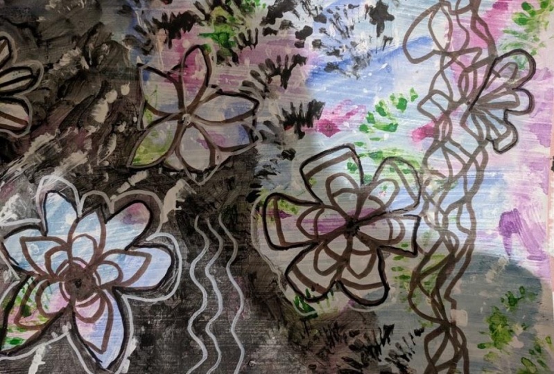
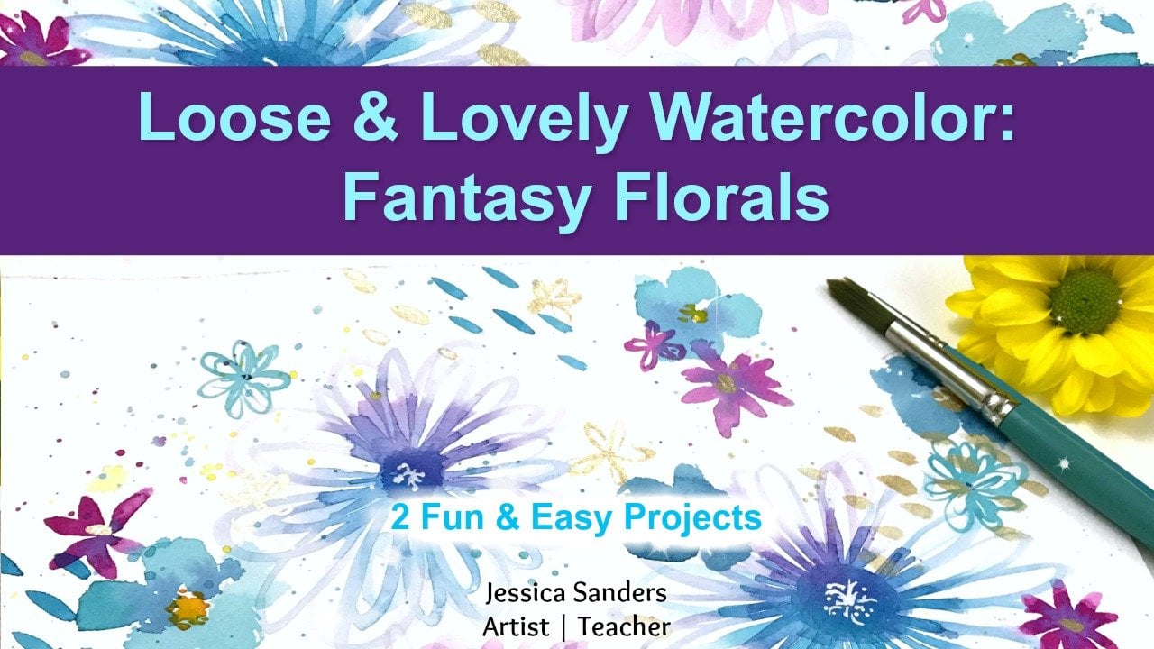
3. 03 Warmups: now let's practice. Our floral shapes were going to do some more months, and I'll show you how to create the layered effect that I've achieved in this article page . So the first thing you want to do is just draw a little circle, and then we'll create sort of elongated oval petal shapes working out from the center of that. Next, we're going to create a second layer of pedals thes. We're going to be smaller and overlap between the pedals we drew in the first place. It really creates a really nice effect when you do this overlapping technique. And then the third layer of this layered floral shape is to create sort of rectangular shaped pedals that are going to go all the way outside and around the first pedals that injury. Now, these don't have to be perfect. They don't have to be completely smooth or they don't have to necessarily be touching. They can be separate. They can be walkie looking. They don't have to be all exactly the same week. We just want to create the idea that this is a nice, big, pretty flower. So there you go. That's the third layer for this particular flower. So try that warm up, you'll get really great results. So for the second flower, we're going to start with a circle in the middle Justice meted before. But this time we're going to make pointed petals. So I'm going to put them next to each other. As I go, I'm curving out and then drawing back in toward the center, leaving that point at the end. And usually about five pedals these air a little bit smaller, usually when I make them. But they can be a large shape, if you like, and then you're gonna put a second layer of pedals between the first layer, so you get this nice, overlapping effect. It's really pretty. Makes such a really nice shape of a flower. So go and get out a piece of paper. You could use a regular pin or your paint pin and do some more money while you're Jess. Oh is dry
4. 04 Gesso Your Page: Okay, So the first step in our art journal page is to Jess of the page. You can use any brand Jessa you have. You can use a palette knife on old credit card hotel key card. You could use a paintbrush there. Plenty of options anyway. You want to put the Jessel on their go right ahead. I just happen to like to use the palette knife, and this one is actually a user cake decorating. But it's pretty fun to use for this purpose. So what you want is a thin layer. Just so what it's going to do is just keep the paint from absorbing into the paper. This journal pay just actually watercolor paper, but I don't want to use the properties of watercolor paper suggest. So will prep the page for acrylic paint, and it will make you where you don't have to use is much acrylic paint, and it's a great surface. Also, this allows you to add texture to your page so you'll see when we get to the end here that I have actually quite a bit of texture from the palette knife, and I really like the effect of that when you're painting. I want to protect the pages that I am not using right now. So I have a piece of wax paper, which is actually kitchen wax paper, that I tour sheet from the role, and I'm using it to protect the other pages. While I'm just saying that I don't have to worry so much about being exactly perfect, not too messy. Aiken businesses I want because I have that protection between the pages. Now we've created some really beautiful texture on her page. Let's let this dry before we go on to the next step.
5. 05 Start your Background: Let's get started in our art journals. I'm turning to the Jessa page that we created earlier. It's already dried and ready to go, and we're going to get started. So I'm going to be using a combination of Dina Wakely media paints as well as liquid text paints. You can use the paints that you have and choose the colors that you enjoy. I'm using a mix of light and dark, just adding it straight onto the page because it's really simple, and I'll be able to use my paintbrush to move that paint around. So what I'm doing is using a dry brush technique. I have a dry paintbrush. I have not been in the water, and I'm just using it to sort scrubbed the pain around in very places on the page. Now you can put the paint where you like. I like to put one color in several different places and then move on to another color, and I will also add whites to bring different tones off the same color of the acrylic paint . So I'm going to speed this section up and you can watch me continue to paint the base layer of the background. Then I'll come back and talk to you about it a little bit more. - One thing to note here is that what I tend to do that we use all the colors in certain color family before I move on to the next. So if you see I used clothes that mixed well and easily together, I'll use the blues and the greens all in one, right after the other in sort of sequence, before I start moving into other colors that don't mix as well, or that create a totally different color with that. So I'm now moving into the red family and I'll do reds and maybe oranges or yellows, depending on the composition I'm creating and pinks. So you also made notice that I'm putting on very thin layers of paint, and I'm getting all of the paint off my brush before I move on to another color. So I just keep working with that paint, scrubbing it onto the paper, painting onto the paper, getting it all off, and then I'll move on to the next color. And there's no color mixing that way, and also the paint dries really quickly. If I want to mix the colors on the page when I can do then is at a small amount of color side by side. So add some of the blue and some of the magenta to get a more of a purple color. As you notice. I wanted to be more blue than purple, so I waited a little bit of the pink and more of purple. So I created, in effect another color with the same colors that I started, which creates a really cohesive design when you're painting.
6. 06 Adding texture: While your background paint is still damp, we can use a stencil and a baby wipe to remove some of the paint. Now, this will not work if you did, not just so the page. So if you skip the Jess Oh part, then find a different way to add some texture to your background. But this is a great way to add texture. We're gonna use the distance away to remove paint with the baby wipes. And then I'm going to just makesem messy texture by scrubbing the pain on with scrubbing some pain through the stencil with my paintbrush so you can see I have the same shapes with the stencil and you can use any sensible you like. This is just one. I like to use the dots, but you can see I have the same shapes in different colors in this way, and I'm repeating the same motif throughout the page, which also makes it a much more cohesive page when you're finished. Please keep in mind that I have sped up this video, and so it's about double speed. So take your time when you're doing enjoy the process, you don't need to rush through I know it looks like I'm going really fast, but I'm not. So once that's done, just dry your page.
7. 07 Add Flowers: So next Let's at our main motif of flowers with our painting. So I'm holding my pen really loosely and drawing these fluid, wavy lines that overlap here and there and just sort of create almost like a fine like shape. And then I added more like very squiggly lines of very loose. If you notice I'm holding my pin at the top of it, not down close. I don't want this to be precise or or rigid. I want to be flowing and loose. And now I'm going to add my floral shapes that we practiced in our warm up. And remember, we're going to be layering the shapes. This is not about perfection is you know you've taken any of my classes. I'm not about perfection. I'm about enjoying the process, and I want you to be able to enjoy the process as well. So hold that pin loosely with a light grip left, adding flow, make loose free marks and layer those shapes together. I'm going to be placing flowers around my page in a way that feels pleasing and organic to be, so if you'll see, I put one kind of on the side there in the bottom, and now I'm moving there. I'll be putting some on the edges that will go off the page, and I will be sort of placing them all across the page in almost a sort of swooping line at to create some visual interest on my page. Now remember, these flowers are are not going to stay completely this way. They may get covered up some of the mega covered up. Some of the may get that painted over, and some of them may not. Some of them may be painted around, so don't worry. If you feel you've messed up or you feel you have a problem, it's OK. Just continue. Almost every piece of art goes through what some artists call an ugly stage. So if you feel like oh my gosh, what's happening? Don't worry. Just continue and take a deep breath. And remember, it's about the process and you're enjoying the process and so continue and at all your flowers to the page. And then I'll see in the next lesson for the next step way
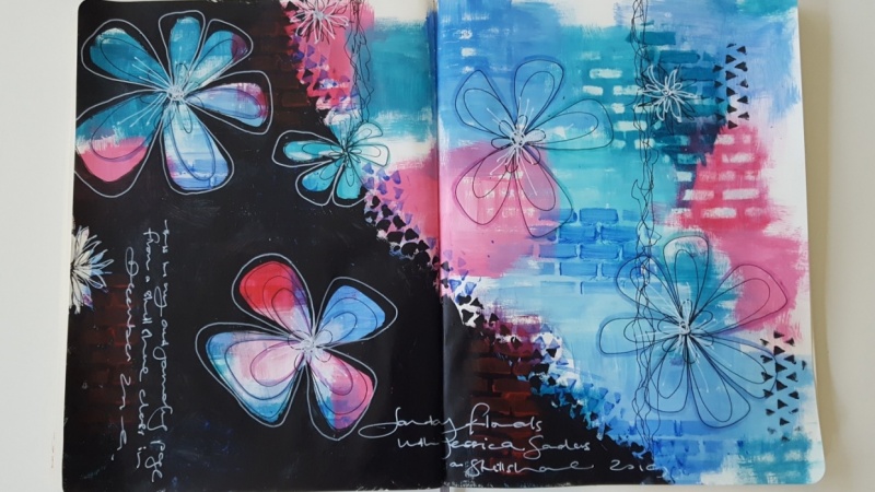
8. 08 Add Black: So next we're going to really pop up this page and make it really, What's the herd? Make it really stand out. We're gonna make these flowers really stand out by adding a black background over part of page, actually over about little more than half the page. We're going to do that by using either black chest so or black acrylic paint. What is whichever you have will work perfectly fine to paint around the flowers. Now I'm not going to be a super picky when I'm painting around the flowers. Is this what I told you before when we were drawing? I'm going to paint around them, But if I go over a line or mess up a little, it's OK. It's not a big deal. It's not going to hurt anything because guess what. The very outer lines are. Flower right now are black, which blends in perfectly with our black background that we're painting. So just relax and pain around the flowers. You can use a smaller brush if you choose. You can paint over flowers that air there if you decide you don't want them there anymore, and I sort of painted partially over the top flowers you could see, but I left part of it. I just again, I enjoy that idea that something is there that you can't quite see. And so I included that when I did my painting around the flowers. You may also notice, in some areas, the black paint this kind of patchy. That's also on purpose. I like to let some of those colors show through. Feel free to make yours as solid and and non patchy as you like or patchy, and I'm kind of creating a diagonal line across the two pages. But if you noticed, when I'm covering up the top corner and I will cover up the bottom corner of the opposite page with the paint, but I'm going to have less and less pain and create sort of a diagonal visual line across there. I'm not worried about covering up the vine shape. I'm going to cover that right up. It goes behind the black and continue that way.
9. 09 More Layers of Texture: and next we can take our stencil, the same one that we used in the background, where repeating motifs were layering want at a layer of stenciling to the edge of the diagonal line that were created with the block. So first I'm going to use the black paint, and I'm going to paint through the stencil again. I'm doing sort of a messy technique. I'm not going to get perfect, distinct lines from the stencil, but that's exactly what I want. If you want perfect lines from a stencil, what you need to do then, is use a sponge and pounce through the stencil with a light coat of paint to create that. But I don't want them to be solid and perfect. I want them to be sketching and loose. So that's why I'm using that scrubbing motion with my paintbrush. I don't have much black pound there, just a little just enough to go through the stencil, and I'm trying to get that all off as I go. Now again, we're using layers, so I'm overlapping the flowers. Some I'm going to add some to the background on the other side of the page where there is no black, too unified my page and bring that black in in that same shape over on that side of the page. Then next we're going to go to a different pink color, so use the background color, any color that you prefer. You can use the pink of the purple, of the blue, or whatever color you use diffused orange. You can use that. I chose to use sort of this light blue teal color. I really like it, and I think it looks nice over the black again. I'm using a light coat the black shows through. It's not really solid because of just the small amount of pain that I'm using. And I'm putting it around the page in different places, just trying to bring my piece together, adding more color, more pop, more layers or texture to be more interesting to you and to me. Actually, it's Meyer Journal, so more interesting to me, but you make it interesting to you. The black was a little overpowering on the top edge of the page, so I'm also using this layered stencil to pull that bite back over. So it's not the main color you see on that top edge, and I will continue to do that in some later steps through the process of creating this page.
10. 11 Shading: Now we're going to add shadows to our flowers. This is a very simple technique of using the color coordinated pip tins to enhance the color that's already there and dark in it, and cause the flowers to pop out. Now, if you don't have the pit pins, that's OK. You can use a simple graphite pencil and do the same technique, and all you do is color next to the edge of the pedal and then smudge it. You can smudge the Pippen, or you can smudge the pencil. Either one will work. So the effect here is very subtle because of the colors that I'm using and you can get a settle or is dramatic as you like, the darker the calorie. Then the more dramatic your shadow will be and the more your flower will stand out from the background. I'm only going to do this on the flowers on the a colored background, not on the black background, but I will add some shadows in the centers of the flowers that air surrounded by black. So I'll let you continue to watch this, and I'll see you in the next section
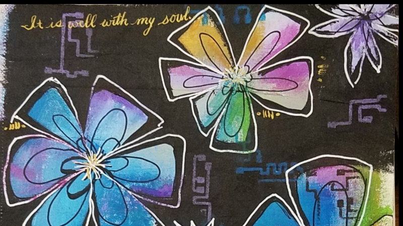
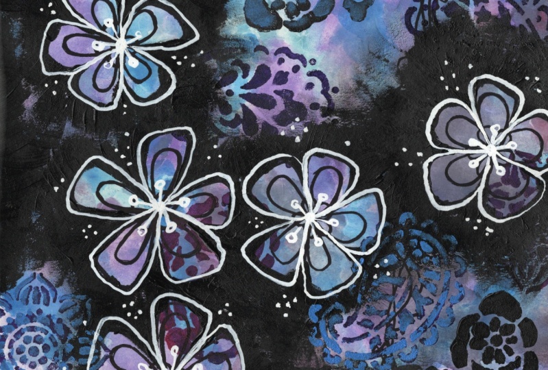
11. 10 Adding White to Flowers: Now let's talk about adding the white outlines to our floral designs. I had a problem with my recording, so I did this on a separate sheet. But I think you can make the transfer over to the journal page. So starting near the center of the flower, draw a rectangular petal shape all the way to the outside of the pedals you created previously but includes some of the black, Really just don't know. It adds a fun element to flower drawing. You can add some details into the middle if you like, and you can continue this on all of the flowers on your page.
12. 12 Journalling: So remember that place on the top of the page where I said there was just too much black? Well, that's where I decided I would add in my journaling with a white paint pin. This is the perfect place to do. It will bring the color, Ah, lighter accent over into that area and some just writing some song lyrics or some sort of journaling. And it doesn't matter what the words are. You write your own words or your own quote, their minds really messy and scribbling. And I just wanted to be sort of artsy and sort of fit into that space, and writing it this way makes me feel almost like it's rain coming down off the page. It fits with the other visual texture. It just flows with the page, and it's not distracting or anything like that. And it's just for me the perfect space for it. But if you don't want to put your writing here, that's perfectly fine. If you don't want a journal at all, that's perfectly fine, too. But if you like to write in your are journal, then this may be a good way to do it, and I'm using that writing to create another area of shape and layer and overlap. I also decided I wanted to add a little bit of doodling to this section. And so at the sort of ends of the senators, I added doodling with the white paint pit. And that was actually a whole lot of fun to do. Sort of a drop shape, maybe a teardrop or raindrop, maybe a few little hearts or something like that. Whatever shapes, you enjoy those of the shapes that you should make. I was making drop shape because this did, as I said, remind me of rain falling down. Now, if you think of rain falling down, my drops are upside down. But guess what? That's okay. It's an art element, and it doesn't necessarily have to be like real lying Exactly. It's just what makes you happy just to what makes you happy when it comes to your art journal, especially because this is for you. This is your time. This is your space to be open and free and expressive, and I encourage you to do that. I added a few more dads. A few more scribbles and this page is finished. I hope you enjoyed it
13. 13 Project and Thank You: Thank you so much for taking this class. I hope you've enjoyed the journey. And I can't wait to see your art journal pages. Don't forget to leave your comments and questions below, and I'll see you really sing.
 Jessica Sanders, Artist | Designer