Transcripts
1. About This Class: This is a quick class with
a really fun project, and that's to create
an intricate, seemingly complex repeat pattern in Adobe Illustrator that's really made from
just simple lines and marks, basically scribbles. Hi, I'm Chris Ruff, and I'm a professional
surface pattern designer, and I've got years of experience licensing my art for
all kinds of products, both home goods and apparel. And some of those
designs have, indeed, featured scribbles or other
simple handmade marks. I'm always exploring
ways to keep my art fresh and to give it a
playful, modern vibe. And one way to do that is
to step back from sort of typical illustration
based patterns and just try exploring, experimenting with
lines and marks. It's really a freeing
way to loosen up and create something that's more expressive
and personal. And that's what I'm going to
teach you how to do today. We'll build a repeat
step by step, and I'll show you how
to hide the seams. So your patterns look
intricate and seamless. I think once you see how simple and satisfying
this process is, you're going to want to make
lots of variations of it. So along the way, you'll
learn how to make pressure sensitive brushes
that'll give your marks a more natural handmade
feel and we'll explore how color can completely shift the personality
of your design. Which opens up lots of
possibilities in surface design. You'll get the most out of this class if you've
already made a pattern or two in Illustrator and understand the basics
of pattern making. If you've never made a pattern, you might want to
start with learn everything about creating repeat patterns in
Adobe Illustrator and then meet me back
here when you're done. Other than that, all you need is a mindset to loosen
up and have fun. So let's go get started and
scribble in Illustrator.
2. Making Fabulous Marks: For all the patterns
you'll see in this class, I use the brush tool
to make the marks. It really is the best tool
in Illustrator to create vector art that looks like it was actually drawn
by a human hand. If you're new to
using it, don't be surprised if your marks look
a little awkward at first. It does take a little
bit of getting used to, but really just like any other new media you might
be working with. So just keep at it,
and eventually you will find your own rhythm
and flow to your marks. Now, you can draw with a mouse if you want
for this class, but drawing with a
tablet is ideal. Not only is it easier to use, but it also gives you the opportunity to use
pressure sensitive brushes, which make your marks
look even more handmade. So let me show you
how to set one up. So go to window brushes. And then click on the
little three lines in the top corner and choose new brush and make sure that calligraphic
brush is checked. Now here we've got some options. The first thing
to think about is whether you want
a round brush or something that looks
more like calligraphy, and you can change it here. Right now, it's set to be perfectly round, and
if we change that, you'll see that the shape
of the brush changes, and we can also
change the angle. But for now, I'm just going
to use the round brush. Right now, the brush is a
fixed size at nine points, and you can change it here and also click here to
give it pressure. Now we have to do
one other thing, and we have to tell
how much variation we want on the brush. So if I choose five, now, if we look up here, these dots are kind of previewing what the brush is going to look like. So in the center is nine points. If we use light
pressure on the brush, then it'll be nine minus five
because that's a variation. And so we would have
a four point brush. And the other way
nine plus five is 14. So our brush is going to be between four points
and 14 points in size. Okay, let's see how that looks. So see how the variation of
the thickness really makes it look more hand drawn compared to the one with the
fixed thickness. So now let's try making one
that's even more dramatic. So we'll click on the
new brush and cigraphic again and this time we'll
make it a 60 point brush, set it to pressure, and let's give it a 60
point variation. Now there's a huge variation in the thicknesses
that we can get in the line from light
pressure to heavy pressure, and it gives it a
whole different look almost like working with
paint or India ink. It really has a paint
brush feel to it. Now, let me reiterate that you don't need a tablet
to do this class. You can use a mouse, but
if you do have a tablet, definitely give pressure
sensitive brushes a try.
3. Creating a Repeat Tile: So let's just dive right in, and I'll show you how
I made this pattern. Now, I know it looks
pretty complex, but it starts out with some
pretty humble beginnings, these little scribbles. Now, I want you to notice two things about these scribbles. First, there's a
whole bunch of them, and that's going
to give us lots of great variety in the pattern, and that helps to make
it look more complex. And secondly, they're
all different sizes. Well, I mean,
actually, the height is pretty much the
same across the board, but the length of
them varies from really short ones to much
bigger ones like this. And that's going
to help us later as we're editing the pattern. So from here, it's
really just a matter of putting them
together in lines. So I'll just take one and then add another and keep going. At this point, there
really isn't much to it. We're just lining
them up and there isn't any specific length
that we're shooting for. We're just putting
them together. Although one thing
I would suggest is when you make
your second row, don't make the elements line up along the edge here because
that's going to make kind of a vertical look a vertical line in your pattern,
and we don't want that. And it might be
hard to camouflage. So instead, just
kind of offset them. So make the edges
of the repeat kind of ragged. And then
just keep going. Now, when I put
this in, I notice it's kind of going downhill,
which I don't want. So I'll use Command
R to rotate it and move it back so it's
a little bit more horizontal. And then
just keep going. Of course, if you come across one that you
don't like, like, I'm not loving this shape, then just skip it, delete
it and keep going. Now I've used them all up. But one reason this
pattern feels so complex is that the repeat
is really hard to spot. The larger the artwork
that we start with, the more hidden that
repeat is going to be. So instead of stopping here, I want to keep going and make
this a little bit bigger. And to do so I'm just going to reuse some of these elements, but move them around so that I'm creating more variations. So I'll take a couple from the top row and move
them into a new row. And I don't want to
move them straight down because might make that might
be obvious in the repeat. So I'll move them into different positions, maybe one here, and this is where it helps
that they're different sizes, so I can kind of fill in
the spaces that I need. So basically, I'm creating
variations of the rows, and we won't be able to see
that in the repeat later. Mm. All right, so now we
have a bigger repeat. We'll look at it and
see if there are any obvious holes or other
trouble spots and fix them. Okay, let's go
with that. Now, we could bring this into the
pattern tool right now. But instead, I'd
like to first create some transitions
between this tile and the one that's
going to be next to it. So I'm going to
group all of this, so I'll right click
and choose group. Now I'm going to move it
to the right and copy it. And I want to make
sure that I'm only moving horizontally,
no other direction. And I'll move it until some of these elements start to line
up like these two here. Now I'm just going to fill
in the gaps between the two. So right now, if I go
into outline mode, you can see that these
are all just lines. And if I click on one of them, it's going to automatically load the same brush that I
use to create them. So now that I've done that,
I'll go back out and use Command B for brush
and fill in the gaps. Now, as I'm doing
this, I want to be mindful that I'm mimicking
the strokes that are already there to make
sure that they feel consistent and seamless
with the rest. Alright, that looks pretty good. Oops. Well, we need
one down here, too. Okay, so now we've made
those transitions. And now I don't need
this duplicate version, so I'll just delete that. So this is the tile that
we're going to work with. I'm going to group
it again, Command G and bring it into
the pattern tool, which is object pattern make. If you're new to
the pattern tool, this is what it looks like. Obviously, here's our artwork, and we're seeing
nine versions of it. So three across and
three tiles down. And that's what this
means down here. Now, we could change that and make nine by nine and it
would look like this, or we could see just one tile. But for now, let's leave
it on three by three. This blue box here
is our bounding box, and that's just the line
that defines the tiles edge. When we bring it into
the pattern tool, Illustrator automatically
makes a bounding box that's exactly the
size of our elements. So they fit exactly within
this particular blue box. But we don't want those
gaps between our tiles. So we can click on
this over here, the pattern tile tool, and now we have handles on
that box that we can drag. So I'm just going to move it
in on either side and the left and right until
our elements line up, just like we did when we
made those transitions. And if I want to check it and see everything
in the same color, I can click down here and
turn off the dimming. So everything is
now the same color. And now let's bring the bona and top so that we close
that horizontal gap. So now, before we finalize this area between the top
and bottom of the tiles, I want to talk about one more tool that we should investigate, and that is tile type. Right now, by default, it's a grid repeat, which means the tiles
are stacked one on top of each other and
also just side by side. So just a really simple grid. And grid repeats tend
to be sort of static. We have other options.
There's the brick by row and a brick by column, which is also known
as a half drop. Because we already have
rows at our design, brick by row is
going to work best. So we can change
that right here. And now, rather than stacking
one on top of each other, they're offset just
like a brick wall. And that tends to make
a more dynamic pattern and also helps us
hide the repeat. So we'll just make
some adjustments, and okay, that's our pattern. Now we'll click Done and make a new shape and fill
it with the pattern. And there it is. And that's
really all there is to it. Although you'll
want to now kind of critique your pattern closely and look for design flaws in it. The best way to do that is
to scale down the design. So you're looking at
a large area of it. So I'm going to hold down
the option key and scale and we'll only transform the
pattern, not the object. So now I can kind of see
there's a hole right here. You can see it here
and here and here. There's also kind of a dark
clump here that I don't like. It kind of stands
out. So I'm going to go back into the
pattern tool to fix that. I double click on the pattern swatch in the swatches panel, and we can edit it again. So here's that hole and we'll just kind of move things
around. Let's try. Well, actually, let's
just draw one instead. So again, using the brush tool, I'll just draw a small
squiggle in here. Now, there was also
this dark area. So I'm just going to delete that and draw a new one
that blends better. Now, one thing I want to point out if I go into Outline
mode now, Command Y, you can see that
where previously, remember, these were just lines, but once we bring it
into the pattern tool, Illustrator automatically expands those lines into shapes. It's not something
that I really like. I don't know why it does
that, but it's just one of the quirks of the pattern
tool you need to be aware of. And I bring that up
because now when we click Save a copy, this
warning comes up. And basically, what
it's telling us is those brushstrokes we made while we're here in
the pattern tool, those are going to
be expanded too. Again, I don't love it, but
that's just the way it works. So we're just going to
acknowledge that and click Okay. And we can make a new
shape and fill it with the updated version so we can
compare it. So here it is. Honestly, I still think there's a little bit of a
hole right here. So let's fix it one more time. And here's that spot. So we'll take it out and try another one and just move things around if we
see anything else. Again, we'll save a copy and click Cancel to
preserve the previous one. Okay, there. I like that better. So that's it.
That's how you make a complex scribble pattern.
4. Get Inspired: Fabulous Scribble Variations: Now it's your turn.
Your project is, of course, to make your
own scribble pattern. You can make one that
looks very much like mine, or you can do something
totally different. Let me give you some other ideas of how you can go
with this concept. Maybe you just want to start
with something basic like this one that's literally
just quickly drawn lines, and it results in a
very textural pattern. In this one, I imagined
I was writing a letter. So my marks mimic words
and cursive writing. Now, earlier, I
mentioned that it's a good idea to have a large
repeat with lots of variety. So let me show you what I meant. Here I made another pattern using those same marks
from the previous one, but there's just a
lot fewer of them, and you can see the difference
in the final pattern. It's so much more
repetitive and just a lot less interesting and
dynamic than the previous one. One thing that's fun to do
is to turn on some music while you work and let
it influence your marks. When I listen to
classical music, my marks tend to turn into soft swirls that just
kind of flow right along. And then there are these that are the result of
something quite different. You get the idea. But no matter what
marks you end up with, the process is the same, lining up the marks in rows to
make the final pattern. And here's a variation
that I did on this one, where I just made the
rows much tighter, and it gives it a
different look, too. So back to my lyrical
marks, in this one, I skip the transition step and just made those transitions
within the pattern tool. And you can work that way, too, if you feel like that's easier. And here's the final result. So keep in mind that
you don't necessarily have to make rows
in your pattern. This one is more haphazard, but it still has
a lot of variety, so you can't see where the repeat is in the final pattern. In this one, I started
with just one of the squiggles and then sort
of built up around it, sort of like putting
together puzzle pieces. Now, right now, it's
starting to kind of look like it's a round
shape. Beware of that. It'll be a lot easier to make those transitions if the shape that you end up with
is more rectangular. And here's the final pattern. Here's one more variation. It starts just like the
other ones first with marks and then in lines,
and here's that result. But then I wondered what
would happen if I added another layer of the
marks turned sideways, that created a whole level
of complexity and texture. So just play and have fun with and see what you
can come up with.
5. Exploring Color: It. Once you've
created your pattern, it's time to explore some
color options for it. Now, I almost always
design in black and white. That way, I can focus on
the layout and the flow of the design without getting
distracted by color options. And sometimes black and
white works great as is, like for these classic
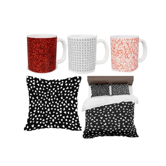
modern looking napkins or this quilting fabric. But your patterns personality can change completely
with color. These are options I created for an actual collaboration
with a swimwear company. So I went bright and bold and
gave them lots of options. And here's the finished product. Now let's look at some
color for this one. In black and white,
it's pretty bland, but making it multi colored
starts to bring it to life, especially with this
dark blue background. Now the colors really pop. I think it's always
a good idea to think about products when you're
deciding on colors. So with this one, I think this could work on men's Wimmer, too, either in a large scale
or a micro print, which is really trending
right now in men's wear. Here's another option. Tone on tone color ways were great
for scriable patterns, either with darker motifs
on the lighter background, like the one on the
left or lighter motifs on a darker background,
like the green one. I think both of these
would work well as coordinating prints
for quilting fabric. Okay, so what about this one? To me, it has kind
of a youthful, maybe a little bit
rebellious vibe. So maybe some bright almost neon colors
would be good for it. Or we could think
about it in kind of a more classic blue
and white motifs, which looks kind of classic
modern with this large scale. Now, this is that same pattern, but remember I did it
in a denser layout as a low contrast subtle tonal, it kind of turns into a
more sophisticated texture. I think it would be awesome as wallpaper in a
bathroom like this, really makes a statement against the traditional furnishings of this bathroom. Okay,
how about this one? This one is so active. It's almost aggressive
in black and white. It just kind of shouts at you. But look at how rich it
looks in shades of red. I'd love to see this
as upholstery fabric. Can you imagine it on velvet, maybe for commercial fabric, like for chairs in an
office or a restaurant? And look at the change here that in your face
design in black and white turned into kind of a serene texture that
now reminds me of, like, grass cloth or coconut husk or some
kind of basket weaving. That's pretty crazy, huh? All that's done just with color. And here's one more option, a simple gray blue on white that I think would make
great table linens. So hopefully that gives you some ideas for
coloring your pattern. So a quick review, we looked at using contrasting
colors like these, where one color is very
different from the other. Or you could just tone down your black and white and use
softer colors like this one. Or you could try
reversing out the colors. Instead of black scribbles
on a white background, try white on black. Some patterns actually
look much better that way. Another option we looked at
is multi colored, like these. And finally, we
looked at lots of tonal color ways that really changed the character
of the design, making them much more textural. And that can make
them very versatile in different product categories. So have fun exploring
color with your design. I do hope that you'll upload your projects to the class page. You can do that under the
Projects and Resources tab and then just walk through
the prompts to upload it. I can't wait to see what you do. I love seeing projects, and I love commenting on them and just getting
that sense of community.
6. Final Thoughts: So, thanks for
taking this class. You guys keep inspiring me to create new classes, and I
really appreciate that. In fact, sometimes you literally inspire
me like this class, which actually started as a question on a post from
one of my other classes. And that class was called Drawing and Illustrator How
to Retain the artist's hand. And if you'd like to
learn more techniques for making your vector
art look more handmade, check that class out. I think
you're going to like it. If you'd like to
learn more about mockups, try Mockup Academy. It's a whole series of classes where I'll show
you how easy it is to take a free stock photo and turn it into your
own mockup template. And if you'd like to learn about color, try color alchemy. It's two super concise classes that tackle the topic
of color theory, but in a really
nice hands on way. I'd love if you take a
minute to review this class. You can do so on the class page. Just look for the reviews tab. Doing so only takes a minute, and it really helps me
to know what's working. So don't forget to follow me on my profile page so that you can hear about new classes
as I release them. Oh, and also, sometimes I give away free one year
Skillshare memberships. So if you follow me, you'll be the first to
hear about those. And lastly, you can sign up for my newsletter at chrirug.com. So until next time,
happy Designing.
7. One More Thing: Hi again. I'm popping
back in to let you know that I'm now available for
one on one coaching sessions. If you like this class and would like to work
with me individually, you can now do so by
booking a session right from my Skillshare
profile page. I offer two kinds of sessions. The first one is a 1
hour portfolio review where we'll look at
your surface designs. I'll let you know
some strengths and areas to focus on and you'll get the opportunity to ask
any questions you'd like about art licensing or
the surface design industry. Now I know it can
feel intimidating to show your work to somebody, but it's so smart to get
professional feedback. All the artists that I've
worked with have felt energized and ready to move
forward after our sessions. I also offer a 30 minute Adobe Illustrator or Photoshop
instruction session. If you're struggling
with any aspect of these software, I can help. We can walk through tools, I can demonstrate techniques and workflows that are going
to help solve your issues. So whether you're looking
for a one time session or an ongoing opportunity
for feedback on your work, coaching is such a great
investment in your career. Unlike some of the expensive online courses that
are available, coaching doesn't have
a fixed curriculum, so I can give you
exactly the information and guidance that you need
exactly when you need it. I hope you consider coaching. I would love to work with
you and I can't wait to meet you and support you and guide you on your creative journey. Oh, you can learn more about my coaching sessions at
chrisruf.com slash CaCE.
 Kris Ruff, Surface Pattern Designer & Coach