Transcripts
1. Class Intro: Welcome to fabric design. How to customize your
clothes with unique prints. In this class, I will walk
you through the basics of surface pattern
design applied to printing fabric
using digital tools. We will understand
the basic elements of surface pattern design
such as mode for a board, repetition, and how to apply those elements to any type
of print idea you have. And we will also learn about analog methods of printing
fabric just to know how it's done without
any digital tools because it's fun to know
about the textile arts. We will then turn all
these new info into a print using Procreate
and Adobe Photoshop, further understanding
how repetition works and amplifying
our creativity, adding layers and
depth to our designs. This class is for anyone who loves patterns
and would like to start creating them to level up their sewing game or
creativity game overall. Of course, I will share my favorite suppliers in
the United States and Mexico to actually print your artwork onto
fabric just like this. Join me so we can start having
lots of fun with prints.
2. Project and Needed Supplies: For our class project, we will create our very own
digital print module with perfect repetition in a file ready to be sent so it is
transformed into fabric. By selecting our
inspiration, moodboard, color palette, and
drawing our own elements, we will bring to life a
costume made print that can be used in any kind
of garment for fabric. To complete the assignment, you will only need
drawing supplies that include but are not
limited to paper, pens, pencils, crayons,
eraser, whichever you prefer to draw and
procreate and Photoshop. I will be using those. You can opt for
any other digital drawing software and optional, if you wish to go
the extra mile, you can send your
module to print and show us your design
applied onto fabric. With that being said,
let's start creating.
3. Lesson 1 - What Is a Pattern: For this our first lesson, we will dive into the theory, starting with a simple question. What is a pattern? There
are basically two ways in which fabric has visual
design or a pattern. Either it is woven
into the fabric with different colors or thread densities while it's being made, like a jacquard or even a
simple check earth pattern, or it is added as a finishing
touch after the fabric is created by adding color onto it with
a certain drawing. A simple trick you can do
to figure out if it is woven or printed is
checking the reverse. When it is woven, usually
it is visible from both sides and if it's
a print, on one side, it has a design
and on the other, it could be totally white or have a washed down
version of the print. If we are talking about
either woven or print, there are a few design terms you should know about when
creating a design. I will show them to you by
drawing with my iPad one of Mexico's best delicacies
and de Mardo. Bonus info. If you wish to see
the entire workflow designing these
motives and grids, I am sharing a linked video
in the resource stab. Since this is not a
designing composition class, I just added the highlights
for this lesson. But if you're interested in
seeing the entire workflow, you can dive into it
with the link vw. Let's start with the
first design element. The first one would be motive, the individual and different
elements used in a design, not the design overall. They can be floral, geometric, abstract, anything you like. In this case, I am drawing
different motives, the main Ban Demerto, a bone, and a gravestone. And as compliments, I did
some sparks to add texture. Then we have the module. This is the interaction of the various motives placed harmoniously inside
a determined area. This module will be repeated across the fabric
multiple times. Report. This is the repetition of the module across the fabric, matching vertically
and horizontally. This term is divided into
categories of repetition. The first and most
simple one is block. Here, the module repeats itself vertically
and horizontally, directly next to each other
in a 90 degree angle. Take a look at how
square and obvious the bigger Pan Demerto
element repeats in this block rapport. The second one is half drop. In this style of
rapport repetition, the module matches directly
in the vertical line, but it is staggered
horizontally, making the repetition
less squared. The third one is brick. This is the same as a half drop, only this time
changing directions. The horizontal line matches directly while the vertical line has an offset repetition. Now you can see the differences between the block repetition, the half drop repetition, and the brick repetition. There are other types
of repetitions you'll find around but
in my experience, I find that calling them that
is quite confusing since they have basically one of the three main repetitions
I just mentioned, block, half drop, or brick. But the motives in these other
repetitions are placed in certain grids inside of the determined area or module
that make the repetition. These type of grids make the
repetition less obvious, but still the main three
repetitions are clearly there. You'll see it.
These are diamond. OG hexagonal. Medallion. Stripes. Random. Another term in creating prints and
patterns is direction. This means the course along which the elements
are visually placed, and this is divided
into two categories. The first one being directional, either vertical or horizontal
and not directional, meaning random all over. This is relevant when
sewing because if a certain fabric has a
directional pattern, let's say, in a
vertical disposition, you want to cut
your pattern pieces matching that direction. In the case of a random
non directional fabric, you can take more
liberties since it won't be visually weird. Moving on to our next
term, background. Having one can bring
dimension to your designs. Notice, not all fabric
has a plain base. It could be a
texture, contrasting color of the same motives, anything you could imagine. Backgrounds work with the same
laws of module and report. And our last but not
least term is scale, the size of the
motives in real life. And I say real life because we are working with
digital tools. And in my experience,
it's very easy to get lost in the actual
size of the print we are creating when we can really zoom in to a detail in digital tools. For example, if we are creating
a pattern for a necktie, the amount of detail
that will be visible in such a tiny motive
is very different to the detail we can have
in a pattern intended for wallpaper that can
extend into a regular world. For this reason, every time I am creating a costume print, I have to know where am I using it and how big or
small I envision it, so I can actually
create guidelines and rulers into my digital tool. Come with me to the next
lesson so we can learn how to create a seamless
repetition for our pattern.
4. Activity - Creating Design Repetitions: For this section of the class, we will do a few fun
exercises to really understand how a seamless
repetition is created. I will show you how to make the first three types of
repetition we talked earlier. Block, half drop, and
brick repetitions. So grab a piece of paper and some drawing supplies like pencils and pens, and let's go. Starting with block repetition. Step one, make a six inch
square with paper and draw a line right down the middle with wise
and length wise. Identify each new
square as follows. Step two, fill the
paper with motives. The only condition here is to stay away from the
outside edges. It's okay if you draw
on top of the lines. Step three, cut the square paper through the vertical
and horizontal lines. This will yield four
separate three inch squares. Place them as they were
identified in the beginning. A, left top corner, B, right, top corner, C, left bottom corner, and the right bottom corner. Step four, we will rearrange the order of
the squares as follows. A and B move to the bottom, and then B and B
move to the left. This way, which used
to be the outer edges is now the center of
our six inch square. Tape the squares
together from the back. Step five, fill the empty space with more motives for
a balanced module. Notice how the
incomplete motive in the top left corner continues
in the right top corner. This is what creates a seamless
repetition horizontally, and the same happens vertically. You have successfully created a seamless report pattern
with block repetition. For the half drop repetition, we will repeat steps one, two, and three from
the block repetition, making a six inch square divided in half length
and width wise, identifying each new square A through D and drawing a motif, not reaching the outer edges. Cut through the lines to
have four separate squares. Step four, we will rearrange the order of
the squares as follows. A and B move to the bottom, then and B move to the left. And this far, we've
done the same process as the block repetition
but from here on, we will do an
additional movement. A will move to C, so C is now on the bottom right. Step five, fill the empty spaces in the center with more motives. Step six, move the top squares, DNA to the bottom and fill the empty spaces at the
center if necessary. By returning each square
to its original position, you can move them around with the half drop repetition and see your rapport come to life. Our third activity is
creating a brick repetition. We will repeat steps one, two, and three from
the block repetition, making a six inch square divided in half length
and width wise, identifying each new
square A through D and drawing a motif not
reaching the outer edges. Cut through the lines to
have four separate squares. Step four, we will rearrange the order of
the squares as follows. A and C move to the right, and then B and A
move to the bottom. This far, we did the same process as the block repetition, but from here on, we will do
a few additional movements. A will move to
where B used to be. So A is now on the bottom left. Step five, fill the empty spaces in the center with more motives. Step six, move the left squares, and A to the right and fill the empty spaces at the
center if necessary. By returning each square
to its original position, now you have a brick repetition. Now that we know the basic terms and elements that
make up a pattern, we are ready to move on
to the next lesson where we'll quickly learn some more
fabric printing methods.
5. Lesson 2 - Printing Methods: Now that we know how to
create seamless repetitions, we can further understand
how a simple stamp or stencil can be repeated into a pattern stamped onto fabric. It's only fitting that we
review some printing methods. In this class, we are majorly focusing on
digital printing. But as a true
textile Abbasian to, I think it is very cool to know the other main methods used in fashion and
interior design. The following list excludes patterns woven into the fabric. Remember, we are strictly
talking about printing, which is adding the
visual element on top of the finished textile and there are more
methods of doing so, but I just wanted to make a quick overview of the most
commonly used in fashion. For all of them, I am sharing some cool videos so you can actually see the entire process. I am linking them in the
additional resources below. The first one is block
or stamp printing. This is one of the oldest
methods of printing fabric. The design is carved into a medium like a wooden
block or linoleum, or rubber stamp or even
the classic potato stamp. Then ink is applied on top of the stamp and that is
pressed against the fabric. The surface that wasn't carved
out is what will be stamp. This is mostly used with natural fibers and
is set with heat. Usually, one stamp is
used with one color. Let's say you want to
use this method with a flower where petals are
blue and centers are yellow. You would need a different block to carve where each
color will be. Silk screen printing. This method needs a frame covered with a fine organza like screen where a
photosensitive liquid is applied and
dried here purple, that will go into a machine
with light exposure alongside the design printed in
black into tracing vapor. We need this shear
paper to make it work. The photosensitive
liquid is cooked to the screen with the light
inside of the machine. Anything covered by black
in the design will be undercooked and will easily
come off with water. Creating your silk
screen stencil. That screen is placed
onto the fabric and ink is pressed against it,
transferring the design. Similar to block printing, you also need different screens for different colors
in the design. Usually up to six,
but it may vary. This allows multiple
solid colors, although I've seen
multiple people create color gradients and
effects in this technique, but that is for the super
experienced screen printer. But you can do almost anything. This is one of the most fun printing methods in my opinion, but it is pretty time consuming
and resource consuming. It is worth mentioning that different inks can be used
with screen printing. The typical one is water based, which mainly works with white or lighter fabrics
made from natural fibers, but we also have flock printing where you press glue through the silk screen and
then a floffy powder, same with foil printing that is this golden foil
sheet and lastly, plastl a thicker type of ink that creates a little
more volume on the print. So with the same screen method, you can actually have
different results or types of designs
and printing. Then we have roller printing. Similar to screen printing, but for larger quantities. Instead of screen frames, rollers are used one per color. The fabric is pulled under the various rolls and each one of them presses the
die onto the fabric. The very special thing about
this method, in my opinion, is that the rollers have a fixed circumference
and length, where the module must
match precisely, which is a constraint we don't experience with
digital printing, so it's fun to know how nice we have it with digital ts and how creative pattern
illustrators have to be in order to create their designs before digital
printing was a thing. And what we are doing in this
class, digital printing, also known as DTG from
direct to garment, uses big ink jet
printing machines that spray the directly
onto the fabric, so they blend together
to create the pattern. This allows for color gradings,
infinite color options. The texture of the
fabric doesn't change, and it can be printed only
on natural fibers like, like cotton, linen, or silk. We also have sublimation, a digital printing alternative
unsynthetic fabric, where special dies are
printed onto transfer paper, which is brought under
heat and pressure, resulting in the die transforming into gas
and blending into the fabric to create
the pattern of the fabric with no
change to the texture. I hope this broadens your imagination and
knowledge towards prints, and I am sure that
the more we know the more we can appreciate
the textile arts, which is what I'm all about. Moving on to our next lesson where we will start
planning our design.
6. Class Project Intro: Our class project is creating
our very own print design with perfect repetition using
Procreate or Photoshop. You'll get to use all
the design principles we reviewed earlier, such as motive module report, and create your very
own color palette. Hopefully, you'll
take the plunge and send your design to
be print in fabric. Although that is an extra
for this class project, you just need to share your design process
and your final report, for one, I am excited to see your illustrations and
designs. Let's get to it.
7. Exercise 1 - Moodboarding and Inspo: The first step we need to take before drawing our illustrations is deciding where
we apply our print. This will be the
north star for us to choose colors,
motives, and scale. In my case, I want to make a Christmas print
for a matching set of pajamas for me and my dogs. I can know where I'm
going with this. I know I want it to be fun, whimsical, not Christmas red, not Santa Claus, something dog related and not so
small in scale. I'm thinking that the motives
will be approximately 2 ", but I'm open to play, I'm
open to have some fun. Let's see what comes up. How do you envision
print, your motives? Do you feel like doing a
big statement print on a large scale or maybe a super
tiny motive like in a ti? I want you to flow
with your ideas and preferences in
terms of scale, theme, and colors so we
can start with boarding. Go with your got and with what feels charming
to you right now. First, let's make a list of three things you do
want, and three, you absolutely don't, both in terms of
themes and motives. In my case, I want fun
motives like cartoonish, dog related, and Christmasy. I don't want
anything red, Santa, coated, tiny scale or
realistic motives. And do another three dos and three don'ts of colors
you would like to have. For me, do is pastels, white Christmas, brown and
gold because of my dogs, and don't are bright red, and autumn palette
and dark gothic. Like, I want whimsical. Now, come up with
three pattern ideas that combine your do. In my case, nut Santa
coated Christmas means the nutcracker food
as in gingerbread houses, somehow dried fruit, lots of pastries and
cozy family time, which also ties
nicely to my dogs. So with all these, my ideas are gingerbread
dog cookies, my dogs dressed as the sugar plum fairy and the
mouskin from the Nutcracker, and also some sort of tua Djui if that pronunciation
is correct, of my dogs like
sledding and next to the chimney just doing
like Christmas day stuff. Once you pick your idea, you can go ahead and find images that will help
you draw your pattern. In my case, I will go for the
gingerbread dough cookies, but I don't want to look at illustrations or
something similar. I want to look for real photographs of gingerbread cookies
and find some inspo. I am currently thinking
of gingerbread man, but I guess some cooking tools or other cooking shapes
might be interesting. That's how I'll
create my Milberd. To work on yours, go to the resource stab in this class to find the
Mod Birth template. You can either download it as
an image to work with it in Photoshop or click the link directed to Camba to
add your images there. Now, I know drawing from scratch is an anxiety
inducing activity for some, let me go ahead and
say that if you want to look for illustrations,
by all means, do it. It is supposed to
be a fun activity, so don't worry if you need something more
clear to draw from. I'll just say let's
keep it profess and nice and don't exactly
copy anyone's work. With that being
said, you can use the Moodboard template on the class resources and
start adding your inspo. For the last bit,
the color palette, here are a few resources of color palette generators
you could use. You can also find them
at the resources below. Fill the entire
Moth board template with your own info and don't forget to add the hex codes of the colors so you know
which ones to use, and I'll meet you
on the other side.
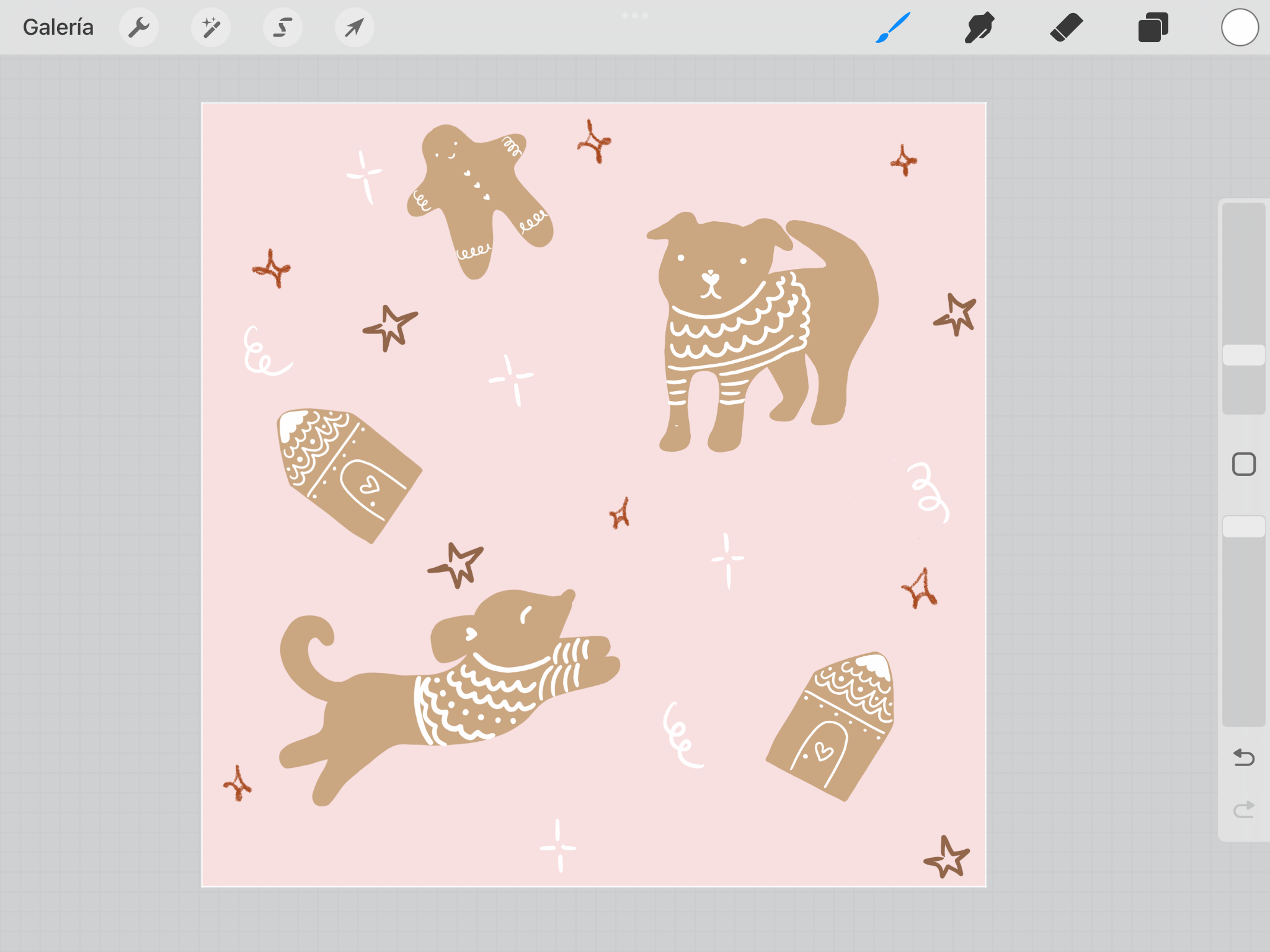
8. Exercise 2 - Drawing Motifs: One thing you need to
know about me is I love intricate designs
and big modules. I don't want you to easily identify my pattern repetition. I don't want you to find the same exact motive in the same exact position
close to one another. This is the reason why
I like to work with both Procreate and Photoshop at the same time
because on one hand, Procreate lets me draw all my
elements without any fuss, which is great for my workspace, and it works with layers which translates perfectly
into Photoshop. Where I design the actual model and I can get limited layers, which is crucial to me since I love big intricate designs. I feel a little bit constrained in procreate in terms of layers. When the canvas and
definition are to be. Overall, I feel I get to play a little more
when using both. Nonetheless, I will also show you how to
create your print by only using Procreate in case you don't have
access to Photoshop. Let's set our file in
Procreate to 6 " at 300 DPIs. In digital printing,
the best size to send your files is 300
DBIs, that's per inch. So we'll start by
creating a library of possible motives using our
inspiration moodboard. Usually, I start with
a plain pencil without any colors yet and do
one motive per layer. If I like it, I will duplicate and add colors in
a different layer. Ideally, one layer per color. Here I am sketching my first dog like she's jumping because
she's pretty hyper, and I want to, like, capture her essence and her personality. So to create the actual motive, I bring the opacity down
and create another layer on top to trace the shape with more flow and other
details like ears, maybe the face, more stuff. Mm hmm. I do this a few
more times until I am satisfied with the
overall shape and style. My tip is to make each motive roughly the
size of the canvas. So you can actually
play around with scale by making the
motives bigger or smaller without losing
crispness crispness in the photoshop file. I really liked this
representation of my dog, so I will add some color to
her in a separate layer. First, I added all
hex colors from my mouth board to
this color palette right here so I can start visualizing the color palette working together and actually try on some of the colors
that I selected previously. I tried giving her a margin, like the cookie color shape, and then the frosting
would be her outline. But I wasn't really a big
fan of this composition. So while I hold that thought, I decided to start working on my other dog to see where that
would take me creatively. I started the same way
by making a rough sketch and drawing the actual motive
onto a separate layer. This cute dog inspires me to forget about the margin
and instead give them white frosting sweaters and some other details
like eyes and noses, so they don't have the margin. They keep their shape,
but it still feels like gingerbread,
cookie dough style. My top tip is to create two
to three main characters. In my case, my two main
ones are my two dogs, and then create two
related objects or additional characters that still feel important
and similar in scale, but they are not the
main main drawings. For me, this will be a gingerbread house, a
gingerbread sweater, and a gingerbread man, which in my mind, are my husband and I to join our doggies. And finally, I
suggest you create three to four tiny compliments to add texture and
smaller scales. I did some spices, dried fruit, hot cocoa and tiny sparks and
bows because I like adding some kind of fuss around my prints to add a little
bit more of texture and fun. Once you are satisfied with
your motive collection, sport it in PSD format, I suggest sending them
to your drive so they can be downloaded to a
computer with Photoshop. After that, we are
ready to move on to the next lesson to set our
module design in Photoshop.
9. Exercise 3 - Basic Module in Photoshop: In Photoshop, I will
also set my Canvas to 300 DBIs to match the definition from Procreate
and all of my motives. I will also go for a 12 inch
square as my module size. I love working with a
clean and organized file, so I will group each
motif with its base and its frosting and
name them individually. Then I want to add my
color palette on top as an independent layer so I can copy the colors
to my motives. I also add a new layer with solid color fill at the bottom to use as the
background coloring, so I can change it
if I feel like it. Once this is said, I can
start editing the color and all my motives because
I don't want all of them to be
browns in a cookie, but I am keeping the frosting
white across all elements. To change the color,
I just use Control while clicking on top
of the desired layer. You know it's right when the
motive has a dashed outline. Then click on Effects and select color overlay where you can add your specific hex code. Each layer with this effect
now has an eye under it, and I do this to all layers
I want to change color to. I like this method because it
avoids the pixel bleed and it keeps the original outline and definition for each motive. Then I roughly scale all main motives to
approximately 2 " and the rest will be scaled according to what looks
good around the main ones. With this, I am ready to
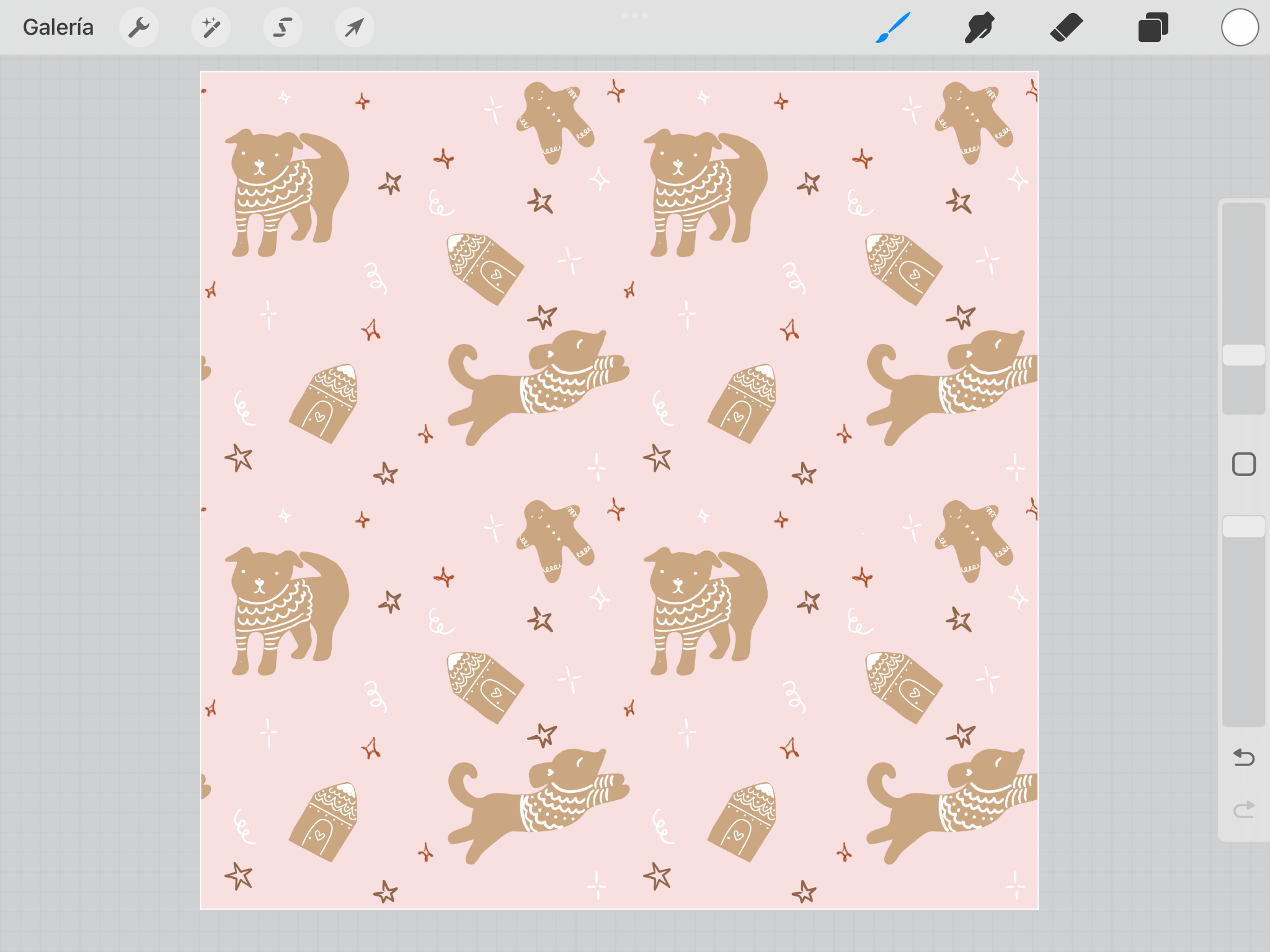
create my design composition. I am doing a random grid
because this is my favorite, but you could try any other
grid we've reviewed earlier, such as the diamond
or directional, whichever you like, use it. Make your module
feel balanced by keeping track of empty
spaces and colors, not just the motives. It's best if we don't
create visible lines from empty areas next to each other or lines from
the same color, even if it's used on
a different motive. This is also a great moment to try different
color combinations or tones from the same palette to see how they interact
with each other. Having fun is key. If it looks cool to
you, just go with it. I didn't end up using all the motives I
drew, and that's okay. That is exactly why I like creating more motives
to choose from. Once I start placing
them in the module, some won't look adequate, so I will just discard them. To see how my module looks with a repetition, I select the entire canvas
and create a motive. Then create a new file, double the size of my
module, and add the motive. This is where I can
see if I am creating clusters or lines or
empty visible areas. This is exactly where
I realized that my module was too
small for my liking, so I enlarged it
from 12 " to 30 ". Copied the composition
and tweaked some of them so the repetition isn't as obvious or close
to each other. I try avoiding making
visible lines, whether from motives or
colors or empty spaces. For this, I change
the direction of the main motives and aim for
an all over the place look. Again, I select the
module, create a motive, and review it in a new file, double the size for my module. This helps me discover
dis concerning areas so I can keep making
adjustments to my module. I have two top tips for you while creating
your design module. First one is you can
come close to the edges, just verify that on
the opposite side, you have a bit of empty
space to avoid clusters. The second top tip is to
represent each color from your palette in the left
top corner of your module, approximately in the first
6 " length and width wise. Because this is the area that most suppliers take
to test print, so you can check your
coloring and definition. This way, you will
be able to check your entire palette
in just these 6 ". Once I am satisfied with the
module and its repetition, I like cleaning up my file. This means copying all
layers, grouping them, and labeling them so
I know that these are the separate motives
that I can change color individually or
edit the shape of. Now, for the copies, I will group them by color. I must admit that this is a
time consuming labor of love, but it will make your life
super easy when trying different color palettes
and overall, a neat file. With every individual
color layer, I can play with different
color palettes. This is where I decided that I wanted to make a pink
palette for me and my baby dog and a forest green palette for my
husband and our oldest dog. Finish working on yours
and export your artwork as requested by your specific printing service
you plan on using. I will talk about my
favorite suppliers to print your fabric in
the next lessons.
10. BONUS - Continous Module in Photoshop: Now, what to do if you wish
to create a grid module, not a random one
with no empty space, so the repetition continues
from one edge to the other. Fret not because I
have a quick tip, so you can create
your module to repeat precisely without
offsetting your canvas, which is so mentally
confusing to me. Sorry. So you can keep
visualizing your module and mods. My tip is my tiny
square workflow. Here it is. In this case, I created a diamond grid, just for an example with
my motives inside it. I made a group out of all of
them and named it module A. Entire group is copied and
dragged to the right corner. Here, you just have
to make sure you like how the motives
look next to each other. For example, the two
main dogs might be weird when looking at the entire repetition,
but we'll see. Zoom in at the right edge of
the canvas until you can see the pixels and create a
new solid color square. Place that square right on
the edge of your canvas. Zoom out and select the new solid square
plus the module copy. Dragon copy to the opposite
edge of the canvas. To do this, you need to click out while dragging your
layers to duplicate. Leave the square
visible to the left and zoom in to see the pixels. Finish moving everything to the left until the
square is hidden. I like doing so pixel by
pixel with my arrow keys. Do not move it a single
pixel to the left more than necessary or the
repetition won't match. As soon as it disappears by
one pixel, you are done. Feel free to delete
the solid square that isn't visible on the outer
left edge of the canvas. Move the original solid square to the top edge and repeat, copying the elements from the top edge to the bottom edge. I will move the solid square
to the left top corner so you can easily visualize the
module repetition up next. Select the entire
canvas, create a motive, and visualize it
in a new canvas, double the size of the original
as we've already done. This is our module repetition, visible thanks to
the solid square. If we return to our
original module, we can see that next to the square, we have
this red star, which will help us
to confirm along this line that all pixels match perfectly in
the repetition file. And doing the same
along the line from the white star on top with wise. Once we confirm, everything
matches beautifully, Zoom out and see if any weird lines or
clusters were made. Tweak your center motives to
adjust any concerning areas and continue reviewing until you are satisfied with your
module repetition. Keep in mind that we can't zoom out that much in real life. So when looking at a garment, the repetition won't
be as obvious. I like this method because I can keep all my
motives separate, even on the edges in case I
want to edit them separately. You could flat out
the original module to move it around as one, but that would not
allow for you to move the motives individually
if needed later on. I hope this tip
was very helpful. I'll see you at our next lesson.
11. Exercise 4 - Module in Procreate : In case you are only
working with Procreate, here are my tips to create
a seamless pattern. I created my module with random
direction of all motives. Then I play around with the
different backgrounds from my color palette and
added some sparks on top in different layers
depending on the color. Once I am satisfied with
the overall module, I want to test if the repetition
of the report looks good or if I need to make some
adjustments and modifications. For this, I want to
copy the module as is. So instead of
copying all layers, I just go to the range icon in my top menu and select
Copy Canvas and paste. This yields our entire
module as one layer, leaving my motives separate so I can still move them
around if needed. Copy your entire module, so you have four of them. Now, for us to easily move each module to one corner
to verify the repetition, go to the arrow icon
on the top menu and select the snapping
icon below that looks like a lightning
bolt and make sure magnetics is off
and snapping is on, and the distance
and velocity tabs are to their max capacity. I have my four modules, select one of them with
the arrow icon and slide the right bottom corner to the center of the canvas, see how it snapped into place, and these yellow lines matching
the middle of the canvas both length and
width wise appeared. Let me remove the other
layers so you can see without the background how the
second one snaps into place. Repeat with the remaining
modules and watch your seamless pattern come to life with precise repetition. In case you want to modify
anything from the module, you can simply return to the hidden motives to modify
and move them around. In case you want to adjust
the edges of the repetition, visualizing those edges in
the center of the canvas, select all the layers that make up the module and group them. Name this group original
and make a copy. I will name this new group left because I will
drag it to the left. The vertical and horizontal
guidelines in the center of the canvas help me to
drag my module correctly. This is what we activated
in the lightning bolt icon. I have to create
another copy of the original because watch what happens if I copy the
left one, the left layer. The module is cut in half. Anything outside of
the canvas was erased, it is important to copy the original to have
the entire module again and rename this new one right because that's
where I'll drag. This is my same module, cut differently, but with
the same repetition. See, for example,
how the pass of the jumping dog continue on the other side
of the repetition. If I return to the
previous disposition of the module, the original, I can see that when repeated, these two brown stars form a
cluster which I don't love. I identify if they are on
the right or left layer, open their group and go to the layer where I
drew the brown stars. To move each one individually, select the S shape icon, select the shape you want to move from that specific layer, then select the arrow icon, so you can move this element around separately
to a new position. Pick the arrow
icon again to drop the selection so the element
stays in its new place. I will draw a few
more brown stars and white sparks to balance
out the module. Repeat the Copy Canvas
in order to check the repetition and
rename these new layers, second method to identify them and copy until
you have four of them. Again, drag the outer corners to the center and review
the new repetition. I love zooming to see
if all pixels are aligning correctly and
they are beautiful. Once you're satisfied with
the module repetition, we can declare our
module finished. To save and share your artwork, make sure you are visualizing the module in its
original scale, not the four smaller layers where we verify the repetition. I also like checking that
my canvas size and DPIs are correct by going to Canvas,
resizing and settings. I save all my artwork for
print in J PE to my drive so I can share them with
any supplier so my artwork can finally
become fabric. I'll see you in the
next lesson to share my top suppliers in the
United States and Mexico.
12. Fabric Printing Suppliers: Once you have your
artwork in JPEG, 300 DPIs saved and
ready to print, I suggest you work with the two following
suppliers which I've tested and results
have been great. I am leaving links
to find them in their resource staff
under this class. First, in the United States, I've used spoon flour, which prints fabric with the DTG method direct to
garment we saw earlier, which uses this large
ink jet printer and is available
with natural fibers. They work mostly with cn, which is great because I
ordered the current jersey to sew underwear with my own prints and they turned out amazing. In Mexico, I like working with few sublimos which works
with the sublimation method. That prints a large sheet
of paper with the print and then applies it onto the
fabric with heat and pressure. In this case, it is only
available in synthetic fabrics. Results are also great and they have tons of different
fabric texture, so I really recommend
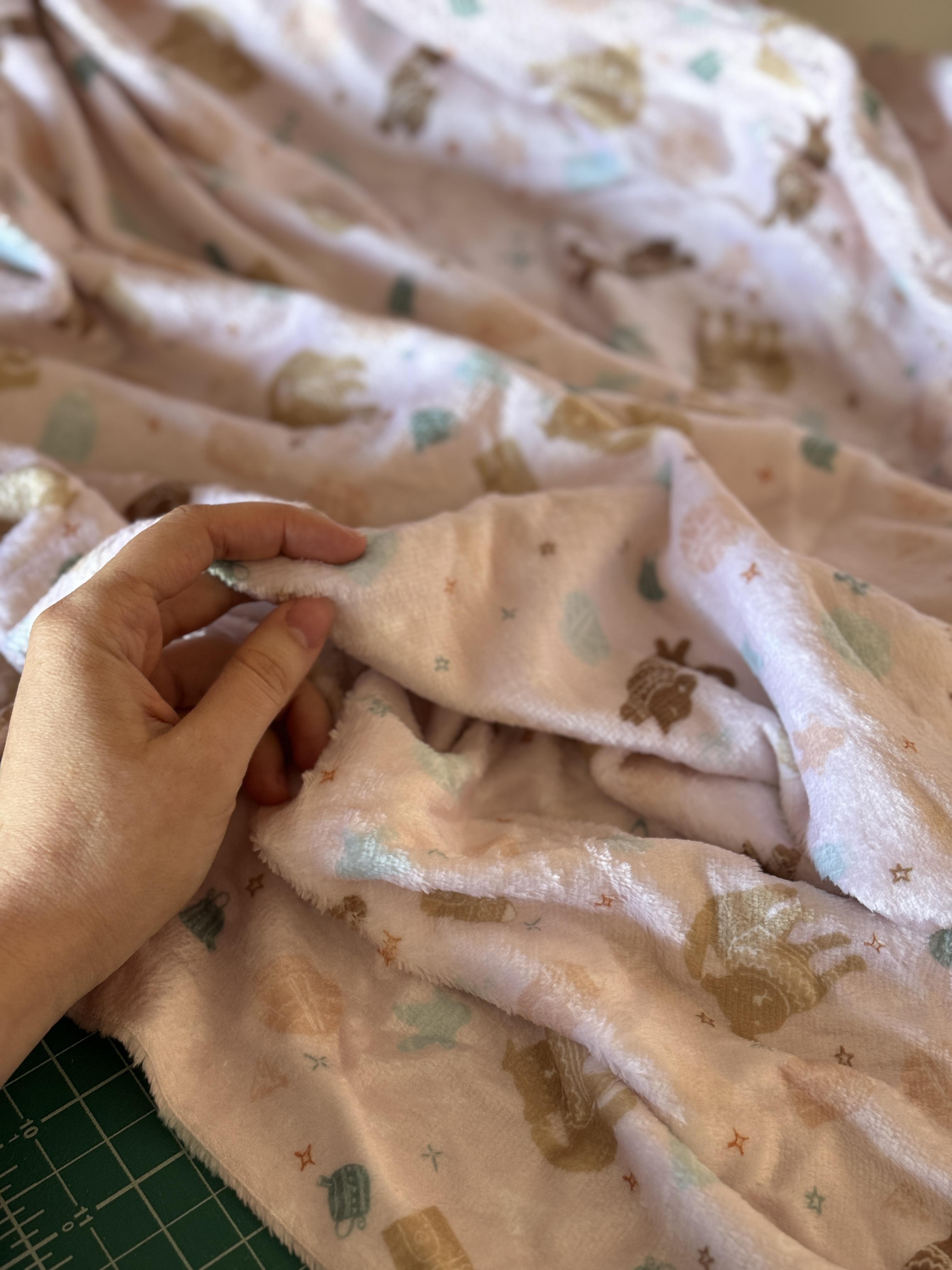
working with them too. This is my artwork. I created
along this class printed into a fuzzy and warm fabric for these color months
that are coming. These are both my color palettes and I'll be updating
you on how I made the pyjamas wind
with this fabric verism. In any case, I suggest
you ask, for example, to test your colors and
scale and make sure you are uploading your artwork as each supplier asks for
because it may vary. If you have any more suppliers, please let us know in the
discussion below in this case.
13. Final Thoughts: Thank you so much
for learning how to create your very own
custom fabric with me. In case you're interested, I am sharing some
other prints I've done before in my
class project below, and I seriously encourage you to fully dive into
creating your own fabric because it will
bring your sewing to a whole other level of pleasure
and fun and uniqueness. If you have any
thoughts or questions, do not hesitate to leave them
in the class discussions, and I am looking
forward to seeing your illustrations
and your process and the finished module, please share them in the
class projects below. Thank you so much for being
here and happy creative time.
 Valeria Carrandi, Textile designer & pattern maker