Transcripts
1. Welcome To The Class!: Hello, everyone. My
name is Will Alliston, and today we're
going to be painting an expressive and vibrant
mountain scene in watercolor. This class is all about
embracing color contrast, and freedom in your
brushwork to capture the drama and beauty
of the great outdoors. Mountain landscapes offer
the perfect opportunity to play with bold shapes, dynamic colors, and
glowing foregrounds. Need to get everything
precise or realistic. We'll focus on creating an
expressive mood using loose, intuitive techniques like
wet and wet painting, dry brush technique, and
layered color transitions. I've been a professional
artist for many years, exploring lots of different
subjects from wildlife and portraits to cityscapes
and countryside scenes. I've always been entranced by the possibilities of watercolor, but when I started,
I had no idea where to begin or
how to improve. I didn't know what
supplies I needed, how to create the
effects I wanted, or which colors to mix. Now I've taken part in many
worldwide exhibitions, been featured in magazines, and been lucky enough
to win awards from well respected
organizations such as the International
Watercolor Society, the Masters of
Watercolor Alliance, Windsor and Newton, and the SAA. Watercolor can be overwhelming
for those starting out, which is why my goal
is to help you feel relaxed and enjoy this medium
in a step by step manner. Today, I'll be guiding you
through a complete painting, demonstrating a variety
of techniques and explaining how I use all
my supplies and materials. Whether you're just starting out or already have some experience, you'll be able to
follow along at your own pace and improve
your watercolor skills. If this class is too challenging
or too easy for you, I have a variety of classes available at different
skill levels. I like to start off with a free expressive
approach with no fear of making mistakes as we create exciting textures
for the underlayer. As the painting progresses, we'll add more details to bring it to life and
make it stand out. I strive to simplify
complex subjects into easier shapes that
encourage playfulness. Throughout this class, I'll be sharing plenty
of tips and tricks. I'll show you how to turn
mistakes into opportunities, taking the stress out of
painting in order to have fun. I'll also provide you with
my watercolor mixing charts, which are an invaluable tool when it comes to choosing
and mixing colors. If you have any questions, you can post them in the
discussion thread down below. I'll be sure to read and
respond to everything you post. Don't forget to follow
me on Skillshare by clicking the Follow
button at the top. This means you'll be the
first to know when I launch a new class
or post giveaways. You can also follow me on Instagram at Will Elliston
to see my latest works. So let's jump in and bring this vibrant mountain
scene to life.
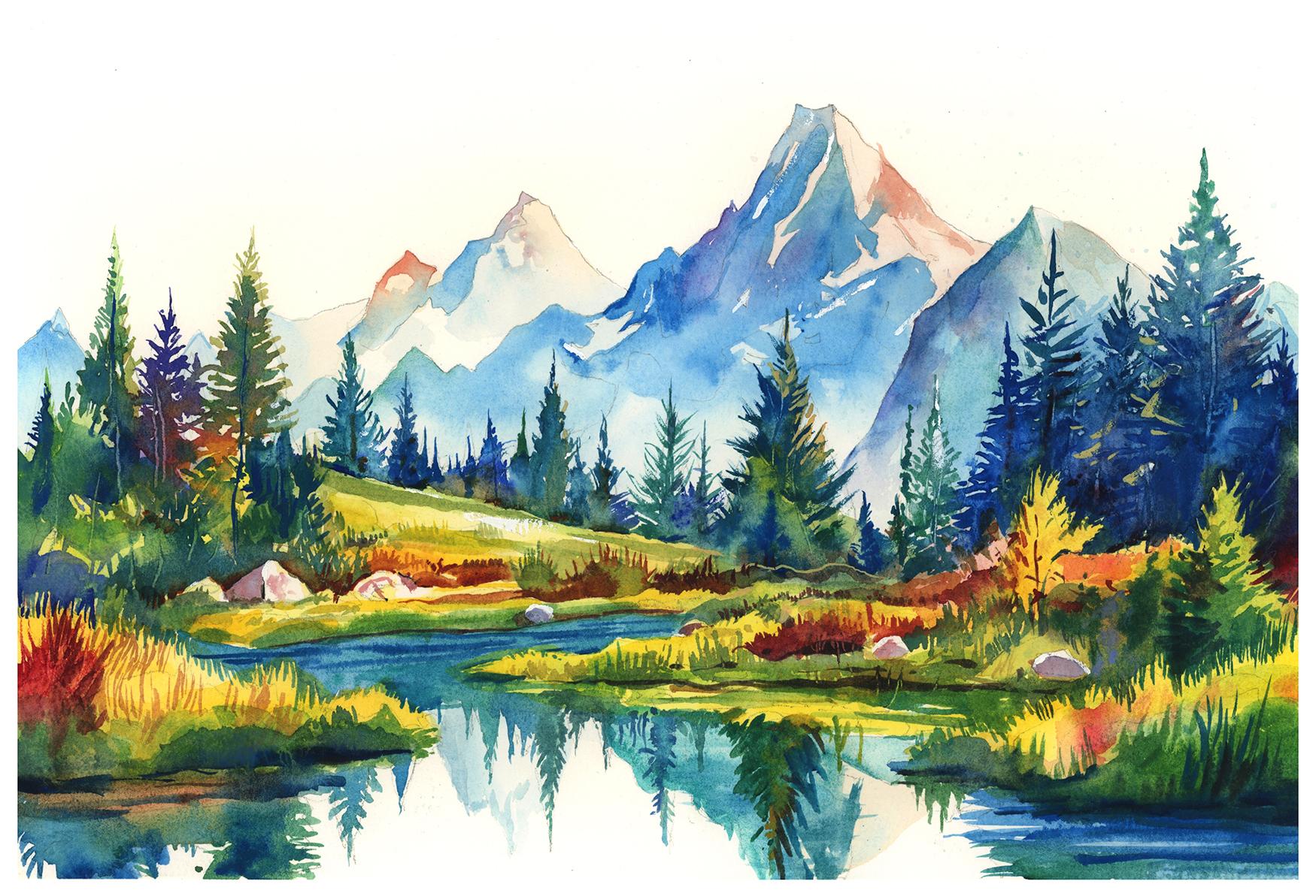
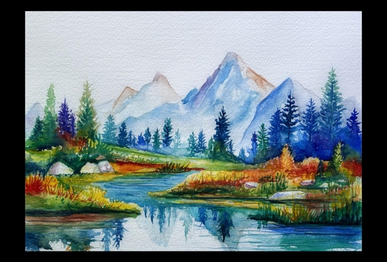
2. Your Project: Thank you so much for
joining me today. I'm excited to
paint this for you. We'll be working on painting a bright and bold
mountain landscape with snow capped peaks, colorful trees, and deep
reflections in the water. This project is perfect for experimenting with
energy and movement, and we'll be covering
techniques such as creating depth and light in the mountains
with flowing gradients, building expressive foliage,
using lead colors and textures and
painting reflections that feel natural and dynamic. Is all about expression
over precision. We'll embrace loose
brush strokes, strong contrasts and
a vibrant palette to make the painting pop. In the resource section, I've added a high
resolution image of my finished painting
to help guide you. You're welcome to
follow my painting exactly or experiment with
your own composition. As we're going to be focusing on the painting
aspect of watercolor, I've provided templates
you can use to help transfer or trace the
sketch before you paint. It's fine to trace when using it as a guide for
learning how to paint. It's important to
have the underdrawing correct so that you can relax and have fun learning the
watercolor medium itself. Whichever direction
you take this class, it would be great
to see your results and the paintings you
create through it. I love giving my
students feedback, so please take a photo
afterwards and share it in the student project gallery under the Project
and resource tab. I'm always intrigued to
see how many students have different approaches and how they progress with each class. I'd love to hear
about your process and what you learned
along the way, or if you had any difficulties. I strongly recommend
that you take a look at each other's work in the
student project gallery. It's so inspiring to see
each other's work and extremely comforting to get the support of your
fellow students. So don't forget to like and
comment on each other's work.
3. Materials & Supplies: Before we get started
with the painting, let's go through
all the materials and supplies you'll
need to paint along. Having the right materials can greatly impact the
outcome of your artwork. So I'll go over all the supplies I use for
this class and beyond. They're very useful to have at your disposal and we'll make it easier for you
to follow along. Let's start with the
paints themselves. And like most of the materials
we'll be using today, it's a lot to do
with preference. I have 12 stable colours in my palette that I
fill up from tubes. They are cadmium
yellow, yellow ochre, burnt sienna, cadmium
red, Alizarin crimson, Opramarne blue, cobalt blue,
serlean blue, lavender, purple, viridian, black, and
at the end of the painting, I often use white gouache
for tiny highlights. I don't use any
particular brand, these colors you can
get from any brand, although I personally
use Daniel Smith, Windsor and Newton
for Holbein paints. So let's move on to brushes. The brush I use the most is
a synthetic round brush like this Escoda Purl brush
or this Van Gogh brush. They're very versatile because
not only can you use them for detailed work
with their fine tip, but as they can hold
a lot of water, they are good for
washers as well. They're also quite affordable, so I have quite a few
in different sizes. Next are the mop brushes. Mop brushes are good for
broad brush strokes, filling in large areas and creating smooth
transitions or washes. They also have a nice tip that can be used for smaller details. But for really small details, highlights or anything
that needs more precision, I use a synthetic
size zero brush. All brands have them,
and they're super cheap. Another useful brush to have is a Chinese calligraphy brush. They tend to have long bristles
and a very pointy tip. They're perfect
for adding texture or creating dynamic
lines in your paintings. You can even fan them
out like this to achieve fur or feather
textures as well. And that's it for
brushes. Onto paper. The better quality
of your paper, the easier it will be to paint. Cheap paper criinkles easily
and is very unforgiving, not allowing you to
rework mistakes. It's harder to create
appealing effects and apply useful techniques
like rubbing away pigment. Good quality paper, however, such as cotton based paper, not only allows you to rework
mistakes multiple times, but because the pigment
reacts much better on it, the chances of
mistakes are a lot lower and you'll be more likely to create
better paintings. I use arches paper because that's what's available
in my local art shop. A water spray is
absolutely essential. By using this, it
gives you more time to paint the areas you
want before it dries. It also allows you to
reactivate the paint if you want to add a smooth
line or remove some paint. I also have an old rag or t shirt which I use
to clean my brush. Cleaning off the paint
before dipping it in the water will make the
water last a lot longer. It's always useful to
have a tissue at hand whilst painting to
lift off excess paint. Also, you never know
when an unwanted splash or drip might occur that
needs wiping away quickly. I also have a water dropper
to keep the paints wet. When you paint, it's
important to have them a similar consistency to what
they're like in the tubes. This way, it's easier to
pick up sufficient pigment. A hair dryer is useful
to have for speeding up the drying time and controlling the
dampness of the paper. And lastly, masking tape. And this, of course, is just to hold the paper down still onto the surface to stop it sliding
around whilst painting. Also, if you plan on
painting to the edge, it'll allow you to create a
very crisp, clean border. And that's everything
you need to paint along. I encourage you to
experiment and explore with whatever materials or
supplies you want to use. Now, let's get on and
start this painting.
4. Tips For The Sketch: Before we even start the sketch, we've got to think about what we want to express
with this painting because the moment we put
our pencil to the paper, we're already starting
to express something. So having an idea
of what we want to express before we
start is important. And the pencil sketch before a watercolor can take many different
shapes of form. Sometimes it's very fluid
and circular and wavy. But because of this scene, it's mountainous and it's
quite rigid and majestic. I'm basically sticking
to hard lines, all straight lines,
very angular. You can see there's
not many curves going on in this composition. Lots of different
triangles as well, starting off with
the distant trees and mountains, of course, all triangles for
the pine trees, I'm just drawing in cone
like triangles upside down and almost like jaws
coming from the ground. A few zig zags
horizontal triangles. No curves because
we're going to have a few reflections in
the water here, too. Starting off nice and loose, this is a nice soft lead pencil, so I can always
rub out and start again or get rid of an
area that I don't like. Then I can clean it up with my rubber and then go back in with a harder
pencil like this, just to further
refine what I want.
5. Distant Mountains Underlayer: So let's start by painting
the distant mountains, and we're going to use just
two colors, burnt sienna. So just creating a
nice diluted wash and mix of burnt sienna. And then in a different pan, I'm just going to use a bit of ultramarine blue just
to get a feel of it, and then actually a bit of
turquoise or cerrillan blue. But really, it's up to you.
Any blue will work white. Work well. My favorite is this turquoise kind
of blue, serlean. I've actually got a bit of
it mixed in the same pan there because I always see turquois Cerlean
as similar colors, so I don't mind mixing them
up every now and again. I'm not so strict on how I organize the colors
in my palette. So starting on the left there, nice and light diluted
and starting off of that blue mix and my brush isn't too small
and it isn't too big. It's just perfect for this. And if you're painting on a piece of paper
that's smaller, you can use a smaller brush, and if you're
painting even larger, then you can use a larger brush. Then when we mix this
cerrillan into there, because it's a warm
orange kind of color. It mixes with the
blue very well. Those two colors pair
together very well, and we're keeping it nice
and light to begin with. And we can gradually build on it when we feel
more comfortable. Some peaks are a bit blue and
some peaks are a bit brown. It doesn't have to be strict. It's all open to interpretation,
how you want it to go. It's something that
you can explore. If you feel like
it's a bit too blue, then you can add a bit
more burnt sienna. And if on the other hand, you think there's a bit
too much burnt sienna, then you can add a bit more
blue to balance it out. The choice is yours. You see, I'm trying to keep
that edge clean where that mountain in front reaches the edge at
the bottom there, trying not to overlap it, keeping it slightly
darker at the top, but it's quite inperceivable
at this moment. It's all such a light tone. We don't have to be too
concerned or that careful. It's all about loosening
up and getting a feel of the watercolor without too much
pressure at all. You can start working
from the bottom up there, so wetting the paper and then
just dropping in some blue, all very random really, because nature is random, so we don't need
to be so strict. We can allow the pigment and the water to flow where it wants to to create
that organic feel. This is pure cerrillan
blue at the moment. You don't have to worry
about mixing colors either.
6. Blues & Browns: I tend to pick a main
color from my pan, whether it's cerlan
blue or burnt sienna. And then I just add a touch of any other color just to keep
it a bit more interesting. So I rarely paint directly from the tube,
but you can do that. There's nothing wrong with that. If you feel more comfortable exploring the other
sides of watercolor, the other techniques,
then you can keep it simple and just work
directly from the tube. I buy all kinds of
different paints, but I always keep
it in this palette. So when you see my
burnt sienna there, it could be made up from
three different brands of burnt sienna, Daniel Smith, Windsor Newton, likewise, with the Alizarin crimson
or the burnt sienna or the Cerlan blue or the
ultramarine whatever. I always keep the colors
in my palette mixed up. So they're all quite unique, but they're pretty much the same color because
all these companies have their own different versions of burnt sienna or Cerilian
blue or ultramarine blue. So I often find that none
of them are perfect. So having a mix of them together has the good
qualities of all of them. Maybe with the cobot
blue, for example, I like the tone of Daniel
Smith, cobot blue, but I actually prefer the texture of cobot blue when it comes to
Windsor and Newton, so I put half and half
in my little pan.
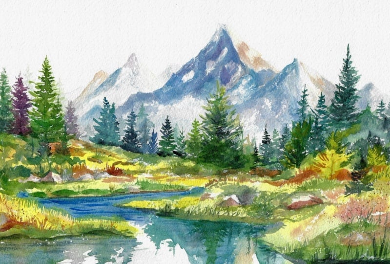
7. Bright Yellow Underlayer: So now we've done the
distant mountains and the reflections
on the water there. And we're going
in with a vibrant yellow now to make things pop. I'm starting with this
yellow in the foreground because it's actually going
to be the underlayer. And because yellow is quite a light tone compared
to the dark tones, we're going to apply later, the general law of watercolor
is to paint light to dark. So we're doing the
light layers first, so it's a wise decision to paint yellow before
we go darker. And the details in
this painting are quite random and organic. I'm not thinking of
details at this stage. I'll only think of them
at the end, really. I've put a suggestion of details with the pencil. Drawing. But you can see the yellow here, I'm not following any
strict pattern or workflow. I just want to get a general
feel of it underneath. I'm not being so precise. And you shouldn't be so precise. Just get the general idea, overlap a few trees. You can look at my final
image to see where I've actually preserve this yellow because we're going
to go over so much of this. This is
just underlayer. So you can see what areas you actually need to paint yellow. It's always useful to have the final painting even open on a new tab on the window
that you're watching it if you're watching
it on a computer or on your mobile phone. Because a lot of the
time with watercolor, we paint things with
the end in mind. So things I'm doing
now might not make much sense because
it's quite abstract. But if you see the final image, then it gives you context
to what I'm doing now. I always include a
photo, actually, of my final painting in
the class description. So if you scroll down, you can see a photo of it there. So you don't necessarily have to open it in a new window or
have it on your mobile. You can just look down and compare I
8. Analogous Colours: Now we can start
adding some green. I'm just going to
use viridian green. And mix it in onto this yellow whilst it's still a bit
wet but slightly drying. Even add a bit of cadmium yellow directly into the
screen on my palett. And some bits are dry,
some bits are very wet, so it creates a nice
organic randomness to it. This isn't control at all. We're in the stage where we're
creating a bit of chaos. We're allowing the expression, the looseness of the
watercolor to come through. And then we'll use that as a foundation to make
something happen later. So this is the part where
we're trying to be expressive, adding a bit of red camium
red into the yellow. So we added a bit
of green, which is on the other side
of the color wheel, and now we're adding red, which is on the other side of
yellow on the wheel. So a nice little bit of range of colors harmony with colors. I've left a few white gaps in between the yellow
there for rocks. Little highlights we'll
want to paint later. But if you've missed those, that's perfectly fine
because we can just use white guash at the end
just to make them pop. A, uh
9. Distant Mountain Shadows: Now, while that yellow is dry, we can go back to
the mountain for a second layer because that
first was just an underlayer. And now we want to pay
a bit of contrast. The first time we went over
nice soft washes with lots of gradients and
ambiguous soft shapes. Now we're going back to create a few more hard edges to find the mountains,
starting from left to right. Being a little bit
more cautious now with what we want to leave out the little bits of white in the background
that we're preserving. So using the tip of the brush, creating those sharp shadows. But using the same
kind of colours that blue for the first color and burnt
sienna, the second color. And those can be
your base colors. Just think of burnt
sienna and Cerleanblue. And then you can use little
subtle influences of other colors to experiment and make the base colors
more interesting. So maybe add a bit of
red to the burnt sienna, just a touch or maybe add a bit of green or purple to the
blue, a little touch, just to make it a bit
more interesting, not to make it unrecognizable from burnt sienna
or Cerlean blue. So now I'm putting
a bit of Villian green down here and mixing
that into the Cerlean blue. So Cerlean blue is
still the main color, but we've influenced it
with another color to make it a bit more
exciting and dynamic. I'm thinking of lots of angles. But on this little section
that I'm painting, I'm making sure the bottom is soft because we'll be painting
trees underneath there, and I want it to have a light background at the
bottom so that there's a bit more contrast
where the trees are in the distance where the
trees meet the mountain. Up at the top, it's important to be quite dark because
we want that contrast. Like there's a snowy kind of edge sprinkling
of snow and ice. And then a bit of
a misty feeling as we transition to the
bottom of the hill. Now I'm adding a bit of purple
into that Cerlean blue. So see, it's very subtle. On the left, we got
a tiny bit of green, and up here on the right,
it goes into blue. So we've got loads
of colors going on, and in the whole composition, we've got the whole spectrum
of the color wheel, but it makes sense with the way that we're playing around
and organizing them. It's a good way to
explore the color wheel because I'm not just
adding random colors, even though we're
using all the colors. I'm only placing the colors that are next to each other
on the color wheel. So with blue, we've got green and purple
we can play around with. And then we've got the
opposite of the color wheel, too, that we can
play around with. So the left side of the
painting is in shade shadow. And the light is
coming from the right. So on all these mountains, I want it to be
light on the right and more shaded on the left.
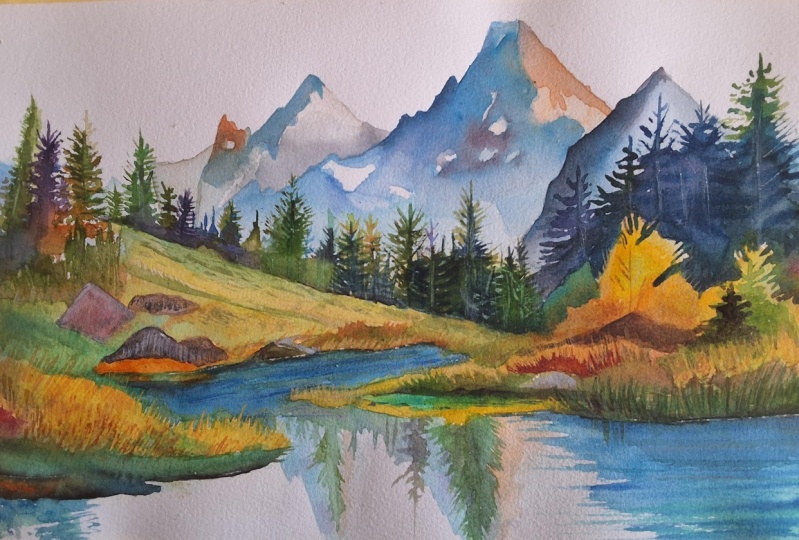
10. Layering The Mountains: Again, keeping with
that serlean blue, adding a bit of green somewhere and purple somewhere else. Not always going back to
blue from my palette, keeping it interesting and allowing a few
random bits of white to come through in this
wash. Up at the top, remember to keep it sharp and down at the
bottom to keep it a bit softer you think about
the atmosphere of the scene, it's going to be nice
and misty at the bottom, so that means soft
brush work, soft edges. And at the top, where it's not so misty, it's going to be nice
and crisp, hard edges. Now, I'm just going to
finish this section here, adding a bit of darker pigment, thicker pigment so that it dries out and gives it a
bit more range of tone, gives it a bit
more of a feeling. But now I want to dry
it completely before we paint the next mount because I want there
to be a hard edge. And if it's wet, then
it'll just soften in and it'll be a bit
confusing to the viewer, whether it's the same
mountain or a different one because it needs to be
a tonal difference, and there needs to
be a hard edge. So right here, make sure you've dried the
layer underneath before applying the stroke And again, at the bottom, we
want it to soften out where those
trees will be later. We want it to be a
light background. So I'm not being too
careful about that, applying a clean brush stroke
of water at the bottom, and then the pigments
will gradually blend into it in an organic way. Painting right to the
tip and then a hard edge down There's going to be quite a few trees in the foreground in this
section or the midground, so we don't have to worry too much about what's
happening underneath here. Just in between where the trees
are where we'll see them, adding a little
bit more pigment. I think as this mount
is the closest one, we're actually going to have
to increase the contrast. So on the left, I'm
just going to add a bit more pigment to make it darker because things
in the distance have less contrast because of all the atmosphere and
particles in the air. So the closer something is, the more contrast they'll be. And as it's still wet,
all I need to do is drop the pigment in
there and the water will spread it out for us. A,
11. Rock Shadows: Okay. Really like to
encourage students to explore different
interpretations of these classes. You're perfectly welcome to follow it as exact as you want, because that's also a good
exercise in order to learn specific techniques is to learn
exactly how I'm painting. Especially if you're a beginner, that's excellent strategy. Even if the project seems overwhelming
or too complicated, you've got nothing to
lose, just trying to paint exactly how it is and
following me step by step. Puts you in the right mindset and it's a good stepping stone. But as you get more advanced, if you feel like you want to
have a more personal vision, if you want to work
on your own style, if what drives you and motivates you to create
art is a personal vision. It's something that
you want to do outside of my projects or other
classes on Skillshare. You can use these classes
in any way that you want, and you can use them as
a starting off point to explore whatever element of painting you
want to practice. So if you want to
focus on color, you can take this class and only think about
the color aspect, what colors you want to use, maybe shift the color scheme. You want to experiment with warm and cool colors or
maybe complimentary colors. Maybe you just
want to stick with two colors or a limited palette. Or maybe you're not too
concerned with color at all, and you want to focus on
tones because tones and light and shadow are even more important when it
comes to painting. So maybe forget about
color altogether, and you want to paint the
scene in black and white, just so that you know how to think in terms of tone without
the distraction of color. You can easily do that and you can do that
on any of my classes. Maybe you want to
think about texture. And that's your concentration. And you can use this project to think about how
you're going to place hard lines and where you're going
to place soft lines, soft transitions
or dry brush marks or wet on wet wet on dry. You can break all these
different elements down, and rather than
being overwhelmed, you can give yourself
a license to just be okay with how
it might turn out. You don't need to feel
the pressure of thinking all these different things
at once because watercolor, in particular, has
so many elements you got to think of
at the same time. This class and my classes
are kind of practice area for you to give
yourself permission to explore without being
too hard on yourself. We're not trying to create
masterpieces of these classes. We're trying to grow as artists. So whatever your results are, you don't want to punish yourself or look
down on yourself. That's exactly the thing
you should be encouraging. You should congratulate
yourself I recently gave feedback to a
student who was very critical of herself and the
outcome of her painting. Yet, in my eyes, it was an absolute success. You couldn't ask
for anything more because she learned
so much through it. And it was through those errors, and it's through that leaving
your comfort zone and pushing yourself that you become a better artist. Uh,
13. Foliage On The Left: Is. Foliage section
I'm painting now on the left is just a nice
exploration of color. I'm actually being very random with how I'm placing the colors. Of course, with the
trees we painted above, used a bit more control
with the shape to make them quite
obvious as trees. But even within the
branches of those trees, it's quite random,
following a pattern. But as we're getting
down into this foliage, I'm just mixing and blending
random colors together. Transitioning them
together, actually. I'm not necessarily blending loads of colors all
into one color, but I'm transitioning loads
of colors into one another. And the little gaps of yellow I'm leaving are quite ambiguous, quite random, adding some sharp, little leafy textures,
maybe some rocks, just to create some intrigue, some range of edges
of tones, of color. It's one of those areas that
is not the focal point, but it needs to be painted, so we're just using it to
be a bit more abstract. Because, of course,
there's certain areas that will have more detail, have to be a bit more precise. But in these areas that aren't the focal point or that
don't require much detail, we actually have a
beautiful opportunity to exploit the nature
of watercolor. These quiet parts of the painting that don't need
to be explained in full. They're not where
the viewer gazes or looks at their
eyes won't rest. And because of that, they give us the freedom to
be a bit more playful, intuitive, and more expressive. Rather than filling in every little space with information, we can let the watercolor
do what it does best flow, blend, and surprise us. Letting go of control in these areas invites
the medium to create textures and transitions we couldn't plan
or even replicate. You can paint a similar thing without having to replicate it. In fact, it's impossible
to replicate. I wouldn't be to replicate
it myself because I'm allowing the watercolor
to be spontaneous. The granulation, little blooms, little soft gradients, tiny
little rivers of pigment. These things happen
when we allow the paint to move on its own, reacting to the
water, the paper, and the timing as well. Then we can use the
tip of our brush just to create a few
spiky little leaves at the edge of this section.
14. Distant Trees: And then we're going to connect it up at the top to
the distant trees. So everything's connected
one way or another. Nothing's really isolated. I'm using Vidian green, but then adding turquoise
or serian blue to that green to make it a bit more harmonized into
the composition. And even when I'm
painting these trees, I'm making the silhouette, the overall shape of the
tree clear in the eye. I want the viewer to
understand that it is a tree. But inside, I'm
using abstraction. Because even the
looser areas can help support the focal point in that it makes it
stand out more clearly. If everything is painted
equally sharp or detailed, the painting can feel
visually crowded. But when we use abstraction, we can create breathing room. If we think about music, you need the quiet little pauses between the notes to
appreciate the melody. So these little expressive
abstract textures, they are the pauses, the
little bits of air and space. They don't take the
attention away, but they help carry their emotion in a
kind of elusive way. They give space to the viewers imagination
to wander around or they allow the painting to feel a bit more
open and alive. So when painting these
background trees, if there's a little
patch of background or a shadowed corner
or a stretch of foliage that doesn't need
precision, just let it go. Don't try to make it something. Let it become whatever the water and the pigment want it to be. These are the moments
where watercolor gets to speak to itself and brings
out the magic of the medium. That's why it's an exciting
medium to work with. Rarely in oil or acrylic, you allow the pigment
to do its own thing. That's all on you as the viewer. It's all very controlled. That's why I think
in watercolor, I try to encourage a lot of these spontaneous
moments because it's often that those are the moments that make the painting
feel most real. On the technical aspect
of painting these trees, I start off with
thicker pigment, just to mark out the outline of these trees where the tips are the spacing in between them. Of course, I've got the pencil sketch below to help guide me. But it's almost like a
dry brush to begin with. And then once I've painted
the tips of the trees, then I can serge it with water. And agitate it and allow it
to move around by itself. I don't want it to be
fully blocked in, though. I want to keep some of
that white paper below. Now you can see the importance
of that misty background, how we transitioned
that mountain to a white at the bottom. It's a similar color to the
mountain, but much darker. We've got the dark turquois Cerlan blue and the
viridian green, but much more concentrated. That's why tone is so important because
it's the same color, the tone makes it different.
15. Why Tone Matters: I'm going to talk about why tone matters even in a colorful
painting like this. Because this painting has
a full spectrum of colors, and we're only going to
be adding more and more. You can look across the color
wheel and just point out any color and add
it into this scene. We've got vibrant
greens, yellows, deep purples, blues,
oranges, even some reds. And the whole idea
is to explore color. And I'm interested
to see how you can get your scene
to burst with color. But ironically, that's
exactly why understanding tone and the lightness and the darkness of those colors
becomes even more important. They go hand in hand. When
you first see this painting, it looks like a color
painting, which it is, but it's equally
a tonal painting to when we use this many colors, especially ones that
might not be entirely natural or realistic like
purple trees or orange shadows. The one thing that keeps
the painting grounded, believable and readable to
the viewer is the tone. You could paint a
mountain bright turquoise and the trees beside
it deep, crimson. And it could still work as long as the tonal
contrast between them supports that sense
of depth, light, and form. And that's the power of
tonal relationships. It's what tells the viewer
what's near, what's far, what's catching the light,
and what's sitting in shadow, regardless of the color used. O. And this is particularly important
in scenes like this one. Nature often surprises
us with color, especially in the early
morning or late evening. But our job as artists isn't
just to copy what we see. It's to convey it
or translate it on paper to give the
viewer enough cues to understand what we see in the scene that's emotional or to understand
it structurally. Sometimes what
creates the illusion of distance isn't color at all. It's tonal separation, like
in these trees right here. We have trees in the midground and a
mountain in the background, and they're technically the
same color, more or less. But because the tree is darker and the mountain
is much lighter, we perceive that
depth and our brains automatically decode
the tonal contrast without needing every detail. And on the flip side, we'll have several colors next to each other that are
totally different, like on the left in that
foliage, yellow, green, red. But if they're all sitting
in that same tonal level, they can look strangely flat. They look combined
and connected. So if you're ever unsure
about a color choice, try thinking in
terms of tone first. Is this area meant to sit
back or come forward? Is it in light or shadow? And then once you
have that clarity, then you can actually use
whatever color you like, even unexpected tones, and
the painting will still feel cohesive and expressive
and even believable.
16. Having Fun With Colours: One of the most freeing
lessons in watercolor, especially in a
landscape like this, is that color isn't just something we copy
from the real world. It's something that we feel. It's a tool for expression,
not just representation. In this scene, for example, I'm not asking what exact color is that tree? What should it be? I'm asking what energy does this part of
the painting need? Maybe it's warmth, maybe
it's a burst of contrast, or maybe it's the opposite, maybe it's a cool calming note to push something back
into the distance. The colors I choose are
guided just as much by intuition and balance
than by observation. In fact, often I try
and do paintings purely from imagination based off sketches in my sketchbook. You can see here that
in this painting, I'm using a very vivid palette. We've got bright turquoises and tent screens, rich oranges. And although some of these
colors exist in nature, they're not actually
necessarily what you would see if you stood in front of
this landscape in real life. But that's not the
point. The goal isn't to copy nature exactly. The goal is to
capture the feeling of being in this
place, the light, the freshness, the
sense of space, even the smell of the pine or the noise of the trickling river that we're going to
paint in a minute. Sometimes exaggerating the color just helps communicate things like that a bit more clearly. And it's nice to play around with how color can
mean different things. I get equally excited from gray paintings than strong
vibrant paintings like this. Sometimes gray paintings hold a bit more mood, a
bit more character. I can actually be a
bit more comforting because you're viewing
it from an outsider. If you're looking at
a rainy street scene of people running
around with umbrellas, but you're inside
in a warm room, seeing that painting, it can
create a feeling of comfort. Is this kind of
expressive color or clown color that gives a
personality to the painting. It lets the viewer
know that this isn't just a
document of a place. It's a response to it, a memory or a dream or
even a celebration of it. Best part is when you let go of the need to be correct with color or with any other
aspect of watercolor, you gain so much more
freedom as a painter and you'll start making bolder
choices, you play more, you begin to notice how colors interact with one
another and how they impact the mood of a piece. So that's how we shift from
an imitation to expression.
17. Connecting Everything: One of the most important
things we can do when constructing a landscape composition
or any composition, even a portrait, this element
can be very important. And that's to make sure
everything feels connected, and it's particularly relevant while we paint these trees. Even if it's very subtle, that connection
doesn't always need to be physical or literal. It can be a visual thing.
It can be implied. But the idea is that
nothing should feel isolated or awkwardly
floating in space. Everything should
feel like it belongs, like it's part of
a larger whole. And the trees play a really important role
in doing just that. They act as visual
bridges between the towering mountains in the
background and the grassy, colorful foreground, even their reflections
into the water. And the tree right now
that's going into the sky, even though it's
a different tone, a different color, it
connects with the sky. Without these midground trees, we'd have a bit of disconnect. The distant peaks and then the sudden jump to the
lowland details, it'll be visually jarring, almost like the scene
is listened to. But by placing these trees
throughout the middle of the composition or wherever we want to place them in order to connect one thing to another, and by paying attention to
their spacing, their size, their placement, we create a
kind of natural visual flow. They help us guide
the viewer's eye down from the top
of the mountains, through the middle
of the scene and into the rich textures
of the foreground. There's a rhythm to it, a kind of invisible thread that
pulls everything together. Sometimes this
sense of connection is created with actual shapes. Other times, it's just suggested through the direction
of your brushstrokes, the alignment of color patches or the way certain elements echo each other
in size and tone. Even a shadow or a soft edge pointing
towards another shape. Can serve as an implied line that helps everything
feel unified. When it comes to painting,
the foliage will use a lot of shadows and undulations
in the grass to basically use lines
to connect it all. When this is done
well, the composition flows almost effortlessly. It's one of those things
that looks simple, and it's a feeling of comfort
because it's so simple, but it takes effort to plan
out that simplification.
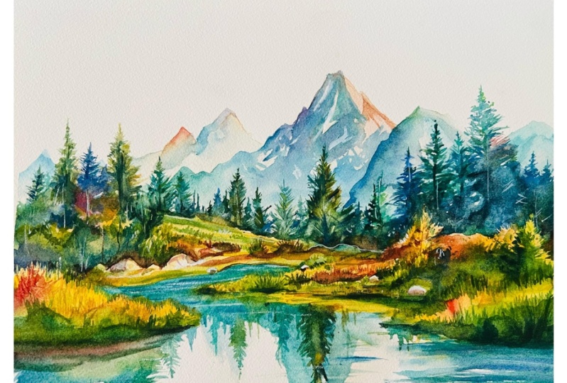
18. Negative Space: As I'm starting the mid
to foreground area here, I'm connecting it to that
foliage we did before. I added a brown pigment, a brown wash just to
make sure that there's a transition and these
lines that I'm adding now, these horizontal lines
help that connection. The viewer's eye moves comfortably through
a piece without hitting any dead ends or
getting stuck in one area. And even if they
can't explain why the painting feels
balanced or engaging, they can feel it subconsciously. That's the power of
connection in composition. It creates harmony and makes the whole painting feel
alive and intentional. So as we paint these trees, let's think about
how they're not just decorative. They're
functional, really. They're helping us build a bridge between different
parts of the landscape, between the distance
and the foreground, the cool and warm areas, the quiet and the
more detailed areas. They're part of the story and
part of the structure of it all You can see the rocks that I've painted
now or rather not painted, left out using negative space. And as I'm painting this
foliage area with a few rocks around I'm thinking just as much about the spaces around the objects as I am about
the objects themselves. This is where the power of negative space really
comes into play. Negative space is everything
that surrounds the subject, the gaps, the light,
the breathing room. And in watercolor, it's often, what is it especially
powerful because we're relying on the
white of the paper. Even though we've added
this yellow underlayer, it's the white that
makes it so bright. We're using that to create
the light and atmosphere. So rather than filling in every detail or outlining
every leaf or stone, I'm intentionally leaving
certain areas untouched. And these gaps aren't
mistakes or empty zones. They're active parts
of the composition. They help define the form, just as much as the brush
strokes we're putting in do. Notice how I might suggest
the edge of a rock, not by painting the entire rock, but by painting the shadows and the grasses around
it and above it. The shape of the object
is revealed by contrast, by what's not painted. With the foliage, I'm using loose broken brush work and leaving plenty of gaps
in between the shapes. Little pockets that hint at light filtering through
the trees or the leaves, whatever's on the floor or the distant space
behind the leaves. There's only about
four or five rocks. And it's just basically an
area that we've left white, added a small
shadow on one side, and you can see on the left at the moment, they're
clearly defined, and the two on the right
are yet to be done, so they look a bit odd
at this stage. But
19. Making Sense Of The Abstract: The surrounding shadows
do the work for me. They define the shape, the depth without
needing any hard lines. Whilst painting this area, I'm realizing that
this actually might be one of the more
tricky areas to paint. Not because it's highly
detailed or technical, but because it's quite abstract. This whole middle ground area is basically a flat plain
in terms of perspective. It's going a little bit uphill, but the surface is broken up and undulating with all
these clumps of bushes, grasses, scattered
rocks, leaves. And yet somehow it still
has to make sense. It has to be convincing like it belongs in the space between the water and
the distant trees. What makes this challenging
is that there's no clear or single reference
or a formula to follow. We're not painting a mountain
or a tree or a cloud. We're just painting
texture, depth, and light, and we're doing it in a way that requires us to use
our intuition, maybe even more so than
just our technique. So the way I'm approaching it is I start by breaking the space into subtle
zones of color and shadow. I think in terms
of warm and cool, light and dark, rather than specific objects. Where
does the light hit? Where might a bush cast shadow? What areas could be
catching the light? And which areas are receding
a bit into the depth. And this helps create rhythm
and depth without needing to define every individual
shrub or blade of grass. I'm doing a lot of vertical strokes like the blade of glass, and you can see how I've changed and mixing
up my brush from the thin brush to
my round brush. I'm using my thin sword brush at the moment to get
those blades of grass. So I'm trying to
vary my brush work, switching between soft
wet and wet washes and drier more textured marks to suggest different types of
plant life and terrain. Even just a change in direction or the
quality of the edge can make a big difference in
how the ground feels. One of the most important
things is to not over explain. We want the viewer to
interpret this space. We can suggest rocks without
painting in precise detail. We can show mounds of
bushes at a bit of spiky section and that's just enough to
convey what it is.
20. More Foliage: So we're continuing on
with this foliage section, and it's easy to get caught up with the idea of,
is this working? Isn't this working? Does
it look like a mess? But actually this section of the painting doesn't
want to be neat, so we don't have to be
too concerned with it. Whilst we're painting and
focused on this section, it can feel a bit odd, but actually we don't have
to stress too much with it. We can always come back
at the end if it's not if it's taking too much
of the attention away. But all we've got to do is just we want to make it feel a
bit wild and uncontained. When I'm painting these tufts of foliage and scattered rocks, I'm actually aiming for energy, thinking how I can
make the most of the energy rather
than precision. Maybe a bit of rhythm for something that
feels alive and growing and weathered almost by a kind
of ageless time in nature. There's not much
cleaning up doing, because there's a temptation, I feel it have to
clean things up, to outline every leaf, to make every brush perfect or to make the rocks
too symmetrical. But when we do that,
we actually start to lose the character of
the natural world. Nature isn't actually orderly in the way we often
try to make it. It's layered,
spontaneous and full of loads of beautiful
irregularities. And that's kind of what we're
trying to reflect here, so we don't need to be perfect. We're suggesting things,
suggesting movement, variation, and a little chaos. Try not to focus on
individual shapes. I'm thinking about groupings,
direction about contrast. I'll mix greens
right on the paper, maybe drop in warm or cool tones into the same patch to
create depth and surprise. A bit of dry brush, maybe, or a rough stroke can
give the illusion of texture better than any carefully
rendering ever could. But when I say I'm not caring. I'm not trying to be it's not about being vague
with what this area is. It's about being expressive, giving space for
the eye to wonder and the imagination to join in. And sometimes that means leaving things a little
rough around the edges.
21. Starting The Water: So now I'm starting to paint the water using Cerlean blue, turquoise blue, and integrating some of the color that
we used up above. You'll notice that I'm not actually painting
the water itself. I'm actually painting
the reflections. That's what creates the illusion of the water in this scene. It's interesting that
these reflections aren't even precise or honest
depictions of what's above. I'm not copying
every little bush, every color or every
shape exactly. I'm just echoing the general
shape and form, the rhythm, the vertical lines,
the soft color shifts, the suggestion of
what's being mirrored. And it's amazing how little
information the eye actually needs to interpret
something as water. Just a few downward
brushstrokes, soften the edges
and broken shapes. And all suddenly the scene
feels grounded and still. That's the magic of suggestion. Trying to make it
quite interesting, though, by not
having a flat color, adding brown where the ground
connects to the water, and then merging it
into that green, blue turquoise kind of color. Watercolor is perfect
for this kind of illusion because it allows us to blur edges naturally and let things dissolve
into each other, just like real reflections do. I'm not even
matching the colors. You can see the mountain
that we're painting here. The reflection of it
isn't the same color. And we can be quite
abstract because the distortions of the water
will abstract the shape. Keeping a little
yellow ridge there because the closer the
object is to the water, the less distorted it will be. So adding a few horizontal
lines at the bottom there. And then keeping the
edge a bit more refined of the yellow up at the top. But still, you don't need
to overthink this part. The goal isn't realism. It's to capture the
feeling of calm water, catching color and light. Et your brush move gently and let the shapes
feel a little abstract. That looseness actually makes the reflection more believable. Adding a bit more cadmium
yellow, blending it in a bit. Mixing in some darker blue into this and maybe
a bit of black, very thick pigment wet on
too wet, but not very wet, just enough to
allow that edge to bleed where the water
meets the grass, the ridge, letting
it fall in there. Making the ground a bit
darker than the water. Then we can add a
bit of ripples.
22. Painting The Reflections: Now I'm mixing a
lovely vibrant blue, and a bit of ridian
just to make it slightly bit green so
it's not a pure blue. Very carefully painting
the shapes of these grass, this long grass, really,
the yellow long grass, negatively painting
the blades of grass. And then just
filling in the area. The good thing about
using this color of blue, when it goes over the yellow, it'll just make green anyway, which is already harmonious with the rest of the painting. So it doesn't matter if
there's a bit of overlap. Very important to use a
brush with a fine tip. And also, make sure you've mixed enough of this color on
your palette because you don't want to start
painting it and then mix more of this color. And then by the time you're
ready to add the paint again, you've got a hard edge
right in the middle of your reflection of your water. So we fill in this area
with a base blue color. Get the general shape happy. And then once we get to
the edge right here, where it's a kind
of horizontal line, we can go back and add
these brush strokes, these horizontal
brush strokes with a thicker pigmentation to give it that feeling
of water, the ripple. The light ripple in the water. And we can start working
down again, connecting it. Now we can start
looking at the trees in the midground and
trying to mimic them. Basically, like a mirror, a horizontal mirror, but much lighter and much
more carefree this time. We don't need to match
the tones or the colors really, a simple blocking. We're trying not
to vary the colors too much like we did
with the trees above. We don't want it to
be so distracting because these reflections will pick up the color
of the water a bit. So we're using that
green turquoise to suggest that it's water. But again, we're not
actually painting the water. We're just painting
the reflections. Of course, the sky isn't going
to be white in real life, but the illusion of the
painting makes it so. Uh,
23. Mixing Greens: As I'm painting the reflections of the trees in the water, you'll notice I'm not reaching for a ready made green from
the palette, a pure green. I'm using a bit of viridian
every now and again, but I don't have
a pre made green. And that's a deliberate choice
because pre mixed greens, maybe even sap green, often look a little too
artificial or flat. So it's nice to
create some variety. You can see all the range of different greens I have there. I'm not using a pure green, especially when we're trying to capture the richness
and variety in nature. Yeah. A lot of the times, actually, I mix my
greens from scratch. Usually starting with
a blue and a yellow. And I've got three different
blues to choose from. I've got cerrillan cobalt
and ultramarne blue. And then you can mix it with cabium yellow or yellow ochre. I've got a bit of
yellow ochre going on in this particular
reflection right now. This gives me far more control not only over the exact
shade that I want, but also the temperature
and the mood of the green. For instance, if I mix ultra marine blue with the
warm yellow of yellow ochre, I'll get a more
muted earthy green, which is perfect
for evergoon trees or shadows in the forest. And then if I use something
like turquoise or serlean blue with lemon
yellow or camium yellow, I get a much brighter, ler green livelier green, which works well
in sunlit grasses or the vibrant foliage
sections of this painting. And what's lovely
about this approach is that you can create variation
within a single stroke. If I load my brush
with a bit more blue on one side and a bit
more yellow on the other, then they'll mix
directly on the paper, and they create
subtle transitions that feel much more organic, especially in the water and the reflections
we're doing right now where you want a bit
more movement and fluidity. And you can even think
outside the box. You can choose to
chift the greens by adding a touch of red or
even a bit of burnt sienna. And that neutralizes the
mixture slightly and stops it from becoming too
neon or overpowering. Of course, we've got a lot of vibrancy in this
painting, but sometimes, most of the time, if you want to take a more
realistic approach, you don't want things
to be so vibrant. And this is useful
for tree shadows or distant foliage, as well. Or where you want
the greens to settle back into the landscape
rather than jump forward.
24. Finishing Touches: So I'm just finishing
off the reflections. I've added dark lines, wet on wet where
the ground meets the water because that
helps the illusion, the separation of the surface. And I use a mix of
horizontal lines for the ripples and vertical lines for the reflections
of the trees. I want it to be a bit more abstract in this
bottom right corner. Like I said before, the contrast is strongest, the closer it is. So you see I'm adding a
lot more contrast with the brightness of this foliage and the dark black of
these brushstrokes. In the final stages
of the painting now trying to draw it all together. Connecting
here, I think. Like right now, I'm adding just a light wash that works
adds a bit more depth. A single brush mark like
this is the size of a field. Adding a bit more texture there. Okay. And it's around this part of a painting
where you've got to think, what else do I need
to add to improve it? And will adding anything
else then take it away. And that's the moment you
realize the paintings done. So when I reach that point, I then switch to my white gouache to pick out some highlights that
we lost along the way, enhancing those highlights
on the mountain face, maybe making some
of the trees pop. Adding a few little highlights. Organizing some of the
chaos in that foliage. Just a few fine simple lines can just hold
everything together. Make sense of that chaos. A few random touches in these trees gives the illusion
of light coming through. A few vertical lines
on the water there. Adding a few more shadows. And when you feel it's done, that's the right time to stop, and maybe you can disconnect for an hour or two and come back
to it with a fresh eye.
25. Final Thoughts: Welcome back and well done on completing your dynamic
mountain landscape. I hope you enjoyed experimenting
with vibrant color, expressive strokes,
and looser techniques to create a scene that feels
full of energy and life. Throughout this
class, we focused on building mood and
movement through colour, contrast, and flow without
getting stuck in the details. That's the beauty of expressive
landscapes in watercolor. They invite boldness
and reward letting go. Remember, watercolor painting is not just about technical skills, but also about expressing your creativity and
personal style. I encourage you to continue
exploring, experimenting, and pushing your
boundaries to create your own unique
watercolor masterpieces. As we come to the
end of this class, I hope you feel
more confident and comfortable with your
watercolor painting abilities. Practice is key when it comes
to improving your skills, so keep on painting
and experimenting. I want to express my gratitude for each and every one of you. Your passion for watercolor
painting is so inspiring, and I'm honored to
be your teacher. If you would like feedback on your painting, I'd
love to give it. So please share your painting in the student projects
gallery down below, and I'll be sure to respond. If you prefer, you can
share it on Instagram, tagging me at Will Elliston, as I would love to see it. Skillshare also loves
seeing my students work, so tag them as well
at Skillshare. After putting so
much effort into it, why not share your creation? If you have any questions
or comments about today's class or want any specific advice
related to watercolor, please reach out to me in
the discussion section. You can also let me know about any subject wildlife or scene you'd like me
to do a class on. If you found this class useful, I'd really appreciate
getting your feedback on it. Reading your reviews
fills my heart with joy and helps me create the best
experience for my students. Lastly, please click
the follow button Utop so you can follow
me on Skillshare. This means that you'll be
the first to know when I launch a new class
or post giveaways. Thank you for painting
with me today. I hope this class
has inspired you to experiment more with
expressive, vibrant landscapes. Until next time,
happy painting. Bye.
 Will Elliston, Award-Winning Watercolour Artist