Transcripts
1. Introduction: December is such a
magical month, isn't it? The crisp air, the cose vibes, and all those little moments of beauty is what makes
the season special. In this class, we
are going to capture the winter magic one painting
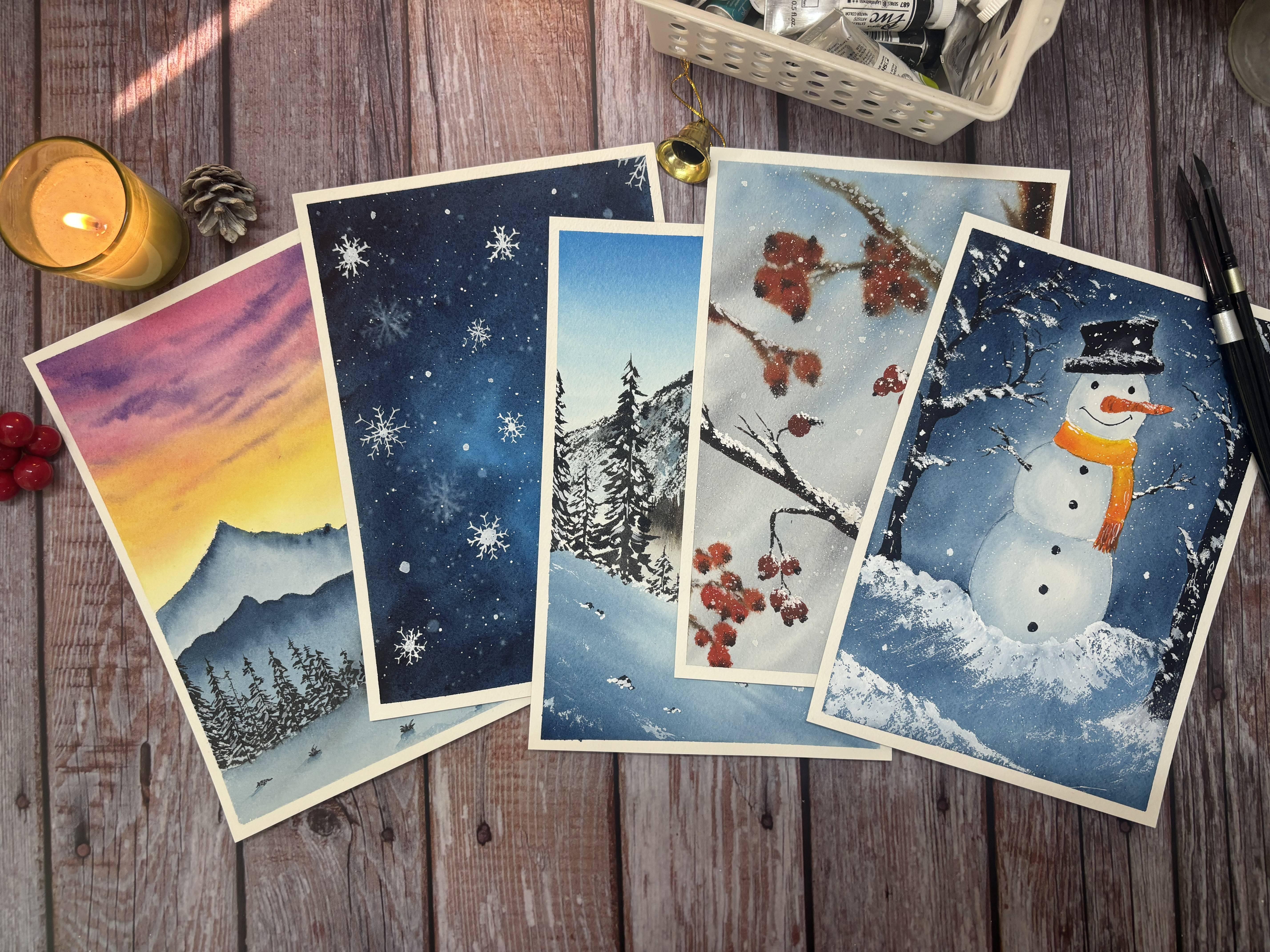
at a time. Hi there. I'm Shaika and I welcome you to 31 days of December
in watercolors. Over the next 31 days, I'll guide you through
creating a series of quick and simple
watercolor paintings, each inspired by a unique
element of December, whether it's frosted window, a steaming cup of cocoa, a snowman, snow capped
mountains, many more. This class is designed
for everyone, whether you are a beginner
picking up your brush for the first time or an experienced artist
looking out for fun, low pressure class to stay creative during these
holiday season. We will focus on wet on
wet techniques to create a magical background
and highlight a single crisp element
in each of the work. By the end of the
month, you will have beautiful 31 little
masterpieces, each one telling its
own winter story. So grab your brushes, get cozy, and let's make this December
a creative celebration. I can't wait to see you
in the class. Bye bye.
2. Materials Required : Let's look at the materials that we will require
for this class. For the paper, I have used archis hundred percent
cotton, 300 JSM paper. This is a paper pad that I had, and what I've done
is I've cut all of these papers into these
small size 31 pages. You can go ahead with
any paper that you have, but I would suggest using 100%
cotton and 300 GSM paper. Now let's have a
look at the brushes. I will be using the
silver Hake brush to apply even coater water. And for painting would
be majorly leveraging the silver velvet size
ten and size six brush to paint the backgrounds
and Princeton round two or long round four
brush for the details. You can use any
brush that you have. I would suggest going ahead
with one large size brush, one medium size brush, and a detailing brush.
Next other colors. I would be using different
brands of colors, BT PWC or Cinela Windsor
and Newton Mgilomission. You can use any brand of
colors that you have. Colors for each of the class
will be shared at the start. As it is a December
class at December is a Christmas and winter month. We will be leveraging a
lot of white gouache, so I would suggest
keeping this handy. Next to mix the colors, I'll use ceramic plates,
either this or this, so you can go ahead and use any ceramic plate that you have or any other palettes
that you might have. We'll also use tissue to clean up the brush or wipe
out any excess water, anything that we
would need help on. Next, that we would need
is a pencil and an eraser. For a few of the
classes, I would suggest also having
a ruler because it would help us out in sketching out the window panes, et cetera. We will need jar of water. You can have one or
two. I would ideally suggest going ahead
with two jars of water, one for clean water and
one where you can clean up your brushes and
the masking tape. So this will help us tape down our paper onto a board
or the table surface. You might also want to keep a masking flute handy
in case needed. I will be using similar
masking flu that I have. In case you don't
have it, don't worry. I'll also share out an option of painting without
the masking flutes. That's all for the materials, gather whatever you have, and let's hop on to this 31 day journey of painting
December in watercolors.
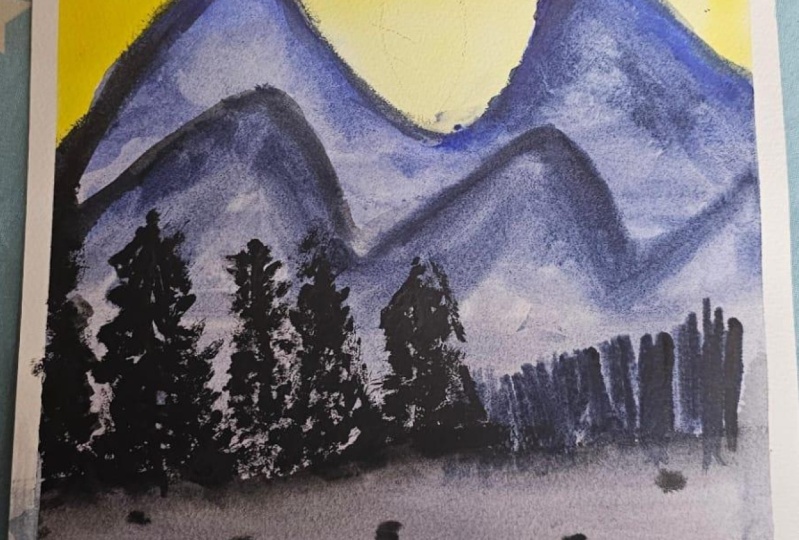
3. Day 1 Misty Mountains: Hi, everyone, and
welcome to Day one. This is the first class project that we would paint today. These are the colors that we
will require for this class. Here I have my paper and
using the masking tape, we tape down to the surface. Run down your fingers through
all the corners to make sure that there are no gaps between your masking
tape and the paper. As we will be
painting wet on wet, this will ensure that there
is no water that seeps into between these gaps and which data gives us the
cauliflower effect. As well as this will
also make sure that we do get a crisp edge at
the end of the painting. The sketch for this
class is very simple. We will have some mountain
ranges, so here it is. The other one goes like this. Then we will have a trees here, and this would be your surface. So the trees and all
will come over there. Now using my kneelding eraser, I will just tap off and
lighten the graphite marks. Okay, so done. Now using
my large size brush, which is the size ten, I will apply an even coat of
water to the sky area. You can use any
brush that you have. Take time and make
sure that you run your brush across the
sky area multiple times. The reason for doing
this is first, not to miss out any area
without getting wet. And the second is, as we
will be building on the sky, the more the layer of water, the longer the paper stays, I will give you a lot more
time to paint onto your sky. Okay, I think we are done. I'll just tap up
the excess water from these corners
with my tissue. Okay, done. Now let's start painting. So here, I'll start with yellow. And that's layer of
yellow that we will have. It is mostly towards
the bottom of the sky and also
between the mountains. So just be very careful while painting near
the mountain area. Taking this up towards the top. I think that should be okay. I'll just blend out this yellow. Next color is orange
or yellow orange. So that will start
somewhere in the middle. So this will start
somewhere from the yellow that we
already have and would go towards the top of the sky somewhere on
the three fourths. And now with the quin rose, we will paint the top
layer of the sky. You can use crimson as an
alternate color for this. So the quin rose or the crimson red and orange blends well. So the first layer would be a very simple sky which starts from yellow and
orange in the bottom, go still being a slight
pinkish at the top. Okay, I'm happy with this. Now we will build on to
the sky with violet, which is basically at the top and the
color of the clouds. So the top would be violet and somewhere below
between as well, the clouds would
be violet shade. It would be something like this. So move from left to right for your clouds and
similarly left sorry, from right to left
to have your clouds. Now, purple and quin rose
or crimson works well, but purple and orange or
yellow gives muddy color. So be very careful
when we move towards the middle section of the
sky to paint the clouds. Somewhere here,
they would be very light and would be
very thin as well. As you can see, they
are very, very light. What I will do is at the top, we'll build onto the quin shade and we will get a little to the middle bottom
section as well with some pinkish clouds and that would give us an
effect of a pink sky. As you can see, just blending out the pink
with the yellow and orange and now going back
again with the violet, we will build on to the sky
only at the top section. Dabbing of excess
water so that we get a very fine layer of sky
and the strokes of cloud. Starting from your right
and build onto your clouds. Again, starting from your
left and building onto it. As you can see, these are
all cloud strokes that I'm trying to build from left to right or from right to left. As we come down, those become
very thin and very light. At this time, I have
taken very dense shade, just building onto that layer of painting the
clouds from left. And now from the right. Okay, now with the clean rush and dabbing of excess water, I just blend this out to avoid these hair like
structures that we get. Okay, now, that's
all for the sky. Let's wait for this to dry before we paint
on our mountains. Now for the mountains,
I'm going to just take indigo and just drop the
shade to the first mountain. And what we are going to do is we are going to just
blend this out. So it's going to be a misty
mountain sort of fields. We'll apply the stroke
again showing it out here. Okay. So these are the strokes. Let me just take a little water. As you can see, we just fill the mountain with the colors and then try to blend it out and get those
towards the bottom. This gives a misty cloud effect. I'll just drop
some darker shades here just to get that
unevenness in the mountain. Now, cleaning off my brush, dabbing off excess water, we'll just try to break it down. And Now, let's wait for
this to dry before we add in the second
range of mountains. Now, again, I'm using
indigo and adding a slight tinge of black to
get it a little more darker, or you can use
pains gray as well. Again, with the same concept, we start with the
layer at the top. You can see my
strokes, it's slightly zig zag to give it a feel
of a mountain range. Paint it till the
middle section, and then cleaning up the brush, dabbing of excess
water, we blend it out. And you can see I'm
just blending it right out just to give it that
smooth misty effect. Again, dropping off
some dense color here and there to give
it a more natural look. So now using my detail brush and with a mix of
black and indigo, we'll add strokes like this, depicting a group of trees
which is on a mountain range. The trees are not distinctively
visible from a distance, but you can make out that they
are making that mountain. I'm just trying to
get that effect with these thin strokes so
they can vary in size. Some of them can be tall
and others can be shorter. Yeah, I think this
should really be enough. Now, let's wait for this to dry, and then we will add in our
detailed trees somewhere here at this side of the paper and some foreground elements. I like how this is turning out. So this has almost dried now
using black or pains gray, we will paint in the pine trees. I've taken in a very
concentrated mix of pains gray and black, and starting with the pine tree, we'll just make a vertical line. So the top, there are
very less leaves. And as you come
towards the bottom, the number of leaves increases, and so does the thickness of the strokes that
we will paint. Okay. So this was the first one. Now, similarly, we will
paint a lot of them. So suppose this is
the one which has half on the other
side of the paper, which is, you know,
outside of our paper, and it's not visible to
us, and it's a tall one. So we start from here and we build on going
towards the ground. Okay, so now what
I'm just trying to do is fill in the gaps between the leaves of these two trees so the trees behind
are not visible. Just building on a little
bit over here as well. They could be a
small one behind, and I'm just adding few strokes with the leaf
structures like this. Okay. Let's say there's another tree between these
two that's very, very far. So just adding few strokes. You can see I've just almost
not painted the leaves. Okay. Now here, let me add this, which is towards the
front and you'll be able to see its leaves
also very predominantly. So just painting
out those leaves. So these are zigzag
kind of strokes. Also a different way
of painting them. Add a thinner, very small
tree here at the back, and somewhere here is
a tall tree which is thin there. There you go. So basically the bottom of your trees would ideally
have something at the back. So what I'll do is I'll
make this leaf heavy tree so that it covers the other smaller
trees which are at the back. Moving ahead with
this one again, let's paint this a
very bushy tree. So there are some trees which has a lot of
leaves and branches, and there are some
which is almost barren. Again, painting a
smaller one here. What I'll do is
I'll just keep on adding some of them
as well just to maintain that continuity. That's it. I think we should be good. So now, basically,
we are going to add in strokes
which make it seem like there is a higher level of ground versus what
we have at the back. And then, again, this
gets blended out. So let me just blend this
out with the background. And once this we'll add
some small layer of stones and bit of branches
of the tree that comes in. So let me just do one thing. What we'll do is we'll add
some trees to this side as well just to get
some uniformity across. So these are very, very far. You would idly not
see the scribbles, but you would know
that there are trees, something that we painted
similar at the back. So let's just paint something in a similar way and I just
try to blend them out. To So now the paper has also dried using black. We will add some leaves or some plants like this
on the snowy ground. So rocks that might be seen, some small stones, not much, a little bit of them, okay? Add shadow dico. We will blend this out
with the background. So I'll just clean up my brush, dab off excess water, and
just try to blend this out. That's it with the
background now. What we'll do is using white quash, we'll
add in the snow. So the snowfall has
already happened, so your trees and
leaves would have some amount of snow
on them, right? So on the branches, there would be some snow
which just left after the fall or on
the trees on the rocks. So just adding them, not a lot, just on some of
the bigger trees. So it's like the snow
that has got trapped between these trees and
has not fallen down yet. So we'll just add these
strokes on top of the leaves, similar to the strokes like
we had while painting them. You can also add some
snow on the rocks, some on the ground plants. I think that's fine. We are done with the painting
for the day one, and we can now
remove masking tape. This is the final
painting for this class. I hope you enjoyed it. We'll see you tomorrow with
another class project.
4. Day 2 Snow Flakes: These are the colors that we
will require for this class. I've got my paper here
using this basket tape, we will tape down the
paper to the surface. Okay, so just taking some time to run my fingers
to the masking tape. This is just to make
sure that there are no gaps between the
tape and the paper. Now, there is no pencil
sketch for this class. We will directly apply
even coat of water. Here I have my hake brush, and I'm just running my brush multiple times back and forth
to the whole of the paper. You can use any large
brush tat you have and take your time to wet
your paper thoroughly. Make sure there is no pool of water anywhere on the paper, and your paper is wet
in all the corners. So the more time you
spend on this step, the longer your
paper will stay wet, and the longer you
will have the time to paint on this painting
that we are going to do. So while painting wet on wet, always spend time
on this step to make sure your paper
is thoroughly wet. I think this is enough. What I'll just do is using
a tissue paper will dab off the excess water from
all the corners of the tape. So the colors that we
need for this class is serene blue or Prussian
blue or cobalt blue, and then it's indigo and a tinge of paints gray
as well or neutrotint. Starting with serlin blue and just applying it
across the paper. This is a fun painting. You can just play with
the colors and the water. There is no fixed pattern of
how we would want to paint, and you can just
play around with the colors in the
wet background. So basically what we're
trying to achieve here is have a slight
lightish background, somewhere in the middle
or somewhere here. And have a darker background
from the corners. So that's why I'm adding indigo towards the
corner and have added Serden blue towards the middle section of the paper, taking indigo, adding
the darker tones, blending them in with
the lighter blues. You can see there is no definite
pattern or the strokes, the way we want the
strokes to be there. We're just playing around with the colors and different
tones of blue. Geraldos will add tinge of neutral tint as well
towards the corners. This will give a more darker
shade to the background. Lay around with indigo, serlene blue, and
the paints gray. There is no definite
pattern to this painting, just playing around and just building on the tone
bit by bit so that I don't lose out
the lighter shade that we have in the middle. Have said that we
could have directly gone with a darker shade when we knew that this
is what we are planning. But then you would not get this natural blend that
we are aiming for. So we'll go bit by bit, build on to the color. You can see with each stroke, I'm trying to get a darker
paint gray across the borders, across the corners using indigo, we'll try to get that
blended out with the erle blue and make it
feel like it's a uniform. It's been growing
the tone of the blue is growing gradually from the middle of the
paper to the corner. Okay, I think I am happy with the way this
has turned out right now. So I'm just ifting
up some color. But that I mean is using the same brush that
I've just cleaned. I'm just picking up some color, dabbing it off back
to the tissue, cleaning up my brush, dabbing of excess water, picking up some colors, again, cleaning the brush,
tabbing of excess water, and picking up some colors. Okay. I think this is
enough, and this is good. Now, using my medium
size brush and white, you will create some splatters. That would be like
the snow in the sky. That's what we're
trying to depict here. So I've taken white
quash onto this brush, and using the other brush, I will just sprinkle those out. Not too many, just
a few of them, and I think this is enough. As it's wet on wet as the drops that we have
put on a wet background, those will spread it would give a blurred effect when dried. So now taking my
detailed brush and with white quarch we'll
just paint on the flakes. And again, as we are painting them on a wet
on wet background, those will be blurred. So let me just try one here. You see, those are
getting blurred. We'll just add on to the flakes
these leaf like strokes. You see, these look as snowflakes but have been
blurred in the background. Let me paint one here. Let me paint one over here. Be very careful as you paint this because your
background is still wet, you do not want to touch the background
and get colors on you. It's okay if it
gets blurred out. It's okay if it's
not very clear. That's exactly what we want, and we're trying to depict. Let me just make one over
here as well at the corner. Now, we'll wait for this to dry. We'll add more snow and snow flakes once the
paper has dried. Before we do that, what
I'll also do is I'll add some bigger snow balls as well, because the droplets that we see with the splatters,
they are very small. Now, let's wait for
this to dry and then we'll again continue
with this painting. Okay, so the painting
has now dried. Using my detail brush
and white gauche, we will paint in the flakes. The very similar
way how we painted the flakes when the
background was wet on wet, we will paint now wet on dry. Very slowly and take your time
on this step to not hurry. What you can also do is if
you have a white gelpin, you can use a white gelpin
and paint these flakes. In fact, let me show you how
do we do that with a gelpin? Let me say paint one here. This is two thart so it
will come out really nice. You just have a little more
control when you create these flakes via gelpin versus when you do
it with a brush, detail brush and colour. It all depends on practice. So the more you practice, the better it will
become for you. Let me paint one here. I'm purposefully
trying not to paint any where we already have these blurred
backgrounds, right? So, otherwise, they
won't be visible then. Okay. Now, let me go back to painting it with
a detail brush. You can add as many
snowflakes as you want. It's all a personal choice. I'm going to add a
couple of them more. You can also paint this
particular artwork while taping the
paper on the board. So, it makes it easier to move your paper around and
work on these strokes. Just a suggestion,
you can try that out. You can add the flakes with or without the center
filling, right? So it all depends. These are flakes, snowflakes and snowflakes can be in
different ways, right? So you can vary them in sizes. And I think you
can add one here, which is not exactly seen, but just somewhere
here, it's visible. So this flake would
be somewhere right in the corner and would not be visible completely,
but it's there. That gives a
different look to it. Okay. So now, using
my medium size brush, like we did the platters while the background
was wet with white, we would do the same now
when the background is dry. And now, what I'll just
do is we'll add like we added bignwblls while
the background was wet. We will just add some of them as well while the
background is dry. Okay, I think this
much should be enough. I think I would paint
one more just right here between these two
and a blurred one. I just feel it's a little empty. You can stop if
you don't want to. I was feeling that
I can paint more. So that's why I just
started again with this. Okay, then I think we are done. As this was wet and dry, the paint has also dried off, so we can remove the
masking tape now. There you go. I like how
this one turned out. A simple and a frosty sky. Thank you for joining for today. We'll see you tomorrow with the new class
project. Thank you. Bye bye. Hi, everyone. Today we are going to paint
this for the day two.
5. Day 3 Pine wood with Snow: Hi, everyone. Today, we will be painting this
as the class project. Okay, let's tape down the paper. Using my mask not tape to tape down the paper
onto the surface. You can either tape it down onto a board or you can tape it down to the table like I am doing. Okay. Always run your
fingers on the masking tape, is to make sure that there is no gap between the
paper and the tape. Okay, so it. Let me just remove sap
green onto my palette, as well as hooker's green. I already have indigo and
pinks gray or neutro trint. So now, using my hake brush, we'll just add even qua of water to the
whole of the paper. Spend time on this step and make sure your
paper is thoroughly wet and there is no area of the paper where the water has
not been applied, as well as make sure that
there are no puddles or pools of water at any
corner of the paper. So always move your
brush back and forth to make sure your
paper is wet thoroughly. For this painting, specifically, we will be working
on a wet background, and we need to work for a
longer duration of time. So if you spend more time
in trapping your paper, you will get more time
to paint wet on wet. Okay, I think this
should be enough. I'll just dab off excess
water from the corners. Now using my large size brush and indigo will drop on the
color from the background. Okay. Now with hookers green, we'll just try to add ins. This is very dark shade. So I've just cleaned up my
brush and using this screen, I'll just try to, you know, create a tree like structure. You can see I've used
the green that we had, and I'm just adding a tree like structure to
the background. So what I'll do is I'll
add paint screen to this screen and we'll add a
little darker tone to this. Okay? What would also do is we'll add some greens
here and there as well. This will give a feel
that there is a tree, but it's somewhere
at the background and it's not very,
very clearly visible. You can see whenever
I'm picking the colors, I'm dabbing off the
excess water onto my tissue paper to make sure I don't get a very darker shade, as well as a lot of
water onto the paper. While painting wet on wet, what we should make sure is
always the quantity of water on your brush should be less than what you
have on the paper. If it is more, then you're applying more water
to your paper, which will cause the
blooms to be created. Okay. And now, what I'll do is with my medium size
brush and brown. So here I am
leveraging Indian gold and mixing that with pain scrape to get
a dark brown shade, I'll just try to add in some places the trunk of
this tree that we see. Okay. So again, taking in some brown indigo and adding
this very dark brown shade. What I'll also do is have a little bit of so they
would be branches as well, although we would
have the leaves, but they could be
branches as well. So taking in burn Siena, because with Indian gold, we didn't get the
shade that I wanted, and adding indigo to it
or paints gray to it, we'll get a darker
brownish shade. This is what we wanted, and we'll add in some strokes here and there just
to depict the trees. Now, with the burnt sienna
and paints gray mix, basically the dark brown shade, we will add some branches
for the other tree as well. Then with the green,
very dark shade, we'll just add in to this tree just to give it a
different greenish shade. It was all very
bright green, right? But it's nature, right? So you will not always have
the same shade of green. So that's why just adding in another layer of a
different shade of green. You can see the strokes are similar to what we make it for a tree because it's
towards the end, you will have longer branches, adding more of those here. Now, over this section, I would just want to
add a little more of green just taking in the
brush and running through it. Paper has started
to dry from here, and I think we are good
with the first layer. Always tab of excess water and your paper has
started to dry, right? So just always dab
off excess water. So they could be very far away so you don't know where it ends. Okay, we're good with this. What now I'll do is before
the paper dries off, I'll just use white because
it's a snowy atmosphere, add in some snow effect. Okay, so we're done
with the first layer. Let's wait for this to dry. And then you will add
in a detailed tree at the front and some more snow. Okay, so the painting
has now dried. Now, using a medium sized illow
lt brush and burn sienna, we will paint a closed up
view of some of the branches. So I've just added some paint gray or intigo to the burn sienna to get
a darker brown shade. And what we do is
starting from here, we can just add in a
straight branch. Okay. So this is one branch. And then similarly, there's this another
branch that's coming in There's another that's
coming in from here. There could be a smaller
branch coming in from here. Now, using your detailed brush, I'm using my detailed
brush and green. So now here we will
use sap green, hookers green or we'll keep on adding paint green to get
different shades of greens. We will paint the pine trees. So the trees, they just have leaves coming
out like these. Okay? So basically the
Christmas trees that we have, the leaves of this
Christmas tree, you just have that poking
straight thin leaves, right? So that's exactly what we
are trying to get here. So right now, I've
just used Lucas green. So it's a darker shade of green. What you can do is you
can add pains gray or indigo to your sap lean
to get a darker shade. So I've just added that And now to the same green, we'll just add more
of indigo or paints gray and get another shade darker than what we
already have on the paper. This is another shade of green, just adding in the leaves, these pine like leaves, some to this side as well. You don't want to cover
the whole of the branch, so we should be able to
see the branches as well, because if you've
seen those trees, the brown thin branch, those are also very
evidently visible. So now starting with
the second one. But the leaves can overlap
with each other, right? There are two branches which are very closely
lined together. So you would have the leaves
overlapping between them, so it can obviously have
that effect as well. So keep on adding these
leaves like strokes. Just play around with the
greens that you have. If you have other shades, you want to add
another shade as well. You can go ahead and do that. You want to darken the greens. You can again add more of pains gray and darken your greens that
you already have. So you can play around
the way you want. Similarly from the
other side as well, we would have some branches. It's basically a forest view, you have close up of some of the branches coming in
in different directions. So I'm going to just repeat
this process once again. If you don't want to do that, you can let your painting
be the way it is. I just feel that the leaves could be a
little more bigger. So just trying to see
how that turned out. So now this looks okay. What we'll do now is we would have snow covered
onto our trees as well. So just with gouache, we'll just add these as if the snow has got
collected onto the branch. So we'll just add some drops and blobs of snow onto
each of these. So it could be between
your leaves as well. It could be on your branches. So let's just using
white gouache, try to paint that out. Could be that were
against the gravity, it could be that
the snow has got collected onto the
leaves as well. Just adding those
somewhere big blobs, somewhere just small. Okay, so we are done
with adding the snow. Now as we did splatter
white on wet background, we will do the same
right now as well. As the background is light, the white splatters are
not visible evidently. So with the brush, I'll add some bigger dots to show
the snow and you can, as usual, add them
as many as you want. I will just add some more
splatters this side because the background is
a little darker so the splatters will be visible. Okay. So the painting
has now dried. Let me just remove the masking. So here is the final painting. I hope you enjoyed
painting this. You'll see it tomorrow with
another class project.
6. Day 4 Winter Trees: Hi, everyone. Today, we will be painting this
as the class project. Okay. Let's start with
today's class project. Using the masking tape, we'll tape down the
paper on the table. Okay. So again, I'll
just run my fingers on top of the masking tape to make sure that there is no gap between the
tape and the people. There is no sketch as
such for this class. But what I'll do
is we'll just add a horizon line and just a placeholder for a tree somewhere
here in the middle. Okay, so this is one
of the branches. This is the tree splits into
two, again splits more. Here is another branch. And then there is another branch like this going somewhere here. So a simple placeholder
for the tree right now. We'll add in the
details directly when we paint it on top of it, okay? Now, using my hake brush, or you can use any large
size brush that you have, we will apply an even
coat of Wala, Okay? So we'll apply the coat of
water for the sky part. So you can just apply the
even coat of water till the horizon line that we
have just made sketched out. And again, take your
time on the step so that your paper stays wet
for a longer duration of time and just moving
my brush back and forth to make sure that the paper is wet from
all the corners, as well as there is no puddle or pool of water being formed. So what I'll do right
now is I'll just tissue. I'll just soak in the water from the corners and will again just run my brush
through the paper. Okay. The paper is wet now. I'm taking my large size brush and yellow dabbing
of excess water, we will start with the sky. So I'm just applying yellow from the middle
to the bottom section. It's a simple wash,
as you can see, just leaving out
some white spaces. Now, using orange, we'll apply the strokes towards
the bottom of the sky. And now using indigo
will paint the top. So now indigo and yellow, when mixed is giving
you a greenish tinge. That's okay. That is what I wanted to have that in the sky. So you can still go ahead
and paint your sky. Now there's a lot of
water on my paper. So I will just using yellow
paint the top a little more but and somewhere here
in the bottom as well. Just adding in some
tinge of yellow. Using the blue, I'll
start again from the top. Let me just, you know, soak
the water that we have here. Otherwise, this will see back
in and will cause blooms. And we don't want that
to happen. It's okay. We will just build on
the layer bit by bit, as you can see, just adding
some blue strokes to the sky. The topmost corner of our sky
would be the darkest blue, and it will become light, slightly greenish shade when
we move towards the yellow. Which is what we
want. Now, again. This is the place where
the blending will happen between the yellow and the blue. Working on those strokes, pulling in blue
towards the yellow, and pulling in yellow
towards the blue. See this. This looks
still much blended. Again, taking in yellow
and adding those strokes. See? This is me pulling in
blue towards the yellow. I'll just take a little
more of dark blue, dab of excess water, and add it here towards
the top because I want that to be a
little more darkish blue. Pulling in the blue
towards the yellow. We just take a little
more of yellow, taking in yellow typing of
excess water, bending it. This is the yellow that
we have adding those hail to greater plant with the orange that we have towards
the bottom of the sky. I use in this yellow, I can just try to blend it
with the blue and have a little more of clear yellow
towards this guy, okay? Lifting of some color from here. It's a beautiful blend of blue, dark blue coming
in from the left, and the yellow coming in from the right and blending it
out somewhere in between to create this
green gradient and then the sunset effect of the orange shade
towards the bottom. Let's wait for this to dry, and I will again just seep off the excess
water that we have here, this and some more hair. Okay, I think we should be good. Let's wait for
this to dry before we paint in the
foreground and the trees. Okay, so the paper has not drip. Using neutral tint
for paints gray, we will paint out the
background trees. And as it's far away, the tone of the color
would be lighter, and also tree leaves
will be not very, very clear and prominent. To I'm going to just shift to my
medium size brush and paint out more
of these trees. So you can try to make it in the similar fashion that you
paint out the other trees. It's just that you can fill in the body of the tree
with a flat wash. I'll add some at the back. So they are very far away so you don't exactly see
the tree leaves. Sn, let me just add very small ones as if
they are very, very far. So, let me just add a big one. Tone of the color is very low because the
trees are very far away, so you might be very
faintly visible. This side I'll not add much
because we'll be painting two trees on the
fetund of this. Okay. So now taking your
indigo and let me just take my large size brush because it's easier to paint,
taking indigo. I'll just add these
strokes here. So you know this is all snow. So this land is
covered with snow. At places you have these
snowy bumps and all right. So just try to depict
those say one is here. One is over here. You can then just fill
the pillow one with water and have a quick
wash done with water. See? Okay. Here, also, I'll just add
some strokes of indigo. Now, here we had
painted a tree, right? So I'll just add a
hilly stroke over here for the tree
base for the tree. Okay. And here we'll have
another one. That's it. I think there should be enough. And here, I'll just add a
little more of denser color, just like shadow of
all the trees and something coming
in, right? So this. I think this should be enough. Now, let's just wait for
this to dry and then we can paint on the
trees foreground here, this middle tree
that we had painted, and some of the trees over here. Okay, so the paper
has not dried. Now using medium size brush and a dark tone of paints gray or neutral
trent or even black, we will paint out the trees. So starting from here, suppose the tree is
towards, you know, the left of this page and we just see towards just
the glimpse of it. So we won't see the trunk, but we would see
just some leaves coming out from the left. So something like this. I think this is enough. Now for the middle tree, let's say we have a branch coming out
somewhere like this. Be very careful while
painting this and branch out as many
branches as you want. I'm just adding the main tree
trunk of the tree for now. Say it comes still here. You can leave this like it's the snow that
has got, you know, stuck on the trunk bottom, and you can have another
ranch coming in. It's getting split
somewhere like this. Then you have small branches
coming from there as well. And then from this
corner, S from here, there's another branch
that's getting split have to be a thicker one and then you'll have
smaller branches branching out from these. So then this would
be your main branch. Make this little thicker. Okay, so now I'll
use my diesel brush. I want to be very, very
careful while I paint these because this is the main
element of a painting, right? So we are showing this
barren and this tree, the winter tree that we are
trying to depict here, right? So let me start from here. So there would be a branch
coming out like this, and then you will have these
branches, shorter branches. Similarly from here, say there's another branch
that's coming out. You trees are never in a
straight branch, right? So we will just make
some zigzag lines, zig zag strokes to get
that natural effect. And as you try to end your tree, your branches will become
thinner and thinner. It's okay to take your time. This one, I'll just
extend a little more. There is another branch that has got curved out from here. Now you can add little
little bit more branches between these each of these
branches will branch out. So the thicker you start for your branch, you can extend it. I mean, you can make a
longer branch out of it because it goes from
thick to thin, right? So if you start more thick, then you can branch it out for a longer time going
thin bit by bit. Add in as many as you want, and you can add in any
direction that you want. So this is all natural. There is no hard and fast rule. You can make it
the way you want. You can make it more. You can have it more
branches if you want. See, I playing around and
adding more and more branches. We just first made trunk and then try to add in the
branches as we go. You can add these broker lights. These broken lines give an
effect of a very thin branch, which is not seen very clearly with naked eyes and,
you know, from a distance. Okay, I think this looks good. I'll stop here and not try
to add any more strokes. Now, again, using a
medium size brush, we'll add some trees towards
this side of the paper. What I'll do is we'll start from a small Christmas
tree sort of thing. So I'll just add lines and then it goes something like this. As you come down, you see
my strokes are becoming thicker and I'm painting
in denser leaves. Now for the corner tree, similar to the way
we had painted this one, we will paint this. It's just that say, it
would be a bigger one. Okay? So say it starts from here and we have a little bit
of branches also visible. It starts from here. What I'll also do is I'll use my detailed brush and
just from the corner, we'll add those thin branch like strokes that will give it
another dimension to the tree. Building it bit by bit. So here it might little overlap with the tree that
we have already painted. That's okay. I'll say
this is where it ends. Okay. Now again, using
my detailing brush, we'll just add some
thinner strokes. What I'll also do is I'll extend this little
bit to the top. Say from here, it starts with very thin brush strokes and very less of leaves and then
it builds on bit by bit. This looks better, right? What I'll do is here, here, we'll add one
more tree because it looks little fern at the bottom, and we'll add in the strokes. I can see I'm working on it very slowly with my detailing brush. The rest is in the snow, so you can't see much of it. Okay. What we will do is
now using indigo again, I will just add that again, a little bit of hair and then
try to blend it out. Okay? And similarly here, I just add that and using
my medium size brush, using my large size brush,
I'll just blend it out. See? There it is. Now, again, this one, just adding a little
bit of dig over here, using my light size brush, blending it out so that it doesn't look very,
very prominent. Okay. See. Just blending it out. I'm just picking up color in the water and tapping off the
excess water that we have. See this. Again,
very similar way, we'll have one over here. Basically again blending it out. What we'll do is with indigo, we just add on a little bit of darkness towards
the left side, just as if you have the shadow
of the trees coming in. Just towards this side. We just blend this out. So you see there are some harsh
edges which is coming in. So using my clean brush and
dabbing of excess water, I'm just trying to
blend them out. These are the shadows
that we have. Now the last part of this
is adding some snowflakes, dipping my medium
size brush into white and using my other brush, we'll just add the
white splatters. And what I can I'll
do is using my white, we'll just add in some places
big dots like snowfall. It can be on top of your tree. Somewhere here, somewhere here. Can be here as well. Not very prominent. The snowfall has just
started, imagine that. So, just building here, and then also just adding some smaller dots where the
spatus could not come in. That's it, I think. So that's all. I think we
are done with the painting. Let us just let it dry, especially this area because we have just reapplied the colors. So let this dry and
then we'll peel off then we'll just peel
off the masking tape and we'll be done for the day. We can remove the
masking tape now. There you go. This looks beautiful, right? Thank you for joining for today. We'll see you tomorrow with
the new class project.
7. Day 5 Majestic Snow Mountains: Hello, everyone. This is what we are going to
paint in today's class. Okay. Let's start with
today's class project. I have my paper here and
using the masking tape, we'll tape down the
paper on this table. Run down your fingers over
the masking tape multiple times to make sure that there is no gap between the
tape and the paper. For today's class,
let's make the sketch. So we have a snowy
mountain over here. And this here, we have a slope. So you have your skiing and all, so you have a mountain
slope, right? So this is something
on that lines. Here, we will have our trees
which are at the distance, and then here we will paint our big trees like we have done in the
previous class projects. Okay. So now for the sky, I will just take in my large size brush and
apply water to there, just making it a little wet so that the colors
blend out easily. And Okay. I think this much should be enough and ceilin blue as
the color for the sky, we're going to use it a very, very light tone, then
painting the top of the sky. You can paint anyway
you want the sky. There is no fixed way of painting this because sky is not the main
element for us, right? So just taking in more color and having a clean
washed ton for the sky. As we come down more
towards the mountain, This is a gradient wash. You apply the color to the top layer and
as you come down, the color density decreases, and that gives a gradient
effect to the sky. Okay. This won't take
much time to dry. So meanwhile, I'll just dab off the excess water from here. Make sure there is no water towards the corners
of the paper. Else, once the paper dries, it will move towards
the paper and create a cauliflower effect which
we don't want to have. Next, we will use
an indigo, very, very diluted version of indigo, and we'll paint the mountains. So it's a snowy mountain, right? So it would have
the reflection of the sky and would be a little bluish in color. I
mean, the background. And then we will
add stone or say, rocks on top of it. So this side of the mountain, I've just added a
simple wash of indigo. And on the other side, you just add in some
random strokes. For now, this is enough. Once this dries off, then we will add in more the black color and give
more depth to the mountain. Now, meanwhile, this dries this section, which
is your slope, right? Also will be of indigo color. So just taking in a
dald version of indigo and starting from this corner
and then blending it out. Okay. Moving my
brush to and fro, adding in more indigo, and just adding in the
strokes in this direction. Okay. Just adding in
some tinges of indigo over here and towards
the bottom as well. This is our slope. Okay. Tap of all the excess
water from this corner. Let me just add slight darker
tones of indigo as well. So just have added a little more of indigo
onto my palette, just adding some dark
strokes as well. Okay, and towards the bottom, making it a little more darker. Okay. Now for the mountains, I'll take in the black
color onto my palette, or you can also leverage
the painra neutral trend. Whatever is available, you can use that color to
build in the mounting. So I've taken plaque, and dabbing off excess
water from the brush, making sure that this has dried, your sky has dried. Starting from the tip, we add in dry strokes. Let me use my medium
size brush for this. Taking in black, dabbing of excess water and building
on top of the mountain. See if this is a dry brush. This is called dry brush stroke. What I'll do first is build on this wavy thing that we
had sketched, right? So this wavy thing would
have your rocky structure. And starting from
the waves thing, you will have direction
to the rock structure. So it would be in
this direction, that would be in the
opposite direction. So this is how you can
build on top of it. Taking a little
water, more of color, tapping of excess water, and building on top of it. Now here as well, building on to the sketch
area and it can be a little way say there is
another peak coming in here, something on those lines, and you can then just try
to build onto the mountain. Can come into this side now similarly again to
the other side, but in the opposite direction. This is what you have here. This is what we
are building here. Taking in mold color, tapping of excess water, building onto the
corders of the mouth. Now what I'll do
is using indigo, a very diluted
version of indigo, tapping of excess water, you can add in a little more
of your indigo strokes. So this blending with the black that you
have just applied, gives a very beautiful
and natural effect. Okay. See, this place, it gives that natural
effect of indigo, I mean, the snow being
on the mountain. And it's okay if it
comes out a little dark, you can always dilute a tab of excess water and just
try to blend this in. Similarly, something
on this side as well and can just do
it at some places. Don't need to add it everywhere. Again, cleaning up my brush, dabbing off excess water, and just trying to lend this in. So I'm pretty happy
with the mountain. I'll just add in some strokes over here to give it
a better definition. Okay. Now, what
we're going to do is we're going to apply water to this area to
paint in your trees. Now using my detailing brush and black or pains
gray or neutral tint. I'll just add in the trees. We have already worked on these strokes in our
previous class project. Building on to the same strokes, we will add on the trees. You can play around and add on these trees with different
shades of brown, black. You can use sepia and
you can use Pains gray or neutral tint to
get these trees painted. Be random in size and color. These are far away from us, and it's a group of
all these trees. So it's not visible
very clearly. No adding a lot towards the right because we will be painting two trees over there. Basically, this
background would get covered using my
large size brush, I just try to lend this out. Now, using a medium size brush, we'll add in the trees on the left side for
now, starting from here. Say the tree is to
left of the paper. So just some part of
the trees is visible. So just adding in
the tree strokes. As you come down, the
tree becomes bigger. So you'll have to paint a tree. So let's do one thing. Let's
paint a tree somewhere here. So this is how you can cover up, in case something doesn't
go right and you have any spots or anything that
has come up because this is a painting with all
dark shades, right? We have worked with
indigo. We have worked with paints gray, and there's as such
no bright color. It's a winter landscape, so everything is
dark and gloomy. I say, by chance, something spots on your paper. This is one of the ways how you can manage to work around it. Okay. So this is where we are. Now, what I'll do is I add
one, smaller one here. I think by the end of
this class because we'll be painting so many trees, we would definitely
get better on this. It's a slope, right?
So there's behind another slope of mountains
where you have the trees, but you see only the
tip of those trees. So just laying around with that. Just play around and
paint the trees you want. You can place them
anywhere you want. It doesn't have to be exactly
where I am painting them. So again, there's a
tree towards this side. So just part of it
is visible to us, building onto that part. Similar to the way
we had this side, where the tree was
mainly towards your left out of the paper, similarly towards the right. You might have a tree
which is out of the paper. So we just add in and play
around with the visible parts. Book. And now I'll just paint one or two over here. There's one which
is coming here. As you start from the top, the trees are very thin, and as you move
towards the bottom, thickness or the density
of the leaves increases. Okay, and just two, three more here to
cover this area. And Okay. Now, what I just feel is
this is a little empty. So using your black
or pain scrap, we'll just add a stone
or something, just, you know, rock or something, and we will cover it with snow. And And now using gouache, white gouache or
white watercolor, we just add in snow effect to the trees and
to the foreground. And the bigger leaves would have more snow on them compared to
the smaller ones. You can just continue
adding the snow effect. So the snowfall we
won't paint snowfall on this one because the snowfall
has already happened, and it's after snowfall when we are painting this landscape. So you have snow
on your surface, you have snow on your trees, but we don't have a
snowfall as such hen. This is still a little
wet lit. This gets dry. Meanwhile, we can paint a little snow effect
onto this ground. In oral Dow, dabbing of excess water will add
some snow streaks. Just dry stroke. Snow some places. I think we are done. Let's just wait for this to dry before we remove
the masking tape. Okay, so the painting
has now dried. We can remove the masking tape
to reveal the final look. This is the final look, doesn't it look gorgeous? We'll see you tomorrow with
the next class project. Till then. Bye bye.
8. Day 6 Snowy Berry Branches: Hi, everyone. This is what we are going to
paint in today's class. I have my paper here on
the table, and again, using my masking tape, we're tape down the
paper to the table. Okay. Again, I'll run
down my fingers along the masking tape
and make sure that there is no gap between
the tape and the paper. Okay. Moving on to the
sketch for this one, it is going to be
a simple sketch. So this background tree, I'm just sketching it very lightly because we will be
painting this wet on wet. Okay? Say here would
be some branches, another one coming
from this side, and then here we'll have our And the main branch here would come somewhere
along this line, which would have
prominent branches, the fruit, Again, some branches. So it doesn't have to be
very prominent sketch. We will directly paint it out once we start working on it. Okay? And then here again, this side waits a branch
coming down from here, which has fruits
here and then here, and then three branch, three, small, very thin branches coming from
here, and this. And then here at the back, we have a lot of fruits. Okay. This is your background. This is your front
where you will have a lot of branches here as
well with some fruits. Okay. So this is a very,
very rough sketch. And what I'll also do is
using my kneelding eraser, just tap it out to remove
these dark graphite marks. Very, very light graphite marks would stay, just for me to know, okay, this is where the branches or the fruits would come in. But I've removed and
tightened the graphite marks. Now for the colors, so now using my hake brush, or you can use any
large size brush, we will apply even coat of
water throughout the paper. Make sure you spend some time on this step because we will
be working on wet on wet for a very long
time and also make sure that the paper is wet
across all the corners, and there is no pool
of water anywhere. I've been repeating this again
in almost all the classes. The more time you
spend on this step, the more time you will get
to paint on your paper. Okay. Now using my tissue, a dab of excess water
from the corners. Okay, using my large size brush and Indigo will start
with the background. So you can just play around
with this color for now. There is no specific way how we want the
background to be. And then using paint scray
we'll add it in some places. See? We need a very light background so that our fruits
and the branches, they come out more than the sky or the background
that we are painting. Okay. I think there should be enough on the
indigo for the paints, I'll just add slight
more strokes, and then we are done
on the background. Now, using my medium size
brush and burn sienna, starting with burn
Sienna for now, I'll add the tree that we want to paint
in the background. That will come say till here. Okay. So now what I've done
is I've started mixing my burnt umber slowly, slowly to the burnt sienna. You can just paint out the
branches the way you want. Taking a bit of ndikebown
and burnt umber. I'll also add very light
tone of paints gray or neutral tint just to
get that darkish tone, and we'll sketch
out the branches. Okay, I think this
should be enough. Similarly, we have some
branches coming here. The tree is not visible, but we just have some branches. There is some branches
coming out here, too. Okay, and then here as well. Now, with paints gray, just adding some darker
strokes to the background, just on top of what
we already have. And just adding
some dark strokes to the main branch as well. I think this should be enough. Now, what we'll do is
using the vermilion, we'll paint the fruits. These are the fruits
that we have. I would just do is tap off all the water from
my brush and try to minimize these threads that's coming in because the color is spreading out, right? So just minimize these. And here also, you have a bunch of fruits
that's coming in. What I'll do is I add a
tinge of burnt sienna to this to make it a little darker and we'll
drop that shade as well. Just in some places to
give it a better shade. Now, again, cleaning
up my brush, dabbing off the water, and we'll clean off these
here like strokes, okay? Now, what also
happens is you have a very dark black like
towards the end, you have these, right,
like in the berries. So just adding these I can cleaning my brush,
tapping of excess, water, and just try
to blend this out. These are say far away, so they will not
be very prominent. So it's okay if they spread like this because that's what exactly gives them
the blowefect. Okay, I'm just cleaning up the edges and making
it more round like. Okay. Now the next
thing that we'll do is snowfall has
already happened, right? So these branches, a
dabbing of excess water, we also have a
little bit of snow. Okay. So just adding these snowfall effect
on all of our branches. Also on some of our fruits. Okay? You can just add
this dot like stroke, which basically gives effect
of snow being collected. Adding some more on this. There's a bunch,
right? So the snowfall would have just
collected over there. What I'll also do is I'll also add some so the snow snowfall, let's just say it's
happening right now. So we'll also just add
some white splatters. More of white color
to give it more of snowfall effect. Okay. Okay. I think this is all
with the background here, and I'm pretty happy with
how this has turned out. Now, let's wait for this
to dry completely before we start on painting the focus
branches and the fruits. Okay, so the paper
has not dried. Now we will paint the in
focus berries and the branch. So for that, I'll use
my medium size brush. And using burnt sienna, because that's the lightest
shade of brown that we have, we will add in the trunk
from here till here. Let's say it starts from here, Now, again, taking more of bone sienna and just making
it a little thicker. So we're starting it
with a little thicker, but as we go towards the left. So from the right,
it will be thick. But as you go towards the left, it will become a little thinner. Now, adding in burnt umber
and just adding in the strop. See, I'm just trying to build in the stroke using paint scray or neutral trint
and burnt umber. So this will give
us a darker shade. I'll just add that
across our branch. Adding a little more darker
tone in some places. And what will also
happen is say we have another branch
branching out from here and coming till here and somewhere around from the back, coming till here. We'll just make this little
more prominent adding a darker shade see building on two the one that
we have already applied. Here we'll add in the fruits. Similarly, there could be a
branch protruding from here. So something like this. It goes here, splits here, and then you have
fruits over here. Okay. Then the last
split of branches, I'll just add somewhere here. This is just a split and
we don't have as such, any fruits on this branch. I see somewhere here as well,
there's a branch going. So with the branch, I'm pretty much happy with it. Just think we can make it
slightly thicker over here. So just trying to make
that without it losing the natural curve that it
has with the dark tone, just highlighting some
of the area. Okay. Now again, using your
vermilion or you can also use scarlet and just adding a
little bit of neutral tint. So starting with this, just paint the berry. Similarly, say
here's another one. Then say we have
three over here, one here and say one
somewhere in between, it's hiding behind this. Okay, here as well. Then we have here. Okay, now using burn Sienna and mix of born sienna
and vermillion, add another dimension to the berries that we
have already painted. Okay. And although I said
that we'll not have one here, but let me just paint one
berry over here. Alone berry. And now with pinsray or neutrtint we'll just
add seed of the berry. Cleaning up my brush, dabbing my fixes water, and just clean up this, okay? Don't worry if it has even
come over there. It's okay. We can always pick up more color and with
very less water, cleaning up the brush every
time, we can fix this. Okay? Now, what I'll also do is add another
branch somewhere, coming from here, a very thin
branch, not a thicker one. It is just the final parts
of the branches coming here, and we see the fruits. Okay, the fruits are
hanging from me. Adding in pink scrap to this, just trying to build on the
color variants of brown, similar to what we did to
the main branch in front. Okay. Now, this time, I'll use my detailed brush
and then apply the vermilion. So this is where we have a By. Let the other word
come from here. And Okay. Now when you have
a bunch of these, what I'll also do say this
shadow comes in here. Using burn sienna
we'll add the shadows. Okay. Slight dark shade. So take Bern sienna, very slight version of Bern
sienna and build that. Similarly, we'll do
that something here. It's basically a
shadow that's coming in from the other
berry that you have. And then you can blend
it out with your red. And this one is below
these two berries, so it will have a
shadow here as well. Let it just dry a little bit. Meanwhile, I just realized berry does not have this
blackish portion. So just adding that
these have also dried, so I can small version of these. Now using Bon sienna, dabbing of excess water, we just add the shadow
effect over here. You see? This is the shadow effect
that we are trying to create. It's like a shadow
that is coming from these two berries and using red, we will just lend it out. Okay. This is enough. Now, we will be
applying snow effect. So activating my white quarh will apply snow to our branch. Snowfall has happened, so half of our branch would
be covered with snow. So say here you have your
snow this side also, the snow would have
accumulated, right? That is the snow again. This side, you will
have a lot of snow because it's a slanting branch. So the snowfall happens and lot of snow gets accumulated
on the branches. So this is what that
is getting depicted. Okay. So in some places, it will be a bigger
pile in some places, it will be a slightly
shorter pile. Now, here, because this
is a curving branch, so even if the snow
would have come in, it would have accumulated
a little bit of hair, but rest, it would
have got fallen down. Okay. But here is where it
might have got collected. So your berries will
have some of the snow. So you can add some snow at
the top of your berries. Similarly, here, it's
a slanting branch, so you will have more
of the snow coming in here because rest wall would
have fallen down here again. On the top of the berries, you might have some snow. Okay, so just adding that. Okay. This also is like ranch is going in this direction and the
snowfall is happening. So these fruits and berries will also have snowfall on them. So just adding some of that. They would have it
say somewhere here and here, somewhere here. I think this is enough. And now, we'll just add in some snow because
the snowfall is happening. Just add some snow over here. As our background is very light, so the snowfall that
we're trying to splattering with
white over this side, background would not be very
visible, but that's okay. For now, we can just
splash it right now, and then we can make
big splatters or with the color and brush,
make big snowballs. Just adding in more splatters
to get on the snow effect. So at the top, we
still have some. I'll just add some more at the
bottom to get this effect. Okay. And now with just this, we'll add some snowballs
like bigger snowfalls. So, I think we are done
with the painting. Let's just wait for this to dry. There's just a slight
drind that we need. It won't take much time, and then we'll just peel
off the masking tape. Okay. So the painting
has not dried. Let me just peel off
the masking tape. Here is the final painting. Hope you enjoyed today's class. Puts you to water with the
new class project. Bye bye.
9. Day 7 Frosty Windows : Hi, everyone. So this is the class project that
you will paint today. Welcome to the new
class project. Again, I have my paper here, and using a maskin tape, we'll tape down the
paper for the table. Okay, as usual, running down my fingers on the
masking tape to make sure there is no gap between
the tape and the paper. Okay. Now for this class
project, we need to sketch. Using a pencil and ruler, we will work on the
sketch for this class. It's going to be a window, which is what we are
going to sketch. This is where this is and then we have two thick
vertical sections. Okay. The seem? This is one of the thick section and see the other thick
one starts from here. I just feel this one is
slightly getting tilted. So try to sketch
this one once again. Yeah, seems better. And then we'll also have two
thin vertical panes as well. And so here is
another thinner one. This one, I'll just make
a little more thicker. It's become too thin. You can see I'm just working with a very light
hand on these ones, and then we will also
have horizontal panes. Okay. So this looks better
using a Nelding eraser. I'll just tap off
the graphite marks. You'll just make them light. I'll just not let go
of them completely because we need them
while we paint, we need them, but I just lighten them up with a knelding eraser. Okay, let's start with the
painting using my hake brush, apply an even at of water
across the whole of the paper. Actually, I'll just
keep it till here because this is the
background is what we will be painting first
so you can apply your water till the window
pane at the bottom. Okay. Take your
time on this step. The more spend
time on this step, the more time you will
get to paint wet on wet. So you can take
any large brush of yours and just apply
even coat of water. Make sure there are no puddles or water pools being created. Okay, so I'll just dab
off the excess water. Now, using my medium
sized crush and yellow, we'll just paint the sky
the sunset effect, okay? Now, using Indian gold, dabbing of excess water,
just repeat this. Okay? So that's the shade that we want the glow
from the sunset. That goes in all the direction. It goes in all directions. Okay. Then we'll apply a little bit of burn
Cena tab excess water, depicting the trees. Okay. Stating the burns because the trees that are here, right, they would get the sun's reflection and they would be somewhat
brighter in color. So for now, I'm just
going ahead with the first layer of background. And here you go with a darker
shade towards the bottom. You can use in fact
sepia or neutral tint. I've used neutral tint here to give it just some dimension. Okay. And this area around here, say would be the ice. So these are the trees, and then you have your ice. Applying very light layer, as you can see, you have
applied very, very light layer. Just lifting of the
paint from here, Taning of my brush, lifting of the paint. Now, again taking Indian gold, just applying it like this. Say for example,
there are trees, so they are near the sun. They might be brighter. Again, here as well, they are in the line
of the sun rays, so they are ten enough. You can also use burn Sienna. That's a lot. Again
dabbing off excess water. Again using burn Sienna, adding the leaf like
stroke, S there are trees. I'm just dabbing
off my brush You can just see it just
dabbing off and you can also dab it off somewhere over here as well on the top of Indian gold to just give
dimension to your trees. And now using burn
sienna and neutral trans basically shade darker shade of burn sienna or CPA
dabbing of excess water. You just add those towards here, somewhere again,
picking up more colour, dabbing of excess water. Do this at every step, the dabbing of excess water. As you pick the color, add that step every single time. Some of them here as well.
It's not towards the right. I would ideally with more of pain scrap to give it
effect that, you know, there's no sunlight
coming over here, so it's more of shadow
that's coming from the top. So the trees that have
got the sunlight. So somewhere here, and
then you can just give it a straight tree effect as well when you move towards
the bottom, right? See, building on top of it. So say this tree is still
here, you have a tree. And then when you
go towards the top, you have your burn CNA. So this is your burned CNA Okay. And then say you
have your Indian gold. So I'm just building onto this
tree that we had painted. I mean, the leaves like
strokes that we had painted, adding a little
more layer to it, and another layer of color will basically brighten
up the artwork. The white spot that
we had is I mean, the colour is basically
moving towards that spot. So just cleaning up my brush, dabbing my excess water,
and lifting up this. Okay. Again, with a little
bit more of burn sienna, just adding some strokes. Every time I pick up colour, a dab of excess water, and then I apply
that onto my paper. If you apply more water to your paper versus what
you already have, you will get cauliflower effect, the water will spread and we
don't want that to happen. Making more of sepia, dabbing of excess water. Similarity here as well. This is supposed to
be a tree, big tree. So just going ahead with more of dark brown dabbing of excess water and just
applying that shadow here. So what I'll do is
right now using indigo, I'll just add a little more of, say, a snowy hill sort of thing. So dabbing of excess water
and just blending it out. I'm just trying to blend this out and not have the
hair like strokes. Okay. Again, lifting off
a little more of color. The background will be blurred because the focus is the
window pane that we have. So that is the reason we are
painting all these trees wet on wet and with not
very specific details. I think this is enough. The tissue that I
have just dab it off hair to give that nice glow. What I'll do is with this brush, just even it out.
So there's snow? Let us just add in the snow. Let just add a
little bit of snow. Now, let's wait for this to dry, and then we'll paint in the window pane and
the snowflakes. Actually, before we
paint the window pane, let's just paint
this bottom area with a very dark
shade of indigo. I've just added paints gray
at the very bottom area. I think that's enough. And now let's wait for all
of this to dry, and then we will paint
the window panes. Okay, so the paper is not dry. Using my medium size
brush and detail brush, we'll paint in the window panes. I'll start with
burn Sienna first. So this side, we have
these light coming in, right? The sunlight is there. So near the sunlight, this would be in a very
light shade because there would be an effect of
sunlight on the wooden pane. If you see this is the
line that we have, being very careful
and painting it out, we can always paint a
darker shade on top of it. For now, just going
a painting this. Now, cleaning off my brush, and we'll just blend this out. Using the darker brown or sepia, a lighter shade here
because of the sun rays. But as you go down as the sun rays are not
directly coming over there, it would be dark, right? So just adding that on top of this So this side, going in with a
more darker shade and you can use paints
gray for the same. As you come up
because of the sun, you have this lighter shade. Now again, using your bone Sino this is the second
pain vertical pain. We'll just just add
the preso stroke. Again, I'm going
with a darker shade. So you can actually
paint completely. But what I'll do is
I'll just add I'll add a darker shade of brown or
say, almost black color. So paints gray is what you
can use here and we'll continue to paint that till the very top and
again near this, we'll just give out
some very slight. You can see. So
this is very dark, but this here is slightly less. Now we have one more paint
here and another, right? These are thick ones.
Again, starting with burn sienna on this side. So let me first paint this side with a mixture of burn
sienna and paints gray. I'll just take my brush and just make a very
straight light. So this is a thicker
window pane. So if you feel it's
not very straight, you can obviously make it thick. Okay. Again, I am using very
dark mix because this side, you have almost zero
sunlight coming in. So just done that. Now
towards this right side, again, where we have a
thicker with pane of window. Been very careful because I still have the other paints wet. So here, again, what I'll
do is I'll just dab of excess water and
I'll just try to lift off some color
from this side. Okay? And again, using the
darker brown or sabia, I just add strokes this your
bottom is going to be dark. Now, again, below,
it's more dark, so we can have a sepia or more of pains gray
and less of burn sienna. So these are the vertical
strokes that we have. Now similarly, we will add
in horizontal strokes. For that, again,
using burn Sienna. Who? Now again, you see a darker shade
of brown at the shades. Now here, because you have
your son again coming here, so it could be bright. But as you move towards
the righter side, it become more
darker and darker. There's one that we had here, so just going in with a light hand just trying to
build straight light, okay? So this is basically sepia. I have the paints
gray or neutral trim mixed with my bone Siena. So this is going
to be a thin one. Now, we will build on top of it. So you can again use
your darker brown, add in your paints gray to it, and add it to this window pane. Now, moving to the third
one which starts from here. I think we should keep
the pencil marks. If you guys are not
attempting it with me and just looking at this
process video first, please keep the pencil marks. We make it very light, but it should be, I think, visible for us to
paint this in a better way. Anyways, as I realized, we are applying a very
dark shade, right? So it's a very dark blackish
brown that we're applying. So even if your
pencil marks stay, it's not going to be
visible because it's a dark color that we are
applying on top of it. So it doesn't matter if you
have your pencil marks on. But I think if you are just
seeing the video right now and we're going to
attempt to paint it later, I would suggest keep your
pencil marks with you. Okay. So now just taking it in the darker shade of brown
and just lending it out. Okay. I think I can take a little more brown
on this pillar. Oops, don't worry if
this has happened with you as well in
any of the process, use your tissue and just dab it. Do not wipe it off, just dab it. Anyways, we will be painting snow on top of it
because it's a window, so you will have snow being collected on your
window panes, right? So you can always and
always cover any of your say if the line is not straight or something like
this has happened, right? You can always always go and clean that up
with your snow. That's the beauty of
actually working with snow. Anything gets wrong, you can
just clean it up with snow. Okay. Now, towards
the very bottom, we have a window pane over here. Sketched a window
pane over here, and that's a very dark
one that is actually not fully visible as well because you have
your snow over here. This one seems a little lighter, so I'll just add a darker
layer on top of it. Be very careful as to not lose the straightness
that I have on that one. Now using your medium size
brush and white quash, let's paint in the snow effect. So all of these pins, let me just tab up
all the excess water, we'll have some snow accumulated between
these window panes. So just with the tip of your
brush touching the paper, let's just add some
of the snow effects. So, it could be a lot at one place like this and it could be very
little at some places. So you can play
around with this, and this will also
help you clean up any accidents that
you might have had. Let's say, for example, there is a lot of snow that
has got accumulated here. Okay? So this gets cleaned
up and you can have the snow done multiple places so that it doesn't look
out to super hot. Okay. And then here
also see you have some of the snow that has got accumulated and
that's what you see. With slight indigo mixed snow as well to blend it out with the below indigo
dat you have, right? Using a clean brush, I just add auch on the
safe vertical panes we see a little bit of snow has got collected
here as well. You can see my brush stroke. I'm holding my brush from
a very long distance and just dabbing it off to
give some natural effect. Just a few dots here. Okay? That's the
snowy effect that you can give to the
window panes, okay? I think this needs a little more of very dry brush strokes. So if you see there's almost
no water onto my brush. So when I'm just dabbing off, I'm getting these
broken strokes. These are called
dry brush strokes. You can just them tap off
all the excess water, apply those for a
snowing effect. Okay. Okay. I think we
are done with this one. Can paint up the musk tape. So here we are. Hope you
enjoyed painting this one. We'll see you again
tomorrow with a new class project.
So then go bye.
10. Day 8 Snowman: Hi, everyone. This is the class project that
you will paint today. Let's start with
the new painting. I have my paper here, again, using the masking tape, we'll tape down the paper
on all the four sides. Okay. Now just running my fingers across all the four
sides of the masking tape. This is to make sure there is no gap between the
tape and the paper. Just run your fingers through the tape and just press it out. Okay. Now, this one
requires a pencil sketch. I just have my eraser
and pencil with me over here and starting
with the sketch. So say somewhere
here is our ground, and then we are going
to sketch a snowman. Suggest building in here a
very big base of the snowman. With a smaller one over here. And then you have
the head over here. This section I'll just
sketch it out closely. This is the sketch that we have. Let me just sketch
it out once again and I'll make it with
a very light mark. So say here is your the
biggest of the three. So this would be your base. Then you have a middle one coming from here
somewhere like this. This is on top of
the bigger one. And then you have the
head somewhere over here. Et me just sketch up the
head a little better. You see, it might not
come in a first instance, so don't worry, take your time to sketch
out your snowman. Okay? Now over here, I'll just add in a scar
that goes like this. I just me a little
bit on this side. I think it's a little
slanting, right? So this also, I'll just make
it a little bit over here. I'm not erasing it completely because I've got
the dimensions now. So say this is your
head of this nonn. I'm just trying to
get it right now. This is your scarf. This side of your snowball, ideally, we won't see because we will have
the scarf coming in. Here at the top, again, we won't see anything because
we have our hat coming in. Somewhere like this. Again, it is in this bit to get
this one streamlined. Okay. It's slightly
tilted on purpose. This room here goes your carrot, which is basically the
nose of the snowman. Again, you won't see
this side of your face, the snowman face, it
will discover like this. You have the eyes over here. Okay. And then smile
coming in like this. Okay? Now, your
scarf comes here. The button of the
shirts, I mean, the button that we
tried to depict, sorry, will be somewhere here. This side actually,
you would even see it. This hole will be covered
in your frinstill here. That will paint and
make it proper. Here, somewhere comes the stick. Somewhere starting
from here as well, you have another stick. Okay, so this is said, cleaning up the bottom section. So the final sketch is this. You will have the snow. So now the snowman is here, so it will be something on the pile of snow
to give it a support. So this is that snow. Now using my kneelding eraser, I'll just roll it across
to lighten the marks. We want the marks to be visible, but it's just not very dark. Okay. I think this is good. We'll just start to paint
the background first. It will be a mix of
indigo and paints gray. Okay. Now using a
large size brush. This time we are not going
to work on wet on wet. I'll just directly
take the colors onto my brush and start
applying the colors. We will leverage the wetness
of the color and just apply water to blend it out
and create that background. Just be very careful while
painting around your snowman. Okay. So just being
super careful over here. Take your sweet
time on this step. But this I know
because we're going to paint it with brown. It's okay even if I get some color on top
of it. So that's okay. So that's the judgment
call that we will take and try to paint the background. Your snowman would be in
the shade of indigo itself. So we'll just try not to get
any color over there. Okay. So using my large size brush, I've just wet the paper, blending in the color that
we have already applied. Similarly towards the left. Again, be careful
near the snowman, but as this is the stick, and we will be painting it
with darker brown or sepia, we can go ahead and apply water or very slight tinge
of indigo over it. So you can see I'm
being very careful. We just want some dark
shades towards the top. And while we come down, we want lighter shades itself because your snowman will also be in the shade
of indigo, right. So just add some darker
shades towards the corner. And as you come inside or just
very near to the snowman, it will be a lighter shade. Okay. So let me say take indigo and paint gray to apply
it at the corners. To give you that blending, just apply it at the corners. And now using indigo, we will just blend it out. Now when the water is supplied, you just have to
drop some color over there and the water
will take care of it. This side has dried
a little bit, so that's why I just running
over my brush again, taking in a darker tone of indigo and applying it
towards the corner. Because when your paper dries, the color loses its
vibrancy slightly. So be careful about that when you are building
on your background. Okay? Now again, just
holding this out, blending this in with just the water to give
it a smooth blend. Okay. Be very careful
around your snowman, but you can on and off drop some color indigo to give your
background a smooth blend. It's going to be, I think,
a painting full of a lot of indigos because your snowman will also be in
the similar lines. So the most vibrant thing on your painting would be
the scarf of the snowman. Dropping in some darker
paint gray or indigo. Okay. For the bottom as well, I'll just take a light
tinge of indigo, and we can actually
paint it off right away. This is your snowman and your snowman is built
on top of this pile of, say, a pile of snow that we have put to give support
to your snowman. So that's what this is. And then say you might have another pile of snow over here, and this could be just a
little diluted color of indigo to give little difference between the surface and the sky. Building here, just trying
to build a the snow is what we have collected over here to give the
snowman a support. So this is all snow that we have collected for the snowman. Oh Say this over here is the darkest layer, which should come somewhere like this because
this is the support, your snowman will
also have a shadow. Say this is how it goes, okay? Somewhere here, you can tap off excess water and
remove some color. That would give slight
whiteness to the paper as well. Now let's wait for this to
dry and then we will work on the snowman and we'll also add some trees and snow to
give it a better effect. Okay. Now continuing with a
very lighter tone of indigo, we will paint the snowman. Say here it is, and just purposefully leaving a slight line of white just
to differentiate it out. And here as well, you will have the shadow from
the cup of snowball right? So that's it. And a slight tone here as well. Okay. Now just cleaning up my
brush and blending it out. So we won't apply very dark
colors to the snowman. Our background is
already very dark. So we will bring in
the contrast and just have a very light shade of indigo applied towards snowman. We'll try to maintain the white that we have of the
paper for the snowman. So that's why in the center, not apply lot of color. Okay. Similarly, a
very similar fashion, we will have the snowball
painted here as well. I'm here because of the scarf, we will have some shadow. Cleaning, taking clean brush, water, and blending it out. Just taking a little
more of indigo. To the shadow hair as well, and again tining the brush
and just blending it out. Just taking a little bit
of indigo and trying to cover up the white space
that we had left before. And now for the face as well, we will have some
darker tone hair below the hat because
of the shadow again. Then we can blend
out the colour. Taking a little more of
too and blending it out. So the first layer of
the snowman is done. Let's wait for this to dry. Meanwhile, using neutral tint, we will add tree
here on this side. So being careful
that this is wet, we will add a very thin tree with its branches and all
towards this site, okay? It could be it's not very, very visible, but it's okay. Just carve out the branches first and then we
will work on clatter. I'll just take very dark tone of neutral tint and try
to add to this tree. Working on the same strokes just with a darker tinge, okay? This will basically give
another dimension to our paint. This will cover it with
snow later, that's okay. Meanwhile, our
snowman has dried, leveraging again
the neutral tint, dabbing of excess water, we'll just paint
out the buttons. If you want, you can switch to your detail brush
and make these. To similarly, we have
buttons here as well. Next, using the
same neutral tint, we will paint on the fat. And again, start with a darker shade at the corners
and to give it a dimension, we will just blend it out. So instead of being
a very flat wash, we'll give it more dimensions. Cleaning up my brush, dabbing of excess water, and just splending it out. And this middle portion
here would be the darkest So we start with
a darker shade at the corners and then
towards the middle portion, actually, we blend it out. This looks okay. Now, mixing this neutral tint
to burn sienna. Let's paint out the sticks. Similarly on this side, I'm using my medium size brush because it has a
good pointed tip. If you think this is
something which you might not be able to get with
a medium size brush, please go ahead and use
your detailing brush. Okay, this is good. Now using yellow, we will
start painting onto our scuff. The inner layer of the
scarf, make it yellow. Similarly, the side. Now, I'm taking
in yellow orange. You can use any orange that
you have and I'll just try to get that blended
with the yellow. You see, I've just
cleaned up my brush, taken up little water
and blended it out. What you can do
is in your brush, take in more yellow and
try to blend it out. Get in again more yellow
and try to blend it out. Again, with orange in
a similar fashion, we'll blend in this
scarf, this side as well. Cleaning up my brush, taking in yellow, we'll
just blend this in. Cleaning my brush,
taking in yellow, we'll get this blending down. Now, for the strips
that we have here, what we're going to do is we're going to take yellow and orange and tour by to add
these thin strokes. This is the rule that we have, which is hanging
like this, right? So just add it like this. Can take more of orange
and add it on top of it. Now for this, what I can also do is I have the
cadmium red orange, which we leverage to add a little more
details to our calf. So I've just taken this in a diluted form and similar to how tabbing
of excess water, we blend it in the
yellow and the orange, we'll also blend this out. I'll use my medium size
brush to blend it out. Again, with the detailing brush, dabbing of excess water,
adding these strokes. With the clean brush,
dabbing of excess water, we will just lend it out. Again, using this, we'll just add in some
strokes over here. Again, with a clean brush, dabbing of excess water, we will just lend it out. Now, using this, we will add
in more streaks over here. Now, what I'll do is I'll take a little bit of burn sienna and add that somewhere in between to give a
shadow sort of effect. When a lot of oranges merge, you have that shadow
effect, right? But this side, I'll just add
a little more of Cerner. Now, for the carrot
that we have, again, leavaging the orange, we'll start from this side, and you can see the strokes
that I'm adding in. I'm not painting it completely. I'm just adding strokes
like this because this will then give the carrot strokes
that we have, right? So here, let me just fill it in. But then I'll again add
the carrot like strokes. So this gives it a natural
look of the carats. So just making the boundary
a little bit better. And then again with the same red cadd orange
and the orange mixture, we'll add some of the line streaks to give it
another dimension. Okay. Okay. So here you have those lines on the
carats, trying to add those. Let it dry a little bit, and then we'll add those. Meanwhile, using
your neutral tint, a very dark tool of neutral
tint will paint out the eyes. The cleaning up the sprash, tapping of excess water, taking a mix of orange
and bon sienna. We add these lines somewhere to give it
the carrot effect. Okay, so now as such, we are done with our snowman. I'm still not very happy
with the cap that we have, so I'll just again
taking neutro tint, adding in some darker tones. Okay, this side also,
let's paint a tree, again, taking in neutral tint and that tree can start
somewhere from here. Okay? And I say it has some branches protruding here around here as well. This is the tree. And just trying to get a tree on the side
of the landscape. Now, using gouache will
add lots and lots of snow. Okay? So they say the snowfall
is happening right now. So you would have some snow here and say this is
the ground, right? So you will have some snow here. And what we have done
is we have accumulated the snow over here for the
snowman to stay, right? So we have just
collected some snow over here so that snowman
is not rolling out with your dry brush stroke, you can give it this
sort of texture. What we're trying
to show here is we have collected the
snow over here for the snowman to be able to
stand and not roll off, right? So I'm just adding
these brush strokes, just pulling in this color that we have already
applied to make it stand out as if there's
a hilly area, right? Again, say here as well, you have snow that has
got collected, right? So just playing around with
the dry brush strokes. So here also, because
near the trees, the snows usually get
collected, right? So that's this area. And what we'll also add is another truting
area over here, which means there is, again, snow collected over here, right? Just say a small hilly area with the snow and you can always
use your dry brush strokes. Okay. Now again, here as well, I'll just add in more snow
to give it a healy effect. Now we will add lots of
snow again on the trees. So starting here, say
there is snow here accumulated You can see how I'm applying the strokes. My brush is slanting
and I'm just very lightly trying
to touch my colours, my brush, the paper, just giving it a
little natural effect. And then here we have
very thin branches, so it could be
covered with snow. Mm Now, similarly to the other side. The trees, although it
doesn't have much branches, but the trees always
have rough structures. They have rough
surface. So the snow can also get accumulated
on that surface. See, I'm just pulling
this up a little further just to depict there
could be a very thin branch. It's not visible, but you have your snow on top of it, right? Now, there would also be
snow on top of your hat, some were hair, some were here, then definitely on top of this. You carrot will also have
some snow adding that. You scarf might have some snow, just very little, not
much towards the corner. Strips might have snow and might also have
some highlights. Using white, adding those. Then again, these arms will have snow So now, I'll just take in some
color and we'll add in white splatters
to depict snowfall. I've not added a lot
of water because I do not want to dilute the white. But what I'll do is to
show big snowballs. I'll just add some of those directly on the
paper using a brush. Of course, your background
is darker on the top, so you will have
more snow effects being shown on the top. But I think now it
looks better, right? When you started, you would have thought it's all
indigo and all indigo. But now you can see it has come out well. It
looks beautiful. So let's just wait
for this to dry, and then we can peel off our masking tame and we will
be done with our painting. So the painting has now dried. Let's peel off the masking tape. There you go. This is the
final look of the painting. That's all for
today. We'll see you tomorrow again with
the new class project.
11. Day 9 Christmas Bells: Hi, everyone. This is the artwork that we are going
to create in today's class. Okay, I have my paper here, using the masking tape, we will tap down the
paper onto the table. Okay, I'm just running my fingers onto the
paper right along the masking tape to
make sure that there are no gaps between
the tip and the paper. Okay, so the paper is ready. Let's start with the
sketch for today's class. So for today, the main element
is the Christmas bell, just trying to sketch it out. Okay, and then this is
the oval of the bell. This would have double layer, so just making that. Take time on the sketch. It might not come out perfectly
in the first attempt, but don't lose your patience and just slowly build
onto the element. Now the second one would
be somewhere here, coming out somewhere
here like this. And this is the bell
for the second one. Let me just clean
this up a little bit. I still needs some work. So let me just try again. See, the sketch might not come out perfect in one attempt, so just slowly, we'll
build onto the sketch. Now there's a ribbon that's
coming in from the top, so the bow of the ribbon goes somewhere like this
and goes like this. The end of the ribbon is
something on the lines. Similarly this side. Now here, the space that you see is where you will have your green pines. Similar to the one that we created in other glass projects, we will create out some of the green leaves,
the pine leaves. And Okay. I think this might
not be in a center, so let me just make
this little thicker. Okay, this looks better. And there's a ring
attached here. So basically, your
bell is hanging on, say, from your Christmas tree. This is where you will
have your greens. Somewhere here as well, you will have your greens. Let me just clean up this area. Okay, I think we're
done with the sketch. Using my kneelding eraser. Let me just lighten out
some of the graphite marks. Now, what we'll do is we'll
apply even coat of water. You have to be
very careful while applying the even coat of water. I'm just going ahead with my large size brush and applying an even coat
of water to the area, which is not part of the bill. See, I'm being very careful
while I'm applying water near the ribbon area. Okay. And it's not necessary. You have to apply water till the very border of the catches. You can leave little space and then while we are painting, then that time we can take care of the colour application. My brush has a slight
tinge of blue. So that's why you can see
that the water that I'm applying is a little
bluish, that's okay. Okay. Now, starting
with serlean blue, just drop off some color. Okay. So as there is water
that has been applied. So when you apply the color,
it automatically spreads. So that's okay. That will help us to blend out the shades. Now, near the bell, we have these leaves
as well, right? So I would ideally want to
keep that area a little free. I mean, I want to keep that
area without much of darker shades so that green and the dark green can
be applied easily. Be very careful near
the edges of the bells. I think that's all the blue
that we need to apply. Now going ahead with indigo, I'll just drop off the sheets at some places and then
try to blend it out. Again, I'll try to make the
corners a little darker. So I'm trying to, that's
why I apply indigo mostly towards the
corners of the paper. It's a very light shade of blue that we have applied
near the ose. As I said that we want to have the trees effect coming in. So this much of blue
okay because that will help us get the
blend smooth blend, and the trees will
also be visible. Just building onto this
section of the paper. Okay, now towards
the other side, I'm going to take in the Indian gold and
apply that shade. It's okay that Indian gold with blue gives you a
slight greenish tinge. That's absolutely okay. Applying a little bit of Indian gold hair to bring
that smooth blend across. And similarly, just applying
a little bit of blue this side to not have very strike difference
between these two colors, but just to know that, okay, they are there
in the background. The left side is
blue dominant and the right side is yellow
burn sierra dominant, but they are not very clearly
separated or segregated. Again, continuing
with the Indian gold, again, being very careful
near the bells and the bows. Now using burned Sienna and
building onto the background. Like we had towards the left, the darker shade of indigo. Similarly, the darker shade
towards the corner in the right side would be
that of burn sienna. And burn sienna, mixed with
blue gives a tinge of sepia. So below, these two
regions are mixing out, so you might have a slight
darker shade of burn sienna. You can see I'm just
simply just playing around with the colors and
trying to create some blends. Okay. I think we are done. What I'll just do is
here in the middle. It's very evidently super blue. So let me just a
mixture of blue and the burnt sienna and also taping of extra
water from here. I just feel this could have
been a little more of dark. So let me just try and see if
we can manage to build it. Of course, the paper
has started to dry, so we might have to
work very carefully. So what I'll do is tap of excess water and
try to blend in. And now when I blend in, I also get more
water on the paper, which makes it easier for
me to work on data as well. Just blending it
out over here and creating more darker shade
of indigo at the corner. Again, cleaning up my brush, dabbing off excess water, and just trying to
create a clean blend. This side also, the paper
has started to dry, taking in burn
sienna and trying to apply an even at of water again with the burn
sienna itself. Now here near the bells going back with the
greenish shade. I just trying to
make a smooth blend. We are also going to
paint snow, okay? So in case you feel the blending or something is
not coming out to be okay, you have an option of covering it up with
the snow later on. So don't you worry and
just enjoy this process, and then later once this dries and once we are done
with all our elements, then if something
doesn't look nice, doesn't look right, we can play around with
it always, okay? No similarly taking
in the Indian gold, I'll just try to build
on and reapply the water along with the color along with the Indian gold to this
side of the paper as well. I'll use burn Sala and
just get the corners because that was
the whole purpose of rewetting the paper, we'll just get these corners
a little more darker. And now we'll wait
for this to dry. Post, we will paint
our bells and ribbons. Okay, so now the
paper has dried. We'll first start with
painting the right side bell. And for that, we'll
use Indian gold, burn Sienna and sepia. So starting with Indian gold, we'll just apply the
color on the bell, work on it very slowly, and be very careful while
painting on the edges. Now adding burnt sienna on top of the Indian gold
and blending it out. The colors towards the
exterior of the bell would be a little darker and we will try to have a glow in
the middle of this bell. Be very careful near the
corners and the edges. Okay, so now just blending
it out more evenly. You see, we have a glow
somewhere here in the center. Taking in a mixture
of Indian gold and Bron sienna and just making
the corners darker again, which will basically enhance the globe that we
have in the middle. Okay. Now, what I'll do is
with a clean damp brush, you'll remove these
threads and blend it out. And using neutral tint or paint gray and mix of burn sienna, or you can also use sepia, we will make this area a
little bit more darker. Okay. Similarly,
this area as well. Now, using burn Sienna,
we will blend this out. And then using the Indian gold, we will blend this
out in the center. So this is the first
layer that we have. Just making this a little more darker as it looks
a little uneven, again, cleaning off my
brush and blending it out. I'm working on it very slowly so as to not lose the
charm of the bells. We are almost there just trying to make it a
little more glowy. Again, using burnt sienna
and neutral tint or sepia, for just this section, we will make it a little
bit more darker. Now, let's wait for this to dry. Meanwhile, using sepia, we will just add it to the
ring that we have here, adding Indian gold on top
of it to get some contrast. I think this looks okay. Now, this ball is something
that we can paint, but being very careful about it, taking in burnt sienna, especially this
side of the bell, would be darker as it
is under the curb, so we will have the shadow. Okay? And then
using Indian gold, we will just blend it out
and create a smooth blend. Being very careful work very
slowly when you paint this. This painting is
all about getting smooth blends and playing
around with shadows and lights. Okay, again with the Indian
gold, just blending it out. Really happy with the way
the ball has turned out. So now let's wait
for all of this to dry for us to
paint the next steps. Okay, so the paper
has now dried. Let's first paint this section, and then we'll continue on the second taking in Indian gold. We'll add the color on the
inner side of the bell. Being very careful so as not to disturb the existing layer, the one that we have
painted and also maintain a slight gap this line that
we had sketched out, right? So just trying not to
get color onto that one. If you are not
comfortable painting the edges with your
medium size brush, you can always go ahead and
use your detail brush to have better control
this side as well, going ahead with
the Indian gold. This is good as the first layer. And now using burn sienna, we will darken the
area towards the edge. So either middle section
or the area near this bell would be lighter versus what
you have towards your edge. So just the way we
painted the bell, we would slowly bit by bit, darken this area as
well with applying burn sienna and then later
with paints gray or sepia. Dabbing of excess water. I'm just adding
sepia or a mixture of burn sienna and paints gray or neutral
tint to this area. If you do not have
sepia, don't worry. You can always create
your own and you can do that by mixing tinge of paints
gray to your burn sienna. Okay. Now, just to blend it out, I'm using Indian gold, dabbing of all the excess water, and just applying that
this side to let go of the hair like strokes that we have and also just to
blend out all the colors. Okay. I think this looks
good. Now, similar to how we painted this bell, we will continue with this one. So starting with Indian gold, and we'll not paint
till the very top till say somewhere here is
what we will have the bell. Okay. Just being very careful and mindful that
we have just painted this. So if you want, you can wait for that to dry
and then continue with this, or else if you feel that you can paint this together,
please go ahead. Can see I'm being
very careful near the area where we are touching
the second bell or say, I would say the first bell. I'll just blend this out here. So we'll be painting in
the green over here. The pine tree green
leaves would be here. But I'm just trying to be very mindful and just
blending it out. Now here again, painting
with Indian gold. It's all Indian gold that we are working on right now
for the first layer, and then we will add in the burn sienna and
sepia to blend it out. Now using burned sienna. Again, the middle
section would be your Indian gold and we will have burned sienna or the darker shades coming
in from the edges. Just building that out. Now going ahead
with a darker tone, which is your mix of
burn sienna and pains gray and adding
out to the edges. Similarly this side as well. Now, we will be building on
it bit by bit and slowly. Again, I'm taking Indian gold and trying to blend
this out over here. Going ahead with burned sienna, adding the darker shade. Now using Indian gold, dabbing of excess water,
blending this all out. Okay. What I'll do is
I'll just add a little bit more of sepia
towards this corner. It has a lot of burned sienna, but less of sepia just to bring that uniformity and building
onto this side as well. Adding in bun sienna and now using Indian gold,
blending it out. Let's wait for this
to dry before we can work on the other areas. Meanwhile, what I'll
do is for this bill, we have the ring over here. Let me just paint it out. I've started with the
Indian gold and created a very nice and clean ring
and then using Bn Siena, we'll just add the color. Okay. And with sepia, just some places to print
that darkness around. So let's wait for
this to dry before we paint on the bow and
the green leaves. Okay. Okay, so
this is not dried. I'll just paint
this section more. So again, using my medium
size brush and Indian gold, dibum of excess water, we will just paint it out. This is a little tilted because the bells are ringing and
they are swinging, right? So that's where this
has got a little bit of tilt to the bell that
you see over here. Go ahead with burnt sienna
and then with sepia. Okay. No cleaning off my brush, dabbing of excess water, picking up Indian gold, again, dabbing of excess water and
just cleaning this out. Again, I'm cleaning my brush, dabbing of excess water, and I'll just remove a
little bit of color from here as to not have
the hail like strokes. Okay, this is good. Now I've got my green
here, sap green. So using sap green
and darker shade of green where we
will mix pains gray, and using the detailed brush, we will add in the pine leaves. So starting with
sap green for now, so say there are leaves
that's coming out from here. Okay. The strokes are
similar to what we had painted when we were working on the class project
of pine trees. So you can play around mix
and match at sap green, add more of Pains grey, Okay. Now I'm taking the darker shade, mixing it with green, and adding that over here. Now again going with sap cream. On this side, I'll just
add in some more of green, some flat wash, and then we
will build on to the strokes. They could lot of
grass over here. So just added that. And now with dark green, we will add in the leaves. Using more of dark green
and adding into the leaves. Now, going ahead with Saki and adding some of them
with the side as well. We Now using darker shade of cream, add some of the leaves. Again, going ahead with sap cream and adding
some over this side. Taking a little more of darker shade and
adding those hydrides. I'll just add one more
somewhere over here. Okay. That's it. Okay. Now for the ribbon, I'll be using
vermilion and men red. Now using my medium size brush, permanent red, we'll start
painting the ribbon. Okay. Now, what I'll do is mixing a little bit of burnt sienna with
the permanent red or vermilion to
get a darker shade and we'll just drop
that in some places. Now, again, using permanent red, we'll paint out the ribbon. So I'm starting with
the middle section and I'm purposefully
leaving out the sides. We'll add cold to it later. And painting out the side. This is where the ribbon goes. I'll first make all
the flat washes of permanent red and then we'll
add in those darker shade. Be very careful and
very patiently work on this step because all our other background elements
are already done. This is the final
element of our painting, being very careful to
not spoil this one. And now, taking a mix of burnt
sienna and permanent red, you just add in some stroke
to gther new dimension. Similar Now, just take in in permanent red tabbing
of excess water. This way, I'll
just dent it up to make sure there
is no hard lines. Now, taking in something
like sepia, a very, very dark shade, paint
out this section. Similarly on this side. You can mix a little
bit of red to get that reddish
tinge so that it doesn't look out very odd because at the end of the
day the red ribbon itself, just because it's
ribbon it's inside, it's become little darker. Okay, I'll just add more of the darker shade darker tone to give a little
more of the effect. Not taking green brush, just dabbing off excess
water just blending it out. Okay. Now let's wait
for this to dry. Meanwhile, for this one, I'll use my white gel pen, and on these leaves, right, we'll just add some places
some highlights of wine. Adding in some broken lines to give that highlight effect. If you don't have
the white elfin, you can go ahead and
use your white gauche. Now for the bells, I'm using this golden
acrylic marker, and I'm just going to
add that to the bells. I don't have any
metallic colors. If you have the
metallic watercolors, you can definitely
definitely use those. Similar liquor as well. So the corner of your ribbon
has this golden color. Okay, this this as well. Okay? Okay. What I want to do is I just add
some design to the ben. Okay. And I think few
dots on top of this. And similarly here and lower, you can add these see strokes, and then on the top, can
just add these dots. And just highlight it
onto the bell as well. This, what I also do is I add some highlights with the
white jelpen as well. Okay. Using the white elpen just at some places adding
these highlights too. And Now, the last thing for us to do is to make it a
little winter effect, we'll just add some splatters. But what I'll do is we'll
try to avoid having splatters onto the bell
somewhere around here, somewhere around here, and it could come on to
the bell as well, but the splatters would be
at the background. Okay? So just using my white quash taking in my medium size brush. I'll just try to add some
splatters to the background. One, two might come on
the bells, that's okay. But it's majorly
for the background. Okay? This makes the
painting come live, right? Now I'll just make a few of
them as usual, little big. Okay. The painting is now ready. Let us try to peel
off the masking? This is how the final
piece looks like. Doesn't this look beautiful and give you a Christmas peak? Let's talk for today. We meet again tomorrow with a new glass
12. Day 10 Winter Gloves: Hi, everyone. This is the class project that we
are going to paint today. I have my paper here. Now using my masking tape, we'll tape down the
paper onto the table. A running my fingers across the tape to make sure that there is no gap between the
tape and the paper. For this one, we
would need to sketch using my pencil and eraser,
we'll just sketch it out. This would be the horizon, here we have snowy hill. Here we have another one. Say this is the side where we have some
of the trees being seen is some here, some here. This is the place
where we have another and then in the background
also we have some trees. Now the main element of this painting this
class are the gloves. So it's a fun painting
where say your gloves are hanging outside and there's
snowfall happening, so your gloves are
covered with snow. This is the wire on which
the gloves are hanging, not just sketching
out the first glove. See, this is the glove. Okay, I'm just working out with just rough sketch to understand
how it would come out. This is the first sketch, and this is attached
with a clip. Just to make it out feel better, this is what you have
and you have this. This is just a design
that we have on the gloves and then this
is the main gloves. The second one I'll
make somewhere here. It's hanging a little low
and this is how it looks. This is hanging a
little low and you have a big clip
holding this out. We'll have some designs.
I'll sketch it out a little later and see the third
one is hanging very low. It is somewhere here. This is hanging low, so it has a very long clip. Okay. Now for the design, this one has a
simple design here. This one has the
main line coming here and then it has some
vertical lines as well. Sections are different
color that we paint out. And the third one, also, it has just some frills
will paint it out. Okay. So this is the sketch. Now, what I'll do is using
my kneelding eraser, I'll just lighten up the graphite marks,
okay? That's all. A little bit here. Now, what we'll do is we'll apply water to the sky
area of the paper. And for that, I'll just
use my Hake brush. It's okay you apply water
on the gloves area. We will be painting
a very light sky, so that's okay because
your gloves would be more vibrant and would have
more tone to your colors. Using my large size
brush and serine blue, I'll just apply the color, so it will be darker
towards the top, but it would be lighter
when we come down. Adding a darker
shade on the top and making it lighter as we
come towards the bottom. It's okay if you have color
coming over here because we will anyways be having
the snow cap on the same. Now, what we can also do so the background
trees are very behind, so they are not very
clearly visible. What I can do is using the neutral tint and
my medium size brush, dapping of all the excess water, this side of the painting right, left side, we can just
chart out the trees. Now, for this color, even though we are
painting wet and wet, let's try avoiding the color
going into your gloves. And using my detail brush, I'll just chart out some
of the darker strokes as well just to give that
little dimension to the trees. Even if you're
painting wet on wet, the way you apply
your brushes, right, the brush strokes that gets
captured into your paper. So that's why I'm just
applying it again. So that comes out that
trees that we have painted here. Okay, this is done. Now let us wait for this to dry. What we can do is we can
paint the bottom part. And for that, again, I'll use my large size brush and
going ahead with indigo, a very light version. So say this is here
mounted, right? So we have to be very
careful as to not get a darker tone
onto our gloves, so I'll just print it out. Similarly, this side as well. Okay. You can see I'm just
playing around the gloves. Okay. And then
we'll plant it up. Okay. Similarly, adding
another one over here. Now, this is towards us, so there is no
gloves hanging out, so we can make it
a little darker. Okay. And I'm just
branding this up with the one that we already had
at the start at the front. That's it. I'll not add anymore. I'll just try to let this
out and clean it up. I would ideally want to
have a little bit of whiteness of the paper as well. That's why not going ahead
with any more of color, trying to blend this out
that we already have. This is good. The
paper has not dried. Now for the rope,
we'll use yellow, and I have it onto
my palette here, the cellular yellow that I
have, activate the color. Dabbing of excess water, I'll just paint it out. Okay. Now, using burnt sienna, dabbing of excess water, we'll just add it
towards the bottom side. Just very lightly. We will not cover the
whole of the yellow, but just to give
it shadow effect because we'll have
snow on top of it. We'll just add the
burn sienna. Okay. Now, starting with the gloves, we'll start with
orange one for this. Tabbing of excess water
and just fade this out. Adding the same
this side as well. Now, using burn sienna and orange mix instead
of burn sienna, we'll just add the shadow. Taking a little more of burnt sienna, tabbing of excess water, and just building in top of it. Okay. Now what I'll do
is I'll use orange, a very diluted version, tab of excess water, and we'll just try
to blend this out. Okay, cleaning my brush. Every time I pick
up more of orange, I clean up my brush
because while I blend out, my brush could pick up some of the burn sienna from
the paper itself. So I don't want that to happen. See, this is blended. And here as well,
blending it out. Taking more sienna and just tell me this a little more evident. This that we have here would
also have your shadow. This looks good, using my medium size brush
and vermilion and orange mix and adding
slight of burns Siena, as well will paint this
section of the gloves. So it has to be a little darker than the
orange that we have. It has a little bit
of this unevenness, so I've just added that. Now, using burnt sienna, although this has dried and
tabbing of excess water, we'll just add this
little prominent. Now you just using clean water, tabbing of excess water, we'll just blend it out. Okay. Using orange,
blending it up, okay? Now, using my detailing
brush and burn sienna, along with a little
bit of paint scrap. So basically, sepia is
what we are looking for. We will add in these highlights, the design part, right? So this is what
will come in sepia. Okay. Also, remember, we sketched some lines over
here, just uneven ones. Those will also be with sepia. Now let's wait for
the above one to dry, and then we will
add in details with the sepia on that as well. Now using your Indian gold, we'll add the first layer to
these clips that we have. Now, let all of this dry and then we will
add more details. Meanwhile, I just realized that this has to be a
little more over here. So again, taking a little bit of orange and just adding this. Okay. Now for the second one, we'll use red and using
my medium size brush, we will paint this out. Okay? I'm just making this little big while
I'm painting it out. Just having a flat
wash right now, and then we will add in the
highlights and the shadows. Using the same color, we will also paint this section, adding that Okay. Now, using your burn Siena, we'll add in the shade here. The middle section between the two lines that's
made up of burn sienna. Just being very careful. Now, a mix of burn
sienna and red. Basically, it will give
you something like a red, brownish shade. Using that, we will
add the shadow. So there will be a darker
tone coming in here. Let me just take a
little more of color and less of water and here. And we will have some
over here as making this a little more prominent in this one and then this side as well. This we will have a little
more of details like these, similar to what we painted
for the other glove. Now, cleaning off my brush, taking in red, and just
blending this out. And this side as well. Just taking in red tabbing of excess water and
blending this out. We'll make this little more
prominent once this dries. But for now, this looks good. Okay? For the burned
sienna as well, just taking a little darker
tone and adding that. That seem very light and dull. So just adding another
coater burn sienna and being very careful because
your reds are still wet. Okay, this looks good. Now, let's wait for this to dry. Meanwhile, for the gloves, we can start the first layer, and we will paint it
with peacock blue, cleaning up my brush, taking in peacock blue. This is from the brand
modular machine that I'm using dabbing
of excess water, and we will just paint it out. So this side, I'm just
adding a little darker tone. Then just blending it
out with a clean water, clean brush to get
a lighter shade. Again, picking a
little more colour, just dropping that
out over here, and then somewhere here
at the top as well. Picking up some
color here to get that slight light tone and
highlight over this side. Now again, picking
up peacock blue will paint out this
area of our gloves. You can use den green or any other blue
as an alternative. Just playing around
with the darker and the lighter tone of this
color for these gloves. Again, dropping in some
darks, being very careful. And just dropping in some darker shades to get that
natural effect, okay? So you can see this color itself is such a
beautiful color. How you can achieve this
color is you can mix your variant green and
indigo to get this shade. This section as well, we paint with the same color. If you do not feel comfortable using your medium size brush, please go ahead with a small
size brush and paint it out, but be very careful as to
we do not want the colors to come on this area and other places because that's
going to be a lighter shade, and it will be difficult to remove your darker shade
tones from that section. Okay. Okay, now let's
wait for T to dry. Okay. Continuing with it. I'll use green with
a tinge of pinscrem, so a darker green you'll paint this section
of the second glove, dabbing of excess water, and just painting it out. Now, for these two
lines that we have, we'll use yellow, mixing
it with slight orange. I just add that out. This is the same
shed that we will have for this as well.
Just adding that. And we'll also add some
of these here as well. Okay. Now, for this one, right, I'll just take a
little bit more of born sienna and red combination. And we'll just try to add
some highlights over here. This we just added
while it was wet. So it did not come
through a lot. Just trying to add them
now when it has dried. That will give it another
dimension altogether. Similarly here as well. Just building onto the
highlights that we already have. But this how quickly
it got uplifted. Similarly, using the burn Sienna will add some darker tones
to this one as well. Somewhere it could be thick, somewhere it could be very thin. Okay. Now, while
all of this dries, the script that we
had created, right? Now let's just add
another dimension to it using Vol Sienna. So I'm just trying to bring it another layer
of another color, and then we will also add
in Pain's gray as well. That's it for now. Not this one, right? The peacock blue
that we had added will also add in
between these as well. So just between
these yellow lines, we would also have the
peacock blue lines. Taking a little move of yellow, tabling of excess
water, and adding some. I think once this dries, then we'll add it out, okay? Once the mole that we
have applied has dried, then we will add another layer. Now, this yellow that we had, it will also have a shadow. It's just adding
orangish yellow hair to get that shadow effect. Let me just make that orange
little more prominent. Okay? I see. Just trying to fill in
the white stat we have. Rest, I think we are good. Now, let's paint out this. For that, using a lighter
tone of neutral tint, dabbing of excess water. We will just paint it out. Right now we're just adding a very lighter tone because we'll add more
layers on top of it. No taking paints gray, we'll just drop it
at some places. And you will also paint
out this clip holder. So basically, there
could be a screw or something which is holding
onto this clip, right? So just add it.
Now for this one, we will go ahead with
the Indian gold, similar to what we
had the first one and we'll add burnt sienna
and other shades to it. Okay. Now, using this peacock
blue and paints gray, I'll just add some
shadows over here. Very lightly, you do not
want it to be too prominent, but just trying to add it
here to give it a dimension. Similarly, something
here as well. It's not too prominent, but it gives out a clear bifurcation that
there's some shadow. Okay. And using neutro tint, similar to what we
painted for others, we'll just add in these
lines here as well. And something as well
just like a shadow. Now using burn sienna, we'll just add some
details onto this one. Now, taking a neutral
tint and bone sienna. So basically sepia.
For the first one, we'll just add
some more details. Okay. Now for this one, let me try adding a tinge of orange to the yellow
shade that we have. I'm just bending it out. Okay. Similarly here as well. Let this just dry.
I'll just add a little more of the peacock
Buchte on this one. No, I wanted to paint
a tree over this side, but I feel it looks complete
with this aspect itself. So what I'll do is meanwhile just this portion
dries using white, we will start to add the snow. Snowfall is happening right now. So we will have snow
being collected on top of this wire or even on top of the gloves on top of
the clips that we have. So just with white, just adding in the snow effect. Continuing adding
the snow but here on top of these clips
would be some snow. And also, I'll just make
it a little more whites. These clips would also have
some snow on top of it, and then you will have snow here as well as on
this layer as well. Okay? So say here, it might be a little bit less. And then as you come here, they might little
bit more of snow. Similarly, the lines as well. But this he is
covered with snow. That's why we had
this white area, and this as well as
snow on top of it. There could be a little bit
more of snow in some places. There could be heaps
of it, because it has the clip over here, so it could be that
there could be more snow around
these clip areas. And now the favorite part, we will add in the splatters. Let me just take up a
little more of color. So I'll take a little
bit more water as well to get little
thicker drops too. Adding a little more of water to get these bigger splashes. They would turn a little
lighter after it has dried, but this gives the effect of a snowy storm because
it would be a little blurred and would
have a lot of snow, right? Okay, I think this is enough. Our gloves are totally
covered in snow. Just in some places, I'll add in big spots. Okay. Now, let's wait for
this to dry a little bit, and then we can peel
off the masking tape. Okay, let's peel off
the masking tape. So this is the final painting. Hope you all enjoyed
painting this for today. We'll meet you
again tomorrow with a new class project. Bye bye.
13. Day 11 Christmas Tree: Hi, everyone. This is the class project that we
are going to paint today. I have my paper here
using the massing tape, we'll tape down the
paper onto the table. Okay, I'm just running
my fingers onto the masking tape
to make sure that there is no gap between
the tape and the paper. Now for the pencil sketch,
it's a Christmas tree, right? So we'll have a Christmas
tree somewhere here, and then it would
be a background. So say this is where the pie is, and we will have our Christmas
tree somewhere like this. I'm actually not going to sketch out the complete Christmas tree, just the outline for us where the tree is and
where is the background. Okay? So say this is where the Christmas
tree would come in. And here would be a star. Let me just sketch that out. Okay. This is going
to be a star, and it's going to have some thing like this
for our keepsake. And then because it's
a Christmas tree, it will also have your
ornaments, right? I'll just add these
balls multiple places. Okay. Okay. And then we will also have ribbon
across our Christmas tree. So say it goes from here. Then it comes here for
something like this. Goes stretch from here to this. Okay. So we have some thing
hanging from here as well. Apart from the ribbons, there would be some
strings and all right. So those are also hanging in. And then a big one comes here. Then say we have some
frills coming in here, some decorations coming in. Some more of ornaments
coming in from here. I think there should
be enough for the background because
it's Christmas, so there are some ornaments
also lying on the snow. Okay. And then you
have gifts here. Okay. Let's say there's
another gift here. Okay. It has a bow, and then it has the ribbons. Okay, we're not going to
paint them very detail. The main element for us is
still the Christmas tree. So that's what we will
be painting in detail. Rest are all the elements complementing the
Christmas tree. Okay, specifically for this one, I would want to apply
the masking flue. We'll apply to the star, to
the frills, to the ornaments, so that when we paint the background and
the Christmas tree, these ornaments do not get
the color on top of it. Okay? Now, so for
the masking flue, I'll be using this cellar
masking flue that I have, and I will be using this old
brush that I have, okay? Taking the masking
fluid, add it over here. Okay. And then add a little bit water to it
to just dilute it out. And then we'll just add the masking fluid to
the areas where we do not want the background color or the green of the
trees to cover up. If you do not have a
masking flute, it's okay. You just have to
be very careful, like we have been
painting other paintings. You just have to be very
careful to not get colors to your ornaments or to your
ribbons, right? That's all. The masking fluide is
just an alternate, and I also wanted to show how
do you use masking flutes? So that's why just
sharing that out. We are basically using the masking flute because the
color of it will be green, different shades of green, what, dark, green, we, light green, but it will be a color
of a darker tone, whereas these ornaments would be gold in colour or
yellowish in color, or red or blue, right? So these colors will not be
visible if you apply it on top of the colors that we are going to apply on
your tree, right? So that is why it's
important to mask them out. Okay, I think that
should be enough. Rest all of these,
we can manage. Now let's wait for this
to dry completely, and then we will start
on our painting. So the masking fluid
has now dried. Now, what I'll do is we'll
first paint the background for that we use erle blue and
using my large size brush, I'll just apply some water over this side to
get that blend. We don't need to apply the
water to the heat page, so that's why not
using my hake brush, large size brush data have. Okay. And now using serlein blue with these
vertical strokes, we'll just apply
the colour, okay? Just being careful where we
do not have masking fluid. This side, it's
okay because it's a very lighter tone of blue. The green that we will
apply will take care of it. That's it. I'll just try to add a slight
darker tone here. Oh. And then using clean brush, we'll just drag it below. Okay, so we are done, and now just using my tissue, I'll just tap off
the excess water that we have somewhere here. Now, let's wait for this to dry, and then we will paint
on our Christmas tree. Okay, so now this is not
dried using sap cream, so I already have
some colors onto my older palette so
I'll use that for now. And using my medium size brush, we will start painting
the Christmas tree. Dabbing off excess water. So I'll just be building on
these tree like streaks. And it's okay if you have
some white spaces for now or say blue at the top, because we will also be
adding darker tones. Okay? But this would be the streaks or our brush strokes that we would be painting
the whole tree with. So you can go ahead
and start building the same using sap green to
the whole of the tree. And then after this is done, we will move to our
darker tones bit by bit. Okay. So right now, just going ahead
with our sap green. And as you come down,
it'll grow like this. So as you come down, you
can take your leaves towards more of the farther
corners. Say like this. Being careful near these gifts, and I think this is done. We're done with the first layer. Now what I'll do is
I'll mix tinge of pain scray to my green to
get a darker tone of green. To your sap green, you
can just add a tinge of your pain scrayO
neutral tint, okay? So that will give you a
darker tone of green, and we will add that
again to a tree, same way that we did
our sap cream, okay? You have painted this over here, so just be very careful. Just trying to cover up any
whites that we might have. And even if it's there,
right, it's okay. Same strokes, but just
darker tinge of green. Especially the grass,
the ornaments or the ribbons would be
a little bit more darker because of
the shadow effect. So you can keep
that also in mind while adding these darker tones. The adding this as well. So a Christmas tree is supposed to come
till here actually, now is what I
realized because see, you have a ribbon coming here. Let me just take a little
more of sap green. Let me just lowly bit by bit try to build the Christmas
tree on this side. It should not be misaligned, but I think we can increase the width of the Christmas
tree can come till here. Similarly, increasing it a
little bit this side as well, bit by bit, going ahead
with the dark tone. Adding the darker tones as well. Okay, so this looks good. Just adding a few more
of the darker tone. We're good with the
Christmas tree. Now, meanwhile, this
dries using indigo and my large size brush will
paint out the base. It's going to be
a lighter shade. Building here. So I just applying a little
water with the shade here. We will just blend out
the Christmas tree like this and just taking in
clean water near the tree. Okay. This looks good. Just pulling in the green towards the blue
that we have, okay? Okay. And now, using a
little darker shade, we'll just add that near the objects and
towards the corner. And here at the bottom of
the Christmas tree as well. So blending it out. Similarly, you'll
have something here. You'll have it here. Now what we can do is
because this all is dried, we can remove the masking
fluid from these and start building onto the ribbon and the ornaments that we
have in the background. So you can use your
eraser or I just use my finger and when you rub it on top of
your masking flute, it will come out automatically, and now we can
paint these areas. Okay? So for the ribbon, I'll use permanent red. And now using my
medium size brush, We add debt over here. Now, cleaning up my brush
just from this area, I lift off some color to
give a shadow effect. Again, cleaning off my brush, dabbing of excess water, just lifting off some color. See? Now, using burnt sienna, which I already have
onto my other palette, dabbing of excess water
will add some shadows. This area is a little
darker, it comes here, it becomes lighter and then here again, it becomes darker. This whitish that we have right, instead of having it white, just using my sennelar yellow that I again have onto
my other palette, using the cellular yellow, I'll add just a little bit of overheir to it gives a
different glow to it. Okay. Now again, using
my permanent red, dabbing off all
the excess water, we will just blend
all of this out. Cleaning up my brush, dabbing off all excess water, using yellow, blending this out. So we always try to blend it out with the lighter shade of the
color that we have, okay? So now, when we're blending
the burnt sienna and the red, we used red to blend it out. So this one for now is okay. Once this is dry, we will
add a golden shade to it. For the ornaments,
I'm using yellow. So going back to
my other palette, I have similar yellow over here and just we'll start
with this one first. So at this side,
we'll add the yellow. I'll clean off my brush, dab of excess water,
and blend this out. This section, we
will try to keep it highlighted so we don't want to add more of
color over here. So just blending it out. And this side could
be your little bit of orange to just
give that shadow. Again, using yellow, we
will just blend this out. And I will also just clean
up the edges that we have. Let me take a little
bit more of orange, dab of excess water, and just clean up this edge. Cleaning up my brush, dabbing off all
the excess water, and we remove the color. Let me just take my
detailed brush and orange to just get
this round, okay? This looks okay. Now for
the other ball over here, let us use Oprah or pink. You can go ahead and
paint these ornaments in whatever color you like because these are all
ornaments, right? There's no specific
color for it. So using this light pink
dabbing of excess water. Now, again, for this as well, we will try to keep a natural
white dish of the paper. This swing has given
some harsh edges, so I'm just blending it out. Okay, this, let's
just blend it out. For this, the complimentary
color would be purple. What we'll do is we'll add the darker tone of purple
towards the corner. I'll use bright violet from the brand mag Mission gold and similar to what we did here, we will just add
that to this side. Now using your pink dapping
of all the excess water, we will just blend it out. Now, this one that we have
we paint them in green, taking sap green, a very
light version of it, a tone down version of it, and we will paint this wall. Again, taking in sap green, dripping off excess water, and just dropping dead shade. Now with sap cream, I'll ideally not
add any other tone. We'll just live with sap because we want that
light glowy green wall, with the sap green also,
we'll try to get there. Now, all of this has dried, so let's remove
the masking fluid. Now, with a yellow
and orange mix, we will paint onto our star. Just with this yellow dabbing off the excess water,
we will paint the star. The orange highlights we
will add once this is dried. So for now, just a flat
wash of your yellow, the brightest yellow
dart you might have. With the same yellow, we will also paint out some
of the ribbons. There are two ribbons that's going through your
Christmas tree. One is yellow, and one is red. So red will come
towards this last one, but the other ones are in a
shade of yellow and orange, so we can start with
the yellow shade, and then we will add a highlight of orange to this yellow ribbon. So we'll stop here because the red one is what is
coming on top of it, and then we'll
continue from here. Okay. Now, using orange, we will just drop
it in some places to get this dual
tone effect, okay? Okay, so yellow and orange
blend well with each other. So once we apply this orange, using yellow, we'll
try to blend it again. Now using yellow,
we'll just work on top of it to blend these harsh
lines that we might have. See, your yellow dt was just a single color has got uplifted after we added
a tinge of orange to it. And now with just this blending, it becomes more natural. Now we'll paint these ornaments. These are very small,
might not have a lot of place to paint them in
detail as we did the others. Just say, this one is yellow
in color, adding that. This could also be
yellow in colour. Let them dry, then we will
add the other shades. Now in red, we'll add some
of the bright red ornaments. Okay, so the other
one could be here. You can go ahead and add the colors that you want
on your Christmas tree. There is no compulsion to just use the colours
that I am using. Now, I'll take blue
as well and we'll add some of the blue
ornament wal as well. Adding one here too. Now using this
bright pink as well, we will add some of
those bold as well. Okay. The other is green. So using sap green, a very light tone. Otherwise, it would
not be visible with the Christmas tree
that we have, right? Okay. For the remaining balls, I would actually go ahead
and use a very fun blue which is this horizon blue
from Shin hen watercolors. It's a very bright and
opaque sort of blue. Okay. There are a few
Christmas balls left, again, using some very
diluted tone of sap cream. There are two balls left right. Let's just add those.
Okay. Now what I'll do is to the ones
that we already had right, say for yellow,
using your orange, we'll just add another
dimension to it. And now using clean brush, let me just add a
little bit of yellow. We will just blend it out, okay? The pinks, I'll add
the purple tone. Now using the pink
dabbing of excess water, we will just blend it out. Okay, so this has
given us some glow. For the reds, I will
use the burn Siena, a very lighter tone
of it, and add that. And again, using permanent red, we will just blend it out. Now, using the red, we will paint out
this ribbon as well. Okay. So starting from here. Let me use my medium
size brush for this tab of excess water. Okay. And here we
will use yellow, dab of excess water
and blend this out. Again, picking up
more of yellow and just blending this
out towards the red. Picking up more
red. Okay. And now with burned CN and
a red mixture, which is basically a
darker tone to red, we will have this side a
little bit more darker. And then we will blend
it out with a red. Now for the star at the top, using a detailed brush and orange tabbing of excess water, you will just add
some highlights. Now using my yellow, you will just blend it out so that we don't have
these harsh edges. Again picking up a
little bit of orange. I think we are good for now. Okay. Now for the ornaments and the gifts that we have here, using my medium size brush, for the ornaments, we will
paint them in yellow. So here it goes and
say this one as well. We add orange this one
somewhere here. Okay. And similarly here as well. Cleaning of my brush, dabbing off excess water. We will just blend it out. Just taking a bit of yellow and trying to create
a clean blend. Okay. There you go. Okay. For the other two, we'll use blue and add. Okay. So one of
them is this blue, the sedenblue that we have. And it's okay. It is just
half seen because it is covered with snow
and the other one, we will paint it in
the horizon blue. This one that we have here. Now for the gifts, using detailed or the small
size brush and red color, we'll paint on these gifts. Say, this is the gift
that we have here, and I'm purposefully leaving
some space between these. We will add the
burnt sienna shade to gift that proper shape. And these ribbons, we will color them in
the golden shade, so I'll leverage my
golden marker for it. Now using burnt sienna, we'll just add some
shadows to it. Repeating the same
for the other one, taking in red, dabbing
of excess mortar, and just painting on
the gift box. Okay. Okay. No taking in bun Siena
and adding in shadows. Okay. Now, what we
are going to do is using the white chirpin
and the golden one, we'll add some shadows. First of all, for these
ornaments that we have, they have something like this
on which it hangs, right? So we'll just add those. And then something on the lines, it would have a golden shimmer. The ribbon would have a golden
band towards its corners. Okay? So we will just
add those as well. Similarly here as well, you have some goldenish
tinge to your ribbon, as well as to your ornaments. So for now, I'm just adding
it on the ornaments, because the ornaments would be hanging on from
a thread, right? So for now, I'm just painting the upper portion
of the ornaments. And then using the thin gelpin, we will add some of the strings because some of the strings
would be visible to us. So it's hanging from the
tree with these strings. Similarly on like we
have in this ribbon, you would also have something
for these ribbons as well. So just adding those out, not completely covering it. You can see I'm
just adding it in some places as broken lines to give it just
that feel that it is slightly visible
from the tree. And this red one is where
we will add it completely. So very slowly just
building onto the border. For this as well, you will have something
like this coming in. And using this il
pen is what you will have some of
these strings, okay? So there could also be some of the ribbons just
coming in like this, just adding those
out in some places. And then your star that would
also have some shine of the golden Now, these gifts I think this looks okay. What I will just do is
below here with indigo, tabbing of excess water, and just add some
more shadow here. Some more shadow here as well. Using my cleaned brush, tabbing of excess water, we just try to blend it out. I feel we can just
add a little bit of white splatters to give it
a white Christmasy feel. And just few droplets, we can add it onto a
Christmas tree. Okay. Just giving it a
feel, not too many, giving it a feel of
a white Christmas. That's all for this painting. Let's just wait for a few
of the elements to dry. Then we'll peel off
the masking tape, and we'll look at the final
look of the painting. Okay, let's peel off
the masking tape. This is the final look of the painting. It's a simple and a
beautiful Christmas tree. Hope you enjoyed
the glass project.
14. Day 12 Holiday Beverage: Hi, everyone. This is the class project that we
are going to work today. I have my paper here ready. Using the masking tape, we will tape down the paper. Starting with a
very light tone of the sketch because it's going to take some time to get this. Work on this very patiently because it is a little
difficult sketch. We are trying to
paint a hot beverage, which is your cinnamon
and lemon tea. Okay. This looks okay. There is a piece of lemon
that will be shown. A cinnamon stick would come this side and another
one this side. Okay? Now the shape of the cup would be
something like this. It will have the
holder coming in here. Okay. Your cup would have
design coming in like this. And then this would
be the cup holder. And your cup would
be on a saucer, which would somewhere
come out like this. Now we will just clean up the cup and sketch
it out properly. I'll just make this
little bit thinner. You have your drink
coming in from here, so you have a piece of lemon
here floating around it. Now, we will have a long
cinnamon stick over here. And if you know how it looks, it is something like this. It is rolled out something like you would also have another stick which
is tipped in over here, and this is how it
will look like. Now your plate is okay. I think this looks okay. The cup shape is also good and the cup stand is also good. Now, you will have, say, there is a lemon cut lemon kept over here, so
you will have that. I'm not sketching
it out completely because we'll be
painting it out. Say there's another
lemon that's kept here. So what we'll do is we'll also add some cinnamon
sticks as well. Okay? So there is a cinnamon
stick which is here, and then it is again
rolled up here. And we will also add this star
shaped ingredient as well. I just want to add
here one orange. It's orange lemon tea. So you have this here, and then you have your
shades, that's it. So I will just try to this from here because
this is not visible, then late lines are not visible. Using my yielding eraser, I'll just try to lighten up
some of the graphite marks. We do not want to lose everything completely
because it has taken us some time to get
the correct dimensions, but just the harsh lines,
we can let go of it. Okay. So a sketch is ready. Now using my hake brush, we'll apply even coat of water. You can use any large
size brush that you have. Okay, we're going to paint
a very simple background, a flat wash of Indian gold. Now using my large
size brush and Indian gold will
drop that color. A very light version is what we will get
towards the bottom. You see my strokes, I'm keeping it purposefully
vertical to depict a wall which might have this color
of wall or a wallpaper. Now, we will have
to wait for this to dry before we paint in
the other components. Now, just using my tissue, I'll just dab off all
the excess water from the corners to avoid water
seeping back to the paper. Okay. So the paper
has not dried, starting with the T over here, using my medium size
brush and Indian gold. So we will have a
lighter shade over here, and while we go
towards the corner, we will have darker shade. For the lighter shade, I'm just using the Indian gold over here. And then cleaning off my brush, dabbing of excess water, we will just blend it out. That's the color that we want. Either you take a very, very diluted version of Indian gold, We will just keep a slight cap. Now, taking yellow orange, we will add that shade
towards the sides. We'll later blend
it out together. Can see we are working on with a very valid diluted tone
of the colors for now. Once we build onto
the second layer, that's when we will add
more tones if needed. Okay. Now again,
taking in Indian gold, dabbing of excess water, and just blending the orange
and the Indian gold out. Now towards the very corner, we will have very dark tones. So I'm going ahead with burnt sienna and
dropping that over here. Okay. Similarly,
this side as well. Now, using yellow orange, we will just pll this out. Now you can see
I've also picked up a little darker tone
of yellow orange. In case you don't
have yellow orange, you can always mix your yellow, either the gambo yellow or the cellular yellow with your
orange to get this shade. Okay. And now again
with your Indian gold, just blend out the
middle section. Just pulling in the burns
bit by bit to the side. Adding born a little
bit till the side. Two And then with
the Indian gold, we will just blend it out. What I'll do is I will just
lift off some color from this side because we wanted that lightest tone
to be seen, right? That's it. Okay? It all
looks also natural. Similarly, we will paint
the top side as well. Again, going ahead
with the Indian gold, we have a very light sketch of the lemon and
the cinnamon stick, so being careful of that We'll start with
the Indian gold, and then whenever we have
the shadows and the corners, we will add the darker
tone of burnt sienna. I'm just taking in
the yellow orange and applying that
over this side. Again, taking Indian gold and continuing to
apply the same. And Now, using burn Siena, just dropping off some
darker tones this side, as it will have the shadow of your lemon and the
cinnamon stick. This side will
have the shadow of your cup and then
some dots over here. Cleaning up my brush, taking
in more of Indian gold, dabbing of excess water, we will just lend this out. I will just drop in a little bit of burn
sienna on this side. And what we can also do it by mixing burn sienna
and paints gray, basically using sepia, we can add a little bit
more of darker tones. Dropping off some color here. Now, cleaning off my brush, dabbing off excess water, let's just blend this out. Meanwhile, this dries, we will paint off the lemons and
the oranges that we have. So taking in my detail brush yellow and dabbing
off excess water, we will try to add in
the lemon strokes, the strokes depicting the fibers of the lemon or the orange. Now, using a diluted of yellow, dabbing of excess water, we will paint the outer section. I will add a bit
of orange as well just towards the corner
to get that orange feel. Cleaning up my brush, dabbing of excess water, we'll
just blend this out. And now with the
yellow orange again, we'll try to build in
the orange strokes. We will have some whites
in between, which is fine. Same thing we would build
in for this orange as well, starting with the lemon, trying to build on the fiber strokes. There are sections in
the citrus fruits, right, so we're just
trying to build that. You're starting with yellow, but we will add in other
colors as well on top of it. Going ahead with yellow orange, dabbing of excess water, and adding in the strokes. Now using orange as well, we will add the same strokes to both of these orange slices. Using toned down version
of yellow orange, we will add the border. Okay? Now, taking
in clean brush, dabbing of excess water,
we'll just blend this out. We do not want to blend
this out completely because we want to maintain slight
whiteness of the paper. I will also take a little bit of burn sienna and add
them to the skin, too. I'm just adding a little bit
of orange at some places. Now, this has dried. We will paint in the
glass now, and for that, we will use pain scrap, a very diluted version
of pain screen. So just adding lots
of water to it, I will start with the
below one because the top one we have just
painted a few minutes back, so it might be wet. Starting off with this section where we might add
some broken lines. It will be more of
a diluted version. Similarly, this side as well. Now going ahead with
more diluted version, we will paint out the Handan. I'm just dropping
in some colors, and then we will blend it out. With my clean brush, we'll just pick up some of the
colour that we have here. Okay. Now also dropping
a little bit of Indian gold because we would have the reflection of
the drink on the handle. Now for the bottom one as well, where we see the cup stand, we will add a little bit of Indian gold and then
we'll blend it out. Now, this side also will drop a little of urint tint and
we'll just blend it out. This area would be dark because of the shadow
of the Cinnamon Stick. Now for the cup stand, we will wait for it to dry. Meanwhile, I will just wet
this section and we'll add in the highlights there with the tone
down paint screen. Now, here we have the oranges, right, so this will
have some shadow. And just building on top of it. With clean water, we will
blend all of this out. Now, this side also will
have a lot of shadow. With the clean brush, we'll
just try to blend this out. This area, I just add some more of the darker
tones of Payne's gray. This is a tricky class project, as we have to work with
shadows and water control. But once you get a hang of it, you will be able to apply the same tricks for
any of your artwork. There are so many
elements we can keep on painting
something or the other. On this side, I
will just a little bit more orange
and then bunsena. Okay. And now I'll just add
in the birds here as well. Okay. Cleaning of my brush, dabbing off all
the excess water, we will just lend this out. Okay. Now we can paint this ring in paints
gray with a lighter, very lighter tone of it. So I'm just taking in a detailed brush and just
adding it around the rim. We will keep some space blank and add some
white highlights to it. Simili seed as well. Now for the cinnamon
stick over here, using burn, Sienna will
start adding that. Now, using a mix of neutral
tint and burnt sienna, basically sepia, we will
add in the highlights, starting with the inside, so this would be totally darker. This will also have some shadow. And similarly, these
sections as well. We can add more details
once this dries in with a darker tone
of neutral tint, for now, just blending it out. Similarly, meanwhile, for
the star that we have, using the burned CNA is what we will start adding
the first layer. And then once this dries, we will add in the
darker tones of sepia. Now, using your yellow, we can paint the lemon
that we have on our drink, just adding the
lemon brush strokes that we had leverage for the
other slices, adding that. Taking in yellow orange and
trying to build on top of it. And again, with the
yellow orange itself, we will just add in the
skin of the lemon slice. Now, once this dries, we will add an orange to it as well. Using my medium size brush, we will paint the orange
that we have here. Now, this one, we can start
with the lemon orange. The brush strokes would be somewhat similar to what we have here. You can see. I'm just trying to capture
the layers of the orange. So my brush strokes are also
similar to what we have. Now using orange, we will add in some of the darker tones. And for these darker tones, we will add a little bit of burn sienna as well
towards the bottom. Again, trying to keep the
brush stroke the way it is of an orange peel. This looks okay. Just taking a little
bit more of orange, dabbing of excess water, and just trying to
blend this out. The billow part could be
a little bit more darker, so I'm just adding in the
burned sienna as well. Cleaning up my brush, dabbing
off all the excess water, and just blending
all of this out. Okay. You see, as in
when I pick some colour, I dab it off onto
my shoe paper and then start again to
pick the colour. Okay. Now, this cinnamon
stick has dried. Now taking in sepia or a mix of neutral tint
and bone sienna. I'll just add in some details. Similarly to this side as well. Now again, using
the Sepia itself, we will add another layer to these star shaped
spices that we have. I'm being very careful
while painting this. Now, using your burn here
and Sapia bricks again. It's a Sapia one that we
are working on right now. We will just add the D of this. I'm just using a dotted
approach to build this one. We would just need
to add a little bit of orange here to
close on this gap. Now, using burn sienna, we will paint the two cinnamon
sticks that we have here. Medium size brush. So what we'll do is we'll use burn sienna and create
the first layer, and then we will
add the sepia mix or even the darker
burn sienna mix to give it more dimensions. For nuts are just a flat wash. And similarly here as well, we'll add in all the details
once this dries off. Now, using paints gray, we will add some of the
darker shadows to our ground. I'll start with
lighter tone for now, so your orange will
have shadow, right? Just trying to
create that right? Your cinnamon stick
will have shadow. So just blending that out. Your plate will have shadow. So it's all this side, okay? Your shadows all
would be this side. So this would be the direction
of the streaks as well. This would have the
darkest shadow here. This would have the
darkest shadow here. We'll add a little bit more
of darker tones later. This would have shadow. It would be the
darkest over here. This will have some shadow, but it would be
in a lighter too. This would be very dark because
this would have shadow. This would have shadows. Again, just lending it out. All of this would have a shadow. This would have a darker shadow. Now we are just lending. This is now giving a shadow
effect, no similarly. This will have a shadow. Taking in my clean brush, dabbing of excess water, just blending this out. Now here, being very careful because you have
another element, it should not go
to that element. Similarly, this would have a shadow and it will go
something like this. It would not be much because you will have your plate here. So ideally, your plate will have the shadow
for your orange, which we will build in
using the pains gray. So very diluted tone of pains gray will
have a shadow here. And it would be in the
shape of this orange, so that's the shadow
that's coming, okay? This is your plate water, okay? Don't worry if it doesn't
come out will be super good. I mean, the plate, we will anyways have a highlight
done on the plate, okay? But this shadow should be very evident that it is a
shadow of your orange. I will just try to get some paint scray here as well because the shadow
would still be there. Now, using my detail brush
and paint scray we'll just add some darker tones to the glass rim in some
sort of broken lines. It will not be very
evidently a complete line. I'm just trying to give that
highlights to the glass. Similarly to the
inner rim as well. If you want, you can use a black fine liner gelpin as
well to create these marks. Similarly, this area as well. Some of these intersections. There will also be highlight of white coming on top of it, so this will then work
out in a better way. So highlights over here as well. Now, the orange peel
that we have at the top, just using orange
and dropping off it at some places to give that
closed look of the orange. And the skin will also have
a tinge of orange to it. Okay, we'll add more
highlights with the white for the
cinnamon stick. Using again, burn see enough, we will start to build on it. So this section would
be the darkest. And similarly, this one, inside would be the darkest. Let me take my
medium size brush. It'll be easy to blend out
the colors using Vin Siena, just dropping that
off at some places. Similarly here as well. For the other one, too. So I feel, we can
add a little bit of sepia towards the
corners of this. So I will just use burn Sienna and just try to reapply
the colors for this. And just using utrtint
and burn Sienna mix, we'll just drop off that
color somewhere here. Now again, using yellow orange, we will just blend this out. Tapping off all the excess water and just blending this up. Adding in a little bit of
sepia towards the corners. Now it burns sienna, just having that tone as well. And then we blend it out. Now, this looks a
little bit better. Similarly this section, also, I'll just add a little
bit of bun sienna. And then tapping of
all the excess water, we will just blend it out. And Okay. Now using my detailing
brush and burn Siena, I just want to highlight some of the areas of this orange
with burned Sienna as well. It's not coming out
to be very prominent. Now using sepia. So basically the neutral
tint and my burn Siena, we will add the details
to the cinnamon stick. Okay? First of all, I'll just add the
darker tone here. And this is what is the darkest because here you have two cinnamon sticks
combining, right? So this is the most dark
point of the cinnamon stick, which is where I'm
adding the sapien. And then there are
some time cracks also in the cinnamon stick. So say this is that crack and we have some darker
tones here as well. Now using your burnt sienna, we will just blend the sun. With a little bit more of sepia, dropping that in some places. And specifically over here. Now, similarly, this
is your darker tone and then this middle section where these two joins would
be the most darkest one. Not using your bone Sena, just blending all of this out. I'll just add a little bit of darker tones here, the sepia, basically, because this will
have darker shadows, okay. So just adding that
towards this section, Ital I can actually make it a little bit till here because your lemon would
be in your drink, right? So we'll just extend
my drink till there. And now you can add a new
yellow orange or burn sienna. I'll use my medium
sized brush for this to just quickly blend it
out the Indian gold, all the colors that
we added to just blend this out with
the over on drink. Okay. This works, right. See? The lemon slice is
floating on your drink. Using my small size
brush and orange, dabbing if all the excess water, I'll just add some
highlights onto the orange, the whole of orange
that we have here. Just very thin and
very light lines. Now, meanwhile, the other
things tries using my white, we will just add some
shadows to a drink. You can also go ahead and
use your white quash. I actually feel more comfortable
using this white elpin. And if you remember, we had created some designs
onto workup, right? So just adding those
highlights as well. There would be some
highlights here as well. Like you have your
black highlights, you will also have your
white highlights, too. The major is your oranges. This will also have your white
highlights, adding that. Just adding some white tot. Here also, you will
have your whites. The top of the glass ring will also have a
white, I told you, we will add some white
lines on top of it, so that is how it goes. Silimon stick would have some highlights,
adding those as well. And then this orange as well
we have some highlights. The last thing is using sepia. I'll just add some
elements here as well. One thing that I want to do is add a little bit
more of shadow. So going ahead with a very
diluted tint of sepia, and I'll just add some
shadows over here as well. Just some sort of a
very rough shadow. Now, this feels good. We'll just wait for some
of the elements to dry off because it's a little wet and then we'll peel
off the masking tape. You can peel off the
masking tape now. This is the fun piece. Thank you for joining
in today's class. We'll see you again with
the new glass project till then. Bye bye.
15. Day 13 Christmas Wreath: Hi, everyone. This is the class project that
we're going to paint today. I have my paper here
using my masking tape, we will tape down the
paper to the surface. Okay. So my paper is ready. Today we're going to paint
the Christmas wreath. Before that, we will just
add in the background. I will be using this
cobalt violet light, or you can use any purple tone that you have or a violet
tone that you have. I just wanted to
try out this color, so that's why I've just used
this for the background. So say that could be the color
of the door that we have where your wreath
has been placed on. So first, we will just
paint the background, and then we will start
with the wreath. Okay. I think this much
water should be enough because we just want to have a flat wash of colors over here. Okay. Now using my
large size brush and taking in the cobalt toilet, we'll just add the
color to the paper. Okay. It's a very light shade. So just painting this out vertically to give
it a door effect, doesn't have to be directly
from top to bottom. You can paint it
from middle as well, but just that you will try to
have vertical strokes done. So this would give
you a feel of a door. Remember I said in other
class projects as well, the way you apply colored, the brush strokes that you have, those get captured
onto your paper. Like when you colour dries, it will look like we have
painted it vertically this way, can go top to bottom or you
can go from bottom to top, whichever way you want, you
can just have that done. While working on this,
I realize we can also add a little
bit of let to it. So I'm just using my let. We don't want very dark shade. We want a lighter shade only, but the cobalt violet
was very light. So I'm just adding tone
of violet on top of it. If your color already
has darker tones, so then you don't need to
go ahead with this step. You can use any of the color that you want as a
background, okay, but let's keep it
a little light so that the green statue paint on top of it should be visible. Using my tissue, I'll just
dab off all the excess water. Okay. Now we'll wait
for this to dry, and then we will paint on Areth. Okay, so the paper
has not dried. Look how beautiful this looks. Now what I'll do is using my
pencil and my masking tape, I'll just add a circle So I'm not sure if
you can see it, but I've sketched
out here a circle. Okay, now what I'll do is I have this round box over here, and using burn Siena, I just add that color over here. Okay? It might not
be there throughout. That's okay because
it is plastic, so Okay. And then now using the
burn Siena itself, I'll just join this out. So it's okay if it
has not come out perfect because you will anyways be adding in
the greens, right. So this was just to give us a guidance of how this
circle would come in, and we don't want it to be
perfect circle as well. So say this is the first one. Now, what I'll do is taking
in more of burn Sienna, dabbing of excess water. I'll just add a criss cross as if there's a second
circle as well, which is cutting this one in
some places, say like this. Okay? This is just to
give you a direction. Now, what I'll do is
using your sap green, this is what we will start. So I have my sap creen
onto my palette, you will start building
onto the leaves. Okay? And it could be simple
leaves that you have. For now, I'm just
dropping in the leaves. Okay. Save from here as well. You will add different shades of greens on top of all of
these, so that's okay. You can just start
anywhere you want. There could also be
different shapes of leaves, different tone of leaves. You would have different
directions as well. See, I'm just taking the tip, pressing it, and leaving. Take the tip, press it, and just join it okay. You can play around with
this the way you want. This is a very fun
painting where there is no compulsion of just painting
out the way I have done, but this just gives
you a direction of how you can start building
onto your wreath, but it doesn't need to
be in the same way. So I'm done with just one
type of leaves for now. Let's wait for this to dry. What we can do is
while this dries, I'll take a little bit more
of sap green and we will add a little neutral tint to it and we'll paint out
another type of leaf. I have paint gray
from my older palate. This should be good. And now
we'll just add more leaves. It could be somewhere like the
maple leaves that we have. You can have a mix of that, you can have a mix
of the simple leaves that we have made. You can keep on
adding more leaves. Now what I'll do is using
the red that we have, we will also paint
out some berries. So there would be
some berries as well, part of your red. Okay. Let's start from here because here, the
colors have dried. I've just added as a
class project because even if you don't know
the different ways of painting a leaf with just the same technique and different colors and
different elements, you can paint a
red for yourself, and it will come out beautiful. Okay, now, I'll just add a little bit more of neutral tint to my green and make
it a little bit more darker dabbing
of excess water. You can also add is
the pine leaves. And for that, let me use
my detailing brush. Okay? So dabbing of excess water and just trying to paint
out the pine leaves. Say somewhere between here, there is a stem
that has come out and you can add the pine leaves. We add them here as well, at some places just to give dad a different feel of your leaves. It's okay if it comes on top of your berries as
well because that's how you will get the
natural effect of painting the wreath because it's all clubbed
together, right? Just trying to paint them
as thin as possible. Another one coming this side. So you can paint them
the way you want. As I said, there's no standard
way of painting a red. I'm just giving you the ideas of what all you can
add as components, and then you can
build on top of them. Okay. We will also add some white lines and all
those things type of a leaf or stem that
we might have on top of the one that we already
have just adding that very thin and there's no specific shape or
pattern to it, adding them. Okay. I can see
I'm just adding in these white streaks like as if I'm painting
out three branches. Pine trees, eavestack we had? Let me just make them a little bit more darker in some places. I've just taken almost paints
gray mixed with green, but a very, very dark tone, and I'm just adding
that in some places. This will just help us out in
giving another dimension to our red I'm not adding anything new. The pine leaves that we
already have in some places, I'm adding these dark color. So now we are almost
done with this. What I'll just do is using the two golden pens that I have, we'll just add some blink to it. So say there could be
something like this, okay? Not much, just a few places. This is very optional, okay? As I said, this is
just directional. You can bring your own
customizations and add things that you would
want to have on your wreath. Okay. That's all. We're done with the painting. So now I'll just peel
off the masking day. A very simple and easy
Christmas wreath. This is all for today's class. We'll meet you again tomorrow
with the new class project.
16. Day 14 Holiday Candles: Hi, everyone. This is the class project that
we're going to paint today. Okay, so I have my paper
here using the masking tape, we'll tape down the paper
on all the four sides. Okay, I'm just running
my fingers through all the four sides
to make sure that there is no gap between
the tape and the paper. Okay, now for the sketch
using a pencil and eraser. So say here, we
will have a tray, which would be
something like this, and we will have our
candles on this tray. Okay. This looks okay and see, I have a candle here. It is curved from the side, and then you have your
candle flick over here. And then just attached to
this would be another candle. Say something like
this, a tall one. Okay, you will have
the flick over here. Say then we have some gap, and then we have a
shorter candle over here. Okay. And another medium sized
rather candle over here. Okay, so this would
be the sketch. And now using my
knitting eraser, I will just lighten up
the graphite marks. Okay. Now for the background, using my large size
brush and clean water, I'll just apply an even
coat of water over there. Seems like my brush has
some yellowish tinge, which is okay because
the background would be in the shades
of Indian gold, burn Sienna, sepia, et cetera. Just being careful to not get
any water onto the candle. I'm leaving out some area, some space between
the candles and the water application surface. This should be okay.
Now using Indian gold, dabbing of all the excess water, just apply the first
layer of the color. Okay? And near the candle flax, we'll just try to not add any color because
that would bright, right. So it would be a little
whitish in color. The area just near
the candle flak Being very careful
near the candle areas. If your large size brush
does not have a pointed tip, please use a medium size or a detail brush to paint the area between
the candles, okay? Now, using burnt sienna, tabbing of excess water will add some darker tones to some area. This section would have
some darker tones. Okay. Now cleaning up my brush, taking in Indian gold, tabbing of excess water, we'll just try to
blend all of this out. Okay. Now, the area where we have the flicks using a clean brush, I'll just lift off the
color and blend these out so that we do not have a very clear bifurcation
between the two colors. So I've just cleaned
off my brush, tabbing off all
the excess water, blending all of this out. Okay. And we can also lift off some color from the
candle flack area. Similarly, this side as well, blending all of this out. Cleaning off my brush, tabling excess water, then
blending, all of this. Again, using Indian gold and
trying to apply the sheets. Now, using burn sienna once again and going on top
of some of the area. This side has to be a
little bit more darker. This area as well. Here we will have brightness because of two candle flicks. But again, this area
would be a little darker, applying the dark burnt
sienna sheets. Okay. Now what I'm going
to do is using burnt umber, this darker shade. Burnt umber is a darker shade. So we'll just apply that
towards the darker areas. Something like this, this
would be the most dark. So we will have ideally sepia
or paint screw over there. But for the other regions, we can add in the burnt umber to gradually increase
the darker shades. Okay. Now again, I'm just
cleaning up my brush, dabbing of excess water,
using Indian gold, tabbing of excess water, just trying to blend
all of this out. Okay. Cleaning up my brush, tapping of excess water, just blending all of this out. This area, we would
have some whiteness, so just trying to maintain that. And now using a mix of burn Siena and pain scrave
which is basically sepia, just dropping out
that darker tone towards the darkest
areas, right? So just trying to drop
it at some places. So here it would be in the
corner towards this side, somewhere towards here as well, because it is between
these two candles, right it will have some shade towards this side and
towards this side. Okay. Now again,
cleaning up my brush, taking in Indian gold, just blending all
of this out, okay? Just trying to blend
this out as well. Cleaning up my brush,
dappling of excess water, and just blending this area. Not just using the paints gray, which is the most darkest shade, just dropping it
somewhere in this side. Similarly, this side as well. And this side, okay? No, I been cleaning up my brush. Now, this time, I'll take just a little bit of born sienna and try to add that shape
to blend all of this out. Okay. And then taking an Indian gold, diluted version of it, tabbing of excess water, and then blending
all of this out. Cleaning up the
shape of the candle. And taking a clean brush, tapping of excess water, just trying to lift
off some color. Okay. This side,
I'll just try to blend this out a little bit
to get a uniform blend. But other than that,
I think we are good. Let's just wait for
this to dry now, and then we will add
in more details. Okay, so this has not dried. Now, what I'll do is
we'll paint this bench. For that, again, I'm taking my large size brush and
just applying some water. Okay. And now using Indian gold, just apply some color. Being careful near
the stray borders. Okay. So this is the base layer. Now, what I'll do is
using burn Siena, we'll drop off some highlights, darker shades and then specifically here because
it will have a shadow, we'll add in the darker tone. Adding in umber as well. Dabbing off the excess water
and building onto the bench. I'll take sepia,
basically the mix of paints gray and bone
sienna and add that over here. This would
be the darkest. So just adding that and also at some places just
adding these highlights. Okay. Because it's a
wooden table, right? So it will have some
darker textures as well. I'll move to my detailed brush and using that and burnt umber, dabbing of excess water, just adding onto
the darker tones. You can see as and when
I pick up more color, I dab off the excess water onto my tissue paper and then apply
the colour onto the paper. Okay. And what we'll also have is there would be some candle
reflections coming in, so taking in a denser tone of Indian gold and just
trying to apply that. We'll use white later and try to get those shadow reflections. Now, starting with
the first candle, using my medium size
brush and permanent red, we will apply that shade. Being careful
around the corners. Okay. And now,
using clean water, I'll just blend this out. Taking in more red, dropping in more color towards
the quarters, similarly towards
this side as well. So basically the sides will have a darker tone versus the middle portion with
the middle section. So just building that. And now, cleaning up my brush, dabbing of excess water, just blending all of this out. Again, taking in
more denser color and dropping off that shade. What I'll do is I'll take
a little bit of paints gray and add that to our red to get a darker tone and using that just
towards the corner, we can add that darker shade. Now just cleaning up my brush and blending all of this out. I think this looks good. I will just clean up the
corners over from here. Taking in more red and
just blending this out. We now cleaning up my brush, dabbing of excess water, and making a clean blend. This looks okay. Similarly, we will paint
this candle as well. So we'll wait for
this to dry before we paint the one adjacent to it, but we can start
with the third one. Working on it in
a similar manner, so making the corners darker, starting with the
permanent red for now, cleaning up my brush and
just blending this out. Oh Okay. Now taking in the darker shade and dropping that
towards the corner. Okay, taking a
little bit more red, tabbing of excess water, and just blending this out. Okay, now cleaning up my brush, tabbing of excess water, and just blending
all of this out. To make this lighter,
I'm just lifting off the color and
cleaning up my brush. Okay, let's wait for this
to dry a few minutes more. This one is almost
right, and then we will start painting
the second candle. Okay, so this is not right. For the other two candles, we'll use orange, so I'm using my yellow
orange for the same. And using my medium size brush
in a very similar fashion, we'll apply the colors. It is mainly a very
light tone of orange. So using my clean water, I'm just blending all
of this out, okay? Here you go. So this just
has a little darker tone because it has your shadow coming in from the red
candid that we have, right? So that's why it has a
darker tone over there. But other than that, throughout the candle would be
a very light tone, and that's what we
have got over here. Similarly, the other one
as well, taking in orange. And then cleaning off my brush, dabbing of excess water, just blending all of this out. Again, taking a little orange, just dropping that
off over here, and rest all just
blending all of this out. This looks good. Now, meanwhile, this dries. Let's try to paint candlesick
for the first one. Now for that, I'll
use white gouache. Okay. And using my detail brush, I'll just taken a
little bit of white. We'll start with white, and
then we'll build on it. We'll just carve out
the candle flick. Okay. That's the candle
flick that we have. Now, using cadmium yellow, or if you don't have
cadmium yellow, you can use any yellow
and white gouache makes. We will add this
yellow to the white. Okay. Taking in orange, tabbing of excess water, and adding a darker tone
towards the bottom. Again, cleaning up my brush, taking in cadmium yellow, tabbing of excess water, and just pulling up that orange. Okay. Then taking in yellow, tabbing of excess water, and just blending this out. Now, using my pain
scray or neutral tint, we will add the flick over here. And then using my burned Siena dabbing of excess water just
towards the flick area, we add the burned Sienna shade. Continuing with your
yellow and white gouache, building onto the flick. Okay. Similarly,
working on this one. Just try to make
this a bigger one. Taking in cadmium yellow. Taking in paints gray
or neutral tint. Using burn CNA, dabbing
of excess water. Okay. Then again,
taking in yellow. Stabbing of excess water, and just blend this out. We'll take a little bit orange. Let me just add a little bit
of white tine to this one. The background is
very light white, so not able to
make this one out. And let me just also add
in the yellow as well. Okay. Now again, taking
in the white and adding a flake now using
in cadmium yellow, dabbing of excess water. Taking an orange, tapping
of all the excess water, and building it out. Okay. Now, I'll use
in the paint gray. A in the flick over here. Ad in the bun Se now. And then using cadmium
yellow and white, building onto that, flick. And then this one. Taking in yellow
taking in orange, dabbing off again
all the excess water and building onto the bottom. Now, using painscroneutrl tint, adding the candle flick. Adding that round
shape that we get, adding that with the burn Siena then using yellow
which is to blend this out. Oh. Now we paint the tray. I'll start with the burn sienna burn umber shade. Okay. Adding a darker tone
with the paints gray. Okay, so this looks fine. What I'll just try to do is
on these candles, right, using a very light tone
of orange and bun sienna, just try to add a small
glow that we see, right? And taking a clean brush
to just blend this out. This is just given a slight glow where we have a candle flick. Similarly doing this
to this one as well. Now using my clean brush, dabbing off all the excess
water, blending this out. It's a very light tone, but it gives some
effect of the candle. Okay. This side as well. I already has the darker tone
and the candle is visible, but I'll just try to bring in that little bit of glow
that we get right. So I've added the color, dabbing of excess water, cleaning up my brush,
blend this out. Okay. Similarly
the side as well. I'm cleaning up my brush, dapping off all
the excess water, and we'll just lm this out. Okay. This looks
a little better. Now, using burns sienna
and paint scrap, so basically sepia, dabbing
off all the excess water. I just add some
lines to the wood. Just some wooden texture. Here as well. So you
lead this side as well. Okay. What I'll also
do is on this tray right with burnt sienna and then with pain
square later on, we'll just add some lines and texture because
that's also made of wood. Okay, so it will also
have some texture to it. Alright. And again, now using your pink gray
and burn Sienna mix. Basically, again, your sepia will make some of these strokes. Ait darker. And I think on the candles, I will just use the golden pen and get
some designs on it. It could be a very simple
just something Christmasy? And Christmas is all
about bling and shine, adding some shimmer to it. Okay. Okay, so we are done. Now, let me just
remove the masmote. This is the final
look of the painting.
17. Day 15 Ginger Breads: Hi, everyone. This is the class project that
we're going to paint today. Okay, I have my paper here
using the masking tape, we will tape down the paper
on all the four corners. Just running my fingers
through all the four sides to make sure that there are no gaps between the
tape and the people. Now for the pencil sketch, we'll start with a plate. And we have our
gingerbread over here. So say one of the gingerbread is in a shape of
a Christmas tree, so just adding that. And then you have a gingerbread in the shape
of the gingerbread, okay. And say another
gingerman cookie is somewhere over here. Okay? Let me just make this here and say you have
a candy over here. You plate has some design, so we have that
over the corners. Okay. So for the Christmas tree, say we have some
design over here, and we would have
some ornaments. Okay. And for the gingerbread, we will have some
buttons. Is the buttons. And all the eyes and everything, we'll make it with
the white marker. Now for this one, let's
say there's a bow here. And then you have
the tress button. Okay. And one of them will
be on top of the other one, we will not have that cross. Say here also, you
have a ginger cookie, Christmas tree shaped, so
you just have some num line. You have a cup or a bowl, something which has your dough. Say you have some candies
over here as well. Okay. There might be a
gingerbread cookie here as well. Okay. Again, some buttons
over here and say a bow. Okay, and then we'll add
some elements again. This looks okay. When
using my knitting eraser, we just lighten up
the graphite marks. Okay, now, starting with
the background first, using painsray on neutral tint and I'm using my
large size brush, we'll just add some
colours, okay? Actually, I think,
let's use indigo. Okay. I'll just apply
some water towards this section so easier
to get your colors. This would be the
darkest section, so it's okay if we just pick up your indigo and add
the colors over here. We will blend this out and make the other area a little lighter. See, using indigo and
applying the shades. Again, this area would have some shadow of this
utensil that we have, taking in more of indigo and
just adding that shadow. Similarly, this one, we can make it a little
bit more darker. And now, you can
just blend this out. You can just play around
with this as the curve of the plate is
not proper circle, so it's okay if it becomes
irregular because anyways, it's not going to
be a proper c you can easily play around
with your colors and try to blend in the darker shades of indigue some places
with the lighter tounes. Be careful here as well
as we have the cookie. Taking in more of indigo, just adding some takatos
towards this side. No just blending
all of this out. It Just being careful around these sketch areas. Market on a indigo, taping of xs water and
just dropping it off here. Cleaning up my brush, tabbing of excess water, and blending all of this out. This India is a
very lighter tone, so I'm just painting it
out on the gingerbread as well because we will not be applying the darker
tone over here. Just going at the darker
tone here on this side, thinning up my brush, tabbing of excess water, and just blending this out. Again, taking a little bit
more of indigo and trying to add darker tone towards these sites because this plate
is the main focus, right? So we're just adding the shadows
all perfectly over here. Aside, I'll just use
my detail brush, take a lot of indigo, dab of excess water and
try to get a shadow, a very focused area
of the shadow. That's why we use the
detail brush so that I have more control and dabbing
of all the excess water, I'll just remove
all the hair like strokes and blend
out the indigo data Similarly, the side on
the gingiman as well, we would have some shadow. This side as well, adding those. And with my medium size brush, cleaned water, just blending
all of this out, okay? We'll add more of
the shadows towards the later side because we had applied what
the gingerbread, remember, because of which, these colours are spreading and we're not able to
get a perfect lint, but that's okay because
it's a little far, so a very soft shadow is
what we are aiming for. We'll add on later some bread crumbs and
all those things, white snow effect and all snow, I mean because we'll have
white icing in all right? So some icing effect
as well we'll add. All of these das which
does not look good, we can cover that
up later as well. Now let's wait for this to dry, then we'll start
without gingerbread. In fact, we can start with
the gingerbread over here, just taking in the
born sienna and my medium size brush dabbing
of all the excess water, just starting on with
the gingerbread. Taking in a lighter tone and just trying to add
the first layer, and then we will add in
the shadows, et cetera. Whenever I'm picking the color, I'm dabbing of all
the excess water and just trying to paint
out the ginger flare. Using my medium size brush, continuing painting
the gingerbread, trying to add in
another layer, okay? And Okay. This is done. Now, the second
gingerbread. Okay. Being very careful
near the buttons and the areas that we want to
paint with another color, rest of the body, we'll just paint it out
with the bunsian. It's a cookie, right,
so we will have some places it could be a
little bit more baked in, so it will have a little
bit more darker tones, and in some places it
would be a little lighter. I Okay, so here you go. That's the second gingerbread. And then we have the
Christmas tree shaped one, so just adding burn sienna
to that one as well. Painting the other
Christmas tree this side. Now using sepia, I'll just
add some darker tones at some places just to bring in some contrast and shadow
effect to the cookie. Adding some siders, well, this cup that we see here. So it has, say, some
of your baking stuff, just adding that as well, okay? We had another gingerman
painted over here, so just taking in again the burn Siena and just
dropping the colour. Now, what I'll do is using my detail brush
and permanent red, we'll add in the reds
of the candy cane. Say this is going to be the red. Then another one over here. That's where it ends.
Then the other cane Then this is hiding
below the gingerbread, right, so it will not
have that one complete. And there you go. The other
one that we have here, being careful about
the gingerbread that we have painted right now. What I'll do is using burn
Siena and this red mix, just getting a
little darker tone, and we'll add it one direction. So just to give it a shadow and the darker to a
lighter tone effect. Okay? No taking in your permanent red, dabbing off all
the excess water, you will just blend this. Okay. Now let's wait
for this to dry, then we'll paint in
the other details. While this dries, I'll just make this cook a little
bit more better. I'm just taking in
the burn Siena, dabbing of excess water, and just blending all
of this out, okay? Okay, this should be good. Okay, so now
everything has dried. Now, using my detailed
brush and neutral tint, we'll paint out the
white spaces with neutral tint and basically depicting the shadows
on the calcine. Okay. So using my
detailed brush, using neutral tint, very, very diluted version of it. Okay. And so let me
start from here. Okay. Now, what I'll do is
using my medium size brush, taking in water, dabbing
of excess water, we will just blend this out. Okay. So this gives
in a shadow effect. Now again, using
my detailed brush, tabbing of all the excess water, I will just add in
the color over here. Similarly again
here and now again. I'm switching between
the two brushes, applying the color using
my detailed brush and then using my medium size
brush, just dending it up. You can continue doing it in a similar way on all
the candy canes. Now, this one, because it has
another candy cane on top, will have a little
bit more of shadow, so I will just paint it out
with a detailed brush itself, on this side as well, continuing and going ahead
with a detailed brush. So this one, I will just apply a little bit of more
colour over here just to give that effect and then with the in brush,
just tnding it out. Similar to this one as well. Okay. I done a little bit more over here just to give
this clean look. Seminary, we'll do it
to the side as well. Starting from here. Here I'll just use
my detailed brush only because it's
a very small area. Using my detailed brush, dabbing off all
the excess water, and just pulling the colouring. No taking the
medium sized brush. Okay. Take your
time on this step and work on this very slowly. It's okay if a little
bit of red colour comes into your paints gray
area, the neutrted area. Okay. This looks good. Now, using my medium size brush and very diluted
tone of paint gray, dabbing off all
the excess water, at some places we'll just
add the shadow to the plate. Say this one I've applied, and then I will just
blend all of this out. I think I can use my large
size brush as well for this. Again, picking a little bit of paint screytabbing
of excess water, and just dropping that in. Using my clean brush, just blending this out. Similarly, this side as well. And then using my
large size brush, tabbing of excess water, and just blending this out. We will add in the
shadows later right now just adding in the
first layer of the plate. Similarly, this side as well. But this area is a
very thin area, right? We have very little
space for blending, so I'll just use my
medium size brush itself and we'll try
to blend it out. Okay. That's the first layer. Towards this side as well, right, this plate as well. I will just take in the paint
scray for the neutral tint, ad in the first layer, and then with the clean brush, we'll just blend this out. Now, what we'll do is we will paint in the
bright colors of the bow and the buttons
that we have to keep. Now for that, one of the
colours that I'll use is the cadmium yellow that I
already have it over here. So just taking that and say, I'll just paint out the
bow in this yellow color. Okay. Similarly, I'll paint
out a ball over here and save one of the buttons over here and save one of the
balls again over here. One of the other
colours that I'll use is this cadmium green pale. So this is, again, opaque color, and this would come out
very beautifully on the ornaments or on the bows. So just adding this.
So for this bow, I'm adding in this color. So there's this button
with this color, and again, here as well. Okay, I'll add one more This over here and say
this button as well. The other color that
is permanent red, red is our favorite
color for the Christmas. So this is one of
the Christmas bowl. This one also has a
button of red color. This as well has a button
over here. Red color. I did not sketch it
out, but obviously, you can add it randomly
wherever you want. I mean, we had painted the brown over it over the
button, so that's okay. And this red, I will also
apply over here as well. And the last colour
that I'll go with is we already have
yellow, we have red. Let's go with orange. So I've taken this cadmium
red orange onto my palette. You can use any
orange dat you have. I had this right now next to me. Now taking in the orange. I'll apply here two or
three balls here as well, I'll apply another button
for this another one, then this Christmas tree and
for this Christmas tree, let me also add
the colors again. So say yellow is coming
over here again, this one has a yellow over here. Okay. And then let me take up this green
that we had, right? So I'll just add
another ball of green. For this, I think we are good. Now, what we'll do using
this red that I have? Remember, we sketched
out some zigzag lines. So very randomly and
in a free hand manner, I'll just add that line. It can be broken. It can be wavy. There's no specific
pattern of painting this. Okay? So just adding
this red line. I'd also take in the
green add another one. Okay? We're done with the plate. Now, what I'll do is the
same pattern, right. At least the red. I'll also
apply to this plate as well. Say that was a bigger
one and this is a small plate of the same set. So done with the red and similarly with
the green as well. Now, we'll have to
wait for this to dry. Meanwhile, I just
think we can add little shadows to our
ginger breads that we have. I'll just take an indigo, tab off all the excess water, and say this side, try to build in a shadow. And now with just a clean brush, we'll try to blend this out. Just making these shadows a
little bit more prominent. Again, this side as well. We have the shadow. Again, cleaning up my brush, dabbing of excess water,
blending this out. Similarly for this one, too. Now, we would also have these
shadows onto our plates. So just taking a
very light tone of indigo and just
adding that shadow. I similarly decides well, Similarly, slightly
this side as well, we will have the shadow. Again, cleaning up my brush, dabbing off all
the excess water, and just leading this out. Now for this one as well. This side as well. So you can always get shadows effectll with watercolors by just playing around the
blending technique. But this also would
have some shadow. Very light tone I'll
add over here as well. And this side as well. Now for this one, we will have some
shadow over here. That It was all flat, but now after adding
shadows doesn't give a three D effect and makes
it a little bit more lively. I think I can add a
little bit of shadow over this side as well. Okay. Now with this rice, work on shadow for this side. Okay. I think this
looks better now. This one, I feel is super flat. What I'll do is I'll just
take a little bit more of burn sienna and again, just try to add it's darker
towards the corners. Okay. And now in the center, I just blend this out. Okay. Looks now better. And now, using my detail
brush and whiteqh, I'll just add in the details
to our gingerbreads. So starting with this one, say it has your eyes over here. It has a smile, and then your ginger breads
across will have a border. Okay. So let me first
add that butter. You can go ahead and use
your gelpin as well, but I feel for
gingerbread because we do not this is all created
at home, right? So what we're depicting is a gingerbread that
we have made at home. So the piping and all would
also be done at home. So it would not
be super perfect, and that's what we're
trying to achieve here that it is somewhere thin,
somewhere crooked. So painting with brush would be the best
way to achieve that. Depends also we have
something like this. A gentleman again,
adding the e here. What I also do is
using my gelpin just adding the details to the s because they would also have
some highlights, right? And the snowman would also
have some highlights. Adding those at some places. Now what I'm going to do is I
will add in a little bit of white splatters because it is all made of your
sugar and all right? So say there's sugar
that's splattered while you were working on
baking your gingerbreads. And it also gives also
Christmas effect. You splattered a little
bit of sugar on top of it to give it a Christmas feel. I think that way
this looks okay now. And what I'll do is, I'll also add some big spot. Say you also have your
these colors, right? So say those have also got
splattered at some places. So just adding those as well. Because while you are baking, you spilled some things
here and there that could also be there on your
plate, on your workbench. Not taking any yellow. We'll add that as well. I'm not adding it as a splatters purposefully because I
don't want a lot of them. So it's better I just add them in some places
here and there. And I think this looks good now. Let's wait for this
to completely dry, and then we will peel
off our masking tape. Okay, so the painting
has now dried. Let us just peel off
the masking tape. This is the final
look of the painting. Something different and
interesting, isn't it? Thank you for joining me
in today's class project. We'll see you over the next
c. Till then. Bye bye.
18. Bonus Lesson: Japan Version Of Snow: Hi, everyone. Welcome
to today's class. This is the painting that
we're going to paint today. I have a paper here ready, and I will be using boards for the class projects
to tape down the paper. Using, again, the mask tape, I will tape down this
paper onto this board. Okay, I'm just running my
finger across the paper and the tape to make sure that there is no gap between the
tape and the paper. Now, using my pencil, you start with the sketch
for this class project. S, this is the mountain. I'm just adding in some lines to help us understand where the
shadows and lights would be. Okay. And this is the rocky patch that we have. And this is where we have
the fencing of the road. This is where the root is. And this side again,
you have a mountain, a rock, and this side is
where you have some rocks. You will have the cherry
blossom trees coming in a lot of places. It is filled with
cherry blossom trees. This is here. We will have some
greenish trees coming in, so we will have those here. And all of this area
that you see right, this will all be covered
with cherry blossoms. This all is chriblossoms. You will have huge
cherry blossom trees. This is all cherry
blossom trees, covering the whole space. Now here, also the
road, this is the road. It will have sobils
Now here again, we will have some
snow pile as well, and let me do one thing. Let me actually Let me just make this till here. This is your barricades
that you have, and this is the snow. This is. This is basically your road and it has that yellow
lime partition. This is how it would look like. That's all with the sketch. I will just use my eraser and just try to lighten
up the marks. You can use the yielding
eraser as well. Okay. Now, starting with
the painting for the sky, I'll just do a wash
of blue and just take the large size brush and apply an even coat of water
on the sky area. You will do a gradient wash of any of the blue
that you have. I have bright blue
already onto my palette, but you can use any
blue that you have and please be very careful
near the mounted area. You don't want any color
to come over there. Now my wash is ready and
now using bright blue, I'll just apply the
color to the sky. Okay, so this is the
sky, a very simple one. I will just dab off the extra water in case
there is from the corners. This is just to make sure
that the water does not see back into the paper once
the paper starts to dry. Okay. So this is done. Now for the tree, we will use indigo. What we will do is, I'll just take my
medium size brush, take in a very diluted
tone of indigo. And I'll just add that
onto the mountain. So specifically the curves
that we created, right, those are the ones which
would have the shadow, those would be a little
darker in color. Okay. Dropping in some color here and there
towards the bottom, we will pick the drier strokes. Let first let this dride. When tabbing of all
the excess water. Just try to make the
dry brush streaks. You see these streaks. So you have to take in color, dab off all the excess water, and just add these streaks. Now there because
the paper is wet, you will not get the streaks. But here when the paper is dry, you will get the
dry brush streaks. Okay. We will add in snow later on top of it to
give it a better view. Right now just try
to the depths. There would be some
area which would have a darker shadow, and there would be some which
would have lighter shadow. Let this area dry
a little bit more, and then you will add in. You can see my brush has
just absolutely no water. That's why it is
swinging like this. I'm just trying to add in
the dry brush Strick Okay. Now for the trees here, I'll just take in
sap creen for now, add in pain screen to it, and we'll create a darker tone. Because these are very far, you will have them in darker
tones so you can see on the tissue and we'll just have these
vertical streaks dm. This depicts that there are multiple trees of different
heights over this. You can add more dark tones, make little lighter
tones to show the difference in the
tree colors that would be there throughout. Okay. Now just taking scream, a little bit of gains grey and trying to add
another layer to it. That's it. What I will do is I will take in my detailed brush and with very little water
and more of color, we'll just try to add in these
thin trees like streaks. I'm not using any new color, just using the color that we
had already leveraged here, which is a mix of sap
green and paige gray, just trying to build that. These are the trees which are near foot of the Mount Fuji. Now, we'll do the first layer for these rocks
that we have here. For that, I'll take
my medium size brush and dabbing off all
the excess water. I'll try to paint in
these round big rocks. I'm just randomly painting
them out for now. Remember, this is
just the first layer, so it's okay if things don't
work out the way we want, anyways, it's a
winter landscape. You always have snow to
cover up your mistakes. What now I'll do is I'll take a little
bit of paints gray, add that to bunsena to
get the sepia tone, and I'll just try to drop
that as well in some places. You can also drop in pure
paints gray tones as well, just to give different depths
and layers to these rocks. See, isn't it
looking better now? You can keep on some of the white spaces because
you will anyways have snow. Those could all depict
your natural snow as well. Similarly, the
other side as well. So this is a big rock. So I'll just add in some
details here and there. And again, adding
in some layer with the CPRT the pain scrato. This is fun landscape where you do not
have to worry about how things look because it's
mostly covered with snow, right, so you can just play
around the way you want and just add in some
of the details. Now for the road, I'll take in a diluted tone of pain scray and this is
where it starts right. So this is the
root that we have. See my streaks are
the way a road is so that even if
once this dries, the brush strokes will give
it the feel of a road. Again, this is the first layer, and then we will see how
do we build on top of it? Now for the barricade
that we have here, again, using a very diluted
tone of paints gray, I'll just add that over here. Okay. And in the middle, I'll just take a little bit of yellow and add it's
basically yellow in color. But with the shadows, et cetera, we would also have tinges of paints gray coming
in here and there. Now, for the cherry blossom, we will be using two shades. So I'll be using in
the permanent rose, and we will mix
in a lot of guash to it to get that cherry blossom pinkish light pink toe, okay? So just taking in
white quash and pink. I'm almost running out
of the white quash. But I have another
one? It feels good. Now I've just taken
in some white. We will paint in this
Cherry blossom tree. See. This is how the leaves are getting
captured. Okay? Taking in my detailed brush and a darker tone of this pink, which basically
means having more of pink and less of white. There's a very slight difference
if you can make it out. This tone has a little darker pink and using that we'll
add another layer of it. Just going ahead, tapping of
this color onto the paper. Similarly, this at
the background, you would just
have lot of trees. You might not know which leaf is part of
which tree because these are all very far away
and all grouped together. So we can just add in the trees. Again, if you see,
I'm trying to get a mix of both a darker
pink and a lighter pink. And in fact, let me just keep a little bit of pink
at the side as well. And as we have opaque color, which is your white gouache in the mix of this pink, right? So you can also add in some. So you see even if I'm painting it on the top of the green that we have,
which is a darker tone, because we have
the white gouache, it makes the color
opaque and you can add it on the top of
the green as well. This is the first layer. Now, what I'll do is I'll take in a very
light tone of indigo, very, very light tone of indigo, we will try to paint on the ice. So this This is all ice. So using a very diluted
tone of indigo, just trying to add in
some tone to this ice. I will have some
reflections at some places. Now, as such, snowfall is
white, does not have a color, but because of the reflections of different elements
that we have, we do get some colors
on the snow, right? So I'm just trying to add that. Just trying to
capture that, okay? Now, this would say have a reflection of the tree
branches and all, right. So it would have a
little bit bluish tinge. So I'm just trying to capture
that similarly over here, all trying to capture that. You can also add some
of these lighter tones, touch it to some of
the white areas of the snow of the
rocks that we have. You can add in a little bit
over there as well because the reflection between the snows would also be part of this. Again, continuing with
the cherry blossom. I just try to add some of the cherry
blossom leaves over here. So we'll continue to have
it over this side as well. And once we are done
with these leaves, that's when we will
add in the branches. Okay? So you can take your time, play around with the way you
want to capture the leaves. Okay. So slanting streaks,
some dot streaks. You can just play around with the way you
want to capture it. Different tones of pinks
can also be leveraged. The trees are all in
line side by side, you don't know where one tree ends and then where
the other one starts. Add in as many tree like
streaks as you want. Okay. So the first cut looks okay. Now, what I'll do is
using the detailed brush, both the detailed
brush that we have, I'll paint out the tree
branches, and for that, I'll use the paints gray color tabbing off the excess water, starting with this section. See this is where the tree is there and it
branches out somewhere here. This goes somewhere here. You have another branch these
are all your main branches. Now with a very detailed brush, again, taking in pains gray, I'll add in the thinner
branches that we have of the cherry blossom tree. In any directions,
you can just keep on adding these thin branches
between the leaves. Now, these trees which are
there at the very back, you would just using
with the detailed brush. I'm just trying
to add in some of the tree branches because you won't be able to see
them in much detail, trying to add say this is
another tree branch here. There's another one, say
this is another one. This is just to
depict that there are multiple cherry blossom trees all stacked with
near each other. Now this side is
where you will have your trees being visible
in a better way. Say, this is your main branch, and then you have
these thin branches branching out here and there and say this is another one that you have
here, which is getting. And as you see right, the nearer to the to me or
to the person viewing this, the thickness of the branches
starts to increase. Okay? That's what you just
have to take care in mind to capture the distance essence
of the distance, okay? Now, taking this say there is another one which ranches
like these main branches. The sub brranches again, you can paint in as
many as you want. They're all broken lines visible
between the tree leaves. And for this tree, you
do not see the trunk, but you see the branches. This is all part of
another branch which is merging and mixing
between this tree. Now, cleaning up my brush and taking with the
detailed brush, taking in yellow paint
out this yellow line. And along with this, I will also add another
layer of the paints gray to this road just to make it
a little bit more proper. Taking a little bit of
brown tinge as well. Let me just clean this up
and let me just in this up. Now the best part which
is to apply snow. So what I'll do is
I will take out a little bit fresh white quash and using my medium size brush, it's mostly the color
and less of water. I try to add in the nonw
effect on the rocks. So I'm just tilting my
wood little diving off all the excess water
and trying to lend in the snow effect. So you would have some places the bricks would be the
rocks would be visible, but it would mostly be
snowy covered in snow. Okay. And we'll need to add another layer of this
because you see right now the snow is not pure white. It has brown tones of it, right. Let this be right
now this way and then taking in more gouache. Just try to also apply
it to this part as well. So all the snow
is cleaned up and plowed over here and it's just collected towards
the side, right. So just trying to depict that. Actually let me do
one thing because this is almost getting over. Let me open a new white gouache. So have this new gouache. Let me just take it out. This is smooth right. The
other one has it's all over. It is starting to dry. So taking in this smooth quash, and then I'm just trying to
apply this to the snow area. This also is all snow covered. You can just add in the dry brush strokes to
capture the snow on the rocks. This also, if you add now see now you're getting more of the white
snow effect, right? So you can use this. There is snow strapped
between the rocks. What I'll also do is we have to capture the essence
of snow here as well. Using the same brush
and the color, I've just added
snow at the top of the mountain and just using
the dry brush technique, try to add the snow effect. I'm just trying to make this snow effects
and a little better. So what I'll do is using
this detailed brush, again, indigo, try to add in some details on the
coast we have applied. This will just bring
out the snow effect. Here you will have a shadow
of the grill that you have, that would be a
little bluish tone. At the below, you will have
the shadow of your rocks. So that would also be
a little bluish tone similarly this side as well. So in some places, just adding this light indigo tone
to get those details. And now using a
little bit of pink, I'll just add a little
bit more color to the cherry blossom
trees just to give another layer of the
different color tone to bring out some
other dimension. I'm taking again here
a little bit more of pink and less of white. I'm just trying to fill in
those white gaps that we have. Say, I will just take a
little bit of indigo when you dilute it ton of indigo and saberd Sienna and this would have some
reflection over here. I'm just trying to capture
that reflections this side. That's why you have some
reflection coming in on this. Let this dry and then we
will peel off the masking. The paper has now dried. Let me peel off
the masking tape. This is the final
look of the painting.
 Shalika Gupta, Watercolor Artist