Transcripts
1. Introduction: So you want to have fancy
motion graphics for your social media content
such as this, or maybe this. But you don't want
to spend tons of money on an expensive motion
graphics preset pack. Well, I'm going to
show you how to build your own with
Adobe After Effects, and even in a way
that you will be able to use your
finished animations directly in Premiere Pro without having to touch
after effects again. So even if you have absolutely no previous experience
with After Effects, you will be able to
follow this course. Marcus. And I started
creating videos for YouTube more than ten
years ago in 2012, when I was still
going to school, which in the end led to me studying media and
computer science. Back then, when I started
creating videos for YouTube, I was always searching
for preset packs that were free to download because
I was a broke student. And at some point,
I was so annoyed by it that I decided just
going to build my own. By now, I have created countless animations with the
After Effects and I've even created a small business
out of it by selling my own text animation
preset pack on my website. Now I'm going to do a very
bad business decision and share all of this
knowledge with you so that you don't have to buy my preset pack because you will simply be able to
create your own. First, we're going to go
over the fundamentals of animation with After Effects. We will be briefly dipping our toes into the worlds
of Adobe Illustrator, and I'm going to show
you how to prepare assets that you can later
use in your animations. But don't worry, we
will quickly come back to After Effects and
cover the basics of what is called an expression in the world of After Effects before finally
putting everything together for our
final animation. But that's not yet it, because the final
step will be to export the animation
into a proper preset so that you can then
use it directly in Premiere Pro when
editing your videos. I'm really excited
about this course. And I can't wait to see all of the amazing animations all
of you are going to create. So let's not waste any more
time and finally get started. Hope to see you
over in the course.
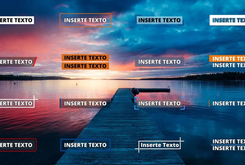
2. Class Orientation: Our clus project for
this course will be to create a social media lower
third similar to this one. I'll show you each step
along the way and explain you how to recreate this
specific animation. But of course, this
is only meant as an example we can work
with for this course. By taking the steps and
principles that I explain, you will actually be able to create much more complex
animations as well. So the only thing you need
to follow this course is obviously Adobe After effects, but also slightly less
obvious Adobe Illustrator, which we will use to prepare
assets to animate later on. And that's it. You don't
need anything else. You also don't need to have any previous knowledge of after effects because we will cover all of the
basics in this course. If at any point, you have the feeling though
that I'm rushing, and you're not able to
follow what I'm saying, I would suggest you
check out my course about text animation with
Adobe After Effects, where I go more into
detail of the basics. While in this course, we will also cover some more
advanced techniques. Nonetheless, this still
is a beginners course, and I promise you
should be able to follow even if you have never touched after effects before. Naturally, in the first
lesson of this course, we will cover the
fundamentals of animation with Adobe After
Effects and create some first very
basic animations to get into the essential of
what a composition is, what keyframes are, and how we can use them to animate
in After Effects, and we've covered those basics, we will then jump into
Adobe Illustrator to prepare some assets for our
actual lower third animation, and we will then import those assets back
into after effects. After that, we will
discuss the concept of expressions in after effects, which oftentimes sound
a bit daunting to new after effects users
because you have to code, but I promise they
aren't that complicated. And then ultimately, we will put together our actual
lower third animation, and I will even show you how to export it in a way
that you can use it directly in Premier Pro and even still have the
ability to adjust stuff. So if you follow the course
up until the very end, you will walk out
of this course with your very own social
media lower third as well as the ability to create almost every motion graphic you might need for your content. So, what are we waiting for?
Let's jump into our first
3. Fundamentals of After Effects: Okay, everybody. Welcome to the first actual
lesson of this course. So I promise that you will be
able to follow this course, even if you have no
previous experience with Adobe After Effects. This lesson is the
one where we are going to cover all
of the basics. Even if you already have
experience with After Effects, consider this lesson
as a refresher, maybe. When you first open up
Adobe After Effects, this is what you're
greeted with, and the very first thing
we're going to do is, of course, click on project. Now, as you can
see, the window is clustered in four main areas. The first of which is the
project window up here. The project window is our
essential hub for our assets. So for example, if we
double click in here, it automatically opens
the import dialogue. But we can also
create, for example, folders in here and
even sub folders, and so on and so forth. This basically works like any other file browser you know from your
operating system, such as the finder in MacOS or the windows
Explorer on windows. I typically always create
myself at least two folders. The first of which I
call zero, zero assets, and the second of which
I call 01 compositions. And it's not supposed
to be a subfolder. I want to have it
on the same layer as the zero, zero folder. As you can see, I tend to name my folders with
prefixed numbers. This keeps them in a
very specific order that I can control easily. I know this sounds a bit nerdy, and it's definitely
not a must do, but it's a way that
I personally like because I can keep everything a structured, how I want it. And I would highly
encourage you to keep at least some
form of structure. Because I promise you don't want to end up with a messy
project. I know it. I've been there searching for that one file that you are entirely sure
that you imported, but you can't seem to find
it is very, very annoying. Second window we have is
the composition window, which we can see over here. The composition window
will later show a live preview of what we
are currently working on. It works basically
like a media player. You see what we're
actually currently doing. For example, if
we were to import star wars and then play
star wars in After Effects, you would see that
in this window. But the composition
window has also some more advanced features that a regular media
player doesn't have. For example, you can also
work in three D space. Us you can create very complex three D animations
in After effects as well. But that is very advanced and not something we're actually
going to do in this course. Then third down here, we have our timeline. Timeline is where we will later on layer our
different elements on top of each other because after effect works in a
layered approach, differently to, for example, Davini resolve or for example, programs like blender
that are node based. Now, I know there are
people that say that a node based approach is much more powerful because
you can do more with it, but in my opinion, it becomes very
very complicated, so I actually prefer it
with a layered approach. Then last but not least
our fourth window over here is one with
various different settings, such as, for example
effects and presets, which houses well
effects and presets. I've already talked about
compositions a few times. I've called this
folder compositions, and I called this window
the composition window. But what even is a composition? You can think of
a composition as a container for your
actual animation, because you can, of course, in the same after
effects project, create multiple
different animations. And each of these animations is then wrapped in a composition. And that composition
also defines some general rules
about your animation, such as the frame rate, the dimensions, and
stuff like that. To create our very
first animation, we simply have to click
on this button down here. Now, this might look scary.
It's not that scary. The only thing we
are going to adjust for now is the dimensions. We're going to set
this to 3840 by 2160, which is exactly four k.
But you could, for example, also set this to 1920 by 12 80, which is what it
was previously at, which would be
exactly full HD or you could also set it to
whatever format you want. For example, if you need a vertical animation for
TikTok or something like that. But we're going to go
with four K for now. The frame rate, we
are actually going to set to 24 frames per second, and we also adjust the
duration 20 seconds. And before we click okay to actually create our
very first animation, we're also going to give
this a name because, as the very great after effect Stub Ban
Mario always says, we always label our layers. And I totally agree we always label our layers to keep
everything structured. So we're going to
call. This one, fundermentals of imation. And then I'm just going
to click Enter or you can click to create our
very first animation. Now, as you can see,
this suddenly changed the composition window
to be a black rectangle. Because so far our composition
is entirely empty. There is nothing inside, so
we just have a black space. To then actually create
our very first element that we will then
be able to animate. We can, for example, click on the rectangle tool
up here and then drag and hold to create our very first Now, as you can see, that did not just create the rectangle up here in
our composition window, but it also created a shape layer down
here in the timeline. This layer in the timeline
actually holds all of the properties that we will
then be able to animate. For example, if we
open up the transform, we can see the position
here, the scale here, the rotation here, and we can
even change these values. To actually animate
these values, we still need a
way to tell after effects when it's supposed
to show which value. So to do that, we're going
to use a so called keyframe. A keyframe is essentially
exactly that. W, where and what value. To create our very
first keyframe, we simply have to click on
the stopwatch icon here, which will create this
small diamond shape, which is exactly what I was
talking about, a keyframe. Now, this specific
keyframe tells after effects at the zero second mark, we want the rotation to be, for example at I don't know, let's say, -20 degrees. If we then go for example to the three second mark and
set this to 40 degrees, it creates another keyframe, and now after effect snows, at 3 seconds, we want to
have this at 40 degrees. And if I now quickly scrub through the timeline,
you can see, ah ha, there is actually some movement, and we can even
play this, and you see our rotation starts. And then suddenly
stops. And there we go. We have our very
first animation. Thanks for attending my course. I'm just kidding.
We're not done yet. Now, this animation
still, of course, is a bit choppy because it
suddenly starts moving, and then after 3 seconds, it just suddenly
stops moving again. That's because this animation
is a linear animation. After effects is simply interpolating the values
between these two keyframes. And we can actually
see that this is a strictly linear animation by opening the graph editor
with this button. Now, we don't have a value
selected at the moment, but if we click on the rotation, you can see, h ha,
there is our animation. It suddenly starts here, and then it suddenly
stops here again. Now, we can make this a bit smoother by applying something that is called easing to
automatically apply easing, we simply have to select both key frames and
then press F nine. You can see this change
this animation from a strict linear animation
to this smooth S curve, which means that the
animation slowly starts, then gets quicker, and
then gets slower again. Let's quickly have
a look at this. Now, as you can see, this
already looks much smoother. But we can actually customize this exactly how we want it. For example, if we
want this animation to start very quickly and then slowly fade out It would
look something like this. Already looks
pretty cool, right? For most cases, the auto
easing that you can apply with F nine will produce
very decent results, though. Now, of course, keyframes are not limited to a
single property, such as the rotation
in this case. We can actually create
as many key frames as we want on as many
properties as there are. For example, if we quickly close the graph view
again and then create another key frame
for the opacity and another one at
exactly 3 seconds, protip, by the way, if we hold the shift key while
moving over here, you can see our timeline actually sticks to
existing key frames. So we want another
key frame at 100%. I can create one by clicking
on this diamond shape. We actually want to set the
first one back to zero. Then we're simply
going to select both our keyframes
again and press F nine to apply the auto easing, and then we have this
cool fading in animation. To be honest, this is actually the base of almost
any animation. Just by creatively creating keyframes and then easing them, you can actually create tons of very, very
cool animations. Let's recap what we
learned in this lesson. There are four main
windows in After Effects. Project window to
structure your assets, the composition window to see
what you're actually doing, the timeline to stack
your different layers, and then a window with a
bunch of other settings. We also learned what
a composition is. It's the container for your
individual animations, and we also learned
how to create one. We also learned how to
create basic shapes, such as, for example, a rect. Last but not least the most important feature
of after effects, we learned what a
keyframe is and how we can use it to animate
basic properties. Then I showed you what easing
is and how we can apply it to our animations that we
created with our keyframes. Now, before you jump
into the next lesson, I would highly suggest
that you open up after effects yourself and
play around with all of this, because as I've already said, you can actually create
super cool animations just with this basic knowledge.
4. Preparing Assets with Adobe Illustrator: Right. Welcome back, everybody. Today, we're going to
cover how you can create assets for your animations
with Adobe Illustrator. The very first question we
should ask ourselves is, why do we even want to do that? There are two main reasons
why I specifically choose to prepare my assets with
Adobe Illustrator instead of any other program. Because you could,
of course, also prepare assets with
another image editor, such as photoshop or even put everything together with shapes directly and after effects. Although that would
be very cumbersome. Reason number one,
Adobe Illustrator is a vector based image
editing program rather than a pixel based, such as, for example,
Adobe Photoshop. What the hell does that mean? Say, we have a very basic shape, such as a triangle a pixel
based image editing program would save each single
pixel of that triangle. So if you were to
enlarge that triangle, you would simply enlarge
all of the pixels, and thus you would get kind of a stairs effect when
zooming in a lot. A vector based image editing
program, on the other hand, saves a vector for each
path of our triangle. So if we enlarge that vector, we still get a perfectly
smooth edge for our triangle because that
edge is saved as a vector. That means if we prepare our assets with the
Dobie illustrator, we have much more
freedom in scaling our assets without
sacrificing quality. Also, simply saving three
different vectors takes up less space on your disc then save tons of pixels
individually, and reason number two. This reason does
not hold true in comparison to Adobe Photoshop, but in comparison to image editing programs not
by the company, Adobe. But Adobe Illustrator just seamlessly integrates
with after effects, which can save you tons of time. I will show you later
when we get there. But the importing workflow
from Adobe Illustrator to Adobe After Effects
is really Chef's kiss, I just love it. It's so simple. Okay. Once again, as a reminder. This is the animation
we're trying to recreate. So let's actually jump
into Illustrator and prepare our assets for
this animation. Shall we? Once again, the very first step, the same as it was in
Adobe After Effects is, of course, to simply
click on new file. Now, differently than
in Adobe After Effects, we actually get a
couple of presets, and we can actually simply go to fill and Video and choose the four K UHD template because this already has
the exact dimensions. We want 3840 pixels
by 2160 pixels. Also, super important,
we want this to be in RGB color mode and not
in CM K color mode. So we can simply
click on Create, and there we have our
very first base Canvas. Now, the very first
thing I'm going to do is import a background image
by simply dragging and dropping it just as a reference image on how
our final animation is actually going to
look like on top of what we're going to put it
on top of later. All right. Now let's go to layers
and create a new layer, which we are going to
call a background box, and we're going to call
this layer background. Image, and we can
already lock this layer because we won't change anything just on the
background image. Let's also make this
slightly bigger so that we can properly
see the names as well. All right. First, let's create
our rectangle, which is like the base rectangle that we're going to put
the animation on top of, which is going to be 38, 40 pixels white,
so the full width, and we'll give it a
height of 600 pixels. Let's move this into position. Go back to the properties and select a full color
of pure black, but reduce the opacity to 30%. Also, we don't want
to have a stroke, so we will simply set this 20. Now, this is barely visible now, but it's like the base
layer for our animation. Now the next thing
we're going to do is to create the white line on
top and on the bottom. For that, we once
again go over here. Now, this is the rectangle tool, as you can see, but if
we right click on here, we can choose a few more tools, and for this, we're going
to use the line tool. Then we go exactly
on this anchor and just drag over here
and by pressing shift. We can ensure that this is
exactly a straight line, and we want this to end over. Here. Now, this
does need a stroke. We want a stroke of about
ten pixels probably, and set this to a pure white. Okay. Ten pixels looks
a bit thick to me. Let's reduce this
to seven maybe. Now, we of course need the other line at the
bottom as well, so we can simply
select our line, press and hold the old key, and then just drag
everything down here that will duplicate
the previous element. Now, I have already prepared
a social media icon, which we can simply
paste in here. Make it a bit smaller
while holding the shift key that transforms
it proportionally. If I don't hold the shift key, you see the dimensions change. So I want to hold the shift key, make it a bit smaller and somewhat move into
position roughly here. Now, when you are
searching for the social media icon
or whatever icon, you want to insert
here because it doesn't have to be a
social media icon, I would highly
suggest to look for an SVG file instead of, for example, a PNG file. B that is exactly the difference I was
talking about earlier an SVG file is a vector file while a PNG
file is a pixel based While Illustrator can work
with pixel based files, we want to retain the
full quality of the file, so it's better to
take an SVG file. But I still think this
is a bit too big, so let's probably make it. Even a touch smaller. Yeah. Something like this looks good. And then last but not least, we still need the text. So we're going to
select the text tool, write the name of our
social media platform here. Make all of this much bigger,
make it even more bigger. Here again, I'm holding
the shift key while resizing otherwise, it
would look like this. That's not what we want.
Move it into position. That's very big now, but first, we're going
to select another font. I'm going to use
Proxima Nova bold that is actually the very same
font that TikTok is using. So I'm using this
font in this case, but you can select
whatever font you want. Let's also make this a pure white so that it's better visible and deg a bit smaller. Yeah. Something like
this looks good. Now let's once again select the rectangle tool
and down here, draw another white rectangle,
something like this. Go to the text tool again
and create our text. And move that text into place. The top text looks a bit big, and the bottom text
is a bit small, so let's make the top
text a bit smaller. We can also reduce the size here of the rectangle and make the
bottom text a bit bigger. Yeah, probably,
something like this. Now we also need to resize
the rectangle again. Yeah, something like
this looks good. Now, we are actually
going to replace the texts again in
OB after effects because we want to have them as native text layers
in after effects, but I've also created
them here to have a visual idea of how everything is going
to look in the end. Well, I have to admit, this was actually a very simple case. The assets for this
animation could have been easily reproduced directly
in after effects, but I wanted to show you the whole workflow
because in my opinion, it is actually very, very
beneficial to prepare your assets in Illustrator and then move them
over to After. Especially when creating
much more complex animations with way more assets
than in this case. Now before we jump
back into after effects and actually import
our assets into there, we still need to separate
all of this into separate layers so that we have everything as
different elements, and we can, for example, move
the top line from the right and the bottom
line from the left and all of that fun stuff. Let's create a layer for the top line and
select our top line. That's the bottom line.
This is the top line. Create another layer for the bottom line and move
the bottom line in there, create another layer for
the social Media icon. Let's move that total
media icon in there. And then last but not
least a text layer. And we can simply put
all of our text into our text layer because
as I've already said, we're going to replace those
later and after effects. Anyway. All right. Let's
click on file and save. Yes, I want to save
it on my computer, and then select the
correct folder. We want to save it in as
our acids don't AI file. Save it with version 2020, not one of the old versions, so we can simply hit. Okay. Now back and after effects, we can simply drag and drop our assets.ai into the
project window, and then we'll ask
us how we want to import this Adobe
illustrator file. Now, we could, for
example, import everything as merged layers. This would merge
everything together again, or we could, for example, choose specific
layers to import, but we're actually
going to choose composition up here and retain the layer size as the dimensions of the footage,
and then simply click. Okay. Now, as you can see, this automatically created a new composition called assets. And it also imported a folder
with our assets layers. And if we open this, you can see all of the different
layers that we created as different
elements that we can use and import into other
compositions as well. If we open the
assets composition, you can see this is exactly what we created in Illustrator, also as different layers. And it automatically retained the dimensions from our
artboard in Illustrator, which we specifically
set to four K. Before we actually going to start working on
this composition, I'm going to retain
project structure, select all of these assets and move them into
the assets folder, then we can delete
this one and move the composition into the
compositions folder. Now, you might think
that we're done, but there are actually
two more things I'm going to show you
before we end this lesson. The first thing is, we
actually have to tell after effects to treat these
layers as vector layers. I really do not understand why After Effects doesn't
do that automatically, but for some reason, they don't. So, for example, if we were
to take our social media, I and scale this up tons, you see that it actually gets pixelated because right now it treats this as a pixel layer
and not as a vector layer. To tell after effects that this is actually a vector layer, and it should be treated
as a vector layer, we actually need to tick
this box right here. So this small little star, if we tick it, you can see, ha, suddenly, everything is crisp and
clear and not pixelated. For some reason, you cannot see this start check box here. You might have other
modes enabled right now. Down here, there is a button
to toggle switch modes. If we click on here, you
see everything changes. There is now other
configurations. If you have this configuration
and you don't see like the check box for treating
layers a vector layers, just click on toggle
switch modes, and There it is. And let's also set back
the scale on this. We don't want the social
media icon to be that huge. And second of all, as
already mentioned, we want to replace
the text layers with actual Adobe After
effects text layers. So we're going to choose
the text tool up here. Just click in here,
re create our text. Once again, we want to
have this in Proxima Nova. And the size can be much bigger, something like this,
probably. Move it over here. Create another
rectangle down here, which should not be red, but should be white instead. Once again, select
the text tool and write our text in here. This should be black of course and much smaller,
move it over here. Then we can actually just remove our initial text layer by hitting the remove
key, and there we go. We have all of our
assets ready to actually start
animating. All right. What did we learn
in this lesson? I told you why I
specifically used Adobe Illustrator to
prepare my assets. First, because it's a vector
based image editing program rather than a pixel
based editing program. Second of all, importing
assets from Illustrator to After facts is actually
super super simple. Also, I briefly showed
you how to actually use adobe Illustrator
to prepare your assets. Then I showed you how
to get these assets back into AB After Now, before we can actually fully
recreate this animation, there is still one more thing
we need to learn about. That thing is what is called the expressions in
the W After Effect. As you might have guessed,
that is exactly what we're going to cover
in the next lesson.
5. The basics of Expressions: B, everybody. I have the
feeling that this is the class that some of you
might be kind afraid of, at least if you have heard of the expressions in
After Effects before. But let me assure you, I was
also afraid to start working with the expressions
when I first started working
with After Effects, but they are absolutely
not as scary as they look. Now, to be honest, this whole animation
could actually be done without ever
using expressions. But by now, I actually
love them so much that whenever I can solve
something with an expression, I tend to go for it because it turns out to be much quicker, and in many cases, even much more stable to later on refine and rework
the animations. Okay. Now that actually everyone is afraid
of the expressions, because I made so much
drama around them. Let's actually jump back
into after effects. Shall we? Previously, I've said that the only thing you
need to know to create animations and to
modify values in after effects over time are
the so called keyframes. But that is actually not true. There is another way to modify values and even animate
them over time, which, as you might have
guessed, are the expressions. You can create an
expression very similarly to how you
would create a keyframe. But we don't simply click
on the stopwatch icon, but we hold the old key, and at the same time, click
on the stopwatch econ. Now as you can see,
doing so, open this small text
window down here. Now, this text window
expects a value in the exact same format of the value that you're
trying to modify. So if for example, in this case, we want to adjust the rotation, which is a single
numerical value, this text field expects a
single numerical value. So if for example, we just write a ten in here, Then
close everything. You see that rotated our rectangle by
exactly ten degrees. But the great thing about this window is that you can actually input code in a programming
language in here. For those of you
that have already worked with programming
languages before, this is actually a modified
version of Java script. I could, for example,
create a variable called R for rotation and then assign a value of let's
say 90 to this variable. And if we then return
this r at the end, You can see that rotated our rectangle by
exactly 90 degrees. This actually opens up
a lot of possibilities to modify values in
very creative ways. Because for example, we can
suddenly make calculations and then define the values
based on these calculations. There are also some
predefined variables, such as, for example,
the variable time. If we simply return time that you can see if it
looks like nothing changed, but if we scrub
through the timeline, it will slowly rotate the
rectangle because the time is actually variable of the time at that point in
time in seconds. So at 10 seconds, for example, our rectangle would have
rotated exactly by ten degrees. Now, if for example, we
think that this rotation is too slow and we wanted to make
it quicker than we could, for example, just
multiply it by two. And then at 10 seconds, of course, ten times
two is 20 degrees. This is already at 20 degrees, and thus the whole rotation
is still very slow, but at least a bit quicker. We can also, for example, access the original values by
typing the variable value. Now, this will simply return the original value
and we could do calculations on the
original value. If we set the original
value to ten degrees, for example, then this would be rotated by ten
degrees all of the time. All of this gets a tiny
bit more complicated when working with values that
need two numbers such as, for example, the position. Let's once again, hold the old key and click on
the Stopwatch icon here, and there we have our
expression for the position. Now, since the position needs two values and not a single one, we need to return what is
called an array in programming. An array is essentially
just a list of values, and in this case,
we need two values. Before we actually
create the array, let's quickly set this to zero. Now to create an
array, you need to write it in square
brackets as such, and then separate the
values by a coma. If for example, we type
00 in square brackets. You can see that
moved our rectangle to the position zero, zero. This principle will
stay exactly the same even if you need
more than two values. For example, when working
in three D space where you don't just have an x
value and a y value, but also a value, then you would need to return
an array with three values. But the great thing about the
expressions is we can also, for example, use some certain
mathematical functions. For example, let's quickly
define a variable call. X, which we set to zero for now and another
variable called y, which we also set to zero, and then we return
these to an ray. Actually, let's not
set them to zero, but back to their
original value. Which we can do, as
you already know by using the value keyword. Now, the value keyword, in this case, of course,
also returns an array. To get a specific
element from that array, we once again need
the square brackets, which we can simply
put after the value. If we now want to get the
first value from this array, which might be a bit confusing, we need to write zero, because actually the indices of arrays always start at zero. So with zero, we get the
first item with one, we get the second item, and so on and so forth, might be a bit confusing
at the beginning, but it actually works like this in almost all
programming languages. As you might have guess,
if we want to get the y value, we once again use Value keyword and
then write one. Now, you can see, this moved our rectangle back to
its original position. So as I've said, we wanted to use some mathematical
functions here. So for example,
the sine function that most likely all of you will already know actually simply
goes up to one to minus one, then back to one and just
continues this until eternity. If we add the math dot sine
based on the time in here. This will add a wiggle movement
because it will add one, subtract one, add one, subtract one, and
so on and so forth. Now, since the sine
function only goes to one, and then to minus
one, we will always only add and subtract
a single pixel. So if we play this You
don't really see anything. Moving a single pixel
is not that much. Let's actually
encapsulate this again in brackets and multiply
this by 100. This will already move
everything by 100 pixels, which is a lot more than
just a single pixel. If we now play this,
you can see, ah, our rectangle is moving back and forth 100 pixels on the x axis. Now, if we add the exact
same thing for the y value plus But we want to use the
cosine instead of design. Again, multiplied by 100. If we play this again, you
can see that our rectangle is suddenly moving exactly
in a perfect circle. Now, this might look
very, very simple, but creating a perfect
circle movement just with key frames is actually
almost impossible. Creating it like this with an expression actually
wasn't that complicated. Now what we are actually going to use an expression for for this animation is to do
this part of the animation. Because we want to
have the rectangle exactly around the
text at all times, even if we adjust the text. So if for example, my name on social media was not Fogel
Fog, but I don't know. A Mr. Best impersonator. You can see our
rectangle does not adjust its size to the new text. Now, to accomplish this, the
first thing we're going to do is actually rename our layer, because as you can
see, right now, the layer name always
reflects the actual text. So first, it was Fogel Fok and now it's a Mr.
Best impersonator, but we need this name later, so we call it a box text. And like this, the
name won't change anymore even if we set this back to with the layer
is still called box text, which is exactly what we want. Now, for the rectangle,
we're actually going to remove this
rectangle for now, but create a new one by using the rectangle tool and then
simply double clicking on it. Now, as you can
see, this created a rectangle that actually
takes up our whole canvas. But since we want to
define the size of the rectangle with an expression rather than predefined it, that's actually perfectly okay. The first thing we're
going to do is move our shape layer once again
back below our box text, and then we're going
to open up the contents rectangle and
then the rectangle path, and right here,
we have our size, and if we drag this, you can see it actually adjusts the size of the rectangle. Now, we don't want to
adjust this manually, but we once again want to
create an expression for it. So we're going to hold the
old key and once again, click on the Stopwatch icon, and there we go, we have
our expression window. We are going to
need two variables, one for the width, which we are going to set, let's set it to 100 for now. Then another one for the height, which we're also going
to set to 100 for now, and then we're going
to return these two, the width and the height. Once again, in an array, as I've explained earlier, and there you can
see, we suddenly have a very small rectangle
here in the middle. Now, of course, we don't
want the width and the height to be
just 100 pixels, but we want it to follow
the size of our text layer. The next thing we're going
to do is actually get that text layer and save
it to another variable. So we're going to call it text. Layer, and we can get the
layer by writing this comp, which references
this composition. Out of this composition, we want to get a specific layer, and then in these brackets, we can define which
layer we want. And the layer we want is, of course, our box text. And this is exactly
the reason why we renamed the layer so that it doesn't change its
name all the time, but we always want
it to be called box text so that we
can reference it here. And then we end our
line with a semi colon. So our text layer
variable now references, well, our text layer. Now to get the actual
size of our text layer, we need another function,
which is actually called source wrecked at time. Sounds a bit complicated,
but we're just going to type it source wrecked at time. You can see after facts
already suggests that this is probably what we're
looking for. So yes, it is. And this is a function
which will get the size of a layer
at a certain time. So since we want to
follow the size precisely and always match the exact
size of the text layer, we will just input
our time variable. So this is always the
size at the current time. And if we now set our width, Not to 100, but to text
layer dot width and the height to text layer
dot height. You can see. Our rectangle suddenly has
exactly the size of our text. But you also see the position does not fit so far
because we also want the rectangle to be at the exact same position as
our text layer, of course. So we can tell the position
of the shape layer to simply follow the
position of our text layer. To do that, we're
going to click on our shape layer
and then press P, which will automatically
open up the position, and also our box text. Once again, click on P
to open the position. We could now, of course, solve this again with an expression by simply copying the position of the box text to
our shape layer, but there is actually a way
to do this much quicker, by simply using this
picket tool here. You can see this
creates this blue line, and if we pick that to our
position, there we go, it automatically follows the exact same position
as our text layer. Well, not really the
exact same position, but the anchor point of both layers is now at
the exact same position. If we click here, you can see the anchor point of our rectangle is right
here in the middle, and the anchor point of our text is also right here
in the middle. But since the text is
aligned to the right, it still grows out of the box, but we can quickly fix this by simply clicking on aligned. Now, usually the anchor
point of the layer is by default exactly in the
middle of the layer. For some reason,
the guys at Adobe chose not to do that
for text layers. But the anchor
point will, as you saw actually follow
the text align, and on the lower edge will be at the lower edge of our text, minus characters, of course, that grow out of the
bottom of the text, such as A G, for example. Now to perfectly align
this and make sure that our text is actually exactly
on top of our shape. We could, of course, open the anchor point of our
box text by clicking A and then roughly move it so that it fits the exact position
of our rectangle. But as you might have guessed, we don't just want
to do it roughly, we want to do it
exactly precisely, and we can do this with
another expression. Once again, we hold
the old key and click on our stopwatch icon,
create a variable. X, which we're just
going to set to zero for the moment,
and variable y, which we're also
going to set to zero for a moment and then return these two variables x and y. Now, since on the x axis, we are already in the
exact same location. Actually, for the x axis, we don't have to
set this to zero, but we can just follow
the original value, and they're the first
one in the array. For our second position, we once again want to get the height of our layer
and divide that by two, which will make sure that we
are exactly in the center. So we can easily do this
by getting this layer. Then once again,
we're going to use our source wrecked
at time function. We also always want to
follow the current time, so we input our time
variable again. Then we want to get the height, and all of this, we're simply
going to divide by two. Now if we click on our layer, we can see Woops. This moved our anchor point, but in the wrong direction
because it moved it out of the box
instead of into the box. So we can fix this by simply adding a minus right
in front of here. And then we realize that
I think I made a mistake. I know what I did wrong
because our anchor point is initially not exactly at
the bottom of the layer, but at the bottom of our text, when we then move it by half
the height of the layer. It actually does not end up right in the
center of the layer, but well, half of the height above where
it originally was. So what we actually want to do is quickly define
a new variable, which we're going
to call layer size. And then apply
this layer source. Wrecked at time to
this new variable. And then what we're
going to do is actually get the layer size dot top. This would be exactly at
the top of the layer, and then add the layer size
dot height divided by two, which will then move it down by half the height of the layer, which should be right exact
in the center of our layer. And there we go. Still,
this is not exactly what we want because it is actually
super super close, because the size
of our rectangle matches exactly the
size of our text layer. And we wanted to
follow that size, but always be just a
slight bit bigger. So we're quickly
going to go back to our shape content rectangle,
rectangle path size. And here we are going to
define another variable, which we are going
to call padding, and we're just going to
set that padding tube. Let's say 50 for now. And then if we add this both
to the width and the height, there we go, we
have a slide paddy. Now, let's go back to fit
our composition size, and now we can get the
position of our box text, and as you know, our shape layer will follow that
position exactly, and we can move this back
to where it's supposed. Yeah, I guess by now
you can understand how incredibly powerful
the expressions are, and that it is
possible to do very, very advanced things with them. But let's quickly recap what
we learned in this lesson. We learned that we can modify
the values of a property not only with a key frame
but also with expressions. Now, when writing
in expressions, properties that
expect a single value just expect a value of
this type to be returned. For properties that
need multiple values, we need to return an array. A array is simply
a list of values, which we need to encapsulate
in square brackets, and then we simply separate the different values
with a comma. We also learned that there are some specific
predefined variables, such as, for example,
the time variable, which will get the current
time Or for example, the value variable, which will get the initial
value of a property. If that initial
value is an array, we can access the values of this array with square
brackets once again. Always remember, the indices of an array always start with zero. Then there is this
comp variable. This will actually just get
the current composition, and then you can
use, for example, the layer function to
get a specific layer. Or if you were trying to get the current layer that
you are working on, you could do that with
this layer variable. Then there is the source
wrecked at time function, which we used a couple of times. This function will get the width and the height of a layer. We also briefly touch the
two mathematical functions, math dot sine and
math dot cosine. But as you can
imagine, there are tons more of
mathematical functions. You could, for example,
get a variable that roughly matches Pi
with math dot Pi. We then applied all of this knowledge to
create a box that exactly always fits around a text and will follow its size, even if the text changes. With this, we actually
have all the basics, we need to put together
our final animation. If you feel adventurous, you can already try to put together the
animation yourself and then jump into
the next lesson to see how I did it myself.
6. Putting our Animation together: Getting exciting
in here, Let's put together our final lower
third animation. Shall we? Since we already imported all of our assets in our
illustrator lesson, let's get started with
the actual animation. So let's make our text, our shape layer, our other text, and our social media. I can invisible for
now and start with the animation of the lines
in the background box. Now, our top line is supposed
to fly in from the right. So if we click P four position, we get our position value, go back to the start, and then go ten frames forward. Set a key frame for our
final position here. Then go back to the start
and then move it out to the right like this so that
it is exactly off screen. Now, this we'll
move in the line, but this is still a
linear animation, so we want to make
this look cooler by selecting both key
frames and pressing F nine, which will apply
the auto easing. But let's quickly open
up the graph editor. By the way, you can
perfectly center your key frames in the graph editor by clicking
this button down here. You see this
automatically centered the graph editor on
our current animation. And as you can see, as
well, since we have two values that we're
animating here, the X and the Y value, there are actually two
lines in the graph We did not change anything
on the y coordinate, so this is a perfectly
straight line, but we only changed something
on the x coordinate. Now, unfortunately, after eats
does not show your handles to modify this as you want
when working with two values. I have no idea hy, but we can quickly fix this with a right click and then
a separate dimensions. Now we have a property for the x position and a
property for the y position. If we go on the x position, once again, select both our
p frames and press F nine. It will once again
auto ease them. And there we go, we
have our handles to adjust the easing. So the way we want to adjust the easing is we want it to come in very quickly and
then slowly fade out, something like this, which if
we then have a look at it, will look something like this. Looks pretty cool, I would say. Now let's do the exact same
thing on the bottom line, but just from the left side. So close the graph editor. Go to the bottom line, click P again for opening
the position property. Scroll all the way
back to the beginning. Let's quickly make this
a bit bigger again. Then once again, if we hold the shift key and
move over here, you can see it automatically
sticks to the keyframes. Now we want the final
key frame to be here and the initial key
frame to be back here. Then once again, we're going
to separate our dimensions. Actually, we can remove the key frames from
the y position, since we don't change
anything there, and we can do the same
thing for the top line. Then select our x position, open the graph editor. And I just realized I did not even change anything about
the position so far. So, of course, we
want to drag this all the way out to be
offscreen as well. So once again, click this button here to
center our animation, select both key frames. And press F nine to
apply the auto easing. And then we basically
do the same thing. We want this animation
to start quickly as well and then slowly fade out,
something like this. Let's compare. Yeah, it
looks pretty similar. Just that one is going down, the other one is
going up because they are moving in from
different signs. And if we have a look at our
animation, Lo is good to me. Now, at the same
time, while these two are moving in
from the sides, we slowly want to fade
in our background box. Once again, we're going to
close the graph editor, click T for opening
the transparency. Let's quickly open the position
back up by pressing P so that we can position
the key frames at the exact same position. Our final position is here. There our opacity
should be 100%, and it should start with 0%. For these two, we will simply
apply the auto easing. Select both press F nine, and that's totally fine for the opacity. Looks pretty cool. I would say. Now the next
thing we want to do is move the social media
icon into position. So let's quickly make it
visible again. Zoom a bit in. And I just realized this is not really
perfectly centered, so let me open up
the position and move it a bit up.
Yeah, that looks good. And something like
this is supposed to be our final position. So let me quickly go here. Then once again, click on the next frame button to
go ten frames forward. So click it ten times. Actually, let's go
forward. 20 frames. So we can either
once again click on the next frame button or we
can adjust it over here. We want to go two frame. 30. This is supposed to
be our final position, so we're going to set a
position key frame here. Then go back ten frames, set another position key frame, and for this one, we want to move it exactly into the center of
our composition, which we could do by dragging it here or we use
the lin option. We want to align the
layer to the composition and center of the
composition. Then we go back To here and also open
up the scale property, which we can do by clicking S. Create a keyframe for this, and if we now press U, it will actually open up all properties that
have keyframes on them. So in this case, the position and ended the scale
at the same time. And then we can go over here, create another scale keyframe, go back to the first
one and set a base 20. If we now select all of our
keyframes and press F nine, and have a look at
how this looks. Let me quickly go back
to see everything. This looks pretty
cool. I would say. Now to animate our text
in the way we want, we actually need a tool that we have not
talked about so far, which is a so called
text animator, because if we would
open the properties, let's make the text
visible again, and then adjust the position. This will, of course, adjust the position of the whole text. But we want to have a way to animate each
character separately, and we can do this
with a text animator. To create one, we're going to click on the Animate button here and create a text animator
for the position property, and then add another
property for the size. No scale it is what it's called. Now, these two values is what
we are going to start a. Because our text animator
will animate our text layer from these positions that we set here back to their
original value. So at the start, we want to have the position right
at the top here, and then slowly move
in all of the layers. All of the characters,
I mean, sorry. Because at the beginning, we want to have
the text up there, and then character by
character move them back down. And we also want them
to slightly scale up. So we're going to set the
scale down to I don't know, Let's say 60 probably. If we now open up our
range selector and start playing with the start
value, you can see a ha. There individually, all of our characters are
actually moving down. If for some reason, this
does not work for you, but it moves the whole
word at the same time, you should check
that in advanced, this is set to based
on characters. Because if we were to
set it based on words, Then adjust it, it will
actually move the whole word. But we want to have
it for characters, so I'm going to set it
back to characters. Then I'm once again
going to move back to our last key frame of
the social media icon, set the start back to
zero, create a key frame. Once again, go ten
key frames forward, and set this up to 100. Then once again,
we're going to select both our keyframes and press F nine to apply the auto easing. Looks pretty cool. Now, I would actually like to have this
a little bounce here. We're going to select our
property and then once again, open up the graph editor. I'm going to select
the bottom one and drag it a bit more over
here and do the same one for the top one which is basically the same as the auto easing,
but more extreme. It starts much more slowly, then gets much quicker, and then slowly fades out again. Now, of course, initially,
we don't want the text to be visible and flying
there in thin air, but we only want it to be visible inside of
this rectangle. What we're going to use
for this is a track mat. To do this, we are
actually simply going to duplicate our background box, which we can do by using
control D pork Man D, if you are on a MC, and
then move this box all the way up on top of our text and make it invisible because we
don't actually need it. We just need it
shape. If we then toggle our switch
modes down here, we're going to see that
we have our track mat, and we want to set
the track mat of the TikTok layer to
our background block. Or two. Now what
this does is that it makes sure that our
text layer is actually only visible if
the layer that we set as the track mat
would be visible as well. But I just now actually
realized an issue with this because our
background box is of course, slightly transparent,
which means that our text is slightly transparent
in this case as well. So to fix this, we're actually not going to use a track mat, but at least we
talked about them, we're going to use
a mask instead. Let's quickly set
this back to no mat, and we can also remove
this layer again and slightly zoom in here, select our rectangle tool, select our text layer. If we then drag and hold from the upper line
down to the lower line. This will actually
create a mask, which means that
everything that is outside of this mask is visible. If we set back our
composition to fit the whole size of the
canvas, you can see, ah ha, there it is moving
in only from inside the box because the mask restricts everything
that would be outside. Our animation that we put
together now looks like this. Now last but not least, we need to add our
bottom text back in. This one, we are going
to mask out as well, but this time we're actually
going to animate that mask. The first thing
we're going to do is select both of these, do right click and
then precompose. This will move these
two layers into a new composition that is then
part of this composition, and we actually want
to move all attributes into the new composition. And we're going to
call this box text. Because we always label
our layers and click. Okay. Now, what we
did with this is we essentially merged these two
layers into a single layer, which we can apply
a mask on now. So let's go to our
last keyframe here. Go to this layer,
move a bit down, once again, select
our rectangle tool, and with the layer selected, draw a mask that
just barely ends up. Here. So now everything that is outside of this mask is
once again invisible, which is basically
everything on this layer. But we want to animate this
mask now as I've said. What we're going
to do is open up our mask properties and
animate our mask path. Once again, we
create a key frame for this go ten frames forward. Then we can simply
select these two dots over here and move them all
the way over to the side. You can see we can adjust
this however we want, and if we press and
hold the shift key, it will actually
move them on a line, and we want to animate this in, so let's move this over here. Then once again, select
both our key frames and press F nine to apply,
the auto easing. And if we then go back and
have a look, There we go. We have our final lower
thirds animation. Let's recap what we
learned in this lesson. We basically applied
the knowledge, we learned in all of
the last lessons to create our final animation.
But not just this. We actually learned about
a few new things as well. We learned what a text animator
is and that we can use it to separately animate
the characters of a text. We also quickly talked
about track mats, but then ended up not
actually using them. But we used a mask instead, and we also learned
how to animate a mask. But how do we now actually use our lower third in our
social media content? Because right now it
is just on top of an image file and not on top
of our actual video content. As you might have
guessed this is exactly what we're going to
cover in the next lesson.
7. Exporting our Animation to a Motion Graphics Template: Okay, so we learned how to create our lower
third animation. But one of the most important
parts is still missing. How do we get our animation onto our actual footage so that we can use it in our
social media content? Now, you could of course, import your footage directly
into after effects, overlay your animation on top
directly in after effects, render everything
and call it a day. But imagine you would
have to do that for every little animation that you want to add to your
social media content? Very quickly become
very cumbersome. Now, as you probably imagined
after this introduction, there is actually a
better way to do this by leveraging a so called MOG RT, which is short for motion
graphics template. MOGRT is essentially an animation template
for Premier Pro, which allows you to use
your animation directly in Premiere and still be able to adjust some settings such as, for example, replacing
texts and things like that. Now if we open up
premier and go to the essential graphics
window directly in Premiere, you can see that
there are already some predefined MOGRTs. Now these MOD RTs actually come directly
with Premier Pro, so they are pre in If we open up one of these
such as, for example, the modern title, I mean, I personally would
not call this modern, but super duper ultra ugly. But that's just my opinion. The question is, how do we get our very own animation into the essential graphics
window here in Premier. To do this, let's
quickly jump back into after effects,
and in After Effects, as well, go to Window and open up the essential
graphics window. Now in this window, we
first have to select a composition that we want
to export as a MOG RT. Now the one we are
going to export is, of course, our
assets composition. And by saying this,
I just realized that we did not properly
name this composition. So before we selected, let's go back to our compositions folder. Right click name and
call this Social Media. Banner. This is a
much better name. Now select our social
media banner composition and called the MOG RT. The exact same thing.
We're also going to name it social media banner. Now the only thing we have to do is drag all of the
properties that we want to be editable in Premier Pro into
this window up here. Now the most important part,
of course, is the text. So for example, if we want the
top text to be adjustable, we're going to open
up the properties of our top text layer, and then drag and hold
our source text up here. This makes our text
adjustable in here, but it will also make our text adjustable later in Premier Pro. So for example, if we were to change this to I don't know. Let's say Instagram, it will automatically update
in our composition. But so far, it
will actually only make the content of
the text adjustable. Now, what if you
wanted to change, for example, the font or
the size of everything? To enable this, we can click on edit properties and allow
enable custom font selection, enable font size adjustment. And enable fo styles. If we now click, you see aha, it now added also a fun selector and all of that fun stuff. Now, what if we wanted
to adjust even more, like, for example, the
color of the text? As you can see, so far,
this is not possible. There is no adjustion option here to change the
color of the text, and we also cannot dragonhld the fill color over here
and drag it over here. That simply does not
work. But we can make this possible
with a little trick. For this, we're actually
going to use the fill effect. So we go to the
effects and presets, search for the fill effect, and then dragonhld the
fill effect onto our text. You can see our text is
suddenly red because the fill effect actually just enables changing the
color of a layer. Let's quickly set
this back to white. And then open up our
effects down here, our fill effect, and then drag and hold our color up here. Now, currently, this is
simply called fill color. When using it later
in Premier Pro, how would we know which
layer this would fill? Actually, let's give both of these properties
more precise names. We're going to call
this one top text and this one top text color. We can actually even adjust this further by adding some
formatting options such as, for example, a group. We could, for example,
call this group top text, and then dragonhld our top text into here and also our color. Now we have a folder that
we can simply close, which will be visible
in the exact same way later in premier L et's
add some more properties. Of course, we also want the
lower text to be adjustable. To do this, we can
simply open up our pre comp by double
clicking on here, and then we can
simply drag and hold our source text from this one into the same
essential graphics. Now we're going to
call this bottom text, and we will add another
group that we also call bottom text and move this property in here and
then close everything. So we have everything
clean and tidy. Now, we could, of
course, also use the fill effect again
to, for example, change the color of the
shape or of the text, but I'm not going to do that now because you already
know how it works, so if you want to do it
yourself, please go ahead. But there is actually another
thing I wanted to show you, because what, for example, if we wanted to adjust the size of the
padding of our box. Now, it's, of course,
also not possible to drag an expression into our
essential graphics window, because if we go in here and
then drag the size up here, this property is controlled
by an expression. So changing the property
itself will actually not change anything because we overwrite it with an expression. So let's remove it again. The only thing we want to adjust Is our padding, which
we have currently saved in a variable right here. Currently, it is
set to 50 pixels. Now, once again, we can make this possible with
a little trick. Once again, we are going
to use a specific effect, which is the slider effect. We're just going
to drag and drop the slider effect
onto our shape layer, and then we have
a slider up here. This slider currently does
absolutely nothing at all. But we can connect
it to an expression. We could do this by getting the specific effect.
Or a little trick. I wanted to show you as well, if we just go in here, and then once again, select our pick whip icon and pick
whip it to the slider. It will automatically write the code to select the slider. Now our padding variable
will automatically take the value that is in our slider control effect
on the slider, which, for example, currently zero, but if we set it up
to I don't know, 500 pixels, then we suddenly
have a huge padding. But let's set this back
to 50 pixels for now, and then open up our
effects, our slider control, and then we can dragonhld this slider into our
essential graphics. Now let's rename this to give it a better name than
slider control. Let's call it a box. Adding and move it into our
bottom text group as well. Probably below the text. Now the last thing
before we actually export our MOU TRT is
that I'm going to go back to our social media
banner composition and make our example image invisible because we don't want our example image to end up in the actual final animation. Now, let's say we are
happy with all of the things we added to
our essential graphics. These are the only values that we want to be adjustable
in premier pro. If you want any more
values to be adjustable, you can of course simply
add them as you wish. But let's say we are fine
with what we have right now. Now to export this as a
motion graphics template, we're going to
click on the Export motion graphics template button. Who would have thought?
Then After Et tells us the project needs to be
saved first. That's fine. Just A After Effects
will open up this dialogue on where we want to save our motion
graphics template. Now MOGRT files actually
need to be placed in a very specific folder so that Premier can
actually pick them up. So if we choose the
local templates folder, then after effects
will automatically put the file into
that specific folder, and Premier Pro will
automatically pick it up. But if you wanted to, you could, of course, also
select local Drive, and then click on Browse to select any folder that
you want to save it in. And then you could
take the MODRT file out of that folder,
and for example, share it with colleagues or other content creators
or even sell it, such as I do with my
essential text pack. But we're going to choose a local templates folder
for now and click. Okay? And if we switch back to Premier Pro now and in our
essential graphics window, look for our social
media banner. There is our social
media banner. And if we now drag and hold
it into our composition, yes, we want to keep the existing settings
and play everything. Tada, there is our
social media L third, and in the edit tab of our
essential graphics window, we even have all the properties
we added to our MOGRT. For example, if we wanted
to change the top text, we could open up this group and change our text once again, and it automatically
adjusts in our animation. And that's it. That's how
you can easily export your animations to make them
usable directly in Premiere.
8. Conclusion: Congratulations, everybody. You can now call yourself an
Adobe After Effects expert. Okay, Maybe expert is
slightly exaggerated, but at least you're now able to build this beautiful
lower thirds animation. And you can also apply
this knowledge to create tons more motion
graphics yourself. You also know why it's
beneficial to create your animation assets
with Adobe Illustrator. You know how expressions work, and that you can do very, very
powerful things with them, and you even learned how
to create a MO GRT out of your animation
that can be used and customized directly
in Premier Pro. So if there is one main thing to take away from this course, it is that motion
graphics animation is not as hard as a T. Three. Almost all animations are just a bunch of key frames. Maybe with some expression
sprinkled on top, but oftentimes not even that. I really cannot
wait to see all of the amazing animations that
all of you will create. Once you have them
fully animated, feel free to upload them
to the projects and resources tab on the
class page so that we can engage and give
each other feedback and possibly get a discussion
about animation voting. Oh, and if you would like to get the After effects
project file that I created while filming
this course for you, I will upload and link that down in the
project description. Or if even after this course, you are still too lazy to
build the Lower 30 yourself, I have a fully fledged
out version with tons more customizations
as a pre made MOG RT file. Able either on my
Patron as part of my membership or in my shop
as a one time purchase. Now, all I have left to say is, thank you so so much for watching this course
all the way to the end. If you are interested
in even more, I love if you check
out my socials. So see you over there.
 Markus Vogel, Content Creator + FullStack Developer