Transcripts
1. Introduction: Ever wondered how to create the beautiful fantastical
environments that we see in video games like
Journey or movies Like Up? Hi, I'm Gargi, a concept artist working
for Sumo digital Newcastle. From studying in Zidi
School of Design in Singapore to learning
from concept art Masters, I've worked for
Truva Interactive, Rockstar Games and Accenture Malaysia
on diverse projects. The very foundation of environment concept art
lies in learning how to masterfully
sketch environments using color, lighting, and mood. Concept sketches are meant to explore different
design possibilities in an environment and are one of the most crucial
stages in production. In this class, I will
teach you how to create such environments
from start to finish, how to translate an idea into an image by following a
professional yet simple workflow. We will start the class by craftily gathering references or taking inspiration from nature, followed by an understanding
of how to block out our environment while paying attention
to shape language, composition and
design principles. By the end of the class, you will have a
thorough understanding of how to generate an idea, create reference boards, how to use quick menus and
shortcuts and procreate, along with creating your very
own customized brush set. To conclude, you
will have learned how to create a finished
environment sketch. Learning this skill
will allow you to create environments
with more efficiency, as you will have all
the tools necessary to explore as many design
possibilities as you can. Without much further
ado, let's get started.
2. Class Orientation: Kurt Voniga once said, practice any art, music, singing, dancing,
acting, drawing, painting, sculpture,
poetry, fiction, essays, reportage, no
matter how well or badly, not to get money or fame, but to experience becoming, to find out what's inside you, to make your soul grow. I have believed this to be true for as long as I can remember. My primary reason for becoming an artist was to experience
such a becoming in spirit. The main project for this class is to create a finished
environment sketch. Sketching is an art in itself. To have the knowledge and understanding to suggest details visually is a skill that is acquired after much
practice and training. Often in production, one of the main tasks of a concept
artist is to produce several many sketches
to narrow down an idea and explore
design possibilities. That is why it is an
absolute necessity to have all the skills necessary to create quick sketches
or mood pieces. The class will be divided
into three main sections. One, idea generation and
reference gathering. Two, blocking out
your main shapes with attention to composition. Three, painting in
important details using color and light. There will be a
thorough demonstration through every phase
of this class. As we begin, I will show you how to effectively
take an idea and give shape to
your imagination using reference images
to plan your sketch. Once we have that sorted, I will demonstrate
how to block in some basic shapes to create
a balanced composition. We will have a neat
value structure while keeping in mind the
concept of big medium, small, the very crux of
our design fundamentals. Then we will learn how to
use light and color to paint in some key details which will add material variety
to your painting. The tools we will
need for this class is an iPad, Procreate and PUF. Procreate is one of the most
intuitive painting softwares that promotes a very smooth workflow with its quick menus, shortcuts, and brush
customization. PUF is a very simple and
user friendly application for assembling and
categorizing your references. Alternatively, you can also
download Miro and use it. It has template options like
the use of sticky notes, custom shapes, arrows, et cetera to craft
your ref boards. I mostly use Miro professionally for more
complex environments, but for a single
environment sketch, I'd much rather use
PureRef as it's faster. However, feel free to choose
whichever you please. As a project resource, I will add a link
to my brush set for Procreate and show you how to
create brushes on your own. I will also teach you
how to categorize brushes according to the very specific
needs of the painting. As we go through the lessons, you will have a greater
understanding of why different brushes are used for different painting purposes. I would recommend trying out
Procreate on your own and familiarizing yourself with it if you are an absolute beginner. Try using the brushes,
the quick menus, quick shape, the selection
tool on your own. Becoming comfortable
with the software is key to having
a good workflow, which is of utmost importance
for a successful painting. It's important to focus, but it's more important to enjoy the process and have fun.
Let's dive right in.
3. Idea Generation and Reference Gathering: In today's class,
we will be learning the very first steps
of concept creation, research and
reference gathering. This is one of the key
phases in idea generation. While this may sound simple, learning how to
effectively go through this step will speed up pre
process to a great extent. We will mainly be using Pinterest and Google
to collect references, and you can use
either PureRef or Miro to assemble and
categorize these references. The goal in today's
lesson will be to have a set idea for our sketch and have a ready
reference board for. Is one of the first steps in learning and
understanding design. Knowing how to effectively
create reference boards, understanding how to draw
inspiration from images, and combining them
together to create a new fresh design is
the ultimate goal. This is an extremely
useful tool, especially for beginners, as they are often
unsure about how to use references to facilitate
the design process. Sometimes when I
don't have any ideas, I'll just go to
Pinterest and I'll start browsing through concept art, inspiring locations, interesting organic
designs in nature. And as you can see, like, I I do love to create these little boards of
inspiration for myself. If you invest enough time
in researching on Pintrest, then it automatically
recommends pins for your feet, which is quite handy, I believe. At times, it also happens when I start researching
in Winterest Like, this is the topic that
I've chosen for our class. And when I started
researching for temple ruins, I had this idea that, what if, you know, these temple ruins were
to be in a magical, sort of fantastical snowscape? Like, if I could mix
those two ideas up, um, and that is what led me to gather some more
snowscape references. And if you notice here, I have gathered
two sets of each. Like, I have some concept
art references like this, which will inform
my color and mood. And then I have some
real world references which will be informing
the design of my sketch. So this is pure ref, and as you can see,
I've started, um, categorizing and grouping the reference
images that I collected. And like I was saying before, I always collect two
sets of references, one, which is mainly real world, which will inform my
design choices, and one, which is primarily for the color palette and
for the lighting, which is going to
inform the mood, which is mostly made
up of concept art. And often I also use screen
grabs for mood references. A good resource for grabbing such screenshots from movies
and stuff is shot deck. Um, as you can see, there's many ways in which you can filter out your results. Like, you can add time period. You can add the kind
of lighting you want. Like, for instance, let's
just let's give it a try. Like, let's give let's try for low contrast,
maybe sight light, and let's give time of
the day as night and, Uh let's see what else we can maybe choose
composition as well. Um, actually, let's leave that. And the search item would be, um, let's go for snow. Whoops. And, like,
as you can see, starting to get something. Sometimes it works,
sometimes it doesn't. But it can still, like, give you some really
interesting compositions. Maybe we should type
snowy mountain. Oh, there you go. And this is a great
way to just, you know, quickly get some really, some really nice mooreps. I really like the colors here, so and then you can get several more like the
silhouette division here is really beautiful. I can't decide which one to
take. I think I'll take this. Just really lovely
composition here. The leading line over
here is just really. So you can simply if
you like something, you can simply just copy it, go back to your PUF, and you can just paste this
in here as simple as that. There's a really
easy and quick way of arranging your image. If you just select the group that you want to
arrange or clap up together. And if you press Control P, then it just arranges
them together for you. And that's why PRF is
just a handy tool. And as you can see, I've written down some small
little notes beside the images of what I like
about the particular image or how I want to use this
particular image in my sketch. So the way to do that
is you press Control N, and that gives you the note. I just have this
one separate one, which has a red sort
of background to denote that these are my
notes for the paintings. And for the headers, basically, I have just
a career background. So you can just type
then whatever you want. Like, um, perhaps
damage or bruin. That's what I like
from this image. And it just this sort of prep before you do the sketch
really helps you not get lost. Even then, while you're
doing this sketch, there have been many
times when I've gone back and I've done
more research or I've collected more references for something that I couldn't properly gauge or when
I was stuck somewhere. Alright. I just going
back to Shot Deck, like, that's what this is. Go check it out, browse
through for yourself. It is a paid membership, but you can still,
give it a try. I do believe there is
there is a free trial, but this is just such
a handy resource that I have gotten a
subscription for it. Anyway, let me just add
this one last image. And also, you'll
notice that I haven't added too many references because I've always noticed
that once I start sketching, I always end up needing
more specific references. So and then some of the references I had
gathered initially, um, are not just handy anymore, which is why I tend to start with a small set of
references like this, which gives me a basic idea
of how to go about things, what kind of composition I want, what kind of colors I want, what kind of mood I want, India. So just to go through
the board in detail, I always have an
overview section, which is just a general idea of the kind of sketch
that I'm looking for, which is going to
be as simple as temple ruins ruin
temple in a snowscake. That's it. And then I go a little deeper into
the temple design, and I start looking
into what kind of shapes will or what kind of an architectural
design do I want? Like, for instance, I really like the shape language
that's used here. So initially, as I was
gathering references, I was thinking, Okay, maybe
something like this or this. But then once these got
my eyes, I was like, Oh, yeah, definitely, I would
like to go in this direction. And given the opportunity
and the time, I would like to
explore all of these, but yeah, sometimes you
don't have the time, so you have to narrow down in your reference board itself,
which is also alright. And then I want it.
I'd like to have it's good to have actually some references to
inform the terrain, some real world references,
just to, you know, have something to
go back to to see how the snow
accumulates in places, the relationship between
the snow and the rock, how the shadow gets cast, what are the hard edges? What are the soft edges
and things like that? Snowscapes and different
kind of lightings, different types of
snow terrains, like The rocky terrain here is much more than the snow versus some of these other ones. So this gives me enough information to then
start adding these sort of little details or
starting my sketch with this information will help
have a better output. And then, lastly, of
course, the mood drifts, which are very important, like what kind of a Mura I want. Like, for instance,
I really love these colorful Northern
lights and also some other, like, sort of magical thing
that's going on here. These are all references from various artists gathered
over Pinterest. Um, so, you know,
the colors here, the kind of cool
warm contrast here, the little streak
of lighting here, which I was mentioning
before as well. And then the composition
in this one, the fog in this one. There are little little
things that I like from each of these
individual images, which will inform my color
palette and lighting decision. The other thing that
I'd like to show you is that alternatively
to using pure if, you can also use Miro.
It's quite handy. There are some templates
that you can choose from. Then there are also, yeah, what I generally do is I just
go for shapes and lines. I take a border like this, and then I there's sticky
notes that you can add, and, you know, you can just start typing
in your notes here, whatever it is, um, damaged. These are the only things
that I can think of since I was, uh, researching ruins. So, you know, when you have an image,
and, like, let's say, this is the way I would do it, if I add an image here, and then you can always
bring these to front. And basically, this is how
I'll collect my references, and then you can really
you can get very, very organized and mirror. Like, you can divide your
board into different sections, and you can sort of
then drag it across. I don't know why is usually doesn't create so much of a problem in
moving, but, yeah. You know, technology. Sometimes it works for
you, sometimes it doesn't. So in any case, So this is how basically I would prepare the basic
structure for my board, like, have a few columns in there, have some spaces to write, you know, the similar
way in which we did. So you write overview. And then or you don't
have to write overview. I mean, this is what I
have been doing for years, and then just
categorizing your refs, like sometimes it can
also be set dressing, whatever it is you're doing, whatever is your And
then in a similar way, like, you continue that and
you keep it's very simple. You just copy paste your
images from wherever it is. Like, if you're using
Shot Tech, then um, you take the image from Shop
tick and you simply you have to click outside the rectangles. And then you just add them here. Well, that's not
a temple design, but you know what I mean? Whatever, I guess this will
go under your mood refs. But more or less, this is also a very handy tool, but we were because we are
going to do a small sketch, I'd like to use PureRef
because it's just very fast and quick to sort
of drag and drop images. I like to use pure rep for that. But if I'm working on a really big project
with a very big scope, then I would probably use Miro. There's also other things like
arrows and stuff in Miro, which are also quite handy. But, yeah, it's
very user friendly. Give it a try. Give it a go. All the tools that you will need are here on
the left hand side, and it's really handy. It's really simple.
Go check it out for yourself. Um, right. Back to PRS. Um, yes. And the other thing that's also necessary while
you're categorizing and, you know, writing
down your notes and placing your images
into categories in PRF is you really get into
the mood of the sketch. You really get into the sketch. Like, for instance,
while I was doing this, I was thinking, and
all these colors, sort of inspired me like maybe my snowscape temple ruin has a touch of fantasy
to it, perhaps. And it's nice to have
that also written down. Because when you do
sit down to sketch, all of these ideas,
getting into the mood, getting into the story, helps. They all help. So to summarize this lesson, we want to have a
few rough ideas about what we want to paint. If we are unsure, we can
always go back to Pinterest. Once we have narrowed it down, we will start our research
and not hesitate to mix up a few ideas together and then gather our
references accordingly. We must also remember to
collect two sets of references, one real world references, and one mood references. The mood references
can be from movies. It can be concept art,
anything you want. Uh, once we are done with that, we need to assemble these
references together either in a Pref or a mirror,
whichever you prefer. And remember to add labels
and notes to mark what we liked about a
particular reference and how we wish to use it. Our thought process
during this time should revolve around
bringing our idea to life. Some of the most
important questions I generally ask myself
at this stage is, what sort of elements could I use to make this
scene believable? What more set dressing
elements could I use to make my scene interesting and to
facilitate storytelling? Even while gathering references, one of the other very important
things I always think about is the concept of
big, medium and small. Uh, big, medium, small and large shapes and how
they are balanced in a scene determines how successful your design
or your painting is. We will go into more details about this in the next lesson. I hope you enjoyed this lesson
and that it helps you have a better understanding about idea generation and
reference gathering. See you in the next lesson.
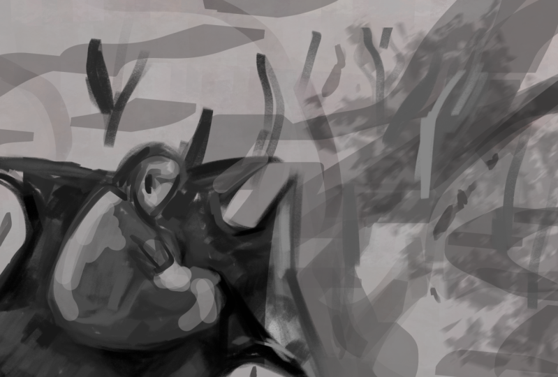
4. Time To Start Sketching: Welcome back. In this lesson, we will start sketching
our environment based on the ref board we created and the ideas we generated
in the last class. Before starting to sketch, I always keep my reference board open either on a
desktop or on a laptop. The main goal of this
lesson is to create a rough environment sketch while paying attention
to composition, the big medium small
theory, and shape language. I'll be starting off
with a five K Canvas, as that's one of the industry standard resolutions
to work with. Depending on the complexities
of the subject matter, I'll either start with
a rough line sketch or block shapes out accordingly. For this design in particular, I decided that it's better to
just block it out directly. One of the key factors
I keep in mind while sketching is not to be afraid to make mistakes and
try out new things. If it doesn't work, I can
always paint over it. As you can see, I've also started my sketch
in black and white. I just find it easier at
this point to completely focus on the value structure and the composition and not
worry about color at all. And hence, it's just easier
to focus on the shapes, focus on my values. You'll see me flipping the canvas over and over
again, every now and then. It's mainly to make sure that the
composition is balanced. And this is one of one of the most important
techniques that I have adapted to my workflow. It refreshes our eyes and allows us to see our work
from a fresh new perspective. Zooming in and out is also a great practice to
incorporate while sketching, as it will allow you
to see the sketch from far away and to ensure
the composition works well. The focus point gets
the attention that it deserves and all our big shapes work well with one another. Designing the flow of the composition with a division of the space into foreground, midground, and background is key in sketching an environment. And you can see, as I start
to make different variations, that's one of the key
things that I'm keeping in mind and I'm trying to
establish very early on, that is the flow
and the balance. Foreground elements
in a composition are mostly used as blockers
to guide the eye, whereas the midground element is where which vainly
formulates the focal point. And the background
is basically meant to give context to
your entire scene. I guess I'll be
making about four of these small thumbnail sketches before I start to choose one, and then we take that further and add more and polish
it further, basically. There is also the theory
of big medium, small, in case of composition that
I think I'd like to mention, this is one of the most
important tools that we use while assembling
our designs. It's tried and tested
over time by artists. This principle adds a
certain aesthetic balance to a design that makes it very
pleasing to the human eye. Um, in terms of the
main silhouette, you'll notice in my sketches
as well that when we balance a big shape with a medium shape and
a small shape, it's basically what's
adding the balance and creating what we call good
design in concept art. There are some key things you can keep in mind
while sketching. One would be primarily
the focal point and how the composition is created to sort of lead the viewers eyes
towards the focal point. You can see in all in the two sketches that
I've done so far and even in the one that
I'm making right now, the idea is always to make sure that the eye is guided
to the focal point. Few compositional tools
that we generally use to do that are a lot of the
way we arrange foreground, midground background
elements, sometimes lighting, like you can see in
the first sketch, the trail of light
that has fallen, that kind of connects the
midground to the foreground, and that's what's
leading the eye there. In the second
sketch that I made, it's the way the
shapes are arranged, and it's also the
value structure that's kind of leading the eyes, the big cloud, the
big swirling cloud, and the second sketch
is the eye to it. And the concept of
the golden ratio is also can be quite useful when
it comes to composition. We generally always tend to keep our focal point
at three fourths, with respect to a
landscape canvas. And C curves, S curves
are also pretty effective when it
comes to leading the viewer's eye and keeping
our subject in focus. You can be pretty quick and swift with
your brush strokes. There's no need to
have any perfection. There's no need to
zoom in any more than I have than you
can see in the canvas. And it's all about sculpting
and building in the shapes. It's all about shape language and how to balance that
primarily at this moment. You'll also notice that I try to use different kinds of
shapes like sometimes I'm trying to balance
triangular shapes with more circular shapes and trying to create a variety in the edges that I'm making like hard edges
versus soft edges. Primarily, though,
it's pretty much about the very basic
value structure. At this point, when you're making these kind of variations, when you're making these
kind of thumbnails, and this is something we
quite often have to do as a concept artist where people
want to see variations. You're art directors.
They want to see variations of the same subject. Like how many options, how many different designs
can you come up with. So this is a very important
exercise for that as well. And the thing is the
first sketch that you make is always a
bit predictable. Like, there's generally
nothing new about it. At least that's how I feel with whenever I make these
kind of options. It looks like a very
tedious process, but it's actually so much fun. In any case, now you
can see I'm just pretty much working out
small tiny details, just trying to add those
little highlights, trying to make sure that there is that the
value structure and the value grouping is paired well and that
everything works well. This one is turning out
to be a real favorite. So I'm spending more time on this than I did on
the other ones. As you can see, I'm
struggling little bit with deciding what to do with
the foreground element. And I might just leave this as is and and
leave it for later. I can figure it out on
the later stages as well. It's not that crucial at this stage to have
everything figured out as long as it's
mostly working. There's something
interesting in it. There's something
fresh and as long as the composition and the
main value structure works, that's more than
enough for this stage. And I'm going to try a few different ones and see if there's any way
I can make it work, I'm struggling a little
bit, but that's normal. It's normal to have these kind of struggles
with tricky compositions, especially like this one where balancing the foreground with the background is a bit tricky. And I'm quite happy with
where this is going. I'm quite happy with the shapes. I'm quite happy with how the
architecture is looking. It's working well. And if
it works on a small scale, then it's going
to work for sure, even on a larger scale. But yeah, the main
thing is it has to work in a small scale. And moving on to the fourth
one, as you can see, like, at the very beginning
itself, like, I'm going to try and define The leading line so that immediately the composition
is kind of set. With whatever shapes
I'm laying in there, I'm keeping in mind that my foreground values
have to be darker. My midground values are
in that midtone range. And then, you know, of
course, the background has to recede. And this is also that the
sense of depth is created. Because the last thing you want is for your sketch to look flat. We want to give that impression of the
depth in the scene. And hence the value
structure is always built in that sense that your
foreground is the Tarkes, the midground is mostly with
mid tones and highlights, and then the background is
further much receding values. And I'm just trying to define what would be the main
what kind of architecture? What kind of shapes would
be in the main midground? Sometimes at this stage, like, looking at references
will really help you. So sometimes I would just
pause and just do that. Like, just pause, go
look at some references, maybe try to find
some new references, get some fresh ideas. And sometimes if working
on one area I mean, I'm not getting any
results out of it. I'll just move on to another
area and work on that. And as you keep doing
that, you always get, fresh ideas of what to do and how to make
the composition work. Experimenting with
different types of shapes. That's perfectly fine.
You can do that. You can start a sketch completely different
and maybe take one really small element
that you like from it and we can simply
get rid of the rest, flip your canvas, flip the
little bit that you drew. This phase is about exploring, it's about trying new things, so don't hesitate to do that. Now it's all about just
defining those highlights and defining some basic lighting is basically all I'll
do in this stage. Like, really basic lighting, just enough to draw the attention to the focal
point, and that's about it. Then just a little bit of definition for the
trees here and there. I think too crazy. Yeah, you can also, you know, use big soft brushes, and you can create
a multiply layer, and that can be used to create some like an overall
value adjustment. Like, I often do that for the foreground,
just to have that. And you can mask it. And with the mask, you have
more control over that. In the end, I ended
up deleting it. But, well, I decided it was
better without the multiply. Yes, you can also use curves. Uh, curves is a very good way to adjust your
values at the end. And with the curves
in Inprocreate, there's control over
your red, green, and blue channels, as well, which we'll explore
more in color. And these are the four sketches. I will take my favorite one, which you all know
which one it is. And then I am going to try
and finish this one off. And I think there's a lot
to explore in this one in terms of architecture. So this will be a good
learning experience for you guys and
for me, as well. Since this is pretty
rough, initially, it's just going to be about fixing the very basic things like right now after you know, zooming in and getting into
the actual canvas size, of course, a lot of
it is too rough, it's too loose and
it's too blotchy. So we want to start out by
defining some of those shapes. Now, this phase is
mainly going to be about giving definition
and giving context. Like, for instance, the foreground element,
they're rocks, right? So they need to look like rocks. They need to represent rocks. And that's what
we're going to do. We're not going to go crazy. Into, like, defining them in a hyperrealistic
way or something, but we're going to make sure that when somebody
sees this picture, they can identify it as rocks. In trying to do that,
you might need to study rocks or something or look at references
a bit more, and that is the process. You might have noticed that
I'm cropping stuff out. I'm cutting stuff out
of my original image, and I'm dividing them
into layers now. And that's basically
what I'll be doing is I'll be
separating some of these elements out into
different layers so that I have more freedom to paint in
different layers as we, you know, try to
finish things off. And then I'm going to just
cut out the background. And this free hand tool is
just perfect for doing that. You can just tap in with your pencil and it
just moves along. And then once you connect, it just makes the selection, and then you swipe
three fingers down, and it gives you the
option to cut or paste or copy and paste,
whichever you prefer. I even use it just to make small selections
so that I can paint, you know, with a big brush. So that's also very handy. It's not always to just divide things
into different layers. At this point, I'm
just sort of trying to define the silhouettes
a bit more in order to finish up the sketch
and just trying to see how I can find
some leading lines, like, as many leading
lines as I can to lead the viewer's
eye to the focal point, which is the ruined
architecture. Trying to create
some more interest in the value structure
there in the foreground. And as you can
see, I always use, I mainly use the round brush, and then I use the smuge brush. And at this stage, basically, those are the only two brushes
that I'm primarily using. It's just mainly the
round, and occasionally, I'll use the airbrush
or the soft brush, but it's mainly the
round and the smug. I don't like to use
the soft brush too much because it tends to
make values very muddy. Now, once I'm happy with how it's feeling
in black and white, I'm going to start
to take it in color, so just making sure that
everything is in order. I'm mainly trying to
focus the tightening on the central architecture because that's where the eye
is going to be going. That's where the viewer's eye is mainly going
to be focused on. So I want to make sure
that that part is a bit more tight and
bit more defined. You know, just trying to find
some interesting shapes, some, like, an interesting
distribution of values. It's important to keep
that layer structure, like your foreground, midground
and background separate. It's just going to
give you some freedom, especially later on when
you want to introduce things like atmosphere
and fog and all that. And as you can see, I'm
always flipping the canvas, again and again to make
sure it's balanced. The other thing I
wanted to say is, if it was just a sketch, I would have probably
left it like, maybe in the stage it was before with perhaps a
little bit more finishing, but because we're going for
a finished concept sketch, I'm going to be tightening
up some of the areas here. Still gonna be quite loose and not as defined as a
finished concept art, but even in a finished sketch. And I will try and
finish it a bit more than than a regular finished concept sketch would be finished environment
sketch would be, just to show you guys, the kind of suggestive painting
that we can do to finish. It's important to study
architecture a little bit, as well when we're trying
to add that definition. This is based on Rajasthani
temple architecture in India. And this is one of my favorite
style of architecture. As far as Indian
architecture goes, everything is it's
really beautiful, but this one, especially
is my favorite. So just trying to
do justice to it, tightening up some more areas
and defining the snow and the rock some more making sure that path and that
leading line to the Fort to the structure is solid and just giving a little bit of definition to the temple itself. And I'll keep noodling
on this until basically, I'm satisfied with however
much I've defined. Small things like painting
the reflection on the water, painting some strokes
to indicate the flow of the water are good
indications of the material. So that's important. I decided to paint in a small little boat to give
it a little bit of context. And that's how we're
going to work through this entire piece to finish
is by taking it in phases. So the first phase was about figuring out
the composition. And now this second phase
is going to be about defining things,
defining the terrain, defining the architecture,
rocks, boats, water, structure, mountain,
cloud, sky, everything. So thinking about the
lighting at the minute, like, the trail of light, like, how do I want the light
to hit the structure so that it flows better?
With the composition. And then I'll just get
started with the color. I'll just paint the color in by layer so that it's
easier on and have an overlay layer and a clipping mask onto
the layer that I'm painting so that I can just use a big soft brush,
and then it's easy. At this point, you can just experiment with different
kinds of color. Use a clipping mask, use the overlay layer, and you can even try different
blend modes as well. And with the overlay, the trick is you have to keep your colors pretty saturated, but you can, of course, move the saturation
and value bar around to see and try to get
that perfect color. It's all about trial and error
at this stage with color. And this is kind of the phase where I try to relax as
much as possible as well. Try test out different
kinds of colors, test out different values. Once I've pretty much added
color to every single layer, I also do an overlay
layer at the top, at the very top where I can
just freely add in color. It's nice also to sort of merge everything and then go ahead
and do some curves on it. This is a good stage to do that. As soon as you introduce colors into a black and white painting, it's going to really change
the look of the painting. So that's a good time to actually merge all
your layers down. And then it's all about
painting in with these colors. It's about trying to
have that balance. At this point, you can try out different kinds
of brushes as well. So I'm trying out
different ones to see what gives me that kind of
flow that I want in the sky. Yeah, at this point, I'm just
experimenting with colors, honestly, seeing what
sort of looks nice. At any point, you can go ahead, make a separate selection of the foreground or midground
or background and try the hue
saturation variations because you can toggle between
a lot of choices there. And then, as you
can see, I'm doing another overlay now on top. The one thing I keep in
mind while doing color is having a balance between
cool and warm colors, between complimentary
colors. So that's important. I'll also add some changes to the value structure
as I go on in color. And now with the hue
saturation brightness, I think I've kind of achieved what I wanted to with
the color. Sometimes I do. I'll just add a
block of color and test out these different
kinds of blend modes. Sometimes you can get something really interesting with that. And then I'll just
leave that quite happy with where it's going now. And then you can always
merge everything together and do a little curves on it. And you can get
lots of interesting results with these curves. You can sometimes
get really nice, interesting experimental
color palettes, like and you can create color variations
as well in this way. Like, I just make a copy, make another hue
saturation variation or do a curves pass on it and see which one
works better for you. I'm quite satisfied with this. This is a very good place we're in in terms of a colored sketch. And you can also notice, like how extremely
zoomed out I am. And this is actually a
good enough read for me. And anytime I have trouble
making a decision, I'll just flip the canvas. And now it's just about finding that right value structure. And you can use curves. You can paint stuff in. I'm trying to see if lights
on or off is better. I think lights on
looks good for now, and I think I'm happy with this. And we have some
options as well. This is how you can make
different variations, and then you can choose
which one you like better. So that's our vinyl
colored sketch, and I'm sure that you have many nice and
interesting options as well, and you can choose
whichever one you like, and we'll push
that for a polish. Let's summarize some key
giveaways from this lesson. Don't be afraid
to make mistakes. Flip the canvas horizontally and zoom in and out to
get a fresh perspective. Have a black and white
adjustment layer to check your values. Create attention
to focal point by using compositional tools,
lighting, and atmosphere. Using big medium and small for creating an
aesthetic design. Separation and overlap of
foreground, midground, and background,
remember, gives us an opportunity to create
interesting shape language. Think about the key giveaways while you create your sketch. Remember to take a break, go out, take a walk, get some fresh air and clear your mind if you feel
overwhelmed at any point. If you are stuck somewhere, go back and have a look
at your reference board. Try to find your answers there. I'm sure you will create a beautiful sketch at
the end of this lesson. Remember, the idea
is to never give up. In the next lesson, we will go over adding suggestive details, material, feel, lighting,
and mood to our sketch.
5. Final Polish: Hello again, and welcome back. In this class, we
will learn how to add some suggestive details and material finish to
our focal point, additional elements,
and anything else we feel needed
in the painting. We will also define
the shapes and silhouettes in some
areas of the painting while adding some atmosphere and fog and refining the
lighting overall. In a sketch, I always look at details and materials
in terms of lighting. It's very important to be quite suggestive with these when
it comes to sketching. We don't want to get too
absorbed in details. So we'll be keeping the canvas fairly zoomed out
during this process. Of course, when you
go further into it, you have to zoom in to take care of little details
here and there, but mostly keeping
it zoomed out, like how I've kept it
right now is good enough. We'll be using a few
blending modes as well for refining the
lighting in our scene. Um, you'll see me use it later. The ones I use mostly are overlay multiply add and screen. We'll get to that a bit later. For now, I'm basically just
tightening up some parts. It's a similar process to
what we were doing before, which is tightening areas. We'll keep certain things loose and certain
things will be tighter. It's mainly about focusing on shape language and keeping in mind the flow of
the composition. Similar to what we did before, but right now we're just doing
it in a more polished way. This is where I'll also be using some texture brushes to get the desired
strokes that I want. And these texture brushes
is basically what I'll be using to denote material change and shift in material
here and there. It's going to be very subtle indications, nothing too crazy. And more refinements of shapes, checking the values
again and again. I've got a black
and white layer on top that I can turn on and
off to check the values. I'm flipping the canvas again just to make sure that
everything is flowing well, making sure everything
is well defined, defining hard edges
to soft edges. Speaking of the
different blend modes that are there, at this point, I can add that screen the blend mode is useful when you are adding fog or
atmosphere in your scene. The layer opacity can also allow you to have control
over how dense you'd like the fog to be
multiply is mainly used for adding shadows or
darkening your seen in parts. I use overlay. And add sometimes for adding lights
and lighting to my scene, which you'll see me do later. In this stage of
polish and refinement, it's important to remember
to not get carried away, which is quite difficult to do. You'd probably see me getting carried away a bit
here and there. But as long as you
stay zoomed out and you can't possibly get
carried away that much. So that's the main idea here. That's why you'll see me
zooming out every now and then. At this point, I'm just adding more interesting values and trying to create more
depth in the scene, trying to create a
better value structure than the one that
I currently have. And then with the main
structure, I'll, of course, be going in and tightening that a little
bit more than it is now. Just making sure it has enough
interesting information, enough indication of materials and just focusing
on different areas, doing the adding
some little lights and shadows and highlights
wherever needed, just to define
things a bit better. It's important to be
bold with your strokes. Try to use as big a
brush as you can, and mostly just make
sure your strokes are impactful and that you're not scratching
in the details. And it's not
necessarily necessary to paint every single
spec of the detail. For instance, we can
suggest reflectivity of a particular material by a
simple stroke of our brush. With some specular highlight. We can indicate a
material like how I've indicated the snow
here or even the water. It's mainly just the reflection that's doing the work there. Even defining the
edges of any shape, depending on how
rough or how sharp or how smooth can help to
suggest the material as well. So edge detail is important. Trying out different different lighting techniques also help. Like, at this point, I'm just I want to see
if I cast some light out the door onto the
snow, how that would feel, finding some parts a bit
more foreground background, adding some textures
where it's needed, adding some shapes, making sure that the shape language works
well with the architecture. I wanted to give that
feeling of a ruined scape, so I think it was quite important to distribute
the structure as well. Like, it shouldn't I
didn't want it to be contained to that central space. So I thought it might be nice to distribute some
of that structure around around our environment and just focusing
on different areas, doing the adding
some little lights and shadows and highlights
wherever needed. Trying to work on
the foreground, I realize that we need a different foreground to
make things work here. I realize I quite like the
scene as it is right now, but the only problem that exists at the minute is the
foreground element. So I'm just going to redo that after I fix
certain other parts. And sometimes it's nice if you can switch off certain layers, and work on the other ones. And now I'm just going to
try out different kinds of foreground options,
different rock formations. I'm quite happy with
where this is going. I just need to figure out the value structure for this one. In testing out the
value structure, kind of realized
that it would be nice if I add some more of that frosted ice visible
from underneath. But now that I've
added something new, it's important to
balance the scene out, redo the value
structure a little bit. And that's kind of like a back
and forth process that you have to do whenever you
add something new to your scene because it's
so close to the camera. I think it's important to
detail out the foreground a little bit more than maybe other things
that you could leave like background elements. Of course, your
midground element, which is your focal point is something that needs
to be detailed. But the foreground element
also deserves some attention. Not a lot, but some. And
now I'm just trying to define the value structure
of the ice a bit better, trying to make it feel as
much like ice as possible. It's fun to paint ice. But yeah, this here
is going to be a little bit of back
and forth for me. I'm trying to understand what I'm doing is
it's a negative, positive value shift
with these icebergs, so just don't want
to do too much, but don't want to
do too less either. And I'm also trying
out different things and seeing how that works. It's pretty much about shape
language at the minute. Like what shape language
feels the best. And these icebergs
are also acting a little bit like leading lines to the main structure,
so that's nice. It's nice to have a human
character in there for scale. So I'm just trying
to decide where to place the red hooded figure, the mysterious red hooded figure approaching our architecture. Going to start doing
a little bit on the water now and just
drawing the boat again, defining the shape
a little bit more. It was a bit more loose. And once you've drawn that in, you can always adjust
the scale later on. Like, right now, the
scale isn't correct, but, yeah, I can always
fix that later on. Sometimes it's better to
draw it a bit bigger, and then later on, I can
always reduce the scale, which, as you can see, I did. Now, back to the architecture, just decided it might be nice to add some
more snow in there. Would give a little bit
of visual depth as well, depth in the value structure. And now I'm just going to
keep repeating this process, trying to see how I
can visually enrich this sketch to move it a
bit more towards polish, just to give it some
more visual information, details of visual interest. But yes, nothing too precise, but mostly suggestive
details, indicative details. That's going to be our focus. And the entire time thinking about the lighting,
that's pretty much it. It's nice to go really, really zoomed out
sometimes just to see how the painting is looking in a
very small thumbnail format, you can spot a lot of
mistakes by doing that. I wanted to spread out
the architecture a bit more by adding
some more elements. And sometimes it's
mainly the process of trial and error through which you kind of realize what
looks good and what's not. So you have to try things
and be prepared to fail. That's all what
concept art is about. Having the bravery to try
out new things and fail. And it's good. It's a process, and that's how we learn and
that's how we get better. And just defining this
architecture a little bit, I think having this architecture here makes the entire
set a bit spread out. Like we've got one on the right, and now we've got one
on the extreme left. So otherwise, I feel like it was too huddled up in
the middle altogether. I'm quite happy with where
it is at the minute, but I feel like it still
needs that extra push. And honestly, how much
you're going to push for to push this to a finished sketch level
is it's really up to you. You can always, like,
cut parts out and paste, and that's how you can
cheat in painting. Like, you don't
have to constantly paint the same thing
over and over again. Like, if you have something
similar in your image, then you can always
make a copy of that area and then use
that painting information. And it's not necessary
to paint that again. And now I'm just adding those
tiny little juicy details that make the architecture really pop trying to see what kind of
details might look nice here. Might be a bit too
much right now. And yes, it's true. I am detailing over
here a little bit, and you don't need to. But it's not necessary for
you to do that in a sketch, but I just wanted
to show you that if you would start to detail
what it would look like. And sometimes you'll
notice I'll be rearranging my layers and
cutting and pasting things. And it's mainly so I can move my brush more freely and
use big bold strokes. So you can do that if you want. I find it easier a bit after a certain stage
to paint in layers. Sometimes you can
paint without layers, but painting in layers
gives you the freedom to have bigger brushes
and bolder strokes. Oh, I'm pretty
much just going to be tightening up
this architecture. In order for it to have the desired visual
interest, as I say, and this is a matter of fact, going into details,
which you don't need to. Even for a finished sketch, you can keep things a
lot looser than this, but I thought I
would just show you guys how I would go on to detailing a little bit if I have to from the
loose sketch stage. And it's tricky to
detail you need to be sure that
everything is balanced, that all the values
are balanced, that everything that it's
not becoming too noisy. So once I'm done detailing, I always take out some of
the details, so to speak. It's that whole
process of pushing and pulling and knowing
when to stop, which I'm not that good at, but hey, we learn. I thought of adding a few
of those imperfections and overgrowth plant growth just to make it feel more real in the scene
in the foreground. Just pretty much going to be fixing the shapes a little bit, tightening up certain areas, adding some more
definition to places, making it feel a
bit more ruined, and just adding
some small details. It's still really suggestive, but some small details, and not entirely happy with
where it is at the moment. I feel like it needs something more,
something feels missing. So I thought I might add some visual interest here
and there where it's needed. Even on the mountain in the
back where you use a brush, your big brush,
overlay some texture. It can be any texture brush, and then you can even check out, clip it to the object which
you are trying to texture, and then you'll get interesting results as you
cycle through the blend modes. If you do a curve pass on
it, change the lighting, and then you can always add a layer mask to that
and take stuff out, or you can erase it or
you can color it in. In this case, I think it was better to instead
of the layer mask, just alpha lock the
layer and paint it in. I'm trying to make sure that the details
are not as harsh, 'cause I don't want that to supersede the
architecture in any way. At this moment, I'm going a little heavy on the texture bit, and I'm adding small
details here and there, which I might take out later on, but I just wanted to
see how it looks, and there's no harm in trying things out you can
always paint over it. So I don't hesitate to experiment when it comes to
that, and neither should you. And now I'm just
going to be fixing up whatever little bits of architecture need
more refinement, whatever is looking too
awkward and too loose. And now I'm mainly just
going to be looking at very, very fine details like little
highlights here and there, balancing the value structure, painting over whatever
feels like too much noise. Like I said before, this is
already finished enough, but I'm going the extra mile
just to show you guys how to get those crispy details in. Bear in mind that this is
still not heavy detailing. This is still
suggestive details. Well, at least according
to me, anyway. No, I feel like the scene was lacking in
contrast a little bit, especially in terms of leading the eye to
the architecture. So I'm just going
to try something a little a little experiment with lighting and
with the ad layer. And you can get
some lines values. And I've basically turned the
black and white layer on, just to see just to make sure that the values
are well defined. And this is a bit harsh, and sometimes it's nice to
go a bit extreme because you can always take it out
benefits of digital painting. I'll keep switching
between black and white in color while I'm
at this stage. And then once I'm
more or less happy, I'll start taking it
out a little bit, bringing it back, taking
it out some more, bringing it back again,
switching it on and off, just seeing whether
it's working, whether it's looking
better or not. These will be the final steps. So trying to see if I can
define anything better. And like I said, I'm going
the extra mile with this. But even then, I think defining the lighting a little bit more
was quite necessary here. And I might take it.
I might push it back. I might pull it back a little bit once I'm done with this. We are nearly quite
close to finish now. Everything's almost set. I just might push back from some of the
details that I have, but before that,
I'm just going to nitpick a little bit more. Trying to see where I
can add a little bit of that light and just seeing how that feels,
it might not work. And yes, my favorite
things concept art birds. Concept art birds are always
fun and just trying out, trying to position them. So, yeah, it's never too
late to try things out. I'm also going to adjust
the values some more, try to bring back some of that darkness that was there
towards the right side, especially cause the lights
coming in from the left. So the right side. And it's a kind of sunset
lighting or sunrise lighting, if you may, either or works. I was thinking more sunset, but in any case, it's important to
make sure that, um, my values are in order, because I change something and also making sure that not everything goes into
dark cause for instance, the foreground bit, it won't catch that much
darkness anyway. So just fixing the
value structure once again in black and white, making sure that feels good. Quite happy with how it's
looking at the minute. Yeah, I'm quite happy
with where this is. I might end up removing
some of those details, and you all will get to
see the final painting. Here's the finished
concept sketch. Hope you guys enjoyed the demo. As we finish up the painting, let's summarize some key
takeaways from this lesson. Do not get lost in
painting details. We will only suggest details
to indicate a material. Interpret details in
terms of lighting. For the areas that
are in shadow, we can completely skip
adding any details at all, and that will actually increase the depth and richness
of our painting. Use a big brush
and bold strokes, blurred edges versus
sharp edges to create contrast in your sketch and guide the eye
to the focal point. Enhance your lighting and colors with blend modes but
don't overdo it. No matter what subject matter
we choose for our sketch, we have to remember what's most important, the focal point, the balance and flow of the composition,
overlap of foreground, midground and
background elements to create interesting silhouettes
and shape language. Lighting, mood and
atmosphere are simply tools used to
enhance your sketch. It's very important that the
sketch is solid in terms of design fundamentals before
we move on to this stage. I hope you guys enjoyed your
final lesson for the class. I will be happy to answer any questions you may have
in the common section, eagerly waiting to see
what you come up with.
6. Conclusion: Congratulations. You made it. I'm proud of you for making
it all the way to the end. Always remember, art is a
lifelong learning curve. The more you practice and repeat the process of
design and painting, the better you will
get at it in time. The one thing I hope
you will take away from this class is never to be
afraid of taking risks, making mistakes, and failing. Failure is one of the
most important steps in the path to real
success in art. I had a lot of fun in
teaching this class. Thank you so very
much for taking part and for taking the
time to learn from me. I hope this class has
added some value to your skill set and that
you found it enjoyable. I'm looking forward to seeing
all your amazing work. Take care, and all the
best for your future.
7. Bonus Content : Create Your Own Brushes: I'm going to be
demonstrating a very simple and a very quick way of
making brushes and procreate. It's fairly simple. There are a lot
of these options, you can see here on the right, and that just gives us control over many different
features of the brushes. So as you can see,
there's stroke path, there's stabilization,
taper, shape, grain. Rendering wet mix,
color dynamics. All these gives us a
variety of attributes. Taper gives you control over the basic
shape of the brush, and this would be the
actual shape in itself. And as you can see, the
shape source library has multiple options. And the same with the grain, which is our next attribute. And yeah, with the grain, as well, it's exactly the same. You can import any of these
multiple grain source files. And guys, I can't
stress this enough. Go check it out for yourself. Oh, yeah, you can
also import photos. So you can take if you find a picture of an
interesting texture, then you can use that here. These are some of the other
options that are there. You can control color. Like, you can have a
brush that changes the hue saturation and value of your brush
with an Apple pencil, there'll be some ways to control the pressure to control
the brush opacity. These are the brush properties, so you can mainly control the maximum and
the minimum size. Of the brush, that's mostly
what I use this one for. With these brushes, having
control over how to use them, making these brushes
on your own. And having certain specific
brushes for specific uses will always have you at a bigger advantage as
compared to other people. What I mainly do while
creating a new brush is, I always duplicate one
of my old brushes, and then I take it from here. So we are going to change the shape and we can
try out with a photo. Uh, just to show you
guys how that works. I tried this thing
out in the past based on a class of
another instructor, Nikolai Lockerson where I
arrange some coffee beans, and I took photos of them. So these are some
interesting options I had. Then once you've added that, remember to double tap to
inverse the values, basically. And then once you're
there, you can try out the different shape
behavior options. Most of these things, honestly, I have figured it
out by trying them. You can flip their axis. You can mess around
with the um with the actual shape by
adjusting its angles. Then if we move on
to the grain editor, the grain editor will
basically define the actual texture of the brush, so go ahead and pick
whichever one you want. And all this will, of course, depend on what kind of a brush
you're looking to create. As of now, I myself don't
know. I'm just experimenting. I've got all the basic
brushes that I need, so I'm just trying to see if
I can come up with something interesting by messing around
with these settings here. Um, yeah, you have movement. You can mess around with scale. You can even change the green if you don't really like it after messing around
with the settings, really have to give this a try. There's so many interesting
options that can come up. Within rendering,
there's these couple of rendering modes
that you have, and honestly, give them a try. I can't stress it enough. You can find such
interesting combinations, and you can end up creating
a really nice brush. I'm just going to show you
how the color dynamics works. Basically, the hue and the
saturation is obviously the percentage controls how frequently those changes occur. And then there's obviously the color pressure and those
things that you can tweak. And as you can see, I have given it quite a
bit of a hue shift, which is why it's changing
so rapidly, the hue. So now if we want
to tone that down, we can bring those
values down and we can adjust them accordingly. Like, if I bring it up slightly, 2%, it doesn't really
make much of a change. So we can actually go back and we can bring some of those
values up a little bit. Same thing with the others. If you find that the value drop isn't as
much as you'd like to be, you can change that as well. The world is your playground
here, really in procreate. There's so many
things you can do. There's so much
control you can have. And these settings,
they're just so easy. The UI is extremely
user friendly. It's not complicated at all, because I now have
the stroke value jitter on with every
single stroke, it's giving me a slight
alteration of value. And these kinds of
brushes are I find they're really good for foliage when you're painting foliage, so Go give it a try. Now, coming back to the brush
itself, I want to try out. I want to show you
the size jitter, which is basically
the variation in size and opacity
that you can get. That's what lies under
the dynamics column. So the size jitter
will allow you to have control over those
specifics of the brush. Then with an Apple pencil, you have the size variation that comes from the
pressure of the pencil, opacity, flow, and bleed
basically shows how much of the texture you allow
to bleed into the brush. And yeah, I forgot
to mention that. You can clear the drawing pad by clicking over there
and checking that button. You can also change
your preview size, but I generally
try to keep it at, like, between 30% to 40%,
whatever is default. This is the angle and
the tilt of your brush. Like, what sort of angle
do you want it on? Try it out. Experiment with it. Make some really goofy, weird sort of brushes. Giving it a little
pressure taper and see what that feels like, and then you can try it
out on the drawing board. I guess, I'm going to try
and change the grain here. Honestly, at this point,
I'm just experimenting. You can search for a particular texture as well by just typing in the
kind of texture you want. I'm just trying to show you guys as many options as I can, what all you can do with
the same kind of textures, how many different
varieties of brushes you can make with just a handful of textures just by changing or tweaking some of these
options and these values here. It's all about trial and error, and that will actually help you understand which
of these options, like how do these options work? It's much more fun to use your own custom made
brushes for your work. Then as you can see,
at every point, I'm testing it out with every little change
that I'm making. And I'm seeing
mode works in mode doesn't it's all
a big experiment. So I'm just trying
different things out. It's all about trying different
combinations of things. Of course, you need to have a basic understanding
of what does what. But after that,
honestly, it's all about exploring and trying
out different things. If you take the rotation
up to its very end, it becomes it actually
follows the stroke. So that's really good for
certain kinds of brushes, especially, certain
kinds of softer brushes, but I didn't end up going
for that in this one. Different kinds of rendering,
like I was saying, so it'll be nice
for you guys to see this light glaze
kind of a brush. So this is giving
me, like, a nice, even noise texture, like a light glaze
of a noise texture. But I'm gonna try
out the blending and the flow and mess around with some more of these options to see what more interesting
results I can get. Here, going back to the shape and seeing if
there's anything I can do. I'm back to Apple pencil
where I can mess around with the opacity and with
the size jitter. And with the bleed
a little bit more. I felt like I could mess around
with the bleed some more to give it a more noisy flow. Or I'm more noisy
scatter, I guess. So yeah, quite happy with
the noise scatter now. And then going back, I'm going to tweak
the maximum size because with noise brushes, like, you'd want to have a
broader scope with them, so it's good to increase
the maximum size. And I have it right now. I have the brush size. In the middle of
the maximum size, if I had the brush size as
the lowest possible size, and if then I increase
the maximum size, then it would be even bigger. So these are some options
you can mess around with. Just just wanted to
show you a little bit about how air brushes are made. And you can actually
look into uh, all these different
brushes that are here, and you can see what kind
of settings have been used to actually give these brushes the
properties that they have. Like, for instance,
the fall of stroke on this airbrush is important. It gives it the
quality that it has. And there's actually
no order in which you need to test out these features. You can go in any
order that you want. I'm just going to remove the
color dynamics for this one, because I don't want
it in this one. And it's nice in
your free time to just experiment with
making different brushes. It's fun and you never know
what you might come up with. And I absolutely love
texture brushes, so it's fun to
make them as well. And they're so handy. The reason why I go back
to the main file is just to check the brush tip
or the brush stroke as it appears and to see how it looks that itself can give
you a lot of information. Just tweaking the maximum
size a little bit here. I like the rakiness
that's there. And the bleed of the texture as well. It's quite interesting. Again, like I said, the main reason for me making
these precious is just to show you guys all these options and how all these
options behave, what options you should
or can use when, but by all means, experiment. I reduced the count
jitter and the count, um, and it gave me this
really interesting texture. It's kind of like a broken,
damaged surface texture. Then if you're not satisfied, there's other options
you can try out. There's things you
can take away. You can try out different
rendering styles to see what works better.
At least that's what I do. Until I'm satisfied with
a particular brush, I'll try out the different rendering styles that are there. Yeah, maybe mess around with some stroke properties
until I feel quite happy. Yeah, I'm just gonna mess
around with the fall off a bit, give it a bit of a fall off so that it has some nice trails. So yeah, some nice custom
brushes we made today. I hope that gives you guys enough information to now
go and create your brushes. But if you're confused, you can come back to this video, but give that a try. The one last thing I
forgot to mention was that you can sign your name and you can give your brushes
some names over here, and Naga, have fun
making some brushes.
 GARGI ROY, Concept Artist at Lab42 Games