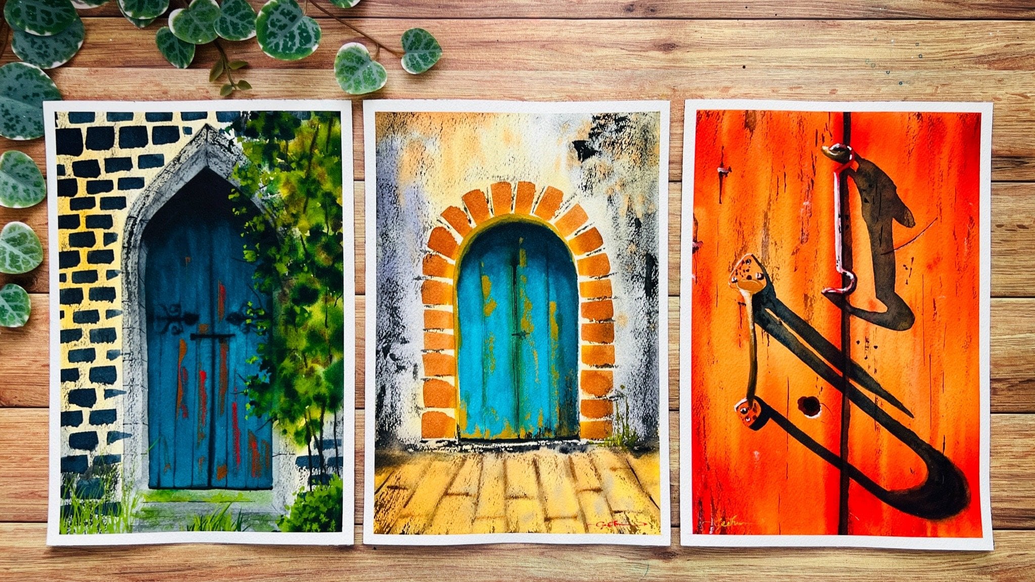
Transcripts
1. Welcome to the Class: Every one of us dream of traveling the world, exploring new places and cities, and capturing those spectacular moments in our memories. Ever since I picked up my brush and ventured into the world of watercolors, painting cityscapes, urban landscapes, and the places from my travel photographs were my passion. The massive architectural elements in different cities intrigued me, and I knew that eventually, I wanted to be that watercolor artists who could travel the world and paint the different cities that I visited or to even paint cityscapes and urban landscapes, at least from the photographs. Hello everyone. Welcome back to my class. If you are new here, I'm Geethu, a full-time aerospace engineer based out of the UK, with a passion to paint and teach art. I have been practicing with watercolors regularly for over two years now, and you can find all my work in my Instagram profile as Colourfulmystique. Welcome to the first of a series of classes on painting, cityscapes and urban landscapes. You are going to tread on an exceptional journey into painting the places in your dreams. We start the series with learning all the elements that make up a cityscape or urban landscape, such as buildings, cars, street lamps, lights, people, and anything and everything that you can think of. This class is ideal and perfect even if you are a beginner who is just starting out with watercolors, because right from sketching and brush exercises to get muscle memory and hand control, understanding color theory, light, shadow and perspective in detail, and handpicking the colors for each painting. You will be even deciding your own color palette and curating your own colors for the future. We are going to create our own urban landscape study journal featuring your own notes, my notes, our learnings, color swatches from various studies, our own color palettes, and our important observations with various architectural landscapes, alongside the painting projects in this class. You will learn to create a nice contrast between the shadow and light elements, which techniques to use to make your watercolor paintings shine, and how to approach any cityscape or urban landscape painting in detail. Packed with all the information to get you started into every aspect and element of painting a cityscape with ease, this class, the beginning of a series, is going to create a new world of watercolors around you. Each of the class projects cover the elements in detail and each day you will get to explore a new element with tips and tricks on how to incorporate them in your paintings. Without any further ado, let us get into the lessons of this class.
2. About This Class: This class is going to be the first of a series of classes where we will learn to paint cityscapes and urban landscapes in detail. Understanding the individual elements that constitute a complete painting will give us the confidence and knowledge needed to paint huge cityscapes in general. Hence we are starting this class with trying to understand these individual components. There are a lot more than these, not just these. Following this class will be larger cityscape and urban landscaping. Things that you will be able to paint with ease, accumulated with all the knowledge from this class. We will venture into different cityscapes such as perspective paintings. Understand how to include weather and seasonal elements, street views from various cities around the world, old cities with beautiful sea view, Wonders of the World, medieval towns, and even abstract cityscapes. The basics of all of these requires the knowledge of perspective in detail, light and shadow theory, color theory, as well as getting color harmony in a painting. For this reason, I'll be teaching you all of these lessons in greater detail with helpful examples for you to understand these concepts clearly. Throughout the whole of this class and the classes that will follow, I will be sharing tips and tricks in general, as well as color theory tips, which will go a long way for you. Here is a quick view of the tips and tricks icons to help you distinguish between each and which you can look out for throughout this class. General tips and tricks, color theory tips or helpful information on colors, alternative colors that you can mix. I hope this class adds a greater value to your painting journey and that you will be able to paint all of the cityscape classes that are coming up with so much ease after taking this class.
3. Materials Needed: Let us have a look at all the art supplies that you would need for this class. We would need 100 percent cotton, minimum 300 gsm, cold-pressed or rough surface paper to get the best result. I would always recommend to go with a paper that has all of these, that is 100 percent cotton, 300 gsm. It can be either cold-pressed or rough, it doesn't matter. But don't go for hot-pressed paper because it does not have the texture on the paper surface to help us achieve the watercolor effects that we want to do. You can either go for this Canson Heritage series or this is Saunders Waterford. This is also a 100 percent cotton, 300 gsm, and this is cold-pressed. Here I have Arches. This is rough. You can also go for the cold-pressed like I said, and all of these, as you can see, are 300 gsm, which is the weight of the paper. We need the paper to be thick in order to withstand the watercolor washes that we are going to do. If you prefer to paint in sketchbooks, you can also go for a sketchbook option if you want. Next, you need watercolor paints, of course. You can either use the watercolors in tubes, pans, or ready-made watercolor sets, whichever you have with you. I will be using watercolor tubes like these from various brands, mostly White Nights, Daniel Smith, Schmincke, Sennelier, and Rembrandt. I just have a collection of all of these different brands and I have chosen the best colors out of them and added them to this box here. I will also be showing you the process of how I have chosen the colors and the making of my palette so that you can make and decide on your own as well. Next, we need watercolor brushes. You don't need a lot of brushes for this class. Typically, I would recommend having a flat brush so that it can apply some water, either a small flat brush or a large flat brush, whichever you have. Then a medium-sized pointed-round brush, such as a size eight or a size 6 brush. A brush which can hold a lot of water and paint. Typically, a nice natural hair brush would be ideal, and then maybe a liner or detailer brush. If you don't have a liner brush, you can go for like a size 0 or a size 1 pointed-round brush. We need the point, so make sure you have such a nice pointed-round brush. Then I would also recommend having a synthetic brush so that we can use it for the lifting as well as where we want to apply the paint and the water onto the paper without the brush having to absorb a lot of water or releasing a lot of water. Don't worry about these synthetic brushes in general. This is mainly because most of the brushes that we own from the beginning are synthetic brushes. They are the cheapest of the brushes, so what you may have with you may already be the synthetic brush. These are the brushes that I would suggest for this class. You can also try and get a Chinese brush like this. These are called Chinese calligraphy brushes. I use them mainly for achieving some texture on my paintings, mainly because of the hairs. But you don't necessarily need the same Chinese brush. All you need is probably a brush that you can handle without caring, like not care about the bristles and handle it roughly. You can see that is the reason why I use this Chinese calligraphy brush. If you have an older brush in which you can handle the bristles without any care for your rough use, then you can go ahead and use that as well. Of course, you'll need an eraser, a ruler, and a pencil. I will be using a mechanical pencil like this one because it is easy for me to use. I don't have to sharpen it at times and all I have is to change the lead in it. This is a 0.5 millimeters mechanical pencil. Then an eraser, of course. I will also be using this kneaded eraser. This is very useful when you want to remove the graphite marks from the pencil. This is called kneaded eraser. As you can see, it's easy for us to knead it. I will be explaining the use of this kneaded eraser in the coming lesson. But you don't necessarily need this. You can go with your normal eraser as well, so please don't stress about that. You would also need a sketchbook, but it needn't be 300 gsm, 100 percent cotton, or any watercolor-specific sketchbook itself because we're going to be writing a lot of notes and a lot of sketches in this one. This is for your journal. Just make sure that it can withstand some small strokes and color marks and it doesn't tear off. Make sure it's not like a simple notebook. It would be ideal if it's 150 gsm at least so that it got a little bit of thickness. This is separate from the watercolor papers that I had mentioned that you will need for this class. This sketchbook is not for painting. This is for your journaling purpose if you would like to do that with me. Some colored pencils or pens or sketch pens or whatever if you would like to decorate your journal. If you would just prefer to go on writing simple notes, then that is fine as well. I'll be just using this red, blue, and this black pen to add things into my journal. You would need two jars of water. You obviously know by now if you've taken my previous classes, one clean jar for taking freshwater to take fresh paints, as well as to apply the water on your paper, and the other is to wash off the dirty paint from your brushes. It is just because imagine that once this gets a lot of muddy and cloudy, we do not want to use this muddy water to be applying on a paper for wet-on-wet method. This is the reason why you would need two jars of water. Next, you can go for masking tape if you would like to tape the edges of the paper onto a board or surface. For this class in particular, we are not going to need any masking tape because I'm just going to be teaching you all the elements at first before we can move into fully-fledged cityscapes, landscapes. Just keep in mind that if you want to tape down your edges, you can go for a masking tape like this. This is no specific brand masking tape that I have been using for a while. Just observe that if you find your masking tape to be ripping the paper, it is not the masking tape that is the culprit but rather it is the paper. A good paper will not rip off even if you use any kind of masking tape. Although I have heard that artists recommend this Tesa Perfect masking tape for their paintings because it is very good and withstand a lot of washes. As you can see this is brand new. I haven't used it yet. This is the one that I use mostly. You'll need some white gouache paint as well. This is a white gouache that I will be using. This is permanent white from Winsor & Newton. If you don't have white gouache, you can also go for the white watercolors in your pans or in tubes. It doesn't really matter. All we need is a nice opaque white color to add some highlights and other details in our painting. You'll also need some tissues or paper towels to remove the excess water and paint from your brush and for any extra techniques that we want to achieve, so just keep some paper towels in your hand ready. We might also need some cling film or some plastic wrapping paper in order to achieve some of the textures that we are trying to achieve for some of the paintings. Just keep that in mind. It's okay if you don't have this because we can achieve this using other methods as well. I obviously forgot this. You need a watercolor palette to be mixing your paints in your palette. A nice plastic or metallic or whatever watercolor palette that you have is absolutely fine. Lastly, try getting hold of an old credit card if you can. This is ideal for some scratching techniques that we can do on the paper. This is one of my old cards which is outdated, so that's why I'm using this. But don't worry if you don't have such a card, what you can use is a palette knife, or you can even use the end of your ruler if it's as flat as this one. Now that you know all the materials that we need for this class, without any further ado, let's jump into the next lesson.
4. Creating Your Own Journal: How would you like to create your own of landscape journal featuring all your important learnings from this class and future being things? Would you like to have all of this info curated into a single place so that you can refer to it whenever you want and come back to the journal when you need to refer to some fundamentals? It is going to help you in your journey and I'm sure that this journal will also be a motivation and of course, proof of your achievement. You're going to do this on your own. I'm merely going to start it for you in this class with the initial ideas. You are the person who going to complete it and execute it. As I said, I'm just merely the initial driver. Consider this as your personal study journal. Some of you may already have something similar or even like a swatch journal or a technique journal so you might already have some of these. But in this class, this is going to be a huge experience. I'm going to be teaching you how to create a beautiful journal and how you're going to incorporate your ideas and your learnings into that journal. I have this journal for swatching all the colors that I own from various brands. It is really helpful when I'm looking to pick up some new colors, are working on a new project and I want to check the shapes that I own and you can also see there are some little color mixing exercises in here as well. Obviously, this is incomplete as well. These is all the colors I own for this and earlier one, but I still haven't swatched them yet. That's because I have actually swatched them onto a bigger sheet of paper and I've stuck them on the ball here in my studio so that is the reason. This is my swatch journal. Our sketchbook or a journal is going to be much more than just a swatch journal. Every tiny bit of our learnings is going to go in here. It is absolutely your choice what to add in and whatnot. I'll be showing you the process of how I do it and what are the things that I'm going to be adding in my journal and over the course of this class, you're going to find lots of tips, tricks, techniques, so anything that you think is useful to you can add them on to journal and there may be elements are important tips or tricks that I will not probably add to my journal while I'm explaining I'm painting because I might already know that and it's something that comes naturally to me. But if it's something new and you find it as a really useful tip and you want to note it down, then you can go ahead and add it to your journals. It's going to be complete lead lots of ideas, lots of technique, lot of swatches, your color balance, everything, and anything that you're going to learn in this class. What sketchbook are we looking for? This time I wouldn't say a 100 percent cotton watercolor paper because it is just basically going to be some swatches and some simple techniques and a lot of handwritten notes highlighted and it's like a journaling of tips and tricks for watercolors. Basically, you don't need 100 percent cotton paper for that. Any sketchbook would be fine. You are going to be writing, sketching, drawing, painting, highlighting, decorating, every possible journaling method that you can actually think of. You can even paste you know the different pictures that you're using there. It's find take out those stationary pens, pencils, highlighters, colored pencils or whatever you own, and just, pour your heart out into this class and lesson because we're going to have a lot of fun. Any sketchbook would suffice and I'm trying to have it at least 150 GSM or 120 at least. Because otherwise, when you're swatching the colors, that is when you're doing simple colors swatches, your paper will start to buckle and might tear off. This is the reason why I recommend at least a 150 GSM. Any basic sketchbooks that as you know drawing sketchbooks out there are also 150 minimum, so that would really be fine. Anything with a fairly good thickness to withstand some basic watercolor strokes. That is what you need. I have this from BBVA Colors. This is a hot-pressed sketchbook. Ideally, if I IV or something bigger is better I also have this smaller one from our design so this is 5.5 inches square sketchbook. You can see that. This is also fine. But I think that this is too small for me. Maybe you might not even fill these whole pages in this class, but then I want mine to be a little bit most likely bigger and can cover a lot of things in it. But this is just some sketchbooks that I'm showing you. The one that I am going to be using is this one. This was made by a very good friend of mine. She is a kaleidoscope artist. She made this for me as an, I bought this from her. She was designing these sketchbooks and I really loved it and this is how work actually on the cover she designed all of this so you can see, it's a kaleidoscope arts, an image kanji. This is my zodiac sign Gemini and then she's written my name in the front and so and this paper is really thick and good. You can see that. This is what I'm going to be using. You can see this is A5 as well. Just similar to this. Just that it's in the portrait mode. This is what I'm going to be using, my sketchbook and I'm so eager to fill it out. You've already seen how it looks after filling it out, obviously. But then you are going to design your own and make your own. You don't need a fancy sketchbook like this, so don't worry about that. If you're in the calligraphy, you can write down the name of your journal in calligraphy writing as well. It's up to you how you want to decorate your sketchbook. You don't have to follow the exact lines that I am doing. You don't have to follow the decorations that I'm doing in my sketchbook. Just go with your own instinct and think creative ideas that you can do and you can also share them in the project section, everybody would love to see what creations that you have made or what are the nodes that you have done in your sketchbook. Then alternatively, if you do not want to create this sketchbook, but would still like to preserve some of the lessons covered in this class, you can have them done on a good watercolor paper and take them to the wall of your table or studio. Trust me, those concepts that we're going to learn in this class are very important and you needed forever. If you already have some things like the color wheel, you can ignore that part and not create it. But then there are lots of other things covered in this class that you need forever. You can have those techniques are done on a large sheet of paper and stick to your wall. But trust me on this, this sketchbook is going to be one of the most satisfying part of this class about from the paintings. Because it is a reflection of your learnings and what you will probably need for all of your future as an artist or as whatever you want to learn from painting watercolors. During the course of this class, I'll be telling you some tips and tricks that you can put into your journal. It is totally up to you to do so. You can create one and try similar to the one that I'm making or you can customize and decide on your own. It's totally up to you.
5. Creating Your Own Colour Palette: Whether you're painting from a reference or in real, you need a palette of colors, a set of colors curated for yourself. Every artist has a set of color combinations or a custom palette of shades or colors which they don't do always, or which are their favorite. These color combinations are clearly visible across their artworks. For example, there are artist who prefer to paint completely monochrome or with cool colors such as blue or warm colors such as yellow and orange, or they may even prefer a certain color for their backgrounds, like turquoise blue. If you check across their works, all of their artworks is going to be like in bluish tone or greenish tone, or maybe lavender or violet. It all depends from person to person and how they like to depict or showcase their work. Hence deciding and finalizing on a color palette is absolutely necessary for us to be able to travel the world with our palette or to create a unique identity for our paintings. But this process of choosing the colors is not easy, it requires a vast amount of knowledge in color theory, in the pigments, in each of the colors and their properties. Imagine having to dig through all the colors you own to paint something. But wouldn't you rather prefer to paint a specific scene with your own palette, with your own perception of the picture of the scene in front of you without getting influenced by the original colors as such? Wouldn't you want to create an original identity of your own? How about I help you to kick start this process? I wouldn't want to choose the colors for you myself, that's up to you. But I would definitely want to help build to choose your own and curate your own. I will tell you the main things that you need to consider and also the major factors that influence your decision while choosing a color palette. This was my palette for my 100 day project class. I had tried to stick to this palette for the entire duration of the class. I think there was only one time that I might have additionally used a tail green light and a cadmium yellow light. Apart from that, for the 100 days, I had stuck to this palette and was using all the colors in this one. This is the reason why I said that creating a palette of your own is absolutely helpful and essential, and it also teaches you a lot about color mixing because then you try to paint from the colors in your limited palette and you're trying to create your own. I am going to help you today with creating your own, and I have also curated another palette for this class specifically. This one was for my 100 day project class, I still love all the colors you can see. I've not cleaned this palette, so I still use it at times. But for today's class, like I had shown you, I will be using this palette and I will be showing you exactly how I have chosen the colors or what are the colors that I have chosen. This is what I will be using in this class. Before we start with ideas into creating our own palette, let us first dive into the understanding of the color will and a little bit about color theory. This is the fundamental and the most basic thing that you would need to understand about colors. Let us dive into that.
6. Colour Theory Part I: Let us now have a look at the color wheel and some of the most important properties of color mixing. Here you can see a simple color wheel that I have made. This is actually composed of warm colors. There is also a cool color wheel option. I'll explain all that in a while, don't bother. The color wheel is the most basic fundamentals of color theory. Every artist, at least once in their lifetime, should have looked at the color wheel at least. But the best-case scenario would be to have this color wheel. By heart, in your mind, in your head, you should know where the colors are, what are the complimentary colors, what is the analogous colors, and everything. If you know it by heart, then consider half the job done. That is, you already know the color mixing part and all you need to learn is the brushstrokes. Let us have a look at that. Here is the color wheel that I have made. We know there are three primary colors, which are yellow, red, and blue. They are the triad, you can see they're like in the edges of our triangle here. The three colors, yellow, red, and blue. Then the next color is the secondary colors. I mean, the colors that come right in the middle, which is composed of mixing two primary colors. If we mix yellow and red, we get orange, which is the secondary color. You see that? That secondary color, there are three of them, obviously again. Yellow and blue, if you mix them together, you get a green. Blue and red, if you mix them together, you get a purple shade. Then the next part is tertiary colors. Tertiary colors are obtained by mixing a primary and a secondary together. The secondary was mixing two primaries, the tertiary is by mixing primary and the secondary together. We said that the secondary is orange, green, and purple. If we mix orange and yellow together, which is one of the secondary and the primary, we get a tertiary color, which is somewhere in between the yellow and the orange. You can see it's a lighter shade of orange, well closer to the yellow, but right in the middle. The same thing, if you mix orange and the red together, you get a different shade of red, which is like in the middle, which is a tertiary colors. The same way you would do for all of the others, and you'll see the varying purples and greens that you obtained, which are the tertiary colors. This is basically the color wheel. The position of the yellow, red, and blue doesn't matter so long as they are in the triad. What I mean to say is you can start with your yellow here at the bottom and you have it go in the normal. But if your yellow is here, and obviously your red should be here and your blue should be here. That's the only thing that you need to take care of. You don't necessarily have to put your yellow at the top, but mostly people do it like this because that's where you start with. This is the basics of color wheel. So long as you know this by heart, it is going to help you a lot. Now, the next thing that we need to know is complimentary colors. Complimentary colors are the colors opposite to each other in a color wheel. Yellow, what is directly opposite to it? That's violet. The complimentary color of yellow is violet, of red is green, and blue is orange. All of these colors definitely have complementary colors. For the primary, the main ones are a secondary color. The complementary color of a primary color is always a secondary color, which is like right in the middle. This is the main thing that you need to understand. Now next thing is how you can split your color wheel into warm and cool colors. Mostly the first section of the warm and cool colors are varying for different artists. Some artists prefer to split at the yellow, some artists prefer to split slightly one here next to the yellow because this looks warmer. Warm colors are basically those colors which is warm, looks more like yellows, fire, reddish, the sun, anything that you can relate to as warm. But cool colors are what you can relate to as cool and gold. That would be the sea, ocean, bluish things, those are cool colors. That is why I've split in my perception, the cool colors and the warm colors through this line here. All the colors towards the left of this line that has this semicircle is warm, and the right semicircle here is cool colors. You can see this is blue and the next colors. This was definitely obtained by mixing a blue with the yellow. Even though the yellow is warm, the blue is actually perceived as a cool color, so that is why you've got a cool version of the green here, I would say. This is definitely cooler because you added more blue into this one to get this color. That is why this whole range is cool and these are all mixed by adding yellows and reds. That is why this is known as the warmer side. Now, there is another thing that we need to understand. I said that actually this is a warm color wheel and this is a cool color wheel. What does that actually mean? If there is already warm colors and cool colors in this one, then why is this called as a warm color wheel? Every color, even though they are on the warmer side, for example, let us take yellow. Even though yellow is a warm color in one single color wheel, you can actually have a warmer yellow as well as a cooler yellow. Let us see how that goes. This yellow that I've used here is Indian yellow, and it's more towards the darker side of yellow or looks more like orange. If you look at it, it's got, just see, it's not at all looking like a blue, it looks more like a little bit of orange or a brownish touch, so that is why this yellow is warm. But there are some yellows that looks slightly greenish. [inaudible] or lemon yellow for example. Lemon yellow is the perfect example. If you try and swatch lemon yellow, you'll see that there is a slight greenish tint. That greenish tint is mainly because of it is a cool yellow. You can term it as a cool yellow because how do you get a greenish tint in a yellow? If you add one tiny drop of blue into this yellow, you'll see it gets a little greenish tint, even lighter than this. Somewhere in between this, you'll get a very lighter greenish tint to your yellow. Actually you can make lemon yellow. That is why lemon yellow is a cool yellow. It's found in real-time, it found in tubes, so you can say that lemon yellow is a cool yellow, whereas Indian yellow is a lighter warm yellow. But there are other yellows that are warmer than this because when you try and paint it, you'll see that it's more closer to orange or looks more like red. That's why it's a warmer yellow. Here are some important points. With yellow, when it looks more like orange or red, it is a warmer yellow. With yellows, if it looks more like greenish or bluish, it's a cool yellow. That's the case with yellows. The next thing is, how do we classify blues or reds as cool and warm? Let us look at that. Here, I've got some blues here. You'll see they're all different. A warm blue would be where it is leaning closer towards the reddish side. When you mix blue with red, you get dark, getting purples. Also, your blue starts getting darker. You can see this is dark. It's a purplish shade, but it still is dark. Red is the most ultimate of the warm colors, that is on the warm side. If your blue starts to lean towards the darker side because of the presence of red in its pigments, it is a warm blue. That's what makes a blue warmer. I'm not talking about this color wheel. I'm talking about colors, in general, just blues. Try and understand the difference. I know it's a lot confusing to understand this concept, but trust me, you'll get it in the end. This blue here is warmer, that I have used, because I actually used cobalt blue. Cobalt blue is a warm blue because it's more bluish rather than it is greenish or towards the yellow. What is a cool blue? A cool blue would be when it starts to tend towards the greenish side. If you start mixing blue with a little bit of green, you get phthalo blue or turquoise blue so that would be a cool blue. The cool blue is colors like phthalo blue, turquoise blue, green blue, and the sea green blues. Those blues, they are cooler because they look more like green, which is also on the cooler side. This is the reason why we have warm and cool blues. Here, I use cobalt blue. It's a warm blue. This whole thing is composed of warmer color palette. Wait, I still have to explain the reds though. Let us see the case of reds. Here are two reds. This is alizarin crimson, and this is quinacridone violet rose. It's the same as quinacridone rose in other brands. It's PV19. Alizarin crimson is what I have used in this color wheel, and it is warmer than this. I would say it's warmer because it looks more reddish, and more like the yellowish. There are other warmer reds than this alizarin crimson, in fact. For example, prominent red or fire red. All these I think are warmer reds than this quin rose. That's mainly because they tend more towards the yellow side. This is the red here. It looks more towards the yellow side. That's why it's warmer. Whereas, this quin rose, it's this one here, you can see it. It is rose in shade. What actually makes a color, a red shade, become like a rose? If you start adding blue to it, it will turn into the violet side, or it'll turn towards the bluish side, which is why it's called a cool red. This is the quin rose, and this is the alizarin crimson. Compare these two here, these two exactly. Which one looks like a yellow or an orange? This looks more like a yellow and an orange. This one. That is why this is a warmer red, whereas, this is a cooler red. This is the main thing that you need to understand about colors. When you're making a color wheel like this, you don't necessarily have to go and find all the warm colors and make it. When you're starting, just start with any three primary colors. That is yellow, red, and blue. Don't worry about whether it's a cool red or a warm red or warm yellow, cool yellow. Don't bother about that. Just try and make the color wheel first, and try to memorize that concept. I will be showing you a little process of how I am going to add this color wheel in my journal here. This is because this is a color wheel that I had made a long time ago. It was actually stuck on my wall here in my studio. I wanted to have this in my journal here. Here is the journal, and I've just made a rough sketch of what I need to add in. You can see, I've made the sketch of the color wheel. I'm very bad at calligraphy, so you can see my writing is bad, but this is just how I wanted to decorate it. But you can just go on, and add so much more to it. This is how I'm going to be doing. What I've done is I've just drawn two concentric circles, and I've divided this into 12. I wanted to add the cooler version as well. The cool version here that I have added, here you can see this. This one, I've only made the primary and the secondary. I didn't do it as because this one, and add the tertiary. If you want, you can go ahead, and do the cool color wheel exactly similar to this one, with the big tertiary colors in between. Actually, I think I went for one shade of tertiary. I didn't do it exactly like a secondary color. I did a mix of a secondary and a tertiary. You can see this, this, this, this. That is a yellow, the red, and the blue. Here is my primary. What I did is I tried to get the two colors in between. These aren't actually secondary colors, and these aren't actually tertiary colors because they're right in the middle. If I was looking for the secondary color, I should have gone for exactly just six shapes, rather than nine. This is what I have divided into nine. That's what I want you to understand. Don't try to pique your mind that it has to be exactly this primary, secondary, tertiary or a combination of all of these. You can see here that this is just obtained by mixing the yellow and the red here together, but I just added more yellow to this one and more red to this one so that I got the two colors in between. That is the magic of the primary colors. You can mix it in such a way and get a variety of shades. I'll be showing you the process of how I do this, and how I'm going to start doing all of the things that I'm explaining here in my journal. You can see, I've just made it simpler, and just added these in my journal for now. I'll show it to you. I will also be attaching pages from this journal as a PDF, so you can refer to it anytime, and you can make your own. Don't worry about that.
7. Colour Theory Part II: Once we have familiarized ourselves with the color wheel, now what we need to understand is the color temperature. The warm and cool colors that I just defined is exactly what is known as the temperature. That's because it's warm or either cool. Like this yellow that I explained, this is a cool yellow and this is a warmer yellow. Now it looks similar. But let's see if you can spot the difference by looking at the two. Which of these looks more greenish than the other? This definitely doesn't look green. But you can look at here. This is somewhat lighter and you can say that maybe there's a tint of green in that, in this shade. This is why this is cooler and this is warmer. There can be warmer yellows than this one. Maple yellow. Just look at this. If you were to look at both of these, now, which one is warmer? The warmer one is this one because it looks more towards the orange than this. If you were to just look at both of these and define cool and warm, this is warmer and this is cooler, although this is not entirely cool when you just say the name, but in comparison to these two, this is cooler and this is warmer. Did you get that concept, what I'm trying to say? When you add these, so what is the order of the warm to cool? Warm, warm, warm. The line of warm to cool would be from here to here. This is the most warmer, and this is the most cooler, and this is in the middle. Can you see that difference in the tubes? That's what we are trying to understand here. The color temperature is basically how you can actually make one color warmer or cooler. Aureolin, for example, this is aureolin. I said that it is cooler, but don't think of it as a cooler warm yellow right now, just think of it as a yellow. This is just a yellow now. Here is the yellow aureolin here. Now, you want to make this warmer. How do you make it more warm? In order to make it warm, add something that looks more like reddish or orange tone, and that would be adding orange itself or adding red, any red, alizarin crimson, or adding burnt sienna. Anything that looks towards the reddish or brownish tone. If you add that to your yellow, your yellow becomes more warmer, and that is how you increase the temperature of it. So here, I've mixed alizarin crimson with aureolin here. I hope you can see it. See you can look at it closer. Aureolin with alizarin crimson and you can see it's got warmer and warmer and warmer until it looks more like a dark or orange-ish burnt sienna kind of look. That's how you make a yellow warmer. Now, how do you make it cooler? In order to make it cooler, add a blue to it. It's as simple as that. Here, I have added cobalt blue to this side. You can see this one actually looks a bit like lemon yellow. Lemon yellow is a bit more lighter than this. But I think if I had reduced the amount of blue that I mixed into this, I would have got lemon yellow, so that's why I said lemon yellow is on the cooler side. Here is lemon yellowish yellow. If you keep on adding more blue, you can see that you've made this yellow into more cooler color. This is how you actually make a color warm or cool. That tip is for yellow. In the case of red, I haven't done it here. This color temperature box here that I have done, you can do it exactly the same way for the other two [inaudible] as well. Pick any red shade, and place it in the middle, and think of how you can make it warmer and cooler. So a red, how do you make it warmer? Here is the red. This is why the knowledge of the color wheel comes into play. Here is the red. How would you make it warmer? If you look at this line, the warmer side is here, that is this. In order to make a red more warmer, you need to add yellow. Into a red, the more yellows you'll add, you'll make it warmer, and into a red, the more blues you add, because this is the cooler side, you'll make it into a cool red. That's the case with red. Note this and you can actually have this in your journal. I'm only going to do one color because I know this. But if there's something in a new information or you actually like to do the swatches, trust me, I enjoy this process and that's why I'm going to do it again. That's with the red. Then for the blue, that is either blue as well so that you can swatch it out like this. Color temperature for the three main colors. Every color has a color temperature and you'll be able to jot it out. I'll explain after the blue. Here is the blue. Here is the blue. How would you make it look warmer? In order to make it with the case of blue, because it's like right in the middle of the cooler side, it has both perceptions, you can add more yellows to it and make it get warmer and warmer, or you can add reds to it. How do we differentiate whether it's a warm or weather yellow or the red is what do you need to add? Let us just understand that. In my perception, blue, green is definitely a cool color, I would say. This is because it is obtained by mixing blue itself. Green was obtained by mixing yellow and blue together, so we obtained green. Green already has a blue in it, isn't that right? Because green has blue in it, that means that it is cooler. This is the reason why when you mix a blue and green, this tone, again, I think it tends more towards the cooler side. Whereas red on the other hand, if you look at it in the perception that it's a normal red color, don't think of cool and warm here. Red does not have a blue in it. It's a primary color and it does not have blue in it. I know we were talking about yellow and reds here but just listen to me. Red does not have any blue in it. The more reds you add into your blue, it's going to turn purple, darker. Eventually, it will turn to red, which is the most warmest color. This is the reason why I believe that if you add reds to your blue, it would turn warmer, and if you add yellows or greens to your blue, it would turn to the cooler side. I hope you understood that. Then from the example, green. So if you had green for example. Here's green, how would you make this warmer? In order to make this warmer, obviously, you can keep on adding yellow, orange, reds, and this would make it warmer and you can make this cooler by adding blues, darker blues, purples and it would turn tint to the cooler side. This is as simple as that and as I said, the whole basics lies in this color wheel and the positioning of the warm and cool colors. If in your head, you can actually visualize, I know you can't see, but I've got my eyes closed and if you actually try to picturize in your head, so I've got the yellow, I've got the red, I've got the blue. So yellow and red, in the middle comes the orange, then here comes the green and here comes the purple. If you can visualize this and then think of this line, that separates the color wheel into two, into the warmer and cooler sides. This side here, starting from the yellow to the red is the warmer side, and starting from the slightly lighter green to the purple side is the cooler side. If you can just imagine this and try and memorize the color wheel, trust me, everything is going to be just simple for you. I know this is a lot of information to process and it takes time to understand. This is where our journal comes into play. Over the length of this specific lesson, you might have seen a lot of points come up. You could add them all into your journal as steps tricks. You can note them down. You can swatch your colors. You can learn so much about colors and it's so much fun. When you're into an art blog or something, what I usually do, although it's not when I get an art plot. Whenever I'm sitting simply, I love to just go and read about colors. Just read whatever you can. Find out about colors, about color theory. It'll just improve your knowledge so much and help you in painting. We just don't want to be using the colors that someone else is teaching us. We want to be inventing our own colors. This is what I wanted to convey through this class. That is, I wanted you to go ahead and create something of your own, create your own pallet, and follow me with the techniques to learn the cityscapes and urban landscapes but on your own. Unless and until you learn on your own and define a composition, I don't think that we can progress ourselves into the next stage. That is why the main aim of this class was to help you understand all of these concepts and to help you in your learning process into journaling all of these things. The next thing is about color saturation. When you look at an object in real time, it doesn't actually look exactly red in its whole. It's got a lot of colors on that specific object itself because of the way that light is falling on it and how our eyes see it. That is why you probably have to mute down a color. It is absolutely necessary to mute down a color in real life when you're painting, because you cannot actually find an object in a single color saturation by looking with our naked eyes. There will be always varying tones of it in different saturation levels, and as I said its mainly because of how the light falls on that object. If I were to show you, maybe this red brush here. If we look at this brush closely, you can see some lighter tones, you can see middle tones of red, and then you can see darker tones of red at the bottom. Can you see that? As I said, this is not a single red shade, it's got different shades of red. Although this is just one color, but the different tones that we see is mainly because of how light falls on it and how our eyes perceive it. That's why. How do we mute down a color? Easiest way to mute down a color is to add the complementary color to it. There are two options, you can either add a complimentary color to it, or you can add a gray or a black tone to it to mute down the color. But artist mostly prefer to use the complimentary color to mute it down. Because when you add black to it, it gets darker and darker towards black, whereas when you add a complimentary color, the saturation level of that color starts coming down and then you see it get darker and darker. You might have heard of saturation in photography or when you're editing, when you increase the saturation, you know what happens. It becomes more vibrant and the color gets saturated. That's what you're trying to do when you're adding a complementary color, you're trying to reduce the saturation of that color. Here is, for example, this is the Alizarin crimson here, and what I have added is I've added sap green. Why green? Because here is the red and the opposite color to that red is green, so it looks more like a sap green. I added sap green to red very gradually until I obtain the dark brown color here. You can see in the first column itself what has happened? When I reduced the saturation of it by adding a little bit of green. I just added a very little amount of green here to this red, and you can see it's already done and it's slightly lighter, or you can't say it lighter, but essentially the saturation level has gone down. Don't you agree? Here, the saturation level has gone down and it's decreasing until further turns towards the grayish brownish scale. This is how you would mute down a color or decrease the saturation of a color. The same thing can be done with all the other colors. Every color you can have opposite color added to it to decrease the saturation level. Same here cobalt blue, the complimentary color is orange, right in the opposite, so I added orange to it. You can see its saturation decreased until it turns to the brownish scale. That's the main thing about color saturation. Now, let us try and understand tonal value or color tone. These are different terms that we need to understand the difference between the temperature was whether it's in the warmer side or the cooler side or how to make it warm, cool. Saturation is to decrease the saturation levels or to mute down that color, and tone is how light or dark a color is. One single color or shade, how light or dark that is, that's what is the tone is. Here I've used Payne's gray. Payne's gray in its darkest form is like black, you can see here. This is the Payne's gray that I have used and in its darkest form, it looks like black. Then if I keep adding water to it. There are different ways to obtain the color tone again, you can either add white to your color or you can just keep on adding water and then swatching it. With white, it is not the perfect scenario, it is the water method that most artists go for because adding white tends to make it lighter, but also tends to make it towards the grayish side in case of this Payne's gray. Also for other colors, it would make it lighter and lighter, but not the exact light that we want. Payne's gray here, it looks like black, and then I added a little more water into that mixture and you can see it turned lighter. I added more water each time until at the end, I had almost nil of the pigment, but more of the water. It doesn't actually mean that you're now dropping water and you end up with a large puddle. No, it just means that, in this mixture here, it is probably like five percent of the pigment and more water. I'll show you how the tonal process is. I think I've already actually shown this in my ultimate guide to watercolors class about color tone, so these are important concepts, which is why I wanted to cover again. That was with the Payne's gray. But there are certain colors no matter how much you try, you won't be able to get a darkest tone of it because it is actually lighter. One main example is a yellow. This is the Indian yellow that I have used here. This Indian yellow, this is the yellow. You can not get any darker side than this, but the more water you add to your yellow, you will be able to make it lighter and get your tonal scale. Here is the initial tonal scale, and you can see this mode looks almost similar, while as this has a little bit of Payne's gray and this has a little bit of yellow. How do you make a color such as yellow end towards the darker side? It's very simple, all you have to do is add a darker version of this to it. That would be either you can go for this Alizarin crimson option or you can go for Burnt Sienna. Here I have done this, Indian yellow plus Burnt Sienna. I added Burnt Sienna to this Indian yellow, and now you can see I've made my yellow darker and darker. Here again, this is not the darkest version of Burnt Sienna, I might get another box. But what if you want to make even darker and get towards the blackish side? Then to Burnt Sienna, you would add Payne's gray or black, or you can add a dark version of it, which would be like a dark burnt umber, and you'll keep on getting the darker version of it. You can extend this line until you get the black by adding more darker versions of this color. The darker versions of each color like yellow, it's Burnt Sienna, from Burnt Sienna, you can go for burnt umber, then burnt umber you think of Zapier after Zapier, you can go for black or Payne's gray, and then you would just keep on getting that darker shade. This is about color tone. These concepts that I have explained here are the main things that you need to remember about color theory. One is to familiarize yourself with the color wheel and the position of the colors. When I say the position, the position related to each other, not where they are situated. Relative to each that means yellow, then comes the greens, then comes the blues, then purples, then the reds, oranges and back to yellows That's what you need to buy heart, you don't need to remember that yellow is at the top. That's not the position I mean, the position relative to each other, the complementary colors then the theory about warm and cool colors of each other. Warm and cool color wheel, color temperature, color saturation, color tone. These concepts familiarize yourself, and trust me, now you are a pro if you actually know all of these things.
8. Colour Wheel in Journal: Now I'll roughly show you how to make this color real and everything into your journal. You can do exactly as I am doing. Or you can have your own creativity and find out ways to do it. Instead of these concentric circles, you can actually go for something similar to this with twelve sections. Or you can have small round circles in that position rather than drawing it like that. There are various ways, even if you Google and find out color wheel, you'll see a lot of options and a lot of ways that you can depict the color wheel. Just go ahead and try and find your creativity. Additionally, you repeat the process now the entire thing. Because otherwise, it's going to be a very lengthy process. But I think once you get the hack of it, you know how to go ahead. I'm going to we using this [inaudible] project pallet here because I think some of the colors are already in here. But also because I haven't actually set up the pallet yet. We're going to be doing it together in the next lesson. Let's just see. Let us start with the color wheel first. I had to actually paste another sheet of paper on the top because the one I made first I forgot to record and also I made a mistake, as in I dropped some pigment on the top, then the whole thing got ruined. I'll stack a paper on the top now to show you how it's done. Also, I like how it looks, it looks popping out the color wheel. It makes this one special. Let us start with yellow. I'm going to be using Indian yellow here. That's our first primary color. Let's fill one of the boxes. Then the next primary color that I'm going to use is red. In my case, I'm going for alizarin crimson. Leave three spaces, that is one for secondary and two tertiary colors. Then comes the next primary again, that's alizarin crimson that I'm using. You can use whatever red you have, for the initial color view, don't bother about warm cool or anything of that sort. Just try to familiarize yourself with the color wheel that you can obtain. That's red done. The next color that I'm going to be using is cobalt blue. Leaving three spaces again, here comes the blue and there is the three space left. Now we'll try and add the secondary colors. I'll show you the first one and after that, all the others, you're going to do it yourself. I'll just speed up the video and I'll just show you. The first one is going to be mixing these two primary colors, yellow and red. Here is yellow and here is red. There mixing those two colors, I have obtained orange. That's what I'm going to be painting. Now, the others, you can do it in a similar manner, just for secondary colors would be mixing the two primaries and would go in the middle. Now that you're done with the secondary colors, I show you how we can get the tertiary colors. To this orange, you're going to add more yellow. You'll get the first tertiary color, and then to the single orange, you can add a little bit of red to get the tertiary color. This is exactly the process that we're going to go through the whole circle that is to this bubble here. If you add more blue, you'll get this one, and if you add more red you'll get this one. The same to this green, if you add more blue, you get this one, and if you add more yellow, you get this one. That's what we're going to do now. Now that you're done making your color fill, you can actually go ahead and label things as you want. Let's first add the split between the warm and cool colors. This is the split in my perspective, there. Here on this side, the warm colors, and on this side, are the cool colors. Then let's just mark the complementary colors as well. Here I think I would go ahead and mark these two. My line is slightly bent anyways, that's all right. This blue here and this orange. That's because I was trying to draw the line because it is too wet, you can see that. Complimentary color and so is this and this, and this red and this green. Those are all complementary colors. Warm and cool. Let's mark here as well. This is cool and this is warm. This is one of the main color wheels. What I like to do is I like to mark the primaries separately just to know the exact colors that I used and the brand information as well, or the pigment information, if you would like to note that. This is the yellow that I used, then this is the red that I used. My blue is contaminated, we have yellow, let me just clean that up. This is the blue that I have used. I'd just like to mark those colors and know which yellow and which blue were used. Because if we come back to this after months or years, you might actually forget which was the yellow that you used if you have a lot of yellows, obviously. What I have used here is this one is Indian yellow, which is PY150 from White Nights. This is alizarin crimson, it's PR83. I know most of these pigments by art, that's why I don't have to look at the tube. This one is ultramarine blue, which is PB29. These are the three pigments that are used. Now when I come back to it later on, I'll know which one is it exactly. I don't need to write the brand information as such, because when I see it's PY150, I know which one it could be. It's either the Sennelier Yellow Lake or Indian Yellow from White Nights. Yellow Lake in Sennelier is PY150. Because I've written down Indian Yellow here, I know it's from White Nights. That's what they've named it. If you follow the lesson on ultimate guide to watercolors, you'll understand that the name seen on the tube of a watercolor paint, doesn't exactly mean the pigment being used. For example, different brands name differently. Indian Yellow is the name given to PY150 by White Nights, and Sennelier has named it Yellow Lake. Other companies might name it transparent yellow or whatever. Different names for the same pigment in fact. This is the reason why you need to look at the tube information, and see what pigment it is. I don't know if we can see clearly, this is too light. PY150, this tube is too thin, that you can't see the pigment information. I'll show you for another one, out of the tube. It's here on this side. Somewhere on your tube you'll have the paint vein. If it's the pan, you can actually check for the covering. The wrapper that came on the pan might have the pigment information. Or you might be able to find the pigment information of the color brand that you're using from online. They may have color charts, which describes the pigment information. It's really good to understand, because that is actually the pigment that's in that tube, and the names don't actually matter. Since I used the warmer versions of yellow, red, and blue, I'll just show you how the cool version of it works as well. I know that I asked you to not bother about the red, blue, and yellow that they're using, but now I just want to show you the difference of what are the colors that you can obtain in a color wheel when you're using the cool version of it. These are the colors, bright blue, Quin Rose, and Aurelion, which I have beckoning in my palette here. I'm just going to quickly show the process. It's again very simple. This one, as I said, it does not have a secondary, tertiary, but rather what I'm going to be doing is it's going to be yellow, rose or red, and blue. Then what I'm going to do is I'm going to mix yellow and red together, but more of red. That goes here. Then more of the yellow, so that goes here. Then yellow and blue together, but with more of blue, so that will go here and more of the yellow here. The same way with the red and the blue. This is what I'm going to be doing. Just observe. You can do the same if you have cool versions of each other. All you have to do is look at your tubes and try to perceive which one you see as cool and which one you see as warm, and then just use those. Here is the cool color wheel that we have made. Here we have used Aurelion, Quin Rose, Phthalo Blue. These are the three colors that we have used here. If you observe this color wheel and this color wheel, you'll see that these colors are more vibrant. In fact, if you actually mix a cool color with each other, they're more vibrant mainly because of the vibrancy of the cool reds and the cool blues. But that is something that we're missing here. We used warm colors here and we used cool colors here. What are we missing? We're missing the mix of a warm and a cool version. That would mean, if we mix this yellow, there's this Indian Yellow with these other two colors, that is the cool version of the reds and the blues, we already mixed with these two, and that's how we got this, but we do not mix it with this. Then what do we get? I'm just going to quickly show you the art. Don't have Indian Yellow. Let me show you how that would be. I'm just going to quickly show you without mixing, on my paper there. That is the Indian Yellow. Then we're going to mix it with this and this, rather than these two. If I were to mix it with this Quin Rose, there, you see we obtained a nice red shade, there. This Quin Rose extending towards the blue side. The blue and the Quin Rose mix, we already know about it. We've already seen it here, that's that. That's all right. But then we haven't seen the mix of this Phthalo Blue or dried blue with the green, there. You can see how vibrant that greenness. I accidentally touched that blue here and there. See what we have obtained. We were trying out the mix of this Indian Yellow with these two colors. Similarly, there's again, the water spending is, the mix of this with the other two warm colors. This with the other two warm colors. The same way with this with the other two warm colors. These cool colors, sorry. Anyways, but you get the point. We have agreed, because we have six colors in total, we have a lot of possibilities that we have to do. Now what we have done is, we have done here the combination of these three and the combination of these three and one combination of intermixing these two. But then there's what's left, is we have to mix Alizarin Crimson with these three. We have to mix Ultramarine Blue with, not these three, you don't need to mix it with red, obviously, for the Alizarin Crimson and the blue with the blue, but then this with this two. Then this yellow with these two, this red with these two, and this blue with these two. There is a lot of possibilities that you can obtain. If you want in your next page, you can try out those mixes as well and see. This is the reason why artist would not use greens in their palette, but rather resolve to using yellows, reds, and blues. If you have a cool and warm versions of all the three primary colors, that's all you'll ever need. You can clearly see the vibrancy here. I used Indian Yellow here on purpose and I used Aurelion here. You can clearly see the orange and the green that I have obtained. This green is slightly different than this green. That's because of the Indian yellow. That is a warm yellow. This is not actually entirely a cool color wheel, but rather this is a mix of cool and warm color wheel, because I've used Indian Yellow, Phthalo blue, and Quin Rose. This is like one color is warm and the other two colors are cool, but you still obtain a cool version of the color wheel. That's mainly, because yellow is not such a dominant color, but blue and the red shades are. That's why it dominates the coolers of the entire color wheel and gives you a cool color wheel. That's that. Now we can go ahead and label the things if you want. This would be the warmer side in here, so it would not be exactly in the middle, I would say. This is still in the cooler or warmer side. This can actually be considered as cool. This is only because I haven't split it as 12 sections, but rather made it only nine, and did not split it into secondary and tertiary. If you want, you can go for the cool color wheel, exactly like this one, and get the secondary and tertiary colors. That's warm, that's cool, and the color I have used here is Aurelion. This is Quin rose, this is Phthalo Blue. Phthalo blue is PB15. Quin Rose is PV19. I need to check this one, because this is a new tube that I just got, and from Shmincke, Aurelion is PY 151. You could also use lemon yellow. That would be fine as well. Here is the three main colors that I've used for this one. You can see how it's turned out. This is the major color wheel that we have made into our sketchbooks.
9. Colour Theory in Journal : I have already explained about color temperature, so I'm just going to show you the initial process of how we can get that color temperature scale. Here is aurelion, which I'm going to start with, so I'm going to paste it in the middle. This book is shorter, which is why I went for this option. Otherwise, you could make a lengthy one like this with aurelion in the middle. What I've done is aurelion in the middle and then warmer side this side, and cooler side this side. You can do the same thing, but because the space was limited, I did it this way. Aurelion, and towards the top I'm going to go for the warmer side and towards the bottom I'm going to go for the cooler side. That's aurelion, and to that, I'm going to add a little bit of blue. That's a very little amount of blue and you can already see that color has turned into the cooler version. It's more towards the yellowish-greenish side. Then, if I apply more green, you can see how it's turning, our green blue. This is how you can mute it. Now, why am I saying mute it down, make it cooler, more and more cooler? What I'm going to do is I'll paint the whole thing with this color and then we're just going to add a little drops of blue on the top. You'll see how it gets cooler and cooler. This is the easier way to do it, or you could mix it in the palette as well so it doesn't really matter. If I drag it all the way here, let's see. Taking a little bit of blue each time, and here I've taken a little bit more blue, and I will add it. Now, a little bit more blue and adding it. That's the wrong blue, that's Taylor blue. Now you can see how I made this yellow cooler and cooler until it reached a darker green. Now we're going to make it warmer, that is towards the warmer side. You can do it initially just like I said, first, just go ahead and apply the whole thing with yellow and then just keep adding red on the top, lighter and lighter and lighter and towards the darker side. Then you'll see how the red affects the yellow and changes it into warmer yellow. Here you can see I've made that the yellow into a warmer tone. You can get actually more tone standards if you extend it and if you have the intermediate tones in between. Let's just mark on this. This is aurelion PY151, and this one was the cooler side, and this one was the warmer side. Here we added less ultramarine blue and here we added less alizarin crimson. That's what we did and how we got the cooler and warmer versions of one color. You can go ahead and do the same for the other yellows and other reds and blues and try to get the cooler and warmer versions of each other. I can just show you one or maybe possibly with the Taylor blue. I'm not going to draw any boxes, but I'll do the Taylor blue and I'll just add Taylor blue or dry blue, it's PB15. If I add red to it, it will get darker and warmer, you can see that. That's the warmer side of this, and the same thing if I were to make it cooler, I would add more yellow to it. There, you can see how it's getting towards the cooler side. That was the case with Taylor blue plus aurelion tending towards the cool side. This is again, Taylor blue plus alizarin tending towards the warm side. I'll just quickly show you the color saturation part as well. For the color saturation, what I said was to mute down the colors, we would add the opposite color to it. Let's start with alizarin crimson. Here is alizarin crimson, this isn't freshest form. But what is the opposite color to red? That's green. Here is a little bit of green. I'm going to add it to my alizarin, and you can see already that the vibrancy or the saturation level of my red has decreased. Let's add a little bit more green. There, I added a bit more green and now you can see the saturation level has decreased and it's turning towards brown. More green, now that's more towards the brown. More green, eventually it will be a point where you have a brown shade and you've muted down the color completely. That's what you're going get. This is how you do the saturation. That was alizarin plus green. It doesn't matter which green. What I added was the green that we mixed for getting the color wheel, so it's just fine. The colors are saturation, increases towards this, and muted down towards the right side. That's what this is. I'll just show you for the blue as well. If we were to use ultramarine blue, let's have ultramarine blue on our palette here, it's ultramarine blue. Then I'm going to add a little bit of orange to that. You can already see what's happened, the saturation level of the blue has decreased. If I add more orange, that was too much, see, it's already starting to form gray, more orange. It'll eventually reach a point where you are getting a grayish tone because you've muted it down with a complementary color. You have muted down the whole color. Now, you know what saturation means. This is, again, ultramarine plus orange. This side, saturation increases, and this side, it's muted down. If you want, you can go ahead and do the same for yellow as well. Now, the tonal value is very important. Here is my pain screen which I'm going to show you, and I'm going to pick up a dark version of it in my brush, as dark as I can, so that it resembles black. That is the final tonal scale because that almost looks black. Do you see that? It's almost as black, almost 95 percent entirely looks like black. That, we paint gray. If I just add a little drop of water to that and paint it, you will see that the tonal scale gets slightly lighter. I'm going to add another drop of water. It gets even lighter. Adding another drop. But when you take up the drop, it doesn't mean that you take the whole paint, just try to release that water there itself so that the tone on your brush is lighter, but then it's got more of water that you've picked up from the palette. More water in the next one. You can see, it's getting lighter and lighter. I'm just trying to move the pigment, this is the darker side, then it gets lighter and lighter. Another way to paint it would be to just use water and pull down the pigment all the way so that at the end, it's lighter and it has only nearly water. These are two ways that you can do this. There, that's the lighter scale that you can see. This is the tonal value of Payne's gray. I'm going to leave this side of the page blank because I'll come back to it later to introduce more things for you. If you can, just leave the rest of the page blank because I have some interesting concepts to tell you about the tonal value. Now, let's see again the tonal value of another color. I'm going to go with Indian yellow here. If I take the concentrated Indian yellow, I'm going to paint it in number 10. That's the darkest of the tone. Here is number 10. This is as dark Indian yellow can get, you can't get it more darker than that. Then how do I go and make it darker? But first, let's see the lighter versions of it. Let's just go and keep creating the lighter versions. That's more light. Just adding water and lightening my entire paint. You can see, towards the end, I have almost no pigment, just water. That's the tonal scale of Indian yellow. But you want to make it darker. What do you do? For that, what you would do is to that same darker version of Indian yellow, because we're going darker, I'm using the most darkest version now, darker. You can do this on a pallet or you can do it on the paper itself. Let me just fill up all the squares with the darkest version because we're trying to get the darkest, darkest, darkest. I'll just show you how we can go more darker. First, we need the ultimate darkest version of the Indian yellow that we can obtain. That's the darkest. Keep adding it to the end. It need to be as dark as possible. This is the darkest version of the Indian yellow, like I said. Now, from that point, we have the darkest version of Indian yellow. In order to make it more darker, what we can do is we can start with burnt umber. Here is burnt umber, this is number 10. If I start adding burnt umber, you'll see that it gets slightly darker than the previous one. Then just keep adding more and more burnt umber, and you'll see that it starts to get darker. See that? That's how you darken down lighter color such as yellow by using more slightly darker version of those colors. For example, if I add a nice concentrated amount of burnt sienna, here, you can see how dark I have made my yellow to be. But what if you want to further darken this? If you want to further darken this, then you would go ahead and probably add burnt umber to your brown because that's what's darker than burnt sienna. There. Now, you're making it more and more darker. Because this is now getting darker, I'll add more burnt umber. This is now darker than this. Now, we need to make it more darker. In order to make it more darker, you can use sepia or you can use Payne's gray. Here, I'm adding sepia. Now, you can see, the brown has got darker. You can now go and keep adding black or Payne's gray, and you'll see you get the darker versions. I am going to go with Payne's gray towards the end so that I make it darker. You see how you have obtained that darker color from a such a light tone such as yellow. This is about color saturation. If you enjoyed this, don't forget to share all of these pages of your journal in the project section below. Hope you really like these. We are still going to continue making parts of these. Let's just see.
10. Sample Colour Palette: Like I said before, creating a color palette or pre-deciding the colors before is essential before you start painting. This is why I have dedicated this lesson to discuss some sample color palettes with you. You don't need a lot of colors to be taking part in this class, but rather, you can go ahead and create your own color palette or decide with whatever colors that you have. This is why I have dedicated this exercise so that you understand the colors that you own and also can decide how to go forward. If I am picking up a specific yellow, and I say that this is a very good color, and I'm using it, it doesn't mean that you have to use exactly the same yellow in your paintings. You can just go ahead and switch it to a completely different color. It doesn't even have to be yellow. Like for example, if I decide to paint a background with lavender, you can prefer to paint it with a different colored background, for example, brown or orange, or turquoise blue or something. Just go according to your instincts. In this lesson, plan what other colors that you're going to be using in comparison to what I will be using. First of all, I'll discuss some sample colors so that you know which is the most basic palette and everything. I have set up some colors here. I will also attach this in references so that you can refer to this and have it swatched in your journal if you already have some of these colors because these are very good and will also serve for travel purposes if you intend to do that. Let us go through these. This is the most basic palette that one can have, and it's absolutely enough. Note that there are no greens, but rather, it's just a combination of yellow, blue, and red and just the Earth colors and a gray. That's all. When I say Earth colors, it's raw sienna and burnt sienna. They are both Earth colors and are different from the other three primary colors. This is just composed of primary colors, Earth colors, and one gray and that's it. This is the most basic palette. You don't need a green because of the ultramarine, or you can switch to cobalt blue also. Because of these two, you can mix any color in the world, even the gray, you can actually mix them using the three primaries. But the grays that you mix might not be as perfect as the Payne's gray, and you might get a muddy color. But if you actually prefer to use that gray instead, you can also skip this Payne's gray. But this is the most basic palette. If you just have these colors, and you want to go ahead and create a color palette with just these basic colors, you can do that as well. You just have to understand what are the mixes and what are the wide variety of colors that you can obtain from this. Here I have added few replacements that you can actually do with this palette as well. For example, the raw sienna can be replaced with either yellow ocher or Naples yellow. You don't essentially need the raw sienna itself. Same with Payne's gray, you can replace it with any other gray that you have or neutral tint. I've also marked in the brackets what are the brands that I've used for swatching these. WN is White Nights and W & N is Winsor and Newton. The others are pretty obvious. Like AP is Art Philosophies and Sennelier. DS is Daniel Smith and SCHM, just in shorts is Schmincke. I think those are the brands that I have used here. You can find these in the references and choose accordingly on your own. Then the next sample palette that I have created here is an addition to the basic palette, plus some sample colors that you can actually use for background and create your own uniqueness to paintings. There are several artists that prefer to go with one single color always for their backgrounds and their elements. Similarly, you can also choose one color for your own and create that uniqueness in your paintings. I've switched to some of the colors in the basic palette, but you can either go for the most basic palette, plus some other colors if you want. This one is lemon yellow, ultramarine, and alizarin crimson. Again, the three primary colors, then burnt sienna, transparent orange, turquoise blue is the color I have chosen for the background here. You can either switch it with lavender or any color of your preference which you like to create a nice background and Payne's gray. The replacements go the same. For Payne's gray, you could also use neutral paint or instead of lemon yellow, you could use aureolin or gamboge. alizarin crimson, you could switch it with quinacridone Rose and turquoise blue or green, you can actually switch it with Phthalo blue. That's also bright blue in White Nights. Note here that in most of my palettes, I include burnt sienna. This is because we're trying to understand how urban landscapes and cityscapes work. Burnt sienna is a very critical color, and you cannot actually mix that Earth color using any three primaries. It's very difficult to get that burnt sienna color as such in a brown mixture. This is the reason why I would suggest to go with a burnt sienna if you have it. It's a very good color to have and ideal to paint cityscapes and buildings or the walls of buildings. This is also the case with colors such as raw sienna, yellow ocher or Naples yellow. It's also good to have this in a palette in addition to the most basic palette. You can just add to this palette similar to these extra colors here yellow ocher, Naples yellow, or a raw sienna, either of these three. The main reason behind these is that it's Earth colors and when they mix with blue, they do not create greens easily. You can apply a very lighter tone of raw sienna and Naples yellow or yellow ocher, and apply ultramarine right below it, and you wouldn't get a greenish tone. That is why these are very helpful and very useful in painting skies as well. In my 100-day project, we had a class where we painted skies, and we applied a little bit of raw sienna along with ultramarine blue, and it doesn't create a green. These are good knowledge that you can accumulate to create your own ballot. Then the next palette that I have made here is the extended, cool and warm palette. We discussed the most basic palette with just three primary colors. In here, we haven't looked at whether that yellow, blue, or red is warm or cool or whatever. But this one is composed of both the warm and cool versions of each of the primaries. There's the warm and this is a cool version in addition to the yellow ocher and burnt sienna, which are the colors and the gray. This is like the extended basic palette. That's why I just needed extended cool and warm palette. This extended palette, you can see the warms are Indian yellow, ultramarine blue, and permanent red or scarlet, or something that's warm, and the cool colors are lemon yellow, Phthalo blue, and Alizarin crimson. You can also switch Alizarin crimson with Quinacridone Rose, which would be the most cool color for the red side. Of course, like I said, the earth colors and the gray, the neutral tint or Payne's gray, so you can go with whichever one you choose. But this is the most perfect palette to have, actually. Because you have both the cool and warm versions of the colors. You're able to create the perfect range of vibrant colors according to the color wheel that we have discussed. For example, here is the color wheel, you remember this, where we discussed. You can see both the cool and the warm color wheel and also the one that we actually made in this book, remember both versions. If you own both these yellows, both reds, both the blues, and additionally, just a few earth colors and the gray, it's the most perfect palette for you to travel and take anywhere. You actually don't need any other colors. But in addition, if you prefer, you can just add a few colors like these, olive green. It's not that difficult to make olive green with the basic palette. But then it's good to have in your palette when you're painting green air and you want to paint a lot of greenery and trees. It's good to have olive green so that's why I have added it. Then, I like to have lavender or cobalt turquoise. This is the one where I said you could switch to a nice background one and opaque colors in case you need to add some opacity for lights and other objects. The three opaque colors, the basic opaque colors. They are good to have in addition to these if you want, but it's completely optional and not at all necessary. The most opaque colors, these three: cadmium yellow, cadmium red, and cadmium orange. These three colors, if you actually have them, they're very good because even on a grayish background, you could apply these colors because they are really opaque and not transparent. You can try them out for yourselves if you have these colors and you'll see that it's very good to have. When you're painting city lights and everything, even after painting the whole of the background and the foreground elements. You can add in the lights in the city using these colors itself because they appear even on a darker background and would just appear on top of it because of the opacity of those colors. Then, I have made a cadmium palette as well. This is because some artists actually prefer to have the whole of their paintings with opaque colors and rather than work with the transparency of warm colors. For example, when you're applying your paint, you want the whole of your painting to be more opaque rather than transparent and also you want your grays or your browns to be more muddy. I wouldn't say muddy, but you want it to be more opaque, then you could go for the cadmium palette. Obviously, it's the three cadmium colors. Then of course, you need a blue if you want to make a green; so ultramarine, olive green, and of course, I would never skip burnt sienna and there's violet. I just added it because using the cadmium colors, if you actually mix violet, that is if you use cadmium red and ultramarine, you wouldn't get a nice violet like this one. This is the reason why I included violet in this cadmium palette and of course gray, which is neutral tint. As I said, the gray is obtained from these are muddy. That's why I include a neutral tint. But then if you prefer that muddy or that kind of gray in your paintings, you don't need this. Again, so this is the basic cadmium palette. This is what you have to decide. What kind of person you are? What are the colors that you want to have on your painting? For that, I would always suggest that you need to understand the properties of these watercolors, that is whether they are opaque or transparent. I've explained this before. You can find all of this information if you're using water-colored tubes or in the wrappers of the watercolor pans, actually, whether it is opaque or transparent. For example, this one, it is an opaque pigment. This is Naples Yellow Light. It is opaque because you can see there's a square here. That square is filled. That means it's completely opaque. If it's not filled and just an empty square, that means it's transparent and halfway filled is either semi-transparent or semi-opaque, so you know where it tends to. Those are the details that you can find on a tube and they are very useful and so are the pigment information. Try and understand all of these and also the most important things that we learned in the color wheel lesson about the color temperature and also about the color saturation. If you know all of these, then I don't think that there's too much more that you wouldn't need to start even if you're a beginner. Then I just added here the ocean palette. This is just in case you're a person who likes to paint a lot of oceans and seascapes, then this is the perfect palette. You can see it comprises a lot of greens and blues and just a single brown or grays, yellow, orange, and red. Yellow Aureolin, cadmium orange is what I have included here and this is because cadmium orange is perfect for painting sunsets. Because when you add cadmium orange right next to cobalt blue or ultramarine blue, it turns into a sweet gray and doesn't make greens in the painting and gives a very nice sunset glow in the painting. That's why cadmium orange is very good and it's also very good to add that glow in the water and so is Aureolin and cadmium orange. Then the colors obviously for the ocean have a lot of blues here. That's Phthalo blue, Cobalt blue, indanthrene blue. It's also called by different names, by different bands. This is sennelier blue or just blue by White Nights. It's different names. Indigo, Phthalo green, you can also add emerald green if you want, then van dyke brown and neutral tint, and then a dark dull black, that's oxide black. This is the ocean palette. Then here, of course, is the palette that I had used for my 100-day project. I just swatch it out and created here so that I forever remember what was the palette that I had used. If you have taken my 100-day project and you followed along, then it is good idea to include this in your book because forever, later on, maybe years later when you come back and check you'll remember, oh these are the colors that I owned long time ago and this was where I started my journey or this was where I did the 100-day project. It's just really good to swatch them onto your journal and keep a note of it. Because for me, that class was really huge and important. It was a really good experience for me in creating that class. I hope it was the same for you if you were painting along. That's why I included it in my journal. In the next lesson, I will show you what other colors included in my palette and how I have chosen those colors so that you know exactly what I am going to be using in this class.
11. My Colour Palette: As discussed in the materials required, this here is the palette that I will be using. It's a plastic palette with 24 wells, and here are the colors that I have decided for my own color palette. You don't need all of these colors. Remember that, which is the most important point. Don't be stressed out seeing all of these colors and that you would need exactly the same. That is why I've discussed the lesson on sample color palettes so that you can decide on your own and not be influenced by the colors and the choices that I make for this class. I don't want you to be overwhelmed at all, and I want you to freely decide on your own and handpick your own unique colors and start your journey into this wonderful painting exercise. I will go through the colors that I have used here. This is a normal palette that I have made for myself. This actually contains all of the colors that I actually love out of all the brands that I own. If I had a palette where I could store all of these colors, that would be the perfect one. But I do have an extended palette which consists of a little more than these. This is a 24-wells, you can see that. This one is a 36-well palette and you can see I've used it a lot and it's not filled entirely yet, but then I love the 36 colors that I curated myself and put into this palette. It's an extended version of these and switched to some other brands as well. You can see it's a mixture of different brands here, and I will show you the extended version of it as well. Here, I'm starting with Naples yellow light. I like it because of its lightness and also because of its opaque version of it. It is very good for cityscapes. You can remember what I said about that. You can either use raw sienna or yellow ocher. I've included both of that in my palette because the one I'm using here is Naples yellow light, and this is yellow ocher, which is a little bit darker version. But you can actually get a darker version if you add a little bit of orange to this Naples yellow, but I just wanted to have a yellow ocher in my palette. That is the reason why I included both of them. Like I said, you don't need both of that. Then aureolin, it's a cool yellow, which I really like because it produces a beautiful amount of greens if you mix it with the different blues. This is the reason why I went with aureolin. You can also go for lemon yellow instead or just go with a single primary yellow that you own. Don't be stressed out. Then this is transparent yellow or Indian yellow in White Nights. I can not go in a palette without this color. This is the most beautiful yellow that I own and I just love it. It's transparent. You can see the empty box here. Okay, that's very hard to see. There, that's the empty box here, which means it's completely transparent and I love this Indian yellow. That's from White Nights, and it's there in both of the palettes actually. You can see this is the Indian yellow. In this palette, among the yellows, I had a few more, this was Naples yellow, yes, this is lemon yellow. I switched the lemon yellow with aureolin here, and this is cadmium yellow. I am not saying that I would be using only this palette, but then this is the main and the other colors that I need is right here. If in all I needed, I might just use a teeny-tiny little bit that I need, like cadmium yellow because of its opacity. I might use it for some light or something, but then it's not absolutely essential for our paintings, so that's the reason why I've skipped it out of my palette. That was cadmium yellow. This is Indian yellow and this is quinacridone yellow or Indian gold. Quinacridone yellow is a name in [inaudible] and the same version is Indian gold in White Nights. I skipped that in this palette. That is because I can actually make yellow or the Indian gold using this yellow and this red, the mixture that is alizarin crimson. Because of that reason, I skipped it, but honestly, if you ask me, I love this Indian gold color. It's one of my favorite. This here is my absolute favorite palette, but I wanted to limit myself to a little bit more lesser colors and curate another palette for my cityscapes class, so this is the reason why I'm creating a different one today. After that comes the orange. I've gone only for one single orange here, which is transparent orange, whereas here I had two different oranges. That is cadmium orange, which is the opaque orange, and this one is the transparent orange, the same one. Then the next one I have chosen is alizarin crimson. With alizarin crimson here in my palette, I'm not going for another cool version of the red. Usually, I have cadmium red, alizarin crimson, and Quinacridone rose, which is the cool version of the red. That's why the three of them. This palette, you can ideally see what it is actually. It consists of the cool and warm versions, plus earth colors, plus some grays, nice greens, and the cadmium versions, that is the opaque version. You remember the three palettes that I had shown. You could go for the cadmium palette, you could go for the extended warm and cool palette. This is what is actually I have added in here. I've just added all three of them together and made this palette here. After that, I start with the blues here. I like to have both cobalt blue and ultramarine blue in my palettes. The reason for that is because although they are very similar, not too similar, but very similar. I prefer to have them both. The reason being ultramarine blue is granulating. There are certain places where I do not want the granulation on my paper, so I would go ahead and use cobalt blue instead. This is the reason why I prefer to have both of these colors in my palette. Then this color is blue from White Nights. It's the same as PB60 or indanthrone blue. I love that color. You can use that. I think it's Blue Lake, so the same color. It's very beautiful color, and it's good for actually painting water and such things. I wanted to include that in case we have some water elements when we're trying to paint cities. This is the reason why I included that. Here actually, I am missing this color. Oh, how could I leave that one up? This one is bright blue. That's also known as tailor blue. I love that color because of its staining property and it's beautiful to paint the skies with tailor blue. But it mixes so easily with yellows to create green, so we have to be very careful when we are using this bright blue for skies. That's one thing that we have to be careful about. Then another color that I have included is the cerulean blue here. This is because of its opacity. Again, it is a very opaque color. You can see that. This is just like the cadmium yellows that you have. You can either use it for skies or it's very good to make grays that is muddy grays or grays that are so useful when painting skies. This is the reason why I have included cerulean blue. Then, the next color is green here. This is green 725 from White Nights. This is my absolutely favorite green. This goes without saying, this is exactly what I feel about the Indian yellow as well. It's the same thing about that green. The blues in my palette here are cobalt blue, ultramarine blue, there is cerulean blue, then there's indanthrone blue, there is indigo. Also, there's an extra color here, which is royal blue. I added it into this palette again because of its opacity. It's a very opaque pigment and appears on top of even the black. I might use it if needed. Here, that's the color, royal blue in case we need to add it for some light or something. But then it's just going to be like a speck of color, which you can actually fill it up with by mixing already the existing colors plus squash. You don't necessarily need to include that in your palette, so that's why I'm not including that. Then here is olive green. It's very good to paint trees and greenery in cityscapes, so this is the reason, olive green. Here I have turquoise blue. You can also replace with turquoise green if you want. That would be tailor green or a tailor sienna and turquoise here. You can switch with either of them. I think I might actually go ahead and use this one. The reason being, this turquoise blue color here can actually be made with the green and this blue here. This is composed of PB15 and PG7. This green is PG8. It's not the PG7, but yes, you can still make a nice turquoise blue shade with these two shades. That's why I'm going to replace that with [inaudible]. I have an empty space here. I haven't decided quite which color I want to put there. Maybe I do love this Venice bubble shade and I want to go with it. But I'm still very confused between this Venice purple and this Serpentine Genuine from Daniel Smith. The reason being, this is granulating. Granulation creates such beautiful effects that you cannot imagine. But then I know that many of you may not have these colors. If I go ahead and start using these kind of colors in my paintings it would be so much difficult for you. That's the reason why I'm not including in my pallet. Then of course, there's violet, there's transparent brown, Payne's gray. I love to include a gray. For black, I have gone with lunar black. These are the main colors. Then comes the colors that I want to use for mixing, of course. Before that, of course, there's yellow ocher and burnt Sienna. You can see I've given that is dedicated the biggest spaces to the yellow ocher and burnt Sienna. This is because these are the colors that I might use so much when we're painting seascape. This is the reason big space goes for yellow ocher, burnt Sienna and so does lavender. It's a very good color for mixing with grays and creating backgrounds and so much used to the lavender. That's why these three get the dedicated bigger spaces. Then these three are the colors, what I want to use for mixing other type of grays and other kinds of colors. This is the reason why I have included them, but you don't need these colors, you can actually skip them and just go with the basic colors. Like I said, go and try and find yourself what are the colors that you have and just use that. Please, please do not be stressed about the extra colors that you need or all of these colors and be overwhelmed that you don't have all of them. It's absolutely not necessary. Just know how to mix the colors in your own palette and how you can create unique set of colors from the ones that you already own. That's it. Here I got a mattes from Daniel Smith, Horizon Blue from Marjorie. This one is shell pink from Whole paint. These three are beautiful colors. You can either use the shell pink from that, or you can use rose quartz from White Nights. That's also a beautiful shade that if we want to use, I mean if you're going to get these colors then these are the extra ones that I would recommend. Rose quartz, then, of course, I love the cadmium orange. It's like I said, it's the opaque version. I have it here in this palette, but I don't want to be filling my palette with cadmium orange here because you can see this, I filled it up the first time and haven't used it much. It's just for little tiny specks that you might need. This is the reason why I'm not using it in this palette. Then, of course, instead of lunar black or beans gray, you can go for neutral tint. This is from [inaudible]. You can go for neutral tint. Then Serpentine Genuine. I already talked about this is a very beautiful color. Then there's this Sennelier tailored green. It's almost similar to the tailored turquoise here. Then this is good for painting oceans and seas caves, those beautiful reflections that you get in the ocean. If you want to go with that, but this is a cityscape class, so this is the reason why I have not included that. But there are some of these replacement colors, like this is transparent, which is exactly the same. I've got a Raw Sienna here. This, the bodies both are all Raw Sienna. You can see I've skipped the Raw Sienna from this palette because I've already got an Naples yellow light and the yellow ocher as well. That's why I skipped the Raw Sienna out of my palette. Then this is another one of my favorite colors that goes normally into my violet is the Quina rose. It's beautiful to create violets. If you actually have these Quina rose, you can actually skip the violet and not have it in your palette. [inaudible] violet is also beautiful shade that are obviously cobalt or quiz. I have here in my violet cobalt or quiz, I included that because this is again opaque. Basically, the opaque pigments are cadmium yellow, cadmium orange, there's a cadmium red as well, but you usually don't need that. You could mix that cadmium orange with a little bit of any other red and you would get a nice opaque red, so it's not necessary. Then there's this cobalt. There's of course, the royal blue. There you have almost, this is the cobalt turquoise, the green version. The three primary versions plus the green versions of the opaque colors. It's pretty good for creating on top of something that's black and it will appear on top of it without any transparency. If you want to know how I spend my dying deciding all of these colors, I want to show you. It's not an easy process, trust me. I spend a lot of time researching, watching all the colors dye have and trying to find out their properties, their mixes, and then came out with this conclusion. Trust me, it's a really fun process for a whole week I was doing this and I was so happy because I was deciding something that I want. I was deciding my own palette. I was really happy to have this. This is here. This is what I was telling. I was just trying out the opaque versions. I didn't pick up a lot of pigment. That's why, but you can see it appears on top of the black, it doesn't fade out. Those are the colors. You can see all the colors, the dye's washed out and this was me deciding the yellow that I want. I've mixed the yellows with different versions of browns and greens, blues to get these colors and then decide which I want and hear about the blues. I own different blues from different brands and I wanted to see which blue is the best I want to go for, which blue creates the best grade that I want to paint with which burnt Sienna I want, because I have burnt Sienna from Sennelier, White Knight, Daniel Smith, [inaudible], all of that. That's why, don't bother if you don't have all of these again, please don't be tensed and overwhelmed because all just what I have accumulated over so many years. Please don't be worried. Here was the reds and oranges. You can basically see how much work I have put into finding out these colors. These were only the basic colors that I have tried out because I had a big idea and a rough idea in my mind as to what are the colors I need because I already had set this palette up and I was only deciding between this palette plus a few extra colors. My decision was already influenced by the idea of this palette. It took me only just a week and this. But in case you own just a basic set of 12 colors, that's absolutely enough for a whole series of paintings. Don't be overwhelmed and don't, don't strain yourself by thinking that you would need that. Absolutely trust me. Here I have picked up my favorite colors that I want to go into my very own palette for the whole of this class and the paintings that go in it. I've made a swatch card for this palette itself. It's good to do it in this shade because then you know which color is in which position. You can also write down the names corresponding to each of these wells as well. But here I have added them onto my journal because this is mine. Here goes my palette in it so that I know, which is the palette that I have finally decided to go for myself. The ultimate palette, including the other extra colors that went into my major low palette would be just this plus the additional cadmium colors, nothing else. This one I have included here. If you want, you can also add them to your journal saying [inaudible] palette. I know you may not have the same colors, but you can at least list them down and you know what the colors are when I'm using them. It'll be really helpful to choose your own because for example, you can maybe make a box or a table and say, okay, so she is using Naples yellow. Instead of that in my painting, I'm going to be using yellow ocher or I'm going to be using some other colors. You can note that against the colors that I have chosen. Then when you're starting to paint for yourself, it becomes an easy task for you. That is, all you have to do is just refer your journal and see which color is it that I'm going to be using. That's all you need to do. It's all about deciding for yourself. It's really important to create that uniqueness to your paintings. That is, to find you, it's very important as an artist. Don't take this lesson lightly, because trust me, it's an entirely happy process, it's a soothing process as well as so satisfying. In the end, it gives a lot of results in your painting. Try and make use of that.
12. Sketching Exercise: When it comes to urban landscapes and cityscapes, the basic pencil sketch has a lot of importance because that is what defines the structure of your painting, the composition, the perspective, everything in your painting. It is absolutely essential that we learn how to sketch those architectural elements. Also, I'm doing this exercise today because your hands actually have a lot of memory, that is, your muscle has memory. If you learn to do some basic shapes, then your hand is going to do the rest. I've seen that a lot of artists face a lot of trouble with respective or drawing shapes or even drawing simple linings. I thought that I will try to simplify the process for you, that is, simplify the learning process so that you get that muscle memory, the hand control on how to draw straight lines. You could actually use a ruler to get straight lines, that's absolutely up to you. But then in watercolor paintings, the more you do it with your hand, the more attractive it looks. This is the reason why I want to show you some sketching exercises like, for example, drawing a line. How do you draw a line? I had this thing when I started out, this is how I tried to learn. Like I said, I mostly try to use a mechanical pencil. This is because I only have to keep changing the nib and I don't have to sharpen my pencil in between. This has got a 0.5 millimeters read inside, 0.5, that's what I like to use. Starting with a straight line, how do you create a straight line? That's a straight line, it's too feeble. What I tried to learn was keeping your hand to the job is what matters. If you move your hand only and keep your arm constant, you can get a straight line. Or another way is to start symbol first. Mark two points on the paper and try and join them. By the way, I forgot to mention, this exercise you can just do it on any paper. We're not using any water or paint. Just go with any normal rough paper or rough sheets, random sheet, back of a journal book, notebook, even a newspaper, this is just for practice. This is just normal A4 printing sheets that I'm using. The key thing is to try and add two dots on your paper and try to join them without bending, without creating any gaps, so there. Then the next time, try to add the dots a little farther apart and then try joining them. What I have observed is, the key thing is to keep your arm constant, and then focus on those two points. See my hand movement. This here, my wrist is, not just the arm, I think the wrist is constant, and all your hand is that it's going to move, see that? If you do that, you can actually first trace your hand around the paper connecting the two dots, and you can see, yes, it's a straight line. Once you are absolutely sure, just do it. See, it's a straight line. Let's move it further apart, there. That is going to be my wrist movement. See, that's a straight line. This is how you can learn to draw straight lines. You can actually learn to draw bigger lines using this method, all you need is just to make sure that your hand can swivel around like the arm of a clock. Just swivel around to create that. If you break, then it stopped. Don't break, just go. Sometimes it may not go straight up to the point but that's all right. When you're trying to get something, all you just need to do is make sure that you keep swiveling back and forth, and one of those lines is going to be the straight line and perfect line. Others, ignore it, it's just fine, it just all comes in the sketching. Your sketches don't have to be perfect, only your strokes have to be much perfect. Once you have learned to connect the dots, now you can move on to your much complex shapes. Select, for example, giving an angle to those dots. Here I've marked two dots, connect them. See, there. Then I'm going to add another dot here. Try to connect those two dots, there, let's add another here. Then practice the vertical strokes as well. For the vertical strokes, either you can actually shift your paper, that is, rotate your paper and do it that way, or you can have that constant arm movement, again, in the vertical direction. You see, my wrist is fixed and only my hand is moving. If I do that, see, I got a straight line. Let's try something else, another point here. It's just basically trying to keep your arm constant and trying to get that movement with your hand. That's how you get the shapes. If I place here, there, another here, see that, I don't have to keep shifting my paper. Just try this, put dots in various places and try to connect them. I think this is just basically like the exercises we had as children in 1st or 2nd standard, remember, where you had the numbering and you just had to connect the dots, and it used to turn into a different shape, it's exactly as that. Just practice that arm movement and you'll see that you'll get your pencil sketches correctly. Once you've got your straight lines, the next thing is to try curved lines. I mean two dots here, and then what we're going to do is we're going to try like half of an ellipse, see that? We need to try keep doing it, try to get the symmetry, there. Let's make it bigger. As it gets bigger, it gets tricky. You might bend and the symmetry might loose. That's okay. Just keep at it and you'll see. In this there is no constant wrist movement or anything, you just have to assume the symmetry. The simple way to do is, here is the two dots, emerging center line in between the two dots. Try starting from that first dot, go up in a curve until that middle line. Once you cross that middle line, start descending downwards towards the other dot. You can see, this is now somewhat symmetrical, and if not, you can just adjust it at places where it is not. There is your curve. You can also add, this is a simple curve, it doesn't look like a dome. If you want to make it look like a dome, so again, here's the two dots, here is my middle line. You can have your curve go upwards, that's touching my middle line. Then from there I'll start descending towards my other dot, so here. Now we have a perfect dome shape, do you see that? Try practicing all of these shapes with your pencil and your hands because trust me, once you get the hang of it, your hands have a lot of memory and they remember the strokes, they can do it. Just trust in the process. That curved line is done, so let's try something different. That's not what I intended, I wanted it to have in the middle. Let's do that again, so here, that's the middle. Again, if I actually mark the middle point, that might be helpful. That's the middle. From the middle, I want to go to the other way. That's like a sine wave. This is what I intended to do. You can see now this, for here, the word curve actually starts at this point, so it didn't go through, that's fine. Just keep practicing these curves and try and get them. See, there's a lot of shapes that you can practice with your hands on sample sheet of paper even when you're watching a movie or just doing random things or even if you're in a phone call. Actually, what I used to do was, like when I'm talking to someone and I'm busy on the phone, I used to have some kind of a pad or a notebook, and I used to keep doing this exercise to get my line straight, and that's how I learned it. You can go for the curves as well, like in a phone call. I've seen that many people scribble while they're on the call, so you can actually do this too. This is a great way where you train your hands, and you're multitasking, basically, because you're on the call, you talking to someone, isn't it? Now, the next thing is obviously to move into shapes, like a cube or a cuboid. That's just basically composed of straight lines, isn't it? Here is a square, not a square, rectangle. If I'm going to add another rectangle. There, so it's just basically composed of straight lines and it's very easy to create. Then comes the circles. For trying to add a circle, go with simpler, smaller circles at first. Just do these with your pencil. You can go around it multiple times, just create like that. Then once you're confident, try adding, bigger circles. With the circles, I have observed that it's again got to do with the wrist movement. Keep your wrist rotating around in a specific position. Like for example, if I'm starting here and first I try and create that rotating motion with my hand, and then once I'm ready, just fill it up so there, somewhere in those lines is a perfect circle. Just have to keep at it and there. See? That's not bad, right? The same thing goes for an ellipse. We've already seen this is like a half ellipse. If you actually have two points and you draw the line of symmetry, on both the directions actually, you can add the ellipse so here goes our dome and goes descending here, the same way towards the other side. While practicing these curves, try the bottom side curve as well like this, because that is what is going to create an ellipse, okay? I think it's good now it doesn't look like an egg, so long as it doesn't look like an egg, it's an ellipse. That's the simple way to sketch an ellipse. Any architectural elements, you can actually sketch them very easily using the basic simple shapes and using the lines of symmetry. Even if it's like a glass, so I think I already showed this in my food illustration class. You have a glass, so it's just basically adding the lines of symmetry and drawing an ellipse for the mouth of the glass, and then going with the line of symmetry and ensuring that the distance, the downward distance that you do is symmetrical on these lines, and adding the base. That's a simple glass. It's just like a cylinder that's tapered at the bottom. That's as simple as that. All of the architectural elements, buildings that we know of, are composed of either straight lines or curved lines for domes. That's a dome composed of some curved lines and some straight lines. You can have more buildings. You can see? It's just these different shapes that we want to learn. It's as simple as that. That is why the sketching exercise was really important. Also, I want to show you the use of this kneaded eraser. It's just like the normal eraser, but then it's called kneaded eraser because actually can see you can knead it to create any shapes. The use of this kneaded eraser is because when you're having a lot of dark lines on your paper and your pencil or the lead that you're using is actually made of graphite. If you actually rub your hand on the paper, the graphite is going to spread and create like a layer of slight graphite on the paper. When your lines are darker and you want to lighten the lines because eventually at the end of the painting, you don't want your pencil sketch to be seen. That's why you want to rub it off. But if you were to rub it of using a rubber like this, this is going to take away the sketch itself. The reason why we use a kneaded eraser is because kneaded eraser can just go over the top, get rid of the graphite and still leave a lighter tone for our sketches. Like if I just rub over the circle, so that circle is still there, but it's lighter. Just rubbing over it. That would work. You can see here it's absorbed, some of the graphite not absorbed, but here on the surface is the graphite, so One it's too much graphite. You can just knead it and change the shape and get it. Using this eraser, you can actually rub the whole thing as well if you rub quite nicely. You see, I've rubbed the top of it. I've made a darker line now and I want to lighten it. I'm just using this kneaded eraser and I've lightened that line. This is the reason why artists use this kneaded eraser, but this is not at all necessary. You can do the same effects with this as well. But I prefer this one over this. I don't know why, maybe just because if there's a lot of graphite on your paper, I can just rub over my whole painting and have my eraser absorb all that graphite without worrying about it taking off any essential sketching lines. I've switched to a micron pen now because now I'm going to tell you the most essential structure of a painting, what is composed of. This is the most important things in a painting. That is form, number 2 is the color, and number 3 Is tone of a painting. The form includes the shape and perspective. The next is the tone, the tone of the colors used. These two together, I should have actually written this number 2.These two together define the depth and Life of the painting. If you have the perspective and the shape of the objects correctly and use the right tone for their position in the painting, that is going to make your painting look real and have a depth. Then the next thing is colors, obviously. We need to check that painting for color harmony. That is, if you've used both warmer and cooler shades in your painting, depicting the objects in different colors. It is the least important of three. But still color harmony is very important. Actually the order is form to tone and three; colors. This is the most essential structure of our painting. Note this, and remember this always in your head.
13. Brush Exercise Part I: Now we will try to understand some brushes and brushstrokes in detail so that it'll help you in your journey to the colorful world. Brushes play an important role in painting, and even though they are only third in the paper, paint, brushes order, these are eventually interlinked. Let me show you how, for example, you already know this, paper and you apply the paint onto the paper. But what is it that links them? The link between the paper and the paint are the brushes. Brushes are the link between the paints and the paper for an artist. The pigments in the paper are placed onto or moved on the paper, mainly with the help of brushes, and thus they play a very important role. The size of the brushes, the hair of the brush, the shape of the brush. They all have a different lesson to teach us. This knowledge and the muscle memory of using the brush with your hand is absolutely useful for an artist. Please don't be worried. You don't need a lot of brushes, but rather a small collection of brushes would suffice for any piece of work, whether it be large or small. Let us understand the main brushes in detail. This is a pointed round brush. You can see the tip is pointed and it's called round because of its round belly. You can see that, so that's why it's called a pointed round brush. But there are more brushes, which is also exactly like a pointed round brush, except for its belly is a little bit fat. Let me show that to you. The brush comes into shape when I dip it in water. There you go, that's a pointed round brush and a mop brush. You can clearly see the difference between the two here, which is, this one, the belly is a bit fat. More brushes are usually having a grip like this in which it's abound by wire onto the body of the brush, that is the handle of the brush. Whereas typically the pointed round brushes have a silver metal finishing casing like this, where it's known as the ferrule of the brush. But there are certain companies that actually follow this principle itself for the mop brushes, and Escoda is one of them. This is DaVinci and these are Escoda brushes. They come in various shapes. Shapes as in sizes. This is a size 8. You can see this one is a size 1. I've got various sizes of these and they are what determine the stroke. You get smaller strokes with smaller brushes and larger strokes with larger brushes, I knew you already know these things. The next kind of brush that you need to know about is a flat brush. This is a flat brush. You can see the bristles are flat and that's why it's called a flat brush. This one is also known as a flat brush. But usually, this fat, big one is usually called as a Mottler brush. These both are from Escoda. This one is a flat and this one is a Mottler brush. Some companies call these flat brushes as one-stroke brushes as well. Another brush that I want you to know is the detailer brushes or liner brushes. This one is from Silver Brush and this one is from Escoda, so these ones are detailer brushes. They're either known as script liner brushes or rigger brushes. They mainly got its name because if it's using the olden days where it was used for painting the rigger lines of the ships, that's where the name rigger brush came from. Let me show you the shape. You can see the bristle is very long. This one is a size 2, and this one is a size 1, so you can see the difference. This is thin, but this is just longer. Because of its length, it is easy to paint thin lines also because of its pointed point here. You can also draw thin lines using a round brush like this one with a pointed tip, of course. But then there is a risk of you accidentally pressing the brush too hard and the thin line becoming thicker. Whereas in this case, because the whole brush bristles are thin, you're still going to get a thinner line. Although visually, because of the size difference, the sizes are going to be different. There are so many other shapes and sizes as well, but then you don't need all of that to paint a large size of painting even. For example, this one was pointed round. This is also a pointed round brush, and you can see that's a size 20, it's huge. So if you want to apply the paint onto a very large surface, this is going to be very useful. It's a pointed round brush, so if I dip this in water, I'm going to get a pointed tip. I don't want to dip it right now because then I have to keep it up for dry, that's why. Now let's talk about the hairs of the brush. They are natural, as well as synthetic hairs. I actually really like the squirrel hair brushes because they hold a lot of water. They release the paint so well, this is Aquario series from Escoda, and this is a natural hair brush. But if you do not prefer natural hair brushes and want to go with the synthetic version, that's fine. There are so many brands that can achieve the properties of a natural hair brush with synthetic itself, so it's okay to go and use that if you have. For example, this one, this is the Ultimo series. This is the synthetic version of the Aquario series. The size is different but I do have the size 8 version of this, there it is. These two brushes are exactly the same in terms of properties. This one is synthetic and this one is natural, that the only difference. If you are someone who do not want to use natural brushes, you can go ahead and use synthetic ones. But then your synthetic brush also has very different properties because it depends upon the hair that it is made up of. Escoda has a very wide range of synthetic brushes in which they've used very good type of synthetic hairs actually because this one can almost achieve 95 percent of what this brush can. But there are other versions of synthetic brush as well. For example, this is the Prado series. This is a size six brush, but this does not hold a lot of water, this does not hold a lot of paint. This ideally goes with the properties of a synthetic brush. That is, where you want to use for lifting or where you don't actually want to put a lot of paint onto the paper. That's where these brushes come into use. Also, here is a synthetic flat brush. Again, this is another type of synthetic brush because you can see the bristles are white. It's white. This is just stained with some color. This is [inaudible]. This also holds very little water even lesser than the pradocidis. This is ideal if you want to lift something along a line because also it's got a flat bristle which makes it ideal to lift something off from the paper. Like I said, you don't need so many expensive brushes. You don't need them at all. What you need is one good brush. For example, if you have one good brush that holds a lot of water and paint, like the size eight or size six ideally, and then probably a liner or you can go for a detail layer, small pointed round brush, like this one. Either a liner or a detail brush, which is a size one or a size zero or size double zero, for example. If you can get hold of that, and then a flat brush, these are enough for any artist. You can paint anything, that's all you need. I would also prefer to have a nice synthetic brush, which can be used because of its properties of the synthetic hair, that is, it doesn't hold much water and when I don't want to apply a lot of water onto my paper, I would like to use a synthetic brush. Don't worry about that because when you start out, we mostly start with synthetic brushes, the brushes that you initially purchased, they are synthetic, you don't need to go and get some more new brushes when trying to find out synthetic ones. All you need are the good ones. But then again, don't stress out on the fact that you need the exactly same brushes, you can go ahead and always use the brush that you have in your hand. It's very important to understand the brush that you have in your hand and to learn coordination and control with that. None of it comes through the expensive brushes itself, so you can do all of it with the existing brushes that you have in your hand as well. That's very important point that we need to understand. It is very important to practice brushstrokes. Don't take this lesson lightly, this is because our hands have muscle memory and we can build it up to our advantage. A lot of times we make strokes without even realizing it. It is the muscle memory in action, so we need to build it. The brushstrokes can be loose or detailed depending on where you hold the brush as well. These are all of the things that you need to take care of, and building the muscle memory is what we're going to be doing in this lesson. You can use your brush to vary the type of stroke that you're using on the paper. If you hold it closer to the bristles, then your strokes are going to be more detailed and more controlled. That is, if you go further away from the bristles, that is further away from the hairs of the brush, then your strokes are going to be more loose and more uncontrolled. This is as your hand moves up. Depending upon what stroke you want, you either want to hold it closer to the bristles or you want to hold it in the middle, or you want to hold it at the end. If you are holding at the end, you can see it's going to be very much loose indeed. All of this, you can just teach your hands to do it. Let us practice various strokes now and build our muscle memory. Let us teach our hands to do the magic. Here I am going to be practicing using my Canson 300gsm 100 percent cotton paper itself, and the main reason why I am going to go for this is because this is a paper that I'm going to be painting on, so I need to learn how my brush behaves on this paper. I know that paper is expensive and using your expensive paper for such an exercise seems, what do you say? Hurtful to your pockets, but then it is a very important lesson. It's very important to understand how the paint, how the brush understands on the paper that you're going to be working on. Because imagine that you start working on a random piece of paper, you get to brush your hand memory that's going to be there, but then at the same time, you're not going to understand how that brushstroke is on the paper that you're going to be using. That's very important for us to understand. This is the reason why I would recommend to go and use the same paper that you're going to be doing the paintings on. Here, in my case, it's going to be this Canson 300gsm 100 percent heritage paper, that's what I'm going to be using, and here I am going to be using this size four brush, sorry, size 8 brush, and also this size four brush, just to show you the difference. Here I'm dipping my brush into water and let's just pick up some paint. I think I'll go with Indian gold. There is Indian gold [inaudible]. Like I said, I'll show you what I meant by the detailing and the controlled. When you're holding it closer to the bristles, your strokes are more controlled, you can see you can easily draw lines and stuff, and the further you hold, you try hard to get the control, but then these are necessary for the loose strokes. If I hold it further away, my strokes are going to be tougher to get straight lines. You can see the difference between these and these, it's very tough, but then this is what you need to paint loose strokes when painting a lot of wet on wet strokes. That's why it's very important. But right now, what we're going to do is we're going to practice some strokes with our brush such that we get the hand control or what do you say? The muscle memory. Let me pick up maybe a dark shade so that we can all see it easily. Here I'm going to go with indigo, there. That's a nice dark shade, and what I'm going to be doing is, remember the stroke is very important, using the pointed tip of your brush, touch the pointed tip of your brush, and then gently push your brush the whole way and then lift it up slowly. You see? It formed a leaf or something. That's one way. You can start with a thin line, and then gently pressing your brush, and then lifting it up again slowly. You see? That. Practice this a few times. It's very important. Let's do that. See? Just see what comes out of it, because the way that your brush releases the water, the strokes are going to be different. Just try twisting your brush in different directions to see how you can get that nice, perfect leaf shape. This one was very nice. This one was nice, so keep practicing that. See? Go on practicing your brush shapes and also try it out with a smaller brush if you have, and you will see that the shape is smaller. This is because of its smaller bristles, smaller size. See? It's smaller. Practice this with your brushes, and then again, the next thing that I want you to practice is using the pointed round brush. You're going to practice to make lines. Just using the pointed tip, I know we have a liner brush for that, but we're just going to use the pointed tip of our brush to get the thinnest of the line possible, keep trying to go until the end of your sheet and only use the pointed tip and try to get as thin as possible. You can see broken lines. That's absolutely fine. You'll know soon why but get the thin line as much as possible. See, it's a little bit thick over there, so just try and get that. With regards to the hand movement, what I've learned is; try to fixate your hand point, just like I was explaining in the sketching lesson, at some point so that your hand can swivel around that point. For me, it's somewhere here and I still would move it. I would move my hand, but then I'm moving it in a straight line. Do you see that? That's very important. Once you have done horizontal lines, I want you to do the same with vertical lines, try and practice vertical lines, and this time, get the thin lines again on your paper using only the pointed tip. We don't want a thick stroke, so there. These are turning out to be good. I'm using a size eight, you should understand how big the brush is, and yet I'm making these thinner lines. It's obviously because of the point, that's why I've said a pointed brush like this is absolutely ideal, but it's okay if you don't have it. Use whatever brush that you have and try to make the thinnest of the strokes. It's very important for us to learn this. I've done it with my pointed brush. The next tool that I want you to try out, it's going to be a little bit more tricky. Using the pointed brush again, we are going to make a spiral. Using the pointed tip, rotate your brush and go around and try making a spiral. These are small spirals. You can see that. It's okay if you get broken lines, that's fine. But then try and get it as thin as possible. That's the aim. You can see I'm getting a lot of broken lines, but then I'm trying to get it as thin as I can. So towards the end here, I try to do some of them quicker. You can see actually how they turned out. It's a little bit thicker, but keep trying these strokes until you get them right. Then the next thing that I want to try out is a bent leaf. It was like this, but then the leaf is bent. So the same thing. If we can start and then lift off in a direction, see that? My paint brush does not have a lot of water, so this is the reason why it has a broken edge a little bit here. But then I got the shape of that smiley or that curve or whatever I'm trying to get. So let's load it up with a lot more paint, and then let's try that again. Starting at the pointed tip, I'm trying to do this and then slowly press my brush. As I'm pressing, I am turning the direction of my brush and then lifting off. This is what we need to practice. You can try and get it in various shapes. I like this one very much. It's perfect, what I wanted. This one is nice too. Here we have the brush stroke for this. Then the next one I'm going to do is this spiral again, but this time with varying pressure. So with the spiral, what we are going to do is we're going to start thin, and then as you move outside, I want you to increase the pressure, and then lift off using little pressure. This one is very tricky and you can see it takes a little bit of time. Actually, I was going to say let's switch color, but we've already made one. So I'll switch it after the next one. Starting small, and then I'm slowly pressing my brush onto the paper. As I'm pressing, I'm twisting, and I'm twisting, and I'm twisting, and and I'm now lifting, lifting. This is what we're trying to do. Let's try and practice this stroke. It's very tricky and it's very hard to obtain, but try it and practice it until you get at least two or three of them perfect. I got it correct until here, and then for the last one, I tried to somehow change the shape of it and then there wasn't enough space on the paper so I ruined it. But what I tried doing really was to try and rotate the brush a little and get that shape. This one is much better. This is what I was trying to do for this one. Anyways, we got that correct. Now, another thing I want to show you is by trying to paint using two colors in one single brush. That's going to be, let's say, I have picked up. When you're picking of the paint for this, pick up the paint in the whole of your brush, do you see that? So I've picked up in the whole of my brush nicely, the paint is there on the whole of my brush, and then now what I'm going to do is on the tip of my brush, I am going to take indigo. Here, I am only dipping the tip, and let's see what comes. I am going to start making these strokes again. I'll start, and you'll see it indigo that's coming out, and then I slowly press my brush and you can see you get a duel tone like that. We are going to try and do that again. Indigo mixed with the yellow to create a little blue-greenish tone. You can see how beautiful it stands out. You can use this to your advantage as well. That is to get a nice duel tone using a single brush. There are various colors that you can use for the same purpose, try these shapes. I love this one. Try these in different directions, different sizes. Here, I'll pick up all of my yellow again and tip with indigo. When I start, it's indigo, and then comes out my yellow. Just because only if is what goes through the middle. You can see the middle portion has that indigo. Then slowly as you go further, more of the yellow starts coming out because we've only dipped once in the indigo. So now we start to get a mix of the indigo and the yellow. Again, practice these strokes as well using a two-tone in your brush. Can we actually do three tones in a brush? Do you think we can do that? Let's also try that. I want to try that. Here, I'm taking the yellow paint in the whole of my brush. I need my red paint to be wet. Let me just wet that using another brush here. The whole of my brush has yellow now, and then towards the half side of it, I have filled it up with red. Then maybe to the tip, I'll fill it up with indigo. I've no idea how this is going to turn out, but I'm sure is going to be fun. There comes out my indigo, and there's my red, and there's my yellow at the bottom. This is just beautiful. If I pick up just yellow at the tips here at this end, its middle portion is the red, and then the tip is indigo. If I try that again, see how beautiful that is. That's a three-tone that we have got. Try experimenting with your brush and see. I know we're not painting flowers, but these kind of strokes are very much important in urban landscapes and cityscapes. You'll soon see how. We are not painting leaves, I know. These are very important, and you will just know soon why and how these are important, that is to learn these brushstrokes. Just keep this in mind. Now the next thing I want you to learn is dry strokes, so dry brush technique. I've covered this in the techniques lesson, but then here I am going to show you dry brush strokes, that is starting with brush stroke and then converting it into a dry brush stroke. That's what we're going to do. For example, let's go with this bright blue shade. Here I have taken up this bright blue shade. I'm going to take off all the extra water using my tissue here, and then you can see this is already dry. I want it to be a little bit more wet. So there. That's a wet stroke, but then as I go, I get dry strokes. This is the kind of stroke that you need to learn about. We've learned a lot about dry brush strokes in my previous classes. If you've taken them, you know we've done a lot of dry brush techniques where you're taking off all the excess water from the brush and then running your brush over the paper. If your paper is textured, then you get a dry brush stroke. Here, I'm talking about it a little differently, that is approaching a little bit differently. You're going to start with a nice wet stroke, and then you want to convert it into a dry brush stroke. Do you see that? That is what I'm trying to do here. Try and get that as well. Practice that semi dry strokes or the half wet, half dry strokes.
14. Brush Exercise Part II: Now, we have practiced our brushstrokes with our round brush. Let's see what we can do with our flat brush. This is also a very important lesson because it's a flat brush and that is a lot of scope and use to this kind of strokes, so that's why it's very important. Maybe I'll go with a different color for this. I'm going to go with red and I'm filling the whole of my brush with red, you can see that. The first thing is obviously that you know with a flat brush, we usually paint like that, but here we're going to try something different. Using a flat brush, what I want you to do is try and create a small rectangle like that. Just a small rectangle. Do you see that? A small rectangle. Try and create them in both directions. You want to try the vertical one and the horizontal one. These are going to be useful when we're trying to paint bricks. Here, let me show you how, so if you paint some horizontal ones like this, and then place them intermittently. See, they already look like bricks, right? This is very important. We try and learn those strokes. The key thing to painting landscapes in urban or rural landscapes or even cityscapes is to have our strokes mostly loose. That's what makes it look more attractive in the watercolor point of view. Because we want it to look like a painting rather than a photograph. I know that's my preference. There are a lot of people who would actually like to have their paintings look exactly like the photograph. I usually don't like that, I want it to look watercolor, like it's a painting. I want to make the painting will have the feel of the painting rather than make it look like a photograph. It's just my personal preference, so that is why we are going for this kind of strokes. That is, loose strokes to practice. That was with the flat brush, that is, these horizontal shapes. Let me show you the next one that I want you to try out. Maybe I'll go with indigo again. Here, I've got nice indigo on my brush. Using the flat brush, I want you to try and draw lines. This flat brush is quite big, that's why. But then if you try and make the bristles as thin as possible, try and get mine using the flat brush. It's not going to be uniform because this is not a synthetic one, it's a natural-haired one. It's a synthetic version of the natural-haired one. The hairs are harder to get. But then this is what you need to practice with your flat brush. If we can practice to make broken lines like these. These strokes are very important when it comes to cityscapes, not straight lines. What we want to do is using our brush, we're going to do this. Let me get that. What I'm trying to do my palette is trying to get the shape of my brush correctly. That's what I'm trying to do. That's why I press it and try to get the shape correctly. I've got almost the shape correctly. What I'm going to do is, I'm going to hold it vertically like this and then press. If you can see the end has a curve, so that's why I got these curvy shapes. Let me try and make it flat. But anyway, that's why this is very important to practice. That is to practice getting those lines there. These straight lines. These lines are very important when you're trying to paint cityscapes. You can use them to get a lot of texture on buildings and stuff. That's something. Then we also need to try and do those strokes in the vertical direction as well. You can see, I'm trying to get them in the vertical directions. You see, these can be used for strokes or for windows. If you can practice that with your flat brush. How the next thing I want to try out is the multicolor version again. With the multicolor version, let me show it to you. What I'm going to do is, I'm going to pick up yellow in my brush, in the whole of my brush, I'm going to pick up yellow. Then just a tip, I'm going to dip it up in indigo there. I've dipped it only the tip in indigo and my rest of my brush has yellow. See that. This brush releases a lot of water. This is why I said that this is like mimics of properties of natural hair. Anyway, as soon as it finishes, you'll see that's turning out. See now it's done into a mix of these two colors. It's ideal than mixing both of these colors on the palette or even on the paper because then you get these strokes. Can you see that? How do you create that when you're mixing that paint on the pallets? This is what I wanted. You can get the shade. The tip still has indigo because indigo is such a dominant color and yellow is not. The tip still has indigo, and try using that well dawn in your brush. Again, these can be used for buildings, not these colors obviously, but different colors. But then you get the point, what I'm trying to say when trying to use multiple colors like these, and get those strokes. These are becoming more exciting now. Another way that you can actually fill up flat brush is when you're painting rainbows. I had explained this in my ultimate guide to watercolors class as well, where you can have different parts of these bristles aligned with different colors, so you need a second brush for that; you will be picking up one color. If it's a rainbow, you would start with yellow, and then you'll start with orange, red, and the next colors and you would apply it in a straight line on these bristles using another brush. That is, you're just transferring the paint. Then when you draw a line, you get it in rainbow. You can make whatever shapes with that. Then the next thing I want to show you is how you can pull down the paint using the flat brush. I going to show you that. Here, I have indigo. What I'm going to do is, I'm going to apply some indigo lines like that. In this case, we need to be quick before that indigo dries out. What I'm going to do is I'm going to take my yellow or Indian gold and I'm going to use that. I'm going to pull down my indigo paint. This was another way. But if I pull down the indigo paint on top of that, you can see, the top part has indigo and then the bottom part you're pulling down. But a little bit of that indigo seeps over into our yellow to create a beautiful texture. This is something. That's another beautiful technique. Let's do that again. Here is the indigo. I'm just going to apply it. I'm going to apply it in the horizontal direction as well. Because my paper is 100 percent cotton it would withstand before drying out. You have to be really quick. You can do these strokes one by one if your paper is drying out. Otherwise, it's fine. You can see how they turned out. You can see, it's got yellow, but then it's got that nice stint of indigo seeping into the yellow part. That's why this is so beautiful. This is one very useful technique. At least we are done with the flat brush. The next thing that we can try out is using the liner brush. I want to show you the thin lines that we can make using the liner brush. With what color do we go? I think I'm going to go with this dry heat blue here or phthalo blue. I'm just trying to make this a lot more interesting on the paper, just trying to use different colors. Here, the use of this liner brush, if you don't have such a liner brush, go with a smaller detailer brush such as size 1 or size 0, and use the pointed tip. The use of this liner brush is to create lines. Do you see the difference between these lines and the lines that we tried with the round brushes? This is what I was telling. When you're using the round brush, there are chances that you might accidentally even apply a little bit of pressure and your strokes or your lines get a little bit thicker, but when in the case of liner brush, you get an even more thinner line, and eventually helps when you're trying to add thinner lines. It's good to get one if you're looking to get one, but I don't want you to go and waste money. Just think of it, and use your smaller size 0 or size 1 brush. Add these and then try and add vertical lines as well. These are hand movements, again, that we need to practice. There, that's it. That's one good thing and with the liner you can see that even if I press it a lot, this is the maximum shape that I can obtain. It's like thin edges, but mainly with the liner, what I want you to learn is how to make grass shapes and such, even with a smaller size brush. If you load up your brush, whole of it with paint, and what you need to learn is to draw strokes in the upward direction. From the bottom towards the up and as you go up, lifting up your hand. There, like that. See that? That's very important when we are trying to add some grass shapes or some strokes that need those. Then the next thing I want to show you is some strokes like this, but then with breaks in between. You are going to draw a straight line, but then lift your hand at places, and draw the line. The reason I'm doing this is, so now you'll see wherever I've lifted my hand, I get a point. These kind of strokes are also useful when we're trying to paint our landscapes. There, I lift. The same vertically as well. With vertical, they are not much evident, but the next thing I want you to practice with a liner brush is the spiral, similar to the one that we did in the round brush. This should be pretty easy. That was a big spotlight, easy to make. I want you to go ahead and try small spiral. That's the toughest thing because you can see even my spiral not got the exact shape that I'm looking for. That's one thing that definitely you need to practice. You can have broken lines. That's fine, but then the spiral, it's tough, and that's what we need to practice. I'm already getting it, so you can see my hands are getting the memory already. It's very, very important. Practice it until you get it right. You might not get it right in the first place and that's all right. These sometimes take years of practice and it's all right. It's fine, but I don't think it's going to take years actually. Honestly, this is the first time I'm actually drawing out this spiral, and you can see I've already got the hang of it. It's just a few extra tries and you're going to nail it. The good thing about doing the spiral is the curves get covered in these spiral shapes. If you're trying to get a curve, see, that gets covered in these spiral shapes. If you know how to make the spiral, then doing a curve, even if it's a larger curve, might be easy. Here I want you to try and draw two poles and then try and join them with your liner brush or the small detailer brush. Two poles, now join them. Try and draw two poles, and join them. It doesn't have to be perfect. That's the key important thing. I want the strokes to be loose, not detailed. We're going for loose strokes, very, very loose strokes. That's what we're looking for. Practice these as much as you can. Now, the last thing that I want you to try out is to try and paint around an object. I am going to go with this yellow again. I love that Indian gold color. Around an object, as in, let's say that this circle is our object. What we need to try and do is, we need to try and paint around that circle without ruining the shape of that circle. It's quite tricky because we actually made it with a brush. It didn't show up, but here is this round that I've made with my marker here, with my pen. What now I need to try and do is, it's easy to go and slowly, slowly do it all around that shape, but no. I want you to try and do it using your brush by going around the shape. Using the bristles. It's okay if you accidentally step inside. No, it's fine. Just take your time to adjust to that shape. Let's do some more. Here are some rounds. I'm going to do three more. Taking the paint. A little gap here. Now, I'm going to fill that, but still, it's so much more better. If you actually prefer, you can turn your books around as well or you can change the direction. It doesn't have to be in a single direction, but then this is a very good exercise to learn to paint around some objects. See, I've painted around that. Now, closer to it. I'll just go a bit slow, but there. We've achieved something. Try this exercise with different shapes. If you're a person who has trouble trying to do this, try that with different shapes, squares, and triangles. All of those should be actually easy because all you've got to do is try and draw it in a straight line. There. This was easy, but then when it comes to circle, that's where it's difficult. That's why I asked you to go and try that curved shape. It's going to really help you. Also I want to show you the difference between this nice, natural hair brushes and the synthetic hair brush. This is a very old, very cheap quality brushes. I would never, never use it, but I wanted to show you the difference between these two brushes, what happens. Let's go with a smaller size so that it's fair to this brush. Here, the smaller size. I'll take the blue and you can see how my strokes are. If I try to do the same with this brush, so here, I've got the blue. You can see already the second stroke of my brush already did not have any paint. This is the reason why this is not an ideal brush to paint with and also you can see this is not going to give me a pointed shape. See the shape is not that exactly pointed. If I were to try and get the point, so this is the closest I can get to a point. It's not that great and here is me trying to get a leaf. Maybe if I try and take more paint in it, let me try and make a leaf. I took a lot of water and it helped. That's why I said you can go ahead and try and use the brush that you have. There, I did it with this brush. Great. This is exactly what I wanted to try and prove to you. We need a good understanding of the brushes that we own. Your brush, you need to know how much water you need to take on your brush. How much water or paint, and how to apply it on to your paper. That is why these brush exercise lessons was very important so that you learn your brushes and you understand about it, and you are able to replicate those strokes because when I'm teaching a class and I'm explaining how to do those strokes, I'm talking about the pressure, the size, and everything, and how the stroke should be applied depending upon the brush that I use. You have to understand your brush and convert those strokes to how they would apply to your brush. That's very important. I hope that this lesson has taught you a lot of good things.
15. Techniques: In this lesson, I'll be showing you some techniques that will be very useful for you in your journey going forward. But if you are a complete beginner who is just starting out with watercolors and have never used it before, then I would suggest to go through my class on ultimate guide to watercolors, where I am discussing all the techniques and explaining it in detail. These are some of the techniques that we have covered in that class. You can see I've covered almost all the techniques with watercolors. Different textures that you can achieve using different objects. Then also the simple techniques, as well as dry brush technique, wet on dry, wet on wet. How you can get the lifting technique, and also about the staining properties of watercolor pigments, as well as obtaining a perfect gradient. Also, how to avoid mistakes in watercolors, how to avoid harsh edges, how to avoid blooms. So much I have covered in that class. Also the same thing with two different papers as well. You can see, I've covered almost all the techniques in my ultimate guide to watercolors class. That is going to be really useful for you if you are an ultimate beginner, who just started out with watercolors, and I'm not familiar with that. Because in this lesson, I'm going to be showing you some more additional techniques that will be really useful for you. Here is my Canson Heritage, 300 GSM, 100 percent cotton paper. I'll be showing you the techniques on this paper. Because the paper that I'm going to be using is 100 percent cotton, 300 GSM, so I really need to be showing you the techniques on exactly the same people. That's what I always suggest to everyone watching this class, to practice and to learn using exact paper that you're going to be doing the exercise or the projects in. Because that really helps you in understanding how your paper and paintbrushes together behave. Let's see. The first thing I want to show you is about creating a nice background wash or a gradient. I'm going to be using my palette to mix my colors. Let's say I want to go with yellow ocher here. Well, I need some more water in my palette. That looks like a nice consistency. The first thing that I want you to focus on is about getting the drop. It's called the drop when you're trying to create a gradient, and also you need your paper to be at an angle. That's why I'm holding my paper. You can either hold the paper like I am doing, or you can put a tape underneath or whatever object underneath, so that your paper has that angle. That angle is very important when we're trying to work on this specific technique here. Let's use a nice good brush like this. Or actually, I'm going to switch to a larger ones, because this is just a size 8. I think, I want to go with a size 10. Either a size 10 or a size 12 brush, that's going to be large enough. There is my yellow ocher mixed with a lot of water. What I'm going to be doing is, I'm going to apply my Indian. Why do I keep saying Indian yellow? It's yellow ocher. So there. There, I am applying my yellow ocher on the top. What you can see is, you see that water accumulating at that bottom. That is what is known as the drop. It's accumulating at the bottom because of the angle, because of the gravity, and it's really important. The drop here is what is important for us to continue our work. It's like insurance against hard edges. Because if you paint right underneath, you're not going to get any harsh edges, just because that drop there exist. I'll show you. I'm going to paint right underneath that. You see, you're not getting any harsh edges, but then your drop moved to a one level below. Maintaining that drop is very important. This is the reason why I have mixed a lot of water here. Try and understand this technique. You can see, you're getting a nice flat wash on the top. Also you're preventing your paper from getting any harsh edges. Draw the borders for now. When we're painting we usually have like the masking tape at the edges. That's all right. What we need here now is to get that drop. Make sure that you apply enough water to your mixture. That's what's important. We can see. Now, I'm going to bring my drop further down. I am going on painting. There, I've dropped down the drop, one one down. I'm still getting a beautiful gradient of the yellow ocher. You can see the paint flow down, and also how beautiful that wash is. It just maintained its beauty. Let's say now you want to differentiate. How about I go with a little bit of cerulean blue here? That's cerulean blue. I need to add a lot of water to that mixture. That's the cerulean blue. Make sure you keep that water there. Don't let it dry. Now, I'm going to bring down my drop. You can see it's likely mixes with the yellow ocher to create a nice greenish tone. But you can see the difference here. It doesn't create a huge amount of a saturated green here. This is the reason why the yellow ocher is good for painting sunset skies. It's actually really good. Just keep adding. I'm losing the water there. I need to bring it down and get my drop at the bottom. Add more water to our mixture. Let's create that insurance. You see, I've brought that water down again. You can just go on painting the whole of your background using this process. If you don't want that water anymore, you can actually get it absorbed with your brush as well. That's another thing. If you use dry brush, not entirely dry, but just take out all the water. You brush can absorb water. That is something that you can do there. I've absorbed all that water. Now that's going to take a harsh edge here. But I'm just stopping right there because I've showed you how that drop technique works, which is really, really important. Then the next thing I want to show you is a dry brush technique. A dry brush, as in my brush, I just dipped into water, but then I'm going to almost dry it up in my tissue. What I'm going to do is I am going to pick up some color. Let's say I go with this green. I am picking up a nice saturated amount of green in my brush. This is directly from my, well, you can see, and I can mix it up on my palette, but you can see how strong that is. You see that? Then I'm applying it onto my paper. You can see it's not usual to the dry brush technique that we know, where we just apply and we get this technique. I'm trying to create some shapes with my dry brush. Here I've just dipped it in a little bit of water. I showed you this in the brush exercises where you can have your brush to start with the wet, and then move on to the dry direction. This is almost similar. I want it to be more dry, come on. Get it dried. Remove all the excess water. See? This shapes as what we want. Let's just try that. You can actually make different shapes with that. Let's say I create something like that. I don't know what I'm creating, I'm just trying to show you some things here, just so that we know. Take off extra water, let's get more. Maybe add some lines. I've just created some random shape onto my paper. Now the next thing that I am going to show you is, so we have our dried up paint directly from the palette here. Now, one technique that you can do is, you can have your wet brush, not too wet, just a wet brush, and run over your dry brush. You see the paint spreads, but then it retains at certain places and it creates a beautiful texture. Let me just show you. You can have it pulled down. You see that? It creates a beautiful texture. Let me show it to you here. If I were supposed to do it here, you can see, the paint stays at some places, but then when you pull it down, you get a beautiful texture. You can actually do it with a different color also. That's one thing I want to cover. Let's say I pick up some nice amount of Indian yellow here. I'm going to actually try and do it at the top of this. You can see our Indian yellow mixes with that green that I applied. Then those dry brush, see here closely, let me bring that closer to you. That dry strokes are there, but are yellow mixed with that green to create a beautiful effect on the paper. That's something. This is just an extension of the dry brush technique. It's going to be useful when we're painting some of the class projects. Now the next thing I want to show you is how to paint two different colors together. Here, let me start with the yellow again. Getting a nice mixture of yellow. Here I am painting some yellow. For this, either we have to work quick or our paper has to be 100 percent cotton paper so that you can work on it for a slightly longer duration. Here is a little bit of alizarin crimson, and I'm going to apply it right under. You can see the paint mixed together, but then it just did not create a harsh edge. I can go back to my yellow and get it applied on the top and create a mixture if I want. There's my red and applied at the bottom. See? It created a beautiful gradient. I didn't have to go over it multiple times to create that mixture. All I did was to make sure that I work quick enough so that my paint doesn't dry right before I finish. That's covering up the edge of your previous stroke right before you finish. I can show it to you once more. Let's choose a different color. Let's go for yellow blue. Here I am painting yellow blue. Let's say I want to continue this. Which color? Let's go for the alizarin again. So here. Then my stroke is not dry yet, so there I go over it quickly, and I get that nice gradient. You can see now, the clear splits between the two colors, and getting a beautiful gradient of the two colors. This is just as simple as that. Now I want to show you another dry brush technique. That's also going to be really, really useful. Let's start with the yellow again. I am mixing a nice yellow on my palette. For this, what you're going to be doing is, you're going to hold your brush in the middle, somewhere like this. Hold it parallel to your paper, somewhat like that. Here's the paint on my brush, holding like that and then just scratching your brush over the paper. You can see at first it was nice amount of color, but then as you move more, you start getting those scratchy lines. Somewhat, it is a dry brush technique, but it's different from this because we already had a lot of paint on our brush. Then because we are using the sides of our paper, we have this beautiful texture, and you can use the same and extend it with a different color. For example, let me go ahead and add some color on the top there. So you see that? That's one useful technique to understand, that's just holding your brush like this and then scratching your paper in different directions, so that's another technique. Now the next technique I want to show you is about using a sharp object. Different ways that you can use a sharp object. Here I have a nice amount of brown on my palette. Let me just fill up nicely with water, so a nice amount of brush on my palette. We need like a nice sharp tip, so look for a brush or something that has a sharp tip on your brush, or maybe even scissors would do, because see that sharp tip is really good on that. Let's try with the scissors actually. Here what I'm going to do is I'm going to just lay down my paint here on my paper, and then I'm just going to use my scissors to just see out some of the paint. This is very useful if you want to create some tree branches. I'll be showing you more of this technique when we're actually covering that in one of the day. Either you can use this or maybe you can actually use the backside of your brush. It works really nicely. That's one way to nicely get thin branches. Do you see the thinness of that branch that we just created? That's a really good technique to understand as well. The next technique is going to be using an old credit card or something that has scratchable surface like this. This is just an old card that I have. That's another thing that you can use. Let's use this brown again. What I'm going to do is, I'm going to apply my brown paint here at the bottom nicely. There are different ways that you can use, for example, you can use it to scratch and create a gap in your paintings. For example, if you want to create birch trees or something, it's very good to do the scratches. Right now the paint is a lot wet, so that's why it's not coming. Let's just absorb extra paint, let me do that. There I have scratched some paint. Then you can use edges as well to scratch off paint. You can see you get nice shapes when you use a credit card or something to scratch off and remove the paint, but it's actually try that with different color. Let me try that with alizarin. I'm just going to apply my alizarin. There is the base of green there, but I think that's going to be all right. I mean, it will reveal the green if at all that happens. See, this works. I think this pigment was too watery and too shiny. This is a lesson, some things that we do need to understand how it works. See, if this was not that watery, I'm able to lift off some paint using my old card there. That's one method. What this does is, when you pull up being like that, it gets the paint accumulated to the right side in a very beautiful texture. You can go on doing that, and that helps to create a nice birch tree texture, and it's also useful in various other places as well, so keep a note of this technique and also you can use the tip of the corner to pull out paint. See, I created a branch, and this is also good for creating small grassy shapes. See, that it's very important and very useful. We can use it to remove the paint and create some textures like that, because there's no way you're going to be able to remove the paint like this using a brush. This is where a pointed object comes into use. I'll show you another object as well that you can use. Let's put alizarin here. Having my alizarin there. The other thing that is a palette knife if you have, as well as maybe you can use a ruler as well. Instead of a credit card, you can actually use a ruler, but I don't want to scratch the edges of my ruler and I prefer to use the credit card instead. This is another thing that you can use to scratch off paint. See, it works the same way like the card, you just use it to scratch off the paint and you can see it creates a beautiful grassy texture. You can also use it and scratch in any way that you want like, maybe some single lone trees that needs to be shown as white. Instead of painting it that white color, this is actually much better because it shows that there is something there in the background and it doesn't attract the viewer towards that side, because if you've paint it with white, then it's going to be clear and evident which we do not want, so that's why as my paint dries, it's going to be easier for me to do that palette knife thing more, because it was wet before, so when I scratch off, my paint is going to come back to that original place, but then all of these are techniques that you can use. Maybe you want some trees to be covered with a little bit of paint, maybe you want some trees to be open like that. You can use all of that to your advantage. Here maybe add the branch, see. This is also another method of scratching using objects and it is very, very, very useful. These are some of the extra techniques that I wanted to cover in this class, which is going to be really useful going forward.
16. Perspective: Now, let us try to understand about the different types of perspective. There are two types of perspective, which are linear perspective and aerial perspective. That is, one is linear perspective and the other is aerial perspective. We will be discussing about linear perspective in this lesson. Linear Perspective is a drawing technique that gives the illusion of depth in an artwork. We live in a three-dimensional world and every object that we see has length, breadth, and height. But when we start painting or drawing, our paper is of two-dimensional. This is just a paper, it's two-dimensional, it does not have the height. Hence, we must make something to our artwork to make it look like three-dimensional. Perspective is that something that creates an illusion of depth in a painting or photograph. In a photograph or artwork, incorporating linear perspective implies that we are tricking our eyes to make the image look three-dimensional. That is, creating an illusion of depth. Objects that are further away from us, we draw them smaller so that an illusion of space and depth is created. There are mainly three types of linear perspective. There are others as well. We will discuss the main ones here. Three types of linear perspective. Let's have a look at linear perspective in detail. The first one is one-point perspective, second is two-point, and obviously, the third is three-point perspective. This is what we will be looking at. Remember this perspective is basically an optical illusion to give a sense of space and depth to our artworks. Let us have a look at one-point perspective in detail.
17. One Point Perspective: Now let us start with one-point perspective. This is the most easy one. One-point perspective is useful for making our painting more atmospheric and it's mostly seen when we want to draw elements that extends a long way in front of us. For example, imagine you're standing in the middle of a road and looking all the way straight ahead. Clearly, you'll see that the road seems to taper closer to a single point further away from you. Perspective is applicable in all areas, whether it is a photograph or a painting. In reality, they are parallel lines, but when you're standing there at the middle and looking at it, you will feel as though these parallel lines are converging to a point. Here I have created these makeshift buildings for you to understand the perspective. I have actually lined these up in a straight line, and yet you can see that these two parallel lines, that is the bottom parts of the buildings, they seem to be going towards each other. They are actually parallel but in the video, you can clearly see the perspective where it looks like these lines are trying to converge to a point in the middle. This is why I said that if you're standing in the middle of a road and looking at some buildings, they look as though they're converging to a point and follow the perspective. It is just not the base, but every part that is facing this side, that is standing here. Every part that is facing these sides are going to be in perspective. That would be the lines, that is these lines on the buildings. If they have windows, they would be in perspective as well as in the top parts of the windows would be in perspective all the way to that center point. If you look at this point, this line that is the top roof of this building, this is supposed to be also in perspective line and the same as this one, and also the top building. All of these follow the same perspective rule. Here at first, we were assuming that we're standing at the bottom of the road and looking at the buildings. That means you are standing here at the bottom, so you're not going to see the roof of any of the buildings because obviously, you don't have that much height. But imagine that you were actually standing on top of another building. You are at an elevated height, somewhat like this. Then, they still are going to be in perspective, all those buildings, but then now you have another edge here and this other edge of the roof that is going to be in perspective and meeting that point. I will show you all of these now so that you can understand and draw buildings and everything else in perspective. The science behind this perception is somewhat complex, but understand that it is mainly due to the way the light from the surroundings falls on the retina of our eyes disk, inside our eyes. We don't need to understand this in detail. Only understand that everything surrounding you is in perspective. You remember that point where all the lines seem to converge or meet? That is called the vanishing point. When we say about one, two, or three-point perspective, we're talking about the number of vanishing points. One-point perspective has a single vanishing point, two-point perspective will have two vanishing points, and three obviously three vanishing points. In a one-point perspective, every other lines that are not converging to the vanishing point would be either horizontal, that is parallel to the horizon line, or perpendicular to the horizon line. What is horizon line? It is usually the line where the sky meets the earth's surface when you're looking at a one-point perspective or two-point perspective. To understand perspective the simplest thing to use would be a box. That is why I made all of these buildings into boxes. In reality, they will not be simple boxes like these they will be complex shapes, but there is nothing that we can't simplify using these simple shapes that we have learned about. Let us try to draw one box in one-point perspective. Let's try this. It's going to be very simple. Let us imagine our horizon line something like this. Maybe this is our vanishing point and you're standing somewhere here and you're looking at that box. Let's see how that is going to be. All the sides of that box are going to be in perspective. That is, you have to draw lines like this originating from the vanishing point. Each of the top parts is like I said, that side part is what you are seeing in perspective. Remember I said you are looking at the buildings from here. These lines which are directly going into that vanishing point is what you're seeing in perspective. These are actually vertical and these will be straight and parallel to the horizon line. This is the height of the building that is this height, and it's just a box that we're drawing. Even the base is again, what goes converging to that point. There's the base. I'm sitting at an angle here so I hope this is a straight line. That's the front part of that box. Now, the other sides are going to be exactly the same, so they are parallel to the horizon line. You can see this is the horizon line and here is it parallel. This is again, parallel to this one that is perpendicular to the horizon line. This is how you would see a box. What about the other sides of the box? Obviously, you need to look at that as well. You are not going to see the other side of the box because you're standing right here and you're looking at it so you're not going to see the other side of the box. Just to show you where is this other side, join this line and the corner, and the same with this. You can use a ruler to get exact straight lines I'm just going to try, okay there. That line there is the perspective line. That's where you would have got the line at the back. We're not going to try and draw that, but in case you want to try and find out, so there, that is the behind part of the building that is this part. It's going to be somewhat longer because this is longer. Then to find where this point is going to be, we just have to draw another line, again horizontal. That is, parallel to the horizon line and there that is the point it's going to meet. Again, the same here parallel to the horizon line, that's the point. That is the inside part of the box. This is that box in one-point perspective and you're standing on the ground. There are different ways that you can get the perspective for the same box like I said. This is you standing on the ground. Imagine that you are standing on top of a building and looking at the building in the front. Here is the building, and this is another building which is obviously taller than this. You're standing on top of this and you're looking at this box so the vanishing point is going to be somewhere in the front. These sides are the ones that are now going to be in perspective. Because just look at it you're here, you're looking straight ahead right in the center here. Again, the lines that are in alignment to your vision is these lines so that's what's going to be in perspective. That would be, here is my horizon line again, that is my vanishing point. For drawing the box again, just draw these lines. That is the line of the box. Then this is the top roof of the box that you are going to be seeing. Here, like I said, this square here is what we have drawn now, then the base of the building is going to be straight because you're standing right here at the top and you're looking at it so that's going to be straight down. I'm not going to draw the full length. This is very lengthy I'm just going to make it smaller. There. That is the box in perspective. If you wanted to get the inside lines, obviously we follow the same rule. Join those lines towards the inside. Again, to get the line inside, draw the vertical line straight down. This line is not straight so that's why I haven't got it correct. This is why I said you can use a ruler if you want. Anyways, there. That is the line. That will be the inside part of the building that's not being seen, I mean the other bottom and the other three sides of the building that is not seen for the cube. This is how the cube would be in a one-point perspective when you're looking at it from the top of a building. I've explained this with the help of a single box now. What does it ideally mean when we're looking at some buildings? Here is the horizon line again. Assuming that that is the vanishing point, your eye level is almost always at the horizon. Imagine that you are standing there and looking at the buildings. The buildings in perspective are going to be like this, I'm just trying to draw on all the sides. Let's not make it exactly in the same line let's have some different taller building. Here, this is one building that you're looking at, and here is another building. This is the scenario where we tried this. You standing here and you have buildings on both the sides. What was this? This is the case where you are standing on the top of a building. Here, again, that is our horizon line, that is the vanishing point. Let's add the buildings. Try drawing this yourself, then you will clearly understand the concept and how the lines of each of these boxes are formed. Don't panic. I know this is a very difficult topic to understand, but fail and don't worry. What are we looking at? We have a building here in the center. You're standing on top of it. How do we get the top? Again using the perspective lines so there, that is your building that you're standing on. Let's say that this is you. At the moment, I'm not looking at getting the perspective of the people right, just trying to introduce the concept for the buildings with you. There's you standing on the top of it and we have buildings on either side. How would you see the buildings? Obviously, here is the side of the building, then the height. This is the height and there is the bottom. Then again, this side is going to be parallel to the horizon line. Again, so is this side and this. This also parallel to the horizon line. This here is the roof of that building. Let me explain so that you understand clearly. This is the height. This is the roof, that is displaying here is the roof of that building. How did I write it Too tiny? Let me bring it close so that you can see it, so there. That is the roof of the building. This here is the height. This was a long building, possibly like a factory or something. Let us maybe actually try a different one, a shorter one. Let's say there's another building here and this is shorter. There, and obviously the other side again is going to be that, there. This is a shorter building but obviously, again, you are seeing the roof of the building. This roof here. You're seeing the roof of the building mainly because you're standing on top of another taller building and looking, otherwise you wouldn't see the roof, you would only see it this way. This is standing at the bottom. I'm just using different colors because this is my journal and I want to decorate it. You could actually also use different colors for the perspective lines, use different colors for the boxes and everything, but for me when I'm explaining, if I start to shift to different colors, you know how long it's going to take. That's why I'm doing that. This is standing at the bottom and this is standing at the top. That was the scenario with just one buildings on either side. What if there are more buildings next to each other? You just have to add more buildings next to each other. That is, in this case, maybe the next building, let's see if the next building is taller. Actually I don't want to ruin this sketch. I'll show it to you using another vanishing point and horizon line. That's my vanishing point. No. Horizon line, it's not straight, but that's all right. There is my vanishing point. Let's assume that we're standing still at the bottom of the road, Here is my horizon line. Let's say that our buildings, that's one building that we are looking at. But let's say there is another building right next to it. That another building, because there is another building right next to it, you're not going to see the entire this side of this first building. That would be masked by the second building. Let's say the second building is actually taller than this. But the base again has to follow the same perspective line, if they are standing in the same straight line, if they're not standing in the same straight line and maybe this building is slightly behind, then, yes, you would need to draw another perspective line. Here let's just assume they are in the same line. What about the top of this because it's taller so you draw another perspective line again. There, that's the perspective line for that building then comes to this and this side. I'm not drawing more, but did you understand the concept of how you would have had more buildings to either side and if you wanted to have a smaller building here, obviously, let's say that smaller building is here in the front. I'm just using my pencil now. Again, to find the top of that smaller building, you need another line. That is the top. This is the base. This will be obviously parallel to the horizon line. Again, so this lines here of the other building will not be seen. It'll be masked by the building in the front. Did you see that? This would be the same on this side as well when you're adding more buildings. I'm just going to quickly add. That's my first building. But let's say I want to add some other building in the front of it. This time, this is what I said. Maybe this building is slightly behind the other one. Then in order to get the base of it, we need another perspective line. There is a perspective line of that. Maybe the height of that building is only under here. Again, that is the perspective line. That's the building. The top of this building is going to meet at the roof there. This is how you would go on adding lots of buildings. I know this looks a little bit complex and very hard to understand, but don't worry, it is not that tough if you start to try and sketch yourself and imagine the site of the buildings that I was talking about, and this image of the buildings here. Now let us look at how to apply the one-point perspective to other shapes. Let us assume cylindrical shape. That was buildings. We have the horizon line, we have the vanishing point. It's a single point. That is why we call it as one-point perspective. Let's say this. The front face, that is this plain that I was showing you here, that is the front face. You're standing here and looking at the buildings. There are buildings on either side, and you're standing here and looking at. This is the front face, this is the side face. These side faces are the ones that are in perspective and these are not going to be having any perspective. You'll see it exactly as the rectangle itself. These lines at the top are what will follow the perspective. In the case of a cylinder, let's say the cylinder is lying like that, so the front face is a subgroup. That is going to be exactly in a subgroup. You're going to see it exactly like that. That is your subgroup. It is not going to be in any perspective. But the edges, that is the sides are going to be in perspective and so it is the back circle. That is again not going to be in perspective, but it would be smaller because the distance here for the lines to join are smaller. That is the back and that is the back of the cylinder, so that's how the cylinder would be. If it was a cylinder here in the middle, let's try that. My circle is going to be bad. Anyway, that is the circular face of my cylinder, but then it's extending backwards. That is the side of the cylinder. What about the backside? The backside, again, the circle is going to be smaller. What do we see? We only see this end here. That is for the cylinder. Let's just, for the sake of it, draw towards the right side as well so that it might looks complete. Here is the circular face which you see as a circle itself. Here is the perspective part, and that is the circular face. But you only see this because this is like the inside part of that cylinder. Do you see that? This is the case with the sides in perspective. But now I want to show you the case where what if it was the circular part that is in perspective? This was the cylinder here. What do I show for a cylinder? This is a good example of a cylinder. Here is the circle and here is the front circle. It was like this. But what if it's sitting like that in parallel to the horizon line? Then isn't this the side? This is like a normal face, so this is what will be in perspective. How do we draw a circle in perspective? Let us see how we can draw our circle in perspective. What is a circle? If you just assume a circle, I'm not using a compass or anything, so it's going to be the worst circle. But my point is, let's fit this circle in a square, and let's split up this square, and just add these lines in the center. I've split up the square. We already know how to draw a square in perspective. Here is the horizon line and the vanishing point. Let me just draw that square. This very same square, this is how it would look in perspective, it's bent. Now we need to just add the circle into this. But then again, how do we find this top point? The middle point I've not drawn it in an equal line, so that's not the middle point. We need to find the middle point. All of these points, how do we find those points? For finding those points, it's not that easy and there is no straight-cut rule, but there's one thing that we need to understand is as things go towards the horizon, they become closer to each other. This line is this line. The center line is what we are trying to draw, and this line is this line. These two will be closer to each other because they are closest to the horizon and the vanishing point. It's not going to be in the center, but it's going be somewhere like that, towards the horizon because this part is going to be larger. I don't know how to explain this more but you will clearly understand when we're further adding elements into our picture. Don't worry, you will definitely understand that concept. Our only job is to get that circle in. The middle point is exactly going to be the same, so just find the middle point of this. I think it's somewhere there. That is the middle point. Now it's easy to draw the circle. The circle is just joining all of those points together. This circle, when you're looking at it from the side, that's how it will be in perspective. When you're looking at it parallel to the horizon line, you're standing there and you're looking this circle. You're not going to see it as a circle but you're going to see something like that. It becomes somewhat like an ellipse. This is how you can get a cylinder to look like in perspective. Let us try and draw one of these cylinders in perspective. That would be again, the horizon line, the vanishing point. My perspective lines. These lines are just a guidance for us to draw our objects, we don't need them. After drawing our sketch, we can drop them off. But here leave them in our books that it's there forever for us to understand the concept. The line, the cylinder, the circle would be an ellipse here because I said it's sitting like that. It's going to be parallel to the horizon line. We need to find the other point of that circle. That back circle is going to be here. This same cylinder would be in perspective if you had rotated it from this one was like this. That is why you see the circular phase. This one is sitting like this. That is why you see the circular phase in the side in perspective. I know that this is very complex to understand for some maybe, but don't worry, just try to take all of these gradually in so that you can understand. So now that you know how to do for a cube or a cuboid and a cylinder, try a triangle for yourself. So that is an exercise or a class project for you. You can try out a triangle. Again, you can just simplify your triangle by putting it into a square first and seeing how the lines would behave inside the square and then adding that square in perspective and then just joining the lines to get your triangle. It is very easy to replicate the phases in perspective by simplifying almost everything into a square or a rectangle. At first, it may seem like a lot of lines to draw. But with practice, you will need lesser and lesser lines to draw your picture. So always keep in mind that the center line of the square will not be at equal distances when drawing phases in perspective, the phase closest will be slightly bigger than the phase furthest away. Just like this here where I explained, for this reason, the roofs, that is the slanting roofs of the houses will always be having one side slightly bent more than the other. Here it is. I have drawn a triangle in perspective. So when a triangle is in perspective, you can see that this looks like the roof of the houses. If there are some roof of the houses, there are some houses and you're looking at it, the front phase of that roof in perspective, the roofline is also going to be somewhat like this. When we usually paint, we always try and add a roof like this and we use to draw houses. They are not ideally in perspective and it's not the right way to do it. This is the right way right find the perspective. So if you were to find the base as well, you will draw perspective lines and find the base. This is how that house would have been. Just trying to explain how all of this comes together in the bigger picture. Let me simplify whatever we have learned about one point perspective in general. So in one point perspective, any object has length, width, and height. So if this is a cuboid in perspective, what would be the height? This is the height, this is the length, and this here is the width. Let me show it to you that closely. That is how it is. So it is always the height that goes into perspective. The width is parallel to the horizon line and the length is along the line of the perspective line. The one that goes shorter is the height. The length is what will follow the perspective line and the width is parallel to the horizon line. Because the height is getting shorter, it is the one that is perpendicular to the horizon line. So this applies to all the objects and subjects in general. This is what I was saying that I'll explain the object going into perspective. Let us assume here is our vanishing point and the horizon line again. Let me just draw some lines. Imagine that you have a street lamp, there is the vertical street lamp, a bulb here. So when you're drawing the street lamps going and converging into the horizon line, they're always going to be in perspective because if you know the history lines are always in the seam line in a road. Unless the construction has been so difficult and they couldn't put it in a straight line. So they're always going to be in a straight line, but here is where the point where the distances comes into picture. The first one would be furthest away, but as it gets closer to the horizon line, they're going to get closer. That is how you give the effect of depth or distance in a picture. So this distance and the distance between the next is going to be smaller. See that? Each one smaller than the previous. Until the end, it'll be like you can't even see what it is. This is how you would draw a street lamp. We will look at it in more details when we deal into that element itself. Before we move into the next perspective, there's one last thing that I want to explain. You will sometimes have to imagine multiple one point perspectives or multiple vanishing points in a single picture. Why is that? This is because imagine a road, but then that road is turning at the end. So if it's turning at the end, but you're still standing in the middle of the road and looking at that. In that case, it's still not a two point perspective. It's still a one point perspective, but how would you draw that? It looks tougher. That case would be, so here's my horizon line again. Here is my vanishing point. Let me add some buildings. Here is one building. I think the building is going to be here. I'm just drawing two buildings for now. Let us assume that there are more buildings. This is the road. Let's have the road as well. This is the road in perspective. This road is actually turning when you reach there and it's not in a straight line, and there are some buildings here as well. How would you draw them in perspective? So the simplest thing would be to assume that this one point, vanishing point here is moving towards the left. So as the road curves, just assume that the vanishing point slightly move here and then draw the buildings that are nearer to that bent. That is all the buildings where you've assumed the turn to be there. Let me show this to you close. So you've assumed the turn to be there. So all the buildings starting from here, you would assume that this is the vanishing point. Again, the road is turning further, so let's move the vanishing point further. So all the buildings here would be using this vanishing point. This is as simple as that. Just Keep this in mind for now. We might need it for the future lessons where we have such roads where you're having a bend in the road. So I will explain, more when we are doing it then, so just keep this in mind for now.
18. Two Point Perspective: Now let us understand two point perspective. Obviously, like I said, it depends upon the number of vanishing points. In two point perspective, it means there are two vanishing points. What exactly is two point perspective? Here are my buildings again. This time, you're not standing in the middle of the road and looking at it. Let me arrange this again. I don't want to switch my camera to the other view, but I'm sure that you will understand. Here, let's assume there are more buildings, there is a building here, it's facing this side, and another building here closest to this one. What exactly is happening here is in two point perspective, you are standing on the road, but not looking straight at a road ahead, but rather you're looking at this angle that is towards the side of it. Now you have these sides that you're seeing, as well as these sides of these that you're seeing. For example, maybe you're standing in a junction or a road that has a bend, not a small bend, but a T-shaped junction. You're standing at that junction and you're looking at a building or something. That's when you get two point perspectives. There are other scenarios as well, but this is the simplest way that I can explain. That is why these faces of the buildings are going to be in perspective and so is these faces of the buildings. They both will be in perspective. Obviously if you go towards the roof and you're standing on top of another building, let's say you're selling on top of a very tall building, but again, you're looking at it from this angle. Here is the building. You'll see these faces in perspective, these faces in perspective, and also you'll see the roof parts in perspective. But again, there are only two points, one here and one here, so two points. That is the two point perspective that we are trying to understand here. Let us simplify that and understand. Here is our horizon line and there are our two points. That means, like I said, you're standing somewhere here and you're looking at the side of a building. Here is the side of that building. This is not straight, anyways there. Now because both the sides are in perspective, you'll need to add the perspective line for both. Now the height gets shorter in both the sides. There is your cube or building. You're looking at it from the side, so you see both of them in perspective. Does that make sense? Yes, it does. This is exactly like I explained with the help of buildings. There is the building and you're looking at it from the side. You see this side and this side in perspective. All of these lines of the floors on the building will also be in perspective, that is, every line of the floor, everything has to follow that perspective. The same with this side. If you were to draw the lines of the buildings, it would be like that. That is how a building would be if you're looking at it from the side and that's where the two point perspective comes into picture. Now let us just add multiple buildings to the side. Just like one point perspective, the height is what gets shortened. Let's say we have a horizon line. That's my horizon line and my two vanishing points. Let me add some buildings. I think I'll draw the perspective lines with a pencil, just ignore that one for now. Here is my one building that I'm going to add. That is this face of this building. What about the other face? For the other face, I need to get the perspective line of the other. That is my other face of the building, but let us add more buildings to the side of it. There's going to be another building here, but we're going to see a bit of the left side of that building. In order to get the left face of it, again, we need a perspective line. I'll darken the buildings later on. Here, this is the left side of that building. The base obviously is going to be the same. What about this right side? It's going to be, again, in perspective. I forgot, this has to be following this line, there. That is one building. Let's add another taller building there. It would make more sense when you look at it in a building point of view. There is another tall building. Let me get the height of it. That is the height. Let me get the bottom part of that and that's the side. What about this side? See, every time you have to try and make it to the vanishing points, you'll see that this line, this line, and these lines are not going to be parallel, but rather they are in perspective. That's what we have to understand. That's three buildings. Let's add some buildings towards that side as well. I think this is actually fine, you can already understand. There are my buildings in perspective, just darkening them so that you understand. Try these on your own using perspective lines and everything. Trust me, you will definitely understand it, so there. That was buildings. As I said, you have a road. This is your road, again , there. That is your road and maybe a T-junction or something like that. You are standing in that road somewhere here and you're looking at those buildings. It's a T-junction and that is why you're seeing this side, that is, this face and this face of those buildings. Now just the last thing, where you are standing on top of a building and looking at it. Again, that perspective would be, here are the two vanishing points. Let me draw the lines. I don't know why I start with the pen always, but anyways, I've just drawn some points. Let me add a building here. Here is the building in perspective. That is the top part that you're going to see. In perspective here, but let's say I want to add another building here in the front so to get perspective line for that. This is parallel to the horizon line itself. That is the height, there is the building. I had said that we are seeing these in perspective. Obviously, these sides are not going to be parallel to the horizon line. You can start like this, that is using one point perspective. Then when you get to the other side, you can find the perspective line of the other. This is one simple way, that is, to start your sketch with a one point perspective and then see the lines which are not the faces in perspective. Then this face now has to follow the perspective line, so there. That is how this face would be. This is an easy way to get your perspective lines. This building would be somewhere there and that's joining the roof. What about this line? This line, again, is going to be in perspective. I'm not using a ruler so that is why my perspective lines are somewhat bent, but we use a ruler to get these straight lines, so there. The roof is going to be like that. The base is also going to lean towards that perspective line. Do you see that? That is how that building will be in perspective, those two buildings. You can try to expand this a lot more by adding a lot of different buildings in different directions. Try adding as many as you can. Maybe try adding a building here, adding a building here, but all of them, if you're looking at it at the side, you'll see them in perspective in this, as well as the other point. That is the basics of two point perspective.
19. Three Point Perspective: Now, three-point perspective. Obviously, it means there are three vanishing points. But here one thing that you need to understand is three-point perspective where the two points are on the horizon, but the third point it's not on the horizon. This is because the difference here is what is happening is, so here is our building. Here is the building if I keep it like this here. Obviously, again, you're looking at it from an angle. But this time, you're not just looking straight at it, but you're standing here in the edge and you're looking up at the building. You can see this edge, you can see this edge, and you can see the whole upper part of the building as well, but you're looking up. Because you're looking up, this height of the building would also be in perspective. Here, let me draw the horizon line first. That is the horizon line. Let us assume that the two vanishing points on the horizon are this. Because you're looking up at the building, that somewhere up there is the 3rd vanishing point for the height of the building. It's not really straight. I think that's all right. Again, I'm just trying to get that angle. Something there. Just do that and let me assume that the building is going to be there. This is the other side of the building. But then like I said, you're looking up at the building. Where do you get the bottom line? In order to get that bottom line, you need to start from that 3rd height-wise vanishing point of the building and go down. This is how you would see the building if you were looking up at it from the side. Here is how the floors of the building would be. I'm not detailing it but I'm just showing you if you were to mark the floors on that building, this is how it would be, and even the windows and everything would be in perspective. But this 3rd line is because of this. But this is very rarely used. You obviously know we don't need much of this in practice unless you're really trying to draw a building that's like this. I haven't seen much pictures like this but this is just good knowledge to have. Keep this in your mind when you think about three-point perspective. There are multi-point perspectives as well as in 4, 5, etc. They're actually more complex and difficult to design. I think it is way out of the scope for even me and all of us right now. I know vaguely how the five-point perspective works, but I don't think I can really explain it at this moment so I don't want to even go into that. That is one thing that I would like to further extend with the one-point perspective looking up. Remember, I said that this was the height-wise because you're looking at it from the bottom and you're looking upwards. What if you're standing in the middle of a group of buildings? Here are some buildings. If I were to place them in different positions, so there are some buildings now here, and you're standing right in the center and you're looking up. You might have already seen actually pictures like that with the shot of an airplane in the middle right in the center of those buildings. How would you design that? It's still a one-point perspective. The reason being, in this case, that perspective is the height-wise because it's going. The perspective that you see is the tallness of the buildings going further away or converging to each other. That is very simple. You just imagine one single point somewhere. Let me just draw a lot of perspective lines so that I can explain this much better. There. I think that's good enough. Now let's assume that you're standing in the center and you're looking at the buildings. I need to get that line straight. There is one building. Again, there's another tall building here. Let say there is another short building here. Maybe another building again here. These lines, they actually need to be like the base of a triangle. Can you see that? That line is the edges of a triangle and they need to be at the same angle. The base should be as if it's exactly a flat line to those two edges. That's how you would draw it. I'm just trying to explain. Now, can you recall seeing such an image somewhere where this is the edge of the canvas and all the buildings are facing upwards? These are tall buildings and maybe there's a plane or something here. Do remember such a picture? I think I've seen so many such pictures like that. Now, this is how that perspective is achieved by assuming that center point there as the vanishing point and all of the buildings are converging to that point. This is about perspectives that I wanted to give you in this lesson. I hope all of this information is very valuable to you. Trust me, it is a very difficult concept to understand. I know. All we just have to do is keep on practicing with a lot of reference lines and guidelines like these. Try and practice as well as if you can actually find real images of cityscapes or urban landscapes, find those images and get them in your phone or whatever device you're using. Try and find out the vanishing point in those places. Let me just show you a few examples. Here are a few pictures that I have. We will be painting all of these in the coming lessons and coming classes so don't worry. Here is the perfect example of a two-point perspective where I said, you remember, you're standing at some point on the road and you're looking at the corner where you can see both sides of the building. Do you see those two lines in perspective? See this one is converging to some point. Obviously, here the vanishing point is outside of this painting. But this is why I said you have to somehow practice and see how all the images converge and find out the vanishing point. In this one, it's somewhere outside and the same with this side. The vanishing point, if you try and extend this line downwards, I think that there is a vanishing point. I'm sorry, that was in sunlight. That there is your vanishing point. If you observe, the roofs of all of those buildings are converging to exactly that point. No matter what the height of the building is, all of those points are going to converge to this vanishing point. This is a perfect example of a two-point perspective. Then what about this one? This is a one-point perspective because this building here, starting from all the way there, there has a point somewhere at the back of this building, of course. This building is not in the side, but it's standing right in front of the horizon straight. That's why this is straight. It does not have any side lines that we're seeing that is converging to the horizon, it's straight. But this whole section is converging to a single point so this is a one-point perspective. What about this one? This is again the perfect example of where I said where the one-point perspective you would have to move slightly because the road is slightly bend over here. Do you see that? For this, the one-point perspective of this building was actually somewhere here. I think for these ones, these ones are all in a straight line. This is where the bend of the road has happened. See that there are two bends here, one here, and one here. The road has bend two times. You need to move your one-point perspective slightly to the left side two times and you would get the height of these buildings. Don't be tense right now. We will be drawing these in detail. Then this one, again, here is a one-point perspective. This one is right in front of the horizon line again. But then these buildings are somewhere a line going and converging. It's also outside of the paper, but it's there. That is, again, one-point perspective. This is why I said if you can refer to a lot of buildings and pictures and try and find out if it's a two-point perspective, if it's a one-point perspective, where is that vanishing point? It's basically reverse psychology I would say. Here when we were tracing all of these, what we had was we first had the vanishing point, and then we were finding out the edges of the buildings. Try and do it in the reverse method where you already have the building. Then now you're trying to find out, okay, where is that point going to in my horizon? Wherever it touches the horizon, that is the vanishing point. That is how you can find it out. Go look at a lot of images and try finding it out yourself. I'm sure you'll be able to find it and do it yourself.
20. Aerial Perspective: Now let us understand the concept of aerial perspective. This is the other kind of perspective when I said there were two linear and aerial perspective. We've already had a look at linear perspective with the one point, two point, and the multi-point perspective. Now we'll look at aerial perspective. You remember I said that let's leave that page blank when we did the tonal value. This is where it's going to come into use. Aerial perspective is basically again, the perspective that you add to your paintings in order to make it have the illusion of depth in it. To get the illusion of depth in a painting, particularly in watercolor paintings, I would say we use aerial perspective. The concept is very, very simple. For objects that are closer to us, objects that are closer to the viewer, so when one person is standing and looking at scenery or nature or even a photograph, the aerial perspective is such that the objects that are closest to the viewer, you would add it with a darker tone, and the objects that are further away from the viewer you will add it with a lighter tone. That is where the tonal value comes into the picture. If we draw a line, the darkest tones would be for the objects closer, and the lightest tones would be for objects that are further away. It also applies to details as well. All the details in the picture would be towards the nearest point of the viewer. Plus details here. Here it would be less details. Let me explain this to you with the help of an example so that you understand it more. Here I have two pictures. Actually this is ideal to show you the aerial perspective in action here. When we are trying to paint this, you can see, so the person is standing here and looking at this picture and all the things farthest away, that is towards the horizon are going to be away from him. All these details, the road details, this tram or bus tram, this cars, and all of these lights here are the objects that are closest, so he would paint it or we would paint it in details and also using a darker tone. You can see these lights, the lamp post, we would paint them in detail. But whereas these are also some buildings or maybe it's some far-off mountains or something. These buildings, again, they are closest to the viewer, so we would paint it with a darker tone as well as add more details to it. Whereas look at this mountain, this, as I said, is towards the horizon and very further off from the person. That is why you would use a very lighter tone of whatever color that element has. Here the element or this mountain, it's composed of some yellowish tones. We wouldn't paint them darker, and also we wouldn't paint them with a harsh edge. We would try to create like on wet stroke without any hard edges, so the soft edges. We'll try to achieve soft edges so they give the illusion of depth in the painting. When you try and add harsh edges, it brings that object or surface to the front and it would not look like having depth in the painting. In order to get that depthness, that's what we would do. Let us look at the second image, for example. Again, here. The viewer is standing somewhere here at the bottom and looking at that building there. All of these buildings are closest. Whereas if you look this building, yes, it is the main highlight in the picture when it comes to a photograph, but if you're going to paint this in watercolors, you can actually decide the blurriness in a different manner when you're trying to paint abstract. But let us not get into that. But I'm talking about the ideal watercolor situation here. When we're trying to paint it with watercolors, you would observe that this is the farthest point in this picture. You would paint these buildings less detailed and also using lighter tones. When you're using this green here, you would use a lighter tone of the green than the surrounding light here, you see? This green and this turquoise green here is also the same round, but then this would be more focused and more dark as opposed to these ones because this is like farther away in the image. The same here. The rooftops of these images which is slightly reddish in color, are going to be having more tonal value than these ones in the center because they're like far away. When you're adding the perspective, just like I talked about the one-point perspective where we draw the perspective lines and the lines come bigger as we come closer to the picture, here, the darkness or the depth of the color is going to increase as we come closer to the viewer. These red lines would be more softer and less detailed as well as less color tone in it, whereas as you come closer, you add more and more colors. That is how you would paint a picture. The extreme details of a painting will always be at the bottom and at the top. The top because this is the horizon line. I know this is very difficult to show with a photograph, but I just want you to maybe go and stand outside on a balcony or just outside the door and look at the scene in front of you. Then including the sky, try and imagine a photograph taken with your eyes. You're taking a photograph, or in fact you can actually try this exercise with a phone as well. That is, go outside, take your phone, and try to capture that picture in the front of you. What you will note is that the center point in that frame is the farthest away from you. Try this with a camera or something in your hand. You'll note that when you're looking at whatever is there in front of you, the farthest point is in the middle and as you go top, it is the sky that is at the top and it is the closest to you. This sky here is actually closest to the viewer because you're standing here, so you can see the Earth is round so the atmosphere is going to curve at the top and reach towards you. This top here is actually closest to you and so is the bottom. The farther away objects in a painting are towards the middle of a painting or towards the middle of a photograph. You will clearly understand this concept if you do the exercise that I just told, just to go outside, stand outside with a phone and just observe that frame. When you look at that frame, you'd see that the sky that is closest to you is at the top and so other details that are closest to you right at the bottom and everything that are farther away from you will be towards the center of the painting of the frame, that is right in the middle where you have chosen your horizon to be. This concept is very simple. That is all there is to know about aerial perspective where you are giving that depth to your painting by using the tonal value and adding more details. That is why, if you've got extra points that you can think of, or if I've said extra points here that you feel are worth noting, you can add them in your journal here.
21. Cars - Sketching Part I: Welcome to the class project. In this one, I'm going to start with one of the most fun element, in cityscape painting. One of the fun and most common but also slightly difficult for almost anyone, and even for me, I had to practice it a lot, a lot, a lot. It's going to be cars. You can see this is how I started with, but then I found out how we can proceed, and adjust slowly, slowly improved, and now you can see how I've drawn cars, see these ones. These ones are my favorite. Yeah, there's some more. I am going to be simplifying the process for you so that you can learn how to draw a beautiful car. Let us see how we can do that. In a cityscape painting, depending on what type of painting or what direction your perspective lines are, there's going to be a lot of changes to how your vehicle is placed inside the painting. It can be either you're looking at the front view, the back view, or the side view, or a slightly slanted views. Let's go for the common shapes first. I am going to show you with the help of some sketching lines so that it is easier for you to follow. Make sure you practice this as much as you can if you want to be a pro at this. Don't panic, it is simplified as much as I can. Let us start. Here I am going to draw a small box. That is our guiding lines for the car. Now I'm going to just add the front view. Leave some space slightly inside the box, and add the front view and there are the wheels. Did you see how simple that was? Just a quadrilateral shape, and then we extend it slightly at the sides, just give it a slight curve or little extension towards the end of the boxes and then do wheels at the bottom. This is the most simpler shape. This can be either the car is towards the front or towards the back. How do we distinguish that? Obviously, they are going to be using the lights. Let's place the lights. Even the lights we can't distinguish correctly. But now this is the back side. Mainly because how the lights are placed. You see that the lights are placed directly below the back windscreen. That's why this is facing towards the back and mostly the lights are going to be in red shade, or bright, yeah, it should be bright red shade if the car is going towards the other side and we're looking at the backside. Let's just add a reference road there. That's one thing. Let's now try and add our next car. Here is my guiding line, and here I'm going to add in again the wind screen, then I am going to extend it a little like a triangle towards the edge. Do you see that at both edge? Then I bring the bottom down and we add two wheels. With the wheels, make sure that you add them slightly towards the inside. It's not actually essentially outside of the car's body, it's actually inside because it's attached to the axles of the car. Not too much inside as well. So there. Now how do we make this? The front of the car, you remember that slight angle thing we made, draw a line there and then add the lines. Maybe a number plate even here, you can have a number plate and maybe backside of the car where you can lift off the boot, Here here is the front. This part here serves as the bonnet. This can also look like the backside of a sedan car, I know. But then mostly what will distinguish this from the backside would be when you place the lights. If you add in a bright white light when you're painting this, then it shows that the car is coming towards the front because the cars do not have red light in the front, but rather they have white. If you want to make this into a taxi, maybe a New York taxi just add something at the top or maybe it's the police car, whatever, but there. That's another simpler shape. But these are the most simpler ones because this ones are facing backwards and this one's are facing front. Here is just the baseline. I've just simply drawn. But let us look at the more complex ones where you have to draw the cars facing towards the sides, and that's the most difficult one. For the car facing side wards, and let me draw a slight guiding line for you. Here, I am adding a rectangle. You can see it's not very long rectangle or very short, making it a square. Here is the square and then this much space extra in front of the rectangle. Then also, let us draw another guiding line here and maybe another extra small guiding line there and guiding line there. This is where the car is going to be inside this is the roof part, this is where the wheels are going to be and this is the right bonnet part, and this is the side part. I will just show you in a while don't get tensed. Here is the top where my car is going to be that, and then we are going to have an angle just like we did on this edge. When you're painting cars facing some side, that is viewing a little bit of the side part of that car, one thing we need to remember is the angle of that windscreen is going to change. Here, ideally, if we were to paint the windscreen, we should have gone in and drawn exactly another line with the same angle as this one. That's where the difference comes. Because this car is facing towards this side, your angle is going to slightly decrease. It's not going to be same as this, but just a little angle, you see that shape now? Then you just join that. Now to draw the front of the car, we're going to first add in the bonnet. Add two lines and both of these lines can actually be like that. That goes for the front bonnet part of the car. Do you see that? But then let's just draw another line just to get that shape correctly and we get the bonnet part of the car. Now, the next thing is to add in the lights. You looking at the car from the sides and what you should understand is the lights of the car, they are not right in front of the main bonnet part, they're in a slightly angled shape towards the sides. Have you seen that? There you take an extra space from there and join it towards here, the same here, we're not seeing the right side. We're going to just take some and add it. That's the lights for the right side. Now we have already that, let's add in some features in the front. This is going to be the, what do we call that? The air vent in the front. That's again going to be this trapezoid shape. That's the air vent in the front, then comes the base. Here is the base line, don't join this part yet. Then here underneath is the wheel for this side. Now it already looks like the front part ideally of a car. Let's just draw some extra lines inside to depict the windscreen in general. Now, for this side, because we're seeing the side of the wheel, where are the wheels? The wheels are actually on the side of the car. This one we're seeing is because we're seeing through the below part of the car. What we want to now see is we already have the side of the car, we need to see the side. We start our wheels from there that's where the side front wheel start. From there and there. That's now the wheel. Make sure that this distance is the same. Just add that much at the base. They're here, those two. Now we need to add in the sides. We want to make this car to be looking towards the front, it is the front. But let us add in a mirror. That's just adding two such a shape. This shape to both sides. Added that shape. Now already there are two mirrors in the front of the car, all we just need to do is finish off on the side. For finishing off at the side, what we need to do is extend somewhat like that, that is an angle. Here it's going to have a very less angle, don't draw all the way up there and join that. After joining that, even at the back is not going to be a straight line, we're going to have some extension at the bottom. Just like this, it's bulkier at the back. Add that bulkiness, see. That bulkiness doesn't go all the way down, but it goes under the body and then back wheel comes there. The back wheel, we have to be drawing somewhere in the center possibly. Just draw it. Join those lines together. You can add a line in the middle, that's where the door and everything splits. But do you see that? Because we added the back wheel there, we need to be seeing the back wheel. That is the one that's in the back wheel other side, somewhere there you'll see the back wheel. Here now, we have a car that's facing towards the side. There's a lot of extra lines here that I have added. Let's get rid of all the lines. This is where I am using my kneaded eraser, so it's very useful to get rid of guiding lines because the other lines I have drawn them very dark. See almost all of the guiding lines are gone and there's our car facing this side. Doesn't that look amazing now? This is a car where you can see this side of it. How about we add a zebra crossing in front of the car? If you want to add the zebra crossing and we're looking at this side of the car, then that means there's somewhere vanishing point. Remember the perspective rules, the vanishing point. You can find that vanishing point by using the top line. Did you see the top line? Extend that, and also the line where your wheels are. Just join them together. That is our vanishing point. That's how this car came into. This is because usually when we're doing our cityscape painting, we would already have the vanishing point and we would have to draw our car, these angles for the tires and these top view depending upon the vanishing point. Remember the one-point perspective theory. But since we do not have a vanishing point in this one, we can also trace back and get that vanishing point. We already got that. Now, what we need to do is add in the zebra crossing. Adding in the zebra crossing. That's too far I want to bring it a little bit closer. That is a little bit shaky line. My pencil's coming lose. That's too close. If I get rid of the other extra lines and also these lines starting from my point because I don't want them, all I'm looking for is the zebra crossing lines. I'm going to stop here for this. There, that's my zebra crossing in front of the car. That's how it is, because we need to take care of the vanishing point always. Let us see how we can draw a car that's facing this side now. For that again, we start with the rectangle. Let's add, and it's just exactly the opposite method, so it's very, very easy. There, adding the rectangle, adding that extra line, another extra line here to fit in the bonnet of my car. If you want to convert this into a taxi, you can do that as well. Here, like a New York taxi, if you draw a little bit of cone type with a flat base. Again, follow the vanishing line at the side that you were viewing, because you were viewing this side, so you need to see this side of that sign. There, that now looks like New York taxi. Oh gosh, this is beautiful. Now again, for a car that is facing slightly this side and you're viewing this side of that. Let's draw that guidelines for the base as well, so our angle here is going to be greater, because remember our car is facing this side. Here I'm drawing, and then my angle here is going to be slightly lesser than this, there. Then drawing the trapezoid here at the bottom and this line is going to be actually like these two lines. Then car's light from here, the car's light the air vent here or you can add also the number plate. I probably need to extend a bit more. I made a wrong judgment with the square. You will understand basically when you're trying to add a shade because with the first rectangle that I had, my bonnet was really small at the bottom. That doesn't make any sense because my lights were already coming under here. That's my light, so I need to have my front of the car a little bit down there. There is my front tire starting from this side, there is my other tire. There are my two mirrors extending outward a little. This angle and this angle here would almost be the same. Then extending a bit outward, just like here. It's just in the opposite direction guys. It's fairly easy, and then curving inwards to add that back wheel. I want my back wheel to come around this side so that I can add another teeny tiny portion of my other back wheel here. Then add something in the middle to give that separation. Finding our vanishing point, there, that's our vanishing point and that's our car. If you want, you can just add a little bit of the top part here, roof being seen. Again, if you are adding the taxi point. Then finding that point, it's really, really easy to get that. Let's add in maybe a zebra crossing again in the front. This is just because it's easy don't do that. I'm adding the zebra crossing mainly because it's easy to depict the vanishing point activity here. That's the reason. That's the zebra crossing in action. Now we can get rid of all our other unnecessary lines in the painting. The car looks as simple. That's the car facing slightly this side. Now we've looked at two different types of cars.
22. Cars - Sketching Part II: In most of our paintings, the cars are going to be either like this or like this, but let's also just for the sake of understanding try and understand a car that's facing entirely sideways as well. Again, this is going to be having some guiding lines and this time the rectangle is going to be larger. Here is a rectangle that I'm adding. I'm going to split this rectangle into three different sections. That's one section. Then the middle section, I want it to be slightly larger and almost approximating a square and the back section in between these two. That is, the lengths are not going to be this or this, but in between, slightly larger than this, but smaller than this. This is how you would split the three rectangles inside the bigger rectangle. Now you know the guiding lines. The next thing that we need to do is we are going to add the middle part of the car. That is our first line. Then let's add in the backside. That's the flat top. Then the backside is not going to have the same angle as this one. If you observe a car from the side, you will see that the front windshield angle is much different than the angle at the backside. If you reduce the angle, that is going to be the shape of the side windscreen. Then usually it's not a flat line like that, but it slightly extends something of that sort and joins. This is the shape of the windscreen. We've got that. Now let's add in. This is just the side windows. If we draw the outside of that because that's the outside part. Now this line here, what you're going to do is you're going to extend it downwards to the front like that. Then, as you read here try and curve it. Let it go curve upwards like that. That's a curve here that you've added, and then here you're going to add the top bar. Add a little, very small curve here and then let's take that downwards and join this curve that what we brought, and let this curve in back towards the inside. It's a lot of curves and it's somewhat difficult, but once you get this practiced a few times, this is going to stay in your head and you'll never forget. It's like that for me now. This curve here and then add a small curve here, bring that downwards and join that back upwards to that. Now that is the front part of the car. Do you see it? You can already see it forming a little shape. At the front, we are going to have our lights. That's the little light there in the front, and then we bring the front downwards and a small line. The front wheel of the car is going to be before even the windscreen starts. If you go and observe, you'll see that it's different for different cars and shapes. I'm trying to do here is a nice sedan. Here at the side you can see the picture that I'm trying to do. That's the inner part of the wheel that is on the body of the car. Now let's keep going towards the other side. This was inside this rectangle. Now, the next wheel of the car is going to start before the end of the side view, what do you call these, glasses. Again, because we are viewing at it without any perspective, there's no perspective lines in action here because it's exactly facing the side, so all of the things has to be in exactly the same line. Here, this has to be the same as this and that. We've drawn until that point. Now we need to continue with the backside. For the backside, this is the top. You remember that small curve that we made? This is the top extended. What we're going to do is, we're going to extend it a little bit more and add the opposite side of the curve there. That is the roof of the car. You remember that we added those lines to the windshield? This extra line? From there, we are going to add another line and this time let it go on to the third rectangle like that. If you look again at the backside of a sedan car, you'll see some extra space. Usually, some of the cars have a windscreen there as well, so it's your choice. This one, we are going to extend it towards the end and then the same way like we did for this, so we need to follow that line again because we need to get that perspective correct for the cars. Make it curved inwards like that. Then comes the backside, the top line of that little curve. This one is the most toughest, I know. Make that and join that like a curve to this side. The backside and the front side is exactly the same. Do you see that? What we did here, we do the reverse but slightly in a better angle or something, and then here is the backside. You can add in the little lights at the back and maybe the fuel tank opening here. Then what? Here, I'm going to add the base. I don't want the base to be flat, but I'm going to add it like a curve because I think usually cars have that little curve at the backside. There, we already have the chassis of the car and it's looking beautiful. I know this is really tough if you're first time sketching this, but it's really fun to try and get the shape right. You can watch this video as many times as you want and try it as many times as you want, and trust me you're going to get it because you saw how many times I had to practice to get my cars right. This is exactly the same way. Then, adding the wheel. This is not the wheel, this is the axle. That's why it's in the center. The wheel is actually surrounding that. You can just adjust it and when you're painting with watercolors, you're not going to realize because the colors are actually going to be in a very loose format, you're not going to make it too much detail, so you'll never realize that. Then here what we need is a small mirror. For that, make a little tiny c like that, join that and then add a base to the c. This is what we're trying to do here but in a smaller format there. That's the side mirror that's attached to the car. Then we need to add the center portion. Here, add a line and a slightly angled one there, maybe something like that. Show the lines on the body. You can show it like here the line goes and joins like that. So you see? The car is already done, it's looking so nice, isn't it? Now you can get rid of your guiding lines and you'll see it more in shape. The guiding lines always try to add them in a lighter tone so that when you drop your kneaded eraser or whatever you're trying to rub off, only your guiding lines will be removed and your car will stay there as it is. Now you can see my car in place. This is already looking so nice, isn't it? This maybe we can add in the place for the shadow. The shadow is not going to be right under here because you can see this part is slightly elevated off the road so the shadow is going to be like that. That is possibly the shadow. That's amazing, isn't it? I'm sure you can do it. I really trust you all, so I know that if you try it, you can do it. That is one way to draw this sedan car towards the side. These cars are the other type of cars towards the side is also not that difficult. What you can do is just take up a reference picture, try to break that into little rectangles or guiding lines and see how those linings are move or in which direction they're facing, that is actually how I painted this car. I took a reference picture and I checked and I added my vanishing point. You can see this car is actually in perspective. I checked, and I saw how each of the lines with respect to those lines are moving. You just need to add those lines as if they are not all square pieces. For example, you can see this is bending inwards and forming that curve of the back bumper. Just looking at your picture and observing them closely to see how you can achieve those things. If you look at these two cars in general, you can see that it looks as though if someone is looking at it from underneath, that's because the horizon line is there. That is, it's just right below the car. Ideally, it should have been a point above the car because remember, we're in one perspective. I said that the heads of all the people would be at the horizon. Here, the head of the people are somewhere going to be at the vanishing point, that is the horizon line here. These two cars looks as though if the person is looking at it from underneath. Let's see the case where if the person was looking at it, not from underneath the but from the top. Let us start drawing. I'm going to draw two cars here side-by-side. They are going to be facing away from each other, both of them. We're going to make them slightly bigger than the ones that I've already made. There and that's the other box for my car, the two boxes. So this car is going to be facing this side as this part where we're going to see, so there. Drawing the two guidelines and then it's top. The angle of this car is going to be greater. Here, not that much angle. There is my bonnet part. The lights. Too small. We don't need this to be perfect, that's the key thing that we need to understand when we're trying to draw cars. So here is my front wheel, there's the other wheel. Now, here's what I was talking about, imagine the horizon line to be somewhere there. That's where the horizon line is going to be, all of our lines on the car are going to be along those lines. That means that the backside of my car and a half my window here, they're seeing a teeny tiny portion of that backside. There, now we have the car. Let's just add our front stuff, the number plate, and everything, and the same will do for this side. For this side, again, the angle of the car is going to be lesser, and here a more angle. Just remember these when we're trying to sketch cars. This is the same principle throughout. There, and then what? Did I do a mistake here? This car was supposed to be this side, and this car is supposed to be this side. That's correct. Okay. This should have been slightly bigger that way. There you go. Then here comes the wheel, then the front. That's just two cars facing each other so we can just draw the inner lines on both the cars, then following the perspective line again. This is the single perspective that you're using, one-point perspective. Use that for all the parts of the car. That is the roof of the car that we are going to see, and then that's the backside. There we have two mirrors. Okay, there. That's are two cars on the road. Let's just add the perspective road again so that we understand. Let's add a crossing in the front. Again, following these lines of perspective, you can use a ruler, if you want, it's not going to hurt, it's just going to give you perfect lines that's it. You can see how it goes. That's how the crossing is going to be. So here you can already see that we have covered zebra crossing as well as far different elements because you can see in so many pictures when you're trying to draw the road it already has a zebra crossing and you're wondering how you would paint it in perspective. If we did not know about the perspective rule what we would have done is we would have just drawn on this. But then if you look at it from the point of a painting, you would understand that it lacks perspective and it lacks the 3D view that we need in a painting whereas the same thing if you were to draw it with perspective. Now, look at the difference between these two zebra crossing. Do you see that? This has more of a perspective and this looks flat. This is the reason why we need to follow perspective lines in our paintings. It's fairly simple so long as you know where your vanishing point is and you just choose that vanishing point, and vouloir you get it. Now what I'm going to do is just going to rub off all my guidelines because we do not need them. This is the reason why I highly recommend this eraser because you can see I'm rubbing inside my car and it doesn't affect much. That's why when you're drawing the perspective lines, you have to draw them lighter and when you're drawing the car and other objects that you need to draw them darker. Then lastly, all you'd have to do is just probably go over it one more time if you think that your sketch has gone. But then you have the previous guidelines to help you. That's our two cars on the horizon. I mean, from vanishing point in the horizon and facing the zebra crossing. Just took away all the unnecessary lines. There's our sketch. Let's now see how we can add some color to our first element, which are cars.
23. Cars - Painting Part I: Now that we've sketched the cars, let's see how we can paint them. What we need to understand now is that we're going to be painting most of these things loosely because these are elements that go into the cityscape or the landscape as such. They are possibly not the element that is the main attraction of the painting, so they would be in a loose manner. Also, another thing that we need to understand is that in the bigger picture, the other elements are going to be so big and much more detailed. But as our cars are not the main elements, they needn't be that much detail. Then another thing that we need to remember is that here we are only painting this element as such, so then it would look like it's something tough with a lot of waiting around for the paper to dry and all. But in the bigger picture, it would be very easy because while you're waiting for that to dry, you can go ahead and paint something else. That's how the whole thing works. Let me just show you what I mean. I've got my palette of colors here. Ignore these two, that is something that I used for a different painting. This we said is the back of the car and this we said it's the front of the car. Let's make it as that. What I'm going to do is I'm going to just apply water all over it. Remember here this is part of the painting and hence, it's not going to have clean borders or anything, so we're just trying to understand how it works. Here, let's go for a different approach. Here, I'm going to take a very light version of gray first. I'm applying a lot of water to it, so it's very light, you can see that. This light tone I'm going to apply to the whole of my paper. You see that? I've applied that lighter tone to the whole of my paper here. We'll try to paint all of these using different techniques because I just want to show you the different techniques that we can use to approach our paintings. While this one dries, let's go ahead and do the next one because I just don't want to be wasting our time to dry our paper. Maybe the next one, the lighter background, I'll go with a different color. Maybe a color like lavender here. I'm going to use my lavender paint here. Again, you can see I'm applying a lot of water so it's got to be very light. This is what I'm going to do for the background. This is not the same painting, but since we drew the cars so close that's why I am applying it. There, I have my background on top of it. Before I actually move on to this one, because these I intend to do them in a different technique. I would actually want to dry this up quickly so that I can show you the next step of painting those two cars. This one is the backside and this one is the front side. Let me quickly dry this out. Here I have dried both of these up, so now we can start painting the car and whatever elements around it. There are different ways to actually paint it. Let me show it to you. You can actually paint by not painting it. That is paint the elements around it. For example, let's go ahead. Here, I'm going to take a little bit of burnt sienna and maybe mix it with the lavender. It doesn't matter, it's just trying to create some sort of color. Let's assume that we have some sort of building or something in the background here. What we are basically doing is we are avoiding the areas of our car. So here, going around the car, and just adding some things into the background. Let me go with a different color. Just want to add a different element to the background. That's what I'm trying to do. It doesn't matter. The focus of our painting is obviously the car, so let's just get to that. There's a line. Whatever is there in the background, we don't care. Then let's paint the road underneath now. That would be again, taking and avoiding all the areas of the car. When you're avoiding all the areas of the car, the main thing that you need to avoid is just the body of the car because the wheels are going to be black anyway, so that we'll paint later on. There you've avoided that area. Let that be. Now the next thing is we need to paint something inside. Not the whole area. Just leave that to a slightly lighter tone of Payne's gray or black or so. I'm taking a very lighter tone of black here that I have and I'm just going over it. You can see I've not touched all of the borders, just some areas, and then I apply the tone inside. You can see that. Now what we need to do is we need to make the wheels of the car. That would be more black and also they need to be shadow for the car. There you can see my dark black paint. We need to be careful as to how much wet the paper is. Don't let it be too wet, otherwise, it'll spread a lot and it will be difficult for us to handle. Then a line underneath. If you can see that teeny tiny gap over there to indicate that that's the underneath surface, but not too much because that needs to be darker as well. But here is what we can assume to be a fair shadow. If you can just darken the wheels a bit more like I've done here. You see that? I've just darken that. I've made the shadow to the right side a little here, which means that assuming that the light source is from somewhere from this left side, which is why we have the shadow towards the right side. That makes a lot of sense, right? We said that this is the backside. So how do we make it look like the backside? In order to make it look like the backside, we need to show it that yes, it is the backside, so that's where our red shade comes in, the light. This is Alizarin crimson, so it's a slight pinkish. I think I'm going to add a little bit of Naples yellow to my Alizarin crimson so that I get a nice reddish shade. It's opaque. That is, this Naples yellow is opaque. What you need to do is just adding two lights there. Either you can leave it like that and assume that it's a white car or you can give it some more details. If you were thinking of giving details, let me switch to a smaller sized brush here. Remember what I said that you needn't focus a lot on getting the details. A lot of those things are about just applying some random strokes. You can see with the lights there itself what I did. I did not paint a perfect square for the lights. I just applied some paint onto those lights. That's the key thing to make our painting look more watercolor. That's the word that comes out of my head to make it look more water coloring. That's what it is. It's about, I'll tell you the trick of it. Just paint only some areas or some random areas, because you know what? When somebody looks at this painting, your brain fills up the rest for you. That's the most important part. The brain of the person who is viewing the painting fills up the rest and makes it look so beautiful. Digitized data doesn't make any sense. Anyway, so that's the thing. Here, I've switched to my smaller size brush and I've picked up a nice solution of this lunar black that I have. What I'm going to do is just possibly, add some edges and some lines, not a lot, so you can see broken lines. That's the key thing about adding broken lines in the painting because just the point I said where the user fills it up for you, so you don't have to do the whole thing. Like possibly just adding number plate and some lines. See that already looks like it's a car that's going that side. You can make them look darker again if you want and add in some shades. Now it still looks a bit weird because the windshield is a totally white, so assuming that the car is white but then the windshield can not be that much white. I know this is just a small ting car and we still adding a lot of details to it, it looks like that, but trust me, it's not because in the long run, when you're trying to add something, it doesn't because you'll be adding it into the whole point of the picture. That was too much of that. Let me just grab that and reduce it. See I've just applied a little bit more black into the windshield, so now this looks more like a car. Maybe I just apply a bit to the right side as well. I guess that's where the shadow part is and here there's a lot of light. What I've done is, I've touched that right part and then just moved my brush towards the left onto the area that I had already applied the lighter tone so then it starts to blend in. Now, do you see that? Now I love this. It already looks like a car, a white car that's going further away. In reality, the car is not that fully, fully white and this is the reason why we applied an initial tone of a lighter gray in there. Also, a lot of other factors are going to be a coming into your painting. For example, if it's like a sunset scene, you're going to have some yellows and whatever colors are in the sky or the nearby objects buildings into your car as well. This is because a car is metallic, you should understand the surface of the car is metallic and that's going to reflect a lot of the color surroundings. That is something that we need to take care off. Let's go ahead and start painting this one now. I said we're going to do it differently. Let's see how different we can make that. I want to go with possibly a different approach on a background now. I'm going to paint that whole thing in lighter tone. Ignore the lavender because it's not going to be seen anyways because we're painting with yellow ocher. Here I've got my yellow ocher and that's what I'm going to be using. Here again, I'll paint around my vehicle and around vehicle very carefully, and then I'll paint the bottom surface again. This time possibly let me use Payne's gray instead of lunar black. There's literally no difference, don't worry. There I've just added a very darker, I'm just going to lighten it up, just using my brush and dropping over it. That's not ruined any part. If you want then you'll drop something in the background using any color. This is just my OCD to try and put something into the background. It's absolutely not necessary, but then it looks more interesting when you see in the bigger picture rather than having like an empty background. That's the part of the car then. Now, let's go ahead and paint something inside. Since we started with lavender in the inside, let's go with lavender again. Here, I'm going to mix it with a little bit lavender and black. Remember my part where I said that you have to decide the colors of your own. If you have chosen some other color instead of lavender in your palette, then that's what we have to go with. So remember that. Here, I've just applied and what I'm going to do is, I'm just going to use my brush to spread that in. See you don't need to spread that even wholly or evenly just something random. Now, we can see that our car is still white. So here I don't want a white car, I want to go with a darker car. What I'm going to do is switch my brush now and I am going take lunar black itself to draw my car. Here what I'm going to do is, possibly draw along the edges. But that's again, another thing that we need to remember. No detailing, everything can just be, just freehand and doesn't need to be any perfection in any of these strokes. See I've just applied a lot of water and the water also spread to the bottom, so let me just flatten that out. See I've drawn something. Let me just add some more lines or detailing in, and also there is something in the top so just add a line there. Now, we need to make this car look as though it's coming towards us. So that's where the lights come in. Remember I said that it's supposed to be either bright white or bright yellow. You can either go with Naples yellow. Here what I'm going to do is, I want to take Naples yellow, and I'm going to add it with a little bit of white. Here is my white paint and I'm going to mix it with Naples yellow. So we get like a very lighter tone of white and we pace it there. It's still not that white, we need it to be more vibrant white. That white is what's going to determine whether our car is coming towards us or away from us. In the center, make it as white as much as you can. Now, do you see the different? It's coming towards us. In this painting actually if it was a rainy day or something, you would have a reflection at the bottom like this. What I did was just holding my brush like this, I pulled down the white a bit onto my floor. So see the reflection, that's something that we need to understand, the difference between the reflection and the shadow. Reflection is always going to be perpendicular to the surface towards the bottom, no matter where you are looking at, even if it was a car that was fixed at an angle towards the socket and the lights spread there. Like for example here, this car the light is here, but the reflection of it, it's not going to be in this side, it is still going to be vertically downwards. Whereas the shadow of it would depend upon where the light is. That's something that we need to remember about reflection and shadows. So there that's already the difference between how a car is going that side and coming this side.
24. Cars - Painting Part II: For the next ones, I think I'm going to show you a different technique. Here let me just apply the water to the whole of the paper. What I've done is, I've just applied water to the whole of my car and that little portion. What I'm going to do is I'm going to start with a nice yellow ocher. Here is my yellow ocher, and I'm going to paint it on my car. This is like totally different technique. You can see that the whole of our paint is spreading and you're possibly thinking, what the hell is going on? There, we've let the whole thing spread. That's all right. Now the next thing that I'm going to do is I am going to take lavender again. This is how I'm going to make this interesting, and I'm going to mix it with a nice amount of lunar black, a little bit more lavender. This is the kind of shape that I'm getting, and I'm going to apply it to the base and maybe around it. I will go with a different shade. I think I'll go with brown, my brown shade here for my background. What you can do is just pick up the brown shade and apply it around. It's not going to affect your car or its background. Don't worry. You can pick up more lavender, mix it with your brown and let it blend in. That's fine. This is something that I'm creating for the background. These are the stuff that you need to take care of. Now you can see the whole car looks spread out, that's fine. Now I'm switching my brush to a synthetic one or a smaller size one. Smallest size brush, that's what I meant, not the size one, and there is my indigo. I'm going to apply some lavender inside and just spread it in. That's the inside part. That's the inside part of our car. We can have more tiny details by using either the black or the bean gray. Here are the wheels. Let me just add something there. What I'm possibly going to do is I'm going to take more of my yellow ocher and apply at the top, and then flatten out any uneven surfaces. Now you can see it looks a little bit odd and we actually need to get the shape of it correct, and also we need to get the light, so these cars are coming towards us. We'll add the lights later on. But for now, what we need to fix is the main shadow or the pavement part. Here I'm going to go with Payne's gray, and I'm going to apply it here at the back downside here. Now about the pavements, this is where the fun part comes in when you're painting the pavement, but I think the paper is still wet, so I'm not going to touch it up. I'm just going to play with the background now. Just adding some strokes that looks like a building or something of that sort. Your paint, if it starts to spread inside the car, try to absorb some of it, but you can see how roughly that looks. You can take a bit of lavender and add to the back windows as well. It's absolutely optional. It's not necessary. What I'm going to do now is I want to take a little bit of burnt sienna and I'm going to mix it with my yellow ocher so that I get a darker version of yellow ocher. It's a little bit of burnt sienna with the yellow ocher, and then we're going to use that and apply it. You see, I've just added a little darker version or a darker color to that area there, to represent a little bit of that in my car area because this area is like the bonnet part, it's flat, and then it goes vertically down. That's the area that gets the lesser light, so we need to account for that. The next thing left is to paint the light, of course, so here I'm going to go with my white paint and adding the light, there. Just add nice speck of light, there. That already looks good. What you must clearly understand is that this is not the main of the painting. This is going to be filling the smaller picture of a bigger painting. Then nobody is going to look at the minor details of this painting. But even then, if you want to go into slight perfection, there are things that you can do like taking more burnt sienna and getting some darker shadows. Like here, I think I'll add a little bit of darker shadows, and maybe some lines. That was too much. But yeah, you get the point. To add some lines and details like that. You can look at this. This is now dry, so I can go ahead and paint the pavement. Here is how I'm going to do it. I am taking a nice consistency of my Payne's gray, and just going to paint in the areas between the pavement areas, you see that? This is, again, we have to follow the lines of perspective, and because essentially those pavement lines, it's better to not leave them perfectly white because that doesn't look good in a painting I would say. It's good to have them in a slight lighter tone color than the rest of what you're adding in the background. Here we just bring that whole thing and I'll show you what exactly I mean. Now, do you see the difference? Now, look at that pavement. You can already see those perspective lines in action. right it's not the white of the paper, but it's got some light details, and originally when you're doing a bigger painting, there are some other stuff that you would do to the background that is a secret for now. Anyways, we'll do that in future lessons, but for now, this is how we would paint something like this. If you are a person that you want to add more details, like I said, you can go ahead and add the base. I'm adding the base because obviously I need to add in the shadow. Here I'm adding in the shadow and maybe generate some lines there that could be the wiper blades. Something we'll start to see that that's a very nice car, isn't it? I hope you liked that. Let's now go ahead and try this. This one, we are going to do it in a different way, but almost the same way I would say. It's just as simple as taking your yellow ocher and starting to paint the whole thing. It's just the opposite of what we did here. Here, we painted along with wet on wet technique, here we're not painting any wet on wet technique, but rather, we just go with the next colors. Here, I'm using my indigo again. Why do I keep saying Indigo for lavender? I don't know. Anyways, I'm just going to add my lavender and maybe something in the back, right the back. Let's go for burnt sienna. Let's take whatever's left of the ballot. I just want to take whatever is left in my ballot and fill it up. Here, you can see there will be slight bleeds because of the yellow that we just added, and it's wet. That little bleed, let them bleed and do create whatever texture it wants. That's the fun of it. I've created some weird background there. Let's go towards the inside. We left the inside out. Some inside and then we need to paint the roof of the car. I left that out. Again, they did something. Again, you needn't worry about the detailing as of now. You can see even when I painted the car, I did not complete it. There are some white strokes or whites-paces I left. I would say, it's like a deliberate and not a mistake. It's just, like I said, keep it simple and have those elements that you can use if with your eyes to fill in. Let me go with a little bit of burnt sienna and add whatever detailing I can. Now, let's take the black and fill in. Again, it's cool with the white. Add in the lights. again, you can look at the lights and see I've not added them perfectly. Maybe even after the painting dries, you can give them a more coat of white so that it looks more white if you want. I've just added some random stroke there. Let's see it. Maybe I'll take more Payne's gray and add it to the bottom for the shadows. We have to carefully follow the perspective line. Because I don't want to wait for it to dry, so this thing is probably going to blow up and spread all around. Let's just see. Not that bad, It's just going to be looking at little loose. That's really not at all bad. Now, where's our perspective line? Let me finish off the crossing at the bottom. That's not at all bad. The line's be somewhere there. Let's not leave it at that, just because of my OCD, I don't want to leave it or the way, I don't care about the background, but I just want to fill it up with something so that it doesn't look empty. You can just add whatever you want. That actually looks much better. That's the next one. These two cars that I showed you, you are going to be painting them in your own way, the way you want, and I'll just quickly show this one now. For this one, what I'm going to do is, I'm going to show you a different approach where we have some light source and it's possibly adding some color values to the car. That's what I'm going to show you. First, I'm going to just add nice background here. I'm going to go for this painting approach that we did. I've added paint to the whole of my little tiny paper there. Now, what I'm going to do is, I'm going to take a little bit. Let's go with transparency at this point. Here, I'm going to take a little bit of Indian yellow, and I'm going to apply it to my car. At the same time. I'm going to pick up a little bit of burnt umber and apply it as well. Like I said, don't bother about the paint is going out or not. We don't care at this moment. I'm going to add some darker version of the burnt umber towards the bottom. It's just possibly to show some of the light reflecting that car. That's what we're trying to do and in inside of the car, let me add that darker tone. That's roughly the inside. Let's take Payne's gray or the black and add a reflection, not reflection this is actually the shadow. I actually did a mistake here I wanted to tell that clearly, but then I accidentally painted it. I'm removing that color, but actually, it's nice. It's made that a gray tone. This is because the wheel, the center part is silver, we're only supposed to actually if you can, go around and create that illusion of a silver part in the middle. It needn't be perfect, you can have certain strokes, so that's fine. That's the bottom and that's the shadow. I know the car looks all bulky because it's spread a lot. Now, if you can actually wait for the background to dry, then we can paint around and it will make a lot of sense. Here I have quickly dried this up and I'm going to add something to the background. What do I do? I want to go with this: alizarin crimson mix it with whatever is there on in my palette. Like I said, it's not the color that you're using that's important. You could go with any color that you want and still create something natural and something beautiful. All you need to actually is get that loose style in our paintings. Here you can see I'm actually going around using everything that's available on my palette. We need to be careful around the car because we don't want paint on our car. Now it makes a lot of sense. It looks more beautiful. Maybe now we can go and add any extra detailing that we want, like for example, let's go with a little bit more of the burnt umber and add it to the bottom, to the lines and anything. Let's also take a little bit of black and add to the areas around because I think for this car, these are slightly going to be black tone. We can add some things to the front, there like that. Then adding some depth to the areas inside because it's like the inside part of that, and also to the area below let me guess it's going to be pitch black, something of that sort. Now you see it makes a lot more sense, you don't have to add all the detailing in. Let's, fill in the lights, that's important. Here is my alizarin, and just added the lights and we'll do the same for the bright light in the front. This looks more a bit like a sketch. That's what I was trying to show. There are so many different ways that you can actually paint one single thing. It's totally up to you the way you want to paint it. see here I'm adding some white strokes into the window. This is because maybe it's reflecting the light of some other object or light or something of that sort, that's what we have added here. Here is what we have learned. These two I just wanted to show you a horizon line, which is at the back of the car and the vanishing point at the back so you're going to paint this yourself, let us see what do you do. Here is my final version, how I have done, and here are the colors that I have used for this: yellow ocher, burnt sienna, lunar black, lavender, alizarin crimson, transparent brown, burnt umber, and Payne's gray. You can see I've just followed the perspective lines and the background is I've just put down all the colors in my palette here and just mix it up. For that cars I decided to go with two different colors here you can see. There is one teeny-tiny thing that I forgot to tell you earlier and I'm really sorry about that. That's to take a little bit of white and just add one speck of line over there towards the center because that is a number plate, that is something that I forgot, but here I've filled it up in those two areas. I'm really sorry about that, for forgetting that part, but here is the one that I have done. You can either try to replicate this exactly as I did or go with your own and choose your own colors and try experimenting. As you might have understood by now, the most important part is to get the sketch right, and then the painting process is just observing the different planes where the light can come from. Here, I haven't added much of a shadow because I've added the reflection. You can see the light reflecting at the bottom. so I've just added a few good reflections there. It's more about adding the colors towards the base. Like we added some burnt sienna towards the base so that we show the depth in the positioning of the car. The same here, I used a lighter tone of alizarin and then used our darker tone here, so now that gives that illusion of depth. This one is exactly like this one. It's just yellow, that is, yellow ocher and burnt sienna at the bottom. That's it. This is how you can try and get these correctly in your painting. In the bigger picture is going to make a lot of sense, don't worry about that, but first of all, we need to understand the elements that's why I wanted to go and practice all of the elements first. So that when we tried to put together all of them in the bigger picture, it becomes so easy for us. I hope you liked today's lesson. Here it is.
25. Buses: Now that we had a look at our first element, which was cars, let us go into the second element, which is going to be buses today. It's another element that's on the road but is also good to add in our paintings. It is going to be very simple because you've already done the cars, which was the toughest one. With everything, all we have to remember is that we need to follow the lines of perspective. Perspective is very important in our main painting. That is going to be a horizon line. That's going to be a vanishing point. Similarly, let's just assume that we have our vanishing point somewhere here. Let us try to sketch the bus. I'm not going to go all the way down. But, possibly, my first line is going to be somewhere there and that's what I'll sketch. Let me start with adding the front face of the bus. The front face of the bus is going to be easy because it's going to be like a small square or a rectangular one. Something like this. Don't let the edges be sharp, tried to curve them. See curved around the edges. Then we just need to add in the details on the front. Let's say that it's got a nameplate or something here. That's the nameplate and that's the window that the driver is going to look through, and there's the light. That's the front part. Once we have done with the front part, now the next thing is to draw the side that we're seeing. We've assumed our vanishing point to be here and we're going to be seeing our car this way, obviously, because the vanishing point is here. Did I say car? I meant the bus. Anyways, so in order to get those straight lines across, if you want, you can use a ruler to get the perspective correctly. That's almost correct, and then that is another, and that's for the base. The length of the bus is not going to be that long anyways. We want to probably stop there. I would probably stop there. That would be a vertical line parallel to this line again. Then, we'll have the window in the front, and even those windows need to be in perspective. If we start our windows there, that is the perspective line, and even the top portion of the windows as well. Everything basically needs to be in perspective. There, that already looks nice. We draw the end, and following the rules of perspective, the further away it goes, it has to decrease, that is the sides between the windows. This will be the largest. Then obviously we can add some details, and let's add the tires at the front of the bus. That's going to be somewhere there. Even the tires, again, need to be in perspective. So the back tire would be according to the top level of that first here. So that would be somewhere here. Then when you add the wheel itself, I'm just roughly sketching all of these because you know why, in our main sketch, none of this is going to be a problem. There, I've sketched a wheel and I'm going to extend the front of it, that's actually the wheel seen through the underneath. Again, for the bottom part of the wheel, we need it to be in perspective. That wheel is in perspective and we see the front part there. That's our bus. But yes, there's something missing because this looks as though it's turning in the air. We need to add in the wheel here at the back. Now, that looks much better. Maybe you can add two wiper blades there. There, that's as simple as that. You can use whichever eraser you're using to rub off those perspective lines because they are not needed. I actually forgot the top portion of the bus, so we actually did that first and it's going to be horizontal there. So that's the top portion of the bus. See, that's the bus, done. Erase off all the other marks that are not needed. You can just add whatever little tiny bit of detailing you want inside. This was the point where the vanishing point is above the line of the bus. Let us do one more where we look at a vanishing point that is not above the line of the bus but right where the middle point of the bus is. That would be something of this sort. I want my bus to be here. So that again is going to be the front of my bus. Remember to add it curved edges, it's not going to have any sharp edges. We can add it differently at the top. I've gone with a different design here, and gone with a different design here, and maybe different lights. These are all things that you improvise depending upon the picture that you're looking at. So if you're looking at a reference picture and you see a picture of a bus, and that's what you're trying to replicate, you can just look at that. This is something that I'm trying out of my memory now, just random. That's it. Then, here is the length of my bus. Again, I only go for curved edges. Here at the end of the bus, I'm going to just add it a little raised platform there just to show the edge. That's joined and that's the bus already. Now, I want to add in the windows. That's my perspective line. That's the top window. It's going to join here. That's my back window. I'm just assuming that the door is going to be always on the other side. If you want, you can actually even add your door. I mean, what's harm in that? Actually, let's do that. Let's add the door of the bus in here. There, that's the door, and these are the windows. I didn't use a ruler. Don't worry, I was just trying to do it quick. There, that's the door. Now, let's get to the wheels of the bus. For that, I need to check the perspective again for the end of the wheel, it's going to be somewhere there. The tires seem same way here, it's the tires and you see some of the front part sticking out like that, and you can take that horizontally to the other side, and somewhere there will be your wheel. Just to understand where the positioning of the wheel is. You can clearly see the distance here between the front and the left side. Same here the distance between here and where the wheel starts is going to be approximately the same on the other side as well so that we have to match. Don't make the wheels towards the end here. I hope all of these things make a lot of sense if you know what I mean. That's the bus facing this side. Again, you can get rid of any additional perspective lines that you don't want on your paper. See, we've sketched out two different buses, so obviously you can go ahead and try this in different formats. Look for pictures of buses and try to replicate them. Now let us have a look at how we can paint them. Let's say for this bus, what color do we make it? You can go with whatever color of your choice, I'm just thinking what color should we add to it. Maybe let's go for a Naples yellow color. You can go and use whichever method you like to paint. I'm just going to directly paint on my bus and without any wet on wet. You can follow any of the steps that I showed in the cars lesson, it's totally up to you. I'm just following this method, there. I'm going to lighten my tone a little for the yellow and adding it to the top. It's just assuming that the light is from the top, so that's why I'm lightening it, maybe I can apply a little to this side as well. Now that I've done that, let us see how we can paint the area around. Maybe the area around, I'll go with a different color tone right now. But then the case with having buildings and cityscapes is that you're not going to be seeing the bus in a green background or a vibrant blue sky. This is the reason. I think I'll just go with my burnt sienna again, and it's my most go to color when I'm trying to paint cityscapes. Careful along the edges and following along very carefully, there. You can follow whichever method you want, if you like the wet on wet method, you can use that as well. But here, note how my paper is behaving. I'm applying my next stroke right before the previous one dries. That's why my strokes looks continuous, they are not wet on dry strokes as such. I'm making them such that the whole of my paper stays wet while I'm making them. You can clearly see that. The tires are going to be black, so this is the reason why I have ignored that for now. I've added that, let me add a nice base or road effect. That is lunar black, you can either go for lunar black or beans gray, or whichever black or gray you have decided. Just going to add it. This is just the background, so I'm not focusing my attention on to it. Just added some random tones. Now just going to actually paint the wheels and maybe add a shadow. That is very important and adding the shadow as well here you can see I'm extending towards the right, so that there's the shadow. Now for the inside details, I think I'll just switch to a size 4 brush because this is slightly too big for it. Here is my size 4 brush and what I'm going to do is, I'm going to take lavender. It's actually my best preference when trying to paint such areas that I need reflection upon. I mix the lavender with almost all the other dirty colors in my palette and create different kinds of colors. This is the reason why I had recommended lavender in my story actually, so you can see I created a gray out a bit. Again, all I'm going to do is just run this along and you can see how I'm doing it, it's like a blended mix, leaving some white areas here and there. The same thing towards that side. Then I'll probably just add some dark spots in my bus at random places. Just some little detailing. There. Now I need to add a little bit more detailing onto the bus region. Want to make it dark at some place. Give it a little dimension. Here I'm using a darker version of the yellow. I used Naples yellow, so I'm going to go for yellow ocher. If you used a normal yellow, mix a little bit of orange with that yellow to get that little darker version, and then apply that. That's a symbol to add. Just added and then maybe few lines or whatever you can add, and then I'll take my black again. Probably going to add some lines around the lines off the bus and maybe get the shape of the wheels a bit more, give that shadow a little bit more dimension. Add that other wheel. Just little things that we need to take care of. Here, I need to paint the top portion of the bus. What I've done is I applied a little bit of that black and then I'm just going to pull it over to the other side that just got pulled over and you can see it extends, and then maybe write something. If you want, you can have it written down in red. I mean, whichever color you choose. Maybe I added a little speck of red over there and maybe if you want to add some details or design, you can add red. It's just totally, that's the whole point of this, that it is completely random and no specific rule, and obviously again, the next point is to add in the lights which would make it white. There are different ways to actually add in the lights. Artist, typically they might use white paint, white wash, or they might even apply masking fluid at first on the areas that are supposed to be really truly white because there is a limit as to the whiteness that you can get with these paints. That is the reason why is it that I've added some specks of white. But I think I want to add in a little amount of red at places. Just added a little amount of red. It's white light, but then it's got that little red underneath. It's basically trying to make it as simple as possible. Maybe we can add in the wiper blades now. I think that this is dry, yes, it's dry. I just added a simple line and same I'm doing to the other side, then you can have a clear distinction between some of the edges like that. All of these are things that you can just improvise and do on your own. What I'm going to do now is I'm going to just take a bit of yellow and make that distinct line at the top. Now that looks as though it's lighter tone, this is lighter and that is darker. The light is not from here, but at the top here. That is why we've got that area as lighter and the shadow is towards the right side so we can strengthen the shadows. Here I'm using Payne's gray and just making the wheels and then adding a little bit more. There's the bigger shadow that is the darker shadow and then comes the halftone. But when we're painting things like this, we don't have to go in depth detailing as to how curved object shadow would be. This is totally enough, and now for the second bus I think I am going to make it a lighter tone of olive green. Just going and applying my olive green to the whole of my bus. So the whole thing of paintings such stuff is to not have it in a single color, but rather add points and paints of some other colors at certain places. Here I would see contaminated it with burnt sienna. You can see I've just added some speck of burnt sienna at certain places just to contaminate that paint, it just adds beauty to our painting, I would say. There getting my olive green again. Here what I'm going to do is I'm going to not paint the lights, I want to skip that regions where it stays white. That's the bus painted. Maybe I add a little dark region and the side, and then of course, this top region and maybe a little burnt sienna as the back. So you can see I've just added it. It's not always burnt sienna. You can choose whatever color and try to add some like dot or [inaudible]. It's just mainly because these objects that we see in real are not just one single color, so we just need to improvise and try and add different colors. Here I am going to assume that the light is from this side. These areas going to be light and so is the left side of the bus are going to be darker and the right side more lighter. This is why I'm going with a darker version of olive green, and you can see it gets lighter towards the right side. There. Taking a little bit of burnt sienna, probably add it there. Now for the center at let's go with the Payne's gray. Here applying the Payne's gray in the center and you can see I'm deliberately leaving white spaces in between. You don't have to even bothered about filling the whole thing is just trying to get white spaces in between, like cover it up randomly and those whitespaces will appear by themselves. Let's do the same for this. Here you can see my brush is not that really wet, so I get this difficult strokes that's what I said about trying to get whitespaces. There. Just added something. Now after that, you can go ahead and start to add in the details. Yeah, this was the door, so it wasn't supposed to be olive green in the middle, so okay, let's cover it up. You can actually lift paint from that region and fill it up with a different color, probably I will go for lavender there in the middle, my go to color. You can add like shades of lavender. Again, this is like I said, it doesn't have to be always the same. I'm just adding, improvising and adding according to my wish. The motion that I have done now is let me show it to you. I just held my brush like that and then using my lavender paint, I just did that at certain places. I got something like this on my bus. You can do the same with different colors as well. Here I have black on my brush, and I will probably do the same. See, it's almost dry. There added something to let me just create a nice border. See, added some roughness. If you want, you can actually use your brush to spread it around like this. Like I said, it's totally your wish as to how you wish to take this. There, I added a little bit drop of lavender into that side. Now let's just add some lines. Again, they need not to be perfect. Actually, I want those lines to be more detailed. I'm going to switch to my smaller size brush. This is a size one brush. What I'm going to do is I'm just going to not complete all the lines, so make sure to up-close. This is too far away possibly, so if you look at the lines, they're highly incomplete. That's the key, not trying to fill them all up. Maybe as you come closer, you can try to make it a little more detailed. But farther away, they need not to be detailed at all. See, I just added some things, and maybe a border. Written something in the front. Maybe the details in the front. Some lines. You could do those even with olive green as well. Just adding some lines or some stuff with olive green. This is highly different from the 100-day project if you've actually taken that. right just so different. Even the class project is different. Here, I'm taking a little bit of red and I applied it to the end. Just a little bit of the olive green. I want to apply it to the left side. As I said, the light is from here, so I want to show the dark parts of the bus. I think the bus is now good to go. Maybe we can add in the wheels as well. That is the wheels of the bus. Then we can start adding the background. What background do we add? That's always the question, isn't it? So difficult to decide what background to add. I think I'm going to go with darker brown, or maybe yet I'll just straight away go for lavender. It's just my go-to color these days. That looks actually good; the olive green and the lavender around. As I said, go with your instincts and choose the color of your choice. Don't pick lavender just because I did. This is supposed to be your painting, so choose the color that you like and you want. Trust me, after practicing all of these elements, it's going to be so easy when you actually go into the main paintings because these little things actually make up the whole of the big other painting. I hope that you all agree to that main point. Here, I'm going to take a little bit of transparent brown up here in my palette. I'm just going to add it to the base and maybe to the back, so just adding as a background. You can clearly see this lavender color is very beautiful. It just mixes with every color to create some nice violet tone. It's just so useful. Here, I have my black and this time I'm going for the shadow now again. Pinch gray or whichever color you are using, and we start to add the shadow. There, I've added the shadow. Now, further detailing can be added once the bus actually dries up. Maybe we can go ahead and add that number plate. If you want to add in our reflection, it would be vertically down like I said, not like the shadow. See, in the painting, they both may not come together. That is both the shadow and the reflections may not exist because, obviously, the shadow will not be formed on a wet surface, so only the reflection will be formed on a wet surface. If there is a reflection, that means that there is no shadow. But there can be vague circumstances where it's shiny, but yet also not that shiny, so you get a little bit of both. But that's obviously too much out of our league for now. Let me just try getting that black and cover for my proper wheels. I think it's already looking really good enough. All I'm trying to do is just my OCD of trying to add more details or these kinds of strokes. You remember I said where I use my brush to pull down and create some strokes, you can use that. But I'm just trying to create another different tone in my bus. There, I think that's good enough now. Why is there a little extra? There, now the shape of the bus looks amazing. I already like it. This is what we have done for today. Here, I have just added the colors that we have used. The top line shows the main colors and the bottom line shows the colors that I just added here and there, like the red I just added. Same here, the top line color shows the main ones that I used, and the bottom line just colors that I used here and there. It's the colors that I used here and there. It's just totally according to your wish and you don't have to even use the top colors as well, the same like I used a lavender background. But you can go for a different color like you can go for a horizon blue or shell pink or any color in fact that you have in your palette. It's totally based upon your choice. That's what I want you to do. Also to try and look for different photographs of all of these elements and sketch them individually as well because that would give you a lot of ideas to their positioning as to what kind of colors comes in the background as well. I hope you like today's one.
26. Trucks: Now let us practice the next element, which is trucks. These are all vehicles you know, but then it's good if you can mix up a car, a bus, and a truck or some of all of these elements into our cityscape or urban landscape paintings, which is why I wanted to cover them. If you've already practiced cars and buses, trust me this trucks is literally very easy. Let's quickly go ahead and try and see how to make one. Here is my vanishing point, which I'm assuming. Let's say I'm going to have a truck somewhere here. I'm just going to use my ruler for some quick lines on my paper. Let me assume that this is going to be the bottom part and maybe this is the wheels. I might need to change it later, but assuming that that is correct, that is the back side. Here goes the trailer part of the truck, then comes this side again, and that's the side. Then obviously, this is going to be parallel to the horizon line. Here, obviously this is the horizon line and this is going to be parallel to the horizon line. This is the trailer attached to the front of the truck. I need to get the front portion of the truck again. I'm assuming that that is what the front portion of my truck is going to be, there. Always remember the perspective, that's all there is to know actually. I'm assuming that, there that's the front, what I'm seeing. Let me extend that a bit and making it straight. This is the front. This line bend, I have to find the perspective line for that. It's going to be like that. The front of the truck, this is the front window. Because all of this is in the side, that's why you need to see that lengthwise, that's why I'm not making it a straight line. But if you've seen the shape of the truck, it's somehow like an extension towards the middle, it's not flat like in the front of a bus, it's got something. It is somewhat flat, but there are different shapes and different looks for each of the trucks. It's just according to what you want actually, so there. Let me make this a little bit straight, that's possibly too much. I think that looks good enough for now. Maybe something like that and I think the base is to go a little bit more down. Yes, because this is the line where the wheel is going to be. That is fair and maybe two lights and whatever detailing there. Then the tires. This part also has actually one tire there. Somewhere there is going to be the tires. Let me just add something in perspective there. My assumption was the tire is going to extend until this way. Then we see a little part of the front, there. That is one of the tires. The same way on the other side you're going to see the other tire, so remember this distance towards the inside, that distance, that distance is there. The inside tire is going to be somewhere there of the truck and you see some part of that, see? Now for the back tires. These trailers are going to have a lot of tires as well again. There is one, since it's a long one, let's assume there it has three. You can see this one has to be bigger than the others. I'm not going to go into too much detailing for now, but this is how it is. But we're not done yet, because doesn't this top look flat? This is because we haven't joined this corner yet. We need to see a little bit of the dark portion of our truck. But in this truck, if you want, you can have the trailer as a flat trailer and just go with that. Now it looks complete. Now it looks like a truck. Actually, I like this, I don't want to change the shape of it. This is the trailer, just some detailing or whatever you want add. Yes, of course, a little mirror sticking out at the side. Usually, the mirrors at the side are somewhat this big, there. The same line, a mirror towards the side. There, so that looks good. This is the truck. For painting it, obviously, I don't have to say it again. You just have to go with your instincts and try different color tones and how you can get varying looseness in your painting. It's just according to what you wish. Let's just try something random. Here what I'm going to do is, I'm going to try and paint the whole outside of the truck for now. How do we paint the whole outside of the truck? What I'm going to do is, I have a lot of paint here on my palette, a lot of dirty paint. I'm just going to use that. It doesn't matter because I don't want to go in and mix any fresh paints. This is a good way to use up all the paints in my pallet. I'm going to do that. There, that's nice shade. Just going to use all of that and put it onto my outside of my truck area. It's just literally using up all the leftover paint from my palette, no recipe, that's why. Just go ahead with whatever you have. Don't fuss about it. You can choose to go with a specific color as well, it's totally your wish, if you would like to create a specific background for it. I don't want this class to be something where I choose one specific color and then you copy the same thing exactly. I just wanted you to be experimenting and finding out things on your own. The key thing is for you to create an identity for yourself by trying to understand all of these concepts and getting a hack of how to paint all of this by yourself, rather than following a single artist somewhere. There's some olive green, I'm just going to add it somewhere there and at the bottom. It's too dark to be green, because I've got a lot of browns and I've got this lunar black shade on my palette from some painting I did before. That's something that we have got. The reason I have painted it like that is because I actually want to get a little lighter color for my truck. I don't want it to be darker shades, I want it to be a lighter white or something. Here is a little bit of, I think this is lighter Payne's gray. I'm just going to use that and I'm going to drop it to the inside of my truck, just a little random. Then I am going to just spread that around so that I get that lighter tone and some of the paint from the bottom is going to sip in. As you can see, it's sipping in to the inside of my truck, that's fine. I'll drop in some more and the front as well. Here, let me assume that the light is coming from the top. Then this region is going to be in the shadow because it's not getting any light. We'll have to paint it some more because it's not getting any light, so there. I think maybe I can pick up a little bit more of Payne's gray and add to that region. I dropped a little bit of water there while I was painting, but that's okay. It's just a background. Anyways, here is the inside part of the truck. Maybe we'll add some bits of shadow and some lines or some detailing because it's in the trailer, it's not essentially going to be white. Just dropped in some paint if you want, dropping some other paint as well. I think I'll go with burnt sienna. I have a liking for these three colors here. That's my personal preference. Just dropped in some paint. Again, nothing in particular. Then obviously again, we have to paint that. The glass of that front region, I'm just using a lighter tone of Payne's gray. I'm going to add in some water so that I blend that area in. Then I'm going to drop in a little bit of lavender somewhere. There. I've dropped in a little bit of lavender paint, you'll drop a little bit of yellow [inaudible]. No specific reason just trying to get that reflective glass. Maybe there's some element here that's made out of yellow [inaudible], so it's getting reflected into that glass. We just don't know. It's just totally random. It doesn't have any specific reason as to why I'm doing that. Okay. About the trailer front, usually I have seen trucks, they're mostly white. I'm just trying to think of a good color that we can add in to that front ocean. How about this shell pink? I've no idea if it's going to suit. Okay, not bad. This is shell pink but as I said again, go with your instincts and choose whatever color you want, no pressure. Anything that you want, I'm just adding little bit of shell pink. I've added some shell pink and I probably need a lighter tone for the areas and shadow. That's a lighter tone, and I'm just going to have blend it along with water. This is because as I said, I'm assuming the light source to be from here. These edges are going to be lighter than these areas. This area has to be darker. That is the reason why I am applying a lighter tone to that region. So is the lighter tone at the top. It's not going to be darker, it's going to be lighter because of the light. Don't have a slight area of darkness here because this trailer is blocking the light from reaching the extreme top point there. But it's going to be lighter towards this end. Maybe to get that dark color, I'll mix it with a little bit of alizarin. That was alizarin in my palette here. I've added some dark shades. Maybe we'll give that dark shade to that top as well, a little bit there. Maybe drop some there and spread it out. That looks good. I like it now. I need to make this shadow region a bit more darker because both colors look almost the same to me. If we want to get the lighting correct, I need to make that darker. Here I'm mixing payne's gray. Basically the whole thing is to just do assume and observe where your shadow regions are going to be and try and get that correctly. Here is my shadow region, and that's the top. That now looks much better. I just got my payne's gray seeping into my pink here. Just going to try and get rid of that. That looks good. This is what I was talking about, where you just need to observe and try and find out where your shadow is, where your light is. Now we can go ahead and try and add those views of the truck. I'm not going into much detailing or depth here, just adding some things there. The same applies to here, something there. Let's now just add in a basic shadow. This is going to have a flat shadow, but leave a slight gap there between truck. Didn't I say that the light is from here, so then the shadow should be towards the outer side, right? I think we probably need to extend that a little more. This side is possibly going to be in the shadow. This left side is not going to have much of a shadow. Let me just flatten that out. The shadow is going to be towards the other side, because we assumed the light from here. The light from somewhere at the backside here. That's why we have some shadow like that. It's not perfect at the moment, but we're just trying to understand the shapes for now. When this dries up, you can add a little more detailing onto the tires. This to dry up before we can add any more detailing. Let me just lift off some paint so that I get the shadow direction correctly. Not bad. Now the thing only left is to add some detailing to the front. Here I've switched to a smaller size brush, and I'm going to go with a darker payne's gray or black or whatever you have. Let's just add in the mirrors, and then maybe add in wiper or something. I don't know what's there, some details. Some lines. Maybe here is a window or a door where the man can get out or the driver can get out. That's like a door portion. Just some minor detailing. Now you see it already looks a little complete. I'm just going to take a little bit of alizarin and add in somewhere, so the lights are going to be white, but I think we're going to add in a little to the side of the light. Then obviously if you want to try it in the lights, you can go ahead and pick up some white paint and drop it there and have your lights. If you want to have them reflecting, then you can do that as well. All of it is just based on your judgment when you're trying to paint. But did you understand about how I was trying to roughly add some things, so I'm just going to make this window here a little darker. Here I've added something to it. Maybe something and maybe you can see the silhouette of some person needed to be detailed, but something's there. There is a silver of a person sitting inside. You're not seeing it in detail. You remember I showed you before. It's just holding your brush like this and just drawing something aligned like that. That would give some details. Maybe I'll just drop in some lines or detailing on this as well. Something or maybe like if you want to give this a brand or something. Maybe, it's written something call us. This is the company, this brand. Maybe there's an emblem or something, just something on that. That's it. Here I have marked the colors that we have used for this truck. I hope you like it just to go ahead and mark the same that you have used. Here this is actually again, I picked up from the data of my palette and added there.
27. People - Part I: Now let us look at how to beat people in our cityscapes or urban landscapes. I'm trying to cover all these smaller elements first before I can get into the larger ones such as street lamps or buildings as such, so there are huge elements. That's why I'm trying to cover all the smaller ones first. People, as you know, it's one of the most important element in a cityscape or urban landscape paintings. If you put in some figures in that painting, that's when it comes alive. Otherwise, for example, if you are just painting city square or something and there's no people in it, it looks empty, it doesn't look real because such a scenario never happens. There's always people, even if it's on the road or anywhere. Even if you're just putting one figure in there, it's good to have in every one of these cityscape or urban landscape paintings. Unless it is one-off something where you're paintings something abandoned empty place or something like that. There are quite a few things that we need to understand when we're trying to paint people or figures in cityscape. First of all, they need not be detailed. They just need to be rough sketch or rough figures because considering the total length of the buildings and the whole image in perspective, these are very small, so you needn't even draw the face or anything properly, they just don't need to be. But then there are certain things that need to go right in painting figures in cityscapes or urban landscapes. These things are basically the shape, composition, structure and all of that of the people. Let us see the things that need to go correctly when you're trying to draw people. First of all, obviously, the perspective should be correct. We've already looked at perspective lessons. The perspective of the people needs to be correct, the form or the shape needs to be correct, and obviously, the last thing would be the shadow. There are more elements involved like for example, the form and shape, you can divide it into the gesture, which means the way they're standing or what they are doing in that particular scene all that. But we needn't go detailed into that as long as we're just trying to draw small people in our paintings. If we want to do, we can do larger ones as well, but even then we don't have to draw any details in them. Now let us go into each of these in detail. Perspective. With regards to perspective, that is something that you should know. When painting people, all of the heads of the people are going to be on the horizon line. If you have a horizon line like this, every person in that picture, the heads should be at the horizon line. The reason for this is that whenever we are painting a scene or a picture, we are assuming that we're looking at that picture and the horizon line was at our eye level. Then wherever you are, your eye level is the horizon line. Then all the heads of the people from where you were standing. Let say this is you, you're standing somewhere and there're other people standing elsewhere. But even though they're literally so far away from you, their eye level or the head level is going to be same as you. I am talking about an adult, not a child in here. The eye level or the head levels are going to be the same. The only differences are going to be in the heights of the people that is different heights. Considering an average, all of the heads should be at the horizon line. Now let us see how it works in perspective. Let us assume the first-person somewhere here, also, always the vanishing point, and always you have to remember all those points. Let's assume the first-person somewhere here, that's the first-person, I think I need to extend the legs a bit. Anyways, I'm not drawing the people in detailed right now, so that is a first-person. Let's say what about other person? At eye level when I see, so it's like around middle point of the head, so that's why I've made the horizon line in the middle point of that. Let us first mark the places, but I want to show how the perspective is going to work in place. Let's say I want to draw a person here, then I want to draw a person here, maybe another man here, another person here, another person here. These are going to be their feet. How would we go about that? We're considering the perspective because arrowheads are always on the horizon. That is how the lengths of people are going to decrease. The person standing here, his head is still going to be on the horizon, then his head is going to be small. It's going to be right there in the middle, and that is his torso. Then that is the person standing a little further away. How about this person? I think this was wasn't the same line. That was completely unnecessary. Anyway, that's that person. How about this person? He's literally far away in the picture. Then he's going to be literally tiny. Just nothing, almost, just only that much visible because that is going to be his whole body, but then the heads are at horizon line. That is what we have to remember. Why didn't I draw this line in the same place? Let's move it down here. Moving down here means that the person is going to be this much. Another thing that I need to tell you before we draw this because this is the length of the person and where the heads are in proportion to the whole person's body. That is where this form slash shapes comes into head. Typically a person should be 7-8 heads. That is the length of a person. Let's pick a different pen. If you draw a head this size, then the length of the person should be approximately 7-8 heads. If you want, you can go for 7.5, 7-8. I'm saying 7-8 to that's the average height differences between different people, so that would be 1, 2, 3, 4, 5, 6, 7, 8, so like somewhere here, this is going to be the total height of a person with the head of this size, okay, so this is the main reference. His height is going to be bad, so this person, let's assume. The torso or the upper body part of that person is going to be around, so that's the chest, waist and the others. That is that then the bottom part. The first is the head, then three heads down for the body. Then the rest of it is going to be the legs that you don't have to draw it clearly, I'm just roughly outlining this is going to be the length of that person. This is how you would sketch a person and the hand of that person are going to be under here, that's 1, 2, 3, 4 heads down from the head, approximately. This is how you would sketch a person. I said this is a line, so we need to fit up person or people. That is, we need to fit eight or seven heads in here. Just roughly, approximately, I think this is that height. That means this is my head probably, and then that's the body of my fifth person. There is my person. This man is now bigger because he is closer to the person who is viewing. That's why he is somewhat big. This one is again going to be a larger person, because it's more closer to the viewer who is somewhere here. That person is going to have a bit more bigger head. But again, always the head is going to be at the horizon. Just going to draw the upper torso. There's the person. Do you see how the people work in perspective? This is how simple it is. Now, I know I showed all of the sketches. Let me just quickly tell you how I sketch these people. It basically draw an oval for the head. Don't draw a circle because it's an oval. Then remember this point for the shoulders don't make it curved or flattened because that would destroy the form of the person so make it slightly slanted, like that. When you're drawing a closer person, do leave a little space for the neck as well. But for these people, you just need to leave a tiny dot space, I've left a little space angled like that and then bring down the body. Just roughly calculate three heads down 1, 2. Three, that is where the body is going to be. For the side, let us just to show maybe a little part of the hand or something, that is why I did a shape like this. Maybe this hand is going forward, facing front and this is backwards, so that is why some shape like this. Then downwards, how are we going to do it? We need 3-4 heads, so 1, 2, 3, 4 approximately there is going to be the ends of the legs. When painting figures in cityscapes, all we need is to just mark the feet, something like that. Because essentially, they're not standing there, they're actually walking. When they're walking, you only see the legs, because when you're walking, you're doing this motion. You don't see the leg standing there like that, unless they're specifically standing there at the point. But this is how you would sketch a person. Sketching, but you don't need to sketch them, but I was trying to explain the concept of perspective here. This person is not included in this picture. He is a one off person standing somewhere else, because he's not correct in perspective, so don't assume that he is part of this picture. I was showing you how to sketch a person. Now that you've seen how to sketch people in perspective form and shape, let us see how we can paint people in a cityscape. Essentially, we would just be adding slight markers for the figures in perspective when painting a cityscape or of a landscape, that's when sketching it, but we would only add in the people in real form only while painting. Let us see how we can do that. Let us go with gray color for our people. Here I'm just mixing enough gray on my palette. I got some grays. Maybe I'll mix a little bit of blue to it so that I get a bluish tone just to make it a little cooler, because I want it to be slightly cooler. That's enough. I've mixed my indentry in blue with Payne's gray. For the heads, I am going to go with burnt sienna. I'm going to mix it with a little bit of permanent orange or transparent orange, so burnt sienna mixed with transparent orange. There, I've got the color. Let us see how we would paint figures. I'm just going to show general painting of some figures now, I'm not going to put them in perspective yet. Pick up your gray. What we are going to do is, first, we would draw a small oval for the head, of course. Then what we're going to do, is we're going to do exactly what we did with the sketch. That is for the shoulders, leave like a possibly a little tiny bit of space, then extend the shoulders down. Bring the shoulders down like that, and join them if you want. It's good if you leave a slight gap there in the between place, it's looking as though it's a overcoat or a jumper or something on the top. right get that torso, and maybe I'll add that angle in the side like this, you remember the shape I had showed you? That is 1, 2, 3? Yes. That is my upper torso. Then for the bottom legs, all I need to do is just extend it downwards. See this is how the people are going to be. There are different ways to sketch people in a cityscape painting. Let me show you another one. That's the head. Here is another way that you can do it. Once you've done the head, draw a line using your brush towards the side like that. Then the other side, draw a V-shape. See a V-shape. V as in a V facing this side, so a V-shape. Make sure you cover three heads down, 1, 2, 3, that's the three head down mark. There, that's three head down and four heads down, four or three heads down. Let's go with 3.5 heads down. That's the leg, can make it thinner and the other leg make it shorter, this is because this cityscape that the man is walking. He's walking, that's why the other leg is behind. That's what's happening. We also need to consider the fact, how do we walk? When we walk, when we put our right leg forward, I think our hands go forward as well. That is something that we need to take care of. There is the head, that's the two lines. Which leg are we going to shorten? Let's say, we are going to shorten the right leg just like this one. Then if we draw the shoulder somewhat like that for this person, see, I think this makes more sense than this one. Because in here, the hand part and the shortened leg are both in the same direction. I don't think that's even possible to walk like that, because when you walk, whichever direction you are walking on, that is the side where you have your hand afterwards. But nobody can feel the difference between these two, so don't bother too much. These are different ways that you can sketch. Let's try somewhat bigger person now. I've drawn a larger head, you can see, make them oval always. Oval, and in the side, just a line like that. Then towards this side, maybe we'll do a V shape, a little bend V shape, and 1, 2, 3. Yes. Then the leg, 1 2, 3, that is going to be my point. There, that is my person. Do you see how simple it is? You can even have the heads smaller, but a larger head is going to make the person look weird or out of proportion. That is something we have to note. Now, let me show you another way of painting people. That would be using this burnt sienna mixture that we have made, so the heads will be using burnt sienna. That is the head, and maybe a little neck for the body. Then you can go ahead and use the gray again, for the body of the person. That's too small, we need just to make it bigger, 1, 2, 3. It's going to be until here. See, that's another person. You don't always have to draw everything with black itself, you can go for other colors as well. Such as, let us try, if I'm drawing another person here with a nice oval face, and let's say, I am going to take a little bit of Alizarin. Let's draw the torso of that person with Alizarin. I like to leave a slight gap in the middle, it shows different highlights in the body. There, that's the torso, 1 2 3. Then for the legs or the pants, I'm going to go with the same color as well, as in I'm going to go with gray itself. There, that's another person when you want to add color. There's also so many different ways to draw people, try and practice these methods so that you can get them correctly. Let me tell you the difference between these two, this person is walking away from you, because that's why his face is covered in black. But if you want to actually differentiate between the people walking towards you and walking away from you, this is the method to do it. That is people walking away from you, their heads would be black, and the people walking towards you, their heads would be brown or orange or whatever color you want to give to the face. Then also, let us maybe try, wearing a different dress or something. That would be, let's make this person, then I'm going to take some Alizarin, make sure to draw two distinct shoulders. Actually in order to draw shoulders, just assume that you're making a tiny V-shape with a gap in the middle, that would be for how the shoulders would be formed. That is the upper torso, then let's assume that this person is wearing a dress or something. Whenever you come towards the bottom, try to taper it down, because that makes it much better to get the way they're walking. Then picking up a little bit of Payne's gray, I'm going to add in some shadows. I'm just going to add some darker tones to the right side, assuming that my sun or light source is from the left, but you can go with whatever assumption you want. Then here is my leg, and this leg is probably walking. There it is, a woman wearing a dress or some clothing. But it's quite different, isn't it?
28. People - Part II: Now let me show you more things. Here is another person. Let us try that. I'm going to add this person with Payne's gray because that person is going to walk towards that side. There's his head. Maybe let's draw a big head. That's his head, and that's his upper torso, so 1, 2, 3, that's under here. Let's draw like a little hand extra part there. When I say hand, I mean to say this angle, that's what's showing as if that person is having his hand a little bit extended outside. We don't need to draw too much details or anything like that. That 1, 2, 3, we fix the head, now the legs. So 1, 2, 3, 4, approximately until here. That's how this person is going to be. There's our person. What I wanted to show you was actually, you can make this person assuming to be carrying a bag or something. But for that, we need this Payne's gray to dry. While this dries out, let's quickly add some more people so that we can add in bags or anything when they dry out. I'm going to add another person here. You can add the other leg like this, like I have shown you. From the upper torso, just make it shorter but make it shorter up until possibly the midpoint of the other one. How about we paint two people walking towards us? Let's do that. There's the burnt sienna, as the head. Then I'm going to draw the body, 1, 2, 3, that's the body, 1, 2, 3, 4, so that's one person. I want to draw a woman alongside that man. The head of the woman is possibly a little smaller and shorter. It's a short woman walking alongside the man. Let's give the woman some color. How about we paint her with a little bit of bright blue or paler blue. That is the place where they're holding hands. We don't need to draw them in detail. But again, that's the torso. Where is the torso going, 1, 2, 3, until there, and make sure that their legs meet because they can't be like standing in different heights. For the legs, what do I want, I will go with wearing a band or something. Let me take gray itself. They're walking in sync, do you see that? As in both of their left legs are coming towards us. That's how they're walking. Two people walking together. Did you see how I joined the hands together? You don't actually have to go and join them like this and depict that. But just that angle, showing that angle in the torso on both the sides will be sufficient to draw them as if they're walking together. This is still not dry yet, so let me quickly dry it out. It's dry now. Let me show you what I was talking about. These people are walking away from us. We can add a bag or something on top of them, and in order to add a color on top of this darker background, we need a color that is opaque. This is where I said that you must understand the properties of watercolors in order to understand how we can paint them. When we paint some people in black and then you want to add some color on top of them go with opaque pigment that is cadmium yellow, cadmium orange, cadmium red, royal blue, cerulean blue to turquoise green, and any kind of opaque pigments. You can find this information in the tube. Here what I'm going to do is I'm going to go with this turquoise green color. This is actually horizon blue, but it's like a turquoise green color. You can take that, and what I am going to do is just going to draw some line on it. Let me show it to you up close. I can do this closer so that you can see, then maybe something like that. Now it looks as though this person has a bag. You don't essentially need to draw both the line. The reason being the main thing that I said, let the brain fill it out for you. The viewer's brain fills up a lot of things. Like when you look at this picture, you can already see lots of people starting in different places, and we haven't even drawn anything in full. This is the reason why it's so helpful when the brain does the work for you. So leave gaps, leave white gaps. Don't finish the things that you're drawing. It just adds beauty to watercolor paintings, [inaudible]. How about another color? I think Naples yellow, yes, that's a good opaque color. Here's my Naples yellow. Pick up a nice amount of Naples yellow. As you can see, there's very little water in my brush. We're not going for a wet on wet technique, but we're trying to get some dry strokes on top of that person. For dry stroke, maybe this person has a crossbody bag or something, let see. Just [inaudible] some random stroke on the top and he's already looking like he's walking towards that side, away from us, but carrying a bag. This is how you can add people in your paintings. I know I'm taking a lot of time, but I just wanted to clearly explain this concept. But there is also one thing that we need to remember, perspective. As in not just linear, but [inaudible] perspective. Here I'm going to show you that now. Let's assume that this is our horizon line, and we're going to paint a lot of figures. Let's paint the figure here, a figure here. Let me draw another one here, another one here, and possibly another person there, and maybe another one there. These are the places that I'm going to paint the figures. Let us see how that would turn out, and some of them are going to be facing away from us and some of them are going to be towards us. Let us first draw this bigger person first. I need to fit that bigger person in there. Eight head span, 2, 3, 4, 5, 6, 7. Then my head a little bit more smaller than my initial measurement. Assuming, I think this should be fine for the head. I'm going to give this person a little bit of color. I think I'll go with paler blue again. The colors that I'm using here don't matter. I think you obviously understand that by now. These are just dresses of the people so you don't have to exactly paint them as in any kind of reference that you're using. Just go with your instincts and try, add them, if you know what I mean. There is the shoulder, then comes a torso, so 1, 2, 3. That's approximately where the torso is going to be. When we're painting closer people, we actually need to draw them a little bit of detailed. But here I'm just showing you for the purpose of perspective, that is why. Then it is not that bad, the shape. Maybe I can extend a bit for its body, and then let's add like a hand for him. It is okay to join all these colors. They're just going to blend in and create that watercolor effect. That's fine. Let's draw the legs. There's that person. I think I made the torso too small, did I? 1, 2, 3, 4, 5, 6, 7, 8. This person is actually a very tall person indeed. I miscalculated the size of the head, but that's all right. He just becomes a tall person. Like I said, your head can go smaller but don't make it too larger. That's the only thing. Now this person has got a smaller head and the larger torso, but then even then it's fine because he does look like a tall person. The other way around is not fine because then it looks weird in the painting. Not a large head, but a smaller head can equally go in fine. We've added this person. If you want to add some details or something, you can draw something in the side, like a little bit of burnt umber. Just a teeny tiny drop of line that I've done. Let me show you close. See? Just a little bit of line. That makes it for the hands of the person. We're only adding it because he's closer to us and deserves a little bit more detail. Then if you want to add something, more color, maybe a jacket or something, I've just added a little bit of alizarin into his neck part. Now he's wearing a blue jumper or a blue jacket and inside there's a red shirt or something. Now to mainly distinguish between the people in perspective. This is where aerial perspective comes into picture. When painting people in aerial perspective, what we have to understand is the people further away should be lighter in tone. Remember the lesson on aerial perspective. This person has to be very much lighter in tone. Use a lighter tone and paint him. You see that person is lighter. Then, as you come closer to the viewer, you can make it more darker in value. This person, he's a bit more darker. This is how you would draw the people in aerial perspective. That's something that you have to remember. Let's draw another person here. He's a little bit more further closer to us so then he has to be a little bit more detailed. His head is going to be slightly larger than this one. He's walking away from us, so 1, 2, 3, that's his upper torso. There's that person. As you come closer, you need to add in that detail. Then let's make this guy coming towards us. Again, his head is going to be larger than this one obviously. This is what I said that I misjudged the head. His head should ideally have been if it was around this size. I think now it makes more sense with the height. That's fine, you don't need to make the head larger. Being smaller is fine. Maybe for the body, I'll go with lavender this time. One, 2, 3; that's three points. Again, I feel that I've misjudged the head because you can already see how big the leg is going to be. Let's make the head larger. That is the larger head, so we need a larger body. That is the larger body, 1, 2, 3. That's where the third head comes in. Then his legs. Now that makes more sense. You can add in some darker shadows, if you want, by adding in darker tone to one side. Just pick some shadows. Now when I added that shadow, it looks more better. You can see how I've connected all of these together, as in do you see the head and then the burnt sienna on the head is connected a little bit to the body. That now looks like a neck. Don't draw people and the torsos together, because that would make it look as if they don't have a neck. That is why I said always leave like a tiny little gap between each of the people. Then that gives the illusion of the neck, the brain completes it by itself. Otherwise, I don't even want to show it on the paper, it's going to look weird. Do you see how you've added people in perspective? If you were to add more people at the back, let's draw more people next to this man; they're all going to be lighter in tone to follow the aerial perspective. This is how you sketch different kinds of people. There are more ways as to how you can sketch different kinds of people. If you want, you can actually not just paint people like this in your paintings, but you can also go for people in different positions. That is more in an advanced way. I will definitely show it to you another day. Let's discover this for now because this is already a long lesson and I'm still left to show the shadow of it. Then I have saved few pictures in my Pinterest and you can see I've got a lot of images of people in different poses. You can see this one is like people in cycle. Whenever you're trying to paint these even, you don't have to draw all of these details. You just have to make them, where it's black, just get the outlines of their positions. That is what is known as the gesture or their pose, that's what you need to get. You can find so much images like that. Actually, what I searched for is people walking and then one of these came up and then I saved it. Then when I went towards the bottom part of it in Pinterest, that is the similar images at the bottom, I found all of these, so I saved them all to my Pinterest account. You can see there's just a lot of references that you can try out. In fact, I actually tried it out one of these. This is not a normal bicycle, if you are confused about the length of it. This is not a normal bicycle, this was a weird kind of bicycle. I don't know what this is called. These are some of the images that I tried out. This was an old lady walking, I found that picture and I just tried it. As you can see, it's just the gesture that I have drawn. You don't need to go into depths or detail. See the face, it's just burnt sienna and orange. What I did is, I added a little bit of that green in the neck area and then added some strokes towards the bottom, so it looks as though she's having a shawl or something around the neck. Then I added a bit of Naples yellow and black mixed at the bag, so it's like she's carrying a bag. These are just things that you can just improvise and add on your own. Maybe I'll just show one of these so that you understand, but it's very hard to pick one out of these. Have a look at this. I'm going to try out this woman, but again, we don't need any of it to be in detail. I'm going to be drawing it tiny as well. This is what I said about when you try to get the shapes, you don't have to go for details. That is the face of that person. You can see how tiny it is compared to what we already have here. That is the face and for the body, I'm going to go with lavender. I'm not going with the exact same colors as well, you can see that. That is my torso. This person is like she's walking towards the side, 1, 2, 3, that's three head. She's got her hand somehow like that. She is walking at an angle. I'm taking black, I'm not going for the white legs. That's her leg. That was even too lengthy for the leg, I don't need that much length. Anyway, see I draw the other leg shorter. Now it looks as though she's standing towards this side. But again, that's my point, you don't need to get all the details correctly. There's the hand on this side. You can see the burnt sienna spread, but that's fine, and that's the other hand. I probably need to wait for it to dry if I want to add in a bag, but then if you want, you can just have it connected. Here's the bag on her body and make her line. She's carrying a coat, but I don't want to add that. But see there's already a person and if you want, you can give a little bit of hair on the head there. That's how you would draw that simple gesture, 1, 2, 3, 4, 5, 6, 7, yes, the size is correct. This is what I said, so try and practice with a lot of pictures and you will get it right. Now there is one more thing before we wind this up that I want to show you. All this while I was showing you adults, I did not show you a child. A child obviously, the heads of the children are not going to be on the horizon line, because if you're an adult looking at that view, then the child is going to be way below down in the horizon line, below your eyesight. Let us just add a child here so that I can show you. Also, the heads of the child are bigger, children are bigger. Let's see how you draw a child here. That's a child along with this man. Do you see how I've added? With regards to the child, it's approximately 5-6 heads, but it depends upon the age, how tall are they, how small are they? It's a lot of difference. Maybe let's make them hold hands. All I'm doing is connecting them using a teeny-tiny line here. You don't have to even connect, I haven't connected it fully. You can see a slight gap there, but that's how now it looks as though both of them are walking and this was another child along with it. This is how you would paint. You've seen how now you can add varying colors and so much things that you can add, just by making these small strokes. I'm going to just give in a shawl or something to this person's neck. You see, just added something, so it looks as though this person now has a woolen, what do you call it? I can't remember right now. Something there hanging, but that's it. You can paint all of these in so many different ways. Here this person is possibly having a red shirt and a black suit. This is how you would draw people in cityscape or urban landscape paintings. A lot of it comes with practice, so all you got to do is find images like that. You get it in Pinterest, it's not going to be triggering any copyright problems. The main either reason is because you are not drawing their faces, you're just taking the gesture or the pose, that's it. Nobody is going to trace it back to this. This is absolutely fine when you're going to make them as small as this and practice people like that. Try and practice in different ways, different poses, and you'll obviously get it. But for initial stages, you can clearly understand how this is. I hope you liked this painting people exercise.
29. People - Shadows: Now let us understand how to paint the shadow of people. Before we get into the painting part, there is a little bit of explanation to do. Obviously, the shadow is going to depend upon the light source. What about the light source? It's going to depend upon the intensity of the light source. Then it's going to depend upon the position or direction of the light source. Position or direction, intensity, so these are a lot of things that are going to matter. The intensity of the light source, when the light is intense, the shadows are going to be sharper, and when the light is not that intense, then the shadows are going to be softer with softer edges, then position or direction, so basically, where the light source is in relation to the object is going to affect the shadow of that object obviously. We'll deal with more about shadows later on. For now, I'm just going to show you how the shadow of some basic things work so that you can relate it to how it would with some person. Basically, again, there are two ways that you can actually depict shadows in cityscape or a landscape painting for people. I'm going to show you the two ways now. The easiest way to show this for me is like this, so I'm going to show the first way now, so this is the horizon line. What I'm going to do right now is I'm going to draw a lot of people here, actually, I'm going to put them all in a single line for now so that I can explain this to you more clearly. Here are some people standing in a line, and now let us assume that the light source is here, so this here is our light source, doesn't have to be the sun, it can be a lamp or whatever. This is the first method, artists use all of these methods, so you can just go with any of these methods. For me, the second method is the most correct one and the exact one in relation to perspective, so this is the easiest one. You can go with whichever one you prefer. Assuming that the sun is here, obviously, the sun's rays are going to act on all of these people in all the directions, so taking the sun's rays to the feet of all these people , to the feet. That's how you would do. Then let me get that line straight. So there. We've added the perspective lines from the sun, so these people, their shadows are going to be facing something like that. This is the first method and the easiest method of painting shadows for people in a cityscape or urban landscape painting. But I would say this is not the correct way, but this is the simplest way, nobody's ever going to realize that the shadows are not correct, so don't worry about that. Let me show you the second method. Also, this was method number one. Second method, which I believe is the most correct method is this one, so assuming that, let's go with different colors just to explain it more clearly. Assuming that this is your horizon line, and instead of people, let me show you with possibly stick first, so this is the stick with something attached, maybe it's a light. Then this here is the light source, so this point here is the light source, so the ideal way to draw the shadow would be to extend this light source towards the bottom and get a point there, and this point is called as the shadow vanishing point, so this is not the main vanishing point in our horizon line. In our horizon line, we might have the normal managing point in the picture like this. See that? This could be the normal vanishing point with your elements. This is the normal VP. This is the shadow VP, so the shadow VP is the line that when you extend vertically down onto the horizon line, you get the point, so that is the shadow VP. Now to draw the shadow, what you need to draw is, you know the dark portion of our object? Extend the top of the sunlight to the top portion of our object in a straight line. Then from the shadow VP, take it to the bottom, exactly bottom of that point. They will meet at some point, so along the line from the bottom, so now this is your shadow, so this is the ideal way to draw a shadow. It's very simple, it's not complicated. Let me show it to you once more. Assuming this is your horizon line, here is your object. That's your sunlight, then extend that downwards to the shadow VP, SVP, and then all you got to do is from the top make it all the way down, and then join the bottoms together, and they're going to meet at some point, here it's outside my paper, but there is the shadow, it's going to be longer, and it's going to be facing the side, so this is how ideally the shadow would be. In reference to people, let me show that to you. Let me just draw some people along the horizon line, just like I did here. Here are the people, and here is my light source, so extending it towards, this was our horizon, the eye levels of the head, it's on the horizon, so this is the shadow VP. Let's see how we would draw the shadows of all of these people. For shadows, to the first person, there it goes extending outward, then from the SVP, of course, to the bottom of his leg. There, that's the point, so his shadow is going to be something like that. Then what about this person? This person's head, again like that and to the bottom of his leg, there. That's the point. That's his shadow. Next person. Now you can see with reference to this, you actually get the length of the people as well, so let me show you the difference. In here, when you were following this method, how do you know how tall the person is? As in, how do you know what is the length of the shadow when you're using this method? You don't know how long you need to place that person. That's very difficult to understand because all I did here was to just draw a V-shape here. I didn't know where the ends are going to be. But in here you clearly have the length of the shadow by this method and also the angle is the correct one in this and not the other one, so this is why I said I feel that this is the most correct way, so obviously when the person is standing on when the sunlight is right at the top, it's quite a little bit of tricky to get the line correctly, so usually try not to paint or add people directly below the sunlight. It is possible obviously the shadow would be related to their position, so when we say the sun is at the top, it doesn't necessarily mean that noon sun at the top. This could be in an angle on the horizon, the sun, so we don't know that. Anyway, it's going to be shorter, and this is how it's going to be. That's how you get the shadows of all of these people. Join the sun to the heads and the SVP or the shadow vanishing point to those points. Here comes a scenario where when you're extending this line, it goes like that and the SVP here. For this person here is the head then from the SVP to the bottom that's the point, so this person's shadow. That's his shadow. Don't you think that this is the correct method to draw the shadows because everything looks clearly in perspective? This is how you would add the shadows of different people. Now, in this method there is one situation where you think it contradicts. Actually it is not contradicting. What's actually happening is, here it is. If this is your horizon line and is your person, let me draw that in a different color. Here is the person. That person is standing there and what if the light source is too close to the horizon? This was like very far away from the horizon. When I say too close, it is lesser than the height of the person. This here is the height of the person, what if the length of the light source from the horizon is lesser than the height of the person? That's when this scenario triggers. If we put that here so, anywhere below this line, when the sun is below this line this scenario is going to trigger. Hear Hear out. I'm going to put my sun here, so there's the SVP. When this happens, let us try to draw the shadow in the method that I suggested. You'll just see what is wrong with this. It's not wrong. There goes my shadow line and there goes my bottom shadow line. How do you join this? It never meets. This is not because it is wrong. This is because the sun or the light source has come way down such that the shadow is infinitely longer, so biggest this points do not join together. The shadow of this person is going to be so long, infinitely long. When you're painting it you would paint it so long extending out of your paper and as you go away from the person the shadow has to get lighter and softer and here, closer to the person the shadow will be darker and hard edges not softer. You would draw it such that you start with a nice hard edge and then bring it softened away and getting lighter but the shadow is infinitely large and the reason for this is because the sun has come way down. I actually experimented this with a light source. What I did was, I tried to hold a pen or something and then try and experiment and see how you get the light. Here I have my phone and trying out the shadow. It's very difficult to show this in a picture but you can experiment it exactly this way by using a pen or something and light source such as your phone, try using it on a table or something, put your pen flat on the table. Then first hold the light source way above the pen. Then slowly bring it down and you'll see the shadow move away and as soon as your phone or the light tools is below the level of the pen you'll see that the shadow is like infinitely longer and infinitely as in it's very long. Obviously, it's going to get cast onto the objects or walls nearby but you'll see that it's so long and the edges get softer as it moves away from that object. This is one way that you can actually find out. So softer this way and in this way it's darker. This is how the shadow of that person would be. Now let me just quickly show you how to paint that. Here's our people. We need a light source for all of these people, so the light source is here. I'm going to draw different light sources. The light source is here for this guy, the light source is here for this guy the light source is way over the top, his light source is this. This guy, maybe the light source is here, for him it's here. For these two let's make it here. For this guy let's make it here. These are just different pictures. This guy here, for this whole picture, let's assume that the light source is there. This is how I want to paint all of the shadows. You can actually try and make a softer shadows if you want. Obviously, you need to get the SVP. As I said, the horizon line is at the eye levels, so it's very easy to get that. There is the top of that person. This person is going to have an infinitely large shadow because you can see the lines are converging. What about him? I think he also might have an infinitely large shadow. Yes. But the direction of his shadow is going to be different depending upon the position of these light sources. See, this one is going to be the side, this one is like that. For him again, that's the horizon line, the SVP. All of these are having infinitely long shadows. Why didn't I draw one properly? Yeah. I think this guy is going to have a proper shadow. Yeah. The pace shadow is going to be this long. Do you see that? We're going to actually cross over this person but that's all right. His shadow, I know it's difficult when you're actually in the painting process and you've going to get the shadows but trust me, all of this comes with a little bit of practice. You'll be able to see that this and just get that angles correctly. There, that's it. This guy and the SVP is there at the bottom. This is going to be his shadow. All of these people. That's his shadow. Where was this guy? Yeah. That's the shadow of this guy, there. Ideally in our picture, don't worry, the sun is not going to be this close. It's going to be like top in the sky and people are going to be way down on the street. Then we're not going to have this much long, so don't worry about that. Actually for these people, let's make the shadow a bit higher because I don't want them to have infinitely long ones. His shadow is the longest line, this woman shadows along this line and from the SVP there is the crossover. With all of these people, this was the shadow, and that's the horizon line. There. Then get the SVP at the bottom. There's his shadow. You can see how easy it is to get the shadow using both the SVP and the shadow line. He is going to have an infinitely large shadow. What about these people here? They'll have a proper shadow meeting somewhere, and they'll meet there. What about the child? The child's shadow is going to be there. This guy, his shadow is going to be along the head. Draw along the head and from the SVP to the bottom. His shadow is going to be way down. I know this doesn't look nice. It looks like there's a lot of too many lines, but you understood what I'm trying to do. The shadow is going to be a simple thing. Let's take some Payne's gray again, and I'm going to make the shadows lighter. I don't want it to be darker, so there that is. We'll always make sure that the shadow joins the leg, it does not have a separation. Obviously, when I say join the leg, it means the leg that is forward, not the back leg, so there. Like I said, his shadow was going to be infinitely larger, so make it larger, but let's lighten it up towards the bottom, so we can see it's softened and lightened up. I'll just use a tissue and dab off that extra piece of water. Even his shadow was going to be infinitely long. There. You can see these are the shadows of these people. What about his? Even his was going to be infinitely long. Obviously, you know that these are different pictures. There's nowhere in a single picture that you're going to have shadows like this. This guy's shadow was this. You can dab off the ends because the shadows get lighter as they go away. Closer to the person, it's going to be darker, and as you move away from the person, it's going to get lighter. This, do you see that? This is how you would add the shadows. Obviously, trust me, in a big painting, it's not going to be this large, but this is just to make you understand the exact perspective. There, this woman's shadow was something like that. This guy's shadow was extending all the way until here. Not guy, this was the woman that we did. It looks something like that, and then I'm taking off the extra paint. See? You can soften that shadow and get nice shadows. See that? I'm not going to draw the shadows for all of these people. What I'm going to do is I'm just going to draw for these ones here. These people, their shadows are going to be obviously lighter because they are lighter. See? Lighter shadows for them. Then this guy is going to have a little bit more of a darker shadow. There. Then the mom and the child, their shadow was going to be longer and extending outward. There. That's the shadow of the child, just that much only because they're leaning in a line and is so away from the light source. Then his shadow was the one that was infinitely out of the paper. My hand accidentally touched here. There are easy ways to actually draw shadows like this when they're extending outward, so I'm going to show you that now. What I'm doing is I'm wetting the paper so that I get a softer edge, just wetting that area of the paper, just wet that area, and then I am going to take Payne's gray, and I want to start from obviously the pointed part of the legs, that's why you would add the shadow. The same for this guy. Then you can take more depth or darker tone and add to the bottom part so that the shadow is more featured. I just did this quickly that's why this is spreading, otherwise, you don't apply a lot of water because we do not want these heads forming. You can actually get rid of the heads by just pulling out and using a tissue to dab off all that extra water. It should be a line along the leg. This one's a little bit fat. We're doing that one. Anyways, we can always lift the paint. There. Now, that's much better. Let me join that as a single leg. Here are the shadows of different people. This is how you would draw them, people in perspective, so you can see all of their shadows, how they are. This is exactly the method, how you would use to find the length of the shadows, otherwise, in the other method, what we are doing was there were so many people standing in different places and you're just adding some shadows like that. This method is not bad at all. You can go with that if that is what suits you, but the most ideal way is to go and add the shadows like this. Here, I've just removed all those horrible lines from my paper, but here you can see how to sketch different people. I hope you like this lesson on sketching, painting the shadows of different people.
30. Street Lamp at Night - Part I: Now, let us see how we can do street lamps in general. There are various methods by which you can paint street lamps in your paintings, but one of the first things that you must try and account for is to find out what kind of street lamp is it included in the picture. For example, is the street lamp that is going to be the main focus on the painting? If it is, then obviously you'd have to add in a lot more details and take care about each and everything in the street lamp. Or is the street lamp just another part or element of the whole painting. For example, this one I was trying out the loose method, whereas, in this one, I was going for the street lamp and it's shadow being the main element. You can see there is a difference between these two, although even though the main parts I have tried loosely, but I tried to put a lot more focus into the shadow part. But then, obviously, for example, if the street lamp is not the main focus of your building, then you need not put it into too much details. These are the first things that you should analyze when you're trying to understand and paint or add a street lamp in your picture. For example, if it's a whole different large painting, you've got a lot of buildings, some cars, and then maybe there's a street lamp here in the corner. You wouldn't add too much detailing into that street lamp, because it's just like another part. The focus of your painting is going to be completely something that's different. For this reason, your street lamps won't be more detailed or having a lot of attention seeking part to it. This is one thing that you should analyze and try and find out. If it was just a loose manner, then you would just go ahead, and start, and paint something very loosely with your brush. I'll show all of that. If it's a detailed painting, obviously, then you'll take care to add more depth, the light effect, the shadow effect, all of that into your street lamps. Here, I have divided my paper into four sections, so that I'll show you four different types of street lamps today. Two of them night scene and two of them day scene. That's what we're going to do. For the night scene, let us first just sketch the outline of my box. Then I'll swatch the colors at the bottom so that you can save this painting and later on you'll always remember to come back to it and check what are the colors that you have used for that. Just like we did for the cast one, I didn't show the swatching process but then here you can see that underneath I marked the colors that I used. The same way, you can do that. Let me just quickly add some boxes in here in all of these sections. As you can see, I'm not using any ruler, I'm just going with a freehand sketch. Always try and generate freehand sketches because that would strengthen the kind of strokes that you're trying to make even with your pencil, so that you'll eventually learn to make straight lines. It will take time, but then it'll help you a lot in the long run. Here, I have added the boxes. Now, let us see how we'll draw the first one. For the first street lamp, let's assume that it's going to be a night scene, as I said. Let us possibly have a building or something here and the street lamps are going to be attached to that building, but since the picture is taken in such a manner that the street lamp is shown in main focus. That is the lengthwise of the building, or simply that is the roof of the building. This is like in one-point perspective, going somewhere to the one. For ease, let us assume that it's this point here, because I actually want to draw the next line of the building as well. The next line of the building is going to be that, see that. Then if I want to get that third point as well, so that was the point. Just at the brim here, I want to get that. There, that's the building in our picture. Then to add the street lamps. Let's say that the street lamp is attached to this end portion here. The person who has taken the photograph has taken the photo such that a close up of the street lamp in front of the building. That's why the street lamp is the main focus. It is the main focus but my point is, this is what we're trying to add into that, the stand within which it is attached to. Actually, I think I'm going to put that stand a little bit more towards the top because I want to add in some details at the base. Let's just do that. Somewhere there then, that's ideal. That looks nice. Then, what? You can draw whatever kind of detailing you want. This is like a vintage street lamp with some, can see. Just adding some things like that and maybe it'll have a bend here. I'm just improvising and drawing from my head itself. That is the street lamp. Now, this is the part where the street lamp is attached , something like that. Now is the point where the street lamp comes. Obviously, if you've seen the shapes of the street lamps it's either they got like different sides or either it is round. You can go with whichever shapes you want. Obviously, this is the most common shape that usually people try and draw. There, and that's the other end, and that's the middle line. Then this is the top portion. Something like that at the top, then maybe we'll have like a nice dome. This street lamps, that's why I said that it can be any shape. If you want to like go for just a straight, dome, or wherever, you can do that. See, this is a street lamp that I want to go with. Yeah, that looks nice. Then for the rooftop, actually, that's the roof of the house. That's this. Then we need to add some windows to the house in the background. This is the sketch that we are going to stop it. Now, let us talk about the aerial perspective, again, and find it how we will draw this picture. In this case, we are assuming that the main focus of our painting is the street lamp, of course. If it's the street lamp, that's the main focus of our painting, then obviously this building is in the background. Then we need to make it loose, that is we do not need to add any focus to the building. How would we do that? Let us see that now. What we're going to do now is, we're going to first wet the paper. Ignore the borders for now because we obviously don't have any edges tape. If you would like to have a perfect painting then you can go ahead and tape the paper and cut it into half. That's up to you. Here you can see I'm applying the water, but then I'm going to skip some region right in the middle of my street lamps, so some area there. Let me see if I can show it to you, the water. Yeah. See in this angle, you can see this drop of place where I have not added the water, that is going to be left there. The other areas, let's now apply the water evenly. Here it is. I have applied it evenly. Now, let's get to painting. I'm going to use one of my mop brushes. Just use any kind of pointed round brushes that you have. First we are going to start with trying to paint the light around first. We need like a nice yellow tone. Here, I'm going to go with Naples yellow, and what I'm going to do is just going to add some light around the lamp, of course. But then, very careful, and note here, that I'm not going to touch the area around the water, so I've not put my brushstroke near the water area. I'll show it to you. Let me show it to you in that angle again. See, my white surface without the water is still there and I've applied the paint around it, such that, I don't get any harsh edges there. Just little area that I wanted to add the light to. Just inside, don't make the paint flow to the edge where you haven't applied the water because then that will create a harsh edge which we do not want, obviously. Now, let's paint the sky around. For painting the sky around, I did say that it's going to be a night scene. For night scene, what I'm going to do is I'm going to mix lavender with my Payne's gray. Here is my Payne's gray. I'll take more Payne's gray and make nice grayish tone color. I think I'll add a little bit of dark blue as well so that I get like a bluish tone. There, and then this is what I'm going to add to my background. Understand that all of these background colors and everything, that's going to be obviously your choice. You have to decide what is the background color that you want to make, if it's a night scene, so in order to get the night scene correctly, which color would you go and which color would you choose for your night. That's obviously something that the whole decision is on you. Here, I am going with this color which I have mixed with lavender, Payne's gray, and a little bit of blue, so I get like a bluish tone. That's totally up to you. You can see that I'm painting close to the area where I have applied my yellow and I'm painting the outside region of that because that's my sky region, which I want to be dark. We've applied the water and we're painting the area outside of that. You can carefully add to the top region. That now is the main part. Got some sunlight here, but I hope that's okay because I'm painting this square here. I'll adjust that after some time when we move down to the other boxes. Now for the building. For the building, I want to go with a brownish yellow tone. Here I'm taking my burnt sienna and then I'm going to take and mix it with a nice yellow ocher shade and that is going to be my building. Here I'm going to add it to the edge of my building. This is still wet on wet. Like I said, our building is going to be not the focus, so you don't have to worry about that. I'm just going to add my paint to the whole of the building. As you can see, I'm using a mix of both the yellow ocher and the burnt sienna for my building. I'm going to do something now, possibly I'll add some splashes into my building just to give it some nice texture at certain places and a nice background look, so just taking my brush and then running my bristles along like that so the splashes fall on my burnt sienna area. Then now I'm going to go with a dark brown. Here is my dark brown. I'm going to use this to add the top areas of the buildings. All of this is still in wet on wet, remember that and the other lines that we had sketched. Just add some basic lines because it's going to be wet on wet, so it's going to spread remember that. It's okay that it's spreading. I'll possibly mix a little bit of Payne's gray with it to get a sepia color and that is going to be what my windows are made of. For the windows, see, just some strokes with my brush. Again, it's wet on wet because my paper is still wet. I'm just showing you the loose method now. We don't need to be focused on what we're trying to do. Just some loose strokes. Like I said, I think I want to add a little bit more drops of water, but I don't want that water to go into my sky, so just outside here, I'll add the water. You can see some splashes. Something is going on there, we do not get any detailed work on that. Now what we're going to do is because my paper is still wet, just going to extend some of this color here because I don't want it to be as yellow or bright as this one so some of the colors just going to extend using my brush so that light is there around my street lamp. Only doing this if my paper is wet so I can see that my paper is still wet so this is the reason why I'm going through this method. You can see, just adding water now and spreading the paint around. There I have added that. Now what we need to do is we possibly need to wait for this whole thing to dry so that we can add in more details to that street lamp. If you want, maybe I'll just add a little bit more yellow to the inside of my street lamp. This is where all the light of the street lamp is, the center portion is the light, that's why it's going to be that dried. The inside part I don't want it to be any paint so I'm clearing that area and leaving it white. There. Let's now wait for this whole thing to dry. The whole thing is now dry. What I'm going to do is, I'm going to start with a nice brown shade and I have switched to a synthetic brush. Using that synthetic brush, picking up a nice brown tone on my brush, I'm going to add in some lines on my street lamp. Here towards the middle, I'll add a line. I'm not going to fill in the middle portion because that's too bright. We'll just leave that space there. Let's add to the outside portion. Again, you can see this is completely loose. This is the reason why I said that you don't have to go for too much details when you're trying to add all of these in a City scape painting. Now what I'll do is I'll add some Payne's gray to that so that I get a nice black shade. This black shade is going to be the top portion of my lamp. Obviously, this is my dome. It's a night scene so my dome is going to be really dark. That's the top. You can leave some sudden white spaces, that's all right. Just added some strokes and just a piece of course painting the base there. As you can see, I've left a little gap. In that gap I'm going to try and add brown there, so that I get a little shade of lightness there from the light at the top. You can see it. Let me clear that up. If you want to get a bit more light, you can go ahead and add some Naples yellow to that brown so that it's now a little bit brighter. Do you see that? Now, let's get back to painting with our dark shade. We don't know what the shape of this dome is, but then it's night so let us leave it like that. I want to add some designs or something on that lamp, something like that. Then that is the end of the lamp. Do at the end here. Then where was the base that we did? We made a nice design. Let's do that. Using a synthetic brush because I don't want these strokes to be too much watery. That is the reason. Maybe I'll add another design here. This is what again, with your brush, you can improvise a lot and get so much. There, maybe another some design here. If you want, you can go ahead and literally paint this with a lot of detail as well. Look at this, this is already looking so beautiful with the effect of the light and all of that in your painting. Once all of that is dry, you can go ahead and add more depth and darkness to certain lines. I'm adding some darker lines to certain areas. There. We add another circular design here. I'm just improvising and I'm just going on adding more and more details. You really don't have to do all of these, you can just skip. But I just not want to keep it empty, but trying to make that street lamp in my own style. Just go with whatever design you have in your mind. Look at how the picture is now, the focus is on the street lamp. As you can see the building is in the background and it's looking so beautiful, isn't it? If you want, you can convert this into a snowy scene or whatever. Let me just take a little bit of burnt sienna. What I'm going to do is I'm going to fill that area at the top where I had added a light tone. You can see the white has gone, but then it's still a lighter tone than the rest and the area already looks beautiful. Also, let me add a tone of burnt sienna inside. This burnt sienna inside is going to be the other end of the light. Inside, there's going to be the inside portion of the lamp seen through the glass. This is our first lamp complete and you can see how it has turned out. It's looking so nice in the night scene.
31. Street Lamp at Night - Part II: Here I have added the colors that we have used for this street lamp. Let us now start with the next one. The next one, let us try and make it a little different kind. Let us see, maybe this street lamp is going to be having a wall, something of that sort. We're looking at it from the bottom, so that's why following the linear perspective, it's going shorter towards the top. Then maybe we'll have the first lamp here. It's like a rounded bulb for this one. Something like that. That's the first one, then the next one is attached from that one. That's the next one. It's going to have some details on it like that. You can sketch by looking at what I'm trying. There. Then the other one facing the backside is going to be right at the back here. The rounded plate of that one at the bottom, and here is the bulb. Finally, the other one, that's going to possibly start from the end here. There. That is the next street lamp, so maybe I'll have some designs on this one. I just need to add to this one. Let's have this showing this one. There's the mark of the other one. This one is going to have its attachment there, which we will not see it because it's towards the backside. Then obviously the top of the street lamp. The top is going to have some weird shapes or something, just some design that we can add. There. That is a street lamp. Let me show it too close so you can pause it up here if you want, and try and sketch the same. This is what is going to be a street lamp. Maybe you'll have some rings on this one. Same design, another set of rings or design there at the bottom. This is not the extreme bottom, the street lamp is going to extend all the way down as well. But this is like half the portion of the street lamp that we want to paint. How do you think we are going to paint this? Again, let us first apply water to the whole of the street lamp. This time, let us apply water to the whole of it. That's fine to apply to the whole. Don't need to leave any gaps. There you go. I'm applying the water nicely because I don't want it to dry quickly. This is something that I always recommend to apply your water as many times as you can so that you know you don't let your paper dry as quickly. We just need like a shine on the paper, not too much water also, so make sure that it is even. It's difficult to obtain that evenness when there's no tape because when there's tape, you can actually push out the water and clean the edges. Don't bother about it too much right now. Here I'm switching back to my brush, and now let us see how we can paint. This time, I'm going to go with a different set of colors. I'm going to start with one of my favorite colors, Indian yellow, and I'm going to apply it inside my lamp. Just leaving a light gap there. That gap, I mean, I'm not focused on leaving it. Just a color is going to spread inside as much as it can and maybe just get rid of all of the white space as well, but I'm not bothered about it. Just leave a gap with your brush and let it flow inside if it wants. But I've painted around the lamps as you can see towards the inside. I've painted around my lamps. Now I'm going to mix an Indian gold shade. If you already have Indian gold, you can use it, but I didn't include it in my palette because I knew that I can actually mix and make Indian gold. For making Indian gold, it's yellow plus a little bit of alizarin and I get that nice golden shade. You can see I've made the nice golden shade, and now this color I'm going to apply towards the end. I think I need to mix more, not just alizarin. I think I need to mix more of my color, paint to get a nice darker consistency. Now that makes more sense. Just going to paint around that again. You can see again it's going to spread possibly towards the inside of the light, but that's fine. Let it spread. That's my lamp. Now for the background, I'm going to mix a dark bluish-green color. Here I'm going to take my dark blue and then mix it with a little bit of [inaudible] green or emerald green, whichever you have, you can mix it. Then I'm going to mix it with [inaudible]. It's like a dark bluish-green color, and that's what I want to apply for my background. You can see, I think it's too dark, so I'm just going to spread it around with my brush and get it lighter. There, I've got it lighter. I am just trying to add different kinds of backgrounds so you can always go with the one of your choice, obviously. You can go with the same exact background that we used here because it's like a night scene again, and we want our light to shine, so this is the reason. Pick up the color and just apply it all around. Make it a little bit lighter around the light because we want it to be a little bit more brighter because of the light, and towards the top, actually, you can add more color for the darkness. Let us try and do that. Now I'm going to take a nice dark blue and add more depth to the top and blend it towards the bottom so that it doesn't look odd. I don't want my stroke marks to be seen. I'm going to add some background to the bottom as well. But going to leave the area around the light lighter, there. Again, these areas that have not blended, you can use your brush to go around and get a nice blend in the lights and also try and get rid of that lighter green that has formed by mixing with your yellow. It's just trying to lift off the paint by going around as you can see, some detailing. As you may know, the watercolor gets lighter after drying, so this is why I'm adding more color because I know that obviously, this is going to get lighter. This is the thing about being in the UK. You can't predict the weather. When I started this painting, it was really nice and sunny, but now you can see other lighting needs. It's just getting really dark and it's so cloudy outside now, so unpredictable weather here. Just mimicking some shapes or something, some building or something. We don't know, so those are extreme background. We don't need to bother, you can see I've just added a little bit of shape or something there so that it doesn't make it look weird. That is the background. Now we have to wait for this whole thing to dry so that we can add in more details. Here it is after drying it out, so now we'll try and add the lamps closely. For that, I am going to go with my brown again, transparent brown, but observe closely how I'm going to do this. Here is my brown and we have the rings around the lights. I am going to start on this ring, going to apply the shade, and apply the shade to this end as well. I'm using a nice synthetic brush, you can see that, and then I've washed off the paints from my brush, wash it off nicely. Then I am going to just use my brush to spread that paint, and each time I'm going to wash my brush also because I don't want it to spread too much. Because I want that center area to be that golden shade, the Indian gold shade that we applied. You can see what I'm trying to do, trying to extend that color and get that lighter shade. Let me show it to you up close what has happened. See? Just a lighter tint of shade there, so make sure you follow along the shape so that there is something. This is what we're going to do for all the others. If you want, you can actually, take a little bit of Indian gold and add it to the top along as well, so that layer looks complete. Let's do the same to the other one. Here is my transparent brown. I'm going to add it to this part of the disc and the other half is on the other part of the light. Let it be there, and the top. Now in the center, we can either add Indian gold or you can go ahead and add just water and blend it along so that's totally up to you. There. That is how I've mixed that and do the same for the other two as well, so the lamp of the other lampshade, that's the lampshade, and there is the other lampshade. Indian gold. I'm going to mix it. You can see that the colors we apply appear dominant on the top because our base is just yellow there. These are almost like fully-fledged paintings, but it is also so much fun to paint these because it's just small elements, so something that you can learn each day and this knowledge is going to really help you when you're trying to add them into a larger cityscape. This is why I wanted to deal with each of these elements first. That's the light added, so now let's add the other base. For adding the base of that, what I'm going to do is let us start with burnt sienna. The reason why we're starting with burnt sienna is because we want to get that brightness on the stem, where we will add darker color later on. To burnt sienna, I'm going to mix a little bit of orange so that I get like a nice orange shade. I think I'll also add in a little bit of brown. That was too much. It's done darker, but we can obviously make it lighter by adding more burnt sienna and more of the orange. See, this is the kind of the color that I want, let me show it to you closely. These kinds of shades of burnt sienna, orange, and a little bit of burnt umber together. That's what I have added. A nice brown shade. This brown shade now, we are going to paint the stand. Here is where I mentioned about, do you remember the dry brush technique I mentioned where you have to pick up very less paint, and make sure that your strokes are done into a dry stroke?. You can see there is very little water here on my palette, and I'm going to try and get those dry strokes. See, the strokes here are like almost very dry. This is where the techniques lesson comes to use. Almost dry, very dry. I'm not going to fill the rest of it. Let's go ahead and start with the other places. There's the stand here, and perhaps again, you can see almost how dry these strokes are. That's what you need to focus on. That is the top. Just painting around my pencil sketch. You can also just go ahead and do it with your brush itself. You don't need a pencil sketch for that essentially. Basically you have the dark portion and some detailing there. You can see how light all of these are. Now is the time that we're going to add some darkness and depth to these places. Now let's go ahead and start mixing the dark color, and for mixing that darker color, what I'm going to do is mix my transparent brown with a little bit of Payne's gray so that I get like a nice sepia shade. Using that same sepia shade, is what I am going to add. Here, I'll just add. Again, the strokes are very loose, and also there's not a lot of water on my brush. We'll add it to the top of that burnt sienna stroke. The top portion is going to be now lighter and the bottom now dark because the light is not reaching there. It gets lighter towards the top, as you can see, and we'll obviously add darker strokes only to certain places, like to that light there. You can add darker strokes to just certain places to get a nice dark stroke, but only where you think is the shadow, so I'm not covering the whole of it. As you can see, just adding at certain places. All those places further away from the light. Here I did on the right side because it's away from this light, and here I will do it at the top side to cover the top portion and obviously, this top portion can be darker because there's no light there. That's something there. We talked about adding some rings here. Let's do that, So I've added something there, and another set of ring parts there, and then this area of that other lamp, behind is dark obviously, then there's the inside part. There's the light. There's that little thing that I added here. I think that looks already very cool, but now there is just one last tiny bit that we need to do, obviously the bottom parts of the light. For that, I am going to go with a nice transparent brown shade again. That's my burnt umber, or transparent brown, whichever you're using, you can use that. We'll add that to the bottom of all of our lights. There to all of that light. Now I want to add in some lines on that light just because, how do you think this bottom part is joined towards the bottom? It must be joined by something to the top. Let's try and add that. I'm going to switch to a very thin brush, and I'm going to pick up my brown again. Using the thin brush, just going to add some lines like that. Can you see that closely? I've just added line there. That's what's attaching this thing to the lamp. Now it makes sense, right? Otherwise, it was like, how is it this attached? That makes more sense I think. Another one that's going towards the other side. Let's do the same for all the lamps, so that it makes more sense as to how that bottom part of the lighting is attached. There it is. I think it already looks so cool. See? This is the second street lamp. Like I said, this one was a bit more easier and quicker, but this one I tried to add in a little bit more details. The main reason because this was the main focus of our street lamps. This was the main focus in the paintings. This is the reason why I gave it a little bit more light and a bit of detail, so you can see clearly how all of these has been done. I'm going to take my brown again, I'm just going to add in a line of detail around those plates. I think that makes more sense. That's the night street lamps completed. These are the two methods. You can either go for the loose method, and the colors now totally depend upon your selection, so just make sure that you know. For the street lamps, you get a nice lighter dawn, something that you can fill up inside. Some artists prefer to use even like a lavender shade inside the street lamps, or you can go for like nice yellowish touch with a little bit of white inside to depict the brightness of the lamps. These are two methods that I wanted to show you for the night street lamps. After that, now we'll look at the day street lamps.
32. Day Street Lamp: When we are trying to draw the day street lamp, obviously, let us assume that there's going to be a shadow. So this is the one where I'm going to add in a shadow for the street lamp. Assuming that my street lamp is attached to the wall here, so it's attached to a wall fixture somewhere here, and there is the street lamp, and then let's take an attachment, something like this. Then obviously the shape of the street lamp. I said the top portion is going to be, all of this has got to be an angle. That's how it is. Let's make the top of this one triangular or something. Instead of a dome there, let's make it have some circles or something. There I show it to you too. So this is our street lamp. Now for the shadow. How would you add the shadow? Remember again, let us assume that our light source is going to be there. For this one, you don't actually necessarily need to go into the shadow because there is no horizon line that we can assume. So if you want, you can like just assume that somewhere down there is the horizon line of the whole picture, but I think it's way down there, so we won't be able to see it. If you assume that the shadow maybe is here, you can just trace out obviously how the shadow is going to be. Let's see. This is the angle in which the shadow is going to be for this beam. Then the bottom beam like that. Obviously, again, the whole shadow has already shifted. That is the shadow of that beam has already shifted one step downward. Let me make that beam a bit darker, and that's the shadow. Now what about these lines? This is where that line is going to start, and how is it going to end? This is how it's difficult to trace out where the angle of that shadow is going to be. Obviously again, you need to draw a line and find out. I think this way down now. So let's assume it's here. If we assume it's here and try and get the end, I think that's not going to work because that is not exactly where the horizon line of that shadow point is going to be. This is where you have to go into assuming where would you like to draw the best of its shadow. I think if you try and this is a starting point, obviously, so because of that, we've got the point there. This point here has come down here and now we need to just point this point. It's very difficult to find that angle, but then assuming the light source here so this is the direction of the shadow. Get that shadow in that direction. This is how the shadow of this would be. Then obviously, this is not going to turn anyways because this is horizontal. Something that's vertical in our picture. Only the shadow gets shifted. These are points that you need to remember. There is that shadow line, and then we can just draw our shadow for the lamp here. Obviously, it's going to have its attachment here and this would come to the base. Actually, I think I want to add in some decoration here for my lamp, just like we did for this because I don't want it to be an empty lamp. So maybe I'll add a shape, something of that sort. A shape like this, and maybe have something here at the bottom, something like that. That is going to happen here as well. This is going to come down here and it's going to have that bendy shape and join the lamp there. Obviously, the shadow of the lamp is going to extend way down there. This is now the shadow, and this is at the top. So let us remove all those unnecessary lines that we have on our paper now. There it is. We didn't draw the top, we didn't finish with the top. Obviously, the shadow is going to be in one color unlike the lamp, of course, and this is like I said, it's a day scene. So we have to remember that the lamp is going to be somewhat reflective of the colors in the background. Obviously, we don't have to go with and show the light. It's a day scene, it's just a lamp there. So let's start by applying the water. So apply water to the whole of the paper. Here I have applied the water, let's just go ahead and start painting. What I'm going to do is I'm going to paint directly with my Naples yellow and apply it to the whole of my background, so I don't need to bother about what's there in the background. But we'll give it some building or some look so that it does make sense but first all just, let's paint the whole thing as yellow. This is my Naples yellow that I'm using, you can see I'm adding nice and dark Naples yellow at some places. Now, let me drop in some more other colors because I don't want it to be a single shade. Maybe I'll drop in like a little bit of burnt sienna, just drop in a bit of burnt sienna and it doesn't have to be even, I dropped in at this square. So you can see it's just a whole lot of mixture of colors that we have added. Now I want to make this more interesting, this is the whole of the background, like I said. Maybe let's pick up a nice amount of burnt sienna and I'm going to add some splatters in this. Those are splatters with burnt sienna and they are wet on wet splatters remember that so it's going to stay and create that blend texture. I'm going to do is, I'm going to add a little bit of splatters with violet as well, so here is my violet paint. You can see the mixture is really watery, and if you want you can go ahead and pick up a bit more of the yellow and blend in at places. I think that's good. Now I'm going to add in some water splashes as well not a lot, just very little, I think that's good to go. Now, I will add some lines on it just to depict some background. So for that, I am going to use my transparent brown mixture here. I'm going to add a little bit of burnt sienna to it and what I'm going to do is I'm just going to add some lines, vertical lines or something. So this is showing the texture on the wall and it's the background so that's why I'm adding it with the wet on wet method, there. Don't bother about the light or the shadow or anything at the moment all we need is some lines. Like I said, maybe this is a wall. Do you see it now? What I was trying to do and maybe some dot or something here so that's why it's dark. Just added some things to the background you can see that, now all we have to do is wait for this whole thing to dry so that we can add in our lamp. Now you can clearly see how the whole thing has dried, and how we can easily see the pencil sketch underneath giving us a better way to paint our details. So what I'm going to do is trying with my transparent brown and a mix of burnt sienna to it, so it's like a nice dark sepia color so a very dark brown color. You can also go for Vandyke brown but like I said, try and choose your own colors in your perceptions. If you want your lamp to be with black go with black, or if you want to go with a lighter shade try to imagine what is the color or the shape of that lamp going to be. That is where this lesson is very important, because I don't want you to be painting with the exact colors that I'm using so try and improvise and use all of that. Here, as you can see my brush is almost following the dry method and I have added the base line. Now I'm going to do this same, I'm going to pick up more transparent brown that's very transparent and you can see the mixture is really, really thick no water almost. That is what I'm going to use here. It's very dry as you can see, and I've just applied that paint. Now, observe what I'm going to do, what I'm going to do is, I'm going to pull down that paint, remember the pulling down technique that I had explained. So here I'm going to take a little bit of orange in my brush, and maybe a little bit of this Payne's gray. Just very little of them so just one stroke of Payne's gray a light, and then a little bit of possibly orange on my brush. Then from the top of that brown, I'm going to pull it down a little so you see something that brown. You can go ahead and add some water to that area, so now that brown has been pulled down along with some orange that we can apply. I'm just trying to maybe add some color info to it and then the rest of it inside. Let's just add Payne's gray not a lot, so you can see just using a very lighter tone and adding the Payne's gray to the inside of it. So this gives that lighter tone of Payne's gray or a black or whichever shade you're using. I think you can also use a bit of lavender maybe that would give it the color for the glass with some dirt or dust on it, so do you understand. There I've added a little bit drop of lavender and covered that up so this is not lit, but then it shows at the glass structure. right to the brown for the base, and toward the inside as well, added some lines and I'll do the same for these. Then using my brown again I'm going to go and add that line. That's our main lamp done, just need to add the top portions. I'm adding this with round. Go with the color of your choice. As you can see, the lamp is not lit, but then, you can clearly differentiate the lamp from the background, so that's what we have tried to do. Now, for the shadow. For the shadow, we are going to add some cool colors as well as some warm colors. Because it's the shadow, it needs to be like towards the cooler side, that's most important. In order to paint the cooler side of the shadow, so let's assume that burnt sienna is like the color that we use. It's almost brown, so that's burnt sienna. What is the complementary color? That's what always we would use for a shadow. It's ideal to use a complementary color when you're trying to add in shadow. If you assume it's orange, what is the complementary color of orange? Is if you remember the color we, it's like blue, isn't it? Let us go with some blue, so here is some blue. I'm taking cobalt blue here and we're going to use burnt sienna. It's not exactly complementary because I've used brown here, but which is almost like, I'm assuming that the bands in it almost like an orange, so that's why I said it's going to be the blue. Almost mix it together in your lead led and you'll get like a nice gray shade, so this is what we are going to use for painting the shadow. You can see I've added the burnt sienna, but what we're going to do is, you need to provide like a mix of those two, so taking a bit more of blue now, and I'll add it and you can add that blue to your shadow that you've added as well. Or what you can do is you can actually go ahead and first paint everything with blue and then pick up that burnt sienna and add it. There, picking up burnt sienna and adding it to the top, so the shadow won't be as dark as this. You can just use tissue to lighten that up. That is light on your strokes up. You can already see how that turned up, so maybe we give it one more stroke so that you can lighten it up. Add a bit of burnt sienna. This time, we're mixing directly on our paper itself. Go with more burnt sienna, so adding the complementary colors help with getting the shadows, remember that. Mixing them together creates nice grays together and that's how you can mix a nice shadow, so let's absorb all that now. We can see now that's done like a nice grayish tone, but like the shadow itself. If you want, you can actually mix them together on your palate, so here is my burnt sienna, here is my blue. Mixing them together, you can see how it's done in to be like a nice gray tone. This gray tone, you can use it to paint the shadow and don't absorb it now itself. Let that soak into the paper a little bit and then absorb it. I think that's good enough. Or if you wanted to be a little bit more darker. But I didn't make it much darker. That's because my light is with brown. That's why I didn't make it much darker. Otherwise, you can see this one. This one, the light was with a black tone, so I added. As you can see, I've added some darker tones to it by mixing with blue and turning it into a brownish shade, but you can clearly see how the shadow has turned out. You can add more paint and if you're adding more paint, make sure there's very little water and very little color in it so that it doesn't look weird. Add some bluish tone if you want, there. That is the shadow. I'm going to add a little bit more bluish tone to here. These ones needed to be watery, there. Now, how was that? I like that so much. If you want, you could even wet the whole background and then add your shadow in a wet on wet method as well, but that's not really necessary. You can just go ahead with this method also, so that's the attachment, that was the base. That is the first-day scene. We'll do another one as well. For the second one, let us assume now that the lamp is like on some platform. Let's assume that this here is the platform for that lamp. It's not a long lamp, but it's rather a shorter one and got some funky designs on it. Something like that and then goes to the top lamp. Let's make it round like that and then, maybe another round at the bottom, so that's the shape of our lamp, let's assume. That's one, it's from right below that point where all of the lamps are joint. Let's say that there is one here. That is again going to be in the form of first, a ball, then another ball on the top. That's the shape of this lamp that we're going to do. There's another one that's like extending outward. Let's make it a little bit more down. I don't want all of them in the same level. There, something like that. Then that's the first ball and that is the second ball on the top. Then how about the other side? There's going to be one lamp there which is not going to be seen, so that's the top bigger ball on it. Then that's the other one. That's the small ball and the larger ball on top of it. On top of each of these bullets, add in like doom or something for the lamps. The top of this is not going to be seen. Let me show you too close. You must have understood why I made these lamps so small. Here in this picture, the lamp is not going to be the focus. This picture, the lamb, and shadow was the focus. Notice, in this picture the lamp is not the focus, so this is how we're going to see how we can paint these lamps. Whatever details or lines there is, we are going to try and add them. That's the lamp. Let us now go ahead and start painting the background. Again, applying water to the whole of my paper. There you go. Now we've added the water onto the paper. Let's just add in a sky or something in the further background. For that, I'm going to pick up my cobalt blue and mix it up nicely on my palette, and we're going to add it to the sky or the whole of the paper. It's going to be possibly a nice blue sky with a little amount of clouds, that's how the day is going to be. I'm adding lighter tones towards the bottom. Then towards the bottom here, maybe I'll add in some plant or something. Just don't want to leave it blank. I just want to create some background, this is the reason why I'm adding this. It's olive green and I'm adding it to my wet paper. The strokes are going to be in wet on wet itself, can see that. Something I've added there, and I'm going to create a darker version of that color. I'm mixing olive green with little bit of burnt sienna and possibly a little blue so that I get a darker color for adding in the shadows. I'm very particular, even if it's the background, that my picture should make sense. This is the reason why now I'm adding a darker shade to the bush there. Mixing more of dark blue with a bit of gray. Now it makes more sense, that bush there, that's the reason why I added. Now, maybe for that stand or platform, I'll go with a nice brown shade. Starts again, burnt umber or transparent brown. Maybe I'll add more color towards the bottom here just to give it a shadow effect at the bottom. Just added the platform. Let me clear up the platform, the paint spreading out. Just flatten that edge. Now all we need to do is wait for this whole thing to dry so that we can add in the lamp. Now the first thing that we need to do after getting this dried is to add in an effect of the glass structure of these lamps. For that, I'm going to mix a very, very lighter tone of Payne's gray. That lighter tone is somehow going to be like, remember our tonal scale. Almost, maybe the number 2 or the number 1, it's of. It's just very, very less pigment. But then there is something that pigment which is my Payne's gray. That would be a drop of Payne's gray into a lot of water. You can see just touching my Payne's gray and adding to a lot of water. See that, that's a lot of water that I have added and now I am going to add to my lights there. That's too much so I'll take more water, and lighten that shade, and then absorb all that water because we don't want that much water, and then we add it to our lamps. That gives it the effect of a little bit of glass or something. If you want, actually you can add a little bit of reflection happening there. What color is it going to reflect? What do you think? There's a plant here and there's the plant. Let's add a little bit of that reflecting plant. Here I'm taking my olive green, but you can see the amount that I've taken it's very less, and these things that we have added is still wet. Just a tiny, tiny amount of that olive green if we can add in there. Since this lamp is very small, it's not even evident. But can you see? It's just a little bit of reflection because it's a glass structure. That's the reason why we're adding that. Then now we can paint the other parts. Now the painting process part is going to be easy. All we need is to take a little bit of Payne's gray or if you want to go for brown, whichever you wish, or I think I have lunar black here, which is also one of my nice theory colors. Choose either of that and just go ahead and paint platform. That is the lamp on the platform, that's what we're trying to add. It's going to be with a dark shade, anyways. There I've the black, now let's add to the top and then obviously these hands. There I have added. Now you can see, so this lamp, obviously as I said, is not going to be much detailed mainly because of it's not the main focus. It is a main focus, but point is it's not large enough to add a lot of details. Do you get that? That is the reason. Adding whatever in the middle. Just, little bit of detailing. Do you see that? Use just your brush itself and add. Do you see that? Now we've added a lot of things in our lamp, but let's just make this more interesting with some designs. You didn't have to add that with your pencil, but you can add that with the brush. Now it doesn't look empty, but like there is actually some lot of things happening in that lamp. We can do the same at the bottom just we don't know, maybe it's like a statue at the bottom, some detailing there. Now what I need to do is I need to take my transparent brown a little and strengthen that platform. We add it with a nice lighter tone at first, but now we'll go with a nice tone of the brown and add it. But you can see, I'm just going to try and mend with my brush. Get like a nice tone. See, this is what I've done. First added the tone, then just darkened it up using my brush. I've added a darker tone there to the bottom. This is because a little bit of shadow or something on that platform. I don't want this to be separate so joining them together, there. Now this makes more sense. That's it. You can see this is less detailed. That is, this was more detailed with focusing on the shadow. This is what we have done, there are two night scenes and two day scenes as you can see. Here I have added all the colors in and here is the lamps that we have done. I hope you like it.
33. Street Lights: We have already seen street lamps in perspective, so let us have a look at street lights, boards, different traffic lights, etc. that is there in the cityscape. Obviously, even these have to be in perspective. Perspective is something that you cannot forget throughout the whole of your painting. I'm going to quickly show you how to do that. Let's assume that this line is our horizon line, and this here is the vanishing point in our painting. Then let's assume that, that is possibly a road or something like this. Then near the road side, we have some street lamps. The street lamp position is going to be there. But then how do we get the correct height of a street lamp? That is very difficult to find out, isn't it? One simple solution is to consider the people in the picture. Let us assume that some person was standing here. How would it be? His head, obviously, on the eye level is going to be at the horizon. Then his body. Approximately eight heads. Like I said, eight or seven, whichever is your favorite, there. We have one person standing there. Then these elements are just poles and street lamps, street lights, all of these. You can take it in relative to this man, that is, its position relative to this man. Usually, street lamps are like two to three times the height of a person. It depends on different places and what kind of street lamp it is, but assume that it's going to be around two times. Obviously, it cannot be the same height of a person because have you seen a street lamp that's exactly the same height of a person? No, right? We can draw a thing approximately to this height. If we draw the first one there, and maybe I'll have a lamp outside like that. That is going to be my street lamp. This is my street lamp right next to the person when I'm going to draw the person. This person was just to depict the correct height of that street lamp. Then now, how do we draw the other lamps in perspective? In order to draw the other lamps in perspective, we need to find the respective line from here to the vanishing point. That would be, this is the line to the vanishing point. Then you can easily place the other lamps. The first lamp, obviously, will be in a distance away, that's the length. Then the second lamp, obviously like I said to you before, the distance between them is going to be lesser, because as you go towards the vanishing point, the distance gets lesser. This one is going to be closer than the other one. See that? Then obviously the next one is going to be closer than the previous one, so we're there. Then in the end, it's going to be so crammed together there towards the vanishing point. Then to draw these lights as well, you can use perspective lines if you want them to be perfect as well. Otherwise, you can just go ahead and just add those lamps. Otherwise, if you want to draw them perfectly as well, get that line towards the vanishing point. That would be the end of your light there. Even for this, so that would be the other end. See, that's it. I actually drew this one a little bit further. Let me get that closer. See? That's the light and the same way you can get for all of them in a similar manner. Like I said, perspective is something that we cannot forget when we're trying to draw city scaping things. Even if it's a street lamp, a car, person or anything, you need to add the perspective lines. You can see how the poles or the lights in a cityscape work, they are following the perspective. While we're painting them, they are also very simple to paint because consider how it is in a large painting. It's a large painting, and your pole is going to be one little part of that cityscape, which you don't need to add much detail to. I'll quickly show you how we can paint this. Let me just apply some water to paint the background. I have applied the water. I'm just going to go with a little bit of yellow ocher to the background there, then maybe a sky or something. Or in fact, let's make it even a bit more lighter. I'm going to go with, this is Naples yellow. That's Naples yellow and maybe a little bit of alizarin at the bottom. This is like a sunset scene or something. Then maybe towards the bottom, I'm going to go with Payne's gray and lavender mixture. That's my road. Don't bother about what are there. There is idly going to be a lot of buildings and stuff there. We're not going to be bothered about that for now. We're not adding any buildings. This is just for the sake of learning these street lamps in perspective. There, I've added the bottom. I think I need to add a little bit more of the sky as well. Maybe I'll go with lavender for that. Lavender and a little bit of blue mixture. There's already some cobalt blue in my palette. I'm taking that, and I'll add that to the top. I added some nice yellow and gave it that nice sunset look. Now, what I just need to do is I'm just going to add that line for my road. This was our vanishing point. There's the road and maybe another line in the center to depict that it's a road. Then something like that. That's our road. Now, all we need to do is let's wait for this to quickly dry so that we can add in those street lamps. As you can see, it's now dry. I've switched to a size 2, smaller size brush and also it's in the thick, because I don't want it to introduce a lot of water into my paper. This is what we're going to use to paint our street lamps. Here, I'm using Payne's gray. There is Payne's gray taking a nice mixture and you can see how dry my mixture is. See that? It's almost no water and just paint. I'm going on taking paint, because we want our strokes to be a semi-dry stroke like I had shown in the techniques lesson. Let's see. You can see how my strokes are coming. It's almost semi-dry here. Do you see that? That's exactly how we want it. Let it be semi-dry. That's fine. You can go and paint it in a detailed manner. But I feel that when you add such dry or semi-dry strokes, it adds some beauty to the whole painting as such, because of the reason that your brain completed. I think I've said this a lot of times already. Your brain, it does a lot of work for us when you're viewing watercolor paintings. There, just fill that up. Maybe we can add something like a design or something. I've just added some design. Let me do the same thing. As you go further away, remember about the idly perspective to decrease the details. Remember that, that's very important. There I added some suede and some detailing onto that. This one is going to be much less detailed. Actually the further ones away, are not even going to be truly visible. We don't need to add too much detailing onto this. See how very less the detailing is. This is following the idly perspective because we don't want too much detailing on them. Now, we've added the street lamps. I'm just adding some lines here to depict that road. Clearly, this is not how the original painting is going to be. You basically understand that. Now, the last thing to do is to add some light in there. What do we do to add the light? I think we need to use a little bit of white. You can either go for a white light or you can go for a yellow light. Here, my white is already a bit yellowish, I think, because I've used it with some yellow paint before. Possibly, I'll mix it with a little bit of my Naples yellow, so that I get that light color. There is my Naples yellow. I'm mixing it. Again, see my paint consistency, it's very, not liquidy, not concentrated, diluted, and just add something. It's not visible. Maybe we'll go for like a concentrated yellow. I think yellow is much better. It's visible. They're picking up a nice yellow. Our background will be more darker then we actually paint this city scape. Then you'll be able to put in more lights into it. The other lights that are far away, you just need to add dots or it's even all right if you don't add anything in there. There. That's the lights. When we're actually painting this big, these things will be bigger and a little more detailed. Right right now I'm just showing you the process and the steps of doing that. But even more than the painting process, the most important thing is to understand about the perspective, both linear and aerial perspective in this picture. The next thing I want to show you is how we can add some lights into our picture after we have painted the whole thing. No pencil sketch. Let's just go about it in a very simple manner. This is just to show you what actually happens. I've just watered this region. Let's add in some color there. I want to make it dark and night. I'll take this lavender, mix it with my Payne's gray, and possibly take a little bit of blue as well. That's good. Here, I'll paint that whole thing, night scene. I think I'll add a little bit more darkness to it because I really want to show how it works in the dark paper. This is really dark, maybe I'll add blue to the top. Okay, there. There are so many ways to do it. One simple way is to lift off some paint and create some white spaces. Lifting off and you can see I've used a very small brush. It's got a pointed end. I lifted off some paint by rotating it in a circle and then dabbing off all that extra paint. Remember to use a synthetic brush. If you use a brush that holds a lot of water while doing this process, that brush is going to introduce more water into your paper and this method won't work. Here I'm not looking at perspective or the light in a straight line, possibly we are looking at lights on the horizon, so there is no perspective rule or anything here. Just assume. I'm just going to show you different methods in this same column here. We've taken off some of the paints. Now, let's not wait for it to dry. What I'll do is I'll add some more light and then I'll show you both the methods. Let me take off the water and the paint from the paper. Now one method is to add in the lights on this one. That would be, so here I'm going to use the synthetic brush again. This is where the colors such as bright colors that are opaque, comes into the picture. For example, this color here, horizon blue. You can also go for cobalt turquoise, turquoise green, and those colors. They are very bright and opaque. If you apply that, you can see it shines through nicely on top of the black or dark shade that you have added. That's one method. This is wet so then it looks nice because it's going to spread out evenly and create a nice effect on the paper. Now the next ones I'll show you. Let me wait for this paper to dry now. Let me quickly dry this up. There, I have dried it up and you can see how the horizon blue has stand out. It's still bad on the dark paper. This is because of it's opacity of course. Like I said, other colors that you can use, are naples yellow or cadmium yellow because they are opaque. See?. Even when you're adding lights. Usually artists either add circular lights or you can go for small lights like this. In the big city scape picture, this is going to make a lot of sense. But then the point, of course, is to understand the properties of the watercolor pigment. That is what is most important. If you were wondering, how would I add some light into the end of the picture, then these are the colors that you need to use. That is naples yellow, cadmium yellow or you can go for cadmium orange, cadmium red or royal blue, sennelier blue from sennelier. This is sennelier blue. If I were to take sennelier blue and add it, you can see it still appears on top of that dark blue. Royal blue is in fact even more brighter than this. I can show it to you. This one here is royal blue. If I were to take that royal blue, taking that royal blue nicely. You can see that's more lighter, isn't it? That will turn out nicely. Then obviously another for the greens, it's going to be either cobalt turquoise, turquoise green, all those colors. What you need to essentially look for in the tube is to see and find out if they are opaque. See? These are nice colors that you can use for this purpose. I've already told you how we can find that information on the tube. Or else, if you don't have any of these pigments, you can still make them. There is an alternative way which of course, is to use some whitewash or white watercolor paint. Watercolor tubes in white are usually opaque. This field square depicts that it's opaque. If you find a watercolor tube or a gouache tube like this one, you can actually mix it with any normal blue, normal red, normal yellow or anything to get that opacity. Because an opaque color when mixed with a transparent color, will give opaque not a transparent one or even a semi-transparent or semi-opaque. It's going to turn into an opaque color just because of the opacity of the other color. You can just mix it up. Obviously when you mix it up, you're going to get a little bit lighter shade than this because when you mix it with yellow, the yellow is going to be obviously a little lighter. But that's not going to be a problem because obviously when you want to add the lights, it doesn't matter having a little lighter yellow light, that's it. That's it about lights or street lights in fact so you know how to add in different poles or streetlights now.
34. Power Lines: Now let us have a look at electric poles or electric lines, power lines, etc. I want to continue on the same sheet for this one. Possibly I'm just going to create a simpler background directly onto my paper here. I'm applying my water because I just want to paint something directly. I added that. Then possibly I'm going to go with a transparent brown shade. That is going to be my background. Let's say it's like a evening sky or something and I'm going to take a little bit of orange as well. I'm just trying to bring in a lot of different colors to my painting. There I added some orange and maybe I drop in some orange towards the top as well. Some orange shade. Then what I'm going to do is, let's add in building to that left side. For adding the building, I'm going to go with my nice transparent brown again. I'm going to mix it with a little bit of Payne's gray so that I get a sepia shade. Assuming that my vanishing point is somewhere there, the place where I have put my dot, the top end of my building is going to curve in like that. Let's make the height of the building from here, because I want to have this left portion of the building. Then that's how it's going to bend towards the vanishing point. As you can see, I'm just literally drawing this with the brush. That is our building. Now, let's just give it some dimension to separate it from this corner and the other side. I've just taken a little bit of brown and edit it. Now you can see that it adds separation. Before this dries up I'm going to add in the windows on this as well. All the windows has to follow the perspective line. Don't forget. That added some windows or some stuff. Maybe let's give the division of the floors as well. So I'm just using my brush itself to draw all of these. You can see all of them follow the perspective and go to that side. Just the roof of the building. Don't care what it is now. This is my background one to which I want to add in the pole lines or whatever. Let me just quickly, while it dries, mark out the colors that I have used. That's transparent brown which I mixed with a little bit of Payne's gray. Before that we used orange, there. Now, let's quickly dry this up to add in the poles, which is going to be the most fun part. Here it has dried up. Now comes the most exciting part of adding the poles or electric wires and all of that stuff. This is where the use of a liner brush comes or detailer brush such as a size 1 or a size 0. Don't go more than that because then you'd lose the point and you don't get the thinner lines that you want. Size 2 would be too large, I feel, but it's up to you if your brush is like really thin and gives you that pointed line, then that's fine. But ideally, this is why I always recommend having like a pointed on medium-size brush, a flat brush, and a liner. These are the only three brushes that you would ever need to be in the cityscape. You can use that pointed round to paint all the other stuff, the flat brush to apply the water, and to draw the extreme background, as well as any detailed technique works that we did with the flat brush and the detailer brush or this liner for adding in the details. I've already explained the properties of the liner before how it gives such a thin line with the brush and thus creates a beautiful longer line. Even if you press it with liner, you'll still only get a thin line because of the long bristles, making it ideal for such work. Here what we're going to do is, I'm going to go with this lunar blue here in my pallet. So you can just go with Payne's gray as well. They're literally the same. There's no much difference except that lunar black is granulating. It's alright if you don't have a granulating paint. Here I have the lunar black nicely on my palette, on my liner brush. Now we're going to add some poles or whatever here. Let's say the pole is the height of two floors here on this picture. We've added the pole, now, we're going to add other stuff into it. Let's assume that the lights are going to all the places. That's a pole and let's assume that there is a light coming out of that pole, or maybe that light is behind that pole. This is the reason why you need this thin brush. You see, you don't even need to complete any of those lines and any lines that are broken or anything are fine. Remember we have this brush exercise. This is the reason why we had that exercise because it's very important when we're trying to add these things in a cityscape. That is to try and draw the pole lines in various angles. Let's assume that there are more lines going from there to the top. Then maybe some other four lines are there at the top of this picture where they are crossing, there are some electrical connections You you can see that. Then what else? Maybe there are some connections between the poles like that. You must have seen all of these. Then maybe there's those electrical wire things some detail. Then let's have wire from that. You can see how thin my lines are and how important is actually to get those thin lines. I'm just at the moment drawing the lines to all the different places just to depict how you can actually do these. There. This is a picture with a lot of pole lines going in different directions. Let's say this is joined there somewhere, some electrical connection. Let's say this has an electrical connection there. Did you see how easy it is to actually do it? That is why you need a liner brush like that. Another thing that now I want to show is, when you're doing all these lines, it's also sometimes good to use whitewash or white watercolor in certain places. Just because ideally in your painting, all of these pole lines, yes, they can be just black but then there are places where when you depict them as white, it shows off more in the picture. Like for example, this building is dark. This is the reason why I actually painted it in brown initially so that I could show you this. I'm going directly from the tube because I want to get an opaque pigment. If I mix it on my palette is going to be more diluted. Here I have my white. If you can add just some of the lines on the darker areas with white paint that also add some beauty. Not all, just some of the lines. That's it. Or in a picture like this, there's going to be more other elements. When it goes in front of the other elements, some places it's good to have white, the darker areas, that actually depicts the light and shadow acting on those lines. That's also good. Even broken lines like this also depicts the lighter and darker areas of the lines. It doesn't actually mean that line is not connected or broken, it just means that the light acting on it doesn't make us actually see those lines in full. That's it. Here now we have learned electric poles. The same thing is going to be when we're painting tram lines or the tram cars lines. I'm going to quickly show you that as well. Again, my lunar black again. Let us assume that that is our vanishing point. Let's assume that the tram line is going around like that. Just assumption. It's going to be connected in different ways. Let's assume that there is another line connected in between the buildings. This one don't make actually any sense now but you'll see when we draw a tram line as such. But my whole point is to show you the use of these liner brushes. Some sort connected. There is the head part of the tram. Then we've seen these stuff connected to the heads of the trams and they are connected to those different tram lines. There can be these power lines running in different directions and they have various crossover points. Our tram is going to be right below there. I'm not going to draw the entire part of the tram but I think you get the gist of it. Let me just quickly show that. We'll deal with trams later on that is covered. But I wanted to make the power lines of it easier for you. This could also be like a cable car, but obviously, what makes it looks like a tram would be when it has a backside. That needs to actually go to the horizon. I forgot about the vanishing point was here. There, not bad. We just add something to the base. Now that looks much better, but we need to draw the dark portion as well. Anyways, this is how we would draw the power lines. That's what I wanted to depict in this one.
35. Traffic Lights: Now I want to show you some simple traffic lights as well. That would actually follow the principle of, remember how we did these lights. It's going to be actually very simple to do that. Let's try that. I'm just wetting my paper here in an area to add in some background for us to add in the lights. Let's say I'm going to add naples yellow and maybe I'll add a nice lavender. Taking a little bit of nice lavender shade and that's what I'm going to add to my sky region. Like a muddy little sky. Now obviously I need to wait for this to dry so that I can add in the other elements. Here. It's almost dry now so I'm going to be using a nice black shade. Here is lunar black. What I'm going to do is I'm going to just add in the traffic lights so you can see. Something of that sort. That's all you need. Maybe something far away that's attached on the top. You must have seen such lights as well. There. Something of that sort. Maybe something further off in the background. Once we've added that, it's actually very easy to pick the lights on these because like I said, you could go for those green or red and add them on the top as you can see. Now, this actually shows green. Turquoise green would be much better, this is horizon blue. I don't have it on my palette here and I don't want to take the other palette. See, that's green added. If it was like you want to add a red, then obviously you would go for cadmium red. I don't have it in my palette right now, but let me pick that up because cadmium red is such a good color that you can have. Here is cadmium red. This is cadmium red from Sennelier. Like I said, this is very useful because you can just add in. See I've just added, let me show that to you close. Just added in some red stops, red marks there. That already shows that the traffic lights, it's working, isn't it? That's a nice cadmium red. It's opaque. It works on top of black. That is what you need to always remember. Or there is cadmium orange, cadmium yellow. I've already mentioned the opaque colors when we were learning this one. That's all for this one. This was a quick one, isn't it?
36. Trams: Now let us have a look at painting trams in our picture. We've already had a look at power lines and as I said, those tram lines are going to be useful when we're drawing the trams itself. Let's draw two sets now. One, I'm going to be showing the front view where you only see the front, and then we're going to have another one in perspective. Let's say that this is the one in the front view, so there. You can see the shape that I've made. I've made some little bend here for the shape of that tram itself. Then maybe towards the roof, let's have a head for the tram. I think this is one of the trams that I saw in Prague. Then obviously the front part. For the front part, let's go with a different shape rather than a whole single front. This is in a window format, you can see. That's a tram there, and the front obviously, maybe you'll have some light in the front and the base is not going to have anything. This is one and not part of this picture, I'm going to add another one again, but this time in perspective. Here is my vanishing point, and I'm going to have my tram here, so the front of the tram. It's the same tram, but then because we're seeing it in perspective, it's possibly a little thinner in the front. There. Then the light, then the front head portion obviously. Now actually we need to add this in perspective. In perspective from the vanishing point, the direction of the tram is going to be like that, and so is all the roofs and every window and everything is going to be in perspective. Remember perspective always. If you assumed the end of the tram to be there, then that's the top, then there goes that top to join that front area, then we have the bottom. Then obviously the windows on the tram all in perspective, so this is why we draw the perspective lines. Then, like I said, those windows, obviously, they'll come bigger when we go away from the vanishing point. There. That is our tram. Then obviously if you want to add in the tram line, so that's going to be the tram line. This is going to be the tram line. Then the head portion of the tram, I didn't add the head portion in here so let me add a head. This is what is attached to the tram line. This tram line is different, it's not the same one, so let's assume that line goes like that, there's another parallel one. A lot of lines going in different directions, power lines. This is attached there. Then let's have for this as well. In the head is that thing, it's attached. Then let's say it's attached to this one, but there's obviously going to be tram lines in perspective as well. There, something of that sort. This is how the tram line is going to be. If you want to draw the other rail as well, then again, try and look at the perspective to join there. That is going to be the tram line. You see how we would draw all of these in perspective. You can remove the lines from the vanishing point now and still the whole tram is going to make sense without those lines, you would see that live in a picture. Let us have a look at painting them. Painting them again obviously depends upon the color, the background, what is there in that trams, the trams can be different colors. You would have a reference or you would be painting in real life. All of that depends on what are the main colors on that. Here, I think, I am going to go with orange shade for my tram. A varying tone of orange and mixed tones. I've taken orange here, and I'm going to apply to the whole of the front portion of my tram, but then I'm going to add in some colors. I've taken brown, that is burned amber and I've added it there. Possibly going to add some color to the background because essentially we don't want the whole of our tram to be in a single color. In the whole picture, it would make a lot of sense. Here is the tram again. Now it looks like a bit of muddiness and some detailing there. Now let's go ahead and mix a little bit of both brown and transparent orange together so that we get a nice brownish orange shade. This is what I am going to use for the bottom here. Just going to follow along the lines. Then I'll take my brown and then I'm going to apply to the top. Then my color is got a little bit of seep into the brown that I've already applied, that's all right, that's how it's going to look. Now I need to paint the inside part. Where do I go? Let's take burnt sienna and I'm going to add the inside details in my tram. As you can see, I've taken burnt sienna and just added. At the moment, my strokes are very loose. But when we trying to paint a cityscape, we can add more detailed strokes if we want. I've added that. Let me possibly add in a little brown, and maybe a little yellow at certain places. This is just showing the inside part. I'll take lavender as well. It's my favorite color to draw in windows and stuff. Just dropped some bits and bobs. Now, obviously, this will not make sense unless we have a background. In order to paint the background, I'm just going to go with a nice Payne's gray. But I'm going to take all of that is there on my palette, so there's a lot of grays and browns and everything. I'm not going to bother to concentrate on Payne's gray itself. I'm just going to take the whole of it and apply. Careful to follow along the edge nicely so that we get a nice edge for our tram. When this dries up, it will make a lot of sense. Possibly add in water to make that area lighter. I'm not going to add a lot of paint to the top. I'm going to push the pigments away. I've added some kind of background. Let me clear that top area a bit. Now, let's just go ahead and add in a little bit of shadow or a base. Just taken a little bit of Payne's gray and added to the base. In our painting, there are going to be other elements. This is not going to be a standalone tram like this, so make sure you keep that in mind. Just so that it doesn't look odd, I'm just taking a little bit of the dark blue and adding some elements just because I don't want it to look odd. Maybe some lavender. Maybe some alizarin. Just dropping in lots of colors. Nothing that I mean with this. Now, at the bottom, we have the nice darkness, so a little bit of detailing for that. Let's just go with a little brown and add it to the base of the tram. some lines I've added, you can see that. Maybe I'll add another line or something. You can see my brush is almost very dry and just added some lines there. Maybe strengthen the line there a bit. Now, we need to wait for that to dry in order to draw the tram lines. I've quickly dried this up. Now for the tram lines, we would go with the liner or detailer brush again and pick up a nice darker tone of Payne's gray or whatever dark tone that you're using in your brush, and add in that detailing at the top. Again, remember, it's going to be loose. You don't need to add that in extreme details. Some tram lines that go in various places. So many lines, but that is the main use of having a liner brush like this. Let's try and paint this one as well. But for this one, I'm going to go into a different color possibly. I think I'll go with Naples yellow. Adding the Naples yellow shade onto my tram. This is not done yet. We need to add in those lights, but I'll add it after everything has completely dried up so I didn't dry it off fully. Here I've added the Naples yellow, but you can see I've added a darker tone towards the front and then a lighter tone towards the left side. Just here, I've added that darker tones. Now, let's strengthen the darker tones a bit more. I'm taking orange here, and I'm going to add to the base and mix it to that Naples yellow. Maybe a little bit of brown as well, like we did with the other one. Blend it along. It's an opaque color, so you'll have to be careful while bending it. Then obviously, again, the roof again. So let's go with brown for the roof again. You can see I've taken a lighter shade towards the left side, and as I go towards the right side, I'll go for a darker shade. It all depends upon the light and shadow in your picture. These are things that you need to take care of and observe in your paintings. But you can already see some effect of depth in the painting. This is, again, the lighter tone is because of the aerial perspective. If you make it lighter as you go away, that is towards the vanishing point, it follows the rule of aerial perspective. Then let's add the inside of the trams. For that, I'm going to go with yellow ocher. I'm just going to add a wash of yellow ocher at first. There, I've added a wash of yellow ocher and now I'll add in other elements and details, so maybe person or some things in there. We don't know what they are. A bit of lavender added some things in there, and we do the same for the front. I'm showing you a different approach. This one, we left it blank, but this one, we're not going to leave it blank, but rather we're going to paint the whole inside and then rather, later on, add details to it. Here, we added grounds into it. Maybe I'll add a little bit of burnt sienna as well. Maybe a little bit of lavender. Now, let's paint the background again. This time for the background maybe I'll add in light and a shadow effect, so I've added some yellow ocher to the ground. Now, what I'm going to do is I'm going to add that Payne's gray. Maybe there is some light that adding this yellow ocher base to our picture. We don't know that. Just added some random background. There is a slide lighter tone. Now, following along the lines of the tram. My palette moved. I can always absorb that water. I was resting my hand on my palette and moved it and my hand went in. Maybe for the top, I'll go with lavender this time. This is just for the sake of this background. Ideally, the backgrounds are not going to be these colors, they're going to be different. There I've added some sort of background. Now, we need to add in the shadow remember. So here is my Payne's gray and right below the tram is obviously where you will add in the shadow. Now, while the other things dry up, I think we can add in the light to this one. Here is my white again, and I'm dipping my liner brush, and you can add in a nice white light and also strengthen any stroke that you think that you've ruined up like any outside edges or anything maybe add a few lines. Whatever detailing you actually want to add to your tram maybe I'll add two lines there and the same here. I think I'll add the light. It's dry, that area and also, I think this is now dry. Yes. That's dry. What you can do is for the windows, you can use white. Instead of leaving white, you can actually use white to draw the white of the windows like that. These are different methods that you can use. Added a nice base there. This yellow light is actually great because I think it shows the light reflecting from inside of the trump. Or maybe there's another street lamp or something there. Let me quickly dry this up so that we can paint the other lines. This is dry and now to draw the tram lines. There at the top is where the tram is attached and the powerline running along the attachment. You can have it in different angles, different directions, any way that you want. You don't have to focus on doing much detailing like I said. I think if you want to add the rail lines, you can do that as well. So that would be from the back. There it goes, and there it goes there. That's it.
37. Trains: Now let us have a look at trains. They are basically almost exactly similar as the trams, of course. You always have to look at the perspective. You possibly always have a reference or a real-time seen of a train. But obviously, I think real-time scene is going to be difficult because it's going to be passing so fast unless it's parked somewhere, of course. Let me just quickly sketch out a train. Assuming that's front, so something like that. This is like the front of the train. Extend it. Now let me assume that this here is going to be my vanishing point. Always remember that is absolutely necessary. We cannot forget the vanishing point ever. My train is going to be from there to there. I mean, not the whole length, of course. It's going to be slightly longer than the trams. That's what differentiates it from the trams, of course. Obviously, the shape and all that. We take that. That is going to be my first engine part. Let's say my train is going to be this long. Once I have got the whole length, I don't need these extra other lines. Then obviously we only need it for getting the window lines. That is the line of my window and the other window. That's that. Then the first compartment is somewhere there. Then let's get the compartment behind that. This is the gap between the compartments. Like I said before, it has to be smaller each time. It's like going further away but you can't actually see the end of it. This is basically how it would be. You can add more details to the top, like maybe a light or something. Then we have the front. This is not done yet. We need to add in the base. This is where the large wheels and everything would go. This is a train on a rail. Assuming that, again, even the rail has to follow the perspective lines. Let's say that there's another parallel rail here and obviously other line. This string is actually on this line here, there, and this is like another line right next to it. This is just a small sketch as you can see. Let's just add in the windows. There, I have added to windows, and just some lines, maybe another window here. This is obviously the other windows out of the dealing. Then obviously you can remove off any vanishing lines, the perspective lines. We don't need them. You don't see them at length. There's the train. As you can see, it's very easy to do that. Just all you have to observe is the perspective lines. We've already seen the perspective lines a lot. Most of it would just depend upon the shape of the train. That's all. But I want to show you something different, as in, how would it be if the train was bending. Let's just try sketching that here as well before we start painting this one. Here is the front of my train; a different one now, possibly. Something like that. That's the front. Just add something on the top. That's the front of our train. But then let's assume that it's going towards a bend and here is the perspective line. If it's bending, how would we draw that? Obviously following the lines of perspective, it would be, let's just add it. Let me make that a little bit down, so I want my vanishing point to be there. The original perspective part of the train would be like that. But then as you can see, the front, I haven't made it turned like this one. We're not seeing the turned face of the train. This is because it's bent towards the front. This is the railing. It's bent. If I add the railing here now, you'll understand what I'm talking about. That's much to the edge. The other one. Now you can see, it's bent. This rail is supposed to be bent and going towards the vanishing point. Now that makes a lot of sense. Then now you need to add the train on here in a bent format. Let's say the train length was around this much, but then we need to make the whole thing bent. That means we're not going to draw it straight, but rather we'll have it curved inside and going towards the back. The same way, Here we'll have an inward curve as well. Adding that inward curve is what will make this look as though it's traveling towards us with a bent. Not too much, just a subtle bend. Now you can actually see it. This is bent towards us. Do you see that? This is why I said we need to add that subtle bend. Then let's add the top portion. Follow perspective all around. It comes bigger away from the vanishing point. That's the top. Then let's say that's the first compartment or bogie there. Then next compartment, next. Can see now, it follows the perspective as well. Let's not make it this long, let's just reduce it by a little bit under there. I don't want it to be too long. There. Now that looks much better. Then there's going to be the wheels under here and that's how the railing is turning. You'll see the layer of the railing here. See, and the same. Start to see the double layer as it comes closer there. That makes a lot of sense now. Again, for the windows, that comes like that and follows the curving perspective. Same here, follows the curve. Now we have the windows and the doors if you want to add. There, so we've just learned two types of perspective, as in this one is in perspective as well. It's just that it was curving a bit so that is the reason why we had to add curve to the perspective. This is actually the part where you remember I said that if your road was turning, then you would keep moving your perspective vanishing point. In this case, as you start, the vanishing point was somewhere here, and then you just had to keep moving that vanishing point to the left side until we get that curve. That's a little bit tricky to understand doing that. Rather it is much easier if we just put that one single vanishing point and try to make your objects curve towards that vanishing point. Instead of going in a straight line, they curve, and because of that curve it depicts in in perspective. This is the case where it was curving like this. Because it was curving like this, we had it come and stretch outward. What if we had done it both this way? Then as you can see, if we do both that way, it doesn't look as though it's coming this way, but rather it seems as if it's going the other way. That is something that these all things comes when you try and do a lot of sketches and you try and find out, okay, how can I make this look as though if it's turning towards me? How can I make it look as turning away from me? All of these you can experiment and find out eventually. Let us now try and apply some color to our trains. Just to quickly show you. I'm gonna start with the sky, of course. Adding water. I'm not going to draw the complete second rail. This is just for the sake of this train. Just unto that much. I will just show you how we can depict more elements that we have learned and put them all together in a large cityscape painting. There, I've added, so what I'm going to do is, I'm going to go with like a nice Grey tone for the sky. Not a lot just some places and maybe a little blue. That's just the sky in my painting. It's okay for the paint to go on top of the train for now. Just added some clouds in my sky. Let's add some bottom areas of the train as well. Taking my morphe brush and thing for the bottom part, I'm going to go with burnt umber or transparent brown. We'll just add that. There, I've added that. Then maybe I'll add some green towards this left side as well. But before that, let me just add the end of that railing or whatever. That's enough. Then remember how we did the green in some of the pictures. I'll mix a little bit of burnt umber with my olive green and that's how I going to add the green. Now I've added nice green, we'll add some darker shadows and depth at certain places. Mixing my dark green with brown so that I get an even darker shade of olive green. Just adding that to that bottom area. Now we have painted the whole of the background or maybe allow just some trees or shrubs or something in the other side of the rail as well. I just want to soften these edges. I'm just using my brush and some water to just soften them. Because it's almost dry now. Yeah. That's much better. Now I'll wait for this whole thing to dry so that I can add in some details onto my train. Here my train is now dry. I'll go ahead and start painting. I'm going to start with a nice yellow ocher to add to the bottom part of the front, my train. In just the first compartment too and then I think I'll go back to burnt sienna. Getting my burnt sienna and adding it long. There, I've added maybe top region as well. This is totally in a loose manner. If you want to go and add it in a detailed manner, you can also do that. But it totally depends upon the way you want to add color to the elements in your city scape. Maybe when we're painting fully fledged paintings, we might add them in more detail. For now, because this is just only the elements, that is why I'm just showing you quickly how you can sketch all of these. As you can see, I've turned my tone into more lighter tone when I'm painting on this side here. There, just turned it a little bit lighter. I think towards the back, let's go with a nice blue color. I'll go with ultramarine. Ultramarine is nice and we'll add ultramarine. It's just a colorful little train. I think we can go and paint the whole thing and we'll add the details to it later on. I think maybe we can cover the windows as well. Because it's fine and possibly the same thing here and cover up the windows and then we can add in the details later on. Then we need to paint the area in between. That I'm going with a darker blue. This is in the theme blue. You can also go with indigo. There. We have added just few detail in there. Now let's paint the bottom part. With that I'll take Payne's Grey and I'm going to add it to the bottom. There, I've added. Now, I will go with a lighter tone towards the right side. This space region here of the train is going to be with a nice burned umber. There. Any further detailing, you can add that later on. For now, let's paint the windows. I'm mixing lavender and Payne's Grey for the windows and maybe to the lighting on the top as well, I'll go with the same and the top area of our train. There. Just something added now. Let's see how we can add in the windows and everything. Now I'll go with a darker shade of my burned Sienna and add it in the windows. This is like very loose as you can see, I have literally not added into perfect strokes. Then I think I'll take Cerulean blue for adding in the windows at the back. It's a different kind of blue on top of the other blue that we have already added. This Cerulean blue is an opaque blue. It appears on the top, there. Maybe at the doors as well, that's fine. I'm literally not going into any detail here, you can clearly see that. Don't bother about detailing for now. There is the rail. Here's the other rails. Just adding the lines. We don't want to add it completely, just loosely for now. I'm just basically showing you how it would be when we have painted it in a loose manner because there are many of us who actually prefer to have all of these painted loosely and some of us actually prefer to go into extreme detailing. I am actually a person who likes to paint these in detail. While we're doing large paintings we'll deal with the details. I don't want to add too much detailing on to that. I think if you want you can stop there. I'll just add in the front details , and maybe something to the windows. That's it for that one. I'm not going to show you how to paint this one because as I said, I'm going to just paint it very loosely for now. Because when we are painting a large cityscape, we'll have all of these elements inside and we'll paint them more nicely. Let me just quickly pain this and I'll show it to you. Here is how it looks finally, after I've added some loose color to my train. You can see how it has turned out and I also added some simple pole lines to the left. I wanted to add some elements to the left here, just like I added these bushes here. There you go. I know I didn't show how to paint this but all I wanted was for you to understand the perspective, which is the most important part. I hope you like this lesson.
38. Trees and Foliage: Now let us have a look at how to add some green or some little amount of trees or something in our cityscape. This is not at all a big part of the cityscape, as you may know, it's just going to be one tiny bush or maybe a father of tree somewhere in that city. That's why I thought it's best to discuss the colors and elements that go into that part as well. Let's look at that today. There are various techniques that we can use to paint our trees, so I'm going to be showing it big. But when we paint it on a cityscape, it's going to be literally tiny and small. The colors are probably going to be different as well, considering the light in the picture, the type of picture it is, the contrasting elements in that picture, so we'll just look at the general step of how to approach that. Here, I have my brush and I'm going to just apply water to the paper. When I'm applying the water, I'm not going to apply to all the places, but rather just observe, I'm just going to apply to certain places. Some of the places are going to be a little blank or without the water, so that would give me a nice texture for my trees so that's what I'm going to do. Then remember I said that we need an old brush or something that you can have your brush do all this bad work because I wouldn't do such a pressing action with my normal brush, so this is why I use these Chinese calligraphy brushes. If you own any old brush that you are okay to destroy the bristles, then this is ideal for that. What we are going to do is we're going to take olive green color, and this is something that I really want to discuss with you. In cityscapes mostly, artists don't use sap green because green are the dominant greens in a picture. When you're depicting nature in a cityscape or urban landscape, you mostly go for olive greens and differentiates inversions of it like that. If you don't have olive green, you can make it by mixing your normal green with burnt sienna or burnt umber, or even a bit of yellow ocher. Ideally, just mix your green with burnt sienna and you get a nice olive green shade. I'm going to make this a little brownish. Here I have taken a little bit of burnt sienna and mixed it. You can see how it stand out that mixture so let me add more greens now. There is my olive green mixture and this is what we're going to apply. With this brush, it's very easy because I'm going to be pressing it down in different motion. Also, the way that I have applied the water will help because not all the places have water, so some of them, my strokes will be loose and in some places, it's going to have hard edges, and some places it's going to have soft edges. Like here, you see, it's got hard edges because you can see there's not much water there, whereas in these places you can see that my strokes are having softer edges where there is water. There's water here, gets softer. But if I go towards the outside, see that? It's not soft. This is the reason we applied the water in that manner, and here I'm pressing my brush in different strokes. This is the way to add the trees in cityscapes or urban landscapes. Obviously, we cannot stop with that in good color, we might need to add a bit of shadow as well. In order to add shadow, you can add a little bit of darker green. But then you see that when I add the darker green, it's turned into a nice sap green color. We can't have that, so we can go ahead and mix a little bit more brown. See, now my olive green has turned into a darker shade and this is what I want. I'm going to apply on the top. See now it's a darker shade of the olive green that I used previously. What I did was I just mixed a little bit of darker green and then burnt sienna to it. Then using my brush, adding those random strokes, you can go for an even darker shade than this. All you need is obviously a little bit of Payne's gray or something and add that to your mixture. I already had some Payne's gray in my palette, which I've added to the mixture that we've made. There. Now it's, even more, darker, and you can add that at certain places to get that nice shadow work on our trees. Now, obviously, as you know, the tree is not complete with just the bushes, we need the branch as well. For the branches, you can go ahead and directly use burnt sienna or burnt umber. It just depends upon, again, the color scheme that you're using for your painting. It doesn't necessarily have to be the same brown that I'm using. Just you can see I'm joining my tree branch along some areas and because there's water that it is going to spread a little, that's fine. The brush I'm using is synthetic because I do not want my water to be flowing. When you're drawing tree branches, try to get it in one stroke, and you can see I've just varied the way that I move my hands and I got similar stroke, so you can see it shows us if the tree has some bends or branches. Don't make it too obviously in a perfect shape if you want to get it nice and perfect. I've added burnt sienna. What I'm going to do now is I'm going to add in a little bit of shadow. Here I am going to pick up a little bit of transparent round or burnt umber now. Assuming that my light is from the left, I'm just going to add in some stroke onto my tree like that. It's got a [inaudible] when this dries up, it will be much more evident with the shadow. Then, I'll pick up my brown again, and maybe I'll just add some using the tip of my brush. Just add some branches sticking out from the tree. If you want, you can go ahead and use the liner brush. This is where again, the liner brush comes into use because it would give us the thin lines that we are looking for. There. I've taken the brown in my liner brush and just using the tip, just add whatever lines you can. Mostly just to pick some extra lines towards the tops and branches sticking out from the tree. This is one way to add the tree of course. Next, now let us look at a scenario where we wanted to pick some trees in the background. This is more in the foreground because you've got some little bit of detailing or harder edges here. Harder edges usually don't go into the background because that means it's a little bit detailed and closer. You remember in the [inaudible] perspective, I said that as you go further away or towards the background, the elements are going to be softer. This has got harder edges, which means that this is not a tree that's in the background. Let's see how we can show some tree elements in the background. Because it's in the background and we need it to be completely soft, I'm going to be applying a lot of water because again, as I said, we want it to be soft. Here I'm applying the water. Here I have applied the water. I'll go with my same brush again, because it really doesn't actually matter. Here I have my olive green, and maybe a little bit of burnt sienna olive green, and using the olive green I just add some forms. Now you can see the entire thing is softer, isn't it? This is obviously because of the water that we have applied. You'll see that the whole thing is spreading, and that's exactly how we want it. We want it to spread. Now, I'm just going to show you a different way to add some shadows to this. In order to add some shadows, if it's having a nice sunset weather which is creating a nice amount of shadow, what you can do is, you can add a little bit of blue to your same tree, so that you get like a nice shadow effect. I am mixing cobalt blue and ultramarine blue. You just need a single blue. If you want, you can go for a little bit more darker blue. This is inventory in blue that I'm mixing. If you don't have inventory in blue, mix it with a little bit of indigo. You can see it's a little darker version of the blue. Take off all the excess water, because this might have started to dry. Then just going to drop in some blues into my tree. You can see, obviously those blues are going to create a nice effect. You can already see how it's creating a very nice effect. Then obviously you can go ahead and add more olive greens if you want. Just taking more olive green in my palette, and then adding to the areas in between the blues, so that the blues would spread together and would actually look like it's a shadow. You can go for a darker shadow with bit bolder colors. This is extreme darker shadows, and the blue would just contribute too. Actually it's looking like flowers also, but when this dries up, the blues are going to get lighter and then it'll look and contribute more towards the beauty of that. Now, this is just all the background details that I'm showing. As in, one one the elements. The next thing I want to show is, what if you're showing a distant mountain, a distant foliage? Very, very distant, which is far away. A distant mountain in that case would be, you would apply water or basically you will have water on the whole of your page and you'll be painting the backgrounds first. When you have water on the whole of your page and you want to add in the distant mountains, obviously the color that you would go for is more like a grayish tone. You would pick up a nice grayish tone and mix it with your olive green, but it's also good to have it like a little bluish tone, so it's mostly a blue olive green and darker tone mixed together. Here I have made that tone, and the mountain or that element in the background will be approximately this color. Do you see that? It would be softer, of course, because it's in the background. There, added that. But obviously you can drop in some good amount of texture or anything onto that. You can add a nice blue tone to some of the areas as well, so there. Maybe I'll add a little green to this side, so there. Then you can soften it using your brush itself, that would not make it harder, so just makes it even without it spreading too much. See that? I just run my brush along the edge and removed all that excess paint. This is in the background, now. For additional details, if you want, you can drop in some water texture onto it, so that you get some texture like this. These are all something that goes way beyond in our painting. It's the extreme background, so these textures or these water droplets blooms actually gives it a more beautiful look in our painting. Now the next thing that I want to show you is, how to add shadows of trees or bushes or whatever into our picture. Again, here's my brush. I'm going to apply a nice background little wash of water. There's my little background mix of water. What we're going to do is, we're going to start similarly like this one, but then after that, we will start adding the shadows. Here is my olive green mixed with a little bit of burnt sienna, of course. I'm going to start with adding my tree. I think, I I to add a little bit more water to the left side, because I want to actually depict the shadow falling to the side. Here is our olive green at the base. Then we're going to have the shadow. I'm assuming that the light is from here, so then we'll add the shadow onto the left side here. Before that, let's add in the base details and the darker elements for this. For that, obviously, I'll mix in a little bit of green, then I'll go and mix in more olive green and burnt sienna, so that I get the darker shade. Then I'll add that on the top. There, I've added that. Now I want to go for a little more darker shade, so I'm taking my Payne's gray and adding to the same mixture and adding to the base. The darker shadows in the bushes are always going to be at the bottom, because that's where the bush is dense. right can directly go and apply some black as well, maybe a little bluish texture into that. We have added the bushy part. Now for the shadows. For the shadows, what I'm going do is, here is my ultramarine blue, onto that, I'm going to mix my burnt sienna. When you mix burnt sienna and ultramarine blue, you get a nice, beautiful gray. This is still brown, which means I need a little bit more blue. There, you're getting that gray when you add more blues, so there. It creates a beautiful gray when you mix ultramarine blue and burnt sienna. It can also be cobalt blue or any blue, basically. Blue and that brown gives a nice, beautiful gate. If you want, add a little tint of that same color that you used, the olive green. Towards the base, you can go ahead and add that shadow. This is too much watery, so let me just get rid of that water. The good thing about mixing a gray rather than using a gray directly is, when you mix a gray and use it on the paper, you have the liberty to shift that gray tone to either the reddish or the blue side. See, if I add more Payne's gray, it becomes towards the reddish side. If I add more blue, it becomes to the gray side. Don't make it go all the way up, because this is not the bush, this is the shadow on the ground. There, I've added that same gray mixed with the blue. As you can see, some places I make the gray to be bluish, and some places I make the gray to be reddish, but it's just wetting the two colors that I have used. You can add the same onto the top of your tree as well, so that the shadow and the tree looks like a one single part of the painting. Ignore all these dark edges for now, they're coming obviously because we do not have a strict border or anything. But when we're painting a picture, this is going to look much more beautiful. But you're get the point, what I'm trying to do here, adding these shadows on to the ground. In this case, it's assuming that the light was somewhere here, from this side, which is why it's casting a shadow towards the left side. This is how you would add foliage or trees or all these elements into a cityscape or urban landscape painting. Here on my paper, I have marked all the colors that we have used for our foliage, trees, and plants in this elements lesson. I hope you like it, and the techniques that we have used here. There is just another method that I haven't actually discussed. It's quite simple and similar to this one. But since many of you may not have it, I didn't show it, but I'll just tell you what it is. It is basically to use a cling film like that, so just some plastic film folded up. If you cut it out, you get a little piece. What you can do is, you can dip your cling film in the paint that you have mixed. If you start applying it using that cling film, you get a similar texture on your paper. This tree here, is actually done using the cling film. You can see the edges, how they have turned out. It's totally up to you, how you want to do it. It's very simple, you can try that out for yourself and see how it turns out. Just fold up a little bit of cling film, mix a nice amount of paint on your palette, and then dip that cling film and apply it onto your paper. The same way, mix the darker shades and apply it onto the paper, and mix an even darker shade and apply onto your paper. Then the tree branches are just with the brush in itself.
39. Umbrella: Next, let us have a look at how we would add some shop, restaurants, cafes or some umbrellas in our picture. There are various places that have these amazing little umbrellas in our cityscapes and it's good to add them. Let's just see how we can add them. Obviously, their shapes go like a triangular umbrella. Here you can see something of that sort. That's how you would start it with a base like that. Then we need to show some inside part of the umbrella, so there. If you can extend that line towards the inside and then add some base. See that? This would add to our umbrella. I'm going to add another one behind it. Let me join this. Those are two umbrellas and the stand in the middle. See that? Obviously, again, there are so many different ways to paint this, the main reason being it will depend upon the background picture. If your whole painting is of grayish tone, then this is going to have a grayish tone but if it's a sunset scene, then your umbrella is going to have some colors reflecting off the sky. All of these things will totally depend upon your main scene. Don't stress about how you are going to paint them because these are just small elements to actually go into the main painting itself, and depends totally on how the scene of the main painting is. We have to be very careful about that. Here I've just quickly applied the water. What I'm going to do is I am going to add some background, assuming that there's a building or something in the background. I'm being careful not to apply the paint onto my umbrella. My paper is not too wet, just a little wet so that it will not flow too much onto my umbrella region. You can see this is yellow ocher that I am applying, assuming that it's some building. But then towards the base, I think I'm going to go with a nice grayish tone. Again, you can see I'm skipping the umbrella region. Maybe I'll add in a little bit of burnt sienna. Don't assume that this is the exact way to paint it. Like I said, it all depends upon what background elements there is. I just wanted to cover this and show you how to go about it and some of the methods to approach painting such an umbrella or a restaurant or a cafe or something in your painting. The most basic thing is to understand the process and how you would approach it rather than the exact colors used. As you can see, I've added some basic strokes and assuming that this is how my background is going to be, maybe I'll have some shadow or something in there. I don't know what's there but it's some messy scene there. We don't know what's between the umbrella and the floor, so just added some things. Maybe these are people sitting, we don't know. I'm just leaving it like that. Then after this has dried, that's when you would add details onto the umbrella. Here I have quickly dried this up. You can see how light it has turned out. In an original painting, it's not going to be this light and it's not going to be this simple either. Now for painting the umbrellas, I've taken a little bit of paint gray and I'm going to add it to the left sides. The right side, I'm going to leave it lighter. Again, this means that the shadow is on the left side and that means the light is from the right side. Just want to blend that into my umbrella. I'll leave that right side as blank. Now you can actually see how it looks, the top already, but imagine the colors in the background are going to be more brighter and darker than this is. This is just showing the initial umbrella only. Then obviously, the next you would need to add a little bit of detailing into it, so I've switched to my liner brush. Here I want to take my paints gray in my liner brush. We can add something to the top, maybe like a line or something joining that. Then obviously, you would need to paint the inside part because that, as I said, is the part inside the umbrella and it needs to be darker. Even this one. There. Now you can already see it coming into picture. That's the head. Obviously, in our picture, there are going to be other elements and detailing here towards the bottom, which we will add when we're painting the whole scene. For now, I'm just adding random strokes of gray and brown there. But this already looks like it's some restaurant with some seats in. I didn't expect this to turn out like that. Maybe I'll add some gray tone, maybe a person sitting there has a greenish shirt, maybe some lavender at certain places and maybe a table and legs. See, it already looks as though there is some kind of detailing there. This is how you would add umbrellas or such elements in a picture. Now, about what I said that it's going to reflect the sun's rays, that would be obviously, again, you would have your umbrella thing, you draw that and that is the line, and that's the inside part, that's the center portion. This is not the exact way obviously, your umbrella is going to be turned in different ways, so we will have to add that. But if you were going to have your sunlight reflected on your umbrella, then obviously after you've painted the whole background and everything, you'll have to reapply water onto your umbrella, water, and then you take the colors that you use for sunsetting. Assuming you went with maples yellow, here I'm adding a bit of maples yellow and maybe I'll take a little bit of alizarin and add that as well. Towards the right side, we'll make it colder so this means that the sun is this side, which means the right side is colder because it's got shadow. There. We've added that. This already looks like a colorful umbrella. Anyways, that's not the intention. We go with darker shades towards the right, you can take a bit of black and add it to the right. Obviously, the bottom part needs to be darker as well. There. It's something like that. That's the base again. This is because some of the sunset colors being reflected on it. You can add some detailing with whatever colors that you're using. There. See that? This becomes more clear when there are elements all around. Mostly when you would draw such an umbrella, the background would be darker because there's the sun from this side, you have the sunset in the sky, but the buildings around it, because it's a sunset scene, are going to be darker. Then all the buildings around this umbrella are going to be in a more darker tone, so then this umbrella would be the brightest thing standing out in that painting.
40. Bicycle: Before we move into the final lesson, which is going to be of course better things in the cityscapes, we are going to look at some last few elements here. I guess these are not elements necessary in all of the landscapes, but I just want to show you or in fact tell you how you would approach such an element. I'm not going to be showing too much of the process, but just want to tell you how you would approach such similar elements in your picture. Let us say that you want to draw a man on a bicycle or something. Then if you want to add a man on a bicycle, obviously, let's see how you would approach that. The first thing that you need to understand is if it's a large cityscape painting, then obviously this man on the bicycle is going to be so tiny and small. You wouldn't need to add them in detail. Unless you're painting in which the building is so in the background and your focus is on the human figure on the bicycle, then it's obviously a completely different case. But that's not what we're looking at here. These are just small elements that go into the main cityscapes. Let's see. We've got the head of the man. You can see this is the head, which means that the height of the person is maximum, going to be just this much, which is obviously 7-8 heads. It's not at all going to be a lot. What I'm going to do is I'm going to take Payne's gray, but very lighter tone of Payne's gray because I want to show you the other in the fit. That's going to be the shoulder. Then he's going to be leaning slightly forward because he is riding a bike obviously. Then that's the hand extending to hold the bike. Then that's his body and his leg, so that he's almost sitting on the bike. Now I'll go for a darker tone to add in the bike. Like I said, we don't want all of these to be in too much of details. Little basic lines would be enough. If that is the handle of the bike, something like that and that's the seat he is sitting on, then obviously that's the backside. Then simple wheel. Then the other wheel is going to be closer to his body, so his leg is going to mask some part of that wheel. You can just add some lines in that with the tip of your brush obviously and the center. We're not going to be seeing what is there, but see I've just added some random lines. I'll show it to you close. When you look up close, it doesn't make any sense at all. But then that's all you need in that, you understand? Because this is a very small part of the picture, let me just complete the hand with a little bit of burnt sienna. So there that he's holding the bike, and that's it. Now, if you want to add in a shadow, again, you can go with that burnt sienna. Ultimately mix for the shadow. It depends on what your shadow needs to be, whether it needs to be cold or warm. That depends upon the picture again. I've added some sort. No big deal in particular. That's the person holding. See, so I've just added some things. This now definitely looks like a person riding a bike in a cityscape. I don't want that shadow to be this darker. I just absorb that extra. By I luck this has turned out actually. The main thing that you need to remember here is that, how did I do this? This was from my head. But then how you can add these elements into your picture is to mainly look at photographs and see how they're positioned. If you see a man riding on a motorcycle or something, just try and trace out the outline of that subject. You don't need to go into any little detail of the figures. That's how you would get such an image. If at all you want to add some detail into it, you can just go ahead and pick up those opaque colors and maybe add a drop of color to the bike. It's not going to be seen in this, but let me show it to you up-close. But do you see that little tint of turquoise green that I have added? You can do the same. Add a little tint of turquoise green, or lavender, or yellow. Maybe you want to add a bag for the person. Just take a bit of some opaque yellow, add it to the person. See now that it looks like a man with a bag. All of these things you can improvise and there is no need for having a perfect stroke to it. That's all you need to understand.
41. Boards and Signs: Let us have a look at some simple street lines and symbols before we just move on to the buildings. For simple street lines and buildings, they're all going to be in loose strokes just like we did the power lines, we did the street lamps, all of it. Let me assume that we have a street lamp like a sign or something, which is having some design. I'm not even going to draw it in detail. Yeah, some design like that. Maybe it's hanging on a hook, a board like that maybe. You can see my strokes are dry and this actually doesn't make sense in a white paper like this. But imagine that you have a whole different background of cities and other things in the background, then these strokes are going to make a lot of sense. I've added something. Let me go ahead and add some stroke into that street lamp. Ideally maybe if your whole background is black, I'm using alizarin now, but you might have to go and use cadmium red in order to get that lighter shade, that is the opaque shade on the top. You might have to use cadmium red. See, these dry strokes are actually going to make it look beautiful. Don't fill it up with colors. That is how it's done as in, it adds beauty to your paintings. Trust me on this. What do we want to add in the sign? Some kind of writing, but I'm thinking, what do I write? [inaudible] I'm a big Harry Potter fan. That's what I'm thinking in my head, but let's not do that, let's put something else. This is my whitewash and I'm going directly from the tube so that I get the darkest, not the darkest, but the, what do you say? Integrate that, not diluted consistency. Let's put hotel in there. As I said, it should be loose. Don't write perfectly on it. See, something of that sort. It written hotel, but it's in a loose and subtle way such that in the whole overall picture, it is going to look great. These are different boards that you might find in your cityscape or urban landscape. But what if you're having a road sign or something? If there's a road sign, you would possibly go with cadmium red if you want to get it to be appearing on top of a black background. But otherwise what you can do is you can use a masking fluid to mask out that area at first so that the center portions remains white like that. It's absolutely optional, not necessary at all. Don't stress out on all of these things. It's always the thing that you would improvise in a painting. When we move on to the main cityscaping things, you will understand that obviously. I've just taken a little bit of black and I'm going to add a circle there in the center. Yes, I don't know what the symbol is for right now. This is just out of the top my head that I've added something. There some sort of symbol. But I can clearly see this in my imagination on a road in front of an urban landscape. That's how I want you to imagine all of these. I know possibly if you've never ventured into a cityscape or urban landscape it doesn't make sense. But then this is just an introduction from my side to remember this when we're actually going to paint something like that.
42. Buildings - Part I: Now let us get to the last and the best of the elements which is buildings, of course. Again, this getting part is very simple because obviously we only have to look for the perspective. Here, I want to show you four main techniques that we will use to paint buildings. You can choose whichever is your favorite and go forward with that for all ways when you're painting cityscapes. Or you can improvise and mix a lot of these techniques or choose different techniques for each painting. It just totally depends upon what you want. Assuming that this here is my horizon line and that is my vanishing point, let's have buildings on both sides. I'm just going to draw it very small right now. If we have the bottom part of the buildings along this line and maybe the bottom part of the other side buildings on this line, just the bottom bar because they're aligned on the street, and this is the length of the first building. How do you get the angle? Obviously, to get the angle, you would draw the line of perspective. That's the line. That comes all the way down. Let's say that you see a little bit towards the front. Actually, let's draw more because I want to make a smaller building next to it. Now let's say that the next building that you're going to see is there, and that's the height of the next building. Then how do you get the angle again? Again, follow the perspective line, and there. Join that to the bottom because these are vertical lines which are not in perspective. It is the height but it gets shortened within the perspective lines. That's the building. See this building goes behind. You remember the boxes I showed when we were learning perspective. Let's say I want another building on the front of this one here. We're not seeing the whole of it, just a little, but it's not tall as this one. Again, to get the angle of the side, that's the angle. These are just buildings in different heights. That's the bottom. This is just one point perspective. We're drawing all the buildings towards this side. There may be more buildings on the other side as well, like let's say there's a building here. You see the side of it, something of that sort. You see you [inaudible] different buildings in different heights. How about we add buildings on this side as well? Let's see. The building on the side is this tall, how do we get the angle? Again along the line and let's say that this building is this lengthy. That's the vertical line. Then goes the horizontal line. Let's say again, just like here, there's another building towards the front of it, and always follow along to the perspective line, there. You've seen how we can add in buildings now. If this is our image, and let's say that this here is the pavement in front of the buildings, there, that was the building, then this here is the pavement. Let's say that we have a road in front, so that's the road. See. Let's say we have a zebra crossing here. If you have a zebra crossing, obviously, then the lines all would follow perspective. Remember what I said when we were learning perspective and we draw the cars, there, so that would be the zebra crossing in perspective. This is how we sketch the buildings. Let me quickly show you more sketches so that we can try the different techniques in painting. Another one that I want to show you is maybe, let's go with a simple two-point perspective one, and let's try to fit it in this box here. Let's assume that this is the horizon line and we have two vanishing points. Let's assume that they're out of the painting. I don't want to show you where all the vanishing points are on exactly the same plane. This possibly is the height of the building. There is building, towards this side as well. Let's make it slightly longer on the side. Forgetting the base also, we need the vanishing point from that line actually to join it there. See, this is how that two-point perspective building would be like. Let's add in floors. Let's add in three floors. No, that line was in certain angle, we need to go along the perspective lines. That's the floors, now it does look like a building that's at an inclined angle. Maybe there are other buildings behind it and maybe there are other, let's say there's a tall building here. Let's say the side of it. Actually, when we're drawing the side, we need to add all of the sides and perspectives. This side would go here and height. Then the angle of that building is going to be bent. This is how you would draw a two-point perspective building. We've already learned perspective. I just wanted to show you a quick sketch so that when we add in the colors, you have a perfect sketch. I'm going to take out my perspective lines as they are not needed. Any of these perspective lines are not needed. As you can see, this is the reason why I use a kneaded eraser like this because it helps to remove any unwanted lines without taking away our useful lines. That's one sketch. Now, I want to draw two more sketches so that I can show you the four techniques that I was talking about. If I add another building inside this one, let's make this one quite simple. Just going to go with a one-point perspective on the side. Let's assume that the building is here and that's the one-point perspective. Let's add in floors. Let's say that that is the base of the building and whatever. There's a road or something and maybe like a mountain or something in the extreme background. Then the last one, let's fit it. You should always try and practice all of these techniques because it is going to be really helpful when we are drawing full-scale cityscapes. How is this one going to be? Let's try adding the silhouette of a city or something. Let's say that there are some trees and some things, but then there's a house or some kind of building , then a dome. I'm just trying to add in different elements into that background. Let's say this one has got a more bigger dome. Remember how I showed you how to sketch the dome following the symmetry on both the sides. There. Maybe I'll just add two more domes here. Don't ask me which place this is, this is like totally out of my head. I think I've seen this somewhere. That's why this is stuck in my head. This is like a bridge in the front. There. This is the bridge and this is the water. These are our four sketches which will try and paint now. For the first one, I'm going to show you a loose style. That is the first one. Loose style as in softer edges for all the buildings. That's the first technique that we're going to learn. Here again, I am going to apply water onto my paper because we need our paper to be wet to get the softer edges obviously. Here I have applied water. We're going to start with the sky region again. Here I'm using cobalt blue and adding to my sky. I'm not bothered about the buildings for now because it's going to be like in a darker tone, so then that cobalt blue is not going to affect it. I've added the cobalt blue, and now we'll go on to the buildings, but like I said, it's going to be in a softer tone so there's still water on my paper. This is mostly painted when you want to add baked softer edges to the buildings. Mainly because maybe it's a rainy scene or like better elements are involved. Like it's a snowy scene or oranges, misty. Or maybe you want to show the aerial perspective in all the buildings because that is something else that is demanding the focus in the painting. Let's get to paintings. Here I'm going to mix lavender with light brown so that I get like a dark brown shade, and this is what I want to add. You can see all my buildings. I will add them with the wet on wet technique. Let me hold that up so that it doesn't flow everywhere. As you can see, I've given two different colors for both the sides. You can go on adding the ring tones to your buildings, but then it's completely softer. You can see. Maybe I will go with this one, see enough with this one. You can see, I've added softer tones. Now, I don't want it to be spreading this much, so we'll just absorb some of the paint from the edges to make it even. You can even add another layer on the top so that now it won't spread as much as it spread before, because your paper is now starting to dry and you'd get the edges more clearly. This is how I actually had painted one of my [inaudible] paintings, the buildings were all loose. The main reason why it was loose was because it was a snowy scene, and I wanted to get that loose touch for my buildings. You can go over it once more. As you can see my paper is still wet, but this time it won't flow much because your paper has started to dry almost but not as much as before. This side is almost dried. It's like I said. Maybe this is for depicting that you want to show some depth on the left side, not on the right side. You can see I've lost the softness on the left side, we should have been quick. Also when we actually paint the large buildings, we would have more time to work on our buildings because right now I didn't apply the water a lot of my paper so that it has definitely going to affect the way the paper dries. Anyway, this painting actually covers both the soft and the hard method as well, to the left side has gone into the harder edges and the right side to the softer. Let's add a little cold color to this building. Make it a little colder. You can see this is mainly used when you're painting something where you want to show the buildings to be misty or snowy or rainy, that's when you would use that technique. Just keep that in mind. Let's add the road now. I'm adding a lighter tone to the road first. Before my buildings dry, I want to add in the windows as well, so you would just draw lines like that with a darker shade for windows if you want to add them. Again, they all has to follow along the line of perspective. Don't forget that. That's very very important. This is, as you can see, very loose, not in a detailed manner. Your buildings can be like the windows, can be lighter strokes. Just very very light. But you get the point. This is still wet. I need it to dry if I want to add details onto the road. That's the road. Again, adding extra color onto the pavement but following along the perspective lines. Now, you can see that footpath has become evident now but this is completely a loose style of painting, and this is exactly the style that I used for painting the tram painting. Let me just show it to you. This painting here, you can see how loosely I had painted all of the buildings and everything. This is mainly, like I said, because of the element involved. That is snowy, and I wanted the buildings to be blurred and soft edges. That's when you would use such a method. Now, let us look at the second method. The second method is quite different from the first one. This is going to be in layers. Layers as in quite a different approach than the first. Let us still first apply the water onto our painting, onto our sketch. Here I have applied the water. We're going to start with the sky again. I'm just going to drop in cobalt blue at certain places and maybe lavender towards the bottom, some areas. That is too much. Let me lighten it up. Anyways, there. Now, maybe the next, what I'm going to show is, show some light in these buildings. I'm just going to add yellow. This is Naples yellow, and I'm adding that to my buildings. This is the base color, remember that. There, just added that, and then let's paint the road area as well, the bottom part. Just mixing brown and paint gray together, maybe a little bit of burnt sienna as well. Added that to the base. Now we wait for the whole thing to dry because this is, as I said, painting in layers. Here, the first layer has dried, and now we get on to painting the next layers. For that, what I'm going to do is, I am going to mix a cold and warm color together. Here is my ultramarine blue, and here is my burnt sienna. There's my burnt sienna. I'll take a little bit of the transparent brown as well in my palette. Now, I am going to start with this transparent brown for this building, and as you can see, I'll just go on adding this transparent brown, and then I'll go with the burnt sienna as well but as you can see, while painting, you can leave gaps. You see that I've left some gaps in my buildings, and those would actually contribute to forming windows. This is how it helps when you're painting in layers but obviously, when painting the windows as well, make sure that you follow the perspective lines there. Give it a mix of both of these colors. Towards the base, I'll go with more of a darker color. Then towards the right, I'll try and add that. Then maybe I'll go with a little bluish tone mixed with my burnt sienna. But see how you can add some windows and shapes to the buildings. Do you see that? That's how you can do. It doesn't have to have cleaner window in all the places. Just keep adding. Maybe the windows was only on the top region. Let's add in the building at the back. This was one method, and this is the second method. Let me add in the paint to the building at the back. I'm adding a darker tone, there. I'll mix a little bit of lavender to that brown there to add to the front. I'll add some windows in this layer. Following along the perspective line there, I'll add another set of windows here. This was painting in layers but as you can see, this is just quick sketches, but when we're actually painting large sale cityscapes, we would go with more detailed strokes. But this was just to show you how the whole thing is. You can also add in detailing onto your painting. Let's go with a smaller brush. This is a size two brush and I'm going to take a nice brown and add some perspective lines, there. Now, if you want you can add closed windows as well. See, not all of them, just at random places, there. This was one way. That is the second way. Now let us have a look at the third. You can add as many layers on top of this to add more detailing if you want. You would go for a different shade or detailing to add here. I've added some extra color there. Now, this side of the building looks separated from the first.
43. Buildings - Part II: Now the next method that I want to show you is the method of counting this plus this. Let's see how that would look. Here I have applied the water. I want to start with a nice cobalt blue for my sky. Here is I'm applying my cobalt blue for the sky region. Going to go for like a nice blue sky. Now that is that mountain in the background. I'm going to create like a darker greenish color. I've taken dark green, then I mix it with burnt sienna, and then I'll mix it with a gray, I need it to be a little bit cooler, so a bit blue maybe. That's a nice color there. That is what I'll add to that mountain at the back. Then now we'll get onto our buildings. For the buildings, let me go with the yellow ocher. There is yellow ocher. I will add yellow ocher. But this time when you're adding the paints, we have to be very careful as to not to include a lot of water in your brush. Because if you're adding a lot of water in your brush, then your paint is going to spread out. You can see the yellow already spread out a little. But then since we are going to combine this method and this method, it's going to be okay. Now I will go with the gray for the road, I'll mix lavender alone. That's one whole bunch of layering added. We can go with starting to add more details like I've taken a dry paint burnt sienna. As you can see, there is very little water on my brush, and going with dry amount of burnt sienna. I will add that to the top of my building. You can see it doesn't spread now. But it's given that a nice shape or a roof to my building, obviously always follow the perspective line. That's why it's thicker here. Then we'll wait for this to dry so that we can add more detailing later on. Detailing like this. Just strengthening that mountain back there. Now let's quickly dry it up. There it is dry now. If we were to follow along the same technique that we used here, that would mean we're going to add a second layer on the top. Here I'm taking my burnt sienna, and I'm going to strengthen the line of our buildings. Then we'll go with yellow ocher again, and add it to the top. Our building looks more secure and in place. This is still, I'm not applying a lot of details as you can see because it's a very small figure. The next thing is we would add in windows or doors. Make sure to follow the perspective. Let's follow the perspective on this one as well. Some kind of building, let's say this one has a balcony or something at the bottom. That's how it would be. There add something. I think that line is not straight because that's the perspective line and if I were to start from here, I'd do go all the way and do that. That's how the perspective would be. Once this dries you can go and add in more detailing on the top again like let me show that to you quickly. If I were to take some paint in my detailer brush, you could go ahead and add more detailing or maybe there's like a balcony. Maybe like a balcony for just the window areas. This is combining these two methods. Obviously the colors used are not ideal, this is because I was just painting out of my head. I don't have any reference at all, so I just went with the colors in my mind. Now for the fourth and the final technique that I wanted to show you is how to paint something misty. This is mostly, I have a picture of Prague where the misty morning on the Charles Bridge. If you wanted to paint paintings like that, that's when you would use this technique. Let's start with the Payne's gray. Let's just apply some colors into the background. That's just something to the background. Now I'll quickly dry this up. Here I have tried it out, and let's now try to paint this whole scene. Here I have my olive green, and this is what I want to start with. Just starting with my olive green and applying. We want to make this into a whole misty scene. In order to make it misty after applying the colors, we would try and blend the bottom. You see? Just mix the whole of it. Let's make this whole buildings in the background with Alizarin. As you can see, I'm not following any particular color scheme. This is just for quickly showing the process. Make sure that any of the edges of our paintings don't dry because we want it to be misty. I've applied the paint. I am trying to quickly cover up the edges without it creating any harsh edge and there I will use my brush to blend the whole thing and that makes it have a nice misty effect. You can also use your brush to lift off some paint from these regions. That gives it the misty look. I've lifted off some of the paint. Again, as you can see, the colors are not ideal. But I was just quickly showing you how we can create the effect of mist in a painting. We'll do some paintings like these in the future. We may quickly dry this up again. After that you can add any detailing that you want, do the father of buildings, as in the areas further away. Here just want to add some lines, there will be the roots of these. Now possibly I'll paint that bridge. Remember all of this is just painting roughly. There is no perspective involved in this painting in particular, mainly because this is like facing on the horizon and we're looking at it from the side. The perspective would have been if you're standing there and looking at that building, then all the edges of those buildings would have been perspective. You do understand that. This is just quickly adding something. Add detailing inside. Just a little bit angle of the building of that bridge is seen. To know what kind of bridge that is I'm just improvising along the way some light or something on the building, then I need to add the water area at the bottom. For that, let me pick up ultramarine blue and more quickly add some things. This is literally sketch kind of stroke. What I was trying to show you mainly was the way you can add the misty effect to the buildings. This is a technique so make sure you try and practice that. That is to apply your strokes when your previous stroke is not yet dry. That's the quickest way to do it. Maybe some shadow in the water. That's it. These are the four techniques. Here are the four techniques for painting buildings. Obviously, when we're painting a large painting as such, we would keep in a lot more detail into our strokes. But the techniques here that I have used are what is most important. This one was loose style. This one was two layers. This one was a mixture of both of these techniques, and this one was to achieve the misty effect. Keep these techniques in mind because they're going to be really useful. As you know, this is the last of the elements that I wanted to cover. After this, we're going to dive straight into fully-fledged to these cave paintings, which is going to come soon.
44. Thank You: Here we have come to the end of the first class in our cityscape series, which was covering different elements, of course. I have shown a wide variety of techniques to paint different elements. Obviously, all of them were too small and not too much detailed, of course. But what I wanted you to focus on were the techniques that were covered, not the colors or not the strokes or anything, but the techniques to paint them and to sketch them as well. Understanding these elements would give you so much insight into how to approach them in a large cityscape or urban landscape painting. This is the end of this class. But then we are soon going to have fully-fledged paintings where we're going to paint large cityscape or urban landscape using all of these elements that we have just learned. We covered cars in perspective in different ways to draw it detailed. We also saw how we would draw the zebra crossing, adding all of these little details into the cars as well as how to sketch them in a more simpler way. Because for me when I started, I had real difficulty in trying to add a car into my paintings. It always used to have a funky shapes, but once I figured it out, I found it really useful, which I thought it would be great to share it with you. Then we painted buses and trucks. Then of course, yes, we learned to paint people in perspective. Some general things that you should remember are to have the heads of the people in the horizon unless they are climbing, or slanting road or something. Also how to paint the people, how to paint the shadows. Remember the two methods that I showed to paint the shadows. Then obviously the street lamps at night and the street lamps during the day, the shadow techniques. There are more waves and more colors that you can use to add the shadows obviously. But the main point was to get the shape of the shadow here. Then yes, we covered street lights, power lines, tram lines, traffic lights. Then, of course, just to add a little bit of trees and greenery to our paintings. I love how this has turned out after drying. Also here, you can see how we added the shadow with the light coming from this side and how to paint a further off mountain in the background. Then we had a look at how to paint trams and trains just to get them correctly in perspective. Of course, then we had street cafes, restaurants, adding other elements such as bicycles, boards, symbols, etc. Lastly, of course, we had buildings which we learned to paint in four different methods. Don't look at the sketch or the detailing now. The techniques that we learned was the most important one. This one was obviously to paint in a loose and soft edge manner. This one was two layers. This one was a mix of the soft and the two layers, and this one was how to get the misty effect. When we're painting in a large painting, this misty effect is going to look more misty and much better than this, of course. I hope you liked the lessons that we cover in this class. For me, honestly, this one is my favorite of the lamps. I just love this one. If you enjoyed this class, don't forget to leave me a review as well as to upload your projects to the project section here in Skillshare. You can attend all of this one by one in your sketchbook or on paper. It is a really good exercise because this is not the first time that I have practiced this. For me to even achieve this level of confidence in trying out these elements, I have to experiment a lot and I have to try and paint these multiple times so that's how I could reach there. Here I have some of my practice ones. These are not even practice ones because these are the ones that I actually tried out how to show them to you. Their, people, the trees and foliage, etc. I have more of my practice works, and it takes a lot of time to get all of these correctly, and I didn't want you all to spend that much time to get the hack of all of these ones. This is the reason why I brought out this class. Stay tuned for the next one, which will be about incorporating all of these elements, deciding our own composition, and putting it into a large cityscape or urban landscape painting. I hope you really like this class. Thank you all for joining me. See you in my next class. Until then. Goodbye.
 Geethu Chandramohan, Colourfulmystique - Top Teacher, Artist