Transcripts
1. 01 Class Introduction: Editing is not for
fixing bad images. Editing is a core part of
image creation that will bring many photos to meet
your goal and expectations. Whether you're just
starting out or looking to refine
your editing skills, this course is designed to help you take control
of your photos and transform them into stunning
professional quality images that you are looking to create. In this class, we will be
using light room mainly to build our editing
principles and workflow. Light room is one of the most powerful
and versatile tools from Adobe for
photographers and creators. This class is not
just about editing. It's about creating a workflow
that simplifies managing, enhancing, and
sharing your work. If you've ever felt overwhelmed by editing options or
unsure where to begin, this class will surely provide a structured workflow to
bring your visions to life. I will be covering everything
that you need to know to get started and
excel in light room, including one basic
adjustment to fix exposure, contrast and color balance, two selective adjustments that can target specific
parts of your photo, three, enhancing colors
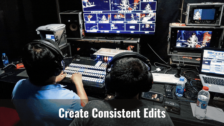
and details, four. Using presets to save time
and create consistency with pre built and custom
presets and five, finally, exporting and
reviewing your own work. And by the end of this class, you will have all the
foundational editing skills that you need to know to have a polished and professional look for all of your
photos and editing needs using most of the editing suites that
are available out there. Of course, not to
forget, each module is designed to be practical
and very hands on. I will be guiding
you step by step throughout the light rooms
feature and share examples of how to apply these tools and explain why they are
essential for you to know. This, of course, isn't just
about learning the tools. It's about understanding
how to use them to enhance your unique
creative style. So whether you're working
on a personal project, building a portfolio or managing
a professional workflow, this class will definitely elevate your editing
games to the next level. So, what are you
waiting for, folks? Come and join me in this
exciting editing class now and see you then.
2. 02 What is Editing: Hi, and welcome to the class. So you might be wondering by now what exactly is photo editing? Well, at its core,
it is a process of refining an image to enhance
its quality and impact. Think of ramen or noodles. Even if you have a great
noodle with a rich broad soup, without the toppings,
it would probably be quite boring and planned. Photo editing allows
you to add or reduce flavor and mood by
correcting exposure, balance color, and even
fixed small imperfsion. So photo editing is the final step before
any photo gets seen or by anyone to correct or enhance the experience
of a viewer. There are many steps
in an edit and always differ from one another
and the process can be from a singular
image to a whole collection of images done one by one. More or less, editing
photo is about editing or removing more or less balanced or unbalanced,
correct or incorrect. So it's a lot of
juggling around there. Now, there are two
types of edit, which is simply not
edited and edited. Now, non edited picture will give you that authentic feel. It is also time saving
and it gives you a sense of things that are
real as seen by the eyes. However, there are
certain limitations to what a non edit can do, such as lacking in vibrancy, clarity, sharpness,
and so on and so on. But editing an image will give you that professional look, more enhanced mood and feel. And of course, you can correct
a lot of imperfection, highlight very
important key elements, and also create consistency from image to image
in your work. Editing will bring the
emotion and story to life by enhancing mood
inducing finishes. Of course, the first
thing that we want to do with editing is to bring the emotion and story to life by enhancing the mood in
our finishing touches. Now take this landscape, for example, the
camera sees the scene, but the edit lets
you feel the warm of the sunlight and the
drama of the shadow. Editing lets you amplify
the mood, sets the tone, and draw the viewers into
your story and mood. Think of it as a way
to communicate with your audience by showing
them how it feels. Editing can give you many
benefits such as one. By editing, you will be
able to correct exposure, which allows you to fine tune a picture that might be
too dark or too bright. It also lets you
fix and bring out the details you thought
were lost or unseen. Second, improving color. You can enhance color to
make them more vibrant or subtle depending on the mood that you would like to achieve. Third, refining composition. Cropping an image can help the audience focus
on the subject and remove any distractions from the frame for adding
artistic elements. Editing allows you to
add your creative flair, whether it is vintage, look, or a modern clean style. And finally, it is to reach a
cohesive, consistent style. We talk a lot about adding odd, but keeping an art consistent
in one direction is also another key feature that must be achieved in editing. Now, it is your turn
to find a photo or any photo that you have
taken and analyze it. What would you
change? Maybe it's dark or the colors don't pop
out as much as you'd like. Imagine what adjustment you would have to make
to bring it to life. Pick one and study
it closely and ask yourself, what was Enhanced? What creative choices were made? How did those changes
improve the photo? And once you've
done that, we can move on to our next lesson, which is pre planning. Let's go.
3. 03 Pre Planning: Before we start any project, we always have to start
with pre planning, and usually we start
with an odd direction. Odd direction is incredibly personal and most
importantly, goal oriented. There's always no wrong
way to approach it because your vision is
going to be always unique. However, there is one rule
to keep in mind consistency. Whether you're working on a single image or
an entire project, a consistent theme and
style are crucial. Think of it like a playlist. Each song might be
different, but together, they tell a story that tries
not to confuse the audience, which is why mood, theme, and styles are the
building blocks of your visual identity. To start, you can always follow a trend or create
your own flavor, but just remember,
consistency is always key. Again, key. Think
of it this way. If your project is like
an ice cream cone, having too many flavors
like chocolate, strawberry, lemon, pistachio can
overwhelm your taste buds. It is hard to know
what you're going for. Instead, focus on
one or two flavors to make your story clear. Your job here is to
guide your audience. Clear theme and mood will
ensure that Tea stay immersed in the experience
you are trying to create. Now, to get a more
familiar sense, let's look at some famous
filmmakers, shall we? Each of them has their
own distinct style. For example, Quentin
Tarantino, bold, eclectic, and
unapologetically quirky. James Cameron, epic and immersive with a focus on
groundbreaking visuals. Christopher Niland,
intellectually complex often with dark and
realistic tone. Tim Burton, whimsical, gothic, and unmistakably imaginative. What makes their
work so powerful is that it is instantly
recognizable. They commit to amoth
theme and style that aligns with their
visual preference. When developing your own style, focus on emotional keywords, and these words
will guide you as your compass for every decision that you are trying to make. For example, let's just
say calm and peaceful. You might use soft colors, gentle lighting, and
minimal compositions. For balance and not
chaotic symmetry, clean lines and neutral
tones work really well. For old and worn out, look at muted palettes, textures like rust,
peeling paint, and fin touch feels. But if we're talking
about editing, you may add grain to your image. These keywords aren't
just descriptions. They're emotional ankles. They help you maintain
consistently while conveying the story that
you actually want to tell. Now remember, your style
is your signature, which is why in next, we always need to keep the
in mind. Let's continue on.
4. 04 Workflow: So when you start
doing editing work, starting with a workflow
is the biggest challenge for just any new
photographers and editors. It is very easy to get overwhelmed as you open
an editing program, and there are sliders, tools, options. It's just everywhere. Where in the world
then should you begin? Here's the problem.
Most beginners think editing is about
adjusting every sliders. Well, the truth is editing isn't just about
using all the tools. It is about knowing
which changes will definitely enhance your photo towards the direction
of your art. Now, remember, always think
with the end in mind. Ask yourself, what mood or story are you trying to convey? Where will this image be used? Social media, print
or something else? With these questions in mind, you might do a bit of
a different kind of adjustment to your picture
depending on the situation. Oftentimes subtle
changes will have a bigger impact than
heavy adjustment, especially if you're sticking
to a very cohesive style. For simplicity, we can break the editing process
into four simple steps, which is pre edit, edit, analyze, and export. The first step pre edit, it is all about organizing. Before you touch any sliders, you have to go
through your photos and choose the best
one that you like. This is if you are sorting through many photos all at once. Remember, in the
pre edited phase, you should already
have a general idea on what kind of emotion and information needs to be
generated from these images. This, in fact, will
save you time and keep you focused on
your strongest work. The second step is edit. Of course, you
have to start with the basic adjustment by fixing exposure to
bring out the details, in white balance
the correct color, crop and straighten to improve
composition, and so on. Once the basics are solid, you can move to creative
edit like editing contrast or enhancing colors
to match your vision. But remember, oftentimes,
less is more. Step number three, analyze. Before exporting, take
a moment and analyze. Compare your edits to
the original photo. Ask yourself these questions. Does the photo look natural? Have I improved its
overall impact? Did I stick to the
intended mood or style? Of course, you don't have to stick to a natural
look all the time. As long as your goal or your
vision has been achieved, then it is okay. So if you have a
different kind of vision, you have to change the
question that must be asked. This step will ensure you
are refining your work and not overdoing it or get lost
with someone else's goal. Step number four,
which is export. During export, choosing
the setting that matches your purpose is a must. For example, if you
are doing prints, you have to use a
high resolution. For social media,
you have to optimize the file size and also
the aspect ratio. Save, you'll work
in formats like JPEG for sharing or
TIF, for archiving. Of course, there's a lot
more formats out there. We will dive deeper
and get back on these settings in
the later chapters. By following this workflow,
you'll stay organized, avoid overwhelming yourself, and produce consistently
polished result. Next up, we'll dive into
Lightroom itself and learn how to get started
with this awesome tool.
5. 05 Intro to Lightroom: Now before we start
to go into Lightroom, I just want to give
a brief overview on what is the difference between
light room and Photoshop. Usually, or typically saying, when we start to sort our photo, we want to use Lightroom
as Lightroom has a function that is not
available inside Photoshop, which is called the
photo repository. Typically saying, light room is designed for photo repository
where there's tons and tons and tons of
photo that needs to be edited either at
the same time or just put there as a folder
so you can sort out your photo before you
actually get into a more fine tuning phase. Now, think of Light
room as your organizer and your photoshop as
your surgical tool. Now, I will be using
the Cloud Light room, which is available inside Adobe, and it also sync with your mobile devices if you are actually
subscribed to Adobe. Now, first one is
on the left side, we will have a library section. You can access photos that is
stored in your Cloud or in your local drive by simply clicking the tab
Local at the top. The next one will
be your viewport. This will be your
main display when it comes to viewing your photo. At the bottom, there's
a thumbnail of the photos that you
want to edit currently. So you can select
them at the bottom. And on the right
side, by default, your tools will be
available here. This developed module can be seen by simply clicking on it, and you will see the
settings that can be applied to the current image that is selected
in your viewport. And of course, not forgetting the menu session at the top. Most users who are new to editing inside a
computer tend to forget there's a lot of advanced tools that is
available at the top menu. So just in case you are
not using light room inside your desktop or laptop, you can still definitely
use the principle that is being used here and applied
in your mobile devices. Adobe also provides you
with Lightroom classic, which is a desktop
on the application. So it is an offline tool that
is designed for you to sort out your photos
inside your PC only. The other cool thing
about light room classic is the fact that this app allows you to use a
tethered camera on your PC. This means you can
connect your camera to your PC through
USB connection, and all of the photos
that you take from that camera will
be sent to the PC, which is sent into the
Lightroom classic bank. But let's leave that
for another course, and let's move on to
importing photos.
6. 06 Importing Photos: Chapter, we're going to dive
deep into importing photos. So why is importing and
organizing photos impo? Well, can you imagine spending hours hunting for a
specific photo in a clouded library or accidentally editing the
wrong version of an image? Well, frustrating, right? A well organized
workflow saves you time, reduce stress, and
ensures you can find, edit, and share your best
shots without hassle. First, imagine a PC or any
type of device that you own. This device will have
a hot disc inside to store data with
everything else inside. Some devices can have more
than one hot disc if you want, and if you are running
out of storage, you may or may not have a
network storage like me. Adding to that
complexity is sharing or doing remote work
through the cloud, making photos to be
just simply everywhere. This can be very frustrating, especially if you're
always on a deadline. That's where the concept
of album catalog, repository comes into
mind with Lightroom. This concept alone
is not available in Photoshop as it is mainly
for heavy editing. Most users who study Photoshop first will soon begin to realize this horrible dilemma where file organization becomes
just a nightmare. Now, let's begin with
importing, shall we. The good news is
that I recently took a maternity photo with my family and ready to
import those photos. So you can just
get along with me here and download the files. So the old fashioned
way typically involves it's going to right click Copy, and we find a place
that we want to put it. So I already prepared this
one. It's a new folder. We're going to call it raw
because this is shot in row. And we're just going to copy
and paste it like that. So, while this is copying, we're going to go
back to Light room and see that inside here, we have all of the photos
that we've actually copied to our hard disk in
here and it's already there. But this is not actually
importing photos to Light room because the
light room that we are using is based on
a cloud setting. So we might want to import
these along with the cloud. If you are using the
offline version, they actually have
an album that you can create by offline. So we are basing this
on a cloud storage, not on an offline storage. Now, you can already start
doing a lot of tagging, let's just say starring
it, making it a star, checking it into a
flag as pick or not, and also doing a lot
of the edits here because it is a
catalog, not an edit. It's actually based on a non
destructive way of editing. So it has a metadata
on how a Photoshop is going to edit this and it's
not going to be destroyed. Now that it has
finished copying, we're going to do a second
way of importing this. So we're just going
to eject it first, and then we're going to
plug in our second cut. So we can browse through here and we can make a new folder. From here, For the name is JPEG
because I've asked specifically to have a
JPEG version as well. Now, at the top, there is a
card showing as EOS digital. And if you simply click it, it will show all of the photos and also the extension of it, which is JPG, which
stands for JPEG. Before it was CR
three, now it's JPEG. So we're just going to wait
until everything loads. Might take a while, depending on the card reader, and your card. Okay, we're just
going to go select. Of course, you can
do a selection of which one you want and which one you don't want inside light room here straightaway. However, I want you to import everything most of the time as just a good practice
of backing things up unless of course you are
running out of memory. So we're just going to
choose a folder right here, and we have the JPEG right
here and it says open. So it's going to save to that folder that we
just made recently, and we're going to
go click Save Photo. It's going to do the
input straight away. And that is actually
pretty quick because this is a JPEG
file, not a raw file. Now we're going
to just check and see whether or not
the file do exist inside our heart disk by going through the heart disc itself. So I've started in my picture, maternity, second baby, JPEG. Oh, yes, of course, everything is in there already,
which is perfect. So at the moment,
this is still very structured in terms of
how we usually do it. Now, we want to
sort them out and we might be doing it one by one. So just gonna go with a vo
view and see what happens. Okay? Now, we want to start going through
it one by one and start doing it a
star, a yes or a no. And this can be done
with a hot key. Usually, the hot
keys are available. So we can actually
go here at the top, and it says photo non star, and we have a hot
key right here, flag which is pick
Z X as in reject. So there's a Z and X and one, two, three, four,
five, four stars. So we're going to do a pick
and reject first, okay? So now that we've
picked our photo, we're just going to go
at the top right here, and we're going to set our view as only show
the flagged photo. Now, we are only showing the photos that
I've picked so far, and I can simply select them
all and say copy to Cloud. And as you can see, I have them in my Cloud. Once we do that, we can
make albums based on this, and we can share amongst other
uses light room as well. But for now, we're just going to use as a normal album first. So we're going to
go add an album. Okay, create an
album, maternity. Second baby. Do not include
the selected photo. And then we're just
going to select them all and put them in
that album right there. So once we click that album, now we can view the photo that we've
imported in that album, and it will stay there forever. So that's how you import a photo using an old fashioned way. Of course, you can also do
it with the light room way, which is pretty much the same. And then you may
want to select them first before uploading
everything to the Cloud. Of course, putting them in
light room makes it a lot easier for you to select the
photos that is not needed, and the ones that is
needed can be uploaded straightaway to the cloud
for further enhancement. So now that we are
ready to edit, let's move to the
developed module.
7. 07 Develop Module Overview: Now, your photos are organized. It is time to move into
the hut of the light room, which is the developed module. The developed module is your editing workspace
in light room. It is packed with tools
to adjust exposure, color, sharpness,
and so much more. In this chapter, I want
you to familiarize yourself with the layouts
and where things are. So before we move
into light room, I just want to introduce you
with a couple of things. And as you can see, there are
a couple of things that you have to know in the developed
modules on the right side, which is preset edit crop, remove masking and version. This can be a little
bit daunting. However, we can divide this
into three different groups which are the first group
got to do with color. The second group
has got to do with selective editing
and also cropping. And then the last
one is versioning, which then you can go back to
whichever version that you think was okay if you have done or if you have
over edited an image. So there's a lot
of adjustment that you can do in the
developed modules. Let's go into Lightroom to have a bit of
a look, shall we? Now we are in Lightroom, and as you can see, there's the developed
module on the right side. It might be placed differently if you're
using a mobile device. However, most software out
there, including Lightroom, has a module somewhere that
has got to do with light, color, and many more effects. Now, we want to go through
this section first, which is the slide. It's got to do with exposure. Of course, there's
a lot of sliders here that we can play around, and of course, there's colors as well. And then there's curve. Curve will be a
little bit tricky, which we will learn
how later, okay? And of course, there's color
mixers, point color effects. And as you can see,
we can increase or decrease texture
and much more. And the first thing I want you to do is to actually
play around with these and see what happens to the image inside light room. So there's optics as well, and remove chromatic aberration, never lens corrections,
and lens blur, okay? And then we can actually do a lot of things like
apply lens blur. So this is estimating depth. So it's trying to
recognize the picture, and it will do it
automatically with AI. So this way we can do the bouquet booze,
something like that, and there's a lot lot
more that we can do, such as refinement and focus. And yeah, that's basically
the developed module. Of course, there's
also the presets where you can actually do a lot of editing that has already
been pre edited by Lightroom, and of course, you can make your own presets this way, too. Okay? So we're just going to try something and see
how it goes, okay? So we have the amount as well, see the amount of
effects that you want to put inside this or not. Okay? So just get yourself familiarized
with these lighters, where things are,
where the crops are. So just play around
with it, and we will definitely get a lot
deeper later on. It's your turn to
try, open a photo in the light room and explore
the developed panel, start adjusting one slider at a time to see how it
affects your image. Notice how each slider
works together. For example, increasing exposure might make the
highlight too bright, so you can lower the highlight
slider to balance it out. And that's it for the
developed module overview. Next, we'll cover cropping and straightening before
we dive deeper into each slider and common mistakes that can happen when editing.
8. 08 Crop & Composition: Color is not everything. But in imaging composition plays a key role in information
transfer and storytelling. Now, you may not notice, but I'm wearing
shorts right now, not long pants, but shorts. Now, that's where composition,
cropping, straightening, and camera corrections come into your imaging for
better composition. Now, before we dive in,
you might want to know that composition serves
to create visual harmony, direct the viewers
focus and convey the intended message or emotion
with clarity and impact. Although there's a lot of
compositional rules out there some rules are being
used in general, such as the roof thirds by dividing the frame
into thirds and positioning key elements along the lines or intersections, reading lines using lines to direct the viewers
eyes to the subject, framing, using objects in the scene to frame the
subject naturally, by creating layers
in the image to provide a sense of
three dimensionality, negative space,
leaving space around the subject to emphasize it
or leaving room for text. Of course, this is
not all of them. There's a lot more, but
these are generally the one that gets used quite often
in the imaging world. The other part that we
need to know when it comes to composition
is aspect ratio, which has got to do with
aesthetic and emotional impact. Each aspec ratio carries its own visual language such as the white screen 16 by nine, usually used by YouTubers and a lot of the
videos these days, which convey a sense of expensiveness and
cinematic grandeur. While the square, quite
often used in Instagram, offers a more intimate
and focused field. Now, choosing the right
ratio will enhance the mood and emotional
resonance of your image. Another thing about aspecratio
is platform compatibility. Now, optimizing Aspec ratios ensures your visuals are
perfectly suited to the medium. For example, Instagram thrives on the balance
square one to one, while YouTube widescreen format, 16 by nine delivers an
immersive viewing experience. It also ensures storytelling
and viewers focus. Aspec ratios frame your
story deciding what remains in view and where
attention is directed. A well chosen ratio highlights key elements and strengthen
narrative impact. It also ensures consistency
across projects. Maintaining a uniform
aspect ratio throughout your work creates a
cohesive visual identity, enhancing professionalism and ensuring a
polished presentation. Now, the one on
the top left here generally gets used by
an older format from photography in the old days
and is still used until now. It has that essence of
photography inside. However, since there's
social media platforms such as YouTube and Instagram, nowadays, we use the one by one, the 16 by nine, or
the nine by 16 and all the other formats that the social media conforms with. The question that you
should be asking is, should you follow the format or should the format follow you? Now, because there's no right
and wrong choices here, the next question you
should be asking is whether to follow what the
platform asks you to do or make it so it works for you using the
platforms aspect ratio. So now let's get into
Light room and start using the tools that are available
inside the software. Now, we are inside
Light room right now. As you can see, you can click the crop button here
on the right side, and a crop module will pop out. First thing, first, you
may notice that all of the options are already
out on my screen. However, in general, the geometry side usually
gets unfolded like this. And sometimes things just needs to be cascaded
a lot more down. So now we're going to
see the crop ratio. So it is original or as
short as two by three. We can have other crop
ratios as well depending on the apec ratio
that we choose, such as the nine by 16 or we can choose it
as a 16 by nine. So we can choose a four by five, and also we can definitely rotate the apec ratio
before we crop. We can also do a
custom format such as, let's just say one by two, for example, if you
want that type of ratio because it really depends on the format that you
are willing to choose. If you have a one by two banner,
that's your choice, too. Of course, if you
want a free format, you can click the unlock
button here and you can use a free form of
cropping and aspect ratio. But in general, it helps to
have a fixed crop ratio, so you can conform with
what the platform needs. We have the straighten option, so we can straighten our
images if we have a horizon. At this picture, we don't
actually have a horizon, but we have a standing person, which is me, and we
can have that fix. And like that, we will
be standing up straight. Of course, we can also do
rotate and rotate left. You can do a flip as well horizontally or vertically
in the geometry side, there is an option to actually make the horizon
straight upright. You can use a guided version
or you can use an auto. You can use level as well. And if you do a guided one, you can start drawing
lines like this, for example, here and here. Alright. This is mainly used
if you're using a building, not for a person. So just in case you
see my face is looking a little bit crooked right
there, which is not great. So we just want to do auto here, and it will be straightened
straight away. Now we can also do other things such as the transform
of distortion. So if you are using a different
kind of lens, let's say, a we very white lens, you can fix distortion
using this. And of course, you
can skew around if you're shooting from
the bottom too much, you can use a skew vertical. So for this example,
my assistant took the photo from quite low, so we want to adjust
it just a tiny bit, just a tiny bit, not too much. And horizontally,
I think he took it a little bit
shifted to the left, as you can see from
the background. So we can fix it a bit. This we don't want to rotate anything because
we've done the guidance. And as aspec, we don't need that too much
because aspec is all about the vertical or the
horizontals and we can do scale and descale of course, we can do offset as
well if we need to to go from left or
right or top to button. There's another
button at the bottom. It says constrained crop. This will ensure whatever
crop that you are doing or such as distortion
will ensure a crop. So first, we're going to do
less distortion first, okay? Now, we're going to
unclick the constraint. So we're going to
do scale first. Okay, we're going to
do cropping, like so. And then once we click
the constrained crop, the crop will be enforced inside the picture, not outside. So that's the function
of constrained crop. If you are doing a
distortion as well, it will ensure a
crop inside as well. The other thing that
I want to mention is the lens distortion fix. Now, the problem with that is it's not on the crop module. I don't know why,
but it is right here in the developed module
for color and optic section. And on the optic session, you can say enable
lens correction. Now, this has been detected
as the Adobe canon 17 55 because the camera is a digital
camera and it is attached electronically causing the
camera to capture metadata, and it is safe inside the file. So it can be
identified this way. But if there is no
identification of this, you can select other devices, and you can also select
other lenses as well. You may do that, and of course, you can do a
distortion correction at the bottom right here. And if there is no option available for you for
your type of camera, you may just use the
distortion slider right here in the crop section. But do be careful right here. Otherwise, you get
a distortion at the back like the one that I'm having
right now over here. So practice those
on your own using your own picture and
great work so far. But up next, we will
dive into measuring basic adjustment where you can make your vision come true.
9. 09 Basic Adjustment Light: Now it is time to
dive into one of the most fundamental
part of photo editing, which is basic adjustment. With basic adjustment,
we're going to start in the light section. We'll start by first
exploring the two key tools, which is exposure and contrast and how they can
transform your images. Now, as we go through these, please watch the Histogram
panel carefully, which is located on
the top right section. Now, if it's not available yet or can be seen
on your panel, you can simply go to
the menu up at the top and simply go to Edit panel
and select Histogram, and it will show up
on your interface. The exposure and contrast sliders is pretty
much your go tool for adjusting the tonal range of an image. Now, let's
break it down. The exposure slider will adjust the overall brightness
of your photo. Moving it to the right brightens the image and expands
the highlight. Well, of course,
moving it to the left darkens the image and
emphasizes the shadow. Or simply being said, it's
either brighter or darker. On the other hand, the
contrast lighter controls the difference between
light and dark areas. Increasing contrast makes
the image pop by expanding the tonal values
while decreasing it creates a softer, flatter. To demonstrate this further and make it easier for
you to understand, I'm going to use a
gradient and a couple of blocks of black and white. Now, as you can see, when
we increase exposure, there will be more
white on our image, and as we decrease our exposure, there will be more
black in the picture because we are increasing and decreasing the
amount of exposure. Now, as we adjust our contrast
in the gradient here, we will have a more subtle
gradient in the middle. As we decrease it, it
will be less subtle and the difference between black and white will slowly disappear. You can further
understand this by using a true tonal value such as this one from almost black to middle gray to almost white. And as you can see at the top, the exposure will increase the tonal values
to the right and then going in to the left will decrease the tonal values
all the way to the right. And when we increase
contrast in this picture, we will actually
shift the histogram away from each other like
this and when we decrease it, we will actually
shift it back in. Like so, decreasing the
overall contrast of the image. You can see it further here when I'm increasing exposure
and decreasing exposure and also increasing contrast and also
decreasing contrast. This happens everywhere
in your image, so do be careful about
increasing or decreasing any of these and just be wary on
how it affects your image. To further refine
your adjustment, light room gives you four
more specific control, which are highlight,
shadows, whites, and black. In highlights, this will adjust the brightness of the
lighter area in your photo. Shadow will control the
details in the darker region. Increasing it will increase exposure in the shadow region. While whites will control the brightest tone aligned
to manage white clipping. And lastly, black
will then adjust the darkest tone to avoid losing details in
the shadow areas. Now, you might ask what is so clipping happens when
a part of your image lose details because of their
brightness level are pushed beyond what the screen or
editing software can represent. If we do underexpose
here, as you can see, the dark areas on the left side of the tree, it's all black. And also, if we increase it
all the way to the right, the sky is all pure white. When the highlights are clipped, you get pure white areas with no physible details
like the sky, where the cloud is just
simply disappeared. And also, when you underexpose and have a clipping
at the black side, you just get this tree blob
without any details at all. Now, clipping can occur
because of a few things. They may be caused by an over
exposure or under exposure. Over editing and
limited dynamic range. When a photo is too bright, this is called overexposed. And when an image is too dark, this is called underexposed. Some parts of the image when overexposed or underexposed,
may be clipped. Over editing by increasing
exposure, brightness, or contrast too aggressively can push tonal value
beyond the range. You might also note that
cameras and screens have a finite ability to capture and display tones called
dynamic range, so extreme values that are
beyond this range may clip. Having better camera capture
and screen display may help, but quite often these devices are not readily
available in the market, making it useless for most sharable content that you want to share using
your mobile devices. You can detect
clipping in Histogram. Spikes at the far left
indicate shadow clipping. Well, spikes at the
far right shows highlight clipping like this. Most editing tools
including light room. Most editing tools
including light room, have clipping indicators to help you spot problematic areas. Now, here's how it works. We can turn them on by simply
clicking here at the top. And as you can see, when we have a clip image that are
overly underexposed, it will have a blue overlay. And when we have areas that are specifically clipped
on the highlight zone, it will be highlighted
with a red. Also visually
inspect your image. Pure white or pure
black touches with no details are a very
clear sign of clipping. There are also ways to avoid
this during the shoot. To avoid clipping,
when shooting, you can use proper
exposure setting while checking your histogram
during the capture. You can also turn on your camera's highlight and
shadow warning features. Lastly, you might want
to shoot in raw format to preserve more details
in highlights and shadows. In our arsenal of in
camera dashboard, we actually have
another thing called the histogram and
also the warnings, Warnings can also
be in highlights. It can also be in shadow
as well or underexposed. Now, you can actually set your camera to
actually do this. However, when it
comes to histogram, some cameras are able
to show it to you on your dashboard by itself when you actually
press display here. Okay. Sometimes you can actually have your histogram
displayed, okay? But the warnings just
wouldn't show up unless you press
your Play button. Okay. And you actually
shuffle your display. So you can actually shuffle
between display with no display at all or any kind
of, like, status showing. You can actually have a
status of the exposure, the date, the time. And then once you
shuffle it again, you can actually see the
warnings and also when it comes, this one actually shows
you histogram as well in RGB and CMY, okay? So it's all in, okay? So it's in the red channel,
in the green channel, blue channel, and all channels throughout the whole picture. Now, as you can see,
there's a blinking area at the top and on
the left and right. This actually shows
which area is actually underexposed
and overexposed. Now, because we actually
want to capture the scene of the
force itself, okay? We have actually captured it quite perfectly
because none of these, none of the areas here
are actually blinking, and this will tell you exactly which one the
camera is not actually capturing properly
and which one is actually being captured
by the camera. Now, you got to be mindful
about this as well, because the histagram itself
is based on the JPEG. It's not based on the row. So it's actually based
on a seven stop basis. Now, with that in mind, you can actually capture
a lot more range of the darker areas
and also more of a highlight area when
you're actually using row because you actually are in
a 14 stop dynamic range. And of course, you can
do bracketing as well in the future to do high
dynamic range kind of picture, but let's keep that in
the future lessons, okay? If clipping happens
during the edit, you can For a more precise adjustment, you may also use the tone
curve tool to target specific areas or
regions in the picture. Now, we will cover
the curve later on at the end of the chapter. It is highly recommended
for you to edit in raw files only as
afils holds more data, so you can often restore lost details in
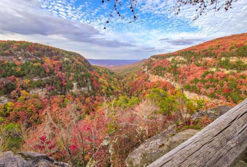
highlights or shadows, such as this picture
where you can push the boundaries of the picture which is originally taken here. You can also push the shadow up. You can push the highlight down. You can push the whites down. So as you can see,
we can start to see what's happening
at the background, which was not seen before. Unlike this picture,
which is in JPEG, you can see that
a lot of the time we cannot barely push any of the details back as it
is not taken in raw. Mastering these tools is an essential step
in photo editing. With these tools, only you
can master editing alone and refine your image
to make it into a more polished and
professional look. Next, we will explore
color adjustment to correct our image or suddenly change the
look of our end result.
10. 10 Basic Adjustment Temperature and Tint: Wrong colors can lead the
wrong feel of an image, colors that are too cold or lifeless or a strange greenish. Tin can also make your
photo less appealing. These issues are common
and often caused by inaccurate white
balance or tin. Of course, we can fix all
of these issues in editing. Take this golden hour sunset
that might look dull and cold or your indoor portrait might have an
unpleasant green tint. That's where temperature
and thin comes in. It will help you fix
those problems and give your photo a
natural polished look. Now let's go into light
room and see how they work. First, let's talk
about temperature. Temperature controls the overall warm or coolness of your image. Think of it as a yellow blue or red blue or
orange blue scale. Sliding the temperature
to the right as warm, yellow and oranges, while sliding it
to the left cools the image with blue
tones. Here's an example. This photo looks too cool and doesn't have enough
warmth that we want. By increasing the
temperature slider, I can bring back that warm, making the image feel a bit
more inviting and vibrant. Now, if I move the
slider to the left, the photo becomes cooler, creating a more cold look. Temperature isn't just
about the technicals. They're very emotional. Warm tones such as red, orange and yellow can evoke energy, excitement,
and intimacy. Think of a cozy campfire
or a sunny day. On the other hand,
cool tones like blue, greens and violets
can show calmness, professionalism, and
sometimes even melancholy. Imagine the crisp
of a snow morning or serenity of the twilight sky. These have very distinct,
different emotions. Warm tones will make an image feel immediate
and personal, while cool tones create depth and a sense of a
very cool feeling. By understanding the
impact of these tones, you can better match
your photos to the mood or story that
you wish to convey. Next, we need to know about tin. TI deals with the green
magenta balance of your image. While temperature affects
warm and coolness, TI focuses on fine
tuning color cast. That may not be
obvious at first. For instance,
here's a photo that is taken under
fluorescent light. It has a slight greenish tint, making the skin tone
looks unnatural. By moving the slider
to the right, we can add magenta to
balance out that green cast, making it look more natural. Another example, but
this time the photo has too much magenta from
twilight lighting. By sliding the tin to the left, I can add a bit of
green to bring balance. Now, the goal is
always to create a color and tone that matches
to your intended mood, not just for correctness sake. To sum it up, you can
use temperature and tint together to define the look
that you wish to make. Of course, another
tool that you need to know is the eyedropper tool. This tool is more specifically used in a harder or
tricky situation. Where lighting or
the original tone can be hard to identify. You can use the eyedropper
tool and select a neutral colored area such as white or gray
colored objects. Selecting a non neutral
color like my genes, for example, will result in
the wrong white balance. So that is it for
temperature and tin. We now continue
with vibrance and saturation to further
edit our color.
11. 11 Vibrance, Sat, Colour V2: Now we are going to learn further adjustment that can
enhance or correct colors. This can solve many issues
such as photos looking dull and lifeless or overly
vibrant and unnatural. Let's start with
vibrance and saturation. The two essential tools
for adjusting colors. While vibrance and saturation
may seem similar at start, they function
differently and can have a big impact on your
editing experience. Vibrance is a
smarter tool for it. Saturation, on the other hand, increases the intensity
of all colors evenly. While it can be effective
for bold artistic effect, it is much easier to overdo resulting in unnatural
oversaturated images. This is specifically noticeable
on human skin tones. The key difference is control. Vibrance lets you enhance
color subtly and naturally. Well saturation is a
little bit more aggressive and can easily
overpower your image. But hang on. What is
oversaturated and undersaturated? Well, oversaturation
happens when color becomes too intense
and look artificial. For example, a grass
might appear neon green or the sky could
turn electric blue. On the other hand,
undersaturation means colors are too muted, leaving the image looking
flat and lifeless. Of course, you can use this if you want to achieve the
black and white look. Overall, four adjustments of
color, which is temperature, tin, vibrance and saturation will cater for most
of what you need. You can also further manipulate
the color in your picture with a little bit
more advanced tools such as color mixer, point color, and color grading. So let's have a look at
them first, color mixer. This tool will give
you precise control over individual colors
and tonal adjustment. The color mixer lets you target specific color ranges
in your image, adjusting their hue
saturation or luminance. This tool is perfect
for fine tuning colors without affecting the
entirety of the photo. Now, before we continue, let's talk about
Hue Hue refers to where color falls on
the color spectrum. For example, red,
orange, yellow, green, blue violet all have
different spectrum. It is the characteristics that distinguishes one
color from another. For example, red and
green are different hues, even if they share
similar brightness or saturation levels. Hue sliders often let you target specific color ranges
in your image, for example, green,
red, and blues, meaning you can change the
appearance of one color only without affecting
the rest of the image. Next, let's talk
about luminance. Luminance refers to
the brightness or lightness of a specific
color in the image. It determines how bright
or dark that color appears without altering
the hue or saturation. Of course, you can also
change the saturation within those selected color inside
the software like this. Now let's move on
to point color. Point color is all
about precision. It allows you to select
a specific part of your image and directly
adjust its color property. This is great if you're unsure on which hue a color falls onto. This is really great if you want to fix isolated issues like boosting the color
of a flower while leaving the background
unaffected without, of course, trying to identify
which hue it falls on. First, we click the eyedropper
tool here in point color, and we may select any of
the color in the photo, and then we can go adjust
those colors accordingly. Either hue changes, saturation, luminance, and of course, the amount of range
that it affects. So let's say for this example, we select the blue because
it has a lot of range. If we do the changes again, we might not be able
to select all of them, and we can do so by increasing the amount
of range that it affects by increasing the amount of range that is selected. Next is color grading. Color grading is slightly different compared
to the other two, and it just takes things
to the next level. This allows you to adjust
colors in highlight, midtones and shadow
zones independently. This is where you can get truly creative and stylize your image. This setting is highly recommended only for
a more advanced user, but please do try them yourself. So that my shadow has
a lot more bluish, and then I'm going to add
the opposite of that, so it becomes a blue and
orange look on the highlight, creating a slightly
different mood to the image. You may also adjust the blending slider
here at the bottom and see the balance which one is a little bit more
better for your case. For my case, I think I
would stick with this. Okay. There you go. Just a quick tip because we have so many tools in our arsenal, you might want to add
things a little bit by bit, but it is generally
a good idea to make the image to be correctly exposed or have the
correct color first before adding more of a flare
or a personal touch to it. In the next chapter,
we will explore the effect step where you
can enhance sharpness and texture to make the
image either looks more soft or make texture
looks more noticeable.
12. 12 Clarity and Texture: In the Effects tab,
you will be able to see five different sliders. They are texture, clarity, dehaze, vignette, and grain. These tools can solve
many issues such as flat or undefined photos
that lacks depth or texture. We will go through texture
and clarity adjustment first. By understanding the sliders, you'll be able to
enhance midtones and find details and, of course, textures in your
image while avoiding common pitfalls like halos
or unnatural effects. Let's move on. First, we
want to talk about texture. Texture focuses on
small scale elements like the green of wood, weaves of fabric, or the intricate details of leaves and even
textures of rocks. When we increase texture, notice how it enhances the small details in
the rocky area without significantly affecting
the overall contrast or tone of the image. Texture is great
for bringing out fine textures without making
the image looks harsh. But never forget overusing
anything can destroy an image. Ousing texture may create
that gritty or over process. Look, unless, of course,
that's what you're aiming for. Clarity, on the other hand, adjust the contrast around the edges of the
objects in your photo. Increasing clarity sharpens the separation
between elements, making textures and
detail stand out. Notice how increasing
clarity brings out the sharpness in the rocks and, of course, all the other parts of the area such as the ocean. Giving the photo a more
defined and dynamic look. Reducing clarity
does the opposite. However, it does affect the brightness of some
areas in the rock. Though, unlike texture, overusing clarity
can create halos. Halos are those natural light or dark outlines around objects. Now, to avoid this, use the slider
moderately and pay attention to the
edges of your photo. Now, while clarity and texture
can be used independently, combining them toughly can take your image to
the next level. Clarity is great for
enhancing contrast and depth in mid tones while texture will bring out
the finer details. Use both wisely. As an example in this image, I'm going to increase
the texture and clarity just ever
so slightly just to increase the detail back
in the picture without really overdoing it or
creating halos in the process. Together, they will create a balanced and polished
look without overdoing it. Now just before we cover Dehaze, I just want to give a quick
shout out to Anthony Hass and also Simon Berger
from Unsplash for these two wonderful images as an example for our next part. Dehaze works just like
the name implies. It either reduced the look of a haze or remove
hazes in a picture. Of course, you cannot
remove all kinds of haze, but it will remove small hazes that still has some apparent
images at the back. Just like any kind of
adjustment over using it can make an image
looks unnatural, so be aware of that. You can also make an image
with a haze appear more hazy just in case you want
to add that into your image. Lastly, we will explore
vignetting and green. These two sliders will give you an added touch to your
well taken picture. While vignetting darkens
the edges of the image, suddenly drawing the
attention to the center, it can also be used to remove an unwanted vignette from an original picture
taken from your camera. Grain, on the other hand, is great for creating a
vintage or film like texture. Now, adding a subtle
amount of grain can give your photo an organic feel, though they tend to make the
image look a bit less sharp. When applied
thoughtfully, grain can add character and
charm to your images. Now, by mastering
all of these tools, you can tweak your images
according to the look that you wish to attain
in the future. In the next chapter, we will explore
selective adjustment to selectively edit specific
parts of an image separately.
13. 13 Selective Editing using Masking V2: Now that we know most of the adjustment settings
available in light room, it is time for us to
learn how to apply our settings only in one
or more specific areas. Selective adjustments or masking is where editing gets more fun. There are, of course,
endless possibilities, and some things that were
never possible could be possible using
this technique alone. Selective editing can solve many issues such as
needing to enhance specific parts of
an image without affecting the entirety
of the photo. This means you can do one adjustment in different
sections of the photo, creating a look that
you could never achieve with photography
or image generator alone. This itself can only
be said to be in the domain of image
manipulation. The only limitation out there is only your goals
and imaginations. But before that, let's take a deep look into the masking
section of Light room. You can do selective
adjustment in Lightroom by clicking the button on the right side here
to create a new mask. Of course, Lightroom offers
multiple masking options, including smart
object selection like subject, sky, and background. There's also manual section available like the
brush, gradients, linear or radial effects, and range based mass
for advanced targeting, which is available
at the bottom. Each, of course,
has its strength depending on your editing needs. Let's have a look at
Smart Object selection first or subject in this case. These tools at the
top uses AI to detect and mask specific parts of the image automatically. In this photo, I can use the sky mask to darken
the sky and enhance the blues or even the reds without affecting the
rest of the image. This is very quick and effective
for landscapes where you want to make the sky pop or just simply change it
into a different color. And as you can see, now I
actually have a blue sky, which used to be yellow. Now let's use the
subject mask in Lightroom to
identify the subject inside this photo without
adjusting all the other things. Let's just say the background. So I'm just going to
click on subject here, and light room
will automatically detect the subject
inside the picture. However, in this example, Lightroom AI has definitely
got it wrong because it also selected the
background inside the subject. And this, of course,
requires further selection masking by reducing the amount of mass inside this selection, which we'll do later on. The AI tool that we have inside Light room is the
background mass selection. This is great for
isolating and toning down distractions
around your subject, ensuring the focus
stay where it should, and it should automatically
select the background for us. Let's see for ourselves, okay? Let's see how good it is. It's detected it
pretty good because this has a solid foundation for selecting background
because the subject is clearly separated
from background. So let's just do our adjustment. Let's just say we want to make the brightness.
Okay, there we go. And it actually does
the job pretty well. Although sometimes the
automatic mask like the subject to in this picture, aren't enough, and that's where manual selection comes in, like the brush tools. It allows you for precise and
further manual adjustment or just how do you start
masking in the first place. So we can just try and
deselect some of these places. Okay, there we go.
D selected it. We want to have density at full. We don't want to select that. Alright. Here we go. Let's just do it roughly first. Okay? Now, since
we've done that, we've selected some of the masking that has been
selected by the AI two, we're going to try and
do readjustment again. So as you can see, some
of the section that we have the selected
is now not being affected by the presets or the sliders that we
are currently doing. Since I've been using
the brush tool to deselect some of the areas, there are some sliders here that you might not be familiar with, so I'm going to go
through with it first. The first one size
is pretty simple. It's basically the
amount of size or the size of your brush
that you wish to use. So this time, we're going
to use add brush, okay. So we're going to
use a bigger brush. And as you can see,
we're actually adding in mask or selection
inside the photo. And then we want to know
about feather, okay? Feather is basically the
edges around this brush. So we're just going to
add this new brush, and we're going to do size
and feather, as you can see, there should be a
secondary circle outside of the brush when we
actually adjust the feather. And this allows you to actually smoothen out
the edges of your brush. Now, if you reduce the feather, as you can see, it will have a very rough edge on the side. Not having a very smooth side can be good in certain times, but quite often in editing, you would need a
softer brush to make your editing look less
suspicious and less obvious. Now, flow is a little
bit different. For those of you who do
not understand flow, it's a bit like
scrubbing through with a pencil and going
back and forth at the same location and making the ink a lot thicker
than previously before. So if we go reduce our flow, and we keep scrubbing,
scrubbing, scrubbing, scrubbing up and
down, up and down, up and down until it
becomes apparent, this is what flow is. It's very useful for those
of you who wants to do a little bit of additional
masking bit by bit, and it can be done
in here as well. However, there's another slider that's very interesting
in my opinion. It's very different
when it comes to light room compared to
Photoshop is the density. It allows you to have
a specific percentage, even though you've
already scrubbed it in. So like we've done
here, we've done 100%. Now, this will make sure that it will be applied to
the percentage amount. So here we have 16. Let's just say 15. This will allow us
to make sure that the maximum amount of mass
will be applied at 15%. So we're just going
to scrub it here, and it will actually
delete the one that is at 100% and reduces it all
the way down to 15%. And it goes the same
way when we do 40%, now we have the hundred percent
here on the right side, and we have the 15%
on the left side. And as we scrub through it, it will ensure it
will receive a value of 40% instead of the
other values as well. And you can mix and match and
combine these values with, of course, your own choice. The brush tool is
particularly useful for small objects or areas that
requires detailed attention, such as the gap between the ring here in this accessory
inside the photo. So now let's explore
the next tool, which is called the
linear gradient tool and also the radio
gradient masking tools. These two are
excellent for creating smooth transition
in your adjustment, making it easier for
you to do masking. Now, linear gradient are mostly perfect for photos with a
lot of horizontal elements, such as the sky right here. Even though it's not
perfectly horizontal, we can still use the mass
from linear gradient, so we're just going to delete
all the mass here, okay? So we're just going to
delete mass delete O mass. Okay. And then we're
going to create a new mass here by
doing the mass, and then we select
the linear gradient. Okay. And then we're going to select the sky just like that. And as you can see,
we've actually selected the sky and we've adjusted it so it can
be a bit like that. We're going to tilt
it a bit more, so it's going to be a
lot more horizontal. Okay. And then we're just going
to adjust that like that. Okay. With that selected, we're going to use some
of the sliders here. Let's just say exposure. But remember, in this picture, we've actually used a thing
called Dehaze before. So we're just going
to go to the effects tab and we're going to
reduce the dehaze section. So we're actually going
to bring up the haze back only for the top section. And as you can see, the picture is now
back to normal because I've reduced the dehaze
section within this picture. Radio gradient is ideal
for creating vignette so the audience can
focus on certain areas. Now, we're just going to add a circle vignette
here on this subject. So it's going to be
a bit more apparent, and the background will stand out less because we've actually added the radio gradient
on this subject. So we're just going
to do this, right, and we're just going to put
some bit of selection here. Okay. We're gonna do
a bit of feathering. Now, we can increase texture. We can reduce lighting and that, but we want to use
this button here, which it says invert, and we're gonna reduce
the exposure, okay? And then we're going to increase the size and reduce
the feather, okay? So as you can see, we can do something like this. And if we wanted to be a
bit less more apparent, we can increase
the feather bit by bit until it goes to the
amount that we like and, of course, use the contrast
everything that we have right here to slightly
reduce that masking. Of course, we can also add
another radial gradient. By duplicating invert mass. Now, this time, we have the mass only for the accessories
around the subject, and we can slightly
increase the exposure, making it much more brighter
compared to the ones that are outside and that has been
selected to be darkened. This will give the object a lot more pop in comparison
with the background. Both gradients allow for flexible adjustment with
customizable softness, making them a go too for a
lot of the effects out there. Is mainly useful for things like atmospheric or even
landscape and portrait. Now the next thing we
want to talk about is the advanced studying
that light room offer, which is the range option, and it has three kind of range, which is the color range,
the luminance range, and the depth range. But in this section, the depth range has been
nullified because there is no depth map available
inside this picture. These tools, of course, will
provide precise selection by selecting specific
characteristics of your image. Let's have a look at
color range first. So we're going to
click on Color Range, and we're quickly going
to select the range. Let's just say this
green area here, and we can immediately change the exposure and
all the other setting that we've previously learned by selecting the color range
within this picture. Of course, you can add more and more color range as you go, and you can select
the amount of ranges or reduce the amount of ranges
within those selection. And you can manipulate almost every single one of the sliders that
we've learned before. Now we're going to undo
that, and we're going to go to another selection called
the luminance range. So luminance work a bit
differently with color range. Luminance is a definition of
the brightness of the image. So if we select the bright areas only,
let's just say this guy, it will select the
range of the image that is a lot brighter in comparison with
all the other image. As you can see, we've
selected the sky. However, we have also
selected the color from the boys shirt because it is also part
of the highlight. And as you can see, when
we adjust the exposure, the shirt will
also get adjusted. This, of course, can be
nullified if we want to reduce the amount by
using a brush right here, and we can simply nullify the ones that they
have selected before. To grab a deep map, I've actually taken
a photo inside my studio using my iPhone, and I've taken a picture of
the stream deck right here. And as you can see, once
we've selected this, the dep map is now available
within our selection. Now we can click that
and we can simply select the dep range that we wish to select within the image itself. And as you can see, we've selected the depth
that is closest to us. Now we can start adjusting
those ones that are really close to us and without adjusting the ones that
are further at the back. This, of course, requires your phone or your
device to send back a depth map and usually only available inside a portrait
note inside your phone. Now, of course,
every masking tools has its own uniqueness, and it really is up to you which one will suit you better
for your editing style. Of course, you can always
use multiple tools at once. You can add and deselect a lot of the masking out there using different tools
such as this one, when you can use the brush and also use
the linear gradient or even the luminous range
within the selection. Editing can be tedious
and repetitive, which is why in
the next chapter, we will explore how
to use presets to turn our editing
processes into a faster, more streamlined
workflow. See you then.
14. 14 Using Presets: Now that we have known most
of our editing settings, applying multiple amounts
of these settings from scratch can be very
repetitive and boring. Well, preset will
solve this issue. Preset will also give
you a way to achieve a consistent look across all
of your edits and photos. By understanding preset,
you'll be able to apply professional grade
edits with single click across multiple
photos all at once. Download user generated presets
for inspirations and even create your own presets
for workflow efficiency. So let's start with
what are presets. A preset can include adjustment
for exposure, contrast, color grading and more all
applied with one single click. Notice how as I click these
presets on the preset panel, the picture changes
accordingly towards the settings that are already
pre built in the preset. Light room, of course, includes a library
of presets that are categorized for a lot of
different styles and scenarios. For this example, we can try the portrait and
light skin version. We can try the PL two, and we can apply
this to the picture. However, as you can see, it also applies to
the background. So you might want to
be careful and use selective editing
when you use presets. The other options here in
the prebuilt section is the newest version of
Lightroom actually has a thing called
the adaptive presets. The adaptive presets
here will selectively select the subject
based on the criteria. For example, this one
is adaptive portrait, so it will look for a
person inside the picture, and it will apply a selective mask for
that specific picture. So let's just say we're
going to do a not greedy, polished, smooth
facial skin, okay. And then we're going
to apply that, and light room will try
and sort it out, see which one is the subject. And as you can see, it's only affecting the person
inside of this picture. You can always find a broad
range of these presets within the library once
you are inside and just see which one will
fit your editing style. You can always just go in and look for the specific
presets that you are looking for currently
for your editing needs. For example, let's just
say for this landscape, we're going to go to season, summer, and we want
to make it a lot more golden and just going to blend it more in,
and there we go. We have a preset
that is built into this picture
straightaway without messing around all of
the other sliders, making this workflow
a lot more simpler. Beyond light rooms
prebuilt options, there's a massive community
of photographers and creators who share the user
generated presets online. These, of course, can range
from professional grade color grading to unique
stylistic effect. Now, once we've downloaded
those and inputed the preset, it will be under the user
preset in the yours tab. Of course, we can move
it to a different group and make a new group
called creative two. Okay? And then we can do it for the
other presets as well. Oopss we can move to
group, creative two, creative two, creative two, creative two, creative two. Creative two, creative two. Okay. So with a single click, we can adjust the photos
that are inside our library, and you can always apply the same preset on
multiple photos, but you first need to
go to your photo grid and select more than one
picture in your grid, and then you just click on the preset that
you wish to apply, and then it will say
apply preset, yes, apply. So it will work.
Then it will apply the preset on all
of those pictures that you have
selected in one go. Amazing, isn't it? That's
very time saving for me. Downloading preset
is a great way to expand your
editing toolkit and experiment with
new style created by other editors
and photographers. Now the next step is to
create your own presets. Once you've developed
your own editing style and find yourself using the
same adjustment repeatedly, you can always save time by
creating your own presets. Let's say for this
picture right here, we're going to do some slight
adjustment to the picture. We're going to
decrease the contrast. Increase the highlight, and then we want a white to
be a bit more white. And then we are going to
crush the black a bit. Of course, we want to make
it a bit more warmer, reduce any kind of tint, adjust the fibrancy
a little bit. And once we have this, we have pretty good effects on the preset that we wish
to do in this picture. Okay? So we need to do
a bit of de hazing. Okay. But I want to
add vignette there. We want to preserve
our detail sharpening. And then we are going to
go to the preset tab, click on the three dots, and we select Create preset, and then we're going to
say Edwin White Pij. Going to click Save. Then we have the Edwin White
Biji and as you can see, I actually have been doing
the photo shoot with consistent amount of exposure in my photo and studio shoot. So I'm just going
to go click here, and then I'm going
to apply my preset and apply them across
all of my photos. And most of the editing
will be already done by only using the preset that
I have done in one photo, this could potentially
save a lot of time. Co time to time, you
will receive some of these photos that have
different kind of settings and would require a
different kind of presets for this
particular photo shoot. So again, after fine tuning
your photo to your liking, let's just say for the light, we want this to be
a lot more lighter, a lot less contrast,
put highlight. We want to push the white. You can always go to the
preset panel, click here, create preset, and
then create a new one, Edwin White PG two. That's your second preset for
your next sets of photos. The preset that you have created yourself can also be
exported for someone else to use just in case you have a team that is
working with you or someone else that you might
be familiar with or you just want to share it online
for the online community. You can select the preset
that you wish to export. Click, right click it, and then click Export and you may go to this wanted folder. Let's just say that I want
to go for the desktop, and then I want to create a
new folder Edwin's presets. And then I want to export
these for my preset and then export again
the EdinsPreset export. I'm going to go to my explorer
and then go to desktop, and the presets are in the
XMP file can be shared for other users if they wish to use these
presets in the future. Now with presets alone, you can streamline your
editing process and focus more on the creativity
side rather than doing repetitive
adjustment that may differ in terms of their
adjustments from photo to photo. And in the next chapter, we will dive into the export settings and how
to optimize your photos for different platforms
from social media to print and much more.
I'll see you then.
15. 15 Exporting Photos: Whew. We are finally at the final step of
our editing journey, which is called
exporting our photo. This step is very crucial
because exporting transform your edited images into usable files for sharing, printing, or even archiving. The things that you
need to be way about is you may face pitfalls
like blurry export, incorrect colors, or even
files that are too large. When exporting photos, there are three main goals to aim for. The first goal is
optimal quality, where your photo should
retain its sharpness, colors, and details
from your edit. The second goal is
appropriate file sizing, where exported files will balance quality with
manageable file sizes, especially for online sharing. The third goal is correct
format for the intended use. File format should
match the intended use such as web, print,
or archiving. You may do your export by selecting the photos
that you wish to export, selecting multiple
or just even one, and there is a button at
the top here which is here, and you can do custom settings. Ight room will
provide all the tools you need to achieve
some of these goals, only if you know how
to use them correctly. Now, before we dive into
the export process, let's disguise some of the
common mistakes to avoid. First is the wrong file format. Exporting in the wrong
format like using JPEG for print and PNG for photos can lead to quality
loss or just incompatibility. Second one is resolutions
that are too low. Spotting with a resolution that at too low can make your photo appear blurry or pixelateed
especially when printing. The third pitfall
is oversized file. Higher resolution images
with no compression might have unnecessary file
sizes that are too large, which can slow down
uploads and downloads. And this can be
annoying as well, people who are trying
to view it online. Number four, is color
profile mismatch. Using the wrong color
profile can lead to inaccurate colors when viewed on different devices or
when it's being printed. And lastly, Miss sharpening. Skipping out shopping can make your images look soft,
especially in print. The export setting has a few settings that you
might need to know, which is the image type, the dimension, also the
OI and the metadata, copyright, file naming, output sharpening,
and color space. Light room in file sizes offer multiple file
format for export, but for most purposes, JPEG with high quality
settings is sufficient. TIF is also another
great option for this, but mainly for
professional printing when quality is priority. A few other formats that you
might want to know is JXcel, which is a future ready
JPEG alternative. A VIV is best for efficient web delivery
with excellent quality, and DNG is an open
source format by Adobe for row editing and
professional workflows. You also need to know about the dimension that
the small one and the full size will follow
the size of the photo. However, you can do a
custom resolution by clicking Custom in this section, we will need to put
the long side or the short side in pixel
wise or anything else. Let's just say for this one, we want to do the long side is 1080 for our screen format. So we can choose pixels inches
or centimeters by default. Then choose the quali to
match the query that we wish to receive when we give up
these files to other people. For most screens, anything
that follows a standard 1920 pixels by 1080 pixels is generally great
for most screens. For most screens, anything
that follows a standard of 1920 pixels by 1080 pixels is generally great because most screens like your phone or even your tablet and your
screens are basically full HD. Most printed formats, however, requires a four times the
amount of resolution. And this is due to the
format of the dot per inch DPI or PPI four pixel per
inch on printed format, which requires you a
300 pixels per inch. Now, although Lightroom CC does not have this function
like Photoshop, you can always calculate this on your own with a calculator. So for papers like this, which is an A four size, which is 8.3 " by 11.7 ", you would need 8 " times 300 pixels as in
2490 pixels wide, and 3,510 pixels long. You can get these numbers
by just calculating 8.3 times 300 pixels, equals 2490, and
also the other part, 11.7 times 300, equals 3,510. And then lastly, color profile. Color profile is a bit tricky, but this will ensure your
photos will be displayed consistently across multiple
devices and medium. For most cases, you may
only use S RGB for web and social media where it's widely supported
for most screens. You may use Adobe
RGB or P photo RGB for professional printing to preserve a broader color range. But only if the printer or devices will support this space, such as your monitor
and also your printer. There are settings such as
display P three, W RGB, and also ProphotoRGB
in this Lightroom CC. You also don't want to miss
out on the output sharpening depending on your
intended format. Where you might want
to choose screen for best online
sharing, mat paper, for printing on paper
like the A four, and also you have the
glossy paper option for printing on glossy
papers for photos. Sharpening will ensure
your end result will retain their sharpness
or crispiness, whether viewed lastly,
don't forget to organize your export file with
a clear name and include metadata for
copyright and attribution. You may use custom names in
light room such as Edwin, and you can use a start number. Let's just say ten, and it will go count up like Edwin underscore ten dot JPEG. This will make
exporting and also file management much
easier during export. A good file
organization will save you time when managing
large batches of photo, especially when you have
tons and tons of projects. You may also use a custom
name that is project based. Let's just say this one is
called Skill Share Project. And then it will
be formatted into Skillshare Project one dot JPEG. This will ensure you can search these names based
on their names, not just based on their
folding and file naming, not just based on their folding. So try the mat on
your own and see in the next chapter
where we'll be making a project based on what we have learned throughout
the whole course. See
16. 16 Review: Throughout this
course, we've explored the essential tools and
techniques for editing photos. These principles can be used in most other editing tools that are also available out there. Now, let's do a
quick review of what we have covered so
far in this class. We began with
foundational tools like exposure and contrast
and also white balance, which are the building blocks of any good edits inside any
kind of editing suites. You have also learned
how to balance light and color to create a clean and natural starting
point for your own edits, such as making correct white
balance and also exposure. Then we also dove into
the color grading, which goes into
brant saturation, color mixer, giving you
all the tools to bring your images to life by enhancing huge tones
and overall mood. Then after that, we've
explored the effect step, which has the texture,
clarity, dehaze, vignette, and grain to further enhance your picture so it will
stay sharp and, of course, give it a bit of a
punch in terms of its art and also make it more
authentic by using grain. If that is what you are looking. Also, remember that the
adjustment can also be done using selective
adjustment by masking, which is available right here. This allows you to target
specific areas of your image, whether through SMAT
selection like subject, sky and manual tools
like brush, et cetera, for a more advanced masking
and also selection. Also covered the power of preset and how to use
pre built options. Of course, we also
download the user generated presets and create our own presets to streamline our workflow and maintain a
consistent editing styles, and, of course,
applying those presets across multiple images. And then finally,
we've had a look at exploring where we discuss how to optimize our
settings for the web, print and various platforms to ensure your photos
always look their best no matter where you are sharing it on any type of
devices or print. These tools combined
with a cohesive workflow will give you everything you need to edit confidently and professionally
in light room and, of course, most of the
other editing tools. Now the next step is to really review your
edits and workflow. Reviewing your edits is just
as important as making them. A few things that
you need to know while reviewing
your edit and work. On the right hand
corner down here, you may toggle your
before and after look. This will help you
see how your edit has enhanced or
change the image. Always look for improvements. Your edit should
enhance the photo directed to the field that
you are always aiming for. Next, always check
for overlapping adjustment if you've
used brushes, gradients, or radial mask, ensure that they don't overlap and
create transition. A lot of time you'll be
working on a series of images where consistency is key. Always see similar
adjustment across photos to maintain a
uniform style and tone. Now, remember,
always step back and evaluate the look
and ask yourself, does this match the intended tone that
you are looking for? Do the tones blend with the surrounding and a lot of
the other questions that you might need to ask
to see whether or not the direction you are
going for is already correct. And if things are not going
towards that direction, you might need to readjust. Always look for noise, artifacts or texture issues caused by extreme
adjustment and apply noise reduction if necessary to maintain a more
polished look. When you're able to
identify and have clarity in your
work and workflow, you can always enhance
your work in the future. So if you've already done the exercise or will
be doing the project, next, I want you to
review your workflow, see if there's anything
missing inside your edits, and that will be it
for the class review, and I will see you
inside the project.
17. 17 Projects: Now that you've
mastered the tools, let's put them to use
with a final project. This project is
designed to challenge your creativity and workflow and reinforce everything
that you've learned. Your project is to create
a series of photo, ranging 3-5 images that tells a cohesive story or highlights
a consistent theme. Here's how you can structure it. Step one, choose your theme. Start selecting a theme or
subject for your series. It could be a day in your city, a specific color palette like
warm tones or cool tones, a mood such as
serene or vibrant, a subject like portraits,
landscape or object. Step two, you need to
edit each photo using the tools that we
have covered so far and edit your photos. In case you don't
have light room, you may use other tools just
so you can get it going. Begin with basic adjustment to ensure consistent exposure
and white balance. Enhance details using tools such as texture, clarity
and sharpening. Apply selective adjustment to emphasize specific
areas of your images. Use color grading or
the color mixer to make the tone and mood across your series much
more interesting. Step three, focus on
cohesion or consistency. You need to make sure your
series feels consistent by applying a consistent
style or editing approach. You can even create and
use a custom preset to maintain uniformity
across all photos, or you may just use
the prebuilt presets. Step four, export your images for the web or social media, optimize for screen viewing with SRGB and appropriate dimensions. Now, finally, share your
work by uploading one of the pictures to this class
to share your journey with the community or get
feedback from me. As you complete
this final project, remember that photo editing
is both an art and a skill. Always enjoy the
process and have fun.
18. 18 Curves: As you've gone
through this course, you might notice there's a
thing called curve here, and it's pretty complex.
That's why I put it here. And now, in this
bonus, we're going to talk about the curve tool, which is one of
the most powerful yet often misunderstood
editing tools out there. This can give you precision
control over brightness, contrast, and color tone. But first, what is well, the curve chart is
essentially a graph that represents the tonal
range of your image, ranging from black, shadow, midtones, highlights,
and whites. It allows you to control
bright or dark parts of each part of the
image as well as adjust specific colors
in the channel. In a sense of way, curve edits your image with a curve
rather than a harsh, blocky sliders like
the ones up here, and it allows a less
clunky look in your edit. In my experience, knowing
curves can make editing often be faster and
also understandable. Let's break it down first. There's an X axis at the bottom. This represents the tonal range from shadows all the
way to the highlights. Then we have the Y axis going
from the bottom to the top presenting the
brightness values from dark at the bottom to
the bright at the top. Now, by adding
points to the curve, you can manipulate specific
tonal regions in your image, creating a custom adjustment for shadow mitons
and highlights. Like, if we put a point here
and when we drag it up, we're actually increasing
the midtone value and shadow a little bit
and also highlight. We also have other channel
like the red, green, and blue, where we can add or decrease the amount of values
depending on the channel. The first one is basically the RGB curve or
the point curve. This will adjust
overall brightness and contrast and impacts all
colors simultaneously, making it ideal for
global tonal adjustment. The red, green, and blue allows you to
adjust intensity of individual color channels
such as green, blue and red. This allows you to mix and
match color using curve, but of course, it requires an extensive knowledge
and trial and error. For example, increasing
the curve in the highlight of the red
channel adds a red tint to the bright areas while lowering
in the shadows at a cien. Same logic applies to the green
and blue channel allowing you to shift colors
towards their complements. Another pod that
is also available in light room is a
paramedic curve. This is basically
a global RGB or point curve with a slight
guidance to each zone. So if you click here, you
may get a curve that is controlled by the software itself allowing you
to not go beyond, and it has a guided curve
inside those zones. Curve editing can help you
achieve several common goals, but it also has its challenges. Now, let's explore
the goal first. One of the goals of curve
is to fine tune contrast. The curve allows you to create a custom contrast by shaping the tonal range more precisely than sliders like
contrast or exposure. Another one is color grading. You can use individual
color channels to add subtle or dramatic
colored tones, perfect for cinematic
effects or creative styles. You may also do a highlight
and shadow recovery. Adjust the top and bottom
of the curve to recover details in a blown out
highlights or crush shadows. For example, we have a black
that is not touching here. We can adjust the levels
to reach the bottom, so we have a black
that is not so crushed or we can increase the black
value here by going up, and we will raise the black up or reduce the brightness
down, et cetera. Some of the most common
pitfalls in curve is, of course, over editing. An aggressive curve
adjustment can lead to a harsh transition or
even unnatural colors. You may also get some
colors clipped because of extreme adjustment in
individual color channels. It will cause colors to appear oversaturated or just flat or
just green blob like this. Quite often, you tend
to over manipulate the midtones and flatten
the dynamic range, making the photo look a bit down and not contrasty or sharp. So the key to curve is to
make the adjustment so subtle that it is apparent
but not too much. So now, you might be
wondering why should you use curves when light room has already has sliders
for exposure, contrast and color adjustment. Well, the answer lies in precision, flexibility,
and creativeness. With sliders, you are adjusting a predefined range like
highlights or shadow, which can sometimes
feel very limiting. Curve tools, on the other hand, lets you target specific tonal
regions exactly where you need them to be without affecting the other
parts of the image. Curve also allows you for
an advanced color grading. Sliders like vibrant
saturation apply a very global adjust while the curve tools allow you to
fine tune specific colors. For example, you can
enhance warm tones in the highlight without over
saturating the entire image. You can also make
custom contrast. Unlike the contrast slider, which applies a
fixed adjustment, curve lets you create a
custom contrast profile. This is especially
useful for stylized look like an S curve for
a punchy contrast. Or a faded look by lifting
the shadow region. While the curve tool may seem intimidating at
first, with practice, you can unlock a
whole new level of control and creativeness
in your edit. So experiment with
subtle adjustment, especially with a curve, and please don't be afraid
to explore its potential. Well, that is it for this bonus chapter,
happy Editing guys,
19. 19 Closing: Thank you. Thank you.
Thank you so much for joining me in this
exciting class. I certainly hope it has
inspired you to keep exploring and developing
your own creative skills. But the journey
does not stop here. There's so much more to
learn and create together. So if you're looking to take your skills
to the next level, check out my other classes. I offer courses on advanced photography techniques,
mobile editing workflow, video editing essentials,
and much more when it comes to digital
imaging and production. Of course, do follow me on social media for more tips
behind the scenes content and updates on future classes and all of the trending
topics that are out there. I would also love to see you work just because you've
taken this class. Tag me in your
photos or projects, and you might just get
featured in one of my future lessons
or social posts. And finally, please
keep experimenting, keep learning, and most
importantly, keep creating. Thank you for trusting me to be part of your creative growth. Now see you in the next class or just one of my
social media platforms. Take care. Bye bye.
 Edwin Effendi, Relevancy in the Rapid Tech Era.