Transcripts
1. Introduction: Hi, everyone. My name is Irina Trzaskos. I'm an artist and illustrator. Welcome to my studio to explore the magic of watercolor. Today, we'll be painting easy Valentine's Day cards. I hope my classes will help you build a successful and beautiful portfolio. In next video, I'll show you the supplies we'll be using in this class. Let's get started.
2. Supplies: In this class, we'll be using following supplies. Watercolor paper, watercolor paint, a water of course, a paint palette, a paper towel. We'll need the color circle, or you can just follow my instructions. A color circle created another class about color mixing, which I highly recommend. Also will need a bit watercolor brush, it's better to be natural and very soft, or it can be a synthetic just soft brush. Also need a medium brush this is kolinsky sable Number 4 and for details will need smaller watercolor brush. This is kolinsky sable Number 2, and this is a kolinsky sable brush Number 1 I'll be using for ink. I also need a pencil eraser. You may need a sharpie pen or any fine liner for measuring if you want or you can write with watercolor. Also I'll be using a white ink or you can use a white gel pen or a whitewash. Also a form of a texture I'll be using some tissue, just regular Kleenex tissues. If you want to exactly replicate my hardship, you can clean the templates in the project section of the class all three of them, which will make it easier or you can just draw with me. I'll say I got some of my paper in a smaller size. You can do the same or you can fold your paper and create the cards of any size you like. In next data, will start painting our cards.
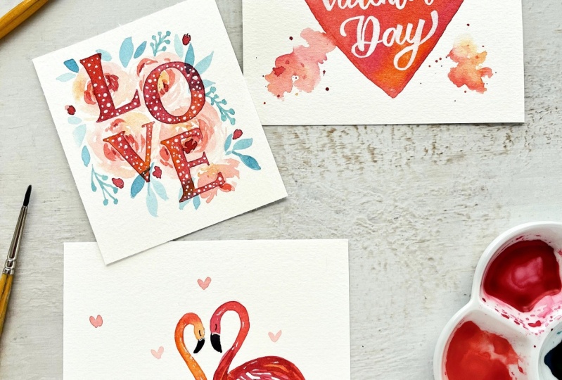
3. Heart Valentine's Day Card: This design is very simple. It's based on the two things of the watercolor, and this is the main accent is on lettering. If you are good at lettering, you can make your own design or you can just print my template, which looks like this, and transfer it into a watercolor paper. The only thing is, I transferred it with pretty thick pencil line. You can see it in veto but I'll suggest you to transfer it with really fine pencil line, which I suggest for every watercolor painting we draw to be really, really light. What we'll do next is we'll just pick our two colors, which are analogous colors, which are situated next to another in the color circle. We'll pick scarlet red and Carmen red, because it's a Valentine's Day card. We'll pick two reds which are analogous. Also I'd like to be dreamy, and I want to pick the first color from another side of the circle, so I'll pick blue, maybe a warm blue or maybe an ultramarine blue, we'll see. What we start with is just start covering our heart with water right over them letters. A lot of water. But it's not yet to cover the entire heart because it'll dry anyway. We'll start with some Carmen red and we'll add it right into the bottle of water we just created. Next slide, we did in blending techniques in essential, what I called techniques class. We'll just start adding different colors and we'll look how beautifully they blend on paper. I just added scarlet red and then I'll add more water and because we'll be painting with white angle of the card heart, don't be afraid to add a lot of color, a lot of pigment, and again scarlet red. Carmen red and scarlet red. When I'll get closer to the bottom, we can see that Carmen red is closer to blue. I want to add so then I'll be adding more Carmen red so that we'll mix more beautiful than scarlet red with blue. You don't have to add blue if you don't want to. I just felt like adding a little bit of blue to this. I'll probably go with one more shade on blue, like a Prussian blue, where it's just called the blue in my set. This you see turned purple. I'll add some more Carmen red here. But this card we have to water base it first because on this white and wet surface, I still want to add some texture, and to do that I'll just take good tissue, I'll crumble it like this, and we'll absorb some water color. This is enough. I [inaudible] a little bit of red in here and turn to purple. This is better. Now I have to leave our heart dry. Then after our water colored heart is totally dry. We'll take some white ink or white wash, or white gel pen. We'll color the letters, inside the heart. Again, if you add a letter and you complete your own letters, it we'll be even more beautiful. Let's just print it some more letters and transfer them into my design. I wanted to add some paint and feel. You can make the card darker if you want. I just wanted it to be, really soft. I'm trying not to overwork it just [inaudible] and drawing over the front. It will have this and maintain. After I'll be scanning this design and arranging it into a card template. You can use this as some banner, but of social media too, or of print, whatever you want. One more word. You can use your handwriting too. Next to it I also want to or really watery. I'm mixing Carmen red with a little bit of scarlet red with a lot of water. I want to draw again our watery hearts with my brush. You can add some different colors in each, as many as you feel like. Once it dries it'll be really beautiful. Add as many as you want. That's it. This is our very easy and beautiful card design, you can create.
4. Flamingo Card: For the cut of this two beautiful flamingos here is my template in the project section of the course, and transfer it with a pencil. What we'll do next just like we did in, what's it called, watercolor birds class, if you've watched it. We'll be using analogous colors, cadmium orange and scarlet red, and carmen red and we'll be painting our birds, blends them in on paper. Starting with cadmium orange, and then add some scarlet red to it. My water color is so watery so it'll be so see-through after it dries, it will be beautiful. Now I will add the a little bit of carmen red here and then I can totally paint the entire body or I can give some white spaces that some fairy design like these. Just like we did in whimsical birds class. If you don't watch it, and are interested, I can give that link below description of this course. Carmen red, scarlet red and cadmium orange are the analogous colors I'm using here. When we mix analogous colors as you remember, we would get more interesting watercolor washers when just using one color. This is enough for now, we can add more design later. For these taller flamingo, I want to use more carmen red and just to get a bit of scarlet red, and then I go back to carmen red. Again some feathers designs just like some brush strokes and a tail. While our birds are drying, I'll paint the water. So they're staying in this pink beautiful water and again, I'm using watery scarlet red and then I add some carmen red to it. Next we have black and probably we'll use a smaller brush. I'll paint this part. We're you are seeing a lot of pigment here and not a lot of water. Very careful because I think the head is still shiny which means that the paint will blend together if we touch it. Yes, it happened just a little bit. The same way on this one and for the eyes we'll await until they'll be totally dry. And then now that are very easy to make art for a friend, or for somebody who is important to you. I smudge a little bit here, but we'll add a little heart there so it's okay and here are the mistakes. Next we have a little more pigment than before. I can add some more feathers if I want to. It's totally up to you. The same on another bird. Or you can leave just as it is, it's beautiful already. I just want to add a little bit of tip that's why I made it stand a little higher. The birds are totally dry so we can paint the eyes. This one is not dry so I'll wait. Meanwhile with white ink, I'll add some more details on the birds. Just enough to add some magic. I'm done with our bird. Next again, with very watery water color, we'll draw tiny, tiny hearts as many as you want. It could be just a few. The more the water you put in your water color the larger will be the heart. I think this is enough. Now finally, we can paint the eye of this bird and maybe add a feather here and here, next to a fine lining, I'll make the inscription and the card is ready.
5. Love Letters Card: I transferred the template with a pencil onto my watercolor paper. Again, I did a big sketch of the letters, but your letters should be with really really light pencil line. Otherwise, they all look a bit too visible on the water color. What we'll do next is just really relaxed and a little style, we'll paint some flowers. I'm putting just some water in the shape of the petals here, and then I'll be adding some color orange. Don't pay any attention to the letters and just let's paint this really watery, really loose flowers. Of course it's a valentine card, I want it to look a little bit like roses. I'll be just shaping them right with the brush. My entire surface of the paper behind the letters, I'll have some flowers and leaves and branches on it. Just relax and enjoy the process. They don't have to be very dark because we'll be painting the letters after, so the letters have to be visible. First, I put in water and then in the middle, I'm adding some cadmium orange right in the water. Then I'm adding some watery carmine red petals to it. You can paint any flowers you like. You can change the colors too, like add a little bit of yellow, maybe. Maybe a tiny bit of scarlet red just to add some variety, and maybe a flower bud here and here. After I painted the first layer of the flowers, I'll take some turquoise, some emerald green, and a little bit of purple. Again, with very watery water color, I'll be adding some leaves and branches, and little bit more purple. You can pick a different color scheme if you like. I think this one is very romantic and dreamy, and will work great for a Valentine card. Now, you can add as many leaves, branches, even berries, if you want. Maybe one more here. I think this is enough. Now again, with the watery carmine red, I'll add few more details on the flowers just here and there, not too much. Just a tiny bit. Now I have to let it dry, and next we'll work on the letters. Now when our flowers are totally dry, I'll take some carmine red and I'll mix it with a little bit of emerald green. Also, I'll add a lot of water so it will still be transparent, and then cover my letters. Make it as dark or as light as you want. A little bit more carmine red. Now, very careful, I'll cover all my letters. I still feel like it needs more red. I'll mix some Carmen red with scarlet red. Now pay attention to proportion while I paint. The wash will be different on the letter. For example, here I have more Carmen red, and next I'll add more scarlet red. This will keep our wash more interesting, and because our watercolor is watery, it's a see through wash, we're taking it more beauty to our card, and more Carmen red. Part of the next letter, and then a darker wash for the last letter. I made it easy and fun. After I painted my letters, I've a small brush, I can decide if I want to add extra details on my composition. If we're co-louring the letters, it's hard to understand, if it's enough or you would need more branches and leaves or flowers. Now is the moment when we can add some more details. I'll try not to overwork it. It's so easy to get painting, and just some branches sticking here and there, so it'll look more casual. Don't worry this ones looks too dark, its just that it has a lot of water and when it will dry it will be way lighter, and maybe a few leaves here. I'll say I want to add some berries, and some flower buds, just like these, whichever starts here too. Also I'd like to add some white details on the letters, and then will just add some white dots to brighten them up a little. Just very casual again. When always if you want to write another object. You would add some lighter pattern to it, and if you want it darker you would add some darker pattern to it. It's that easy, if you didn't get your value right in the first place, that's how you can fix it. Just a little bit of pattern, and again you can make more interesting washes on your letters, it's still up to you. A few more details on the flowers, maybe it'll show some middle, for the flower here and there. I think that's it, this is our Valentine's Day card.
6. Last Thoughts: Thank you for watching my classes. I hope you've had a chance to paint with me. If you like this class, please leave a review and upload your project at the Project section of the class. See you in my next class.
 Irina Trzaskos, Watercolor Artist & Illustrator