Transcripts
1. Debossed Skull Study: Intro: You may have unbelievably
good free hand capabilities, but turning this into this takes a completely
different skill set. Most people think you need heaps of natural talent
to draw realism, but the truth is
most realistic art isn't about talent at all. It's about patience,
persistence, learning a few key techniques, and developing the
ability to notice subtle details that aren't
immediately obvious. The following easy realism drawing series is
designed to give you a taste of realistic
drawing without being overly difficult
or time consuming, full of fun, short form lessons that are simple to follow
and easy to complete. Won't need expensive materials
to get started and we'll probably have some pieces of equipment laying around
the house already. Each tutorial works as a standalone class introducing different tools and
techniques along the way, or with a strong focus on
simplicity, accessibility, and fast results,
which can all be found on my main profile
page as and when published. If you've always wanted to
try realistic drawing but didn't feel ready to jump into a full length course just yet, this series is a
perfect starting point. You'll learn how to transform
simple outlines into three dimensional drawings with convincing structure,
depth, and detail. Knowledge that can improve
not only portraits, but almost any type
of illustration work, including character
design, animation, fashion illustration, story boarding, and
much, much more. So if you're ready to jump
in, I'll catch you in class.
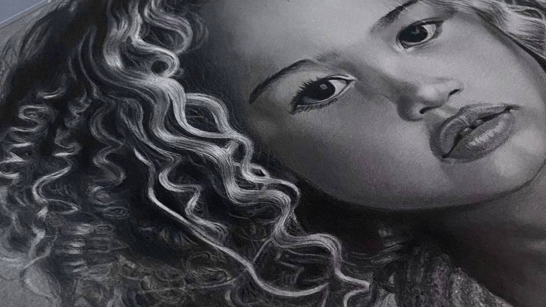
2. Debossed Skull Study: Class Orientation: Hi, I'm Shane, a professional portrait
artist based in the UK. And in this lesson, you'll be
learning how to manipulate value and form to turn a simple outline into
a hyperrealistic, three dimensional
debossed skull, a drawing that looks as
if an image has been pressed into a material
surface to make an imprint. You can free hand a
drawing by using a lesson, if you like, or make up your own and use the
same techniques. I've edited images that are
found online in resources for you to copy or use as
inspiration to create your own. Using sh, hot pressed
watercolor paper, but any smooth paper will do. Just make sure it has
a good weight to it, as it does help prevent the paper from
buckling when working. I wouldn't recommend
printer paper, for example, as it's too thin. This paper is great
for beginners. It's a little more hardware
than most papers and allows for easier workability,
like when blending. Whatever you decide to draw, take some time when working
out which lines need recess planes and which lines
need highlighted edges, as this will help
prevent mistakes. Also, spend a bit of time adding the final details as this is what's really going to
make your drawing pop.
3. Debossed Skull Study: Outline & Backgound: So I'm just outlining my square
in the middle of a page. I draw two lines across
the center of the page, one vertical and one horizontal, then mark 5 centimeters
at either side of both lines to form a
ten centimeter square. Then use Scotch removable tape to keep a crisp, neat edge. This tape is perfect
for sharp edges or borders and will not rip
your paper when removing. Okay, so now I've
outlined my square. The first thing I do is
to lightly free hand a skeleton using the
same four H blue pencil. Feel free to copy this design or make up something
for yourself. It'll be great to see
what you come up with. I've added a few ideas in resources to give you
some inspiration. I'm just using the
yaw pencil eraser to neaten up the outline here. The lead in this eraser
is a little softer than Faber Castell
perfection eraser, which means it's better
for cleaner erasing, whereby the perfection
eraser is excellent for lifting very subtle layers without disturbing
layers underneath. When happy with the outline, I strengthen it with a HB black. I always use HB black to
strengthen outlines when drawing portraits as it
has quite a stable lead, which means it won't
smudge or disappear if using tissue to blend
graphite around the outline. You'll see what I mean in a moment when I add
the background. Don't go over every single
line in a portrait, just the ones that are as
dark or darker than HB black. Don't forget to always
use very light pressure. And now for the background, I add three layers
of B blue pencil, smoothing out every layer
using a cotton ball. If you don't have a cotton ball, tissue is just as effective. You'll notice a tone becoming more solid with
every layer added. This is why layers
are so important when creating beautiful solid tones. Always change the direction
of my strokes as this helps create an even solid
tone before blending. And if any dark blotches
appear after blending, I use a needable
eraser to gently lift, which will help keep
the area looking even. You can mold the eraser
to a point if need be, or keep it rounded to
pick up a wider area. Also, I keep the angle
of the pencil quite low to the paper and hold
it far from the tip. This will help with control and keeping a light, even pressure. When blending, I use
circular motions going in both directions as
this helps push the graphite around for better coverage and a better blend. Notice how the first layer is a little blotchy after blending. This will diminish with
each additional layer. You can see that I change the direction of my strokes
a little in a moment. I'm also becoming
aware that there's some dark graphite building up to the left side
of the background. This will probably
need some attention soon using the kable eraser. You can see now just how stable the HB black pencil is
when blending over lines. If I had used just
the graphite pencil, the lines would have
probably rubbed away by now. Or if I had used a darker
pencil from the black range, the softer lead
would have smudged, leaving dark blotches
all over the place. As I mentioned earlier, you
can use a combination of pointed eraser and wide
surface to lift dark areas, and don't forget to re blend an area with your
tissue after lifting. So as we come to the
end of this lesson, don't forget to slow down, make sure your background
is smooth and blemish free, and I'll see you in
the next lesson where we'll add the three
dimensional effects.
4. Debossed Skull Study: Building Depth & Dimension: Okay, so now we're ready to
add the lines that will give the two dimensional outline a three dimensional
embedded look. To do this, we need to first decide where
our viewpoint is. In this drawing, it's the bottom left corner of the screen. And second, decide where the
light source is coming from, which is top right of screen. Also, we need to decide
which recess walls to draw. We can do this by mentally splitting the skull
into two parts. First, imagine the entire skull out to the perimeter
lines being recessed. And second, the features inside
the skull, like the eyes, nose, and teeth bar being raised forms inside
the recessed skull. If we focus on splitting the image this way,
with a little thought, we should be able to determine which lines to add
the recessed planes to every recessed edge
has three components. One, a light facing rim, two, a turning plane, which will be the
surface, and three, a darker interior recessed wall. So if we take the
eyes, for example, we can see in my
finished drawing that the light facing rims are to
the upper right of the eyes. The turning planes
are the surface, and the darker
interior walls are along the opposite side
to the light source, the bottom left of the eye. It helps to imagine running a finger across the
surface of your drawing. If your finger drops, that line will need a recessed plane. If it raises, that
particular line will need a light
facing highlighted rim. So in our drawing,
if I imagine running my finger from the
upper right corner to the lower left corner, my finger will drop at
the edge of the skull, meaning that line will
need a recessed wall. As I reach the eye,
my finger will raise, meaning that line will
need a highlighted rim as it's facing the light source
in the upper right corner. I run my finger along
the turning plane, which is the surface of the eye, then my finger drops
again at the other side, meaning that line will also need a recessed
plane, and so on. I hope that made sense. I've now added all the recessed
planes to this drawing, so it's time to add
some dark value. Because the planes are all facing away from
the light source, they will need our
darkest value. I always begin with a layer of five B blue to my darkest values just in
case I make a mistake. I then add a second
layer of seven B black. Try to make all the cessed
planes the same thickness. The only time a plane
will get narrower is when a line begins to travel
towards the viewpoint. Notice how the plane on the upper right outer
edge of the skull disappears as it moves
closer to the part of the line that heads in the
direction of the viewpoint. Now let's add some shadow. I'm going to add
another light layer of B blue to the surface
in the recessed area. The surface is lower, so not as much light will
be hitting the area. Adding one more
layer will darken the area ever so slightly, and in doing so, disconnect
it from the upper surface. Mm. I use both the kneadable and
perfection erasers to make any subtle tonal adjustments
as and when needed and a small makeup brush or cotton
bud to soften and blend. If your soft makeup brush
isn't blending that well, it could be down to the paper. Just use a slightly
stiffer brush or cotton bud or tissue. As mentioned previously,
graphite moves around a little
easier on che paper, probably has
something to do with the gelatine sizing
in watercolor paper. You can see here
just how effective the perfection eraser is at lifting subtle
layers of graphite. I'm just making sure all
shadow lines are sharp, straight, and heading
in the same direction. Oh Okay, I've changed my pencil to the five B blue to
finish the rest of the occlusion shadows as I felt the HB black was slightly
darker than I needed. Then once again, I
use the B blue to add a very subtle layer to the recessed surface in the
upper part of the skull. Mm Take a little time, making sure all the lines on all the cast shadows
are going in the exact same direction. Otherwise your drawing
won't look realistic. I'm just gently dabbing the kable eraser to
lighten the tonee a little in the lower part of the jaw as it's a tad too dark. Just like when using
all other equipment, a light touch is needed
when using a cotton bud. Otherwise, you run the risk
of leaving dark blotches. Before we start
finishing detail, I'm just finishing off all the shadows using
the five B blue, making sure they
fade away naturally, keeping all lines
sharp and lightening the pressure as I move away from the dark occlusion shadow. As is often the
case, you need to adjust value as you
build the drawing. Now I have all the other
tones on the paper. I now realize that I need
to deepen a tone for the occlusion shadows a bit
more using the HB black. We've come to the
end of this lesson. Now get ready to add
the finishing detail that'll really make
this drawing pop.
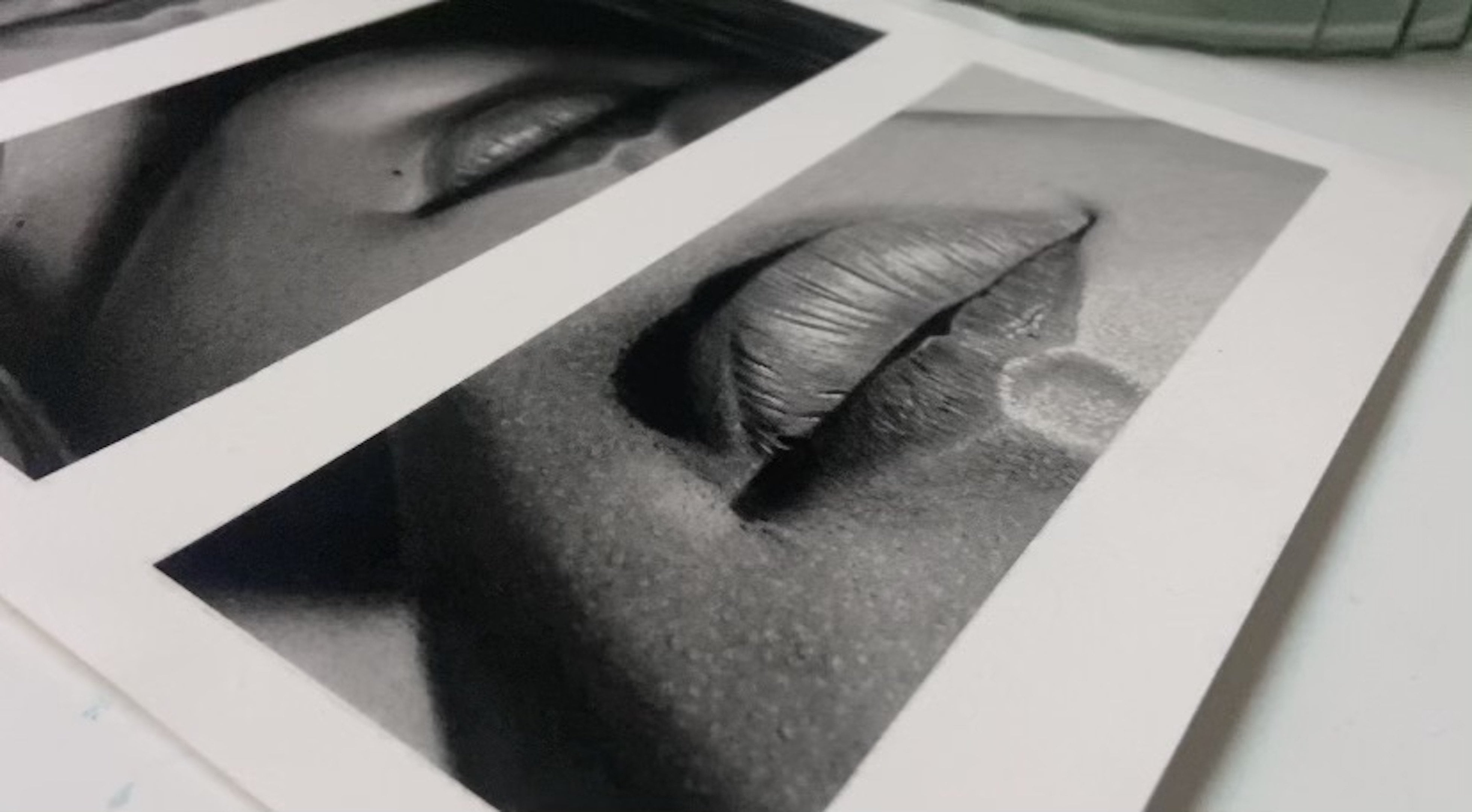
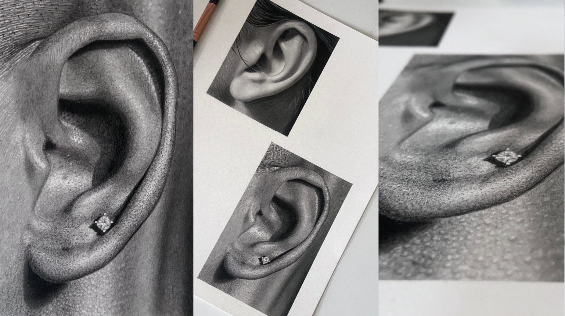
5. Debossed Skull Study: Finishing Detail: To begin with, I want to create a highlighted effect along all the edges that
face the light source. I don't want to create
a solid highlight line, so I'm gently dabbing
the eraser along the edge so as to create
something a little more rugged. Try to keep to the HB black outline that we
made at the beginning. If you go off course a little, you can always touch up with a graphite pencil and bring the highlights back to the line. This Derwent battery
eraser doesn't come with a two
millimeter lead adapter, so I used one from an old Tehu battery eraser,
which fit nicely. I use this as it has a little
more power than the Teho. You can buy a rechargeable
battery eraser from Derwent, which does include the
two millimeter leads or go for the cheapie version
by Tehu or ten win. Don't forget to keep the tip of the battery eraser sharp by running it along
a sandpaper block. Very gently, neatning
up the highlights that have gone astray using
the B Blue pencil. I'm also making
sure that the ends of the highlighted
lines look like they fade away naturally as they go around the curve away
from the light source. I do this by lightening
the pressure of the battery eraser to make
smaller dots and pencil work. Now that I have all the
battery eraser highlights in, I use a jelly roll pen to stipple another
layer of highlights. This will add a
brighter layer of highlights and really start
to make the drawing pop. I'm using mostly dots here, but with the odd tiny
dash here and there. This is the only pen that I've used that hasn't
dried up on me, so I highly recommend it
has a 0.5 millimeter nib. I did purchase a
smaller one as well, but that one actually
dried up, too. Mm. Although we're nearly finished, we can add a little
more realism. If you imagine
pressing a stamp of a skull into a
material's surface, it would raise that material around the edges of
the stamp a little, creating further opportunity to add soft highlights and shadows. The tops of the eyes and nose, for example, will
be slightly convex, so I can lightly use the
perfection eraser to create subtle highlights to the upper right of
those features, A to the outer
edges of the skull. Pressing the skull into
the surface would create a small mound of material
along the outline here, facing the light
source, so we can add a subtle highlight
along this line. Make sure these highlights and shadows are very subtle, though. Pay close attention to where the highlights and
shadows begin and end. There'll be a lot of
switching between tools as I add the finishing
touches to this drawing, all the same tools that
we've used up until now, so I'll let you follow along by yourselves from here without too much interference from me. We can also add subtle shadow
to the opposite side of the mounds to the highlighted
rims, as I'm doing here. I'm using the Tube black here to deepen the occlusion shadows, the darkest part
of the shadow that adjoins the Resist walls. Mm. Now using the perfection eraser to soften the highlights a little so it looks like they naturally fade away at
the top of the mound. Remember, if we press the shape into a soft surface to
make an indentation, the excess material that was
pushed aside would create a slight convex effect or
mound on the top surface, meaning the light would slowly disappear as it reached
the top of the mound. Right, so just the
last few touch ups and we're done. Thanks
for your time, guys. I hope you had fun.
I'll be adding a few more short form classes
in the coming months. So if you enjoyed this one,
do keep an eye out for those, and I'll hopefully
see you there. And if you fancy
testing your skill and patience with some
harder drawing studies, you can check out some
of my other classes.
 Shayne Wise, Professional Portrait Artist