Transcripts
1. Let's Go!: Hi, I'm an artist in Skillshare, top teacher Adam Palmeter. I have a question for you. Who's a good boy? Who is the bestest boy? Who is the bestest boy in the whole wide world? Why is Zulu, of course, and I think you'd agree if you've got to meet Zulu. This class is for all you animal lovers out there who want to draw a custom pet portrait of your furry friend. You don't have to be a professional illustrator to do this. Because here's the big secret. You can snap a photo of your pet and use it as a drawing guide. Your final illustration is a unique spot on resemblance. Trust me, this is super simple. Class, we'll be diving into a bunch of fun stuff like infusing neon accents into your drawing to create some really cool effects. We'll also be playing with color palettes, abstract background blends, and full 3D digital effects. If you're hearing this and thinking that this is way beyond my skill level, I'm here to assure you it is not. This class is for all levels, including those who have never used the iPad drawing app, Procreate. Trust me, you're going to be able to follow along just fine. In fact, I'll be walking you step-by-step through every lesson. You're going to learn how to create phenomenal artwork using super simple and intuitive techniques. By the time you finish this class, you're going to have some a pretty cool pet portraits in several different styles. Plus as a special bonus, I'm going to show you how I quickly turn these amazing pet drawings into personal stickers for friends and family. When it comes to gift-giving, nothing will beat surprising a pet owner with their own personal pet swag. Stick around at the end of class to learn how print on demand websites can turn your class project into some incredibly unique DIY gifts. Snap a pic of your furry friend so you can create an artistic tribute to your dog, cat, jumbo, warthog, gorilla, or whatever awesome pet you call your BFF. But before we dive in, don't forget to follow me on Skillshare by clicking the ''Follow'' button up top. This means you're first in line when I send out discount codes, creative life updates, and occasionally giving away a three-year of Skillshare premium. Just hit follow up top to get into loop. Are you ready to create your new pet portrait masterpiece? Let's jump in right now.
2. Getting Started: For today's class project, you're going to take a photo of your pet, import it into Procreate, and trace the likeness. First things first. Get a cute pet photo. If you don't have a pet, just take in a stray or just borrow one from that friend who can't stop posting photos of their pet. You know exactly who I'm talking about. When it comes to composition, I look for a headshot that doesn't have a complicated depth. Basically straight on or a beautiful side profile. Three-quarter views don't really translate as well. It gets a bit trickier, especially when we're doing cool stuff like adding neon effects and playing with linework distortion. A head-on shot like this or a majestic profile like this are going to work best. Now, let's chat supplies. You'll need an iPad, a reference photo, and the drawing app Procreate. I also use an Apple Pencil for digital drawings. If you don't have a drawing stylus, you can just use your finger. In this class, you're going to learn to navigate the basics of Procreate as you create your masterpiece. Everything is broken down into short videos. You're going to learn specific techniques in bite-sized chunks. You'll explore drawing skills, play with transparency effects, create compelling backgrounds, and explore fun tricks with neon effects, color, and more. During all this fun, you're going to be learning some pretty snazzy technical skills and shortcuts. The next time you open up Procreate, you'll feel more comfortable and confident with your next drawing. At the end of this class, don't forget to share your project in the project gallery. That way we can all like and comment on your incredible artwork. Without further ado, let's jump right in and open up our iPads.
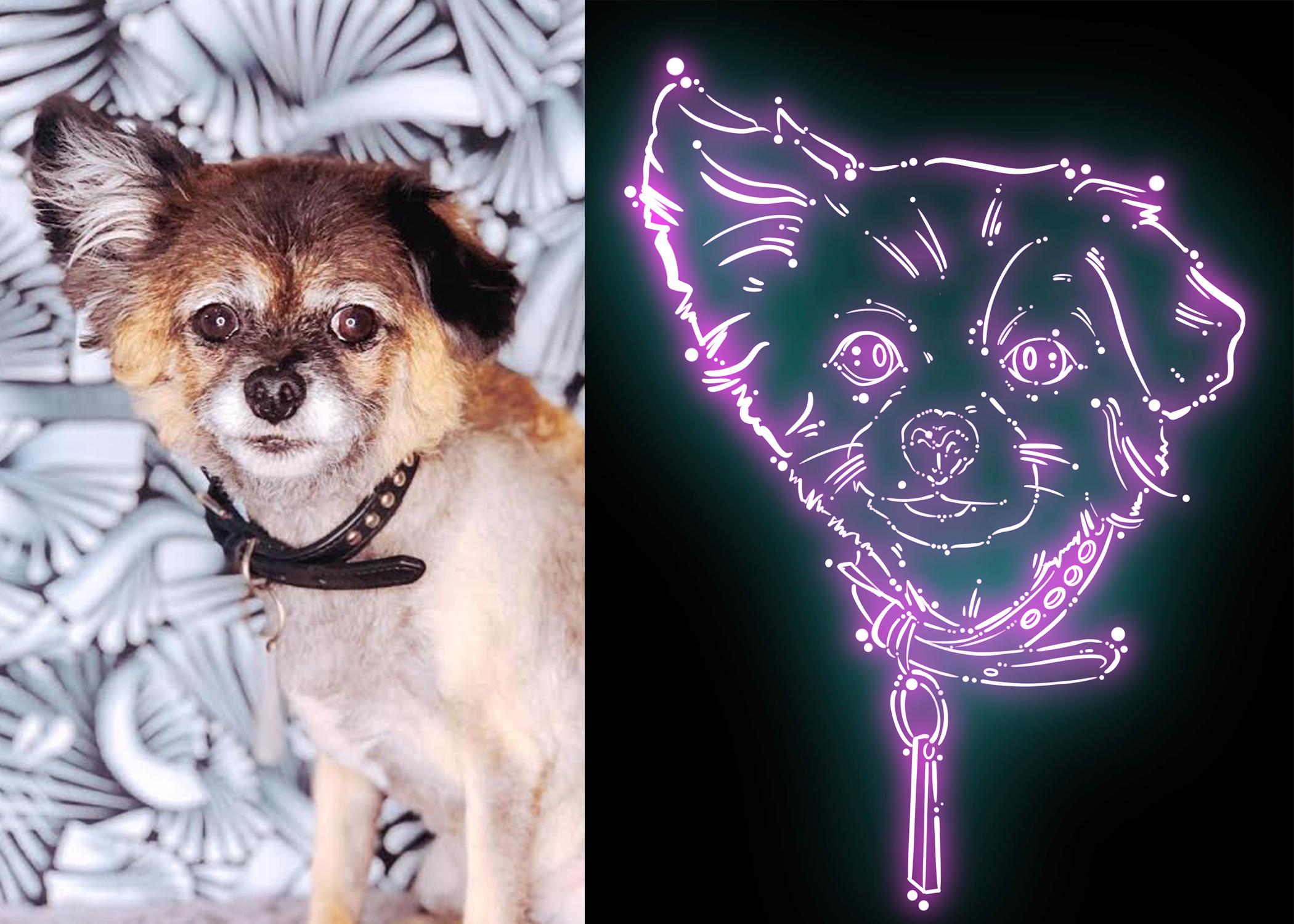
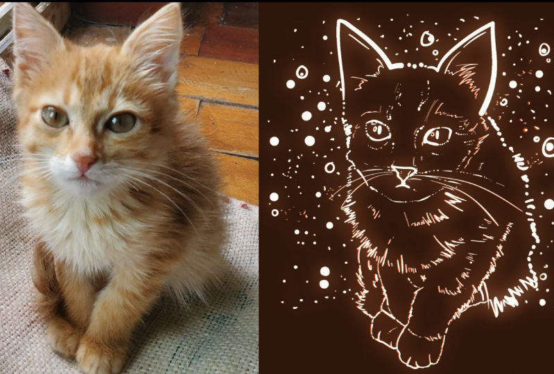
3. Prepping the Canvas: Let's go ahead and import our reference photo to our iPad. There's a lot of ways to get the photo to your iPad. I prefer AirDropping. You can use an existing photo you already have or just snap a quick one with your phone and AirDrop that to your iPad. But if that's not an option for you, you can easily email it to yourself and then open it on your iPad. Or if you want to be super simple, you can just take a photo of your pet with your iPad. Now let's open up Procreate and get our canvas setup. Here's what my gallery looks like when I open up Procreate. We're going to want to start a new canvas, so click the "Plus button" up here. As you can see, I have a lot of preset size canvases here, but I'm going to walk you through how to set up a brand new one. Up in the top right corner, you're going to see a small rectangle with a plus sign on it. That's going to open up a brand new canvas. Go ahead and click on that. Here we have our new canvas settings. First thing I'm going to do is switch it to inches, click on the width, and let's start with a 10 inch and then click Height, 10 inches again. That's going to give us a dpi of 300 with a maximum of 55 layers. Basically what we're doing is setting up a 10 by 10 canvas at 300 dpi. Mine gives me a maximum of 55 layers. But if you have a different model iPad, it may look a little different, but that's okay. Once our 10 by 10 canvas is all set and ready to go, click "Create", brand new canvas. Now that our canvas is all set up, let's go ahead and import our photo. Here's how you import your photo. First, we're going to tap on the wrench in the top left menu bar. But before you click Insert a photo, I'm going to show you a little trick I use. Instead of just tapping it, go ahead and swipe left. Now you have the option to insert a private photo. Essentially what that means is when you make a time-lapse, the photo will not show up in the time-lapse recording, it will remain private, which is great because we're tracing a photo and we make the time-lapse replay, it won't show up. Make sure we swipe left to insert a private photo and click that. As you can see in the bottom right corner, we have my reference photo. Go ahead and tap that to open. Now let's size our photo to our canvas. As you can see, there's a highlighted border here letting you know it's ready to be sized. You can put your pencil on a corner and drag it out to size of your canvas. Once you're happy with the size of your pet's face, you can go ahead and click that arrow to set the transformation. Now if you're using a photo that has a lot of color to it, this is the time to desaturate that photo and this will make our tracing a lot easier to do. Let me go ahead and show you how. Now, this photo is already black and white, but I'm going to go ahead and walk you through the steps. First things first, look for your layers icon in the top-right menu bar. It's these two overlapping squares. Make sure your photo layer is selected, like mine is now. Then go over to the Magic Wand tool in the top left menu bar and click Hue, Saturation, and Brightness. Highlight the layer. Then you can bring the saturation all the way down. Now, this is a black and white photo, so you don't see too much variation here really at all. But if you're using a very colorful photo, you will see all the colors desaturate as you bring it to the left of the spectrum. Cool. Once your photo is desaturated, let's click the Magic Wand again, brings us back. The last thing I like to do is adjust the transparency of my photo. Again, that's going to make it easier for tracing. To do that, let's open up those layers again. Tap the N. N stands for normal, as in a normal blending mode. We'll get into that later. But what I want to focus on right now is this opacity bar. We're going to bring that down about 75 percent. Depending on your photo, you might want to make it more transparent or less transparent. It all depends on the contrast you have within your photo. The reason we're making it transparent right now is because when we trace over this photo, we'll be able to clearly see our line work. Once that's finished, go ahead and tap anywhere on the artboard. Now that we're finished with prepping our canvas, it's time for the fun part, which is tracing our pet.
4. Tracing: Now it's onto the fun part of tracing our pet. First things first we're going to click on our Layers and click this plus sign to add a new layer above our pet photo. Now, it's really important to make sure all of our tracing is done on a separate layer from our first photo. That way when we're finished, we can simply delete the photo and have the tracing all on its own. Let's make sure our layer is above our pet photo and highlighted in blue. You can always move your layers around by clicking and holding them and dragging them around the stack. But I'm going to leave mine right here. Now that we have our fresh new layer above our reference photo, let's go ahead and choose the brush we're going to be using. To do that, I'm going to click the Brush icon in the upper-right menu bar. Good news. If you already have Procreate, you have the right brush for this project. Because I actually went down to procreate headquarters and demanded my students have free access to the Script Pen Brush and they told me that it was already included in the app. Thank me for my enthusiasm so you're welcome. Let me show you where to find the Script Brush. In our Brush Library, go down and click on the Calligraphy folder. Down here at the bottom is Script. Click on that. I've been using the Script Pen Brush since I started using Procreate and it is incredibly dependably plane if that makes any sense. It's just round enough, simple enough. It bleeds just enough. The edges aren't too sharp and it's got a pretty soft edge, but perfect for what we're using for this project. Now that our script brush is selected, Let's go ahead and choose a color. To do that, lets click this circle in the top-right corner of your menu bar, and that will bring up our colors and palettes. As you can see, I have a bunch of custom palettes put together but for this project, we want to create a custom color. To do that, I'm going to go into the lower left-hand corner and click disk. Here we can create a new color. For the purposes of this project, we're going to use a bright fun color that really contrasts the black and white photo. This way we can see our line work and design very clearly. I'm going to be using a really bright magenta. I'm going to slide the color wheel down to about here to get the color. You can look at the top-right corner to see what color is chosen now. The saturation is the center part of the circle. We're going to slide that to the Pincus pink. Now you can see in the up-right corner the color has changed. Now remember, this color is completely arbitrary. We can change it later, but for right now we just need a color that's going to pop off our photo. So a bright pink or a teal or a yellow, anything that's going to create that really bright contrast. Again, we're going to be playing with color later, so this is not the final color. Now that I've got my bright pink selected, I've got my Script Brush selected, I'm all ready to start tracing. For my drawings, I always begin with a general outline of the face. That is way too big. That's too big, I've made my first mistake. How do we correct this mistake? You can use two fingers. Click on your Art Board and it goes away. Three fingers to bring it back, if you have commitment issues. Two disappear, three to reappear. Or you can use the Undo and Redo icons here on the side. Let's get rid of that. I'm going to bring my brush size down. Let's say to about halfway of what it was. Let's start that again. Isn't that horses coming through? Yeah. If you can hear that horse going by, that's just how life is here in Florence, Italy. Would you like my kitchen? The horse is gone. Now, we can actually begin. One more thing I do want to mention, let's make sure we're on the right layer. Right here, the layer above our image, we are fantastic. Here we go. I start with a general outline using a collection of small dots and lines. This helps me get a natural sketchy feel for it. I don't really do too much of long lines, instead, I'll opt for a bit wispier, more broken-up lines with these little dots. As you can see, I'm just getting a very simple outline of our little furry friend using short lines and dots. This is just my style, but feel free to play around with your own. Some of these lines here, like along the fur where the fur goes from white to black usually I don't do too many hard lines along that. For that part, I might even use teeny tiny lines like this, a few lines of dots. But again, do what feels right. For example, in this ear here, we have these small folds and these small shadows. I'm not going to shade it in, what I'm going to do is just add a few collections of dots and those dots are going to be a guide almost for your eye when you see our final picture. If you want to zoom in and move your photo, just use two fingers and by bringing them apart or together, you can adjust the size of your photo as well as the angle you want to draw from. For this project, I'm just going to be doing the face. I'm not going to do the shoulders or any other part of the body that's not even there but if you'd like to do an entire pet, go ahead. Now let's move on to the eyes, nose, and mouth. Eyes are fun to play with. What I like to do is zoom right in on the eye. You can see there's several lines here to work with. I'm going to do an outline here. Couple of dots. Turn my photo. Couple of dots. Again, this is not going to be perfect but as close as possible. Now, for this line, here's a fun little tip. If you were to make one line like that, hold it. As you can see, the arc holds itself. I can move that. It's nice and smooth. I can make it as big or as small as possible. I think that's a fun way to get it as accurate for something as round as an eye. On this part, let's try that again. Our small arc. Keep your pen tip to the screen and it holds it itself. For these eyes, using that same technique, I like to create little circles, hold the circle and an ellipsis is created. I'll put one there and then I'll put one on this side. Again, as you hold your tip to the screen, you can move it and adjust the size as much as you'd like. Let's see about that. Then, I'll add one more big dot inside the eye. There we go. Maybe a couple of more dots over here, just to embellish. Looking pretty funky already. Let's jump aside to this eye. Use that arc technique again. Feel free to embellish or abstract this photo. Make it look as cool or as funky as you'd like. There we go. Again with the eye, I'm going to play with these circles. We got one circle, two circles. We'll put one of the dots at the bottom there. Now let's jump into the nose. Again, we're tracing maybe not all the lines, but enough so you can recognize the animal you're drawing. Now, this pup is looking cute. I'm going to add just a few more details to really bring it out. I like to add these larger dots around the portrait just to give it a fun pop art look and those will brighten up a lot once we do our neon of sex. A few on the outside. I feel like I'm in a pretty good place with this. Now I want to go ahead and check out my sketch without the photo. I'm going to click my Layers icon and hide the visibility of my reference photo by unchecking this box. Now the photo is still there. You can turn it on and off by clicking this box, but now we have a chance to see our beautiful pink pup. Now this is your time to look at your sketch without the obstruction of the photo and see what adjustments and edits you may want to make. If you want to add some line work, this is the time to do it and if you want to erase, that is simple to do as well. Just go ahead and tap and hold the Eraser icon and when you click and hold the Eraser icon, it will actually switch to the type of brush you're using. You can erase with the same brush. Let me show you what that means. As you can see, it's erasing with really crisp lines the same way my brush is using crisp lines. But, of course, I don't want to erase that part, so I'm going to use two fingers to undo and a quick pinch to fit my canvas' screen. I think it looks pretty good. Now that we have our sketch nice and polished, I'm going to show you how to infuse some pretty cool effects and change the colors all in the next videos.
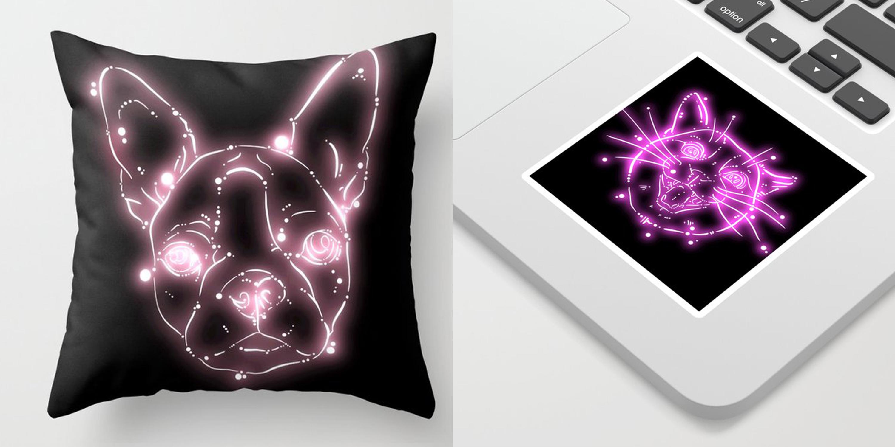
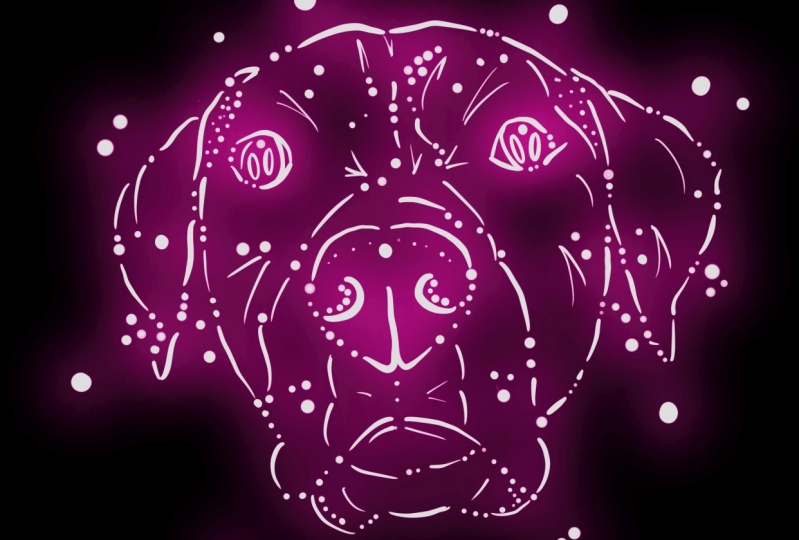
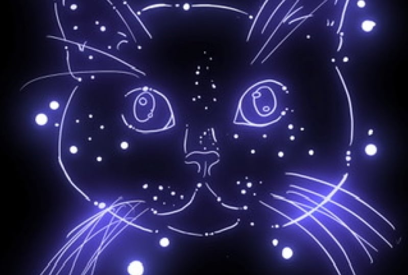
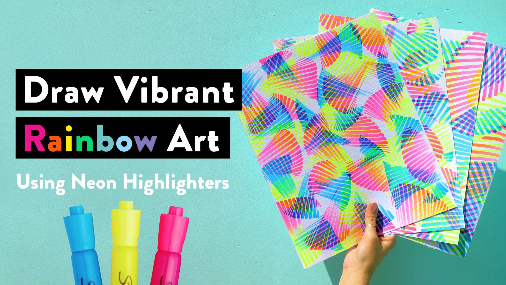
5. Neon Effects: [MUSIC] Now that we have our initial sketch, I'm going to show you the first of many of these fun new effects and skills, starting with a neon finish. The first thing we're going to do is come up with some redundancy. We're going to make a copy of this Canvas so the original stays nice and preserved, and we can work off copies. To do that, go into your gallery by tapping "Gallery" in the top-left corner and now click, "Select" click "Our New Design" and click "Duplicate". Go ahead and press the X to unhighlight it, and that's going to give us a copy of our original. What we want to do is leave the original alone and click "Open" our copy. Now, this is the copy that we're going to be creating a neon effect with. To begin, we're going to open up our layers. Make sure our top layer is highlighted, swipe left, and click "Duplicate". That's going to give us two of the same layers. Let's hide the top one and work on our second layer. Now that we have this highlighted, we're going to click on our board, go over here to the Magic Wand, and come down here to bloom. Click on "Bloom," then "Layer". Now what we have to do is slide our pencil across to adjust as it says up here, Slide to adjust. Put your pencil on the paper and slide it all the way across. The other bar is moving over here. We're going to bring that all the way over to 100 percent and you can see how this begins to glow. We play with the transition size and burn down here at the bottom. What you should do is slide the transition down about 50 percent, and you can see again how that glow is really turning up. You can play with the size or how far out the neon effect comes. As you can see, it loses its potency as it goes away from the line. You can adjust the burn to make it more intense. That looks pretty crazy right there. I don't know if we needed that intense, but what we want to do is to get this nice pink glow. We will do that by playing with these different bars. Depending on which one you'd like, I'm going to have the size come up here to about 55 percent, burn roughly the same coming in at about 60. This is going to be our first layer for our neon sign. Now to get out of this, let's click our Layers. We're still on the layer that we just intensified with the neon effect. Now what we're going to do is duplicate this layer the same way. Slide to the left, push "Duplicate." Now it's even brighter. On this top layer here, we're going to click the N. Now the N is on normal. What we want to do is click "Add". Add is going to brighten that up a little bit more, Make it a bit more of an intense picture here. The final step to doing this is re-clicking on our top layer. We're going to change that color to white. Make sure our top layer is selected and the box is checked here. Go into our color wheel, make sure we have white. Despite whatever color is highlighted on the outside ring. If you go into the center where the saturation is and click in the top-left corner, that's automatically going to give you the widest white possible. Now we have that. Click back onto our artboard. Click "Hold", drag it all the way across you'll see that circle light up and then pull this all the way over. Now it looks pretty bright, we're going to change the background. Let's change this background color to a black. There we go. Having a darker background is going to have a much better effect for these neon signs. Now we can zoom in and check this out by using two fingers. You can see just how cool this effect is. The white on top really helps define your pet face, and you can see this ring of deep pink around it, this neon pink plus having the glow. I think this is a really cool and simple effect. Feel free to play around with the transition, burns, size, and colors for all the different neon options. Before I wrap up, I want to show you how to adjust the color of your neon. Maybe you don't want to use pink. First, we go to our Layers, make sure our top layer is selected, it is. Then let's go back to our Magic Wand and select "Hue, Saturation, and Brightness". Click on "Layer" and here you can play with the whole color wheel. I want this one to be a bright blue. Cool. Now that I have a cool blue, I'm going to do the same thing to my other layer. Click on the Layers. Make sure the third one is highlighted. Again, go to our Magic Wand, Hue, Saturation, Brightness. Click on "Layer". Slide this just a bit. That really intensifies the blue. You could even use the brightness here to adjust it as you like. There's several options and different ways to make this look really cool. I invite you to explore all the colors and brightnesses to make your neon pet yours. But for now, we're going to go on to our next fun skill.
6. Fill Effects: [MUSIC] Now that we have our neon effects, I'm going to show you how to make some cool backgrounds. Let's start by duplicating our Canvas. Go to gallery, "Select". Going to select our neon canvas and duplicate. Click the "X", and now let's go to our duplicate. Let's open up our layers, and we're going to add a new one. This layer, we're going to click, hold, and bring it just above our photograph here. This is the layer we're going to start painting on. First thing I'm going to do is hide these neon colors. We have just the white here and our dog. Make sure we're on this background layer. Not the background color, the background layer, we are. Let's click the board. Let's click our brushes. Go down here to spray paints. I like to use the fat nozzle spray paint. Make sure that's highlighted, and now let's go to our color wheel, and now let's change the color. How about this nice red? Back to our art board, and using the fat nozzle, I turn it all the way up and I will cover my pet face. That's an easy way to get a nice solid background color. Now, we'll add some different colors. Using the same fat nozzle brush, I'll change the color to let's say this blue over here. I'm only going to do one or two bursts with the blue. It looks pretty cool. One, two, as you can see, it's pretty big. If you want to adjust the size of these bursts, you go to the left and you can play with the brush size. For these purposes, I like how bright that's coming out. Something else you could do, let's go back into our brush library and flicks. These are fun little spray paint flicks. I think add just a bit more characters, if you see, I just slid my pencil across there and you get all these flicks as if they naturally fell from the sky. Now we have red and blue. Let's play around with another brush. How about some organics? Click "Organic", and we have flowers and clouds and a bunch of cool different stuff to play with here. Let's try this paper daisy. Now I'm going to switch up my colors to a yellow. Let's see what this looks like. We have some flour daisies, I'll be honest, not a huge fan. We can go over here, click and erase those. Let's find another one. How about abstract? Let's go into abstract, and we have these spicule, look like little lines. Let's see what this does. Nothing if it is too small. Let's bring that all the way up. Oh cool. Here we are, adding a few, I guess these are like laser lines. Again, maybe not what I'm looking for, but this is a good opportunity to play and see what works. We can go down here towards the bottom into vintage, and here at the bottom we have flower power. I like flower power. Let's click on that. How about a nice light purple color for this? Let's see how this looks on our pup. They come up almost like snowflakes. I like how that adds a little extra flavor. Now that we've played with a few different brushes, it's time to cut out our pet face using our eraser tool. Let's click our eraser tool. If you click and hold the eraser tool, it will actually erase with these flowers, which is not what we want for this project, so let's go ahead and make sure this is nice and sharp. It is, wonderful. What I want to do is go all the way around our little doggy face and get rid of the colors we don't want to use. [MUSIC] Usually I will do a outline, and we're getting rid of big chunks. As you get closer to the line, you can also play with the brush size during that eraser, a little smaller as you go about halfway through these white borderlines. Anything outside of that eye I erase, so as you can see, some of the circles out here are left all by their lonesome, but that's okay. There we go. We have our dog with a little pattern behind his face. Now, you can choose to do this again by opening your layers, and you can actually hide this one. Add a new layer just above it, and you can practice the same skills again. Let's bring up our background, and now let's go ahead and see what this looks like, with the neon lights. That changes and brightens up quite a bit. That is pretty funky. We can still see our dog face, it has a cool abstract flower power background. Feel free to play around with all the different brushes and different color combinations. The world is your oyster.
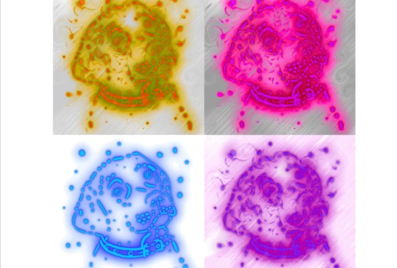
7. Warhol Style: Now, I'm going to walk you through how to do a really cool Warhol-style effect like this. It's got some really nice pop art vibes and we get to play with a lot of color. Let's go ahead and dive in. Same as before, we are going to make a duplicate of this canvas, so go into your gallery, Select. Go back to our original, and let's duplicate that. Hit the X, and now let's open our duplicate. Essentially, what I want to create is a grid with all different color palettes, so I'm going to show you how to do that. First things first. Let's open up our layers. We no longer need our dog photo so let's go ahead and delete it by sliding to the left and clicking Delete. Now, I want to start a new layer. Click the "plus" sign, and I'm going to fill this layer in entirely in yellow. You can choose whatever color you like, but I'm going to start with a bright yellow background. I'm going to tap the Color icon, make a nice yellow. The yellow up here indicates my color that's chosen. Then I'm going to click the board, click and drag the yellow and release it into the layer. That's going to cover the entire layer, and it's even hidden my little dog. Let's go ahead and click and drag this layer under our drawing, and there she is. As I mentioned, I want a panel of four different color options. Let's go ahead and use the Transform tool to create that grid. First, we're going to go to our layers. I'm going to swipe on both of these layers and group them. Now we have our first group. Now, instead of selecting individual layers, we're going to select the group as a whole. Now, when we shrink this down, it will shrink everything in the group and not just a layer. Make sure the New group is selected and both of our layers are in that group. First thing I want to do is go ahead and click the "Transform" icon. Go down to the bottom left where Snapping comes up. I want to turn on Magnetics and Snapping. This is going to help us accurately place our grid. Now, we're going to click and drag this corner, bring it towards the middle, and we're going to let this guide, show us when it hits exactly into the corner. Now we have one-fourth and our composition is already complete. Now we're going to duplicate this three times. Go back to our layers, swipe left on the group, not an individual layer, and click "Duplicate." Now go back to Transform, click "Hold" and drag, and it snaps in place. Now we're going to go into this new group and change the background color of this new layer. If you're ever unsure of what layer you're on, you can toggle on and off the visibility. Let's go ahead and change the background color of this layer. Let's make sure this background layer is selected. Go back up to our color palettes, and I'm going to choose a slightly more mustard yellow. Now I'll click and drag from my color picker into the square and it's changed. We're losing the pink line work on this orangey-yellow. I'm going to brighten that up and make it a lighter pink. First, let's go to my layers to make sure I have the correct one selected. Again, you can toggle on and off the visibility just to make sure. Now I'm going to go to my magic wand, click on "Hue and Saturation," Layer, and I'm going to bring the brightness way up to an almost white. Let's hit the magic wand again to set the color, and now we have a completely new palette. Let's do the same thing now two more times. Go back to our layers, select the group, Duplicate, and we have our new group. Let's click the Transform, click "Hold" and drag, and now we have yet another beautiful dog. Now I'm going to go to my layers and change this background to a nice blush pink. Go to our color wheel, we have our blush pink selected, click, drag, release, and now we have a pink. Let's go ahead and change the color for this to be much darker since we're already on a very lightly colored pink. Go back to my layers. We're going to click the top layer to make sure we're on the right one. We are. Now I go to my magic wand, Hue, Saturation and Brightness, click "Layer." First, I'm going to make this darker. Then we're going to bring up the saturation and choose a new hue. Right there, I like that color. Last one. Go to our layers, select the group, slide, duplicate, and there we go, and Transform. Click, drag, snaps into place, hit the arrow one more time to set the transformation. Now what I want to do is have this line color be the background for this one. I'm going to show you how to color select a specific color. Let's go ahead and click the box outline on our menu bar, and you can see the color picker has popped up. Go ahead and click and drag it over the green, and you can see up here in the top right that our color has changed. Now let's go to our layers, make sure our background layer is selected, and now drag and fill. Now let's make this dog outline pop. I'm going to select the layer, click on your board, and I'm going to use the same color picker and drag that over the pink. Now I want to zoom in, go to my layers, temporarily hide the background, click and drag this pink all the way across the board. Now, I can put the background back on, and voila, we've just created a piece of modern pop art. Before we finish, I want to show you one more cool thing we can do with this. First, I'm going to duplicate this canvas, click your Gallery, Select, Duplicate, X. Open our new canvas, go to my layers and we're just going to pinch all of them together into one. One perfect layer to rule them all. Now, I'm going to show you some cool blending modes. With this layer selected, let's go to our magic wand, and we're going to click, "Gradient Map." Select Layer. This is a way to key in color so it all looks like it comes from the same color palette. Now, you can toggle through these presets and seeing the different effects. I think my personal favorite is Blaze. I love how it keys them all into this retro color palette. Now one more adjustment I want to make is to bump up my saturation. Let's go back to our magic wand, Hue, Saturation, Layer, and let's bump that up. Excellent. Anyways, you can play around with all color variations. It's a lot of fun and I invite you to explore the room. I have one more cool effect to show you in our next video.
8. Faux 3D: Last but not least I want to show you how to make this really cool full 3D effect. Same as before we're going to go back to our gallery and we're going to create yet another duplicate, so we're going to select our original and duplicate that. Hit the X, go to our new duplicate, and this is super easy. We're going to go into our layers and we're going to duplicate our top layer. With that second layer selected, we're going to change that pink to a bright blue. We're going to go to our magic wand, click "Hue and Saturation", click the Layer, and let's find a nice blue. We can make that even brighter and more saturated. I wanted to feel like a nice cyan. Let's go back to our layers, and let's click the N which stands for normal and we're going to change that all the way up to multiply. You can zoom in and it looks like everything just became this navy purple color, and that's happening because the cyan is multiplying on top of that pink. As I mentioned before I want this nice offset 3D effect, so I want to stagger this illustration. Let's nudge it over a little bit. With my blue layer selected, I'm going to go to the transform tool. What we want to do is make this a little bit offset. As we slide this over you can see the separation of layers, but it's also jerky. It only gives you so much freedom in terms of where it can go. The reason that's happening is because snapping and magnetics are on, so let's go ahead and toggle those off. When I move it around I have more freedom, it's much smoother and I can put this wherever I like. This is a personal taste thing. You can make it very offset, or just off to the left or right like I traditionally do. Let's click the arrow to make sure that transition stays and we can zoom in and see how it looks. Because I put that multiply transparency effect on the cyan layer, it creates this cool overlay effect over the pink to make almost a purple or navy. I love that look. Wasn't that easy? That is our final illustration technique and if you want to play with the colors and backgrounds again, you have all the freedom in the world. I want to show you how I save for maximum resolution.
9. Saving: Now let's talk about saving our artwork to the highest possible resolution. We have a lot of different things to save. If we go back to our gallery, we can see all of our files. As you can see in our gallery, we've created a lot of canvases. Let's go ahead and pick one to start with. Let's start with our 3D canvas. Let's click and open that. We're going to save as two different file types, beginning with JPEG. Go ahead and tap your wrench icon, "Share", and now, "JPEG". here is where you can select how to share it. I usually AirDrop it straight to my computer, but you can also save it as a photo to your iPad by clicking "Save Image". Now it's flattened as a JPEG and saved to your camera roll. What a JPEG does is completely flatten your artwork onto one layer. The reason why I use a JPEG is because it's a very well-recognized file type that can be used across several different platforms. You can email it, you can upload it to print-on-demand websites, anything, especially sharing on social media like Facebook or Instagram. The other file type I like to save is a PNG. PNGs are special because they enable a transparent background, which is great if I want to have this printed on a kiss cut sticker or on a t-shirt. Let me show you how. First, I'm going to go back into my layers and turn off the background. As you can see, it's all transparent. Now go back to the wrench icon, click "PNG". Once again, you can export that through AirDrop, email, or just saving the image to your camera roll. Now I have two file types saved, a JPEG, which is all flattened with a white background, one image, and then a PNG, which is the image without the background. It's transparent, usually for printing. Remember, I got the transparent background by going back into my layers and toggling the background color off. Now we can go back to our gallery and repeat the process with all the other work. I'll let you do that on your own time. Now it's time for the fun part of turning your artwork into a sticker. Let me show you how.
10. Stickers: Hey, because I'm in the giving mood, I'm going to add this bonus video to show you how easy it is to turn your new artwork into a sticker for your laptop, a t-shirt for yourself, or a framed print for a loved one. If you're looking for an amazing gift for a pet lover, this is it. Who wouldn't love being surprised by an original and functional piece of art starring their pet? Let me show you how easy I'm going to make this for you. First, let's start by going to Society6, a prominent print-on-demand website that anyone can use. Now, you're going to want to start an account. They make it very simple to begin and all you need is a PayPal address and an email. Choose a username, corresponding email address, and a password, and then you'll have to go through the easy steps to verify your PayPal. All very standard with any print-on-demand website. Bam, you've got a print-on-demand website. This is what mine looks like. Now, let's go up here to sell, and then over to Add New Artwork. Enter your artwork title, and make sure when uploading your artwork file to Society6, you think about what the product you're trying to print will be because different file types work better for different products. Let's start with a JPG. I always start with a JPG because it has the background in place. Now click "Continue", click the boxes that ask you to follow the rules and other corresponding boxes regarding content. Now your artwork is in draft mode. In this section, you're going to fill out your artwork details. Start with category, and click whatever applies. Enter tags to help people find your artwork if you choose to sell it. I usually skip the description but feel free to fill in whatever you'd like and save the details. Now that it's in draft mode, you can toggle over the products you would like to have for sale in your new shop. Of course, depending on the size of your work and what you've made, some of the products might not be practical, but most of them are. But if you use larger canvas sizes in Procreate in the future, you'll be able to enable more products. Here's how I create a sticker. Now I could just toggle on this sticker, but I'd like to make a transparent sticker. Let's go into that, click "Edit", here you can play with the scale and style of sticker you want to create. You can make it larger or smaller to fit it just perfectly. But as I mentioned, I want one with a transparent background. I'm going to go and upload a new piece of artwork, this will be the PNG. As you can see, this is going over the boundaries a bit, so we're going to bring down the scale to make sure we get the correct size. You can even generate previews before you enable it. Just to get a peek as to what's in store. Now we can see what my transparent sticker looks like on a darker background. Go ahead and click "Out". Now I have the chance to enable the sticker with a transparent background, or with the original black background. It's good to see what both previews look like to make your decision. In this case, I'm going to stick with the black background for my sticker. But I'm going to use the transparent option on the t-shirts. Anyways, scroll through and see which products your artwork looks good on. Some are more practical than others. But you have a lot of really good options here. When you're finished, scroll up to the top, click the box that lets everyone know this is your artwork, and go ahead and publish. You'll notice up top that the status has changed from draft to publish, and congratulations you have a store. Now to see in action, let's go to my shop. Sort by new, and see your newest designs come to life. Along the left, you'll see the list of products. Click "Show More" and scroll all the way down to stickers. It can take between five and 30 minutes to get your new design up in your shop. In the meantime, I'm going to show you how to order from one of my previously uploaded designs. Here's galaxy cat. Now I'm going to select what size I like. I like the three-by-three size because it's good for your laptop. Add to your cart, checkout, and to your shipping information in your cart, and bam, you have a personal pet project headed your way. Rinse and repeat for all new designs you create. Guys, I've got a few more tips for you in my final video.
11. Your Project: [MUSIC] This has been such a fun class and I really hope you enjoyed creating these beautiful, fun pet portraits. If you want to see a time-lapse replay of your work, I'm going to show you very quickly how to do that. For example, let's pick one of our canvases. I'm going to open up this background fill, our little flower puppy over here. I'm going to go to my wrench icon, and I'm going to click "Video" and it says Time-lapse Replay, and we can click on that. It will show us from start to finish the whole process we went through creating our fantastic pet portraits. The reason you're not seeing your reference photo in the background is because we used a private photo when we originally set up the canvas. This is the reason why it looks like you drew this without any reference. Good for you. Click "Done" and you can export these videos right here. Export Time-lapse video, you click that. Choose video length. You have full length or 30 seconds. It's not even long enough to get 30 seconds, but 30 seconds is the perfect amount of time for a social media post. Let's click "Full length". Once again, it exports, and you can choose between AirDrop, email, or saving your video to your camera mode. I usually AirDrop it straight to my phone so I can upload a social media post and let the world see my beautiful portrait. If you enjoyed this class, don't forget to follow me here on Skillshare by clicking that Follow button above. That way, you'll be the first to know when I have new classes on the way, what I'm working on, and when I'm giving away a full year of Skillshare premium for free. My followers are always the first to know for all of these things. I would love to see what you've created in this class. In fact, you can upload your JPEGs to the student gallery below right now. This means we can all like and comment on your lovely artwork. I'd also love it if you can include the original reference photo for your pet, so we can all see where you started, where you wound up. But more importantly, we can ooh and ah over how cute and adorable your little pet is. Now, if you want to know where I am in the world, either painting walls or performing comedy, just follow me on Instagram @adampalmeter. That's enough out of me. Over and out from Italy. Peace.
 Adam Palmeter, Artist / Comedian / Teacher / Author