Transcripts
1. Introduction: Hi everyone. My name is Jacqueline Jensen. I'm the Community Evangelist for Piktochart. Today, we're going to talk all about visual communication. According to Buffer, visual communication is 40 times more likely to be shared on social media. Piktochart is an easy to use infographic maker. We help millions of non-designers create beautiful visuals every day with over 600 templates. Piktochart believes that anyone, even non-designers, can create beautiful visuals. In this class today, we're going to cover five things: first, why is visual communication essential in today's workplace; second, we're going to talk about three main types of infographics that can help you achieve your goal; third, I'll show you easy tips that you can use to create your next infographic; fourth, I'll show you three design principles that you can use to make your design beautiful; and finally, now that you have your beautiful visual, I'll give you some tips and tricks for how to share it with your audience. So, now that we have our game plan, let's get started.
2. Why Visual Communication?: So, let's kick off the course with talking about why visual communication is an essential skill that you can bring to the workplace. Visual communication is at the core of storytelling and includes things like maps, charts, timelines, or storyboards. According to Pearson, 65 percent of people are visual learners. So, communicators today are turning more and more to infographics to share their message with their audiences. So, what are infographics anyway? Well, infographics are simple image-based format to help you communicate your message. When people see your information presented visually, your message goes from abstract terms to meaningful information. Powerful designs create a meaningful connection between you and your audience. Adding things like a map or a chart can give insight to your dry data. The best visual communication has five key elements. First, it encourages discussion. Second, it's shared within a community. Third, it drives positive change. Fourth, it encourages your audience to take an action. Last, it has an impact that's powerful. Let me share with you a case study about how a big-name marketer used infographics to create a real impact in his business. In the early days of his company, Kissmetrics, marketer Neil Patel was focused solely on written content. He was seeing more and more that people online loved infographics. He started to experiment with creating infographics for his website, and he saw two and a half million visitors come just to see those infographics. It generated 41,000 back links. He saw infographics take off on social as well. Each infographic produced 621 tweets and 572 likes. Going from solely written content, to including some visual communications in the mix ended up growing his user base and readership dramatically. According to Buffer, visual communication is 40 times more likely to be shared on social media. In particular, Mass Planner found that infographics are liked and shared three times more than other content on social media.
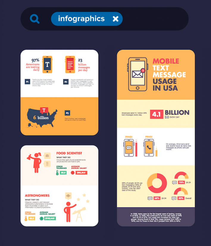
3. Type 1: Persuasion: There are many types of infographics, and depending on your message, you'll want to pick the right one for you. The first type of infographics we're going to talk about today, is persuasion infographics. Persuasion infographics are used to promote something you're working on, or to compare two things to help your audience see what's best. Persuasion infographics can also be used to educate someone about a brand new topic. There are two things that are vital for persuasion infographics to succeed. First, you need to demonstrate your authority on the topic, and second you need to be clear and concise in your messaging. The first type of persuasion info graphic, is a versus graphic. This is a head to head comparison of two different things. For this type of info graphic design is very important. It should be easy for your audience to compare two different things, item by item. Versus infographics work really well when you have lots of data and items to compare between two different things. The second type of persuasion info graphic, is all about promotion. These are perfect for social media. They showcase a visual and then text to guide the reader. The key when picking your visual is to make sure that it's an intriguing image that also tells the story. The last persuasion info graphic, is a complex content infographic. Let's look back to when we first started seeing infographics. It was in the field of science. Stats, complex algorithms and endless bodies of techs were the order of the day. Renegade scientists realized that adding a visual to their communication would help their audience understand. Now, you may not be a mad scientist, but consider for your next message adding a visual or two. Here are four tips for creating your next infographic that has complex content. First, you need to have a strong and intriguing title. Second, you need to use design elements to your advantage like fonts, colors, and icons. Third, make sure that your infographic is not too wordy, and forth, always Keep It Simple and clean.
4. Type 2: Reporting: The second type of infographic we're going to talk about today is all about reporting and presenting. The next time you pitch a new idea, make a report to your team, or create a beautiful presentation, try doing it with an infographic. These type of infographics have a five step process. First, you start with a great introduction. Second, you share your data. Third, you facilitate discussion. Fourth, you make your own recommendations and fifth you drive home a powerful conclusion. The first type of reporting and presenting info graphics are pitches. When you're pitching a new idea, raising capital for your startup, or meeting with a big client, you'll want a great presentation that stands out. A pitch deck is a brief presentation usually involve slides and it presents an overview of your idea. Next time you're creating a pitch deck, try presenting with images rather than just words. The next type of reporting and presenting infographics is Reports 2.0. The next time you have data report, why not stand out using an infographic? The key to being efficient with this type of infographic, is to start by putting in work creating a template that you'll use time and time again, every week, every month, or every quarter that you have to report your data. Creating a next level report is great for nonprofits who are sharing data with their donors. It's also great for consultants who are delivering reports to their clients, and we've even seen parents sharing data about their children in unique and interesting ways using infographics.
5. Type 3: Storytelling: Throughout history, human beings are wired to tell stories visually. Bringing visuals into your message will help your audience retain information. According to Lifelearn, when people hear a message, they only remember 10 percent of it three days later. But, if you add a visual, they retain 65 percent of your message three days later. The first type of process and storytelling infographics, is a decision tree. These show information streams, they are used to guide an audience through a flow or a sequence. These are often simple, lighthearted or humorous, and they work really well on social media. The second type of infographic is a timeline. These infographics tell a story in relation to time, and they take your audience through a journey. The last type of process or storytelling infographic is taking someone through a process step by step. These are perfect if you want to create a how-to for your customers, clients students, or team members. Your infographic is likely to be referenced over and over if someone follows your instructions. So, it's important to have usability out-way design. If you want examples for great step by step infographics, take a look at Pinterest. They're everywhere.
6. Basic Design Principles: Every visual under the sun, no matter how complicated, can be broken down into basic design elements that even non designers can understand. Let's talk about three of those design principles. The first design principle to use in your next creation is Icon consistency. Consistency is important. The key is to choose an icon style and stick to it throughout your entire creation, whether you go with simple icons or playful goofy designs, the key is to not change your style as you create. A great icon can replace an entire paragraph of text and be understood by your audience worldwide. Make sure your icons are related to your topic, are universal, and match a color palette of your design. The second design principle is all about the colors you'll choose. It's safe to say that what you choose could be the biggest design decision you make in your entire creation. But picking colors isn't easy. Let's talk about one important role that can make the decision a bit easier. The rule of three colors. The rule is simple. Pick one primary color and two secondary colors. Now, it isn't a hard and fast rule and it can be broken, but it works as a great guideline. The goal here is to simplify things for you and your reader. You don't want colors fighting for attention. Now, let's talk about three things you should ask yourself while you're picking your colors. When you're picking your colors, the first thing to keep in mind is to ask yourself if you have any preset colors that you need to follow for your brand. Adhering to brand guidelines is always important step to make sure that your readers can recognize your brand. If there's already a set color guideline, just save yourself the trouble of picking your own colors. The second thing to think about when picking your colors, is if there's any seasons or holidays that you want to highlight. If your visual is timed to a season, like an end of the season sale, or marketing campaign that's all around a holiday, get inspired by the season. The last thing to think about when choosing your colors is to look to your content. Let your content decide which colors you choose. Here's an example to picture. Think about an infographic all about coffee that uses brown, tan, and cream as the color choices. The last design principle is all about white space. White space is a very simple design concept that makes a huge difference. White space is that areas in your creation that have no visual component like text or icons. It's literally the white space. Utilizing white space mindfully in your design gives each design element a sense of breathing room. Being mindful of white space helps you to avoid color and make your design instantly more professional.
7. Demonstration: Now that we've learned about different types of infographics and learned a few design principles, let's create an infographic. You'll start with a body of text. For an example, I'm going to start with text about this course. Once you have your body of text, look through to find the main elements that you want to visualize. In this example, we have five main elements. First is the class title. Second is the class time. Third is where people will find the class. Four, are some things that they're going to learn. Five, probably most importantly is that no design skills are required for this class. Once you've identified the things you want to take visual, now it's time to think about your audience. Is your audience younger, older, bilingual, highly educated? Are they in a hurry? Do they have short attention spans? It's important to determine who your audience is so your design has a great impact. For this example, my audience is perspective students, people interested in design, and people who are comfortable with online learning. The next thing to ask about your audience is where will they be viewing your visual. Should it be sized for social media like Twitter or Facebook? Should it be a high-res download so I can print it and hang it up in the hallway? For this example, I plan to share my visual on social media and I also plan to email Piktochart users who are interested in learning more about design. So, for this example, our infographic type is a persuasion infographic. It's important to remember not just to browse templates, but to keep your goal in mind when choosing your template. Now that you know what type of visual you're looking to make, you can look for a template that matches it. We have infographics, presentations, and printables. A presentation would be for startup pitch or reporting metrics to your team. A printable would be like a poster or flyer. For this example, we'll make an infographic. As we browse infographics, we'll see if there's one that we like. This one is a timeline. Nothing in our content has anything to do with a time frame or taking people through journey. So this template might not be the best fit. This template is a meeting agenda. Looking through the template design pieces, I see that some of my key elements might be perfect for this. I can show the class title, the class time, where people can find the class, make sure they know it's not for professional designers, and also outline here the things that they'll learn. So, we'll start first by changing the title of the infographic. This one is meeting agenda but we'd like it to be the title of the class, Creating Easy Infographics. We can see it's a little too big, so bring the size down. Now, I'll move it up so it's centered in the design. Something we don't need that's in this infographic is a date because this is an online class, anyone can sign up at any time. So we'll delete that part. For the description here, we're going to put Visual Communication Essentials for Non-Designers. So, people reading this infographic will know what this class is all about. Now, our next block, we will talk about what students can expect to learn. There's four main things that we're hoping they takeaway. The first is why visual communication is an essential skill in today's workplace. Then, we're going to talk through three main types of infographics to help people achieve their goals. The third thing is graphic design basics. The last thing is how to effectively share and present. Something here that I notice, this icon of a pencil, I'd like to change it out. So, in our icons, I'm going to a search for design. As I look through these icons, this is the one that stands out the most to me. To match the theme of the template, we'll look to see what color this pencil icon is, and it's a white. So we'll change this out to the same and then we'll replace out this icon. Now this block here, we don't need. So, what I can do is just delete the block. I'll also delete a few of these blocks because this is just a short infographic. Now at the bottom, rather than sources, I want to tell people where they can go to take this class and I also want to know that this class is for non-designers. All right. So, looking back through my infographic, it is for people who are interested in design but are not designers, and I've mentioned that it's visual communication essentials for non-designers here as well as down here at the bottom. So I'm making sure that my audience understands this class is for them. Finally, let me show you our new color scheme feature. These colors are great, but what would the infographic look like if we tried a different color scheme? It's had minimal changes, so let's see if we can try a different one. This one is great. I love the purple, I love the pink, so I think I'll stick to this one. Last step is naming your infographic and sharing it with the world. Right now, it's unpublished but we want to make it public. We could also make it private, and so it's password protected. Now our infographic is live.
8. Sharing Infographics: Now that you've created your infographic, it's time to share it with the world. There are various reasons that people share infographics, and so it's important to determine how you want to share yours to get it out to your readers. Small business owners are marketing their product and service, so they definitely want their infographics shared externally. There are also people who want to share their information internally, like incorporate communications or internal communications. They would want to do a live presentation or maybe even share their infographics as a PDF. A consultant, on the other hand, may want to showcase or share findings and reports or get sales material to new clients, so their presentation materials would be external. A hybrid between the two is a consultant who's creating internal reports but for multiple clients. Another example would be a nonprofit who's raising awareness about an issue. They're sharing it with their donors, constituents, potential donors, volunteers, and with the wider public. Here are some different ways to share. If you take your infographic and use the iframe and embed it in your website, as you change your infographic on Piktochart, it will actually change on your website, too. Another idea is downloading your infographic as a PDF to print out and send them onto your team members. Two other examples are to use presentation mode to deliver presentation to clients, or investors, or members of your team. You could also save your infographic as a JPEG and share it on social media. After you've published your infographic, there is a link on magic.piktochart.com. You can share the URL with your audience and they can see your infographic. What's great about this is any changes that you choose to make your infographic will still live on that link. You can showcase your infographic on your website and you can also include it in your next email newsletter campaign. Another idea is to create an infographic for press coverage. If you're covering something in your industry, send it to media outlets and see if they'll republish.
9. Closing: So, we talked about why visual communication is an essential skill in the workplace. We talked about design tips. I showed you some case studies, and we talked about different types of infographics. We even created an infographic together. But now, it's your turn. I'd love to see what you create in the project gallery. To make sure your design toolbox is filled with everything you need, you can try Piktochart PRO for free. Just head to the class copy to get all the information. If you have any questions about anything I've covered today or you want to share some tips and tricks of your own, head to the comment section, and I'll review and get back to each of you. Thank you so much for taking the time to learn more about visual communication today.
10. What's Next?: way.
 Piktochart Sdn Bhd, Community Evangelist at Piktochart