Transcripts
1. Welcome To The Class!: Hello, everyone. My
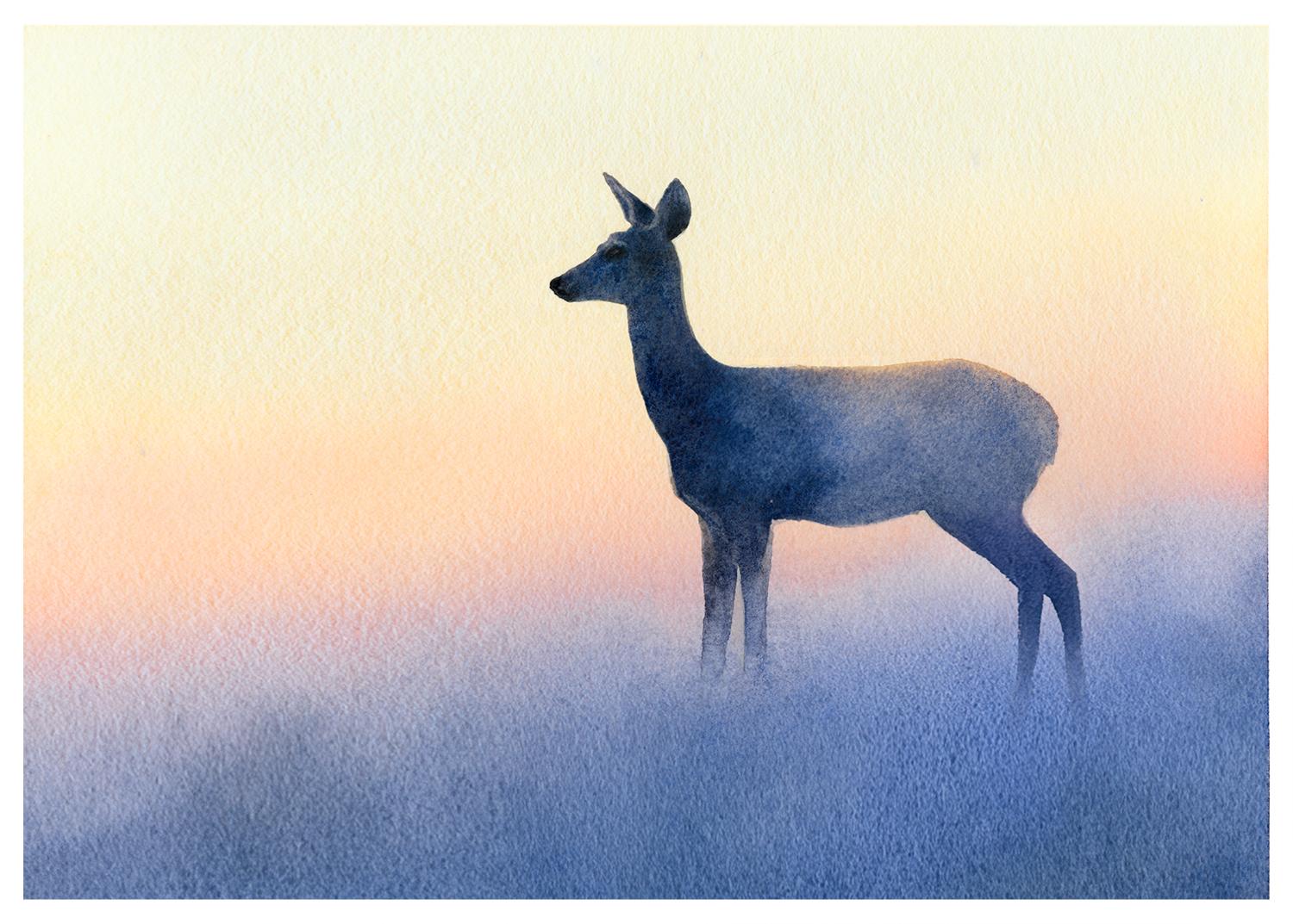
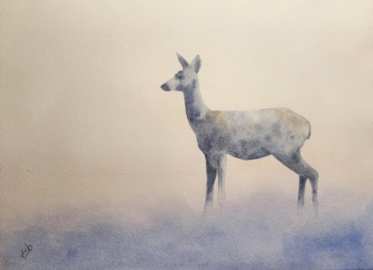
name is Will Elliston. And today, we're painting a quiet atmospheric scene of a deer emerging
from the mist. This class is wonderfully
simple on the surface, yet full of useful lessons. We'll explore the elegance
of a clean silhouette, the softness of a fading edge, and the beauty of a smooth, transitional wash moving gently from warm light
into cool shadow. The large areas of open space give the painting a
calm, spacious feeling. While the soft mist
around the legs helps the figure feel integrated
rather than cut out. It's low stress, meditative,
and surprisingly effective. I've been a professional
artist for many years, exploring lots of different
subjects from wildlife and portraits to cityscapes
and countryside scenes. I've always been entranced by the possibilities of watercolor. But when I started,
I had no idea where to begin or
how to improve. I didn't know what
supplies I needed, how to create the
effects I wanted, or which colors to mix. Now I've taken part in many
worldwide exhibitions, been featured in magazines, and been lucky enough
to win awards from well respected
organizations such as the International
Watercolor Society, the Masters of
Watercolor Alliance, Windsor and Newton, and the SAA. Watercolor can be overwhelming
for those starting out, which is why my goal
is to help you feel relaxed and enjoy this medium
in a step by step manner. Today, I'll be guiding you
through a complete painting, demonstrating a variety
of techniques and explaining how I use all
my supplies and materials. Whether you're just starting out or already have some experience, you'll be able to
follow along at your own pace and improve
your watercolor skills. If this class is too challenging
or too easy for you, I have a variety of classes available at different
skill levels. Throughout this class, I'll be sharing plenty of
tips and tricks. I'll show you how to turn
mistakes into opportunities, taking the stress out of
painting in order to have fun. If you'd like to explore
watercolor a little further, I've put together a
free guide called the ten most common watercolor Mistakes
and how to avoid them. It covers some of the challenges we all face when painting. With practical advice
to help you overcome them and feel more
confident with your brush. You can download it for free
by joining my newsletter, Will Elliston Studio Notes, where I share painting tips, creative insights,
and inspiration to help you develop
as an artist. You'll find the link in the
class description below. If you have any questions, you can post them in the
discussion thread down below. I'll be sure to read and
respond to everything you post. Don't forget to follow
me on Skillshare by clicking the Follow
button at the top. This means you'll be the
first to know when I launch a new class
or post giveaways. You can also follow me on Instagram at Will Elliston
to see my latest works. So let's get started
and discover how little a painting really needs in order to be effective.
2. Your Project: Thank you so much for
joining this class. At the heart of today's painting
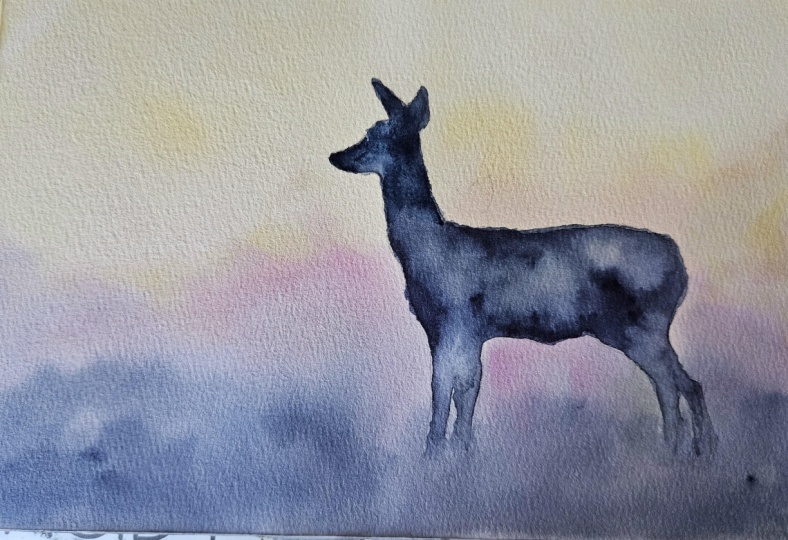
is the striking contrast between a clearly defined animal and an almost
weightless environment. The deer's dark shape gives
the composition strength, while the lower body gradually dissolves into the
surrounding color, creating an illusion of fog
passing through the scene. The softly graded
background also offers a useful opportunity to
explore water control, pigment strength, and
seamless transitions. Because the design
is so uncluttered, every choice feels intentional, yet the overall process
remains playful and forgiving. It is a lovely reminder that atmosphere can be created
without adding more detail. In the resource section, I've added a high
resolution image of my finished painting
to help guide you. You're welcome to
follow my painting exactly or experiment with
your own composition. As we're going to be focusing on the painting aspect
of watercolor, I've provided templates
you can use to help transfer or trace the
sketch before you paint. It's fine to trace when using it as a guide for
learning how to paint. It's important to
have the underdrawing correct so that you can relax and have fun learning the
watercolor medium itself. Whichever direction
you take this class, it would be great
to see your results and the paintings you
create through it. I love giving my
students feedback, so please take a photo
afterwards and share it in the student project gallery under the Project
and resource tab. I'm always intrigued to
see how many students have different approaches and how they progress with each class. I'd love to hear
about your process and what you learned
along the way, or if you had any difficulties. I strongly recommend
that you take a look at each other's work in the
student Project Gallery. It's so inspiring to see
each other's work and extremely comforting to get the support of your
fellow students. So don't forget to like and
comment on each other's work.
3. Materials & Supplies: Before we get started
with this deer painting, let's go over all the
materials and supplies you'll need for this
class and beyond. Having the right materials can greatly impact the
outcome of your artwork. So I'll go over all the supplies I use for
this class and beyond. They're very useful to have at your disposal and will make it easier for you
to follow along. Let's start with the
paints themselves. And like most of the materials
we'll be using today, it's a lot to do
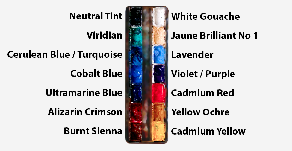
with preference. I have 12 stable colors in my palette that I
fill up from tubes. They are cadmium
yellow, yellow ochre, burnt sienna, cadmium
red, Alizarin crimson, Opramarne blue, cobalt blue, serlean blue, lavender,
purple, ridian, black. And at the end of the painting, I often use white gouache
for tiny highlights. I don't use any
particular brand, these colors you can
get from any brand, although I personally
use Daniel Smith, Windsor and Newton
or Holbein paints. So let's move on to brushes. The brush I use the most is
a synthetic round brush like this Escoda Purl brush
or this Van Gogh brush. They're very versatile because
not only can you use them for detailed work
with their fine tip, but as they can hold
a lot of water, they are good for
washers as well. They're also quite affordable, so I have quite a few
in different sizes. Next are the mop brushes. Mop brushes are good for
broad brush strokes, filling in large areas and creating smooth
transitions or washes. They also have a nice tip that can be used for smaller details. But for really small details, highlights or anything
that needs more precision, I use a synthetic
size zero brush. All brands have them,
and they're super cheap. Another useful brush to have is a Chinese calligraphy brush. They tend to have long bristles
and a very pointy tip. They're perfect
for adding texture or creating dynamic
lines in your paintings. You can even fan them
out like this to achieve fur or feather
textures as well. And that's it for
brushes onto paper. The better quality
of your paper, the easier it will be to paint. Cheap paper cuinkles easily
and is very unforgiving, not allowing you to
rework mistakes. It's harder to create
appealing effects and apply useful techniques
like rubbing away pigment. Good quality paper, however, such as cotton base paper, not only allows you to rework
mistakes multiple times, but because the pigment
reacts much better on it, the chances of
mistakes are a lot lower and you'll be more likely to create
better paintings. I use Arches paper because that's what's available
in my local art shop. A water spray is
absolutely essential. By using this, it
gives you more time to paint the areas you
want before it dries. It also allows you to
reactivate the paint if you want to add a smooth
line or remove some paint. I also have an old rag or t shirt which I use
to clean my brush. Cleaning off the paint
before dipping it in the water will make the
water last a lot longer. It's always useful to
have a tissue at hand whilst painting to
lift off excess paint. Also, you never know when an unwanted splash or drip might occur that needs
wiping away quickly. I also have a water dropper
to keep the paints wet. When you paint, it's
important to have them a similar consistency to what
they're like in the tubes. This way, it's easier to
pick up sufficient pigment. A hair dryer is useful
to have for speeding up the drying time and controlling the
dampness of the paper. And lastly, masking tape. And this, of course, is just to hold the paper down still onto the surface to stop it sliding
around whilst painting. Also, if you plan on
painting to the edge, it'll allow you to create a
very crisp, clean border. And that's everything you'll
need to paint today's deer. Let's go on and sketch
this simple scene out.
4. Preparing The Composition: The drawing for a painting
like this is actually quite interesting because although
we're painting an animal, we don't really need very much internal
information at all. Most of what makes this deer recognizable comes from
its outer silhouette. So rather than getting involved with the
anatomy straightaway, I like to reduce
everything down into a few simple shapes,
the general shapes. There's the main body, which is almost long oval. Then the chest comes down
into the front legs. We've got this beautiful
long neck rising up from the body and the smaller shape of the head as well,
very simple shapes. The two ears pointing
upwards, and already, just a few simple
shapes like this, we can start to recognize the
simplification of a deer. And that's quite
reassuring because it means we don't have to draw every muscle or every
little change in the fur. In fact, most of that will
eventually disappear. All these little lines will be hidden underneath
the paint anyway. So what I'm paying attention
to is the proportion. How long is the body
compared with the neck? How small is the head compared with the body,
that kind of thing. How far apart of the legs? What angle is the
back traveling at? Angles are very important
to look at, too. Those can be very useful tools
when working out drawing. And particularly with the legs, I want to make sure that they feel like they're supporting the body rather than
simply hanging beneath it. I think it's useful to
draw quite lightly at the first stage because the first few lines are
really just questions. And then we can do
alterations like maybe the neck needs
to move slightly. That's when we come back with a bit more pressure
like I am now, or maybe the body needs
to be a little bit longer or we can shift
one of the legs. There's no problem with
making adjustments at the early stages when we
use light brush marks. That's what the
earlier lines are for. They're not for committing. Because this is going to be
such a simple silhouette, small changes around the edge can become surprisingly
important. The little angle of the
ear, the shape of the nose, little curve at the back here as it goes
round to the tail. It's those kind of things that give the silhouette character. But I still won't
spend too much time drawing little details or any details inside the deer because this painting
isn't about that. We're trying to simplify
it as much as possible. The drawing is just giving us a boundary to work
towards, basically. And, of course, as always, if drawing animals isn't something that you
feel comfortable with, there's absolutely
nothing wrong with using the template I provide
in the project section. If the tracing means you can concentrate more fully on the watercolor techniques
and the atmosphere, then it can be a very useful way of separating the two skills. It's important to
practice drawing. But for this, the
important thing is that once we get into the paint, we have a shape that feels
believable and balanced. And then from
there, we can allow the watercolor to do
much of the work for us.
5. Staring The Background: We're going to start with
painting the background, and the first thing is
to pre wet the paper. You don't always
have to do this, but I feel it just makes the
whole thing a bit easier and safer and more comforting in
the mind and less stressful. So pre wetting all of
it even over the deer. And the colors that I'm
going to use are going to be a range of warm
colors and cool colors. Later on in the
video, I'll show you some alternate colors
you could use. But I'm experimenting with
some new pigments today, and this kind of exercise is a great
way to do that because it's low pressure. It's not a highly
detailed painting. It's basically just one shape, a silhouette of a deer on very wet and wet,
soft background. So I'm using a large brush
just to saturate the whole of the paper so there's no white gaps because having
a wet background will help, of course, the wet
on wet technique, a lot of smooth transitions rather than any
unwanted hard lines. So I'm starting off
with some yellows, very light to begin with yellow ochre and
cadmium yellow, that is. I'm trying to
practice being a bit more impulsive with
this exercise. So this is a very light yellow. In fact, it might
be imbeceivable. I'm just trying
to make decisions based on how I'm feeling
rather than anything logical. Doing a bit thicker with
the yellow ochre here. Trying to get an underlayer
of some warmth in there. Maybe it's a sunset
or a sunrise, and we've got that
yellow glow in the sky, just taking it off
white to begin with. I'm painting the top
two thirds, really. The bottom is still the
white of the paper. Again, you can experiment with whatever color you
want the sky to be. Maybe you want it to be blue. And there's so many different
blues you can choose from. Now, I think as we work
further down the page, I'm going to get a bit darker and stronger with the pigment. So you can see it's a light
kind of yellow at the top. As it reaches the middle, it gets a bit darker. And going further down, maybe we can start
transitioning to a red so the reason I pre wetted the paper is because I don't
have to be worried about it drying and it gives me time to make decisions and
think about things. I don't have to be rushed. So I'm starting to add a
little bit of red there. I started off with
a zar and crimson, but it's actually quite
dry on my palette, so I've just gone straight
to the cadmium red, and mixing that on top of
the yellow on my paper, it actually looks quite orange. So I'm adding a little bit more and going
stronger as I go down, so there's more of a transition. So it doesn't just look
like yellow and then red. I'm going back and forth
with my brush stroke. It helps using a large
brush and transitioning that yellow to red by creating a kind of
orange in the middle. Because it's wet, like I say, the water will help spread
out these pigments for us into a nice
smooth transition. Getting a bit stronger, again, we have the Alizarin
crimson now. Alizarin crimson is a bit
cooler than camion red.
6. Foreground Transition: So far, we haven't been that
heavy with the pigment. It's all quite light, and also they're all warm
colors at the moment. We've got yellow, orange, red. And I'm going to work
through the color wheel now, so adding a little
bit of purple, which is next to red
on the color wheel, the other side of orange. And now we can apply blue,
which is next to purple. So there's always a bit
of a transition going on. I'm using cotton paper, which is so forgiving
and resilient. So I can go back and forth
with these brush strokes and not worried about any
pigment coming up. You can see a few
bits and residue. That's actually more to do with this cheap brush that
I'm experimenting with little hairs coming out and bits coming off it rather
than the paper itself. So that was ultramarine
blue that I've used, but now I'm using a
bit of serlean blue, even a little bit
of cobalt, as well. I still want to have
that soft transition, but I want it to be a bit more solid where the legs and the feet of the deer
connect with the ground. And then beyond that, you can imagine the softness is disappearing due to the
atmosphere and the air. So you can see the paper is so wet that it's actually
created a few crinkles. I'm not too concerned
with that with cotton based paper because I've got it taped
down nice and tight. So when it is dry, it's going to completely
flatten back out again. If it wasn't cotton based paper, these crinkles will
most likely stay. The only issue is that it creates little valleys in the
paper where the water runs down and creates a few
uneven bodies of pigment. But this is just a
fun little exercise, so I don't mind playing around, getting a few textures
as it starts to dry. When we think about
painting mist, it's tempting to
think that we have to paint something white or cloudy. But in reality, mist
is mostly about losing and reducing
contrast in tone. If you look through
actual fog or mist, objects don't necessarily
become white, they gradually become closer in value to the
atmosphere around them. So darks become lighter and
colors become less intense. So I'm starting off with a very vibrant blue here, but actually, I think I'm going to
add a bit of black into it to reduce that intensity. Also, trying to
encourage soft edges. I don't want any
hard edges, either. Like, eventually, objects completely disappear altogether. So rather than asking,
how do I paint mist, I think it's often
more useful to ask, What does mist do to
everything that's behind it? It reduces information, that makes this painting
a bit more simple. And where the land, the ground is a bit
closer to the foreground, we can add a few darker bits, a bit more form, where the shapes are visible through or before
the mist appears.
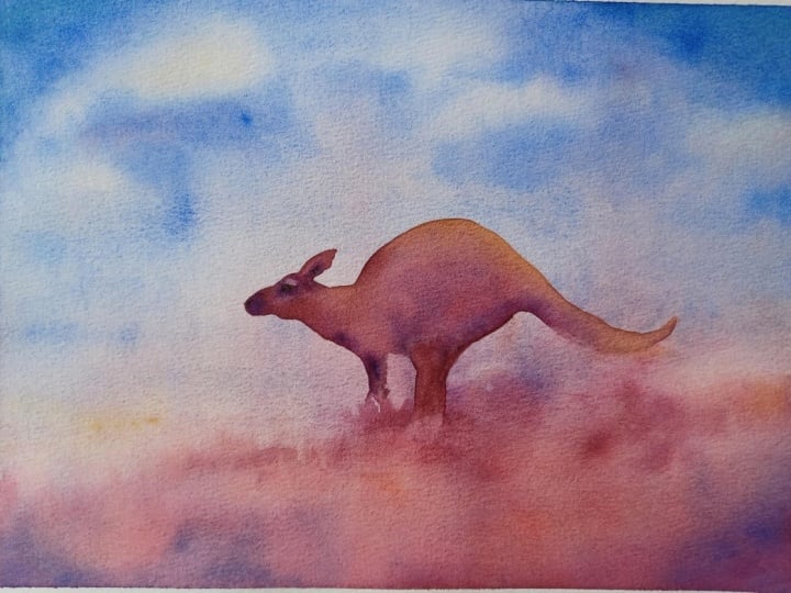
7. Alternate Colour Combinations: Before we move on to
painting the deer, because we've just finished
the background now, I'm going to show you different color combinations you could use or try out if
you wanted to if you didn't want to follow the
main demonstration one. So this one I'm painting
now is a pure Cerlean blue. There's the classic
sky color, really, and then burnt sienna, pure burnt sienna, which
is a classic earth color. So we could use just those
two colors and simplify it, do a similar kind of thing using soft edges a nice
clean transition, creating that feeling of depth. And those are
complementary colors, really, the blue and the orange. And we can experiment again with complimentary
colors on this one. This one's a bit more abstract. We can use a red sky, kind of luminous red sky. Red skies can exist, of course, sunsets sunrises. And then the contrast or complimentary color
of red is green. And of course, we can
have green land as well. Vidian green, which
I've used here is quite an artificial
looking green. It's not like the
same color as grass, but red and green go
quite nicely together. So we could experiment
with that as well. Maybe we could do
a Christmas theme one and put a reindeer rather than the regular doe that we're using in
the demonstration. This one is yellow ochre, a bit like we did with
the main demonstration, but much stronger yellow ochre, using it as the primary
color in the piece, like a really glowing sky. Applying the red again because
warm colors in the sunset usually are at the lower
end towards the horizon. Adding the blue as well. This is like a stronger version to the main demonstration
we're doing at the moment. Something else you might
want to experiment with as well is adding a few clouds. So I'll show you in this small little thumbnail
how that might look. Using a light sky, of course, you can
use any color. Soft clouds are created
whilst wet on wet. Using that muted blue
color for the ground. A bit of purple maybe just
dropping a few random lines in and I allow the water and the pigment to figure
it out itself. So these are just four very
quick demonstrations of different combinations
you could use. But you can pick two or three of your favorite colors and just experiment,
practice washes. Exercise, this class is
just an excuse to practice some very important
techniques you can use in future paintings. This isn't necessarily just to create a masterpiece
out of this scene. It's an excuse to
practice techniques.
8. Starting The Deer: So now the paper is completely dry and we can
start painting the deer. Like we did with a background, I'm using pure water just to wet the area that I'm
going to start painting, and it just gives us
an easier check mark because if we don't pre wet it and we start painting
the head here and the ears, and we feel like we
need a break or we need to think about
something before moving on. It'll create a hard edge, and the pigment will dry
with that hard edge. But if we pre wet it like
this and we start painting, it gives us time to take
a step back because the water continues that
wash without any pigment in, so it creates a
softer transition, and it gives us
time to manipulate the pigment in a way
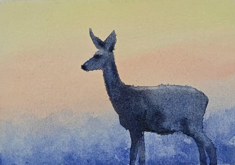
that we want to. So using a tiny
brush just to paint right to the edge because this silhouette is very important. There's not many details
inside this deer at all, but the strength of this exercise is getting the silhouette as
clear as possible. So I'm going to match
the same colors that I used for the
ground, basically. At least I'm going to
keep them cool and blue. And the blue that I'm using is like a muted
ultra marine color, but I'm experimenting with a very strong granulation blue. So the pigments in it, the particles are quite thick. So as it starts to dry, there'll be a lot
of texture in them. And whilst it's wet, I'm
dropping in thicker, darker pigment, where
there may be shadows. Just implying a few shadows, darkness around the eyes, where the ears meet at
the bottom, the nose. Is the closest things to details that I'll
be doing today. A painting like this
is quite interesting because we're not really
relying on any detail at all. If anything, the whole effect depends on how much
information we can remove. There are no individual hairs. There aren't any complicated
facial features, really, we're simplifying the shape
of the ears and adding a few soft drops of pigment
for the eyes and the nose. We're not painting any
trees in the background, although you can add them or experiment with
that if you want, or a few blades of grass or
a few clouds in the sky. If you feel like you
want to do that, this is very adaptable. As it stands at the moment, with the way I'm
demonstrating this painting, there's hardly any environment
being described literally. Just a very kind of abstract, subtle ground that
transitions into the mist, a blue ground as well, not even nth natural with real colors. Yet we still understand
what's happening. Around the simple shapes and the tonal relationships
that are brought together. So I'm extending out
this wash down into the body using that pure
water again as a check mark, as a safety line so that we
can create clean transitions. So yeah, we just take
away the complexity. We see a deer, and we
feel the atmosphere.
9. The Deer's Body: We can already start to
sense that this deer is standing somewhere
misty and quiet. And that's what I hope you
find with your painting, too, and you can see that
fascinating aspect of it. Sometimes we assume that if we want a picture to
become more convincing, we need to add more information. But very often the
opposite is true. We need to decide
which information is essential and remove
everything else. I'm deciding to go
very strong now. I don't mind the deer
being a bit darker as it is the main center of
interest, the focal point. As we come to the legs, we'll have to transition them out into the ground
quite seamlessly. So staying with the body at the moment and trying to
get the tones a bit right, making sure there's
enough water, everything's evenly washed. So as I was saying about
leaving things out, that's a particularly
useful concept with watercolor because the medium is naturally good at digestion. A soft wash can imply that
mist without having to think about painting mist and a faded edge
can imply distance. And that warmth in the background can suggest light coming through
the atmosphere, a glow in the sky,
a glowing sunset. So this painting is
really an exercise in trust in the big shapes in the values and the idea that the viewer can fill
in some of the gaps. It's something worth
practicing sometimes because we want to, of course, push ourselves and tackle more technically strong or technically difficult paintings to improve our
technical ability. But it can actually be very difficult to
leave things alone. There's always that temptation to add one more line or
another bit of texture. And that idea of knowing when to intervene or when to
leave the paint alone and recognizing some of those common habits that
can make watercolor more difficult than it
actually needs to be is something that I've been
thinking about a lot recently. I've put together a
free guide called the ten most common
watercolor mistakes and how to avoid them, where I go into some of these problems into
a bit more depth. Things like overworking,
muddy color, struggling with water control. So if you think that
might be useful, you can download it
completely for free. If you go down to about
this class section, you can see a link there for it. But coming back
to this painting, I think this is a good example of that restraint we
were talking about. There are quite a few areas here that I could
add a bit more, but I actually think leaving
that suggestion is stronger. So we've painted the legs now. I just want to soften
them out a bit.
10. Edge Variety: This exercise is good
practice for edges as well, because we have all three
different types of edges. We have hard, soft
and lost edges, and they're all connected. And I think it's
useful to understand the difference
between them because they can completely change
how a painting feels. So as you can imagine
and probably know, a hard edge is very clear. We can immediately see where one shape ends and
another begins. There's a definite boundary. And because of that, hard edges naturally attract our attention. They feel sharper, closer
and more deliberate. And that's what this silhouette is the main silhouette
of the deer. Then we have a soft edge the
boundary is still there, but it becomes blurred. We can still understand where one shape finishes,
and the other begins, but there's a much gentler
transition between the two. And then we have
a lost edge where that boundary almost
completely disappears. The values and colors on either
side become close enough that we can't clearly tell where one shape ends
and the next begins, and the two areas
almost merge together. And in a misty
painting like this, having that whole range
is really useful. If every part of the deer had
a perfectly hard outline, it would start to
feel like a cutout, just placed on top
of a background. But that could work if we wanted something very graphic
or illustrative. But it wouldn't give
us that feeling of the animal actually sitting
within the atmosphere. At the same time, I
don't want every edge or most of the edges to
be soft or lost either. We need some harder
edges to give the painting structure and definition around the
head and the main body. Then we can gradually
allow other edges to soften lower down where it kind of connects
into the ground around the legs on the
underside of the body. Y. And some of those edges can disappear completely into the mist right
where the feet are. I don't want there to be any clear edge where the feet or legs are on top of the land. I want them to just
smoothly transition. So having the contrast
of those edges, the three different edges is
what makes the atmosphere convincing because the hard
edges give us clarity. The soft edges give
us a transition, and the lost edges give us
mystery and atmosphere. Because the viewer
doesn't need the entire outline to be described. Once we've given them
enough clear information, their mind is perfectly capable
of completing the rest, and it's actually more satisfying for the
viewer to do that. If everything's stated equally, then it can be quite bland. That said, some things have
to be said very clearly, depending on the painting
and the context. But the good thing about
watercolor is that we can really tap into the more suggestive elusive
side of things as well. Also, I want the
emphasis to be on the head as the main focus. So I don't want the feet
to be that jarring. That's why I'm spending a bit of time to soften it up a bit.
11. Finishing Touches: Another important
thing I hope you take away from this class is the idea that value
comes before color. Because with a
painting like this, value is doing far
more work than color. We could probably paint the
whole thing in one pigment, and the idea would still work. You could try that
out yourself, too. Maybe you want to
use Pains gray or ultramarine or just
black. Anything you want. It's quite useful
to remember because it takes some of that pressure
away from color mixing. Of course, we still
want beautiful color in our paintings. We can still have a
soft blue or a violet. But if the values are wrong, all those nice colors won't
actually save the painting. The most important
relationship is that the deer is darker than that surrounding
atmosphere behind it and the land that
it's fading into. If I squinted the painting, all the subtle color disappears. And what remains is a
very simple arrangement. And I still carry that principle forward to my more
complicated compositions, because it still has
to have a simple read, even if there's far
more many elements and techniques involved. That's really the foundation. Because so much of this painting has
basically been wet on wet, we've actually allowed the water to do most of the
painting for us. We've just manipulated where we wanted it to go
and the boundaries. And really, the best
watercolor work is the one that we don't
actually do with the brush. We place a pigment into a wet area and then allow
the water to carry it. It gives it that nice
organic ethereal feeling. If you want, you can tilt the board slightly
a different angle. You can let gravity
move the wash. Sometimes when I paint
personally without the camera, I tilt the board at
different angles. Maybe we can touch one color beside another color and
then just watch them merge. These effects often
look much more natural than if we actually try to paint their transition manually. And the mist is a
perfect subject for letting the water take some of that responsibility because it already knows how
to diffuse itself. Our job is really to just create the right
conditions for it, the right amount of water and pigment strength and the timing, then we can step back
So the last thing to do is to take a bit
of clean water with a small brush and just apply it over where you might
want some highlights. So I'm not using white paint. I'm just using pure water, letting it reactivate
the pigment on the paper less use a
tissue just to scrub it away and it creates a little
subtle highlight there. A soft highlight, too. If we use the white
gouache for that, it would create a
kind of hard edge which we're trying to avoid
for this kind of thing. So we don't want to overdo it. Once we've added
those highlights, we can consider it done.
12. Final Thoughts: Well, welcome back. And
congratulations on completing this class on painting a
misty deer silhouette. In this study, we saw how a single strong shape can
anchor an entire composition, while softness and fading edges provide mystery and depth. The transitional wash brought movement into an
otherwise still scene, and the restrained
color scheme helped preserve its quiet,
dreamlike quality. These principles
can be carried into many future subjects from distant figures and
animals to trees, hills and buildings that
disappear into the fog. Remember, watercolor painting is not just about technical skills, but also about expressing your creativity and
personal style. I encourage you to continue
exploring, experimenting, and pushing your
boundaries to create your own unique
watercolor masterpieces. As we come to the
end of this class, I hope you feel
more confident and comfortable with your
watercolor painting abilities. Practice is key when it comes
to improving your skills. So keep on painting
and experimenting. And if you'd like a
little extra guidance as you continue painting, I've put together a
free guide called the ten most common
watercolor mistakes and how to avoid them. It's full of practical
advice to help you overcome common challenges and feel more confident with
your watercolor. You can download it for free
by joining my newsletter, Will Elliston Studio Notes, where I share painting tips, creative insights,
and inspiration. You'll find the link in the
class description below. I want to express my gratitude for each and every one of you. Your passion for watercolor
painting is so inspiring, and I'm honored to
be your teacher. If you would like feedback on your painting, I'd
love to give it. So please share your painting in the student projects
gallery down below, and I'll be sure to respond. If you prefer, you can
share it on Instagram, tagging me at Will Elliston, as I would love to see it. Skillshare also loves
seeing my students work, so tag them as well
at Skillshare. After putting so
much effort into it, why not share your creation? If you have any questions
or comments about today's class or want any specific advice
related to watercolor, please reach out to me in
the discussion section. If you found this class useful, I'd really appreciate
getting your feedback on it. Reading your reviews
fills my heart with joy and helps me create the best
experience for my students. Lastly, please click
the follow button Utop so you can follow
me on Skillshare. This means that you'll be
the first to know when I launch a new class
or post giveaways. I hope this class leaves
you with curiosity about how far mood and atmosphere
can carry a painting. I look forward to seeing you in a future class until then B
for now and happy painting.
 Will Elliston, Award-Winning Watercolour Artist