Transcripts
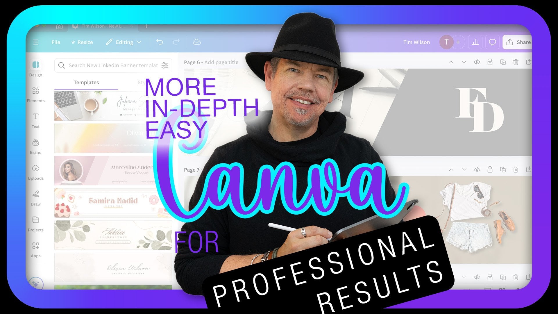
1. Welcome to this Easy Canva for Professional Results Course!: Hi. My name is Tim Wilson. I'm a senior trainer
at Red Rocket Studio, and I would love to
help you to create beautiful and professional
looking work in Canva. Not only have I
trained for some of the world's leading
companies like Adobe, Disney, Times, Nissen. I've also worked
for many years as a lecturer at a university
teaching graphic design. We'll start right
at the beginning, and we'll go through
everything step by step. Now, you won't be left
on your own because I'll be there to
answer your questions. So by the end of it, not only will you have
about 20 or so projects that you can use
and you've created, but you'll also be
a Canva master. I'll be showing you some
pro tips and tricks, as well as design principles to help you create
amazing looking artwork. These are some of the
real world examples we'll be working through
during this course. Social media documents. Flyers documents for screen documents for
professional printing, animated page documents,
Animated posts. Video posts, multimedia
projects Infographics. As well as we'll create a
website and so much more. Start right now. I can't wait
to help you to loan Canva.
2. Get to Know Canva - Intro: Welcome to the first section. In this section, I want to spend the first two
videos looking at the differences between the paid and the free
version of Canva. Now, if you can possibly get the paid for version and you
can get a free trial of it, I'd suggest doing so for this course because there's
a lot of things that we do, which are only available
in the paid version. It's not to say that
you can't do a lot of the stuff in the
free version as well. Of course, if you've already got the paid version and you don't want to
see the differences, go on to the third video, and that's where
we'll start looking at the interface of Canva. So enough of me, let's get straight
on and get started.
3. How to Get Canva: So how do you get Canva? Well, there are two
forms of Canva. There's a paid for version
as the free version. To get the free
versions really easy, you just go to the
Canva website. I'll ask you for an email, and then you go
and get an email. Oh, you go to your email account and they will have
sent you a code. You put the code in and that's
it, you're actually in. Now, in Canva, you
can either use it in a browser like I've got over here or you can download an app, whether it's Windows or a Mac. You can have an app,
and here we go. It's the same thing in an app, and they both look
absolutely identical. So when you first
sign up for Canva, you will probably be
in the free account. You can go and try the P account out for 30
days if you wish. I'm going to start off with the first project done
in the free account, so you can see that most
of the features are there, and then I'll move over to
the Pro account after that. The Pro account, you
can either rent it on a month by month basis or you
can pay for it over a year. If you pay for it over
a year, it saves, probably about 40% of the cost. So where else can you use Canva? Well, you can also use it on an iPad or an Android
device, as well. And it's all pretty much the same wherever you're
actually using it. Now, if you want to pay for it, and you can just go along
here and I'll just say tripro for 30 days in there, and it's going to actually
ask some details. You can say start my
free account in there, and then it will actually start to ask you about payments. Now, you can see mine is set for monthly payments of 13 pounds
because I'm in the UK. It's different depending on
where in the world you are, or you can have a yearly
account in there. Now there are different
kinds of accounts in here. You have sort of the standard
or the free version. You have a paid for
personal version. There's a teams version as
well for multiple people, and then you've got the
enterprise version. They don't give you
a price for that. They just say contact us. So no idea how much
that would be, I think, depends on the
size of the business. Anyway, make sure you've
got Canva on your machine. If you want to use it in
a browser, that's fine. If you want to download the
app, that's fine, as well. It's going to be exactly
the same for both of them.
4. Free vs Paid: As far as the
differences between the paid and the free version goes, there's a few of them. Now, first of all, there is a big difference between the
storage space that you get. So you'll see that on the
free versus paid page. But the other things are that there's a lot of templates
which are paid for. And you can always tell
the paid for ones because they've got this little
crown in the corner. When you first go in here
and you think, Well, there's only don't seem to
be too many paid for ones, there aren't in the
default setting, but the moment you
search for something, there will be, I'm going
to search for cake. In there. You can see we've got some really nice
templates over here, which are the paid for ones. The ones that are not quite
so great are the free ones. So that's for the templates. If I go across now to my
elements and into photos, so I'm just going to go
down here to photos. Once again, I'm just going
to search for cake in there, and you'll see that the better pictures
are the paid for ones. It's the same with video. If I go down to the videos here, we'll search for cake in there, and the better ones
are the paid for ones. Now, if you've got your
own pictures and videos, this won't affect you at all, so don't worry about it. But there are other
things as well. And I'm going to just
go and find a photo. Let's go and get a Oh, I know. I'll use one of these
free pictures over there. So I've got him
and I want to cut him out and get rid
of the background. So we've got a
background remover here, which will just cut him
out really quickly. But once again, that's
a paid for feature. The other things are
when you go to export, if I want to share this
document and if I'm going in and downloading it and
exporting it as a JPEG, it will allow me to do that, but it doesn't give me any options over here for
the size or for the quality. If I go back again, you'll see that if I'm trying
to schedule something, so I can get the different
things I've made to appear on different days or to be post on different
days, you can't do that. Lastly, over here, if I'm downloading this and I wanted to go for
commercial printing, I could actually choose
PDA footprint in there. The crop marks and bleeds are they're available
on the free version. By the way, if I'm talking
about things and you think, What on earth are you
talking about, Tim? Don't worry about it. We're gonna be covering all this as we go through the course. So the thing about
printing, though, is if you're sending workout
for a commercial printer, they usually expect the file
to have a color profile. That's this here of CMYK. And if you go and
try and choose CMYK, once again, it's a
paid for feature. Once again, that's
not the end of the world because you
could send a printer an RGB file and then ask
them to convert it for you, and some of them are really nice and will do it straight away, and others will charge you a
little bit for doing that. Anyway, those are the big
differences between them. You might need some of
those paid for features. You might not. It's
entirely up to you.
6. Getting to Know the Interface: Let's have a look
at the interface. Now, whether you are in
the app or whether you are in the browser version,
it's exactly the same. What we've got is something
which looks like this. And we are in the
home area up here. There's a project area, which will show
any projects that you have been working
on down there. There's a template area, once again, showing
all the templates. There is a brand area you can see there's a
little crown over there, so a lot of the brand stuff
is just for the paid version. And finally, this
apps down here. Now, we're going to be looking
at some of these apps. It's a lot of them, some of them are really quite
cool and useful. But let's go back to
the home area here. Now, when I'm creating a
new project or document, what I can do is I can either click Create a design
button up there, or I can choose one of these
existing ones over here. For example, if I clicked
on social media there, it takes me into creator design. It says social media and I can then choose from
the options in here. But if I click Create
to Design up there, it takes me into
exactly the same thing. So those two are the same, and it just takes me to the
appropriate area that I want. Now, once you get into
this create design, you can then go further
in and you can say, Well, I want to do, for example, a Instagram post square. Or I can go in here and I
can choose from the presets. I'm going to click the
Instagram post square in there, and it then opens up a blank Instagram square
document for me to work on. Now if I change my mind, how do I get rid of this? Well, don't go and
close this down. When I first started with
Canva, I closed that down, thought, why does it keep
closing down down Canva? You need to close down
this little window here, and then you're back
to the home area. So it does open up in
windows like a browser. Anyway, I'm going to go along and choose
one of these again, so I'll choose social
media in there. And if I wanted to use one
of these pre made posts, I can just go and
click on one of those. Now, if it's a paid for one, it'll ask you to upgrade. If you find one, let's do that again without the crown on it. Like that. I'll go straight into that and you can
then start to edit. Now that you're in
the document itself, you can see we're
actually in this Beige White soft document. I've then got tools
or areas down the left hand side and some options running
along the top over here. If I click on Design, it opens up a little window here which shows me things
like templates and styles. I've got some brand styles
that I can work from. Or I can go down to elements. Elements are things
like your photos, your videos, shapes,
those type of things. I can go down to text, and this is all
things about text, putting in text,
adjusting your text. Now, if you do use some of
these areas here and say, for example, I click
on the text in there, it opens up another
little area or tool set over here to
allow me to adjust those. So if I click off
of that, you'll see that that disappears. Moving down, once again, we've got more brand options,
uploads, drawing options. So there's some tools
here you can draw directly onto your project. There's the projects
option and the apps option down there. And then we've got
something called Magic Media at the bottom. We'll talk about that
later in the course. And finally, this
big button here, which is just quick actions. So it just allows you to go into actions that you
might want to use, which might be appropriate
for what you're actually working I'm going to go
back to my elements. If, for example, I
want to find a photo, I've clicked on elements, I've scrolled down to photos, and I can say see all. And then in here, I can search
for the photo that I want. I'm going to say makeup I can
pick the one that I want, and it will appear
on my document. Then to get back again, I go up to the top here
where it says photos, I click on that little arrow, and that takes me back to all of the different elements in there. If I've clicked on the photo, I've now got options along
the top here for the photo. It doesn't really matter
where I am over here. If I click on the item, it shows me options for the
item that I've clicked on. Anyway, do have a
bit of a play with that and make a mess,
add some things in. Don't worry about
it at the moment. Try doing different
bits and pieces, pop them in, see what happens. And then when you want to get
rid of it, up the top here. This little tab, you just
close that tab down and you're back to your home screen
again. Try it out.
7. Create a Social Media Post from a Template - Intro: In this section,
we're going to look at creating a social media post, and we're going to use
an existing template. Now, there are so many of them and even more if you've
got the paid for version. But if you haven't,
it's absolutely fine. You'll be able to do
everything from this section. Now, we're going to
take the template and we're going to
totally redo it. We're going to add
our own text in. We're going to change
the text that's there. We're actually going to
change the pictures as well, and we'll have a look
at the graphics, too. Anyway, you can see on the side this is what
we're going to be creating, so let's jump straight
in and do it.
8. Make a New Document & Add Template: Let's create a social
media post for Instagram. I'm going to go up
here to social media. You can, of course,
click Create a Design. It's exactly the same thing. I'm on the social
media area there, and I'm going to find
an Instagram square over here. There it is. Now, that's given me
my Instagram square. If it's not the right size, you can actually go to resize if you have the
paid for version. But I've made the default
the correct size. Now, what I want
to do is I want to add a template to this, and this whole project
is going to be about a piece of
cake, slice of cake. So it could be for a
restaurant or a coffee shop, and they're giving free cake with every two cups of coffee. So I want to search for some
cake templates in here. I'm just going to do cheesecake. In there. And there's quite
a few nice little templates, and some of them are actually
rather nice and are free. I like this sweet and tangy one. I like the very delicate text
that they've got in there. So I'm just going to click it, and that puts that template
onto my clear background. Now let's have a look at this template and see
what's actually in here. You can see I can click
on the text over there. I can click on
these bits of text. I can also go down and click on this black square and the
text that's in there, that text, which is actually
on a circle over there. So all of these things
can be changed. Anyway, if you'd
like to bring up the same one that
I've got over here, and then we'll go
and adjust this and make this how we
want it to look.
9. Find a Photo & Change Stacking Order: I'd like to change this picture to something with
coffee and cake because that's what mine's is going to be about. So
I'm going to click on it. Press the backspace
button to delete. You can just click
off to deselect it. And I'm going along
to my elements. And in the elements, I'm going to go down to photos, click on SA, and I'm going to
search for coffee and cake. And I found a really
nice free one over here. I'm going to click on that,
and then I can grab a corner and just scale it up
until it fits in. So I'm after a
sort of a piece of cake which looks like that. And you can just about see
the coffee on this side here. Now that I've got that in there, you can see that my black bar at the bottom is actually
underneath the picture. If I do that over there, the black bar is behind it. So with the picture, I'm going to make sure
I've selected it. I'm going to go up to position
up here. Click position. This opens up a position panel and I can then just send
that photo to the back. You'll see if I click on
this send to the back, it goes behind everything and
then this little picture, sorry, this little graphic
appears in front of it. You can change the order of things by just going to position and it
works with anything, by the way, not just pictures. If I move that out a little bit like that,
clicked on the text, click position, and said
send that to the back, you can see it's now
behind the photo. If I said send to the front, it'll bring it right
to the front like so. So I'm just going
to get that into the position that I wanted to
be in something like that. It doesn't matter that it's
sticking out over there. If you grab a corner,
you can pull it in if you want to be a little
bit neater. It's up to you. But have a go, change
the picture and try out that position option of sending things to the back or
bringing them to the front. It will become very
useful later on.
10. Change the Text: I like to move the text
around and change it. So this sweet and tangy, I want this to say
coffee and cake, and I don't want to be
right up the top there. I want it to be down here. So
I'm going to move it down. I'm going to double click on it, which selects it and allows
me to just change the text. So coffee and pisand cake. That fits in rather nicely,
but as you can see, we can't actually read the text because it's so dark
on a dark background. So along the top, remember this little bar that changes depending on
what you click on. We've got an option there
for the text color. I click on that, and in the
solid colors down here, I'm just going to choose white. Now, I've chosen white. Why
is it not changing my text? Well, if I select
some of the text, I can then change individual
characters like that. But if I click off and just make sure I've selected
not the text itself, but the whole box,
then when I do this, it will change all the
text inside there. If you've double clicked
and you're actually in the text and you've selecting
individual characters, or you can see that
little flashing eyebam then when you change it, it's only for the character or characters that are
selected in there. Whereas, if I click
out and just click on the frame and do
it from the frame. So there's no little
flashing ibam in there, then it will change all of
those characters as well. Let me move this a
taste cake taste of. Let me change that over there to a little bit of
slightly different text. I'm going to select that and say free cake with two coffee. Now, it's gone onto two lines, but let's have a look
what happens when I click off over there, it puts it onto
that circle again. So when you're editing, it
goes back to a linear shape. I'm going to move that up
just a little bit over there, and I'm going to
change the color of that also to white as well. These bits of text, I'm going to obviously adjust them as well. But have a look as I'm
moving them around, can you see the little
dotted line that appears? Have a look there.
When I do that, a little dotted line
appears in there. I do that, and it
just jumps around. What this is doing is
show me what things are lined up with other things. If I move that closer, you can see that topet of
text is now lined with that. So moving things
around just helps you with those dots
to align items. Now, I need to change some of this text around a bit. There's
a little line over there. I'm going to move that
up. Over to there. The price I don't
want, so I'm going to delete that or you can click on little bin like that. This is very, very
small this text, so I'm going to double click
it. I'm going to change it. It just says, each bite offers creamy richness over there and I'm going to delete
the rest of that text. And make it slightly bigger. I'm going to select the text by clicking on it a few times
until it's selected. I can go in here and
just adjust the text. Let's have creamy on
that second line. I need to move some of
these things around. This will move up, and I'll
grab that and move that down a bit or I could put it
between the two of them. But I'm just watching the left
hand side for the lining, for the dots to make
sure that everything is lined up. Don't
want that at the top. Like so. Anyway, I'm going to change the
color of this text in a moment and adjust
the text a bit, so you don't have to
copy my text exactly. We will be changing it as we go. I just want to show you
how to edit the text, move it around and
change the color. Have a go with yours and
have a play with the text.
11. Color from Photos & Letter Spacing: I've changed my text
around just a little bit, removed some words,
changed them about a bit. You can have anything
in there that you like. But let's have a look at
a bit more in the color. I'm going to go to this
bar along the bottom, this black shape that
we've got down here. And I want to change
the color of that. So I'm going to select it. I'm going to go up to
the top and once again, this little interactive bar is now showing options
for the shape. I'm going to click on color. But this is really cool.
Have a look over here. This actually shows me
colors from the photo. So I can go and say,
well, actually, I wonder what it'll look
like if I use that color, which probably comes from the
cup or something like that. Or how about that
one over there? Would that work?
Would it look better? I kind of quite like
that color there, but we'll try out that one. Mm. That's rather nice. I'm going to go with
the blue, though, so it helps to balance the
whole picture up because we've got blue up there and we'll
put some blue at the bottom. And you can do that
with anything. So for example, here, I can go along to the
cheesecake at the top. And once again, I go to
the colors over there, and I could pick a color from the document somewhere in there. Now, the second thing I
want to do is to change the text a little bit in here. You can see with the text, my characters are
quite close together. The coffee and cake. All those characters are
really, really close. Now, that might be an
effect that you want. But if you want to change that, go along to the top. These are the options for the text and find this
little button here, it's called spacing, and it's got an arrow that
goes up and down. If you click on that, it allows you to change the line spacing. Well, we've only
got one line there, so this is actually not
going to really do anything. But we can change the letter
spacing which will and I can move the letters closer
together or further apart. I'm going to go back
to this bit of text here and once again up to that and just change
the spacing on that so it looks a
little bit better. There. Do have a bit of a go with those
two options there, changing the color and getting text getting color
from the picture, and if you go to your text using this little
spacing option to change the spacing or the letter spacing on your text as well. If you find it doesn't
go as far as you want, just pull out the little box
that the text is in like so, and then you'll find that
you can actually get it to go further as well. I'm looking at mine and
thinking I'm lining it up with that bit of text over
there. To try it out.
12. Copy Shape & Add Graphic: Let's have a look at a
few little graphics. Now, first of all, we've got
a square graphic down here, and I'd like another little
square to go across the top. The easiest way if you've got something and you
want to copy it is to hold down the Alt
or the option key. A option is usually a MAC key, and the altar is the
same thing on a PC, and you just drag the
shape so I can just drag a copy of that
right up to the top. In there. And I'm going to
make that right to the top, so it's going to be
quite small over there just to help
frame the picture. Now the second thing
I want is I want a little logo of a
coffee cup in here. I'm going to go from my photos, I'm going to click the
little back button, and I'm going to go
down to Graphics, click on CAL, and I'm going
to search for coffee. And once again, you
can see there's some really nice ones
which are paid for, but there's also rather
nice one over here, which is free. I'll
click on that. It brings the graphic in, and I'm going to scale it down, so I want to be a lot
smaller. Maybe like that. I'm going to put it just above
that bit of text in there, and then I can change the
color because up here, we've got the options for
editing that little shape. So I'll click on color there, and I'm just going
to choose white, certain matches,
everything else in there. I might even make
it a little bit smaller and just pop
that in the center. You can see how
those helper lines are showing me exactly where the center of the document is. In fact, I need to
move that over, so that's in the center as well, because it wasn't
quite centered. In there. Do try that out. So remember if you want
to copy something, hold down the Alt
or the option key, and you can just
drag it like that. You can also use Command C to copy or
Control C if you're on a PC and Command or Control V to paste to paste in copies. But honestly, the lt
or the option key is much, much faster. Have a little bit of
a go with that one. If you want to take this one and change the color, remember, click on the color, and
you can take colors from the document itself
or from elsewhere. I might even go with actually, I'll go back with the blue. I like it like that. It's up to you how you want to do yours, though. Try it out.
13. Check Size & Download as a JPG File: Before we export
this out as a JPEG, what we need to do is
we need to have a look at this and see how it'll work on devices because it's all very well to look at
something quite large like this, but how would it look
when somebody's looking at it on quite a small phone? So I'm just going to go
down here to where it says, page one of one
and a percentage, and this will allow me to zoom
in and out of my document. I'm just going to zoom it
down like so to think, well, if it's on a small phone, it might be about that size. Can I read everything in
there? And the answer is no. This pata I definitely
cannot read, and that there is quite
difficult to read. We can just about get away with the free cakes with
coffee because people's, you know, they were just about
to be able to read that. So with that in mind, I might need to go back
again and actually just adjust the size on
some of these items. So over here, we'll just make the address a little
bit larger in there. The visit us could be
a bit bigger, as well. Although, to be honest,
we don't need visit us. We just need the
address in there. I'll just pop that
in the center. Now, when you're
moving things around, you can either use your cursor or you can just
if it's selected, use the up and down
arrows left and right arrows on your keyboard
to move things about. I am also going to
select these and make them a bit bigger. So
I'm going to click on one. I'm going to hold down the
Shift key on the keyboard to select the second one and click
on the third one as well. I can go to the corner and
I can then just pull them out like that to scale them
up all at the same time. I think that should be readable, even if it's quite small. Yeah, people can read that. So do bear that in mind, especially if
people are flicking through different social
media posts very fast. If there's something which
is really important, make sure it's readable quickly. Now, we're going
to save this out or we're going to export it, shall I say, we're going
to do that as a JPEG. We go to the Share button, the top right hand corner, click that, and I'm going
to download this over here. There are some other options. For example, we can take
things directly to Instagram. I just want to download it as a JPEG file so I can
upload it when I want. Click on Download, and in here, I'm going to choose
JPEG at the top. All I need to do now is
to click on Download in there and it will
download it to my machine. Now, you can see we've got all this stuff about
scheduling your posts, but that's only available once you've got the
paid for version. It's going to be called
Coffee and Cake. I'm putting it onto my desktop. You can place it
wherever you like. It's a JPEG file.
I'll click on Save. And now I've got that on my
desktop somewhere over here. Uh, coffee and
cake. There it is. I'll just preview it, and there it is
ready to be uploaded to Instagram. Have
a go with that. Once you've finished this one, try it again with some
different subjects. Find something which is
close to your heart. Obviously, as you can see, cake is pretty close to my heart. But, um, do whatever
appeals to you cats, dogs, cakes, mountain climbing,
whatever. Try it out.
14. Instagram Story - Intro: In this section, we're going to take an existing template, and we're going to redo it, and we're going to
be adding video. Now, of course, we'll
change the text, we'll change
everything about it, so you won't even recognize it. And you can use
the free version, you can use the
paid for version. It'll be pretty much the same. Anyway, as you can see, this is what we're
creating and it's going to be awesome. Let's get going.
15. Find & Explore Template: For this particular project, I've gone over to the paid
for version of Canva, but you can still
use the free one. You just might not
have access to the same templates and the videos and pictures
that I'm using. But you can find some free ones. What I'm going to
do is I'm going to go over to social media because I want to create
an Instagram story, and we're going to add
some video to this. So I'm going to
Instagram story here. I'll click on that, and this
then opens up my project. Now, what I'm going to do is I'm going to find a template, and I have been
searching for templates, so you didn't have to watch
me doing it all the time. I found a really nice template under boat rental,
believe it or not. Now, we're not going to
create or I'm not going to create a Instagram story
about boat rental. I want to do one
about dune buggies. So you don't have to use the same subject
that they give you. You've just got to find one
that looks really good. Of course, for you, you could
do any subject you like. Once again, cakes, cats
or climbing mountains. Anything you want,
it's up to you. But I'm going to start off
with this boat rental. I'm just going to click
on there and bring it in. Now what we have here are photos which are in
little shapes in there. There's one there, one there.
I can move them around. There's this one over
here, which is in that shape at the top. We've got some text over
here. We've got a button. We don't want buttons, so
I'm actually going to delete that little button over there. We'll talk about buttons
and things later. And we've got some
shapes over here. There's this shape and
that shape in there. So I'm going to bring in my pictures and my video into here because
although this is stills, I want to actually have a
video in the background, and I want these two to actually be stills or
photographs in there. I'm going to change that logo. I don't like that logo, so
I'm going to change that. Let's delete that and bring
in my own logo in there. You know, if you'd like
to get up to this stage, find a template that you like the look of doesn't have to
be the same one as mine, but just a template where you've got maybe some
pictures which are in shapes in there so that
I can show you how easy it is to change
them. Have a go.
16. Working With Photos And Video in Shapes: These pictures here are just normal photos
inside a shape. And if I click on them, I can press backspace
or delete on the keyboard to just
get rid of the picture, and there's my little
shape over there. Let me do that again with
this one, backspace. To remove the picture, and I'll do the same
with this one over here. Click on it, backspace, and that gets rid of
the picture from there. Now, let me go and find
some images to go in here. I'm going to go along
to the elements, and I'm going to
go along and I'm going to search for Buggy. And what I want to
do is I want to go to the photos over there. This is a great one, so I'm going to just drag that across. But you can see it
doesn't go into any of those unless you click on it and move over and then
it pops it straight in. It just drops it in like
that. Let's do that again. This looks like a great picture. Let's pull that over to there. Oops, let's try that again. Pull it over to there, and I can drag and drop it
straight into there. Now, if I click on it, I
can then also go and grab the corner and size the whole thing around
if it's not right. If you go in and
you double click, then you can actually
size the picture inside the frame like so. So with this one here, if I double click it, I can go in and I can adjust
where the picture is. We want a little bit more of
the buggy like so, I think. Well, actually, it's
going to go over the edge, so we'll do that. And then just click
out to get out of it. Now, what about video? Well, it's exactly
the same thing. I'm just going to go to videos
and show all the videos, and let's find a little
video over here. That looks like an
interesting one with the buggies on the dune. All I have to do is
to drag and drop it. You can see as I move over it, drop it straight into
that frame like. Let's play that and
have a look it really is as simple as that
to get pictures and video into the shapes. I'll stop there, try it out.
17. Add Your Own Frame: What about if you
don't have any shapes? How do you get the
shapes in there? Well, I'm going to get rid of
this little one over here. We'll delete that and I'm going to delete again
to delete the shape. What you can do is if
you go to your elements, you can go down or scroll up, shall I say, until you get
to frames. Over there. Let's just say see all frames, and there's all sorts of
different frame sizes and shapes in here. We can just take something. Let's get a really weird
one at the moment. I'll just take that
little one in there. Drop that in, you can see it's got the same background
that we had before. So now if I go back to
my pictures or my video, I'll just go back again
over here to the video. I can drag that in,
and you can see I can then drop it into that
little shape over there, and it will just play. Let me just undo that again
and get rid of that video. So what about the colors
around the outside? Well, we can do that up here because you've
got a border style. I'm going to put on a border
and just increase the width. You can see how it's actually changing the shape in there and just adding
some width to that. And I can click on there and pick a color if I wish as well. And that's how those
circles are done. Let me get rid of
that one over there. In fact, I'm going to undo this, so it's either Control Z or if you're on a
PC or Command Z to undo and I can just keep undoing until I get all the
way back to my picture. But if you'd like to have a
go with some other shapes if you don't have any on there, or if you want to
put in another shape for video or pictures, by all means, do so.
18. Trim Video: Let's adjust this
video a little bit. I'm going to double click it, and that takes me into this
area where I can crop it, or I can resize it. I'm going to pull this out a bit like that and maybe
move it up so the buggies are going to be bigger in the video. Over there. Now, when I click Done, you can see at the top here, we've actually got a
little timeline which is showing us what's
happening in there. Now, I don't want the whole
of the video in here. I just want part of the video. So right at the beginning, I'm not that interested in here. I'm not really seeing very much, so I'm going to stop
it there and I'm going to move the beginning
up to that point. It's going to start
there where this buggy is coming along in there. I'm going to then play
on. I like those two. And I'm going to
stop it over there. And once again, I'll just pull that back to
about that position. So all we've done is crop
this down to 10 seconds. I think it was about 30
seconds before that. And you can just choose
done, and that's it. If I now play this video, it will just play that cropped version where the buggies
are a lot bigger in there. I can still at any time, click on there and resize it. Now, remember, if you click
and you resize over there, it's resizing the
shape on the outside. So make sure that
you deselect it, and when you click, if you don't see
anything else over here about the shapes,
just click again. So that's it. I can then pull those up, maybe make them a little
bit bigger in there. That looks a lot better with
those buggies coming in. I might have to move it
across a little bit, so we'll double click
on there, move it over. And let's see how that
works from the beginning. Oh, that's pretty good. I like where those positions or the buggies are positioned. Do try that out. So remember, if you click twice or
double click over there, you can get into this area. Once you click Done, you can actually get into the trim area here and you can trim your video to any sort of length
that you want. Click Done to come back again. And remember, you can
always just double click, resize, move it around in there. Double click to get
out of it. Have a go.
19. Change Colors: I'd like to change
some of the colors, and I want to start with
the background color. So I'm going to click
on the background, go up here and just
choose a color. Now I'd like a color
from my photos. So I think something like
that works quite well. And then I'm going to go
along to the shape over here, and it's got a stroke. The stroke or the border
color is that one there. So I'm going to click on that, and I'm going to choose a color. I'll use a bright
yellow for that. Now that I've done that, it comes up down here
with a little button. It's only once you've
changed it, and it says, Do you want to change all of those shapes that have got the same color there to yellow? And I'll say, I'll change
all and it changes that, and we've got the yellow
down here changed too. A really nice, quick and easy way of adjusting your colors. You can experiment with
some of the other shapes. I'll go to this shape over here. Once again, click on
the color at the top and see if that works
with a different color, kind of quite like that.
And this one as well. The white just
doesn't do it for me, so I'm going to go over here and pick a different color for that. Let's have a bit
of red to just get a bit of something more
interesting in there. Anyway, once again, have a bit of a go,
change your colors.
20. Change Text: Now this next bit
is really easy. I'm just going to go
and sort out my text. Get rid of that
bit of text there. This one here, this is going
to be called une Buggy. This bit of text over here is going to say whatever
I wanted to say. In my case, it's
going to be noisy, dirty, um, noisy, dirty,
whatever, fun fast. Let's try that again. Fast fun. I'm going to change the size
of that by going to the top and just increasing
the size of that text. That looks okay,
and we'll move that down a little bit to there. Maybe move this
one down as well. And then, of course,
we can update those to our appropriate
phone number. Lastly, I want a little
graphic of a dune buggy here, so I'm going to go once
again back to my elements. I'm going to search for Buggy. And I'm going to go to graphics, and then we can find a little buggy in here that will work. I think I'll use that little
one there. Bring it in. And, of course, I can always go and change
the color over here. Yellow. No, that
doesn't really work. Let's go with a white on that. So we'll make that a
little bit smaller, but it will still sit maybe
on top of the text, like so.
21. Download to Video: Let's save this out as a video. So I'm going to go up to share. I'm going down over here to download because I don't
want to upload it yet, so I'm just going
to download it. And you can see it
actually suggests me doing this as an MP for video, which I'm going to choose. Now, in here, we can choose
different qualities. You'll find that if you
are on the free version, you can't always get
to these settings, it's a little crown over there. So I can go with 1080 P. Or I can go with four
K, which is higher. Mostly for social media, ten ATP is absolutely perfect. If you find your
files are too large, maybe they're just taking
too long to upload, you could try 720, but ten ATP will
be perfect for it. I'm just going to click
on Download over here and it's downloading it to
my Downloads folder. Might take a moment to do because there's video in there and it's got
to render it out. As you can see, I've got my dune buggy Save As options here. I'm going to put
this onto my desktop so it's easy for
me to show it to you and it's going to
be an MP four file. Let's click on Save
and that's done. Now, let's have a little
bit of a look at it. I'm going to go over
here to my movies. I'm going to find it and
double click and here it is. The whole thing is playing. That's it. As easy as that. Have a bit of a go and download something. And if you want to upload to
your social media account, by all means, do so.
22. Simple Video Advert - Intro: Let's take some video
and put them together. So we're going to
have four videos, and we're going to put
them together in pages. You'll see how that
works as we go along. We're going to put some text in, and we're going to
make once again a social media video post
out of this. Let's start.
23. Make a Custom Video Size: Let's make a custom
video size advert. Now, I'm going to go along to video, click on Video there. What I'd like to do is rather than use these sizes
that they give you, I'm actually going to
go down to custom size, and then I can put in my width
and height for my advert. Now, if this is for an advert, they've probably told
you exactly what size you want or they want. I'm going to go with a width of 1080 and a height of 2,600. You can do any size you like.
It really doesn't matter. I'm just making
this thin and tall. And the units are
going to be in pixels. I'm going to click on Create New design in there and
you'll see I've got a nice thin advert like so. And then we're going
to go to our elements, and we're going to go
and find some videos. So I'm going to do cats. You can do dogs, squirrels, raccoons, anything you like. It really doesn't matter at all. Just pick a subject
that you like. And I'm going to do cats, as I said, I'm going
over to videos. Now I can either go
to videos there or I can click the videos
button at the top. It's all the same thing. What I'm doing is
I'm just looking for a few videos that I can put together. I
like this one here. I want some light
videos because I want to put some
text on the outside. I'm going to start off
with that one over there. I'm going to well, actually, it looks like it's on its side, so I'm going to rotate it round. There we go. That's a
bit better over there. I'm going to make it the
size that I want it. I'll just scale this
up a little bit. Like so. Now, I'm leaving this top section
free because I want to put some text
on this as well. There's my first page. What I'm going to do now is to add another page in so I'll just say add page in there and
it comes out below it. Now, this can be a bit annoying when you find that you've got one video there and
one video there. It's nicer to see them
all on the same timeline. But what I'm going
to do is I'm just going to bin that one in there. I'm going to stop so you can
catch up to this point here, and I'll show you how
we can get them onto the same timeline to bring
in the other videos. While you're there,
have a look at some other videos you
might want to use. We want four of them together.
24. Add More Videos: If you can't see
the duration button at the bottom over here, you might be in the
new beta editing area. Now, to find out
what's going on, you can go to the Canva
menu over here in settings, slightly different on PC, but you're looking for
settings in there, and you're looking
for your profile. And if you scroll down, what you'll see is the
video editing says use new multi track video editor
Beta. Switch that off. Now, let's go back
into here and you can see the duration
button has appeared. Occasionally, I found that you actually need to start
another document again before it will
actually appear in there. Now, as I said, if you add a
page, it comes in below it. But if we go along
here to the bottom, we can click on the
thumbnail view, and that shows us the
pages next to each other. But we also want to see how long these videos
are going to be. I'm going to click the
duration button down here. That takes us into
this timeline. When we play the video, you'll see the timeline
going along like so. Watch out which of
these areas you're in, and you might need to
click the buttons there, you might need to
click duration. If you click duration again,
it'll go back to there. I just go back and forth
between these various views. So now I want to add
in some more video. I click on the little plus here. It adds in a page
on this timeline, and I can then go and find
my next piece of video. And I'm just going to use
this little cat over here. So let's just pull that
up. A little bit like so. Now, this is getting
very, very long. We've got 8 seconds
for the first one, 10 seconds over there. And I want this to be
really quite short. So maybe just three
or 4 seconds per cat. So I'm going to pull this in over there, and let's
have a little look. At how that plays. Oh, no, that's the second one. Well, let's look at that anyway. So I want to looking
up towards its owner. So I'm going to
pull this bid into there and that bid
across to there. And I'm going to
go with, I think, 3 seconds on that. And the same with this one, I'm going to pull that back
to about 3 seconds in there. So if we play this now, we'll get 3 seconds of that. And 3 seconds of that. And then continue on
over here as well. So go and find another cat. Here we go. We got
another one over there, so I will just make a new
page, drag this one in. And once again, I'm
going to take that down. I'm just looking to see
what sort of area of this cat I want There we go. I want that a little bit, where it's looking
at the camera, so I will pull that in and
make that 3 seconds as well. We'll have a last
one in here as well. I won't get you
to watch me doing it because you know how
to do that already, so I will just add another page, add the video in for that. Have a little bit of a go with that and don't
forget the duration. And this little button down
here, the scroll view, you can go between
scroll view and thumbnail view in there
and have your duration on.
25. Font Combinations: I've put in my last video and
I've made it a lot longer. I've made that 6 seconds. So those are three, and
this is six in here, because the last one
is going to have the main product in it. So let's go and get some text. I'm going to go to
the first page here. You just click on the pages to jump to that particular page. I'm going to go to text, and I want to find some
text for this advert. Now, this advert is
all about cat food, so I'm going to just
put in food in there, we've actually got quite a
nice little one over here, the new menu for foodies. I'm going to use
that. I'll click on there and pop it in here. Now, of course, what I want
to do is to change that text. When you have text like this, which comes from these font combinations, it's
grouped together. You just choose ungroup
to group it into the various types
that we've got. I'm going to just zoom in
a little bit over here, and I want each page to have a slightly separate
bit of text on it. So I think I'll use words, whatever the type,
whatever the color of cat, whatever the age of the cat. So I'm going to have whatever and let's have type in here. Whatever type of cat. That's the first one. Now, I'm just going to take
these ones here, copy them, so it's either Control and C or
Command and C to copy. And then I'm going
to go across to the second page over
there and once again, control and V or Command and V. The control is if
you're on a PC and the command is if you're
on a Mac in there. You can see I can just paste
it straight in over there. So let's have color. And once again, I'll
go to the third one. I'm going to paste
that one in as well. Command Va for Mac, Control V on the
PC, whatever age. So I'm just going to zoom
out a little bit over here so we can see
those in there. Move back to the beginning and just play that get
3 seconds of that, whatever type, whatever
color, and whatever age. And then the last one, I'm then going to have the
final bit of text in there. But if you go to these types of texts that you
use the font combinations, and you'd realize,
actually, you know what? I don't want that offcaT. You can just delete
them individually. As long as you've
ungrouped them, you can get rid of
any of those bits and edit them as you like. I'll stop there so you can get some text on those three pages, and then we'll come and
we'll do this last page and we'll save this out
ready for uploading.
26. Final Text & Download: I'm going to bring in
the font combination again over here
for my last page, and I'm going to change
it a little bit. I'm going to ungroup
it. I want to zoom in, so I'll use this little
Zoom button there. I'm going to change the new over there in the
menu, click onto that. Double click it to
select the text, and this is going to
say real in there. I want that to be a
lighter color or white. Now, if I go up here, there's some really
interesting sort of colors in the cat's eyes. So I'm going to go to
my text color in there, because this is sort
of a yellowish green, I'm going to just
try out a yellow and see how that works on there. I might even try green. No, I like the
yellow over there. I'm going to do the
menu over here. I'm going to make that white, and actually it's not going to say menu, it's
going to say meat. And this one here is going
to say for foodie cats. And I'm going to select that, and I'll probably go
with the same yellow again over there. Get your last piece of text in. So let's download this. Go to share. Download. We're going to choose
an MP four video. That's the size that
we originally made it. And all I have to do
now is to download. Now, it's popped up, so I can just go along to desktop or save it
wherever you want. I'm calling mine whatever. And I'll click on Save and let's go and
have a look at that. Here it is. We'll
play it through. And there we go till finally
the cat just looks at us. Yours might be totally
different, as I said, different subjects,
but have a bit of a go and put together
some videos like that.
27. Make a Flyer - Intro: Let's start on this
amazing flyer. Now, as you can see, we've got a number of different
pictures in there. We're going to create an
interesting background by montaging pictures together. We're also going to add a
cutout picture in the front. Now, if you don't have the paid for version, you won't
be able to cut it out. But there are websites that you can find that
will cut out images for you or you can find an
image which is pre cut, or you could just use a
smaller image as well. But we're going to
be adding text, text effects, all
sorts of cool things. Anyway, let's get started.
28. Add Photo & Cutout plus Filters: I'm going to go across to
the print option over here, and this takes me
to print products, and then I can choose from the different pre made
sizes in here. I'm going to introduce flyer, which is going to be an A four. So, of course, if
you're printing this on the office printer
or a home printer, A four is just perfect. And of course, you might want to be emailing it to round people and they print it on their home printers or office printers, as well. I'm going
to click on that. And I'm then going to go along, and I'm going to do
all the bits myself. So I'm not going to start off
with one of the templates. I'm just going to jump
straight in to the elements. Now as you've seen
from the intro video, mine is all about a poster for a guitar fest
over a weekend. What I'm going to
do is I'm going to start off with an image for the background and then add
a few more images on that. We're going to be
looking at some cutouts over here, chopping images out. Now, when you start to
select your images, if you're on the free version, you won't be able to use
the cutout tool or option, so choose your images very, very carefully because you
won't be able to cut them out. I'm going to pop in
here and I'm going to look for grunge backgrounds. Now, of course, if you
don't want to do a guitar, grungy background
type of picture, feel free to do any
subject you like. The principles are all the
same no matter what you do. I'm going to go to my photos and I'm going to find
something in here. I really like this
grungy one over there, and I'm going to
rotate it round, so I'm going to just
click over there, rotate it round into
the right position, and let's just pop it up there
and move it down to here. I think that's
probably about right. Now, the next I want to
do is I want to bring in some shadow shapes, which will be guitarists
for the background. So I'm going to go to graphics, and I'm going to put
in guitarist in here. Now, I've got a few different
guitarists in here. I want some sort of
action type shots. I'm going to take
that one. I'm going to make it a lot bigger. You're not going to see Well, it's going to be
difficult to see this. You're just going to
see bits and pieces. I'm going to go up to the top
and I'm going to click on color and then I'm going to
change the color of this. Now, we've got
white there, black. That doesn't look
too bad at all, but of course, I'm going to
change the transparency. So with this, I'll go up to the transparency
option and just reduce the transparency a little
bit so we get the feeling of the guitarist although we're not getting every single detail. Let's go and do
another one. So I'm going to go and find a
different guitarist. There we go. We got a
really cool one there. Once again, I'm going
to bring that in, like so, and exactly the same. Well, it's black already,
so I'm just going to change the transparency
down a bit. So we're getting these guitarist shapes in the background. You can do them sort
of different sizes. You can do them at
different opacities, as well if you like, I just want the head and a
bit of the guitar in there. And now I want to go and find the guitarist who's
going to be the front most or the
important person in here. So I'm going to go to photos, and what I'm looking
for is a guitarist that I can cut out reasonably easily. Some of them are easier
to cut out than others. Something like this where you've got a rig dark image in there, doesn't always cut out
soap so perfectly. I did try this one earlier, and it cut out really well except for a little
bit by his leg. I'm going to click on this
one with a blue background. I'm going to make the
size a little bit bigger, like so, something
along that line. And I'm going to
click the BG remover. And what that does is it
just cuts out the image, and it does a really,
really good job. If you want to, though, do a little bit more yourself, if you find that it's cut
out too much or not enough, if you go to where
it says BG remover, and click it, it
will allow you to use some tools in here
to either erase or add. For example, if I
click on Restore, I could actually restore
those bits over there. If I choose erase, I can erase those
bits in there and you can change the brush
size to anything that you want. Over there. Now, of course, I
don't want to do that, so I'm going to use Command
Z or Control Z to just undo those cause I was quite
happy with the way that it was. Let's
click over there. Now, when you go in there
to the background remover and start messing around,
I've noticed this before. Sometimes it doesn't always
update with what you've done. So to get around that, I'm going to undo that, get
rid of it, bring it in again. There. Let's just resize it. And use the BG remover
straight on there. Now, the next I want to
do is because, well, the guitarist looks
a little bit too, it doesn't look grungy enough, I think, if there's
such a thing. So I'm going to go to Edit
up here next to BG remover. Click on Edit, and this gives me all sorts of ways that
I can edit the image. Click on filters, and you
can see if I choose some of these colors you can see how it's affecting
the color in there. We get different variations. The one that I'm
actually interested in some of these ones down here, the black and white versions or some of the color pops in there, which do look quite
cool on there. I think I'm going to go with a black and white
version over there. Let's try the black
and white ink. And then I could just
change the transparency on that so we can
get the feeling of the guitarist
coming through there, but with slightly less opacity. And, you know, once
you've done that, experiment with different
options in here. Uh, let's try the
color pop again. Poster. That's not bad. That poster there looks
really quite good. In fact, I'm going
to go with that one. I will stop there because I've done quite a
few things in here. So first of all, bring
in a background. Bring in some graphics in there and reduce
the opacity on them. Finally, bring in your
main hero subject, and once you brought it in, use the BG remover if you're
on the paid for version, and then you can click on Edit
after that and you can go in and you can change and effect some of these
filters in there. If you want to try
out the other ones, go along and have
a look at Blur. Have a look at the
duotone option. There's tons of
duotones in here. Let's do a purple one, mustard. Sepia. The Sepia one actually
works quite well, as well. I might keep it on on that. Have a play. Whatever
your subject is, just try it out.
29. Add Text: I let's go and add some text. I'm going to go along to
the text tool over here, and all I'm going
to do is to put in some text straight
onto the image. So I'm going to say, add a text box, that's
that button over there, and put in my image. So this is going to be
called crazy shred. I'll just do the
word crazy in there. And let's pull that up to
make it a little bit larger. I want to change
the font in here. Fonts are often
called typefaces, as well, but let's
go with the font. And up the top here, I can then change to
a different font. I'm looking for
something which is fairly heavy duty, like that. But you've got so
many different fonts in here that you can try out, just lose yourself for an
afternoon looking for fonts. Now, what's an interesting one. Hm, that is kind of a
little bit wacky, isn't it? Anyway, I'm going
to just go back to the one I had a moment ago, which was this heavy duty one. And I'm going to
rotate this around. So I'm going to have the text
going vertically, like so. It's just pull that
around over to there. And this needs to be
a little bit larger. So we just pull out
the ends over there. You'll notice I've kind of
gone over the edge there. I'm not too worried about that. And I think I'm going to
move that over to there, it's going to say crazy on one side and shred on the other. To make a copy of this, I'm going to hold down the
option key or the old key, move it across to
there, double click it, and then change the text. Now, the shred has got
five letters in it. Crazy has got five letters, and I want to move shred so it kind of goes
from edge to edge as well, and I'm going to select it. And then just change the size
a little bit. Over here. This is kind of
slightly cheating, but let's pull that up a bit so they're
all go on one line. But you probably won't notice it because it's all going to be in the background. Right. Now, I've got those
two over here. I would like them to be kind of quite light so you
can't see them. They're not taking over everything as they
are at the moment. So I'm going to
select both of them, so I'll click on one, hold down the Shift key, and
select the other one. Go up to the color in here, and I'm going to use the
color from the photo itself. I wouldn't bother to use it from here because we're
not using that color. We're just using the background
color at the moment. And then I'll change
the opacity on those or the
transparency as well. But I'd like the guitarist, the hero of my poster to come through and
be in front of those. So I'm going to make
sure I select him. And as you can see,
if I click and move, he's sitting behind
those bits of text. I'm going to go along to
the position up here, click position, and
then over here, I'm going to say move
him to the front, and that'll move him right in front of those bits
of text in there. Do you have a bit of a go
with that? Get some sort of text going on
in the background. Your background text,
move it around. I'm just putting
mine on the edges. You can place it
wherever you want, but then move your
hero object in front of the text to get a
really interesting look. The amount that you
actually change the opacity on that text, it just depends on how
you feel about it. You can make it as
much or as little as you wish. Try it out.
30. Add Text Effects: Let's put some more text in. I'm going to go and add another textbox over here and once again, do
the same thing. Crazy. And I'm then going to make that a bit
larger over here. You can change the
typeface at this stage, if you wished, and I'm going
to make a copy of that, select it and say shred So these two here really should
be a wild color. So I'm going to
select them both. So I've selected one and held down the shift key to
select the other one. I'm just going to go down
here to the colors and find something totally
really wild and wacky. And I also want to put some sort of effect
on here, as well, because it's still a
little bit boring, and I want this to be
really in your face wild. So I've got those two selected, and I'm going to go along and find some effects for the text. Now, if you scroll
up and down here, what you see are pre made text, and all of those have got
different effects on them. There's one here
called Tech glitch, which actually looks
quite interesting. I'd like something like that. I'm going to go up to the
effects at the top here, click effects, and this is where we have different
things that we can put on. I've got these different
styles that I can apply or we can apply them to shapes.
We'll do that later on. I'm going to choose
this glitch effect, and I'm going to
offset it quite a lot and just angle it
around a little bit. Like that. So we get
that really weird, weird and wonderful effect. This of two colors that you
can choose to work from. I think that one looks
completely benign. Now, let's look at
other effects as well. If I select them both, go to effects in there, we've got things like this lift. This lift is actually just a little drop shadow
you could put on instead, and it just helps you lift
that text further up. I'm actually going to use
Command and Z undo that, just go that wild effect. But I'd say that
that is probably one of my most used
effects in there where you can just lift
the text away from the background with a
very subtle drop shadow. Have a bit of a go with
that, get your text in. Once you've done that, I'm going to make another
copy of this again, select the text and put in
the rest of the details. Mine's going to say,
Camden town, London. That is a really
cool music place in London for those of you
who don't know London, but just in normal text
to go at the bottom. But I'll do that while you get your crazy shade
or whatever text you're using with
an effect on there.
31. Make a PDF file: I've got my two bits of text in, but this little
bit of text, well, it's getting lost in the
background being white. Obviously, black would be
even worse and colors, well, they're not really
working so well for that. So what I'm going to do is I'm going to go along
to the effects. I'm going to use LIFT on there, and I'm just going to
increase the intensity there. If you look very carefully here, that's it off, and
this is with it on. You can see as I'm scrubbing
that backwards and forwards, it's very subtle the effect. It's just enough to lift it up. You could try some of the
other effects in here as well. We've got an interesting
echo in there. There's hollows, there's slices. So many of them in there. But as I said, I'm
going to go with lift and take the intensity right up. The second thing is
I've got Camden Town and London with a big
gap between them. I want them closer together. I'm going to go up over here to the spacing and
the line spacing. I'm going to use that to move
those two closer together. If you come from a more
design background, you might know that as
being called leading. If I'm feeling happy with that, I'm going to go along
to share and I'm going to be sharing this by
downloading it first of all, and then choosing
how to share it. Now I'm going to
share it as a PDF. I'm doing it as a standard PDF, not a PDF for print. I know we're
probably going to be printing this on
the office printer, but the PDF for print really is good for commercial printing. So I'm going to choose
PDF standard in there, and we've got a little option here which says PDF standard. I'm going to go and choose
a download over here, and that's going to
download the file. There we go. I'll
put onto my desktop. And let's go and have a
quick look at that now. So here it is, as a PDF, we'll zoom out a little
bit so you can see the whole thing in there. At this stage, I might
look at it and go, Well, I don't like the guitarist
being in that darker color. So I can always go back in there again if I need to
make any changes. So I'm going to
select the guitar, maybe adjust the transparency, so he's a bit more
obvious in there, or I can go along
to the edit options and just change some of
these options in here, maybe go to the filters and
say none for the filter. There. Everything is fully editable once you've created it. In fact, I'm going
to go down here to Duotone and just say none on the duotone to
get them back to full color again, I think. So there we go. We've got some crazy
colors going on, too. I'll stop over there so
you can try that out. But once you've
done this one, have a go with some other subjects, try different subjects in there, move the text around, move
things in front or behind, try some effects on your text, as well, and just have
so much fun with it.
32. LinkedIn Multiple Banners - Intro: In this section, we're
going to make some banners. Now, I've put them as
linked in banners, but you could make
the same thing for advertising
or anything else. It's the process that's
the important part. And you'll see as
we're going along, we're going to make
copies of things and then variations on them. We're going to use all sorts
of new techniques as well. So I hope you enjoy it. I'm sure there'd be one sort of banner in there
that you'll really, really like a lot.
Let's get started.
33. Create a Very Simple Banner: We're going to create
a LinkedIn banner. So I'm going to go
along to social media, click on the social
media button. And along the top, we've
got some popular sizes, and I think the LinkedIn one is probably in the popular size. There it is over there
LinkedIn background. I'm going to click
on that and create a blank LinkedIn banner. Now, it comes up with all of these templates
and ideas for you, they're quite
interesting because you can go through and you can get some great
ideas from that. But we're going
to make something which will be our own design. I'm going to go across to
elements to start off with. Now, what I'm looking
for is some sort of background element over here, which, um well then sort
of describe my business. Now, for this first
one that I'm doing, I'm going to say I am
a motion designer, so I'm looking for
something with movement. Now, we could try some pictures. It kind of gets a
little bit twee if you just use somebody
sitting at a design computer. That's not so great. So I'm looking for something a little bit more interesting. I'm going to do that by going along to my graphics in here, let's just see all the graphics. And I'm going to type in
motion. And see what I get. Now, those ones
look well, awful. I'm going to try
something different. Let's try graphic design. Now, once again,
they're getting better, but these ones are
a little bit too well, everybody uses those. Let's go and find
something different. Now, this is looking
more interesting. This sort of weird shape over there. That's
the one that I like. And I'm going to click
on that, bring it in, and I can then pop that
over my whole screen. For this first example, I'm going to keep it really, really simple like that. So I'm happy with that
exactly as it stands, and I'm going to get some
text to go in there as well. So I'm going to go to the text. You can see how simple
this really is. Then I can go in and down here, we've got all sorts
of font combinations. I want to have my name and then something which
says motion designer. So we've got these
ideas that we could use in here or if
nothing appeals to you, I'm just going to say, add
a text box and put this in. I'm going to put in my
name in here, Tim Wilson. Now it is really
tiny at the moment, so we'll double click
on that and increase the size quite a bit. And I'll just move
it along to the end. So click and drag that can
sit really nicely in there. Now, the font, I don't like what I've got
in the font there, so I'm going to click down
here and find something which says motion designer. So let's go down here and have a look for something
which looks interesting. Right, I found a font
called Quicksand, and I rather like that
it's very rounded. It kind of looks like
what I feel is motion, so I'm happy with that. And then I'm going to hold down the alter the option key
and drag it to make a copy. Double click that,
and this is going to be what I do Motion design. I'm going to take that and
use another font in there. So this is called font pairing when you use
more than one font. I would suggest that you never use more than
two fonts at a time. Things can look very, very
busy if you do. To are great. Or you could use one
ready bold and one light, and then a slightly
different one as well. But I'm going to go in
there and I'm going to find a different font over here, something really simple
to go with that. And I think just something not avener that's
too close to it. We'll just make that
a whole lot smaller. And I could spend
ages just looking through fonts here to find
the perfect font for this. I'm going to go ready safe and just use Helvetica for that. So that's my first design
in there, ready to go. Really simple, a picture and
a bit of text. That is it. But then what we're going to
be doing is we're going to be creating some
variations on this, and that's what
this little project is all about
creating variations. So if you'd like to have a go, just bring in a simple picture, put in a little bit of text, make up job spec for yourself. I'm not a motion designer. I do motion design, but
I'm not a motion designer. I'm going to do some other ones. I'm going to do one for
a graphic designer, and I'm going to do one for
a font designer as well. But have some fun with
that, keep it simple, and then we'll go
on and we'll do some copies of this
four variations.
34. More Variations: Let's make a copy of this page. What I'm going to do is rather than say add page down there, I'm going to go along to
these little buttons, and this will actually allow
me to duplicate the page, so I can just do that
and I get a second copy. Now, this copy I want
to change a bit, so I'm actually going to move
the picture out the way. And if I click on
the background, it gives me options to change the background
color over here. You can see the
background is selected. I moved out the way. Otherwise you keep
clicking on the picture. The background is selected
and I can go along to the color and just
pick a different color. I'm going to go with
solid black over there. Move that back to the
same position that I had it before and then go to my text and I'm going to change the text
in here to white. I'll select that, choose
white for that bit of text, and this one over here, a bit of white on
that. Really easy. Let's try another
one. Once again, I'm going to go over here, click on Duplicate page. I've got another
version of that. This time, I'm going to change
the color of this image. What I want to do with the
color is I actually want to go and adjust it and
make it shades of gold. To edit an image, you
go to the top up here. You can see it says,
edit in there. I'm going to click on Edit. Now this changes to editing the image rather than just
showing the image options. We've got different
filters that we can use. I think I'm actually going to go down and I'm going
to find Duotone. Now, Duotone is interesting because you can choose
the ones that they give you there or you can actually click and change
the color because a duotone is about two
tones, two colors. If I click on this
one, for example, this is about pink and blue,
pink and blue in there. So if I click there, I can
click on the lighter area. I can say, Well, that one there, I want that to be a yellowish, a light yellow color like that. And I'm going to make
this a darkish brownie orange, maybe like that. And you can just experiment with your own colors in here and
see what works for you. I think that's a little
bit, too bright. With gold, probably something
like that might work. It's not a true gold, but it gives you
that impression. I've made another
copy over here, and what I'm going to do is just move this picture
around a little bit. I I don't like it that way, you can use the
little flip button, so I can just flip it either
horizontally or vertically. I think that would
probably work a bit better because
with LinkedIn, you have a photo in
a circle over there, and I can then just take my
text and drop it up here, keeping this really
nice and simple. Anyway, do have a good go with variations of your
theme in there, and then we'll try
different one.
35. Color up Graphics: Now, if you want to view your projects in different
ways or your pages, shall I say, there's some
options down the bottom. First of all, is the Zoom. You can zoom in and
out on your pages. By the way, you'll notice
I've only got three now, I deleted one of them
because I didn't like it. I thought I had too
many of those with that little bin in there. But we can then zoom in
and out on our pages. Now, this is in scroll mode. If you go to the right
of there, there's a little button called
thumbnail view. And if you click on
that, you can then see your pages as thumbnails down the bottom and
just click on them. We can also go along
here to the grid view, and that just gives us
the documents as a grid. This is really helpful if
you've got tons and tons of pages in your project. To go back in, just
double click and that takes you into one of
these views over here. Now, what I'd like
to do is I'd like to create a new document, so I'm going to click
on the plus here, sorry, I would like
to create a new page. I'm going to click on the plus over there to make
a new blank page. Now, my page has come up as black, so I'm going to click it, go up to the top to
the background color, and just change that into white. I'd like to go to my elements
now and find an element. Once again, I'm going to
use the graphic design. Oh. Can't spell
graphic design, can I? Right, graphic design in there, and I want to use one of
these little characters. So I'm going to go along and find there we are my
graphics in there. I missed it totally. That's the one that I'm
after, and I'm going to click in there and
bring in that graphic. Now, these graphics
are really quite cool because you can still go and adjust them a little bit more. So I've brought in my
graphic over there. I can adjust the
size at any stage. I think I want
something like that. But if I was looking at this
and think, You know what? I don't really like the color. Now, if I click on it and
click on the ddt button here, we could go in as we did before, and we could use something like a duotone to put another
color over the top, but that's just a two color one. But if you look along the top, it actually gives
you the colors which are in these files. And this is really cool
because looking at this, I can then go to the purples, click on the purple, and I could change that to
a different color. I'm going to go with
a red for that. Takes a moment, but it does it. Then I can go along to the
yellows and I'll change that to try a lighter pale
of a yellow in there. In fact, I think I preferred
the colors that were there in the first place to
be perfectly honest. I'm going to go
back to that, but I want to show you this, anyway. So I'll click on
that red and then go back to my purple over there. That's a much
brighter purple than I had before. Let's
try that one. There. So this is
brilliant because you're not stuck with the colors that they give you
in these graphics. It doesn't work on
all of them, but some of them it
does really well. For example, this one over here, if I brought that
one in in there, that's set to
black, I can go in, I can change the
color of that to anything that I like.
I'll just delete that. Lastly, I'm going to put in
some shapes on the side, so I'm going to go back
again to my shapes. So let's go back down here to elements and I've
lost my shapes. I'm going to click
on all over there, so I can go down
and find shapes. And here. Now, sometimes when you start
scrolling up and down, you think, Where on
Earth's everything gone? Well, what you do is just look
along the top over there. I'll click on shapes, and that will then
take me into shapes. Now, it says there's no
shapes for graphic design. So if I get rid of that, now my shapes will come back. Anyway, I'm going to
bring in the shapes. I'm just going to drag
and drop it in there. I'm going to use
the same sort of color purple that I
had for that one. And I like that, but I want to rotate it a bit. So this little rotate
button over there, you can see the little circle. Click on that, and I will
offset that a little bit like that to give it
a bit more life, I think. I'm going to hold down
the alter the option key and drag a copy and put
another version of that. On that side, I might have to go up a
little bit like that. That's a nice sort of angle. I'm trying to vaguely match
the angle of the pen. And then I want to get the text from one of
these other ones. I'm going to just go
to this one here. Get this bit of text. I'll select both of them
like that, copy them. Control and see on the PC, Command and C on the Mac. To copy it, go back to
this one and then control and V to paste or command and
V to paste it straight in. So I can now just change this to vector design or whatever
else you want to call it. Right. Do have a bit of a go with that, bring in a graphic, but bring in a graphic
which will allow you to change the colors
and you can play with the colors in there. Do a variation, and then have a look at the different
ways that you can see all of your different
pages along here. Once you've done that, try a different color
variation of this design. So remember, if you go back to your scroll view,
when you're there, you can just go to that
little button over there, click on that to
duplicate the page and then change the
colors on that.
36. Create a Monogram: I'm going to add a new
page down the bottom. And for this one, I'm
going to use a photograph. So this is going
to be Tim Wilson font design or font designer. And I'm going to use a photo. So I'm going to go
up to my elements, go and find my images. Now, I'm going to choose font design. There
we go in there. And you can see if
I go to photos, well, I'm still getting
these photos of fonts. I want something a little
bit more serious for this. So I'm actually going to
try graphic design again. And see if I can find a photo with some fonts or
some type in it. So I'm just looking over here at these desk
type of images, and I did see one a
little bit earlier. There we go. That's
what I'd like. So I'm just going to click on that and I'm going
to bring that in, maybe make that type or
that picture a little bit bigger so I can see the type
a bit clearer in there. Now, of course, this
is very, very bright. It's different to the rest of the style that I've
got where it's fairly muted in the colors or limited in the
colors, maybe not muted. That's the wrong word.
Limited in the colors. This is nice because
it is sine magenta, bit of yellow and black
in there, so CMYK. But I'm going to go along
to the Edit button. So I'll click on the picture
over there, go up to edit, up the top, click on Edit, and I'm going to use
a duo tone for that. Now, I really want to knock
the color back on this. I don't want those
A's and pencils and paper to be overwhelming. I just wanted to be
there in the background. So I can go and pick one
of these colors in here, or and we've done this before, I can go along and say,
well, the highlights, I want them to be
more of a sort of a yellow color like that. And the shadows, well, I'm going to go try a blue, but let's go with
a red over there. So I'll just do a
darker red like that. The yellows, I think,
are still a little bit too bright and over the top. It's just darken it down. Alright, so you can sit
and play with us for ages. And unfortunately, I do, but you don't want to watch
me doing that all the time. So have a bit of a go and get
what you want. There we go. I kind of quite like that sort
of a sepia sort of effect. And then I'm going to
bring in a shape in here. You've done this before, so I'm going to get rid
of that over there. Go along to my shapes, and I just want a rectangle,
which I'll drag in, and I'm going to make it a lot bigger,
put it on the side, using the same sort of
feel as that where we've got something which is
angled around, like so. Now, the color just does
not work with that, so I'm going to
click on the color and choose something else, which I think might
be a bit better. Now, with these colors here, those are from the document,
none of those are working. I might have to go down and find a different color in
here that will work. Now I'll come back to
that and sort it out. By the way, while
you're in here, you can have a lit bit
of a go with some of the gradients as well and
experiment with those. But let's just go back
to that for a moment. What I want to do
is I want to create a little logo out
of some characters. So this is going to
be about font design, so I'm going to use the
character F and D and put them together so they look
like a little logo. So let's do that. I'm going to zoom into
my page over here, and we'll just move that
around so I can get to it. I'm going to go
along to my text, and I'm going to go and
find a font to add in, so I'll just add in a
textbox, first of all. I'm going to type in F in there. Going to make it a bit bigger, double click it, and then I'm going to go and find
something which works. Now I'm looking for
something similar ish in style to that. So going up to here again, I'm going to go down and
find something that I want. Now, I've come across
a font called fabrica, and I think that works really well with that style. So
that's what I'm going to do. I'm going to make my
font color white. So either white or
slightly off white, maybe off white
would look better. I there, you won't believe how simple this is
going to be now. So I'll just click off of it. I'm going to move that up there, hold down my ultimate option
key to make a copy of that, and remember this
is font design, so I'm going to double click
that and make that into a D. And then I can just
move them together. So I'll just place that
one right over there somewhere until we get
the feel that I'm after. So they almost like they are
a single character in there. Now, that looks a bit
too heavy in the middle. I can experiment with different parts of
this, moving it along. Like, so that might
work in there. There's no right or wrong here. You can just play
with these until you get the look that
you're actually after. I think I'll just take
that one down to there. So we get that F and D together. Now I'm going to select one,
hold down the Shift key, and select the other one
and move them across on my page to the edge or wherever I want
to put them, to be honest. I'd like to bring
in my name now, so I'll just go over to here, copy it from this
image in there. You can either do the copy and paste or you can just
hold down the alter the option key and drag it
across onto that document. And, oh, my screens
getting a little bit weird Whenever I move over
it. Come on. Stop. Okay. I might have to zoom out, so it behaves itself
again. There we go. And we'll just pop
that down there. Then these two here, I'm
going to move St over them, so they sit in there. I could try different
typeface on there and see if that works. Now, I really don't like the
colors that I've used here, so I'm just going to
go back to that one, back to edit and over
to my duotone in fact, I'll just use a dark gray over there and a very
light gray over there. Right, that looks
kind of quite classy. Now, I want to see what these are going to
look like finally. So if you go along to
this little button, it's sort of a double arrow. Click on that. It shows you
your design full screen. And then I can just flick
through them and go, Yep, quite like that one.
Oh, not too bad. Yep. Happy with all of those. So just flick backwards
and forwards with them. But do have a bit
of a go with that, and don't forget you can
always make custom logos, just using typefaces by mixing
the two of them together. Have fun with that, try it out, and then
we'll export these.
37. Download: Let's go and download this. I'm going to go up to share and I'm going to go to Download, and I'm going to choose
the JPEG option for this. Now, we will talk about PNG
files later in the course. But for the moment,
let's go to JPEG. You'll see we've got a
size option over here. Now, these ones are all fixed if you are on the free version. But on the paid for version, you can go to your size and you can actually increase the size. I could go along here and
actually double the size up. You can see on the
right hand side, if I go back to one,
one is normal size, so that's 15 and 84. If I go up to two, that will double up
the size to 13 68, and you can actually go three
times the size in there. So if you do need a larger
file than you have, this is a quick way of doing it. You could also go to
half the size that way. Then we've got a quality
option over here. Now, the quality default is 80, and that's a really good quality because you get a
slightly smaller file, so it's not too huge, but the quality is
still pretty good. If I took this all
the way down to one, the file size would
be really small, but the quality would
be really poor. So 80 is good, 100 is brilliant, but the
file sizes are much bigger. And lastly, we've got a limit
file size two option here. This is if you need to limit the file sizes of certain things that
you're exporting, a lot of businesses say, Well, your image can't be
more than X kilobytes, and this way you can limit
it to whatever you need. Now, the select pages, I can click in there and I
can choose which ones I want. You can see I can
pick them that way. In my case, I'm just going
to choose all of them. I'll click on
Download and again, this just takes a little
moment for me to download it. Let's just click
No thanks on that. Then it says, We
do you want them? It's going to put them in a zip file because there's
six of them, so I'm going to put
them onto my desktop. You can put them
wherever you want. So desktop over there. Click on Save. Now, if I go along to my desktop,
here is my zip file. I'll double click to open it up. There's the open file. And here are all of my pages as JPEG files like so
ready for me to use. Anyway, have a bit of a go and export or download
your files to JPEG.
38. Business Variation: Now, let's add
another one in here. This is kind of like
just a little extra one, and I'll show you a
few more options. I'm going to add another page, and this one is going to
be for a little business, like a fashion shop
or a clothes shop. But you can do it for
whatever you want. So first of all, I'm actually going to take a few
items from here. So this one, I'm
going to hold down the Alt key and drag it across. Now, when I drag it across
and drop it over there, you can see it doesn't
actually show up. Let me undo that. So when you do drag it across with the
Alt or the option key, you need to drag it until the whole thing is in the new page and then
it'll come across. Otherwise, it still thinks that you
want to drop it there, even though you're on
this particular page. Let's go and find a
picture to go in here. I'm going to go to elements. I'm going to go to photos, and you can see I've actually
found this one already. It's in my recently used. That's the one that
I want to use. So I'm going to
drop that in there. Let's make this larger. In fact, I'm going
to make it so large, it's going to cover the whole of that background
picture like that. But I want it to be
underneath that gray thing, so I'm going to click on
position and send to the back. Now, if I could this shape
here and click on that, I'm going to change the
opacity in the top, the transparency, knock it
down a little bit so we can see some of that picture coming through in
the background. Let's go and get another
picture to go in here. So I'm going to and once again, I found this one already. You can find anything you like. I'm going to bring
this picture in. I'm going to change
the size of it. My screen just goes
really weird sometimes with this. Pull that across. And what I'd like to do. Now, if you have problems getting
things in the right position, use the arrows on your
keyboard and I'm holding down the bottom arrow and you
can see how it's just moving down like that. And then I'm going to
go to the BG remover. Click on that, and that gets rid of the background for me. Now, I want to
bring in some text for the shop in the middle. So if I had white text
on this background, it'd be quite
difficult to actually see because we've got some well, darker colors in there and
some lighter colors as well. If I had a dark text, you wouldn't be able
to read it either. So I'm going to take a shape. So I'm going to go
down to my shapes. I'm going to use
this shape here, drag that in, and
just pull it around. Now, as far as the color goes, if I click on the colors here, I can then choose colors
from my photos over there. You can see I can just take a color from the photos in there. I might even do that
for the background. Click on the background and
pick a color from the photos. I think that actually works
really well that color. This one here, let's
use that brown, and I will change the opacity or the
transparency a little bit, so it's not quite so harsh. But I'm also going to
go to the corners. Click on the corner
rounding and round off those corners so
we get something a little bit softer and
more interesting. Lastly, I want to
bring in my text, and I'm going to use
this bit of text here, hold down the alter
the option key, drag it across, and change it. So let's have some text in
here which says, Summer Oops. Put an R over there. Summer style styles. I'll just click off of
that and move it in there. Now, I'm thinking at the moment that the text
needs to be bigger. So if I grab a corner, I can just scale it out, get
into the right position. I'm also thinking
that the picture in the background is a little
bit well, overpowering. So I'm going to click on it, and I'm going to go to edit, and I'm going to
use the blurring. Now, when you come to blurring, you can either blur
individual areas. If you go to brush,
you can paint on things and then blur
just that area. You can see we've got
different brush sizes and different intensities in there. I'm going to just undo
that or you can click on whole image and you can then blow the whole of
that image in there. I just want to feel of clothes
on a hanger we're done, and there we go really quick and it looks
quite professional. Let's click on this little
background image here. I'm going to see if I can change the opacity of that
just a little bit more. I'm going to go to my text, move that down into
the right position. I'm using the arrows on
the keyboard over there, and I feel quite
happy with that. Let's do a quick
variation on this. I'm going to click on
the duplicate button. I'm going to go to the clothing, and then let's go
to edit in here. Now, there's a few
things that we could do. I could go down to the shadows
and within the shadows, I could put a bit of a drop shadow underneath the clothes. If you scroll down here, you've got things like
how much blur you want to put on the distance
away from the clothes, that the shadow is, the
angle in there as well. Keep going down, you've got
the intensity of the shadow, so maybe just a
very subtle shadow like that might
work beautifully. The other thing that
we could do, though, is we could put a edge
around the clothing. So I'll just choose
none for the moment. I'm going to go to outline. You can see that's
really an awful outline. But if I go down here, we could get something
that looks like one of those cutouts that one used
to get in the olden days of clothes that you'd
cut out and you put on a paper cut out of a doll. So I'm just going to click
on the color, choose white. And then I can go to
the size and I can choose whatever size
I want in there, maybe something that
looks like that. That looks quite
interesting, shall we say. The shoes work really well. Not so sure about the
white shirt on there. So if you just had a
pair of shoes in there, that would look
really, really cool. Anyway, do have a bit of a
play with these options. There's glows, there's angled
ones, there's backdrops, which sort of puts it
down at the bottom there, and have a look at the settings
that you get down here. I'm just going to go
with a black shadow underneath that. Try it out.
39. Animated Icon - Intro: In this section, which is
not going to take too long, we're going to
look at animation, and we're going to animate
some characters coming in. So we'll have different
characters coming in with different
types of animation, and we'll make it into, like, a little animated logo or icon. What else can I say?
Let's get started.
40. Create Background & Type: Let's do a little
animated logo now. I'm going to go to social media again and I'm going to go across to Instagram and just animate
a little Instagram square, so we can have a look at some
of the animation options. Now, what I want to do is
I want to start off with my elements in here and I'm going to go to the
background first of all, and just change the background. I've clicked on the background. I'm going up to the background
color at the top here. And then instead
of actually using these colors here,
I'm going to go down. I'm going to use a gradient. So I've just got this
little gradient in here, which looks quite good. Now I want to have another
shape in here as well. So I'm going to go to
my once again elements. I'm going across to
the shapes over there, and the moment that they appear, I'm looking for a
rounded rectangle. Now, there we go. And I'm going to take that rounded rectangle and just pop it
in there as well, maybe slightly smaller
than that one in there. Now, I can go to the
shape up the top here, and this shows me
other shapes as well. So if I got it wrong, I
can just change it to something else in
there very quickly. And then obviously you've
seen this already. We can go to the corner
rounding and we can round off the corners how much
we want them to be. We're just going to have little rounded
corners like that. Let's go and change the color. I'm going to go up to
the colors over here, click on the color, and I'm going to just change
this to a solid peach. Now, because the one behind
it is a gradient going from a slightly darker peach
to a lighter peach in there, it makes it look, well, this one's actually
got a gradient on it as well, which it hasn't. I'm happy with that. So
the next thing we want to do is to bring in some text which is
going to be our logos. And we're going to
do that by bringing in three individual letters. So I'll start off by
saying, add a text box. This is going to be my logo. My logo is going to be for cats and dogs for
want of anything. Use your initials or try
something different. I'm just going to see
over there for a cat. I'm going to make
it a lot bigger. Select the text. I just double clicked to select
the text in there. I'm going to go and
find a really nice, um fairly solid looking like
that one there, typeface. And I'm going to
make that white. So I'll go down here, make that white, and then
I'm going to click it again. You notice I always click off, click over there and then
come back and select it. Otherwise, it just thinks
you want to select the text itself rather than
the frame that it's in. Hold down your option key, make a copy, double click that. This will be my absaneOce again, you'll notice I'm
trying to move it, but I can't because I'm
still in the text tool, so click off, click it again, hold down the alter
the option key, and this will be the
D for dogs. There. And then I could just
move these around so they kind of look almost
like they're one item. You see I've kind of got
that D just in there. And you can use the arrows on the keyboard to move things very subtly up and down.
There. There we go. That almost looks
like it's one shape. Now. So have a bit
of a go with that. Get a background, pop
in maybe a gradient, get another shape in there. I've used this
rounded rectangle. You can use a circle
or anything you like, and then get three
characters in there. We're going to animate this. Once you've done those
three characters in there, add another little bit of text. So another text box over here, and this is whatever your
business is going to go. So mine is going to be
cats and dogs design. So I'm going to put in fashion. Fashion would be good one.
So cats and dogs fashion. I'm going to select
that and then I'm going to go and find a
typeface which is different to the C
and D. I'll go up to the top and I've got one over
here that I used recently. That's perfect. It
looks like it's just scribbled on very quickly. That's exactly what I
was after in there. You just change the
size to anything you like and see how it looks. Just get a nice
balance in there. Anyway, get that far and then we'll start
to animate them.
41. Edit Gradients & Use Groups in Layers: I think I'd like to actually
put a gradient on this one here because it's not showing up as much as I'd like
against the background. So to do that, I'm going
to go over to my colors again and I'm going to
pick the same gradient. Now, you're probably
looking at me and thinking, Well, Tim, that's
just even worse. It just doesn't appear at all. But if I go to the
top over here, you'll see there's a gradient
in the document colors. If I move onto that gradient, what I can do is I
can click it and there's a little edit icon
that comes up in there. If I click on that over here, I can change this
gradient around. Now we have different
styles of gradient. In here, some of
them are circular and some of them are linear. Or I can actually go in
and change the color, so I can click on the
yellow and say, well, let's make that yellow orange. I just move it across to a
similar orange in there. I can go to this orange
here and I can make that yellow or any other color
that I want in there. I'm going to make a yellow color and match that the other way. I've got my two gradients going in opposite
directions now. Hopefully that will show
up a little bit better. There we go. It's showing up so much nicer. Over here, I'd like
to take the C, the D, and the A. I think I've
got them all selected, and I want to group
them together. So when I move them, they will
all move at the same time. I haven't done that
with fashion in case I want to change the
color of fashion. I've left that separate. I'm then going to go over to the effects over here and I'm going to
click on the effects, and I'm going to put a lift, which is a drop shadow on there. Now you can see, even though
I've grouped them together, it's still showing up as putting it on the
individual characters. So let me undo that. So I'm actually going
to make sure that I select all three of
those characters. Now, I'm having trouble
selecting them. So how can we select
things otherwise? Well, if we go along to position and then over
to layers over here. So instead of a range, we
go to layers in there. I can then see my items, and they are all in
a group together. If I click on that, now
they've all selected. You see if I click off of that, if I just choose one of them, it's just select that
one within a group, even though they move
around together. But if we go to
position and layers and you select it in there,
it selects all of them. So if I go back to my effects
now and apply the lift, it applies to all
of those items. Now, I want to make
it very subtle, so I'm going to take the
intensity right down over there. Feel free to try out
some of the other items in here as well
if you think that they might work a
little bit better. Anyway, keep it nice and
subtle and don't forget, edit your gradient and also have a look at actually just
grouping these items together, but using layers and the position there to
select them all at once.
42. Animate & Download: Let's animate. I'm
going to go to my C over here up to animate, and I want this one to come
in with the pan over there. I'm going to click
on that. Speed wise, we don't want it to be too fast, but we don't want it
to be too slow either. So somewhere in the middle. I'll do the same with the D. I'm going to bring that
one in over there, and then I'm going to
go to the ampersand, and I'm going to
get that to come in with something
different as well. I think I mean, this one here looks a bit
extreme in the middle there, but maybe it will work. Let's find out. And those are all
on enter in there. I really don't like that stump. It is really a bit too much. Let's have a bit of
a go with a blur, so it just blurs up in
there or fading up, that'll look a lot better. Then I can go to fashion
as well and once again, do something with that. I will fade that in as well. Anyway, do you have
a bit of a play with those characters and get them all to animate
in individually. And once you've done that, we're going to go
along to share, and we're going
to download this. And you'll see it says it
suggests an MP four video, which is absolutely
perfect for what we want. Let's take the quality a
little bit higher over there. You'll see that in here, we've got for streaming and we've got different qualities, and those are resolutions. So it's not like JPEG
where it actually compresses the size down and it doesn't change
the number of pixels. This changes the
number of pixels. So that's fine for Instagram. But if I was putting
it on somewhere else or doing it as an advert, I might want to increase the resolution in here
or the number of pixels, shall I say, in the image. So do watch that one over there. I'm going to take my little
bit higher than Instagram. We're just going to click
on Download in there. And then once it's
downloaded or once it's getting into
downloading process, it'll ask me to save it. So here's my save option, and I'm going to call this C and D. Click on save,
and we're done. Let's go have a look. I've saved mine into my Downloads folder, so I'll just go to
Downloads in there, double click it and I suppose we should click
the play button ready. There we go. Really
nice and fast. It just comes in very quickly. At this stage, you might
look at it and go, Well, my timing doesn't
look quite right. Maybe I'll slow those down so they come in a
little bit slower. It's up to you as to what
you want to do with that. But do have a bit of a go with that and then try some others, different characters in there, and maybe some
different animations.
43. TikTok Product Mockup - Intro: This one is brilliant. What we're going to do is
we're going to take a letter. I'm going to use the letter A, and we're going to use AI to
make it look interesting. I'm going to put
flowers on mine. You can do whatever
you want on yours. And then we're going to
take that and we're going to put it onto
different products. But not just on still products. We're going to put it
onto moving videos. So as you can see on the
side here, it's amazing. It looks like it
really was there. Let's start.
44. Create a Floral Character with AI: Let's make a design and
put it on our products. I'm going to go to
Social Media again. And this is going to be
for something like TikTok. So let's click on TikTok, and that gives us our
1920 by 1080 size. Obviously, you can use that for all sorts of different
social media platforms, and it can also go
for a web advert. Now, I'm going to go along
and I'm going to put in a character in here that
I want to have for flowers. The idea behind this, as you've seen from
the intro video, is that we're creating a bit
of a design for a gift shop, and we want to be able to show it on our different products. So I'm going to start off
not by doing the text, but actually by going down
on the left hand side to creating things using
the AI creation tools. I'm going to say magic Media. That's this little
one down here. Now, all I have to do is describe exactly
what it is that I want. So let's start off with a few words and
then we'll add to that. So I'm going to say flowers on what should we have
it on a letter A. And then I'm just
going to press Enter and let it get on and
create that for us. Now, as you can see,
I have cut that. It took a little while, but we've got some really
interesting ones in here. That does not look like
the letter A at all, but this one does
and it's quite nice. I'll just drag that one into
my document over there. We'll do a few and then decide
which one we want to use. Now, you could, of course, if you didn't
like any of those, just click on Generate
again and I'll do that now. And there we've got a few more. So this one is actually probably the type of thing
that I was really after, so I will drag that
one in as well. Now, if you didn't
like any of those, you could then go back and
just re put in what you want. So I'm going to go back and
I'm going to say plants. In a letter A, you can use any letter of
the alphabet you want. I want A because this is
going to be Andy's gift shop. Plants in the letter A on
a plain white background. Be as specific as you can. The more specific you
are, the easier it is for the AI to create
something for you. Well, those are interesting and none of them look
like the letter A, so I might have to keep trying, but I really like this one
that I've got over here. So what I'm going to do is, um, close down the magic media. There's a little button at
the top that says close. I'm going to delete that one, and this is the one
that I'm after. Now, I do want this to be on
a plain white background. I'm going to go to the BG,
the background remover. If you are on the free version, unfortunately, you
won't be able to do it, you can still continue on with some of the other
things and use the mockups, but you'll have whatever
background it's given you. I'm going to use BGR
background remover, click on there, and there we go. It's removed that green
for me and left the A. Now, sometimes I do
like to just zoom in a bit and I'll zoom in there to just check that
it looks okay. I was a bit worried that some of these weren't working correctly, but they all look
absolutely fantastic. Have a bit of a go with that. Get a character up like that. Doing it on a TikTok video
because we want to be able to save this out as a video
in the end. Have a go.
45. Add Mockup Video: Now, I want to have a
few different pages in here with different videos to show the product
in different ways. So I'm going to go over here and click on these
little buttons here. I go to scroll view, and I'm not going to add a page. I'm going to go to the
top and just duplicate that page several
times. Over there. You'll see if I
click on Grid View, I've now got four of these
pages with the A on them. Let's go back to the
first one over here. What I want to do is I want
to go along and I want to find something
that says mockups. If I scroll down over here,
we've got the mockups, click on mockups,
and then we can decide what sort
of mockup we want. Now, I don't want to put
this on a standard object. I actually want to
put this on a video, I'm going to go to videos. I'll choose C A. And then I can choose which
of these I want to add. Now I'm going to go down, and I want to add
this onto a bag, a canvas bag to start off with. And I do know that
there's one down here somewhere that's
got a canvas bag in it. Now, sometimes
these little videos take a while to appear, and I've got the one
that I want over here. I'm just going to click
it, and I'm going to scale it up so it fits
into my document. Now, what I'd like to do is
I'd like to actually move it behind the logo
or the design. So I'm going to go to
position, go to layers, and I'll just drag my
design above it over there. You can drag these
above or below each other like that until you get
them where you want them. Now, I'm going to take this and move it until you
see it goes lighter. As I'm moving around, it
doesn't always do that, but when I move it around,
it goes lighter in there. I drop it and it will
just put it into that area over there where
the little landscape is. Now, I'm going to play that
and we'll see what happens. Nothing's happened at
the moment. There we go. It takes a while sometimes
to get it to work. And if I click on play now, you can see it's become
part of that image. It's a really lovely
little feature. Let's do that again.
So I'm going to go to my next design over here. Let's go over to the grid view, this one here, and I'll
do the same again. I'm going to go to videos.
I'm going to go down. We've got another
tote bag over there. I'll click on it, bring it in, make sure it's behind the
other things so you can drag onto it and we'll
pull that up like so, good position, move
one above the other, and then drag the top one
until you see it goes light, drop it, and that
will bring it in. It will play in a moment. Let's do one last one over here. I'm going to go over to
Grid Vew same again, Sal. I'm going to go down, I'm
going to find the T shirt. I'll click on the T shirt and
bring that in. There we go. Let's change the size of that. Oh, I got two of them now. Let's change the size of
that's make it a bit bigger. Move that into the right
position and same again. Change your stacking ado. I've got two of them
now. Three of them. Let's get rid of that. Pull that down and drag that in like so. So if we go back
to all of these, let's just go to thumbnails over here and right back
to the beginning. What we should be able to
do is to play through, and each one of these
they've got different times you can see it's
moving on our toe bag. It really looks like it's actually on the tote bag itself. And then onto the T shirt, and you can see how it sort
of as the T shirt is moving, it really looks like
the design is on it.
46. Add the Text: Let's add some text to this at the beginning and at the end. So I'm going to go along on the left hand side
and find the text I need to scroll up because some of those little
tools are hidden. Go to my text tool and I'm
going to add a text box. You could also add a heading, a subheading, or a
body text in there. If I added a heading, it just means that
the default text will come in quite large. Adding the text box
is absolutely fine. Now, I'm going to change
this to Andy's gift shop. I will move that down,
so I'm going to click off of it, move it down to here. And I think, well, I don't really
like that typeface at all doesn't go
with a lovely sort of flower delicate
feeling of the products. So what I'm going to
do is to select it, go up to my typeface, and find an appropriate
font in here. That looks quite good. Let's make it a little bit larger over here and I'm going to move it
into the right position. Also, the text. Well, it's quite black and everything else is interesting
and delicate shades. So I'm going to go
up to the type color and find the color that I want. Now, I'll just click
on a color in there. Um, don't really like
that orange at all. Let's go with something maybe a medium gray would be better. I could also go to my
document colors over here and if I click on the little plus over there in this
add new color, I can then go and actually
change that and make my own color with
this little slider. Or if you've got web safe colors also
known as hex colors, you could put the
number in there. We've also got it eyedropper, so I can click on
the eyedropper. I can move over the design. And find the color from there. I think this dark pink
actually is rather nice in there and that
suits that really well. Let's just move
this up over here, we'll have Andy's
gift shop and we'll have a gift for any
occasion down there. Anyway, I won't force you to watch me putting
in my next bit of text. I'm going to do that. I know it's right at the end over here, but don't worry, we're going to sort that out very shortly.
47. Move Pages: As you can see, I put
in my text in there. Now, the problem with my text is the lines
are too far apart, but I'm sure you know
how to do that now. If I just go in over here and just do a return,
select the text, and I can then go
up to the top here, up to spacing, and I
can change the line spacing to move those
closer together. So I've got this little
bit of text down here which says a gift
for any occasion. Now, I would like to
have this logo in Andy's gift shop at the front and at the end of this video. So I'm going to first of
all, make a copy of this, and I'll go and do
that by going to scroll view over here because
it's easy to do from there. Up to the top, there
are other ways to copy the page, by the way. I'll just say duplicate page. I've got two of those pages, and this one here, I'm going to change to
your design on a product. Let's just say your
design on a product. And I think we'll put that
over two lines as well. Now, I'm going to go
over to the grid view, and you can see this is the order that
these will play in. So I'm going to
take this one over here and just drag it
right to the front. So now the order is this one here with a design
on your product, your design on a product. I'll play through
those, and the end one will say a gift
for any occasion. Let's go back and have
a look at all of those. Again, we'll just close
the grid view. In there. Now, I'm going to click
this little button here, the thumbnail view, so I can actually see the
timing on these. 5 seconds is a long
time for this intro. People will lose interest
really, very, very quickly. So I'm going to take this down and I'm going to just make it maybe 1.5 seconds enough for
people to read the text. And then this little one here, maybe 4 seconds so. This one, once again, I think we'll do that also about 4 seconds enough for them to look at the
product and see it going. And this one over here,
once again, 4 seconds, you could drag from the
left or from the right, depending on which bit
you want to cut out. And when it gets to the
very end over here, this is just going
to play out like so. So they can read that
and just once again read Andy's gift shop.
Now I'm happy with that. I'm going to go up
to the Share button, and I'm going to download h. Let's go to the Download
button, click Download. I'm going to do this as
an MP for video in there. I'm going to keep it at the suggested size because
that's fine for TikTok, and I'm going to click on
Download to download it. I'm saving mine onto my desktop, so I'll click on Save and let's go and have
a look at that. So all I have to do
is to double click. A. You can see that 4 seconds is quite
a long time to watch. We might need to
shorten it as well.
48. Add Music: Let's look at adding
some music to this. If I sound a little
bit different, it's because I've
changed my microphones so that you can hear the
music from my computer. I'm going to go to
elements in elements, I'm looking for music, and you can type
in music in there. You can see it gives us
all sorts of music things. Now, what I want to do
is I want to use audio. I'm going to say see
all under audio. Then through here, I'm
just going to click on one of these quick links. I'm going to use
advertising in there. And then to listen to the piece, you can just go and click on it. And it will play it for you. Let's try this little one here. Sometimes it takes a moment
to just download it. Right, I'm going to use that. So all I do is click
it. It will add it in. Now, we're gonna have
to pull this out, so it goes all the
way through to the beginning because my
curse was at the end. I thought I just want to
start the music over there. And let's play through this now, so if I click the play, buggy, That's almost perfect the way that it goes right the
way through to the end. So all we need to do
now is to share this. I'll click on Share,
go to Downloads. I'm going to download
this as an MP for video, so I'll click Download. And wait for it to download. Now, I'm going to give
it another name so I don't overwrite the
last one that I did. And I'm saving mine onto my
desktop so you can see it. Let's click Save. And we're
going to have a look. So it is this one here. Double click it, and then
I'll click the Play button. Did the wrong one.
Did the one that I did before the music.
Let's try that again. So you get these mixed up when you just have two
after the name. They look very realistic. That's it. Have a go with
that, try some other ones. If you are using music, though, and I'll just go
back into Canva, some of the music
requires certain things. So for example, if I went to this one here, this kite lines, when I go over here to download, it says, connected to
your social account. So do read what's going on
here whether in this case, it wants to connect to
the social account. So each time you use the video, it stops a content ID
claims against you. Anyway, have a go with that.
49. Photo Popout - Intro: This next image that we're
going to do is a still image. We're going to be
looking at putting text around the circle and
controlling the text. But most importantly, I
want to show you how to get an image to pop out
of a shape like this. It's one of those
things that you will have seen quite a few times. And once you've
done it like this, you go, actually,
it's so easy to do. So let's start it.
50. Put Shape In Circle: For this project, I'm going
to go to social media again. I'm going to go along
to an Instagram square. You can use any other
social media size or whatever you want, Ri. I'm going to go to elements, and we're going to go
and grab a picture. So I want something
to do with skating. You could do a roller skater. You could do an ice skater, skateboarder, anything you want, Reali as long as
it's got action. So I'm going to do skater. Or just skate, I think. And I'm going to
go to my photos, S A, and I like this
little one over here. It's got a lot of action
coming towards the camera. So that's one that
I'm going to use. Now, although you
can actually go in and use the non paid
for versions on here, do remember that this
project only works with the paid version because of the background remover in here. If you want to do something like this on the free version, you'd have to remove the
background some other way. There are some sites online
that will help you to remove backgrounds or if you've
got any other applications, Adobe Photoshop or
anything like that, you could get rid
of the background. But what I'm going to
do is I'm going to take little this child and
put them into a circle. Now, before I do that,
I want two versions, so I'm going to hold down
the alter the option key and just drag a
second version out, which I'm going to move
over that side in there. So let's get this into a circle. Now, to get it into a circle, what I'm going to do is
I'm going to go back here. I'm going to get rid of skate, and I'm going to go
along to my shapes. So I want to use these
shapes over here, so I shouldn't say shapes. They are shapes, but I
want to use the frames. So I'm going to go along
to the frames in there, click on the circle to
bring in the circle. And now remember, all you have to do is to drag this into that. You can see as I'm dragging it, I can drop it straight
into that circle. If I double click on it, I can then go to the
picture inside the circle and I can adjust the
size of that picture. So what we're going to do
is we're going to have the skater coming out of
the circle like that. I think I might just have
that it a little bit of a hand coming out there as well. So the face is up there, a little bit of the
hand will hide this and we'll have that bit
coming out at the same time. So I'll just choice
done in there. No I'm going to stop over there. So if you'd like to
get yourself an image, put it into one of these shapes, one of the frames, should I say? I always say shapes. Sorry
about the confusion. But there are actually
the frames in there. You don't have to use a circle. If you say see all,
there's all sorts of different shapes that you can
go in and use from there. And then make sure that
you copy that image before you actually
put it into the shape. And we're going to be
using this one over here to get the rest
of the cut out.
51. Cut-out Image: Let's add a little line
around the outside. So I'm going to go up to the top here and we've got
a border style. This is also known as a stroke. If I click on that,
I can choose from different border types in there. I'm just going to choose
a standard border. I'm going to really push that
up a little bit like so. Now, don't forget you
can go to the color. There's the border color, and I could pick colors from
the image itself, which could look
actually quite nice. That's not bad at all. I
really like that over there. And then we're going to
get this image here, and this image at the moment
is behind the other one, so we want to move
it into the front. So I'm going to do that by
going to position over there, and in position, I'm going
to go across two layers. We've done this before,
and I'm going to move and drag one of those above
the other or below the other. So this image is now in
front of the other one. Now, the next thing is
going to be really simple. All I need to do is to
remove the background. I'm going to click
on BG remover over there and just wait for a moment while it gets
rid of the background. It is quite large, sorry, quite small in
comparison to the other one. And the other thing is, as
I move it over that one, you can see how it tries to
put it into that circle. You have to be very careful at this point that
you don't drag it in and replace
your last picture. So I've got to grab
this corner over here, get it to roughly
the right size, and just move it around oh, that wasn't bad at all, that
guess there that I had. But you might need to
tweak it until it's the same size as the image that you're
actually going over. And you can see the
effect that we get in there of the boy
actually or the girl. I don't know what it is
coming out of the picture. But we want to augment
that a little bit more. So what I'm going to
do is I'm going to cut the foot off over there, so it looks like
that foot is inside and it's just coming forwards. And to do that, we're going
to go along and once again, in the BG remover, you'll see there
are two options. There's an erase option and
there's a restore option. I'm going to use the erase
option and just erase. We've got a brush size here. If your brush is too small, you just change it with
that one there. So I'm going to just
erase that foot there. Now, I'm not being
terribly careful. You'll see that if I
now close that down, it just erase it
because we're seeing both images in there
at the same time. If I wanted to, I can, of
course, do the other one, so I could go over there erase that foot and let's have a look. It looks like he's
actually coming out of that image in there. That's working really,
really well at the moment. I want to move those
two around together. So once again, I'm
just going to go to the position into my layers. And you can select
multiple layers at the same time by holding down the shift key
on the keyboard, so I can select both of them, and I can move them
around together as well. So we're going to pop
those in the middle. Anyway, if you'd
like to have a go, get to that stage there, and then we'll take it
a little bit further, and make it a little
bit more interesting.
52. Add Some Text: Now, let's change the
background color. To get to the background, if I click on one of
these good position, I can then go in and just click on the
background in there. It's easier than trying
to select it over here because you might have a picture which is
in front of it. So this is a great way to
select it very quickly, and I'm then going to go
up to the top and I can just change the
background color in here. I'm going to choose
a color which is from the photo as well. So my colored palette
is quite simple. Then we're going to bring
some text in over here. I'm going to go along
to my text tool. I'm just going to
add a text box. If you want to use one of these ones in here,
by all means, have a bit of a go if
you see one that looks really interesting or just say, add a text box over there
and put in your text. So I'm going to say
learn to roller blade. Now, I'm going to make that a little larger, so
it's easier to see. And I'll just change the color. I'm going to make mine white, so it's easy to see
against the background. We need to select it first and then make it white like so. So change the background color, get some text in here, and then we're going
to make the text go around the shape itself.
53. Type on a Circle: I'm going to put
this onto a circle. And I know there's a few
things I still need to do. I don't actually like the
typeface that I've used, and roller blade should
actually be one word. But I want to show you how
you can fix that later. So I'm going to click on that. And in the text
options up the top, I'm going to go to the effects. And with the text effects, if you scroll right
to the bottom, you've got none or you've
got text on a curve. So if I click on curve there, now if I scroll up a bit more, I've actually got a curve
which I can then adjust. So I could move this
up over to there, and I can then make that
larger or smaller this way. Now, let's say that I did that and I thought,
You know what? I want my text to be bigger. I can just double
kick on my text, and you can see how it actually takes me back to
normal editing mode, but you can see the
text in the background. So if I were to increase
the size of the text, you can see how it's showing
it on the curve behind you. So I'm going to make it bigger. I don't like the typeface
that I've got in there, and by the way,
I'm just going to say this is going
to be one word, so I'll take roller and put in a B in there, get
rid of the space. So I'd like to
change the typeface. I'm going to select
that. And this is aimed at getting kids
to roller blade. So we need a nice child
friendly typeface or font. So I'm going to click on the
fonts and go down and find something which might
appeal to children. So something possibly
fun but still readable. This one here is really nice. It seems very child friendly, but it's very difficult to
read for a young reader. So I'm going to go to this
Canvas student font in there, which looks like it's
sort of semi handwritten, but it's actually very,
very easy to read. I'm going to make
that a lot larger. All right, so I think
that's probably quite good. And I'm going to go
back to my effects now, and I will change
the size of that. And you can see I can just get that to go
around like that. If I've got that
correct on the circle, I can then still go over here
and I can rotate it around. So if I wanted it to be on that side there
around the circle, saying, Learn to rollerblade like that, and I can pull this out
a little bit over there. Once again, thinking in terms of the people
that this is aimed at, learn to roller blade might not be ideal written
on the side like that. And to be honest, this is the adverts
actually got a very, very small child in there
who probably won't have an Instagram account anyway,
although you never know. These days. But what I'm going to do is I'm
just going to undo that. I just go back all the way to where I had this
standard text in there. So going down to the bottom, instead of putting the
text around that way, let's pull the curve the other way so I can put it
up this way there, and that's going to be a lot easier to read if I then
put that around the bottom. I can still make it
bigger if I want. I'll just drag it out to make
that larger and once again, just pull this in
to tighten that up. Like that. I think
that'll be a lot easier for a younger learner to read. If you want to change the color, by all means, do so,
double click it. Go into your colors over here, and you can pick
colors from the image itself or choose your own
bright colors in there. I might even try something like a really bright yellow color, although it's very difficult to see against that background. I've just realized I
might have to go back to a blue or a white. It's up to you. You
can just sit and play for ages with those colors. That totally color wise, doesn't look like it would
actually appeal to a child. So I might have to rethink my color scheme in
the background, do something a little
bit brighter in there. And remember to do
your background. It is position over to layers. Click on your background
color in there. And I'm going to go
with something a little bit more groovy like that. That's probably a lot more
appealing to a child. Anyway, have a bit of a go
with that. Get that done. Once you have created this, if you want to go and share it, click on the Share
button over here, go to Downloads, and of course, you can just download that
as a JPEG file over here. If you're on the
paid for version, you can choose different
sizes if you want something bigger for a poster or anything along that line. Have a bit of a go with that.
54. Alternatives & Shadows: Once you've tried
out that simple one, why don't you have a go with something slightly more complex? I've done this
exactly the same way. I've got a skateboarder
here who's jumping, and I've done exactly
the same way, by making a copy and then erasing out parts
that I didn't want. You can see the bits that I've actually erased out
myself in there. But we're going to take this a little bit further this time. What I'm going to
do is I'm going to go along and change my
background color first. So remember, you can
just click in there, go to position, go
to the background. It's a quick way to pick it up and change the
background color. I'll use the same color
as the sky on this image. And now what I'm going
to do is I'm going to go back to the shapes. Incidentally, the shape that I've got is one of these frames. If you just click on CO, you'll see there are so many if we go to the basic
shapes in there, there are so many
different shapes in here. There's a whole
lot of letters and numbers and all sorts
of things in there. Just keep going down until you find the one that you want. So back to this again, though, what I want to do is I want to actually make this look
like it's standing up. I'm going to go all the
way over to my graphics. And as you can see, I've
already searched for these. But what I did was I
just put in shadows. I searched for shadows,
and with the graphics, we've got so many different
shadows that we can use. I kind of quite liked
this one over here. So if I click on that
and bring it in, you can see we've got
this lovely shadow I'm just going to put
that under there, go to position, and move
it underneath the S, and that makes it look
like it's actually standing up in there. You can put in multiple
shadows if you want it, if you want it,
say, for example, something which looked maybe a little bit more like the
board was in shadow as well. Once again, I could
just add another one, maybe make it a bit smaller over there, place
that down there. So that's vaguely where
the board would be. And don't forget
with these graphics, you can always go to
transparency and reduce the transparency so I can
adjust that to whatever I need.
55. Document for Print - Intro : So many new things
in this section. We're going to be making
things black and white. We're going to be
bringing in charts, and I'm going to show
you how to adjust them and adjust the
data on those charts. We're going to create something which is going to be for
commercial printing. So for those of you
on the paid version, you will be able to send this
directly to the printer. We'll have the printers
marks in there. We'll be converting
it into CMYK. If that whole CMYK
things just gone Wish over your head,
don't worry about it. We'll talk about
that as we go along. Anyway, as you can
see, it looks amazing. We're going to be erasing certain bits out of pictures as well, which is kind of cool. But let's just get
on and get started.
56. Create a Photo Grid: Let's create something for
print for commercial print. And I'm going to go to the top here where it says print seal. And I'm going to do a flyer, so I'm going to take this
little flyer button. I've created an A four page. Now, I'm going to go and put
some pictures on this page, but I'm going to elements
because what I'd like to do is I like to put a
number of pictures in here. So rather than just
dragging pictures in, I'm going to go down to
the frames and grids. With the frames, I could draw a few frames in there and
put the pictures in there, but I'd like to use
a grid for more. Well, so it lines up better. I'm going to click on CO. We've got a nice one here
with three pictures in. I think I need a
few more than that. I'm going to keep going
down four pictures over there. And we can keep going. There's so many
options over here. There's quite a few pictures,
six pictures altogether. I think that'll take a
little bit too long for us, so I'm going to go with
this five picture one. Drag that in. Now, as
far as the size goes, you can see it is slightly
bigger than the page. I'm going to just extend
it a little bit further. That is very, very important. This being larger than the page, because when it comes to putting the printers
cropping marks on, we want to make
sure that there's extra areas on the page. The problem with this, though, is if you make them
too big like that, you'll find that you cut off
some of them on the side. So just be aware of that. Those edge ones might be slightly smaller than
the next one's in. But let's just pop
that out a little bit. Like so. So I'm going to go and find some
pictures and bring them in. But just before I do that, there's actually gaps between
the individual columns. Now, that might look really
good or I might not want it. If you click on spacing, you can change the
size of those. They're normally called gutters, the shapes between them. Now, I'm going to just leave
them like that for now. If you want to change
them by all means, do so. But I'm going to go to my
elements back to my photos, and I'm going to
look for business. Find some business images.
Be there? Let's see all. So I'm looking for,
and they disappeared. So I'm looking for pictures probably along this line here. No, not too much in the
way of people in there, but some images like that. Now, you can see as
I'm dragging it, it's just saying Where do
you want to drop this? Well, I want to drop that
one right over there. If you double click it,
you can then go and move it around inside that frame. Don't forget that. And I'll
just say done over there. I'll just find a few more. That looks very businesslike, so I'm going to drag
that one in and once again place that
wherever I want it. Double click, go and edit it. I think we'll handshake over
there. Group of people. They're definitely in
the wrong position. So I think we'll have
that with a handshake. Click on Done and one more image to go on the other
side. I think that. Now, I double clicked
it by mistake, and it just came
in on top of it. So if I do that, you can see I can drag it
and drop it straight in. I did it twice,
actually, like so. And if I click on this
area, once again, it just shows me the
individual areas of that grid. If we click on spacing, I can then adjust them
all even after the fact. Have a bit of a go with that. I'm going to change
some of these pictures because I think these ones
here are a bit too light. I want them to be slightly
darker, but have a go, put together some images into
some form of grid like so, and then we'll go on from there.
57. Black & White: All of these images that I've got don't really work together. There's blues and
oranges and browns. They're not really cohesive. What I'm going to do is to
make them all black and white. That's actually
quite easily because all you do is you
just go to the image, click on Edit, and you
can go to the filters. Let's just choose CO in there. Now, there's so many
different filters down here, but I'm going to go across
to the mono filter, and you can see well, the different types of black and white that you can
create in here. There's, well, a
whole range of them. I think the ink for me looks about the best for that image. Let's go to this one here. Once again, I just click
on it, go over here. I think that's the
best for that one. This one here, I
prefer the slate, and I'll just keep going until all of those on black and white. And the whole thing should
then look a whole lot better. Yep. Like that. If you wanted a slight bit
of color over the top, well, you could either
do them that way, you could go to
something like Duotone. So if I went over
here, once again, I'm just going to go to edit and I could go and use
the duotones on there, so it can go to
effects and Duotone. And you can either choose
a custom color there, and that way you could go
to your highlights and put a little bit of color
in if you wanted something like that with your own branding or
brand color on it. I'm going to undo that
because I just want the fast black and white. Now, if you want to put
a color over the top, once again, we could
do that with a shape. So I'm going to go to elements. To my shapes, I'm
just going to put a shape over the image. You'll notice I'm going
right over the edge. I said we'll talk
about that later on. And if you notice when
I go to the edge there, there's a little dotted
line that appears, notice that dotted line. There'll be one on this
other side as well. And I'm going to pick
a color in here. Maybe I've got a brand
color that I want to use quite like
that one there, and we could even go up here, change the transparency
of that so we can see a bit of the image coming
through underneath. I might have that color
right at the top there, and the important
thing here is that you go over the edge of that. I'm going to hold down
the alter the option key and just make another copy
of that down the bottom, possibly with a different
color in there. If you'd like to just have
a bit of a play with that, make things black and white, and then we'll move
on from there. O
58. Add Text: Now that I've got my background, I'm going to put in some text. I've gone to the text tool. You can just add a text box if you wish and
choose your own fonts or you can go and choose
your branded fonts in there. More of that later
in the course. You can have it as headings, subheadings, or body text, but I'm going to
go down here and find a pre made
font combination. These are often called
font pairs where you have two different
fonts together. I'm going to type in the
word business over there, and these are
business style fonts. Moving down here, I'm just
going to look for one that works for me. I like that. I'm going to click on it,
and then I'm going to change the text to
what I want to say. Over here, I'm going to put
in the city conference. I'll pull that out. We'll change the size of that in a moment. You can see this one
moves with that, so I can double click on there
and edit it very quickly. Next spring. But also, if I want to have these
as separate pieces, just go in and ungroup them. If I click on them, there's a little ungroup
button over there so I can ungroup them and now they will all move
around individually. This one over here needs
to be a lot smaller. Those two, let's pop
those two together. And with this bit of text, I'm going to go in and I'm going to make that left aligned, sorry, right aligned over there. So we're going to take this one, make it a lot smaller. It's just a little strap
line underneath it. And we'll have city conference
sitting on that line. If you can't read it
because of the color, just go up to your color up here and pick a
different color there. Have a bit of a go, get some
text going on in there. It doesn't have to
be the same as mine. You can do whatever you
want with that text.
59. Magic Eraser: Let's get on and do
our second page now. I'm going to click
the add Page button, and then I'm going to bring
in a picture down here. Now, I'm going to
go to my elements. I've put in the word
industry in there, and I found a
picture that I like. Once again, you can
use anything you like, but I'm going to use
this graphic over here. I'm going to make my graphic once again bigger than the page. So I'll just pull that down over like that so it
overlaps the edge, and I'm going to pull it
down near the bottom. Now, I really like this graphic. However, it doesn't
suit what I'm doing. I'm just going to zoom in on my page over here a little bit. You can see what I'm doing. Because instead of having these cogs and those
industry things, I don't know what
that is over there. I want to just have
little words in there or even numbers and then
a legend down the side. So how can I get rid of them? Because this is a photo. We can click on the photo and then I'm going to
go and click Edit. And we've got something
in here under the magic studio
called Magic rays. Now, if I click Magic Eras, takes me into the magic
arrays studio area. I've got a brush in there, and I can change the brush size. So I'll just do a biggish
brush over there, and I'm going to remove this weird little
robot arm thing. Now, once I've done that,
I click rays and it just does it for
me. There we go. Very quickly like that. And I can then just work
through the rest of these that I want to get
rid of that one there. This one here needs to go. Just get rid of that. This one Now, the other
two that I've left there, I'll just erase those for now. But there's two more
that I've left there, and I want to get rid
of them completely. I don't even want to have
the little line in there. So it's just move across. So I can now just erase them out by going
around them like that. Let's do that one and that one. Once again, click on Ease. I've done that with
a largish brush. And then once that's done that, I can make my brush
a lot smaller. I think that's about right and just paint along this
little line over here. Even though I'm
going over the arm, I just keep painting
right over that, and I'll do this one as well. The software is really
clever way that it just realizes what to fill in
on those extra areas. Right, I'm happy with that,
and I'll click on eras, and that'll get
rid of those too, as well. There we go. You can't even see
where they were. Let me do this one over here. So if I do that one there, let's go all the way
across into that. I don't think we need
this one, either. We go. And then a larger brush. I'll just increase
my brush size a bit, and we'll get rid
of that and that. Once again, click on eras, and that's sorted for
us and we can then put some text into
those little boxes. Brilliant. I'm happy with that. I'll just click off of
that, and there it is. All ready for me. Have a
bit of a go with that. Don't just try it on
images with graphics. If you want to have a go with people or anything like that, by all means, try it on
there, see what you get. All you have to do is
click the Edit button, go to Magic arrays and paint
out the area that you want, and then, well, hope like anything that
it does what you want. Honestly, no idea what
that's going to do, sometimes does a great job,
sometimes not so much. But if it's a simple piece, it shouldn't have
a issue with it. That wasn't bad at
all. Try it out.
60. Use a Chart: The now, as you can see, I've put in some
numbers in here, and these are just using the standard text tool and I just made one the
right size and shape, and then I copied
it across in there. And over here, we've got
little bits of text. Once again, just use a text tool to pop those bits down the side
to give us a legend. At the top, we want to add in a chart with some
bits and pieces. And I'd like to do a circular
chart, so a pie chart. So I'm going to go
to my elements in there and I'm going
to search for charts. And then we've got all these
different charts in here. Now, some of them
are really cool, some of them, okay, interesting. I really like, well, not so much the pie chart, but the doughnut
chart over there. I'm going to click on that
and that pops it straight in. I'm going to just
size it down a little bit over there because we want that chart
to be over there. And then I can go and change all the labels and the values. So down here, I've got things like network
ideas and growth, and those are the three
that I want in here. So item one is going
to be network Ideas. Oops. I left in the item one. Let's try that again. Network. This one
over here. Ideas. And that one is
going to be growth. And the networking, well, that's not that important, so I'm going to give it 25. Let's try that again
with 25 over there. The ideas over here. I think this is
really important. So I'm going to give that
78, and this one over here, the growth is going to be 130 because that's very,
very important in there. Now, this one here
we don't want, so I'm just going
to delete those, and that one can be
deleted as well. And that gives us our nice
little pie chart over there. If I go along to the
colors over here, you'd see by clicking
on these colors, I've got the color editor
which I can go to, and I can just choose different colors for
those areas as well. Let me do that again
with the next one. So I click on it. See the three little
buttons there. Click Me. I can go to the edit color and I can change to a
different color for that. I'm just kind of using
some vague colors that worked down
the bottom there. I really like those blues, but there we go. So click on three
dots, edit color, and pick yourself
another color, like so. And we've got so many
different charts down the bottom in there
and most of them are actually pretty
cool, to be honest. If I go over onto
my chart itself, you'll see there's some
more options along the top. I can see the three colors
that I've got in there. I can click on the
data to go back to the data in here as well. You can change the fonts, you can change the font sizes. Everything that you normally
do is all available up here plus some extra
bits down here, like labels and
being able to upload data from an EcellS
file or a CSV file.
61. Use a Chart Plus: Now, for those of
you who are really into your data and graphs, there's another type of chart
that we can use as well. We're going to go to
Apps and just type in chart or charts in the apps, and it gives you something
called Charts plus. If I click on that, this allows me to do all kinds
of different charts. So I'm going to just go
back a little bit here. You can see we've got
histograms, ridge lines, heat maps, all kinds of charts down to
map charts in here. Now, I'm going to pick
one of these charts. I'm going to go to
this bubble map. Click on that, and to help you, they actually give you some examples that
you can work from. Now, the idea is that you
actually have all your data in a CSV file, as you
can see over there. And if you're not sure, just go over to here and click
on the example data set, and it will show you how the data should be
done in your CSV file. This particular one is all about different areas on a map, and we have got latitude
and longitude coordinates. If we just take this
bottom one over here, it's 58 comma -3.83. We've got the group,
we've got the size, we've got the name in there. So to use it, all you have to do is to choose the file and I've got one here, which is find it for you
as part of the course. I'm going to click
on that, click Open, and it then shows me that
information on a map here. Now, going down, I'm just going to zoom into
that map a little bit more and we'll just update the preview until I
get the area that I want. I can change the colors
on the map if I wish. But once I've done
that, I just say add to design and it brings it
straight in, like so. And this information here, these bubbles over there are the information that
were in the data set. So over here, for example, we've got Paris in
there and there is the latitude and
longitude for Paris, and that would be
right in over there. If you want to try that one out, have a bit of a go with that. If you're not so into data and want to
try something else, by all means, have another go with one of those
other charts in there.
62. PDF With Bleed & Crop Marks for Print: Now let's go and export this
out ready for printing. So I'm going to go across to share and I'm going to
go down to download. And I want to choose the
PDF for print option. Now in the PDF for
print, I'm going to say, make sure that I include
crop marks and bleeds. I've got both pages
which I've selected, and over here where it says RGB, I'm going to click on that
and I'm going to choose CMYK best for
professional printing. And then I will just download that and then let's
have a look at that. Now that I've downloaded,
I'm going to pop it onto my desktop. Over there. I'll call this some conference. And I'm going to click on Save. Now, while I'm here, I'm also going to
prepare a version, which I can then pass on to other people as a PDF
to just email around. So I'm going to share again, do the same thing, download. But this time, I'm going to use the PDF standard over there. Once again, let's click on a Download and wait for
that to do its thing. Now I'm going to save this
and I'm going to call this conference
Email. And say that. Let's go and have
a look at those. So we've got in the
PDFs, two options here. Let's have a look at
the conference email. That's this one over here,
and we'll just zoom out a little bit so you can see that's what we'd be sending to people. There are two pages in
there. Everything's done. Let's have a look at the
one for printing, though. Now, this one is
slightly different. You see it's got a
white border around it, but it's also got these
little cut marks in there. So those will be on all four
corners of both of those. So what happened is
when you designed this, what you could see was the page up to where those
crop marks are. You couldn't see the
outer edge over here. This is known as a bleed a bleed is an extra
area that gets printed. So when the gillotin cuts these up into the correct sizes, you don't get a little
white funny mark in there if the glotin
is not perfect. I cuts it into that printed area in there. That's important. When you design it, you
need to make sure that your picture is slightly bigger than the page that you're
designing so you can make sure that you get that
bleed mark in there. Let's zoom out a bit and you'll see both of them are the same. And this one's been converted
into CMYK, as well, which is the color mode
that the printers require. Have a go with that.
Try both of them. Try one for emailing and round one for printing commercially. If you're going to be printing something on the office printer, you probably won't need
these bleed marks. You can just do it as a
standard PDF, like so. Have a go with that.
63. Create a Professional Video Edit - Intro: For those of you
who need to create professional looking video, Canvas got some
really nice features, but you can also make certain things which
look really good. So in this section, we're going to look at
creating an intro and an outtro or a head and tail, depending on how you
want to call it. But we're also going to look at changing the view
ever so slightly. You probably won't even notice
because I do it on mine, and I will have done it
on some of my videos. You probably even haven't seen it until you see how it's done, and you go, Ah, that
makes sense. Let's start.
64. Edit the Clip: Let's put together a professional
looking piece of video. And this will be a
talking head video. We'll put in an intro section, and then the outtro as well, or the head and tail as
it's sometimes called. I'm going to go along to video, and what I want to
do is I want to do something for YouTube, so I'm going to click on
the YouTube video size. Now, I'll bring in my video, and I've got a piece of video that I'm going
to be uploading. So if I go along to
my elements in here, these bits are all the
ones that exist in Canva. And yes, if you want to
use any of these videos, by all means, help
yourself and have a go. But otherwise, I'm going to
go down to uploads in here, and this will allow me to
upload specific files. Now, you'll see we've
got some options from Dropbox and Google Drive, as well, but I'm going to click
on Upload Files in there. And once again, this file has been provided for you
if you wish to use it. I'll click on Open. And then I'm going to
drag and drop it in here. Now you can see this is me. This is a little piece
of me talking to camera and I'm going to make it
a bit larger over there. I've got the sound off for
the moment so that you can hear me rather than
hear me on the video. But I've got this
piece of video, and the first thing
I want to do is to edit it down a little bit. So right at the
beginning over here, there's a piece of me
just sort of looking a little bit blank
waiting to start. So I'm just going to
click the play button. And just before that, just
before that little area there, that's where I want to start it. So I'm going to go
to the video and just pull it in a
little bit like that. You'll see it'll actually snap to where the playback head is. So if it's started, it'll go from there straight in. And the same with the end when I get to the end over here, let's just play this
bit at the end. And that's where it ends, and I'll pull this back as well. Now, I'm going to put in a
beginning bit and an end bit. But there's a little bit in the middle here where I'm
actually talking to camera. Well, it's okay, but I'd like to have almost
like a second camera, so I can kind of close
up camera in there. So what I'm going to do
is I'm just going to chop the video and then move in close to the to my face. And if you know what I mean, I'll show you how that goes. But do have a go
bring in the video and get those end bits cut off. M.
65. Create a Zoomed in Cut: I have unplugged my main
microphone that I use so that you can hear the
sound on here as well. And we're just
going to start from the beginning over there. Not only have I trained for some of the world's
leading companies, including Disney,
Nissen, BBC, NHS, the Times, but I've also spent many years as a lecturer now, in the middle section, I refer to some of my
previous clients. So that bit there, I'm going to cut, and I'm going to zoom in
a bit to my face. I'll show you what I mean here. So I'm going to play this. Including. So including. And if I right click where
that playback head is, I can say split
the page in there. Now, it's splitting the video, but it's actually splitting
it into separate pages. If I carry on playing, Disney Listen, BBC NHS, the Times And at
that stage there, I'm going to split
that again, so I'm going to right click. I'm going to say split
page and this middle page. So I'm going to go to
the middle page there. I'm going to zoom in on that. So I'm actually going to go out a little bit
there. Pull this out. Now, one of the
tricks to using this and zooming in is
that you do need to make sure that you actually have the eyes
in the same position. So if I go to the top, you'll see there is actually
a ruler there and there. And if I drag this rule, I can kind of drag it
to where the eyes are, I'll just move my playback head back to the
beginning there. And by dragging it down, whoops. I got two of them now. You can see that's right
on my eyeline in there. If you're not sure how
to find those rulers, if you can't see them, I'll show you at the end of this video. And I could actually even go in there and put in one on my nose. I'll get an idea
of exactly where that is. And then I'm
going to zoom in. So I'm on this
middle video here. I'm going to zoom right in and move my eyeline
back to there. So if we play this now, not only have I trained for some of the world's
leading companies, including Disney, Nissen, BBC, NHS, the Times, but I've also spent many
years as a lecturer. So it just jumps
and gives us that sort of zoomed in
professional look. Now, if you can't
see those rulers, what we can do is go along to the file menu and go
down to settings, and you've got show
rulers and guides. You can switch that on and
you can switch them off. So just file settings and
show the rulers and guides. Of course, if you
don't want them, you can go to settings
and you can clear the guides to get rid of any that you've put in that
you don't want as well. Anyway, do you have a
bit of a go with that, whether it's the video of me or whether you've chosen a
different video that you want to zoom into a
little bit? Try it out.
66. Add an Intro: Now let's go and create the intro and Otro or
the head and tail, depending on what
you want to call it. I'm going to do that
by adding a new page. So this page here, I would like to have a
different color background. I can change it later on. For the moment, I'm
just going to put in something like a gray in there, and then I'm going
to bring in my logo. Now, if you have your own logo that you
want to work with, you can go to brand
over there and you can say upload logo. Now, I've got a little
PNG file of my logo here, which I'm going to open up. If you don't have your own logo, by all means go to
elements and just choose a little graphic
there to work with. So I'm going to just
save that in there, and then I can drag in
my logo over there. So, I'm quite happy with
the logo where it is. I think I'd like some
lines in here as well. So I'm going to go
along to my elements, and I'm going to
find some lines. They're probably going
to be in the graphics. Let's go see all
in the graphics, and it's usually easier
to search for them. Lines in there. There we go. There's a perfect line. I'm going to use that one, move it down, and I'm
going to pull it out. So it roughly matches my logo. You can do whatever
you want with this. I'm going to change the
color of that line to white. I just want to be quite
nice and delicate in there. And I want another one,
so I'm going to hold down the old key, move
it up to the top. Like so, to just frame my logo. But you can do whatever you want with yours. It's
absolutely fine. So once again, if
you'd like to set this up with a logo or a graphic, bring in some lines or some shapes and then
we'll animate this. But you do that on a
page right at the end. We will move this to the front, so don't worry about that.
67. Add an Outro: Let's add a bit of
animation to this. If I click on my logo for them, my logo is a PNG file. So it sees it as a
photo or an image. If I click on animate
and go to Photo, you'll see that this is
to do with a photo there. If you clicked on
the little line there, it's called an element. Now with photo, you have some new features in
here for animation. So I click on that,
we can get it to sketching or we can come
in with this gradient. I got a brush effect in there, or you can just go to
the general effects in here and choose one of these. I kind of rather like that blurring or the
fading in over there. I think I'm just going to choose the blur in option for that. And then I'm going to
go to these ones here, and this one, the line over there will choose
fade because it's an element and that one there. I've got fade on that as well. If you go in here and you choose page and you then add one
of these effects in here, you click Apply tool pages, it will apply not just
to the page you're on, but to the other pages or
those clips of video as well. So just be very, very
careful with that one. Let's see what that
looks like if I move my playback head back a
bit, we'll get it to play. And they just come in
very, very gently. Then I'm going to
take that page, and before I go any
further with it, I'm going to make
a copy of that. So if you can't see the
little copy button, what you can do is
you can go down to the bottom and just see your
pages in different ways. If I say as scroll
view over there, there's the little copy option, duplicate a page, and I can
make a second copy of that. You can click back
to this at any time. So it's just one of those
things if you miss something, you can't see it.
Try different views. You might be able to see it
that way a little bit better. This one I'm going to drag right the way to the front over there. 5 seconds is a long, long time to sit and stare
at a logo on the screen. So I'm going to pull it down. You can see the little
timer comes up in there. I just want to be very fast, maybe something like 1 second
or 1.5 seconds in there. Let's try that out and see what the timing's like on that. That's it. That's more
than I need for that. At the end, it's
not such a problem. I'm going to change this and put a little bit more text in here, so I'm going to go
over to my text. I'm going to add a text box. I'll just say Thank
you for watching. Very simple. Let's change
the color of that to white, and I will move that down
to the bottom there. So have a bit of a go, do a little bit of animation, and then try this out. See how your timing goes. You might need to tweak
things a little bit more. I've noticed that
when I've done this, there's a little bit
of a gap between this intro happening and
me starting to talk. So I might have to
shorten that just a little bit in there until
I just about start to talk.
68. Transitions & Download: Let's add a bit of a
transition between the intro and the first video in there because at the moment, it just goes from one
straight into the next. Now, you can do
that by just going between any videos
that you like, and you'll notice you can
either click on the plus to add another page
or below that, you can add a transition. If I click on that
add transition, it now gives me all
these different types of transitions that I can try out and you can see
what it's doing. You've got things like wipes, circles, flows from one
to the next, stacking. I'm probably going to use
something really simple like a very short dissolve, just
from one end to the other. So what I've got to do is
choose that one over there, and we've now got a transision between those two.
Let me go to the end. Same again on the end, I'll
click on Add Transision and I think I'll use the
same dissolve on there. And test it out, keep testing until you're
happy with that. I wouldn't put
transitions between these zoomed clips because, well, you really just wanted to go straight
from one to the next so people don't even realize that you've
zoomed in a bit. Let's have a little
bit of a look at this, so that starts to play quick
transition into there. That plays along.
We have the Zoomed in effect, very, very fast. Zoom out effect,
very, very fast. And then onto the
transition at the end. And you probably don't even realize that those middle
Zoom bits are happening. Now that you've done that,
you need to save it out. So I'm going to go to
Download over there. I'm going to choose
MP for video quality, we've got ten ATP over there, or if you want something higher, we can go for a larger screen. But this video was
recorded at 108 P, so I wouldn't want to
go too much higher. I'll just click on Download and then save that somewhere
where I can find it later. Does take a little bit
of time to download it. Right. So now I can
actually save this out. I'll put it onto my desktop. Let's have a look. Not only have I trained for some of the
world's leading companies, including Disney, Nissen,
BBC, NHS, the Times, but I've also spent
many years as a lecturer in graphic
design at university. That's it. Go make your
videos look awesome.
69. Well Done & Thank You: Well done. You've made it to the end of the first
part of this course. I bet you're creating
amazing work already. Now, please leave a review. It really helps us out, and
then just jump straight in to the second part
of this Canva course.
 Tim Wilson, Adobe Certified Instructor and Expert