Transcripts
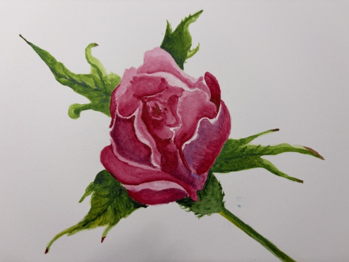
1. welcome: Welcome to this floral
illustration class. While a guide you through
the steps on how I paint a rose on hot
press watercolor paper. My name is Catherine graph. I'm a designer and mother of
two from southern Germany. My passion is painting
with watercolor, and I love to share this
beautiful medium with you. Why arose and why
hot press paper? Well, a rose is always
a good idea, isn't it? And I press paper is
especially good if you want to turn your
illustrations into clip arts, fine art prints, or
illustrations for books. Because it doesn't
have this typical grainy watercolor paper texture. The surface is really smooth. This mixed easy and
great for details. But it can also be very tricky
and hard for beginners. But don't worry, you don't have hot press paper or you're not that advanced
in watercolors, you can just as well join
this class and follow along with their preferred
paper that you already use. Let's get started.
2. class project: Class Project is fairly simple. Follow along with me and
paint this beautiful rose. I will provide you with
a drawing template and a reference image so you can
get started very quickly. You can find both under Project and Resources
area down below. Then take a picture of your finished illustration and upload it to the class gallery. In the next lesson,
I'll show you which materials I'll be
using in this class.
3. material: The materials that I'll be
using today in this class, or my hot pressed
paper by honeymoon. It's called Harmony. And you can get this
as well in cold press and rough than two, couple of round brushes, a medium and a smaller one, and then a fine liner
brush for details. At the end. My main color will
be this Alizarin crimson, which is a nice pinkish color, but you can use whatever color
you like for the blossom. Then I only use
one jar of water. My palette. I didn't clean it out because I don't want to
waste my pigments. And then just one or two greens, but you can really choose
whatever green you have. So it doesn't really matter which exact color
you'll be using. And then a little bit of
blue for the shaded areas. Besides that, I have
a linen cloth to wipe off excess water from my brush
and clean it in-between. And to just quickly show you
the difference of the paper. I got some example papers here, and this first one is
Arches paper in rough. The second one is, I think it's Anna Mueller,
expression paper. So it already has a fine grain. But there's still
some texture to it. And the last one is hot
pressed watercolor paper, which is really, really smooth. So I'll just quickly show you how it looks when I
apply some color to it. The key can see the edges
that are really grainy. And here it's already
a bit better, like there are some edges. And this hot press
paper is really smooth.
4. first layer: Sketch, keep in mind, just keep the lines that
you actually want to see. First, I will apply a really
light wash to the whole of the blossom, the whole area. And I will go petal for petal. In some areas. The paper doesn't
really soak up the, the colored that good.
It's on the hot pressed. You really have this
puddle of water that stays on the paper and
doesn't soak in as quickly. So I already want this. Yeah, the shapes of the
petals to come up here. First, I'm using my bigger
brush for the larger areas. I'm just trying to follow the the leaf shapes
while the petal shape and just tried to get a half halfway
a smooth surface. But as I said, it already
like the papers known for, for drying and making pools and splashes and
something like that. Which can be really nice
because it has more character. So because I, I think like a lot
of beginners pieces look really flat and
a little bit dull. So this hot press paper already gives you a little
bit of advantage here. Or you're not just plays its
own thing with the colors. So like on any watercolor piece, start with the
lightest color and then later on in a
second, wash cloth, go over it with a darker shade, a little bit of layering. And this will give
me more depth. If you start really light, then you can go over it later. Over the darker areas
in a second wash. So I think right now I
already leave it like this. While the blossom
in the middle might be still a little bit wet. So I'll still leave it to
dry a little bit more. I'm going to color in
the leaves as well. I tried to make it
fairly light and then I add in the darker areas later. When you look at the
reference image, see that some of the leaves
have a like a red spot, the end or brownish
look brownish dot. I will just in a little
bit of my lesson, crimson because
it works together nicely with a centerpiece. And just do the same thing
with all the other leaves. There was just a drop
running off my brush. The paper was too
wet and I cleaned my brush so that I got rid of all the excess water and
then just lifted the color. That was too much on the paper. And for the corners here, just use really high
pigmented color. So if it comes from a tubule, don't even really need
to add any water, can just take the color
right of the tube and it's, it will be quite dark
and not that runny.
5. second layer: Now with my smaller round brush, it's a size four. In this case, I'm using a little bit of more
pigment it wash for the darker areas. Just have a look at
the reference image and tried to see where
it's, where it's going. Lighter and the dark parts are. As I've said, if it helps you, you can make a pencil
sketch upfront. Either paint on that with watercolors or just
have it to the side so that it's easier for you
to decide which areas are shaded and which ones
to keep fairly light. So now we're kind of in the
middle of painting our rows. And this can be the ugly stage where you think I just doesn't
look that good. But once you've finished adding
a little bit of details, I think it will come
out really fine. Now you can see that if
you apply a second layer, it gives you a really nice details that you can play with. If you go in the
direction of the leaf. We want to simulate some veins. So this is the perfect
time you can do that. And make some really
nice contrast. Now I'm going to speed up
the video a little bit. And you can just paint in your own time and
then come back to the video. Once we are done. Here, I'm adding a little
bit of fluid because the dark part and I really want the hair to come out, to stand out a little bit more. Now as well, add a second
layer to the leaves. I make the center
part a bit darker and leave it lighter line outside. On the outside. I apply that to
all of my leaves.
6. details: So now squint your eyes
a little bit and see where there needs to be
a little bit more depth. And then you can apply
a more pigmented wash and even add some blue
for my shadow areas. I'm just gone ahead
and these are my wash to whether a really
dark shaded areas. Sometimes I might blend
it out a little bit. But it does well, has a really nice effect if you leave it with a hard edge. I think that makes a
nice contrast between the hot pressed and cold
pressed watercolor paper. If you are ready,
you can already applied some really
fine details. This one, a little
bit more shading, I think that looks too flat. And add a little bit of
detail to my leaves as well. Come out a little bit better. Then I switch to my
fine liner brush and get really high
pigmented color. Like a colored pencil. I draw some lines. I used the lines that
are already there from the pencils and
then I just kind of stress the shadow areas, the lines that are
wanting to have the two separate petals. Just really defining and
giving some character. This is a very personal note, and depending on how
you sketch and draw, this is where you can apply
a cure certain style. I think you can already
see how it gets more dimension and character. You have to be real
careful where to set your, your marks. Now some of the roses have really nice spots
and this is like, you can make little dots
like this to really, um, you know, play with the character of the
rows and the like, the nature that every
rose is different and At some splotches, this kind
of gives them a bit more, even a more realistic look. I think. Even still there, they seem kinda random. They just give more character. And I as well, it can do that
with the leaves, of course. Let's give it a
little bit more edge. And on the leaves you can see there are some
kinda little hairs. And this is the
time we can apply this texture to the
road and to the leave. This as well. We'll give it a more finished, more
professional touch. I think. Here's all the, that the character of the hot
press paper comes out better. Because you can really make these fine details and are not distracted by their texture
of a cold press paper. So your brush slides
smoothly over the surface. So add as many or few
details as you like. What's your periphery? Preferred method and look. I would describe
my illustration. Style is semi realistic. Semilunars. That's not that blues as I sometimes would
like it to have. But even as well, it's not that detailed
and not that realistic. So I think if I look at it, it has nice
difference in values. So it has light and dark parts, and I'm quite happy
with the result. The last step you
could do now is either sign your painting
and then frame it, or you could scan
it and clean it up. This is really like
a good paper for it. And then you can print
it on watercolor paper, which is as well available
from Hannah ruler. And you will have a pretty
smooth watercolor look to it. So I really like this paper for professed not
professional usage.
7. final thought: Congratulations. You made it to the end. Thank you for taking the time and joining
me in this class. I hope you enjoyed it and
you're happy with your result. Don't forget to share your
rows and the gallery section. I can't wait to see it. If you like, hit the
Follow button on top here on Skillshare, that means that you get a notification when I
published my next class, or come visit me on Instagram. Thanks again. Have a great day.
 Katrin Kamides Studio, Watercolor Illustrations