Transcripts
1. Welcome!: Hi and welcome to the
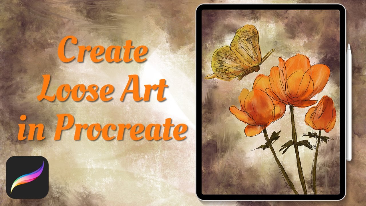
skillshare class. I'm join loose floral
art in procreate. My name's Abraham and I'm a
professional illustrator. In this class, I'm going
to show you step by step how you can create
this gorgeous paint daisy. Drawing loose floral art is a relaxing and enjoyable way to connect to your artistic
self and create. We'll have a reference
for you to guide us, but the great thing
about loose floral art is that there's no one
correct look to our painting, a pedal this way or that we
aren't trying for realism. Instead we can let ourselves go and enjoy the
experience of creating. You might even find
it quite meditative. This class is suitable
for all skill levels. All you need is the ipad, the procreate app, and I highly recommend
the Apple pencil. If you're ready to
have a wonderful, enjoyable experience creating beautiful art,
let's get started.
2. Rough Sketch: The first thing
we're going to do is get a reference picture. One place that I
really like to go for reference photos is in
a place called Pixabay. Pixabay provides
amazing high quality, royalty free images that you can use for all
types of purposes, both personal and commercial. I think it's a
really great option. It's going to go to
the Pixabay website. You can search in the search bar or click the flower
at the bottom here. It'll come up with a lot
of amazing pictures. I'm going to choose
this flower over here. I'm going to click on
it and it'll come up. What we can do at this
point right now is we can swipe it from the bottom and take procreate and
move it to the side. Then we can have two
at the same time. We can have procreate
on one side and look at a reference photo on
the other side and draw. But another option if
you want to import it, is you can click
the download button here and download again. Then open in Procreate. Now it's going to
send it to Procreate. To see it there, we'll have to, I think, open Procreate
one more time. Here it is. I'm going to move this into our skillshare folder if I want to see the whole
proc slide to the left, and now I have proc full
screen if I want to bring this flower
into our canvas. The way I'm going to
do that is open up the flower and cup the layer from this
canvas to our canvas. I'm going to hold here, hold on layer, and then drag it to the side. Click
on the gallery. I'm going to click
on our entitled one, and then I can drop it in here. Now we brought our
photo into our canvas. I want to make it full screen. And to do that, I can click
on the Fit to Canvas button. Right here. There we are. And so now we have a
nice size picture. What I would do then is go and lower the
opacity by clicking on the little n here
and sliding down. Then we can start to draw. We'll take a color here. Actually, what we can do is we can make a duplicate layer, duplicate of this layer,
Make this full opacity, and move it to the side, so that way we can use it
for sampling some colors. So I can sample darker pink. Holding my finger down, get the color selector and
I'll choose a darker pink, make it just even a touch
darker for our sketching. We'll go to the
sketching section and six pencil and
we can just draw some loose shapes to try
capture what's going on here. Be a rough guide. I have a feeling I'm new layer,
I'm doing the wrong layer. Hold 1 second. We're going
to make a new layer here. On this new layer, we'll
start drawing. Mm hmm. I'm going to the edge, even past going past the borders because I want
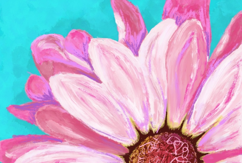
this to fill the whole frame, the holes canvas. Okay. Like this, loose and easy. Doesn't have to be perfect. That's the beauty of this. Here we are. So
I've now added in all the different petals
and I can hide this layer. Now we have our petals Is a little bit to reduce the
capacity of this layer. Make a new layer and I'll put it underneath. Drag it down. I take our sketch layer
and make it into multiply. Here we can start to
fill in our colors.
3. Initial shapes: Let's begin with color pick. You just go into our little mini thumbnail we have
on the side and get this nice purplish
color for our brushes. I want to go in the
artistic section and take old beach here. We're going to go and fill
in some of these petals. I'm not even staying so close to the our rough sketch here. That's okay. She is here. I'm just going to hang all
the different colors here. See that one I think would a slightly more pink, pink color. So we'll put it in
a second look here. Let's go sample
that. We, the pink color here and then it's
a little too bright. I'm going up here like that. Good here, I think I would make a new layer underneath and start
painting over here. Must be purple here. That sample that purple here. A deeper purple like that. Okay, so now what we want
to do is start to layer, add some more layers
and textures. So we're taking this purple again and I want
to go take Tara. We get end and see what happens if I start to paint
a little bit. So just add in some color
here and not bit more white and dark
smaller, pure white. Is that pure white? Yeah. I just tossing some color on here and I think we also want to I think I would approach the middle
of our flower. So let's take some of this color and I'll put that in here. We'll do it with the
old beach again, larger first, going to
lay down this color here. I know it's not exactly
matching, but we'll get there some yellow and see
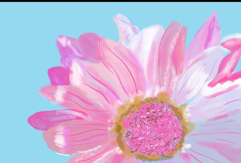
some of our pink color. Also, what I want to do is take a very dark color and throw in the little beads that
rivers in the middle there. Let's take our black burns. Good, bigger, and
just make some, just some scripty circles. Okay, So that's good if I
wanted to now light it up and. This more circles. Okay. That's where I went for
that. And on the edges, we're going to take
whatever yellow color, we'll try some black burt. Still y bigger, not liking that? No. So let's go back to the
old beach, this yellow, and see what happens here is on this layer here, so we can blend it out. The darker smaller, the corner here,
right where it meets. I'm looking at the
reference photo to have an idea of what we're
trying to achieve here. I'm going to blur some out. And for a blending, I'd like
to use this charcoal block, make it a little smaller and
just push out a little bit. Help me a little bigger texture is not just sm smearing and
blurring as pretty cool, you know, charcot texture
when you're doing it too.
4. Adding details: Okay, let's go back
to our southern layer here and make it a
little more intense. If I duplicate it, we'll just make it that
much more opaque. I can merge the two
layers together. Let's go pull on a
few more colors here, like this pink color, and make it a little
bit larger. The brush, I'm following the contours
of those petals as I'm painting and I'm
going to come back. I'm just using the same color of all the different petals. I going to come
back and then add in some other color variations to Okay, we did that. So I'm gonna call
here and come back. Water, tiebout snow bit. It is. Try to build up
every area equally, not to focus too much
on one section and you want to try to get an overall feel of building everything
up at the same time to go back to our black burn, a little more texture.
Look at that texture. Wow, that's so cool, beautiful. Okay, continue on here. He's heading it to each
of the different pedals to a black burn, very
versatile brush. I can now go add in
a little bit more. Um, whites. They don't reduce
the passage just but so the hear is loose. We're just, I'm gently, just very gently touching the. Pen to the tablet and these, these nice textured strokes. That's beautiful, Look at that. I love that everyone has their own stern style and
I encourage you to explore, to see what type of marks
that you can make and what type of marks
you like to make. I have to do something darker here as
well, but we'll get to that. Let's go to these flowers. Let's Live, all flowers. I go back to, I think an
old beach, larger size, adding in the shadows and contours to give us
flowers more depth. I keep looking at the reference photo for
ideas of how I want to shape our petals.
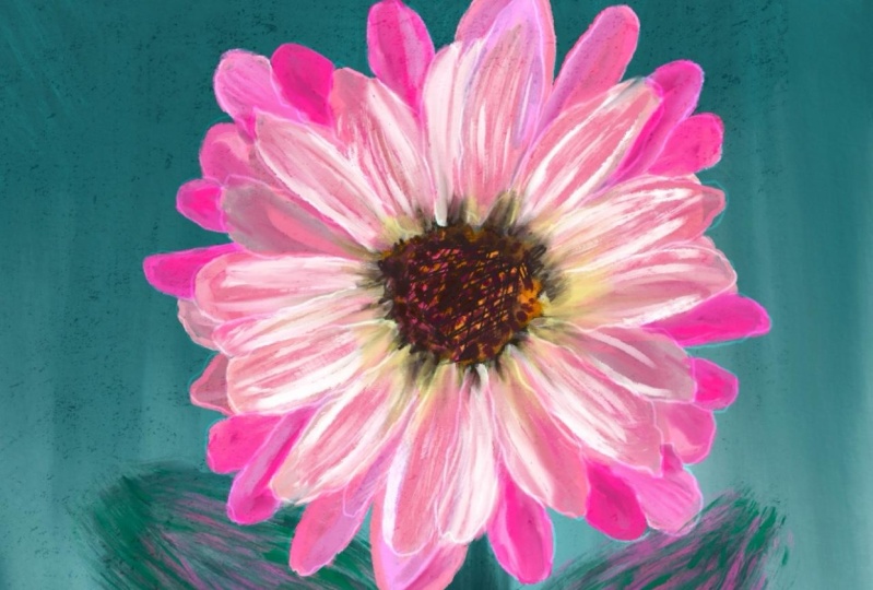
5. Background and final details: In that blue background.
Let's go back to our bottom most layer here, Sample or blue. And I'm going to drag this, make it slightly blue, blue. And drag it in back to here. And take our white, or a pretty close to white color and back
to our black burn. Actually I think I will
switch to turpentine. Something that I
really like about the turpentine brush is how it holes and drags like a paint brush that
has the color on it. It also mixes and blends with the colors
that are beneath it. And so you have this
really nice texture and mixing of the colors. I think at this point
I want to take this, merge these two layers together. And that way I can pull them together and the turpentine is going to smear
the two together. So as you can see how it's really pulls
everything together. And I'm tapping, I'm tapping around the middle of the
flower with a darker color, so to make the
middle flower really pop out really dark. So I think we can get rid of our initial drawing
sketch. Need more. Think where these
two layers together. Now, just a little bit more out of the way I'm gonna take more. Let us back. What?
I think we should still continue with a go back to our turpentine. I'm adding in darker colors. Now give a little more
contrast and interest. Makes some of the flowers
makes the petals go more in the background and
that will bring the forward much petals pop thing, this purple color. And I want to make it
to the bill more rich. So bring this in like this. But go back again to using Old Beach lovely. At this point, I feel like I'm departing from the
reference photo, just looking at
the flower petals and just seeing what inspires me and how
to take it from here, I bring my own artistic
voice to the, the painting. What I want to do also is try to balance off
any color I'm adding. So that if I'm
putting in one place, I want to be in a few
other places also as well. So it doesn't look too
one sided painting just takes the texture sort of, it gets the best
of both textures. Here I get a little bit
of the rough texture from Blackburn and then
we have a little bit of pulling texture
from turpentine, darker as it gets in the middle. So I'm tapping a little
and then pulling. So one thing I just see here
is our blue background, I want to make sure it doesn't
show up so much over here. Oh, what a lovely pink
color that it is. Okay, I think we can get rid of this
reference photo. One thing I want to do now
is just on this layer, I think we can add a little
bit more interest if I go back and just add a
little bit more of a texture. Let's talk to try A again
and we put it here, tapping a little bit dark. I'm going back for light. This is looking almost perfect. Just the one area I'm
seeing is over here. One area of the petal is
a little bit dark for me. I want to tone that down. We'll do that. We'll
try it with turpentine. And it was based on the
part of the picture, but it wasn't really
working for me. So sample this color, bring it in this here, here.
6. Thank you!: Thank you so much for joining
me in the skillshare class. Creating loose floral
art using procreate. I hope you had a wonderful, enjoyable experience creating
something beautiful. I would love to see
it you made and so please upload it to the
Pros Resources section. I'll be happy to
comment and I'll also give encouragement
to other students. I would also really appreciate any feedback or comments
you have on the class. I'm always trying to
make the classes better, and your feedback
helps me know what I did right and what I
could have done better. Lastly, if you'd like to hear about any new classes
that I create, please are able to subscribe. Thanks again so much for joining me in this
skill share class. I look forward to seeing
you and another one.
 Avraham Nacher, Artist & Photographer