Transcripts
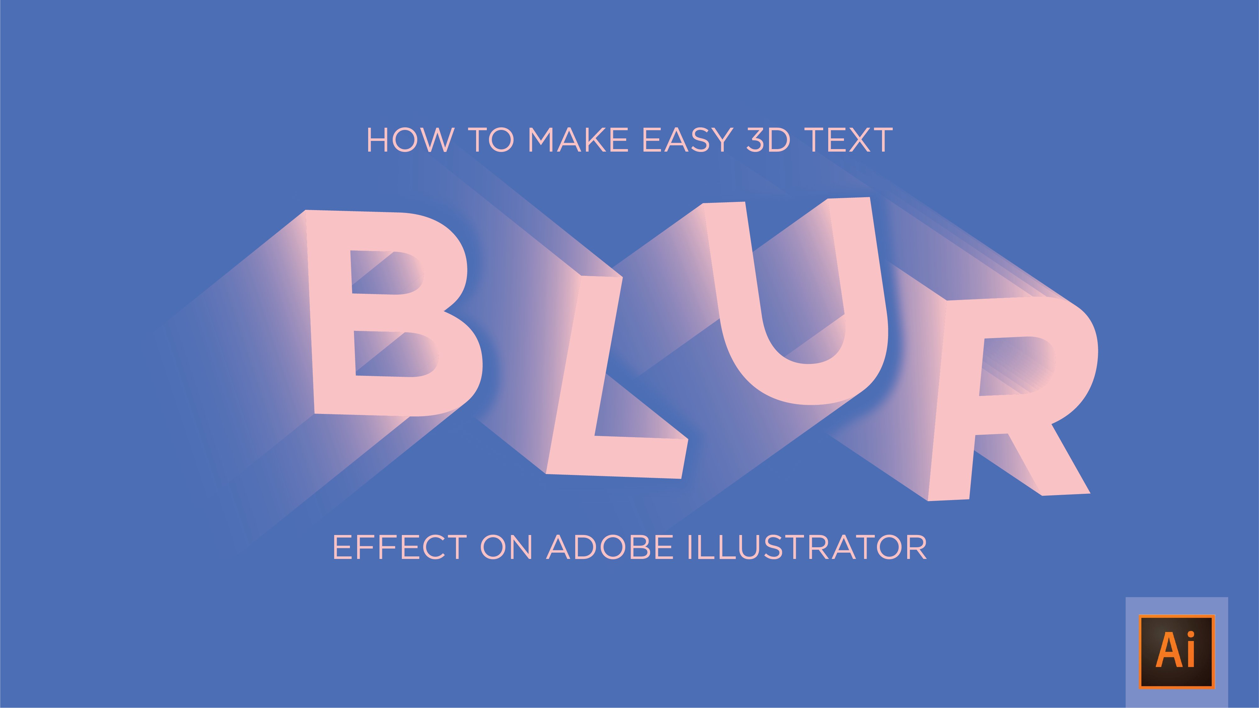
1. Introduction: Hi there, my name shown. And today we're going to be learning how to re create the three D text effects used on the title graphic for this video. The design is going to be made entirely within Illustrator. We're going to be learning how to make the passing within the text as well as making the text three d itself. This question be for everyone. We're going to go through it step by step, learning how to construct it from the bottom up. It's a really nice effects that wants you more familiar with the process. You'll be out to recreate a lot faster. So if this seems like the sort of thing you be interested in learning, let's dive straight in and start learning how to make it.
2. Setting up and picking your font: So the first thing you're gonna want to do is load up. Illustrates. Once you've done that, had over to file, go to new on. We're gonna make sure that we've got our documents out quietly. These are the settings I'm going to be working with. I'm going to have my size of eight for landscape orientation color mode sets RGB Now it's important you gotta back color range and ask you be You do see him like a You can change this later. Wrong. But for now, what with rgb and you Will the raster effects set too high 300 people. Once you've done that, go ahead and click. OK, I've already set up my document for this project just but the colors that I'm going to be using. So you will be looking at a blank white art board for now, whereas I have mine cell with colors already on. So the next thing we want to do is select the fun we're going to be working with. Go ahead over to your tax tool over on the toolbar or hit t for sure on. We just want to type out the word that we're going to be working with now because I'm recreating the title graphic that I use for the video. I'm going to type out the way Illustrates a I'm going to center in the middle of the canvas . You could do this by clicking and dragging, or you can come up here to you D menu bar just at the top on just along here. You've got some align options under this little drop down menu. You want to click that, and you want to make sure you've got your object selected on you. Want to make sure you're a lying to our board, so well, that's gonna do is that's just going to send to your text and the middle off your document to go ahead and just click this one here horizontal online center. Not just aligns it to the middle on a vertical line center, and that just makes it a lot emphatically as well. Now my tax size is set to about 1 50 I'm working with the BBS funds. It's a bold form on you. Do you really want to be working with a bold font here? By all means, you can use something else, but for the purpose of this tutorial, a bold phone is recommended. It's a lot easier to work with and a lot easier to recreate the effects that you can see in the title graphic.
3. Making the 3D elements and offsetting the text path: So the next thing we want to dio is we want to take the tax that we just typed out. We want to expand it to pixels. At the moment, it's still a text object, which means you can edit it. But we want to turn this into pixels, which means expanding the object So you want to select the object, come upto objects on the menu bar at the top and go to expand. We want expand objects and Phil just click OK, and what that's done is it's just drawn a line around all of the latter's turn them into your admissible objects. The next thing I'm gonna do is we're gonna make this text appear three D now for these purposes, you just want to set the color of your foreground toe white that does the text white on. This just means that when you turn in three d, it is a lot easier to work with. You can see the three D X treated elements as well as the text in front of you work with black. It turns the whole thing black ondas a lot more different. So what you've done that just come up to effect three day extreme level. And what that does is it loads up the three D option menu that you can extreme type with now come down to the bottom of the window and hit preview. From what that does, is it just you can just see on our board? It previews. You'll shape on. You can see how it's gonna look now the settings I'm going to be working with is I want to set the X axis toe one the y axis toe, one on the zed, access to zero on what that does is it just creates an ever so slight three D effects. You can edit this by any means, however much you want. But for me, I just want a very slight three D effect. I don't want it appear too much now, once you've done that, you want to come down to extreme depth under extreme bevel on. You just want to raise this right up on. As you can see, it's just X treated text. Now this value you can say it's however much you want. I'm going to set my A roughly 800 if you want to. You raise this up you can on what that does is it just makes TheStreet ID elements bigger on more three D. So I'm gonna go ahead, set my 2 800 because that's just the right amount. Three D that I want to work with her. What you've done that. Go ahead and click OK on. You've got some three D text now. At the moment it's plays one object. Once you move around, it all moves. Is one object you don't want that you want to be a quacking with. It is pixels like we did with text originally. So come upto objects again and go to expand. Appearance on what that's done is it's expanded. The appearance of the objects drawn a line around every element a drawing a line around the three D elements as well. The next step is you want to just click off that what we want to do is we want to separate the text away from the three day. This means that we can change the colors a lot easier on it. It's much easier to work with, so you want to come up and select the direct selection tool or a on the keyboard, and you want to come in and you want to select all of your letters, but not the three D elements. Once you've done that, you want to go to edit, cut or command X on the keyboard. But what that's done is it's cut away all of the text and left you with the three D elements. Now, once you've done that, you want to select the three D elements remembering to ignore your background, so just decent like that by holding shift on. You want to group these to go to object and group will come out G for sure. Once you've done that, we want to paste back in our original text on You want to do this by going to edit and paste in front on what paced in front? Does it paste it exactly where you left it? So go ahead. Neither or command official. It's pasted exactly back on top, where it was before. Now, before you d select it like I just did. You want to group these elements as well, uh, to go ahead and click command G again. And now we have two groups. You have the three D group ons, the text, grief
4. Grouping your design: The next thing we want to do is we want to create the inner element of the text. And how you do this is by using the offset path function. Its electoral tax group come upto objects go to pass on, then offset path. Now just checking a preview box here on what you can see is it just expands out the text lion. Now we don't want to expanding this. We want to be making a smaller So in the offset box, Just make sure you have a minus at the beginning of your pixel value. You just click into the next books. You can see it shrinks it down into the inside of the original text. Now play this values much. She want you more. You might want quite a large intersection. We also might walk by small intersection, at which point you just reduce the number and it gets smaller. Now I'm going to set much about five. That leaves me with quite a big area to work with inside of text. Five something a little bit too much. Say it's about four. Once you've done that, just click OK on, just like before you got a group with the in a text inside of your original text. So now you've got a design with ex treated elements a text element andan in a text element where you've offset part. You have the in a text element on and the original text element in the same group. You don't want this. You want them in separate groups so that when you choose your colors, it's colors only the inhibits all the acid to go ahead, go to objects, click on group and what that does. Is it just one groups All the latter's so like you did before. You want to just go through, select every Lhasa click on group again, and now you're left with all the letters individually. Now just go through and select all of Thean elements of the text like I have done here and you want to greet close. I like it did before selects the original text. Anyone scream those as well, being careful notice like the inner elements at the same time, what you've done that go had a group them and now you're left with an ex treated group in a group Andan original tax group
5. Adding colour and drop shadows to your design: The next step is we're gonna start adding some color. Not for me. I've already got my color cell. I would recommend choosing some colors with quite good contrast. So I've gone with a light background on some darker colors that have quite good range on what this range will allow is all of the different elements. Teoh complement each other and not disappear within each other. So you want to set your original text layer to the lighter color from this selection. As you can see, it's just colored the original taxslayer and left all of the other groups un colored to keep going through just out of the color the inner text layer you want to set to you a darker color than the original text layer on what this does is it just allows the text to have a bit of depth on. Later, when you out some shadow, it will give the appearance that there is some sort of depth to the Enola. So just continue in this fashion now coloring. You'll ex treated elements Teoh a Dhaka, still color, and now you should have something that looks a little bit like this. Maybe in your in color style, but feel free to use these calls as well. So the next thing you want to do is you want to add a drop shadow to the extreme elements. Before you do this, you want to you decide on a shadow color that's going to complement your background quite well on coffee. The color code over here at the color panel on the right. If you can't see this, come up to this little menu. But just here on make sure you got RGB selected and you'll be able to select the RGB. Once you've done that, come down to your ex treated elements. Go to effect. Stylized drop shot way. Want to set the mode to normal capacity to 100? Blatter. Zero Andi What the X offset on the Y offset means is it just means the positioning off the drop shadow behind three D elements. You go ahead and click preview. You can see it's added a drop shadow behind us. You can raise the accent. Why, officer? If you like. If you want this shadow to be slightly further away, you can raise that a lot and you'll see that the shadow appears quite some distance behind the text. Now I'm going to set mind to roughly 10 because it just lines up perfectly with the text and provides just the right amount of shadow that I want for this design. Once you've done that, go into color paste in your color code at the box just down here. Allow that to update and then just click. OK, you can see it's added color to the drop shadow on. Once you've done that, you can go ahead and click OK again. And now you have a design with some color Andi, a drop shot.
6. Adding inner shadows: next step is to add a drop shadow to the inner element of this sign. We're going to zoom in here just to see you can see what I'm working with on what you want to do is you want Teoh duplicate your in a text layer. So go ahead and copy that by going toe, edit copy or come and see for sure on I'm going to paste in front again. So go to edit based in front or command f for sure on what that's done is it's just created too, with the same objects. Now you want to line this up so that there is an ever so slight shadow around the inside of your original in attacks layer select dot Pick the color that you have to the extreme genomes and you could just see without cutting out the shape. Yet it just gives this nice in a shadow effect. Now you don't want all of this overlapping here. You want it all to appear inside each other. Now, once you've done that, you just wants a jeep. Okay? Your original in attacks layer copy paste in front again. What that does is it just means that when we do this next bit, you're not going to lose that in a text. Select your new layer on and the over lately, come up to a window Pathfinder, and we want to be using this option right here, minus front. Go ahead and click that Now what's that's done? You can see there is. It's left behind a lot of the inner shadow elements that we want now. The lay the Jeep K is you want to go ahead a re color that if it's changed and you're left behind with an inner shadow within your three D text?
7. Implementing a pattern: The next step is we're going to be making this person just here. What we want to do, I'll see you in about, has come to our shape tool select a rectangle tool or hear em on the keyboard for short. Now go ahead and we want to just draw somethin. Rectangle shapes Set the color to black so you can see it. Go ahead of duplicate these you get. Consider this my copy and pasting bull. If you hold the bulky, you can just click and drag and it makes a copy. Once you've done a few, select them just you get them all and you're able to replicate a lot quicker. Once you got you a little bit like this, select all of them on. We're going to be using the alliance to look at to come up to the top bar. Click the align to light up the align panel. We want to go to a line. Teoh. Well, it's a line to selection What you've done that you want to come. Teoh Horizontal distribute sensor. What that does is it just spaces All the lines equally apart now with them still selectors , you want cheap? OK, them again on a line them up within the gaps between the other lines, and you want to set the color of these two nothing. So just select the white box with red lines through what you're left here with what you're left with. Here is a pattern of black too black, too black to blank that you can use to create your effects. What's your at this stage? Go ahead and select all those lines again. Light up the swatches panel here on the right. Just drag that designing and that's created a new pattern. Swatch. Go ahead and delete those lines, then you want to come down to your in a text. Layers. Select your in attacks, not the shadow layer. Go ahead and duplicate that again by going copy and then paste in front on. You just want to apply your new passes. Watch to go ahead and click it on the Swatch panel. What that's done is it's just added some lights. Now. This doesn't quite look like the types of graphic yet now what you've done that you want to select your in a text layer, right click go to transform pounds right Taste now If you click preview here, you could just see a little walking with. I want to set mind to about 45 degree angle. You want unchecked transform objects and select transformed patterns. And what that does is it just edits the swatch inside of the in attacks layer on doesn't affect the text itself. Once you've done that, go ahead and click OK on your left with a design with the passing inside of it. Well, I've done in my design title graphic is lower the opacity off the pattern feeler it to about 20%. You're seeing you're left with quite a nice effect on the inside attacks. You may find that that is too dark, at which point you can learn it down more on. If you wish to do even more than that or you like a range between the two, you can go ahead and just type in the value that you want, and then you're left with a design with a three D effect on a pattern on the inside of it.
8. Thanks: so that's it. Guys, Thank you for watching the video. You should now be able to re create your own three D text effects using the skills that I demonstrated within this video. Go ahead and post your responses within the class project section or Technion them on instagram so I could see what it'll be like You.
 Sean Bates, Graphic Designer