Transcripts
1. Introduction: Hello and welcome to this
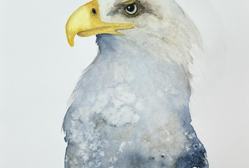
advanced watercolor class. Today we're going to be painting this majestic eagle together. We're going to be
creating him using lots of water and flowing paint. This will give that
wonderful softness and sense of movement. Now you can either choose
to paint the sea eagle, or the bald eagle, they're very similar birds. They're just a tweak of
the coloring on the chest. I'm Jane Davis, I live, paint, teach and walk my
lovely spaniels in the beautiful South Downs
National Park, England. Over the last 15 years, I've taught myself the
free flow technique that you'll see today. Not having been to art school, finding my own way has been
fun and sometimes daunting, but it has allowed me to
develop my own style. This has led me to teaching others either on a
one to one basis, or as part of a group in a wonderful studio in the
heart of the South Downs. I also run a successful
commission based business, painting pet portraits
and wildlife art, in my own home studio. In all my classes, you will follow
along in real time. What I can guide you
to keeping your work loose and fresh
without over fussing. I have over 20 classes
available on Skillshare now. If you're just starting out, my three beginner
classes will guide you, then you'll find over
20 masterclasses covering a wide range
of beautiful subjects. In each one, I'll share the techniques that I use in
my own professional work. We'll have a lot of fun
together and you'll gain the understanding
and confidence, to incorporate everything you
learn into your own work. Plus, I will share a few of my tips and tricks
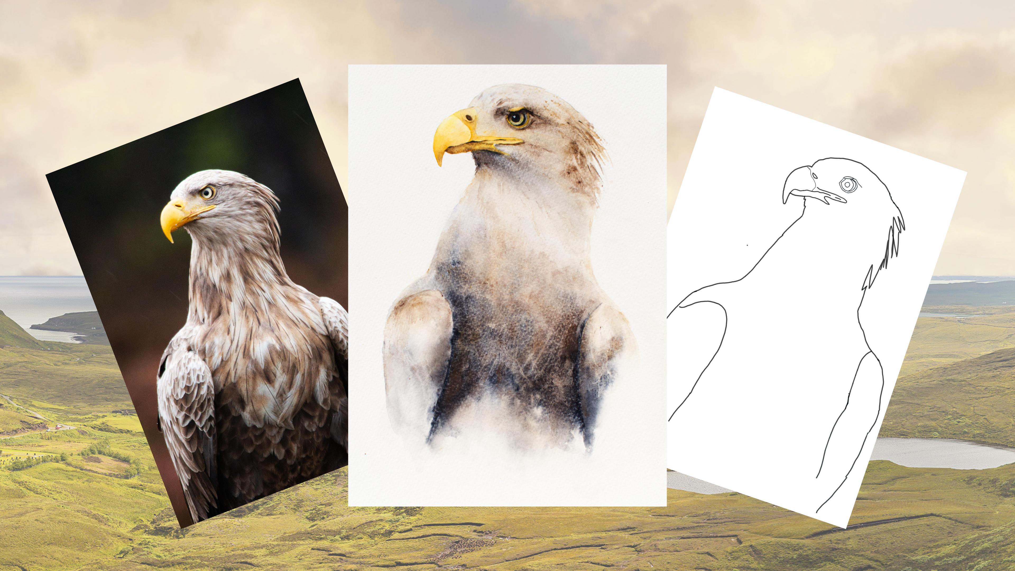
along the way too. As ever, I provided you with a wonderful
reference photo of him along with a downloadable template
for you to print out. The template gives you a stress free drawing so you can
just enjoy the painting. I'll be showing you the joy
of simply placing paint onto wet paper and allowing gravity to create you something
unique and beautiful. I'll be guiding you through
sectioning areas off, and adding layers
to create depth of color all the while
retaining the light. I'll also be showing
you how to achieve that wonderful
detailed eye and beak. Of course, I'll share many of my professional tips, tricks, and musings as we work our way through
the class together. If you'd like to learn more
about me, all my work, please pop over to my website at
janedaviswatercolors.co.uk. This can be found
on my profile page, along with links to my
Instagram and Facebook pages. I'm very active on my
social media pages, where I love sharing my art, especially on stories
with many ideas, works in progress, and tales of student life. I really hope you will share all your paintings on the
projects and resources pages. As I love showing
you more species. Don't forget, I'm here to
help if you get stuck, or have any questions. I want you to experience
that buzz of painting in this liberating wet on wet
loose style. Come and join me.
2. Materials: Welcome along to this
sea eagle/bald eagle. Mind become a little bit of a hybrid as I've gone
through the class, but you can choose
which one you prefer to paint and I'll show you how
you go about doing that, and they're very similar in
their colorings and stance. Let me run through all the
materials I'm using today. I've just realized I've forgotten to put a little
bit of kitchen roll, but there's some kitchen
roll paper towel. Firstly, there's the paint, so they're all a collection
of Daniel Smith's. A little word on the
choice of colorings, it depends a little bit
on whether you're doing the bald eagle or you're
wanting to paint the sea eagle. If you're doing the sea
eagle, choose a nice rich brown similar to what
he's got on his markings. Have a little play around
and see which colors you've gotten you think
would suit him best. If you're wanting to
do this bald eagle, I've used payne's gray, It's been quite nice to use, but really any dark color. I'm not a great fan of black, I find it quite heavy, so I tend to have
blues or build up the darker colors with other colors rather
than using black. But if you've only got black and you want
to have a bash, then go for it. Please don't feel you can't do this project if you
haven't got exact colors, I'm sure you will have
something that's close enough, so please don't be put off. Starting from the top, I've got the cadmium yellow
deep hue and I've also got a haynes or
hansa yellow light. It was quite nice to have the two different
colors for the bill, because as you can see, it's quite a rich
yolk-y color and then he's got some really
lovely light colors, so I found those two
combinations nice. Touch of lavender,
but if I'm honest, I've used it only a little
bit on top of the head. Buff titanium is again, quite nice for the head. Just gave a little bit of
just a different color, a little bit of warmth.
It's a nice color. I've got sepia, which I
love a lot, but again, it's not used a huge amount, just bits around the eyes and for a little
bit of heaviness. Goethite, which I love and
I use that quite a lot. But again, another
of my favorites. I've got Payne's gray,
which I used for the blue. You can obviously see
the bluer colors there. I've got a bit of white
gouache, which is, again, just for the eye, a little catch light in there. Obviously, I've got
a pot of water. I've got some salt, which you
can't see any evidence of, but it soaps quite nice. It may well work better on
your paper with your paints. I've got a little bit what's
called a magic sponge, but I actually think you
could also buy it on as a house cleaning
product so I will put a link in the projects
and resources pages, but it's wonderful
for taking color out just a little
along the lines, especially for the bottom here. It's a helpful, clever thing
and I only tend to use it day to day in any spattering as I get
that all my white paper, that it's really lovely
to take those out. Obviously, got a
rubber. I've got just a little something to raise my board up that's
about an inch high. You'll also need
something a little bit higher because at some point
we took these quite a lot. I've got a very old tin box which is about
three inches high, probably so anything
you can find, just a pop your painting up. It doesn't have to
be anything posh. Brush-wise, I have got
a large number 12 and that's just for wetting the areas down a
little bit quicker. I don't actually use it to paint with modulus to
wet an area down. I've got a number size 8. I've got a number 2
down here somewhere. That's obviously
doing smaller detail and I've got my little
Aurora dedicated brush, which is a great little tool, if you haven't
called cross that. Obviously, got a
pencil somewhere in this one collection there and I've got a fine liner pen. That's number naught 0.1, and that's for doing some really crisp detail
around the eye that sits. It really sharpens detail up. It's quite fun to use. But if you haven't got one, it's not essential,
but it's useful. It's quite a clever
little thing. Obviously, I've got a hairdryer. Obvious I suppose,
because you can't see it, but I do have a hairdryer and that's just to dry the layers a little bit quicker in-between. But again, not
essential by any means. Just looking around, obviously, you got the reference
photo and the template, which can both be found on the projects and
resources pages. Again, don't be afraid to use that template because again, is all about the painting on. It is not a drawing class. I think that's it, so come on, let's go and sketch them
out and then we could do the fun bit and
start to paint him.
3. Sketching Out: Variety ***, onto the
sketching our output. I know it's not the
most exciting element, but it's quite important. As you can see, I've
already sketched them out, so I just going to
give you a few tips actually to the best
way to go about him. Any little things I
think were useful when I did many examples of
him as practice pieces. Now, don't be afraid
to use that template that's in the projects
and resources pages. It's really helpful. It gives you the right shape, it gets everything
in the right place so you can just
enjoy the painting, so don't be afraid or
feel like it's cheating. But if you do use it and you
take your template away, you often end up with
rather rounded shapes. It's worth than lifting it away and looking at
your reference photo and just going around making sure everything's
as it should be. The beak is really important
on this bird because it's so distinctive and it gives the character
of that certain bird. If I start, the
actual beat goes in nothing because it's not that obvious on the reference photo, but it goes into the
body, so that's worth. I'm just making sure you've got that little bit
right and the sweep, and actually, I've probably got mine a little bit rounded. I might just adjust that
before I start film. It's a little bit
rounded, isn't it? It needs to be quite pointy, this shapes, quite important. Getting this little line here, you can see that it's just where the beak joins the puppy. A very posh word for that,
but I don't know it. I get that little line in. The eye is really important on this painting because the rest of it is so loose and
let for interpretation. But the beak and the
eye are going to really pull it all
together and making him rather than a
lot of runny paint, so make sure you're getting
you've got that in place. I've done the eyeball, and I've also done the little
line that's going to be the yellow circle on
the outside of the eye. Also get this little yellow, I'm going to call
it mythical frown. Get that in, any little lines
you think might guide you. Don't get too carried
away with the flicks. Because what we're going to
do in the first layer is to wet up to a certain up to here. Don't get too involved
with trying to draw those flicks because it
will just distract you. Just make sure you've
got the sweep bright, nice wings again
a nice important, so a shape, quite distinctive.
Just take your time. There's no paint drawing,
there's no hurry. On my commissions, as I may have said this in a few
other classes, but I will always
sketch out my piece. Go away and just 15
minutes, 10 minutes even, come back and re-look
at it because you'll see a little bit like when
you finished the painting, you will see things
that maybe aren't quite right or just need
a little bit of tweaking. But as I say it's really
important to get this nice because then you can enjoy
the painting and you know you've got the sketching. Just one other little line
which isn't on the bird, but it's just a going to be an area we wet down very gently, just really gently because you don't want to
see this underneath. That's just a little line
we're going to paint up to. That's was very gently
sketching it in. I would say with any
line you put in mind, probably stronger
than I would like, but obviously I want you
to be able to see it. But try and keep your
pencil marks nice and light because these all, ideally you don't want to be seeing once the
painting is finished. As the subjects quite light, they will stick
out if they're too heavy and it's so nice
if you don't see them. Go in a really nice and gentle just so you can
see where you're going. I don't think there's
anything else to tell you, so let's get started.
4. Body First Layer: Let's get some paint
on. Now we're going to do the black part or the
darker part of the body. Obviously this week, I'm going to be
painting the sea eagle, bear bear that in mind. But obviously this can be
translated into the bald eagle, which just needs a little
bit of heavy paint. While I'm doing so, the brown, I'll hopefully explain
as I go along, but you'll be doing a slightly
darker color than me. I will be mixing the darker Payne's gray
with the tiger's eye. Again, you're more than welcome to follow me and
paint this eagle. But if you're doing
the bald eagle, you just want to go
a little heavy and a little bit dark
and go more heavy on the Payne's gray or your
chosen gray than the brown. I think I've explained that. We're going to start by wetting the top of that wing line. Then we're going to follow
it down just to the end. We just want all this to soften. I'm going down here. Tell you what I'll do.
Let's put this here. This is just for you to
see where I've wet down. Not for you to put any color in because I
think this is helpful. I'm just going to pop a touch of color so you can see what
areas I've wet down. It's not always that obvious, is it when it's on the camera. Can you see that? Yes, you can. Just enough. You got to
be nice and bold now. You want it nice and wet. No dry patches. As ever, you don't want
it sitting in puddles, but you want it as close to it. I'm just going to give
it a little minute just to let that
soak in a touch. Actually looks like
I've stretched my board card fairly well. No buckling so far. I'm going to pick
up Payne's gray and I've got the burnt
tiger's eye as well. Let's give a bit of a squidge. Operational. We're going to
work mainly on this edge. Just tapping. No brush strokes. We're going to do a
bit of zigzagging. Work our way around
to the other side. Make sure you follow
that wing line. Keep it in lovely, neat. Try not to go in and
keep it all tidy. I'm going to pop a
bit of tiger's eye, I think this is
moving around a bit. See how useful that
tiger's eye is. Again, if you are doing the bald eagle and
you're trying to keep to the darker colors and you've got a nice granulating paint, you know we'll move
things around, then don't put too
much of the slade. This is just, I would say it's an impression of
the bald eagle and again it's an impression
of this eagle. We're not doing a
specimen guide. I'm just tapping and allowing. You need a good amount of paint. If you're working with pans, give it a really good Russell, get a lot of paint as much as
you can get on your brush. I'm almost scooping. I want a lot of color here. We're going to move some
of these up in a minute. Nice bit of tapping,
and now we go over the top along because
I'm trying to say. Just try to allow because always it's going to
shift around so much. If you follow me on Instagram, you may have noticed
how many bodies I did. I'm just trying to
get this right. Just trying to get it
the right way around, if I'm honest and
the best techniques. At this stage, it's all
lovely and wet still. We're going to touch that
wet line and we're going to draw it up. Just pulling. You can see, we're going to go up to that penciled mark we put in just by dragging. We can pull a slight tilt if it's not moving for a minute, I can get my little
trusty heart. I can give it a little
help tilt. Just watch it. If it moves too quickly
on you just just take the little support there. Take your little thing that's
raising your paper away. The reference photo isn't
probably a lot of good really, because it's just an impression. I'm just going to try to
get a little bit of color. Just watching it. That's
flowing quite nicely actually. What you want to be
careful, if it's tilted, you'll find that the water will start gathering up
here, up at the top. Just drag and just gently stuck that up
your bigger brush. Carry on pulling a little bit. It's lacking. Try not to panic. This is very easy, isn't it? It's all moving around
and I'm like, goodness. A lot of it is just allowing
this to do its thing really. The minute you think that's looking quite nice. That's nice. We will do another
layer over here. We can always add more color. If you're doing
more of this eagle, I'm going to lay my flax. I don't want it to get
too dark higher up. But if you're doing
the bald eagle and it's looking like your nice
dark color is moving up, then as they say go with
the flow. You know what? I think I'm going to leave that there because I
know if I fiddle, it's just going to go
a little bit array. I'm not going to
add any more paint. Now it's really wet here and
I want to add some salt. I also want to add some little marks
with my kitchen roll, but I'm going to
have to hang on. I might just fill this
little corner in, just allow that
paint to go away. That's the edge of
the body that's touching the left hand wing. I think my left and right. Just tidy up at this stage, make sure the wings, you got this in nice shape
so it's not too raggedy, so you can just
have a little tidy, but try not to add any more
color or add any drops of water at this stage just
to allow this all to move. Because that's going to
be your natural, lovely, loose flowing look
that I'm after. If you start fiddling,
you'll lose that. I'm going to just hang on a minute and let
this dry a bit and then I can show you how to get a few marks and
textures in there. Now I can see this little
area is starting to dry. This is still a bit wet. Maybe my stretching wasn't
quite so successful. It just is running in a little bit of a divot
here. That's fine. But what I want to do, I'm going to put a
little bit of salt here. Now this paper and
paint is ideal for it. But I'm going to put it
down anyway just because it's just for you if you want to add a
little bit of salt, this is a good time to do it. Once your paper and
paint is starting to get just to that right
stage or dryness, it's just so you can
see that shinny, knew know it's going off, you can almost feel
the top if you've got a bit of texture which
is starting to dry. It's a little bit of going
by experience I suppose. It's worth, if you are unsure
on the stages of salt, it's worth doing
a little swatch, just a little bit boring, but it's worth doing because you're like, that's the stage. That's where my salt
will make that mark. You can do little on a
scrap of watercolor paper, on the paper you generally use. Just do little squares, paint it in and at different
stages of wetness, add that salt and
then you'll get a gauge of went it's too
wet and when it's too dry. Now I can see this body
starting to starting to dry. With a clean bit
of kitchen roll, I'm just going to just add. I've just sort it up really. I'm going to just suck
a little bit of paint up and try to be very random. I'm not trying to put
feathers in particularly, I'm not going horizontal, trying to keep them
vertical lines. Now if you do this when
it's still a bit damp, they shouldn't mark too much. But hopefully when it dries, just gives you a
little bit of texture. It's a little bit getting
the timing right, so you don't want
very hard edges, but just gives you
a bit of texture. As we're doing another layer, they will soften anyway. I'm going to try and
put a little bit of salt down here in a minute. But these, my two edges
are a little bit wet, but I'll sprinkle
some salt there and then literally I will allow that to dry all naturally on its own. The hairdryer is useful, but only as it begins
to just about go off. Because what you
really don't want to, especially on this land, how loose it is is to put
a hairdryer through here, because it always
and it will all move around and it won't go well, I don't think, so it's best
to let it dry naturally.
5. Head: Now I'm pleased way
way this has dried, so I hope you've
had equal success. The next part we're
going to do is the head. I'm going to do a bigger
brush for just for a minute and get
some paint down. I'm going to just
pick up my Goethite, and I'm going to put
a tiny bit of color, so you can again see
where I've wet down. This is just, again, just for you because I'm nice like that. [LAUGHTER] Again,
just go carefully, make sure you go
right round the head. Just take your time. And we're going to miss our, we're not going to go
into those flicks. Almost draw or
paint should I say, wet a line down. You can see that. We're not going to
go into those flicks until the second
layer over the head. I've got this nice
little gap in here, fill that in up
underneath that beak, and we're just going to go down to that line we've penciled, that very light line. Just back-fill. Again, just make sure you've got
it all nice and wet so you can dibble your
head up and down. You can see, let
me swap brushes, so I can get a little bit
neat around the eye because I want to make sure I
don't go into that yellow. Really want to, because we
start going into that area, it's going to be hard
for the yellow to take, so go really careful. Same applies to that
top of that frown. Little frown, the
yellow frown mark. I have got some eagle facts
I'm going to bore you with. Where shall I start?
The feathers. Apparently, a bald eagle, and I should imagine this probably similarly we
applies to the sea eagle, has 7,000 feathers.
There you go. Don't quote me and all of these. I have just looked
these up online, so I don't know these
off the top of my head. [LAUGHTER] Okay, so
that's nice and wet. Just ducked my head up and down. I can see I've got
no dry patches. Hopefully, you can see
why I've wet down. Now, we're going to put
that down for a second. I'm going to tilt
this a little bit. I've got my little heart spout, as I say, probably about
an inch high, isn't it? It doesn't have to be precise. Whatever allows
your paint to flow, so just a little tilt. Now, be aware because
we're tilted, you're going to find you're
going to get puddles here. Even before you start, just makes sure that you
haven't got a great big puddle there because you don't
really want it whizzing off. So you just keep an eye
on, be mindful of that. Now, in this layer,
we're just trying to get a little bit of
a light color down. Now, if you're doing
the sea eagle, he's a little bit darker. But if you're doing
the bald eagle, just go a little bit lighter. There's not a lot of
difference, I think. [LAUGHTER] Again, apart
from my many facts, I think a bald eagle doesn't actually mature his
white head until later, and a sea eagle as they
get older will lighten. So yeah, we're going
somewhere around the middle. I picked
up my lavender. I've got my buff titanium
as well in my hand. A little bit that same color. I'm just going to touch
that along the top there. All very light, just
sort of hints of color. We can always darken
on the second layer. It's almost better to
go lighter, I say, especially if you're
doing the bald eagle on the first layer. A touch more. Just allowing that to run, adding a little bit
more water, and again, just be careful of the back
of the head, it gathers. It's quite pale here, and I'm sure it would
be on a bald eagle, so we're not going to
put a lot of color. Just want to do a
little bit of buff. I pick up my go for light. Those who followed
me on other classes, this actually is the
same tube I've used. They were a worthy investment. You don't use a lot of paint. Just going to start
adding that you can see is a lovely sort of line that runs off
that eye a bit there. Keeping everything very loose. Just holding my
paintbrush right at the end and taking all my
wrists as light as I can. Just dabbing, dabbling
and dibbling. Let's get the Burnt
Tiger's Eye as well. Let's have that one as well. One of my favorite paints. One of the very early
ones I bought too. I do like it. So we've got a lovely little
bit of darkness there, so we're just going
to pop that in. If you squint your
eye, you can see where the darker parts are. A little bit runs off
there, off the top. Add little bits of water, you can add water here and
just allow that to run. But as you add water, obviously, be mindful of the
back of the head. Soak that up. We can get a bit
of kitchen roll, perfectly clean, and just
suck a little bit up. Just make sure it doesn't
leave any marks like it did here that we intended to. Okay, let's get underneath
this little part here, and actually before that
dries because obviously your front area is going to dry quicker than the back
because it's tilted. Let's put some of these, let's put those colors down. I'm going to pick
up the paint gray, put the Goethite down. Burnt Tiger's Eye
and Payne's Gray, and we're just going to
out a nice matte under. their started to dry.
It doesn't matter. I can just clean my brush, add a little bit
more water to that, and just allow that to run. It's running partly because
we have it on a tilt, partly because it's got some
nice water to run into. Make sure you get right
up against that beak. Getting a nice puddle
down here again. Now, if it's running
in a direction, you don't quite
want it to because really I'd like you to
run to what's that say? Four o'clock
underneath this beak. I'm just trying to maneuver
this so it's running. Just allow my paint to run a little bit more
in that direction, so you can tilt it a bit higher. I will suggest when we finish, this layer is actually to leave it drying at quite a tilt. You can see how that's
encouraging it to run quicker, and running, say, downwards. It's giving you that
lovely texture and flow just by holding it up a
little bit for a minute. Pop it down again. I don't really want to touch this
area because I'm going to interfere if I add
any paint in there. I'm actually quite
happy with how this has sort of worked. I know I've got an extra layer. I can put a little
bit more color down. Especially if you're
doing the bald eagle, I would suggest that's probably
enough for that layer. Again, it just needs to
dry naturally, really. Put your paintbrush
down and let it dry. I can see mine is almost
always going now, so you shouldn't take too long. Before I disappear off, don't forget to draw
it at quite a tilt. I'm going to use my, let's
extract that out the way. I'm going to use my old tin. I'm going to leave
that to dry and quite a tilt. Allow
that not to slide. But you might want
to just hang on it and stand and watch
it for a minute, just to make sure you don't
get any sort runoff here. Just to suck in the app better. Mine is drying
pretty quick and I don't think there's much
more water to come off. I'm pretty confident
that won't bubble, so I'm going to leave that to dry it that real steep angle
6. Wings: You can remove whatever you popped underneath
your paper to have a tilt with working flat again. You can put that back. We're back to working
flat. We'll go model. Tidy here. On to these
wings, nice and easy. Wet your big brush down and
we're going to wet each wing. Again, just make
sure you stay within those nice lines and touch
right up against the body. If it bleeds a little
bit, that is perfect. If it doesn't like
mine, don't worry. With a little hard dry quickly just to finish it
off so I could get on, and it's dried my paper, so it's warmed my papers so my water is going to
dry a bit quicker. It's worth remembering if
you do use a hair dryer, it's going to leave your
paper quite warm so then your paint is going to dry a
bit quicker and your paper. Again, make sure that's lovely and wet and no
little dry patches. Wet again the edges. We're going to use
the same colors again as we did on the body. That's the Payne's gray and
I've got burnt tiger's eye. Now see how we go with these, might put a little
bit of go flight in but we start with the Payne's
gray and tiger's eye. I want to go fairly light, I don't want it to be too heavy. Obviously, if you've got a bald eagle and
you're doing that, then you can go a
little bit darker. But again, it's just
a suggestion still. I think with both
of these birds, you're not aiming to get
that raw depth the color, is just an impression, I think that's what's lovely
because it's obviously a bald eagle is quite dark and it got a bit of iridescent. You can see the
brown underneath, but it's nice to have there left to a
bit of interpretation. Right up against the edge, I put the Payne's gray, and the burnt tiger's eye. I am just dibbling. It's probably not
overly helpful, but I'm just allowing
just lots of water, just allowing that paint just to give me
something interesting. I'm really not trying to do any detail on all
those 7,000 feathers, apparently, just I always want a pleasing pattern
and just keep that light. Again, I can put two colors
on my brush at the same time and just touch and allow
that to keep moving, a bit more, and you can just do a
little squiggle around. Whenever you need to get
right up against the edge, just so your eye can
see of the ends. You got a end of the wing. I quite like leaving this one a little bit lighter to see, almost get a proper shean when you take your
once it's dried. A little bit more depth
on the right one. Again, it's just
tapping and allowing. Any runs you get, just allow that to
do its thing really. Put a little bit of color down. Just going to pop,
let's actually pop these two colors and
pick up the gothite. Just got a tiny little
bit attached to that , almost too much. If you ever do too much, you can just easily
sac and back up again. The Daniel Smith paints, [LAUGHTER] majority of them
are very easy to work with, easy to lift back out. Obviously very beautiful
in granulating as well. Pick your white ones,
a little bit color. Pull your eye away, have a
look, see what you think. We are going to do similar
to what we did here. A little bit of salt if
you want to add salt, I'm probably not going to, we'll do the kitchen roll marks because I
quite like those. But again, they need to be done once it dries a little bit. Just sucking some of these, I've got quite a lot
of water sitting here. [NOISE] I'm just going to put a tiny little
bit of tiger's eye, a little bit too
warm for my liking. Just delete it. That's enough. I think that looks nice. You just need to hang on, what eagle facts can
I bore you with now? Apparently, they can fly at 30 miles an hour and up to 100 miles per hour
when they're diving. One of those can be down at you because they're, big birds. These wings are starting to go, so I'm going do a similar thing. Just know horizontal lines, mainly vertical lines, because the feathers are
obviously running more vertical. But just shape of
the kitchen roll to give you some unusual
patterns, marks, so I'm really not trying to
put any feather edges in, it's just when it dries
and you look away at it, it's just giving you a
little bit of texture, a little bit a few lines. That's enough. It's
a bit like the flix, it's very tempting to do lots. Put that to one side, and again, if you want to put any
salt down, pop it down, just at the time it's
just starting to go off, but I'm personally not going to, but I'm just going to
allow that to dry and then it's only the beak
7. Beak: So it's onto the beak next, but just make sure
your wings are nice and dry because it's very easy to put your hand
in and smudge something, so just make sure they're dry. Now I'm just going to take a tiny little bit of my
pencil marks out because I really don't want to be able to see these
when it's finished. I'm just going to go ever so slightly and take some
of that pencil workout. Hopefully you'll be
able to still follow. Just so I can just
about see them. Perfect. I will suggest a smaller brush
and we're going to wet down again, I will. Again, this is just for you
to see the areas of wet down. Going to put a tiny little
bit of color on my brush. That doesn't look
very tiny, does it? We're going to wet down the main part right down to the end, and go really carefully, even if you change brushes
to something small, just make sure you get
that lovely pointing. Because quite a few
my practice pieces, I wasn't very careful
and I ended up with a rather rounded beak. We're going to miss out the
lower part for a minute. We're going to go into the, I'm going to call it his mouth. But you get what I mean, and then up to the higher part. You just be really mindful. You've got the
bits you want wet, wet and not the bits
you don't want wet, and make sure it's nice and wet. Not paddling. But as
I say, pretty much. Almost pretty much, that doesn't sound very
English, does it? Sorry. I've got my cadmium deep yellow, and I'm just going to tap
right at the very end. You can see that's just
moving up on its own. Take your time is no
great hurry on this. Just going to allow that. You're going to run
it to the lower part. I actually going to pick
up my, the hinge yellow. I'm going to put on top just tap and allow we can
mingle them around a bit, and also use that hinge
yellow combination. Hinge yellow and the cadmium
and go into the mouth area. Can just allow it
all to move around. I'm not going to be too mindful, just going to allow
it into there. But once that dries, we're going to put into another distinct
layer just so you can see in your reference photo there's a sections
off, doesn't it? It's a really nice
part to get it get in. I think that's looking
all right actually. Just make sure you
get a nice good point and we are going to
put that one down. Hang on to that. Pick
up the goethite, give it a squeeze. We're going just to pop a
little bit right at the end. Now if you've got, I've tried to limit my colors from
my color palette, so I don't give you so
many colors to look at. But if you've got a
little like an orange or a deeper red, you'd put a tiny
little bit of color. That's what a color
rather than the goethite. But if this works, this works well too. But just if you
have that to hand, you could always put a
little bit of red in there. I think that's looking
pretty good actually. It's you just want
yellow in there. We'll go to tidy it all up in a minute and
add this layer. But really, that is your
main part of the beak down. But I would just say
be really mindful. You've got a lot of really
edges are loving and crisp. But that's the thing you
want to do on this layer. I'm just going to add a
little bit more color there. A little bit pale. You know what we've
got to do now. Just allow it to dry really. See a bit of a bubble there. Just got to let it dry and
then we'll do that under part. Can I bore you
with a quick fact? They mate for life
apparently. Bless them. So very loyal bird, anyway. [LAUGHTER] We just
need to let that dry. I can see it's quite
wet and again, the same applies
to the hairdryer. Just be cautious of hair drying paint when
it's still very wet. Now my beak is nice and dry. Or at least the top beak is, I can go underneath, so we're going to
do, watch here. I might use my tiny
little brush because I can be a little
bit more accurate. We're going to just
wet underneath this we get a really nice
crisp line up against the upper part of the beak. Nice, it's wet. Last I'll put a hairdryer
over this because my paper is probably
nice and warm, so it's going to
dry quite quickly. I'm going to pick up quite
quickly the cadmium, and I'm going to have the
goethite. Good color. Again, if you have the red, you can always pop a
little bit of red, and do exactly the same
just to warm that up. But as I say, I quite like the goethite too. Just tap in and just allow. The beak looks a
little bit brownie. You can always pick up the
yellow, the Haynes yellow. Hansa yellow sorry, not Haynes. Just try to allow the
paint to move as I'm trying not to
interfere too much, just allow it all to do
its own thing ready. That's, I think sometimes it all seems
too easy, doesn't it? Surely I should fiddle
a little bit more, but actually that's
done a lovely job and I don't need to do anymore. She said so, I just want
to give it a little bit. I miss drawing actually, telling you to be careful
about the drawing. I'm just going to get
that right up against the top part of the
beak. That perfect. Now we really again
just need to let that dry because we're
going to do the, just paint that little part in, but ideally we need
to let that dry. Just give it a little bit. It will dry really quickly, especially if you've hair
dried the top of the beak, and I'm going to probably use a hairdryer for that now
and we can do the top beak. [NOISE] Once it dried, I'm going again, I'm going
to stick to my little brush. Kitchen roles, blown
off my hair drying. We're going to just wet this. You can see it's quite obvious, I think on the reference photo
you can see the top part. Now if you haven't
got this very strong, you can always add a
little bit more color. I'm just going to
go along the top and then take it right down to the bottom part of that
beak we've just done. I'm just going to
use the cadmium. It's a bit warmer and
so creamy or isn't it? I'm just going to tap it along that edge
really and just again, just allow it to move
into the damper paper. On the top there.
Get a nice sweep. Wait it can be a little bit [inaudible] with it as it were. Just make sure you've got that. It looks like it's
actually going into the head rather than sitting
on the outside of it. Make sure it looks
like it's going in. We will take little
bits of color out on the finishing off bits. But as long as you got
something like that, that will be perfect. Now, just as that begins to dry, you can see it's
little nostrils. So that's really nice to put in, and I'm going to use
the sepia for that one. We haven't used it yet, have we? We will do. Just as it goes off, rather than putting on
when it's completely dry, it should just give you a
little bit of fuzziness, a little bit of quiet so hard. Perfect. Coming along, isn't it? You can see him appearing. We're going to do the eye next and that will really
bring him to life. But some really ideally
just want let that dry. But if you're confident you
won't put your hand in it, you can obviously, just
continue on with the eye
8. Eye: Right then onto the eye. Now you really just
need a little brush. First of all, we're going
to put that yellow ring in. I would suggest
using the cadmin. You can always add a little bit of here, let's do the two. I'm being annoying, so it's just a literally case of painting
and nothing complicated. You just really take
your time if you like, if you've been
standing like I have, I generally like to
stand when I paint. This is a lovely time to sit and take the
weight off your feet. Because you really want to be nice and close to this so you can get that lovely
detail in because it's all about the nice crisp detail in
the beak and the eyes. We're going take our time here. Get that in. That's
nice, round and obvious. Don't go inside. Nothing complicated,
just go round and it also wants to
do the top frowny bit. More color underneath
than the top you can see there's a nice lump
of light but again, don't worry too
much if you'd gone, just painted it all in
because we can take a little bit of
color out on top, on the finishing off bits. You want to get
something like that. Obviously it needs to dry, but I should imagine because I've been doing a lot of hair drawing and my paper is quite warm so
that will be dry within seconds but I will
give it a little blast because I don't
want any of that to seep because the
yellow is obviously quite a light color
and we're going to be working darker little bits. You want to really try to retain that yellow
and keep it as clear and crisp as
you can and clean. Quite simple, she says. You pick up your lavender
and the hands yellow. Now you can, if
you'd like mixing, you can mix this before you add. But you know me,
not a great mixer. I'm just going to
wet the eye down. Be really mindful of
staying in those, not getting into that yellow. Really take your time. Then I'm going to pop down the
yellow, just diblit. I'm going to put the
lavender and diblit. I'm going to give it a
bit of a brush around. Just so you get the
right color to that eye. I'mma need a little
bit more yellow, is going a bit greeny. Apparently, in Gaelic language, the sea eagle is known as the
bird with the sunlight eye. Isn't that lovely? We're trying to get a little bit
of sunlight in here. Might have a little
bit buff titanium. This is where mixing would be quite a good idea to getting
that color just right. If you're mixing rather than doing it as I'm doing but I'm happy with this and that's how I'm used to doing it. I think once the bits
of color are taken out, I know that's going to be, it's a nice color. Let's pop that down. It's getting these out of order, let's try to be organized Jane. Obviously there's quite
a shadow underneath there because what is a little frowny yellow top
is obviously shielding and shading that eye so we're going to pop a little
bit of tiger's eye. She's going to pick up
the paint gray as well. Go very gently with
the paints gray. If you're using or any gray, or any dark color.
Just gently tap. If you want the
shadow underneath and it runs around to the
front, doesn't it? I'm getting into
that to the corner. Just so it'll keep
tapping and allowing and just hanging on a minute, just watch it flow. As usual, I'm working
a little bit away from this so I don't get my
head under the camera. Always so easy because I'm
a little way away from it. Just doubling, watching, squinting, squint your eyes, look at the reference photo. With your eyes back
and forth, further, reference photo and
it's really helpful if you're using an
iPad or anything. Obviously the device
you're looking at, the reference photo, it's a scrolling so you can see that line nice and clearly. Always add a little bit water, if you find this begin
to dry you can just wet your brush and just drop
a little bit of water in there and it gives you a bit more time to continue playing. If you first find your suddenly getting a little bit muddled and you don't quite
know where you're going, just allow it to dry and
then come back to it, re-wet it and then you can, sometimes you need a
break from it, don't you? I used to struggle
a little bit with eyes and you really
all get a bit messy. My best advice would be to stop, let it dry, see what
it looks like when it's dried because
obviously it lightened. I think that's looking
okay actually. I just want to, when we do
the next layer over the head, we darken this area, so get it dark but don't worry too much if it's not as heavy as you maybe think it should be, because we do add a little bit. That's nice at the moment, so I want to leave it there. Then obviously I
need to let that completely dry and then we can do that nice crescent of
dark and the scary pupil. But let's let that dry first. Once it's dry, we're
going to literally paint that dark crescent in. Now I don't normally
like just to paint but I did try this eye
and then just like we did with a little
lost or just putting in while it was a little bit
damp but it spread too much. It wasn't ideal. This is a really crisp detail
and so we'll crisp line. I think we have to
stay true to that. Just very carefully, I
say as we're painting, we're not waiting
for anything to dry. We can be very mindful and gentle and just take your time. Keep your eyes literally on that reference photo and
flick them back and forth. What we do do in the
finishing off bits, I use a little fine
liner and we'd just go over that again. Just a crispy up
any detail that we haven't managed to
get with a brush. You want to get it
in and bear in mind, keep that eye pupil is round. Try make the pupil round
by putting that darken. Say we can always just think and slightly adjust for
that fine liner pen. That's quite nice because it can be really accurate
then with that. I think that's
looking all right. Trying to get close to this. The closest I can take without putting my head on the camera. I think that's taking okay. I may adjust it slightly
when I turn the camera off. If it looks slightly different, that's why it's just
I cannot physically get that close and
see very clearly, but just take your time get nice and close to it and
make it nice and neat. There under the pupil. Now he's looking, it's
looking a little bit forward. What we want to do, start with a little dot and very gently, just keep going round
and round and round. Take your brush away. It's always going to
look a little bit odd and we're going
to, don't forget, we will darken some of this as well but that pupil
is incredibly round. Take your time, take
your brush away. Have a look, get
the right shape, get in the right position and again with that fine
line at the end, we can always make it a little bit round
or a little larger. If in doubt make it smaller
and then we can add to it later so it's
very hard to take, obviously the eye is
very pale and it's quite hard then to take a
very dark area out. If you've made it big, it's quite hard to then take out so I would air on
the side of caution and make smaller and you can always adjust it slightly
with that fine liner pen. Why is it going slightly
funny trying to look at this talking about eyesight, so I can see 4-5 times further
or stronger than we can. I can see mine is going to need a little bit of adjusting. This isn't quite round enough. As I say, I can't quite see
it that close enough better. Step back, have a look,
see what you think. I think mine still needs
to go a little bit larger, but I'm going to make
it a tiny bit bigger. Going against my advice. Yes, that looks better. Now it look a little odd at this
stage, if I'm honest, because we've put some dark underneath the eye but
we haven't done it all. But there's a lot of neat
me up to do and softening. It's all going to look a little stark at the moment so don't worry because we all need
quite a lot of adjusting. We're going do that
on the next layer. I love doing a catch light but I think because the way
these delay is structured, we're probably do that
right at the very end in any lights taken
out of the eyeball. At this stage that's
probably your eye done. Now if it looks a little
different, when I come back, it just I've been
with get closer and neatened up the edges, but I haven't done
anything different than I've explained to you. Again, just let that dry
and then we can move on to the next layer where
we can add a bit of depth and really soften
that eye down again.
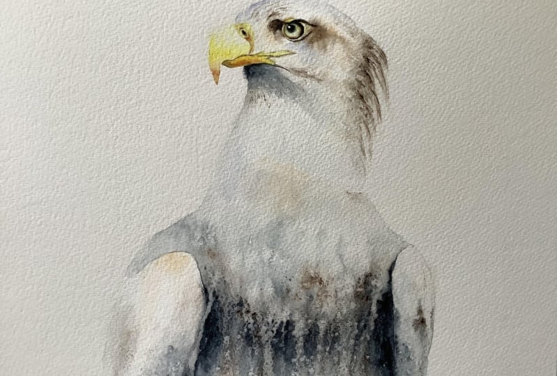
9. Body Second Layer: We're going to put the
second layer over this body. Let's get rid of that salt, it should have dried nicely. Again, it doesn't work very well with this paper and
a combination of paint. You may have used different
paper and different paints, so you make get a
nice salt effect. What we're going to do,
we're going to give this a little bit of a tilt. Again, we may let it dry. You have to judge
your own piece, but will probably let it dry
at quite a tilt just to get that lovely flow down the
neck. You need your big brush. We're going to pick
up the go flight. The tigers and a little
bit of lavender. Now, depending on what
bird you're doing, if you're doing the seagull, would keep it quite light. If you're doing the bald eagle, probably want to add a
little bit more color. What we're going to do, we're just going to pop a line just underneath near
the wiggly line we put in. Underneath that wiggly we're
going to pop some color. Just like a little mini palette. Doesn't matter what
order or how you do it. Go flight, the tiger's eye, weekly along let me just pop a little bit of
tiger's eye top. Really doesn't matter.
It's just a little pallet. Clean your brush. We're going to have it right on each side. It's really nice and wet, and we're just going to
drag some of that down. If you get little bits of clear spaces or dry spaces,
that's absolutely fine. It's lovely. Just
give you a really lot of interesting texture to
run it down wiggly around. I just give it a dabble,
get that running. Fairly quickly before
it dries we want to then wait up to that wiggly
line that we put in. Make sure these don't stain. Just give them a good old wiggle and then allow that to run. If it's not running enough, add a bit more water. Don't be afraid, but just keep an eye on this bottom,
that obviously, it's going to puddle at some
point because it's running. Let's go a bit further down. Then we can add more color. Give it a bit of a
Russell, add a bit more. Just keep in mind these edges. What you can do
just to stop this [NOISE] is to be careful. Get a clean piece of kitchen
roll and just pop it right on top of where that's
paddling, and just leave. It should soak up. Keep it a little bit higher, not too low because you
don't want it to stain. Because there's always
a risk of it staining, but as long as you keep it
a little bit higher up. You can go higher if
you feel like it needs a little bit of extra
room to add that water. Let me put a bit tiger's
eye then I go through it. Just allow it to run
little bits of water. Just go really gently
over this body. Again, if you're
doing the bald eagle, you could add a little
bit more depth. Just be careful because
it actually there. The white feathers
probably start here. Be careful not to add
the dark too high up. Just bear in mind
if you start adding it where that wiggly
line is we put in, I think it's a
little bit too high, so you could start adding
the darker. I'll show you. You want it. I'm not
going to do the dark, but that line you could start
adding a bit more dark. It will bleed gently up. I want to do the sea eagle
rather than the bald eagle. I don't want to put the dark, if you want to do the bogey, you'll just put a
little bit more depth, a little bit more Payne's
gray probably than the brown. You've got another chance to
do another layer if needed. I won't, but I will explain when they're
finishing off bits, if you need it to
be a bit darker. Look away from it.
If you're sitting, stand up, and have a look. Get a little bit of
distance from it. I quite like that if
you squint your eyes, it sounds really cool
thing, doesn't it? A painter squinting their eyes, but it does work. If you needed any depth, if this too ended up
getting a little bit washed out on your first layer, you can add a little
bit of color here. Put a bit of depth there. We get round little bit. Just be careful because we put those nice little kitchen roll marks and didn't waste them. Be careful you don't add. Just be careful about
rustling those layers up. You just want to go very gently, just drop color in. Put a bit of lavender there. I don't want to make
this too dark on him. Just careful. What can happen? I can see as the
water is gathering, it can then stain, so just
be careful with that. Never quite sure if it's
a good method or not. I can just run into
that top wing. The funny little area here
can be a bit problematic. I don't want it too dark, but I clear don't want
to section it off. I like that, I don't
think I want to put too much more and I want
to keep it as light, I want to keep it really fresh, and moving, and flowing. I'm going to leave it at that, but what I will do, put down for a second. I'm going to really
leave it to dry, at a quite horizontal but
aquatic. Can you see that? Can't quite get the area, but I'm going to raise it up. I'm going to
probably take it off the stand. Looks so cute. We've lost you, haven't
we? [LAUGHTER] He can't quite get a gauge,
can you have the age? But I'm going to leave it
to dry on quite a tilt. Be really mindful of
paint gathering on here. If you do use a kitchen roll, as you take that
away, it might be worth just looking at it. As you can see, it can't
use a bit of a funny angle, but you can carry on adding
a little bit of water, but be really careful
that it doesn't then run because you obviously
steepen the angle. Add water and then
suck it up as well. Yes, just watch your own piece. I will suggest that
at this stage, while it's drying, you can
add a little bit of salt. It probably won't come
out. Salt is best done on the first layer or the
kitchen roll marks. Look at your own
piece and watch it. I will suggest at this
stage and let it dry. Try not to fiddle probably
too much, she says. Yeah, allow it to dry. We're nearly there,
we're getting there.
10. Head Part Two: Once it's dried, you
want to then lower it down to horizontal.
How's it look? Just by tilting it quite
an exaggerated angle is giving you a little bit more sense of flow, hasn't it? It is straight for you. Lovely. We are going to
do the head area again. A little bit like I
did with the bill. I'm just going to rub
out this pencil mark. You could do the same as well. The first layer should give
you the line of where it is. But I really want
to be able to keep that head to clear of any pencil marks to give it that a lovely little lost
and found look. I'm going to wet it down
with a medium brush. It's going to be
around the bill, around this lip area into a
little groove around the eye. Again, tucking right
up against that yellow over the top of
the frowny yellow top. Right into the corner where that bill joins over the top of the head.
Swing it around. We're still going to take it down, come up a bit of color. I didn't want to add too much
color at this stage because it's not as easy to take out and but just hopefully
you can see that. You want that straight line like we did on the first layer. Again, down to that wiggly mark. Go gentle, especially underneath where we've allowed
that to flow. Any second line you want to
go as carefully as you can, you don't want to upset
that first layer. You can end up adding a lot of water because you have to be gentle. Don't worry too much. It's better to have a
puddle of water than it is to so upset
those nice layers. It's actually warm here up
in the studio quite a bit. My paper's drying quite quickly, so I can see that was
already beginning to dry. It had a bit of a hairdryer
as well to draw it off. We just wanted to add
strength to the head. Just scrolling in on my picture
so I can see it clearly. Now we can do a
little bit of tilt. Let's do a bit of a
tilt to start with. I'm going to put my
little heart down. It's only a small tilt, probably about an inch high. Just so we can get some
of these off lines. It's got a lovely sense of
movement at the moment. If we leave it to flatten, but do lots of layers and
the second layer all flat, we might lose some of that
and I like that movement. I'm going to use some sepia,
hasn't been used yet; has it? Get it going. I love this line. This is a really nice flowy line down here off the top of that eye. Could see p doesn't move as much and because we're
on a second layer, we can start to get some strength in without
wasting too much. Again, there's a nice dark area and go right up to that yellow. Have a little bit of
tiger's eye with it. It's a nice line again, off the lip area
that's running down. If it does that and blooms up, you can just add a little bit of water to that side
and just encourage it to flow down. You
see how that's pushing. Again, be mindful
of any puddles. I mean, go back under the chin. I just want to add a bit
more brown feminists because I've got
quite bluey there. Just add a bit
more. Again because we're on to layer number 2, you have to judge your
own piece a little bit is if you've gone quite heavy, you may not want to put
as much color down. Judge your own piece. Get a little bit
of we've got here. I'm going to put a little
bit on top of the head, get a little bit of
color, as I say, be mindful if you're doing the bald eagle you
probably want. He's got color, hasn't he? You need to add something, although he is quite white, you still need to get
some depth in there. But you probably don't want as much as if
we're doing this eagle. That buff titanium, a little
bit of buff titanium. Hanging off my finger there. Just to give a
little bit of color, this little bit of buffering
in that crease there. I'm just going to close
it down a little bit. I might have made mine,
it just attached too big. I actually you're going
to close it down. I'm just going to
go into that yellow a little bit and just drawn. Get rid of that, made it a little bit chunky.
that's better. We can do a few little flicks out there just
underneath that beak. Let's pick up my little brush. Just a few. Don't do too many. A little bit of color.
Let's have sepia. I don't want to go too blue. That's probably enough. Let's
put the buff titanium down, grabbing too many colors
here. Put the paint. I've got sepia, goethite, and I picked up the burnt-out. Now, I'm try and get some
of these fluxing now. There's a bit of a
puddle going on. I'm going to just gently
take the excess water off. Then I'm going to
add a bit of color. We're going to use
that color and we're going to clean your brush. You don't want
your brush to wet, but you want some nice flicks. It's a bit scary doing
flicks; isn't it? Because it's easy
to go a bit array. I would suggest starting a little way in and
then coming out. Because you do it
right on the edge, it either looks they're being stuck on or you can
go a little bit too far out with them
and just run down. How's it looking? Add a
little bit, not too much. Again, if you're
doing the bald eagle, you wanted to go
careful on here. You could add a little bit
of blue or a little bit of lavender rather than the brown. But say is within the CEO. While I'm doing this eagle, just want a little bit
of color in there. We need to tackle
this little eye area and make it a bit softer. I'm going to lay this flat now. [NOISE] Now he's flat, a
little bit of water there. We do little brush. We need to sort this out and make it a little bit
darker underneath. What we're going to do,
grab your tiger's eye and let's have a tiny
little bit of Payne's gray. Be careful, mind your hand in this potentially
wet underneath. We're going to add a
little bit of strength. We're going to
actually go underneath the yellow frowny line. Now we're going to just go
into the eyeball. Very gently. You may find you got enough
color just by introducing this tiger's eye in the corner and going into the
eyeball may be enough. You may not need any extra
to see how it looks. You can see that's
already given him a shadow underneath there. The sepia. It's a really
lovely dark part there. It's going up against
that yellow, isn't it? We're running out.
Just type that in. Tap underneath here. Have a little bit of
Payne's gray, a bit darker. Also I want to very carefully just
incorporate that sepia into the yellow ring
just at the very top. I just want to get
a sense of shadow. Don't try and go into
this dark eye pupil. This is ideal for me because I'm so far
away from this eye. I just then gently soften it out to the gently
wet that eyeball. The color, not the pupil
so the eyeball and just gently wet that down. Just as you can see that
shadow is starting to appear, I'm going to put a
tiny little bit, it's quite dark underneath here. It was a menacing, but it gives him that frown,
it gives him that presence. Before that, he looked
a little bit stock. Just take your time. Look at that reference photo. See where it looked
for the dark, find the dark and just
gently tap that in. I think that's
looking all right. I need a little
bit over the top. Now if he's beginning
to dry on you, which I can see mine is, I just add a little bit of
water. Just very gently. Don't put it too close to
the eye because you don't want that to work careful
what we're doing, but it just gives us a little
bit more time to tinker. As long as all of
it is still damp, you can just add a bit more
water and then you continue. Well, I'm going to
use a little bit of sepia with a nice
ring underneath here. Nice dark line which goes up against that
yellow, doesn't it? Tap that in your photo, see what it looks like. It's a little bit of lavender. A little bit of lavender
just down there. It's like a little
bit of color out. Quite light to right up against
this corner of the eye. It's quite light
there, isn't it? What we can actually
do now is to go into the top part of
that yellow of his beak. The bit we sectioned off. Don't go into the mouth,
you just want that yellow, the very top yellow. If it bleeds, perfect. You can see this bit
of yellow, can't you? That's mingling in to that face. If it's not mingling, it's got five tubes
on the go now, you can just add a little bit, just of tiny sub hints, just tiny colors
and suck stuff up. Losing some of the yellow, which I said was not ideal. Let's put some of these
colors down, too many. I'm going to hold onto my
sepia, and the Payne's gray. I'm trying to get away
from it a little bit. Have a look, see how I'm doing. I think I'm there for color. I don't think I need
much more color. I might do my little brush. Just to give a little
bit more depth for these flicks to a couple
of more, just a few. Give me a little bit more. We need to do it as well. Because there's a risk of getting a little bit
of a waterline here. While this is
actually still damp, where we wet up to, you just want to
gently drag it down. It's almost a dry brush. If you get watermarks or waterline to further down,
that's absolutely fine. Just give you a little bit
more texture to the body. You get rid of this wet line where we started and we
wet their head down, just drag it off. The whisk, you end up with a bit of a divide there
and you'll see it quite obviously.
I'm liking that. He's looking all right. See, I've got a little bit, I think a lot of
the little bits and pieces can be altered in finishing off stages. I'm just going to
take a little bit. I've lost as quite exact
line underneath his eye. You can see if I can
get it back in again. I just put it too much. Just suck it up. Let it dry on a tilt, actually get a little bit
more movement back in again. I need to get a little bit closer to my eye to
have a little feel. But hopefully that
made sense to you. We just want you to just get the eyeball
sort by going underneath. I'm going a little bit into
the top of that yellow ring. But keeping the
lower part clean, which I haven't
done a very good at drawback because I'm a
little bit far away from it. It's looking a little
muddy at the moment, that's why but I might have to deal
with that in a minute, and I can get a
little bit closer. I just want to put a
little bit more color. Well, that's
beginning to dry now. I can add strength and it's
not going to move as much. Again, I can re-put that in that lovely line off
the top of the eye. I think I'm going to
let us say I'm going to tilt that up and let it dry. It's a nice tilt.
There's a lovely line coming off the corner
there as well, isn't it? Just make sure you
still damp your paper. He doing this still. I'm going to put a drop of water there and put those down. I'm going to tilt
it and I'm going to let it dry because it
needs to fiddling now. That little blob of
water I popped on there, but hopefully just run down. You can see the lovely sense
of light down there by popping a bit of water
there while it's drying there will run down. Just create that line. That lies sense of light. Also you could do that
at the top of the eye, you can pop a little dot of water in there and
allow that to run. Again, that will flow down. Just be mindful if you've done any running or popped
any water down, that it doesn't gather
too much on those edges. But yeah, I think
I need to let that dry and then we can do the
last finishing off bits
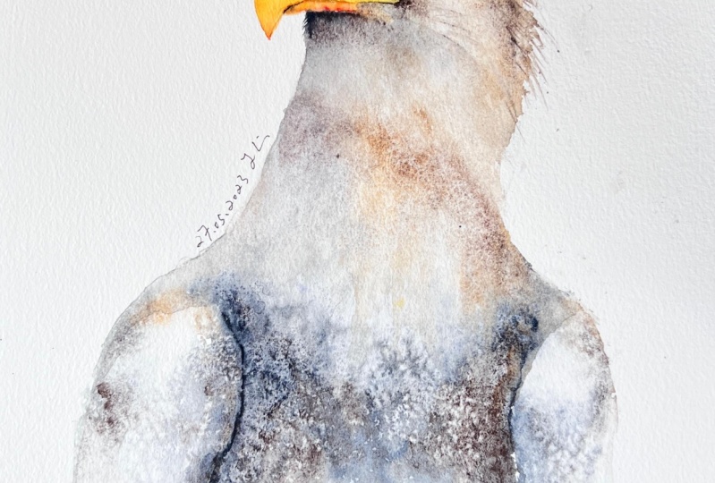
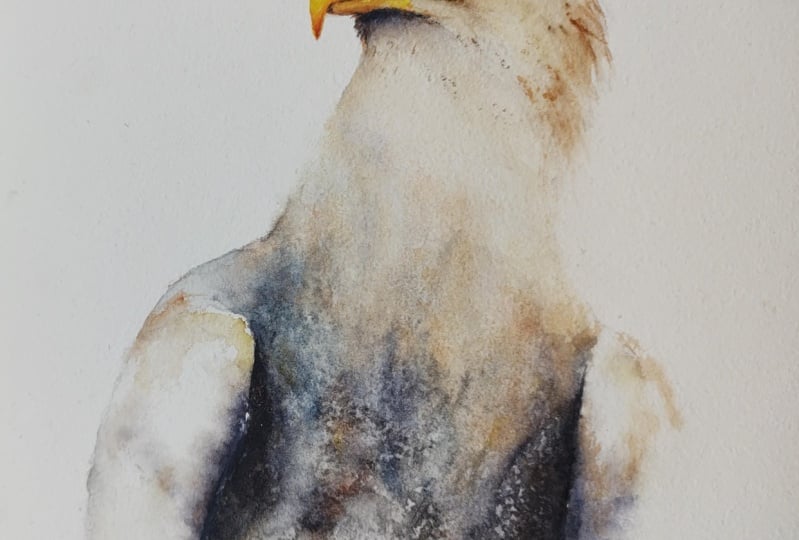
11. Finishing Off: How's yours looking
now? Now let's draw it. I'm quite pleased with how
he's taking shape or her. Apparently, it's very hard to tell the sex between them, so him or her. I think she's, he's
looking all right. Definitely needs a few little
tweaks here and there, but that's what this finishing
off part is all about. If you had it on a
tilt, lay it flat now, and I've now got
some clean water. Have gotten that kitchen
water let me pop that on. Its a clean kitchen roll that really need my salt
and get rid of that. I have my magic sponge, got my fine liner back in, and I've got my little
eradicated brush. We're just going to
go round and mope. I'm just going to go round and just thought a few
bits and pieces out. I can see my frown just the eye area needs a
little bit of adjusting. As I said, I was painting
quieter away from it. Although I've had
a little fiddle off-camera while
it's still drying, I can still see bits
that need adjusting. The fiddling bits, just say it wasn't anything I didn't say hopefully explain to you is just the fact that I'm working
a little distance from it. I just needed to neaten it up when I could
get a bit closer. I think first of all, we're going to rub out
these pencil marks, so really make sure this is dry before you start
rubbing any pencil works better or rubbing
out because you don't want to find
that your paper, or your painting is
still a bit damp. But go round, take all
those pencil marks out, let's paint here
around the beak, top of that head, down the side. Anyway, you've got pencil
marks basically. Just go easy. If you've got them in
the body, just go easy. I'm trying not to rub too much. Also, that straight away
looks better, doesn't it? It's just getting it, takes that confinement out. Looks better already. I'm going to tackle
the eye I think first and we get
that lovely sharp, then we see where
we're going with it. Again, this is just personally, so it gets a little trickier
as the class goes on that obviously we start to
differ from one another. But the reference
photo he's frown, he's a little bit more
slanted than mine. I want to put a little bit
more dark underneath here. The rest of the eye
has worked out okay , it's dark enough. If I start, say
yours might be fine. If your any of these little
finishing off pieces, you can see that yours is absolutely fine.
Don't follow me. It's just a case of looking
around your own picture really and adjusting if need be. Trying to make this a
little more tilt here. I've got the tigers eye. I don't want it too heavy. I'm going to go a
little bit stronger. My brush isn't particularly wet. I'm just going to go underneath a little bit and then bring
that line down a little bit, it so it became
slump a bit more. Get closer underneath the eye. This is where [inaudible]
I can always just soften any bits so you can
still put lines in. If I wanted to paint this
in a little bit more, you can either soften
under any lines, use your finger
to double it out. It's always quite
nice. It softens it without taking color out. Again, that gives us a
little bit more texture. Yes, that looks better. Often it's a case of putting
it like I always say. If you've first-time with me, I always suggest you look at
these the next day because it's amazing how you see
things slightly differently. I think now that
feels better to me. Just a tiny little things. They can be minute. It's a little bit of paint and it suddenly transform something. Just down that, put that away. I'm going to go
round and just take little bits of color out,
I think to start with. First of all, a little bit
too much color here still, it doesn't actually need to be eradicated brushy
almost too much, but could have a little
slightly softer brush. If it's eradicated brush, its very good at
taking color out, but always too good. Whereas this is a softer brush, it'll just take out
a little softer. Again, I can squish rather than actually dabbing it
with the kitchen roll. Actually what I'm going to do, when we incorporated
this yellow, I think I've almost washed out, so I'm actually going to put
a little bit of yellow in. I'm just going to paint that
in to soften it all out. Say, at this stage
so like I say, it's all little tweaks that
maybe you don't need doing. But hopefully this will give you a slow guide to how I would go about
finishing off a painting. That's better. I think I
can just squish just so I get a hint of color. That feels better. It's funny sometimes you just do something, and you're like yes,
that's what it needed. Just a little bit more. Sorry, that was a tiny
bit of burnt tigers eye. I am just extending
that out a bit more. Yes, that's better. I'm just going to put
some feather marks. Actually before I
start taking color out, I'm jumping
the gun with that, so lots of water sitting
on top of that tube. I'm sure if there was.
We're just going to do, I've done often to do any marks, but I feel it just
helps with this brush. I've just tapped the
color along the bristles. Just tap a little few, keeping the direction
those feathers are going. For that obviously on the top of the head they're coming down. Then long because we've done quite a lot of work to try and get that
sense of flow. Make sure you put the feathers in the
direction they're going. Just a few up here. Just the tiniest of hint. And again, just squish
them if you feel they've got a bit exaggerated
just to soften down a bit. But that gives a little
bit more texture, doesn't it as well? I'm just going to add a little bit more color
here in a minute, so I'm not going
to add any here. So let's do that now
and then we can do. This is a little bit
light, just where we've had that gap, where we were adding color
at different stages. It's gone quite pale there. Yours again, might be fine, but you may have a
similar thing to me. So why don't we doing wetting
this underneath the chin? Let's go with a little
bit of tiger's eye. I don't want it too strong. Blue is quite strong,
the Payne's gray, so tiger's eye is
lovely and soft. I'm just popping that down, cleaning my brush
and we're going to just add slightly
at the waist. I'm stopping my
wrist from moving. I'm just going to pull
some of that down. Brushes is damp and you can see it's going
to lead me to be some obvious dry marks and that's giving me similar to what we're doing with the
edge of the brush really, it's just giving me a
little bit of texture, add a little bit more color. Let's add a bit
of, and go for it. I can just do the same. Everything is nice and light. Try not to press too hard because you
know that that's true. In theory, we've done
three layers there. Lift your head up or lift your
painting up should I say, step away from it a
little bit if you're sitting quite close to it,
see what it looks like. I think that looks okay. What I want to do while I'm here to say we're going to be going around taking color out. Almost lost some of
that light there, so damp brush just pulling
some of that color away. Trying to do with the kitchen
roll because you find it might just take too much. I'm pulling right out. I really wanted to try and
keep all that movement. We've tried really
hard to create by tilting the board so
still want to keep it in that faint of movement. A little bit here, not too much, and just again, just pull
my finger a little bit. Almost good thing is to exaggerate it if
you're not careful. Sometimes you look at a piece and you can do a little thing in it and it just makes
it light in your eyes. Now I'm going to go round now and just take little
bits of color out. I like taking a little
bit off the top here, just on that edge
on top of his head. Clean bit of kitchen
roll. I can just dab , taking the color out. So I'm still working a
little way and I've got a bit machine here of light,
where the light is hitting. I'm making excuses, aren't I? So take a photo so you can
see my funny pole that I have that sits in front
of the work so I don't accidentally get
my head underneath. I'm just getting rid
of that hard edge just a little bit and you
don't want to do too much or something
disappears. Again, we're going
to try and go round and let's take a little
bit again at the beak. And say if yours is very
light already, don't do this. But if it's like mine, it just takes a little
bit of color out, gives you a little bit of light. Get rid of that very
hard edge that's there. Work our way down, tiny bit here to the dilly bit. I quite like what's there? We'll try to do
tiny bit out here. I'm sure that wing
is exaggerated already just to find
that nice line again. If you've lost it,
put that there. Coming further down, this
is where the magic sponge, if you haven't come across a magic sponge before,
they are brilliant. I think a cleaning product, so these can be found on Amazon. I've put the link in the
Projects and Resources pages. So you wet it down, wring it out and then you can just get rid of
these hard edges. So very gently dampen them, which in a way, look
at that, magic. It's great for any level, I tend not to use a huge amount apart from
obviously very obvious, little splurges that you
get when you're painting, which is really hard not to
when you're doing watercolor. They're amazing for taking those out and cleaning
your work out per the end. Occasionally I use
them like this and this is a good case, just to get rid of any hard waterline that you'd
been left with. You can see little bits here, a little bit there, just
where we've tilted it. Let's run a little bit. I like what's happened here. It's a very hard tool to use or a bit of a
blunt tool to use. I wouldn't take any color out in the body or
anything major. It's a little bit
of a blunt tool where I think the way we
would say a bit harsh. So right here, I'm going
to swap that and I'm going to take a little
bit of color out of his, a few flicks out
of his tufty bit. Great little brush this. Not too many, don't do
too much because again, it's very easy to do too
many. That's probably enough. I'm just going to flick back my iPad from a closer
up to his face. I would take a little
bit of light out this mouth area, so the low, what would be his
lower lip I suppose, I'm going to just take a
little bit of a color out. We need to color in as
well to do those lips. Certainly looks better. I'm just waiting, making
sure that all this area is dry before I tackle
the eye for some, if you wonder why I've diverted
away from the eye again. Better, I want to make
sure that it's dry. So I thought we could
continue fiddling along here. Lower beak. What we're going to do, we're going to wet it down again. I just want to get a little
bit more depth in there. Say, if yours is dark enough, you don't need to do this. I'm going to color
a bit color there just to bring us a
little bit of strength. Actually what we will do, it would be helpful actually, even if you're happy with your strength
is to just to wet it down and then what we will do, let's pick up the bird
tiger's eye again. Very carefully, if you say, once it's wet down, I'm just going to put a little
bit of color underneath. We're going to try and
make that mouth line. We can also do this with
the liner pen as well. So I'm going to do a
little bit of both and hopefully where that's where I've wet this to
take that color out should be a little bit
soft and damp stuff. That line should soften. Really want a very hard line, lip under there and
make that a little bit stronger and we can
shape it if need be. If you've lost some of your
shape, you can shape it now. It's a silence of
concentration here. A little bit darker
at the end as well, so it's quite dark there. Where the lips joins
the bottom of the beak, the little line there
as well, isn't it? Only tiny little things. That's enough actually.
Put that down. I should be dry now. What I'm going to do, firstly, I'm just going to take a
little bit of color out. The bottom of the eye it's
almost already there. But where we've on that
second layer when we wet the whole head down and we
covered the eyeball game, we've lost some of
that light zone. Small brush, I'm just
gently wiping away. Again, you can reshape the eye if you're black
color a little bit muddy, got a little miss shapes. You can shape that now. A little bit of that brown out. It's also quite
nice. Got a little. It's like I started going into my yellow when I
was doing the eye. Just guess trying
to reclaim that. Also it's nice just to get a little sense of light as well, just a little bit of color out
there in that corner edge. Say these are just a tiny tweaks that make all the difference. Just say keep
flicking your eye to your painting and then back
to the reference photo. They almost super-impose. You can see suddenly
what need to doing. Hey minds got quite a frown actually but I'm
going to leave that. [LAUGHTER]. It's either
obviously concentrating. It's probably because
I'm concentrating. I've made him concentrate, giving them a concentrated
expression to. Sometimes where he's
finishing off bits is probably advisable
and before you get too carried away
with doing lots of little tiny fiddly bits is to actually look at
it the next day. You may find actually you
don't need to do anything. What I'm going to do? I'm
going to just going to add a few more of those little. I'll touch it on sides in
the way my wrist movement. Just add a few more of those little bits
of colored detail. It's just squeaking. Or if
you've got panty just running along the edge of the brush. Will put some down here. Though we went that
down, I'd hoped, they've giving a little bit
more color and actually that she's almost washed out. While I drag that down, Let's put a few in for say. Make sure you go in the line of the feathers,
so follow that line. Think I'm in danger of
over-fitting if I'm not careful. [LAUGHTER] Just last tool, I am just going to blast it with a hairdryer very
quickly just to make sure it's really dry before
I do any either fine lining. [NOISE] With the fine liner, this is where you can really
crispen up that eyeball. Just look your reference
photo and really crisp it up. That gives you that real ping. Again, go around that
crescent of that. I'm really sharpen
up that detail. You might need to scrap a paper here might need to
give it a little bit of a scribble clip runs out as
it's going over the paint. Hope you get the gist you can. You might look at the eye, you want that eyeball
to be lovely and round. This is where I say you
can just be sit down, get really nice and close to it. I get that I eyeball
really lovely around. Any other detail. It's got nice to do just
the nostril to run out. To do nostril and go around
that sharpen that up. Again, you can do a
little bit, just bits, don't draw a long line
because it will look a little bit too
much personally. I would just do a
little section of it. Just a really crisp up. Any of edges. Because the rest of this is
ever so loosened flowing. What I'm trying to get is some very sharp
detail in the eye. Should pull that back. That's enough for me. Just see I quite like take a little bit
more color out that eyeball. Just trying really make
that shine. That's better. The pierce the
resistance as they say, little bit of the
white paint and white gush get it really loving, creamy with your small brush. I know he hasn't
got one on there, but I still like putting
them on and I would put it towards the you want to
see looking up here. Put it towards the front of that pupil to a tiny little dot. Think it makes all
the difference. [LAUGHTER]. There's also, the
minutest little. Just a little bit of
white here, isn't it? Just where the eyeballs rolling
around to look forward. Just pop that in as well. We're almost there. Any other thing is to
take a little bit of color out of that frown
if you think you need it. You lost a little bit of
yellow here personally, it was me trying to
paint from a distance. Excuses. I'm there with him. But if you were wanting to do the bald eagle and you found this was a little bit
too light here still for you. He's not. [LAUGHTER]. It looks a little bit
weird now this one's. I was quite pleasure with them. He's my first prototype
amongst many. But what I've done, I've done another
layer over him. You can see the paint gray here. Like we did and we did this
second layer of the body. We did a little
stripe along there. Did very similar little dots. Quickly wet it down. Had it up a little bit of a tilt and then let it all run down. It's exactly as we did
with the second layer. If you go back to doing the
second layer over the body, it's exactly the same
technique really. We're just doing it
with some paints gray. Then again, once
you've done those dots very quickly, pull it upwards, but be mindful not to go too far up because
I think the bald eagle, do they have quite a
chunk of white head and the white feathers run
further down their neck. I wouldn't go any
higher than this. That's almost a touch
too high and said, so it's better maybe to
start a little bit lower. Don't start at that line when
we did the second layer. Don't add the paint where
we started go further down because you can always
do pull it up like we did. Then I would let it dry, tilt it again, and I would
let to dry quite a tilt. Again same rules apply
watch out for there any paddling that might
appear down here. But bear in mind, it's
just an impression. Say we're not trying to do
a bird observers guide. It's something that's pleasing from a distant in some ways. Don't get over technical
better detail. I think the nice thing is just
to get that I really love in crisp and the beak
really lovely crisp. I would take my time over doing those and
leave the rest of it quite loose and
flowing and loose. [LAUGHTER]. I hope you
enjoyed painting along with me for this
class he's been numb. He's been a learning
curve for me as well. I've really enjoyed the
challenge of painting him. If for any reason, when I look at him
the next day and I find this is other things I feel I could alter and will be helpful for you to see the alter I will do
another chapter. If there isn't another
chapter I've considered, he's okay the next day. Yes I would do likewise, popping away for the
overnight and then, as I say, in the
finishing of bits. Just looking it in the next
day and tinker if need be. Thank you very much
for joining me.
12. Next Day Tweaks: I came back into my
studio and looked at him with a fresh pair
of eyes as you do. I can see little bits
that need adjusting. They're not obviously
going to be exactly pieces that you would need to adjust
on your own piece, but I hope this is helpful
for you to see how I go about finishing off my pieces
to a more of a crisper, higher standard, I suppose. Mainly, what did
I see that really stuck out? It's silly, isn't it? We spent an hour and
a half, I suppose, to get the painting
and you look at a piece for so long
you almost don't see what you're looking at. I think it's why
it's so helpful to reassess your piece the next day before you go, it's done. Because quite often
you come back and go, that could have been a
little bit different. I can see lots of little bits. The biggest issue I would say, he looked a bit
small and cramped. When I actually looked at
my reference photo and this template is me telling you to be really careful
about sketching them out. I haven't done a particularly
good job myself. The wing needs to
be a bit wider. I'm going to show
you how I'm going to make this a
little bit bigger. I eel like he can
maybe do a couple of more cliffs at the back here, which is where
those feathers are sort on the top of his head. Tiny little adjustments
around here in the nostrils just
to crisp it up. I think, again, because this is so loose pieces, so crisp details and
that lovely contrast, which I think are nice. I'm also quite aware, I've done a bit of a hybrid
probably because this is the actual sea
eagle with brown or mainly brown and I've
obviously gone quite blue, hoping to incorporate
the elements of the bald eagle for you. I'm going to add another layer and it's obviously not
going to cover up the blue, but just to give it some more of a warmer brown
tones over the top. Also I can demonstrate how I go about doing
another layer, which would be helpful
if you're wanting to do the bald eagle and
add more dark blue, I hope that makes sense. Adjust this wing a bit. Let's get started before I waffle on wet all my
tiny little adjustments. First, I'm going to try and work from top
to bottom just so I don't put my hand in
it and I don't want to really have the dry bits, so I probably need to put that down and pick
up my tiny little brush. Little things around the
nostril, there it is. The minute shadow, let's say this is getting a little bit
pedantic, I suppose. I just want to put a tiny
little shadow there. It's just with a very
bit of graphite. Just put in that
little line there and just softening down. I can just do a little bit
more strength under here. He's got quite an
exaggerated dark areas so I've lost that
somewhere along the line. I think I didn't
have it one point, but somewhere between the
washes, it's washed out. I'm picking up a
little bit of sepia, tiny bit of graphite, and I'm just literally
going to paint it in. Just a little hint. I don't want to get too, I'm also having to walk
away from it again, because when I was
closer up to it, I can see it quite clearly. Now I'm a little away from
it. I'm trying to judge. Yeah, that's better.
Just this color got a little bit lumpy. Again, I just want to soften that white line where I
put the white gouache. It's gone a little bit clumpy. I'm just smoothing that out a little bit.
Yeah, that's enough. Don't think there were any
other issues higher up. I think his head was okay. I just wanted to see if I can do some more flicks
and without making it look like they're
stuck on because I know there's a few
people of comedy going, you need to do it
while it's still wet. Let's see if we could do this without them looking
stuck on it. I can show you how
to soften them if you want to do them later. I got tiger's eye, which is nice soft color
and I got the graphite. I just want to keep all
your wrist nice and loose. Let's see if we're obviously
going in that direction. See what they look like. This is that one there. Yeah, that's better. No more. Then you can just very gently
clean your brush again, Find where the you started
with that brush smoke, and then brush a
stroke, not moat. Then just gently soften with your other finger or
something just so you don't get that hard
line where it started from. I think that's helped. I'm going to do the wing next, so I'm just going to
literally really wet the whole thing and incorporate
a slightly larger wing. Making it bigger. I don't know how it got so
dwarfed, I'm honest. Just going to use my
eradicated brush. I'm just going to try and
get that existing line off. Give it a little
bit of a rustle. Left with two lines. Then with the tiger's eyes, I pick up the Goethite again. I don't want to do too much. It's just did the minute
little line, I suppose, so your eye can see that
that wing is larger than it actually was a
few minutes ago. Say I've got some nice
markings on there. I don't really want
to mess up but don't mess any other
pop, particularly, we'll put a little bit more
gold because I'm aware I've started making
it quite dark. As I said, I was
doing sea eagle. It's probably not a
great representation of him. That's enough. Again, I can potentially be
left with some watermarks. I'm just going to just gently drag it down a little
bit of kitchen roll. Just gently soften
that waterline. I think that's making it better. This side is where we
just got one layer. It's a little dull, hasn't
really got any interest. So I'll keep the
tiger's eye down. I'm going to grab a
little bit of sepia. I'm just going to put
quite a dark mark there. I'm just going to put that in, just literally painting that in. Cleaning my brush without sticking my hand in the
other side of the wing. This is why I always have to dry things in-between because I'm likely to do this. So I'm just going to
drag that into the wing. Make sure I got the shape right. Soften the top. If I just start dragging, I'm going to end up with
a suitable drag marks. Just need pressure to
the top of the wing, although it's very like
the top of the wing. You have to interpret these reference
photos to make them almost work for
your piece as well. This is knowing what to put
in and what not to add. What's going to make the picture an improvement and what's not. I'm not convinced this is
working either at the moment. We never dragged down. Sure, I've got the
smoothness of that wing. Tiny bit, it goes right there. That looks
better actually. I lost some of these
nice drag marks, but I think that
looks all right. I'll take a little bit
out of the kitchen roll. That looks okay.
Let's put those down. Now, I'm going to start
this little body bit. I'm just a little bit cautious. Both wings are a little bit wet. They will leave a little line. I'm try not to
incorporate it too much. I'm not going to use any
of the Payne's gray. Obviously, if you're
following this and you're wanting some
help with doing that third layer now to
make the bald eagle darker, then obviously use
your darker blue or black or whatever you decided to do
for the dark colors. I'm going to use a
brown because I want to make him a little warmer tones, and give him a little
bit more impression he's a seagull,
not a bald eagle. So as we did with
that second layer, and when we put little
dots down of paint, I'd say go lower because
again, with the bald eagle, it's quite a lot of white. It's just not his head, it also goes down to his neck. Sorry, I've got tigers eye. I don't want to add sepia. It's a little bit dark and I haven't got
any other colors. When you dotting these down,
once you put them down, you need to work quite
quickly because you don't want to be
left with any dots. Put a nice light amount. Clean your brush and I'm
just going to drag again, keeping everything very light. Let's try not to
knock right wing. I also want to drag
up fairly quickly. I don't mind it'll dry patches, but just make sure the
runners is the feather. You're following
any feather marks or feather lines, that's it. This would apply exactly. If you'll turn to add
the dark, just the same. You don't need to. Can you see that's giving a little bit of just warming
up a little bit, isn't it? Pull it down again. Also we've got our magic sponge. We can take little bits out if it looks a little
hard on the edges. But my main concern
was just to add a little bit more strength
and a little bit more warmth, a little bit more brown for me. Again, you may be wanting
to add a little bit of dark giving him more of a bald eagle attempt.
I like that. I don't think I want
to fill it much more. Just making sure I haven't
gotten any obvious dots there. Let's put a little
bit right more there. Squinting your eyes
is always great. Really helps to see where you think you need
some dark on your painting. I sit on the redundant
or his fatal. If I say I'm nearly done, normally means I'm going
to continue fiddling. Sometimes you just
can't resist, can you? It's very hard. I am
definitely at that stage. If I carry on, I am going
to ruin what I've got. I like that little liner there. I'm going to allow that to dry. I look and allow that to dry
and I'm going to soften any. Once that's completely dried, I can use that magic sponge out. We didn't clean any edge it up. If you haven't gotten
a magic sponge, just keep an eye
on it as it dries. You can use a clean
piece of kitchen roll and just gently soften
those edges as they dry. Very gently like
that so you're left with that nice lost and found where it's very
soft and it disappears. Wonderful. I hope this little
extra class is been a help. As I say, these aren't
necessarily covering any of your particular
issues because yours might be perfect and you may not have the same
issues as I've got, so I hope this has helped. So please don't
forget to put any of your work on the projects
and resources pages. I'm so looking forward to
seeing these eagles appear. I know you're going to do an amazing job and it's going to be nice to see the
difference between the sea eagles and
the bald eagles, whichever you decide to do. Well, you may have a hybrid, a little like mine,
but whatever you do, please do share them because it's very rewarding to
see your pieces appear. So again, thank you
for joining me.
13. Final Thoughts: I hope you enjoyed the class. Which bird did you paint? Whichever one it was, I hope you had fun allowing all that wonderful
paint to flow. Isn't it exciting
and liberating? Hope you enjoyed painting
that beautiful eye and beak. It's worth taking the time
to get it wonderfully crisp. Did you add the third layer to give you a little more depth? Or had you been bold
enough on the first two? As I always say, it's worth stepping away and
coming back and looking at him with a fresh pair of
eyes and tweak if necessary. We look forward to seeing
you in the next class.
 Jane Davies, Professional Artist and Teacher