Transcripts
1. Dye Ink Techniques for Papercrafting Class Introduction: Hello and welcome to dye ink techniques
for paper crafting. My name is Cheryl
and I'm going to be teaching you some
of my favorite ways to use dye inks in
pavement is class. We're gonna be doing
more card making, but any of these techniques
will go well with junk journaling, art
journaling, ATCs. You could even use some of them in scrapbooks or other projects. Let's go take a look at
what we're gonna be doing. So these are the cars
that were going to be creating in this class. The very first
couple are gonna be doing ink backgrounds
using different dye inks. One is gonna be with markers, one is going to
be with ink pads. These are the
markers that I like to use, their Tombow markers, but any dye based ink or I die based marker should work
for those techniques. And then for the ink pads, I'm using distressing
pads, but again, any dye based ink pads should work for what we're
what I'm using those four. We're also going to be
doing some direct to stamp techniques and second-generation
stamping techniques. And then finally, we're going to combine all of the different
techniques that we learned in this class and create another couple
of cards with this. So in this class, we're gonna be doing is
six cards total. Is. This class comes
with a supply list that has pictures of
each one of the cards. And this applies
use for each one. Those supplies are
linked to where you can purchase
them if you choose. But it's also a great resource for just what supplies are used for each
one of the cards. I'll also have the
measurements for each of the pieces for the cards
on that same supply list. Now let's go create.
2. Marker Background Technique: The first card we're going
to make is this one here. And we're going to use some dye based markers to
create the background. But first we're going
to need to stamp and emboss the image
on the cartilage. Move this out of the way here. I've got a watermark
ink pot, ink pad. So this is an ink pad that has some sticky ink that is going to stay sticky
for a little while, while we do our embossing
on our card base. And because we are using lots of water for creating
these backgrounds, I'm doing this all on watercolor paper for
my image pieces. Regular card stock does
not do well with water. So it's not recommended
in any way, shape, or form for doing backgrounds that have
lots of water on them, you could use a
mixed media paper, that one will be okay for water. But I chose to use some
watercolor paper for today. Let's get our powder here and I'm embossing it with white. If you emboss it with clear, sometimes the water and
the ink kinda seeps under that embossing and it has a
completely different look. So I've chose to do
white so that I have a crisp white flower
image on the card. I'm using a heat gun here. This is emit heat. It doesn't really blow air, so it's going to melt
that powder where it stopped to the stamped image. It's a little bit harder to
tell what the white paper on white or white powder
on white paper. But it goes from being a
white granular to a smooth, glossy white image while
you're melting it. So now I'm going to stamp
in a boss my reverse. You could do your
background and then do the stamping and
embossing afterwards. But by doing the stamping
and embossing ahead of time, you can choose what colors you want behind different areas. It gives you a little
bit more options. Now saying that the ink
is going to flow and move around once we
add the water to it. But it is nice to
have a little bit of control over what color
is going to go where? No, let's melt that one. If you happen to have any powder stuck outside of
your stamp damage, you do want to brush it
off before you melt it. Once it's melted, you
can't take it off. Just noticed a few
pieces on my flowers. We're not totally melted. There we go. Alright, so now we've got our watercolor paper
embossed there. We're going to take our markers and we're going to color it. Now. You're not trying to
be careful with this. This is just to get some
color on your background. And like I said before, it's not going to
stay where we put it. So it's going to move
around a little bit. So you do not in any way need
to be precise with this. Some more over here. And as you can see, I'm not concerned with getting the background
completely covered. I'm just doing trying to get all areas to
have some in it. I'm trying to put each of the colors in several
different places. I don't want just like
one block to read and one blotch of purple,
blah, blah, blah. And you can do whatever
colors you want. I chose these colors because
they coordinate with the other cards that
are in this class. But you don't have to go with these colors in any
way, shape, or form. The markers that I'm
using are Tombow markers. But any diabase marker that
reacts to water will work. Now we need a spray bottle
and we're going to spray it as much or as little
water as you want. I just want to make sure that
there's a good amount of water so that the ink starts to move around and
blend with each other. I don't in general tend to
move the card stock very much. I pretty much spray it and leave it to move to blend
and stuff like that. If you wanted to, you could lift and tilt to move
it where you want it to go. But I kinda like seeing what it does and where it flows to. If you happen to have
an area that's really, really dark, that you
don't like it All. The best way to get
rid of it is take a corner of a paper towel and just place it on there and it will suck all
the excess out there. So I'm going to leave
that to completely dry. You could take a heat tool, not the embossing guide because we don't want
the heat from it. We just wanting something
that's going to lightly and gently dry the inks, you could do that to
speed up the ink drying. I'm going to let it dry
completely naturally. So it will take awhile depending on how much water you've added.
3. Marker Background Technique: Card Assembly: Alright, our background
is completely dry and we're ready to
glue or car together. You do need to wait till all of that ink is completely dry or else your glue is
not going to stick. But I love how the
ink just blends. Just, you can just
get some really, really cool blends
that you can't do with angle ending
on a background. So it's one of my
favorite techniques just to see what happens
because it's one of those things that you can only control what colors
you put down. You can't control how they start to flow and
blend with each other. And it's a great way if
you have dye based markers to just play and
create backgrounds. Again, you want to make
sure that you're using paper that can handle the water. So either watercolor paper
or mixed media paper. But have fun with it. And then obviously the stamp images and the sentiment can change for whatever it is that you're
making it hard for us. So it doesn't have to be this
stamping, this sentiment. But definitely a fun technique. I've got all my mats for my piece already cut
and ready to go. I'll put the measurements
for them on the supply list. You'll know the
sizes of everything. All of the cards in this
class, like I said before, are five by seven because of the size of this stamped images
that I'm using. But you could do
the same techniques and scale down the
cards if you had different stamps that
were on a smaller scale. Now, the watercolor paper here, see how it's starting
to curl up there. When you're using water
with watercolor paper. That just happened.
It does that. Just trying to find
my block here. So what I like to do is put a acrylic block on
there while it's drying and then put
something to weight it down. And then when you're done, it will be completely flat. But I love that background. So in the next video, I'm
gonna show you how to create a similar background, but with dye based
ink pads instead.
4. Ink Pad Background Technique: So this here is the next
card we're going to make, and it's the same design, the same card front
design as the first one, but we're going to use some
dye based inks instead. The technique is very similar. But just so you know
that this technique can be done with
either die based ink pads or diabase markers and get a very similar result. I changed the colors
for this two blues just because I thought
it'd be nice to see it with a different
color scheme. So this first steps
are the same as the last one we need to
stamp and Emboss our image. We're going to use that
same sticky watermark ink. Watercolor paper has
some texture to it. So choose which side you prefer. And then when you're stamping, make sure you press
your stamp really, really well to get
a good impression of your image. Rico. Excess powder back
in the container. And who'll melts this? Then do the sentiment. This is a thank-you sentiment that I just really, really like. Again, it could be
with any sentiment. This image is so generic. It can be a sympathy card. It could be a birthday card. You could do a wedding
card, so you don't, you're not limited to what the card could actually
be with this image. I just want to make sure
you choose a sentiment that fits in the open area. Once again, if you
have any powder stuck to something outside
of your stamped image, make sure you take a soft
brush and brush it off. This is looking good. Perfect. Now we're going to
use our ink pads. I'm going to go
from light to dark. I'm not really for any reason. But just that the off
chance that the ink pads are the ink is still
slightly damp from one. I don't want to get dark
ink on my light ink pad. And I tend to do about
three areas of each color. But obviously, this last one, there's gonna be more
because there's more open. And again, you don't
necessarily have to cover every single thing just
like with the last one, anything any spots that
are open are going to get filled once you spray it with the water and they
start to move around. So we don't even need to wait, wait for the ink to dry at all. We're just going to spray again as much or as little
of water as you want. And if you want to tip it to move the
ink surround you can. I tend to like to leave it on its own and just let it dry. I'm going to let
that dry completely, same as last time if you
happen to have a spot that gets lots of ink that
you don't want it too. You can use a paper
towel to mop it up on. And you can also put it on a paper towel so
that some of the excess can run off and just be soaked up
by the paper towel. And I'm going to let
that completely dry. And then we'll see you in
a bit to finish our card.
5. Ink Pad Background Technique: Card Assembly: Alright, this piece
is all dried. I love the combination
of those blues together. I think that background
looks really, really cool. And you can see, I mean, because I used all blues, you don't see different
colors blending together, but you can see how, you can see a little bit
of each of the colors. Like I just liked the way
colors blend together when you just add a bunch of water
and let it do its thing. Sometimes you get the most
unexpected results from that. Alright, so my back or my mat
pieces are cut once again, and I did similar ones
to the last card, just in colors that coordinated with the colors of
this background. And then you can
also see how curved my card stock is from the
water and stuff like that. Even when you'd use watercolor paper or mixed media paper, It's bound to happen. Once again. I use
the acrylic block, make sure it's set
the way that I want it to, then
add a weight to it. This one here is almost dry and you can see how
much it's flattened out just by letting it dry
with a weight on top of it. So that works
really, really well. It just takes a
little bit of time. Alright, the next card, we're going to use some
markers rate on a stamp.
6. Direct to Stamp Technique: So now we're going
to use the dye based or markers and
we're going to use them directly on our stamp and
create a watercolor effect. Penny Black has a bunch of
these different stamps that have a brushstroke kind of a watercolor look to
them that are fun to use. So what I'm doing here
is I'm taking my marker, I'm taking the brush
ended of my marker. These ones have a
fine and underbrush and I'm using the brush
and for all of it, for this, I'm coloring
directly onto the stamp. Now while I'm coloring
on the stamp, the ink will dry on that stamp. But what we can do
then is mixed it with some water
and then stamp it. And it'll create a
watercolor effect. So as you can see,
some of the colors are pretty easy to see as
I'm coloring them. The lighter colors are a lot
harder to see on the stamp. But I always work
from light to dark. Because if I get some light
marker on this dark one, it's not going to
really ruin my marker. And if I get some dark marker onto my light one, isn't it? Again, it's not going to
necessarily ruin the marker, but I don't want
to color expecting this light color and then
get a dark purple with it. Whereas that's not
gonna happen with the dark purple here. So my flowers are done. And now I'm going
to do my greenery. So I have two
different greens here. There's not a whole lot of difference between
the two of them. But I do still like to use a darker one to add
a bit of shading. I think it just gives it a
bit more of a realistic look, as well as the fact
that I find when you use multiple colors, which just gives
it more dimension. So light-colored done, the dark one is going on
the bottoms of the greens. Anywhere there would be a
little bit of a shadow, so rate the bottom of the leaf, they're underneath that flower. We go. So now I'm taking my misting
bottle and all you do is missed it two or three
times just to get a light mist over
and I don't want it drench because
if it's drenched, you're going to lose some of
the detail of the flower. So I'm trying to get
it wet enough so that the ink is wet and it's going
to transfer really well. But I'm not trying to
ruin much of the detail. I'm gonna do one from
this side. There we go. And you wanna make sure that
you have a mister for this. That gives us a nice
fine miss this one here. I did get a few drops
with it, but that's okay. But in general, I want
one that has a fine overall missed and I
like this mr. For it. This one if you're pushing
the lever or the trigger, whatever all the way you
tend to get a fine mist. And if you push it
part of the way you get it, it's kinda spits. Alright, so I'm going
to lift that up. There's still a bunch
of ink on there. We're going to use it for another credit in
the next section. So don't clean your stamp off. But there we have our image. I'm going to let
that completely dry. And while that is drying, I'm going to just add a
sentiment to the bottom. And this one, I'm using
an ink pad to ink the stamp because it's a
close enough purple for me. You could use the
the purple marker that we just used in color it. But in that case, instead
of spraying it with water, you would have on it
as if you were like cleaning how you have fun glasses to clean
them, you would do that. You want some moist
air to rehydrate the inks way that you can stamp it for something this detailed. If we were to mix it with water, you would lose all the detail in your stamp would
pretty much are, your sentiment would
pretty much be smeared. But there we go.
We're just going to let we're just going to
dry that quickly a second. It shouldn't take too
long because there's really not a whole lot
of water that we added. We just did enough to get the detail or the stamp
to transfer over. Because for a stamp this big, by the time you
finished coloring it, the first colors that
you used or all dried. But it's good enough to bear. Once again, I've got
my pieces already cut and you'll see that
there wasn't as much water. So this one didn't bend nearly as much as
the other ones did. I'm using a liquid adhesive to a glue my cards
together just because I like it so that if by chance I got a drop
of water on there. So let's put the
glue on the side. If by chance, I don't
place it correctly the first time I can move
it and adjust it. Whereas with just a
double-sided adhesive, you don't sometimes have
that leeway, but you could, if you'd like it
to using a tapered or you could use
a tape runner for this doesn't necessarily
have to be a liquid is GC. I tend to find that my
liquid adhesives though, last way longer than
my tape runners do. This one, you need
to hold it down for just a couple of seconds
because it is bent. And I am going to, after I turn the camera off, I'm gonna put it acrylic block
and a weight on there too. It's to finish drying it. But there we go, our first
card in the next video, I'll show you what we do
with the remaining ink on the pad or on the stamp.
7. Direct to Stamp Technique: Second Generation: Alright, so now we're going
to take this ink that's left from inking the stamp with the markers
from the last card. And we're going to create
another car with it. Now I'm actually going to stamp
this two different times, just so that you can see
you can use it a few times. The other thing. So the very first
time we stamped it, we got quite a dark image. Each time we stamp it, There's, the image is going to get
just a little bit lighter. So that's a
second-generation stamping. This one here is a
third-generation stamping. So this is the one that
I did after that one. Each time it's going to
get lighter and lighter and absolutely you can use it until it gets to the
point where there's not really much this one here. I didn't create a card with. But just so you know that you
can use this a few times. And I did my inking
for this with markers. You could try do
it with ink pads. It's going to really
depend on this stamp. Some stamps are going to
be a little bit easier to judge where the
different colors are and be able to separate
them in ink them. Some, it's just really not
going to work too well. In my opinion, this
flower is one where it really doesn't work
quite as well. So now I'm going to miss this
again and stamp it again. And this one, I'll
just put it aside and make a card with it later. But it's pretty cool
that you can Inca stamp once and then get several
different cards with it. And I could probably
do it yet again, but I'm not going
to because limits. So this one I'm
going to set aside, I'm not going to use this this. I'm just going to dry it
a little bit before we go with the next step. For myself, my own opinion, this is just a
little bit sparse. There's not a lot to it. So what I did was
just stamp a text in the background just to kind of fill that
out a little bit. So drying it, you
could let it air dry. I'm just doing it with the heat tool just to get
it dry a little bit faster. But you definitely
don't need to. You could absolutely let it air dry and you'll get the
exact same result. It just depends on
your patient's level really. There we go. So I have I'm using
this stamp here. It's got a text, one
is going to music. It's got a few different
background ones. And all I'm gonna do is keep inking it and I'm
going to stamp it up the background of the card. I'm doing it in a really, really light ink so that we get that pattern and the
texture in the background, but it's not competing
with the flower image. 1 second, Let's make sure our
texts is the right way up. So if this was stamped too dark, then you would lose the
image of the flower. And basically it will just
be a little bit too chaotic. And the stamp here
that I'm using is obviously a border stamp. Easy enough to get a background. But if you had a
background tech stamp, you could absolutely use it. Even that music
stamp I think would be really cool in
the background. But the beauty of
a set like this, as you get several
different background options within the same, within the same set. Alright, there we go.
Our background is done. Now I'm just using
the same sentiment that I used for the last one. It could be again, whatever
sentiment you want. You could even use a die
cut for a sentiment. There we go. Now, let's glue or car together. I use the same layers
as the last one. The same color layers. I just liked the way
they look together. So again, measurements for
all of this will be on your supply list
that you don't need to worry about having
to write it down. But I kept all the maps for
the different cards the same. Just to get a little bit of
continuity between the cards. There we go. Once again, this does need to be weighted
with an acrylic block, so I will do that.
But there we go. Another stamp or
another card done with a stamp with markers
directly to it.
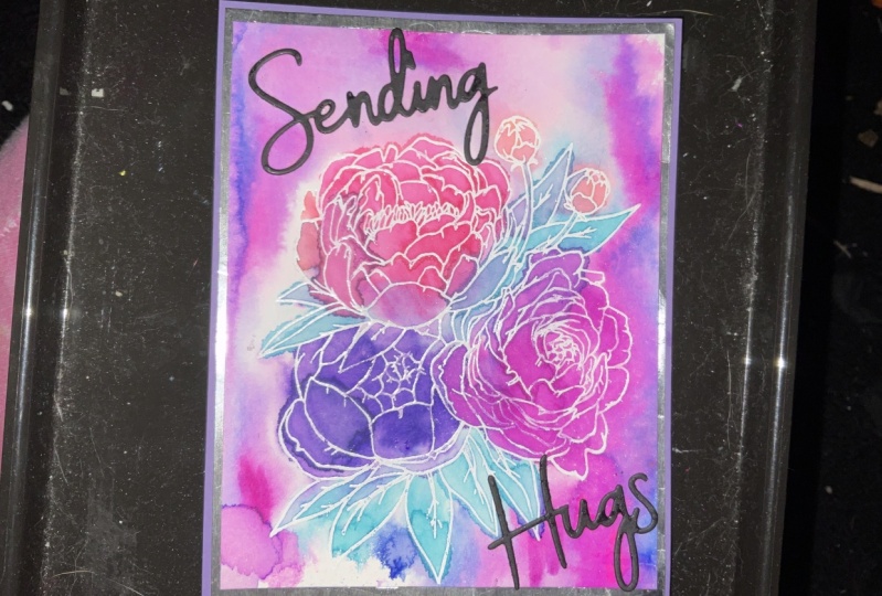
8. Combining all of the Techniques: So for this card,
we're going to combine a bunch of the techniques
that we've already covered. So we're going to use
some ink pads to do a bit of a blending
technique in the back. We're also going to use markers rate on the paper in combination
with that technique. And then we're going to use the markers rate
on the stamp to do the image, the
front of the card. So very first step. And I'm only actually
using the red and the dark charcoal for using the markers
on the background. I didn't want to have
a green background or too much green
in the background. But I did want to tie
in a little bit of some of the image colors. Just putting a little
scribble of each one. And that's enough. I don't really want it
to go too far in because I don't want it to interfere
too much with the image. So now I'm taking my iPad's here and I'm smashing
them on my surface. Obviously you can't see
them because I have a black mat here
that I'm working on. So then I'm going to
miss the ink pad ink. And then I'm going
to dip this in. I'm going to dry it a little
bit and then dip it a couple times just to get some really nice texture
in the background. So you want to see some
water droplets when you add the water to your table, there are two your surface. And if you've got a
spot that's not wet yet that hasn't been wet down, just dip it into the water. Now I'm going to
try it slightly. If I were to just keep it
keep dipping it into water, I would just keep blending
the inks by drying it. I'm setting some of the inks. And by setting, I
mean, if I were to douse it with water,
it would still move. But I'm going to layer the
inks on top of each other and just get a more
dimensional look in a little bit more. You have a little bit
more control when you dry the Incas in between. If I were to just keep
dabbing it and moving it, I would just be blending and smearing it and I
wouldn't really be adding some extra
texture to it. It would be fairly
one dimensional. So this doesn't need
to be completely dry for the next layer, above 75% is good. I'm pretty much everything is
dry other than the top here and a little drip
there, but that's okay. So what I'm gonna do
before, instead of just dipping it over and I'm tapping it the exact same
space and whatnot on here. I'm just gonna move it this way. I get some of the colors
mix a little bit. Tap in the center. You see how you get some
dots. By doing that. Just adds a little
bit more texture and a little bit more dimension. And same as before. If there's a darker area
that you don't really like, how much is there? You can simply take a piece of paper towel where that
excess isn't just lifted up. All right. That is good enough. I'm going to dip it probably
just one more last time. There we go. A little bit up there. A little bit in there. Here we go. Liking how that's looking. So now I'm going to dry
it completely 100%. I'm just going to pause the cameras so that you
don't have to watch. The ink is completely dry. I'm going to take a
paper towel and clean my surface off here. I don't want any ink
residue over there in case I happen to dip something or tap
something over there. So now we're gonna do the
same director's stamp method as the first iris card. So you can see that I am taking my marker and I tend to go from where I want it
to be the darkest. And then kinda feather
up a little bit. I don't try to, I try not
to get harsh lines on it. And I'm also using the
side of my marker. I'm not using the tip. The side is going to
cover a lot more area. And it's also gonna
be a little bit less damaging to your marker. These markers, if you do a
lot of this and are really, really heavy handed with it, you will start to
see your marker starts to degrade
over time because it's the tips of these are
not really great quality. So I tend to actually save this technique
when I, for one, I have markers that
are starting to, starting to get to
the end of the day. Because it's a great way to
get more use out of them. Now I'm taking my
dark charcoal here, putting a little bit of black in the center of that puppy. And once again, I'm going
from where I want that black, the darkest, I've kind
of feathering out. And then a little bit
of green once again, same as last time I
do the light 1 first. And as I'm doing
this, I'm trying not to overlap with
the other colors. Don't want to contaminate
my marker by doing this, I'm just trying to
get the color down. So I tend to start where there is a
different color and then move away from it so that I don't accidentally
go like this into it. There we go. Then same as before. I do my darker color, basically where there
would be a shadow. So under flowers where things go behind other things and
then from the bottom up, underneath leaves sort of thing. One of these things
that is a very, very forgiving so
you don't have to be too, too worried about it. Now I'm going to miss my
stamp a couple of times and then I'm going to stamp
it before doing that, make sure you've checked out your background and you've decided where you're
wanting to stamp it. I'm going to stamp it
like this because I want my flowers up in this
light to open space there. But you can see how
exactly the same colors, the same technique, you get completely
different backgrounds. And that's part of the thing
I love about this technique is you never know exactly
what you're gonna get. Missed it. And then let's stamp. I like to hold it, make sure it's firmly in place
and then press around to make sure that that stamp gets good contact
with the paper. And then lifted up. Love that. Once again, there's a
ton of ink still here. We're gonna do one more
card after this and we're going to use this
excess ink for that. So this needs to be
dried once again with the drawing tool. Now if you found
it too busy with the red that we added
along the outside, you can eliminate
that completely and just do the ink
pads or whatever. But I just wanted
to see the color is incorporated into the background and I liked the way it looked. But it's not for everybody. Some people might just find that it's a little bit too much, That's a little bit too busy. And I do love the way
it looked, but I do, I cannot understand how. For some people it
might be a little bit too much, a
little bit too busy. Everyone is different, so, but it's fun to learn
these different things and it kinda sparks your
imagination on what you can do. Alright, that's
probably dry enough. Yeah. Let's go glue
everything to the card. Once again, everything
is already pre-cut. Rough edge there from
cutting initiative, trimmed it better, but we're
just gonna go with it. Lastly, our image piece. And once again, we're
going to need to hold this down with or acrylic block. And our little jar of weights. I do have a die cut here. Rather than stamping
something on here, I didn't think stamping
would show up. I thought it would be a
little bit too messy. And a little bit probably
won't be as bold as a dicot. So I just die cut the word love in black so that it
shows up really nice. You could use whatever
dicot you want. And if you didn't want to
put anything on the front, you could just put it on
the inside of the card. There we go. Make sure this is all on there perfectly before
we put our weight down. There you go. And that
will dry, nice and flat. Just like this one here. Was just a fun little
way to combine, combine all the different texts, techniques that we've been learning in the last few videos.
9. Combining all of the Techniques: Second Generation: Alright, we can't let the
ink on here go to waste. So let's do one last card. So I'm just going to miss
this a couple of times to rehydrate that ink,
stamp it down. So this, the technique
for this is very similar to the one with the second-generation
generation Irish guard. Really, it's exactly
the same thing except a different stamp. We're doing a different
background stamp. And then I've got the same die cut that I used on
the other poppy card. And once again, there's
more ink on there. I could likely get a
third stamp out of it, but I'm just going to put it
to the side for right now. Let's dry this ink before
we stamp our background. Always nice when you
can do one technique and get several cards out of it by stamping it
and stuff like that. So why not tiny little bit in the center of
this still damp. I'm just trying to dry. When the paper
curves up like this, you can also use the
tool on the back of it. Try to flatten it
out a little bit. It's not going to
go completely flat, but it will help even it out. I think that's dry enough. Yeah. Alright, so now I've got to this one
to the music stamp from that same set
as the script stamp. And what I like to
do with this one, I'll stamp it this way and
then rather stamp at this, then stamp at the exact
same way all the way up. I will turn it around just so that it looks like
a sheet of music rather than the same thing repeated
over and over again. The way to keep track
of which way it is, is there is treble clef and
bass clefs on one side, so I just pay attention to
what side I had it on last. Another thing that you could do is instead of
stamping it here, you could like you can move
it over this way as well. But it always looks a
little bit better if it's not a powder and going
all the way up and down. Once again, you could use just a background music stamp
that would work as well. Just something to add a
little bit of texture to it. Although this one
with the red I didn't find to be quite as sparse. I easily could have
created a card with it, just as it was from
that first stamping. But I do like the pattern
background behind it. Another super-quick stamp aren't super quick card
to get together. And great for if you
wanted to do a bunch of cards in one sitting
to encompass stamp with a marker and then do a couple different stamping with it without
needing to re-engage. There we go. And once again, the dicot. So the dicot, I do like to use this liquid adhesive width. What I like to use is
distress collage medium. And the reason I like it if you haven't watched the video
where I've talked about it, is it dries completely clear
and it also dries matte. So if anything squishes out, and especially when
you're doing dye cuts like this that are quite fine. If anything squishes out. It's gonna be completely clear once it's dried and
it's also going to be met. So you're never going
to see that it's there. You're going to have no idea. So while your glue is what
you want to make sure to see the edges of it and
make sure it's all lined up. But there we go, That's
the final result.
10. Dye Ink Techniques for Papercrafting Class Thank You: Thank you so much
for joining me for dyeing techniques,
for paper crafting. I hope you enjoyed
learning these techniques and then it's inspired you
for your future projects. Now remember you can
change any of the colors, any of the stamps, any
dye based inks will work. It doesn't necessarily
have to be the brands that I
used in this class, but have fun with it.
I'll see you soon.
 Artsy. Island Girl, Teacher