Transcripts
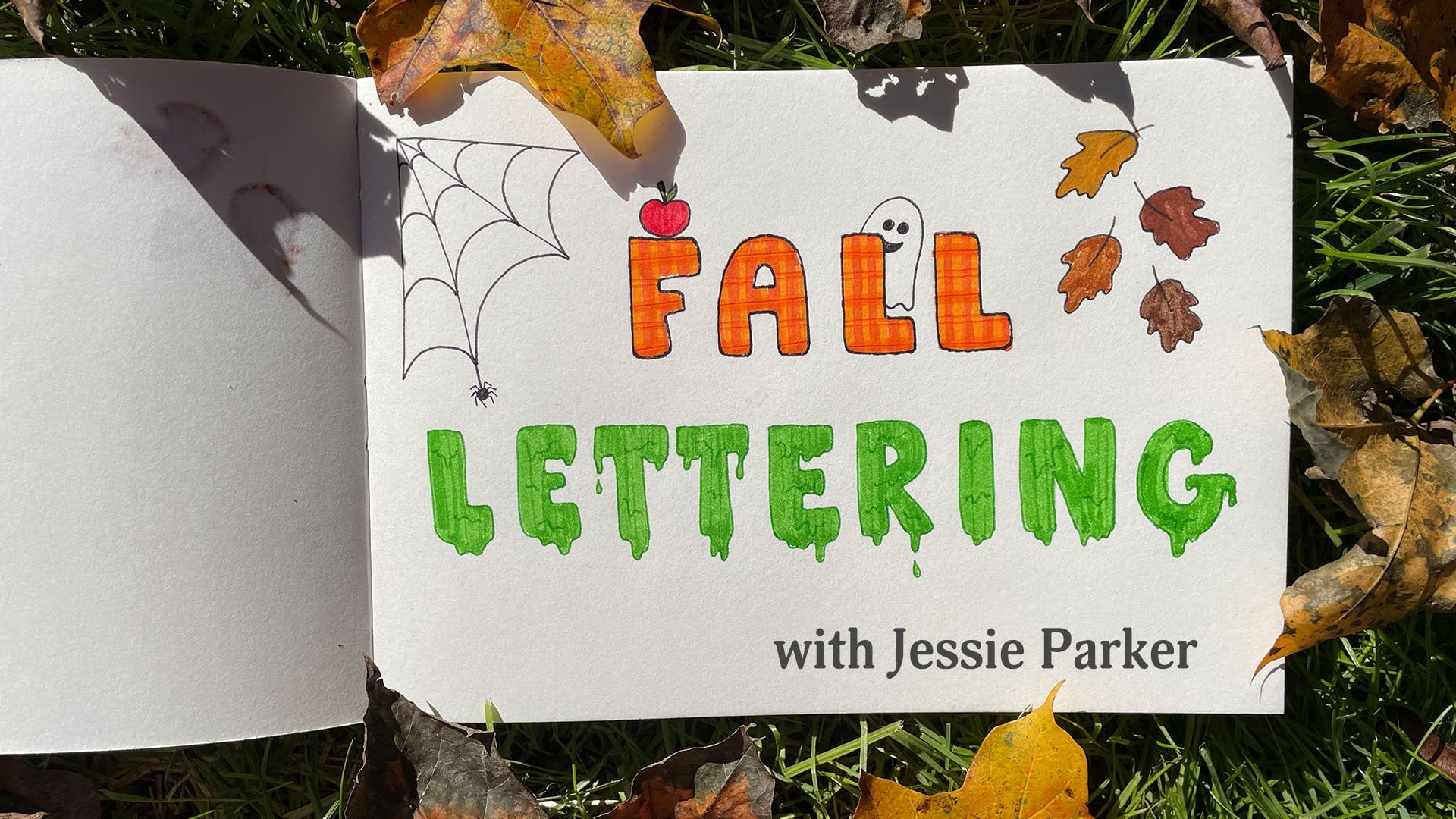
1. Intro: Hey guys, I'm Jesse. Welcome to dress up your littering part two. If you haven't watched part one in this series yet, that's okay. You'll still be able to follow along. But I would recommend that you go back and watch it at some point because it's only going to help you to expand your toolkit when it comes to lettering. In today's class, I'm going to focus on teaching you how to dress up your monoline letters. Monoline letters are letters that stay the same thickness or wait all the way around. So something that you might draw with a regular pen, for example. Today I'm going to start off by showing you one of my favorite lettering styles that I actually learned when I was a kid. Then I'm going to show you how to add simple designs to your letters. And to finish off by adding patterns into your letters, all you're gonna need to follow along is a pen or pencil and some paper lined paper is totally fine. So if you're ready, let's get started.
2. Uppercase Dots: So the first style I'm going to show you is something that I simply refer to as dots. So we're going to write out our letters. I'm just going to do a sample shape in this case. And we're going to add dots to all be open ends. And the joints of each letter. You want to make sure that the dots aren't too small so that you can't distinguish them from the rest of the line. But you don't want them to be so big that they cover up too much of the letter. Remember, the dots are supposed to be an accent feature. They're not supposed to be so large that they overwhelmed the letter and cause it to lose its readability. So similar to what I did in the first class, I'll give you a couple of variations of certain letters when I think of them. Otherwise, you can just adapt this technique to your style. So first is the letter a. I'm gonna make my letters a little wider than usual. And that's just to make sure there's enough room for the dots so they don't overwhelm the letter. First, I'm going to add the dots to the open ends. And then I'm going to add them to the joints where the crossbar meets the frame. And for this one, I'm also going to add one right at the top in the middle. Another variation of the letter a is if you make yours angled. So again, I'm going to add one to the open-end. And I'm going to add one to the peak in the middle. And then right there at the joints where the crossbar meets the frame. So you can see there's enough of a rounded part that you can see it over the line, but not too much that you lose the shape of the letter. For B. I'm going to add mine at the corners where the bowls meet the stem. And then I'm just going to add another one right at the middle where the tubules meet each other. I'm not going to add an e to the middle of the bowls, but you can certainly try and see how that looks to you. For my c, I'm just going to add mine to the open ends. For letter D. Similar to B. I'm going to add them where the bowls meet the stem. But I'm not going to add one in the middle right here. But you can try that and see what it looks like to you. For my letter E, I typically tend to make my middle arm shorter than the rest. But for this style I'm going to make them the same length. Then I'm going to add my dots to the open ends and the corners and the joint and the middle. Same thing for F. I'm gonna make my arms the same length. I'm going to add my dots to the joints, to the ends of the arms. And then the bottom on the stamp. Or the letter g. I'm going to add it to the open-end. I'm gonna make it slightly smaller on the arm only because it's such a short line. But you still want to be able to see the line between those two dots. H is a pretty straightforward letter. Will just add the dots to the open ends. And then right there in the middle. I typically don't make my eyes with caps, but for this style I will. So here's a good example of why you don't want to make your dots too big. Because if you're going to have three in a row, like when I add mine to the ends of the stem right here, it might overwhelm the rest of the letter. And if you didn't like the way that looked, I'd recommend leaving off those dots in the middle as opposed to the ones at the open ends. For J, I'm gonna do the same thing. I'm going to add a cap. And I'm going to add my dot at the open end, then to either end of the crossbar and then one right in the middle. For a k. Mine to the open-end. So the stem, the arm, the leg, and right at the middle where they both meet. And whether your K is curved or straight, you can do it the same way. For L. I just add them right there to the ends in the corner. For M, I add it to all my ends and my joints. And then I also add one to that middle angle. For n, it's going to be the same thing. And it really doesn't matter the order you put the dots in. As you can see, I'm doing it differently for each letter. Since o is a full circle, I like to think of it as the starting and the stopping point or at the same place. So I tend to just add my dot right in the top middle at that one joint. But you could also play around with adding one to the bottom or seeing how you like it on the sides as well. P is going to be similar to the letter b. I'm just going to add one to the open end of the stem and both ends of the bowl. Queue is a little trickier. So I would do the same thing I do for my oh, I do one right at the top middle. And then I'd add one to either end of the leg. And it's up to you if you want to add 12 the middle where they meet. And I'll show you what the difference looks like. So for me it would be a matter of preference, but I think it doesn't quite balance out the rest of the letter like it does on the first version. Next is our add it to the ends of my bowls and then to the open end of the leg. And similar to the letter k, whether you do a straight or a curved leg coming off of it, you'll do the same dot pattern. Since S is one continuous line. I'm just going to add the dots at the starting and stopping point. For a t. Again, I'm gonna make a wider crossbar than usual just so I can accommodate all three dots that come across the Kaplan. And by making it wider like this, you ensure that it's not too crowded once you add that dot detail, you as another rounded letter where I would just add them to the open ends of the stem. But if you wanted to, you could experiment and see what it looks like if you added one to the middle. For me, this'll help distinguish it from the letter V, As you'll see next. We're going to add it to the open ends and then the joint in the middle. So even though they are slightly different shapes, obviously this one is Angular and the EU is rounded. I think that dot detail on the middle helps really distinguish your two letters. W is another letter with a lot of joints. So we'll add a dot to each one. For x, we're also going to add one to each end of the stems and to the middle where they both cross each other. And if you don't like how that looks, you can always leave off the middle dot. For this style, I think that a more angular Y works best. As some of you know, I tend to do a more rounded why typically. And for Z. And you may also remember that I typically put a crossbar in the middle of my x0. But for this style, I think it reads better without it. It becomes a little too cluttered with the extra line and the extra dots. So there you go. That's the capital dot alphabet. So again, some of this is just a matter of preference. You can totally play around and add dots in where I didn't or leave some off where I did just to see how it looks. And that's an easy way to make this style more reflective of you. Let's move on to the lowercase letters.
3. Lowercase Dots: So for the lowercase letters were gonna do things a little differently. Since the letters are so much smaller. Instead of adding dots to the joints, we're only going to add them at the open ends of the letters. For the letter a. I'm just gonna add a little dot to either end of the stem. I'm not going to add them to the bowl. Same thing for the other versions of the letter a. I am just going to add them to the ends of the stem. For B. Same thing. Since the letters are so much smaller to many, Das additive would make it look too crowded. For D. When I write the letter O and add my dots right to the end. What are E? If I were just adding the dot to the end, I could do it like that. But even though it's technically a joint because the line does overlap itself, I also like to add a dot there because it is the beginning of the line. Same rules for letter F. I'm going to add everything just to the open-end. And for the lowercase letters, I'm just going to skip that one right in the middle. For g. I'll add one right at the top corner, and then right there at the end of the tail. And H has three open ends. So I'm going to add it to all of those letter i, i would add your dots in first before adding your dot over tap. And same thing for letter J. Add one to the under your tail, add one to the top, and then dot your letter. You'll just want to make sure there's plenty of space between them. For a k. Same thing, we're just going to add them to all the open ends. And we're going to skip that middle joint that we did for the capital letters. Or lowercase L is just a stamp. So that's easy enough to figure out where to add them. For lowercase m, I'm going to add it to the top and the bottom of the stem. And then I'm just going to add it to these open bottoms right here. No need to worry about the overturns. N is going to be the same thing. I'll add it to the top of my stem and the bottom. And then the other end of the overturn. O is going to be similar to our capital letter. I'm just going to want to add one at that joint where the line starts and stops. For p. Just gonna add it to the stem. And then I'm gonna do the same thing for q. R is going to be similar to N. We're going to add them to both ends of our stem. And then just to the end of the arm. S is going to be just like the capital letter. Add it to the open ends. I am trying to make my dots smaller for these since the letters are so much smaller, but it's not always working. For t, whether you make it straight or rounded. You're going to add one to the top and you're going to add one to the tail. And then just to either side of the crossbar of leaving that middle area free for you. If you don't add the tail, you can just add them right to the end, like we did with the capital letter. Or if you do add a tail to the end, it'll be just like we did for the N. For V, We're still gonna add all three of our dots. So including the one right there at the joint to help distinguish it from our lowercase u. For a w, If you make yours angled like this, you can still add it to all the ends and all the peaks. And if you make your letter rounded like this, you'll just add them to the open ends. For x. We're only going to add them to the open ends and we're going to leave the middle clear right there. For why. I'm also going to do an angled letter. And I'm gonna add my dots to all the open ends. But I'm still going to leave off from that middle joint. And if you do a rounded lowercase y, you're gonna do the exact same thing. And for z, just like the capital letter, I'm going to add one to each end and each corner. And for my purposes, I'm going to leave off my crossbar in the middle. So that's the lower-case alphabet.
4. Monoline Designs: Another way to dress up your monoline letters is by adding designs into the letters themselves. For this round, I would recommend that you use a pencil first to write out your words because we're gonna be going over them with pen and we can always erase the pencil later. Something you'll want to keep in mind is that you want to write dark enough so that you can see what you've written, but not so dark that it's going to be hard to erase your lines later. As you can see here, I've drawn out guidelines in pencil. I've written two sets of the same word. Another thing to keep in mind is that my paper is going to be fixed in one spot while I'm teaching. So you can see it clearly, but you can feel free to move the paper of if it makes it easier for you to write. So now that we've drawn out our words and pencil, we're going to trace over the letters with a pen. It's okay if it's not exact because we're going to erase the pencil lines anyway. Depending on the kind of paper you're using and what kind of pen you may need to let this dry a little bit before you can erase the pencil. To start off, we're just going to add a simple shape to the literacy. And one of my favorite gotos is always a heart. You can add it to any point of the letter that you like. And ideally you're gonna keep the same shape and the same spot across all your letters just so it looks consistent. But if you're not into hearts, maybe you want to add a flower. Just gonna make a simple five petaled flower. And if you're more comfortable, Of course you can draw these in with pencil to even before you start tracing the letters. What if I wanted to add a star? The key is just making sure that your shape is centered and anchored on the outlines of the letters. We could even add a simple shape like an arrow. Or what about a plain old circle? Or maybe you prefer something that looks like the outline of a leaf. Notice how this just adds a little bit of personality to your letters. This would be a great touch for something like a birthday card or even the envelope that the card comes with, just to make it extra personal for whoever's receiving it. Now let's move on to the next word.
5. Incorporating Designs: For this version of the word, instead of adding our shapes to the top of the letters after we've written them out, we're going to incorporate them into the letter itself before we draw them. So again, we're starting from this pencil outline. And if I use the same example of a heart, I'll pick where I want my heart to go on the letter and I'll draw that in first. Then I can fill in the rest of the letter around it. Notice how I left a gap between the heart and the rest of the letter. Lets try this again with a flower for the letter R. I'll start off by drawing my flour first. I'll draw that line first. And I'm going to leave a little bit of space between the design and the rest of the stem. And let's see what it looks like with the star. So your designs don't have to be limited to something this simple. And the great thing is you can tailor it for any occasion including holidays. So what if we did want to make this for a birthday card? What if we decided to incorporate a balloon into the shape? I could start off with my basic oval and then add that little bit at the bottom where the string attaches. Color that in. Also looks like a fish. If you're interested in that, then I could add the balloon string maybe for the rest of the letter. And I can continue the rest of the shape with a straight line. Or for something like Halloween, What if I wanted to add a little ghost into the stem? I could draw my simple little goes cheap and then fill in the rest of the line around it. And I'm going to add arms to make him look a little. Over Christmas. What if you wanted to incorporate some mistletoe interior letter? You can start off with some simple leaves. Then add in a spray of berries, and once again, fill in the rest of your lines around it. There really is no limit to what you can add to this. It's all a matter of making it personal to you and having some fun with it.
6. Adding Patterns: The last technique I'm gonna show you for how to dress up your monoline lettering is adding patterns into the letters. So we're going to use some of the skills that you just learned in the previous section. And we're going to add a little more to it. So I'll use hearts for the first example. I'm going to add them so they're centered on the letter. And then I'm going to fill in the line around it, leaving a little bit of space between the heart and the line. Although you could do this with the other style to and draw the letter out first and then add hearts and a pattern over tau. So let's try this again with flowers. I'll add flowers. I'm just sort of adding these wherever I feel like it. Whoops, extra pedal. But if you wanted to measure things out to make it more consistent, you're more than welcome to do that. Now, I add in the lines around it. And again, it doesn't matter if you don't draw exactly on the pencil lines because we're going to be erasing those anyway. Another simple way to add a pattern is with dots and dashes, kinda like Morse code. What if I added three dots in a row? Boats? You might want to try and keep them all consistently space. And then again, fill on the lines between them. You could also just do it with one dot or with two dots. You could also create a pattern that's entirely made of shapes. What if I filled up this entire ei with hearts? I'm gonna skip filling them in, so it goes a little quicker. I'm gonna keep mine all facing the baseline. But you could also just keep him going around the line in the same direction. And once we erase the lines, you'll still be able to read it as the letter a. You could also add some other simple designs into your letters. One of my favorite things to draw is curlicues. Think of it as an old-fashion phone cord or like little pigtails. And then you just continue the pattern all the way through the entire letter. Or like a really simple zigzag design. And there you have it. Just erase the lines and you're all set. All these letters look so drastically different just by adding in simple patterns using shapes you're probably already making for fun. I'd love to see what other patterns you come up with.
7. Final Thoughts: So that's it for today. I really hope you guys enjoyed learning all these different ways that you can dress up your monoline lettering and that you get to play around with it some more. Which brings me to your final project. I'd love for you to upload a photo to skill share where you've written out one word in five different ways using some of the techniques that you learned in today's class. Remember you don't have to use exactly what I taught you. Those were meant to be more of a starting point, not a limitation. And if you post anything that Instagram, please tag me so I can see it at Jesse makes stuff or using hashtag, Jesse teaches stuff. I'd also love for you to review this class on skill share so that I know what you thought of it and the students will know what to expect. Thank you for taking the time to join me today and I look forward to seeing what you come up with until next time. I'm Jesse.
 Jessie Parker, Sparkle Enthusiast