Transcripts
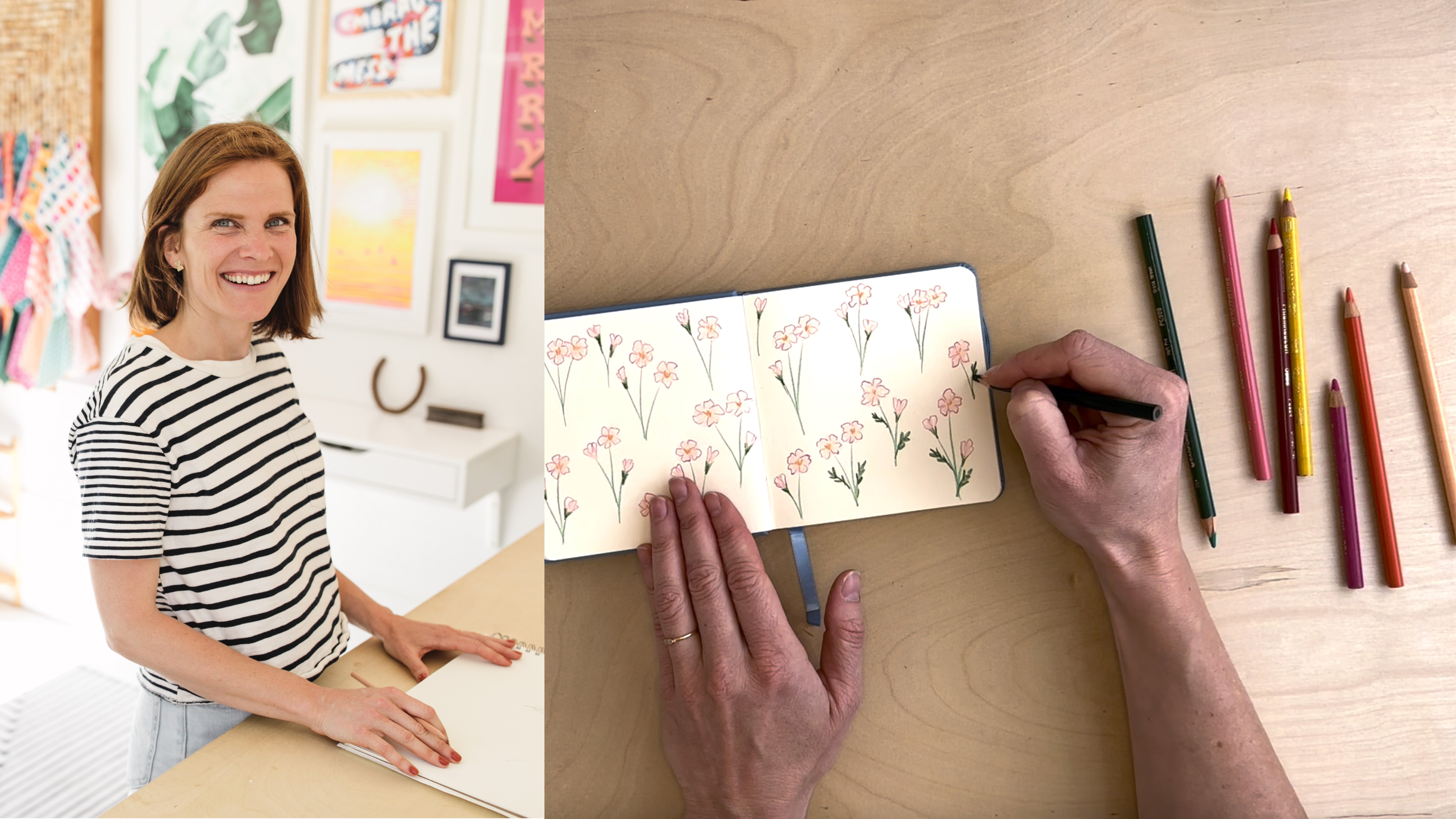
1. Hey There!: [MUSIC] Hey there. My name is Jenny Koland and I'm an artist and surface pattern designer in San Francisco, California. Have you ever been
overwhelmed or frustrated, staring at a blank
piece of paper and unsure where to begin? Or is it sometimes difficult
to get your pencil or paintbrush to make
exactly the kind of shape you want to make? Or do you just like
unlocking new parts of your brain and exploring
creativity in the process? I have news for you. Paper cutouts can
help with all of these things and the
result can be awesome, polished, marketable artwork, that is also super fun to make. I've been making art since I was old enough to hold a brush, but I've been working
professionally as an artist and designer since 2018 when I began designing and
producing stationery stickers, wall art, and
children's products. Now, I also have added
to that art licensing. I license my surface patterns on fabric and in the
crafting industries. Additionally, I'm the host of a creative co-working community
called the Co-League, where I mentor and support other independent artists
on their creative paths. I am a huge believer
in the power of play as part of
the creative process, and I love working with paper
cutouts because they are a great warm-up exercise and a great way to push
through creative block, precisely, because they open up a different and playful
side of my brain. In this class, I'm
going to share my process that I've used
for countless pieces of work in my
professional portfolio and for play around my studio. I like combining the analog
process of cutting up paper or scissors with digital tools like
Adobe Illustrator, because it lets me,
on the one hand, keep the fun and spontaneity, and unexpected results that
working analogue provides. But also, I get to fine-tune
the finished product, and I don't get my fingers
all sticky with glue. I think this combo
analog-digital approach is the best way to work because it gives me
all the flexibility of color and composition
that digital provides, while still letting me work with my hands and get a little dirty. It's the best of both worlds. Together in this class, we're going to create a digital collage still-life
using cut paper motifs, and we'll talk about
color and composition, and creativity along
the way. [MUSIC]
2. Class Project: [MUSIC] For the class project, we'll be creating a digital
collage still-life and we'll explore color and composition to make a finished piece of art. We'll create this art using cut paper motifs that we'll cut out from colored
paper with scissors. For materials, you'll
need colored paper, just a few different
colors is fine, a pair of scissors, and any old pair will do, a scanner or a camera, and a phone camera works
perfectly well for this, and a computer with
Adobe Illustrator. All this is definitely a
beginner friendly class, a basic understanding of
Illustrator will be very useful. I've also provided
some reference images, and a sample color palette, and a texture file
that you can use in your finished work if
you want to follow along with how I'm making mine. You're welcome to use your
own reference images as well or work from your
imagination if you'd prefer. To find the reference
images, color palette, and texture file, go to the Projects and Resources tab and you'll find
everything you need there. When you have finished your
project for this class, this is also where you'll come to upload your
finished work. Again, come to the Projects
and Resources tab from a laptop or a desktop
and upload your project. While you're there,
leave a note of encouragement for
a fellow creator. I'm so excited to see
what you make. [MUSIC]
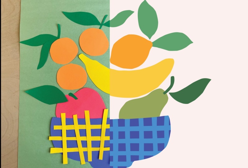
3. Creating Cut Paper Motifs: [MUSIC] Let's dive in. Take out your colored
paper and scissors and have your reference images
nearby if you are using them. I like to have a few
different shades of paper to play with. I can begin to imagine how
my finished piece will look. But we will be
changing these colors later on once we get
into Illustrator. Don't stress about
getting the colors just right at this stage. For scissors, any
old pair will do. I like to put a
large blank piece of paper next to where
I'm cutting as a place to stage my cutouts and see what I have so far and
what I still need. We're going to kick
it off right away, cutting out shapes
for our composition. I'm beginning with the
fruit for the fruit bowl, using the reference images as a very loose guide for
approximate shapes and angles. You don't need to cut
out all of the fruit, but you can pick and
choose what you would like to include in
your still-life. If you're new to paper cutouts, the big piece of paper
may seem overwhelming. I find it helpful to cut off a smaller square or
rectangle to get started. You can also cut out
funky trapezoids to give your brain something to
springboard off of as you create. I often find that the hardest
part is just starting. Sometimes I also start cutting before my brain has fully
figured out what I'm making. It allows my hands to take
over and go by intuition, which can have some fun
and unexpected results. I'm going to speed
up the video now as I cut out the rest of my motifs. Paper cutouts are so forgiving, it's nearly impossible
to mess up. You can always start over if something doesn't
turn out how you would like it to and you don't need to use every cutout in
your final piece. I do recommend keeping
every cut out for now, even ones that may
feel like mistakes since you never know what you'll want to pull in later on. At this stage, don't worry about cutting everything
out to scale. When we bring it into
Adobe Illustrator, we'll be able to scale
up or scale down everything and adjust the
size as much as you'd like. This can be really helpful with paper cutouts when
you're trying to cut out something that you want
to look really small in the end but your scissors
just aren't cooperating. You can try cutting it out
at a much bigger size and then changing the size later
on once we get digital. Now I'm moving on to make some
foliage for my fruit bowl. Here I'm going partially by
imagination and partially by the reference images
creating leaf forms that'll be bold and
dynamic in my artwork. This is where using
the trapezoid trick, is really helpful for me. Starting with a
non-standard shape, puts my brain into
problem-solving mode and helps me come up with inventive and
unexpected solutions and it helps create variety
and dynamism in my work. Finally, I'm cutting
out a fruit bowl. I love to cut out
vessels because they are always less perfect and more organically wonky and
beautiful than in real life and they bring such character to
the final piece. I'm leaning into the
asymmetry of how a bowl looks when it's cut out on
the fly in this example. Now is a good time to
assess what you have. I like to make several
versions of each motif so I have options once I
get into the computer. If you notice anything missing, or if you have ideas of
variations you want to try, now s a good time
to cut those out. Or if you want to add smaller details to
your fruit shapes, this can be a good time to cut out little detailed pieces too. Once you are happy with your variety and
quantity of motifs, we'll move on to creating
our compositions. [MUSIC]
4. Composition: [MUSIC] Before I move
to the computer, I like to experiment
with my composition physically to more quickly
try out different ideas. Using my staging paper
as a background, I'm rearranging the different
elements of my fruit bowl still-life to find a composition that has balance and
is pleasing to my eye. I am going largely by gut and personal taste here and I
encourage you to do the same. Find what feels good to
you with how your shapes play off of each other
and fill out your piece. It can be helpful to
look at works from other artists to see
what you're drawn to. Do you like symmetrical
pieces or more asymmetrical, full or more minimal? Do you like lots of
whitespace or not so much? Do you like busy work with
lots of overlapping pieces or more sparse work where everything has a distinct place? Now's a good time to
try out a lot of things quickly until you find
something that feels good. I'm going to continue
moving my pieces around and shifting
them until I find a composition that has the right amount of
balance that I'm looking for and is visually very
pleasing to my eye. When you find a composition
that feels right, take a quick picture to use
as a guide later on. [MUSIC]
5. Scanning: Our next step is scanning the motifs to move our
work to our computer. I'll be using my scanner, but a phone camera or any other camera works just as
well for this process. I often use a camera when
I'm away from my scanner. I like to scan or photograph
my elements grouped by color to speed up
the image trace and colorization process. You can scan multiple
colors at once, but it is helpful
to at least keep the very light colors
by themselves. With any very light colors, it can be helpful to put
a dark background behind your elements when you
scan or photograph them. This will make it easier for image trace to pick up the
shapes in illustrator. Simply place a solid, dark colored piece of paper like this black
paper here that I'm using behind your elements before scanning or
photographing them. [MUSIC] A couple of tips
if you are using a camera, makes sure to keep it level to avoid any distortion
of your shapes. If you are using a dark background under
your light shapes, make sure to use a
light background on your dark shapes that is a consistent even
color so that you can pick that up and Image
trace and remove it. Once you have scanned or photographed all
of your elements, we will bring them
into Adobe Illustrator for our next step. [MUSIC].
6. Time to Digitize: [MUSIC] Time to digitize, I have just opened Adobe Illustrator
and I will make a new document for
the digital collage. I will give it a name
and for this document, I will create an artboard
that is 10" by 10" square, or approximately 25cm by 25cm. You can make your artwork
any shape and size you want. But I find this to be a
pretty useful starting point for me because I can
visualize it easily. I am leaving my document
in CMYK color mode, as I may want to
print this work, and I'm leaving the rest
of the default settings. You can use RGB if you'd like to make yours one for
sharing online. Now I click "Create" and
I open my new document. To bring in my scanned images, I'll go to File, Place, on a Mac and select the
images and click "Place". Now I can use my cursor to draw rectangles the size
I want each scan to appear or I can simply click once to have
the full-scale scan. I'm going to place
smaller versions about the size of my artboard
off to the left side here. Next we will be using the Image Trace panel to
turn our scans into vectors. I have a shortcut for this
panel on my right hand menu, but you can access this
by going to Window, Image Trace on a Mac. With your Selection tool, select the first image
you want to image trace. Since this image has
multiple colors and I want to try to maintain them
as separate colors, I will change the Mode to Color, but I will reduce
the number of colors for the output down to four. Look at your image that you are tracing to determine
how many colors you want for your output and remember to include one
for the background color. Also, the more colors, the longer it will take so
try to be sparing here. For cutouts, I typically leave the pads at 50 percent and the noise at 25 but you can experiment with those
settings as you like. I select "Ignore
white" when I am converting something
on a white background. Now trace. I'm happy
with this trace result. I can see all of my elements with the amount of detail that I want and I will click "Expand" to convert
this to vectors. I'm not worried right now about the actual colors of the output. These don't really look like the colors that I scanned in, and they aren't the colors I
want for my finished work. But that is just fine
because we will be changing all of that later on. For my next image, I'm scanning something on
a non white background. This has my black background
and my yellow motif on top. I'm going to want to delete this background after
it's been traced. For this example, since it's just two colors and there's
one that's very light, one that's very dark, I'm going to leave it in black
and white mode. But I won't select
the box that says Ignore white because I don't
want to ignore my motif, which will come out
as white in the end. After I click "Expand", I'm going to double-click
on the image to enter isolation mode to
delete the background. I'll click on the black
background and I can delete it here or if the background is not
all in one shape, I can go to Select, Same, Color Fill to select everything that is the
color of the background, and then delete it all at once. Now I will select all of the remaining white motifs that are hard to
see right now in the background and
I will give them a color so that I can see them as I move
them around later. Once I'm all done in here, I'll double-click outside of my image to leave
isolation mode. Now if you have more images to trace, finish tracing them. Once everything is traced
and in vector mode, I right-click on
each image and click "Ungroup" or I can
use my shortcut, which is Shift Command G
to ungroup them on a Mac. I like having all
of the elements separate from each other
for moving around. Sometimes though there are pieces that I know
I want to stay together like with some of these pieces of fruit
and their leaves. I'll group them together in the configuration
that I want them, just moving them around
and then selecting all the elements for a
given group and either right-clicking with
Group or using my shortcut Command G on
a Mac to create a group. The final thing I'll do at
this point before moving on to the layout is a
rough pass at color. I just want to make
sure that the colors I'm working with will
be pleasing to me during the process and won't turn me off from the
design for a silly reason. I have a color
palette saved that you can access in
the class resources. I'm going to open
that up and copy over these colors shapes
into my document. I'll create a new
color palette by clicking on this folder
icon at the bottom of my Swatches panel and I
will name that for the class. Now I have all the colors
saved in my swatches panel. I can put in some color to
places that weren't quite sitting right with me before
and now I can move on. Click "I" on your keyboard to
access the eyedropper tool. Now select a color from your swatches panel that you
want for a particular motif. Then hold down the
Option Key while you click on that motif to fill
the shape with the new color. Once everything is colored
nicely and grouped if needed, we can go on to our art
print composition. [MUSIC]
7. Assemble Your Digital Collage: [MUSIC] Now I'll begin
assembling my collage on my art board by dragging my colored motifs
one-by-one into position. I'm going to bring in the
photo of my composition from earlier into Illustrator
and use it as a guide. You can assemble your collage directly on top of your
photo in Illustrator if you want to replicate it exactly or you can rebuild your layout from scratch and
tweak it as you go. If you scanned in your motifs, you may have to reflect
or rotate some of them to get them to be in the same orientation as your photograph. To do this, you can
right-click on the object, go down to Transform
and click "Reflect". From this dialog box, you have the option to reflect vertically or horizontally, or alternatively, you can click "Transform"
in the top bar. Click on the list
drop-down button, and then click Flip Vertically
or Flip Horizontally. Again, I'm looking for a balanced but asymmetric look in my piece because
that's what I like. I will rotate each
element until it is just right and in position. I usually rotate by
hovering my cursor at the corner of an object's
bounding box until I see the rotate arrows and then clicking and dragging to the angle of rotation
that I want. I will also scale
motifs up or down as needed to create the
feeling that I want. I do this by clicking and dragging the corner of
the objects bounding box while holding the Shift
key to maintain proportions. I'm going to speed up this video a bit as I move my motifs around and decide on the composition that
will really work for me. [MUSIC] I cut out fewer
strips than I need to create a grid
pattern on my bowl. I'm going to duplicate
them by selecting them and dragging while
holding my Option key. You can do this with
any motif you want to duplicate to use more than
one and your composition. For example, if I wanted a second lemon or additional
leaves to use in my piece, I could make more right now. I want to crop these strips
to fit within my fruit bowl, and I'll use a clipping
mask to do that. First, I'll group
the yellow strips with Command G on a Mac. Then I'll duplicate
the bowl motif and bring it to front, Command Shift right
bracket on a Mac. Next, I'll select
both the grouping of the yellow strips and the
bowl in front of them. I'll right-click and select
"Make Clipping Mask". Once you are satisfied
with your composition, you will likely want to
add a background color. To do this, select
your rectangle tool, which is M on your keyboard, shortcuts for a Mac. Click once in the center
of your art board. When the dialog box comes up, type in your art
board dimensions. In my case, that's 10
inches by 10 inches. Then press "Enter" to
create your rectangle. Then I send it to back using Command Shift left
bracket on a Mac or you can right-click
to send it back as well and align to the
center of your art board. You can access the align panel
by clicking on "Window", "Align" and make sure you have aligned to art board selected. Then click Vertical
Align Center, and Align Horizontal Center. Now you can select a color
for your background. Your artwork is nearly complete. In fact, you can stop now
if you're happy with it, or you can continue adding
detail adjusting color, as you will see in
the upcoming lessons.
8. Final Touches: [MUSIC] First, we
will work on coloring our piece using the color
palette I have provided. For a motif that is
ungrouped and by itself, it's as simple as
selecting that shape and then selecting the color from the swatches panel that
you would like it to be. If the motif is a group
of multiple shapes, it is easier to use the eyedropper tool to change the color of just
one of those pieces. To do this, we will
want to click outside of the artboard to make
sure nothing is selected, and then you can
pick the colors from the swatches panel
that you want, and then click on the eye on your keyboard to select
the eyedropper tool. Then while holding
Option on your keyboard, you can click on the part of
the motif that you'd want to change color and
drop that color in. You'll notice that when
you click Option on your keyboard when you have
the eyedropper tool selected, it will change the image
of the eyedropper tool from empty eyedropper to
one with a black tip. This means that you are going
to be dropping color in instead of selecting color
from the motif that you click. Whenever you are satisfied
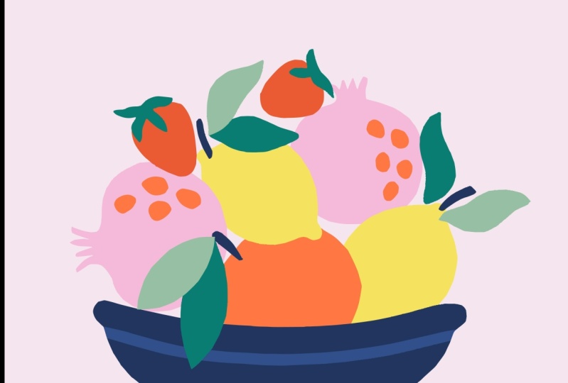
with your color composition, you have your first version of this finished piece of art. In this example, I have tried to use somewhat realistic
colors for the fruit and their leaves while still
having some variety between the different shades of green and yellow for example. I kept the bowl blue like the one I cut out because I
really liked the way that pops against the greens and
warmer colors of the fruit. My background is still light, so everything is
very visible on top. I'm really happy with how this looks and how balanced it feels, and I can say complete
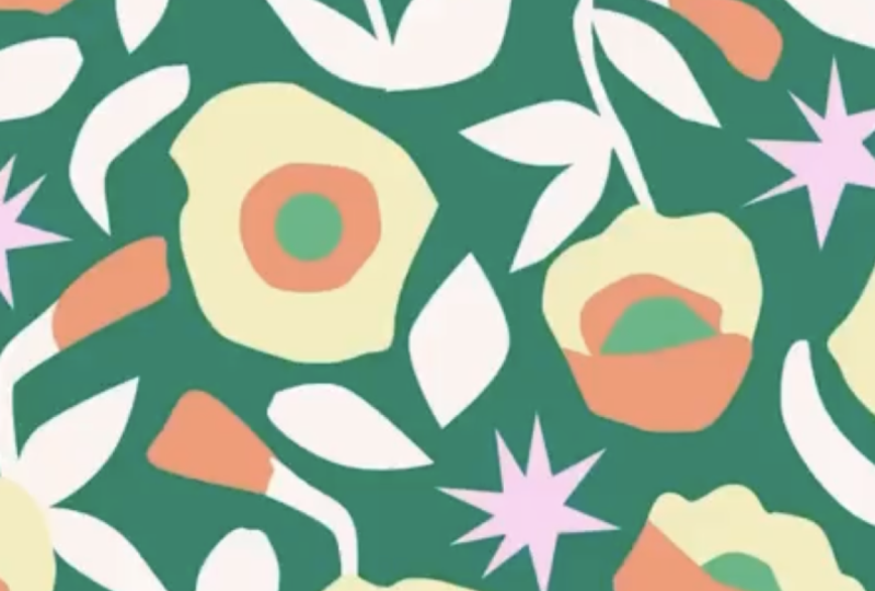
for this first version. For our next example
of finishing touches, we're going to use the
recolor artwork tool, which is a really fun way to test out other
color combinations. So first I'm going to select
my whole piece of art and drag it to the
side while holding the Option key to make
a duplicate copy of it. Now I'm going to make sure
I have everything selected, and I'm going to go to
the color wheel icon in the top bar to open the
recolor artwork tool. When you first open this tool, you'll see this version, which is the basic version. But when you click
Advanced Options, you'll have more things
that you can do. You can select open advanced
recolor artwork tool dialog on launch so that you
always see this panel. Here, you can see all the colors used in your artwork
that you've selected. When you click on
a color group to the side or a saved
swatches palette, then it'll randomly assign them to each of the colors
that you're currently using. By clicking this
randomized button on the bottom of the color list, you can try new
combinations where it will cycle through in random
order the different colors. One thing to remember is if you do find a combination you like, you want to save it because you will not be able
to get it again. It's all very random. You can also go into a specific color
that comes up during this random process and change the swatch if you want to
keep most of what you got, but you want to
try out something a little bit different
for one of the colors. You can go to the color swatches that you have saved
by double clicking. You can test out
lots of things this way really quickly and come up with examples of
colors you might not have thought would look
really great together, and it's particularly good for, in this case when you don't want very realistic looking color
options for your fruit. I really like that
as well though, because it brings in some unexpected playful
look to the art. You can also drag a color from the existing colors that you're using over to the new colors, and that is one way to manually change something
in a new palette that you're coming up with. Then whenever you are ready and happy with
what you've made, you can click okay in the
bottom righthand corner, and then click no on saving
changes to the swatch group. There you have your
new color option. I'm going to make
another copy again of my original piece by holding
Option as I drag it, and this time we're
going to make some new shapes where the different motifs
overlap each other. Getting prepared for that, I'm just going to make a few more overlapping pieces by moving some of
these leaves around. When you have overlapping
pieces and you want to show that overlap almost as if
it's a translucent area, you want to select both motifs or both elements
that are overlapping, and then you'll hit Shift M on your keyboard to come up with
your shape builder tool. With whatever is selected, with this Shift M
shape builder tool, when you hover over
your selected area, it will allow you to
click on the shapes that have been formed by where the overlapping
lines cross. Here with these
two leaves, I can click on the center part of those leaves and define
that as a new shape. It will permanently change how these two shapes
interact by creating this third shape that is
cut out from both of them. If you have first selected a color from your
swatches panel, that will be the color that
that new shape becomes. Here I want to highlight the overlapping piece where the apple goes behind the bowl, but I don't want to overlap
the grid part of that bowl. When I select the apple and
just the bowl background, not the grid on top, that'll allow me to do that and create that part of the
apple as its own piece. If I have the grid
selected as well, it would dissect that apple
into many more pieces. In this case, I've decided
with these overlapping parts, the grid really isn't
working for me. I'm deleting that detail
to just highlight the different color
blocking shapes of the fruit peeking through what now looks almost
like a glass bowl. We're going to create one
last version to show you a final option that
you can use to add a little bit of detail
to your final piece. In this version,
we're going to be adding some texture that I made using ink on paper and
scanned into my computer. First we'll make a copy again while holding Option
dragging our artwork over, and then we're going to open the drawing with scissors paint splatter texture
file that I have included on the projects
and resources tab. If you zoom in on this paint
splatter texture file, you'll see these are all individual vectors
that I have made from the original ink
paint splatter piece that I scanned into my computer. It started out as
highest quality scan, I used image trace to
convert every piece of it to a vector so that we can recolor it and
resize it as needed. This whole thing is grouped, so you'll just need
to copy and paste it into your still life
cutouts working file. When it was pasted in, it's going to be big
and it's going to be over all of your artwork. First thing you might want to do is scale it down
like I'm doing here while holding my Shift key
to keep the proportions. I'm going to color it to be the color of the
background because I think that'll look
interesting on top of the fruit so that there's
a little bit of roughness. I can also double click into the isolation mode
to move around the individual paint
splatter pieces until they look how
I want them to. Maybe there's too much in one area or not
enough somewhere, and you can control
all of that by clicking in and
adjusting manually. You can also play with
different colors, darker or lighter for
the paint splatter and see what feels
good to you in terms of using this kind of texture to make your piece look a
little bit more interesting. I'm going to try having
this only on the bowl, so I'll use a clipping mask to do that by pasting
the bowl shape in front and clipping out the area of the
splatter around that. I'm really just experimenting with different ways to
use this texture to bring some interest
to this piece and make it feel a little bit
less two-dimensional. I like it in front here, I like it with this
slightly lighter blue color as a replacement for the grid. But I'm just moving it
around and duplicating it to make it more
busy and more dense. I'm holding Option
and dragging to make more copies of
this paint splatter so that I have more of it
show up on top of my bowl. I'm playing around with using a few different colors
in the splatter, so it looks like a
painted ceramic bowl. Because this has a
lot of vector points, sometimes it can slow down
your computer a little bit. It's slowing it down here
just in the display of this where it looks like it's not totally clipped, but it is. As I zoom in and out,
you can see that the part that should be
clipped will disappear. Now I have four versions of
this piece that are all using the same color
palette but do show really different ways to
have the final piece look, from more realistic colors
to more out-there colors, some that has more
depth or more texture. You can even play it with totally different
color palette if you want it to shake
up this artwork. There's a lot of ways I can repurpose these cutouts
once I have them in here, and that's one of the
really exciting things about using cutouts digitally, is you can use them
again and again for a lot of different purposes. I hope that you have found
some versions that you like and that you're excited to share these
pieces with the class.
9. Thank You!: [MUSIC] There you have
it. I hope you've enjoyed drawing with scissors and turning cut paper into
striking digital artwork. This is a great
technique to have in your tool belt for breaking
through creative block, coming up with new ideas, or just for having a little
bit of creative fun. As you saw, you don't need a whole lot of things
to get started. Getting started can be
the hardest part though. If you're struggling
with that part, just start making cuts and
see where it takes you. Lean into the playful
side of this exercise. You should now have
a finished piece of art that is ready
for the world to see, and I definitely want to see it. Please make sure to upload
your finished projects on the Projects and
Resources tab for this class from a desktop
or laptop computer, so that we can all
celebrate what you've done. While you're there, leave a little comment for someone
else and make their day. If you enjoyed this class, I would love it if you'd
leave me a review. It's the best way for other people to be able
to find out about it. If you're going to keep
drawing with scissors, please tag me on Instagram
@jennykoland so I can see the work that you're making
and cheer you on. [MUSIC]
 Jenny Koland, Artist, Designer, Color Enthusiast