Transcripts
1. Welcome to Drawing What YOU See!: I'm Helen Robertson. I'm a painter, printmaker
and illustrator. I run 7 hz Studio and I've been making
art since I was a kid. My mission is to get more people excited about making art. I don't have an art degree
and I'm not an expert. I learned art from elementary and high school art teachers, a few formal art classes
and lots and lots of how to draw books checked
out from my local library. I'm still learning
are to this day. I wanted to share what
I've learned because I want to see more art
for more people. The more artists and
styles we have access to via social media, art fairs, online shops,
brick-and-mortar art shops, or your friends and family
members kitchen tables. The more people
will see art that speaks to them and
inspires them. Everyone is creative and
everyone can make art. Art enriches our lives and helps us experience the world
in a different way. We all see the world
a little differently. This course will help
you learn to draw what you see in your style. Our communicates
importance in a variety of ways using tools
like proportion, perspective and
shadow or shading. This course will help
you learn to communicate what's important to
you via illustration. We'll zoom out, talk
about the basics, zoom in and jump into drawing
and learning by doing. Then, zoom back out to review what we did without
even realizing it. In the last lesson, we'll
put together all the skills we've learned and draw
an image in your style. Just a few things
before we get started. As a bonus, I've
created a list of 31 drawing prompts
to help you continue your practice after you
complete this course. Download them via the link in the about section
of this course. Don't forget to follow
me on Instagram and join my email list for peaks
behind the scenes promotions, new artwork and more
thoughts about art. You can also follow me on
Skillshare by clicking follow at the top of the screen for
updates and new courses.
2. Materials and Class Project Overview: Here's what you'll need. Three to four pieces of paper, any kind of paperwork. You can use a sketchbook, notebook, paper or anything
you have around the house. I'll be using this
notebook from my aunt. She had acute cover for
one of the line notebooks. You find it a grocery
store or a pharmacy. These lines can be
great to provide new guidelines when
you're drawing shapes. You'll need some tape. I have scotch tape but you can use duct tape, Painter's tape, anything you have
around the house, something square or rectangular? I have a little gift box. Something circular or oval. I've got a little furniture pad, a pen and pencil, or two pounds and two pencils. I'll be using one new
piece of paper for each exercise that you can combine exercises on
one sheet of paper. Just make sure you reserve one plain sheet of paper for
our traits and exercise. You'll also need this image that I've provided
as a download. You can print it out or you can use a tablet
with a drawing app. Optionally, you can
use a light tablet or light box or some
tracing paper or both. I'll be using both to make my demonstrations easier to see. But if you don't have
those, don't worry. I'll show you another option.
3. Let's Warm Up: Let's start with
a quick warm-up. This is just about getting
some marks down on your paper to get an idea across
kinda like Pictionary. I'm going to put 20 s on the clock and we're
going to draw a cat. Don't think too much about it. Just draw the first thing that comes to mind when
you think cat. What did you draw?
What characteristics of a cat did you capture? What makes a cat a cat to you? In the next lessons, we'll lean into defining characteristics to help
you draw what you see.
4. Drawing Circles Squares and Triangles: In this lesson,
we're talking about breaking objects down
into basic shapes. If you've ever played music, this is like learning scales are notes before playing
a full song. Let's start with
circles and ovals. Let's start by tracing your
circular or oval object. You'll take your object,
trace around it. And now we're going to
trace over that line. Start out slow, and then see if he could
pick up some speed. As you're tracing. See if you can notice what
your hand naturally does. So you can see over
here, over here, over here, I've got a little
bit of a wobble in my hand. So just think about what
comes naturally to you. I spent two years in
architecture school. And this is a lot of
how we learned to draw freehand just by tracing
over something we've traced. So now let's try free-hand. Now I've done this before, so my circle might look a little more circular than
yours and that's alright. So again, we can see when
I'm doing this freehand, my wobbles come through
a little bit stronger. So for the next circle, I'm going to lean into that and really make those
lines a little wobbly. So now I've got a
circular shape. But a little bit more dynamic. Looks like maybe a drop of
rainwater or splash of milk. So just think about
what you naturally do. If you've used the
circle to trace. Try free handing an oval. Just thinking about what an
oval shape would look like. If you started off with an
oval, try that with a circle. This is something you can
do really at anytime. You can do it with
your morning coffee while you're on hold, while you wait for
a meeting to start. Or maybe if you're at a coffee
shop waiting for a friend. Now let's do squares
and rectangles. I've got my box here, just like with the circle, will trace the sides. And then we'll go over
those lines a few times. Squares are a little bit
more frustrating because naturally we want
these lines to be perfectly straight,
perfectly parallel. But no one can really draw
like that, including me. So let's just try our best
to go over these lines. And as you see my wobbles coming back in a
little bit here. And I've actually extended these lines beyond
the right angle. Just makes it a little
bit less intimidating to try and get this
corner exactly right. Plus it gives it a little
bit of a stylistic flair. After you've traced a few times, try drawing free hand. Again, I've done
this a few times. So if your square looks
different, own worries. So as you can see, I've exaggerated these links a little bit beyond that angle, that 90 degree corner. Let's see some of those
wobbles coming in. And you can see some curves starting to show through here. So a little bit of
grit curve here, little bit of a curve here. That's just what my
hand naturally does. So for the next one, I'm going to play
that up a little bit. I'm going to make this curve
a little more dramatic. Make one on this side. Hey, quite here and here. So we've still got our four
sites are four corners. But it's got a little bit
of a different feel to it. So think about where
your hand does. See how you want
to lean into that. Let's move on to triangles using our square or
rectangular object. To make a triangle. We take our square or
rectangular object again. And then we'll make this, we're into two triangles. So if you want a straight edge, you can use one side of your
box or whatever kind of square objects you have and just kind of eyeball
that angle there. Since this isn't quite
long enough. Not perfect. Let's alright. So just like with
the other shapes, trace over what you've just created until you feel a little more competent
to try for hand. Again, just like what
the others think about what your hand
naturally does. Think about what's triangle
feels a little bit better. If you like the corner up here, maybe like it down here. Whatever feels better to you. Alright, so now
let's try free hand. I'm going to have my corner
in the bottom right. And I've got my
free hand triangle. So again, just like
with the square, got a little bit of wobble
to my hand over here. You can see this side isn't
quite a straight line. It's a little bit
more of an arc. So for my next free hand, I'm really going
to lean into that. Going to make this arc
a little more dramatic. Gonna make these
sides a little wavy. And then as you can see, I've made this bottom line a little bit darker
than the other. So I'm going to exaggerate that. Make this more of a base. Make this a little bit smoother. Alright, so there
we've got a triangle. We can think of more
complex shapes as just basic shapes of
different sizes combined. E.g. a. Teardrop shape is really a triangle and
circle put together. So think about more complex
shapes that you can break down into simple shapes. You can even make a
cat with a square, circles and a few triangles. Maybe add some whiskers
and a little half circle. Now that we've got
our basic shapes, join me in the next lesson to find those shapes in an image.
5. Let's Trace: Now we'll trace a
reference image to help us understand more complex objects. Tracing an image is kind of like learning covers of songs. You like to help you
understand how the song is constructed and how each
chord change creates impact. Just a quick note that
is not ethical or legal to trace other people's art
to make a profit off of it. If you do trace
other people's work, just make sure it's for
your educational use. You can change your
image to black and white using photo editing
software printing in black and white or
photocopying and black and white to see shapes and shadows
a little more easily. Tracing can help you
understand how elements of a scene or object
work in context. Let's break this image
down into shapes, proportion, angles and
perspective and shading. We just drew circles, ovals, squares,
rectangles, and triangles. So let's find those
shapes in this image. We can see the tops
of some circles here are the roof or the
ceiling meets the walls. We have some circles
here and the windows, we also have squares
and triangles. And these windows, we've got an almost triangular
shape with this ladder, the angles come up and
we've got distorted square. Where we can see this
opening comes through. We'll talk more about
proportion in the next lesson, but let's talk about
proportion in this image. Think about the times
you've seen or climbed a ladder and the distance
between the rungs. For me, most rooms are somewhere between my
uncle and my knee, usually about halfway,
sometimes a little bit higher. So that information can
tell me about how tall this ladder is in proportion
to how tall I am. We'll talk more about angles and perspective in a future lesson. We can see angles and
perspectives all the time and we can see a few examples
in this image. Because of the way our
eyes and brains work, angles and perspective gives us information about
depth and distance. And we can represent that
with a drawing or image. Things that are
further from our eyes becomes smaller and
closer together. So the legs of this ladder
are closer to our eye, closer to the photographer. The top of the
ladder is further. That's why the sides of
the ladder are the legs of the ladder that are built to be parallel to each other
seem to come to a point. The further up we go. We can also see some perspective
in this opening here. Most likely this is
actually a square. The sides of the
sides are parallel. But because we're looking
at it at an angle, and these sides here, these corners here are
further from our eye. It looks like these sides are
coming together to a point. We'll talk about a
vanishing point and how that changes your
drawing in a later lesson. We'll also talk about shading and line weight in
a future lesson. In this image, there's a wide
range between the darkest, the lightest areas because of where the light
is coming from. Natural light like the
light coming through this window and this opening, create different
and softer effects you can see here and here. Then you might have, if you had a very dark room with
one spotlight coming in, you can see some
areas of shadow. Because of the framing
around this window, we have darker areas
of shadow here. And you can see how
this opening phase, this area here in light as well. I'll show you a quick
demonstration of how I would trace this image
to understand it better. You can trace any
part of the image and as much or as little
detail as you'd like. I've got my image set up underneath a piece of tracing
paper on my light table. If you don't have a light
table or tracing paper, go ahead and set up your image underneath a plain sheet of
paper on top of a window. So I'm going to focus
on the areas of this image that I find
the most interesting. I really like how this
ladder comes up on an angle. Just show us that
we're looking up at the ladder and how
the light from this opening hits the ladder in different areas telling us where the light is coming from. So not too worried about
straight lines here. Just going to outline
legs of the ladder first. You can see gets a
little bit wider towards the base and then almost disappears into
the light at the top. Come back in and a little
bit to add the shadows, or it's further from
the light source. Now I'm going to
add in the rungs. I'll come back in later to add the shadow underneath on the underside of
the rungs as well. We can see what the
rungs they look like. They're getting longer
and further apart. As we move down. You'll see this image
is at a right angle. I've had that setup because
that's the way it fits on my light table
and in our video. But it's also a good idea to
shift your image a little bit so you can really focus
on the shapes you see. Because sometimes
if we're looking at an image the way it's
meant to be seen. Our brain can fill in
the details and we miss some of what we
might find interesting. We'll add in the opening here, frame of the opening. The opening itself. Add in some of the shadow
with a darker line weight. We see at the top of this frame add some shadow
underneath the rungs. The underside. Just to remind us where the
light source is coming from. There's also shading here. As we get further from
the light source. And a little bit more towards
the base of the ladder. We can also see the way the ladder casts a shadow because of the way
the light hits. So now we've got
that raft and let's turn this off and
take a look at, well, if we've got joined me in the next lesson for a quick activity to
keep practicing, tuning into what you see.
6. Puppy Break!: Let's take a break from
drawing for a few minutes and take a look at some
pictures of puppies. You'll see three
pictures for 10 s each. For each picture, jot down some feelings or adjectives
that come to mind. What did you write down? Here's what came to mind for me. When you're looking at the
thing you want to draw, Think about what comes to
mind first when you're looking at it. Do
you feel excited? What about that
thing is exciting, is that the colors? Is it that it reminds you of an exciting event or
time in your life? Is the combination
of objects together. Think about what
makes an image or object strike you as exciting, sad, or even boring.
7. Measuring and Drawing In (Or Out Of) Proportion: Let's talk about proportion. Proportion tells us a lot about function distance
and importance. Let's look at some examples. Proportion can communicate
function, e.g. this T-Rex is probably
doing more damage with its hind legs and
teeth than its front legs. Proportion can communicate
distance, e.g. we can tell the houses closer to the top of this
image are further away because they
are smaller than the houses at the
bottom of the image. Proportion can
communicate importance or significance, e.g. the deer and this image is significantly larger
than the horses, even though in reality, horses are generally
taller than deer. This tells us the deer is
more important in this image. To translate proportion from
an image or object to paper, you can use your pen or
pencil or finger to measure. Let's draw the pen or pencil
you're using right now. Alright, so such a pen
or your pencil down or lean it up against
something really my tongue up against my box. Use my pencil. What we're gonna do
is we're going to map out your pen or
pencil on your paper. So let's make a little mark. We start. Now, we're going to use our
thumb as a measuring tool. Sometimes it helps to
close one eye to do this. So I'm going to
hold up my thumb. Close one eye from my angle. First look at the
cap of the pen. From where I see it. The cap runs from about the tip of my thumb
to my knuckle. So I'm gonna make
that mark on paper. Now. I'm going to
measure the rest of the pen from the cap. It's about three times
the length of the cap. So I'll mark that out
on my paper when 23. Now we're going to look at
the thickness of the patent. So again, using your thumb or your finger from where I sit, That's about half the
length of my thumbnail. I'll mark that out on the paper. And then looking at the bottom, it's about a third. Mark that here. Then I noticed that the cap is a little bit thicker here
than it is at the top. Measure that again, it's about half the width
of my thumbnail. So now we can pretty
much connect the dots. So for now, we'll
just use rectangles. There's cap. And then do your best
to draw all the way to the end for the rest
of your cotton. So now we've got the basic
pen shape mapped out. Now look at it and
see what you notice about the differences between the pen as you see
it in your drawing. First thing I notice is I have this moreover,
even rectangle. But really the pen cap is a little bit broader at the base. So don't worry about erasers. We're just going to
make these lines where we brought
them right over top. So I'm gonna make this a little bit more of a
truncated triangle. That looks a little
bit more realistic. The other thing I
noticed is for my angle, cap is a little bit rounded, bottom of the Kappa's little bit rounded and add those curves in. And I notice bottom, my pen is little curved as well. We're going to add that in. The other thing I noticed this, this tab has some ridges going
to add in this ridge here. Use my thumb as a
measuring tool. That's about half my
thumbnail. Mark that in. And again, this has
a little bit of a curve to it to from
where I'm sitting. There, you've got
your basic pen. And we can work on stylizing
this a little bit, these lines a little heavier. Then think about what's
important to you about this pen. Maybe you really like
the shape of the cap. We can exaggerate
that a little bit. Exaggerate the size relative
to the rest of the pen. Make a cap that's
little bit bigger. Maybe the pen feels
really warm to you. We can extend that
pen all the out. That current in the bottom. And my pen has a
little clip on it, can't see it from the
angle I was working on. But you can always add that in. So this one drops out
to most about it, this line, this
other curved line. And then the length of that, about the length from the tip
of my thumb to my knuckle. There you've got a pen. We just learned a little
more about how to communicate important
seizing proportion. Now let's dive a little
deeper and learn how to incorporate
angles and perspective.
8. Using Angles and Perspective: This lesson will focus on using
angles and perspective to communicate information
about how you see an object. Angles communicate perspective
or where the viewer is in relation to the
object they're looking at. You've probably seen how long straight roads or
train tracks seemed to almost angle together to come to a point on the horizon. That point is called
the vanishing point or convergence point. We can communicate that
same sense of distance using vanishing points and
drawings and paintings. Let's pretend we're
standing in the middle of a long straight road and drive what we would
see to get started. Alright, I'm gonna
pick one point on my paper as my
vanishing point. I'm going to make
our mark right here. Now I'm going to
draw two lines at an angle to make
an upside-down V. Don't worry of these lines
aren't completely straight. So think about the times you've looked down a long
straight road. Usually these lines don't quite come to a point like
we have in the paper. So I'm going to
pick another spot, one on either side of
that vanishing point. I'm going to meet it up
with my original line. Now that's starting to look a little bit more like a road. Now, we can add in things to make it look
more like a road. Can add in the line division. Just kind of eyeball it. He finds will look longer
and larger the closer you are extending these lines here compared to this line here. And then I'm going to lean
in to the wobble in my hand. Maybe this is the grass
at the side of the road. Add in some little circles. Gravel on the side of the road. Just a little bit more texture. So see what you wanna
do with your road. Angles can also communicate
importance by showing or not showing various
sides of an object. Let's draw a house. First. We'll draw a square. You can trace your square or rectangular object
if you'd like. I'm going to do mine freehand. So we've got our
square. Let's add a triangle for the roof. I'm going to use
the center line as a guide point from the
top of my triangle. Now we've got our house. So let's add a little
more character with some smaller squares
for some windows. At our rectangle for the Thor. Now we've got a simple house. This perspective is the facade
or the front of the house. We'd see it if we were standing directly in front of the house, looking directly at the house. This tells us a lot about
the house, just as it is. We've got two stories. We've got an attic or maybe a top floor with
some sloped ceilings. So now let's add a vanishing point and learn a little bit
more about this house. So just pick a vanishing
point to the right. Now we're going to take
the perspective as if we were standing closer to
this corner of the house. So we're gonna take
this corner here, will extend a line out
to the vanishing point. Take this corner here, extend that to the
vanishing point. Let's try that again. And just like with
our Rhode House, doesn't exactly come to a point. Obviously civil choose a spot in the middle are a little
bit further out. And we'll make that the back of the house will do the
same thing with the roof. We can use the same vanishing
point just for simplicity. And then come down here,
see where we meet. Back at the house. We'll make that the
end of the roof. So now we can see a little
bit more about this house. We can add some
rectangular windows. Again, we can use the
same vanishing point. Have those windows disappear
into the distance. Maybe we want to do
that for our door to choose a point here. Take it to the vanishing point. And we'll add an a door. And now we've got house. Perspectives and angles
are a lot to take in. The key points to take
away is things that are further from your eye or
closer to the vanishing point. Now that you know that you
can play around with angles.
9. Using Line Weights and Shading: Line weights are my favorite
thing to play with. Line weights or the
thickness of your lines can communicate so much about
what you're drawing. We can represent shading
with different line weights. Let's go back to our
basic shapes and explore line weights
and shading. For this section, you can follow my lead or try out
your own style. Go back to my triangles
and as you can see, your eye is drawn to
the thicker lines. We're going to
experiment a little bit more with light weights. I'm going to make this arc thicker to balance
out the other side. So now that we've got two
thicker sides of the triangle, really stands out that
this one is thin. Heavier lines make it look a little bit heavier in terms of weight as well as line weight. So let's try doing
something much thinner. So we'll try and
replicate this triangle, but with very thin lines. Try this one little bit
straighter and edge. And then we'll try one. Replicate this top
one will come back and make all the
sites dark, heavy. So this is something again, you can do while you're
waiting for me to start or waiting in a
coffee shop or a friend. Just play around with
the line weights and see what you like. See how the shapefiles
in terms of balance. Maybe you want to
add some wavy lines. See how that feels. Or maybe we want to add a
thinner triangle inside. To contrast the heavier line
weights on the outside. Let's add some shading to communicate depth and
a sense of space. Let's practice a few
different kinds of shading. Instead of shading that's
realistic and blended, we'll use some lines to
approximate shading. Looks a little bit
more stylized. So we'll try some lines
as straight as you can. Try to evenly space them or try adding in a few
at irregular distances. What that looks like. Now we'll add in some
perpendicular lines. So this is called crosshatching. Makes it feel a
little bit deeper. Shading can see what happens if you put
thinner lines in-between. Thicker lines. See the difference between
this side and this side. This looks more shaded. This looks less shaded. You can even fill in a shape completely with lines that
are very close together. You can go fast. The Lions makes
them a little bit easier to draw. Straight. Then let's add some
crosshatching. Just so one-half, just to
see the difference between the cross hatch side
and the side where we only have one
direction of lions. Experiment. See what you like. Maybe try different shapes, can try a triangle. Just pretend that only
one side and a shaded. See what that does to
the field of the shape. Now, we're going to see
what it looks like when there's light source on something that's
roughly a sphere. So I've got this cute
little bat figuring. And we're going to use his belly to look at the shading
and where the light hits. So for my angle which is little different
than your ankle, I see darker shading here. I've got reflections from
a light source here. And a little bit of
shading on this side. So let's translate
that to the paper. I'll make this an oval, even though it's
not quite an oval. Let's simplify it a little bit. I'm going to trace where
I see the shadows. Again, just approximate it. I'm going to mark out where
I see the light source reflecting most
prominently right here. And then I'm going
to mark where I see a little more
reflection on this side. Now we're going to
fill in the shading. Looking at the shaded side, we can see a little bit of variation in the
darkness of the shading. So for my ankle looks a
little darker over here. So I'm going to map that
out and write here. So I'll map that out. So these spots are where
I want it to be darkest. This is where I want
it to be lightest. And this is gonna be
somewhere in-between. Let's start dark and
work our way to light. I'm going to draw lines
very close together. Add some crosshatching. Do the same here. Now I'll add in these parts with lines that are close together
but not crosshatched. I'll even go over the
cross hatch part, blended in a little bit more. Kind of go over the
crosshatching here. Now I'm going to look
at the depth and the darkness of these
sides and lighten it up. We're going to use
some very thin lines that are spaced a
little bit wider apart. Going around the spot where I see the light reflected
both strongly. I'm going to try and connect these doesn't need
to be perfect. There we have a stylized
shading of all that. Figuring. Line weights and shading are good things to
practice while waiting for a bus or waiting for a
friend and a coffee shop. In the last lesson, we'll
put together all the skills we've learned and draw
an image in your style.
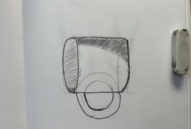
10. Class Project: Draw A Mug In Your Style: Now it's time to put together
everything you've learned. I've set up a scene that
I'm going to sketch and I provided an
image of that for you. I'll also show you the scene onscreen so you can
draw along with me or you can set up your own scene with
objects around your house. This is a no pressure sketch, is all about making marks on your paper the way you
want to make them. I'm going to take 10
min for my sketch. And I encourage you to
set a timer for yourself. You can take 10 min with me or you can pause anytime to take longer time sketches take the pressure off of producing
a perfect final product. It's about seeing what you can create in a finite
amount of time. Then you can look
at what you made. Think about what you like, what you want to improve
or change, and try again. Before we start the sketch, thinking about what you've
learned about your style over the past lessons since
you drew your CAD, are you going to lean into a less steady hand
and use wavy lines? Do you like exaggerated shapes? Do you like heavier line weights are lighter line weights. You have an idea of
what you want to try. Okay, let's get to sketching. I've said one of my
favorite mugs on top of sketchbook inside a filing
box for us to draw. You can also set up your own
scene at home if you'd like. I provided the image is
the download and it's also on the screen for you
to follow along as I draw. I use this box because it
has a blank white inside, which makes it easier
for me to focus on the object I'm drawing today. I'm just going to draw the BCG. But if you want to add
more time to your sketch, you can add in the
notebook if you'd like, or dry whatever
you have at home. I'm going to put 10
min on the clock. And we'll start by measuring
the distances of this bug. Will measure the distance
between the opening, the top of the opening, and
the bottom of the opening, the width of the cup and the length of the
sides of the cup, as well as the length
of the handle. I'll put 10 min on the clock and I'll explain what I'm
doing as I'm doing it. Put on some music for us. Awesome too as well.
Alright, let's start. I'm going to start
by drawing a square. I'm going to measure
the distance between the top of the
opening of the cup, the bottom of the cup, the outsides of the cup, not including the handle. So I'm gonna use my thumb
as a guide from the top of the opening of the cup to the bottom of the cup
right down the center. That's about halfway through halfway along this bone and my thumb measure
that on my paper. Now we're going to
look at the width. So a cross, again in
the center of the monk. That length is
little bit shorter. Just past my knuckle. Mark that on the paper. Try to be as equal as possible. Get it right down the middle. There are four points. So now let's freehand align
doesn't need to be perfect. Connect those points. And now you have the
rough volume of our cup. Now we'll fill in the details. I'm going to measure
the distance between the top of the opening to
the bottom of the opening. This looks like an oval because of the angle
we're looking at it. Even though if we
were looking at directly into the cup,
we would see a circle. So this distance is just short. The full length of my thumbnail. Hallmark that in now I'm
going to draw an oval. Keeping the outsides of the oval within the
outsides of my square. Can see my hands a little
bit wobbly as it usually is. That's okay. Cups got a
little bit of a wobble to it. Now, I can see as
I look up my cup, the bottom of the cup isn't
quite a straight line. That's more of an arc because it's going to be the same width across as it is at the
opening of my cup. Now I'm going to
measure the distance between the bottom of the curve where it comes up
to meet the sides of the cup. Take my thumb again. And I see that that distance, it's about quarter of the
length of my thumbnail, which is just a dot here. Measure that on the
other side as well. Just about here. So we can make an arc
or we can draw an oval. Because the opening
of the cup is gonna be the same as
the bottom of the cup. Can try and match that
normal as best we can. Or you can make it
look completely different, totally RTO. Now we've got the sides, top and the bottom of our mug. Now let's add the handle. Again. We're going to measure the top of the handle. The
bottom of the handle. The whole length of the handle
comes down about a quarter of the width on my thumbnail from the left top
corner of my mug. And it stops just
about a third of the way down my thumbnail on the bottom, mark those lines. And as we look at our handle, we can see it's
almost a semicircle. So I'll draw in a circle. But first we need the
furthest point out. Measuring from this side of our monk to the very
outside of our handle. That's a little bit longer than the distance or the length. My thumbnail. Now I can draw a rough circle
to connect those points. That is the outside
of my mug handle. Now I'll add in the
thickness of the mug handle. The thickness about a third, the length of my thumbnail. Add a little merch. And I'll add one here as well. And add one here on
the outside as well. Now again, I'll draw a circle to connect
those three dots. You can see this is more of
an oval, but that's okay. So now we've got our handle. There's about 5 min
left on the clock. Let's come in with a
heavier line weight to mark the outside
edges of our handle, inside edges of our handle, outside edges of our mug. Now we've got our mugs shape. Now, we can add in some shadow. If I take a second
to look at my mug, I'm going to map out where
I see areas of shadow. I see the darkest
areas of shadow here. By line weight is
already pretty dark. So I'm going to add
another sliver. And I'll fill that in with some lines that are fairly close together but aren't
quite a solid line. I'm just gives a
little suggestion of the gradation of shadow. I see. I also see as the mug curves around further from
my light source, which is coming from the left. There's a shadow on the
right side as well. This cup has a few dimples in it and we can add
those in or not. I'm going to ignore
those for now. And draw what I see. I see this coming
in a little bit of an arc because that area in shadow isn't quite as dark
and deep. This, this area. I'll add in some lines that
are a little further apart. We can leave a little space for the rim of the cup if we want. Maybe we can even add in
that rim light hitting it that gives it
its curved shape. Just give a suggestion. For that lip might be
the inside of the mug. I see some shadow on the left side because the light is coming
in from the left, hitting the inside on the right. Again, sketch out that shape. It's a little darker
than this era here. So I'll add in some
crosshatching. Now we've got about 2
min left and I want to add shadow to my mug handle. As you can see. When you look at your mug, you'll see just the
top on this section, but you can actually
see the inside here, inside of the mug handle. To make that clear, you can add more shadow.
Where we see it. Here. Can add some cross hatching. We want to make it
a little deeper. And then we can show where
there's some shadow here. My line is already pretty thick, but I'll add a few
more lines to it. Nice lines here and here. Almost connect, but not quite. Now, we've got about 1 min left. So I'm going to
look over my monk, see if there's
anything I'm missing, anything I want to add. One thing I noticed
is there's an area of reflection, my
mug handle here. So I'll quickly
add in some very, very light lines to
make that distinct. And my last action will be to add again
some very light lines, the inside of the cup. Because that area is then more shadow than the
outside of the mug. With our last thirty-seconds. Take one last look at the mug. See what you like,
see what you missed. I see a little bit
of shadow here. Yeah. And a little
bit of shadow here. A little bit here. I'm going to ignore the
dimples in the mug for now. We can add more of
the dimples in later. If we want to add time. Time's up. Please share your sketch on the class project section
of this course page.
11. Final Thoughts: Thank you so much for
taking my course. I hope these lessons helped
you find your style and identify your unique way
of seeing the world. Here are a few tips and reminders to keep in
mind as you continue your art practice. Keep practicing. Okay.
 Helen Robertson, Painter, Illustrator, Printmaker