Transcripts
1. Introduction: Hey, there. I'm Sabrina Gosson, a certified wildlife biologist,
gone freelance artist. I've explored many
creative paths and have earned diplomas
in graphic design, digital photographic
Imaging, which is to say I'm a
professional photoshopper, as well as most
recently UX Design. As an illustrator, my primary tools are
alcohol based markers. However, no matter
your preferred medium, warming up is a key step
to any creative process. That's what this
class is all about. Warm up exercises are an often overlooked part of
our daily artistic routines. But just like athletes get a good stretch in
before a workout, artists can benefit from simple exercises to
loosen their hand, build creative confidence, and
improve overall technique. There are countless
exercises out there, and in this class, I'll be
going over a variety of them, including my personal favorites to get your lines
more confident, your shapes more shapely
and your artistry glowing. By the end of this session, you'll have an arsenal of go to exercises to include in your
daily artistic routine, helping you feel more
relaxed and ready to create. Ready? Let's go stretch
our artistic muscles.
2. Prep & Materials: Okay, so for our first exercise, we're going to do
some simple linework. I'm using my Strathmore
sketchbook because it's super old and I haven't
used it in a long time, so why not make use
of those empty pages? You can use whatever you
want, like plain paper, an old sketchbook like I am, paper that you
printed on and you don't need anymore, whatever. Just not loose leaf as
it already has lines. So our first exercise
is probably one of the key warm up
exercises in my opinion. For this one, honestly, for all these exercises, you just need something to
draw with, preferably a pen. You could also use a pencil, but I recommend a pen
because it'll help improve your line confidence since
it's permanent with pencil, you're more likely to create a sketchy chicken
scratch effect. You technically can use
whatever pen you want, you just have to make
sure it actually works. Here are some pointers though. For example, this one is dying
and maybe a bit too thin. An ideal thickness
would be 03 or 05, as those are the most
common pen widths. There's also brush
markers out there, and unless you're always
working with a brush marker, these are better suited
to a future exercise, which is pattern making. I'm exaggerating here, but you can see it's very volatile. You can get consistent lines, but for the sake
of this exercise, you'd ideally just
stick with a basic pen. This one works well,
but to be honest, it might be a bit thick for some of our line
consistency exercises, as you're gonna want to see the results of going
over your lines. I'll be using your
basic gel pen. This one has a nice line. It's got plenty of ink
and it's not that old. This one's too
thin and scraggly. This one's okay, but drying out. This one's too thick, too inconsistent,
and just right. There you go. Paper, pen
or pencil if you'd prefer. And we're good to go.
3. Exercise 1 - Lines, Arcs, Waves: Our first exercise is
all about line control. Take your paper, your
sketchbook or whatever, and you're going to start with
drawing a bunch of lines. We're going to start with,
let's say, ten short lines. This would be about
two to 3 " long. Basically, you're only going to want to use your
wrist for these. No longer than you can go without moving the
rest of your arm. Do them as straight as you can. Yeah, you see, I
moved my arm here, so that's not a good
one. Let's try again. Your wrist. You can move your hand down as you create them, of course. Try to make them parallel
and about the same length. Some of them won't
be exactly the same, but this is, of course,
just a warm up. That's ten. If you want, you can see how straight you got them with a ruler
or a straight edge. Not bad. Then for the second part, before we move on to our longer lines, this is related to
line consistency. You're going to want to
take one of these lines, try to find the straightest one, for me, the top one seems pretty straight, so
I'll go with that one. Ghost the line a
couple of times to get used to the feeling
of making the line. Then commit and try to recreate the line you made
about eight to ten times. Do your best to create the
exact same line. Just a tip. If you go too fast, you're more likely
to curve up or down, and if you go too slow, your line will wind
up all wiggly wobbly. Try and get a feel for the right speed and feel free to go over
more than one line. Now for the next set of lines, you're going to want to do a line using your
arm from your elbow, all the way out to about
halfway through the page. Let's see. It's a little wobbly.
These can be tough. They're not going to be perfect. That's the nature
of us being human, Go as far out as you can
without using your shoulder. You really just want to use
your elbow for this set. If you want, you can
actually use your wrist and stretch it out a little bit when you can't go further. I'm just going to keep to
using my elbow though. Try and find your
accurate speed, not too fast and
not too slow again and do the same number of lines as before,
about eight to ten. If you look, my line
is curving a bit here, if this happens, you can just
adjust with your next line. Let's see how we did here. You can tell that it's a little bit upwards, and that's okay. It's just practice.
It makes sense that these ones aren't as straight because the longer the line, the more difficult it is
to keep them straight. Just like the previous
set of lines, you're going to choose
your straightest line and go over it to
practice consistency. Since mine aren't as
straight as I'd like, I'm just going to create
a fresh with a ruler. Then just like before, you got to get a feel for
the line, then commit. Try not to increase the
thickness of your line. It's certainly tricky and you can't hide your
mistakes with pen. What I also like about pen
is it's nice smooth feeling, which is another reason why I like to use them
for my warm ups. Once you go over your
line about ten times, it's time for our last set. For these, we're going to use our shoulder and our
elbow and our wrist, if need be, all the
way across the page. Just shaking out my arm first. It's nice when you
have a sketchbook with a tear line as it gives
you a nice endpoint. All right, so there we go. These are a little bit
more wiggly wobbly, but this one looks okay. Let's check with the ruler. Not bad, but I'm still going to create a new line
for my next exercise. Tricky. Don't worry
if it's not perfect. It's rare that anybody has
a perfectly straight line. We do that ten times again. All right. The next part is very similar and we're going to use this
same line as a reference. Start like before, but now add an arc to your line
and keep going. Each time increasing
the curve of your arc ever so slightly. Again, to work on
line consistency, you can retrace your arc. You can do just one
or more than one. This is your warm up session. If you notice with
these long arcs, I'm making full
use of my arm and in particular my wrist
to get that curve at the end and for the shorter sharper
ones at the bottom. All right. Next, another thing I
like to do is start one long straight line and
then try and follow it. Follow it, follow it, and boop curve it out. Again, a little shorter, but ending at the same distance. I keep going trying to keep the distances between
arcs consistent as I go. This is something I
personally like to do. I don't know if anybody else really includes
it in their warm ups, but I like trying to figure out interesting ways of
practicing line consistency. So now, this is the tricky
part about this one, and that is that you
do the same thing, but in reverse, like
a mirror image. I say it's a bit
tricky because you're working at angles you're not
used to, take your time. Luckily, if you messed
up with these warm ups, it isn't a big deal as this is really for
warming up your hand, practicing your movement,
and your confidence. You can go over them if
you want. It's up to you. Now for waves, you can
start with short waves, about two to 3 " like the
lines we started with. Adjust the oscillation of them. They can be tight or larger. Try a variety. Then increase the length of the
waves you make. Make a bunch. Then like always choose one or a few to practice
going over them. Then what you can do is take the last wave you
did and try and continue this set while
keeping your line as parallel and evenly
spaced as you can. There we go. A good set of base warm ups
using lines, arcs, and waves. You can fill up as many pages
as you want using these. There's plenty of patterns
you can create as you warm up like different
sets of arcs. Enjoy. Next up, even more
line based exercises. Yeah.
4. Exercise 2 - Points & Lines: Ready for more line practice. This next one I like to do is putting a bunch of
points around the page, and then you connect the
points using straight lines. I try and get every
possible combo to be able to work with a
variety of drawing muscles, wrist, elbow, even arm if your points are far
enough from each other. It also helps hand
eye coordination, visualization, and
line confidence. Feel free to move
your page around to suit the angle you're
most comfortable with. For example, this is a really
awkward angle to get right, and it'll hurt your wrist. Ah. If you shift the page
around, tea beauty. You don't have to
keep to one angle, but certainly avoid those
really awkward ones. Just keep going and
be sure to ghost. It's super helpful in keeping your lines
confident and straight. Try to use just your wrist
for the shorter lines, elbow for the longer and full
extension of your arm and shoulder for the longest to
exercise all your muscles. That's point to point. Then
we have something similar, which is lines through a point. Plop a dot on the page and draw a variety
of lines through it. Friendly reminder to ghost
your line before committing. Try to do a variety of lines, and don't worry if you miss. This is just an exercise. Last exercise that's similar to these is curve through
a series of points. For this one, you place a
few points forming a curve. Then you do your best to create a curve that's
hitting each point. No need to rush. Just try
to get it nice and smooth. You can work on speed later. And if you want to work
on your line consistency, you can try recreate
the same curve. And another one. If you're working with a spiral
sketchbook like I am, it might be a bit
tricky if you're super close to the edge,
something to be aware of. You try different sizes, too. And a tip if you're struggling. Let's say you're
drawing your curve and oh, I can't do it. Just pause at a point and turn your page before
continuing your line. Try your best to keep it smooth. As you can see here, there's
a bit of a rigid angle. Ideally you'd want to keep it all in one swing
to avoid this. But sometimes you just can't can have fun matching up your curves points
as a little bonus. There we go. Another set of line based warm ups
for you to try out. There's a lot of them out there, but these are my go
to line exercises. And next up, no more lines. We're going to be
doing some circles.
5. Exercise 3 - Circles & Ellipses: Our next warm up exercise
is circles and ellipses. We're going to start with
some free hand circles all over the page to
loosen our muscles. What I would recommend is just ghosting your circle to get a feel for the movement before you actually
place down the mark. When you start your circles, they're likely going
to be a bit cky because your muscles need time to figure out how
to create them. Make sure to do your
best to match up your endpoints and actually
close the circle, too. Notice how mine start off really rusty and
improve as I go. And just like in our
previous exercises, you're gonna want to find the most appropriate speed
for creating your circles. Not too fast, not too slow. And try out different
sizes, too. And you can have fun creating
circles within circles. Just keep going and
eventually you'll notice your muscles gaining
the motor memory of creating this circular shape. Next, try and find
a perfect circle, either an actual circle stencil, tape roll, mug,
anything, and trace it. Then use your perfect
circle as a base for that same line consistency
exercise we did previously. Start slow and feel free to increase your speed as
suits your comfort level. After going over it, that magical ten times, try out some more free hand circles to see
the difference. Once you're tired of these, the next step involves
creating some lines. We need to create parallel lines with the
variety of space between them. As we're going to use
these as reference to you guessed it,
create more circles. Start filling up the spaces, assuring your
circles are touching each other and the
top and bottom lines. The bigger circles are definitely trickier
to get perfect. Like mine here are starting
to look like eggs. Whoops. It's all good, though, because as I've said,
these are warm ups. Okay, tired of circles yet. We're on to ellipses now. Same thing as the circles. We start freehand, ghosting the page before
committing to our shape. Draw a bunch to get a feel for
them and then test out how well you did by dividing your ellipses in half and
comparing the two halves. Are they even? Is one pointier
or rounder than the other? Mine certainly aren't all
perfect here, as you can see. Also, feel free to make use of your whole page and even go over your circles
if you want. After practicing free hand, we do the same as we did with the circles, some
parallel lines. But before we create
our ellipses, draw out some angled referent
axises along the spaces. Then use these to
create your ellipses, trying your best to have
them touch each line, as well as keeping the
axis in the center. You can make them thin,
fat, however you want. If you want more practice, feel free to throw in some more axises to fill
in your empty spaces. Another thing you could do
is create a sort of funnel. Then fill that in with
ever shrinking ellipses. Then just have fun trying out different things like filling in your ellipses
with more ellipses. And let's not forget going over what you've created
for consistency. Okey doke. I think we've
had enough of these. Let's move on to perspective.
6. Exercise 4- Perspective: This next practice is
going to be perspective. This isn't a perspective
class per se, so we're not going to go
super into it or anything. This is more about practicing the very basics of perspective. Practicing perspective
will not only help you get more confident
straight lines because we're going to be drawing
a lot of straight lines, but it'll also help you
really conceptualize space and the visualization of three D objects as you draw. So it's a really good
habit to get into. We're going to start with
one point perspective. That means it involves one
single vanishing point. This is the simplest one. For the exercises,
we're going to start our little vanishing point here in the middle of our page. Now, our perspective lines are going to go out
from it like this. Then we've got our
horizon line which should go right through
that vanishing point. Now the first part of our
exercise is to create simple flat shapes in perspective using our
reference lines here. Basically, after you draw two perspective lines
following the same direction, you drop some vertical
lines between them like this and connect them. Boom, a square or rather a
rectangle in perspective. Now you can keep going trying out different angles
and reference lines. Moving on from that, you can try and turn these
into three D boxes. To do this, let's
go with this one. You add perpendicular lines
here to create a flat square. Then you take your lonely
little corner here and slap on a line connecting
to the vanishing point. Another missing line
here, so we add it. Same as the other ones in
parallel with the horizon line. Now you've got yourself a box. To see what it looks like
if it were transparent, you can add the rest of
the perspective lines and connect the necessary lines in behind to create the
back of your box. It's good practice to get
a handle on the idea of spatial relationships
and grasping the concept of three D
objects as you draw. Be sure to try some at varying angles like
above the horizon line. Once you've done a few
or more than a few, we can move on to two
point perspective. Draw your two vanishing points
on the same horizon line, but at opposite
ends of the page. Now you've got
perspective lines coming from both points to
use as reference. Now to create a box, we start with a vertical line. You then connect each endpoint
to both vanishing points. Then decide where you
want it to end and drop another vertical line connecting those same reference
lines you just created. Now we match up the lines endpoints with the
vanishing points. Or if you want to keep your
box solid like me here, just the visible one and do
the same on the other side. Just a quick tip here
that if you want to keep things a little
bit less confusing, as we are creating
quite a bit of lines, you can choose to draw your perspective lines
in a different color to more easily
distinguish them from the lines that make
up your actual boxes. So play around with it,
throw boxes everywhere, stack them up on top of each other if you want, and have fun. Again, this is just a quick
little warm up type exercise. If you want a more elaborate
lesson on perspective, I highly recommend
doing a search on Skillshare or even the web for perspective
specific courses. Okay. Last up in our
little perspective warm up is three
point perspective. For this one, you
will have to consider the three diverging
axises of X, Y, and Z. To start, we're going to keep our vertical or Z axis
nice and straight. This exercise is a little different from the others
because we're going to be drawing our perspective lines towards our vanishing points
as opposed to from them. The concept is the same though, but now you have to
consider that there is a vanishing point on
the Z axis as well. Let's start like we
did before and create our starting line along
our vertical or Z axis. Now we have to use
our imaginations to visualize where our
vanishing points would be. There is no set
distance you need to place them, but
not too close. Otherwise, your box is
going to be super skewed. You can even just draw
your line and figure out the vanishing point or
point of convergence after. But be absolutely sure that the lines you've
created are not parallel and will eventually converge. Same for
the other side. This is where we
have to consider the third vanishing point rather than a completely vertical line like in two point perspective. In this case, we need to angle
our perspective line here so that it will eventually
converge with our z axis line. Once we've established where our vanishing point would be, we can create the other side. Now we just match
things up as before, but using our imaginations to visualize where our other
vanishing points would be. And there is our box in
three point perspective. Here's another example with
similar perspective lines, but different vanishing points. I made the vanishing points here a little closer to give you a clearer idea of how things can look in three
point perspective. Another thing you
can try to do is use the same vanishing points and create a box in the
same perspective. Let's say it starts here. This also shows how the z axis won't always
be completely vertical. The key with three point
perspective is that the axises go in opposite ways and never
converge with one another. There we go, another box
in the same perspective. All right. A few perspective
exercises for you to tackle. Practicing perspective is very useful and there are a ton
of exercises out there. These are just basic ones that you can do just
to really start grasping the
conceptualization of three D objects in space. Next up, we're going to create some textures
and patterns.
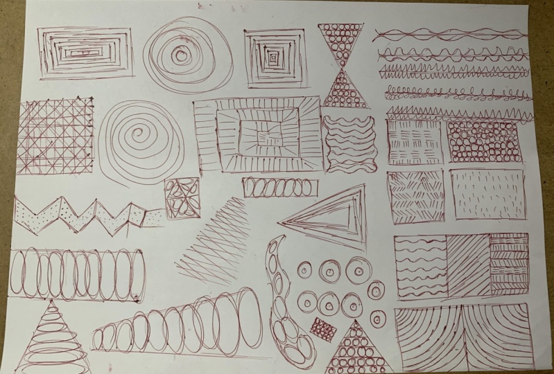
7. Exercise 7 - Patterns & Textures: This next exercise
is arguably one of the more therapeutic things I'll be going over
in this course. We're going to be doodling
patterns and textures. I've already divided my page
into a bunch of squares. You don't have to really measure them or keep them
perfectly equal. Just consider that you'll be creating a different
pattern in each one. Whenever you get a new tool, it's a really good idea to
get acquainted with it, try new techniques with it, get a feel for how it works. This is perfect for that. Same with your more familiar
tools like basic pens. It's very useful to experiment with new
textures and patterns, even if just to warm up
your creative juices. You can follow
along with me as I go and to further expand
on your pattern journey, you can search the web
for pen pattern practice, pen texture examples or swatches or something
similar to use as reference. I'll be using my trusty old pen, as well as this nifty
pentel pocket brush pen later to try out just a
few pattern swatches. Let's get started with
our pen. Just a note. I'm left handed, so
I like to start from the right side of
the page to avoid smudging. You do you, though. Okay. Let's get going here. I'm going to start
with some dots, trying to keep them equidistant, almost as if I'm creating
a dotted notebook. This helps with visualization
of space and control. And when you're
done, you can always check with the ruler to
see how accurate you were. For me, I guess
it's not too bad. As a bonus, you can throw in a quick point to point practice. Next up is another
basic technique that's really
popular in shading, hatching and cross hatching. There are many different
versions of this, and that's another thing
you can search online for. Honestly, I don't know what this particular pattern
is actually called, but what you want to do is draw short sets of little parallel
lines at varying angles. Let's say four to
five lines each. You're going to want to
avoid making sets that are next to each other go
in the same direction. Otherwise, you'll
lose the effect. So keep going all
the way around. Then if you want to practice
your cross hatching, you can go over it with
a second series of line bunches at slightly
adjusted angles. If you want to create
a shading degradation, leave some as they
are and go back over a third time at
yet another angle, each time covering
a smaller area. A Now you've got a
dark to light effect. Another similar pattern
you could do is the same sets of lines but
perpendicular to each other. The lines do not
have to be touching, and personally, I think
it looks nicer that way. And yes, this can be tedious. If you're doing warm ups, you want to keep them to, let's say, 15 minutes
to half an hour. I wouldn't necessarily do a full nine by 12 page
of textures either, especially if they're
super intricate ones. This is also an exercise
in experimentation, so I decided to see what different cross hatching
angles would look like. Another method of
cross hatching is to create lines using what's
called feathering. That means lifting the
pressure with which you make your line
as you draw it out. It's more obvious
with brush pens, but you can see here that the beginning of the line
is thicker than the tip. After doing a bunch of these, you can adjust your
angle and create a similar batch of lines to create that
cross hatch effect. Then again, at a different angle to get an even darker shade. Then you can just play around. Let's say we throw out some
straight lines here and then cross them
with wavy lines to create a sort of
weave like texture. You can pair your lines up. Then cross them to get
a plod like effect. Kind of like doodling
in high school. As for more texture
like effects, let's say you want
to do animal fur. That's created using a
feathering technique as well. But instead of crosshatching, we can bunch up our
lines or spread them out to create
dimension in the fur. If you want to create patterned, for example, a cheetah pattern, you can check for
references online, whether illustration or actual photos to inspire
your technique. For a cheetah, the fur
is on the short side, so we have to adjust
our lines accordingly. But whether the fur
is long or short, you still need to
feather your lines as fur is thickest
where the follicle is. You can also use circles to
create a variety of textures. Let's start with tight
little circles here. Then we can move on
to the bigger ones and vary it up both
size and space wise. Play with it, have fun, see what you like, and
how you can use it. This kind of looks like
a road or bubbles to me. Let's add some organic
shapes in there. And now it really has
that pebbly path effect. And. Okay. Next, rain, draw some quick sparse strokes and tack on some sketchy tips at the end of them
to convey droplets. Rain comes in many forms and can be conveyed
in many ways. So feel free to experiment
with different techniques. Another fun texture
to try out is cracks. For this, you have to let
your pen wobble around. Keep it natural with splits
and a bit of haphazardness. Cracks are also very
rarely an even width, so let's add some
thickness here and there. It can be subtle. Or you can really exaggerate
the width variety. Maybe there's a huge gap
here. All right, done. By the way, notice how I'm
moving my page as I go. You want your hand and
arm to be comfortable. Let's make some points now, like a stippling effect. The denser you
create your points, the darker it appears. This one is absolutely
a practice in patients and one you may have been introduced to back
in school, actually. For the sake of time, I'll keep mine generally less dense. One last thing that
I'll go over with my basic pen is wood texture. There are many ways of
rendering wood texture, and I'll just be going
over one method. Basically, start with
wobbly parallel lines. To add to the effect, you can add some loops to represent the knots
and natural texture of an actual tree and just have your other lines flow around them, almost
like a river. Like I said, there are many
methods of illustrating wood, take a look online to explore, experiment, and figure out
what your preferences. All right, there we
go. Wood texture. Now, on the whole, you kind of get the idea. Just try things out. Try these patterns out or search online for
more inspiration. Now I'm going to show you just a few examples with my
pentel pocket brush pen, which acts quite different to a regular ballpoint or gel pen. Just like the name entails, this at is more of
a paint brush than your typical pen and you can get huge variations
in line weight. This particular brand
is very sensitive compared to something like
this Tombo brush marker. The Pentel brush is
very much a brush, whereas the Tombo is more of a marker that's
in the shape of a brush. It's a lot sturdier and
takes pressure differently. To start, I'll show
off the pocket brush. I barely need to touch the paper to start
creating a fine line. Increase the pressure just a
bit to get a thicker line. Just do a few of these lines at varying pressure
intensity to get a feel for how this particular
tool should be used. To practice line work, you can create these
sort of loops while varying the width of
your line up thin, down, thicker, and so on. Another thing you can
practice is feathering. Start with a slightly
heavier pressure and then lift as you
create your line. With the brush pen, the
effect is much more obvious as it is a lot more sensitive to
changes in pressure. You can create little tufts
of grass or fur like this. Notice how I'm barely
touching down with my pen. It really doesn't need much. You can practice cross
hatching with it, too. This is a good way to practice creating thin lines with it. Same idea as our other
hatching patterns, sets of short lines
at varying angles. And then we cross hatch. We can also practice
creating circles, which is a bit
tricky with this pen because you want to keep
your marks consistent. Notice how I'm holding my brush completely vertically
for better control. Keep playing around as you want. I'm also going to do
a few examples with our little Tombo brush
marker here. Same idea. We start with creating multiple
lines of varying widths. With this pen, you can create really big marks by
angling it to its side. Now our loops. Get a good feel for the pressure needed to create your desired line width. It's quite different if you compare it to
the pocket brush. You can especially tell when feathering how the
line variation, while still apparent,
is less obvious. Hatching and cross hatching. Some circles. I had fun making a sort of
textured look with these. And with the tombo
there are two ends. So just a quick pattern
to fill this page up, I'll do some stippling with the fine point nib to give you an idea of how it differs
from a regular pen. So, there you go. A full
page of pattern practice. Absolutely a useful
exercise to do, especially when you're
trying out new tools. And next up, we're going to
explore some three D forms.
8. Exercise 6 - 3D Shapes: In this lesson,
we're going to be playing around a little
bit with three D shapes. For this first part, you're
going to want to use a pencil instead of a pen because we're going to
be erasing our lines. These first
exercises, I wouldn't necessarily consider
them warm ups per se, but they are definitely good practice and
good exercises to do, I thought I'd show
them a little bit. We've done some
perspective now and a little bit of practicing
lines and circles. What we're going
to do a little bit here is create a
few three D shapes. Now, three D shapes
is a huge topic, this is just a little bit of
an introduction and we're going to start with a box like we created in our
perspective lesson. Feel free to draw your vanishing
points if you want to, but I just guestimated it here. For these exercises, we're going to want to be able to
see through our shapes. To start, we're
going to have fun adding to and subtracting
from our shapes. For this box, for example, let's slice through it. You want to create the same line on corresponding
sides of your box. Add some shading if you want
to really bring it out. Now we have our new shape. Feel free to erase
your extra lines too. Let's do something else
with a brand new box. This time, we'll add
another box on top of it. We need to consider that this new box is sharing
the same perspective. We can start by
drawing the plane that will be intersecting
our first box. Then create the
remaining sides as you would and extend past your point of
intersection like this. Then find the corner where
your second box sticks out. Draw in your intersection line. Then fill in your planes
or sides like this. You can pretend the sun
is shining from somewhere too to use as a reference
for a bit of shading. I did it a bit less
e fare though. If you want, you can try and add more boxes to your little
creation or start again. With this one, I'm going
to cut into it again this time making a
triangular indent. We'll divide our two sides to find the center
point of each. Then use the lines we've
created to make our new shape. As with the previous boxes, once we find our shape,
we can shade it in. You could have fun
doing all sorts of different experiments
with cutting into shapes and
adding on to shapes. So far, we've just played with boxes and straight
lines and angles. Let's introduce some new shapes. We've practiced our circles,
so let's try one out. This is a flat circle, but as soon as you
add an ellipse to it, it's a sphere now.
Let's play with it. You have these two planes
here so you can solidify these and match them
up and check it out. You just created a
whole new object. Let's try it again. We've got our center here, but let's say we want
a tighter angle. Add another ellipse, making sure it goes through those
connecting points. Now, you can use that one
as your new cut line. Here we are, a more acute angle. It's almost like Pac
man or something. He's going to eat them.
He's like, Oh, no. Yeah, feel free
to goof around to make this a little bit more
interesting if you want. Like, why not change this
little dude into a frog? Throw on some little circles and another sphere for
his body and boom, you've created an organic
critter of sorts. It doesn't have to be a frog. Throw on some ears, tail, whatever. Just have fun. Back to the actual exercise. Let's say you want to
create a cylinder. We start off with a
little ellipse here, then drag down some
straight lines and another parallel
ellipse at our endpoints. There we go. That's
our cylinder. You can, if you want draw another ellipse at a
bit of an angle here. Make sure it touches your lines and here we have a cut cylinder. And just keep at
it and have fun. What other things can we do? If you start with a triangle, but make it rounded at the end, you have yourself a cone. Then you can add another ellipse and chop off its little head. Now it's like you have a little panel for
somebody to talk. What else? Something
fun we can do. Let's start by creating a little three D
rectangle like that. We're going to make
a very basic car. You can visualize this as a piece of clay that
you want to cut into. Create a curve here
for the front, then match up using your perspective line where
the other side would start. If you notice your base
rectangle is too short, go ahead and extend it. Slap on some basic wheels here. I did these fast, but make sure they also
match the same perspective. Oh I'm doing this a little willy nilly just
to show you the idea, but you can throw in some extras like a windshield or a door. Again, it has to match
up perspective wise. Not quite the right type
of door for our car, but anyway, let's throw on a bed on top of
this car. Why not? This person likes to
gaze at the stars, and so they have a bed
on top of their car. And let's not forget a pillow. Okay, weird looking car done. Let's try out something else. So we got our transparent box. How about we create
something similar to this, but using a cylinder
instead of a triangle. So draw out your cylinder following the same planes
and same perspective. Then cut it out like
you did before. One last one. Let's
create another box, but with this one, we're
going to add a roof to it. One way of doing
this is to create a brand new box
right on top of it, and then create a sort of triangular shape out of
this box for our roof. Et's find our center point. Drag down our roof lines. Make sure they go a little
past our other box. There we go. A
basic house shape. You can add windows,
a door, and whatnot. Let's say you want
to add a door. We want to add in the
center line here. You can get more perfectionist
and serious about this, but I'm just doing
really quick exercises to sort of grasp
visualization and conceptualization of three
D objects and whatnot. As you can see, they're
not particularly perfected as it's
more of a practice in visualization and
conceptualization. So you have an idea. You can use boxes. You
can use cones, pyramids. We've got cylinders too, which can be shorter, thinner, your cone can also
be thinner and shorter pyramids and
spheres too, of course. Am I missing any? Probably,
but you get the idea. Squares can also become
rectangular boxes. Then you can play around
with all of these, plopping them onto each other, cutting them out, et cetera. I hope you enjoy this
quick little demo on creating three D shapes. Now another related
exercise we can do has to do with more
organic three D forms.
9. Exercise 7 - Organic Forms: Another three D shape
related exercise that we can do is practicing
organic shapes. Let's start by drawing a
series of ellipses here, following each other in a row. After you've got your
ellipses drawn out, you can go in and trace the
contour of them as a whole. This little doodle
is to give you an idea of what will be
drawing in this lesson. The next step is to add a
cross contour line like this and you can visualize it's almost
like a worm or something. Let's do another one like this. Drop in some ellipses. They can be quite varied. Then try your hand at contouring and cross contouring
the resulting shape. The next step is to draw
relatively simple forms. You don't want to
get too complicated, otherwise, your mind
might just overload. You can have things
jutting out if you want, or maybe a bean shape.
Let's start with these. What you want to do is try and do what you did with
the first shapes you created and recreate
them with these new shapes. If you think about
it, it's almost like wrapping rubber
bands around them. I'll be honest, for some reason, I have always had
difficulty doing these. I'm just going to
do my best here. I After plopping on these little elliptical
rubber bands, we can go in with the
cross contouring. This second one wasn't
actually necessary, well, you get the idea. Keep going with the rest
of your created forms, contour lines, cross contouring. There we go, our little bean. Remember, rubber
bands, rubber bands. Don't want them to slip off. I like to do the
little bit sticking out individually and then
kind of bring them together. Here another unnecessary
cross contour line. Then we can actually try and
create more known shapes. For example, let's do
a mushroom type thing. Again, with this section lines
being like rubber bands. Now, cross contour like this, imagining how the line would curve around your
mushroomy form. All right. Now let's try
with an apple type shape. Getting the idea. All right. Apple done. Okay, one more just for fun. Let's see if I can manage this. Just draw a bunch of
circular forms sort of stuck together and see if we can make something
interesting out of it. Same concept,
visualizing the shape as you add your rubber
band section lines. Take it slow if you need to. There's absolutely
no need to rush. Notice I'm defining
the section lines. I've made a little more so they stick out from
my base structure. You have to also
make decisions on which part of your shape is
in front and which is behind. Try to avoid adding too many section lines or it will get messy and
a bit confusing. And once you're done,
you can even add some shading to bring out
the shapes form even more. And we can't forget
our cross contouring. For some cross
hatching practice, you can shade some
of your shapes in. There you go. A
basic demo on how to visualize and practice creating
organic three D shapes. Like I said, I don't know why, but they don't come
the easiest for me. I do hope this little
demonstration at least gives you a decent idea of the
concept behind this exercise. So go forth, have
fun and next up, we'll be doing some
gesture drawing.
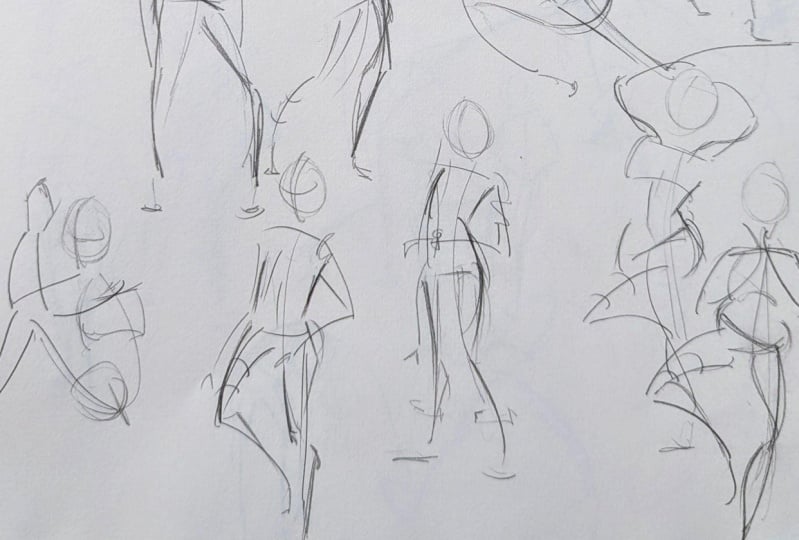
10. Exercise 8 - Gesture Drawing: All right. Our last warm up for this class is going to
be gesture drawing. Once again, gesture
drawing is a big topic, and there are plenty of full courses just
on gesture drawing. But for the purpose
of warming up, or at least for this lesson, we're going to keep
our drawings to about 30 seconds or less. These are really just
meant to warm up our hands and
loosen our muscles. So we're not going to
dive deep into it. We're really just focusing
on making loose sketches. If you'd like, though, you can absolutely do longer poses, but I won't be
addressing those here. I have a bunch of
reference photos in the projects and resources
section of this class, feel free to check them
out and follow along. If you want more, it's fairly
easy to find poses online, even with just a printerst
or Google image search of model poses for gesture drawing or figure drawing
poses, something like that. There's even figure drawing specific websites like line of action.com that even include
a tool for timed drawing. It's really great and I highly
recommend checking it out. Anyway, back to our
little warm ups. Like I said, we're keeping it at a max of 30 seconds or so. I'll have each reference
photo on the side of the screen so you can see what I'm working off of as I go. I got all my reference
photos from unsplash.com and pexels.com to avoid
copyright issues. But in your case, you don't
have to worry about that, feel free to use
whatever resource suits your fancy. We'll
start with this one. 30 seconds, I'm
not really timing it because I'm talking at the
same time. But here we go. First, you want to start
with your line of action. Now, the line of action is basically the general
direction the body moves. I should mention, there are several ways to go
about gesture drawing. Some artists don't
even start with a line of action,
but personally, I feel it's a good starting
point or base reference for the direction
of your sketch. After drawing the
line of action, I like to add these reference
lines for the hips and shoulders as these are the
body's main points of torsion. In this case, the
shoulders are pretty straight and the
hips are angled up. Now we've got our
reference markers. We can start drawing
in our gestural lines. Keep it loose and be mindful that we're
drawing the motion of our subject and not super concerned about anatomical
detail or proportions. Imagine the movement
within your subject and let that guide your pen
strokes or pencil strokes. It may look simplistic,
abstract, or strange, but that's okay because you're not drawing
the actual body. It's also an exercise
to loosen your hands, not create a pretty picture. Keep your lines very
loose and quick, try not to think or stress
too much as you go. You can include marks that imply the movement of
the muscle as well. In this particular pose, you can't see your whole body, but you can easily imagine it. So this one's going
down to this side. And this one's slightly out. Feel free to add
section lines that show her leg is ever so
slightly bending forward. I don't draw much for
the feet because again, our main emphasis is not the body itself,
but the movement. Her shoulder muscles,
you can imagine, are tightened, if you will. We can imply that
with some squiggles. Then we can add some
lines here to show one hip is clenched while
the other one is relaxed. So that's just
fine for this one. Let's move on. Line of action. This one's a bit more dynamic. Again, with loose
strokes to imply motion. You can really exaggerate
them if there's a movement you want to
emphasize like her arms here. It's a pretty grandiose pose. Practicing the
exaggeration of poses is great if you want to capture
emotion and figure drawing. Just to note, after
the line of action, I generally like to start
with the legs because they usually have a lot
of movement going on. But depending on your preference
or even the pose itself, you can start with
whatever you like. Here you can see the bum
has a very strong line. I'm going to define
that. Then a long curve for implying her
outstretched body. Even that is enough if you want, because you already get the idea of the motion behind the pose. That's all we're
trying to get at here. Let's see. What else?
Let's do this one. We're going to do
about a page of these little gestural drawings. Let's get our base down. Now our legs go like
this and like that. Like that and like that. You might notice that
as you get into it, you'll find it easier to understand visualizing
the pose in terms of gestural lines and your drawings will become more gestural
and flowing as a result. Just like the feet, don't worry
about the hands too much. Drop some lines implying their
direction, and that's it. This is a strong line,
so we'll add that. Then you can emphasize the sharp corner that
makes her pose here. Sometimes you may want to add a bit more definition to your drawing like
her chest here. Just don't get caught up in it. Maybe we want to add the pulled back shoulder
muscles here. Just as long as you get the idea of the motion
behind the pose. How many times have
I said that so far? Oh, I love this pose. It's a perfect gesture
drawing candidate because it's really showing
some dynamic movement. We've got ourselves a big
swoosh for a line of action. Mm. And our hips and our shoulders. You can draw this bottom leg as one connected gestural line, but I decided to split it. Then nice curves
for our other leg. You can also add a gesture line here to emphasize the
shape of the action. Line segments to show his
leg is slightly bent. For the arms, they're
also quite dynamic so we can really extend and
exaggerate our lines. We can show this arm is going backwards by using
our section lines. Just a quick note. Section lines with the ends
pointed up or away from us implies the object is
moving backwards or away. While if the section
lines are pointed down or towards us, well, then the objects
coming towards us, just like the leg here and arm. For his head, feel free to
draw his facial line first, then the head itself. Or you can do it the
other way around. Here's another nice
gestural line to include. Contrast it with the
bend of the other side. I like that. It's nice, simple. For a look into what
gesture drawing can look like if you push
it further, by the way, you can do a quick
search online as some people are very
proficient in capturing poses. For me, I keep them
quick, minimal, and here I'm really just using them to
loosen up my muscles. In general, try to keep
most of your lines smooth. But in cases where
there's a tight bend, you can create sharp
contrasting corners. All right. I think
this is the same guy. I guess he's a little
ballet dancer. Another very dynamic pose, in this case, there are
multiple lines of action. As it's more of a
reference for yourself, go for the one that your
mind is most attracted to. I really like his bent thing going on here, so
I'll go with that. Remember, the line of
action is optional, and it really depends on how you go about doing your
gesture drawing. We've got some really
nice movement here. Nice, loose strokes. And we've got a tight bend here. If you notice, the proportions are not particularly accurate, but that's not what
we're going for here. Now, this isn't really
coming towards us much, but I wanted to add some
section lines anyway. The pulled back shoulders. Let's show the bend in
his back here, too. Here's another really fun pose. Another opportunity to really show the movement
here in the leg. I kept it as one flowing line to imply she's
really extending it. We've got a nice
gesture line here, too. And the shoulders, you can really see
they're scrunched up. So let's show that too. And crunched versus extended
sides of the torso. Let's do this one next. He's got a nice exaggerated
line of action here. Really stretched out the torso here with that
contrastingly bent back. You can include some
clothing in your gesture, too, if you want. It's for you. Okay. Almost done. Appropriately she's
checking the time. How long is this thing? Anyway, we can also exaggerate her line
of action to enhance the sort of exasperated
emotion behind her pose. Quick lines of motion here. Now, this leg is
sticking out a bit, whereas this one is
pretty solidly straight. Okay, last one, I promise. Same thing as always. This leg is obviously
sticking out, so let's slap on
some section lines. Trying to emulate the
flowing motion of her arms with quick
sweeping strokes. The arms also go
back a bit here. Let's emphasize the
strong curve here. This is also a pretty
solid line we can add to emphasize the
bend of the leg. Reggie. Done. So yeah, some people draw
these really elegantly, and I'm way impressed. But for the purpose
of this lesson, they're really just meant
to warm up your hand. Key point to take from this is that you really just
have to make sure you're drawing the
movement as opposed to the actual sort of proportions
and anatomy of the body, especially for 32nd
gesture poses. You don't really
even have the time to focus on the details. Even with 1 minute or two
minute gesture drawings, you can allow
yourself more freedom and adding details and whatnot. You can get an idea of what those look like
if you search for 1 minute or two minute
gesture drawing to really compare to what a 32nd versus longer
pose can look like. So, now my hand is
nice and loose. I feel like I'm ready to tackle more serious illustrations.
How about you?
11. Conclusion: And that's a wrap. Warming up might seem
like a small step, but it can make a world of
difference in your confidence, your control, and your
overall artistic growth. Whether you're sketching for fun or diving into a big project, taking a few minutes
to loosen up can set the tone for a more enjoyable and productive drawing session. I hope these exercises become a helpful part of your
creative routine. Feel free to mix and match them, tweak them to suit your style, and most importantly,
have fun with them. I'd love to see how you incorporate these warm
ups into your own art. So please be sure to share your practice pieces in the project section
of this class. Thank you for joining
me and happy drawing.
 Sabrina Gosselin, Freelance Illustrator & Photo Retoucher