Transcripts
1. Course Trailer: Hi and welcome to
this course on how to draw realistic pencil
portraits for beginners. By the end of this course, you'll understand the basics
of realistic shading, how to draw the basic
facial features. And if you followed along with
this step-by-step lessons, you will have drawn your
very own realistic portrait from beginning to end. We'll start off by learning the basics of realistic shading. You'll discover how to
create smooth shadows and tone and how to assemble them together to create a
three-dimensional form. Then we'll apply
what we learned to draw on each of the
facial features. You'll see exactly how to
draw and shade the eyes, nose, mouth, and hair
in complete detail. Once you're comfortable
with all the features, we'll put it all together
in a full portrait drawing, you'll see how to easily draw an accurate laying of the face. Then we'll render each of the features until the
portrait is complete. You'll be able to see the
entire process unfold step-by-step and follow
along with each stroke. This course was designed to make the topic of portrait drawing fun and approachable even if
you're a complete beginner. So I hope you're ready to learn and I'll see you on the inside.
2. Drawing Materials: Alright, so welcome to the
portrait drawing course. Before we get into
the actual lessons, I'm going to go over the material that
you're going to need. So I'm going to go over the things that I use and
that I recommend you get, but also what each
one I'm going to give in a cheaper alternative that you can use if you
don't want to spend the extra money or you can't get access to them for
whatever reason. Okay? Alright, so first we
have the drawing paper. For this course. We're going to be using the Strathmore
Bristol Smooth paper and this is 100 pounds. You can get them at
any art supply store. The reason I like this type
of paper is because it's, first of all, is a little bit
thicker than regular paper. So you get that that sturdiness and also the smoothness of the paper really lends itself to the technique that we're going to be using
in this course. You can blend and shade the, you're drawing a lot easier
on this smoother paper. But if you can't get a
hold of these paper, you can always use the
regular copying paper. And as you can see, it's a
lot thinner than the Bristol, but it works just as well. I actually, I, I like to
practice on this cheaper paper. And then once I'm ready to
draw our final portrait, then I'm going to use
the thicker paper. Okay? These are very common. We pray to have some lying
around your house somewhere. Okay, Let's see. Next you're going to need
a mechanical pencil. And this one is a 0.5
lead mechanical pencil. And the 0.5 just
referred to the, the size of the lead
that you feed into it. The nice thing about a
mechanical pencil is that the tip is always sharp. You don't need to worry about sharpening a pencil
and you can make very small fine details with it. And it's also great
for shading as well. If you can't get a
mechanical pencil, I recommend a just
a regular pencil. And you can get these anywhere. It's not. You can't make a sharp details with it as the
mechanical pencil, but it works just great. You just have to
sharpen it regularly. With the mechanical pencil. When you buy it is
going to come default with HB lead already in there. But I recommend you replace
it with some to be led. The to-be lead is just a
little bit softer than the HB. And so that causes it to lend more easily to shading and
you can blend it more easily. Okay, So next, we have the
total arm or blending stump. And you're going
to be using these to blend together the
shading of your drawing. They're basically just
paper that's been spiral, wound and shaped like
a pencil so that you can be more precise
with your blending. These are very cheap,
cheap as well. You can pick them up at
any art supply store. If for whatever reason. You can't get a hold of these, you can always use
a regular Q-Tip and use that to blend your shading. It's not quite as effective, but it'll get the job done. And you can also even rip up a small piece of paper
and use that to blend. Then next you have
the kneaded eraser. And this thing is really cool because you can mold it
into any shape you want. And it's great for very precise erasing on your drawing
and to lift highlights. So you're going to see all
the little cool things we can use it for in the main course. Well, let me show
you what it can do. So you can mold it
into a fine tip like that and just use it to lift, enlighten your shading
in your drawing. Alright? Then you will need a regular eraser for erasing large areas
where you don't need quite as much precision. Then I would recommend
that you get a horsehair drafting brush. This tool isn't
absolutely necessary. But as you can see, if you are going to erase a lot, you're going to leave these
little eraser residue. And if you use your hand to
brush it off your paper, sometimes you're going
to smudge your drawing. You see how there's little
graphite on my finger. You use the drafting brush. It won't. Okay. So it's a little extra bonus
if you're going to do, if you're going to be
doing a lot of drawing, I recommend that
you pick one up. Let's see. Then you go to need a
ruler to erase, excuse me, to make straight
lines and to draw your grid lines as you'll
learn about in the lessons. And lastly, if you are not used to drawing circles
for the eyes and whatnot, I recommend you pick up a sensor template to help
you draw little circles. So yeah, I think that's it for all the material
you're going to need. They're not, none of these
are very expensive at all. And I'm going to include a link to every
one of these items so that you can pick
them up through amazon.com if you don't have
in our supply near you, or you can just go to my supply store and
pick them up right now to begin
practicing the course. And for whatever reason, if you can get these materials, don't let that stop
you from drawing. Just use whatever is
that you have available. Because in the end, it's going to be
used at you that determine the quality of the
drawing, not the material. Now they're nice to have, but they're not critical, they're not essential.
So that's it. Go ahead and assemble all your materials and then I'll see you in the next lesson.
3. 5 Elements of Shading: So as you know, the number one key to listing drawing is all in the shading. That's what gives you a drawing that
three-dimensional look. There's basically two
parts to shading. The first is to know what
the different tones are, how dark they are, and where to place
them in your drawing. And the second part
is the skill of being able to actually
put pencil to paper and create those tones
in your drawing and to do it in a smooth and
gradual way as possible. And that's something
we're going to cover in future lessons. But in this video, I just wanted to talk about
what the different tones are and where to place
them in your drawing. When it comes to shading, There's something called the
five elements of shading. What they are is basically five different shadows that you use when you share your drawing. So let's go over what they
are and the role that they play in making the sphere
look three-dimensional. We'll go from
darkest to lightest. First, we have the cast shadow. And it correspond this area
right here on the sphere. It's outside of the sphere. And this over here
on the second one. And that's the reason it's
called a cast shadow, is because it's the shadow that the object has when
light is shone on it. So in this example, the light source is right here. And when it hits the object, it casts a shadow on
the opposite direction. On this one, the light
source is a bit higher. So the shadow is not as long as this one is more
closer to the object. This is the darkest tone you're going to have
in your drawing. So you should try to make it as close to
black as possible. Correspond to this
square right here. On the value scale, the
darkest one on the spectrum. Next, we have the shadow edge, and it's this curved crescent right there near the
edge of the sphere. This is what gives the
sphere it's rounded look. You notice it's the gradual
transitioning between the light tone and the
dark tone that create that illusion that the sphere is curving and gives
it the 3D look. Ashley, the darkest shadow
that's on the object itself. And the value it has
this dark gray and it correspond to this box right
there on the value scale. Notice by the way, that it's the furthest part of the sphere that is
away from the light. So, so wherever the light is, it's sort of formed
this round half circle. Where around where the
light hit the object. Okay. Okay. Next we have the half tone, and it's this area right here. It's also sometime referred
to as the middle tone. And it's basically the
transition between the dark shadows edge and the full light area is
the heart in-between. The interesting thing
about the halftone is that if this was
a color drawing, so if this fear were
say, a blue ball, then the half tone would be
the true color of that bar. Whereas the shadow's
edge would be sort of a darker blue
because it's cast in shadow. The halftone would
be the true color, unaffected by any
light or darkness. And the value it
has is medium gray, and it corresponds to
this box right there. Next we have the
reflected light. This part is interesting. It has this rounded band of light right on the
edge of the sphere. And it's created because the light from the
light source hits the surface that the
sphere is sitting on and then bounces
back onto the sphere. So the light goes like that. Then reflect onto the sphere, creating this ring
of light around it. And it's a very subtle detail, but it does a lot. To add an extra
dimension to the sphere, gives it that extra
bit of realism. And this is the one thing
that a lot of beginners miss. They begin drawing. So make sure you include it in your drawing because it
does make a big difference. The value that it has
is light gray and it corresponds to
this box right there. Lastly, we have the full light, and it's this area right here. That's where the
light hits the object directly and it's the
brightest part on the sphere. Correspond to this
box right here, which is just white. You just leave it blank. Some
artists like to shade in the full light and
make it a tad bit gray because they don't want to show the white of the paper. That's just a matter
of preference. Some people think it
looks better that way. This particular sphere,
I just left it white. You can play around
with that and see which one you like better. The one advantage of shading in the full light
area and making a little bit gray is that you have an extra level of
whiteness to play with. So if there were some spot
that you want it to make pop, then you could erase and let that be the
white of the paper. And that's it. Those are the five
elements of shading. You notice they're
pretty easy to remember. You just think, okay, there's the light source. The full light is where the light hits the
object directly. And as it moves out
from that area, it gets gradually darker. So first you have the halftone, and then you get to
the shadow edge, and then you have
the reflected light. And then lastly you've
got the cast shadow. If you look at any port drawing or any drawing for that matter, you'll be able to see these
five elements have worked. Msd, key positions of these five different tones and their gradual blending
of them together. That gives the drawing,
it's realistic look. And we'll talk more about how these five different tones play in portrait
drawing later on. But for now, let's just focus on what they
do in the sphere. So now that you know
what the tones are, your homework assignment
for this lesson is to go around your house and just observe different objects
and see if you can spot the five different elements
of shading in those objects. See where you see if you can
see where the shadow edges, so the cast shadow or the
reflected light and so on. And that's going to train your brain to think in
terms of these shadows. Then once you done that, I'd like you to try to
create your own value scale and try to match these tones
as closely as you can. That's going to train your
eye to think in terms of these tones and also train
your hand to shade them. One tip when you're
doing this exercise, I'm going to include a
picture of this gray scale below so you can print
it out and have it with you when you're
doing the exercise. But one tip when you're
doing this exercise is to be very careful around the lighter area because that's where you need to exercise
the most control. The dark area is easy. You can just press down harder or go over it multiple
times to make it darker. But the light areas
where you need to really lighten your touch and make sure you're not
pressing down too hard. With the light gray
in particular. Don't feel like
you have to shade in the entire box with this one. I didn't. I simply keep my
touch very light. And I just sort of put in
a thin layer of graphite. I didn't shade it all the way. I just sort of half fill the box with my shading and
then I use the total on to spread the
graphite out and blend it together to create a smoother look less what
you can do with this one, okay, We'll talk more
about how to use the total line in
the next video. The main point of this exercise is just to get you used to the five elements of shading and also the
different tones. Okay, so go ahead and do
those exercises right now. And I'll see you
in the next video.
4. Gradual Blending Technique: Alright, so now that you learned about
the five elements of shading and where to put the different
tones on your drawing. Let's talk about the
actual skill of putting the tone onto paper and making it look smooth and gradual. So with that, I'm going
to introduce you to a blending or a
shading technique called gradual blending. And this is what gradual
blending looks like. It's when you have
the different tones, but they are blended together. So gradually that you can't see where 1to1 ends and
the other begins. Why does this method of shading lends itself to
realistic drawing so much? Well, if you take a look at my, my hand here, you can see the five different
elements of shading at work. There's the cast shadow
right there on the paper, albeit this one is very light because I have
a lot of lights here. But you can see it anyway, and there's the shadow's edge. And then you can
see the full light and then the halftone. But you notice that
these tones aren't separated with hard lines. In fact, they are
just blend together very smoothly and gradually. And that's how real life. So when you want to
make your portrait drawing look really realistic, you need to learn how
to blend your tones together so that it mimics
the look of real life. And this shading techniques is designed
specifically for that. So that's, this is a big, big secret to making your
portrait look realistic. A lot of artists out there,
well then draw portraits. They use different other
shading techniques like say, hatching, where you create these diagonal
lines that you fill up your portraits or
crosshatching when you add another diagonal line
layer over that. And these techniques looks fine, but they're very stylized
and so they don't lend themselves to a
photorealistic lobe. So if you, if you would like to draw really
realistic portrait, this is the one method
to learn, okay, So how do you go about
developing gradual blending? Well, the first, the
only way actually to practice it is to create
these blending bars. So let me show you how you
go about creating them. First, you take your lead
pencil and tried to don't hold it too low of an angle because when you apply pressure you're
going to break your lead, which is hold it at
a comfortable level. And we're going to start
with the darker tone first. So you can apply a little
bit more pressure. Just press down and
make it nice and dark. Just go up and down
with your pencil. Keeping your pencil
strokes close together. You don't want, you don't
want to be doing this kind of thing where there's too
many lines between, too many whitespace between
each line because then your pencil sharp we show
and we don't want that. We want to avoid hard
lines as much as possible. So you just got to
go up and down, make it nice and dark. And then as you
move down the line, you can gradually lighten
the pressure a little bit. If it helps. As you're doing this exercise, you can have your gray
scale bar with you so that you can see all the tones that you need to include in it. So right now, working
on the black. And so now I'm
transitioning into the dark gray and then the medium gray. And then the light gray. You want to be very
extra magenta. You can actually stop at the medium gray because
with a light gray, we're going to use the total
arm to create that tone. Then you can go back
over your drawing. There's no rule that you'll, you only have to
do it in one shot. You can go back and see where you need to
darken certain areas. You see any white spots
were white lines. You can fill that in. Then once you get to
a point where you feel that it's good enough, it's time to blend it
with your total line. With the before we start
to get into the blending, I like to tell you about my my sorting system
with the total arm. These total arms are
basically spiral and pencil. And when you use them, you're going to
notice that the tip gets dirty because it
picks up graphite. You use your total aren't in a really dark area
like this one. It's kinda pick up a lot
of dark graphite when you take that same total on and
shade it in a light area, it's going to make the shading a lot
darker than you want. So that's not good. That's why it's really
important for you to take a total of four dark area and
keep it separate and use a, another tort a lot for your lighter area so that
you don't ruin your drawing. The system that I use
is a numbering system. I just take the total
on that I use on dark graphite and I write
a number four on it. And then another one that I use on a slightly lighter graphite and I use the
number three on it, and then yet another one
with the number two on it. And this one is very light. Number one would be basically a completely clean turn around. And number five
is totally black. I find that just use having these 33 different
total lines is enough. You can see the different in
their darkness at the tip. You don't have to use a system, but I find that it saves
me if I'm going through to many different tonal lines
which can get pricey. Blending when using a tunnel on. Be sure to hold it at an angle. Because if you hold it straight up and down like this
and you press it down, is going to bend the tip. Sometime there's a place for holding up and down
like that when you're trying to shade a
very precise area and you need that extra
position of the tip. But most of the time, just hold it in an angle. You want to use very
light to medium pressure. You don't want to press down too hard because
that's just going to embed the graphite into the paper and then it's
not going to go anywhere. It's actually going to make
it harder for you to blend. Use a light to medium
pressure and be patient. The blending is very subtle, so it might take
you going up and down a few times before you begin to see the
graphite blending. Just start at the
dark area first. Then slowly work your way down. And again, as you're working your way down,
lighten your touch, especially at the very
light area. Okay. Then when you get, when you
get to this area right here, you can actually
go into the white. And by this time the
total ion has picked up enough graphite that it
can shade on his own. That's the cool thing
about total on is that with a dark one like this, you can actually use
it as a shading tool. Instead of your pencil. When you have an area that you want to shade very lightly. And it's hard to do
that with a lead pencil because it has a sharp tip. You can go in with the
total line and just create a base tone over it very easily. So that's a neat thing
about using a total on. So yes, that's the,
the whole exercise. And now for your homework, I'd like you to practice
creating this blending bar. Five to ten times or whatever. However many it takes for
you to feel comfortable with creating this bar and using the gradual
blending technique. And go ahead and
do that exercise. And I'll see you
in the next video.
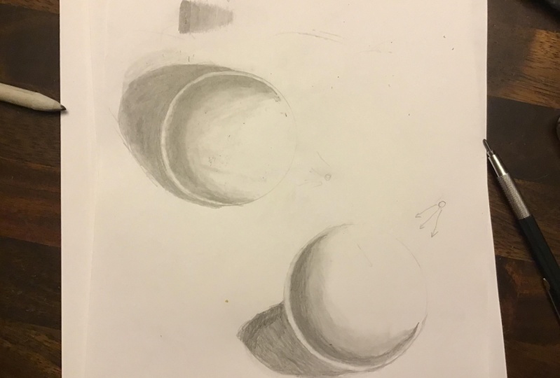
5. Drawing a Sphere: Now that you've learned
about the five elements of shading and the gradual
blending techniques, it's time to put them together and create our first 3D object. In this exercise,
we're going to learn how to draw a
three-dimensional sphere. Now, you might be
asking, why the sphere, why are we learning
how to draw the sphere when the ultimate goal is to
draw realistic portraits. Well, first of all, the sphere, by drawing the sphere
is going to help us learn to practice
the five elements of shading and the gradual
blending technique in a simplified object before
we get to portrait drawing, which is more complicated. But more than that,
the sphere is actually the most important
shape in portrait drawing. And that's because if
you look at a portrait, many parts of our face, It's actually made
up of spheres. The eyeball itself is a sphere. The iris or the
people is a sphere. The tip of the nose
is another sphere. The cheeks or sphere
or semi spheres. The chin is a sphere, and the top of the middle of the forehead
is also a semi sphere. So when you learn how to draw, how to draw a sphere and shaded, well, that skill is going to help you along way
in portrait drawing. Okay, so with that
said, let's get to it. First. You want to create
the outline of your sphere and drawing
a perfect circle. It's extremely hard and even very experienced artists
struggle with it. So there's no shame
in using a template. Not want to use this glass here. And you want to make an
outline extremely light. Don't even press down
with your pencil. Let the weight of the pen
so do the drawing for you. This outline is actually
just a guide us. We don't want it to show
up in our actual drawing. Okay. So that looks good. And Oh, okay. I guess you can't
see that on camera. So I'm going to actually darken line much more than
regular normally would. All right, so that's better. So the first step is to
determine your light source. In this example,
I'm going to put the light source right here. And so it's gonna be hitting
the sphere at this area. That's where the
flight is going to be. And the cast shadow
will be, excuse me, the shadow edge will
be around here. We're just going
to mark out where the different tones are gonna be to help guide us
when we shaded in. And the cast shadow
will be right here. It's going to be,
It's not going to be a complete circle
because it's distorted. It's going to still roughly
take the shape of the sphere. Okay? Alright, so now it's time
to go in and shade it. I always like to start
with the cache shadow. Darker is part first
because that's going to help allow me to determine how dark to
make the other areas. So I start off going shading the edge of the sphere and you want
to be really careful. Let me zoom in so you
can see more easily. So when you shade this area, you want to be very
careful not to go into the sphere and ruin that really rounded
edge that we created. Once you get to this area, you can share it faster, but right here you want
to be extra careful. Go really slow. When you're shading comfort is everything. So if it makes you
more comfortable, go ahead and turn the
paper sideways like that. All right, now you can
go a little faster. Again. Remember this is
the cast shadow, so you wanna make
it pretty dark. Press down pretty hard
with your pencil. You always want to
go with the contour. Of the sphere, you don't want
to go up and down like that because that It's too chaotic that your penicillin
is going to show. When you keep with the
contour of the shape, the pencil line will blend together and it
will look a lot smoother. You don't need to
make the outer edge of the shadow perfect because that's not going to look as natural as if
it's a little blurred. And we're actually
going to create a gradual blend between the cast shadow and the rest
of the surface as well. Because as you move further
away from the object, the cast shadow will
gradually become lighter. As light hits that area. This is just the first stage, so you don't need to worry
about little bits of detail. We're gonna go back to this area after we blend
it and touch it up. So you just, you just want to lay down the
foundational tongue. Alright, so we're done
with the cast shadow. Now for the shadow edge. One thing to notice
about the shadow edges that you want to leave room for the reflected
light on the outside. And because the
reflected light is caused by the light from the light source bouncing off the surface and
lighting up the sphere. It's only going to
appear on the lower, lower half of the sphere. So when you leave room
for the reflected light, it's going to be the widest
when it's near the surface. And then as it goes up, it will gradually
become smaller. So make sure you
include that curve. You don't want to have it be the same size throughout because that's not
going to look natural. Alright. So I'm just gonna
put down tone where the cache shadow or excuse
me, the shadow edge. Again, you want to go with
the contour of the sphere. You don't have to
start off super dark. I like to actually go
light at first and then darken it as I as I go along. Then once you get
up to this area, you can begin to lighten your pressure a little bit to create that gradual blending. You notice that this is
pretty much identical to the blending bar exercise that I had you done
in the last video. Except this time we're
going in a curb, which makes it a little
bit more challenging, but it's still very doable. Just need a little bit practice. Now I'm gonna go back over the shadow edge and make
it a little bit darker, even out the tone of it. You don't want to
make this area right here way too dark because you don't want a sharp edge between the shadow edge and
the reflected light. You still want a
gradual transition between those two tones. So I like to leave a little
bit of room so that I can add little transitioning
tone between the two. Okay? All right, so at this point, Let's do our first
round of blending. I'm going to take my
number four total on. And I'm going to start
blending the cache shadow. Again. We're going to
start near the edge, and I'm gonna be extra careful around the edge not to smear inside the sphere. Okay? Now, for the shadow edge, and at this point, you
can actually lighten your touch and then go into
the reflected light area. Because you don't want that
area to be completely white. Needed it to be gray. So I'm just going to
fill in that spot. And then just shade
out from the tip. So you can create that
gradual blending, gradual transition point. You want to take your
kneaded eraser and lighten the outer
edge of the sphere. Because now you don't need
it as a guide anymore. Okay, I'm just going to lighten
this top area right here. Again, normally
when you draw this, you wouldn't make the
outline quite so dark. I only did it here for
the sake of the video. Alright, so now you can use your total on and use the graphite
that's already on it. And start blending the halftone. Put in the half tone. Then we want to create
more gradual blend. I would take my
number three total on and work on this area. You go lighter and lighter as you move closer
to the full life. And again, still keeping with
the contour of the shape. Now, it's time to sort
of refine the shrine. So it's a process. It's not one and done. You keep going back-and-forth,
back-and-forth, retouching it, adding
more shading here, blending it out there. The more, the more
time you spend on it, the better your sphere
is going to look. I'm just darkening
the shadow edge to give it more contrast.
6. Hard Edges vs Soft Edges: So before we get into
actual portrait drawing, I like to talk to you
about a concept called hard edge versus soft edge. So what is a soft edge? A soft edge is basically where the object you're
drawing begin to curb and creates a sort of
a shadow edge like this one right here is the
sphere begins to curve. There's an edge that's
created by the shadow. But the reason it's soft is because the change in
tone is very gradual. It goes from light to dark
in a very gradual way. There's no hard line to it. A hard edge is this
area right here. And it happens when
two surfaces with differing tone either
touches or overlap. So in this case, the sphere, which has a light tone around
the reflected light area, overlaps with the surface that is sitting on
and the cast shadow. And so the dark and the light creates this hard
edge right there. And the mistake that a lot of beginners
make when they draw a portrait is that whenever
they encounter a hard edge, they inevitably use a very
hard line to create it, rather than using
the different tones to create the light. So here's what I mean.
In this portrait. The area where the jaw line overlaps with the
neck is a hard edge. Jaw line. The face
is very light, the neck is very dark, and where it overlaps, it creates this hard edge. And what a lot of
beginners do is they draw a hard line
between the two tones, which makes it look fake. What you should do instead is just shade in the darker area. And let the contrast between the light area and the dark area create
that hard edge. Rather than having three
tone, the light area, the darker and the line itself, you should only have two tones, the light area and
the dark area. Okay? And likewise, this area
here is a soft edge. There's no hard line to it. It's just a gradual
blend between the shadow and the
lighter part of the neck. So when you shade it, make sure you don't
put a hard line to it. I know it's tempting because
it makes it easier to shade. If you do put a
hotline to guide you, make it very light so that you can camouflage it
what you're shading. So you just want to
make sure you share the dark area and then do a gradual transition
into the light area and use the total on
to blend it together. So that's a small detail that if you just keep in
mind when you're drawing, it's going to add a lot
of realism to your work.
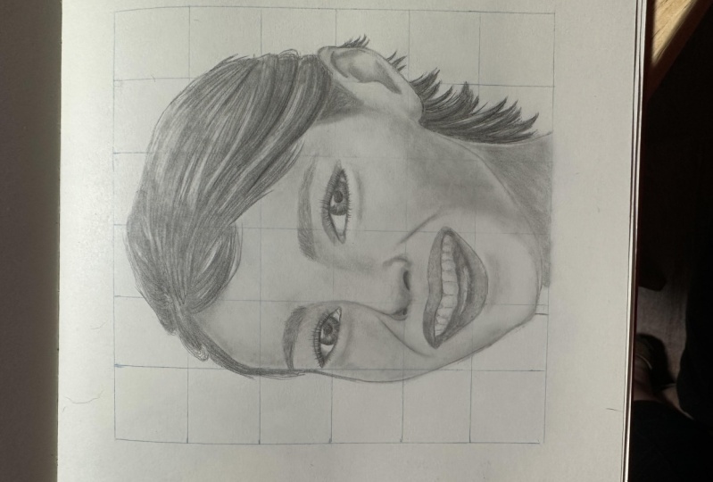
7. The Grid Method: Now that you learn about shading and you practice
drawing spheres, is time to move into drive
some actual portrait. Now, a lot of beginners and myself included when
we first started out, really struggle with getting the proportions of
the face right? We would start out drawing, say the I for instance, and it will look great. But as you begin to draw out
into the other features, things begin to slowly
straight out of proportion until your
nose looks way too big. Ellipse isn't where
it should be. And in the end you'll have a portrait that looks very
weird and cartoonish. And it might look
something like this. And it's nothing like the subject that you
were trying to drop. So in this video, I'm going to show
you a method to help you keep your
portrait in proportion. And it will drastically improve the accuracy
of your drawing. And it's called the grid method. And this is, here's
what it looks like. It's one of those rare things
that will drastically, drastically improve
the quality of your portrait instantly as
soon as you apply it, okay? And the reason it
does that is because it breaks the portrait
into a bunch of smaller details so that you can focus on it and
it becomes much easier to draw rather than tackling the entire portrait head on and trying to free
him the whole thing, which can be very difficult. Okay, so so let me show
you how to use it. The first step is to draw a grid line on your
reference photo. For this one, I just took
my ruler and I created a, a 1 " by 1 " square grid
line over the reference. With a reference you can draw, you can draw the lines
as dark as you want. After you've done that, you go to the paper that
you're going to draw on and you replicate
that grid here. The cool thing about
the grading is that you can use it to either enlarge a drawing
or to shrink it. So if I want it to transpose this picture
just the way it is, then I would simply
make my grid line 1 " by 1 " just like this one. But if I want it to say double
the size, then I would. Where's this is 1 " by 1 ". I would create my
grid line two inch by two inch on my drawing paper. So when I draw this
square onto here, it will be automatically
twice as big. And likewise, if I
wanted to shrink it, then I would make it half
an inch by half an inch. So it's a really cool way for you to enlarge any
picture that you want. It. Particularly if you're drawing
from a photograph that's really small and you want to blow it up onto a bigger paper. So apparently, obviously, if you want to
use the gridding method, then you need a reference
photo that you can draw. Which might not
always be the case. You might be drawing from
a family heirloom like a family portrait photograph that you don't want
to ruin. Which case? I would recommend
that you scan it and then print it
out like this one, or take it to your local photocopy store and have them make
a photograph of it. Or another way you
can do it is to go to your local art supply
store and pick up some very thin
see-through trace paper. They should have that at
pretty much any store. And you can put the grid
lines on that paper and then overlay the paper on the
photograph, your drawing. Okay. So let me show you how I put the grid onto my drawing paper. It's very important
that you make the grid line completely
square and that you keep all the lines
perpendicular and straight so that it doesn't get distorted when you're drawing. And also when you're
drawing your grid lines on your drawing paper,
make it extremely, extremely light, just barely
enough for you to see it because you're going to use
it as a guide for drawing. But you don't want
it to show up in your finished, your
finished drawing. But for this example,
because of the video, I'm going to make
my grid lines much, much darker than
I normally would. Okay, so the first step
is I will measure out, I'm going to make
the grid 1 " by 1 ". So I will take my ruler
and I will measure out the all the 1 " mark. Alright, and then I'll do
the same for the other side. Alright, now, I'll just
connect these two. The reason I measured
it out is to make sure that the lines that I draw
are perfectly parallel. Because otherwise, you might
have lines that are slightly skewed and that's going to
mask what you're drawing. Now I'm just going to
connect all the lines. Okay? So now I'm going to repeat the exact same process
except going up and down. Right? And that's it. Again, make sure when
you draw your grid line, make the lines extremely,
extremely light. I'm just doing it darker so that you can see it on camera. And then when you, once you've done that, you simply look at your
reference photo and match up with the corresponding square and begin drawing it
one square at a time. And that's going
to make it much, much easier for you to copy each the visual square rather
than the entire portrait. Now some artists don't like
gridding because they feel like it's too much of a crutch. And I completely disagree. I think it's rather elitist
way of looking at things. And I think grading is an
extremely valuable tool for beginning artists to develop
their freehand skills. Just like a child needs to use training wheels when he's
learning how to ride a bicycle. There's nothing wrong with a
beginner using gridding to help them develop their skill
at copying and freehand. Grading is basically free hand, but the only difference is that you're trying to free hand a much smaller area of the picture rather than
the entire thing itself. So it makes it a lot easier. And like I said, is a training wheels. So once you become
comfortable with drawing, you can, you can gradually challenge yourself by making
your grid lines bigger. So if you use one-by-one grid and you're
comfortable with that, you can start drawing your
grid two inch by two inch. So instead of having
these line here, they will be gone
and your grid would look something like this. And that's going to make
you have to freehand more area without the
help of the lines, which will be a little
bit more challenging. And as you become more
comfortable with that, you can make the grid
line even bigger, three inch by three inch
or four inch by four inch, until eventually your grade will be really big or you won't
even need them at all. And that's the ultimate goal. But until then, there's no shame in using these
lines to help you draw N, help you get some encouragement
and see some results. Because grading
is very powerful, you'll see that when you apply it for the
very first time, you'll get a very dramatic, dramatic improvement
in your drawing. So, yeah, that's the
greeting method.
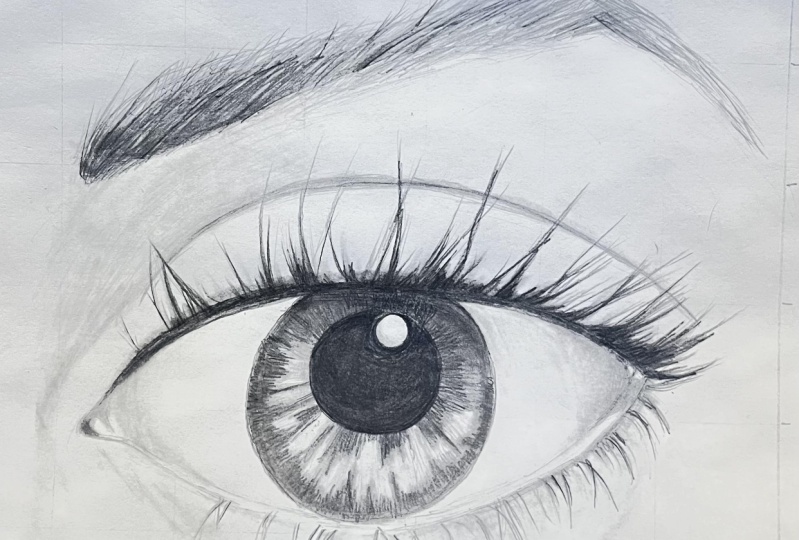
8. 7 Eye Drawing Lay In: Okay, So in this section
we're going to learn how to draw the eye will be working
with this reference photo. So I included a file for it,
but right below the video, make sure you print it out and have it with you so you can draw along to begin, place the grid line onto
your reference photo, and then replicate it
onto your drawing paper. After you've done that,
the first step is to create the rough outline. When drawing the rough outline, I like to pick out
an area on the photo where there's a hard line or more defined shapes
that I can follow. And in this case, it's going to be the crease
right above the eye. So we'll start with that. Make sure that you line up the drawing grid with your reference photo
so that it matches. Alright, so we'll
start right here. When drawing these curves, I like to notice where
the curves intersect with the grid line on this end and then where it
intersect on this end. And that will give me an idea of whether or not the
line is curving upward or downward or
just staying even, then I don't know how to
draw it on my my side. So in this case is
curving upward, slightly. Make a little bit darker so
you can see it on camera. When you're drawing your eyes. She's still want
to keep it light. And here it's beginning to
curve downward a little bit. Is this part where the
grid line really comes in handy because it helps you keep your line-drawing accurate. Okay, so next we'll
work on the eye itself. We'll start with this
curve right here. When you get to this area, just ignore the
eyelashes and follow the path of the, of the eyelid. Will go back and add in
the eyelashes later. But right now, you
just want to create the rough outline and
shape of the eye. So okay. Then we get to the
tear duct area. A little bit rounded right
at right at the corner here. Then the lower eyelid. Again ignore the eyelashes. And this is the outer
edge of the lower eyelid. Now we'll come back and
put in the upper edge. Notice how it barely
touches the iris. And you just want to joins
up with the upper eyelid. This part here is the eyelash, so we want to ignore that. Okay. Now let's put in the Iris. Normally I would
use my template to create the circle and make it as perfectly round as I can. But this circle is a little bit too big for
the template die half. So I'm just going to
freehand this one. Have you have a template that big enough? Go ahead and use it. So here's crucial that
you use the grid line in order to keep your circle
is round as possible. Barely touches the lower eyelid. Okay. It's not perfect, but
it looks pretty good. All right, Now, for
the people here, I might, I do have a template
that's the right size, so I'll just put it in a rough outline so
I know where it is. And then we'll go back
over it with the template. And then there's a catch
light right there. So make sure you
leave room for it. Sort of cuts into the pupil. Alright, it's a
little bit light, so I hope you can
see it on camera, but we'll darken it right now. And we're just trying to find the template
that's the right size. That looks pretty good. Make sure you line
it up properly. Okay. Okay. And that's it for the eyes so far. Now let's work on the eyebrows. So again, makes sure
your squares matches up. Let's start right here. When you're drawing the
beginning of the eyebrows. Might be a little tough because
that's where there's not a lot of hair and so that's
the shape is not as defined. You might have to just
put in a few sram in the beginning until you get to the darker area where
it's more defined. So it's putting a few light
strands to mark out the area. Okay, so now we're at this
dark area here where we can just draw it in a shape
to do to represent it. And then just follow the
outline and the eyebrows. When drawing the eyebrow, It's important that you get the general direction of where
all the hair is heading. Accurate. But don't
worry too much about these individual
strands sticking out here. We're gonna go back over it and create that hair-like
appearance later. For now, you just
want a rough outline. Again, use the grid lines
so it can guide you as to where as to how the eye
brows is sloping up. Okay. And here is when it
starts to turn downward. And then now it's time
to do the lower part. Here, it's sorted,
jumps up a little bit. Okay. So I mean darken, so you can see it on camera a
little bit easier. Okay, so that's the rough
outline. At this point. You don't really need
the line anymore. So you want to start erasing it because you don't want it to show up in your finished work. You can use this
just regular eraser instead of your kneadable eraser because you're gonna be
erasing large areas. And be careful when you get it. You get to around your drawing. And that's it. So go ahead and create
your rough outline. And then when you're done, you Ratio grid line. And I'll see you
in the next video.
9. 8 Eye Drawing The Iris: Now that you have your
rough outline filled in, it's time to start shading. While I draw the
eye, I usually like to start with the
darkest area first. So that's usually the
pupil and the iris. With the people, it's easy
because it's just jet-black. So I'm going to fill it in. As far as the five elements
of shading is concerned, it's more of the cast shadow. So we're going to try to make it as close to
black as possible. All right, next we'll draw in the catch light right above. And there's also another catch light right around this area, but it's not as visible. So mainly you want
to get this one. So we draw that in. Okay, that's a little bit of
a catch light right up here, but it's not as defined. So we'll just we'll put
in a rough shape for it and we'll define it more
when we shade this area. Okay. Now there's this shadow
that goes across the iris, and that's the shadow cast
by the eyelashes above. So we'll put that
into our drawing. It's sort of intersect with
the catch light a little bit. It curves down. Tiny bit. Alright. This cast shadow was probably the second darkest
tone inside the iris. So this is more of
a dark gray and it corresponds with the shadows
edge. Will fill that in. Okay? So right here with
this catch light, as I said before,
it's not as defined. So we don't want to just leave this square
block right there. We're going to just let the
shading bleed into it a little bit and make it smaller. This bit of details a
little bit tedious. So you prefer you can
just shade it in. It doesn't really
matter as much. It all depends on
your preference and how do you tell You want
to make your drawing? Alright, that looks pretty good. Next we're going to work on
this iris, the outside part. You notice that the shading
for the iris follows this Sunlight pattern is almost
like the pupil is a sun, and there's these rays of
tone that comes out from it. And it connects with the
outer ring of the iris. So when you're shading, you want to keep
your pencils sharp. Going out towards, from the pupil that we can create
that ray-like effect. Okay. So we'll start with
this area right here, would just trace out
where that tone is. And then we'll go over it
with this line movement. Okay? All right, so now let's use that movement
and fill in the shadow. You want to make
this tone a little bit lighter than this tone. It's okay if it's
not perfectly even. That's the look that
we're trying to go for. We'll blend it later on and that's when it's really
going to come together. Okay. Now let's work on the
shadow on the outer ring. Again. It, the tone is sort of
going up and down like this. Very thin around the end. So we just do the same
thing on our drawing paper. Can pay attention
to where the rays go up so you can match it
with the reference photo. Be careful when you're around the edge so that you
don't go outside. You can leave a
little bit of room there and then later we can go in with this motion
and fill it in. Okay, so now you
can go back over it with this emotion and fill in the gap between the edge of the iris and the tone
that you just put in. Okay, so now we'll fill
in this area in between. This, this area
here is very light, so you want to keep your
touch very, very light. And that's also some,
some unevenness. There is some part that's a bit darker and some part that's
a little bit lighter. For now, we'll just put in a somewhat even
tone and then we'll go back later with this
kneadable eraser and lift up some of
the white spots. Okay. You still want to
keep with this motion that goes from the people
to the edge so that we can keep with that
ray-like affect. Your touch very light. And don't feel like you had
to fill in every white spot because because it's okay
if it looked uneven. That's how it appears in the reference photo.
When we blend. It's kinda really high
and all these lines. Okay, so that looks pretty good. Now we'll take our total on. Here's my number four total on, and we'll start with the pupil. Next. We'll do this shadow up here. And now we'll do this area. And when you're
blending this area. Move the tone alone in a, in the same motion that
you use to draw it so that we can
maintain that look. Okay, now, do the same
thing with the outer edge. And you can use the circular
motion again to blend the, the really outer edge without having to go
outside the line. And then just take your
total ionic spike it up every once in a while to
create that ray like look. Okay, So now the last part
is to blend this area. Just keep your touchberry light because we want to
keep this area light. Not too much blending
in that area. You see how there's
still some little bits of white among there. That's actually a good
We want to leave that in there because it matches with the reference
photo more than if we just blend it
all really evenly. Now, if you want to do
a little retouching, you can go back and
darken certain areas. I'll make this shadow
heel little bit darker. Dark in the pupil in a bit
more tone to this area. Okay, so now you can take your kneadable eraser and put in that catch
light right there. And just sort of lighten
up this area. Very gently. Brush it with your eraser. Okay. Then blend it a tiny bit. And that's it. That's pretty much
the whole process of drawing the iris
and the pupil. Now go ahead and go through this same
process with your drawing. And I'll see you
in the next video.
10. 9 Eye Drawing Eyelashes: Okay, so now it's time
to put in the eyelashes. When drawing the eyelashes, it's good to first take a look at the reference
photo and just observe the general pattern that the lashes follow
with this photo. And you notice that the
lashes are more clumped together and I'm guessing
that's because the model who took this picture was
wearing a lot of mascara. So there's not a lot
of individual strands. Most of the eyelashes are clumped together
in bigger chunks. And also, you'll notice
that the lashes go from being rather
relatively thin. And as it moves to the right, it gradually become
thicker and thicker and more pronounced until you get to this area where there's
almost like a chunk of shading and shadow that's created by all the eyelashes. So the first thing I would do when drawing
this is just create a light outline of all the major strands so that I have a general idea of what
it's going to look like. And then begin going in
and adding the tone and adding little bits of details to make it
look more natural. So let's go ahead and
do that right now. So I'm just going to look
back-and-forth between the reference photo
and my drawing and create these
light strands here. The motion I'm going
to be using is sort of a very light curved
outward, shrunk like that. Okay. So if you're not very practice
at making this motion, you notice how as
I'm doing this, I I started off with a little bit more
pressure and as I go up, I lightened my touch so that it creates this hairlike look. And if you're not used
to creating this motion, go ahead and take
a scratch piece of paper and just
practice doing it. Oh, wow. And you'll get the
hang of it pretty quickly. Okay. You want to move quickly
because if you slow down the line you make
won't be as natural. Alright, so let's get
to the drawing part. So first, we'll add in this area the lashes sort
of foam little triangle. I guess I'm not using
that quick motion as much here because I still
want some precision. This thing will be used later on when we're
adding the finer detail. So right now I'm still
going pretty slow and making sure that I have
the major detail accurate. And I'm joining two pencil lines together to create
that big clump. Some of the lashes sort of
go in different directions. Make sure you want
to capture that. And if you notice in
the reference photo, the lashes starts off
from the upper eyelid. So when you draw, make sure
you begin your line there. Okay, and then now we're
into the lower eyelashes. And here the lashes lot thinner, so it doesn't require as
much detail and you don't have to be as accurate to it as when you're drawing
the upper lashes. So you just have to make
it look somewhat similar. You don't have to be
completely dead on. I'm keeping it very light. Still using that pencil line that sort of concave into each other to
form a tip at the end. Sometimes I would just leave a little light strand
that mixes it up. As you move the curving up, the lashes begin to change. So right here, it's
curving this way. But as you move. Towards here it begins
to curve the other way. Then tort, once you
get towards the end, the lashes starts
to get very scarce. So it's very thin. Only want to put it in a few line there. And that's about it. Okay. So that's the rough
outline, the lashes. Now let's go back in and make
it a little bit thicker. Alright, so now basically we're going to look
back and forth with the reference photo
again and just add in the tone where you
see these dark spots. Okay? And keep your pencil stroke. Go along with the
contour of the lashes. Don't go like that or
any other direction. You still want to keep it
in that general direction. And you want to shade darker
towards the root because that's where the lashes
clumps together. The Titus. It's going
to look the darkest. As far as tone is concerned. It's gonna be closer to black because it's
pretty much a cast shadow. As there's not a lot of light
getting into this area. You just using that quick
movement that I showed you earlier to fill in the darkness. We'll just add little
bits of tiny strands here to transition between the, each of the big clumps. Don't worry too much about
the little strands for now. We're just laying in
the bigger shadows. And then we'll come back
again and add in little bits of sram and make it
look more natural. This point, you
might want to take your piece of scratch paper and rest your hand
on it so that you don't smudge your drawing. A little bit. Look at the reference photo. This a little bit of transition here between this
comp in this comp. So add that in there. Okay? And right here,
there's a light layer of lashes that
extend to this part. So you want to put that
in there, but it's not. So much strands of hair. It's more of a layer of tones. So you sort of just
want to shade it in and maybe add a few strand
just to give it that look. Okay, Let's darken this
area a little bit. Okay. Now we'll work on
the lower part. And this part is not as dark. So we'll lighten no
touch a tad bit. Then once you get
to here is more of just individual strand
rather than shading. We come back to that
light flickering motion. Some of the lashes is going to intersect and go in
different directions. So make sure you
can add a few in there so that it
looks more natural. Alright, so let's go
back to the upper part. And we'll add in
some little bits of random strands to make
it look more natural. We'll just even this base shadow here where the
lashes stems from. A little bit more smoother. When you're drawing lashes
will have to be super detailed about it because hair
is chaotic by nature. And obviously because
we're drawing this, in this drawing, the lashes is a huge part
of the drawing because we zoom in onto the eye so much. When you're drawing a portrait that comprises of
the whole space, the lashes account for very little of the likeness
of the portrait, even if you got the
lashes completely wrong, as long as you follow basic guidelines and
make it look natural, no one's going to notice. So it's up to you
how detailed you want to be when you
draw your lashes. Alright, so at this point, you can start your blending. Just take your total
lung and lightly, very lightly because you
don't want to blend so hard that you get rid of the strand, the individual hair
look that we created. So you just want to blend the shadow area and make it look a little
bit more smoother, but not too much. Stay close to where a
lot of the shadow is. Don't really blend the tip of the strand because we don't
want to smudge that area. When this part here, maybe a tiny bit on the lower
eyelashes. Very lightly. You want to use this
flickering motion as well. So if you whatever tone you put on there will
follow that curve. Okay? And that's pretty much
it for eyelashes. Obviously, you can keep going back-and-forth between the reference photo and
you're drawing, keep retouching it and
making it more detail. But that's pretty much
the whole process. So go ahead and draw in the
eyelashes for your drawing. And then we'll come back and I'll see you in the next video.
11. 10 Eye Drawing The Eyebrow: Alright, so now it's time
to draw in the eyebrow. And drawing the eyebrow
is actually going to be easier than drawing the eyelashes because it
requires less precision. We already traced out the
main form of the eyebrow. Now, our job is just
to go in and fill it in with individual strands. The main challenge of
drawing the eyebrow is to match the darkness
value of different area. So if you look at this photo, this area right here is very thick and the
eyebrows at darker. And then as you move down here, it still remains dark, but it gets gradually lighter. So we want to match that
pattern as much as we can. Okay? So we will, in this area here is very light because there's
only a few strands. So we'll start with the dark and work our
way down this way. Now, I'm going to use a
scratch piece of paper to rest my hand on so I don't smudge the work
we've done so far. I'm just going to
start by putting in a light base tone and
then we'll come back and darken the places that
we need to make darker. And just do these
quick light stroke and follow the direction
of the eyebrow. You can go outside of
your line a little bit. Because that's how the
reference photo looks. In the reference
photo, you can see that the outer edge
of the eyebrow, there's these little pointy
strands that go upward. So just trying to recreate
that in my drawing. And then here are the eyebrows
week into curve downward. As we're drawing
it in, you can see the outline that we put in
originally begins to fade. It gets covered up with all these pencil strokes,
which is what we want. You really want to get
these outer strand, right or add them
into your drawing because that's the part that
people were really see. In the middle of the eyebrow. You're going to
be shading it in. So there's not much
differentiation there, but on the edge is where people will begin to
notice the details. Then when you get to this area, right area right here, you want to be careful
because the hair begin to. Now and so any error
or inaccuracy that you create will be more
visible. Take your time. No one reached the tip. Just go really lightly. Alright, so that's a
pretty good base tone. Now we're going to go back and darken this area right there. Here you want to keep
looking back and forth between your drawing and
the reference photo. You just want to just layer on more stroke and let
that filling the tone. Rather than scribbling
in your shading. I'll make it look more natural. And that looks pretty good. I'm just adding a little
bit more tone here. Now, we're going to take the tour line and
blend it together. Again. You want to go with the
direction of the hair. As you reach the tip, kinda lift up the tunnel on a little bit because
you don't want us much. It you don't have to blend it too much because
again, unevenness is good. That's it looks more
natural that way. Now you can go back and
retouch any area that you think needs to be improved. And that's it. That's the whole process of drawing eyebrows.
It's pretty easy. So go ahead and add the
eyebrows into your drawing. And I'll see you
in the next video.
12. 11 Eye Drawing Final Shading: Okay, so now that we have all the major components
of the eye are drawn in, it's time to start adding the final details and
work on putting in the, the tones, the lighter tones. So we'll start with the I-bar. Now. During this phase, you're going
to need to refer back and forth with your
reference photo a lot. And you might not be able
to see the tone very clearly on the video
in this printout. So you can't see
it very clearly. I suggest you open up
the original source file and view it from your
computer because that's going to be a lot
more high definition. Okay. So like I said, let's
start with the the I-bar. Now, the I-bar is similar to the sphere
that we drew earlier. So there's going to be some shading around
the corner as the, as the eyeball is curving away. So there's gonna be
some tone right there. This area here, and
around this area here. So we'll put that in. It's very light tone, so you don't
actually want to use your pencil and and
shade it just yet. So we're just going
to use the total on and use of graphite
that's already on there. And keep it very light. Then here on the shadow sort of leak onto the lower eyelid. So even though I tried
to keep it very light, there's still a little
unevenness that happened. So I'm just going to
take my kneadable eraser and tap it on the parts that are darker than I
would like to even it out. Okay. There is a hard edge
around the lower eyelid. So I'm just going to
put that in there. A bit of a dark
shadow right here. I'm not actually
drawing in a hard line, I'm just letting that, this really thin shadow
create that line. Okay? Now make this shadow here a little bit
more and it's fine. And it seems like it's darker than the tone
that's on the eyeball. So cuddle it, will shade
it in a little bit. Blended out. The lower eyelid is pretty bright around
this whole area. So we'll just leave that alone. There's a little bit of a
shadow on the eyeball itself. Shadow here. Then the
shadow curving here. We'll just fill in
this whole area. Then we'll lift
whatever highlights we need with the
kneadable eraser. Okay. Now let's work on the tear duct area because that spot is a little bit blank. We look at the reference photo. That's sort of a catch light
right there and there. And then there's a
bit of a dark shadow. Excuse me. Does this catch light
right there and then there's a bit of
shadow right there. Okay. So we'll fill
in the shadow. Not very dark. So you don't want to overdo
it and just keep it like that. Then the fan-in. Use the kneadable eraser to
add in the two catch light. Okay, and there's still light. A small band of shadow coming
around the lower eyelid. So I'm just going to
add that in there. It's not as apparent
as over here, but it's still there
across the entire eye. Okay. So that looks pretty
good as far as the inside of the
eye is concerned. Well, let me just actually
darken this area a little bit. It looks like we still need to add some
darker shading here. Like it looks like there's
a gradual blend between dark tone to light tone on
this part of the eyeball. So adding an extra layer of town to make a
little bit darker. No blend that out. Okay, That looks good. Now, let's work on the
upper eyelid right there. If you look at the
reference photo, the upper eyelid is pretty, pretty thick because
the fold creates a little shadow right there, so well as that in the drawing. Okay. Now we're going to
take the total on and shade the part that's right above the eyelid because it's a little
bit darker there. And then it gradually
gets lighter as it goes up to shade that area there. Careful not to smudge the
other parts of your drawing. Then there's a bit of dark
tone right around this area. Right around this area here. That's where the,
the eye is sort of cave in against the nose bridge. So the nose is right here
and this is part where it lives upward creating
a shadow in this area. So we're going to
add that in there to give it some 3D look. Here, we're actually
going to use the pencil because that tone is darker than the
total lung can make it that we want to
keep it very light. Follows this curve. Here is when it starts
to get lighter. Okay. That's where that little
bone begins to protrude. So that part's can receive
more light than the rest. Will just skip around that area. And the tone down here. Then it begins to recede
right around this area. And then you notice
that underneath the eye, there's this bag. And that's caused by
the eyeball protruding outward and causing a
shadow to form there. So we'll fill that
in a little bit. Still want to keep it light. All right, So now
let's blend that in. So we have a little
base tone going. Be careful around this area. So that's a lot of graphite
around the eyelashes. I already kinda smudged
it a little bit. So I'll take the kneadable
eraser, left that out. Alright. And we also wanted to put in some time underneath the fall. Here. Again, the the eyeball is causing this part to be
protruding out the most. And so that part
receives the most light and therefore
will be the lightest. So there will be sort of
a full light going here, and then it gets gradually
darker as you move down. Now just sort of a little very lightly, barely touching it. And then move to the next side. Again. Be very careful because there's so much dark graphite in this area that you
can easily smudge it. All right? No, just put a little bit of
tone right here. And have you look at
the reference photo that's a little bell, a foot light right there. So I'm just going
to use a kneadable eraser to put that in there. And then I'll follow
a little bit down here to form nose bridge, the contour of the nose bridge. Okay. Now let's,
let's sort of draw in the little subtle crease that's in this area of the eye. They're really subtle
so you don't want to make them too dark. Just one layer in
the graph, right? A little bit, and then use
the total on to blend. Adding a little bit more nice. Blend that out. Let's add a little bit of
dark shadow here. I just noticed that
the reference photo, the more detail you
make, the shading, the more three-dimensional, unrealistic your drawing
is going to look. At this point. It's
just a matter of time. How much time you
want to spend on it. You can keep sitting here
and going back-and-forth, back-and-forth from
the reference photo to your drive for hours. And the more detail you add to it or convincing
is kinda look. I'm going to try to make that
crease a little bit darker. Since I noticed that it's quite dark in the
reference photo. Let's blend that in. And that's it. And
that's the whole process of drawing a realistic I. So go ahead and go through that shading process
with your drawing. And then I'll see you
in the next section.
13. 12 Nose Drawing Lay In: Okay, it's time to
draw the nodes. In this section,
we're going to be working with this
reference photo. I included a file for it
right below this video. So make sure you print it out so you can have it with
you and draw along. Okay, so first thing is
to put down the 1 " by 1 " grid on your
reference photos and also to replicate that
on your drawing paper. Then after you've done that, it's time to create a rough outline to help guide
you when you're shading. The tricky thing about drawing the nose is that
the whole thing is made up almost entirely of just shadow and
gradual blending. There's very little hard
lines for you to follow. So that can be a
little bit tricky. The important thing to
remember is that when you're creating the outline, you don't have to
be super accurate. I mean, you want to be
as accurate as you can, but because you're not
drawing actual hard line, you just want little bits of you just wanted to be able to mark out where the major shadow goes so it can guide you
while you're shading. When I draw the nose, I always like to start with
the nostril area first because that's where
all the hard lines are and it makes it easier
for you to draw it. So make sure you
match the square on the reference photo with the
one on your drawing paper and just go light. Okay, I'm gonna go a little bit darker so you can see
it better on video. But when you're drawing your, your actual drawing,
just make it light. Because again, you want
to avoid that hard line. The nostril is probably one of the only place where
it's okay for you to press down really hard.
I'll still keep it light. And I'm just tracing out
that dark cast shadow. And then the nostril. Definitely keep these
area pretty light. And then next time I'll
probably start with the eyebrows because
those are easier. Just wanted to put
in a rough outline. No need to be super detailed. And that's this part right here. That's where his hand
cuts off his eyebrows. But you want to put
a line right there. And the other eyebrows. Again, nothing too crazy. Just a rough outline. And let's see NX the eye. This isn't an eye tutorial, so we won't spend
too much time on the I just want to put it in there so that it
fills up the drawing. Catch and put in a few lines
for the crease of the eye. And then this, we're going
to attack with this area. This is pretty much the main
part of the nose right here. That's where the majority of its form and shape is
going to take place. So we just want to trace
the curve of this shadow. Again, don't make it too
dark because we're going to have to blend over this. When we start shading. This is just a guide us. Okay? So the shadow goes from the
eyebrow and curved downward. And then it sort of
point out like this. That's where the
bridge of his nose, sort of how it's formed. And then a little
bit down is when his the tip of his
nose begin to form. So there's this area right
here that's just sort of know heart-shaped
to it. Okay. So just do that. And then continue down here. Mark out the nostril, the ILO bit darker. And then, and then the last
part is this left eye. We can't see too
much of that one, so we'll just do a really
rough placeholder for it. Okay, so that's it. That's the basic outline. Very simple. You just want to sort
of just do a marker. So go ahead and print
out the reference photo, place your grid and create
your rough outline. And then the next
video we're going to begin laying out the tones. Okay.
14. 13 Nose Drawing Base Tone: So now that you have your
rough outline is time to fill in the different tones. So the first step is
to take a look at your reference photo and just notice where all the
different shadows are. Where the tone is, where it's
darker and whereas lighter. And this is a skill
and it can be tough at first if you
haven't done this a lot. So one thing that
really helps is to just get your
reference photo, get your pencil, and
just shade over it. Go dark where ever
the dark areas are. Tracing the tone by using the reference photo
instead of your drawing paper. You have the, the tone of the of the reference
photo to help guide you, which makes it a lot easier. And then there's
something about adding in this drawing motion
that really helps your eye to distinguish
the tones are. And as you're doing this,
you'll be able to tell like, okay, this, that's
the dark area. There's the light area. And then you can recognize where all the five
elements of shadings are. So here's a dark area. Okay? That's the cast shadow.
There's another one. And then it's dark right here. Around the edge of the nostril. It's dark down here. And then this is area right
there where it's in shadow. And then there's a
reflected light area right there around the
edge of the shadow. I mean the edge of the nostrils. And that's a little bit of
a full light right here. Okay. And there's another
foot light right there. And there's not much
shading in down the this part of the nose is, this whole part is more
or less full light. And since the light source
is coming from this side, this area of the nose
is a lot lighter. And you can see a little bit, you can see a little bit of tone on this side
of the national. So I'm fill that in. And here you can see that the same curve in
his nose bridge, duplicate it over here, but this time it's much lighter. And then it falls downward. Okay, so let's do that
exercise and that should really help you to distinguish
where the tones are. Alright, so let's put
it onto our drawing. I'm using this diagonal
line movement. You can also go
with the contour, but I prefer this look roughly filling and
don't make it too dark. Again, this is just
sort of a guide for to help us when
we start shading. So you can get a sense of what the picks the whole picture
is going to look like. Keep looking back
and forth between your drawing and
the reference photo to make sure that you get you match the shadow accurately. And you just want to focus
on the major shadow. I mean, if you really look
at the reference photo, you can see that
there's all sorts of different changes in
lighting and stuff, so it can get
really complicated. The main thing you
want to focus on is this big shadow here, this shadow here, this
area right there, the reflected light
national, the full light. You just want to focus on the main things that gives
the nose it's formed. And then we're going to
fill in the nostril. Make a little bit darker. Be sure to leave this area. Why? Because that's the
reflected light. And you want to keep
your pencil touch light so you don't put
down too many hard lines. Because we still need
to blend it together. As the full light area, they wanna go around it. Okay. That's this dark
band above the eye. Fill in the pupil. Shading here for the eyelashes. You can fill in
the eyebrows too. Slim thing over here. We want to keep, make your pencil stroke
in the direction on the eyebrow so that it looks like hair will cover that more in the how
to draw eyes section. And still a little bit
for this eye here. And then you want to
lay in a light layer of shading to give mark out
the shape of the nose. Alright, so that looks, Let's make this part
little bit darker. Okay, so that's the rough ER the rough outline of
where the shadow is. Go. So go ahead and do
that to your drawing. And in the next video, we're going to go in and
add even more shading.
15. 14 Nose Drawing Final Shading: Alright, so welcome back. Now it's time to really lay down the tones and give this
drawing some definition. So I always like to start
with the darkest part, which is the cast
shadow of the nostril. Which going to fill that
in. Make it really dark. And do the same for
the other nostril. Okay? Then take your dark Tertullian
and just blend it gently. And you can take the graphite
from the dark area and sort of blended into the
surrounding part. And just let the tone
that we laid down in the last section guide
you as you're shading. This is the part where the total I'm really
comes into play. You're going to do the majority of the shading using
the total line. And then just going in
with your pencil to darken any area that
needs more graphite. And always look back-and-forth. Refer back to your
reference photo that you want to make
sure that you're shading is accurate at this point. And we just want to
blend in the shade, the tone we put down to the last section
and keep it light. We can always go back
and retouch it and make any area that needs to be
dark, darker later on. Right now you just
want to keep it light. You want to blend with
the contour of the nose and be careful around
the full light area. Okay. And do the same for
the other nostril. And just let that graphite
go outside a little bit. Go with the contour. This area right here. Merge these two areas together. Then you can blend
in the eyebrows too. The people, we're not going to focus too much
on the eye right now. So even though it differs a little bit from
the reference photo, will cover how to draw eyes more in the how to
draw eyes section. Just want to use as a
placeholder for now. And then there's this
curve right here that gives the the bulging
effect to the eye area. You make sure you
put that in there and do the other eyebrow. And the other doesn't really
look like much this one. But anyway, Alright, so that, that really gives the drawing. It's farm. So now at this point, we're just going to
go back and forth between the total on
the left-hand side. Keep retouching and refining the drawing until it
looks really good. Now I'm going to add
some dark graphite to this area to make
it more contrast. You still want to keep
your touch pretty light. Just add on layer of graphite slowly and see
how it looks and then, you know, make it
darker if you need to. You don't wanna go too dark
right from the get-go. Okay. And it in and then blend
it, see how it looks. Now I'm creating this area right there where this part
connects with this part. And it looks like this area right here is darker in
the reference photo. So we're going to add
some more shading to that and then blend it. At this point, you wanted to
take a blank piece of paper and lay it down onto your drawing so you can
rest your arm on it. You don't want your hand
to be smudging graphite. Okay, So this part here is a little bit darker because it's tucked underneath
the Nashville. So we're going to darken that and then blend it. And there's a little bit of darkness here
going up and down. So that to this part here is a little bit darker. It looks like this
whole area right there in general is pretty dark, so more shading there. You want to make this
part darker so that it, this part seems
lighter in contrast. It looks like we put
a little bit too much shading in that area. So you take your kneadable
eraser and just sort of tap it to pick up
some of the graphite. But let's take a bigger
one and use that. That's better shape in here. So at this point we're
going to be using the total line for the
majority of the shading. You want to create
that gradual blend between the dark
and the light area. And fill in the reflected
light area too, but lightened the total on
so that it's not too dark. You don't want it to be full white because that's
going to look weird. But you do want to
keep it lighter than all the other area. But the full light you can
keep completely white. And I'm just going to
go blend this area, make it follow the
contour of the nose. Make sure to leave the
bridge down the middle. White. Let's add some
detail to the eyes. Splendor and then add some shadow there. Little bit of shading
underneath the eyelid. Then there's this white
area here that we want to leave. Leave blank. Some darkness to the eyebrows. Okay, Now it's time to sort of go into the these lighter tones so we can fill it in and
make it look more natural. Again, keep the touch or your
Twitter long, very light. You got this reflected light around the edge of the nostril. We want to darken
the area around that in order to
highlight that area. Make it seem like it's lighter. Sort of a shadow right there. Make the nostril
little bit darker. And that's pretty much
the whole process. So at this point,
I'm just going to go back and forth between
my reference photo and the drawing and adding in tone wherever I feel that
it needs to be darker. And then blending it and
then keep retouching it back-and-forth until I'm
happy with how it looks. Okay. I'm putting in a transition tone so that it's a gradual blend
between the dark area onto the top of the nose bridge. Okay, so that's it. Go
ahead and try to draw this yourself and refer back to the video whenever you
need some help, okay.
16. 15 Mouth Drawing Lay In: Alright, welcome to the
how to draw lips section. In this section,
we're going to be working with this
reference photo. As always, I've included
a file right below. It prints out. We're going to begin by
placing the grid line onto the reference photos and then replicating it on
your drawing paper. Okay, so let's start by creating a rough outline of
the lips and teeth. I'm going to start with this corner of the
lips right here. Makes sure your grid line lineup that you're drawing will
fit on your drawing paper. And we'll just start with
that line right there. When you're drawing
your outline, make sure you keep the light, the lines very light. I'll try to make it
darker than normal so that you can see
easier on camera. And you can tell that
this lip sort of have a bunch of
subtle curves to it. And so pay attention to that because it really makes a
difference in how it looks. This is where you're
really going to use the grid line
to help guide you. Sometimes when you're making your when you're trying to
copy from the reference photo, it might help for you to look at the negative space
of your drawing. So what is the negative space? Well, in this
square, right here, the negative space
would be this shape that's created by the
square and this line here. Okay? And by looking at that shape, I find it sometimes to be
helpful because it gives me a better sense of how this line is curving
when you follow, when you just tried to
follow it with your eye and using these two
lines as a guide, it can be challenging sometimes to really get the
accuracy right. So if you factor in
this shape here, it can give you a better idea, okay, Just a little tip that could help you
when you're drawing. So let's get back to
copying the outline. Right now. I'm copying the
inside of the lips okay. Ends right there. We'll just continue downward. This area right here. You can actually see that the teeth is
overlapping the lips. We'll worry about that later
when we draw the teeth. For now, I'm just going to keep tracing where that
lips would be. Alright. Now let's draw the
outside line of slip. Start right here. And it sort of go
out towards here. It curves back down. It might look a little weird when you just
have the outline in. But once we put in the shading, It's kinda look just fine. Okay, now let's draw the teeth. I'll start with the middle one. This, this part is where the teeth sort of
overlaps with the lips. I'll take my eraser and
erase this area of the limb. Alright, so let's
work on this side. This is where it overlaps with the lips again,
sound erase that. And here's another point
where it overlaps. Right here the teeth is
being hidden by the lips. There's a little little
spot right there. I don't know what that is,
but when draw that in. Okay. So that's pretty much
it for your rough outline. Again, for the
sake of the video, I made the line a
little bit extra dark. But when you draw yours, be sure to keep your
pencil stroke very light. Now, the next step is to
erase all the grid lines. And so go ahead and draw in your rough outline
and then erase the grid line. And I'll see you
in the next video.
17. 16 Mouth Drawing Upper Lip: Welcome back. Now that you've
got your rough outline, is time to start
shading your drawing. Well, in this video
we're going to start by shading the upper lips. Now, I actually
think the lips are the most difficult
parts to draw on a face because there's so many
details on the lips. In order to make
it look realistic. I really struggled with
it for a long time until I discovered the process, the procedure for creating that realistic
texture on the lips. So I'll show you
that in this video. Again, the key to
making your lips look realistic is to create
that texture that you see. Little creases and lines and unevenness in
darkness and light tone. So I'll show you how
to do that right now. First step is to create a light base tone
over the entire lips. So we're just going
to take the pencil, hold it very lightly, and go and use this horizontal
motion across the lips. Just to add in a light
gray tone to it. You don't have to be super detailed about making
the tone even. We actually want some
unevenness because that's going to make them
make it look more natural. So I'm just going to be a
little careful about it. Just be careful about not
going outside into the teeth. Okay, So now, so
now that you have your rough layer
of tone drawn in, we're going to take your total on and blend that
in, smooth it out. Okay, so now that you have
your base tone put in, it's time to add some
details to the lips. If you look at the
reference photo, the lips has a lot
of these up and down pattern creases
and tones in it. So that's what we want to
replicate in our drawing. When we put it in the bass home, we were using these
horizontal motion. But now when we put
it on second layer, we're going to be using
the up and down motion. Start with a corner here. I'm going to find a piece of
scrap paper. So unless mine. And the point here is
that you don't want to make your up and down
stroke perfectly even. We're trying to
create a texture. So we actually want
it to be uneven. And I'm not really even
filling it in all the way. I'm just sort of putting
in lines here and there. While you're doing
this, it's good to observe your reference photo and sort of noticed where you
see a lot of darker tones. In the photo here. I see a lot of these white speck and also
darker lines in this area. So I'm going to try to
match that in my drawing. And also there's a dark
spot area right here. You don't have to be
perfectly done on. Just try to approximate
it as best you can. Don't go crazy, spot
every little detail. That's not what
we're trying to do. If you just come close
to approximating it, it will look great in
the finished product. Don't worry, this is
just the first round. We're gonna go back over
it several times in order to create that texture. So right now we're
just laying in the vertical tone to give
it that up and down look. And when one side you start
getting to the center, I begin to slant my
pencil a little bit to match the the curve of the lips. So if you look at
the reference photo, once you get to the center, the line appears to be more horizontal rather than vertical. I'm just going to turn my pencil and began making
horizontal lines. We actually want it to
look a little chaotic. You don't want it too
perfect or to even. Okay, so now that
we're past the middle, go back to the vertical lines. And I'm keeping these
strokes pretty light. You don't wanna go too dark. We can always layer
on more tone, but it's hard to take it away. They'll go light first and
darken as you see fit. Okay. Now, take your total on and blend that
layer of Tony just put it in after the blending, you can see that
it's starting to look a little bit
more realistic. There's a lot more unevenness in the tone and that's giving
the lip some texture. Okay, So at this point, I will look at the reference
photo and sort of try to see me zoom out so you can
see a little bit easier. I'm going to try to spot any white light area
that is on the lips. And then this photo, since the light is hitting right down the
center of the face, you can see there's this
light area right there, right at the center of the lip. We're going to take
our kneadable eraser. I'm just going to tear off
a piece from this one. You don't want to be working
with this big chunk. This is harder to maneuver. Flatten, flatten it out
into a fine tip like that. And I'll just use it to lift some of that highlight
right in the center. I'm taking the racer and using this flicking motion to take off some of the graphite
and lighten that area. Okay. Just a little bit. Okay. Now, I'm going to look back-and-forth
between my drawing and the reference photo and try to replicate this
pattern is best I can look for the areas
that are dark. And I'll add that
into my drawing. Again, you don't have
to be perfect here. Just try to approximate
it as best you can. At this point, creating the texture of the
lips is a process. We're going to be going
back-and-forth, back-and-forth. And each time it's going to add more dimension to the lips. Make it look more realistic. Alright, so I'll take my
total on and blend that out. I always like to use a horizontal motion
when blending the lips. At this stage anyway. Sometimes I will turn
it and go this way. Okay, be careful when
you get to the library. We don't want to make it too dark and sort of
undo what we put in. When I'm blending this area, I will go all the way
across at certain points. Because in the reference photo, the shadow that goes all the way across and this foot
light in the middle. So I want to match that. But you don't want to
take the whole total on and just mush, that whole area. Looks pretty good. Okay. So that's good enough
for that area right now. Now let's work on this
side of the lips. Now you want to really look at your reference photo and
mark out the dark areas. It might be hard for you to see on this photo in the video. So if it helps open up the original file that I included and refer
to that one instead, you might be able to see the
tone a lot more clearly. If you're drawing
from a photo where it's really difficult
for you to see. It's okay to just sort of put in random tones here and there, these random dark lines. I'm just going up and down and putting in
these dark lines. Almost like a snake. These are the vertical
creases in the lip. You want to be a little
bit chaotic with them. Don't make them too neat. So I'm just going to make
them a little crazy. How we want it. You can put some that goes down
from the top as well. Let me zoom in so you can see what I'm doing a
little bit easier. Okay, so once you put
in these pencils, show it's time to blend
it out just to underline. Okay. Now, we're going to add some
highlights to this area. So take your kneadable eraser and hold it
vertically like this. And we're going to just flick up and down
the lips creating these in order to create
these white highlights. And you want to vary them up, have been going in
different directions. Very them in thickness. Just make them a little chaotic. But you do want them to
be going up and down. You can change the direction
a little bit, okay? And now just take your
total on and blend that so that it looks more natural. Now, we're going to add
a little bit more tone. So I'm just going to find the dark areas and make
it a little bit darker. At the same time avoiding the highlights that
we just put in. There is so on the
reference photo is a shadow there against
the edge of the lip. So I'll put that
in here as well. You want to add
these dark lines, soda right next to the highlights so that
it emphasized them. This part is little bit tedious, so you gotta be patient. Okay, so now let's
blend it one more time. All right, now let's do the
same thing to the other side. Putting that shadow
near the edge. Okay, so let's blend that. Take our kneadable eraser, put in the highlights and that together. Not too hard. You
want to go a little bit lighter on the total
on, on this round. Okay? Then add in some dark tone. Okay? And at this point I
like to go up and down with my total on that. It creates that
vertical crease look. That also goes side to side. You can see I'm sort
of blending into the edge of the lip that I drew earlier
because we don't want to have that hard
line showing up. We want to blend
it in. Because if you look on the lips itself, it, the lips merge very smoothly with the
skin on the outside. And a mistake that a lot of
beginners make is that they draw in a very hard
line right there, which really killed the Realism. Okay? So that's pretty much
the whole process. Now it's just a
matter of retouching and going back-and-forth,
back-and-forth. And keep doing the
same thing until you get that texture and
consistency that you want. Let me zoom out and just go through that process multiple times so
you can see how, what effect it has
on the drawing. Okay, so that's pretty much the whole process of
shading the lips. Go ahead and do that
on your drawing, and I'll see you
in the next video.
18. 17 Mouth Drawing Teeth: Alright, so now it's time
to draw in the teeth. I find that the teeth is actually the easiest
part of the, of this trying to do. But it does the most
to really bring your picture together and
make it look professional. When you draw your eyes, you'll find that when
you put it in the teeth, that's when you picture
it really comes together. So the first thing I like to
do is to shade in the gum and all the dark cracks
that is between the teeth. So in the reference photo, the gums are right here. And these dark cracks
right in between the teeth are
sporadic throughout. They're going to be
our cast shadow, so we'll shave them
as close to black because we can start with that. Okay. I'll start over here. And this is just basic
shading, nothing fancy. Just make them dark. And we're going to use this, the darkness of these areas to define the shape of the teeth more so once you fill in them, once you fill in
these dark area, the teeth will
become more defined. Okay, so now that we got
the cracks filled in, let's work on shading
in the government. The gum is more
or less even tone because it's very smooth, but there is some
variation in darkness. So there are some areas
that is darker than others. We'll try to capture
that in our shading. And also you'll notice that as the gum is moving to
the side of the mouth, it gradually gets darker because the front of the mouth is where the
light is hitting it. So we'll try to capture that
in our shading as well. But for the most part,
shedding the gummies easy. We'll try to make the
tone a little bit lighter than that of the lip. Let's start with the
one in the middle. So we'll try to make
it a little bit uneven by making some part
darker than others. That will usually just
happen naturally as you're shading and so you don't have
to worry too much about it. Then once we blend it in,
oh, look really great. Alright. Again, we're using
the shading from the gum to try to define
the edge of the teeth. Once you put it into the gum, the teeth will look
a lot more defined. All right, Now let's get our total on and
start blending it. Okay, so now it's time to
start shading the teeth. Again. When you look at
your reference photo, you'll notice that the light is hitting the front teeth full-on. So those spot will
be the brightest. And as it moves outward
towards the side of the mouth, it will get darker and
there'll be a shadow, a darker shadow on this side
of the teeth over here. And then on the other side, on this other side of the mouth. You'll notice that
shading the teeth is very similar to
shading the sphere. So if you've been practicing
how to shade the sphere, we're going to find
this part very easy. Most of the teeth will be
shaded in only the only area that will leave white are these small bright
spots right there. Okay. So we're going to do the
majority of the shading of the teeth with
the torn a lot. Alright, so let's
start from this side. This little white
spot over here. We'll just fill in. Most of the teeth
on this side of the mouth will be shaded in. This one is pretty dark. We're still going to
create that dark shadow on the side of the teeth. Let me zoom in so you can see. So it's okay. We
make these darker. Then lighten. You're
touched when you get to the other
side of the teeth. And this one here is
when we start to need to lighten that hutch and
add in the catch light. I'll start by adding
the shadow on the side. Slowly. Light, touch, create
that gradual blend. Then go ahead and fill it in. Then we'll lift the highlights using the nib or
kneadable eraser. Then take your
knee boy racer and molded into a very fine point. Get a clean point. So they can pick up more
graphite more easily. Then find that catch light. So we're gonna get
this one right here. It's gonna be tough to get
that exact shape right away. So we're going to take off a larger area and then use
the total on and shape. Shape that that catch light. You can even make it a
little bit bigger than, than is shown in the reference photo so that we can see it more
easily because it is difficult to make it show
up because it's so small. If you had an electric eraser that can allow you to erase
very small area very easily, then it will make this
job a lot easier. But for now, we'll just make do with our kneadable eraser. All right. Now onto the next teeth. You can sort of borrow some of the dark graphite
from the dark area, use it to shade the
teeth. Just be careful. It's going to get
very light over here. Take the eraser. Next spot, then shape it. In the front teeth. On these front teeth is the shadow should have
followed this pattern here. And then this area
is a lot lighter. Almost white, will
follow that pattern. She didn't hear. Then take our eraser. And then we'll just repeat the same pattern
for all the rest of the teeth on this one. But it's really dark
area right here, I guess because it's
being hidden by this other teeth. We'll
add that in there. Not every teeth is
going to be uniform. So let's kinda me little
variations here and there, and you need to pay
attention to that. So you can add that
extra details here. And drawing. Some teeth will be tucked behind others and some will be
protruding out more. And you can really show
that in your shading. Okay, so now we're, at this point, we are
more or less done. Now. It's just a matter of going back and touching up any areas that you think needs
a little extra work. So I would go back
and try to make the catch light more
visible in certain areas. You can also take your pencil and make the edge of the teeth
a little bit more defined. Now, you got to be careful
here because you don't want to press down too hard. Because that's going to make
it look very unrealistic. But if you look at
the reference photo, there is a tiny shadow against the edge of
each of the teeth. So you can put that in there. The distinction here, I guess, is that you're using
shadows to create a line rather than drawing
a hard line itself. Okay. So and also in the front teeth, make the line and make
your shadows shadow lighter because that's where
the light is hitting it. And you'll see more,
you'll see the shadow darker sort of between
the gum and the crack, not so much in
between the teeth. Severity shadow detail. You can actually leave this
part alone if you want to, but depending on how
detailed you want to be, you can make your picture
look a little bit better. Then you can add a
little extra shading to some parts that you feel
like needs to be darker. Just be very, very careful with this because you don't want
to make your teeth too dark. You definitely want
to keep a lighter than all the other
tones on the picture. All right, that's enough. Then blend that in. By adding a little
bit more contrast, you'd give your teeth more
dimensions. It looks more 3D. Add a thin line or
a little bit of shading on the edge of the gum and the teeth to separate
them a little bit. Not too dark. And also maybe a little bit of tone between the
teeth and the lip. Okay. And that's pretty much it. That's the whole process
of drawing the teeth. So go ahead and do the
same for your drawing. And I'll see you here
in the next video.
19. 18 Mouth Drawing Lower Lip: Welcome back. Now it's time
to draw the lower lip. The lower lip, the process is pretty much the same
as the upper limb. The only exception is
that there's going to be this white full light spot right there where the light
is hitting the lower lip. And I'll show you how to draw, put that in later on. But the first step is the same. And we're going to put in a light base tone
throughout the whole cell, will start using
this diagonal motion to put it in the bass tone. Nothing fancy, just
back-and-forth, back-and-forth. And it's okay if
you make an uneven, That's how we add
texture to the left. Okay, so now I'm going to take our total on and
blend in the town. Okay, So next, we'll add in a second layer using
up and down motion to mimic the
crinkles in the lip. And we'll just do that. Starting with this side. Here, you can look
back and forth between the reference photo
and try to add in areas where you think
it should be darker. This is where you create
the texture of blood. Okay, let me zoom in so you
can see it more closely. Then once you get to
around this area here, you want to slow it down a bit. Here we're going to add in
this white bright spot. As you can see from the photo, it's sort of range from about a little bit in from
the left front teeth. And then it spans a little past the other end
of the second front. So we're going to start
it right here and end it right about here, right in
the middle of the list. So we'll take our kneadable
eraser and erase that part. Doesn't have to be perfect. Just need to clear out an area
for the full light. Okay. Now we'll just add in
the little creases. Again, refer to the
reference photo. When you add in the
crease, you want to use sort of light brushing motion. You don't want to just put in a hard line because that
won't look natural. Mci make it as uneven
and Crockett as you can. And these lines were just
sort of be the base tone. We're going to keep
going back and erasing and blending and refining it. To make
it look better. You don't have to follow
perfectly close to the reference photo just
as long as you mimic it, mimic it as closely as you can. I'm going to add in some
sort of light lines. Make it appear a little chaotic. Okay. Then I'll do a whole
up and down thing. Up here. There's a bit of a dark
shadow right there. So add that in bit of darker tone in
this area of the lip. And then just continue with the up and down motion onto
the other side of the lip. Again, make note of where the dark areas are
and add them in. I should have went
into the teeth. They're a little bit. So you want to be careful that you just lift it out
with a kneadable eraser. Okay, so now that you put in the second base tone
sound to blend it again. So take your total on prior to keep the
white area white so that stays brighter
than the rest. So we just blend
in-between the lines. We're going to reattach
this area later. Right now, I just want to put it in the tone for
the rest of the list. Alright, now we're just going
to go back and forth and keep layering on tone until
we get that consistency. So just look at the
reference photo and see where the
dark areas are. Add in an extra layer of
tone. On top of that. There seemed to be quite
a bit of dark tones here. On the edge of the left. A blanket against here you can blend in this
area a tiny bit. Okay? So at this point,
I'm going to take my kneadable eraser and again, reshape it into an edge. And we're going to use it to add little highlights
to the lower lip. So we're gonna go up and down in this motion and adding
little shrieks of highlight. You want to make them
as random as you can. Do it here too. You can start. Make sure it goes through
the edge of the lip. Okay. Because stats That's how it appears in the
reference photo, might not be able to see
it very one in the video, but the creases sort of merge from the lip to
the surrounding skin. Then make sure you add some to the top area,
the lip as well. Having gone every which way. You can see that
it's starting to add a little bit more
texture to the lip. Your eraser gets dirty. You might afford it over so that you can use
a cleanup part. Alright? And now after you've done that, you're going to blend
it in one more time. This time blend very lightly so that you don't undo the highlights
you just put in. You just want to
blur it a little bit. Make it more subtle. So K that the edge, the outer edge of your
lip is not very clean. Because in the reference photo, the lips sort of blend in very gradually with the surrounding skin
so you don't want, you don't want to harm them
an edge around the list. Okay? That's starting to look
pretty good if you like. Now the last part is just
to work on this area here. If you look at the
reference photo, it sort of goes full light. A little bit of a lighter tone, and then lastly a darker tone. So there's a gradual
blend between the full light area and
the surrounding darkness. So we'll try to add
that into our drawing. Take your kneadable
eraser and just put in lightly put in some
of the white area, trying to make it as
gradual as you can. And I'm targeting, I'm
targeting the spots where where it's really white
in the reference photo. I'm not erasing all of it. I'm using this tapping swiping motion so as to give it
more of a blurred look. We want a little bit of chaos. And then we'll take the
eraser and lightly, very lightly blend a little bit. Sort of get rid of the harsh
pencil mark or excuse me, the harsh eraser mark that caused by the
kneadable eraser. Okay, so let's zoom out so we can take a look at
the whole picture. Alright, that looks really good. Now it's just a matter of
retouching and refining. So just look over
your drawing and find any details that
you want to retouch. Like for instance, the edge between the lips and the teeth. I could add a little bit of pencil tone in there to
make it more defined. Not too much because
you don't want to, again kill that realistic look, but that is there is a very thin shadow between
the teeth and the lip. So that in there to give
it more definition, it's sort of a hard edge where the teeth overlap
with the lower lip. Hello, no tone to your
lip, if you like. Alright, and so that's
the whole process of drawing realistic
lips and teeth. Go ahead and shade in the
lower lips on your drawing. And I'll see you in
the next lesson.
20. 19 Hair Drawing Lay In: Okay, so now is time to
start drawing the hair. As always, we'll start
by putting the grid on the reference photo and putting it onto
your drawing paper. Before creating the outline, I like to survey the reference
photo and just sort of notice all the major details of the hair that I
wanted to put down. So looking at this picture, we have the middle line where
the Harris split in two. And there's this section
of the hair here, this, this little
strand here where the hair split off that
we want to capture that. And then there's the outline of the hair and little
shrimps on the side. So it's not all
that complicated. We mainly just want to
put in and outline so we can have a guide when
we start shading, okay, I'll start by drawing
the outline of the face so that we have a reference
point to draw around. For this tutorial, we'll just
focus solely on the hair and we'll leave the
facial feature blank. Alright, I'll start
with the outline of the face and use the grid line to guide you that you your drawing is accurate. And then the hair sort of cut
off the face right there. There's a little bit
of branching off here. Some of the hair. You can see the
earring right there. So we'll add that in. It's very faint. Okay. That's enough detail
for that area. And then I will draw the hair that
curtains the face up here. Then you will draw the the
air with a hair split. And then here we got a
little fold of the hair. This part gets a
little bit chaotic, so just do your
best to match it. And we'll add in the little
detail in the shading. Just sort of ignore the little tiny strands of hair for now. Focus on the big clumps. All right. Now for this part, it's not as quite as even so. We want to capture that
sort of lopsidedness. Again, when drawing here,
you don't need to get hung up on all the
little details. And then one of the cool
part of drawing hair is that you have a lot more freedom in how you want to make it
look rather than having to stick really rigidly to
the reference photo. Then at this point the
hair starts to fray out. So we'll just create
these little sharp edges. There's a lot of them
in the reference photo, so we'll just
approximate it for now. And here you don't really want to match the reference photo exactly because that's just
a little bit too tedious. So just make these little
thin strands almost like a Christmas tree. Alright. And well, the inner part, we'll just put in the earring. Now. Then, maybe a little line here to separate the dark part
from the light part. Okay, So that's pretty
much it for the outline. Now I'm just going to erase the grid lines and then we'll move on to
the shading section. So go ahead and create
the outline for your drawing and then
I'll see you next video.
21. 20 Hair Shading 1: Okay, so now it's time to
start shading the hair. Now, the number
one key to drawing realistic hair is to match the different
tone of the hair. Okay, So if you look at
this reference photo, you can see that it basically is consisted of three
different tones. First you have the dark tone. So that would be this
area right here. Little bits of dark throughout
this area right here. Then there's the gray tone, which would be this
area right here and little bit right there and
it's scattered throughout. And then lastly, there's the light tone or
the full light. So that would be this spot right here where the
light is hitting the hair. And then you also have
little specks of it throughout your tasks
as an artist when drawing hair is to match these tone onto your drawing
as closely as possible. This can be a very
time consuming and tedious task because
as you can see, hair, the different tone is
blended in with each other, rather, in a rather
complicated way. So there's this dark tone here, and then next to it, right next to it is a
little bit of gray. And then right next to that is a little bit of white tone, and then you go right
back to black again. So it's all scattered throughout and really mixed together. Okay. So because of that, drawing hair can be a very
time-consuming process. Sometimes it might take you, um, as long or even longer
than the time it took to draw the rest
of the portrait. So it's kinda take
a little time. Don't be discouraged
when you had to put it in a little bit
more effort into it. But if you follow the steps, I'm going to show
you by matching the tone and then blending and using your pencil
stroke in the right way, you're going to
be able to create this realistic effect
where it looks like you constructed the hair from thousands of little
pencil stroke and strand when all you really did was lay down the tone
and blended them. So let me show you
exactly what I mean. Okay, So in this video, we're going to focus on drawing this portion
of the hair right here that I've sort of circle out and hold it
till when an arrow. And I'll use it to show
you the concept and then will extrapolate that to
the rest of the drawing. Okay, so when starting out, I always like to begin
with the darkest area. Then that's going to be
my, my reference point. And from there I'll work out and then fill in
the rest of the tone. So we'll start with this, with this dark spot
right here. Okay? So when drawing, when you're
laying down their tone, Always keep your pencil stroke moving along the
direction of the hair. So when I'm drawing and
you're going to see me doing this the entire time. I'm never going to go
diagonally or any other direction because you want to, you want to create that
strand like effect. So just observe your
reference photo carefully and then lay down wherever
you see the dark tone is. So right here this dark tones would go down a little bit
and into a bit of a line. Then over here. The cool thing about drawing hair is that you do get a little bit of freedom. You can deviate from the
reference photo or tad bit without and still have your drawing
looking pretty good. So what I always like to
stay as close as I can. This is the dark tone, but I mean, I'm not going
super dark just yet. This is a process, so we're going to go
back-and-forth and lay, put on more tone and
shading and making different parts darker
as we need to right now, I'm just putting on
a preliminary layer. And if you look at
the reference photo, you'll see that not all the hair up long in the same direction. This part here is sort
of flowing downward. This here is curving
a little bit. And then there's some area where you're going almost
horizontally. So I tried to match that
with my pencil stroke. As much as I can. So like I said, it can be a rather time-consuming process. So I'm just going to
let you see how I go through this process and maybe even speed up
the video a little bit. Okay, so now that
we've basically map out all the dark
spots on the hair, It's time to put
in the gray tone. So basically, that's all the
other area that isn't dark. So I'm just going to lighten
my touch and draw in these light strands and fill in the rest
of the whitespace. And as you're getting to
the edge of the hair, you want to sort of
overlap with it a tad bit because we want
to get rid of that. This hard outline
here that we put in. You don't want to have this line around your hair because
that will look artificial. So we're just going to
overlap it slightly to get rid of that line and
create that ran like effect. Because in real hair
there's going to be little bits of hair that
falls out of the outline. Up in this area here, there's a lot of dark tone and gray tone peppered
in to each other, so it's very hard to
discern where they are. So I'm just going to add random dark tone here and
there to mimic that effect. Okay, so now that you have
your gray tone, edit in this, take your Twitter lawn and
blend the entire area. Again, still keeping with the direction of the airflow
when you're blending. Okay. So now that you blended it in, at this point is just a process of going back-and-forth,
adding, and refining. So what I'm gonna do is again, looking at my reference photo, retouched the dark tone. So I'll be adding tone where
I feel like it should be darker and making sure that it's more accurate
to the reference photo. Some of the line
that I put it in previously got blended out. So I'm going to reinforce them and make them
even darker this time. Now you notice that
when you're drawing with your mechanical pencil, sometimes the lead
as your shading, it will become sharpen to a tip. And that's, that's very handy when you're drawing
hair because you can just turn your pencil and use
that sharp tip to put in these really fine dark lines. And they really lends itself to making the hair look
more realistic. Because in the reference
photo you can see that there's even among
the gray tones, There's tiny, tiny lines of
dark running through them. So you want to mimic
that with your pencil. Lead pencil really
lends itself to that. Split in randomly. You know, when you get to this top area here
where the hair split into, even though we put in a
dividing line to guide us, that line isn't actually
in the reference photo. So again, we're going to use our pencil stroke to sort of
hide that line in the hair. Okay, And this, this
split area here, if you look at the
reference photo, it has this little
white patch there. And I sort of cover
that up in my drawing. Don't worry if you
did that as well because we're going to go over this area with a
kneadable eraser and I'll put it in that
light, light patch. So the process is
not complete yet. Alright, so that, that
looks pretty good. Now we're going to
blend it one more time. Okay? And so you can pretty much go back-and-forth over this process as many times as you like? Usually I might go
over, you know. One or two more times, but for this video, I think it looks
pretty good for now. I'm going to go
to the next step, which is to take your
kneadable eraser. And we're going to, we're going to use this
to add in little bits of highlights in the hair. Because like I said, with
the reference photo, you have your gray
tone, your dark tone, and then little speck of light
tone scattered throughout. So we want to add in, add that effect to our drawing. So take your
kneadable eraser and just let me reverse it so I
can show you how I did it. I just take a kneadable
eraser and then just mold it into a thin edge like that. And then we're
going to take that. And again, going with
the flow of the hair, just look at the reference
photo and notice where you see the light tone and they
usually follow a pattern. So just don't put
them randomly tried to put them within the
vicinity of where they belong. And just scrape it
against your drawing. Put in those highlights. So in the reference drawing, it seems like most of the highlights up here
in the middle area. And you'll notice that after just a few shock
is kind of like become black and then it will
pick up any more graphite, in which case you would just
have the folded over and get a clean edge
and do it again. All right. There's a little
bit of light right there. So that is okay. Then I'll try to add in this area here. Okay? So that looks pretty funky. But we're going to
take our total on and blended in so that
it's not as harsh. The white lines are
sort of faded in, but you can still tell that it's lighter than the
rest of the area, which gives the
hair more texture. Adds to the realism. This blended lightly because we don't want to
make it too dark. Okay? And you can see
that that little bit of highlighting did and
some texture to the hair. And you can just keep
taking it and going over it again with that whole process until you're happy with
the way they look. Blended in. And you can go back once again with
your pencil and adding more, more dark strands of hair. Just to give it more contrast. And keep retouching it
until you are happy. Alright, so that's pretty much the whole process of
drawing realistic hair. Go ahead and draw in this
section of your drawing. And then I'll see you
in the next video.
22. 21 Hair Shading 2: Alright, welcome back. In this video, we're going to cover how to shade
this area of the hair. So the process will be pretty much the same
as the last video. First, I'm going to
begin by marking out the dark tone on the, on the on the paper. So right here we have a dark tone where
the hair connects. Here we have another dark tone. Then I'll be sure to leave the bright area where
the Harris thinner. Then this area here is
a bit tricky because there's a little bit of dark tone peppered
throughout as gray tone. Then there's also a
band of light tone, sort of curve, curve
this direction. And that's, that's created
because the head is rounded and the light
curves as the head turns. So you wanna make sure you leave a lot of whitespace
to capture that. Because that's
that point, right? There is really important in giving the head a
three-dimensional look. I'm just going to put
in little strands of darkness here and there. This part here is
actually mostly re time. Let me zoom in so you
can see a little bit better than this little
strands of dark tone. Then right here we
have the shadow that's cast by this little
strain of hair. So we'll put that in there. It does follow a definite shape, so you wanna make
sure catch that. For this one, you
want to fill it in as thoroughly as you can
because it's a shadow. And then it's sort of
rays out from there. And then here's the shadow where the urine again,
we'll fill that in. Then what Dr. down here. Then here's the shadow
that's cast by the jar. And then there's
the shadow that's cast by the hair onto the face. That's right there. Okay, So now that you mapped out the dark tone is time to
layer in the gray tone. I'm just going to use again the same direction
of pencil stroke. And a right around this area. I'm going to be
very aware of where the full light area is and just thin out the shading so
that I leave room for that. Again, we're going to go back over it with a kneadable eraser. But I do want to make I'll
do want to make my job as easy as possible by
leaving a lot of room. That making it too dark. So the tone sort of gets a little bit darker
around this area here. So it's sort of follow a dark and light and
then dark pattern. Then it gets lighter again. In this area. Once again, I'm going to go outside
the lines a little bit trying to hide that
outline that we put in. Then this area here starts
to get dark. We can. So I'll put a little bit more
pressure onto my pencil. Right here is where the
that strand of hair intersect and overlap
with the other hair. And you'll see
that the tone that is behind the Shan is a little bit darker and that's
what makes it stand out. So I am going to shade this
area here darker so that we can make that srand pop out instead of having it blend
in and become invisible. And then the tip of
that srand seem to be getting some for
light hitting it. So we'll leave that area blank. Little bit chaotic right now, but we'll reattach it. Okay, so now that we put
in our first layer is time to take the photo lawn
and blend the entire thing. When you're around
the light area, you want to make sure to barely touch it with
your tone alone. Because you don't want
to smear too much graphite into that area. Alright, so now that
you blended it, it's once again time to go over it and retouch any tone
that needs to be darker. And fill in more detail. Alright, and then take your total on and blend
it one more time. Then add more tone. Okay, so now it's
time to take you on kneadable eraser and
put in the highlight. So this time I'm going to
break off a new piece, clean piece that doesn't
have so much graphite on it. More into a thin edge. Then I'm going to work on
this area right here and trying to put in that
little speck of light. Now you can see we already
did a pretty good job of leaving this area
lighter than the rest. So this should make this
part a little bit easier. In this highlight right there. Let me zoom in so you can
see it a little easier. Folded over to get a clean edge. Okay. Let's see. We'll go down here to see if this
any spot we need to. I like this highlight in this speck of light left there on the tip
of that hair strand. So this will have two more, the, the eraser into a
little bit flimsy. Want to roll into a
triangle or a cone rather. Okay. So that we have a pointy tip. And I'm going to lift
that tip like that. Almost dry with the
kneadable eraser. Okay, So then I'm going to
take the total on and then blend it out again so that
it highlight that we did. Doesn't look so harsh, but make sure you keep the
touch very light, okay. We just want to
liberate a little bit. We don't want to counteract
all the things we did down here as well. Very likely. Then I'm going to take my eraser and add more tone because
in the reference photo, usually around the light tone is there's going to
be a speck of dark. Contrast each other. It makes them pop out. So I'm gonna go in there and
put in those dark tones. And I see near the light area sort of
interwoven into each other. And then we'll take the
total ion and blend it out. And so that's pretty
much the whole process. Let's see. Actually there's
little tiny strands of hair that goes out and
they reflect the light. So you can see a little bit of strands of Fulbright
across the hair. So we can actually capture that as well with
the kneadable eraser. I'm going to make
the tip very thin. And I'm just going
to with them very quickly across the drawing
to create this little, little tiny strands of light. Highlight. That one is
a little bit too big. Then you know what, whichever one you don't like, you can simply blend it in. I will blend all of
them in a tiny bit because at first they're going to be a little
bit too light. So when you just put your
total on over it a tad bit, makes it a little bit more subtle and it looks even better. Okay. So yeah, that's pretty
much the whole process. Again. You can go
back and forth, back and forth many
times we touching it. And the longer the more
time you spend on it, the better and more realistic
it's going to look. But now this looks pretty good, so I'm going to
leave it at that. Anymore work you do
on it is up to you. But that's pretty much
the whole process. So go ahead and fill in this
area of your head drawing. And then I'll see you
in the next video.
23. 22 Hair Shading 3: Okay, so now it's time to draw in the final
section of the hair. And that would be
this area right here. This part is consisted mainly
of dark and gray tone. There's not a lot of
highlights in this area. So again, we're going to use
the same process and I'll begin by filling in
the dark section. Now because this area
here is pretty dark, It's okay for you
to deviate from the one direction,
pencils sharp. You can go back and forth in order to make the shading
a little bit easier. So I'm just kinda fill in
this big block of dark tone. You can see. And then right here I want to go
around and leave leave this metal earring hoop light because it seems to be that
way in the reference photo. And then it seems like
the dark tones going to go into the
urine and type it. Shed that dark. Okay. And then it gets a
little bit lighter. This is pretty much like
shedding the sphere. Okay? So I'll just add a
little tone right here. And then for this area, I'll just leave that so that we can shade it
using the toilet. Not just fill in the
dark tone down here. Alright, so now
we're going to start working on transitioning
into the gray tone. And the border between the dark tone and the gray
tone is sort of messy. It's it's kinda the hair is going in a bunch of different directions
and this kind of frizzy. So I'll just try to create
that effect with my pencil. So we won't keep it all uniform, will make it a little chaotic. Will still try to match the
reference photos best we can. And it looks really
messy right now, but it's gonna look a lot
better once she blended in. Alright, so now we'll
put in the gray tone. So here I want to go back to keeping with the
direction of the hair flow. But the the thing about
this area of the hair is that the hair is going in a bunch of
different directions. So keep that in mind
when you're drawing it. So now let's take our total
on and blend it together. Lighten the touch for the E-ring so we can
create that gradual blend. Then there's a little bit of reflected light
right at the edge. So I'll be careful
to put that in. All right, Now let's go back
and retouch it some more. Even in the gray tone area, there's a lot of unevenness, little bit dark tone
mixed up in there. So I'm going to go back and add in areas that I
feel should be darker. Blend that in. Alright, so now we'll
look at the rest of our drawing and then tried to look for any
areas that need to be retouch, maybe darken, and put the
finishing touches on it. So looking at this area here, it looks like solute a bit light compared to
the rest of the drawing. And I've noticed
that I didn't put enough dark tone
around this area, so I'm gonna go
in and fill that. Now that dark areas down here, it looks
really light. And this area here, use a little bit more tone, will blend that in. So that looks pretty good. Now, you could just take your kneadable eraser and clean up any dirty spots
where you might have. Smash the graphite little bit. Retouch tiny details. And that's pretty much it for the whole process
of drawing hair. So go ahead and draw in the
final area of your hair, and then I'll see you
in the next lesson.
24. 23 Full Portrait Lay In: Okay, so welcome back
and congratulations on completing all the
previous module on how to draw the individual features. In this module, we're going
to be focusing on how to draw a complete portrait
from start to finish. So we're going to put together everything that we've learned so far and do an entire portrait. So hopefully I'll be
able to cover a lot of the subtle and little
details about how to rob Hartford that I wasn't able to talk about in the
previous video. So we're going to be working
with this reference photo. I included a file below, so print it out so you can
draw along if you'd like to. If you'd like to print out a photo of your own choosing
and work with that. That's okay too. And so, alright, let's get started. First thing first, we
put the grid line on both the reference and
the drawing paper. And then I'll just begin by
creating a rough outline. I'll start by drawing
the outline of the face. And here with this
reference photo, drawing the outline
can be a little bit tricky because the
face is, first of all, I said, the face is at an angle and the subject
and the picture is smiling. So that's sort of her face
is contorted in odd ways. Is not like a frontal. Look at a face where you can pretty much
draw straight lines. That's a lot of subtle
curves in the phase. Okay? You definitely want to pay attention to that
because it doesn't make a difference in
how the portrait looks. So let's go slow,
take your time. Keep looking back and forth
to the reference photo a lot. And if it helps you look
at the negative space. So when drawing this
section right here, I would notice the line, the area of a face, but also the negative
space That's farm with the grid line
and the empty space. And that will help you judge where to put your drawing line. Don't be afraid to erase
and redraw on any area that you feel might
be a little off. Okay. So she has
sort of a crease here in the side of her
face where she's smiling. Make that a little darker
so you can see on camera. Now, draw the ear, then the neck. Okay. Now we'll do the
top of the hair. Here. There's a lot
of different strands for you to look at. So just pick one that's most prominent
and then follow that. And then just forget
about the rest because we'll fill those detailed in when we begin
shading and drawing the hair. You just want a rough
outline here to guide you. Okay. So that's pretty much it for the
outside of the face. Now it's time to draw in the
different facial features. And here you really want to take your time because this is, you know, obviously this is
where the whiteness reside. So take your time, try to make the line drawing
is as accurate as possible. I usually like to
start with the nose because that's just
my preference. I feel like it's centers
the face and makes the rest of it easier to draw. And also because
I feel like it's one of the easiest part
on the face to draw. So make sure you really play. Pay close attention to
the subtle curve of the nostril because
it seems simple, but it's a very easy
party get wrong. Then what I like to do is look at the reference
photo and compare. So if you notice that
the two nostrils are not exactly parallel with each other and then they're
not in a straight line. This sort of tilted. So this left nostril here is a bit higher than
the right nostril. So use the grid line and also
use different landmarks in the reference photo
to help guide you so that you know where to
place every little detail. Okay. Then we'll put in that line on her face that's
created by the smile. And then the lips. Again, really use the grid line because it's very tricky and
it's easy to get it wrong. If you're having trouble making your line
drawing accurate. You could even draw in, divide the grid line into smaller sections and then do the same on the reference photo. And that way, you will have
more lines to guide you. If you're new at this and you need a little
bit of extra help, that's one way to do it. The more you practice, the
better you're going to get. Keep your line drawing at a light efforts so that you
can erase it if you need to. Then the inner loop, the inner edge of the lip. So it doesn't know exactly, go in a straight
line and sort of curved down a little bit. Then it curves upward. So this is really a lot of tiny subtle shifts in the
curvature of the lens. So something to
pay attention to. Right now, the teeth I like to sort of let the teeth form by using
little hard line is I can hear you definitely want to keep be careful and make
sure that everything stays proportional
because it's really easy to make a one teeth
bigger than the other. And then pretty soon
you'll entire mouth begins to look really off. So you gotta be careful to keep keep everything as close to the reference photo as you can when it comes to the teeth. And then There's a little
bit of her town showing. That's that. We'll we'll
we'll fill in more. When we start shading. We can't really do
much with the tongue just with line drawing alone. Put in a little bit
of her lower teeth. Alright, and then finally, we'll get to the eye. I'll start by trying to
lower part of the eyebrow. Then. This part
is really tricky. I think this is probably the
hardest part on the face, is getting the shape of the eye. Just right. Because it's such an important
part of the portrait. You might, it might take you a bunch of different tries
before you get it right. Just play really
close attention. You know, use the grid line and Use the different landmarks
on the reference photo to try to guide you people. Okay. Then you look at
the reference photo. That's this, the I, and then there's
this dark layer, this layer of dark tone
that that's the eyelashes. So I'll also add that in here. And we'll just put it
in that dark layer. We won't draw the
eyelashes just yet. The thinner layer with the lower eyelashes,
the lower eyelid. Then there's decrease in UI and the little bags underneath the eye. Okay. Then the other eye. Again, you know, compare
the reference photo. So here this eyebrow is a little bit lower
than the other one. And so is the I. So make sure you reflect
that in your drawing. And that sort of curves up here. Then tapers off. What worry about the
details for now? Okay. And the eyelash layer. Okay. Then that's this
little wrinkle in the eye that's created
when she's smiling. Put that in there.
The lower eyelid. Okay. Then the fold in the eye. All right. So that's pretty much it for drawing the outline
of the portrait. Now, all you need to do
is erase the grid line. So go ahead and draw this outline for your drawing and then erased the grid line. And then I'll see you
in the next video.
25. 24 Full Portrait Eyes: All right, So welcome back. Now that we have our
outline completed, it's time to start filling
in and shading are portrait. So the way this is going to work is I'm going to go
through each of the features separately until we have our whole
portrait completed. And in this video, we're going to focus on
how to draw the eyes. So let me zoom in so you
can see it more easily. Okay? When drawing the eyes, I like to always start with the parts that
I find the easiest. And so for me, that's going to be the
eyebrows and the pupil. So let's begin with
the eyebrow first. We already created
the outline for it. So now we just
need to go in with little hair-like
strokes and fill it in. I usually like to go in and just draw in
a base tone first. So we'll just keep it
light and then we'll come back and darken any area depending on
the reference photo. Okay. Then when drawing the eyebrows, I like to go outside the lines that I made with
the initial outlay so that it looks more realistic because that's how
real eyebrows are. So we're just gonna go
outside the line of tablet to create that natural
hair like appearance. And then we'll add a
little bit of thin, shrank the hair here. Alright, so at this point, I'll take a look at
the reference photo and notice where
the dark tones are. And add that in. Because usually the eyebrow will not be perfectly
even throughout, is going to be some
area that that is thicker than
others and whatnot. This one is relatively
straight forward. Okay, so now, once we
got the tone late in, we'll take our total
on and then blend it. Fill in the white spots. Alright, so next we're
going to draw the pupil. And I'll start by putting
in the excuse me, it will draw the iris. And then I'll draw my, I'll start by putting in the pupil. And you've got to make sure you leave room for
the catch light. So we'll put that
square in there. That part, we will not shade the iris around
that or excuse me, the people fill that in. Make it as dark as we can. Okay. Now for the iris. So in the reference
photo that's a bit of a dark shadow right here
that's cast by the eyelashes. So we'll fill that
in. Then there's sort of a dark ring
around the iris. Then we're going to sort of
go up and down this line without pencil to create
that ray like effect. In this part you want to be slightly lighter than
the outer vein so that it has that
gradual lightening as it goes towards the people. And then lastly,
we'll just put in a light tone in the middle. Then we'll blend it in. Now add some more contrast between the iris and
the rest of the eye. Right? Now we'll draw in the eyelashes. So first we start with
that layer of dark tone. That's sort of the
base of the eyelashes. Then there's a little
bit on the lower part. You want to leave just a tiny
bit of whitespace there. For the lower eyelid. There's a little bit of gap here before the eyelashes begin. Okay. No. Lashes. With eyelashes. Sometimes less is more. So you wanted to go real slow. Don't, don't overdo
it and add too much because it can make your
drawing look really weird. I like to go adding a few, look back at the
reference photo. Then step back and take
a look at my drawing and see how it looked before
I continue with more. Sometimes you'd be surprised
how just a little bit of eyelashes will make
a big difference. Okay. Take to it on. Just sort of lightly blend it. Then we'll add in the lower one. This one is a lot more subtle. Doesn't take a whole lot. Okay. Now let's darken
this eyelid area. Alright, so that's pretty much most of the shading
now we're just going to use our total line and
start blending in the subtle tones of
the surrounding skin. And this is where you really
need to pay attention to the reference photo
because there's a lot of minute details
that need to get right. Now the light and dark. Here, there's a little
bit of a wrinkle right in this area of her eye. So I'm just going to throw in some light pencil
mark them there. Take your Twitter line. Blended. It's pretty much dark and then there's
a lighter area here. And then she got some wrinkle
on the corner. Her eyes. There's sort of, you know, light tone and dark tone interweaving into each
other in this area. So you got to leave some
light tone and then I'm just going to draw in a
little bit of a wrinkle here. And then for the, the bag underneath the eye, make sure you put into this for light right in the
middle of it so that it shows that
it's protruding. That's what gives
it its fullness. And then I'm going to
shade into the white of the eyeball right to the
side a little bit over here. And immediately you
can see it's starting to look a lot more
three-dimensional. Just from you adding that
little tone in there. And tear duct draw in a little
bit of detail in there. And that's good
for now for this, I would do the
same for the left. Start with the eyebrow. Just like short strokes. I'll add some extra
term right here because that's where it's darker than the reference photo. Some tiny bits of
strands of hair. Alright, then we'll blend it. And I guess I'll make it
a little bit document to match the right eyebrow. Okay. Now for the iris, the catch light, the pupil. Then we'll add the
surrounding tone. Will do the logo really
light pencil stroke. Well, fill in with
a lighter tone. Blend it. Then we'll go back and add some contrast to make it pop a
little bit more. Okay, so now let's
draw on the eyelashes. Shading the base of the eyelash. Now on this side the eyelashes seems to be a little
bit more prominent. So blend that. Drawing the lower lashes. Barely noticeable. Alright. And then we'll add
the tear duct. Okay. Now, darken the island. Lend it. So now we're going to use the total line to blend
the surrounding area. Nasty bridge of the nose, bone, shading here, bank
underneath the eye. Then we'll just
start right there where the light is hitting
the side of the face. Make sure you leave a little bit of white right in the middle. Okay, so that's pretty
much it for drawing. The eye is, go ahead and do
the same for your drawing. And then I'll see you
in the next video.
26. 25 Full Portrait Nose: Okay, so now it's time
to draw the nose. We'll start off by drawing
in the darkest tone first, and that would be the natural. So we'll just share that in sort of gradually gets lighter towards this area. Okay. And then we do this,
not sure here. This one was easy. And then any other dark area like underneath this nostril. And that's pretty much
it for the dark tones on the nose will blend that in. Now for the rest of the nose, we're just going
to rely solely on the total line to fill
in the different towns. Okay, so first of all, notice that there's a
white edge right here. So just leave that area blank
and then shade around it. There's a little bit
of a dark shadow underneath the nose right here. So I'll just add some tiny bit of graphite with my pencil. And then we'll share
that with the total arm goes all the way up here. So again, the nose
is sort of a sphere. So you'll notice that there's a full light area right here. And then it gradually gets darker as it recede
away from that. And then there's the reflected
light right on the edge. Knowing that you can be able to draw the
nose a lot more easily. Follow the curve,
shade appropriately. Then there's the nostrils. Just connect the
bridge a little bit. Then there's that
right in the middle. Little bit tome right
here on the forehead. The top of the nose. Okay, so now I'm going to
add a little bit extra tone. Right here. Right here. Very lightly. We want to make those areas slightly darker than the rest. They will blend it out. And I guess I made this
area a little bit too dark, so I'm gonna take
my needle eraser and just lightly tap it. Okay. And the parts that
are right in white, you do want to actually
shaded in a tiny bit. Just very lightly though. I want to leave it
completely white, except for maybe this area right here in the full
light random at all. And a little bit of
extra time here. The dark, the dark when
you make this area, the more protruding
the nose will look. So if you leave it too late, will make the nose look flat. Alright? And that's pretty much the whole process of
drawing the nose. Pretty straightforward
is probably the easiest of all the
facial features to draw. So go ahead and do this same
thing for your drawing. And then I'll see you back
here in the next video.
27. 26 Full Portrait Mouth: Alright, welcome back. So now it's time to draw the mouth. And with the mouth, we'll
begin by drawing the lip. The first thing I like
to do is to just put in a thin layer of base tone for the lip so that we have
something to work with. So I'm just going to use a horizontal motion
and put in a thin, thin layer of tone. Zoom in so you can see better. It's okay if it's
not perfectly even. We'll do the same for the lower. Just blend it in real quick. Alright, now I'll take a look at the reference
photo and sort of try to spot any different tones. So e.g. in the lower lip, the edge right here is a
bit darker than the rest. So add more tone there. And then at the
corner of the lip, this part here is darker. And also this part here is dark. So I'm going to add some
extra tone and those area trying to match it to the reference photo
as much as I can. Also, some tone on
the edge of the lip is created because the lip is curving back into the mouth. And so it creates this
thin shadow here. I'm going to talk about
here, dark around this area a little bit more. Okay, so now that
we've done that, it's time to add some
texture to the lip. So if you notice the
reference photo, there's a lot of up and
down groove in the lip. So we're just kinda go and add
these vertical line there. And just be rather light
with these strokes and just kinda keep it
sporadic and random. The same for the upper lip. Now we'll take the total
amount and blend it in. Okay. So now I want to add in the
little highlights and lip. So I'm going to take
my kneadable eraser and form it into a tube. Then we're just gonna go vertically along the lip on
adding these little white, little white stripes
on the lower left. Start from the bottom. Flick it lightly upward. And a little bit
throughout the lip. Skip it more texture than
do the same for the upper, and then blend it in. Then I noticed that
at the lower part, isn't it written center, there's a bit of a
full light area there. So we're just going to
take a kneadable eraser, tap that area to make
it lighter. Brush it. Okay. Add another bit
of texture there. Cross some light tiny lines. Also do that over here. Next to the highlights
that we put in. And blend down a little bit. And go lightly when
you're in the right area. Actually add a little bit of
texture for the upper lip. A little bit too smooth. And few more highlights. Lighten this part right
here a little bit. Sort of reflected light
on the reference photo. Blended white in this area a bit more. Okay, so now let's start
working on the piece. I'll start by again, shading and all the dark areas. And so that would be at
the corner of the mouth. Around these teeth. Sort of gradually gets
lighter. Down here. Would it continues to be dark. I guess that's the shadow that's cast by the teeth
inside the mouth. Then it forms sort of
vicious circle here at the center of the tongue. Okay, let's fill in the
dark area over this side. Lambda in a little bit. We'll just shade in the
rest of the tongue as well. Making sure to leave this white space here
for the lower teeth. Anna more shadow here. I want to put a little bit
at transitioning town here to make the blend them a
little bit more gradual. All right. Now I'm going to shade the gum mostly
using the total lung. Nothing fancy. We're just going to fill it in with a light layer of tone. And then for the teeth,
It's mostly white. There is some shadow. There's a little for
light right there, so we'll leave that area MT, this shade around it. Don't press too hard with this show made a
little bit too dark, so I'm going to take
my kneadable eraser, lighten it, rushing
at lightning. Okay. Now also shade the
lower teeth habit. And I'll add a bit of a
shadow around the edge of the lip where it belongs. Of course, we don't
want to just draw in a line that will look weird. What I'm going to make the shadow little
bit more defined, so that makes the lip hop
more against the gum. Here a little bit darker since it's towards the
corner of the mouth. Alright, so that's
pretty much it for the drawing of the mouth. Go ahead and do the
same for your drawing. And then I'll see you back
here in the next video.
28. 27 Full Portrait Ear: Now it's time to
draw in the ear. And this part is actually
relatively simple. It's just a little bit, I guess, tedious to match
the tone exactly. But we're basically going
to start by filling in the dark tones. Right here. It's not too dark,
not like cast shadow anything except maybe like
this area right here. But then it quickly
becomes lighter. Okay, So that's pretty
much it for the dark tone. Now we're going to take
the total lung and blend that and also to fill
in the dark area. Now the key to
making the ear look realistic is to capture all the little reflected
light area in the ear. And there's a lot of them. So right here there's a little thin reflected
light right there. There's a little bit right
around the edge and over here, and also thumb nested
within the ear. So that's the tedious part. But other than that it's
pretty straightforward. So we're just going to
shade and then keep our eyes out where those
reflected light area are. Tried to leave lives a little
bit of space for them. But since they're so thin that we're pretty much
going to have to go back with our kneadable eraser
and put in those highlights. Just going to shade where I can take the pencil and add
some tone right here. Okay, so now I'm gonna take my kneadable eraser and
I'll do some fine touching. Mold it into really,
really thin point. Okay. Let's see here.
It's right there. In their corner. Yeah. Okay. No. Go back
in with the total loan to redefine the tone right there. Okay. So that's pretty
much it for the ear. I mean, you can keep
going and adding more minute details
if you want to. But that's pretty
much efficient. Alright, so go ahead and do the same process
to your drawing. And then I'll see you
in the next video.
29. 28 Full Portrait Shading the Face: Okay, so now that we have pretty much all the features drawn in, it's time to begin working on shading
the surrounding area. So now we're going to give the face a little
bit more dimension. And for this we're mostly going
to be using the total on, because most of the tone
will be pretty subtle. I guess I'll begin with
the darkest parts, which would be
this little crease right here on the
side of her mouth. Just shared along the contour. And again, of course, this is where you're going
to need to refer back to the reference photo to make sure that while you're different
tones that accurate. I'm just, I'm just going to map out where the light and
dark area, alright, so there's going to be a, an edge of light here along
the side of the face. So we'll just mark that out. The total loss is actually a little bit
a ton right here. The midst of it all. It goes down here. Right now all the
tongue will pretty much be an even value. But we're going to go back and darken the different
areas later. Here's the chin, just a little bit of foot
light right there. Some tone underneath the neck. Does not light edge around here. Press a little bit too hard
there with my water line. So let's just lighten that. Leave some light there
around the cheek. So the pattern is
basically any parts of the face that is protruding will be lighter and then
whichever part is receiving and will be darker. So darker as part
of the creases. Nearer to the face? A little bit. Okay. And then we'll go
into the forehead. Again. There's that
edge of light. Then there's a little foot light right there in the
middle of our foreheads. Okay. Then let's do the neck agile play here on the corner of the neck. Okay, so it's pretty thin, pretty hard to see
what it's giving you a good impression of what
the tone should look like. And now we're gonna go
back with the pencil and add more tone where
it should be darker. So I'm taking my pencil and we're going to start
with this crease here. Darken a little bit. Now we're going to lift some of the hard lines that we
put in when we drew the outline because it's not quite as prominent
in the reference photo. It's more of more of the, the tone that's creating
those line rather than a hard line itself. And then over here, we'll darken this a little bit. Then there's some creases
that's caused by her smiling. So I'm going to add
some very light tone just to put the appearance
of them in there. Crinkle here. We need to have lower lid. And then we'll blend that in. Add some tone here
to define her chin. Let's add some more time underneath this
second layer chin. I'm actually going to
put it in some tone for the for the jaw line
right on the neck. And I'm going to try to match
the tone of this area with the line that we put in for a job so that we can
get rid of that line, but still create the
illusion of the jar. And it's gonna be darkness
around here and then gradually gets lighter. Blend that in. And that's a little bit extra
dark beneath this area. And this is created by her chin. We'll put in some
more tone in there. A bit more tone up here. So you can see the
jar still in there, but that line dividing is gone. Now we're back to the face. And then I'm just
going to fill in some little white
spots here and there. And that's kinda sporadic
throughout the drawing. Lightly fill it in so that it's not just
completely white. Now take the kneadable eraser
and do some retouching. So any areas that a little bit that is a little
bit too dark, I'll lighten it like maybe
this spot right here. And then I'll also add in
little reflected lights where where I see them
in the reference photo. So let's see tablet right here. Sort of reflected light
around the edge of the mouth. That's a very thin
one right here. Around the edge of the face. One right down here. My life for the Mac little bit. This area for the jaw line, shown right here
around the wrinkle, the I add more tone in there. Let me lift nice lines
around the face. Normally they wouldn't
actually be this dark. I just made them extra dark when when drawing the outline so you can see it on the camera. But you will want to
make yours a lot more, a lot lighter than this. Okay. No fill in the little bits of
whites here around the eye. Okay. So yeah, that's pretty much the whole
process of shading the face. It's more of a, you know, looking at the reference
photo and try to imagine it as
closely as you can. And you can spend hours on this, just going back and forth, back and forth, retouching
little details. And the more time
you spent on it, the better it's kinda look a little bit too dark
right hand rule. Lift that up. Alright, so go ahead and go through this whole
process, what you're drawing. And then I'll see you back
here in the next video.
30. 29 Full Portrait Hair: Okay, so the last and final step of drawing this portrait
is to shave the hair. First thing I'll do is we are recreated the
outline for the hair, but I'll go through it and look at the
reference photo and just map out where the direction
of the hair is flowing. So this sort of create a rough estimation of
what the Harris dealing. Here. We've got a few strands
that goes across her face. Got another sort
of clump of hair, goes curl and goes
slightly behind the ear. Just make note of that. And the hair is
flowing down this way. Then there's another set of hair that's going
down like this. One is gone. And it all seems to be stemming from this part right here. Okay. A few strands, they
go outside the line. A little bit frizzy, hair going in a bunch
of different direction. Then that's a sign of the head strands right here. Alright, So now that we have the general flow of the
hair all worked out, now it's time to go back through it and fill in
where the dark tones are. So now I'm going to just
look at the reference photo and notice where
the hairs darkness. This part right here.
Again, notice that I'm still still shading along
with the flow of the hair. My pencil stroke is consistent
with that direction. I'm going down here. Up here. Some of it down here. There's little strands of tiny frizzy hair that
will just add lightly, add that in little bit
of dark tone over here. Okay, So that's good
enough for now. Now let's just put in a light tone for the
rest of the hair. But still you want
to be aware of because she has little
blonde streaks and our hair. So you want to be aware of where those areas are and avoid them? Because we actually don't
want to make those dark. Let me go into the
line a little bit. So it looks like the hair
growing out overhead, rather than just having a
discrete line dividing the two. Okay, so now take your total
on, blend it together. Okay, so now we're going to
find it by adding more tone. Maybe try to get rid
of the pencil line, make it less prominent. Tone, a little bit more gradual. So I'm just going to darken the areas that I see
in the reference photo and then blend it
together again. Okay, so now at this point, I'm going to take
my kneadable eraser and we're going to use it to put some highlights
in her hair. Again, make the sharp
edge and just take it and draw it along wherever you see the blonde
streaks in her hair. So there's a bunch of
them right here in this area when it gets
dark pretty quick. So you got to turn toward
a new edge, towards it. Find a clean edge up here. The little, little bit of random streaks
throughout the hair. Then there's sort
of a light band here on this side of her hair. Just like me, put that in. And then we'll blend it again. See how that looks. Then. At this point, we're
just going to keep going back and forth
and repeat the process until we're happy with
the texture of the hair. So I'm just going to add some
more tone here and there. Take more kneadable eraser
and some highlight. Blend it in very lightly. Now let's work on this part
of the hair down here. And this part is pretty simple. It's mostly dark. Was a little bit
of tone variation. So we'll just shade it in. Make sure to make the
n look really fizzy. We'll use kind of
chaotic pencil strokes. We won't make it even actually shade in a
way that makes it, makes the tone uneven. Because we want to
mimic that look. Okay, I'm going to take your
total on and blend it in. Alright. Now to add little bit of
discoloration in there, take the kneadable eraser and mold it into a thin point. I'm just sort of put in these little strands
of blonde hair. Very, very small. So just kind of whip
them very quickly. It's not gonna be perfect
because it's very hard to produce that, those
little strands, but we'll try to
match as best we can. And then we'll blend it in. Again. Let me take a pencil and add the
phrase back into the edge. Quick, chaotic stroke. I guess, like me blend it in very lightly because
you don't want to get rid of that or the sharp
edges that you just put it in. All right. So that's pretty much it. The whole process of drawing
a complete portrait. Go ahead and fill in the
hair on your drawing. And congratulations, you just
drew your first portrait.
 Ethan Nguyen, Portrait Artist & Art Instructor