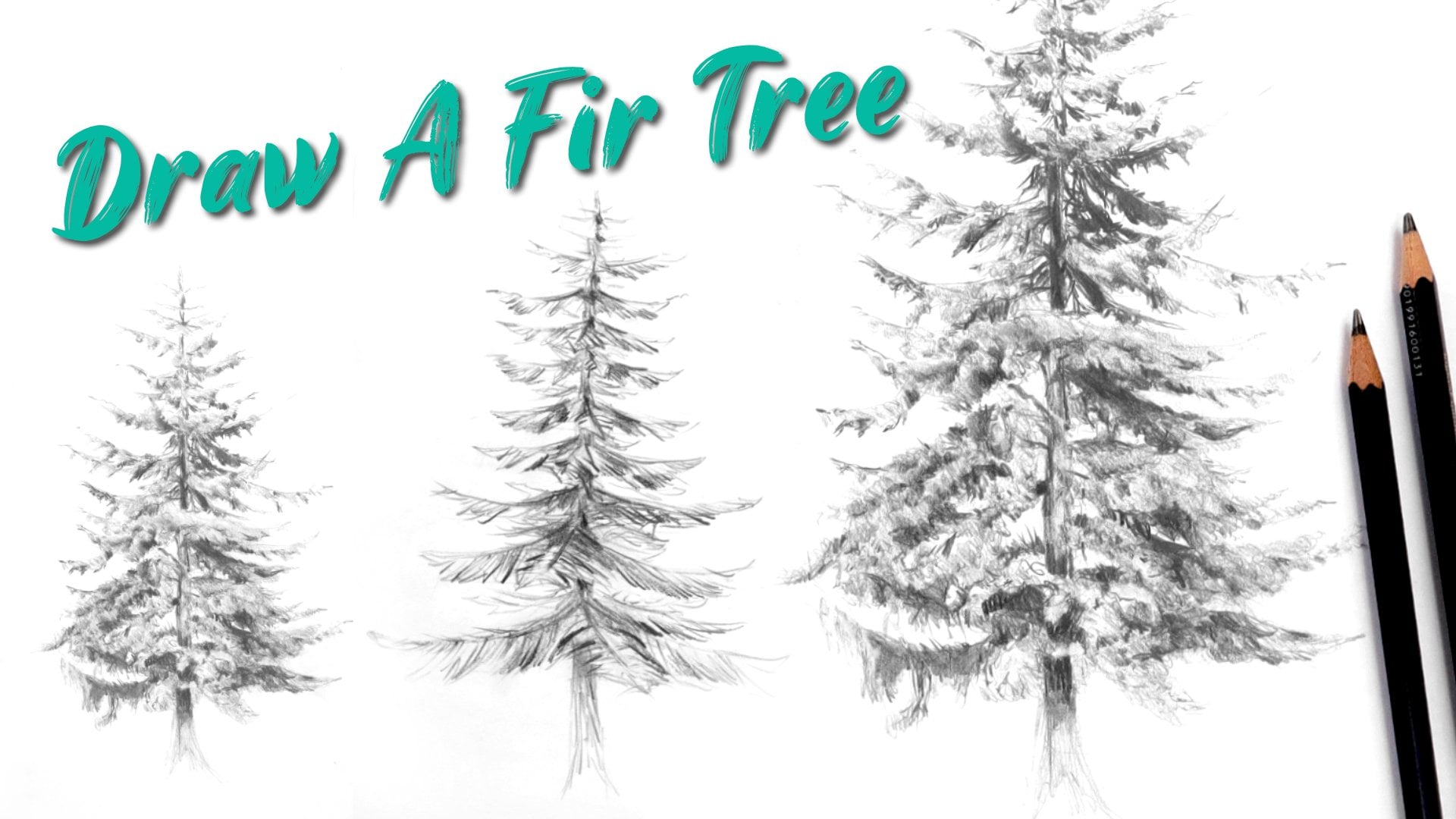
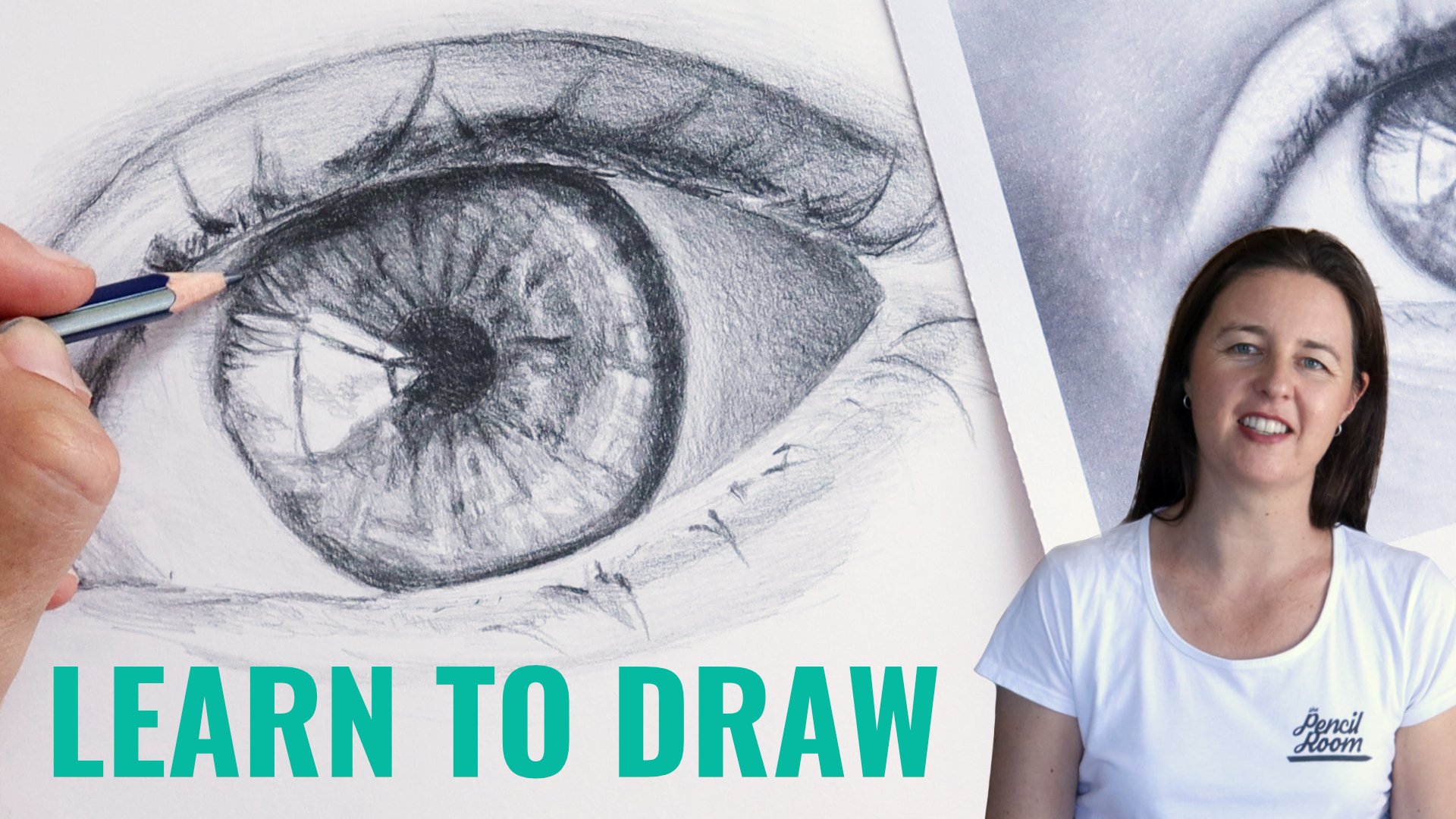
Transcripts
1. Introduction: Hi, I'm Emily. I'm an artist and a drawing teacher
from New Zealand, and today I want to share some skills for using one
of my favorite mediums, charcoal. Charcoal is messy. It's moody and sometimes
it's hard to control. If you've never used
charcoal before or you're not quite
sure how to use it, this class is a good
place to start. We'll begin by testing some different types
of charcoal Now, don't worry if you've only
got one type of charcoal, you can just use that through the whole
class if you like. Charcoal is a great medium
for working quickly. And I'm going to
take you through three quick landscape sketches so you can see the effects of different types of charcoal. And to practice creating
a sense of distance, then we're going
to spend more time on a final charcoal drawing. You'll learn
techniques for using willow charcoal and
charcoal pencils. And then at the end, I'll
also show you how to use fixative spray so you can
protect your charcoal drawings. We'll be covering landscape
related techniques like creating distance and
creating textures, which are also applicable
to drawing with pencils. So this is a good class
to take if you're interested in getting better at landscape drawing in general. Just a warning, if
you're using willow, charcoal or charcoal powder, it's going to get messy. It's easy to clean off your
hands or of hard surfaces, but it's best not to
be wearing anything white when you take this
lesson. Let's get started.
2. Materials: I'm going to start with a demo of some of the different
charcoal materials you can use. If you have some of these, then you can go ahead
and get them out and we will see what
we can do with them. So, I've got a couple
of charcoal pencils. I've got one that is
medium says two medium, and then one that says H B hard. Sometimes they're
graded the same as regular pencils with HB and two B and six, and
things like that. Sometimes they'll just
say medium, hard or soft. We've also got some
willow charcoal. This is right. Keep all
my different charcoals. Willow charcoal comes
in a stick form, has some hair, it's usually
a bit longer than this. That is actual willow
sticks that have been processed and
burnt essentially. Then I've I've got a different
willow charcoal by nitram, which is really nice to use. Probably won't use it today
just because it's actually quite a different tonal
value to regular charcoal. But the nice thing
about it is you can sharpen it when you use it, it doesn't really crumble. So you might be able to see
the sharp tip on that there, so you can get a
really nice sharp mark with it and it doesn't break. But yeah, it's a
bit warmer tones than the other charcoal. I don't tend to use
it in combination. We've also got some
compressed charcoal. You won't be using
this. It's essentially the same as what's
in the pencils. It's charcoal with a binder
and some charcoal powder. And I've got a brush as well. Whatever you've
got, even if it's just pencils, go grab those. I've got a putty eraser, and I tend to keep a separate eraser for charcoal just because
they get really dirty. This, by the way, is
a very old used piece of leather chamois, or chamois. And it's really nice for getting smooth textures with your
charcoal when you're erasing. I won't do any on this
paper because like I said, it's very well used. But it's also nice
because it is used. I can actually just use
that if I want to get a nice soft background for
something, it was yellow, if you can believe it
when I first bought it, that's something if
you want to go on with charcoal drawing and do a lot of it that you
might want to get. It works a lot better than like a tissue or even than
these blending stumps are. That's also what? I've
got a blending stump and somewhere around here
I've got a tissue as well.
3. Charcoal Experimentation: Let's have a bit of a
practice of these marks. The willow charcoal
is very soft, it is very easy to wipe away. Now, this has its benefits, advantages, and
its disadvantages. The advantages are you can get really nice soft
blends like that. But the disadvantages are, obviously, if you want
something really dark, you've either got to fix it at the end or you've got to
be really careful with it, because anything that touches it is going to pull
it off the page. I should say too, that if you're working with
a willow charcoal, you're going to
get really messy. I covered in charcoal, but it has a really nice
soft quality to it, not just in the physical nature of it that it's
going to rub away. But just the look of it as well. It doesn't have a hard edge. You can get some nice blends
with it just by shading. It's got a cool tone to it, It's gray, but it's almost like almost a green or
bluey gray to me, if really, really
think about it. And I like that you
can't get really strong, deep blacks that looks black. But when I compare that
to a charcoal pencil, especially a softer one, this is the medium
one that's black. That there is still like a very dark gray or just a soft black. The charcoal pencils
are much darker. You can use them lightly, but it's more difficult. They're much harder to
get rid of the willow. I can basically just pick it up off the
page with my finger. With this here, it'll smudge but it's not going to
come up off the page. You're still always
going to have a mark. It's good in some
ways and bad in some ways, you can erase it. But it's also had, if I try my hardest to
get rid of all of this, there's still a mark there. Whereas the willow charcoal, there'll still be a bit in
the grain of the paper, but not really so much a mark. You don't really see the long
marks of the strokes there, the different pencils here. Like I said, I've got an HB. This is like a regular pencil, but it feels a bit more
chalky and you can go darker. It's got that strong
contrast to it, but same as with
the harder pencils, graphite pencils,
the charcoal pencil, the more easily you're
going to see those marks. If you're wanting
to shade, you've got to be a little
bit more careful about keeping your shading
nice and even close together. You can get a really sharp
marker use on its point. The two B pencil is much darker. This is a medium
charcoal pencil. It's much grainier, Harder
to get a sharp line, I'd have to keep sharpening it and sharpening it
on some sandpaper. This is a good thing to use, especially for
these soft pencils, because they can be
quite difficult to sharpen with a pencil
sharpener or even a knife. They can break really easily if you can get some
sort of point on it. And then you can use
sandpaper to get a nice, nice, strong point on it. Sharp point. It's
not really sharp because as soon as I
start making a line, it starts chipping away. The charcoal is getting
left on the paper, so it gets soft very easily. Again, very hard to
get rid of that line, that hard line, once
you've got it down there. So, pays to use this
one quite lightly. To start with, you can use blending stumps
on any of these, and like my erasers, I try to keep a separate
one for charcoals. Has still got some
charcoal on it, but you get quite
a nice effect with the charcoal pencils if you use a blending
stump over top. Now the paper I'm using is
just regular sketchbook paper. You can get better
smoother results with like a Bristol paper. But I think the trick, I think one of the problems I
see people having anyway, they can't get smooth values, is the rubbing too much. They've got some charcoal
there and they're really just trying to spread it
out and rub it everywhere. Then you're going to get
something that's really messy. Same as with graphite pencil. You need to layer
up the charcoal first if you don't have
any charcoal down there. This is very scratchy
at the moment. This one. This is the
HB, there it goes. But better if you don't have
any charcoal in that place, then you're not going
to get an even coating. You've got to have the charcoal down using light pressure with your pencil and
using light pressure with your blending
stump as well. It takes a bit of patience. It's just a gradual thing, you might think of charcoal, I can just smudge
it really easily. Be much quicker and easier
than graphite pencil, but it's really
the same process. Now, if you were really keen on getting super smooth blends, then that is where you
get some charcoal powder. Now I say get some
charcoal powder, I'd actually recommend just making your own charcoal powder. That's this is again, sometimes it's a
slightly different tone to what you're actually using. It might feel warmer or cooler. You'd apply that with a brush. And this is just an
old paint brush. I don't actually use powdered
charcoal very often. If I did, it would
be probably over top of some of these other
marks and things if I just wanted to tone the
contrast back a little bit. But you can brush
it on depending on the coverage you'd want. You can experiment
with different brushes as well, but I just
quite like that. This one is a
little bit splayed. It is a little bit
like a makeup brush. And you can use makeup
brushes as well. I can do small
circles with that. If you wanted to make
your own charcoal, you can simply use that
piece of sandpaper, whatever charcoal you're using. So you're using willow charcoal. You'd sand it off on here, and then you very
gently tip it into a container like any
powdered product. It's not good to be
breathing this stuff, so you got to be
careful with it. If you did buy a jar like this, it's going to last
you a lifetime. Barely a third or even a quarter of the way through
this. It's still going. There is one other way you
can make powdered charcoal, and that's with
something like this. I find this one is actually
a little bit too coarse. It gives you charcoal.
It's a bit too lumpy. This is by De. Went. I do
use it sometimes still. You can just grate whatever product you want
into this little container. Not so great with willow
charcoal as a previous break, but you need to move
it over the surface. This end up with all
your charcoal in there. But like I said, sometimes
it's a bit coarse. So this is really the best way, sending your charcoal on a
piece of sandpaper and then collecting the scrapings you don't need much
like a little bit, goes a really long
way when you're brushing it on, what
else have we got? You can use any of the other things that
we normally use for blending cotton buds and
then tissue as well.
4. Optional: About Nitram Charcoal & Compressed Charcoal: I'll just show you the
compressed charcoal and the nitram charcoal, just if you're interested. So the compressed charcoal comes in similar sort of
grades as the pencils. It comes in medium and soft, and extra soft, quite
like the extra soft one. This doesn't feel like
it's extra soft though. I think this one is extra soft. And it's, like I said, basically the same thing
as what's in the pencil. You can see how dark that is, maybe even slightly
darker than the pencil. These are quite
good quality ones. They are Faber Castel, and you get very messy. But you can get a
holder for them. I'm not sure where
mine is. I don't use the holder very often, but it just claws
onto that there. You don't get dirty fingers. Then the night tram charcoal. You might be able to see
the difference in the tone. I'm not sure I do
a lot of it there. It's more browny
than this one here. Like I said, it's not great
to be combining them. But these are, I forget
what they're called, the petite sticks and
they're very soft. You're not going to have any
problems with them breaking, that's why I bought
them, basically. And then you also get the hardest sticks.
He has one here. These ones come in rounds and then these ones come
in different grades. They're both willow charcoal. They're both soft, but the
soft one is a lot softer. If I take an eraser and
rub some of that out, can you see how brown that is? It's quite brown. That's something I didn't
expect when I bought them. It's fine if you're
doing a whole drawing, and it's actually quite nice
if you're doing a drawing on like a warm paper
to have that tone, but they're not great for
combining with other charcoals.
5. Drawing Nature Textures: We're going to be
sketching some landscapes. And what I thought I'd do
first is just go over some of the patterns that
might be useful for when we're drawing
the landscapes. We're going to treat them
as quite loose sketches. When you're drawing landscapes, it's very much about illusion. How can you create the
illusion of a pattern, of a surface texture like grass or bark,
things like that? If you're doing a
full landscape, you can't do every
individual blade of grass. So we've got to come up
with some patterns that we can use to represent
those textures. We'll also go over drawing
a couple of trees as well. We'll use a mixture
of willow charcoal and charcoal pencil. So the first thing you might be drawing is maybe some sky. I'm just going to
get a fatter piece of willow charcoal here. They come in different
thicknesses. It's a thin one and
here's a thicker one. The thicker ones are nice. Want to make sure I don't
touch my face with charcoal. Fingers have black
smudges all over my face. The thicker ones are nice because you can use them
on the side and that's really good for putting
down a very light layer. If you have a long piece
of willow charcoal, you can break it up
into smaller pieces. If we're doing a sky,
then we might leave a little bit white
for some clouds. Then just put a
little bit of this around for the rest of the sky. Maybe a little bit darker
underneath the cloud. Then you can use your
finger if you want to or you could use
a bit of tissue. The tissue is going to pick up a lot of the willow charcoal, so it starts to disappear. If you use too much smudging, you see I'm losing
it now already. But you get a bit of a
softer, softer effect. You see that cloud in there. And then maybe I could just layer it up a little bit more. We're using willow charcoal. You could do this
with charcoal pencil. You could draw a cloud as well. But the willow charcoal
is just really quick. That might be one way
that you create a sky. You can also bring your party eraser into that if you want to bring out some whiter parts. You can create clouds
with patterns with that eraser just by moving
it around a little bit. I'm just exaggerating here
and doing a few more clouds. But you get erratic or
use a erratic mark, you'll get something that
looks natural looking. Like I said, if you wanted to, you could have a
go at doing that with the charcoal pencil
would just be the same thing, you leave your white area. I'll just do this
one very quickly. And then maybe using
a blending stump. Not great if you're doing
a huge sky because you don't want to be having
to blend the whole page. If you're doing a full
page in most of its sky, it's going to take a
really long time to get that nice smooth effect
with the blending stump. Could alternatively use
the charcoal powder, and I'm not going to use that in these classes or in
these lessons just because I think most people probably won't have
the charcoal powder. And it gets really
messy as well, But you could brush
that out and then get your eraser and bring
out some clouds. That way you get some
nice sort of effects. There's some clouds
if we're doing water, you can get a really nice
water effect just by dragging your willow charcoal
across the page. That might be all you
do for the water. Bring out a bit of the
texture of the paper, or maybe put a few
horizontal lines in there as well to
create some ripples. No smudging. It's nice to
combine some areas of smudging, maybe in the sky, and then have other areas that are sharper, so you get really nice contrast. These are just sketching tricks, I guess, if you're sketching
a quick landscape. Obviously, if you were
doing something and you want it to be
hyperrealistic, then you wouldn't
do it this way. You'd spend a lot of time, just like you would
with a pencil drawing, same process, light
layers first and then building up your values and then adding your textures afterwards. But we're going to sketch
quite quickly for this one. Let's have a go at some trees. So I'm going to use charcoal
pencil for this one. Let's see, we'll do some chunk. When we're thinking
about shapes, it's good to put down the
main shapes that you can see. It's a very idealistic
looking tree, but maybe it's got three branches with big bunches of leaves and things on them. And each one of
those sections of the tree needs to be treated as a three dimensional
form of its own. So it's going to have a light, a middle, and then a dark. And I was using a
side to side texture, but you could be using
little dots or scribbles. So we want light,
middle, and dark. And that's going to
give us the illusion of form in those different
parts of the tree. That's more What kind of
tree would that be here? It would be a but cow tree
or something like that. One of those trees
that branches out and it has a lot
of leaves on it. But we could also do, pine trees might use to be pencil here, this is the medium. It's a lot softer, a lot darker. For the pine trees, we can just draw straight
line for the center and then we can start to flick
out at different angles. Do a couple for each one. These are shortcuts for
drawing trees and sky. It's a good warm up and
it's also a good way to quickly put in like a symbol
in place of what you see. We often talk about not wanting to draw
symbols when we're, we are drawing, we want to draw, we actually see,
but you can't draw a whole tree in complete detail. We've got to come up
with these tricks or these shortcuts or I don't know what else
you'd call them. Maybe like code ways to get
down the basis of a tree. And then you could edit it. You could look at the tree
again and there might be branches coming further out this way or
something like that. That's pine tree. You could do another one where the branches are maybe
coming up a little bit more. Obviously they're going to get smaller as they get
towards the top. We're going to
make sure we bring some in the center here too. We're going out to each side, but then there's going to
be some coming towards us. And those ones are going to be, they're just going
to look like long, wide shapes rather than long shapes because we can
only see the length of them. When I hold this
pencil pencil here, we know a branch or
a pencil is long. But as soon as
we're looking at it from the end of its length, you can't see any of that. You can't see any of
that length there. You can only see the end of it. So we can see the width
of the tree branch. I'm using a lot of scribbles
and scribbling technique is really useful with charcoal
for building up texture. You might want to have
a practice of just doing something where you're
scribbling erratically. And I think about it as being a little bit
like drawing concrete. If you think about the
texture of concrete, you can have these
little scribbles that I'm moving my pencil
in the same direction, but they're not all the same. Some might be, it might be wider textures like that
can be nice for bark, they can be good, maybe
for rocks as well. Just get used to that movement. If you're very controlled
when you draw, this might feel strange. You can even hold
your pencil a little bit further back and
that might give you a more natural mark
because you got less control
scattering those marks about all over the place. It's like if you put
a piece of paper on concrete and then you
brushed over top, that's the mark you might get. We'll just do a couple
more rocks or cliffs. We had some cliffs, then
I'd use an HB pencil or a hard pencil because you can get some sharper marks and
that's what we want for rocks, you might have
some jaggedy lines going through these
cliffs or rocks. Then you might have
just some textures. I'm just playing around here, but again, almost
like just a scribble, I'm doing more linear scribbles and then you could
have willow charcoal underneath or over
top of that as well to take away some of the white the building in some crevises here. This is the top of a cliff face. You could do the same
with like a single rock. You might have the
top of the rock. This is a very square rock, but even if you
did a round rock, you'd have a top to it as well. You might have some
jaggedy textures on it. The harder pencil is
going to give you a harder mark which suits the nature of things like rocks. Anything that we
draw in a landscape or anything we draw at all, generally speaking, it'll
be darker down the bottom. There'll be some
shadow cast somewhere. We can think about that with
things like rocks as well. And make sure that
they are darker down the bottom than they
are at the top. The last thing that
you could practice is grouping together
a line of trees. We're not always going to be drawing single trees like this. Sometimes in the
distance they might look like just a long, dark shape and maybe you can use a round mark or
a round scribble for that. Again, like the rock, it's going to be darker
down the bottom, generally speaking,
than it is at the top. It's just another little
trick for creating some depth and some volume in those trees rather than them
just being like a gray slug. We've got this darker
part down the bottom now. It's more of a
three D gray slug. Have a play with each
one of those elements, sea trees and rocks. You might be able
to come up with some different patterns
that you can use. In a moment, we're
going to go ahead and have a go at doing
some quick sketches, and we'll put some of
these techniques to use.
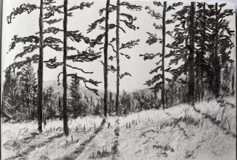
6. Quick Sketch: Willow Charcoal: We're going to do
some quick sketches now and the emphasis
is on quick. We're going to use the charcoal
to put down some values and practice some of those textures that
we did previously. Just be mindful of that and don't get caught up in trying to make it look perfect. We want to create a quick ill, or capture a quick illusion of the landscape and we've got
some different ones to try. We'll using separate media
and also combining media. But if you only have one
type of charcoal, it's fine. You just use that
for the whole thing. I've divided my page up into two landscape and one
portrait orientation. We will start with this
landscape up here. This one. I'm going to
use only willow charcoal. We're going to start
just by putting in a horizon line very lightly. I'm using it like a pencil. Using the tip of the charcoal. Then I'm going to put
in the main shapes. We've got this cliff side, not worrying about
the trees for now, but getting the general shape. We've got that cave
in there as well. A little too big there. The size of my rectangle
is a little bit bigger than the rectangle
of that picture. Stretch it out a
little bit too far, but it doesn't matter too much. I was just trying to get
these general elements and then I'm going to just put in the tide line, the sea, then this
other line here. Then I'm going to put
in island in the back. There's actually a
rainbow in the sky too. It's hard to do in black
and white for the sky. I'm going to use my willow
charcoal on its side. We could put some
clouds in there if you want to maybe leave
a few bits white. I might leave a white
cloud over here. Everywhere else I am shading in with that
Willow charcoal. Using charcoal is a little
bit using water color. You've got to think a little
bit about the lights in the darks before you start because you can go
lighter if you need to, but it's quite hard to go light. You still will leave some of the charcoal in the grain of the paper, anywhere
you want. White. You've got to think about that beforehand and leave it white, give us a little bit of smudge. I'm not worried if
there's a bit of texture, what paper you have is going to determine
the texture you have. But also, like I said, the only way to get a really
smooth texture is to use a powder to apply
it as a powder. If that's something that
you're concerned with, you have to get over it for
this particular lesson. But it might be worth
investing in some powder or just having a go at sending some powder and
seeing how that works for you. You might really
like that effect if you're after the smooth look. I'm just going to add
a little bit more to these clouds with an eraser. And maybe darken up just
under those clouds a bit. I've got to be mindful
that we are doing this quick and I don't want
to get carried away either. Okay, there's my clouds now, the water, I'm going to use
that texture coming across. Just put a light
layer across there. And maybe in the foreground here where you can see
some ripples and things. I can put those
in not so much of the back because we can't see detail in that
far in the distance. There's this white
white part here. To make that stand
out, I'm going to have to build up some charcoal. Will go a little bit darker. Anyway, in this area, this part of the sand,
we want to feel smooth, so I'm going to smudge that
a bit and blend it out. You see the different sorts of effects that we're getting here, and I want to be able to
leave that area white. So I'm going to go in with
some quite sharp texture marks on the other side
of that white area. I'm doing sharp texture marks because it's an area
that's close to us. Anywhere that's close to us, we can afford to put a bit of texture anywhere
that's far away. We want to leave plain
and low texture. And then maybe a little bit of a jagged line underneath
that wave as well. It's quite dark under here. This one's all with
willow charcoal. Let's get something
on those cliffs. Same way we did the sky. But this time I'm going to grab, it's really just a ground
layer or base layer. Start putting in that
open cave there. Now you do have to be mindful
of what your hand is doing. I'm working the way a
right handed person would, but I have to be
careful that I'm not putting my hand onto that
charcoal and smudging it. Same way if you're going back over here and working
on something over here. We haven't done
that Headland yet. You've got to be mindful of
where your hand is going. Let's put that Headland in there now so that you don't
end up smudging yours. If you're right handed, it's maybe a little bit
dark because things in the distance are usually
a little bit lighter. Generally speaking, we'll leave that to last just so
that we don't have a whole lot of charcoal
all over the place. I'm just going to
try and come up with some marks that feel
like that cliff face, those darker parts coming up. I'm holding my pencil on its
side, but piece charcoal. But I'm also using it
with quite a bit of pressure to get some of these
lines coming up here too. If you haven't used
charcoal before, it might be a little bit like using a
completely new tool, like what it's like if you start to use a palette
knife for the first time. It feels a bit strange to
figure out what marks you can leave and how you
create those marks. Now I'm using that
concrete method where I'm doing a few scribbles, but I'm pushing quite hard, and this is to give me
an idea of shrubbery or trees or something coming
down here, down here. Then we're going to use
the tip of the pencil, tip of the charcoal to bring
out some of these trees. We didn't really practice
ones like these, but again, a little bit like
the concrete method, but I'm just trying
to leave a few gaps. You can see the light
coming through them. There's one that
comes up from here. This one has a few clumps where we could
treat individually. I remember you want to
have a bit of value, a bit of light and dark for each clump, Maybe here as well. A little bit of dark
in there just to show that they are separate
sections of the tree. There's a little bit in here, but we can leave out
anything we want. I might just leave
that part out. Then we've got light levels coming through here
of tree leaves, shrubbery, a bit of white space coming through so
that you get that sense of the light coming through
the leaves again, putting in some darker
parts somewhere. We just about finish this one said we're going
to keep it quick. I'm going to try and
stick to what I said. Then we're just going to put in some really dark shadow on air, especially on that
right hand side and underneath then we can
lessen up the pressure. Maybe even just smudge
it across there. And you can keep layering it up until you get what you want. Then we just need a little
bit of sand in here. Maybe a few of footprints. I don't really want white, because we want the white of the wave to stand out in
the white of the clouds. This part here. It needs a
bit of texture on it too. Something like
that. And we've got a nice little landscape. We're going to do
another one down here. And this one is going to
be just charcoal pencil. I'm going to use two pencils
hard and my medium pencil.
7. Quick Sketch: Charcoal Pencils: We've got another escape here, but have a look at that
sky, very dramatic sky. We could do a good job
with willow charcoal, but I really want to see what the differences in
style when we use a pencil, the feeling or the energy that
you get from the drawing. I'm going to use my
hard charcoal pencil, just very, very lightly though, and start to put in
these main elements. The general shape of the, the cliff there and then
the bottom of the cliff. If you don't get these
exactly the right shape, hey, it doesn't matter, no one's going to know the sandy part or the
stony part of the beach. Then we want to show or identify where the white
wave is going to go. Just very lightly and
with a broken line, I don't want any outline to it. It's really just an
indicator for me, so I know where to keep white. Maybe another one coming in
here then for these clouds, maybe putting a bit of a
general shape there as well. The advantage of willow charcoal is you can rub everything
out very easily. I could just rub this out
with my hand if I wanted to, but because we're not
using willow charcoal, we're going to be careful
with those lines. And we've got to think about the pressure that we're using. We've got to think about what we're putting down and where
we're putting it down. I'm just going to use
side to side motion, start to shade this in, but it is a quick drawing
using quite broad marks, catching that weird
part of the pencil. This hard one's got, I don't
know, something stuck in it. It feels like it's like
just getting a bit caught on an edge or something. Might have a few scratches
in here. It's okay. All of this is going to be gray just like a regular
graphite pencil. If you hold it on its side, you're going to get a thicker
mark to cover more ground. Darker there and then lighter here, that could be it. But I'm going to go ahead and
just build this up a little bit darker and use
a blending stump. But you could use
a tissue tissue just like the willow charcoal. It tends to pick up a lot
rather than smearing it around. And I'll want to smear it
around to keep it on the page. Using a blending stump with small round movements down here. I'm going to use those
long strokes again, If you feel like you're
running out of charcoal, you're smudging but nothing's really happening or
it's getting messy. You got to come back in
with some more charcoal. There needs to be something down there for you to move around. Just darken up just a
little bit, not too much. You don't want it to be black, but I want it to be the
heaviest part of those clouds. You can see the
shape that is like the bottom plane of the
clouds. Same up here as well. That'll make them feel heavy.
You can get that shape. Well, this one's taking
longer than I wanted it too. So let's quickly move on. Just a quick sketch. Soften off that edge for the water. It's really quite dark. I'm going to use a
horizontal mark, trying to get that flat
plane of the sea moving across but a scribble in here because it's getting messy with that white water leaving a
few gaps to show through. If we want this to
go even darker, then that's when
you could bring in your medium pencil
or a soft pencil, maybe a bit of smudge of that
back back to a hard pencil. Bring in some of these details. I guess really what we're
doing here is we're just sketching the same way we would with a normal pencil. But we've got the added bonus of being able to smudge it a lot more and quickly
get high contrast. Put a line there
to show that wave, it's quite dark behind this
part of the wave here too. Just about lost my wave. Keep an eye on where that
white part is that you want to leave long marks coming through here to show that
the wave is drawing back. What have we got here?
The white water here too. Just a little bit of a mark in there. Quite white up here. Again, some long marks to
show the was pulling back. I'm not going to
worry about these little ones in here too much. Let's do the cliffs And
then we can quickly add in sand gravel. This is where we want
to use sharpness of this pencil to put in some
crevasses and things. And I'm almost like
contour drawing. I'm just following my way along the cliffs and using my pencil in quite an erratic way to
follow the shapes that I see. But if I get some
interesting marks, well, that's good too looking at
those different shapes, coming down the
cliff face there. Just looking for the main
crevasses that I can see. We might want to shade all of this in so that it's not white. This time I'm going up following the
direction of the cliffs. But you could change
the direction. You might get some
interesting facets happening. If you change the direction
of your shading up here, I think grass or
shrubbery again, how do you get a
different texture? Well, I could do it a
little bit more sideways. I can use my pencil on
its side more as well. So I get a softer mark in some general shading
at the back there. Then I'm just going
to reinforce some of those darker areas or crevices. Remember I said down the bottom, there's usually a
shadow and we can see quite a dark
line along there. Just putting that in will make
a difference to your form. As we come in a landscape or the foreground in this area here is closer than this area, we can expect to
see more detail. We can put that to use in our drawing
by adding more detail, the foreground areas, that's going to help with the
illusion of distance. Okay, I'm not going to
do much more with that. Then somehow we've got to get these very dark stones in the
air and gravel and things. I'm going to use
that same principle of it being detailed in the foreground using
some scribbles, quite erratic, then they're going to get a
little bit smaller, go back, and then I'm going to have to
use my dark pencil. Let's move to this one. This is the two B, I want
all of this to feel black. I could actually shade it all in black by pushing quite hard. But at the very least, as we
darker than everything else, moving in the same
direction as I feel like the waves
are moving out. We're going to bring some
of this in here too, maybe be a little
bit more detailed. The stones at front are
going to be bigger. As we move back, they're
going to get smaller. Remember it's a quick sketch. We just want a simple ill, when I lean back a little bit, you get a sense of distance
and you get a sense of what these different
elements feel like. What's the texture of them? Just needs to be maybe
a little bit more dark. Here, closest to us is going to have more
contrast, more texture. It's quite dark at
the back there too, but I don't want any
texture in that. We got one more to
do, then we're going to have to go at a
more final, a drawing. We can spend a bit more time. I won't be rushing
you through it.
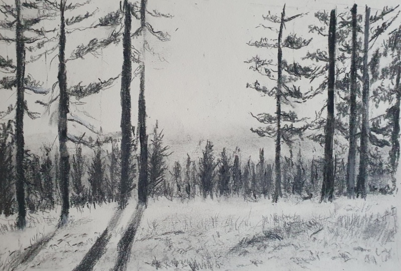
8. Quick Sketch: Mixed Charcoal: I think it's a good idea to practice drawing
really quickly and to learn how to interpret something when you don't
have a lot of time. And also to learn how to be
expressive with these marks. How can we use these marks
to create the illusion? If you're taking your time and spending 2 hours
on a landscape, sometimes you lose some of that energy that you would get if you were drawing quickly. Now, this one is probably the most complex
one we've done yet. I'm not going to do
it quite that big, just keep it small so that
it doesn't take all day. This one I'm going to use
a combination of willow, charcoal, and charcoal
pencil. You can do the same. Or if you've only got
one or the other, then you just have to go
with whatever you've got. I'm going to put in what
would be my horizon line, which is in the center. You can see that line of trees. There is a bit more on an angle. I'm just using willow charcoal. Now on the other side of the river is on a
bit of an angle too. Then we can bring this section of trees very lightly
with a broken line, putting that in these
tall trees on the right. Then we've also got
some on the left here, so a little bit lighter. Then we've got a little
bit of a hillside. Then we've got this Rocky Cliff. Rocky Mountain that comes up, looking at the shape of
it, something like that. There's another little
one back there. And then we've got these clouds. We've also got the reflection. So we've got a lot happening, but we're still going
to work really quickly. And we can use the
willow charcoal quite effectively to be able
to put in some value. Very quickly, I'm going to
leave the white of the clouds, just mark those out. And then using the side
of my willow charcoal, put in that blue sky. If you really like the texture, you could just leave it
quite textured like that. You could come in with a tissue and lose some of that and maybe push a little bit of bit
into the clouds as well. It's a little bit
grayer down here. I'm just using what's
on the tissue to put a little bit down closer
to the mountains. We can tidy that up a bit by
bringing some whiter whites. Not everywhere,
but just where you see the brightest
parts of the cloud. Perfect shapes, don't
matter so much. Let's get an idea of
those clouds in there. Let's put a little bit more down and we'll slowly work our way forward so that we're layering
on top of that background. Put this in here and now
this is quite light. Use my finger to smudge it. If you're losing definition, you might just have to
carefully go in over the edge. As things are further away, they are lighter, less detail. This is a good example of that. Look at the difference
between this and this and this
in the photograph. The difference in the values. I'm going to put a
bit on this one too. What we could do is go
through and put in all of the values with the
willow charcoal first, and then use the
pencil for the detail. That would be one
way of working. It looks like we're
going to be working that way just taking it as it comes. Here's the next layer. I guess what you
run the risk with, with willow charcoal is that
everything just ends up looking the same
because it's very tempting to smudge and
it's fun to smudge, then you might just
end up with gray. I think we'll probably
stop there and move to the pencil and we're going to get that same feeling
of sort of rock, sharp rocky cliffs that
we did in the last one following my way along. I'm not trying to
make an outline, I don't really want to make a dark outline around
the top I have, but I'm also aware that I'm going to be shading
some of these parts in. It's going to go much darker, so it's not going to appear
as a dark outline at the end. But just be aware of
that, that you're putting a hard edge
on everything. Coming down here and
keeping it a bit lighter. Looking at some of the crevices, there's one that
comes down here. Whatever you see, you can put
in using some sharp marks, putting some texture
on there as well. It is quite dark down the side, so I could actually afford
to shade and all of that with my pencil. Just check for your lights in your darks in that cliff side. We don't want any
really bright lights where there shouldn't be or any dark darks where
there shouldn't be. So there is a bit of light
here in the photographs. I'm just going to leave
that part showing. Definitely a bit
darker down here and a bit darker up here
then that will be about it, that one shapes a
little bit strange. Looks a bit like a
chimney or something, but it's going to
come together when we put everything else in as
well, it's in the distance. Okay? This one here, this is trees. A
lot of pine trees. I'm just going to use like an upward or upward scribble mark to give an idea of
those, create a pattern. Let's put a little bit
more detail on that one. Getting the correct values. Now I think I might
have gone a bit dark with that or maybe this one can go darker with
my other pencil, but I've got lightest hair and then getting darker
and then getting darker. And then when we
get to these trees, we're going to go
really, really dark. I'm just going to put in a layer just so that I can get rid
of any white because I don't actually want any
white showing through there. We can do the same on
this side as well. And let's move from this
side to the side here. I'm just going to put in what
would be trunks for maybe, let's say 123 trees. 123 to come up a little
bit higher than that. And then there's a
few in here as well that then we're going to use our pine tree mark moving
outwards on each side. Look at the way the branches
angle so that angle upwards. We're same for the
one behind it. Then there's the small ones. There's one here that stands
on its own a little bit. I'm going to speed
this up a little bit. The video, I'm going
to just speed up my drawing because I don't
want to spend ages on this. You can make these denser just by shading over
top of them like that. If there's too much
white in there, I could come back with my
other pencil, my hard pencil. Maybe just put some nice
clean points on these too. There is some white in there. I don't really want maybe gone a bit dark with these ones, a little bit lighter
down the bottom. I can just smudge them a
bit with that putty eraser. That will also get
rid of some of the white coming over
to the side here. Now I could go through and draw each one of
those individual trees, but all I'm going to
do is just be aware that they are coming up in size, smaller at the back, and then
they're getting bigger and I'm just going to make
up where they are. You could look and think, okay, there's a couple there and
then there's a bit of gap. Then there's this main one here, and then there's two quite close to the edge of the frame. And then just fill in the gaps, especially with these
ones at the front, we can add some detail the
direction the branch is going. There's a bit of white space up there that we can leave
or a bit of light showing through those branches. But as we come lower
down down here, there's no light
showing through. That's where we're going to
beef it up a little bit. I'll just do the tops
of them first so that I can get that a little
bit of detail in there. Detail. And these
ones at the back, they could almost just be
like just scribble lines. As we come closer, you start
to see more of the detail. These ones here will be
the most detailed ones. Remember, you go
side to side and then you want some coming
across the front as well. Then all of this I'm just going
to put in on mass so that we can get onto those
ripples and things also reflections
in the foreground. That's worked fairly well.
If you feel like this is too dense then Putty eraser, just bringing out
a few light areas but you get that
nice smudge as well, which is really
effective to just create a bit of difference in the textures that you've got. There some soft and hard areas, subtle changes in values which you have in amongst
those dark trees. Let's go ahead with the HB pencil and just put in
a little more detail here. I'm just going to put
on the shore line that's a little bit
lighter than the trees. Then on this side it's probably the few areas of white that
we've got a very light, this white light part
that comes along here. There's some dark just above
it heading into those trees. Then I can put in
the reflection, I'm just following the direction that the reflection is
cast across the river. Then I'm going to switch back to my willow charcoal in here. You can see that it's got
a smooth feeling to it. There's really ripples, maybe a few right
in the foreground. I can just do the
whole thing East. We'll use our eraser to
bring out the lighter areas, the good smudge when
you're smudging, you don't want to be pushing
really hard into the paper. If you need more to smudge, then you put more charcoal on. If you're pushing
into the paper, you're actually showing up
the texture of the paper. You're also sometimes
messing around with the actual structure and the fibers of the paper and
you'll get weird marks. I'm going to go in now and
put in the lighter part. You can see the reflection of the hillside or the
mountain top there. And I'm not getting rid of all of the charcoal
here, but that's okay. Because I can see in
the reflection there, there's some bits of gray in the clouds and stuff as well. I can use any eraser too, so I could bring this one in if I really want
to get detailed in any areas and bring out
some cleaner whites. We're just working quick, so
I'll stick with this one. Then I'm going to
bring my hard pencil because I can use
that more lightly. And I'm just going to
put in a little bit of detail here in
this reflection of the mountain cutting out that
shape a little bit more, even if it's just some
up and down lines. Then you can see the trees coming up on this side as well. The reflection of the trees
the same on this side here. This should line up with
what they're reflecting. This would have been
a really nice one to use the powder on in the brush just to get
those really smooth areas. You can see some trees
coming through here too. A little bit of mass there. Then I just need to get the
contrast a little bit closer. So it's very dark in here. Dark but soft. A bit of a smudge will be good. That's going to bring
out the shore line. We are just about finished
with this push back. That white a little bit,
comes right over to here. But then there's a few like cuts through that reflection there. I think it's just where there's some lighter trees on the shore. This is a fun one to play
around with if you want to do a bit more on it later
with these reflections.
9. Analysing Our Drawings: Take a look at the
drawings that you've got. You'll be able to
see a difference, especially between
the willow charcoal drawing and the charcoal
pencil drawing, just in the feeling that
the material gives you. You have a lot softer grays with the willow charcoal and you have some sharper marks with
the charcoal pencil. Then we can combine those
to create something that has a bit of both softer
for the reflections, harder marks, darker marks
for things like the trees. I'm saying that
this one needs to be maybe a little
bit darker in here. You can also see how we can use the grays and the values to create
a sense of distance. They are usually lighter
in the background. This is never going to
be as dark as this. Even when we were not close, There might be some
caves and things, but it's never going to
be as dark as this here, because this is closest to
us, this is further away. You just think about
anytime you've looked at a mountain range
in the distance, it'll appear maybe
like grayish blue. You won't be able
to see the texture and you won't be able
to see any contrast. Whereas things that
are up close to us, we see a lot more
contrast in detail. Contrast being the
black and the white. If this felt a little bit
fast for you, don't worry. We are going to move
on and do a drawing that's a little bit longer,
not a whole lot longer. We're still going to be working in quite a sketching manner, but I think it's
important to try these things sometimes
and you might be surprised by what
you've come up with. If you feel like
something is lacking, then I just go through and
think about those values. Think about do you
have the things in the foreground darker than
the things in the background? And also think about texture. Do you have more pattern and texture in the foreground than
you do in the background? Sometimes just
really simple things like adding a little bit of black somewhere can
make a big difference. If you're working
in a sketch book, you can see how mind
started to get smudgy. I was just cleaning
it up a little bit. I am going to show you how
to use fixative at the end. In the meantime,
if you're worried about it getting on any
other parts of your book, you just put a piece of copy paper or something
on top of that. It'll smudge a bit
onto the copy paper, but it just means it
won't get all over your other work, just like that.
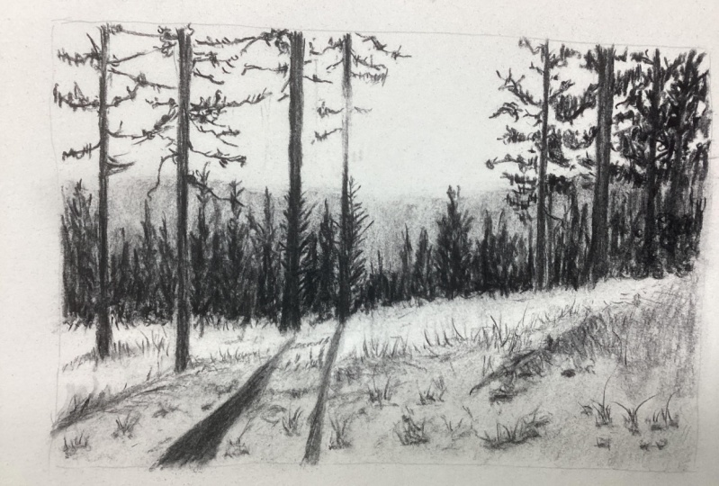
10. Project: Charcoal Landscape Background: This is the image that
we're going to be drawing for our final drawing. It's still going to be a sketch. We're not going to spend
hours and hours on it, but you can always
choose to spend a bit more time on
it if you want to. If we think about some of the rules we've been talking about, the landscapes, when we're
doing those quicker ones, the levels in the distance are lighter than the
levels in the foreground, At least in terms of this area. We've got that level and then
this other level of trees, you can see a bit of it there. And then we've got these trees
right in the foreground. We've got lightest and then
we've got darkest here. Then we've also got
this really close area, the foreground here, which
has a lot of texture in it, and we're going to use
a pattern for that. Again, we're not
going to try and draw every blade of grass, but we want this
area to feel like it is much closer
than this area here. The way that we can do that, they're about the same value, but the way we can
do that is by having a lot more texture in
this foreground area. We'll use a combination of willow charcoal and
charcoal pencil. Decide how big you want
your drawing to be. I'm not going to
do full size page, just maybe a bit too
much charcoal for my liking In this
particular sketchbook, I'm going to do mine
about that big there. It's maybe like half
of the sketchbook, half the size of the sketchbook
page I'd normally use. We'll bring this up
a little bit bigger. Let's think about the levels that we've got going on there. We've got the foreground area. Can use willow charcoal just to very lightly
with a broken line. Draw that in, then we've got that area in the far distance, it's almost like the page
is divided into thirds, maybe the sky area is
a little bit bigger. Then we've got some trees
coming into the foreground. One, I'm doing
this very lightly, probably going to end
up rubbing some of our out with my hand by mistake. That's okay. 34. Then we've got one, probably the main one there, the thickest one, and the two that are
quite close together. It's a very quick
layout of our drawing. I got to think about what
I want to leave. White. I'm going to leave
all of the sky white. And that's going to
show through some of these dark areas
of the branches. I can start putting in
the background layer. Now there is one layer that I haven't put
in yet and that is, you can see these pine trees
that are in the distance, but they're not way,
way at the back. I'm going to put those over
top of this layer here. All of this can be gray because there's no
light shining through. You could use willow charcoal. It could use pencil as well. I think I'm just going
to use willow charcoal, but I'm going to use it
now a little bit more on its end rather
than on its side. I'm getting a darker mark by putting some pressure on
the tip of the charcoal. What that means is,
when I smudge it, I'm I'm going to get
something slightly lighter, but it's going to be denser than when I was using
it on the side. That's nice, it's soft, which suits that
background layer. Anything that gets a bit messy, you can just use your eraser
to clean it up a little bit. Things in the background can
be blurry as well because we don't see them as clearly as
things in the foreground. Still a little bit
more out here. When I'm smudging with this tissue or your
finger, I'm pushing hard. I'm very lightly smudging
over the top there. It looks messy, but we're
going to have a lot of detailed stuff over the top. Yeah. Literally our background. Let's come in with a HB pencil
or a hard charcoal pencil, and I'm going to put in some
of those distant trees. I'm using the HB pencil because it's a
little bit lighter. One of them comes
alongside this tree trunk. That's a tree trunk that's
more in the foreground, but then I can see behind it
there's a tree sticking out. It's coming into the
light area of the sky. You see, I'm working with
my hand down a little bit further so that I'm not
smudging all that charcoal. And it's just something you
have to learn to deal with. You can be as detailed
as you want with these, but I'm just creating a
pattern for that tree. She should be a bit
wider than that. I think as it comes
out to the other side, I think I've made it a
little bit too far away, but it's okay too far
away from the tree chunk. And then I'm going to
put another one in here. The direction of
those branches are coming at an upward angle, but we don't want them to just
look like lines like this. We need to give
them a little bit of irregularity or start bringing in some of
those ones at the front. Scribbles are always good. I'm putting in these main
ones just because those are the ones that I want
to be more in focus. The other ones, the ones that are a little bit
further back here, I can just do those
with some mass shapes. A bit more detail there.
Something dark down here. Then I'm going to put in bunch of trees that comes through
and over to this one here. Now it doesn't matter if you have a different
number of trees in there. I'm drawing them
as a mass shape, looking at the oval outline of them and then
shading them in. We can go over with the medium charcoal pencil to
make these darker. Okay, so I've got those in, that's like a
placeholder really now. I can make sure I've
got these long trees in the right place
working outwards, I can come back with
my willow charcoal. Willow charcoal is
always safe just because you can rub out the
lines that you don't need. We had this one
coming in front of that tree and the other one, we've got one that comes a little bit more into
the foreground. Building it up slowly. Going to do just a
little bit more work on what would be behind here. I'm going to use a,
a scribble pattern, but I'm also thinking they are the same sort of pine trees. I put a few upright lines. The way I approach this is
very much about creating ill, especially this area here. There's just not much you can do unless you're working with a grid and you are wanting to spend
hours and hours on it. You've got to use a pattern. There's nothing
else to grab hold of except maybe the
dark shape in there, dark shape, and
then some pattern, that concrete pattern in between these ones, you can definitely see some
individual trees, 123. I'm going to switch
to my medium pencil, but I'm not going to use it too hard because I
don't want it to be completely black yet. Can add the black. And later down the bottom of them, they're quite clumpy, you can't really see
a lot of detail. And then as they
come up to the top, you can start to
see the branches. There's a few through here. All I'm doing is just looking for light and dark
through this part.
11. Project: Adding The Main Trees: We're going to get
some of the foreground in and then we can
go back and think, do these need to have
more detail on them? Do they look a
little bit sparse? In which case we can add in
more trees in between them. But we might find that once
we get these other ones in, they fade into the background, which is what we
want them to do. Let's start over this
slide here using the hard pencil to start with, just because it's going to
give me a nice sharp edge, can get rid of any willow. If there's too much there, then I can come in with
the medium pencil. If I want to build it up darker, all I'm going to do is look
for the main branches. Something coming
up here, come up. I know it looks like there's
just so much going on. There's another branch
there coming down again. It's a little bit
like contour drawing. I'm moving my eye trunk, when I see a branch
sticking out, I'm going out and across. And then I can even start
coming into the other trunk. I can see them
crossing each other, make a crisscross pattern
at the top there. And then I can put in
some texture over top, anywhere I can see
clumps of pine needles. I can put those in. There's another one here
with a few clumps on it. Sorry, you didn't
see much of that. I'll do it again
for the next one, but I know there is another
big tree behind here. I'm ignoring that. Just because it's
detail behind detail, it's very hard to distinguish
exactly what's happening. I'm coming up this side and
again looking for branches, putting them in, and then adding some light and dark scribble. We're starting to get something that looks like a pine tree. Now, if I come over this side here and
again work my way up. As I run my eye up the
photograph and I see something, I'm going to put it in. Already done some of
the ones on that side. Let's come over
to the side here. Running my eye up, there's a branch that comes down through here and it's actually got a little bit of
light reflecting off it. So that could be nice to
bring in a precision eraser. If you've got one, then
I come up a bit more. I can see another one
following its general shape. So being willing to put
in just a little bit of erratic movement to get
something that looks natural. This one's got some
clumps of pine needles, we really need to get away
from looking at these as individual needles
or individual leaves. It's very much the same as
when you're drawing fur. When you're drawing
hair, we need to remove ourselves from that
and we need to try and see just the shapes
that we're seeing. I'm going to run out
of room at the edge of my rectangle here. It's okay. So there's quite a dark shape
joined to this branch. I'm trying to see that
as a shape and then I'm just adding some
texture in that shape. There are some scattered
textures in here too. Branches that are a
little bit further back, a little clumps on that one, and then we're getting over
to this big or wider trunk. Can you see these ones come
down into the grass here? This one seems to be
behind the grass. It is the harder pencil
first to put it in, then I can use the
darker pencil. Darker bits softer.
And sometimes you don't want that soft marks where the hard one is
quite nice on the edge. Then we've got this
one here which has some light coming across it. It's dark down the bottom, also starting behind the grass. The fades out a bit where there's some
light coming across. I think maybe it's like a flare the camera and then be
dark at the top again. Let's have a look and see what's happening with
branches on this one. There's not a lot till
we get further up and it shares some branches between this trunk
and this trunk. The tree doesn't
actually share branches, but in the image it does, putting in the branches first, following them with my eye, adding in whatever
shapes I can see, even just some
scribbles sometimes if it's appropriate,
especially back here. There's not a lot happening
and it's a bit paler, it's a bit lighter. I can afford to just put
a few scribbles in there. You might think when
you're drawing it and your face is really up
close and you're looking, you might think it
looks like nothing. But you can see from
what's on the screen, it starts to take on the
appearance of what you want it to from a distance. All artworks are viewed
from a distance. Most of them, I think that's the way we need to be looking at our artwork as well
from a distance. Now there's something
very dark in here. It's just going to give
an edge to my page. Definitely need to sharpen
my pencil shortly. I'm actually going to
just color most of that in a light gray and then
put in the dark at the top, which could be a
tree sticking out. I think it is just going to sharpen my
pencil a little bit. Now, these soft ones tend
to break very easily. I usually just sharpen them, not all the way, or if I
want to sharpen it further, I won't jam this into the pencil sharpener just because that's how
you break them. Sometimes they're already
broken on the inside. I'm putting it in, then pulling
it back a little bit and using the blade of the pencil
sharpener to sharpen it. But especially if
they've been dropped, they will be broken
on the inside, very hard to sharpen
because the lead just keeps falling out of them. There's not really much
you can do about that, but you can use the sandpaper. If you've got some
lead sticking out, then you can use
sandpaper to sharpen it.
12. Project: The Foreground: Moving along, I might go on
and do the foreground area. And then I'll speed up doing these ones so you can do
them in your own time. The process is going to be just the same as
these ones here. There's some bigger
darker shapes around here in this area where there's just a little
bit of light showing through. That's really all you need
to be aware of that one. The foreground.
We're going to go back to our willow charcoal. We want to keep all
this area light. If it's like mine, you'll
have some smudges in there, which is nice because we
want it to look soft. I'm leaving this light area and then shade and everything else, even just this texture
that I'm getting from the willow charcoal is really nice and that might be
all you want to do, especially if you're getting tired and you want
to break, you know? I mean, that kind of looks
like like grass, right? Smatch mine out a little bit. And then I'm going to use my hard pencil and bring
in some of these shadows. And the reason I'm
using the hard one is just because I
have more control. But I'm going to use
it quite lightly. I want control because I
want to have them move across the top of that
plane, that lighter part. And then they angle slightly differently as they come down, they start to straighten
up a little bit more. It just shows the curve
of the landscape there. You could use a blending stump here if you want
them nice and soft. Definitely need to go
a little bit darker, but don't have to go as dark
as they are in the photo. They're not the same darkness
all the way through, just because there's
some clumps and things start to put
those clumps in as well. This one here, you
can't see much of the shadow until it
gets over that hump, and then it's quite strong, comes out and gets bigger
as it comes closer to us. All these rules
about things being smaller in the distance and
bigger in the foreground. Lighter in the distance and darker and sharper
in the foreground. They apply to everything. Even these shadows, be careful, you're not over blending. You definitely need some
dark in there still. Just like pencil, you
might need to come back in with your charcoal and do a little bit
more over at the top. Then this one here comes out and you can't really
see a lot of it. That's given the some form and given the whole
thing some depth. Now that we've got these
shadows coming forward, we just need to make sure
that this front plane of the grassy area is
a little bit clearer. And what I mean by the
front front plane is you see this section here
is more like a slope. Whereas the section above
it, that lighter area, is more like the flat land. That's what we want to show, the difference
between the top and the side of that
area of landscape. We could bring a little
bit of darker in here. Actually, I'm going
to go back to, I'm going to stick with
the hard charcoal pencil. Because we're in the foreground, we can afford to
have more detail. The willow charcoal might
just be a little bit soft. I'm putting in this darker part here because that
shows the ridge. All of this here is quite gray. I get the feeling the grass is going that way a little bit. I'm moving my pencil that way. We've got some clumps quickly rendered with
scribbly shapes. Up this dark part here, we could create a little
bit more definition. You can choose where
the eye goes to. It's going to go to
anywhere with texture, It's going to go to
anywhere with contrast. Put some contrasts in here and be a bit more
careful with the marks, it's going to
create more detail. I'm looking at the shapes
that I can see there. Each one's got a light top and then a darker bottom part to it. But in saying that
it's not white, it's like a light gray. Okay, just about there, you put a few grassy
marks in here. Moving up into the light
areas, very light. Touch with my pencil. I want to draw the
whole strand of grass because it's
so light at the top. The grasses are almost
white in the photograph, but I can show the
bottom of them. That's where there's going
to be some more shadow, the same over here. But I mean, I can choose
to keep this loose because I might not want to draw people to the
edge of the page. If we want to show the
parts in a bit more detail, we could bring some
dark coming down from our dark area that will create the negative
spaces between the grass. Hopefully you can see
that a bit better there. It's got to join up to a dark space, but
then you can just, with very light pressure, flip down a little bit, create some of those gaps
in between the grasses. And then I just got
to join up the dark again and try and keep them flicking in different directions so
that it looks natural. Maybe a little bit flicking
up from underneath here. I'm looking at values, it's a little bit darker
around this trunk and there's no white
really except for that one long ridge. It's a darker part comes along here that I've
missed as well. Maybe that's given you
enough to go on with. I'm going to do a
little bit more in the foreground here
with these clumps now, we don't want them
to look uniform. Even these ones
here are looking a little bit too uniform
for my liking. You could give them a bit
of a blur if you want to, but just be aware that because
it's in the foreground, we don't want it
to be too blurry. But that might just soften
things off a little bit or just be aware that we don't need to do
every one of them. If you try to join them all
up as they are in the photo, you might end up with
something that looks strange. Unless you're drawing each one exactly as it is in the photo. We're taking more of a pattern approach.
What's the pattern? You've got dark shapes, light shapes, and
the dark shapes. The light shapes and the shapes. Sometimes they join
up a little bit. It's almost like a
pattern like this, but a little bit more
irregular than that. And you've got dark, dark, dark, dark a little bit. Don't do that. That might showing
you that might help you see the patterns a bit
more clearly in the photo. I'm not even worrying if they
don't match up too much. But these shadows
could be markers. They could be useful for finding those clumps that
you want to put in there. Definitely don't need to do
over everything As soon as we get, as soon as we get in. Some of them, it fills in the rest of the
space with those same marks. Each one of these clumps I think is like a mound of grass. You could play around with that, to have a little bit of
grass coming out of them. Very wary about telling
people to draw the grass, because sometimes it does just end up looking like lots and lots of long strokes and
loses the naturalness. Anyway, moving on, I'm going
to go ahead and do these. If I think of anything else, then I will tell you
after I've done those. But otherwise just
carry on on your own. I just thought of
something else there. I'm just gonna put in
a little bit more. Willow charcoal
there, softened off. It's quite soft in that area.
13. Project: Summary: I hope you enjoyed this one. I think it's really fun to
use charcoal in this way. If you haven't done that before, you might feel a little
bit out of control. You might feel like
this isn't working. It doesn't look like a tree. If I look up close, this doesn't look anything
like a tree. But hopefully it looks
like a tree to you from a distance that foreground and background and we've
got this ridge happening. There's lots of things
that you can learn from with this
particular photograph, which is why I chose it. Even if you've ended up with
trees that you don't like, hopefully you've at least
got that sense of distance, which is the most important
thing in a landscape drawing, I think, or distance
and texture. We've got both of those. We've got the very
bright foreground, the light hitting here, and then we've got
our mid ground. The far distance is lighter than these
other dark areas here. Sometimes it could
be a bit confusing. I'm saying, well, it should
be lighter in the background. But we've got this
light foreground here. Well, that's light because
it's lit by the sun. It's a bit, it's a different concept than
the sense of distance. If you think about
things that are shadowy, they usually feel like
they're getting lower down and things that are
lighter, getting higher up. So there's a whole lot of things going on is what
I'm trying to say. But our focus is
getting that sense of distance and also the
different textures. I'd love to know how
you found the drawing and whether you struggled with anything or
whether you enjoyed it. There is something
about charcoal that I quite like because
you can smudge it, but some people really,
really hate it. And that's fine. You
don't have to ever do charcoal again if
you don't want to. But maybe you've discovered a love for it as well and the different
things that can do. You can do quite different
things to regular pencil. We've got the
contrast, we've got the smudginess. It's
all a lot of fun.
14. Project: Filling In The Gaps: There's a lot of dark things
happening over this side. My strategy for this
is to just find the shape and then shade
it in with scribble. It's maybe a lazy
strategy because we're getting towards the end of
the drawing, but it works. I don't want you to be spending
hours and hours on this. Getting it perfect. It's just a good one to have a go at some of the textures and getting
our lights in our darks, in the right places, and using those different
types of charcoal. Hopefully you can take
these skills and apply them to something that you really enjoy in
terms of a subject, maybe a landscape that
is important to you. More interest is filling in some of these
darker shapes in here. What I'm looking for now is any areas where there's
light showing through, a lot of it is dark
at the moment, I still got a little bit
too much white space. I'm going through
these white spaces and bringing a little bit
of scribble into them. Still joining to
the dark spaces. Getting a little bit lost. Like this one and this one
here are big strong spaces and they actually need to have
things coming into them. Just a little bit to show that there's leaves and pine needles and little bits of branches and stuff like that coming in. Maybe a few more branches
for structure there. This is a good example
of how difficult it is to get rid of
the charcoal pencils. I accidentally brought
my tree down into that light area with a very
dark stroke of that pencil, and I can get rid
of it with this, but I lose a little bit of the freshness of
that white space. But that's okay. I'm pretty much
finished. I've still got this glaringly white
space in here. And that just needs to be tied up a little bit with
hard charcoal pencil. Have a little bit more control. Then the last thing you
might do is to really bring out that light area is to go back into the background. I've got some areas here. These ones might be
a little bit tall, actually, now that
I look at them. But I can bring in my medium charcoal pencil
or a soft charcoal pencil. Really bring in some darks. Be careful not to have
a hard line here. Scribble is really useful, but that's going to bring
out that light area. When I say make it dark, we don't want it to be as
dark as these trees here. That's probably a little
bit too dark what I've done because we want to keep
that sense of distance. But there's also some
areas here where I've got a lot of light and
there isn't any light. I can just go
through and quickly put in some tree shapes. Then maybe using the
patty eraser if they feel a little bit too forced or too obvious that patty eraser is really
good for smudging. If you're using the
charcoal pencil, see with the willow charcoal, it just pulls it right out. But if we've got charcoal
pencil down there, especially the dark
charcoal pencil, you get some nice values. If you smudge something
and you don't like it, don't try and just keep rubbing it out. It's
just not going to work. It's going to bring out
the fibers of the pencil. You'll be able to
see the texture and everything and look
a little bit ugly. The better thing is just to go over and add more definition. These are starting
to look like trees now with a light side
and a darker side, which is quite nice even though I don't have all the
branches and things on them. These ones here could
definitely be a little bit, just a little bit darker
and denser down the bottom. Bring out that light
ridge definitely in here. Because I have nothing in there. I think it's just that this tree should come out a
little bit further. But I could also just throw in another tree shape
in the back there. No one's going to know a
little bit of a smudge. Try not to lose my
willow charcoal. If there's anywhere where
you can definitely see light hitting a tree
on the side of a tree, smudging, It's nice
to bring that out. Just go through that background
and just have a look at your values, what
should be darker. That one's quite light, but there's definitely a dark
one in here somewhere. If you've lost detail, that's probably the hardest
thing to bring back. Because the more you smudge, the less detail you have. But you might be able
to just get rid of some of your value and then
use a very dark pencil. That could be a way
of bringing back some detail over here. We've got that pattern where there's a little bit
of light shining through. But I'm just going to
darken it up a little bit. I'm leaving some of the layer underneath to show through that creates the idea that there's
light hitting the leaves. Some shrubbery or bush
or something back there. I don't think it's a pine tree. Oh, keep seeing more to do now. Just when I thought
I was finished.
15. How To Use Fixative Spray: So I'm just going to go and fix these drawings
with some fixative. This is fixative here, and I've got a couple
of different brands. I'm only going to use one brand. This one is more of a
student brand and this one is more of a professional brand. Now, you probably won't
have access to the ones that I have access to just because we're in
different countries. If you're in a different
country to me, if you're in New
Zealand or Europe, even then, the Schenker
one is really good. It's made in Germany
and this one I find one coat
will do the track. This one it takes
about three coats. I'm not sure why exactly. I just know this one's better. This one is more
expensive as well. So this is $50 which is a
lot of money for a fixative. The most important
thing is that you do this in a well
ventilated area. If you're sensitive to these
things or you're concerned, then you might also
want to wear a mask. I'm going to take mine
outside and spray it. Definitely don't spray
anywhere close to where you're sleeping or
eating or anything like that. So maybe a garage might be okay, but it's flammable as well. So keep that in mind. Make sure you don't have
the fixative too close, so if you're spraying
really close, you're going to
get wet on there. And we don't want
that, we don't want puddles or drops or
anything like that. We want it to be about 30 centimeters away
or a foot away. And we want it to be
on a slight angle. Our paper, That's just
because if you have a flat, you might end up with too much. If you have it up like this, a lot of the fixative
is going to fall down. Before it gets to the drawing, you have it on an angle, you're
getting the best of both. It's coming out and
then it's falling down. But it's not just like piling
on, if that makes sense. You're having an angle. We do one coat, then we do another coat. The first one will go across and do not this close,
about this far away. And then the next one
will go up and down. Then that's it. If you're using a cheaper one, you might find you have to
do that three or four times, letting it dry in between.
Right. Let's go do that. I'm going to take it outside. That's the best place to do it. Just brought you outside here. It's quite cold. It's
sunny and very bright. It apologies if I'm
squinting a little bit. I've put this up
against this pole here at about a 45 degree angle. If you're worried
about getting fixative on anything that you're leaning this up against the side of
your house or something, then I just put a board
behind it just to be careful. And then I'm going to give
this a really good shake. I'm just going to go across maybe four strokes back and forward, and
then up and down. Across, across and down, and then up and down and across. I show you what I mean. I'm going to start outside the page and I'm going
to be about a foot away, or maybe 30 centimeters away. If you haven't used the
fixture for a while, you might want to just
test it on something to make sure you're not
getting big droplets. So it should be a
really fine mist. I'm going to start
from here and go 1234, and then we go up and down, well, down and up 1234. If it's windy, it's not
windy today, which is great. But if it's windy,
you've got to make sure the fix of the spray is actually getting on to
your charcoal drawing. It shouldn't be wet. I mean, a little bit wet, but it
shouldn't be puddles or shiny. And when it's had time to dry, then you could just
do a touch test, see if anything's coming off. And then if it's
still coming off, you might want to do
a couple more coats. So again, across and
then let it dry, and then maybe one more. Now, this is a sketch book,
It doesn't really matter. All it's going to rub off
on is the opposite page. So I'm not too worried about it, but if it was say,
a commission piece, then you probably want to get a really decent fixative so that you don't have
to worry about it and you probably want
to frame it as well. When you finish
using the fixative, you want to clear the nozzle. And that's because if
there's fixative in there, it's going to
potentially block it. It'll dry and you'll get the droplets
which we don't want, we don't want big fat
drops of wet fixative. It'll just leave marks
on your drawing. Once you finish, I don't need to shake it,
but once you finish, you're going to hold it upside down and you're just
going to give it a spray until it changes. Sound That means that's
just pushing out air. Then you'll be ready
for the next time. Using fixative does
come with a warning because what it will do
is darken up your values. And in something like
this, it doesn't matter. And I actually don't mind it at all because usually when
I'm using charcoal, I'm wanting something that's
quite dramatic and moody. Anyway, so the darks
are going to go darker, the grays are going
to go darker and it's going to increase the
contrast and the depth. But if you are drawing
something like a portrait and you know, really delicate skin tones
and fair skin tones, then adding the fixative may
make quite a big difference. It's going to bring out any
small light marks as well, so even texture of the
paper will show up more, the little dots of white
in between your marks. It might also change those really light skin tones
quite dramatically as well. That's just something
to be aware of. Thanks very much for joining me, for coming outside with me doing something a little bit
different at the end here. I hope you found it useful, maybe a little bit
challenging with those fast sketches as well. It's always good to
be challenged if you've got any questions about charcoal or about
using fixative, or if there's any
subject that you want to see a tutorial on in charcoal, do let me know and I will do my best to
bring that to you. Thanks again for watching and I'll see you on the next one.
 Emily Armstrong, The Pencil Room Online