Transcripts
1. Introduction: If you had a roomful of
artists and gave each one of them a piece of
paper and a pencil and asked them to draw flower, all those flowers would
look different, right? That's because not only are they going to interpret a
flower differently, they're also going to use
their pencils differently. And that's something
we call the hand of the artist, or
the artist's hand. That refers to the
unique way that artists use particular
tools or techniques, like we each have our own
identifiable handwriting. Now, when artists transition
to working digitally, sometimes that hand of
the artist can get lost. That's because Illustrator and other drawing
programs make it so easy to make perfect curves
and squares and circles. And while that might be
faster and more convenient, sometimes the results
can be art that's a little bit generic
and impersonal. Hi, I'm Kris Ruff and
I'm a surface designer. I've been lucky enough
to have my artwork used on all kinds of
different products. Some of my most popular
artwork has been my line of dog and cat illustrations
that I call Dogwood Street. They've appeared on ceramic
things, and rugs, and stationery, and
even shower curtains. I think part of their
appeal is the loose, imperfect drawing style that
I used when I make them. Now I draw all of
them in Illustrator, but I've found ways to use
Illustrator's tools that allow me to retain my artist's
hand, in these characters and also in all of my
work. In this class, I want to share those
skills with you, so you too, can find out ways to really incorporate your own artist's
hand in all of your work. Retaining the hand
of the artist means that instead of drawing
something that looks like this, I might draw it
this way instead. Or instead of smooth
simple flowers, I might leave some
of the imperfections so that it looks more like this. In this class, I'll
start by showing you all of Illustrator's
drawing tools, and then I'll show
you how to reset them so they're not
quite so perfect. I'll show you how to make
pressure sensitive brushes, and then I've got some
exercises for you, to help you get used to using the tools with
these new settings. And then I'll show you
techniques that other artists use to help make their digital drawings
look less digital. At the end of the class,
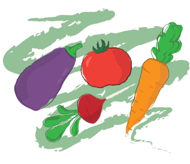
you'll have all the tools and techniques and inspiration that you need to finish your project, which is to take these simple
vector vegetable drawings, and turn them into
something special. Now, you don't have to be a
seasoned Illustrator user in order to take this class, but you will get more
out of it if you know at least a little
bit of Illustrator. I always strive to
make things as simple, and easy as possible and I'll explain everything
very clearly. It's more important
that you bring to this class a mindset
of wanting to play, wanting to loosen up, and wanting to have fun with
your Illustrator drawings. It's going to be fun.
Let's go get started.
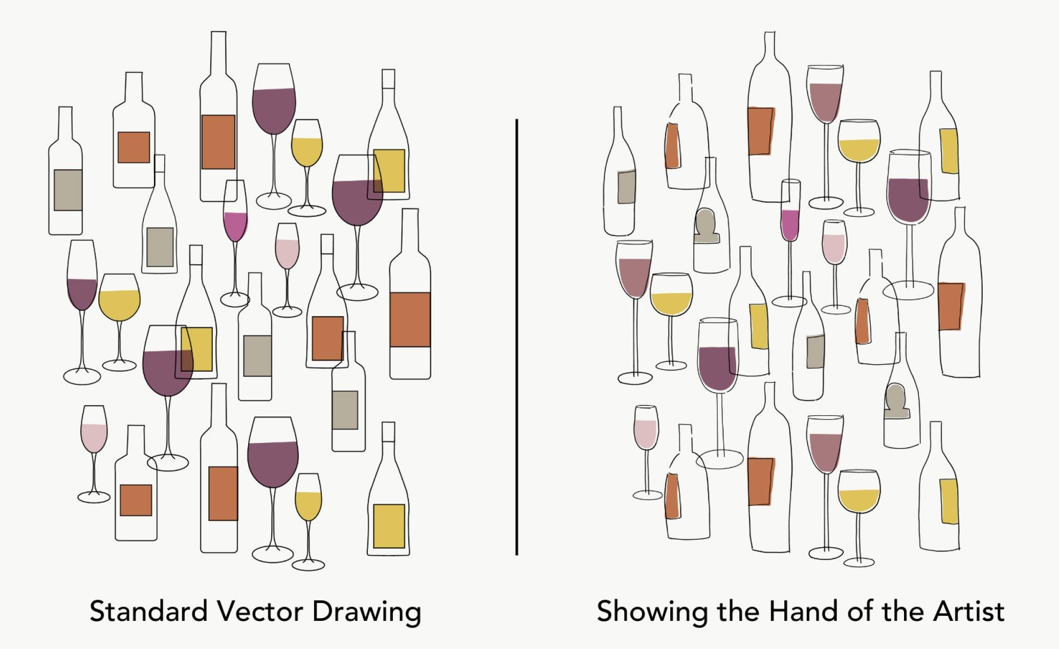
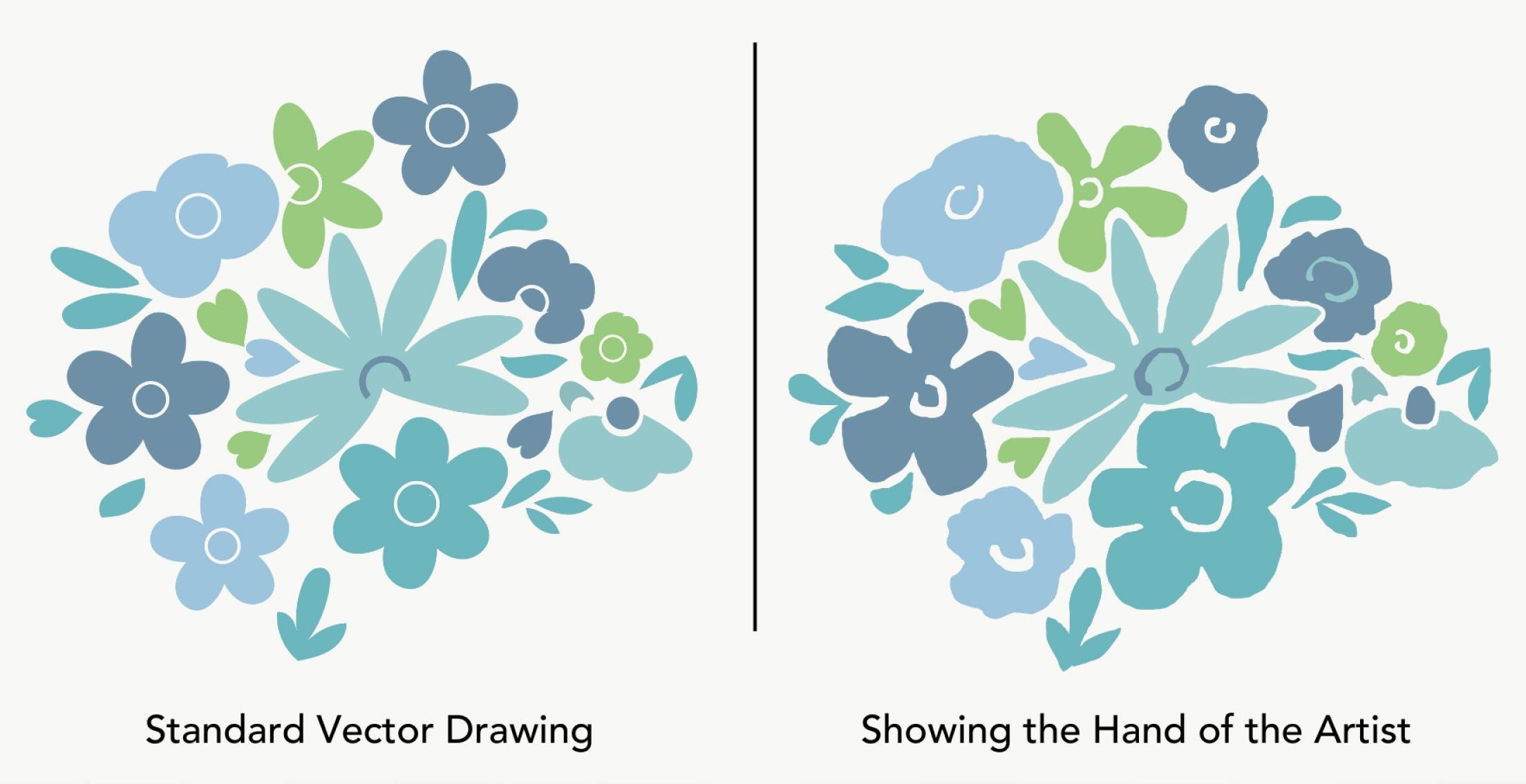
2. What Makes Art Look Digital: You can almost always tell if a drawing has been
made digitally. But what exactly makes
art look digital? Well, there's a couple
of telltale signs. They often are drawn with
a uniform black outline. Sometimes a thick one like this or a thinner
one like this one. The drawings are often made up with smooth lines
and simple shapes. Flat color is another
common characteristic. The color usually fills the
outlines perfectly often. There's not a lot of detail in vector drawings or the details are just
really simplified. And you'll see a lot of
perfect geometric shapes and symmetry because it's so easy to do those
things in illustrator. Now, this graphic vector style can look really appealing
if it's done right. But a lot of times, especially with beginning digital artists, the drawing can look pretty
stiff and impersonal. That's what we're
trying to avoid as we go through the lessons. Keep these characteristics
of digital art in mind. I'll show you ways to draw
looser and less perfect. You can retain
your artist's hand even in your digital drawings.
3. Adobe Illustrator's Drawing Tools: Let's just do a brief review of illustrators
main drawing tools. They are the pen tool,
the pencil tool, the brush tool, and the blob brush. Let's
start with the pen. And that's up here as
you probably know. The way you use it is
you just click a point. Then as you pull away from it, you get a little
leash that's going to preview where where the
line is going to be. You click and you
just keep clicking around to make your shape. Then to make closed shape, you go back to the beginning
and your cursor gets this little on it
and close the shape. If you want to make curves, you click rather than just
going to the next point. You click and hold, and you'll get these little
bezier handles that come out. Then you go to another spot, and again you get
that little leash, but this time it's
curved, it's going to preview where your
curve is going to be. You click and you can
start making more curves. In that way you can move
around your shape again, when you get to the beginning, the cursor gets a little on it and you can
close the shape. Now it doesn't have
to be a closed shape, but pen tool isn't usually
used for just an open stroke. But you can still
make one like this. If you want to go from curves
back to straight lines, all you got to do is click
back on the last point. And now you can do
straight lines again. Click and hold, and
you go back to curves, click, and then
just keep clicking and you get back
to straight lines. If you want it to be an
open shape like this, then you can just
click on a tool in the tool bar and it
will end that stroke. Let's move on to the pencil
tool that is over here. Probably under the shape tool, it's a little bit more
intuitive than the pen. You basically just click and
hold and draw your shape. And the same with the curves, just an open outline
you can make as well. For the brush that is over here, it works basically the
same way as the pencil. You just click and hold
and make your shape. You can make lovely curved
shapes as well, or a big line. Now the blob brush is right underneath the
paint brush right here. It works the same way
you draw your shape. You can make a curved
shape or a big line. Let's now talk about some of the details with these
different tools. If you want to change a shape that you've made
with the pen tool, you can use your
direct selection tool and you can click on
a point and move it. If you want to get
rid of a point, you could click your delete key, but that will give
you an open shape if that's not what you want. Instead you can click on the
point you want to change. Then use the minus
key on your keyboard. That will put a minus sign on your cursor and just click on the point to get rid of
it. The opposite is true. If you want to add
a point, click on the plus sign and click
where you want the points. Then you can click A
or go back up here. Now you can change those points. On curved lines, you have
a couple of options. You can move the points
just like we did before. You can also move these
little handles back and forth to change the
shape of the curve. You can also click between the points and change
the curves that way. On the pencil tool, you
can do the same thing. You select your object, move points and curves the
same way we did before. Now, there's one
other option with the pencil tool that
is you can click on your object and then make sure you have the
pencil tool chosen. You can click on that
line and just redraw it. Now that is change
that part of the path. You have to make sure to line
up with your line again. If you don't, then
it'll make a new line. I click, I hold it
and I hook back up to the previous line. The
same works with this. You can change part of
the line like that. The brush works the same way. You have points that you
can move, curve handles, you can change, you can
redraw sections if you want. Now, for the blob brush, it works a little
bit differently. If I click on my
object and try to redraw, why did that happen? Well, if you look carefully and I'm going to go
into preview mode, which is command Y, you'll see that over here we ended
up with a single line. But over here the blob brush actually makes a vector shape. There isn't a single line. If I click on one of those, you can see I'm pulling just
one side of that shape. Look at the other thing
that happens when you use the blob brush here. I drew this line and I drew this shape when I did that over here and select my
item, there it is. Here is my other line. Now over here, when I use
the blob brush tool by select my shape, it
takes everything. If I go into preview mode, you can see that that
line that I made on top actually joined
into the other shape. I can no longer
separate those items. Those are the four
main drawing tools. How do you know
which one to use? Well, let's simplify
things a little bit. When you use the pen tool, you tend to get very smooth or geometric shapes
For this class, that's not the look that
we're trying to make. We want to make something this
a little bit more unique. We're not going to
use the pen tool now. I never use the blob brush either for those reasons
that I talked about here. We are going to take
away the blob brush. Now we're down to
the pencil tool and the brush tool in this class. In general, we'll use
the pencil tool to make shapes and the brush
tool to make lines. In the next lesson, I'll show you how to change
the settings of these tools that'll
make them more responsive and
also less perfect.
4. Resetting Drawing Tools: Smooth, perfect lines are built into the DNA
of Illustrator. But we want lines that look more like they
were made by hand. We can make some changes to the tool settings that
will help make that look. Let's start with the brush tool. If we go over to the icon, we can double click on it and we can find this
set of tool options. The top one is the
most important. It gives us a scale of making our lines very accurate
versus very smooth. The default is right
in the middle. Let me show you the
differences here. We'll put it on smooth. And then I'm going to draw a circle and see how it
changed as I let go. What if I draw a
really jittery circle? It ends up looking almost
as smooth as the first one. How about a raggedy line? You can see how much
it alters it there. If we go in and do it on the middle one.
Let's compare that. I draw a circle, didn't
quite change it as much. How about a jittery circle? A jittery line. It still
smooths that pretty much. Now, if we go in
and have it all the way to the left on accurate,
we'll do the same thing. Draw a circle, and draw jittery circle and
a jittery line. There's still a subtle
amount of smoothing there, but you can see how
much more accurate, hence the name it is. When we move that smoothing
all the way to the left, that's the biggest change we're going to make to our tools. I recommend that you always
use it over here on accurate. There's one other change I
suggest and that's under view. Make sure that any of
the snaps check those because those can tend to move our lines in ways that
we don't want as well. If they're off, then we have
more control of our lines. Now we'll do the same
thing for our pencil tool. The keyboard
shortcut for that is N. I remember that by pencil. Which is silly, but
it works for me. If I click on N, I get the pencil and I can go
up here and double click. And we've got those
same controls here. They basically work the
same way, very smooth, it changes quite a bit in the middle and all
the way to the left. Now there are some other changes we can make in the pencil tool, and we'll talk about those
in an upcoming lesson.
5. Practice Drawing with New Settings: Are you ready to put
pencil to paper, at least in the digital sense? Well, here is a
brush practice sheet that you will find in
the class resources. I want you to download
it and give it a try. See how different it is
using the brush tool. With the accuracy setting
all the way to the left. Make sure you've
got your brush tool and double click so that it's all the way
to the left click. Okay, just give
yourself a black line. Then make sure your
layers palette is open. If it's not, you can go
under a window layers. I want you to make a new
layer by clicking down here. And then we're just going
to lock the other layer so that we'll draw on this other layer and not
affect the layer below. Now just start drawing. See what it feels
like to draw on these lines when you don't
have any smoothing going now. It's going to look
different, of course, but that's okay.
That's what we want. How did you do, how did you like that? It's
different, isn't it? Let's turn off the eyeball on the lower layer and
see what we've got. Obviously, this looks
very different from what you're used to when you've
got a lot of smoothing on. But it definitely looks more
like it was made by hand. Which part was the
hardest for me, It's always doing
the vertical lines. You can see how terrible
my vertical lines are. I can hear what you're saying through the computer screen. You're like, no,
this looks terrible. I don't want to do it this way. Well, in the next I'm going
to show you some ways that we can manipulate and do a little bannial smoothing
on these things. And make some
changes to make them look hand drawn but
still professional.
6. Smooth and Refine your Drawings: Now let's go over some tools
that you have available to revise and refine
your drawings. Let's start over here with
this grouping of tools. Usually what I do
is just click right here and that tears off
that group of tools. That you can put them
right where you want so that they're really
easy to access. The first one I want to
talk about is this one, and that is the smooth tool. Now if you double click on it, you'll see that it
has the same settings as on our other tools. So you can lightly smooth your artwork or you can
make it very smooth. Usually, I leave
it in this range. Let me show you how it works. You just click on a path, then you can just go over the parts that
you want to refine. Let me turn off the lines and you can see a
little bit better. You can see the parts
that I go over. Every time I go over them, they get a little bit smoother. Obviously, if you have
it on very smooth, it gets very smooth. But I usually use
it in small doses, just in the areas that I think are a little
bit too rough. Another thing that you
have available here is the path eraser tool. I tend to make these little
hooks when I'm drawing. This is a good way
to get rid of those. Like down here, I'm clicking on each line and
then getting rid of that end. Now there's actually two
different kinds of erasers, I just showed you this
one the path eraser tool. If I click on something and move across an area that will
take out that area. There's another eraser
tool and that's over here. It's similar, but
let's say we have this shape and we
fill it with black. If we select it and use this
tool and erase an area, we've now created an
open shape like that. Instead we could use this tool, select your item, and
then do the same thing. And it just re draws that we
maintain our closed shape. If you have a filled shape, this is definitely the
better tool to use. Another tool you have available
is this one in the end. And that's the join
tool. To be honest. I don't use it very often
because it's not very reliable. For example, I can click on this and just go back
and forth on that, and that will join
that, this one. On the other hand, the
points aren't close enough together for it
to join this one. Let's see if that works.
It works on that one. It's a little bit finicky or fickle which
lines it works on. For example, if I go over
here like these to reconnect, if I use the join tool,
it doesn't work there. A better way to do this thing is going back to just
the pencil tool. Click on your line and
just draw across it. Of course, you can just redraw
areas if you want as well. Okay, that gives
you some tools that you can work with now to revise your drawings
a little bit. Now, use them as needed,
but don't overdo it because you want to retain
that hand drawn look.
7. Create Pressure-Sensitive Brushes: Let's make some pressure
sensitive brushes. Now, if you haven't
worked with them before, get ready for a
light bulb moment, because it is the best way to retain the artist's
hand in your work. To use them, you'll need
a digital drawing tablet, but you don't need an
expensive one or a large one, and you can buy
them for under $100 or you can even buy them used. I get a lot of my
technology that way. If you have a newer ipad, you can also use it
as a drawing tablet. If you use the software
like Sidecar or Astropad, you can turn it into a
digital tablet as well. Let's go make some brushes. You'll need to have your
brushes panel open, which is under Window Brushes. And make sure you've got your
paint brush tool selected. Then over here, click on
the three little lines. Click New Brush. It's the
caligraphic brush we want. There's some choices in here. Let me start with the middle
one, which is roundness. If you look up here, you can see how we're
changing the brush. We can make it less round. If we change the
angle now we can make a brush that's really similar
to a caligraphic brush. Let's make it a
little bit bigger so you can see it better. And click Okay, now
we'll just go try that. That's a 20 point brush
with fixed pressure, meaning there isn't any
pressure sensitivity to it yet. Let's go back in and
create another one. We'll use the same settings, but this time instead of fixed, we're going to make it
pressure sensitive. We also need to define how much variation there
is in the brush stroke. If we look up here right now, this is a preview of
a 20 point brush. The light pressure
will also be 20 and the heaviest pressure
will also be 20. If we change that here, and we can go as
high as whatever this number is
here, make that 20. Now I look over here
at the preview, and here's our 20 point brush. 20 plus 20 equals 40. If I press on it
as hard as I can, it's going to be a
40 inch brush and it goes all the way
to zero in this case, if I make it ten here, now you can see it goes
from 20 point plus ten is 30 and minus
ten would be ten. Our brush width would vary
from ten point to 30 point. But let's go back and
I want to show you at 20 Now I can make a line that's very
small, medium pressure. And the heaviest pressure, of course, I can
vary that as I go. That is the 20 point
brush with pressure. And a 20 point variation, here it is, with only
a ten point variation. Here is the lightest
I can do and medium pressure and
heaviest pressure. You can see it doesn't have as much variation as we
had in the previous one. Let's go make one more same
thing there, this time. Let me make it round so we're going to keep
the roundness here. We're going to make it pressure and let's make it really big. So we're going to
make a 60 point brush with a 60 variation. Again, you can see the preview
here, we'll click Okay. I can still make a tiny line, it's a little harder to control. I can make a medium one, a little heavier and
really heavy in one line. I can go from very
small to very fat. When you get this
much variation, it is a little bit hard to
control, but it is cool. Some of the shapes
you can make that is the 60 point brush with pressure and a
60 point variation. Now one thing that's really
cool about brushes and illustrator is if I want to go back now and use this brush, I don't have to go
find it over here. I can just select a line now it automatically loads that
brush into my tool. Or if I want to go
back to this one now, that's really handy. I wish that, like
procreate had that so that you didn't
have to constantly remember which brush you had. Now there's one other
option I want to show you. If we go back in, click
New brush calligraphic. One thing that's fun to
do is choose random. Now the widths will change. Let's make this a little
bit bigger so we can see it better. Click Okay. Now just using my mouse, I can make a small line. I really don't know what the
next line is going to be. It gets bigger then it can
get really smaller again. Now, it doesn't
have a lot of uses, except sometimes I use it when I want dots
in the background. If I just click, I get
different size dots. That's the 30 point brush
with a random setting and 30 point variation that gives you some ideas how
these different brushes work. There isn't any good
ones or bad ones, it's just all what you
like to work with. Experiment with the
different ones, and figure out which one
suits your hand the best.
8. Get Inspired!: All right, this lesson is
all about inspiration. But first, let's step back and remember the problem
we're trying to solve. We want to move away from
drawing with smooth lines and shapes that give off a generic vibe that's so common when people
draw an illustrator. These dogs are a great
example of that. The good news is, it isn't hard to make drawings
more personal, and there's so many ways
that you can accomplish it. For example, just look
at these animals. They look a lot like the ones on the left with some
subtle differences. They have a variation
of line quality. Sometimes they're thick,
sometimes they're thin. And the lines don't
go all the way around all the shapes perfectly. We get some breaks in the lines and also the colors are
applied differently. On the left, it's like
draw within the lines, right, the color is
applied a lot looser. The overall effect
is more energy, more spontaneity, and
more personality. These drawings even take those
concepts a step further. These are even less perfect. There's even more contrast
of thick and thin lines. There's more breaks,
there's more imperfection. You don't have to be perfect. Isn't that great when you don't have to be perfect and it's a good thing you can just see how much
personality these cats have. It starts to blur
the line between. Were these drawn on the computer or were they drawn on paper? Which is one of the results of showing your artist's
hand in your work. Then when we change gears and go back to a typical
illustrator drawing, you can see the
difference compare the one on the left
with this one. You can definitely see the
artist's hand in this one. It's almost like
they wanted to draw a really expressive line and it just happened to be in
the shape of a flower. They don't make any attempt
to show us all the details or to be perfect in their
linework. Same story. Here we've got a very
expressive line. We can see the hand
of the artist. The color is applied
imperfectly. We retain the sketchy
feel of the drawings. Now that sketchy, haphazard look is not the only way
to get an expressive line. Look how graceful and
elegant these drawings look. They also have thicks and thins, but notice the outlines
don't go around everything. The artist has given us just enough information to
help us understand what the gesture or the
pose of the model is and then leaves it to
us to fill in the blanks. This one has a similar
technique where we just have enough lines to show the gesture, the
pose of these bears. But notice what a
different feeling it has. That one was very
graceful and elegant. This one is much more playful. And that's because of the really exaggerated chunky lines. Gives us a playful, more childlike look in this one, some of the items don't
have outlines at all. Instead, shapes are used to define the parts
of the drawing. And then the lines are
just used to fill in some details that's
employed here too. Here the chickens don't
have any outlines. The lines are just
used to add in little details of the feathers
and the feet and the eyes. Just those little
tiny things that it helps to fill in the blanks. This one, there's no outlines
on the flowers at all, they're just pops of color. And we get just the
briefest lines here and there to give the
idea of the stems. The result is they have a
lot more energy than you can get from the typical
illustrator drawing. Now this one does have some
outlines here and there, and they're pretty chunky, but that fits in
with the playful, childlike quality of this. For the most part, shapes are used to outline
the animals with lines to indicate
just little details and textures on the animals. Some places are a little bit more smooth like around here, but others you can
definitely see the hand of the artist in these
lines in this mushroom. Now I wanted to point out
that all three of these use the idea of lines just
to define details, but you can use that technique in many
different ways and you can see what a different feel these different drawings have. So far, just about
everything I've shown you has been very organic, like florals and animals. Is it possible to capture
the artist's hands in something more three
D with very hard edges? Well, of course, let's
look at a couple examples. Here's some drawings
of appliances in a typical illustrator
vector style. Here something
completely different. What a difference it makes
when you use illustrators pressure sensitive brushes
and turn off the smoothing, It made it possible to turn these little appliances into
whimsical little drawings, almost like whimsical
little characters. Or here's a whole city full of geometric shapes and
three dimensionality. But this artist resisted the temptation to
use illustrators rectangle tools or make really
smooth geometric lines, and the result is a really
warm and inviting image. Here's a different
take on architecture. Now this one breaks
some of the rules. It has outlines
around everything, and it's using a uniform
line all the way through it, but the artist's hand comes through in how these are drawn. Again, there's no
geometric shapes. Everything is hand drawn. There's lots of curves
and like slopes in the roof and no attempt to
make straight lines straight. How about these fun examples? Remember those really, really
crooked lines that you did in the exercise a
couple of lessons ago? Well, look at how
fun they look here. That's what I'm
trying to get across, is to let go of the smooth, perfect things and just have
fun with your drawings. Now here's a much
simpler version of some three D objects. Again, it breaks the
rules with lots of outlines and a
single uniform line, but the artist's hand comes through in the way
these are drawn. In most cases, the line
work is very fine. There's no perfect geometry, and things like the
picture in the front have a nice perspective to them. On the other hand, here's
some organic things that are drawn in a more
almost geometric style. The lines here are
quite a bit smoother, but there is some subtle
thick and thin going on, But it's really
got its own style. You can tell that this is like the artist's
signature style where tomatoes are almost geometric. And there's an egg plant
in there that also has quite geometric lines.
It really draws you in. It has great interest.
Now this one has a more architectural, buttoned up look to it. Still, it has no
perfect lines in it. But I wanted to show you
that you don't have to have that whimsy that so many of
these drawings have had. Here's another style that
you can use to bring in the artist's hand for something that's more three dimensional. This looks like
somebody is sketching an actual sandwich
that's in front of them. But notice how personal
all of those strokes feel. You really get the idea
that you're looking at a real sketch from
somebody's sketchbook. And similar here, but again
a very different style. This one is much fatter lines, almost as if it was drawn in a sketchbook using
a Sharpie marker. But again, I want to
show you that you don't have to have the
whimsical style. These are more serious drawings, just like a regular
artist would do. There's one more style
that I want to touch on, and that's this one. What we have here is a very delicate botanical
style drawing. The artist's hand
isn't shown with expressive lines or
lack of outlines. Instead it comes through in the craftsmanship
of the drawing. If we look at the
close up on the right, notice how each bud and leaf is individual and the artist
renders it in great detail, that detail and that
craftsmanship is what elevates this drawing way above a standard vector drawing. The same is true for this one. This is another example as well. I hope you now have
some more ideas of what you can do with
illustrators drawing tools. I've tried to show you a huge range of styles because I don't want to suggest that one way of drawing is better
than another. With one exception, I hope that now you're able to see
that these are really just bland vector drawings
that now you'll be inspired to do something else to explore and find your
own unique style.
9. Start a Digital Sketchbook: Now it's your turn.
You've learned how to use the tools and
seen the possibilities, Now you have a blank page. How do you begin?
What should you draw? Think about giving a crayon and a piece of paper to a child. They rarely stop to
consider what to draw. I want you to bring
that into this lesson. Don't think about the result
or focus on what will sell, or what's trending,
or mood boards or color palettes
or anything else. At the beginning of this
class, I told you that black lines were one of the
giveaways to digital art. Ironically, now I'm
going to suggest that's where you start,
but in a different way. No more generic lines. Create much more
interesting lines. Just explore them.
Use your imagination and let the process
itself inspire you. Look at the lines
you're creating, and start to see things
appear in your lines. Let scribbled lines
become shaggy dogs. Or if a drawing turns into
a robot, draw more robots. Make really bad art. Lots of it. Try lots of
different styles and techniques. Feel which ones
resonate with you. At first, it's all
going to feel hard, but that's true of any new medium or techniques you learn. Push past that frustration because there's good
stuff on the other side, I believe in the process
and I believe in you. What you've been looking
at are pages from the beginnings of my own
personal digital sketchbook. I encourage you to develop
a digital sketchbook too. Just label a folder
on your computer as sketchbook and then when
you fill up a page, don't throw it out,
just save it as sketchbook and
then add the date. Doing that's not only going to create a record of your growth, but also gives you a
valuable resource. Next time when you're
faced with a blank page, you don't have to start
with a blank page. You can go back through your digital
sketchbook and pluck little pieces out that you
want to develop further. Because sometimes we don't see the merit of something
we've drawn until later. That happens to me
all the time here. I'll go back through my
sketchbook and go, hey, I remember that little
flower that I do, I want to develop that, or I like the way this line looks. I'm going to see what
I can do with that. Let me show you some examples from my own personal experience. This was really just a warm up, but I like this part of it and I wondered what it
would look like if I made the loops going
the other way on the inside. I liked that better. I had this light bulb
moment thinking, hey, this would make a fun sheep, and I didn't sit
down to make sheep. The inspiration came from the process of
making those marks, actually ended up licensing
it for quilting fabric. Then when I needed some
ideas for holiday art, which is not my
favorite thing to do, I turned it into this. Now a betting company
saw it and liked it, but their policy is
always they can't license something that's
been licensed before. I offered to make
them a variation of it that they ended
up using on betting. That's a really good example
of what can come from those simple spontaneous
digital sketchbook drawings. Here's another example,
just simple scribbles. And I was thinking they
looked a little bit like writing and turned them into this repeat pattern that then got used on swim trunks
and quilting fabric. This was an interesting example. I, I don't know, drawing lines and some of them started to
look like animals. And then I was doing
other animals and I don't know this
scary cat creature, but I really liked
this little bear. This drawing literally sat in my digital sketchbook for years and I always
came back to the, I'm like, I wonder if what
I could do with that. And then another time that I needed some ideas for holiday, I thought maybe I could turn
them into a polar bear. And I took the idea
of the sheep and added mittens and hats and
scarves and stuff to them. Here's another example
of a sketchbook page. You could almost see my
feelings about this. Oh, I really don't want
to do Christmas art, What can I do? But when I made these
little rainy deer, I thought, oh, maybe
there's something to that. Then I drew a whole bunch
of variations of them and they end up being used on
table linens and ceramics. I hope that gives you some
ideas about how you can capitalize on the drawings
in your digital sketchbook. Now, obviously,
not every page in your sketchbook is going to
end up licensed on a product. And of course,
your sketchbook is going to look completely
different from mine. I tend to use very
organic shapes. If you draw with straight
shapes, that's great too. The point of this lesson is
to loosen up and let go of the idea that everything
you do in your sketchbook needs to be sellable or
needs to be polished. Any of that stuff, just
let go of that and just draw because people
can see your joy. If you're enjoying the process, that will show through and
that is your best asset. That is your secret sauce.
10. More Pencil Settings: All right, now we're
going to switch gears back to the pencil tool. Remember I told you there was some other settings that
we wanted to look at. Well, let's go
through those now. The pencil tool is
N on your keyboard, and then we'll go double click over here to get
to the settings. We've already talked
about this and I recommend keeping
it on accurate. But let's go through a
couple of these here. The first one is the
most important for me. When you use your pencil tool, you make a shape and you
end up with a black line. Now, what if I put
a green fill on it? Now you would expect that you make that shape and it
would fill with green. But it's not. It took me forever to figure
out why that is. Well, it's this silly
setting in here. Why default isn't to
have that filled? I have no idea, But I always make sure that that
one is checked. When I draw a new shape, it will automatically be
filled with that green. I rarely use stroke
on the pencil tool. Let me turn that off now. If I wanted to make some leaves, I could just very quickly make them and they're
automatically filled. That's a huge timesaver. If we go back in here, this is an important
one too, right now. By default it says keep
selected. What does that mean? That means when I make a
shape stays highlighted. Every time I make a shape
that one stays highlighted. Now that's good
because I can just automatically refine
it or change it. And I don't have to go
back and reselect it. I can keep changing that line. Now, let's say I want
to make a branch with a bunch of leaves on it. I go like that, that now I want to move just
this one leaf, but I can't. I've got a whole
pile of them right there to avoid your shapes being hooked together like that. I always keep this unchecked. Every time I make a leaf
not highlighted anymore, I could make another
one right next to it. I could make another
one right here. And then when I go back, these are all still separate units. Then one other
option is this one, whether or not you
want your paths to close when you get
near the end of them, you can see this
better if I go into preview mode, which
is command Y. Now when I draw a
line right now, the cursor has that star on it. When I get it close to the end, it changes into an O. That means it's going
to automatically close that shape. Let
me do that again. You watch for the O and
it's going to close it. Now, if it's too far
away, it won't close it. I actually prefer them
not to close because sometimes it feels
like it's doing something that I might not want. I usually unclick that
they do not close. No matter how close I
get down to the bottom, see that's still an open path. There's definitely pros
and cons to that one. You can try them both and see which one you
like to work with. Those are the main
points with pencil tool. Now obviously you can use all
of these tools over here. Remember when we tore that
off and brought it over here? If I want to smooth this line, I can click on the smooth tool. First, check how smooth
it's going to be. I can go in and clean up
little parts of that drawing. Now, one other thing
I want to mention. That line had a lot of points. Let me draw another one. If I make a jittery line, look how many points this has, sometimes that's
okay, because it gives you that handmade look. But if your drawing is starting to get way
too many points, one thing you can do is to
go to object path simplify. If we click on these little
three lines over here, we'll get some more
options in here. If we make this
all the way here, it'll be how we started out, the way we drew it ahead, 57 points and now it's already
dropped a couple points. But you can see as
we move this one, that changes a lot and how
many lines are on our stroke. It also makes it smoother,
just be aware of that. We can click on this
and it'll show us the original lines so we can see how much differences
going to be. This one, you can
experiment with two where the points between them are smoother or have
sharper corners. That's good to know about two. I've mentioned a couple times
that I don't generally use the pencil tool for
strokes or for outlines, but that doesn't mean you can't. Let's go over a
couple of things if you want to use your pencil. Four strokes, obviously it works just like the brush tool. The default in general
is a one point stroke, which you can see down here. That's why you see
this just small line showing up in a
lot of vector art. Obviously, we can change that. If I select my line, we can make it a
much wider line, it gets a little
bit more graphic. If we do something with lots of very sharp
angles like this, you can see that it can get a little crazy when you have
a thick line like that. You do have some control
over your strokes. Right down here, the big
one is, this corner here. I've got my shape selected. I'm going to hide
the lines over here. I can click on Round Join. Now those lines are rounded. We can also use this one, which gets a little
cut off lines, but that works a lot of
times better than this one. You can also change
the ends of the line. If I choose this one, go over here, that's the caps, right now it's on this one,
we can make a round end, and that makes these ends rounded or they can
be squared off. Let's say we draw a shape. In this case, I want this
to be a closed shape, so I'm going to just
draw over that edge. The blue is the line
that I drew right now. This stroke, I've got a
nine point stroke on here. It's equally on that side of the line and this
side of the line. And we can actually change that. Down here is where it
says a line stroke. Right now it's a line
stroke to the center. But let me make a copy of it. We'll change this one to align
the stroke to the inside. Now all of the stroke is on
the inside of that line. We can also align it all
the way on the outside. It's not something that
I use all that often, but sometimes it comes
in really handy. I wanted to make sure
you knew about that too. Let's look at a couple
other features. I've got two circles here. One is drawn with
the pencil tool and one with the brush tool. I'm going to select them
both and hide the guides command H. Let's go look
at some fun features. If we go under effect,
distort and transform. There's a couple of
fun options in here. There's pucker and bloat. If we move towards pucker, parts of the drawing
starts to be pulled in. Then if I go the other way, Bloat starts to push out
parts of the drawing. It almost starts to
look like a flower. That's a fun thing
to know about. Then there's also roughen which can give you an
interesting line here. It looks a little bit
like pucker and bloat, but if we make
this really small, like 1% and smooth, the line down here now
starts to be interesting. Then if we make this
really big, you can, it gets to be an
interesting line, especially over here
in the thicker areas, it gives it a nice texture. We also have this option and it has a little
bit different effect. This lesson got a little bit
longer than I anticipated. Let's just do a
really quick review. We talked about in the settings, checking the box that says
fill new pencil strokes. Whenever we draw a shape, it'll be automatically filled,
unchecking, keep selected. That way we're sure
that each shape that we draw will be a separate
individual unit. We talked about
the pros and cons of clicking on close paths. Then I reminded you about
tearing off this set of tools so that you can use them to smooth and
refine your paths. We talked about using
simplify in case you have way too many points in
your path for strokes. We talked about using
corners down here to change the way angles
look on your strokes. Then we looked at pucker and
bloat for some fun effects. And also the rough and
filter and that can give you a nice textured
look to your lines. In the next lesson, we'll put it all together and actually
do some drawing.
11. Putting It All Together: So we've gone through
a huge amount of information in this class
about drawing tools, how to reset them, about
drawing with lines and shapes. And how to hopefully become more comfortable with the imperfection
of the artist's hand. This listen is going to
be a real world demo of how to put it all together. How to combine the brush and
pencil tools and smoothing editing and working it all together to get to
a finished product. I'm going to start with drawing with just the pencil tool. We're going to draw
with just shapes because that's a
fun way to work. I'll just start,
I'm going to just draw a little stem with a little leaf on the end and then just draw
some other leaves. Not worry about all the
details at this point. Just get in the general layout. Then let's maybe add
some little berries. I'll go get a red. Just
draw some simple circles. Now let's add some
different colors. I'm going to go pick a different green for some of the leaves. Then once I've decided on one, I can use my Eyedropper tool that's just on your keyboard. And then I just click
it on the color. I want it to be on
to the new color. Then let's make a
second little stem in the same way, right away. I know I want that to
be the darker green. Then I'll go back to my pencil
tool and draw more leaves. As I'm working here, I keep
my left hand on the keyboard. Hart cuts so that my
right hand can just focus on drawing and make
it all go very smoothly. We'll add some berries again. This time I'm for speed, I'm just making them in green. And then I'll go back later. Select both of them and use my eye dropper
to make them red. Same way with the leaves. I'll pick a couple of them
by using Shift Click. Click on the color
I want them to be. Now let's say I'm not
really happy with that green and I want to
change all of them at once. I can click on one
of them and go up to select same fill color. That chooses everything that
has that same fill color. Then I can just change
them all universally. Now there's another
way to do that. I can go up and use
the magic wand tool, then I just click on the
one I want and see all of them that had that same
color will get filled. I'm going to turn off the
guides so I can see it a little better and
choose a different green. I want something a
little bit darker now. It's a matter of just looking at things and cleaning
them up a little bit. The nice thing about working this way is everything
is separate. I can just adjust
things very easily. If I want to rotate one
of them, I click on it. Again, my hands are
on the keyboard. I just click R for
rotate on the keyboard. And then click this little
point and rotate it because it'll pivot around that spot and I want it to rotate
around the stem. Then this one I want to
make a little smaller. I can click and redraw
on something if I want. And I'll just go in
and start cleaning things up with these berries. I'm just going to redraw
that open edge here. I don't like the end
of this. I'll click on it and redraw
that little bit. I want this to line up
a little bit better. We'll just go through and
make those little edits. Now when I'm ready
to do my smoothing, I'll go back over
here and click on this and tear off
that set of tools. What I usually do
is on my keyboard, I have my fingers on command A, which is select all. I hit command A and then choose the little spot that
I want to smooth. Then I click on command A again and go find another place
that needs some smoothing. In that way, it
works very quickly. And you'll notice when I
start smoothing one object, the rest of them are unselected. And that's why each time
I go back to select a and I know that when
I start smoothing, it's only going to smooth on that particular object that
I started smoothing on. So I'm just going to go through and do a little
bit of smoothing. And sometimes if there's
something more I want to change, I can go back and
use my minus key on the keyboard and click on a point or two
that I don't want. And then I can go back to smoothing and just
proceed in that way. So once your hands get the idea of the
keyboard shortcuts, you can really work
pretty quickly. There you go. I think
that's my final product. Now let's look at a workflow where we start with a pencil, but then add some
brush strokes in there to help add
details to our drawing. We're going to make
a dog this time. I'm going to speed
things up here so you can just see how it goes. As I mentioned before,
I really like using the pencil tool and just starting with shapes
instead of outlines. It just feels like
it's easier to revise the shapes so that you can get exactly the
shape that you want. Then let's give him a little
black nose and an eye, then let's give him a mouth. No, I don't like that one.
Let's get rid of that. Let's use the brush tool now. Okay, that brush I think
is a little bit too fat. Let's go and make a new brush. Let's make it a small brush, five point with a
five point variation, and then try that. All right? I like
that a lot better. Then let's add some other
little details like we saw in some of the line quality examples a couple
of lessons ago. And we'll give him
a little collar, sometimes it takes a couple
tries to get what you want. We'll give him some
little spikes on his collar and a little tag. Let's make a little
water bowl for him, then let's add a
little bit more color. I'm going to go back to my
pencil tool and I'll just follow roughly along the collar
and also around the bowl, obviously we need those to go
in back of the black lines. I'm going to shift,
click and grab all of them and the dog's body. Then I'm going to right click
and click on send to back. Let's add a little
bit of water to his bowl then we'll want that
one line in front of it. We go again to arrange
bring to front. Then I'm just going to go in and clean up things a little bit. Redraw that line a little
bit and use the erase tool. Do some more little cleaning up. There's our little dog. Now let's do it the opposite. Let's start with the paint brush tool and we're just going to draw another sprig like
we did in the first example. I've got a pressure
sensitive brush here so I can get an
interesting line. Then we're going to open our layers palette and
add another layer. And put that layer
underneath our outlines. Now we'll draw on that
one so that it'll automatically be
underneath the lines. That's where we want it. I'll switch back
to my pencil tool and just make some green shapes. You can see how when the color doesn't perfectly
fit the shapes, it gives it a little
bit more energy and shows the artists hand. Then when I'm ready
to do some smoothing, I'll hit command A and just go around and
do some clean up with the smoothing tool here. I'm going to get rid of
that little end and re, draw a little bit and
go over the rest of it. Then I can add some
color like before. I'll shift click on some
of the different shapes, change it to a
different color green, and add some berries again. Now we're going to
want these berries on top of the black line. We can shift, click
on all of them, then go over to
the layers panel. And they're on layer
four right now. Take the little blue dot and
move it up to layer three, and now they will be
above the black lines. Then we'll just clean
those up a little bit too. Then one last thing,
This black outline seems a little bit too strong. Then go back over
to the magic wand tool and click on one of the outlines so
that you highlight everything that has
that same stroke color. Let's go pick a different
color, like a dark green. It goes with the artwork better. That's our
final drawing. It's very loose and
none of these are meant to be great works of art. But I just wanted to show you those different
ways that you can work between the paintbrush
tool and the pencil.
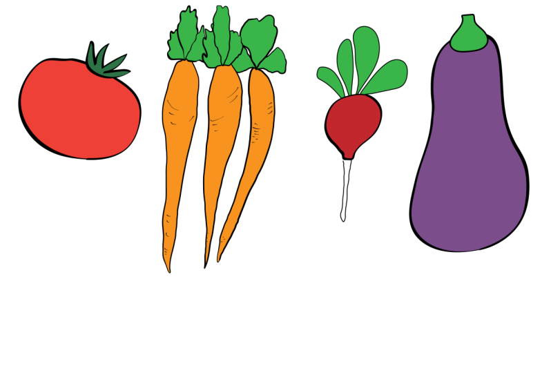
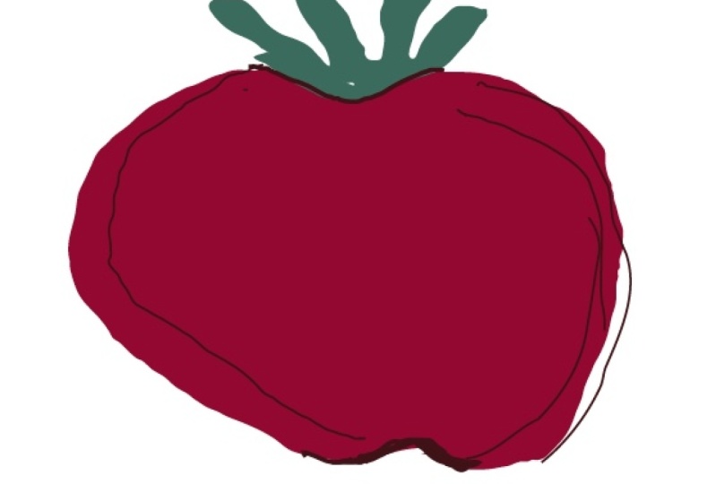
12. Bonus Exercise and Project: Before we dive
into your project, here's a little
warm up exercise. I want you to look
through your portfolio and choose a drawing or motif that you think has that typical vector look
like this tomato, or you can use this tomato. I'll put it into the
class resources. Then think about all the
line quality examples that you've seen in this class. Then ask yourself, how can I make this drawing
more interesting? Then just try some things. Keep asking yourself, what
what if I made the lines thicker look already that looks more interesting and
has a much more graphic feel? What if I edit the lines so
that they're less perfect, they don't surround the
object all the way, they're a little bit broken up. And I could also add
some more leaves in the background to give it
a little bit more depth. What if I added more outlines and not all of them were black. I could add some red ones
and some green ones. Or what if I used a pressure
sensitive brush and gave it a much more expressive line and then added a stylized
shadow onto it? What about instead of outlines? I just did some sketchy
lines around it. What if I skip the
outlines altogether and give it more 3D quality to it? What if now I add some
outlines back in and give it a really like a
sketchbook feel. Or what if I think about
tomatoes in a more abstract way. Use the basic shapes and give
them some expressive lines. Now this exercise could
just go on and on. I'm sure you'll come
up with lots of other ideas for
your drawing too. I don't think all of these
drawings are successful. This isn't like an
evolution from bad to good, but each iteration gave me new ideas about how to approach the drawing
in a different way. If you do this often enough, you'll start to realize, hey, I really like working
in a graphic way or in a sketchbook way. You'll find how you
really like to work. That's really going to help you find your signature style. Once you finish the
warm up exercise, your project is to take one of these vegetables,
or all of them, If you feel really ambitious and turn them into
something special, like we did with the tomato, these drawings will be available in the resources of the class. You can try each of the
variations I showed you with the tomato or come up
with ideas of your own. Don't feel like you need to keep the same shape or colors
that are shown here. Just be creative and
really make it your own. I'd love if you'd post your finished veggies
on the class page. When you're done with them.
It would be so fun to create a whole gallery or garden
of unique veggie drawings. If you look at the
class description page, you'll see a link where you
can post your projects. I hope you've
enjoyed this class. I do have a favor to ask. I'd love it if you could write a review of the class
that helps me out a lot. Helps me to know what resonates with people and what things I can work on for future
classes to make better. If you'd like to do
that, you can just go to the class page and
click on Reviews. And then look for the blue
bar that says leave a review. If you'd like to know
about future classes, you can follow me
here on skill share, or even better, get
on my mailing list. When you do that,
I'll send you my list ten ways to draw an illustrator. It's great for inspiration and also reminders of what we
covered in this class. You'll find a link in
the class description or you can go to my website, KrisRuff.com In the meantime, I hope you have a lot of
fun drawing an illustrator.
13. One More Thing...: Hello. Hi again. I'm popping back in to
let you know that I'm now available for one on
one coaching sessions. So if you like this class and would like to work
with me individually, you can now do so by
booking a session right from my skill
share profile page. I offer two kinds of sessions. The first one is a 1
hour portfolio review where we'll look at
your surface designs. I'll let you know some strengths
and areas to focus on, and you'll get the opportunity
to ask any questions you'd like about art licensing or
the surface design industry. Now I know it can
feel intimidating to show your work to somebody, but it's so smart to get
professional feedback. All the artists that I've
worked with have felt energized and ready to move
forward after our sessions. I also offer a 30 minute Adobe Illustrator or Photoshop
instruction session. If you're struggling
with any aspect of the software, I can help. We can walk through tools, I can demonstrate techniques and workflows that are going
to help solve your issues. So whether you're looking
for a one time session or an ongoing opportunity
for feedback on your work, coaching is such a great
investment in your career, unlike some of the expensive online courses that
are available, coaching doesn't have
a fixed curriculum, so I can give you
exactly the information and guidance that you need
exactly when you need it. I hope you consider coaching. I would love to work with
you and I can't wait to meet you and support you and guide you on your creative journey. You can learn more about
my coaching sessions at chrisrug.com slash CoachE.
 Kris Ruff, Surface Pattern Designer & Coach