Transcripts
1. Trailer and What to Expect: In this Skillshare class, you will learn to
see and accurately draw the many different
shapes of beverages. Then use watercolor
to paint effects for a realistic and yet
painterly result. We discussed the
perspective of ellipses required to draw the angles
and shapes and all beverages. These are applicable to cylinders and other
subjects like vases. You will also see
how I layer and build up painted
effects in watercolor, we experiment with
using salt and discuss other materials that can be used to embellish the
final paintings. After this class, you
will feel more capable of drawing your day and the
many drinks that includes. You can follow along with the lesson to paint the
exact beverages I do. Or you can use what
you learn and paint the drinks that are sitting
right at your tape. I use my skills in drawing and painting drinks so
that I can enhance my travel sketchbook and
daily art journals as I sit with friends
or solo at cafes, breweries, and at my
own kitchen table. Here are some examples of how you can use the
skills you learn in this class to paint all sorts of different things in your
journals and sketchbooks. This class uses basic
materials like watercolor, paper, brushes, and any
set of watercolor you own. It suitable for beginner to
intermediate artists who have some ease with
observational drawing. Some experience
controlling watercolor since the subjects do
have detailed work. However, beginners will gain valuable drawing
tips and get to see every step of each
painting in real time. So I encourage beginners
to participate as well. I hope you will
join me as we learn still-life drawing and
watercolor techniques for your very own daily painting
and travel journaling. See you soon.
2. Introduction: Hi, and welcome to my class
on beautiful beverages. Today we will be drawing and painting many different shapes. There's a bottle, they're glass
and fancy shaped glass as well as margarita and wine. So today we're gonna
be painting a bunch of different shapes in watercolor. After we draw them. This is a drawing class
and a painting class. So you'll learn a
bit about watercolor and some techniques. But you'll also learn about
the just accomplishing, accomplishing these drawing
shapes on your own. So it doesn't have a template to go with this
class that you can print out. If that's something
you really desire, let me know and I
can make one up. But my intention with
this class is to teach you to draw those
shapes comfortably yourself. And this is because we gathered, humans, gather
everywhere together to be social and to
rest and to sit down. And that's my,
that's my leisure, leisure leisure leisure letter. So we gathered in coffee shops, we gather in breweries and
pubs and things like that. And these shapes you'll be able to apply to a whole
lot of other drawing. So if you learn elements of color and
reflection through glass, you can apply that to vases of flowers and all sorts
of things, buildings. And I think that
there's a lot to gain from this
class that you can apply to other drawing
and painting as you go. The other reason that I am teaching a class on
beverages is because man, I paint a lot of beverages. So here's some white
wine and kombucha. Right below happened
to be some tea cups. And let's take a look at what we have in this
little travel one. So it's a way to sit
down and document. This is me in San
Antonio sitting at Huff Bauhaus with my mom
and I painted the beer there. So what you're creating a memory right here, it's
even more detailed. This is like a little
art journal element. So you see I labeled each of the beers in the flight
that I was sampling. Separate book here. Look at those tabs. There's
an awful lot of hemorrhages. So just a glass of
water in a Denny's. Nice to look glass from
our local brewery. Some orange juice and a coffee cup while visiting
family for Thanksgiving. And someone had a
T, a bottle of t. Distorted but still very cool. Fancy wine glass for
a friend's birthday. And again another, this is a beer garden and
new bronchioles, Texas. And so again, more glasses, different perspectives
That's looking more down at the table. There's still more. You can just fast forward to materials if you don't
want to see all these. One of the drawings we're
doing today is a bottle shape. And while it's a corona bottle, the skill is still the same. So you would be able to
apply what you learned today to draw all sorts
of different types. This is a mini champagne. And that was to commemorate
are my engagement. So everyone has a
little meaning. And this is what I
mean about once you learn glassware and shapes, you can apply it to anything so you don't have to draw
alcoholic beverages. You can draw Ice, coffee's,
you can draw vases, you can draw mason jars and water bottles and
all sorts of stuff. You will never again
lack for subject matter because there are beverages and cylinders and these
shapes everywhere you go, you will always be
able to apply what you learned today into
your future drawings, sketch book,
journaling, etc, etc. Let's go find out what materials you're going
to need for this class.
3. Materials: The materials for this class, you'll need a pencil and eraser. I'm just using a
mechanical pencil. It really doesn't matter
what pencil you use. I like these because they're
so sharp all the time. When your pencil gets dull, you've got a much broader point and it's going to make
a mess of your drawing, the pencils, and they'll show up more when you add watercolor. We aren't making
this project to be a drawing with where we'd use really nice
drawing pencils. The final element of this
really is watercolor painting. Any light, fine pencil
will be perfect. I just use this eraser, but you can also grab any eraser of your
choice that you need. I have some simple watercolor
brushes in size 246. They're pretty detailed. I don't normally use
such small brushes. I normally have much bigger
brushes for painting. But we're working with very interesting subject matter that I think requires
some finesse. The watercolor set I'm
using is only about $20, I think on Amazon it's premium marketing tropical oils and
has all the colors you need. To achieve this. If you can just use any watercolor you
have, as you well know, you will need paper towel
or some sort of towel to be able to control
your water on your brush. You, you cannot paint watercolor without something to
sort of absorb moisture. This is how we control the paint and the water
that we're working with. Then you'll need some
watercolor paper. You're welcome to try doing
this on mixed media paper. But I wouldn't really
recommend doing it on any sort of lighter paper that's going to warp and wrinkle and affect your
beautiful effort. So this is Strathmore. It's a really great book. It only has 15 pages. Um, so that's the
downside to it, but the pages are super
thick and they have a thin sheet of paper
between each drawing. And I think that's
really helpful too. If you work fast and you're
kind of moving through, it will absorb excess water. It will keep your work
from smudging the pencil. And you can also use acrylic
and mixed media on here. And you won't have
acrylic pressed against more acrylic and that can
get stuck and tear and such. So those are all the things we'll need, plus
obviously water. And now we can begin
our first lesson. A couple of optional materials. One is salt of
varying coarseness, fine and much coarser grain. This is kind of in-between the two that I use in the class. And that is for experimental
sort of textural techniques. So you can see what the fine grained salt does
and what the thicker green, the coarser grains salt does. Then I also discuss the
potential to use white ink, white acrylic paint, or
as I do in the class, white gel pen, just as like a little cheat at the
end to add details. My favorite white gel
pen is uni-ball signal. I get the broad ones. It just rolls better and it's the right
size for sketches. And then jelly rolls
a good backup. White gel pens dry
out all the time. So that's a bit frustrating, but we use that in
this class to achieve a couple of different little
highlights after the fact, it is not necessary, but it is what I use in
the class to achieve a couple of those little
last minute details. Alright, see you in the class.
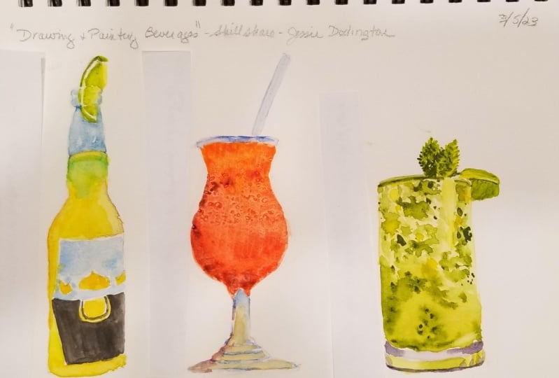
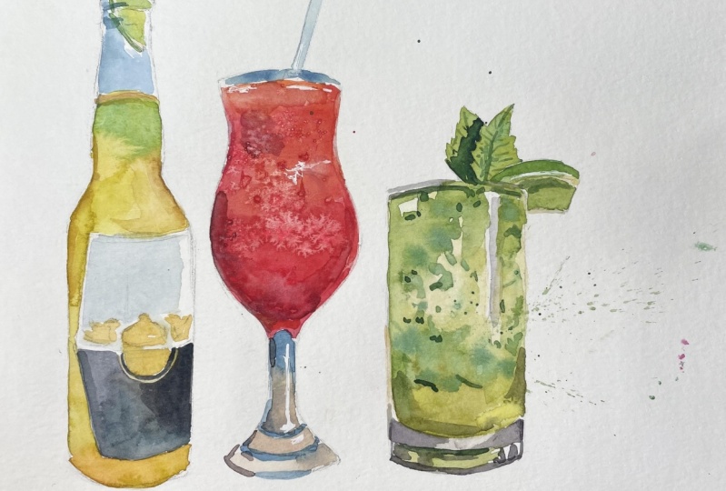
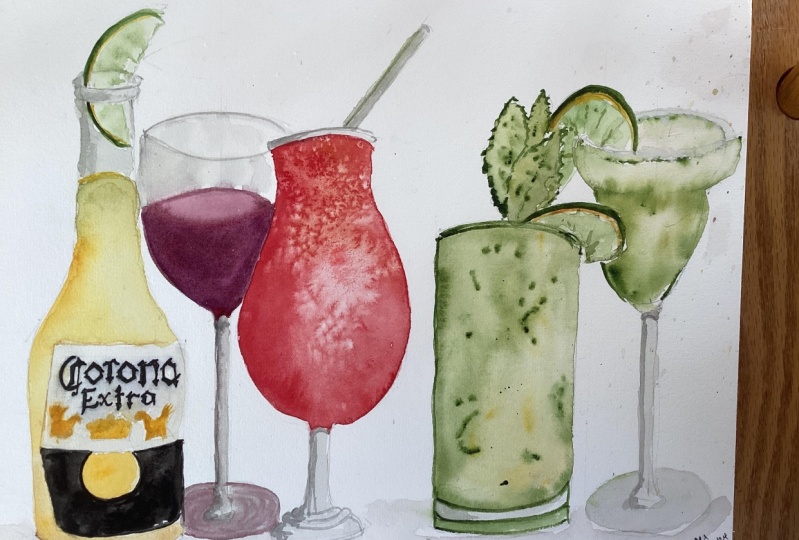
4. Beer Bottle and Symmetry: All right, first things first, I'm going to walk you through some different beverage
illustrations. And we're going to
learn how to draw V, some tricks and tips to getting these very different
glass shapes down. And then we're going to
add watercolor to them. They happen to be
alcoholic beverages, but you could make yours
virgin Dockery or you could take what you learn in
terms of making ellipses and perspective
from this lesson. And you could pick any number of beverages or still-life objects. Alright, let's begin
by drawing some of the various shapes that the drinks that you
might want to include. So for starters, it's
going to be a lot simpler to just draw the beverage as if you're looking
straight out at it. And so that's going to be we're going to
start with the beer. So you're not dealing
with the ellipse, ellipses, the ovals and such. Right away. We're just going to start with, there's a slight
curve to the top. But that's a lot simpler than if you're looking down
at the beverage, for example. One of my tricks for
drawing me zoom in here. One of my tricks
for drawing bottles is to start with a line
and do this very faintly. If you can. You start with a line
down the center. You could go all out
and use a ruler, but that's not really
what we're here to do. We're not here to
be super specific. But what this will help you
do is it will help you keep your bottle in proportion, sort of looking the
same on both sides. So I've put a very light
line through the center. For the sake of teaching, I'm going to make it a
little darker so that you can see it for sure. And I've got a slight
curve at the top, a little frown going on. And I've made two bumps to sort of show the
top of the bottle. And it can do another
curve just barely, just to match the, the
top of the shape there. Then this bottle
comes out a bit. Bottles are tricky, they really are because they're
all different. But this way, you can
measure sort of how far out. And I'm just buy measure. I mean, just visually. How far out this side is going. And try to keep it symmetrical with a
line down the center. It's going to be a lot easier
to notice lopsidedness. And it is totally
okay for us to make some lop-sided drawings that's not going to add character, it's not going to take away
from the memory of it. Then the bottle blooms out here. So I think I'm just
going to make a mark and advance equidistance
from the center there. And then that will help me sort of do the,
the curve going out. And it might not be
out quite far enough. So let's make it a
little farther out. Here. We go. From there, we just go straight
down on both sides. It's okay if it looks a bit
too geometric at first, you can always round
it out as you go. Now, our reference picture has this beer just
sitting in the sand. So that's a nice, easy sort
of quote unquote cheat, where you won't
have to deal with drawing the bottom
of the bottle. So you could just put
it in some sand by making some suggestive
flowy marks around here. We've got one in front. And you could make a little flowy sand in
the background too. If you're not into that. If you don't want your
corona planted in the sand, then to do the bottom of the bottle that
you're just going to add a bit of a curve. We're looking straight
at the bottle. We're not looking
down on it too much, so we'll just do a slight curve, just the smallest smile here, and curve outer edges there. And let's add, we don't really need the center
line now because we've got a bottle shape looking
fairly symmetrical. So you can erase that. Remember that I'm drawing
dark so that you can see, but you're going to want
your drawings very faint. Just suggestions. I think it's fine to see pencil marks through
your watercolor. You might not like that. So remember to keep
your touch very light, not like what I'm doing. I'm just doing this
for an example. So the corona label, I think this might
be a little short. Let's make it a bit longer. Then. We're going to slap
on a label here. So the coronal label starts at the widest part
of the bottle and it goes pretty much
straight across. If we were looking down at it, there'll be more of a curve. It comes out just
slightly on an angle like a little arrow
triangle shape, and then make the bottom of the label just as curvy as the
bottom edge of the bottle. And that will help give you that round appearance
right from that center, that's where the label
has changes color. So we're going to make a
slight swoopy line there. And let's add the shape here. The kind of looks like a sun setting only flipped and we're not going
to add text right now. You can totally add
that if you want. I'm going to keep mine
super-simple and suggestive and just put the crown on and the little random shapes
here, just to suggest. And then the beer
goes to about here. And it's a little curved just slightly to
match the top here. I'm going to add some
color change in here. Then let's add a line
that's a nice touch. Let's start with from
right here to about here. That's gonna be our nice curve, the edge of the lime. And then this edge is rough. It gets squashed in here, so we're not going to see
really much of it there and then kinda comes down here. Add a bit of the
can't really see through the lip of
the bottle there. So I'm just going to kind
of blur that out and then it becomes more in
focus again up here. That's nice green edge. You can add in a couple of sections of the lime
as well if you'd like. That's up to you. How detailed you want to get. You could just suggest
the lime in there. You don't really need to
get that crazy about it. Alright, so I've redrawn the beverages Fairly faintly onto this watercolor paper so that we can add some colors. So I'm going to use, I'm going to keep the
brush large here. I'm going to use
an eight just to hold more water and
get more of the fun. Loose watercolor effects. And I'm going to start
by mixing the light. Lemony yellow. Now my tropical is palate doesn't really have
a lemon yellow, so I'm going to use lots
of water to make it paler. I'm going to add a
bit of green to it. In fact, my asthma green has a really light
lemony look to it. So that's what I'm going to do. My my first layer in the corona. Now we're not doing these
two look high realistic, that's a whole, another
way of painting. We're doing these as if
we were actually there on the beach and just trying to
capture a memory or moment. As it comes down the side here, I'm going to add more green that's sort of
shading it a bit darker. The edge of my glass, the edge of the bottle has
more of that green in it. So while it's wet, I can drop
some more green into it. I'm going to grab a bit of
this nice turquoise green. I'm watering it down so
it's not too strong. And I'm going to
add that up here because this is
the ocean water or the sky showing through
a bit of our beverage. So I'm just going to
plop it down in there. Don't have to be too
precious with it. Let's keep going with the
yellow down our side here. I'm going to make
mine a bit more golden as it gets
towards the sand. So I'm going to add
some of this yellow ocher to deepen it, to deepen that yellow
rather than the green. And I'm even going
to add a tiny bit of orange to this,
actually activate this. My pans are all dry. I could have sprayed some
water on them before I got going but didn't. So here's a little bit
of orange to drop in. Whenever I add
watercolor or actually any medium of paint. Whenever I'm working
in paint and color, I tried to add as many
different colors to it to cause variety
within the color. And you can go
overboard with that. It's true, but colors are never, they might look like
they're a solid. Green are solid yellow, but when you add varying hues, it really does, I think, help it look more
realistic or come to life or be less stagnant. I'm adding a tiny bit of
the brown to this side. It's kinda my method
of shading right now. Just dropping in some color. It's kinda dried up a
little more yellow, so I'm wetting it to
help blend it in. And I think I'm going
to move on to the lime. Got some greens out anyway. So it's got a really
vibrant green going. This one, this is
like a dark green. You don't need that. Right now. We want lime green. I'm going to leave
the area between the rind and the
fruit of the line. I'm going to leave
that white for now and maybe add a tiny bit
of color in a minute. But let that be lighter. Dropping some deeper green along the way where it's
closer to the edge. And I want it to
be more yellowy, closer to the
center of the line. That's enough variety for me. It's pretty simple
but effective. And if you need to switch to a smaller brush for some of the details, go
ahead and do that. I'll drop to a four
just to paint the rind, I'm going to get a nice,
Whoa, that's dark. I'm going to get a nice
medium green going. A bit stronger than what
we used for the lime, bit darker than for what we used for the
fruit part of the line. When it goes into the bottle, I'm going to make it a bit paler because we're looking at
it through the glass. Alrighty, That's all I'm
gonna do for now on that, I'm going to let
parts of these dry. I'm going to paint the
bottom of the corona label. And I don't have a black in this set and you don't need it. I'm just mixing some of my
darker colors like blue and brown and purple to
get a deep gray. If you want to color swatch, I think color swatching
looks nice on the sides. You might not, you might want to keep your sketch book pristine, but I quite enjoy testing
out the colors I've mixed on the side or along
the edge or on another page. I don't mind it on
the same painting, I think it looks kinda neat. So if you're going to touch this color
next to the yellow, if you're going to
actually touch that, it might bleed into it unless you've given it time to dry. But I'm leaving a
little gap here. Or you might really
love that look of just different colors
bleeding and together. It's a really nice effect. I find it beautiful. So just up to you whether
you want that happening here or in another
part of your painting. One color that I love
using instead of black, I'm, I don't have black
here as I already said, but I like using a Payne's gray can get quite a
dark value to it. And it just seems
a bit more lively, bit more complex than
a like Mars Black. It's more blue. Okay, I'm touching
this color next up right up to the yellow
and it's not bleeding, so it's dry enough. And there's a whole bunch of
colors going on right there. I kinda like that. I think it's more interesting than a solid going to
make it more blue. And then going to, it's
a silly detail maybe, but I'm going to just
do this carefully. This is something that you
could do with a pen later. Part of the design. Not, not terribly effective. It doesn't really look
like the label, but Again, it's not really
what I'm going for here. The little details
up here are golden. So it's going to drop them in their very loose just to look like blobs. But it does the trick for me. In capturing the general
design of corona bottle. There's one more
detail we can add, and that is the sky through the, um, the bottle here. It's a blue. I'm not sure that this set has quite a bright enough blue. I prefer to use
cerulean for my sky. I'm going to steal
it out of this set. It's just one that I like. I just made this
panned by pouring the paint from the
tube in there. So I didn't really buy
this color in a set. But it's, it's hard to
achieve a sky blue. Sometimes you just need
to buy the right blue. It's not something
you can just mix. If you don't have
a brightness blue, you don't have a
brightness blue. Sometimes there aren't
tricks around color. I'm leaving some areas white. I don't want to go
right through it, but just a bit here and there. I'm going to add
darker blue in here. And this gray I've created, going to make it much paler. And use it to add some, sorry about the
clearing of my throat. Add some definition
to this white-label, so it's not just pure white. I've come back and done this in. It's dry right now. So that's why it's not
bleeding in with the yellow. And because it's dry here, I can add the lovely
golden to this part. Makes sure it's dry or that's going to
become a muddy mess. Think there's not
really a white. It's a light yellow
that goes right here. Again, I don't really
have a lemon in this set. Maybe we can steal
a lemon from here. This is my shrink set. So that yellow
actually came in it. It's 12 colors. And they're really, really
vibrant and effective. I love them. So that's very lemony and I'm going
to add that up here. And I'm going to add some lemon elsewhere for a little zing. I think we're done for
that sketch for now. I always say I'm done and then I catch a couple more
things I could do. You can add a tiny bit
brown to the top here. I kind of see that
little brown rim in the resource photo. Alright, let's move
on to our Dockery.
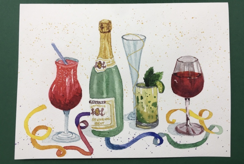
5. Daiquiri and Salt: We're going to do
the DAC reshape. And to do this, we're also going to take a very, a pretty straight on view. We're not looking down at it. So let's put it on
the same level here. We're going to start
at the bottom. And we're gonna do
a nice curved base. And it's going to
be maybe about the same as the beer bottle
could be a bit bigger. And same thing because this bottle has a
very curvy shape. At bottle, this glass
has a curvy shape. I'm going to Draw a line, make yours very faint. I'm gonna do mine a little
darker so that you can see it. And this will help me get
the stem centered properly. Here's my stem, and it starts sloping out
right about there. You can see how easy it is to make your beverages lopsided. So don't be too
hard on yourself. This is, it's kind of fuzzy work making it
perfectly symmetrical. You might skip that entirely
and not bother with it. So we are stem goes
up to about here. We have a nice wide bowl
and then it comes in. Can you see these
marks I'm making? I hope so. Yeah. And then it's going
to go back out but not quite as far as as
the base there. So maybe to about here,
somewhere in-between. So this is the widest part. Narrowest, comes in a
bit and goes back out. So let's slow bar beverage, glass up like this. I'm not going to worry
about how perfect it is. This slope right here is a little way to make this
slightly less drastic. So this is more
gradual than this. This angle is nice and gradual
and then comes back out. And we're going to do a very
slight curve on the top, a little bit of a frown
and erase my little marks. And I think I made
mine a little narrow. These glasses come
in all shapes, so it's up to you how much of a perfectionist
do you want to be with this? But it is not too
tricky at this point, especially if you drew lightly to just make it a bit fatter. That's going to make
mine a bit wider. That way we get
more Dockery in it. There we go. Our drink, it comes right up to the top, so that's not too much to draw. And let's add the straw. I'm running out of
paint page up here, so I'm gonna make my
straw that's shorter. You can make yours longer. We can't really see it too, too much in the glass, but it comes up here. Slight curve at the top
helps it look cylindrical. And there you have it. You've got your basic
shape for this drink. There's a couple more
details we can add. You can wait till
the painting portion of this or you can add
them now, part of that, where were these sort
of smile shapes here? And then there's also, if you look at our
reference photo, an arch here, kind of where
the drink meets the stem. You've got these shapes here
and that just helps make it look realistic like it's glass. So when we add the
watercolor in here, this is the darkest
part right here. And then we're going
to have all sorts of frothy goodness in
this area right here. Back up to my eight brush. And I'm, this is an opera rose. I think. I didn't write it down
just from a tube of mine. And it, you'll see it
as a nice hot pink. I want to mix that a
little bit with a red, not the color we're
going for here. This is the tropical sat. And so we have some
very interesting rents. We've got this pink
and this pink. It looks very red and we don't really
have that orangey red. So I'm reaching over
here off of the Out of camera here to
get that cadmium red, that bright orangey red. And I'm going to
mix it with a pink. And this is going
to get us closer to the color of the drink that
I'm trying to get here. That makes me happy for now. So I'm going to start in here. Now, one really neat way to get the IC look of the
string would be to add salt. It's a technique of
water in watercolor, I'm sure you've heard about. So we'll paint in the bottom here and
then we're going to play around with some
textures for the top, I think there'll be lots of fun. And it's not necessarily something that you
would have with you on the road when you're
actually travel paintings. So we might as well take advantage of getting
stuck at home. We have salt, least I
hope you have salt. So I'm even adding this little weird arch
shape in the bottom. And now I'm going to take a little break to go run
and grab some salting, going to soften this edge
right away right now because I don't want it to
form a hard line. And I'll be right back
with some more materials. So what I have here is
regular table salt. That's pretty fine grain. And I also have course. And they'll work differently. When thrown onto watercolor. Really huge grains of salt. It's just going to work a lot, a lot differently than
the fine grain. So I'm going to just set
it right here and play. I don't use this
technique a lot, I just thought of it now. So if it fails, it fails, but we're
gonna give it a shot. We're gonna get a lot of pain, a lot of pigment, because
if it's too pale, you're really not going
to the salt when it sucks up the, the moisture, it's not going to show this nice crinkly texture unless we've got lots of pigment and lots of moisture on there for it to draw
into the crystals. So lay it on. Don't be shy. I'm going to make it more
orange at the top. Just because variation is nice. And as it gets farther down into the
wide part of the drink, I'm going to let it
get sort of pink ear. Very vibrant though. It's not muted like this, it's in your face. So let's experiment. Let's put a couple of big grains right in
the middle here. If you add too much, it'll suck up a
lot and you won't really get the
texture looking for. We're going to add
the fine-grain. Look at the difference here. You know, Salt. Don't need
to tell you about salt. We're going to put
that at the top here. And for fun, maybe a
little bit down here. So I have put it fine grain and then big grain in
the center just to see the difference
together. Why not? As that dries, let's add to
other parts of the painting. I think you'll probably want
to go down and brush size. I'm going to jump
back to my four. You could use a six
depends on how big your sketch book is really how much, how big
you've drawn these. And I'm gonna get some
of that sky blue. And I'm going to let that
show up through the glass. It's a beautiful I'm gonna
put that at the very top. I don't really want it to
contaminate the orange, so I'm trying to
keep it separate with some white in-between. And I can make it
a little darker, a little more zing. At the very top. You see how little I just added a tiny little touch
and it spreads out. Don't need a ton. Back to the pale blue. Diluted even more and I'm going to add some into my straw. You might wish to
paint your background. Blue sky or something like that, in which case you'd
probably let your straw, like retained some white. But since ours is a
white background, I'm just going to lay in some pale blue and a bit
more down here. Now, remember those blue rings we saw that we sketched out. Those can be a bit darker there, reflecting water and sky. Because our resource photo is of a glass sitting on a beach. Because that's where I
want to be right now. It's okay. It looks a bit stripy. It looks a bit like the glasses, blue and white striped,
but that's okay. Add a bit more blue
here and a sandy color. So I'm going to
use this ocher and I'm going to try to tone it down with a bit of the purply gray. Maybe even add a
tiny bit of pink. See if I can get sandy color. You want it to be a bit
brighter than that, a little less sad and dirty. So let me add more water. Clean up this area a bit so
it's not quite so filled with purple. That's not bad. If you add a lot of water, it will be nice and pale. I think I might want a
bit more yellow in it. Then we're good to go. We've got some nice sand color with what we've got
here to work with. So and add that to the center. I'm aware that this part is wet and I'm just letting
things bleed together because create some interest and kinda makes the painting
look a little less stiff. This reference, you will notice has a beautiful long
shadow that you could add, and it's just a big
ellipse itself. It's just like a big oval. So if you have space on
your final drawing to add a shadow that would greatly enhance this little
painting of this drink. And I think that we need some shading in the
beverage itself. So I'm going to use a bit
of purple and a bit of that deep pink and add
some shading in here. Just to kinda give it the
roundness, give it some volume. Painting over salt is not a
technique that I'd recommend. It's not going to work. It might actually mess up some of the texture you've
already made there, but I'm not being too
precious with this. It's kind of just an experiment. I'm just warning you, Casey, you're following what I'm doing. I think we have a lot
of variation here. I'm a little concerned that
the salt didn't pull up enough of the paint to create
that white sort of crackly. So I might go back into
this with a bit of ink or pen afterwards. But one way you might
be able to lift some color if you want
it to be a bit paler and you kinda laid down
a bit too much color. Is too wet your brush,
clean, wet brush. Drag it over that itself. You can see we'll pick
up some of the color, but you can also dab it
with a paper towel and wow, it comes right up. So if you think that you didn't leave enough variety of value going in through here. That is one way to
re-establish some lights. It's not ideal. If you have to have good
paper to do this play a lot so that if you
have really cheap paper, it can tear the
paper a little bit and create an anoxic
desired effect. But I am going to add
a tiny bit more of a shadow on the left here. And then I'm going
to call this done. All right. Just before we move
on to the margarita, I wanted to take note
of the fact that we left the salt on there and
moved on to another painting. And we didn't we made sure not to brush this
off until it is dry. It is still slightly damp, so I'm still not going
to brush it off. That could leave
streaks of paint elsewhere and it could mess with the texture
happening here. So wait until this part of
the painting is completely dry before you brush the salt gently out of the
way to see the texture. But already we can see the very interesting
texture it's creating with these little sort of coral shapes happening,
these little mini blooms. So There's some neat
texture happening there. Maybe not quite the variety in light to dark, but
I was hoping for, but still quite an
interesting texture that you can play around
with for beverages.
6. Mojito: This is the Mohit
though I chose it because I love this beverage. It is so refreshing. And also, it was one of
Hemingway's favorites. And I'm reading a book
about Key West right now, which is where one
of his houses were. So I've actually been
to that house and it was really exciting for me to go and look at this lush house with all the cats around there. He's a bunch of six toed cats
and huge palm fronds and a catwalk going
from the house to the little place
where he would write. Alrighty, So this
one is going to be a cylinder shape, very basic. It's a shorter glass. So again, remember to do your drawings lighter than what
I'm doing here. A wide glass. We're not going to do a
Tumblr sort of whiskey glass. We're gonna do the sort
of small juice glass. I've got a slight curve. You can make it even less
curvy at the bottom there. And then we're going to kind of show the
edge of the glass. And then where the beverage
comes down is right here. We've got our main
lines in there. Again, adding
slight curve to it. Going up is going to help
make it look like it's round. And we've got at the top, Let's make it mostly
straight across. If if anything, it's going
to be a bit of a frown, bit of a curved line going down. And there's really not
much more to this shape. We've got a highlight here that, so you might lightly draw
that in with pencil so that you remember to keep that
part white and it tastes. You don't have a white
gel pen or ink like this that you could paint
over watercolor with. It's important to
remember to leave your white, your whites there. So you might draw that highlighted and there's
another little one here. And then let's draw some mint. The best part of omega
is this mint leaf shape. We're going to put two in here, kind of spiky edges. And this leaf is butting up
against the edge of the line. So I'm going to jump to the
line drawing right now, going to go out like this. Come down a little bit
and this is the back of the line, the rind. And then this is kind of
the edge, the uneven part. And you can add in the
sections again if you want. This looks like it's
a wedge, like this. So the sections are
a bit different. We're looking at it
but differently, but there are still sort of
veins coming in like that. Then let's finish at
the top of this leaf. You can add the third leaf
in there if you want. I'm going to just say
it's good at two. We have tons of flux of ground, like blended mint
throughout the drink, and we're not going to
worry about adding that now that'll be a fun touch to add. When we get to the
painting of this drink. Starting with, let's get
a really nice yellowy, lime green for a nice
first wash down here. I'm going to leave it
much paler in the center. Add more pigment
around the edges. See that little white
area I'm leaving. That's the highlight
on the glass. There was another highlight
I just painted over. Grab your paper towel
and lift it off. I'm going to leave
that highlight there to adding more water
to the center. Kind of leave it lighter. Now as we get down
towards the bottom, let's add more paint. There's a beautiful
sort of murkiness to our resource photo. I'm adding a tiny
bit of brown to the green for the
shadow down here. And then I, there's a
couple of ways to go about that wonderful sort
of ground-up mint texture. You could mix a medium green with your brush and just make little
dabs and flexing flakes. We could also lay papers around this so that we don't splatter the whole page. And we could. Flick our brush and get a
nice splattered effect going. There's a couple of different
ways we can approach it. Going to paint a little
bit of the glass green down here because it's
reflecting the beverage. I'm going to add a bit of
darkness to the lip here. I really like the
way that that was semi dry and so it
bled a little bit. We're going to have
little pockets of so that's already dry
or so we're going to get different textures. So where it's wet, it's
going to bloom into these little areas
which I think is really lovely for this drink. And where it's more dry,
you're going to get little sharp, more sharper marks. And that is also going to add a nice variety to the
string and its textures. If you're having fun
and you don't care about the surrounding
area so much, then you could just
lay a splatter on. That's a really nice effect for, you know, any
watercolor paintings. I'm going to test it off
to the side here first. You need a bit more
paint on my brush. But yeah, you can. Splattering watercolors
like a thing that lots of people do. It's a stylistic choice. That was me flicking
the brush like this. But you could also
get your paint on your brush and drop it. So smack it against your, your finger there
and it will drop much larger pieces of
paint onto your page. So this is, I'm, I'm
enjoying all of it. Like this bladder. It gives
it a sort of a party feeling. And I like the fine splatter and the fixed bladder like
the combination of the both. So that's good. Let's get some yellow into our green and work on this line. Has a bit of a
yellow edge to it. I'm blending that
into a darker green, which is the the rind, leaving a little gap just so they don't
all bleed together. I'm going to paint
in the fruit part. It's in shadow. The light isn't hitting it directly, the light's
hitting the top. So it's going to be I'm
going to leave it a little darker than the
glass next to it. And I want to do
the mint leaves. They are a different kind of green altogether, super bright. Better, this is the
best one for us. Dab of green there. Be careful where this
color meets the lime. If you don't want it to bleed, you gotta leave a gap
or wait for it to dry. Watercolor takes a lot
of patients sometimes. Now in the center of this leaf, I'm going to drop more
green and it'll bleed out. It takes a lot of time
to control your bleeds, to control the amount
of water on your brush. So don't be frustrated. If you add dark green
to the center and it, you've added so much that it just filled the whole
leaf with dark green. Just embrace the result. And if you want a
different result, then just keep practicing
it until you've figured out just how much moisture needs to be on your
brush for that area. I'm going in here and I'm
darkening some of the drink. Whoops, I almost
painted that highlight. Again. You do that a lot. Don't maintain my lights. So I'm going to clean my brush. I'm padding it dry and I'm picking up some of
this color so that it's not quite so invasive to
the rest of the glass. And I'm going to
use a nice purply neutral gray for the shading
of the glass down here, rather than the blue
of the other two. And I'm going to let it be
a bit darker on the edges. Dropping some color
in there and letting it bleed into the rest. I'm going to mix a bit more of my quote, unquote black, ish, color, some brown, blue, purple. Just getting a nice dark
value doesn't really matter what the hue is here. And then going to just enhance this bottom
edge of the glass. There's a white
highlight on this side, so I'm not touching it. There's a really nice
yellow glow right here, but I did not preserve
the lightness there. So I'm just going to take a
bit of wet brush and lift some of the color out of
this corner so I can get a nice yellow glow
going right there. I actually touched this and it's wet and so it's
bleeding in there. So if you're wondering
what's happening, that was an accident. So we've got a bit of a glow
go in down here and going to drop reaching over offscreen here for that lemon
from my other set. And I'm going to just
drop some lemon in there and see if that won't lighten it up a
little bit in that corner. This is still
looking a bit abrupt between the dark edges
and the center here. So it's going to try to, Is it a bit? There's some nice blooming
happening in here. It looks like crazy, but I'm
not going for perfection. I'm going for some
character here. So I think I'm happy with the current amount
of stuff going on in this class right here. Let's make a dark green that we can place into our mint leaf as a shadow here. So that's a shadow
on the second leaf. And because this is fairly dry, I can go in here and
add a bit of texture. You might even switch
to a smaller brush. For example, this is a two. And I can get some little
veins going on here. A lot easier than with the four. Again, I'm not really
honing in on the details. I'm just suggesting. Now we did leave the white on this line here and I think now's a good time to just
it's for sure dry. We can make a pale yellow and just take a bit of that harsh white out of that and
part of the line. And we can do the
same rate over here. So it's still has a light value, but it's not completely
white unpainted. That brings us to pretty
good place with our Mockito. I'm feeling the need to
let me just put down the two that is too small
to be of use right now, I'm finding the need
to create a tiny, tiny bit more shading. This seems to have pretty
much the same value. This is a little darker here. It's creating some interest. And I think I just need to
create a bit more depth, a bit more darks in here. And I might as well, while I'm at it, use those
darks to create shape. Enhance the shape
of the glass here. I'm adding a bit more of
an olive green in there. I'm going to mix a dark green and add
a line right here. All these little things
we'll kind of work together to create
some interest. Grabbing a pale gray here and getting the
top of this glass. There's some bars. I mean, now we're
getting a bit nit-picky, but there are some neat
reflections going on in the corners here that you
can add if you so desire. There are a million ways to
make glass more detailed. All right. Good job on the
Mockito, everyone. Time to move on
to our margarita.
7. Margarita and Perspective: We're going to do the margarita. Margarita is a very
interesting shape glass. And we're also
going to look down. We're going to try looking
down a bit at this one. So this is an angle you could take with all of the beverages we've done so far. And instead of doing a slight curve like this to
show the top of the drink, you can do that if you want to look at it straight on like
the others, you can do that. But this one, our
reference photo, has the, is looking down at it. So we have the nice opening. This. It takes some practice to get it looking like the right shape. I think it's a little
more squished than this, a little more narrow
than what I've drawn it. So take your time. It's not as not as circular
as you think it is. A little trick about ellipses is that when the closer
they are to the horizon, the thinner they are,
the narrower they are. So if we're looking
straight out, Let's say this is the horizon. We're looking straight
out at something. Then the ellipse will look
like what we've done so far. These little it'll look like
these just barely an arch. Okay, So that's what it looks like when it's near
the horizon, right? It's very narrow. It could be like this
a bit or it could be curved in a frown shape
as it gets farther up. A way for looking,
let's say we're, we're looking up at a
beverage from below. It's going to get wider. So this measurement right here, suddenly wider and the farther away from
the horizon it gets, the bigger that ellipse will
get the wide or the oval. Same thing looking down. So if we have a beverage, the top is going
to be thinner and say this is our
glass or whatever. The bottom ellipse, the base of the wine glass or
whatever is going to be much taller than
this area here. So if there was a another, let's say the, the, let's say this is a
straight drink here. This bottom is bigger
than here in the middle. It's gonna be somewhere in
the middle. So this is, let's say you've got
half a drink lift glass is half-full, glass
is half empty. This measurement is going to be in-between this one
and this one. Okay? So that is a trick to help you get the
shapes looking right? Otherwise, you're going to draw this big open
top of a drink. And you get down here. And let's say you
do a narrow one. And it's going to get
the perspective off. It's going to look wonky. So let's keep that in mind as we go into this
margarita drawing. So if we have this
narrow opening, I mean, that's not, not too bad, but here's the top of the drink. Too big. We've got a lime in here. That arch is going to bug me. It almost comes
straight down for just a minute here
and then curves in. So this is a margarita
glasses are cool. Bowls right here. It's flat, it's not too deep. And then it has another
part coming down here. So think of that as two
different components to different sections of the glass. So we'll erase this in a second. We're just getting
the shape right. So here's your lifetime. To do the little sections in it. While I'm doing this very roughly. Take more
time on yours. Curving it in, making it
look a little less sharp. And if you need to
do that trick of the line through the center
to get it looking less wonky. Mine's already uncentered here. I'm going to bring
this site out a bit to match the side on the left. We get down to the stem. The drink ends here. And We see a bit of the glass there, and then it comes
down to the stem. And in our reference photo, this part is missing. It's covered with flowers, but we're going to use our trick from this little moment
and repeat it down here. So we want the base of the drink to be a bit
more round than this. Right now, that looks
almost the same. We could just do a
little measurement here. So if I do this, it's almost exactly that. And to do that up here, this is my really
easy way to measure. Without a ruler around. You can just mark, okay, it goes to there and
that's about the same. So we want it to be
a bit a bit thicker. Maybe want that oval to be a bit wider at the bottom here. Apologize for all these lines. Just goes to show you. You've got to feel
it out a little bit. I think that because of my page, I'm making this drink
a little too short, but this glass a little too
short, but that's okay. Make yours a little bit longer. The stem doesn't join up right here because we're
not looking straight. Looking straight out
at it like this, where the stem joins the base. We're looking down on it. So the stem is going
to come down into the middle of this section
instead of up here. Then we tried to center this, I'll do this drawing
again and better when we are getting to the painting
section of these drinks. But here you have the basics of how to make
these four unique drink shape. These glasses for
different cocktails. We have a salt rim on this, so maybe mark that out
with your pencil so that you don't paint on that
section. Keep it white. Preserve your whites so salt or sugar rim depending
on what you like. And this section right here, where the bowl
meets the the base, Let's suggested a
little bit but not have that harsh line that was drawn there a
second ago to get the shape, the initial shapes down. Take a look at our
reference for this. There's some shadowing in here. And that would be
enough to suggest that there's some
highlights in here as well. I see the mostly
on the right here. And that does it for
the basic shapes. Let's move on to painting them. I'm going to do the
same thing I did with the last drawings and take
this gummy eraser and just lighten lighten that graphite so that there's just less
pencil showing through. I don't mind seeing pencil
through my watercolors. I think it's quite nice,
actually, a nice effect, but I'm a little too much
can take away from it. I'm just going to draw your
attention to the base of this because I
wasn't super-duper pleased with the base of the last margarita
glass that I drew. And I just wanted to show you how the stem comes
down into the center. And there's this
sort of like area where it connects to the base. And the base is this ellipse that you can see
from here to here. The from top to bottom here, how wide that oval is, is wider than the oval at
the top from here to here. From the lip to the lip. So that's just a reminder of the perspective
of these ellipses. And you can kind of lightly
See that I had used the same trick of the line down the center to get a
fairly symmetrical drawing. Now let's splash on some color. And that will bring
us to the end of our little vacation beverage
portion of this class. So let's begin. By mixing a fairly light Smokey, green color because
this is a frozen drink. First, I'm going to clean up these wells a little bit just because it's nice to have some
premixed colors in there. But sometimes I
don't have a huge, huge set, a huge area, surface area to mix on. So sometimes it
just gets a little hard to keep your colors clean. And I've got my
eight round brush. And I'm going to start with testing these colors because
these two or so similar, they look so similar in the pans here that I have a hard
time telling them apart. So this one's more of a
Hooker's green and this one is the more sort of ocean blue. We're going to add
some cerulean to it. Could use ultramarine
if you want to. And we're getting this
kind of smoky blue. It's probably leaning a
bit on the blue side. So I'm going to add
a bit of this very yellow as all green. And that is, we only needed a little tiny dab of that
because it takes over. And I'm going to test
on the side here, I think that's still
pretty vibrant, so I'm going to try to
tone it down a bit. This cerulean is
somewhat opaque. It's a kind of odd watercolor. This is going to be perfect
once I add a bit more water to it to sort of de intensify, de intensify. What's the word? Grab some. Mix. A Smokey green. You could mix a regular green
with a tiny bit of black. You can mix in a tiny
bit of purple to make it the sort of dirty, Smokey green. And then we're going to lay
it in and paying attention to the areas where
we want to leave. White of the page to look like we have a
salt rim going on. So I'm laying this in. It's pretty subtle. This color. I'm pleased with it. And I'm going to leave
room for the salt rim. And the highlights as well. We have highlights in here. When it's near the edge here, I'm going to add a
bit of lemon yellow. Just on the edges here. Just have a little bit more. Haven't glowing a little
bit more on the edge. Letting a little bit more
light in the center. I'm going to keep Smokey green going and I'm
going to actually have it get a little more gray in this bottom of the
part of the glass. So as I said before, a little bit of purple. Now my purple is super vibrant. If you have this set
of tropical oils, the purple is just intense. You're going to want to picture. You've led in a bunch
of diluted it a lot, letting a bunch of water
to kind of calm it down. Unless, of course you
are looking to make just a super bright
watercolor that pops. I'm trying to be a bit subtle here, slightly more realistic, but you could just go wild and make these
super bright and fun. There's no real need
for high realism. I just painted into this
highlight a tiny bit, so I'm gonna take it out. I wanted to outline it, not completely paint over it. It's okay. And in the top of the glass, I'm going to add a bit
more of the yellow, green. Make sure it's not too crazy. I kinda like that. I'm going to just use
a clean brush and sweep it into the
rest of the glass. I'm working with this all quite
wet so that I can achieve some smooth textures without too much too many lines and too much hard work
with the blending. I'm just kinda letting the
colors blend themselves. Now, I've done the center and our reference is quite dark. But I think that we get go in. We get kind of like a
black or gray dark color. We can get some of this. This room painted in the part of the rim that isn't
covered in salt. Going to add a bit of
the room back here, make it a lot paler. And adding some shading here, some shadow side of the glass. There's no real wrong way here. We're just adding
some definition here and there
without overdoing it because there's a heck of
a lot of white up here. Now, I've added the lime to, on the opposite
side of the glass. Just for room on the page. I drew it a little bit
too close to the left. So add in the bowl here. Tiny bit of shadowing. Then the center of the stem. Keeping these curves
kind of defined. And just just
suggesting the rest. I'm not really going
to go crazy with it. Mixing blues and grays
to keep it varied. Making sure I've got a
nice pale color here. For the side. The more see-through
parts of the glass, I'm going to leave these
little white bits here. I think it is
effectively looking like some highlights on
the glass, so that's good. Adding a tiny bit
of darker value. And before we go any further, we should probably
dive into that lime. So if you've got
sort of a hookers green, I'm mixing neutrally. Not to BCCI, not too green, sort of like grass green. For the back of this lime. I'm going to transition into
a bit more of a yellowy green as I come down there. And then I'm going to, there's a bit of a highlight
on the back of the line. So if you want, you can add that later. Or take a clean damp brush and lift some color out to create a bit of a highlight even on the skin of the line. And then I'm going to do the center sections leaving some white just as we did
in the other beverages. It's not realistic,
It's nothing fancy. It's just laying it in so that it looks like what
we wanted to look like. It immediately jogs our memory to that amazing
imaginary trip we took. Maybe this is a real
memory that you're finally getting the
chance to bring to life in your journal or sketchbook from an actual trip you took and you didn't
get time to paint, you just had time
to take pictures. And now you finally get to recreate it with a bit
more of a personal way. Now it's going to be hard to. Define the salt rim when we don't have a
dark background to pain. You may choose to add
in a blue background, sky blue, the beach scene that we did with the
others through the glass. Or you could just try to
get a bit more detailed in your texture textural edge. So right up where
the salt would be, you could get into a bit more of a dabbled sort of edge here. And that will sort of give
it the texture you want. I'm using the very tip
of my brush to get some, some fine texture. And this is creating
a bit of a dark edge, but we can blend that
out in just a second. I'm cleaning my brush. It's clean but damp. And I'm just swiping
it along too, create a more natural edge. And in the back, I think, rather than do green up here, which will just look like
the glass is very full. I think what I'm gonna
do is use cerulean. And having that
issue I talked about not having enough room
to mix a clean color. We don't want this, this blue to look
like the drink. We want this blue
to kinda look like the BCCI sky in the distance. So get out your, your light blue and paint in
this area here of the glass, but not the white salt rim. You can add this blue in touches elsewhere so that
it's not just in one spot. It's good to disperse the various colors you use
in a painting all around. It's just in little bits. It helps create balance and move your eye
through the piece. I'm pretty happy with that. I think it could use a
little bit more sculpting, a little bit more
depth down here. So I'm going to add a purply gray that's purple and a
bit of brown mixed into it. And I'm just reinforcing some of these shadows
I already laid in. Now there's some more
value contrast and I think just makes for a more interesting
final piece. Pulling that gray up into the center of this
little bowl again. Ready? Last but not least, the little area
between the rind and the lime wedges with
lime little sections can be colored in a
little bit so that it doesn't just glare white
like we forgot it. And that is the end
of our fancy drink.
8. Wine Glass: Alright, so drawing a wine
glass is going to rely on the same basics of the other beverages
that we've gone over. So it's all about the
ellipse and symmetry to make a good drinking glass or bottle or
something like that. And then it's really just about getting
these curves right. Now. There are so many different
shapes of wine glasses. You can do no wrong here really, unless you make it super wacky. At the joins where the bowl
of the glass meets the stem. Try to make that a
nice transition with sloped lines instead of having your bowl
come down like this. And then just a
straight join here, it's a little, it's a
little more abrupt. So pull down your stem pretty straight,
straight as you can go. And then we're going to
create a little base here. And just remember that the height of this ellipse. So from here to here, you would like to be wider than the height
of this ellipse, which in this case we have it, It's subtle but it's there. Then the wine inside is going to be somewhere
in-between the ellipse there. So this looks pretty
close to this right now, maybe even smaller, so
we don't want that. We want to open it up
a bit, widen it out. It's okay if it looks
very similar, if it's, if it's very close to this one, it's going to be similar. I'm gonna do, I'm gonna make
this a little more narrow. You can see it takes me
a couple of times going over it because it's
very easy to make weird ovals that aren't sort
of similarly shaped, nice. And even so, there
you've got the basis. If you're doing white wine, you're going to have a lot more reflections to paint in here. And that's beautiful and fun and I would highly recommend it. If you choose a red
wine, perhaps you will. This will be a lot darker and it might be simpler
to go that route, but it's up to you what
color of mine you go for. So there's our
little wine glass. So you might say, that's all well and good, but I don't want to drink a light bodied white
wine, in which case, let us sketch out
a little bit of a bigger glass for the light bodied red wine or
the full-bodied red wine. So the biggest difference here is you're going
to have a wider glass. And you know the rest. For what goes on down here. You're going to have a
lot fewer reflections in here as the glass will be. The wind will be much darker. So you have a couple
of highlights, but a lot less, a lot less like different
reflections coming in. And if you want to do a more full bodied red wine and just make this glass taller, but it's still very
wide glass compared to has a bigger
opening at the top and it's just larger in general to compare it to the one
we just did a second ago, which is more like. So. You can get creative with this. You can pull up, if you just search which wines
go in which glass, you can pull up a
lot of little images on the Internet of the different types of glasses
that the wind can go in. That's a really good
reference to have. Let's move on to painting it. Alright, we have our wine glass drawn-out and we are ready
to add some watercolor. I'm still going to use my tropical set from
Prima Marketing. I'm going to pull out a
small or smaller relative. Number four and
number eight round. And this one's going to be just for a couple of line details. Let's begin by mixing
the bright red. I'm going to put
some orange in it to make it lean towards a cadmium red. A yellowy red. Feel free to swatch on
the side of the page. And that's what I'm
going to lay in on the very top edge where the light is coming
through this beverage. I've chosen obviously to do some red wine is what I
drink the most when I was in France and I sort of
associated with Paris. It's more, I don't
know, Frechet. So I'm going to mix some
more of the rose color, maybe a bit of purple
to get a deep color. And I don't want
these sharp lines. I kinda want things
to blend together. So while it's still wet, I'm going to add in all this. While these other hues. Now you may want to preserve
your whites for highlights. And I see some right
here and here. But I'm not too
worried about it. I have the secret weapon of a Jelly Roll pen so I can go
in later and work on that. So I need to mix almost what
looks like a black and I putting purple and
brown together and going to add a little
bit of blue to that. We get a really deep
color for this side. If you have a block on hand, this may be the time
to pull it out. I'm not touching the surface there too much because I really want to keep the
value is different. I want the top of the wine to be lighter than this side and here, and it will just
help make it look more three-dimensional. I'm having trouble getting
a dark enough color. I'm just going to keep combining all the dark colors naturally. Land in different areas on the
spectrum of light to dark. I'm trying to use all the
ones that naturally are dark. And we're getting there
doesn't have to be perfect. I'm enjoying the
wet on wet effect, letting it kind of
bloom a little bit. Dried some of the paint
off my brush just now. So I have a bit of a dry brush and that will pick up
some of the paint. I've left a little red, a brighter red on the side here. And I think it's time to just
switch to my thinner brush to add a few details to
the stem and the glass. Adding water to the
dark mix to just sort of make it lighter. I think this is a little dark. So what I'm doing is
I'm wetting my brush, dabbing it on the paper towel. Lightning, this value. The stem or the glass rather
is not meant to look purple, so we just want to
neutralize it a little bit. I'm going to add some blue. And hopefully that will lean
it more towards the gray. Different shapes appear
in different glasses. I'm going to add a
subtle as I can, sort of shading
to the stem here. I've left some highlight
action happening there. I think there are certain areas that could
go a little darker, maybe right in the center. And then the side of the glass. I'm adding blue to my purple mix because that purple,
it's kinda taken over. And going to get the side here. Leave a nice big
highlight on the glass. And grab my pale gray. You can drag this
right over the red you made as long as
this part is dry. This will help it
look like glass. And you'll notice, I'm not going straight down with this shading. I am following the
shape of the glass. So it's kind of like a
very thick contour line. Contour, meaning just following
the shape of the object. And let's get a nice thin line. You might drop down
to a size two if you have trouble controlling water, where you're slightly
newer to watercolor, I think it's maybe easier to have to jump around and
sizes of your brush, but I'm not too picky
about how this looks. So I'm going to use
the very tip of my for clean brush just to ease the stark contrasts
here and there. Bit more blue to this stroke
I'm adding right here. You can add a bit of
shading to the back part of the glass and retain
some whites here. And they're adding a couple of sort of sharper
detail lines down here. And I'm varying the thickness. So it was kinda fin
back here and it got thicker as it came
around the front. Clean, wet brush to
sort of blend it in. I'm just going to leave
that paler on that side. Lastly, you may add a
touch of yellow because you're likely getting
some sunlight or some interior lights. Interior lights more yellow than outdoor light, I'm
sure you know. But you'll probably have
some yellowish tinge here and there just reflected
from your light source. I just dropped it in here and
they're mixture that purple is dry before you drop
a yellow into it, it's opposite on
the color wheel, it will create brown. Now, I would like my part of the wine glass
right here to just be darker and I'm having a
hard time achieving that. I don't really love the
purple tinge of it. So I'm going to go right
in here and grab this, which is black, which
is really dark. And I'm going to add that in. It's not cheating. It's just nice to show
some times that you can mix the colors were close to the colors
you can improvise. You don't need every color. But sometimes it sure is nice to just pick out the color
you want it to be. I'm probably mentioned
it 10 thousand times, but it is always good to mix your colors
as much as possible. So don't just grab this exact color and pop
it on your painting. It's a very quick way to make
things look more immature. So you, you're going to want
to mix your colors so they don't appear like they're
just quote unquote out of the tube or out of the pan. Darkening this up and
really getting a dark, dark value is what's
going to make this wine glass really
successful in or pop more? Even going to add some to the
reflections here and there. And as well as the top
surface of the wine here. I'm keeping a very
thin line right there. You can add that later in pen if you have trouble
keeping a thin line. And this red, the initial
red is quite pale, so I'm going to mix some more
and lay on another layer. So what I love
about watercolor is we can keep adding to it. This is a kind of
taking away from the these strips of glass color that we
pulled down over top. But I don't mind that I think it's more
important for this to have some color. Look nice and ruby red dropping in a tiny
bit of dark here. Again, just for variation. Variation always makes
things look more realistic. There you have it. We've got our wine glass. So another, yet another beverage you can add
to your repertoire.
9. Final Touches: And that is the end of our
fancy drink series of four. And I hope that you can
pick one or two of these to recreate in your
travel sketchbook. To bring a nice
flare of color and a little bit of a close-up
still-life elements to what might otherwise be a
ton of landscapes and such, and maps and things. Gluten. Here's that texture,
it's completely dry now, so I'm going to actually rub
the rest of the salt off. And we'll take a better look here. That's pretty interesting. It kinda looks like frost
on the edge of a glass. Maybe not quite the value
contrast I was hoping for. But if you're crazy for that, there are inks that can
nicely cover watercolors. So you could add, I'm
grab a tiny brush, maybe a two or a four. This is my four
that would be small enough when you're
using the tip to just add some nice white highlights
with ink afterwards, white gouache, acrylic paint, and also gel pens. Gel pens are very easy to use. Such a nice cheat. So this one, if they are
working and not dried up. Let's try this one. So it's a really easy way to add some white back into
whatever you were drawing. That might need more highlight. Even just down here, we can just kind of enhance
the highlights a bit. Dropping things. I do this line. This little details
like that can make your sketch book POP. Hope you enjoyed this
part of the class.
10. Outro: I hope you enjoyed learning
to draw and then paint several different
beverages and glass shapes that you are able to
incorporate them maybe into some travel journaling
or other art projects. I do have another class on Skillshare that is called
imaginary vacation. And in that one we paint
a tropical journal spread and a Paris
journal spread. This one is two pages. And you could easily incorporate your beverages into
these journal spreads. As I showed you in
the introduction, I had some beverages that were painted throughout my little mini travel watercolor journal. So head on over there. If you want to continue to develop your skills or
maybe you've already done that class and now you can add any element of still
life and closeups, which will bring some
variety to your sketchbook. I also have a free
class on Skillshare, landscape sketching in
watercolor and ink. And that one is like
a really loose style, but I do go through value, a little value lesson, as well as some pen and ink techniques like
crosshatching, etc. So again, all of these classes
can be interwoven and you can sample and take
a little bits from here and there and
pull them together. I'd love to see your
projects, your drawings, even if you just did a sketch and didn't even
get to the watercolor stage. That's okay, That's awesome. I want to see everything. So thank you so much for taking this class and I hope you'll
join me in another one soon.
 Jessie Dodington, Visual artist, Instructor, MFA