Transcripts
1. Welcome!: Hi, my name is
Victoria Nico and I am a portrait artists specializing in pencils and soft pastels. I am self-taught,
So I have learned from so many incredible
artists online. I'm tempted to say that
I watched pretty much every single drawing
tutorial on the Internet. So for this class, I brought together all of the
knowledge I gathered over the years and consolidated
it into this course. This class focuses on
the basics of drawing, so it is made for beginners. But I also recommend
it to artists with a bit more drawing experience
because it's always beneficial to know the
technical side of drawing. I am very excited to share
with you the cheat sheet, which is a free
downloadable resource. It is a consolidated version
of the lessons and it has illustrations to help illustrate the techniques we are
going over today. We also have a worksheet so you can practice the
techniques with me. The worksheet as well
as the cheat sheet, follow the structure
of the class. So the idea is that you turn to the appropriate
page and complete the exercise with me as we are doing it together
at the same time. Among other things, we will be learning about pencil grades, proportions, how
to draw the source of light to make your drawings
look three-dimensional. Different shading techniques
such as crosshatching. Then we will go through my favorite topic, which
is perspective. We will be learning
one-point perspective, two-point perspective, and
three-point perspective. We will also do a
quick still life study together so we can apply our
new knowledge to practice. There is so much
more in this class, I really hope that you join. I promised that
you will have fun and you will learn
something useful. I hope that by the
end of this class, you will be able to put all of the principles and
techniques together and have a very good foundation to create artwork of your own. I am excited to present
this class to you. So grab your pencils, download the resources, and I will see you
in the first lesson.
2. How To Use This Class: The first thing I want to introduce you to is
the cheat sheet, which I am very excited about. It's essentially a
consolidated version of the lessons and
it has a ton of illustrations to help you better understand the techniques
we are learning today. I made this because I
personally find summaries to be very helpful when
I'm taking classes. They helped me to remember
all of the information. After you've done the class. And you want to go back over one section instead of going
over the entire course, you conveniently have this information on
the cheat sheet, chapters in the cheat
sheet to follow the same structure
as the lessons. So while we are going for
the lessons in order, you can turn to the correct
page of the cheat sheet and you have both sources
of information at once. Feel free to print this out and write on it any extra
notes you have. I use the Procreate app on
my tablet for taking notes. So if you have one,
you can open up the document there and
add your notes this way. The cheat sheet is a great
resource and I highly recommend you use it so you may get the most out of this class. Another downloadable
resource that comes off the class
is a worksheet. We won't be creating one
big detailed drawing. Instead, we're going
to do a series of small practices to understand
more about blending, sketching proportions and a lot of other interesting techniques. So the worksheet has
been created for you to follow along and practice
the techniques with me, just like the cheat sheet to the worksheet follows the same
structure of the lessons. So the idea is that you use
it as eager fruit of class, but this is an optional
resource so you can use your sketchbook or just
any plain piece of paper. Another suggestion I
would like to make is that you go through
the lessons in order. They have been designed,
so we build on them as we progress
through the course, each new lesson we
will have bits of knowledge we learned in
the previous lesson. Then hopefully by the
end of the class, we can put all the ideas
and techniques together and you can create complete
drawings of your own. And that's it. We are ready
to start the lessons now, so download your resources and I will see you
in the next lesson.
3. PENCILS: Everything You MUST Know: We will start the class
by talking about what is probably the most
common drawing tool, which is a pencil. I would like to tell
you a little bit about pencil values, which is what all of these little numbers and letters mean. Grades of pencils
are organized in a scale based on
softness and hardness. Mostly C, H pencils
and B pencils. H pencils are
harder and lighter. Graphite H stands for HOD. Be pencils are
softer and darker. Graphite B stands for black. The degree of graphite
hardness is determined by the mixed racial
of graphite and clay. The greater the graphite, the softer the lead
and the more clay, the harder the lead. The number in front
of the letter shows how soft or hard a pencil is. A six H pencil is harder
than a for H pencil, and a six B pencil is
softer than a for B pencil. Harder pencils produce
lighter marks since less of the material is released
as pressure is applied. Softer pencils make darker marks since more of the
material is released. Therefore, a for H pencil will produce lighter marks
than a to H pencil, while a full beat
pencil will make dark marks than a to B pencil. There is also an
F pencil which is similar to a HB pencil. It's slightly
lighter and harder. People like it because
it can stay sharp for a long time and it's great
for drawing fine details. Hence why the F stands for fine. So the H pencils are great
for producing light marks, but they can't produce
a great range of tone. If you create a
lot of layers with a huge pencil and
press really hard, you won't necessarily
get a dark turn. You'll end up with a shiny gray. However, if you use a B pencil, you can get the whole range from very dark tones to very light. You can apply more pressure on create layers to get dark values and apply a little pressure and thin layers to get
lighter values. You don't need
every single one of these pencils to create
a successful drawing. I only use a few of them because softer pencils have a
bit more of a range. I mostly use pencils on
the B side of the scale. My favorites are to
be six b and 90. And I also use the HB
pencil for sketching. Another tool I would like
to briefly introduce you to are the blending
paper stumps. This tool is made of
compressed paper and it works incredibly
well with pencils. It is used to blend or smudge graphite and many
other drawing mediums. They work really well for
blending large areas using the side and even small
areas when using the tip. This is great for
when you want to blend small detailed areas. The fine tip of the paper stump gives you more
control compared to alpha blending tools like
your fingers or a Q-tip. Another important thing about pencils that I would like to discuss with you is how
to hold them properly. So the way you hold the pencil depends on what you wish to do. Generally, holding a
pencil really close to the lead gives the most
control you can achieve. I'm very precise marks this way. In contrast, if you hold your pencil all the
way on the other end, it gives you a lot
more flexibility. You can create longer
lines and it's also easier for me at least to achieve straighter
lines this way. So personally, I like to hold my pencil this way
when sketching. It's also a little easier
to create curves this way because you can use the
movement of your wrist like so. If you hold your pencil
close to the lead, it's a little more restricting
to create a soft curve. This is a good way to hold
your pencil if you are drawing something
like long, wavy hair. Another important factor is
the angle of your pencil. If you draw straight up, you will find that you achieve
a very thin, intense line. However, if you tilt
the pencil to the side, you will get a
softer, wider line. This is more appropriate
for shading. All of these
techniques are good, but really it just
depends on the effect do you want to achieve. So e.g. if you are sketching, it's
a little easier to hold the pencil towards the end and be a little more loose
with your lines. If we draw a circle, It's hard to get a perfect shape if you commit to
it in one stroke. So try this out with me. If we grab the pencil
right at the tip and tried to draw a
round circle in one go. Or you might find that
it's a little tough. But now if we shift our hand towards the end of
the pencil and with a lighter hand create a lot
of shorter curved strokes. Then refine the shape and try to find the perfect shape
within those lines. It looks a lot better. This is what sketching
is creating small lines. Even if you have lighter lines, they will disappear over time. You can erase them later. This is the benefit of
drawing with a lighter hand. You don't commit to democracy or making and give yourself
time to perfect them. If you draw one
heavy-handed line, it's harder to capture
the exact shape and also harder to erase
the line completely. So keep these things in
mind when you're drawing, try to be intentional
with your lines. This will probably become
automatic for you and you won't have to think about this so
much the more you practice. But in the beginning it is important to keep
these things in mind.
4. How To Draw The Source Of Light: Welcome to the lesson. In this lesson, we
are going to be creating the source of light. This is actually one of my favorite things to teach about. So I'm very excited
to have you here. Light is what makes these
shapes look three-dimensional and it adds a lot of
realism to your walk. So try this out with me. We are going to be
creating the source of light on the first page. So let's try to draw a sphere. Here we are going to apply the rule that we learned
in the previous lesson about creating your sketch
using small strokes. I'm drawing small lines. Now I'm going to find the
circle in all of these lines. If we just wanted a 2D shape, we would just draw
a flat circle. So currently this is a 2D shape. It doesn't look like it's
coming out of the page. It doesn't have any
shadows or highlights. So how can we turn this
into something that looks more three-dimensional
and realistic? So what makes objects
look realistic is light. So they have definition, they have shadows,
they have highlights, just like any object you
see currently, my hand, it has shadows and
highlights on it and that's what makes it
look like, it's real. So yes, the first step
we have to figure out is where is the
light coming from? Is it coming from the top? Is it coming from the side, the right-hand side
maybe from the bottom. So for this lesson, we're going to imagine that the light is coming
from the top-left side. That's even draw an arrow so that we don't forget
where the light is. So this is our light
source over here, beaming down onto us. Feel like this. Now, if you had a
shape just like this, say you had a golf ball on a table and you're shining
a flashlight on it. Where do you think the darkest and lightest points would be? Considering that
this is a sphere. The lightest point would be when most of the
light would fall. So it would be somewhere around here because the light
is coming from this way. It would be over here. And the darkest point
would be the area where the least of
the light reaches. So it's going to
be all the way on the other side of the object. So this would be
the darkest side. So now if we start to shade in this object and build
intensity of shadow, we're going to start
lightly up fast and go over the areas
we want to darken. So this is what we
mean by layers. So see here if we
draw one layer of graphite and then
another one over it, and another, then it gets darker and darker without necessarily
pressing any hot on. So you will layering, you're not pressing really
hard in the beginning, you're starting very thin
and then you're adding two. Because remember,
it's always easier to add a layer than
to remove one. Even if you see an area
that looks pitch black, you don't want to go in
there with a heavy hand. You want to build
this up gradually. So if the highlight
is over here, this is going to
be lightest point. And as it goes
down to this side, it's going to
gradually get darker. So let's fill in
all of this region. And this is going
to be very light. It's still going to have some of the pencil marks
on it because it's never really the
white of the paper. So just fill it in
slightly and then we'll just make everything
from there a bit darker. So here we're making dark
lines as we go down. I'm just using A5
B pencil for this. You don't necessarily need
more than one pencil. You just need to control. You just need to control the intensity at which you
are pressing onto the PayPal. Because if you press lie to, you can get a very
thin layer of gray. And if you press a little bit harder and go over the layers, then you get a
slightly darker gray. And then this
creates a dimension, but you can add a darker
color to it, e.g. now I'm going to use an API
just to enhance the shadow. But if you just have one pencil, don't worry, that's also fine. This is why I like to use the B pencils because
they're very versatile. You can achieve all sorts
of turns with them. The source of light
is very important. Always before
starting the drawing, take a moment to
observe the picture and figure out where the
light is coming from, where the highlights are, where the shadows are falling. And maybe there are even
two sources of light. Maybe there's one
coming from here and there's one
coming from here. In which case the shadow would
look something like this. This would be the darkest point, and that would be
another highlight here. A highlight here, and it would cross right
here in the middle. And then another thing
you have to consider is that you have a shadow
underneath the sphere. So if the light is coming
from the top-left, then again, the shadow
would fall like this. So you would have shadow that would look
something like that. And it would probably be
darkest tools, the bull. And it would become
lighter as it goes out. You have to ask yourself, what is the space sitting
on a flat surface? And maybe there's even, maybe there's even they
sat and background color. If we try to fill this in, maybe we have a gray wall
right behind the sphere, then it will look
something like that. Again, the table probably won't be the light of
the paper as well. Sorry, I just start
sketching anything you see, books, furniture, houses, plants, just stopped
drawing with a light hand and creating
numerous shorter strokes. Pay attention to
where the shadows are falling and where the
light is coming from. These other things you do
to make your drawings look convincing and just remember, it's okay if it doesn't look good the first time
that you try it, this is why you
have an eraser and a whole lot of space
to practice on. The first sphere
doesn't work out. Try again, maybe change
the light source, perhaps it's coming
from the top right side or straight from the top. In that case, think
about where would the highlight be and where
would the shadow falling? And if you are
finding it hard to imagine how the
object would react. If you were to move around
the source of light, then perhaps take
a real object and a flashlight and do
a little experiment. See how the shadow
response to the movement of the flashlight and try
it with other shapes too. Maybe you can find a cube, in which case put a
flashlight on it and see how the shadows
walk around it. If we were to do a cube, who tried to make
it symmetrical, then currently this is a
two-dimensional shape, but if you want to make
it three-dimensional, then you would put
it into perspective. And it would look
something like this. And we will be learning about perspective in a few lessons, which I highly recommend that you watch these
lessons because the, my favorite, but this is
a very basic idea of it. So here we have now a cube in, in, in perspective as a
three-dimensional shape. And again, if you imagine there is a light
source, so again, let's make it the same as the previous
one. Draw an arrow. Then again, you have
to think about what is going to be the darkest side, what is going to be
the lightest side? So the light is
coming from the top. So this is probably going to be the lightest side right here. So we're gonna give this a
very gentle layer of graphite. And then this over here
would be slightly.com. Then we have the darkest
side because this one is away from all the sunlight. And then you would also
have a shadow that would be here in the bottom right, similar to this fan. Again, it wouldn't be darkest as it comes closer to the shape. And also something that's
interesting is you start to notice that the shadows
around the object, they start to blend in
with the actual object. And it gives you kind
of a softer effect. And again, we are
going to be learning about this and how to use it in an intentional way to give a sudden effect
in your drawing. Sorry, that's gonna
be towards the end of this class. Trained for that. These are very small
quick examples of how to use light
in your drawings. I hope it communicated the
basic principles well, then these are great
to practice because once you draw the
spheres and cubes, then you can draw anything
in nature because everything in nature consists of these simple shapes when
you break it down. E.g. if we have, I'm going to draw a tree
than the top of this tree is just a sphere and then you have a cylinder that comes out of it. Or if you have, or
if you have a house, then that just consists
of cubes and triangles. Pretty much everything in nature consists of these
very simple shapes. And you can break it down into these for the
sketching purposes. Of course, they are a
bit more complicated and they need a bit
more finding, e.g. the tree may have a lot of
smaller circles within it. The cylinder may
come in and out. In some, in some places. We will talk about this
now in the next lesson, but I quickly wanted
to mention it to show you that this is a
great way of looking at the world and breaking
down the shapes to create your initial sketches. I hope you enjoyed this lesson. I will see in the next one.
5. How To See Your Subjects As Simple Shapes: Everything can be broken
down into simple shapes, including everything you see
on the screen right now. Objects are triangles, squares, and ovals, but usually they don't appear in a
2D form like this. E.g. if you are drawing
a simple landscape, so let's practice a
simple version of this. So a tree is just, as we mentioned previously,
a rough circle. And then you'll have
something that looks like a cylinder coming
out at the bottom of it. You may have mountains here, which I'll just
select the triangles. And then you have flatland. And of course these stripes
are not perfect symmetrical, simple cylinders in squares. They do need refining, but just for the
sketching phase, they can be oversimplified. So this tree is of course
going to have some texture, but it is still a circle on the lying
underneath everything. And maybe, you
know, the cylinder isn't even might look
something like this. The mountains have a bit
more texture to. Then. The way to make this look realistic is just
by adding values. So like we discussed briefly
in the previous lesson, first thing we do is we decide
where the light source is and we place our shadows and highlights
down consistently. So again, if we assume that the light is coming from the
top left side, so like this, our shadows will fall
on the right side, so that will be shadow
underneath the tree. The mountains will have
shadow. On this side. There's more value here. So we are building
layers and enhancing the shadows as we go and we
remembering to be consistent. So DACA values on this side, he enlightened values
towards the left. We know that the sky
will be the lightest, so we're just going
to do a very, very light layer of shading. And then what our shadows
are more intense. This is where we really
press down just a little bit harder and we go over the areas to create
depth of layers. And also notice I am not holding my pencil right
here at the bottom. I'm holding it at the end. And I'm kind of using
the flat side of the pencil tool to create
the most natural shadows. Here we have our mountains
tree tree cylinder. Of course we have the cross. And we can pick up our HB pencil or whatever higher pencil
you have if you want to. And you can add
darker values to it. Bring out the tree shadows
a little bit more. Shadow will be most
intense as well. So it really is just putting
all of these principles together and this is how we
make our outlook convincing. We will also look at perspective
in the later lessons, which will be very helpful and I think you will find
it enjoyable as well. Anyway. Once you have the
basic shapes down, you just start refining them. This tree is not
a perfect circle. We need to make the outline
a little more messy. You start out with a circle, but there are other
small shapes there, so you just start modifying
and you can break down much more complicated shapes
into simple ones, e.g. on your worksheets, you
have a fox exercise. I see many basic shapes
within the body of this box. It looks like we have a bit
of a cylinder on the torso. So then you have another cylinder here,
which is the tail. The legs are also, they seem to be cylinders. And you have the head
which is a sphere. And they showed
two cylinder here. You have triangles as it is. Here you have some triangles, two more cylinders, sphere. And again, all of
these shapes are not perfect to they need
some modifying. The foxes torso is not
a perfect seminar, but it's a little bit rounded on the edges and it
goes in and out. For sketching purposes,
this exercise of simplifying shapes
works very well. So it lets you focus on the general foundations before
going into the details. So this is a great
way to approach making an initial
sketch because you can take your image and observe what will
the basic shapes are. And then think of it as
copying down the basic shapes, not copying down the entire fox. So this will give you a
very good foundation. And then after that you add
the values, you add shadows. You start refining your shapes, you add your details. And then also you have your
blending stumps so you can add this step to smooth
out your objects as well. We can blend them in and
make it a bit more cohesive. Just like this. Remember a tip to use a soft hand when you are
creating the initial sketch so that we can rub off the lines that we don't
end up needing in the end. So, yeah, once you have
these sketches down, we add the values and
something you can do to make observing the values
easier is squinting. So if you squint your eyes, this gets rid of
all the details and it leaves you with
just the values. My advice to you starting out would be to just
sketch everything. Do little thumbnail sketches, don't think about them too much. Just draw the basic shapes. Start with the basics
and then refine. A sketch will not be
perfect the first time. So this is why we were fine. I hope you enjoyed this video. In the next one, we will do
some shading techniques, so I hope you will pick up some useful information
over there. I will see you in
the next lesson.
6. Easy Shading Techniques: Welcome back. I hope you find this
lesson very insightful. We will be focusing on
shading very simple shapes. Imagine we have a spin. Again, we're going to
quickly sketch this out using short lines. Something very
quick, very rough. It doesn't need to be good. It's just to illustrate a point. And I want you to
do this with me because This is
very good practice, just so you remember
it better later. Now, imagine that
the shape you want drawing is transparent slur. If we were to put rubber bands around our transparent sphere, think about how it would
come around the object. Would it be a straight line
going through the middle and then you would see another
straight line at the back? Or would it be
something like this? So if we put a rubber
band around our sphere, you would probably find that the front would look
something like this. Then the back of the rubber
band would be like that. Probably a bit more to the side. So a rubber the back
of your rubber band would look something like this. And then making this
line dotted just so that it's easy to remember
which one is the back one, which one is the front one? And then if you had
one going on the side, so we draw our front
rubber band fast. It would carve
something like this, and then the back would
carve something like that. So now that we
drew our cava jaw, I want you to see
that the middle he is actually the closest
point to here. This is the closest, this area. So I'm showing you this because when you begin to
shade something, you want to keep in mind
that the curvature of the shape to make it
appear like it's freely. So if we were to shade this in using straight lines
just like this, then it wouldn't
look so natural, it would lose its
three-dimensional form. But if you have another
sphere over on this side. So when we create a shade, we want to follow the
curvature of the object. So we had these lines, hey, they represent how
the object curves, what the form is. So now if we go to
shade in the subject, we want to keep in mind these
lines and be consistent. So if there was a rubber
band going around this side. So if we were to map out the curvature of the
object over here, it would be something like this. Okay? So then if
we shade this in, we want to follow
the curve of chunks. Like so. We want to
slowly create value. So remember the if again, we have our highlight
coming from this side, then this will be lightest. This will be darkest.
So you just go over it. Use a range of pencils. If you have them
at your disposal. It gets gradually
darker as it goes down. So I'm going to
use an HB pencil. And then of course we
also have to follow the form on this side. So depending on
where the light is, the shadow will be
more or less intense. So it will be most intense here. And these intense here. So yes, we make our value
here a little darker. So I'm using the flat
side of my pencil. I'm not using the tip straight down and
pressing too hard. I gradually working my way up to the darker tones here,
following the curvature. And it gets lighter and
lighter towards the top. See how I'm moving my pencil. This is, this is what
you have to do because look how we have
these lines here. This looks a lot less afraid
I mentioned or than this. Then we do the same
thing. Button. We follow the curvature
of the object. We can use higher grades of pencils to enhance our shadow. So yeah, we're just
bringing together all of the principles
we learned so far. We are initially sketching
with short light strokes. Then we are establishing the source of light and
we are adding values. So yeah, I'm just using the
flat side of my pencil. I am not using the tip straight down and pressing too
hard because this will create some
very harsh lines and that won't look so natural. So yes, I'm gradually pressing a little bit harder down here. Ever so slightly and going over the same area
helps a lot too. You don't necessarily
have to press extra hard to create layers. As you can see, if we add
another layer of graphite, then this will make the
layers beneath it even.com. So you can practice a little
gradient here with me. We pressed light fast and then we press a little
bit darker, ever so slightly. And you can see this is
lighter and it gets darker. And then if we go
over this area again, I'm not necessarily
pressing any harder, but just having more layers of the graphite just brings it out even more and
makes it look.com. Now we will go through
crosshatching. So this is just another
form of mark-making. You can have dots, you can have scribbles. You can have anything
that creates a mock. In essence, crosshatching is mark-making by overlaying
parallel lines. So something like this. And then we overlay
parallel lines. And you don't have to draw lines that are perpendicular
to each other, but you can draw
them at any angle. So you can have these
one's going this way and these going this way. And you can lay on top of them
to make the lines thicker. Now you can see how
these examples, they have different values. Here while we lay it, it's a lot darker than
this section over here. So if we try to implement this cross hatching
technique on Cairo charm, so let's draw lines like so. Then we have crosses over. So this starts to
create curvature. And if we had maybe
a shadow over here, then these would be
a little bit.com. We're going to practice
this again in a second, but I just wanted to show you how you would
implement crosshatching. And then you can see if
we create a gradient. So something like we did here, we can also make it
with crosshatching, can stop by making
very light lines that are further apart and they
get closer as they come down. And then we can also draw lines going in
another direction. And again, they become less apparent and they're
further apart at the top than they
are at the bottom. And we can again
layer over them. To create a gradient. Again, you can even
use darker pencils to enhance the darkest points. Sorry, this here
where we lay it is a lot darker than this. Over here. You will observe that the
lines are further apart. The area appears lighter
and this area over here is darker because we added slanted vertical lines over it. So again, if we try to
demonstrate this on a circle, just do a quick study. Okay, so now we have
our 2D cycle that's tried to demonstrate
crosshatching on a sphere. It becomes a little more
interesting this way because for this
shape to look free D, it has to be carved, slurp. When we create our lines, they have to follow
the clever charm. So again, if we choose our standard source of
light coming from this way, then this area of the
sphere is the darkest. We want to concentrate a lot of the lines close to
each other over here. Like so. We can draw curved lines really, really close to each other
following the curvature. And then as we get
towards the front, towards the highlighted area, we make them really,
really far apart. Even concentrate them a
little bit more over here. Now again, we will create lines going in the opposite direction. So we will make them
more concentrated on the shadowy side. And they kinda fade out as
they go towards the front. And also they don't all
have to be the same length. You can make some shorter
here at the shadowy side. Sorry, something about
the curvature is it helps to enhance the form of the
shape you want drawing. So if we have a circle
and we were just to draw straight lines
instead of following the curvature than the object
would appear quite flat. So let's try desk quickly
with a cylinder now. So we have our cylinder shape. It's very quickly. You don't need to try very
hard with these shapes is just to illustrate the point and
get some practice done. Here we have a rough cylinder. So now the dominant curve, if you want to have a
rubber band around this, if it was a transparent object, then it would be
something like this. This would be the front. So when we all crosshatching, let's again have the light coming from this way
to keep it simple. So if we are cross hatching, we want to follow the
dominant cava Chaucer. This is the way that
the shape curves. So it goes like so. And then these lines
going this way would be straight because it doesn't
really curve going up. So the lines are
more concentrated here and less concentrated
towards the highlighted side. We also have a slight bit
of shadow here at the top. So I hope this
makes sense to you. I hope it was easy to follow. I hope you have an
understanding of curvature and some
shading techniques such as regular shading with the side of your pencil and
also some crosshatching. So yes, I hope you
found this useful and I will see you in
the next lesson, which is my favorite part because we will be going
over our perspective. So I will see you then.
7. One Point Perspective: Hi artists and welcome. The next free lessons
are actually going to be about a topic that my students
usually enjoy the most, sorry, it is perspective. I hope that you will
be able to combine the knowledge learned in
this lesson with what you know about the source
of light and shading and be able to create
really cool art of urine. So let's get started. We will be drawing
straight lines, so we need a rate
law for this lesson. Alternatively, you
can use the edge of your notebook or wherever
else you have accessible. So we are going to start
with a horizon line. So essentially the horizon
line is the line that separates the sky from the sea when you
were at the beach. So grab a pencil. I am still using the same
five B pencil from earlier, and I am going to just draw
one straight line across the entire sheet here
I need to measure it is just about having
a straight surface. And then what you need
is a vanishing points. So this can be a dot anywhere
on the horizon line. So e.g. let's have a point right over
here on the horizon line. So anywhere on the line
you can have your point, you can have in the middle, on the side, you can even
have it far out of the page, but I'm just going to
put mine right here. And essentially a vanishing
point is any point at which receding parallel lines viewed in perspective appear to meet. So essentially everything is going to vanish
towards this point. When we make our
drawing is going to go towards this point over here. And this is one-point
perspective. So for now we just have one.in the later lessons when we
do two-point perspective, we're going to have two points on the horizon line and then we have three
point perspective. We're going to have three dots. And I'm going to show you
how each one of them works. But we start with one
point perspective because it's the basic one. Then we will, we will step up the difficulty one
manageable level at a time. Okay, So why don't
we try drawing a house for this exercise. So let's start with just
the front of a house. Let's just draw a squared house. Doesn't need to be
anything pretty, just something very basic. We are just practicing
the idea here. We're not trying to
make a masterpiece. Okay, so we have the
front of the house. Maybe there's a little
door right over here, and then we'll have
windows right over here. And of course this isn't
the nicest drawing. But as I said, we are just
trying to do the exercise. We're not focusing too
much on the details. We are focusing on the
idea of perspective. So we have our very stunning
house right over here. For now. We just said the front, because we will complete the
sides now using this point. So essentially the way to go about this is you
want to connect every single edge to
this vanishing point. So we will draw a line using our ruler
and that stopped by connecting this corner and this will make sense to
you in a second. So just follow me for a moment and then I'll show you
where this is going. So this corner is now connected
to the vanishing point. And let's do this corner now. And this third one here. And this one we don't
have to do because it's actually behind the house. So we're just going to do these ones because
they're visible. And now what you want
to do is you want to decide how long do we
want our house to be? So maybe we want it
about this long. So it's a cube shaped house. Okay, so we're going
to draw a line. And now let's do at
the top of our house. So we have to connect this point to the line that vanishes. So what are any going
as far as the line? So it meets the line about here. And then now we have
our house on what this point does and what connecting all of
the edges does, is it puts the house
in perspective. Now e.g. if we maybe want
to add a roof to our house, maybe if we try to do
a triangular roof. So to find the
center of the roof, what you're gonna do is
you'll take your rhythm and you will do an x on the
front of the house like this. And like this, we are
connecting the two edges. Okay, and now what you
want to do is you want to decide how tall do you
want your roof to be? So we're going to put our
Rayleigh right in the center. And let's say we went
over to be about this big and sorry to do the front facing side of the
roof we do is you just connect it to the corners. Just like so. Then what you do is you want
to connect this point to the vanishing point to put the roof in perspective as well. So here we have a Rayleigh wave just going to draw a line. And you don't have to make
your lines as dark as mine. I'm just making them quite
dark so that you can see. But if you make them lighter, That's probably the better because then you can erase them after you are done doing
the perspective sketch. So now we have to do
the back of a roof. So what you do is you connect
to the corner of the house. You draw the line all the way up until
the vanishing point. And now we have our
roof in perspective. What we can do now is we can
erase those lines that we no longer need because they're
not going to be visible. Because we have a
root hair. Now, you don't need those lines. We don't need this cross
in the middle either. So now the amazing
thing about this is because everything here
is in perspective. We can draw the same
object behind it. Sorry, perhaps we have
neighbors living behind us, so we can draw their
house over here term. This is the side of the house. The roof goes up to this
top of the vanishing line. And there we have it, we have our neighbors. They would have the
edge of the roof. Now there is a house behind
them and you can keep going. You can add even more. I'm just going to roughly
sketch does yeah, you can, you can
just keep growing. You can have fun with it. You can create so many drawings
and just this technique. And you might notice
that as things go back, they become a bit smaller because they are
further away from us, so they have less detail. They appear smaller to us. They are actually
the same size as this house over
here at the front. But because it's in perspective and it's
further away from us, it just seems smaller. So this is how, what the, so this is an
exercise you can do to make your drawings
look more realistic. Maybe you want to have a
tree in front of the house. So here we have a
little tree over here. Then you can also put
the stream perspective. So here's the
bottom of the tree. Top of the tree, the base. And now as we go back, you can just fill in
the shape, copy it. And they have another
tree in perspective. And you can draw as
many as you like. You can add so many
little pods to this. You can add a color, you can add a letter box, you can draw clouds,
anything that you'd like. Then what you do
is you just apply the principles that
you've learned already. So maybe we have another source of light
coming from here. Then we know that these areas, they have to be Dhaka. You add value consistently. So all the highlights
and all the shadows, they have to be on
the correct sides. So here we are adding
some value to our roof. Trees would also be darker. On the right side.
Just like this. Here's our cylinder,
the base of the tree. Yeah, so this is the
very basic idea. We're going to do two-point
perspective in a second, which I hope you
will enjoy equally. Um, but yeah, I hope, I hope this just conveys
the very basics. Two-point perspective
is going to be a bit more interesting. Then three-point
perspective, it gets even more interesting to you. I hope you can see
how you can put all of those principles together to create a drawing so fast the
sketch with a light hand. Then you add your
source of light, then you add shading. And we will learn about creating edges and being intentional
with our composition. So these are the very
basics of perspective. You can have a lot
more vanishing points which we will practice next. But I hope that this conveys
the basic idea very well. And now we will increase the
difficulty just a little bit and move on to two
point perspective.
8. Two Point Perspective: So now that we have gone over one point perspective,
hopefully, two-point perspective should
be a little easier to understand because the
idea is very similar. We just have two
dots instead of one. Sorry, our objects will
vanish to two points. So again, we start
with our horizon line. So again, this is the
line that separates the sky from the sea
when you add the beach, okay, So it says
the horizon line. So this is two-point
perspective. So this time we have two
marks on our horizon line. So let's make them
far away from each other to make this
easier for us. So for one-point perspective, we started off by drawing the very front
side of the house, but the two-point perspective, we can't do this
because we're both looking to the left
and to the right side. So let's throw another house. And this time we will do, we'll start with a line. So we'll do a line about
right in the middle. And yes, so now essentially
what happens is you want to connect the bottom
and the top of this line to each of
the vanishing points. So I'm going to make my
lines quite dark saw, you should make yours lighter so that you can
erase them easier. I want mine to be
very visible for you, so I'm making my
lines quite dark. So here we go, just
connecting them like so. So again, we have to decide how wide we
want our house to be. So this is the
edge of the house. So this is essentially
this line over here. Here we're going to try to
do another cube shape house. You can do those
however you like, but I'm going to draw
somewhat of a cube. So this is the
side of our house. And this will be the
side of the house. So this is our house
in perspective. This is one side. This is another side. So what's important is
that these two lines, they have to be parallel
to the line in the middle. So again, we would like to
draw a roof to our home. So let's assume that the front
of the house is this way. So again, you want to do a
cross to find that the center. So it's about here. And then you mark up
while you're crosses. And you can make your
roof as tall as you want. Let's make this one quite tool. Then you connect it
down to the edges. And we are going to connect our roof to
the vanishing point. So the tip of the roof to
the vanishing point here. It doesn't need to
go this way towards this line because the roof goes down to the side so you don't need to do a line to
this vanishing point. And then we have to do
the back of this repair. So parallel to this line is
the the back of the roof. Then we can do the
doors and the windows. So that's dual identical ones. So these two lines, they're just going
up, they're straight. But now we can't just draw
a straight line like this, like we did over here because it needs to be in perspective. We're no longer looking
at the front side. We're looking at it at an angle. So what you have
to do is you have to connect it to the
vanishing points. So it would go like this. I took, I do, you
don't necessarily always have to draw these lines. What you can do is you can just, you can just fix
the ovary it out to the vanishing
point and then you can slide it and see the angle at which your
lines need to be drawn. So e.g. now, we can move
our reload this way, but it needs to just stay, stay still on this point. So now if we do the windows,
Let's try this out. If we do the windows that stir the bottom of one window here, the bottom of
another window here. And then we go to the top. Let's make the
windows ready tool. The top of a wonders like this. And then you just do the sides. Just going to draw this
cross right in the middle. But now say you want to draw a window on this
side of the house, then what you will have
to do is you will have to draw them Vanishing
to this side over here. Because essentially if
you're trying to figure out which point the lines
are vanishing to, just reference back to the line that we did
in the beginning. So this line over here was
our first off faster line. And almost all the time, whatever is on this side of the line will vanish
towards the left point, and whatever is on the
right side of the line will vanish towards the right point. So again, what you wanna do
is you want to add value. Create some realism. Again, maybe our source
of light is here again. So this would be
somewhat darker. And so would this. And maybe there's even the
shadow behind the house. So yeah, These, these
are the things you do. You put all of the
principles together and you slowly start to build a drawing. Remember all of the
techniques we went over? Again. These are just
the very basics, but you can create a whole bunch of drawings using
this technique. You can even use your
blending stump and create some nice blended mocks like we did with the previous
one-point perspective, e.g. if we want to again
add neighbors, then you can just
follow these lines. So e.g. with and-a-half
neighbors right here. Behind us. Again, you just add value. And again, these are
just the very basics, but I hope they
illustrate the idea well. I hope you feel excited
to use this technique. You can really have a
lot of fun with it. What you can do is you
can do skyscrapers or you can draw
maybe a city corner. So you would have a
skyscraper here and a ton of little
shops on the sides. You can really have a
lot of fun a little bit. Just remember add values to
start with a light hand, because there will be
a source of light. You can play around with it, create a lot of
different drawings. Again, you can add the trees, you can add a letterbox, you can even do a
puff coming out along this way and it would get wider as it comes closer to us. Like this. Bringing all
the principles we learned, ad you alight, audio
shadows blend well. Next we are going
to be going over the final perspective pot, which is going to be
three point perspective. And again, it's very
similar to these two, but all it is is we just
add a third point on. We can create even more interesting drawings
using this technique. So I will see you
in the next lesson.
9. Three Point Perspective : Welcome back. So this is the final part
of the perspective lessons. Here we will be learning how to draw in three point perspective. Again, we have our horizon
line right at the top. Like so. We want to add two
points on either end. We want it to appear as
though we're looking to the left side as well
as to the right side. But this is a free point
perspective drawing, so we will also be looking down. So let's just add a cross right at the
bottom of the paper. Now we will draw a
dot somewhere in the middle between all
of these three points. We will again draw a building. So let's start with a roof. We will be connecting this
dot to the left side. And we are going to be
connecting it to the right side. So now what you want to
do is you want to decide how wide you want
your building to be. So we're going to be doing
a flat roof for now. So I want it to be
between this side. Between this point. I want it to be
up to about here. I'm going to connect
my line to it. And then I am going
to try to make a similar amount and connect
it to this point here. So now this section over here
is the top of our building. So now we have a roof and
two-point perspective, but we want to connect it to the three point perspective to make it appear as though
we're looking down. So to make the sides
of the building we refer to the
point at the bottom. So we're going to be doing
this line in the middle first. And however long our line is that the time ends the
height of the building. So let's make this
boat in 3D, 3D tool. Let's leave about
a centimeter space between the bottom
vanishing point and at the bottom
of the building. And now what you
want to do is you want to connect the AVA three points to the building. And this one go down to
the vanishing point. Now what you want to do is
you want to do the bottom of the building perpendicular
to this line over here. So 3D building should
look like this. And this. So we made our building
a little bit too long on the sides, but that's okay because
we can just erase that. Now, our building looks
a little bit wonky. That's because it's kind of, I guess, like bird's
eye perspective. Because we are working
on this small piece of paper so the vanishing
points are close together. But if you do this on
a big sheet of paper or you even make
your vanishing point like way off the page, then this will look a
little bit more natural. But it's okay because we can still make this look realistic. So you can e.g. add windows. So remember you have to keep
using your point over here. And we will just draw windows on this building and still
using this point. And then perpendicular
to this line over here. We connect our windows. You can shade in the
side of your building. And they have it. I hope
now you can see how this building is starting
to come together. And let's shade in the
side of the building to you could go ahead
and add windows, but For the sake of time, let's just do a very
quick illustration. And what you can do is you
can add even more buildings, so you can have another
building here on the side. So using this line over here, let's do the side of
another building. Another make cutting
it to this point. This is the top of
another building. And then you go
ahead and connect it to this line as well. So these look 3D, 3D, elongated and stretched
out, kind of unnatural. But I hope that this
just illustrates the basic idea of how to draw with three
point perspective on maybe you can make your
own drinks on your own. And I'm sure it will turn out
a little bit bad than this, but, but yeah, I hope, I hope this demonstrates
I'm free point perspective. Well, here's another
building machine to make this one a little bit darker. Maybe you can even use
an HB pencil if you want to enhance the shadows. You can just keep going. You can make so many
more buildings. You can go to the back,
you can go to the left. Again, you can add shadows. Would have very long shadows because of how tall they are. And maybe you can
use the blender. Again, just like with
the previous ones. You can also have
neighbors behind here. Like so then you connect
it to this point. Again, as it gets closer to the vanishing point,
it becomes smaller. So this is pretty much it. There are many excellent
teachers here on Skillshare who teach this
topic in more depth. If you would like to draw more complete drawings
in perspective, then I definitely recommend
diving deeper into the topic. But you can definitely
get by making a lot of drawings using the basics
that we just went over. I really hope you enjoyed
learning about perspective. As I said, my students usually really enjoy
learning this. So I hope you that too. And now we will be learning
about composition.
10. COMPOSITION: How To Make Your Art Stand Out: When we refer to
composition in art, we refer to how the elements of a certain drawing are arranged
to give a certain effect. E.g. you may be
painting a flower, and if you put the flower in
the middle of the canvas, that is a choice of composition. Maybe you're painting
a basket of fruits. So the way you choose to arrange those fruits in your final
piece is the composition. So a good way to
understand how to create a good composition is
the rule of thirds. So imagine this is your
regular A4 piece of paper. So then imagine that you fold this piece of paper into freeze. And you do so horizontally
and vertically. When these lines
over here, meat, these are points of interest
where they cross over. So imagine now that we are
drawing a land and a tree. So somebody that
wouldn't really know about this rule of thirds
principle might put the tree right in the middle and they would have some land. But that is not
interesting enough for the viewer because
it looks too simple. But now let's move on to
this section and let's draw a tree towards the right side over these
points of interests. So we have a tree here
and it goes down. Now imagine that we put
maybe some hills in the distance over the left
side to create some balance. So now if we quickly
add some value here, just very quickly
shading everything in. Again, imagining that
the source of light is coming from over here
to make it simple. So I'm just adding some
very quick about a year. See how we made this
beautiful blend. I'm holding the
pencil at this angle. We're drawing using
the flat side. And there is a very smooth, beautiful application
of the graphite. Now if we want some precision, we hold it closer to
the tip of the pencil. Yes, we have a bit more
of a balance and this guides the eye through the
image very beautifully. So you can see how there is a clear difference between
this image and this image, even though they both
have the same elements, but the composition is arranged differently
and more intentionally. And this is why we gave us a
nicer effect with our image. So this is a very general
basic principle and there are other interesting variations of this composition. So e.g. if you change the orientation to
portrait like here. And then what's
interesting is if you observe portraits of precedents, you might notice that the heads, I'll usually to
the side slightly. They may look
something like this and their bodies would be here. And what you might notice
is that the eyes are almost always in line with
the first fad right hand. There are other ways
to lead the eye free to painting using composition. You don't always have to
use the role of fads, a lot of landscape painting Z is a composition in the
shape of an S, e.g. in one of my other
Skillshare classes, we drew a beautiful landscape and you can see the
portfolio or the S curves. This guides to
nicely for the image and these it through the focal
point, which is the harm. If you would like
to try pastels, I recommend that class. We went over the
entire drawing process and the outlines of
the whole drawing. I'll provide it to
print so you can even treat it as a
coloring exercise. Another interesting
composition you see a lot is the triangular
composition, and you see this a lot
in classical paintings. A good exercise for this
lesson is to take a look at some classical paintings and
think about the highlights, the shadows, the composition, and think about what makes it appealing or maybe
unappealing to you. Start to look at the world
like an artist and think about how we can apply these
principles in your own work.
11. VALUES & CONTRAST: How To Use Them Intentionally: Welcome. I hope you are
enjoying the class so far. Now we will be talking
about contrast. We will discuss how to make certain parts of your
drawing intentionally stand out and how to use
values to create such effects. So if we have another
bowl is sitting on some kind of table here. And I know we went
over this already, but I'm just going to
do it one more time to illustrate my point
a little bit better. I'm starting out my
circle using a lot of short light strokes trying to build up my shape.
Here's a good cycle. So again, if we have our source of light
coming from over here, the bull will roughly
be shadowed like so. It's going to have a dark shadow on the bottom and
lighter at the top. So going to look
something like this. Okay, So if we had
a source of light coming from the top-left side, then Alice failed would
look something like this. It would have a
darker shadow over here and a lot of
highlight here. Now you may notice
that this area over here stands out because
there is a lot of contrast. This is very dark and
this is very light. And now if we have
some kind of surface, then we have a shadow over here. Something like this. The shadow is darker
closer to the sphere because that's where the least
amount of light gets in. So let's try to bend
this a little bit. So now that we have
a shadow here, we can see that
this area over hey, no longer stands out
because it blends in with the shadows so there
is no longer an edge. So using values we have
lost the edge over here. This is a very prominent
edge between here and here. Because there's a,
there's a sharp change in values on this area
here is very dark. But imagine now that we actually have a pretty dark background. So let's quickly shade this in. And you will start to notice
something quite interesting. So now the shadow of
the sphere over he has become a very soft
edge because it kinda blends in with the rest. There isn't a sharp
change of values. But now I might actually
be attracted to this area here because there
is a really sharp contrast. This here, this
highlight is very light, and this is very dark. There's a bigger
difference between this, this highlight than
there is between this and this shadow, DC. So the eye is attracted to
high contrast and sharp lines. The idea is that
you start to lose edges if the values
come really close together because the
background is quite dark and so is the
shadow of the sphere. The edge almost blends
together and it looks less sharp
than the highlight. So this is how we
can use something like this intentionally to guide our view or to a certain part of the drawing that we
want them to focus on. This is valuable to
know because I noticed that a lot of artists
starting out, they like to draw lines, e.g. if they draw a nose, they start to draw
harsh outlines of the nerves that don't really
come across as realistic. So this might be a nice head, but this doesn't look real. If you take a look at my nose that run our harsh lines anyway, it's mostly just shadows. So you might notice
that there are shadows here on the sides, but there are no harsh lines. The outline, the nerves. If you were to draw a nose, it would look something
more like this. So say we're looking at
a slightly side profile. This will be a very
quick drawing, but just to illustrate to you, it would look something
more like this. You would have
values instead of, instead of sharp
lines like this, you would, you would
build up very slowly. Like this would not be
one harsh long line. It would, it would be a
collection of smaller shadows. You might also find that you have some highlights
in certain areas. Maybe something like this. Yeah, this is just a very
quick study of a nose, but I hope this
illustrates the idea that you wouldn't necessarily
start a drawing like this. You would, you would
actually stopped by adding a series of shadows
and highlights. The hash lines give more
of a cartoon effect, which is okay if that's
the look you're going for. But if you are
aiming for realism, then it's much better to draw soft values instead of outlines. A beneficial
exercise would be to practice creating a
controlled gradient. So try to go from try to go from dark to light without
any harsh lines. Once you get better at controlling the intensity
of your pencil marks, then it will be easier
for you to create these controlled values
on your portraits. So this is it for this lesson. I hope it was helpful. And in the next lesson we are going to be drawing
from still-life.
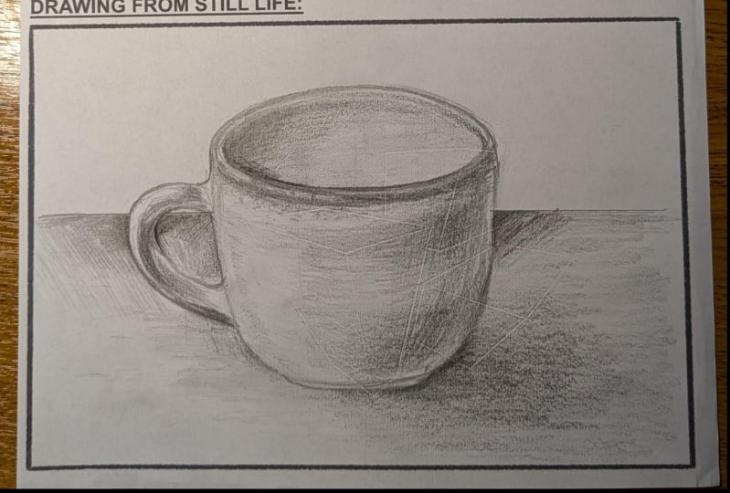
12. STILL LIFE STUDY: Put Your New Skills To Practice: Hi artists and welcome back. In this lesson we
are going to be talking about drawing
from still-life. This is great practice. So grab a random object. Do you want to draw
such as a cup, a plan, maybe your desk lamp? I want you to keep it simple at first so you can practice all of the basics before you move
on to complicated details. So I will be drawing
a cup and I will have a picture of this displayed
somewhere on the screen. Feel free to either draw
this cup with me or maybe you want to pick
an object of your own, but it's just important
that you keep it very simple so that we can
learn all the basics fast. So once you have chosen your object that you
would like to draw, the first thing I
want you to do is decide the orientation
of the paper. Are you going to be doing
a portrait or are you going to be doing a
landscape like we have here? So to decide this, I always look at the ratio
of the shape we are drawing. Like this cup fast. We're going to
measure the width. So from the edge of this
handle to the edge of the cup. So the width for me looking
at it is about this wide. And the height is of
course, much shorter. So for me it makes sense to draw my cup in landscape
mode and horizontal. So the first thing I
usually start with is IMAP out randomly where the edges of the shape are going to be. So first I'm going
to do the top of the cup and I want it to
be somewhat about him. Our cup has a handle
here on the left side, so I am leaving room for that. That's why the cup
is kind of shifted slightly towards the right
side, but not too much. It's still kind of like
somewhere around the middle, but we just want to
make sure that data, we're going to have
space for the handle. So this is the top
of our cup now, and we're going to assume
that this line is correct. So now when we draw
the remaining lines, so we're going to compare everything to this
line over here. So how does the width of the top of the cup compared to
the height of the cup, I would take my object and
I would measure it again. See, okay, it's about
stole from my perspective. Competitor. It's about the same width. It seems. It seems like the width of the top of the cup is almost similar to the
height of the cup. So now I'm going to
measure this line. And we know if we
keep a hand here, that the bottom of the cup is going to be somewhere over here. So I'm making a
mock and then I'm going to follow the COVID Sean. And I'm looking at the image too because I want our drawings
to turn out the same. This object has a bit of a
curvature at the bottom. So I am not just drawing
a straight line, I'm following the
lines that I see. Okay. So we know that the lines
are slightly slanted there, a slight angle of the cop. It's not like a straight
downwards angle. What kind of goals? It's Lance slightly
on this side here. So I am going to factor this in. And I'm just being very
loose with my lines. I'm not committing to
any details for now. I'm just drawing the
very general outlines. I'll even make them a bit
darker so that you can see. We have a small opening of
the cup somewhere about here. So of course we have to
draw this small lines. So yeah, we just want to find
the relationships between the lines to create
proper proportions. So if we made the top-line bigger than
the length of the coupled, also have to be bigger. And also you have to get
the foundations correct before you move on to
adding the details. So this is why weight
creating all of these faint lines to build up these fundamental
outlines and find the right shapes because you don't want to commit
with one thick line. You don't want to commit
with like one thick line and then not be able to
erase it or adjust it. You want to build
up very gradually. Um, I get the framework correctly before you go
into any details like e.g. imagine that we started
with the handle and we finished the handle before
we moved on to the rest. But then you found that if
the handle is a certain size, then you wouldn't be able to fit the rest of the cup
into the picture. So then we'll have that progress would
have been for nothing. So yeah, it's important that when you start any
portrait that you do, all of these measurements
fast to save yourself the time and make
it, make it easy on. So anyway, um, yeah, we're just making these
small adjustments. I can also see that I
didn't make this curved enough in relationship to this because this is
a pretty big cough, so it has to follow the curvature here
at the bottom as well. So yeah, you want to
build up gradually because in the beginning
we are guessing where the lines are and
we want to give ourselves a lot of
chances to get it right. And if I wasn't doing this in front of the camera
for the class, I would take a
little bit more time to make this as
accurate as possible. So be patient with the drawing. Take your time to make the drawing as
accurate as possible. So anyway, now we're
quickly going to do the handle so you want to find out how far it goes in relationship
to the cup. So we can see that the
handle actually it's almost, it's pretty much twice as wide
as this opening over here. So we can take the
measurement of this and roughly double it and
then bring it over here. And we know that our handle with and somewhere
around this point. So then we want to be
able to see, okay, where is the top of the handle and whereas
the bottom of the handle. So at least on the picture I have provided because
of because of course, this changes depending
on which perspective, depending on the
perspective that you are looking at it from. But at least on the picture, it seems to be pretty much
in line with this over here. So the top of the handle will be somewhere
around this point. And then to find the
bottom of the sandal, I would like to see
where it connects to the cup on the image
that I have provided, it seems to be about one FID, the height of the cup. So if we were to divide this
into fads than it would be somewhat on
the, on this line. So now we have the box
where our handle would be. And now all we have to do
is fill in the shapes. So it seems like it's a cough. And this seems pretty straight. Then it steps down. Here. You also want to
be able to observe the final details like
the distance between these two sides of the
handles seems much thinner than over here because of the perspective at which
the photo was taken. So you want to look at all of these little
details and see, alright, This is like there's
less distance between these two lines then
between these two lines. Okay, so you want to be able to observe these details
and factor them in. So now it seems we have the general outline of
our shaped correctly. And you can use this
technique with anything, you can use it with faces, landscapes, anything,
anything that you draw, you just have to find
the relationships between the lines. Alright, so now that you have the sketch roughly accurate, you want to shift
your focus to values. So take a moment
to observe where the darkest and
lightest values are. So maybe the darkest shadow is the shadow
underneath our object, or maybe the darkest shadow
is here on the side, or maybe hey, on the
inside of the cup. So it seems like for our image, the darkest point is actually the inside
of this cup here. Because you can see
that the sunlight was coming from the left side. So this area over
here was blocked most from the sun, this section. And then the lightest
points they seem to be. On the other side.
So this area over here is very light because it's, the sun is coming right at it. And also over here
it's quite light. On this side here. And also the handle, the left side of the handle. So the way to go about this is I would usually fill
in the darkest point. So this over here is
definitely the darkest. Then we also have quite a significant shadow
underneath the cup. And I would say that these
two are the darkest points. Really is just this
line right underneath the cup and this
section over here. Then we know that these are the highlights, these sections. So the idea is that we will now compare the remaining
values to them. So we know that this area over here cannot be lighter
than this area over here because these are the
most intense highlights on our, on our cup. So now that we have the
darkest and lightest values of the other remaining values
have to go in-between them. Also, the highlight color
is the lightest turns, so it might be close to
the color of the paper, but everything else has to have a value and be filled
in with the pencil. So be mindful not to leave anything the color
of the PayPal. And likewise be
mindful not to make anything darker than the
darkest part of the drawing, which is this section and
the shadow underneath. The little trick I do
is I squint my eyes. And this actually
takes out all of the details and just keeps
the simplified values. Try this right now and
see if it helps you pause the video here for a
second and try to strip out. So now that we know where our highlights one quickly
going to do is I'll just fill in the entire
rest of the image. Because we know that this is
going to have some value. And I find that people starting out and
I also did this myself, is I overuse the amount
of paper that I had left. White. Like I was very afraid
to press down my pencil. And I just love my drawings were lighter than
they are actually supposed to be on the
head then on this, as you can see, i'll, I'll put some examples on my screen. When I wasn't pressing
hot enough of the pencil and I wouldn't
be too many areas white. And you may notice that
even the lightest points, they are actually rarely
the color of the paper. I just, I think it's
good practice to do a very thin layer of graphite pretty much everywhere other
than the very highlights, because it's harder
to fall into the trap of all we using the
white of the paper. I'm even going to do a very, very thin layer over the
highlight because as I said, the highlight is never
actually that light anyway. Now you're just going
to see like we have a pretty dark shadow over here. So I'm quickly just going to
follow the rough shape of that and also the rim of our glass because
it has these details. These details are
darker than the, than the color of
the cup itself. So we're just going
to mark this. So here it's quite dark. I'm just, I'm just
adding value here. I'm comparing the
values to each other. I'm not going to make anything
darker than this section over here and this over here. And I'm essentially staying in-between the lightest
and the darkest values. This section over here is
definitely quite dark. Because again, the cop has some details and they they
show up to be very dark. See, I just fill
this in with me. We're not overthinking
this too much. We're just filling
in the details. We're being very loose. So we're following the
college on our object here because the cup is rounded. So I'm trying to be
mindful of that. If you have this tool, It's amazing to use because
it really just gives you such a nice smooth transition between, between your values. So if you do have this blending
stump, definitely use it. It's great. It's one of my
favorite tools for sketching. I can see that there's
quite an intense shadow underneath the cup, so we're just filling this in. And you can see how by adding the values
and the highlights, the cop is immediately starting to come out, come off the page. And it looks it looks
quite free dimensional. Yeah, we just, we just keep
on building on the values. So this is still quite dark. We lost some value here. I'm just building layers, adding more graphite
and pressing that they had on hand. I also lost this shadow
right underneath the cup, so I'm trying to add it back in. Yeah, when sketching, definitely
switch between pencils. So when you're sketching a HB pencil is great
because it's not too dark. I'm not too light, but when
you're making shadows, It's great to use one of the
higher B pencils like six. This is an eight B. Yeah, just sees the darkest
pencil you have. And I like to use
the darkest one because I find that
it's easiest to move around later when we
use the blending tool. Like if you tried to use a HB pencil or a to-be
pencil than this, just it doesn't move
quite nicely as a pencil, nine B pencil would. If you do have these
high LB pencils, then that great to
use in this way. They're also most
versatile, sir. Even if I'm not trying to
create a very dark value, while I do is I just
press very lightly. But you can also have
very dark values by pressing very hard. Whereas if you tried to
do this with an H pencil, you can't really get this value. Norma, how, howdy press or
how many layers you add. I like to use my B
pencils a lot when I'm, when I'm actually drawing, I find that I don't really use the H pencils as
much on the same during like really,
really fine details. You can also use your tools. This has kind of blend it
a little bit too much. So I'm going to add that
highlight back in there. And also this section over here, it's definitely a little
bit too dark now. This there is a highlight here which I didn't
previously observed. So yeah, we can just use our
eraser to add this back in. And this is a light
highlight to see. Yeah, this is a
very quick study by Hope that it illustrates, illustrates the point. Well. Of course you can spend
a lot more time on this. But yeah, this is
just the basics I wanted to show
you how to measure proportions and how to
think about values. We can also, we can also add
the background slightly. So I took this
picture on the floor. So there is a bit
off color to it. Slight by years. So you can fill this in. And then you can see the thing that we talked about in the
previous lesson about edges. Where you start to
lose certain edges. So maybe this would have, so right now probably
the area that stands out the most
is this because there is most contrast
because this is very light and
this is very dark. And even though you have a
shadow that's pretty much the same intensity
hit on the bottom. It's actually quite dark
all around it so it doesn't attract your eye,
just doesn't match, sir. Yeah, remember the eye is
attracted to contrast. This is something you can
use this intention to lead, to lead the eye
through the image. I hope you enjoyed this. I hope you found it helpful. And as I said, you can, you can keep on adding to this. You could spend more
hours on this and make it look like a picture if
you want them to be. I hope this just
covers the basics. I hope you learned something useful and I hope you enjoyed. And I will see you in the next and final lesson where we will talk
about proportions. So I will see that.
13. PROPORTIONS 101: Hi artists and welcome back. In this final lesson, we will be talking
about proportions, so we will make comparisons between objects within objects. We'll try a grid
technique and then we'll do a proportions
practice at the end. Sorry, to compare
between objects. So let's assume I have
an apple in front of me. This is a rough
apple. And I also have here, I'll make this.com. I have an apple in front of me, and I also have a lemon. So assuming that the
apple is drawn correctly, I now have to keep in
mind that the lemon has to be proportional
to the apple. So if the lemon is only
half as tall as the apple, I have to draw it out like so. There would be how a lemon here. This is comparison
between objects. Of course, you can
shave the sin, but you also have to compare
proportions within object. So how tall is this apple
compared to how wide it is? How tall compared to how wide? And if you make
the Apple shorter, you also have to
maintain the ratio. So if the apple is
roughly an inch tall, it also has to be the
equivalent amount of the width. So if you, even if
you scale it down, you have to keep
the ratios in mind. You have to make the same, this ratio the same as this. And if you had practiced the
still life study with me, then we would have gone
over this briefly. But this is just the
summary of it. So yeah. So when you draw a picture with a bunch of different
objects within it, you have to draw one fast, too fast, make sure that all the proportions live
in it are accurate. And then what you
do is you compare the remaining objects to it. So it's just like painting or any other medium with color. You put down the
first color value and you make sure it's as
correct as possible. And for the rest
of the painting, the remaining values rely
on the initial column. So this is sometimes a
difficult thing to get down, but it's incredibly important to make things look realistic. So spend some time on this
and don't feel discouraged. The way to go about is to
draw very gradually and find these lines that
Phil and look right? So if you are drawing from
still-life or a photo, use some tool to compare the relationships
between the lines. So I like to use my pencils. But you can also use
a grid like this. Like, I'm sure you've
seen other artists use. So the way this works
is you draw a grid over a photo and an identical
grid on your PayPal. And they are measured
out very precisely. So you know, Okay,
this bottom of the basket is in
this square here, and this fruit is also here. Like so it looks
something like this. I like this method because
you want not looking at the whole
overwhelming subject. You're looking at
each little squares separately and trying
to replicate it. So if we do this little
exercise together, we can see that the
basket runs for somewhere towards the
middle of this grid here, but it's slightly to the left. It's in the middle of what
kind of to the left side. And then it almost
goes to the top. Then we have what seems
to be like a melon. And the age just
take each squares separately so he copy down
all of the shapes. You see. They have a little
basket goes around here. And then you have your grapes. I don't know. This is a very rough sketch, but I hope this illustrates to you how to use a grid technique. So the way I would advise to
get started on this is to start with simple
objects that don't have a lot of
measurements going on. Like an apple is a
good place to start, or even they cut a face is quite difficult
because there are so many things you
have to compare and a lot of measurements
you have to make. And another thing about
faces is that people are extremely skilled at
recognizing them. If something is wrong
with a face drawing or there is a slight
miscalculation in proportions, then people will recognize
this immediately, especially if you are drawing
someone that you know or a celebrity whose
face is familiar. So I would start a little bit more simple
and first drawer things that don't require
much measurements. And then I would work
my way up towards more difficult things
such as faces. Or if you do want to draw faces, a grid method might be
very helpful to you, or maybe you can even try
tracing in the beginning. Also faces, It's much more crucial to get the
proportions correctly. We can draw a lemon
or an apple and everybody knows what
they look like, but they don't really
have individuality. So they come up in a lot of different proportions,
shapes, sizes. So again, if we go back to
our apple and lemon example, we want to stop by
drawing the bottom of our scenes or say within a half, an apple and the lemon is
going to be right over here. Sorry. Now what we have to
do is we have to figure out how tall
our fruit saw. An apple might be. This tool, and the lemon might be three quarters of the height, roughly, say
somewhere about here. So we can draw a line on the top to the term and the
height of the apple. And then this also
influences our width, sir. So maybe the width is the same as the
height of the apple. So I will object would
be within this bulks, our apple would be here. And maybe the lemon is the
same width as the apple, is just a much shorter. So it would be
something like this. Here's a lemon. And who is going
to be our apple? So yeah, the first thing
you want to do is determine the width of each object
and the height of them. And then after that you can
start adding in your details. Yes. So I hope these lessons
will very useful to you. I hope you learned a
lot about proportions. And thank you very
much for watching. Let's just move on to the conclusion where
we will discuss the class project and thank
you so much for watching. And I will see you
in the conclusion.
14. CLASS PROJECT & THANK YOU!!!: Congratulations, we made
it to the final lesson. Thank you so much
for taking my class. If you enjoyed it,
I would be very grateful if you left
a positive review, a comment or a project, your interactions with the
class help it show up on Skillshare or other
students may find it if you have any questions or would like me to
clarify anything please ask below and I will be more than
happy to help you. For the class project. I would love to see any
exercises you completed with me, maybe the sphere drawings
or the still life study. I leave feedback
on old projects, so definitely upload
yours and I will give you some further
constructive guidance. I have more classes
here on Skillshare. If you'd like to get into
drawing with soft pastels, I have an introductory class when we went over
all the basics, such as how to blend
and layer pastels. Or perhaps if you
have an iPad or an iPhone and would like to try the procreate drawing app, which I would highly recommend. I have an old terminal
themed class for that too. While we went over all
the basics and revealed cool tips and tricks and
hidden features of the app. Don't forget to follow my
Instagram victory Amoco at all. My website Victor, I may call
that column why I actually recently started an art
blog that is all from me. Thank you so much for taking my class and following along. I really do hope that you
learned something useful. I am really looking
forward to seeing your OT and answering any
questions you may have. Thank you so much again
and happy creating.
 Wiktoria, Professional portrait artist