Transcripts
1. Introduction & Overview: To create an original illustration, you do not need to draw everything precisely as you see it in real life, but rather reduce, simplify and visually interpret what you see. Minimalistic illustrations can be created from owners prints or can be developed into logo marks, pictograms, or used as passing elements. This is Dominic, from Attitude Creative. In this class, we'll be exploring tools and techniques for creating animal illustrations in a reduced graphic style in Adobe Illustrator. The beauty of this technique is that you do not need to be great at drawing or very proficient using Adobe Illustrator. I discovered this minimalistic drawing technique whilst attempting two draw a complicated illustration by experimenting with reducing and simplifying its shapes, and I'm really excited to share my experience with you. I cannot wait to see your illustrations. Enroll now, and let's create something awesome.
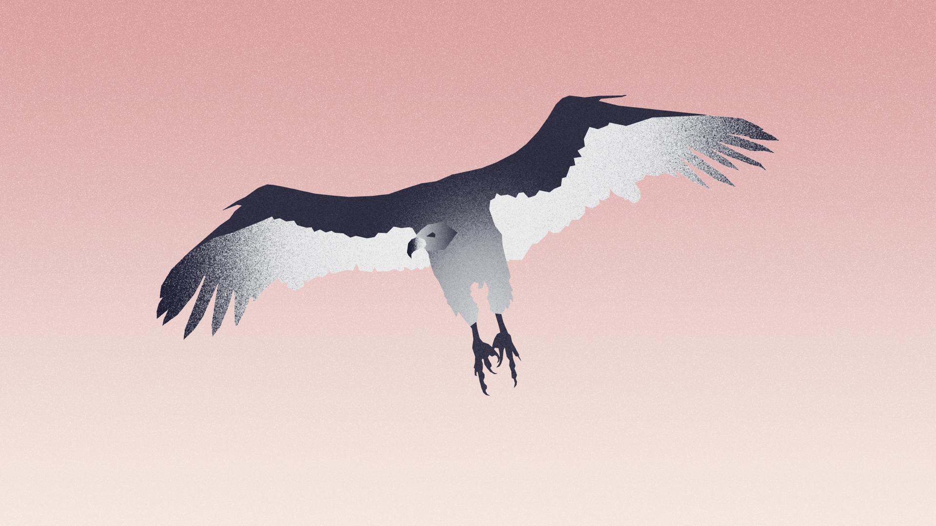
2. Choosing Reference Images: Before you can start drawing in Illustrator, you'll need to find an object to draw. I'm going to be drawing safari animals for this class, but you can draw anything you want. Have a look around on the Internet for inspiration. Because in this class, we'll be looking at reduced style illustrations. The object that you want to draw should have a distinct shape and features, and be recognizable from looking at a silhouette. Most animals work really well using this technique, so that is why I suggest you use for this class project. Alternatively, you can experiment drawing vehicles, ships, planes, plants, flowers, or household objects. When you have decided what you want to draw, take a source image. Since my illustrations are about animals, I'm going to be looking for wildlife photographs. When looking through search results, look for simple shapes and angles from which the object looks interesting and is easily recognizable. A good example here is my vulture illustration. Other animals usually see vultures circling above their dying prey. It made little sense drawing a vulture on the ground where it looked like plump Christmas turkey. Image quality is not important, so anything from Pinterest or Google images should be fine as long as the shape is right. When you have found right images, save them because you'll use them in Illustrator, to help you draw your elements.
3. File Setup: Open Illustrator and create a new document by going to the File menu and selecting New, or by pressing "Command-N" or "Control-N" if you're working in Windows. I'm going to select an A4 document size. Do not worry if you do not know what size to make your document. You can always change the size later and vector illustrations can easily be scaled without any loss in quality. On the right-hand side, there's a range of custom options. Name. This is where you can give your document a name. Height and Width. Here you can input custom sizes. Measurements. This allows you to change the measurement used when setting up your document. For example, if I was designing something for digital application, I would probably use pixels. Other measurements include points, picas, inches, millimeters and centimeters. For this project, I'm going to be using millimeters. Orientation. This option allows you to quickly change the orientation of your document's artboards between landscape and portrait. Number of artboards. Think about artboards like an artist's canvas. You can have multiple artboards within your document. I'm going to start with one artboard, but I can add more later if necessary. Marks and bleeds can be set for printing over the edge of the document and trimming. We don't need to worry about bleeds in this class. Color Mode. Here you can set your document's color mode. Because my illustrations are going to be put on the Internet, I'm going to set the color mode to RGB color. If you are creating artwork primarily for printed applications, you'll need to select Print, which uses CMYK color. Underneath the Color Mode option, there's a button for More Settings. This will open up the traditional Illustrator new document settings which were recently replaced. It contains all the same options which we just covered, except for raster effects, which are very important and determine at what resolution any raster-based effects, such as shadows, blur, glow, or grain used in your document would appear and render. Set raster effects to 300 dpi to be able to make everything look smooth. Now that your document is ready, click on the "Create" button in the bottom right-hand corner.
4. Placing Reference Images: Before we can get started, we'll need to place our found images into the Illustrator document. To do this, go to the File menu and select Place or press command shift A or control shift A if you're using Windows. Images can either be linked or embedded into Illustrator documents. It's important to understand the difference. Linked files are stored separately outside of Adobe Illustrator. This means the if were to delete the file or move it to a new location or rename it, Illustrator would not bee able to locate the file. This problem can be negated by embedding the file into the Illustrator document. However, you will not be able to edit the file later in Photoshop and that will increase the document size. To embed an image into an Illustrator document, simply click on the Options button when placing the image and deselect the link option. Now, simply select the files that you want to place and click on the plus button in the bottom right-hand corner. This will place the image into Illustrator. We're almost ready to begin outlining our animal. But before we can start, I'm going to go and lock the layer with our reference image. So I do not accidentally click on the image when drawing. Go to the Layers panel. If you cannot seen the Layers panel, go to the Window menu and select layers. In the layers panel, go to the reference image and click on the little padlock icon to lock the layer. Finally, before starting to draw my animal, I'm going to save my document. Go to the File menu and select Save or press command S or control S if you're using Windows. hear you can give you a document to name if you haven't already done so when you are creating your document. Decide where you want to save your document and select an appropriate format. When working in Illustrator, I usually save my work as an illustrator document. When ready, click Save to save your documents. Now we're ready to start drawing.
5. Drawing in Illustrator: To draw my rhino, I'm going to start by outlining its basic shapes. Have a look at your reference image. You should be able to design basic shapes. For example, foreground legs, background legs, body, head, eyes, and a camouflage patterns. The objective here is to reduce our animal, the simpler the better. Reduction in design is an important but often overlooked process of building something by subtraction, reduction, and the creation of negative space. I'm going to draw my rhino's basic shape using the Pen Tool, which can be found in tools on the left-hand side of Illustrator's workspace. You can also quickly access it by pressing the P key on your keyboard. The Pen Tool is often misunderstood and I frequently see people complaining about it. However, it is actually a powerful tool and one of the fundamental instruments available in Adobe Illustrator. The Pen Tool works best when it is used to create precise shapes and geometric artwork. It is a precision tool and should not be used to make sketchy artwork like the Pencil or Brush Tools. The simplest path you can draw with a Pen Tool is a straight line made by clicking the Pen Tool to create two anchor points, one at the beginning and one at the end. By continuing to click, you create a path, straight line segments connected by corner points. Complete the path by doing one of the following. Close the path by positioning the Pen Tool over the first anchor point. Small circle should appear next to the Pen Tool pointer when it is positioned correctly. Click on the point to close the path. Leave the path open by command or control clicking if you're using Windows anywhere away from the path. If you have left an open path, you can also close it by selecting it with Selection Tool and pressing Command J or Control J in Windows. This will connect the end points with line segment. In this class, we'll be working with closed paths. However, feel free to experiment. Now since I've drawn my first shape, I can refine it further by adding, subtracting, moving, or manipulating anchor points. Firstly, select your path using the Selection Tool located here in tools or by pressing the V key on your keyboard. I'm going to turn down the opacity so that I can see my reference image below. Go to the options bar on the top of the workspace and turn down the opacity. Usually 50 to 70 percent is enough to see both the path and the reference image. I can now work with my path by selecting individual anchor points using the Direct Selection Tool located in tools next to the Selection Tool. The Direct Selection Tool works in the same way as the Selection Tool, except where it allows you to select individual points or multiple points when shift clicking or individual line segments. I've selected this anchor point. By clicking and dragging, I can move the anchor point to a new location. My anchor point has a sharp corner. I can change this in options by clicking on the Convert selected anchor points to smooth button. I'm going to draw my animal using only sharp corners. However, if you want to experiment or drawing an animal like a dolphin which requires smooth corners, then this is how you can quickly convert them, and then adjust the curve using these handles. You can also draw smooth anchor points when drawing your initial path by holding down the mouse button and dragging when placing the point. Adobe recently introduced a new feature which allows you to create curved corners by clicking and dragging on this circular handle. The curves are symmetrical and you can have problems if you move your anchor points after creating this type of curve. The Pen Tool has several more options, which allow you to add or subtract anchor points. This can be quite useful, especially when you're trying to simplify complicated shapes. To add anchor points, go to Tools and click and hold on the Pen Tool icon, a sub menu will appear with further options. Select the Add anchor point tool. Using this tool, I can add anchor points anywhere in my path. I can also subtract anchor points using the delete anchor point tool. This is located in the same place. Both of these tools have shortcuts, which are the plus and minus keys respectively. I usually start out by drawing to many anchor points, and then reduce my shape backwards, seeing how few anchor points I need to create and shape. Think about it like this, a square only needs four points, one in each corner.
6. Understanding Fill & Stroke Colours: Paths drawn in Illustrator can have both stroke and fill colors. The stroke is the line between several anchor points or the outline of the shape, while the fill is the color inside of the shape. If you have got an open path, then the stroke cannot go all the way around the outside of the shape. You can control the strokes, color, style, and weight, and the fills color. To change the color, select your path using the selection tool and go to the color picker and the bottom of tools. There you will found a control which allows you to select the path stroke or fill. Double-click on either, and you'll open the color picker, where you can set a custom color or input an exact color using RGB, CMYK, HSV, or hexadecimal controls. When ready, click "Okay". Your selected color will be applied to your path.
7. Using Pathfinder: I've now finished outlining the basic shapes of my animal. It's a good idea to name different paths so that you can easily navigate through your file. I've turned on the opacity of each my paths so I can see the reference image underneath. I've also used different colors so I can tell the shapes apart. These colors can be anything because we will replaced them later with proper colors. As you can seen here, several of my paths are overlapping. This is not a problem so long as the path which is intended to be in front is on top. What happens underneath, for example, this jagged shape hair, does not matter because when we turn off the paths opacity, it will be hidden underneath. Later, you can further refine your shapes using the Pathfinder tool which can be accessed through the Window menu by selecting Pathfinder. The Pathfinder tool can be used to combine, subtract, intersect, and exclude paths. For example, here are two overlapping paths. When using the Pathfinder tool, it is important to remember that the path which is on top is more important. Using the selection tool, select both of these shapes. The first option in the Pathfinder tool is combine. This will combine both of these shapes into a new, larger path. The path on top is more important. So Illustrator has used its settings. For example, color and stroke weight when creating a new path. The second option is Minus Front. This allows you to subtract the path on top from the path underneath. This tool is really useful for cutting holes in paths. For example, here I have two paths and the path on top is smaller. I've got them both selected and when I click on the Minus Front button, Illustrator cuts a hole in the path underneath. The third option is called Intersect. It allows us to combine two overlapping shapes but only where the shapes overlap like here. The fourth option is called Exclude and it basically does the opposite of the Intersect tool. It excludes any overlapping areas. Anyway, best to keep things simple and outline your animals basic shapes.
8. Swatches and Global Colours: Now that I've got the basic shape of my rhino, I can start to think about its colors and how I can create shape that in texture using both colors and gradients, grain and blending modes. For example, I can use lighter and darker colors to create an impression of shape and light. I have decided to give my rhinos front legs and torso a lighter color. The hind legs I have maid dark as if they are in shadow. You do not need to use a lot of colors to color your animal. But it is important to follow the rules and have enough contrast between your animals different elements. For example, you would never color a shaded area in a lighter color because that just does not happen in your life. To color an element, select the path using selection tool, you can select multiple paths by shift clicking. The simplest weigh to color a path is to use the color picker, which we covered earlier. However, I want to use swatches and explore global colors instead. Go two the swatches panel. If it's not available, you can access it through the window menu by clicking on swatches. Swatches are basically a selection of colors which we have available in our document. It is important to remember that colors in Illustrator are document specific. That means if you create a new color swatch, it'll be saved in that document and you'll have to export the swatch if you want to use it in another Illustrator document. To create a new color swatch simply click on the new swatch button at the bottom of the swatches panel. This will open the new swatch color picker. If you already had your path selected when you clicked on the "Create new swatch" button, then its colors will already be applied in the color picker. The swatch color picker has several important options and features which will help us create an apply our new color. Swatch name, hear we can give our a swatch name. This could be important if you're building a range of colors only to identify a specific color. Color type, this option allows us to pick between process and spot colors. A process color is printed using a combination of the four standard process eggs, cyan, magenta, yellow, and black. Spot colors are special pre-mixed colors. Use process colors for now. Global color which has been applied to several different paths, can easily be edited. For example, I'm going to use global color to color my animal's hind legs, ears, and eyes because they all use the same color, and when using global color, I can easily adjust all these elements color at the same time. Color mode allows you to select a desired color mode and then choose your color using the handles or by inputting a specific value. I'm going to use RGB. If you're inputting a value, then remember the RGB goes up to 255 for each color channel, whereas CMYK only goes to 100 percent. Remember that a color created in CMYK might look different when displayed in RGB. Underneath your preview button, you might see one of two icons which look like this. The first of these is out of web color warning. This means that the color we have got selected cannot be displayed correctly in web browsers. By clicking on the icon Illustrator attempts to produce a similar color which can be displayed correctly on the Internet. When ready, click "Okay", and your new swatch will be created. Swatches created as global colors have a small dark clipped corner in the swatches panel. You can now apply your swatch to other elements by selecting them and then clicking on the swatch in swatches panel. The big advantage in global colors is that when you edit the swatch afterwards, the changes will automatically be applied to all of the paths using that global color.
9. Adding Gradients: Now that I've colored my animal, I want to develop it further using some appearance effects. This will allow us to apply gradients and texture further enhancing the impression of light, shadow, and shape of our animal. There are several different techniques for adding texture to Illustrator drawings, some of which involve working in Photoshop or with raster elements. The technique I'm going to show you today is based on Illustrator, and it uses a combination of gradients, grain, and blending modes. The big advantage in this technique is that it is easy to change the colors afterwards, just like in swatches. This technique uses several paths combined to create a texture effect. To do this, select the path you want to add texture to, and then paste it in front by pressing, firstly, Command C and then Command F. If you're using Windows, you will need to press the Control key. I'm going to texturize my animal's torso. Now select the layer on top and go and apply a gradient using the Gradient tool. When you add a gradient, you can change its position and proportions in respect to the path it's applied to by moving it around or scaling it up or down. The Gradient panel can be found in the Window menu, and it has a range of different controls and options. Type, here is where I can decide the sort of gradient I want to apply. In Illustrator there are two basic types of gradient, linear which works in a straight line, and radial which is circular. You need to decide what gradient you want to use, and this will depend on what you are colorizing. I'm going to use a linear gradient for the torso. Angle, this control allows us to set an angle for the gradient. Although our gradient is a linear gradient, we can still change the angle. I'm going to set the angle to about 30 degrees, which is about right for my rhino's torso. Now go to the Gradient Slider. There should be two toggles below which are called color stops, and one toggle above which is called the Midpoint. The Midpoint determines the location where two colors are mixed in equal parts. Color stops control the color, opacity, and location of colors on your gradient. You can add a new color stops by clicking just below the Gradient Slider. This will automatically add a new color stop with the settings for that part of the gradient. To delete a color stop, simply click and Dr it away from the gradient picker. Now go to the Left Color Stop and double-click. This will open the color picker which will allow you to select your desired color. You can pick a color from swatches or create a color from scratch. I'm going to select this color for my rhino's body, and then go to set the right-hand color stop. I will use the same color. Now I'm going to create a new color stop in the middle by clicking underneath the Gradient Slider. Notice how the midpoint stops move and are automatically positioned between my new and old color stops. I'm going to set the opacity of my new color stop to zero. This will mean that it is transparent. I should have a gradient with this color at each end, but which is transparent in the middle. This is important because we need to be able to seen the background past color when we apply the grain effects and blending options to the path above.
10. Applying Texture: When you've finished setting of the gradient, go to the Appearance panel while still having the desired gradient selected. If you cannot find the panel, go to the Window menu, and select Appearance. This will open the Appearance panel. Make sure that the gradient Fill is selected, and then click on the "Effects" button located at the bottom of the panel. A Drop-down menu will appear. Scroll down to Texture and select Grain from the submenu which will open. This will open the grain filter effect. In the bottom left-hand corner, there is a simple control which allows you to zoom in and zoom out. If you have got a particularly large graphical illustration, you might need to zoom in or zoom out so that you can see the effect. You can see that the effect has already bean applied to my rhino's body. The area in the middle where I set the gradients color stop to transparent is clear, and either end of my rhino's torso is covered with the grain effect. On the right, I have several different controls for adjusting my effect. Effects menu, a drop-down menu allows me to select other effects. Intensity and Contrast, two sliders which allow me to control the strength of the effect. Experiment with these and see what works best for you. Grain Type, this option allows you to control the type of grain. There is a range of different options available including Enlarged, Stippled, and Horizontal. Experiment with each of these and see what they do. When you're ready, click "Okay" to apply the filter. Now, we go back to the Appearance panel. Make sure the grain effect was applied to the fill. If it is outside of the fill, click and drag the grain effect to the fill like this. If we do not do this, then when we change the blending mode, it will not change the grain effect. Now that our grain effect is inside of the fill, we can experiment with the blending modes. These can change the appearance or behavior of a path. Click on the "Opacity" option towards the bottom of the Appearance panel. Small dialogue box should open like this. Click on the Drop-down menu. Here there are a range of different blending modes including Overlay, Darken, and Multiply, which is great for dealing with darker colors and Lighten and Screen which can be used for lighter colors. Feel free to experiment, and see what works best for you. I'm going two use Darken on my rhino's body because it creates quite a rough texture similar to its skin. This is how we can add texture to our animal using gradients grain and blending modes. Now I need to texture the rest of my rhino. Be experimental, especially with the Grain effects and blending modes because these are powerful tools which can be used to create shape, texture, and light.
11. Ideas for Further Development & Conclusion: Now that you've finished drawing, coloring and texting our elements, think about how they can be developed further and applied in designs, illustrations, and products. I have taken several of my animal illustrations and uploaded them to our Society6 shop, where they're available as art prints, iPhone cases, laptop sleeves, tote bags, and cushion covers. I've also developed a surface pattern using all of the elements I have drawn on the Illustrator. You can make surface patterns using both Adobe Illustrator and Photoshop. If you'd like to know more about creating digital patterns, check out my digital patterns from Vintage Encyclopedia illustrations class. You can also try further developing illustrations using negative and positive space, this can be useful for creating logo marks or printing in one color. So, that's it for this class. I hope that you've enjoyed it and learned something new. If you liked this class, please leave a review so more people can discover it. If you have any questions, leave a comment on the community board for this class, and I will happily answer it and provide feedback. I cannot wait to seen your illustrations. Make sure to post your work in the project section for this class, and if you're going to share your work on Instagram, please tag attitudeskills so we can save that too. Also, don't hesitate in following our Facebook page to see what we're up to, get all the latest updates, send us messages if you need to get in contact with us about something and see our new students spotlight gallery. Thank you for enrolling in this class, and I hope to see you in our other classes.
12. Bonus: Making of Vector Illustration of a Stegosaurus:
13. Bonus: Making Of Vector Illustration of a Buffalo:
 Evgeniya & Dominic Righini-Brand, Graphic Design & Photography