Transcripts
1. Introduction & Class Overview: Gradient mashes make a
fantastic base for creating exciting and trendy
abstract artworks and designs! And when you work methodically, you can easily develop even
rather complex compositions with beautiful color transitions and elaborate
organic distortions. Hey guys, my name is Evgeniya Righini-Brand, I am a graphic
designer at Attitude Creative, and experimenting with
gradient-based designs in Adobe Illustrator
has been one of my favorite creative
playgrounds for years. I teach a popular
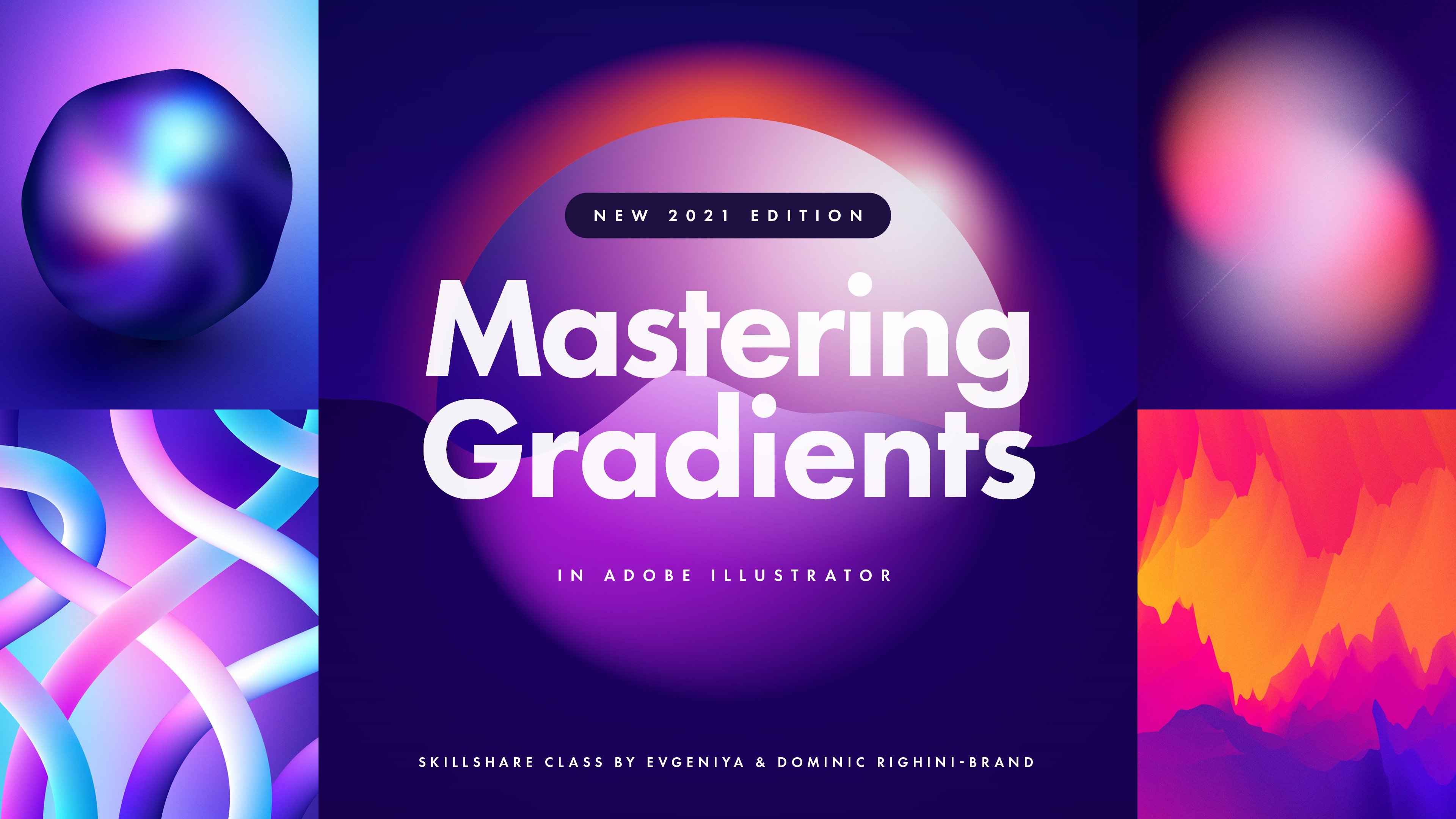
Skillshare class, Mastering Gradients
in Adobe Illustrator, where amongst other things, I covered the basics of
working with gradient meshes and tips and tricks for distorting them in an
experimental manner. And in this class, I'm excited to share
with you a different, more intentional
approach to working with gradient
meshes and break down my complete process
of creating exciting, vibrant, abstract
gradient artworks. Following this class, you
will be able to create your own sophisticated
abstract gradient artworks by gaining an
understanding of what goes into creating
this type of work, how you can split the process into clear manageable steps, and how you can use a range of Adobe Illustrator
tools to develop your meshes into
captivating designs. In this class, I will step-by-step guide you
through all the stages, including developing
the structure of distortions with smooth
controllable shapes in the mesh, creating exciting
vibrant color transitions and refining
the composition, integrating solid graphic
elements into the mesh to elevate the work, give it more dimension and
add a personal stylistic touch, and I'll finish it off with
tips for enhanced your work, and saving it for print
and digital use. If you're a designer,
illustrator, or an artist who loves
the look of abstract, organic colorful artworks
and would like to create your own to use in digital
or print projects, to sell as art prints, or to decorate a physical space
or create digital wallpapers, this is the class for you! Whilst the step-by-step
nature of this class will allow you to follow the process
regardless of your level, for the best experience, you will
need to know your way around Adobe Illustrator and have some understanding
of the principles of creating vector artworks are working with the colors and gradients in
the digital environment. I'm super excited to let
you in on how I create my abstract mesh-based designs and cannot wait to
see what this class inspires you to create! So join me in this class, and let's
make something awesome!
2. Class Project & Giveaway: There are a few different
ways you can go about distorting the meshes and shaping them into
the composition. You're after from more experimental and
playful approaches where sometimes you don't quite know what you'll
end up creating. The more intentional and
control development of the distortions to create
the desired shapes. I'm predictability and complexity
of the results created using the experimental
techniques have their own charm and appeal. But working with the meshes in a considered and methodical
manner helps to avoid getting overwhelmed when
creating distortions and getting all the shapes and color transitions
to your liking. And that's how
we'll be developing our artwork in this class. For your class project, follow the stages I'll be
going through in this class and create your own abstract
measure based artwork. Don't try to close the
recreate the composition I will be creating is it can
become counterproductive. And instead, let
your creativity flow experiment with creating
any composition you like and just use the tips, techniques, and workflow
I oversharing to develop your work in your
role unique direction. Because gradients are all about the colors I have
shared with you. My favorite color swatches, which have proven
to work really well in blend into
beautiful gradients. So don't hesitate
to download them from the projects and
resources tab for this class. Use them in your work to get going with your project, pasta. Share your final artwork alone is the
development stages by creating a project in the project and resources
tab for this class. I always super excited
to see your work here, how you're planning to use it. To celebrate your creativity and the launch of this class. We'll be running a giveaway, often a year of Skillshare
membership to participate. Post a project in this class, leave a class review and
follow us on Skillshare. To increase your
chance of winning by being entered into
the draw twice. You can also share the work
you create on Instagram. Tag us at Attitude
Creative and use the hashtag abstract
gradients with attitude. So we can easily
find your post and share your work with our
Instagram. Community. Entry deadline is at noon
Eastern Standard Time. On Sunday, second
of October 2022. The winner will be
drawn at random and announced the following day. I cannot wait to see your
projects and good luck. Now without further ado, let's get on with the class.
3. Getting Started: Let's start by creating
a new document. I usually create my gradient
designs in a template file. But let me quickly show you
what document settings I use. Normally I work on to
fold and by default, or pixel art boards
in RGB color mode. And with the raster effect
set to 300 ppi to make grain, which I usually add to texture my work look nice and small. And these settings
allow me to create pretty large artwork when it is exported in the
roster at 300 DPI, the art board of these sides. So these are my
recommended settings. Now I'm quickly going to
name my future document. And click Create. Because I'm starting
with my template. Before I can start creating, I need to load my
color swatches. So first of all, I will delete all of
these color swatches, which will load it by default because I won't be using them. And then I'll go to the swatch libraries menu and find my gradient
color swatches. Now I'm going to select all of them and add them to the
documents, swatches like this. You can download
these swatches from the cluster resources
and try using the same colors in
your work if you want. So let's close this panel. Since now, everything I need
is in the swatches panel. Whilst working on my artwork, I will be using the
swatches panel, the color panel, which
I usually set to HSB to be able to easily
adjust the colors. Then out in the
transparency panel because I'm going to be working
with the opacity masks. And of course, I will
need the layers panel. So to make it easier to follow along your workspace
up the same way. Now, it is a good idea to
save this new document. So you can simply hit Save
from time to time whilst working and not worry about specifying the location
or the filename. Later. Check that the
format is set to ai. And hit Save next week and
start creating our artwork.
4. Setting Up the Gradient Mesh: As a basis for this artwork, we will be using
a gradient mesh. So the first thing we
need to do is select the rectangle tool and create a square covering
the whole art board which will contain the mesh. Let's set the fill color
of the square root to black, stroke to none. Then we can create our mesh
manually using the mesh tool. But to make it faster
to get started, let's go to the Object menu and select create gradient mesh. In this dialog, you
can set up your mesh to have some
gradation of colors. And I like starting with grayscale gradient meshes
because they're super fast to set up and allow me to
concentrate on shapes and distortions without
getting distracted by needing to assign
colors to the color stops, working on some specific
color transitions. And removing the colors
from the equation and using just the shades
of gray to begin with, is it really liberating? I recommend keeping your mesh is relatively simple to begin with. There's just six or
seven rows and columns. I'll use seven because there's just a little bit more room
for experimentation with all these black areas
around white in the middle and a couple of
shades of gray in between. This look is created by the
appearance settings here. And you can invert
it if you want. But I will select the center option,
because compositionally, I prefer working when
I've got darker colors at the edges and highlights in
the middle to begin with. And it is just a matter
of preference because these colors will be used just for working with the
structure of the mesh. In any case, in the wound
feature in the final artwork. If you want to have
more contrast in your mesh and gradation
from pure white to black. So the highlights
here to 100 per cent. Now we can click Okay
to create the mesh. After creating my gradient mesh, I usually quickly create
a copy as a backup. So I won't need to recreate it. If I mess something up, then it roll back
to the beginning. Then I'll quickly
rename this layer so my document is
a little bit tidy. Now I'm ready to start
working with the mesh. So create and set up your
mesh in a similar way. And then let's move
on to distorting it.
5. Creating Initial Mesh Distortions: The majority of my
experimental designs are created by distorted meshes. And working with the various
distortion tools, e.g. the warp tool, twirl
tool, or wrinkle. And whilst it is
actually a lot of fun working with these tools, it is also a very experimental and sometimes
quite unpredictable process when you start mixing
various tools together. Also when using the distortion
tools, in most cases, you will be creating extra
points in your mesh, which can get quite
difficult to control if you want to start manually
modify your mesh. Because you have many
more mesh points to select and work with. You can totally use any of
these tools if you want to create something a little bit more messy and experimental. And if you do, don't
hesitate to check out my class mastering Gradients
in Adobe Illustrator, where I share in detail how to set up and use these tools. But in this class, I'm going to show you how to work with gradient meshes more intentionally and create
the desired distortions manually using the
direct selection tool, the anchor point tool, and the mesh tool. I want to create a
composition with elements which look like they're sort of mountain or hanging over each other or
something cave-like. But also with smooth curves. For this, I'll start by using
the direct selection tool. And for all the class, I will be using shortcuts
for the direct selection, anchor point and the mesh tool. And you can find this
shortcut cheat sheet in the class resources if
you need to memorize them. And you will see the
shortcuts popup in the corner of the screen
when I switch tools. So I'm going to start distorting my gradient mesh using the
direct selection tool and move in a few points to create some interesting and
organic shapes in the mesh. And the great thing about the direct selection
tool is that it allows you to select and work with multiple mesh
points at once, which makes it faster to
reposition a lot of points. If you need to adjust
the composition. Apart from squash and the
mesh points together. You can also overlap mesh
lines to create these ridges, which allow to create
some interests in three-dimensional
shapes in your work. We're one part appears like it is overhanging.
In other part. And this is a general technique
I'll be using to create the initial composition with some organic shapes in the mesh. So during this stage, I will just move in
some points around. And I'm not going to worry about the colors or even the
shades of gray yet. Because all I need to
do here now is create some interesting structure in the mesh and a basic
three-dimensional look. If you start seeing
some graphic defects in your mesh where you have
overlapped the mesh lines. It is best to straightaway
fix these issues by moving the points apart and
working with the handles, which adjusts the curves to
make everything smoother. So there are less issues
to worry about later. So it is a bit longer process than working with the
distortion tools. But because you
control what you're doing and you're not creating
any additional points. It allows you to shape your mesh is more predictability
and precision. So these are my
initial distortions, which I'm quite happy with. And before I distorted
this mesh any further, I'm going to create a copy as a backup and save the
document just in case. To distort this much filler. I will be using the
anchor point tool and playing around
with the handles. The great thing about
the anchor point tool is that you can work with the
individual handles like this, which allows to create more
fun, interesting transitions. So here I'm just moving around different handles
one after another, and checking what I can pull where and what
effect it creates. It's not necessarily
super predictable. Although you can learn what to expect when you move handled in a certain way in relation to the other handled
and mesh lines. But still, this
process is more about experimentation and just move in Handel's, see what happens. And I'm doing steps. If something doesn't
work as desired, there is no right or wrong. You just need to play around. And what I like about
this process is that unlike when working
with a distortion tools, you have much more control
over what you're creating. And whilst it takes more time, you can create more
intentional shapes and transitions
in your measures. You don't need to move all of
the handles for each point. And in most cases, moving just one or
two handles for most points is good
enough to begin with. So just experiment and
see where it takes you. And remember that you are creating something
abstract here. So don't worry if it doesn't look like what do
you have in mind? Because it will be
exciting either way. Because we're distorting
the mash menu only and only have the anchor points which
were originally in the mesh. There are not so many
points to work with. It is not too overwhelming. And there are no extra points
to distract you. Just hip. Also working with
just the shades of gray which were in the
mesh to begin with. And not worrying
about the colors or even other shades
of gray helps to concentrate on
developing the flow of the shapes and creating
a 3-dimensional effect. Measures can look super complex. But the limiting, what
you concentrate on during each stage of the
process really helps to get things done
faster and not get overwhelmed with all the different aspects
of the artwork. At the same time. I will be changing
some colors of the color stops to other
shades of gray a little later to see how I
can use them to add more details and emphasize
more shapes in the mesh. But it can wait for now. It is best not to get
distracted and not spend any time
assigning any colors. So this is the second stage. For now. There might be a few
minor issues here, but I can address them
during the next stage. So again, I will create
a copy of this mesh for backup and carry on
distorting it further. So far, I have only worked with the Direct Selection
and Anchor Point tool. Now I'm going to switch to the mesh tool and move
a few points around. And the cool thing
about the mesh tool is that if you hold
down the Shift key, you can move the
mesh points on top of one of the lines it sits on, which allows you to make minor
adjustments to the mesh. And at this point, I'm just moving the
mesh points around, then not adding any new
points and mesh lines to avoid making my mesh more
complex than it needs to be. This area here got a
little bit too messy. So again, I'm going to switch to the anchor point
tool and play around with the handles a
little bit more to make everything here
a little bit smaller. Generally to tidy up your mesh, you need to work
with the handles of the adjacent mesh
points and move them around and avoid
overlapping them with each other or
with the mesh lines. And just move things around
and see what works and what allows you to create
a smooth result and avoid graphic defects. It might take some tweaking and go in-between
different handles. But you'll get there with
a little bit of practice. This already is
looking quite good, but I'm going to move a few more points around
to adjust some of the transitions and play
around with the handles a little bit more to create more interesting
shapes in the mesh. And if it gets a bit
too messy, like here, I can reset the handles by using the anchor point tool and dragging the mouse
from the mesh point. And this will create a set of handles in the default
cross position, which helps to eliminate
some of the graphic issues. And now I can tweak the
handles a little bit more to adjust the shapes and
add more depth to the mesh. So I'm pretty happy with the
general distortions so far. And there is no need to overdo it because it is
just the beginning. So get your distorted
mesh to a similar stage. And next we can move on to the next stage and start
changing the colors of some of the color stops in
different shades of gray to create some more pronounced
shapes in the mesh.
6. Adding More Depth & Detail: Your mesh at this stage met
already look quite good. But it is always a good idea
to spend a little bit of time changing the colors of some of the color stops
to differentiate, agree to develop
the mesh structure in a little bit further. Get the shapes in the mesh
look more detailed and allow for a more
varied recoloring during the later stages. Because I have started
with the mesh which had four white color
stops around the center. I want to play around with changing the colors of the color stops here and try to create
more color transitions. And the more depth. Again, I'm going to
copy my mesh for backup and start analyzing
which color stops. I need to change. I quite like this
highlight here, but because they are free
or the color stops next, it colored in the
same white color, changing the color
of one of them. In this case, this
one will allow to create more transitions
in U-shapes in the mesh. So I'm going to try out a few different grayscale
color swatches in, make this area slightly
darker like this. And to increase the contrast
and emphasize this shape, I'm going to make this
color stop lighter instead. Generally, to bring out
the shapes in your mesh. And to create more
exciting transitions, you need to have some contrast between the adjacent
colors stops, but not necessarily
a huge amount. So look for the areas and
stops which like contrast. Try changing them to
different shades of gray and see how it
affects your mesh. Again, it is a quiet
experimental process. So I'm going to play
around with making some of the color stops lighter
and some darker. And the main objective of this stage is to
develop the composition further and generally to make them look more detailed
and more four-dimensional, behave in a larger variety
of shades of gray in it. Also, make sure that
you don't neglect the color stops at the
edges of your mesh because they can allow you to develop the transitions even
further and create a more even the composition
which will make your entire artwork
look more considered. So I'm pretty happy with
the range of shades of gray and transitions so far. But because now there are a few new visible
shapes in the mesh. Next, I'm going to work
with the mesh points and handles a little
bit more just to further develop some
of the shapes and to eliminate any graphic defects which have cropped
up in the process. So now this mesh looks
considerably more detailed. There are no defects left. When developing your work. You can totally stop here. It was the actual mesh
structure development. Then move on to adding the colors of your
choice for your work. But I want to play around with
the mesh a little bit more to make a few further
adjustments to its structure. So in the next part, I will share with you
how I go about analyzing distortions and tidy up the mesh to get it
ready for recoloring.
7. Finalising Distortions: Manually distorted
meshes is great to begin with as it allows you to keep
everything under control. Then look to over populate your mesh with any extra points. But after you have developed the general composition
of the distorted shapes, this is a good idea
to very gently use some of the distortion
tools to fill it. Develop your artwork. Again before I just store
this mesh any further, let's quickly create a copy
of this mesh at the stage. Can save this file. As you can see, I'm really into baking up every stage
in the same document. And I really recommend
you do the same, both to be able to easily roll back to the previous
stage if necessary, and also to see how
you work develops. Now I need to select
this new mesh. And I'm going to continue my experiments with
the Warp tool. Let's quickly check
its settings. Set the detail value to one, intensity to 20 per cent, simplicity to 50 per
cent and apply changes. Now I'm going to make the distortion brush
a little bit larger by dragging the
mouse and holding down the Alt and Shift keys. Now start moving
and pushing things around the art board to see how it can distort the shapes and open up this area
around the middle. And being able to change the distortion brush size
on the goal makes it very easy to control how much of the mesh is affected by
the distortion tool. So just a little bit of work, and I'm much happier
with how this is looking in comparison
to the previous stage. But there are a few new
graphing defects here caused by moving the mesh
points and lines around, which I need to
fix the usual way. You can also spot there if you knew points
on the mesh now, which were created by the warp tool and just
move points to work with. And that's why using
the distortion tools is best left to this
stage in the process. And keeping only the
essential points in your mesh for easier
manual development. And the earliest stages. I don't mind some of the rougher transitions
here because they add more dimension to the work and don't look particularly glitchy. But if you don't
have much patience for sorting all of
these issues out, try to keep your mesh as simple
as possible and go light. It was the distortion tools. Also, if you get a little too messy with too many
additional points, you can always delete some of them using the Delete
Anchor Point tool, which can help you eliminate
some of the graphic defects. At this point, it is a
good idea to address all obvious graphic
issues or play around with the areas which
don't look quite right. So I will carry on working
as the points and the curve handles to make everything in this area look a
little smoother. And sometimes when you're
trying to make things better, they actually can get worse. So in this case, it is best to undo a few steps. Just try again, like
I'm doing here. So now this is looking better. But this area here could do with an extra mesh point to make it darker and add more
volume to these shapes. So again, I'm going to quickly create a copy of this
stage for backup. And then select the mesh tool and add a new mesh
point in this area. In change it to a darker color. So this edit more
volume, so this area. But straight away, there are a few more visible defects
which I need to go and fix the usual way when moving
the points and the handles around until
this area looks smooth. So keep in mind that
when you start adding new points or
changing the colors, or even just tighten
things up in one area. Some graphic defect
might pop up in a different area dependent on how the distortions
go into your mesh. So you need to pay attention
to what you're doing and carefully go through
different areas of your mesh. Makes sure that everything is as smooth and clean as
you want it to be. So all these shapes here
look quite good to me. But usually what I
like to do is pick just a fragment of my
distorted gradient mesh, use it for the final artwork. So I'm going to create
another copy of this mesh. Then I'm going to scale it up and play around with position
it on the art board, rotating it and see which
part of the mesh works best. This will do for now. But I want to create
another copy of it and see whether
I can distort it a little bit more with
the Warp tool just to develop the shapes in the
mesh a little bit further. I wouldn't recommend
playing around with a distortion tools after
tidying up your mesh. But hey, I will be
careful here in the US, not very big
distortion brush size, and try not to make my
mesh all messy again. So this will do when you feel
that you are almost done. Be sure to look at your mesh
overall and see if there are any areas which might benefit from a little
bit more contrast. E.g. this area is
looking a little flap. So I'm going to experiment
with changing this color stop to a darker shade of gray. And it looks so much better now. So now it's time for one final inspection
of the whole mesh. I'm not super happy
about this area here. So I'm going to try
to sort it out. And this is definitely better. Now, I'm pretty happy
with this mesh. And I'm just going to reposition a little bit on the
art board like this. My whole process involves
a lot of little tweaks. But if you are not as pedantic
and perfectionist as I am, you might be able
to progress faster. Remember that this is
an abstract artwork, so it is completely up to you
how clean or messy it is. So finalize your distorted
mesh in shades of gray. And next, we can move on to
the fun part of color in it.
8. Initial Recolouring: Now is the structure or the black and white
gradient mesh ready? We can start experimenting
with color in it by changing the colors of the
color stops in the mesh. Two different colors
from the color swatches. But first, to keep my developmental layers
easier to navigate, I'm going to create a
separate new layer, name it development, and put it underneath
the design layer. Then I'm going to create a copy of these latest
mesh to work with. In drug all my black and white developmental meshes want on my new layer and then
the lock and hide it. So they still in this
document in case I need them. But separate from the following
color development stages. To recolor your gradient mesh in the colors from the color
groups in the swatches panel. You can either manually
assign different colours to the mesh points or you can use the recolor artwork tool
to get them done faster. And that's what they usually use for the initial recoloring. Let's open the Advanced Options. And here, select one of the color groups
from our swatches. And these colors will replace the shades
of gray in the mesh. And my favorite thing here is
swapping the colors around using this button and seeing how it changes
the look of my mesh. It is also worth quickly
trying out other color groups, since we haven't got
quite a few cycle for the colors to see
different options. When you settle on
the color group, which you want to use, start to slowly change
the order of the colors so you don't miss the spread of the colors, which you like. Changing colors
this way is quite fun and sometimes can allow you to create the
desired coloring really effortlessly,
end quickly. But in some cases, it might not work as
well as you would like. E.g. if you don't have a lot of different shades of gray in your original black
and white mesh. Or if you don't have
enough colors in your color groups to replace all of the shades of
gray in your mesh. Also, there are color
reduction options which can be accessed
via this button, which will affect how the
Recolor and is applied. E.g. these are the
settings I have used which determine how
the genes are treated in. You can try other
options and see how they affect your
particular org. I also have preserved black
and white checked here. So then automatically
recolored T beginning. And after swapping
all other colors and achieving the
desired effect, I can turn on the recoloring
for these colors like this. And I will manually assign
a color from my swatches to replace my black color using the one of the darkest
blue swatches I've got, which will keep it aligned
with the color theme and preserve it as the darkest color in the work at the same time. As for white. I
won't touch it for now and keep my
highlights white. In this color can
be replaced with some off-white color from my swatches later, if necessary. The stage of recoloring, there's just the basis for
the future development. Unless of course, you
managed to stumble upon some really cool color
during this stage already. When you are
generally happy with the distribution of the colors, hit Okay to apply recoloring. But don't save changes
to your swatch groups. In this dialogue pops up. And after doing this
quick initial recoloring using the recolor artwork tool. Next, we need to refine
color transitions by manually changing the colors
of some of the color stops.
9. Refining Colour Transitions: After recoloring your work, you might notice
some weird things happen in your mesh which
you will want to fix. But first, it's better
not to get distracted. And start by manually changing the colors of some
of the color stops, which don't blend
tool and don't create the desired transitions with
the neighboring colors. E.g. I. Am going to
start by trying out different dark blue
and purple swatches to replace some of the darker colors in the mesh to create cleaner transitions. Also, I've got a load
of not super plays in dark colors around
the edges of my mesh. So I'm going to
replace them with someone in a little
more vibrant. Be sure not to neglect the color stops at the
edges of your mesh. Even if you might be
using just a fragment of the mesh in your
final artwork. Because all of these
color stops will affect the transitions
you see on the art board. So play around with
the edge colors. You can see how you can add some more font color into
your work around its edges. Avoid any dirty transitions. So with the edges of the mesh
looking much more vibrant. Now, I can move on to
working on some areas within the mesh where the colors
don't mix well together. And before I get on with
more menu recoloring, again, I'm going to quickly
create a copy of my mesh. Then I will switch to the
direct selection tool. Then starts recolor in some of the color stops, which look odd. E.g. here, I don't
like how these blue color blends
the colors around. So I will try some
other colors which will also help me bring
this shape out. This will do for now. Next, because I want this area to be sort of a
focal point in my work. I need to spend some time making it look smaller in January, make it stand out. So I will play
around with changing the colors and also work
with the points and handles. And remove some extra points
which mess things up. So if you're planning
to have a focal point in your composition and January, dependent on how much you
have distorted, you mesh. You might need to
spend some time playing around with
this structure a little bit more after recoloring it
to get the look you like. Now this is a much more
interesting shape. I also would like this shape
to appear more vertical. So I will quickly rotate the
mesh a little bit this way. And then proceed with
more than the points around until I
like how it looks. So this area is done. And now I'm going
to play around with other color stops to create more exciting and
cleaner transitions. Whilst I have a lot of
colors in my color groups, they can also use some tins of some other global
color swatches. If I need to create lighter
versions of these colors, which will nicely blend
together with the other colors. So at this stage, I would
just go around the mesh, have a look at different
color stops to bring out some shapes
and add depth. And also adjust any
issues which are caused by changing colors
are moving the points. This is all about refining the color transitions
in your mesh and making sure that the colors
which are next to each other blend
nicely together. Then there are no dirty
America transitions. And to speed up the process, at this stage, I usually just go through
my color swatches, can see what blends well and adjust tens of some of
the colors if necessary. Another thing you need
to pay attention to when recoloring your mesh is
what happens to the shapes. We should have spent time
refining in shades of gray. So play around with
the color stops in the areas which were
supposed to be shadows. And bring back the brightness to the areas which are
supposed to be lighter. And adjust any adjacent
areas to bring out the shapes and create
nicer color transitions. On the go crazy,
adjusting a lot of color stops and
just concentrate on the obvious areas which
lacked detail and contrast will have some
random spot of colors. We don't blend too well
with the surrounding areas. And changing just a few
color stops can help make the composition more
detailed and dynamic. Add more depth to it. When you change
some of the color stops to a very contrasty color, you can straight away,
see some oranges, which can make your
work more dynamic. So you just need to play around, experiment and see how it goes. But of course, you
don't need to take it as far as I am doing here. And if you're happy with
how your work looks, even right after you
have recolored it using the recolor artwork tool and change just a few colors,
stops many early. You can stop there. So this looks quite good, but I think there is room for developing this mesh
a little bit further. But I will do it with a
copy of the mesh yet again, just in case I
mess something up. So let's add a few extra
mesh points to add a little bit more variety and more shapes to
the composition. And spend a little bit more time finalizing the colors and making sure that there are no default colors
created in the mesh, which are usually not the
purest colors and can spoil the overall
brightness of the work. And then generally look through all different
colors stops. You can see how the
colors work together. Whether I need to balance
certain areas up, e.g. by making some areas
darker and some brighter, or bringing in some different
hues to different areas. E.g. I. Will add a
few more blue areas to my artwork to make it
all work better together. So this looks quite good. And now I want to reposition
the whole mash on the art board to see what area I can use
in my final artwork. Now, you can see a few
more little things which I want to fix
in my focal area. So I'll go and play around a little bit more with
the curves in the mesh and move the points around
and change the colors just to get this area looking
as nice as I possibly can. So I'm getting a little
too pedantic here. But paying attention
to these sort of little details really helps
to develop the work a little bit further and finalize certain areas which might
have been neglected before. Refine the color transitions and tweak the structure of
the mesh if required. And then let's move on to
develop in their work filter by finalizing all of the shapes and transitions within
the art-board format.
10. Finalising Colouring: After doing the
initial color in, the next step is to work with the mesh elements within the
format of the artboard and develop the composition
without getting distracted by any elements which will
feature in the final artwork. So first of all, I'm
going to duplicate my gradient mesh and move all of the previous stages
of the development layer. At this point, the file might
get a little bit heavy. So if you want, you can
save a corporate with all of the developmental
meshes as a separate file. Only keep your latest stage of the gradient mesh in
your working file. Just to make it a
little bit easier for illustrator to handle. To see how the part of your mesh works within
the art boards format. You can either put
your mesh inside a clipping mask in a
shape of your own word. Or you can go to the View menu
and select Trim View here, which will hide anything which falls outside your artboard. Switch into the Trim View only just now is really important. Because if you switch
to it earlier, you might miss some of
the points in your mesh. You can keep them colored in
some unconsidered colors, which will feed into your
design from the edges and might make the transitions
look dirty and not very nice. With everything beyond the
art board boundaries hidden. Now you can start paying more attention to what is
happening at the edges of your earned word and how various shapes work
within the composition. And most likely at this stage, you will want to reposition
your mesh within the art board to get the composition look
in a more considered. Now, working as the mesh points which fall within the art board, you can experiment further
with the colors to make your whole composition
work better color wise. To add more volume to it by
introducing more contrast in colors to shade or
highlight the shapes. You might also find some areas close to the edges
of your art board, which didn't stand out
before within the full mesh, but which now look
like they could be developed in a
little further. E.g. like these shapes
I have in this corner. So if necessary, play around with the mesh
points and handles a little bit more to get all of the areas in your
work look considered. Now I am pretty happy
with this area. And next, I'm going to go around the edges and see what
else I can change to make the colors and
shapes at the edges of the art board
look more exciting. Depart from trying
different color swatches. At this stage, I
also like to adjust the colors using
the HSB sliders. If my team like a
pedantic process, given that they have a
lot of swatches to use. But making minor adjustments to colors which you have
in your swatches can really help to fine-tune
the color transitions and make the colors than
the Better Together. If you have some
air in your work, which stands out
for no good reason. And since underdeveloped, e.g. like this area here, this is a good time
to finalize it by working with the
structure of the mesh in changing the colors to either create smooth transitions for colleges to have
the same level of detail as in the rest
of your artwork. When you're concentrating
on some small details, it is important to work both closely with the area to
have more precise control, but also zoom out
a little bit from time-to-time to see
how the changes you have made to this area. Because the rest
of your artwork. Looking at the overall artwork, I want to make a few final color changes to certain areas. You'll have more
consistent color and then also fix any graphic issues which I might have
missed so far. And now it is looking
pretty much done. So finalize the coloring
and shapes in your mesh, work within the format
of your art board. And next, we can move
on to the next stage of 18 more graphic elements to
further develop this artwork.
11. Adding Geometric Elements: Your artwork might already look great just as a distorted mesh. And you can keep it as
simple as that if you wish. But in my work, I like using the solid
color geometric elements or topography, which makes the work more
playful and exciting way creating contrast with the
organic shapes in the meshes. So in these next few lessons, I will share my process
of creating and working additional
graphic elements into the gradient meshes. And you can use the following
tips and techniques to add a solid color elements
to your work if desired. In this artwork, I want to use some very simple
geometric shapes to add a little bit of
layering and depth to it, just to make it a
little bit more fun. So first of all, I'm going to lock my mesh to stop it getting
moved by mistake. And then I will switch to the Ellipse tool and draw a circle filled
with white color. I love using circles
in my work generally. But you can try using any
other shapes you like. This looks like a good
size to begin with. So I'm going to create a
few copies of this circle. To keep my work simpler. I like using elements in
exactly the same size. And since I'm integrating a layering effect and it
in depth to my work by partially mosque in
solid color elements behind the edges of
the shapes in my mesh. I usually spend quite a bit
of time moving them around the art board and
finding some interests in areas where there
are some sort of shape, inches and place my
elements circles in this particular case nicely in relation to these
shapes in the mesh. After eight and my circles, I want to quickly try and making them all a little smaller. So I will select all of them. Here we go and play around with their size in the
transform panel. You can see how they look. So this is a tiny change, but I like it more. And now I can go and tweak their placement a
little bit more, playing around with
their position in relation to the
shapes in the mesh. Yet again. Next, add a little bit more
contrast to this work. I am going to switch to the line segment tool
and add a few strokes. Before I create
any more strokes, I'm going to play around
with the stroke weight. You can see what works best
with this composition. I don't want something too thin, which won't be really visible, then it might look facet. And I don't want solvent to fix, which will look
like a rectangle. So this looks quite good. So I can create a
couple more copies of this stroke going to play
around with their arrangement. At the moment, my objects are in NOI and listening to each
other when I move them. So I'm going to quickly turn off smart guides so I can
move them around freely. And then carry on working
on the placement of my strokes and circles until
I get the composition. I like. When developing the composition of the
additional graphic elements. Sometimes I delete some of
the elements in the process. If it looks like it is too much, and then create more copies
if I need to add more. And in this case, I have deleted a few along
the way and then recreated a few extra copies to
arrange them along the edges of the artwork to
make it more interesting. I can be here all day
moving this objects around, but this is good enough. So create and arrange any desired additional elements on top of your gradient mesh. And in the next lesson, I will share with
you my process and tricks I use when
integrating these sort of elements in the meshes using masks to add more
depth to my work.
12. Masking Geometric Elements: Placing additional elements
on top of gradient meshes can sometimes work
without any extra steps. But I like working my
geometric elements into the composition using masks to add some volume to my work. And in this lesson, I will walk you through
my process of using clipping and opacity masks to organically integrate any
additional graphic elements with a distorted meshes. To begin with, I'm going to
select all these elements. Then set the blending mode to overlay so I can see what
shapes are underneath them. And even though this
looks quite cool, I still want to mask them behind certain
shapes in my mesh. As you cannot extract the
paths or shapes from the mesh. To create clipping paths. I use the pen tool and trace edges of the
shapes in my mesh, create polls, puffs, and then apply them
as clipping masks like this. So now this shape appears as if it is in front
of this stroke. Next, I will repeat
the same process here. Because I want my
stroke to look solid. Hey, to change its blending
mode back to normal. And also I need to go
back to the first stroke. I have mosque in change its blending
mode to normal as well. Now onto the next stroke here. I wanted to appear from
behind this shape. But because I cannot
see its edge when the strokes blending
mode is set to overlay, I'm going to turn down
its opacity instead. And then using the pen tool, draw a slightly curved segment like this pole on the
edge of the shape. And then carry on as usual, by creating a cost above. Select both the
stroke and the puff. Change the blending
mode back to normal. Create a clipping mask, and change the strokes
Opacity back to 100%. Then I'm going to repeat the same process with
the remaining strokes. And the hardest thing
here is creating the paths which follow the
edges of the shapes precisely. So you might need to play
around with the points and handles to create
the exact curves. So there is a little
bit more depth already. Now, we can move on to circles. But with the circles, it is not as easy because of the complexity of the
shapes in the mesh. So instead, I'm going
to use an opacity mask, work with the original mesh
and see how it could work. So first of all, I'm going to select
all of the ellipses, change that blending
mode back to normal and group them together. And also group all my
clipping masks with the strokes and all them so
they don't get in the way. Next, I'm going to
create a copy of my mesh and put it above
the group with circles. Then all the
original mesh below. Now to use these copy of the
mesh as an opacity mask, I need to select both the
mesh and the group with the circles and hit them Make Mask button in the
transparency panel. Sometimes applying a
colorful gradient mesh is an opacity mask
can work, alright? But to be able to work
because the match as a mosque in a more
straightforward way, it is best to convert the mesh used as a mask shades of gray. So I'm going to select
the opacity muscle group. Then select the mask object, which is my mesh here. And having the mesh
selected on the artboard. Opened the recolor
artwork window. Again, let's open the
Advanced Options. This extra step of opening the advanced options
can get annoyed. So you can check this
option here so that the advanced recolor
artwork dialogue will open by default
in the future. Now, let's select the group containing greyscale
color swatches. It might look better already, dependent on how the recoloring
is applied to your mesh. But I'm going to be swapping the colors around to
change the look of the mask circles until I get
an opacity distribution. In general, it looks quite nice. I'm going to apply changes. Next, I'm going to select
my mesh used as a mask. Go and manually change some of the colors of the color
stops to make some areas more transparent by changing the color stops to black
or darker shades of gray, and making other
areas more epic. He's in some lighter
gray color swatches. So this is the main logic of working with the opacity masks. And that's what I'm
going to be doing. Going through different areas which are next to my circles and changing adjacent colors stops to different
grayscale color swatches. Do I get the look I like? And in some cases, it might not be super
straightforward. What affects what it is all about playing around to
create the desired effect. So this area is quite tricky. So I might need to mask
it a different way. But I will get back to
it a little bit later. First, I will finish
all the other areas near my remaining circles
which need to be masked. So most of the circles
are masked nicely. Now I'm going to
deal with this one. First of all, I'm going
to go and find it in the group and then take it out of the group so I can
work with it separately. Then I'll turn
down is a positive so I can see the
shapes underneath hip. Now I need to move
just a little. So the circle is placed over the hard edges of the
shapes in my mesh. Next, I will carefully trace this edge
using the pen tool. Create a closed path. Increase the opacity
back to 100%. Select both shapes and
create a clipping mask. And now the circle
is properly masked. And these sorts of
overhanging effect is exactly what I was after. And here's another
tricky area where I need to develop how this
circle works because the mesh, because it doesn't
cover any hard edges. I need to mask it in
a more complex way, both keeping it within
the main opacity mask. So first, I will
create a copy of the circle and paste it in
front of their original one. Then filled with the black to white linear gradient with two opaque color stops for now. Then using the gradient
tool, set it up. So it's somewhat goes in the same direction
as this shape. And adjust the gradient
just a little. Then select both
circles and create an opacity mask out of the top one filled with a gradient. So now it looks a
little bit better. Next, I'll go back
to the circle. Select the mask object, and adjust the
gradient a little bit more just to make this circle, then beta was the
edges of this shape. Now it is looking much better. Next, let's select this
opacity mask group and quickly check out different blending
modes to see how I can better blend this record
is the colors in the mesh. Enlightened here. Looks alright. Next, let's see if I can move this circle in a slightly
different position. This could work, but I
prefer how it was before. So I'm going to undo the previous few steps and go and play a
little bit more with this gradient forming the
opacity mask and change the colors and the opacity
of the color stops. And in this case, why transparent color stop
instead of the black one, works quite well and creates a slightly
different transition. Now, I'm going to make a few final adjustments to
the gradient slider here. This circle filled batter
into this shape in the mesh. Then I'm going to go and play around with the blending
mode of the circle. Once again, because I removed
the previous blending mode. In this case, screen seems
to be working quite well. Next, I'm going to adjust the colors in the
gradient mesh used as an opacity mask to see whether this edge in the mesh can
fade out a little nicer. This looks better. Now let's switch
to the Trim View to see our progress. So far. The artwork looks
almost finished. Requests just a few
final adjustments, which I will address
in the next lesson. So experiment with using
clipping and opacity masks to work additional
graphic elements into your mesh to create
the desired effect. Then, let's move on to finalizing the look
of the artwork.
13. Finalising Artwork: After working as the colors in the mesh and add an
extra graphic elements, have a look at the art for coral and see if there are any
areas which you would want to either stand out a little bit more
or better blend with the surrounding areas. E.g. I. Think that the
areas here and here could do is a little bit of color development to make
them a little more exciting. For this sort of
color modifications, I like using additional
gradient elements. So I will create an ellipse and fill it with a white
to white radial gradient, which fades out like this. Set its blending mode
to orally and then play around with its size,
position, and gradients. Let the settings to create a highlight in the desired area. This allows me a
more precise control over coloring in certain
areas of the gradient mesh. And obviously, it is also not destructive to the
gradient mesh itself. And it is easier than tweaking the color
stops in the mesh. Especially if you're working
with a gradient mesh, which is quite complex
and has a lot of points. And you can use this
technique of using fading out gradients in different
colors to highlight. Shading will alter the colors in certain areas in your work. So I'm quite happy
with how it looks and highlights this
area in the mesh. But I'm going to quickly
go and check out other blending modes to see
the alternative effects. Overlay works best in this case, because it adds
more contrast here. It makes this shape
stand out more. Using a fade in our
gradient here gives me an idea for what I can try
with this circle here. So I'm going to fill my
previously solid color mask the white circle with a fading out white to white
linear gradient. And keep it within the opacity
mask as it was before. This looks so much
better this way. Now I'm going to quickly copy this highlighted
gradient to this area. Can play around
with the size and position of this gradient and the blending modes and the gradient slider
settings and see what can allow me to create
the desired look. Not sure that this
is what I need here. So I'm going to delete
this ellipse and instead go and make a few
minor adjustments to the colors in
the actual mesh. Just to make it a
little bit more interesting and a
little darker instead. Now, this is almost finished, but I want to really quickly finalize the position of some of the circles and just move them
around a little bit more. Next, let's switch
to the Trim View. So this is how it is looking and the artwork itself
is now finished. So make any required final adjustments to make your artwork look
more considered. And the next step is to add a little bit of green
to it to give it a more finished look and to make it look better
when it is printed.
14. Adding Grain & Colour Enhancement: When creating my
gradient designs, I usually texture
them using green to make the color transitions
look smoother, both on screen and in print. And to give my work a
more finished look. To texture this entire artwork, I'm going to switch to
the rectangle tool. Draw a rectangle in the
same size as my art board. Make sure this is
perfectly aligned to it. Then set its fill color to
some darkish gray color, e.g. using these colors swatch. Hey, in this rectangle selected, go to the Effect menu, then texture, and select grain. In the Grain settings. I will set the grain type to stippled intensity to
them and contrast. So 50 is it creates
a nice even grain. And click, Okay. After the grain
effect is applied, I'm going to set
the blending mode of this rectangle to soft light. Then go and adjust its opacity. I usually set the opacity
of migraine object to 35-50% dependent on the design and how much green
I want to create. In this case, 25 per
cent, work quite well. I'm going to create some
nice, subtle grain. Usually grain also helps to increase contrast
in the work. But here I feel that the colors can be a little
bit more intense. So too quickly and non-destructively
intensify the colors. I'm going to create a
copy of my gradient mesh. Select the Copy, set its
blending mode to Multiply, which should work with
these range of colors. So it looks more contrasty and more intense, straightaway. But that's a little bit
too much for my liking. So I'm going to turn down the opacity of this
mesh to about 50%. This looks much more exciting in comparison to how it was before. So keep this in mind and try using a different
blending mode and opacity settings to
non-destructively and just the colors
in your mesh. So at grain to texture your work and play
around with intensifying or modifying the colors using a copy of your mesh and
blend modes if required. And after that, let's move on to export in our
work in the roster. So it can be showcased
in line or printed.
15. Saving & Exporting Finished Artwork: Now that artwork is finished, we are ready to export it
for print or digital use. Before expert in,
I'm going to give me composition one final check. First, I'm going to lock the
rectangle containing grain, so I don't move it by mistake. Then unlock and group all of the design
elements together. In nudge them just a little
bit within the art board. So their place better
within the final format. So I'm happy with that. I'm going to click Save
my Illustrator file. And now I'm ready to export it. Gradient artworks are
best printed from roster files and not
EPS for PDF documents. So let's go to the File menu and select Export, Export As. And here you can
export your work in either for
professional printing, JPEG or in some cases in PNG. I'm going to export my
artwork in a jpeg format. Check Use Artboards. So I only export what's
on the artboard. And select my art board here. And click Export.
In the next dialog, set quality to maximum. I'm going to be experts
in my work in RGB. Because angry to be printing
and selling this art work via print on demand services
which accept files in RGB. In my case, Society six. I'm going to set the
compression method to baseline standard resolution
to 300 ppi for print. Then select Art Optimized
anti-aliasing to have nice smooth edges of
the shapes in your work. And embed the color
profile here. And then click Okay. Now if we will file to
be exported, That's it. To produce smaller files for
sharing on social media. Or in your Skillshare project. You can either export
your artwork at 72 dpi separately or you
can open your image, expert it as 300
DPI in Photoshop. Then scale it down
to the desired size, which should be ideally kept
to at least 1,200 pixels on the shorter side
for both sharing on social media and for
your Skillshare project. And this brings us to
the end of the class. Let's wrap it up.
16. Final Thoughts & Conclusion: Gradient meshes in Adobe
Illustrator and great for creating experimental designs and exciting abstract artworks, which you can use in
digital or print projects. Print out to decorate
an interior, will sell as print
on demand products. And I cannot wait to see
what you create in here, how you plan to use it. So be sure to post your
project in the projects and resources tab for
this class and share your final artwork along with the development stages and a few words about how
you're going to use it. If you're going to share
your work on Instagram, please tag us at Attitude
Creative and use the attitude skills and abstract gradients with
attitude hashtags. So we can easily
find your post and share your work with our
Instagram community. If you have any questions, please leave a comment in the discussions tab
for this class. And I will happily answer
and provide feedback. If you want to learn about
all the different tools and techniques for creating
gradients in Adobe Illustrator. Be sure to check out my class mastering Gradients
in Adobe Illustrator. And if you are after some
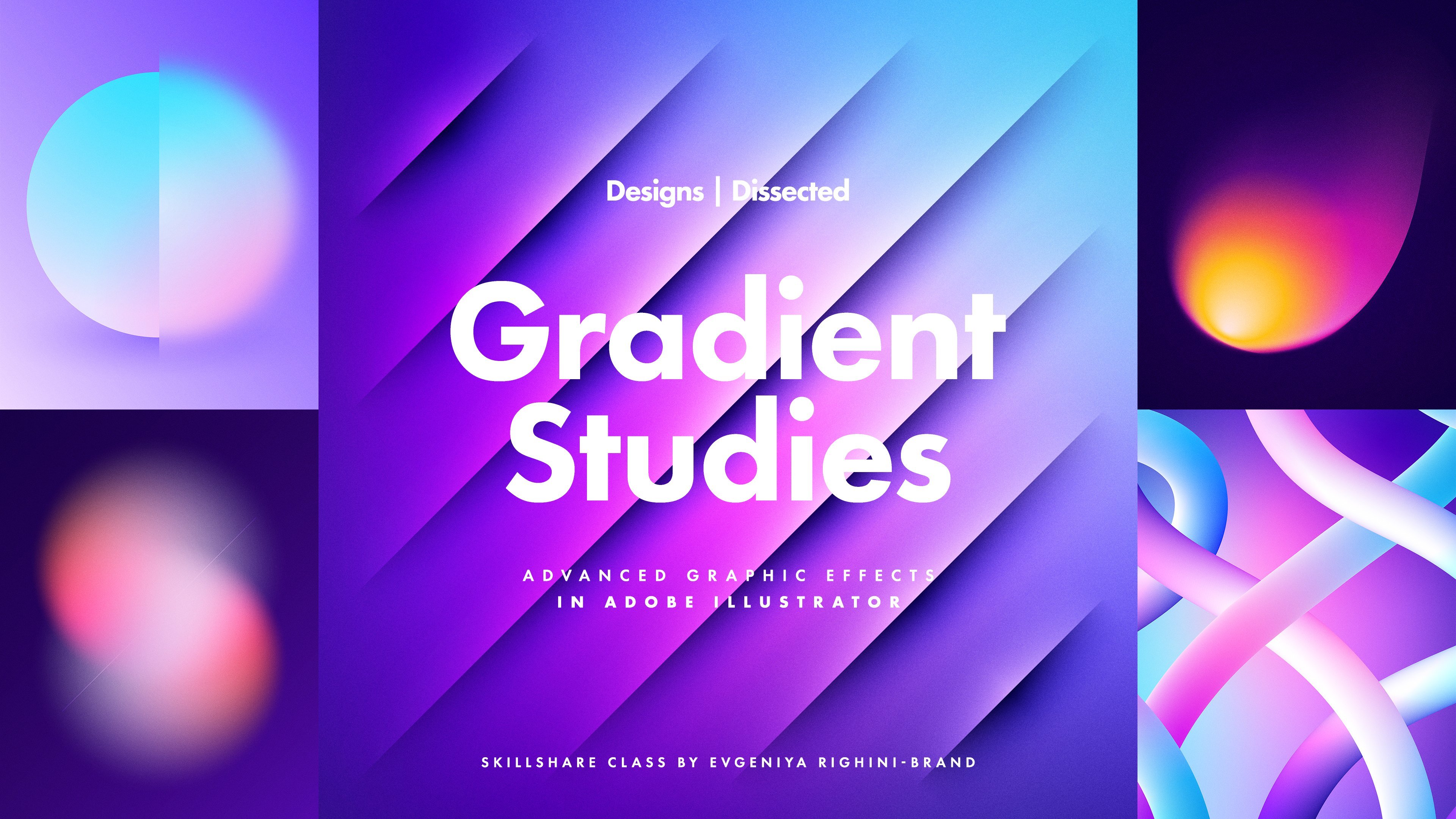
examples of how you can smartly combine different tools together to create different effects. Checkout my class designs
dissected gradients that is in the graphic
effects in Adobe Illustrator. And that's it for this class. I hope you have enjoyed it
and learned something new. If you found this class helpful, please leave a review so more
people could discover it. And be sure to follow up here on Skillshare to be the first to know about our new classes,
updates and announcements. Also, don't hesitate to
check out and follow our page on Facebook to
see what we're up to. Get all the latest updates. Send us private messages. If you need to get in touch
about something and not to miss if you're featured in our students spotlight gallery. Thank you for watching
this class and I hope to see you in our other classes.
 Evgeniya & Dominic Righini-Brand, Graphic Design & Photography