Transcripts
1. Introduction: Oh, my gosh. Hi. I'm so
excited that you're here. This is such a fun class because there's so much imagination and creativity that
can go into it. You're going to design
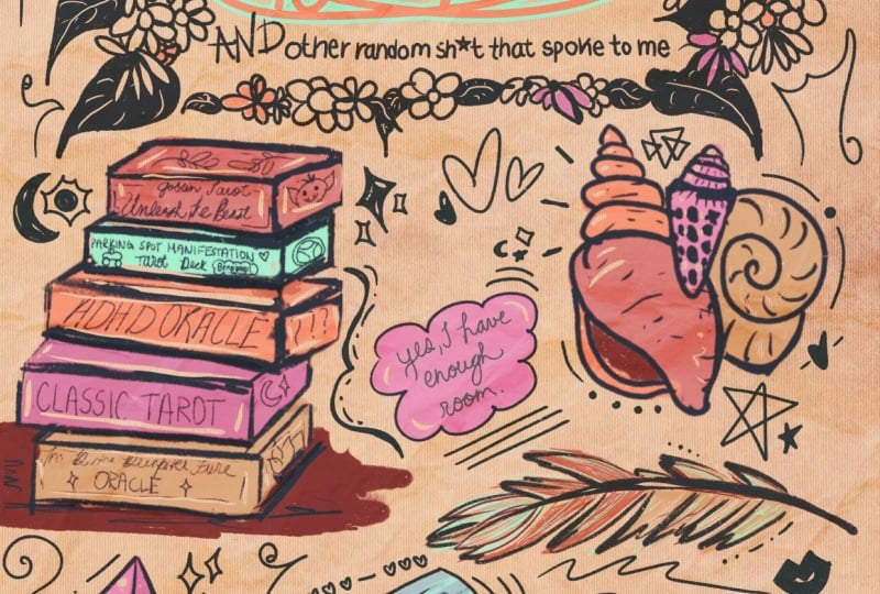
a field guide, too. You insert the blank, and that field guide will
consist of all of these fun objects that fuel and feed into that main
theme. It's so fun. It's so personalized, and it's just a
really easy way to be creative and take
the load off and not have to think and
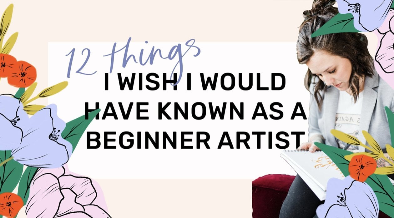
not have to be You know, finicky about a final project, even though you're going to have an amazing final project. I am Peggy Dean. I am an
artist, author, an educator. My favorite thing
in the whole world is to provide these resources for anybody who's
passionate about creativity and the ways
that we can fuel it, whether it be technique or
whether it be projects. And we're gonna get a little
bit of both in this one. We're gonna be
covering coming up with ideas, polor palettes, composition, a little bit of hand lettering because
I can't help myself. We've got a little
bit of everything sprinkled in this class for you. You can do this in
your sketchbook. You could do it on your iPad. Let's just jump in. Let's just jump in. Let's start right now.
2. Brainstorm Ideas: I am so excited that you're
joining for this class. Welcome, welcome, welcome.
This is so much fun. I ask that you just keep
an open mind and bring your inner child and play and get up all your art
supplies, and let's get messy. So the part that I
think is so fun, and you can really get
lost in this part. So please limit
yourself to, like, five ideas because there's so many ideas that come
from all of those ideas. This is the ideation part. So this is where we're going
to figure out what it is that we want our
art piece to be. They stop them. And it doesn't
mean that your other ideas aren't amazing and
that you can't visit those two, but we
need to pick one. Am I talking to myself
right now, probably. But we need to pick one
and roll with that. So let's make a list. Okay. And let's just
start with a basic list. So pencil paper, pen
paper. It doesn't matter. What we'll start with
is we're going to say field guide, two. And then without having to think of everything that's
going to go inside of it, we can think about what we
might want to do generally. So I have some
ideas to kick off. One that I've been wanting
to do is inner child. So something having to do
with your inner child. It could be nostalgic, you know? Another one might be you know, like, it could be seasonal, so summers are autumn,
you know, winter, but what can we do that's
even more specific than that? So on the inner child dame, I might think of, like,
childhood summers. Or if it's summer related, it could be like us talking about this type of a project
inside of my community, the art Nest recently. And somebody brought up
surviving summer heat, which I thought was very
fun because it could be It could be funny,
but relatable. Another one might be like, kind of magical, ideal
guide to a mermaid summer. 'Cause why not? We
can do what we want. This is art. Art is creativity. We could do, like, rainy days, just a plain rainy day, or, you know, being a homebody. There's so many different
avenues we could take, cat logic, you know, I could have to do with our
cat or our dog or our horse. That could be funny.
It could also be hut. Maybe having guests over or, like, being a guest
or being like, What about being
a wedding guest? That's very specific, but
it could be pretty funny. Sorry, if you start not being able to read what I'm
writing, I don't do well. On the bottom corner
of a paper pad. Um what about road trips? So it could be field
guide to road trips. Oh, group text. Group text or specifically, like, family group text. But then, as your list grows, one of the things that we're going to have to think about is, how can we narrow down, what we're going to
put inside of it? So I feel like this is
a pretty good list. I could go on for a while. What? I feel like
this is pretty good. And what we need to
think about is what types of objects are going
to go inside of these. So, for example,
family group text. Well, what are some, you know, different things that we might put inside family group text? It might not be super
Illustrate bull. Is that a word? I mean,
it might be, too. It just really I really depends, but I think that
maybe just start, let's do something
a little simpler. But before that,
let's pick like, pick your favorite five. I said five. Let's pick three. Let's narrow this down. So
I really like inner child. I like rainy day. I
also like sleepovers. I think sleepovers can be fun, 'cause I'm really feeling
pulled like inner child. Um oh, summer camp
would be good, too. Is going to write it on my list? I'm I know. Write your ideas down, you know? I'm going to go with
sleepover. Okay? So from here this is where we can start to put our ideas
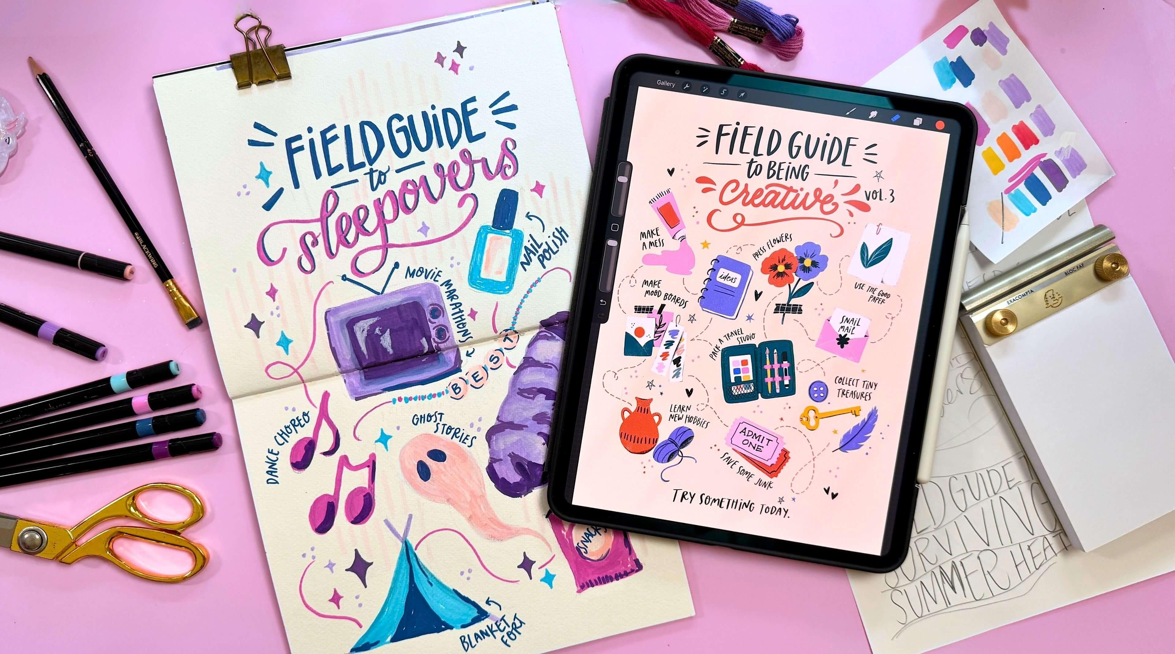
for the topic down. So field guide, two, we have those ideas. But how about now? We go Field Guide to our topic. To sleepovers. C. So what types of things
can we put in here? Now, you can think
about phrases. You can also think
about actions, and you can think about objects. So have sleepovers. Obviously, like blankets, pillows on the ground. I'll just say
sleeping bag for now. Okay, so sleeping
bag, ghost stories. Maybe scary movies are just like since I already said ghost
stories, movie marathons. I'd be fun with, like, a retro TV. Making a fort, nail
polish. Maybe braids. Like braiding your hair. Oh, friendship bracelets. Definitely. Secrets? I don't know how I
would draw that. I'll just write it just
in case. Dance choreo. Did you guys ever make
up dances at sleepovers. Dance choreo.
Choreography. Man, I thought we thought
we were so cool. Okay. What else do we
have for sleepover? We had snacks. And then
how many do I usually do, like, tenish, so two
horses, eight. We have ten. Perfect. Okay, there's our
list. It's that simple. Now that we have
everything put on paper, we can take this idea and
we can then put it into a general composition of
what that's going to look like as far as
spacing and whatnot, to get it down and make
it into something real. It's going to be very fun.
3. Plan Your Composition: Alright, now that
we have our list, and we know what
we're going to do, I'm gonna save my idea list because save your
ideas. They're fun. Put it in a journal so you don't have a lot of loose
papers around. But I'm going to take this
list that we have made. I have about ten.
I might add to it, I might subtract
to it. We'll see. This is a running list. It's a draft. And then I'm going to take just a blank
piece of paper, okay? This is just printer paper. It's nothing fancy,
and this is where I'm going to kind of plan
out my composition. So this is easier than it sounds because we're going to want
to have room for our title, and we're going to
want to have room for all of these objects. And so make sure you can
see that. There we go. The best way to do this
is I just use circles. So title. You can put
that in the center. You can put it at
the top, whatever. This is not our final piece,
so it really doesn't matter. We're just getting
kind of the lay of what this will look like. So I have room for my title. Guild guide two, sleepovers. Perfect. I'll make this darker
so you can see it better. I would do this
light, though for you because you might want to erase and then
move stuff around. But this is going
to depend, right? So some of these items are
gonna be in certain shapes, but we don't have to think
about that really, really. What we just want
to think about to start is just to get I have ten, so ten blops places. If you have, like, nine, then you could easily go one, two, three, one, two,
three, one, two, three, and keep it nice
and clean in, like, rows and columns, or you can have it kind of
scattered throughout. And that's what I like
doing. So I'll do this darker so you can
see it on screen better. So I have one I'll
just do two, kind of, like an overlap or like an interactive with
the title somehow. Three, four, five, six, seven, eight, nine, and maybe
ten will go right here. It'll probably move
over a little bit. But that's really easy, right? So all of this will probably
shift to the left a little, but then I can kind
of plan this out. So like a sleeping bag, I can do, like,
the general shape. I don't draw the full
thing. I just draw, like, a very simple
shape, like rectangle. Okay, sleeping bag.
Got it. Ghost Stories. Maybe I could do a little ghost. Well, then I'm thinking, Okay, this is kind
of a plane shape. I'm gonna want these
to be larger than I think they need to be because
we're filling up a cage. We don't want tiny little icons. So maybe the ghost, if I have sleepover
here, I could do, like I want it to be like spooky sleepover so it
wouldn't be at the top. So maybe just right
here, actually. So ghost, I'm gonna make this larger than I
think it should be. I'm gonna have to I'm gonna have to practice
the ghost here. Okay, Ghost. There we go. S get it. Okay. I'll make this sleeping
bag a little larger. Okay, we have that
movie marathon. I could do a retro TV. That could be fun
right here, maybe. It is a box, so I might not want two boxes
right next to each other. So that's kind of why I
like to plan the shapes. So I think maybe
I'll put it here. Remember, I'm gonna have
more breathing room. I'm just getting it down. I'll go ahead and
erase this part here. Also, isn't this
the coolest eraser? They're like, gemstones.
Isn't that so fun? Makes me so excited
every time I use it. It's definitely not a
professional eraser, but it works well for drafts. Okay, TV Fort? Hm. How are you gonna do a fort?
I don't I want it to kind of maybe on this side
or maybe down here, 'cause I have the ghost
kind of coming here, so then I could put
this fort right there. So, see, it's just basic
shape. Nothing else to it. Oh, you didn't even
see that. There we go. Basic shape, nothing more to it. Um, nail polish. That's also kind of rectangular, so I could put it
here, and I don't want these to go the same direction. I'm gonna want it
to kind of, uh, maybe come like this.
Okay, nail polish. Done. And braiding. That's gonna be that's
gonna be something. I don't know if I want
to do braids, maybe. I don't know, right?
It could be fun. Let's just throw a braid in
here and we'll see we'll see how that goes.
It's gonna be fine. So I don't want it
to be like random tuft over there.
I'll move that over. So I know I'm going
to make a note to myself to move this over. And then all of it I'll
know to move over. Friendship bracelets. Okay, so this one I don't we can do a friendship bracelet to
where it is a solid shape, or it could kind of
flow throughout. So I feel like having it kind
of flow might be cool with, like, beads in the center.
So I think you'll do that. So that removes one
of these I think I'll remove this one and then
scooch everything over. Okay. So got that. Secrets. Oh,
how do we do secrets? I guess maybe I could
be Like a bubble. Like a chat bubble.
This actually ended up being in
this circle area, so I can scooch
this one down here and then still use this. Okay. So Dan's choreo, well, maybe we could do like, maybe just like music notes, 'cause we want to
simplify it, right? We don't want to have
to draw a whole bunch of a whole bunch of things. So I'll just do music notes, and then we can
write the label or, you know, what have you. And then I'm just gonna move over and be
like, right here is. I can flow a little bit. And then, lastly, snacks. We could just do,
like, bag of chips or cookies or maybe vols. Think that I want to
actually put it down her and less up. So this will go away. This will be nail
polish, and then chips. See, this is why drafts are
great because you kind of get to figure out exactly
where you want things. And mine is very messy. Like, I'll be honest.
It's very messy. And if it helps you to do
all of this and then go in and take a pen
and go over it, so you can really see
where things are. I do. So you can really see how this is all
coming together. Then sleeping bag, music notes I'm bringing
up a little higher, ship bag, braves
and then a ghost. And then nuke that. This is going to
be the retro TV. How did the antennas
are like this, right? I'm gonna have to
look at a sample. And then your four. Okay,
there we go. So I have it all. It's flowing well together, and then I can
work on the title. So I do want to do that separately because
lettering is a whole thing. It's not a lettering class. I have lettering classes. Highly recommend.
They're very fun. But what I want to say is we can I want you to like
the labels that you do. I want you to like the lettering and the title that you do. So I want to do a brief
lesson next on how you can create a title that
you actually really enjoy, and then we can marry the two and put
everything together. You're gonna be happy with
your title and your labels. I won't have it any other way.
4. Practice Lettering: Ch. We're going to
look at titles. You're going to love the
way that this turns out because it's going
to be adorable. Also, there's so much to know for lettering.
There's so much. I'm going to try not to
get crazy detailed about it because I nerd out about
lettering. I love it so much. I have classes for
that. I'll link them. You can explore to
your heart's content, but for now, follow
along with me. We're going to make this pretty
simple, pretty standard, but I want to do a couple
renditions with you so that you're really happy
with what you end up doing. She. I'm just gonna use
the back of my paper. I'm gonna make it super simple. This is how I
approach thumbnails. I do you could box off six faces or you could
just draw small. So and I say draw because
I'm gonna make myself big. I say draw. Because
when we do lettering, we're drawing.
We're not writing. And so if you're like, Oh, my handwriting sucks,
Minos, too, girl. Like, I get it. Uh, but we're going to be
drawing our letters. So it just changes the way that we approach each
individual letter. That's gonna help you when
we're doing this part. Okay? Keep that in mind.
You're drawing, okay? So field Guide two. We're not going to draw
just yet because we're just writing it out to get the
general idea of spacing. But when it comes time
too, don't worry. That's the point. Field
Guide, two, okay? So this is my first option, and then I could go make sleepovers look all
fun and pretty. Okay, so there's
there's one option. Field guide to sleepovers. Maybe it'll, arc a
little bit, Arch, Ark. And that's cute and fine. But then there's
other options, right? So I could say field guide. And then I could say two. And then sleepovers, M and caps. So we're just kind
of getting an idea. So these are two.
They look different. They have different vibes. Maybe I joge that up
more and then do, like, something like
this with some juge. So maybe when I'm
drawing letters, see how I'm making these longer than they normally
would be, right? This doesn't have to
look pretty right now, but it's just kind of getting
an idea. Field guide. Okay. And then maybe two is
in this little bannery thing. And then sleepovers
could be like so. So. And they get to like a
line break or something, maybe with some flourishes,
might be kind of fine. And then something like
this, we could I don't know. This is where we play.
It doesn't have to have, like, a, this is
the right answer. One way that always makes it
fun is to do, like, okay. Nod I like to do three lines. So if you have, like, field Guide two surviving summer heat or
something like that, I'll just do that one just as an example so you can see
what I'm talking about. So if I go Field Guide two
surviving summer heat. If you do these like wavy lines, and then the next
one, I'm going to go instead of up, I'm
going to go down. And then I want to
leave enough room for letters so I don't get
super thin right there. But then I'm just going to kind of change the way it looks. Field guide, two, surviving. Semi heat to come up like this. Okay, this is fine. So what we do is we need to
have enough room in here. So field guide, too. So just know your
letters are going to be kind of smooshed. But just watch it
kind of unfold. So we're going to go the
whole length or what is it? Height. And then we're
just going to follow the curves as well
as we fill this end. So field Guide and see
how it gets smaller. This doesn't have to
look pretty right now. It's just our draft. Two. Already, that looks fun. And then we'll say surviving. And surviving could
be something fancy, but when it's like this, it kind of does the fancy for us. We want to have some room
in between the lines, so just leave a small gap
between ser surviving. And then it gets large, right? Okay, lady that looks fun. And then we can say summer
heat. Needs to go up. And this is just a draft. I know I keep saying it,
but it's gonna look kind of weird when we're not
actually lettering. Okay, Field Guide surviving
summer heat. Isn't that fun? It's just like
something different. I like this kind of vibe. I'm gonna try this.
You got to do it a little smaller 'cause
I don't have a lot of room. Giild Guide, two. I think I'll put two
right here and then try kind of a little bit of. Angle. I think I
like it like this. Yeah. And then I'll say, like, field guide and little
do this right here. I'll have to move this
over just slightly. But overall, I think
that's what I like. Maybe maybe lift it. So field Guide. And then sap a
little more space, little breathing room, too. And then so this is about
a lower. Do it even lower. Sweet. Since it's said in pink. Something that also helps is to actually put a line and
then follow that line. I think two could go
right here also in, like, a little banner.
I like this, actually. This is why I like
doing thumbnails, too, because you're able
to really explore. Like, I'm also really
drawn to this one. But you're able to
explore and see how all the different options, and then you'll
actually enjoy it. So we've got the
composition now, and there's a few things I
want to show you that are like little lettering tips
that are going to help with how you actually
approach the letters. You don't have to have
everything look perfect. It's not meant to
for this project, but a few things that
I really like doing are you want to make sure that the width of the letter
is the same throughout, right, because that's cohesive. But some little tricks
that I will do is, like if I have an F
and I cross it high, then I'm going to make sure my E is also crossed high, right? So simple things like this, you could also have them
be a little more wonky. So, maybe it's shorter, and then it's also
at a weird angle, and then this one
has a little dot. And then this one comes
off the baseline. So, if the baselines
here, see it's off, and then maybe this one comes
back down a little bit. So, see, then it gets
kind of cutesy and fun. You can also do things. And then well, real quick, if I go into Guide, I can cross that high because everything
else is cross high. Guide. And then this
one is cross tie. And see how even though
I just wrote that, it's like this
quirky end result. So this one or, you know, something that's longer,
you can make it. Just make sure that the
whip and the cross, you know, wherever you
do that is all the same. And then it's starting
to look like it's wide. It looks intentional, okay? So that's one quick tip. One more quick tip for you
is adding weight lines. So let's say you wanted to
add weight lines to this. You could do it to where anytime that you come down on a downstroke is
where a weight line is, and by that I mean down
stroke right here. So just thicken that line, right? And that's it. This is going to
be a thicker line. It doesn't have to
be perfect, okay? Ticker line right here.
This is a downstroke, so thicker line right here. And then you just
have a little bit of gouge to your lettuce. You can also add syrups. And that is just where
you add you know, these little notches at
the ends and the bottoms, and I'm not going to
go into all of it. It's a whole thing. But if
you want to get quirky, you can do these
without having them be, like, exactly perfect. You know, like, they
can be just fun. And that's part of the fun about illustrative lettering
is they don't have to be like professional
lettering. And as much as I would love
to go into that with you. Okay, so we're
going to just take this and apply it directly to our final piece. I don't
want you overthinking it. I'm going to stick with, like, a Corkier can see that
The Corkier style. And we'll play and
go from there. So now we're going to
actually draw our elements. We'll pencil them in, so grab your pencil on the final piece. You can do this in
your sketchbook. You can do it on a
watercolor piece of paper, if you want to add watercolor
water media to your piece. You could do it on your iPad.
It really doesn't matter. Now is the time where
we're going to, though go into the art piece.
5. Sketch Your Draft: I've decided that I want to do my final piece
in my sketchbook. Honestly, I actually wish I would have done
all these notes in my sketchbook because I
love seeing all of the notes, and I love seeing the process of how things unfold
in the sketchbook. I just think it's
kind of magical because it's like
your playground. And I do have a
watercolor sketchbook, so I can apply what
media, should I want to? I'm not quite sure what
do I want to do yet. But right now, all we need to do is just draft
the general shapes. We're not getting crazy with
detail on our final piece. And so I have my
composition draft, and I'm going to apply the
general spacing, okay? And I think I want to do a
double spread, not this way. I think I want to do a
double spread this way, because I think it's
also really fun to open a sketchbook and see a
full spread. So okay. And that way, you can also
see what's going on here, as far as my draft
fullness, there we go. Okay, so I'm going
to get my title in. I realize I have more
space here than here. That's okay. I can
eyeball that, right? So that's just, like,
our general draft. So here's my field good area. This will be lighter 'cause
I'm doing my final piece, but you've got your
draft ready so we can go ahead and apply it. Just supply it. So
I'm going to put in the lettering style that I want to do first
because that way, I know exactly how it's
going to interact. In fact, I think because I have this much space, I want
to go even bigger. So field guide, I'm gonna make this quirky, although larger. And I'm doing it
darker so you can see, but I would go pretty light, and I'm going to make my middle of the letter very high, okay? And then I'll do these kind of kind of wonky, kind of off, and that's by design, so you can break the rules as
long as you know what they are so that they're intentional. Also, my L, see how I
didn't bring it way out. That's because these
are also narrow. So that is helping me. Keep that wonkiness consistent. Okay, and then Guide, ring not higher, and then MU. And the other thing
is, we want to make sure that our letters are the same height, well enough. Not just basically, like, they keep returning to
about the same night. And it's okay if
it's a little off. And then I want
to do sleepovers. So SLEEP. So P would probably be out
here, so I'm gonna move over. And then I also want to do the very light line here to follow because that's
going to help my eyeballs. In fact, I think because I
see how much room is here, I want to drop it just
a little bit more. So that bottom line, and I'll
go and then if you want, and also do a top
line to kind of see how high to actually
put your letters. So then I'll bring this in too. I won't really get crazy
with how the letters look until I have them placed. So sleep. O. Did we do
good? We did pretty good. Alright, sleepovers. And now I can add, like, flourishes and whatnot. So, if I wanted to do flourish. The P flourish. I know, I know. Listen,
get it in place. If you see an opportunity for something like this,
you can put it in. But I do have lettering classes. They're very fun. But
don't think you need to, like, get on that. Okay, then I didn't wait hear. I know I was gonna do,
like, a banner thing, but I'm wondering at just two. Say two. Yeah. Maybe,
like, a little something. Oh, no, I think it makes it
kind of I think it makes it, um, it's a little loss. So maybe I'll just do
it real small and then just do two little dashes. Okay, I like that. Perfect. Okay. When we have
this in place, and I do want to make it kind
of wonky, just like these. When that's in place, we can
finish that later, right? So we're just doing
the base shapes, and now we can start putting
in our actual objects. So I have my nail polish
that's at this angle so I can go ahead and remember to draw these larger than
you think you need to. You can always
make them shorter, you can always make them larger, but you do want them to be a size that's going
to fill the page. Okay, I don't want to talk
thing right here after all. I think I might swap
it with What's this? Chips. No. Maybe the TV. TV? Yeah, I'm gonna swap it. So this will go All no. All no. TV, and I'll go ahead. I love now, personal thing. I love going off or using the center the same
of the sketchbook. I love going off of it, so I'll drop this down. And add maybe up to here, and then the knobs
will right here. Yeah. Okay. Here we go. And then the little
antenna situation. We can get some of the
even smaller screen. Okay. But generally, I mean, I'm just going out in memory. We can use references
if it's easier. Not oftentimes it
is. But remember, don't overcomplicate it. It's supposed to
be fun and simple. Okay, so there's
my movie marathon, and then my music notes. I'm gonna save those.
Maybe it helps you to, like, cross things
off as you draw them. Sometimes I have to do that. You can grab. Like
any color pen. Okay, that's done. This
is done, technically. Not that area, we get. Okay, so the ghost,
I think I might. Wait, the friendship
brace let's here. And since I put TV here, I might need this to kind
of flow through this. Way let's see. Blow up
and then around or flow. There we go. Okay,
and then beads. I'll make them large because and maybe I'll just do the
word like best it's, like, a best and then friend. And then I'll just do
little beads throughout. I don't need to draw
them in right now. And then see how close this is. I don't really want
that to be super close. Like, we want it close,
but not like edge to edge. So I'll just move that. Okay. And then we
have that one done. So now we can do sleeping
bag is kind of small, but maybe it would make
more sense right here. So instead of doing this here, I'll just move the
sleeping bag to here. So this is the
thing that happens, and it's okay if you are actually filling
something out and saying, Okay, well, this isn't actually what I want to end up doing. And let me tell you something. It is perfectly okay because
it's part of the process. You don't have to make something look exactly like the draft. Um, making kind of a
cocoon sleeping bag, but Well, I've never owned a cocoon
sleeping bag, so I don't know. And then I'll just do little
things when it comes time. You're going to
understand what it means. Okay. And then from there, we have sleeping bag done. And then I have my bot. I have my chips, and I have my ghost. I think ghost would be kind
of cool. Yeah, where it was. One thing to keep in mind, too, as you're doing your
final piece is to not have something like
unless you're on purpose, stacking things, not having things stacked right
on top of the other. And if you do to angle them, this is already angled this way, so the ghost angled that
way would be kind of weird, so I'll do it like this. I said I was gonna look up references for some of
these, and I didn't. So you're gonna see my
wonky drawing process. That's right. That'll work. Okay. Ghost base. From here, Ghost is done. Fort. I had it here, but now I'm wondering
if it would make more sense right here,
and I think it would. So I'll have my Fort but see how it just
makes the whole Like, even if you change it, it
makes it easier to approach. Like, it makes it easier to start, and that's what we want. Okay, then this is
gonna open right here. And you go a little bit longer to make
it a little bigger. Yeah. And then the chips,
I'll just move right here. And what kind of chips will
they be? We'll find out. I'll be honest with you,
I've never been good. I've tried to draw chips. I'm not good at drawing
chips. I want to angle this. Since this is flat. But we're gonna see how this turns out. I have faith in mesh. I. That helps to add, like, a little outward thing, music notes and then secrets. So I think I don't
think we need secrets. I think that I think that music notes cause one
of the things that I'll do, especially in this type of
illustration is filler. And so if this is a sleepover, well, it's probably
it's night, right? So we could do stars. I know I have a braid here, too, but I don't
think we need it. I think this is pretty good. So I could do, like, twinkles. And even if there's, like, breathing room, it
still does a good job. Like, it won't look
like there's a bunch of empty spaces when you add
those little twinkles in, then just do little
ones in between thetes. And if you want to do little
labels, you totally can. I would just find those areas. So, if I want to do like
sleeping bag with an arrow. I'll do that in the same
kind of wonky writing. I'm just going to
do this. So you can kind of see sleeping. And then it doesn't
need to drop, but I'm doing it on
purpose so that we have kind of a wonky line that isn't um
perfectly straight, and that kind of feeds
the woppiFun part of it. Nail polish, I'm in it. Make this a little bit smaller, so that it kind of flows
with everything else better. Okay. And then we can go. No polish. And see, I'm on purpose kind
of angling them differently. Nail polish. Yeah. And
then friendship bracelets. I didn't leave a
lot of broom here. The ghost could be smaller. If we're being honest. Ghost? Making it smaller and
then friendship bracelet. Right? I'll do all
of the rest of them when we're actually
doing the piece. This will take too
much time, otherwise, of you to watch me do a draft, which is just not fun. I think because I want to
add room for the labels, I'll just move this bot
over to right here. Mo. Okay. So now, grab your medium of choice when you have your
composition down. And what we'll do with it is
get everything into place. So some things to think about. If you're using watercolor, you want your pencil lines
virtually non existent because watercolor isn't
always opaque, right? Sometimes we want
it to be lighter. And so if you're
using watercolor, get your pencil lines so, so, so so so light. Just use an eraser and
get them really faint, so you know where it is, but it's not like
showing through. If you're using
acrylic or paint pens or anything like markers, be careful with markers if they're light because
they're gonna show through, also, get your pencil
ends really light, just like you would
with watercolor. Otherwise, if you're using
something like, you know, acrylic sh or even just gouache, anything that is going to
have the opaque nature. You're good. You can leave
your pencil lines and just erase whatever is
the spill over. Like, whatever's left
over afterwards, which just makes
things so much faster. I think I'm going to
use these paint pens. So you can grab
markers, paint pens. Paint. One thing I really want to talk about when
it comes to, like, actually applying color or finish is a limited
color palette. So in the next video, I want to go over your color selection so
that you're actually really happy with the
final result because it can make or break it. It can. So let's do that. And then we'll apply those
colors to your final piece.
6. Choose a Color Palette: So when it comes to
choosing colors, my recommendation is to pick
one or two main colors that you want to use and then find secondary colors that
complement the first one. The reason for this is
because I feel like, listen, you could
draw the simplest, siliest thing, and
it will look amateur or polished just with color
changes. It really is true. Like, my work just
got so much more elevated when I
applied this practice. And so I want you to
hear me out and try. So let's just create like let's make a couple of swatches. So pick some like pick
two colors that you like, and we'll see we'll see if we can make a palette
that we love, right? So I'm feeling that because
my topic is sleepover, I think that, like, purples
and blues might work best. And then we can do shades
of whatever color. So I have just, like, a pile of paint pens in this. Like, there's no rhyme
or reason, okay? So I'm just grabbing whatever. I want you to grab whatever medium calls
to you right now. Okay, so purple. I like that. So that could be a mid tone. You want to make sure
your values are here. So values meaning if we were to desaturate everything right now, we would have a light tone,
a dark tone, and a mid tone. This is a midtone. And
so here's a dark tone. So it's going to
be darker, right? That's going to allow
values to show, even if it is just a simple
doodle illustration, it's going to matter. So I'm going to
keep these out, and then I'm going to add
some blue in here. Maybe a deep tone that's
blue. Yeah, that'll work. So that's a dark tone. And then I'll do a light version of it. Oh, that's a mid tone, actually. It's not super light. It's lighter, but it's
pretty mid tone still. So we need light light.
I can add white. That's always a win. To put in some, there we go. A cream. I feel like maybe. It feels like it's taking away.
It's a little too warm. It's kind of taking away from the overall vibe,
so that's gonna be a no. So this is kind of how I plan. You can plan a palette
for what we want to do. So white. I'll just know. Right there. Okay, so white's in
there. So this is palette number one as an option. Now, just like we
did thumbnails, let's experiment a little more, and let's see if we
can get a little more creative and see if we
like something different. And we might love our first
palette. Totally fine. I'm gonna go with
that purple because that was what I was
drawn to first. But then what if I
did red and maybe, like, an orangy tone. And then this, like,
yellowy. Let's just see. Orange. It's just gonna have a different vibe, which
could be kind of cool. So that's bright. That's like that's, like, more of like the nostalgia
kid, like, fun palette. So sleepovers, like, if we think about everything
in these tones, it's gonna have a
different vibe. It's fun. I don't know that's what I want. I kind of like
this better still, but that's number two.
Okay, that's an option. And I didn't have to
look at light tones, dark tones because I wasn't
really married to that. Idea, but let's see
another one, okay? Don't have to be purple for
me to start every time. I just I definitely want
that color in there. So here is a lighter
tone that isn't warm. I mean, it's a little warm,
but it's more neutral. So that might work. And then here's
another violet tongue. It's warmer, though. Might be fun to do
something warmer. This is cooler. I like the cool, which is strange for me. So I'll stick with that.
And then what if we did purple with peas? We're just gonna go over
this with this pink color. Okay. Oh, I like this. Oh, I like this. I like this
more than I thought I would. I didn't think I would.
Let's see what pink looks like with
this first palette. I also like that. Maybe I'll do something
like. These are colors I never, ever
use, by the way. I'm trying really hard to
use more cool colors in my work because I am so
notorious for using, like, this palette,
specifically. And I'm trying, okay? Da, great, John.
Doing a great job. Okay, I'm gonna go
with this palette. So from here. Yes, I have a palette, but I have a lot of midtones. So what can we do about that? Well, I can take
the same colors, and then with this purple, I'm going to need
something light. So maybe this light tone here, right? Or the white would work. So I'll bring the white
over. I have my dark tone. Okay, great. Purple's done. And then blue. We have
dark blue, mid tone blue. I can use this pink as like a pop of pink somewhere in here, and I don't have to worry about, like, 'cause it's not
one of my main colors. It's more of an accent.
So we have neutral. We want some neutral in there. So that little light pink
color will do that for me. Then then everything else
is just kind of play. We have different tones.
It's going to help. So I'll show you what I
mean as we build this up. But basically, what
you need to start with is just a face color. That's it. Okay?
Cool. Let's tin.
7. Add Color to Your Project: Alright, let's take
our first color, and I think that I'm going to start with the purple that I
was going to use, and I'm going to find
the most prominent thing because if I want
my piece to be, like, primarily a
certain color or, like, have that vibe, this is the color that I was going for. This is the color I'm going
to apply to the larger items. So I'll start with
the sleeping dye. Now, if you're using acrylic
or guash or paint pens, it might not cover all of the pencil right
away. That's okay. Let it dry completely and
then just do another coat. So I'll go ahead and
see what I mean? It's really fairly there, but it's enough to where
you might be bothered. Okay, so here we go. I'm having a little
wrinkle in there, so it looks a little bit more. I mean, I want it
to look doodly, but like a sleeping
bag and not, like, a random a random
duty. Oh, my gosh. Please I said that. I did, and I'm not gonna edit about. But you know what I mean? Like a weirdly shaped please let's just pretend
this didn't happen. Oh, my gosh. Okay. So I don't care about streaks. I actually really like streaks, and that's one of
the reasons why I love working with pens. I love a marker streak. I am a weirdo, okay? If you don't like
that, then trust me when I say let it dry
completely all the way. If you're using pen, a
paint pen of some kind, let it dry completely. And then after it dries,
when you go over it again, it takes away the Like, even when it feels
dry, it's not yet. It's not yet. You got
to give it a minute. But it'll take away the streaks. Okay, so from there,
we want balance. We want balance
of color. So I'll bring this over here somewhere. Right here would be too exact because it's
just directly across. So I'll bring it to the TV, and I think that
I'll bring it to the outer part because that's
going to be more prominent. So, um I'm just
going to go around. This particular
marker is a little a little mad because
I've used it on surfaces that
it hasn't liked. And so the bristles are not
bristles, but, you know, the felt tip, if they get
abused. Used and abuse. If they get used and
abused, they will Like, I don't know if you can
see what's happening here, but if I use just the tip of it, it doesn't have a
lot of ink flow. That will happen to
the tips of your pens, if you use surfaces that have a lot of fibers
that are like hokey. So if you use, like printer paper that isn't laserjet it will
shroud your tip pens. So if you have markers
and you're like, Why why doesn't this flow like it used to
these don't last long. It's probably not your pen.
It's probably the paper. This is a Strathmore sketchbook. I'll link the supplies I'm
using, so if you love them. But, yeah, this one does a pretty good job
with these pens. Now, please keep in mind when I say a
Strathmore sketchbook, I'm referring specifically
to the watercolor one, not the mixed media one. The mixed media one is the
reason this kind is mad. I hadn't ever used
it, and I bought it. The mixed media version, and, like, it's not for paint pens. Say that. He, watch. We come back to this.
And then I can go over all those streaks again
in multiple directions. See how it's just becoming flat. So that's something you can do. If you want. I don't.
I like the streaks. Alright, there we go. Bann,
bam, let's do one more, and I think we'll make the fort I think that having the Ford that color would
be too too much, but if we did, like,
the little sticks out of the top, that
might be kind of cute. So I'll just do those. And then have them kind of
peek out the bottoms. I don't know if that's
how to make a fort or what they look
like, but there we go. Okay, now let's use
the next color. So when I said
values, I don't mean, like, let's put this somewhere else, which we can, of course. But I actually mean
in the details. So, for example, a sleeping bag, if I wanted to add, like, some of the wrinkles, you
know, you could do that. You could also do this to where it actually
has some shading, and this might make
you kind of freak out at first to do, like,
scribbles like this. But I have found the looser
that I am with these, like, little shadowy areas, the more they just kind
of start coming together, and you can do
quite a bit of it. And it's not going
to mess anything up. Like, it actually just
looks as long as you keep shadows in their,
like, natural areas, see how it just kind of makes it look Like it has a little
bit of depth. Just a little. And you don't have to make
it scratchy like this. So I'm also going to
make a little area here to where you can
clearly see that that's, like, the top thing to get
inside, sleeping bag part. Um, So that's kind
of what the value is the values are for is
to add that dev then. They could just be lines. Again, you know,
they really can. They don't have to be chunks
and scribbles like this. It does look strange until
you have everything done. So there we go. And then I could do
it to this. So I might want to do the knobs, this color instead of doing, like, those dark shadows. I could do both, though. So
let me show you what I mean. So knobs, and then
I'll create kind of just like these
assumed circles around that just to
have a little extra. And then I could do like a drop shadow underneath the screen and maybe to the
side just a little bit. And maybe right here just to
add a little bit of dubs. And then we could just
carry some of that over and then it doesn't
have to go the whole way. You know, it feels wrong, but you really Like, it starts to come to life more. It's wild. I'm not sure yet. But that's part of the magic of this project is you
don't have to know yet. So I'm just doing
two. Fill that in. And this is where
we experiment and get to know our preferences
and get to know, like, what we like
and don't like, and nothing has to
be like, just so. In fact, the drop
shadow I added now just disappeared because
I added this here, which kind of messed
everything up. Did it? No, we can just go in and add a different
color of drop shadow. And then, suddenly, it
makes sense again, right? So maybe the knobs have
a little blue in them, and that's fine.
That's just Shushi. And then we can add blue
to the little antennas. Antennae. He. And it doesn't
have to be anything special. It looks kind of
lmpy. That's okay. If you bring something
up that's dark that's too high and you're
using acrylic or something, when you go over
it, it might not seem like it is having
great coverage. Just go over it again,
after it dries. Please remember after it dries. Otherwise, it just looks
like there's no coverage. I just keeps picking up the
paint you just quit down. I actually am gonna
get rid of that. I liked the idea until
I added the dark. So I'm allowed I'm allowed to change my mind, too, as are you. In that dry and
I'll over it again. Okay, now, I'll add
highlights to these two, and I'll add some to this one, just so you can kind of
see it come together because I know that
this is a part of the class that is
just going to kind of go on because this is the part where we're
applying a bunch of color. And I don't want you to have to if you want to
bounce, I get it. But if you want to
work along with me, I hope that's fun as well. But basically, the highlights are just to kind of break some of
that up. They can be choppy. I know that this
particular pen is a little mushy, too, right now, and so it might look like
it blends more than normal, but this end will not. And I want to add, like, a little bit of
Sheen to the screen. So it looks like a screen. Meteor here a little bit. Okay. Doesn't have
to be perfect. Light colors on dark colors. Again, let it dry,
go over it again. You're gonna want to
go over it again. Okay, so I'll take
this light blue now. It's not light, mid tone, and I'll go to this
nail polish here. And I want to leave
room for, like, a little label area, so I'm just going to draw around the center like shoe and the label might not
have anything on it, which I'm totally fine with. I just want it to
be there because it feels more complete that way. Another thing you can
do, especially if you're painting with
watercolor or something, is you can leave white space in, like, the actual color. Like, just leave it, and that
can act as your highlight. And then the top, I'll
just do this darker blue. And Then for the
label Pid labels, I might end up doing
with this dark blue. I kind of like the idea of that. For the inside, though, because it's blank, I might want to bring this
pink color in, but maybe not the whole way. Maybe just a little bit, just to give it something. See how it just
makes it less flat? Lit over this again.
And it over this again. It's not gonna be like crazy
bright, but it does help. It's fine. Okay. Her. You
can also do it just to, like, a highlight on one side. Alright, so you get
the idea, right? So I'm going to
just speed this up and go over the rest of this in the exact same way
that I just explained. One thing I do
want to say really fast is if you have the issue where you've covered
something up 1 million times and
it's not covering, take a white paint pen
and go over that area. I haven't done it yet. I
can just tell it's going to happen with this
pencil line because the pigment on this
pink is not Um, it's not as opaque. And that's just what
happens sometimes. So I'm just gonna go
over this with white, and I'll let that dry go over it with
white one more time. And then I should be good. I just know from experience, but sometimes we have to do
that. Alright, here we go. Okay, so when we're done
here with the main parts, I'm still letting this one dry. I forgot that the pen
that I'm using for white, does leave a shen, and so this is gonna have
a different finish. I'm not that worried about it, but it is kind of it can be annoying if that's the
case, but that's okay. I'm also going to bring some
of the color throughout its little star verse here, and, um I'm going to vary them
because I think that it will be fun to have them kind
of carry through and balance the color even more. And I might add a few more. And then after that, we will go in and
do our lettering, and that one is fun because
We're knocking over the cut. Um Okay, I promise. It's gonna be easy and
fun and straightforward. And cute. Okay, so I'll add
these stars in, and then we will continue.
8. Add Playful Lettering: Alright, so we are
ready to do our words. And this is so much fun. Please don't overthink this.
This is going to be easy. Just remember basic
principles of width and making sure that
the height, you know, width and height of letters are streamlined and
then if you want to add any sort of
effects of any kind, just make sure that
they are consistent. Okay? So I'll walk through
my process for this one, and if you want to follow
the scene style, feel free. Okay, so we have
everything in place. And I also I added a few little
fillers, like little dots. I love doing little
like things like that, I think it just adds to it, like just a few little
trios of little dots. Okay, so I'm going
to use a dark blue. I'm going to go
over these letters, and I want to thicken
them a little bit. And so I'm just
going to make sure all the lines have
that same thickness. And that doesn't mean that they have to have
the same thickness. That's just the choice that
I'm making in this style. I could do this style with
a larger weight line, just like I talked about before, but I don't I just want it
to be essentially the same. It's okay if it's a little off, but it's going to just be bold enough to where it looks intentional and not just handwritten. Does
that make sense? Like, it actually has
some sheape to it. So I'm gonna just fill that. Whoops. And then see right
here. I mess that up. I'm not concerned about
it. I'm just gonna thicken just that one
part and be fine with it. So I hope that when you
think that you messed up, you can realize, uh, it's
not really a mess up. It adds to the quart. 'Cause
that's part of the fun. So basically, I will go
over the full letter first. Before I add the weit line. It helps me figure out, it's not the whole
thing's a wait line, but before I thicken it
it helps me see like, do I want to add
this on the inside or the outside of the letter? As far as what's going to be
the spacing in between them. I just is a nice visual
to be able to help. Okay, so not super consistent. This part's a little
wider than over here. But overall, the weight line is there. It's quirky, I know. The other thing I know
I wanted to do was these three little first lines. And since this is
in the way here, I think I might just
do two right here, and then maybe one right here. That'll work. Okay, field guide, then we'll go two sleepovers. And do I want that to be
in a different color? I think purple could be cool
because sort it over to the dark purple. And
so I'll do that. Actually, I think the
light purple could be good or even the I don't have
a lot of pink at the top. So I might bring the pink up and then do a dropshoto let
me show you what I mean. Okay, so I'm going to
start off with monoline. If you have any
sort of lettering, I know I didn't talk
about the form, but I will talk about how I'm going to add weight lines because they are going to
be a little different. So overall, I do want to thicken
everything a little bit, but I am going to add a little
more weight, not a lot, but a little more weight
to the downstrokes. Usually, I would do a lot more, but I want this to
look pretty mod line with just a little personality. Okay. So, there we go. Got the main part in, and it kind of curves a little, which is what I wanted.
This isn't connected. That's not either,
so that's okay. Just do a little. Blue one. Okay, so I am going to
thicken everything, but on the downstrokes, I'm just gonna make them
even a little bit thicker. Not by ten, but this little I know that's
not a down stroke, but I do want those ends to
also have a little bit more. And then a little thicker. So basically, anytime there's
a downstrop upstroke, it curves around
in a downstroke. See how I thicken that.
And then a little thicker, then right here, more. Okay. That's a little cramped, but I'm not going
to stress about it. 'cause it's hand drawn
and that's okay. Then I'll just have a
little teardrop edge. I'm thicken this line
just a little bit. And then this part There we go. It doesn't look bad now.
It's it's like the more that you apply the same
consistency throughout, it's like, if you think
something looks bad, just work through it and get
to the other side because chances are you might end up being and that's one of
the reasons I've just, like, learned to kind of let things go they oftentimes
work themselves out, or they just kind
of end up like, you can make so many things look intentional, even wonky things. And that mindset
comes from exerives. So I wish I could say, Here's how to do here's how
to have that mindset, but it really is
just a matter of, like, I've messed
up that many times. I've messed up that many
times and been okay anyway. And it was okay. One thing I like to do see all these
flourishes are here. I think it's fun to kind
of have a line that kind of is a through line. So you could sketch
something in, but I think that it's just
fun to kind of have, like, a loose Brine for
something like this. When it's like the
type of piece that flows and actually makes
sense to have like objects. They could be dashed lines, like a journey of some kind. Okay, so now we do
label Oh, wait, first I want to do the little Drop Shadow
I told you about. And that's just to kind of
bring the title together. And I don't want to
make this crazy. I almost don't want to do
it, but I said I would, so so I'm going to. But basically, just
like on one side, I'm just gonna do
a real thin line just to kind of bring the depth. Down. And sometimes
I'll do this like on one side and the
bottom of each one. I have to do it here, too. But for this one, since I
don't want to do a ton, I'm just going to do it on the right side of all the lines. And that just creates a little
extra something something. Let's make sure we
don't miss this. Okay. It doesn't
have to be perfect. It's just like kind of a
little bit of an after. I was gonna say an afterthought. I don't know why. But yeah,
I mean, it really is. It's just like a little
extra something that isn't necessarily speaking
to the whole shape, but there we go. Did
I miss anything? Spot. Little spot. List spot. I missed quite a bit. I missed quite a bit. Not spot. Okay. Left. I mean,
right side. Right side? Right side. If I see something
later, I will add to it. But there we go. Now, you can make this as
thick as you want. Sometimes the drop
shadows, like, I'll put out this far.
It's very fun to do. So, just play with that
if you like that idea. Yeah, and then I'm
just gonna use this to do all the labels. So I will put in I'm just
gonna do it in that weird, sloffy writing that
I talked about. And my S is, I'm not
gonna really form them. I'm just going to make them kind of silly and wonky. I'm
not sketching at first. Like, it can be It can
be this simple movie. Man, I'm just making
sure that I cross toward the top and just make
it a little wonky. Marathons, little
arrow. Same it works. Dance choreo. I will
do this right here. So DA. See how they're kind of wonky
letters. Corio. And then ghost stories.
I think that would fit. I don't think we need to write friendship bracelet I'm
gonna write best right here. So I think I'm going to
actually get rid of that. We'll see. We'll
see how this looks. Okay, so I'm going to
do this in just, like, standard There. Best. Yeah, I think
it speaks for itself. I'll put a little
bit of a shadow, like assumed shadow along. Like not a full outline, but you can see that helps. That helps the shape. Okay. And, I'll put
ghost stories here. Ghost Stories. Then sleeping bag. That's basically. All that we need to do for these labels. And then snacks, I'll
put actually in here. You think they'll fit better
if it's kind of at an angle. I mean, it's weird and
wonky, but it works. Fort. Maybe blanket Fort. I felt like Fort was
a little boring. Just the word blanket. Or see how I'm changing up the angle of the letters to
make it just kind of wompy. Okay, so we have this, this, this, this, this. Okay,
everything's labeled. Alright, that is where
we would stop, right? Okay? So there's a
few things left over. I do need to erase all of
the remaining pencil lines. You want to make sure that
everything is dry if you're gonna go over anything,
like, quickly, you know. So everything needs to be dry. You're gonna smear it,
which is gonna be so sad. And after that, there is an
option to add a background. So what I mean by that is the background color or background stripes or
shapes or whatever. Depends on how busy it is. Since this is a
pretty busy piece, and it has a lot going on, I would either do a solid
background color or just, like, vertical stripes or little points of
interest like that. I don't think it needs anything, but if you know me,
I'm a little extra. So next lesson, I'm just
going to do a quickie, and you can play along
with me if you want to.
9. Finishing Touches: Okay, I'm going to show
you how I like to apply, like, like chunks
of vertical lines. It's so easy. It's
so easy, okay? So I'm just going to take my pen that doesn't work very well. And then I'm just going to I tested it right here to
see if I liked the color, and I do because it's so, so, so light, and
that's what I want. And so I'm just going to do
I'm going to space these out. And this is it. So I can do chunks of these. And by chunks, I mean, they'll stop at a certain point. So maybe it's just right there, and maybe you'll
bring this one up to here so you can kind of see
that it follows through. And that could be
it. I could also do a chunk like maybe over here, so I'll have it start, and maybe it'll get a little longer. This is like a go
to that I do in my sketchbook because it just, like, adds some interest without taking anything away
from the actual. You want to go over
that line. There we go. And then maybe this
is shorter here. It's so subtle.
It's so, so subtle. Sometimes I do
them a lot darker, but I really just wanted
to put a little extra. I know it's so, so subtle. But I I just feel like it's so much more
finished when I do this. Um, so that is Mago too. There we go. Boom, look at that. Look at that. It's so much fun. It's just like it's just, like, such a fun, like,
happy little spread. This is a fun, happy
little spread. And I am so eager. So eager to see what
you ended up doing. Please Share. I am over
here eagerly waiting. It's my favorite favorite part, especially when it's
something so try explorative. Exploratory. Let's go
with one of those. Thanks for hanging out with me. Thanks for letting me be
part of your creative day. My name's Peggy Dean again, and I will see you on the
Internet. Bye for now.
 Peggy Dean, Top Teacher | The Pigeon Letters