Transcripts
1. Welcome to Class!: Hey there, how are you? My name is Andy One, and I'm so happy that you've decided to join me
here for this class. I enjoy working with
alcohol markers, Posca markers and
colored pencils. And sometimes I haven't like using all three
and even more, such as acrylic paint and watercolors and doing
something called mixed media. Over the past ten years
of my artist's career, I've learned and
gathered knowledge on how to draw and paint. Over the past three
years of teaching, I have learned what appeals to my students and how
they learn best. In this class, I want to help build your artistic abilities. Here's what we're going
to learn in this class. In the previous class, we worked on sketching the butterfly and learning
how to draw it symmetrically. I will leave a link
below this class for you to go and
watch that class. At the same time, the same
technique of coloring a butterfly can be used on your own drawing or
sketch of a butterfly. So feel free to
adapt your design or drawing and use my
coloring technique that you will learn
in a few moments. For this class, we will
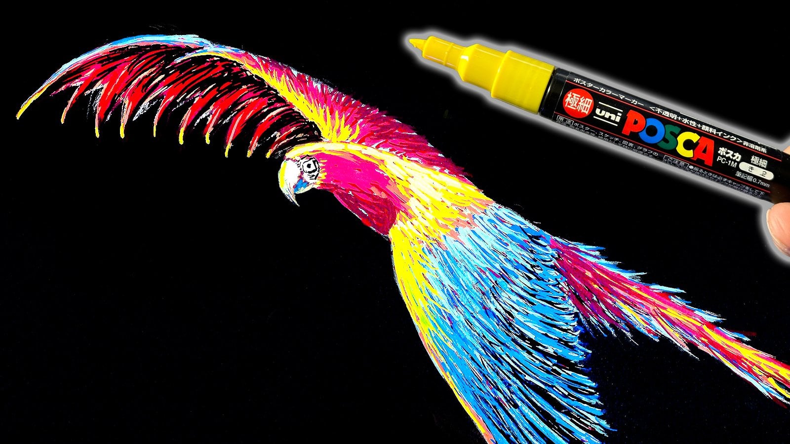
be using Posco markers. There are other brands of critical markers and whatever you have at your
disposal is fine, but I will be using
these Posca markers. I have three different types
of these Posca markers. I will be going over this in
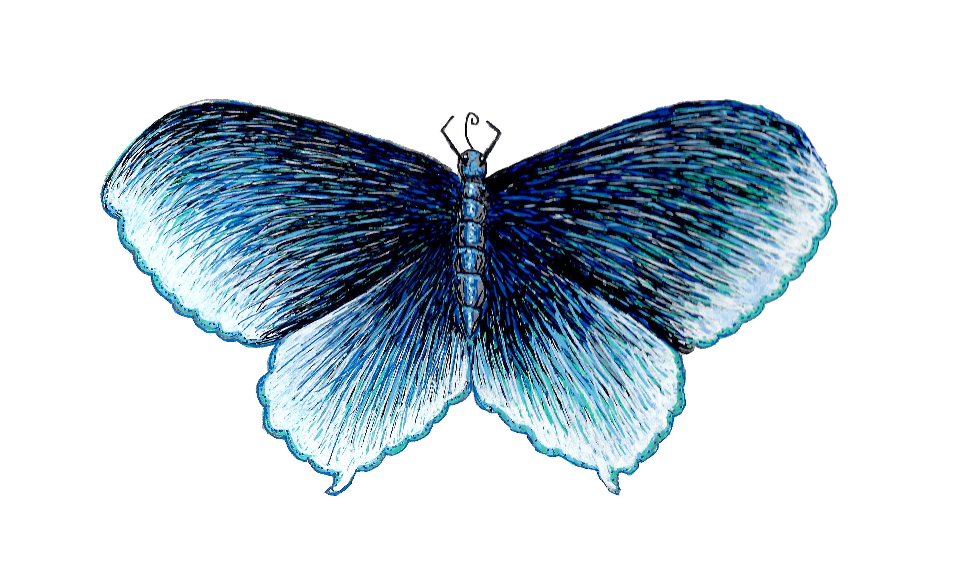
detail in the next video. The goal of this drawing is
to get the butterfly to have an iridescent sheen
to it so that it really looks like it's
shining and iridescent. If you would like to
use a different color than what I am, that's fine. Encourage you to have fun
and enjoy this class. There's a list down
below this video with all the details and full description of
what you might need. I also invite you to please, when you're done
with this class, leave a review and be sure
to share your work on Skillshare so that all of us can see and check out
what you have done. If you have any
questions at all, please don't hesitate
to ask me and I or someone else will
be sure to help you out. One final thing is that
I'd like you to feel free to check me
out on Instagram. My page is Andy's attitude
and you can see my work. What I do on a daily
basis to finalize. And before we start
with the class, I encourage you to follow
me here on skillshare. In the coming weeks, I will be releasing part three
of this butterfly class. In that class, we will be
coloring in the background. We will be adding leaves with Posca markers and also
covering with acrylic paint. So I hope to also see you
here for that third class. It is now time to
start this class. So sharpen your pencils
and let the class begin.
2. Uni POSCA MARKERS Explanation: All right, so to start
out in this series, I will be using Posca markers. Now there are different
kinds of a critic markers, different brands that exist. However, I know that the most
popular is Posca markers. These are made by Uni Posca. But what I want to
point out right now is the difference in
the points of these, in other words, the
different sizes of nibs that we have
on these markers. To start out, we have
the extra fine point. This is a black marker. If you notice on the
front of this one, we have a fine point. This is for detail work. For little details getting fine lines and we'll
be using that. Then we have this medium sized one that has a bit
thicker point. Then the third size that I have available is the thickest point. This I believe is a five. This is getting a lot of paint down at once.
This is really good. For example, if I were
to do the initial layer, and that's what I'll be
doing on this piece, is to use this thicker
pointed marker. Because I can get
more of the paint down faster and I just
find it more convenient. Again, the fine points, these small ones
are for details, the medium ones are in
between egoism for both. And then the big ones are for some of the initial
layering that we do. Or they can also be
good big projects. And below this video, you can find a full list of the colors that we'll be
using for this class.
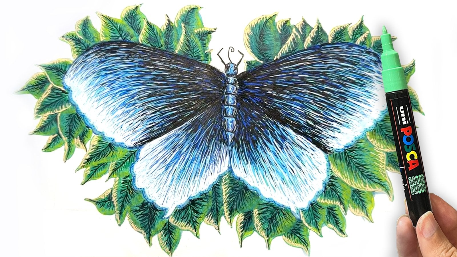
3. Initial Layer: Okay, I'll start out by working
on the right side here. What I will do is I will
narrate how I color in the right side of this butterfly and the left I will do in
the time lapse format. All in all you'll
be able to see how I color in the whole butterfly, but I will really focus on explaining when I
do the right side. To start out I'll
be using this thick aqua green and I've
already shaken it up. So be sure to shake
your markers up and test them on a
separate piece of paper. You never want to test on the paper coloring
or drawing on, then you might make a mess. And that's never
fun. And clean up. We'll start here. I'm
going to start uttering in from the left inner
side of the wing, following these
lines that I drew in the first initial class. Following these
lines of the wing, like I said, I'm
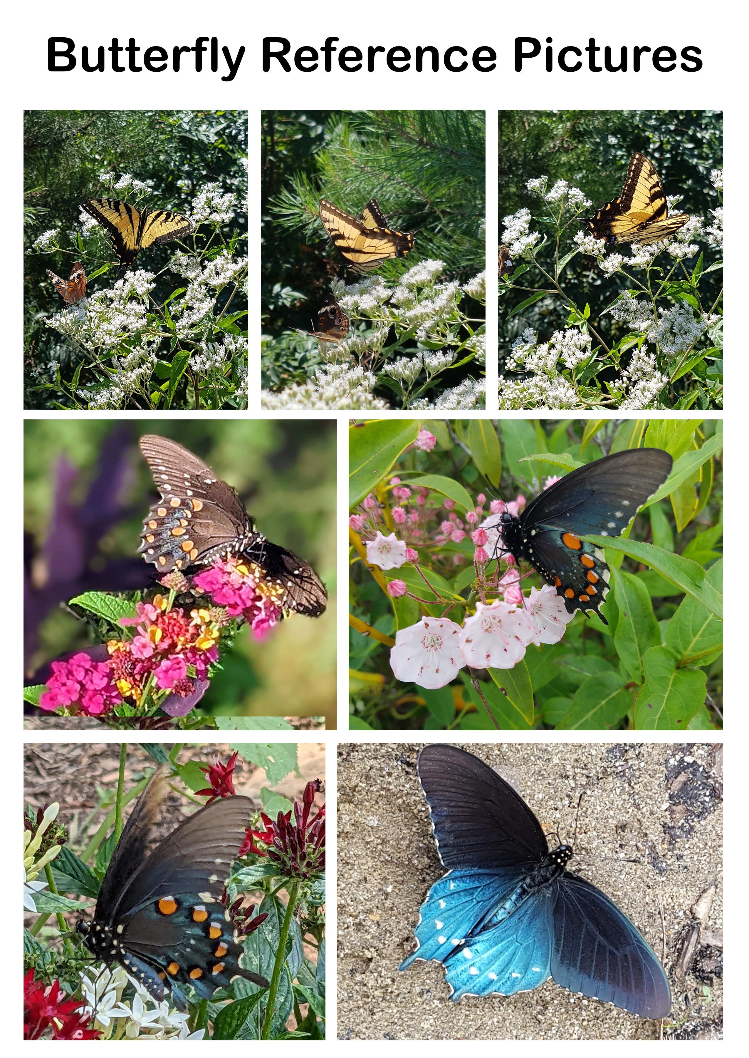
following the folds or little ridges in the wing like
we see in the photograph. And I'm not going to color this in all the way, 100% solid. What I will do instead
is color it in about 98% What happens is that eventually once I go in with the
rest of my colors, I will get it all
the way colored in. That's nothing to worry about. I will be working on this
upper wing right now. I want to focus on
how these lines flow out of the body of the butterfly
flowing out of the wing. And for these edges here, I will just trace them
and then cotter them in. I'm continuing my line work, building up these lines
all the way to the edge. I'm going back now on coloring a few of these
lines that are too white. We don't want them
to be too big. I know I said I wanted
to leave a few of these marks of white
of the paper below, but I wanted to still
cover some of them up. Basically, this is the level
of thickness that we want. We don't want to
color at all in, but at the same
time we don't want to have too much white
showing through. We want a nice balance. That's our first layer. And we need to let
this dry thoroughly. And then we'll come back in the next video with
our next layer.
4. Second Layer of Blue: Okay, so at this point
we'll come in with our blue, dark blue. And I'm going to use the
medium tipped marker now. Basically, I will repeat the process working
from the inside, having my lines flow out. I don't want to color
this all the way in solid because I want some of the light blue that we added a minute ago to show
through color this in. I want to have some of
these lines overlap others, so it looks random. As I get towards the outside
of the wing over here, I really want to have it
almost be none of this blue. So I want to have a lot of
thick blue inside around here, near the top of my finger. And as we get out here, I want it to disperse
and be really green and bright
aqua blue out here. We get kind an Irte
effect over here. Okay, so we've gotten
it to this point. We have a nice dark
blue over here. And it's less and less as
we come out here edge. And we have a bit of a lighter blue with
this blue out here. And we have this blue dispersed
out here near the edge.
5. Third Layer using Black: Correct? So the blue has tried. Now we will come in with our extra fine
black Posco Mercer. And we will start again doing something
similar to what we did with the dark blue working from the
inside and going out. And we want to have our lines diminish as we get
towards the edge. And we want this to
happen even faster, maybe diminish around
this one third point. So looking at the
wing as a whole, maybe about one third of
the way to the right. All right, and
we'll pause there. That's about as far as I want the plaque to come
right in there. And one thing I would like
to point out is that we never want a line or anything. We don't want these
transitions to be soft plaque. We don't see an abrupt line, We see it fade out and
b***d out into the blue. That's one thing I wanted
to point out and I encourage you to try to
produce in your piece. Let me come back with
some more plaque. I want to get it darker over on this inner side, right in here.
6. More Layers of Blues and Black: All right. At this point
I will come in with my light blue Mercer and you can either a medium size I will, or you can use an
extra fine point. It's up to you. So
what we'll do this time is instead of working
from the inside out, we'll work from
out in and add in very few of these little
lines going in like this. That's about all I want
to do with that color. I don't want to overdo it. All right, and now
I will come in with my extra fine point white. And this is important
that you have an extra fine point White. We're just going to add in a few quick highlights working from the
outside of the wing coming in or you
can work from that. All right, and I hope we
want to add too much in now. We need to let that
dry at this point. This a bit scribbly. What we need to do now is
go in with our flak again. We will b***d this in. What we'll do is we're just adding another layer of black, intermingling with
some of these lines. We want to intermingle
with some of these lines of the
white and blue. No, no, no, no, no, no. Okay. So we got it about there. We want to stop, and
we got a nice balance. We have our air tested, shimmering colors in here. And then we have a nice
tight area with our richer, lighter blues out here. And the nice coming and
fading out towards the edge. So we'll stop there.
7. Adding Highlights to the Wing: All right, so I will come
back with my white now. And I'm going to add a
little bit along here, outside of this wing. I wanted to look even brighter, more shimmery. Go right inside. Not at the very edge, but a little ways inside
along these little bumps. All right, So we get the
white right up in here. Kind of starts at
a small section here and widens
out a little bit. But also, again, like we
discussed a while ago, we really want it
to intermingle and b***d in with our other
blacks and blues up here. So that's how we leave it.
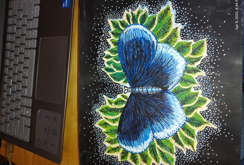
8. Lower Wing - First Layer: Okay, on this part of the Id, we are going to work on the
lower part of the wing. What I will do is
repre the process of layering that I used for
the top part of the wing. I will do the same thing on the lower part
of the same method, but I will use a
bit less black and less blue of the dark
blue. Let me demonstrate. I'll start with this green here, flowing out from the body of the butterfly and flowing down. So I've repeated the
process of leaving a bit of white to show
through this aqua green. I'm going to leave it like this, leaving a bit of this white.
9. Lower Wing - Second Layer: Okay, so with the second there, I will use my dark blue marker and I will come in
and start working from this upper part having
the lines flow out and down. But this time I'm not going to take the dark blue as far down. I'm going to have
it fade out a bit higher up because as we see
in the reference photo, we have more light shininess on the wing up and through here. We want to show this in
this part of the wing. Okay. So I got my blue
down and I pulled it down a bit further than
I originally planned, but I was working on it and that's how I
felt it should look. And I encourage you, when
you're drawing or painting, you may have an original plan, but then you may be working
at it and find this looks better this way or that way and just go with the flow. Don't be so rigid that you can't deviate from
your original plan, because when you're working, you discover new things and you may find that
another technique or another way of doing
it looks better than the way you originally
intended to paint or draw.
10. Lower Wing - Third Layer: Okay. So just as waited
on the top wing, we're going to use
our extra fine, black scorer, and we'll start up here working our way down. We don't want to go all the way to the bottom of the wing. We want to have a
really air tested area down at the bottom that is
in our reference photo. I'm going right around this area where these two parts of the lower wing and
the upper wing meet. I want it to be a
bit darker there, just so we have a bit of a separation between these
two parts of the wing. I'm just going to go in the lower part of the lower wing and at a
few lines, not too many. Just a few and I will
stop before I overdo it. Okay. Right about there it is. Good.
11. Lower Wing - Fourth Layer: All right, so we'll go
in with our light blue, and I'm using a medium. Points Mercer, I will start
here near the bottom. Work my way up, drag it into the black a bit. We really want to have a
fit appearance of here. This end up in here in
this part of the wing, okay? So we will stop there
and let that and try.
12. Lower Wing - Fifth Layer: All using my extra fine
tipped white posca. I will come down here just like I did here
on the upper wing. Working along but not all the way touching the
border of the edge. I will come in here
doing something similar and dragging up
into the wing of ways.
13. Lower Wing - Sixth Layer: I'm going to come in now
with a medium white and I'm going to do a few edits on
this sing I want to bring out the whites here on the edge
and make them stand out more. Okay, So I'm going
to come in with my extra fine park blue and just go on the very
outer edge and add a bit of a
small border here. And you don't have to do this, but I thought it
would look nice. What I will also do is add a few little specks like
we see in butterflies. In nature they have sometimes
little dots on their wings. I'll do that using the
same dark blue right on the outside order
right around here.
14. Butterfly Body: Okay, in this part of the video, I will be working on coloring in the body of the butterfly. And for this I need my
gray posca fine point. And what I'll do to begin with, I'm going to cover in
the body and the head. One thing I will point
out is that I've tried to show that there are
different segments to the body. So there are stead curves
and segments that make up the overall body out. Now that the gray will
come in with the flat, extra fine point marker, we are going to come
in and just detail and outline these
different segments. And while I have my flag, I will draw in the antenna tracing the nine
I have there from my original drawing text at the eyes over on the side. Then I will add some cheating around here by adding some line. Or next I will come in with my
fine tipped blue. Just add a bit of blue
right here on the top. And I want you to
notice that I'm not covering the grade underneath, I'm just scribbling in and adding a bit of
a color in here. Finally, I will use my extra
fine point, light blue, to go right around
the bottom side of the stitches just to
show that there's a bit of a division in there below the wines
of the divisions, of the different
segments of the body. I'll also add a little bit
of the middle of the body. And using my fine tipped white, I wear a little spec to
the eye for a high light.
16. Thanks for Watching!: Thank you so much for watching. I really hope you enjoyed this class and we're able
to learn something from it. Please feel free to post a
picture of your drawing below this class so that
all of us here on Sco chair can see what you did. If you have any questions, don't hesitate to start a discussion in the discussions
tab below this video, and I will be happy to
answer your questions. Well, if you would
like to support me, please check out my website at www.andartitude.com
And feel free to visit me on Instagram and
Facebook where you can see daily updates of my artwork
at Andy's attitude. Stick around here on
Skillshare and follow me because in the coming weeks I will be uploading
more classes. That's been it for now. I hope you have a wonderful day. See you in the next class.
 Andy Villon, Fine Artist