Transcripts
1. Trailer: [MUSIC] Want to create
your own comic strip? Trust me, it's
easy as one, 2, 3. In this class, I'm going
to show you how to create your own four-panel comic
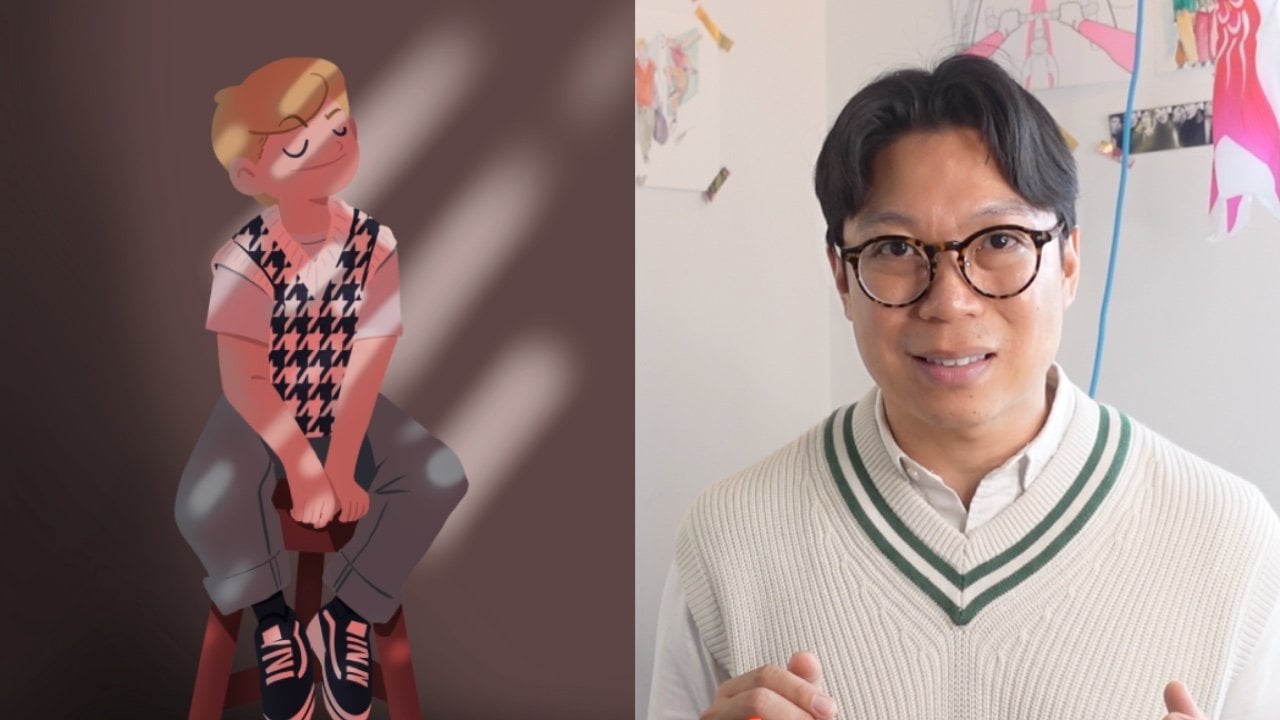
strip on Procreate. Hi, I'm Simon. I'm a digital illustrator and
top teacher on Skillshare. I'm currently living in one of the happiest place in the
world, Copenhagen, Denmark. Today, I draw about simple
things that make me happy, and I share it on my various
social media channels. In this class, I will
unlock your creativity by finding inspiration
in your everyday life. Remember, the more you
sketch, the better. You will go from an idea to a series of sketches that
we call thumb nails, that's like your story forward. Together, we will review the structure of what
makes a good story, with an introduction, a
conflict, and a resolution. We will discuss different
shots that you can use, and how to use them in order
to make your story more impactful, dynamic,
and engaging. Finally, with all
those tools available, you'll be able to create four clean drawings
on Procreate. I'll guide you on how to create clean and confident line, add a splash of color, and help you with the
composition of your drawing in order to add the text in
a way that's meaningful. If you're a creative person
with some drawing experience, especially on Procreate,
then this class is for you. By the end of this class, you'll have a beautiful
four-panel comic strip that you can share on your
own social media channel, and also on Skillshare. On top of that, you'll learn some valuable
techniques on how to try your ideas and find
inspiration all around you, and transforming a simple
idea into a series of beautiful colored
illustration that tells a story. Are you ready to
tell your story? Ready in 3, 2, 1. Bye. [MUSIC]
2. Your Project: Do you remember reading the comic strip section
in the newspaper? They usually were
quite simple and only consistent to 3-4 panels, but how can you effectively tell a good story in such a
short amount of panels? For your project, this is
what you're going to explore. You're going to draw
3-4 illustration to tell a story
specifically for Instagram. This means that you will create 3-4 images or illustration
to tell your story. Here's how [MUSIC]. First, you're going to draw your thumbnail, which is basically
your storyboard, to visualize the scene
[NOISE] [MUSIC]. Then your story will
consist of three parts. A beginning to set up the scene, a middle to introduce
a conflict, and an end to show
the resolution. Finally, you will draw your line illustration and color it using
Procreate [MUSIC]. The project is first and
foremost a skill share project so don't forget to upload it in your project
and resources. Make sure to put the
comic strip into proper order so we
can follow the story. Once your project is uploaded, you can receive my
comments, my feedback, my appraisal, and also encourage your fellow classmates
to comment. On top of that, I
welcome you to tag me on Instagram if you want me to share it with my followers. I'm so excited to read your beautiful stories and see your beautiful
illustrations. With that being said, let's get started [MUSIC].
3. Finding Inspiration: Remember, stories don't
need to be complicated. They need to be simple, genuine, authentic, relatable. Gosh, that might be
a little bit much. For this video lesson, you will need a notebook and
pen, and your smartphone. Finding inspiration
is something that we all struggle as
creative people. Remember it, there's
nothing scarier to the artist than a
blank sheet of paper. But rest assured there are
simple ways to help you find inspiration in
your everyday life. By being able to visualize
those simple anecdotes, you'll be able to share
them to a wider audience. First, let's talk
about the importance of telling stories
on social media. Our addiction to
social media might have exploded a few decades ago, but it's nothing new. As humans, we are
captivated by stories. We love to gather
around a good bonfire and tell stories to one another. Or before even
having a smartphone, people were glued
to their newspaper and gossip magazines. It's all the same. The great thing about social
media is that it gives you the opportunity to reach
out to your own audience. Second, finding inspiration. Finding inspiration
is all around you and it's also super
convenient to just go online and check it out. I like to go on Pinterest and Instagram to check
out artists that I like. It also encourages me to
play with different style. You'll naturally
gravitate towards a style that you appreciate
more than others. That's something that you
need to get attuned to. For me, it's a child-like
drawings of Cozy Tomato with a twist of
vintage or to clean and editorial vector line
drawings of Tommy Parker. Look around and for sure you'll find
something that you like. Number 3, is to
document your day. Throughout your day, you'll get really good ideas
when you least expect it. Sometimes just in the shower or while you're
bored on the train. Take note. Don't miss this
opportunity, write it down. I use my digital
notepad on my phone to sometimes write my
ideas conveniently. I also carry with me a
notebook to write down and doodle and also
create initial sketch whenever I feel inspired. Some ideas are good, some not so great, but at least they're
written down so then I can get back to
them at a later stage. Another tip is to take pictures throughout today
because we're all armed now with a cell that
really allows you to take snippets very easily. Taking picture is a
great way to remember what you've done during the day, but also to use these
photos as reference for whenever you're drawing. Telling stories is
what makes us human. Remember, they don't need to be complicated or extravagant. Far from it, you'll see
that these types of 3-4 panel comics in
newspaper or even online, are quite simple and benign. It's just the way they
are told with personality and with a punchline at the end. Remember to keep an
eye open to the world, to your surroundings, and everything around you.
4. 1,2,3 Your Story: [MUSIC] Do you remember
reading the newspaper and skimming all the way
to the comic section. These comics generally consisted of 3-4 panel comic scripts. They were quite simple in
nature but they all follow a specific structure which is a beginning to
set up the scene, a middle part to introduce a conflict, and the end
to show the resolution. With social media, and
in this case, Instagram, each photo that you will upload will act as
a single panel. That means that the user
will be able to swipe through to different
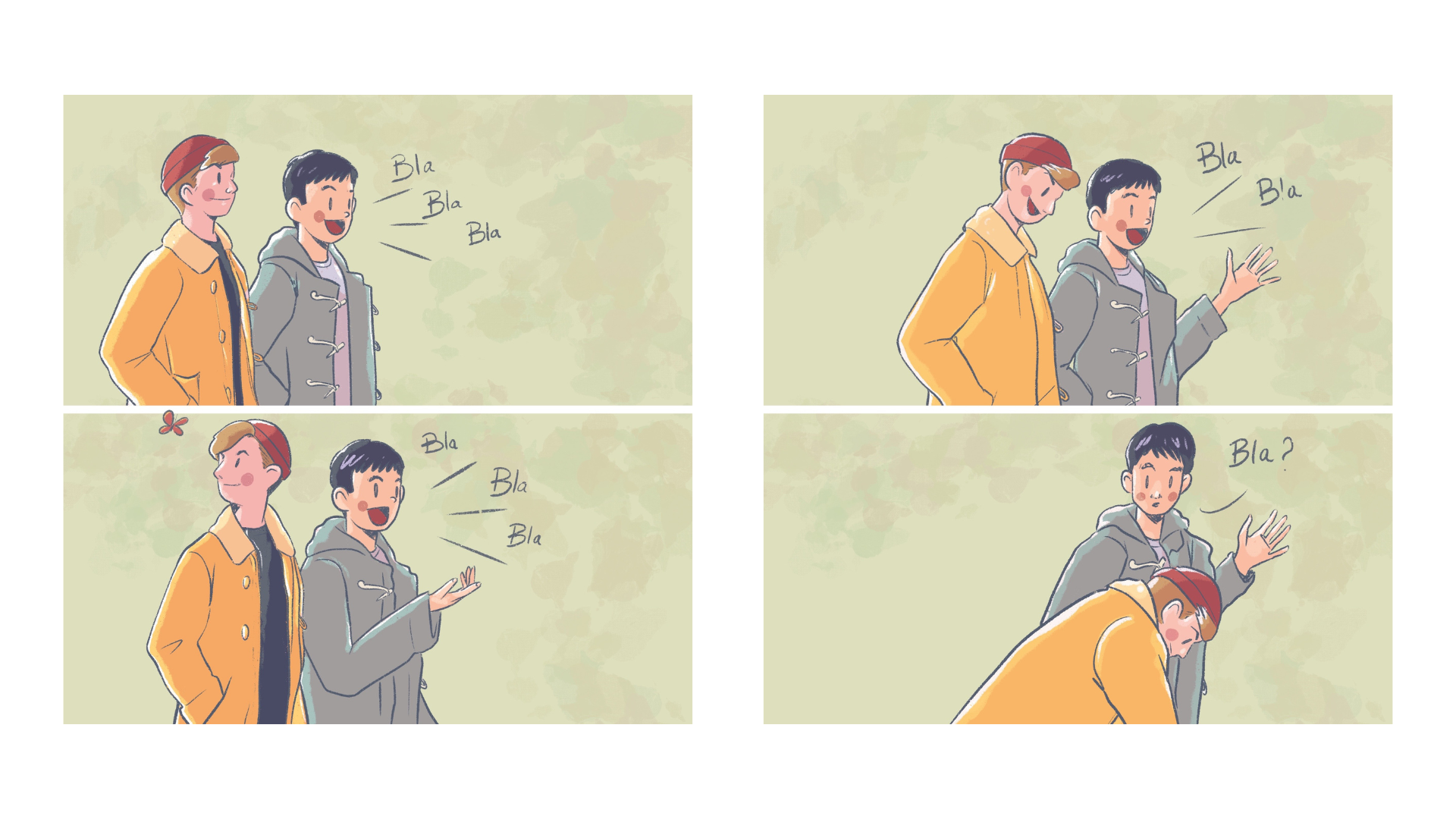
images to read your story. Let's look at these
two illustrations I drew to dissect the
structure of the story. Let's start with the
beginning of the story. Your first panel is always to provide the context
of the story. In the case of Instagram, it's also the eye grabbing
story in order to encourage the user to stop his feed and to start swiping,
to start reading. With the first panel, the user will be able to
answer these five questions. The five W, where, when, who, what, and why. Let's look at this
example together. Here the beginning consists of a few frames, but that's okay. We can tell here that we have a light blue background which represent that it's a
little bit more serene. The character is taking
some space to be mindful, and that's our objective
to do yoga and be mindful. We don't know, but we assume that we're probably
indoors and the time of the day is not indicated but that doesn't
really matter for the comic. Let's look at the
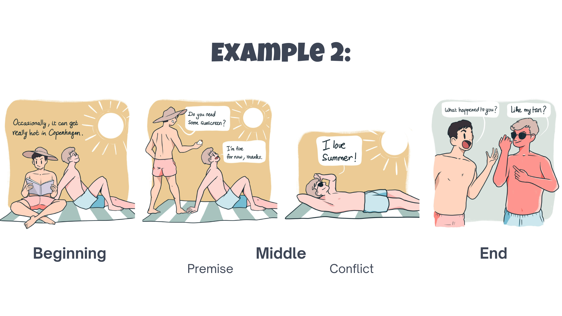
second illustration. Here we can see a yellow
background with a white sun, which indicates that
we are outside. We also note that
it's during day time and probably during summer based on how the
characters are dressed. There are two
characters involved and their objective
is probably to relax and enjoy the sun [MUSIC] . Now for the middle part. The middle part is composed
of two components. The premise, which is really
the what of the first panel, and then the conflict, which is the depth
of the premise where something's stop the
protagonist from being able to perform
what they are performing. For example, being interrupted
in the yoga practice, or being asked to
put sunscreen on. Now the reader knows, and this is a little bit more subtle, that something bad will happen if two protagonist
decline putting sunscreen on. A story without
conflict is plain boring and that's why we need
to introduce this conflict. Finally, Step 3, the end. The end is where we find a
resolution to the conflict. This last part allows your
reader to get to know your character and
how they behave or think faced with
that conflict. In a well-written comic strip, this result in something funny or unexpected and
that's your punchline. For example, your character
is so oblivious that he's in the middle of the living
room and blocking the TV. But he's not fazed by it
because he's really into his yoga practice and that reveals the way he
reacts to the conflict. Or the character is not very preoccupied for
having burned under the sun and is quite happy
with his lobster complexion. We can sense a little
bit of delusion in that. Consider that drawing
a single panel will take you a lot of time,
so it's better to focus on only 3-4 panel and do it well in order to tell an impactful story in a
short amount of time. To tell that impactful story, remember to have a
beginning to set the scene, a middle to introduce a conflict because
otherwise it's boring, and an end when you
show the resolution and that tells you about the
character of the character. The way your character reacts to the end of the premise is really your opportunity
to tell a story in a fun and unexpected
way. [MUSIC]
5. Sketching Your Thumbnails: This is your first
draft to visualize the idea that you have in your head into a piece of paper. You will need a
notebook and pen, or an iPad and an Apple Pencil
and of course, Procreate. During this phase,
really don't overthink it and really let your
wrist do most of the work. For this part, I like to create thumbnails where I roughly
draw what I have in mind. Thumbnail sketches are quick, abbreviated drawings
done without any correction or edits. They're done rapidly,
usually on the small scale. But in this specific instance, I like to draw a
little bit bigger. Sketching your story. Now, to sketch your story, you can use any medium, even your iPad Pro and
your Apple Pencil. Whenever I need to conceptualize
and have no correction, I usually prefer the feel of drawing directly on my sketch
book with a pen and paper. You can see I've done several sketches before
I finalize my idea. The more sketches you do or
the more thumbnails you do, you'll get closer and closer
to your final drawing. First, this sketch
book is quite large. I'm quite comfortable
with its size, so it allows me to create four different quadrant to
draw my four thumbnails. It's also an old
sketchbook with a lot of coffee stains, missing pages, ugly doodles and I really am not afraid to mess it up
and that's a great way to really open to your creativity
because you are drawing and testing without
really any edit. Remember that this is
a comic strip and you might want to add speech bubble. Whenever sketching,
remember to add some space at the top for your
speech bubble or captions. I usually prefer to save the upper half of
the panel for text. Now, let's talk camera view. When you draw a comic, think of each panel like
a frozen moment in time. It's like watching a movie and pausing on different
frames to tell the story. Here are a few
things to remember whenever you plan
your comic strip. Like in a movie, your camera
angle is super important. Don't worry, we're not planning the next big blockbuster movie. It's only a simple comic, but I will still recommend
these three shots. First, the wide shot. The wide shot is used to set up the location and add some
context to your story. It also allows you to
answer the five W's. That's why I like to use
it in the beginning, but also at the end, sometimes to show an
element of surprise, something that we didn't see. The medium shot. That the medium shot are usually used to show dialogues between two characters and that's
why I like to put them in the middle to show the premise and also the
death of the premise, which is a conflict. Now the close-up shot. The close up shot
really focuses on the character's emotion
or on a specific gesture. It's often used
in the last panel to shoot a character's
emotion or to introduce an element
of surprise or a specific detail that we
didn't see until then. At the beginning, you can see that the character
is a little bit apprehensive or confused
with all that singing. Here at the end, we focus on the clinking of the glass to reshow the characters full involvement in
the festivities. As artists, we tend to plan by visualizing and
that's why drawing those thumbnails are
an essential part of the planning of
your comic strip. Remember when sketching your four panel comic
strip for Instagram, remember to draw
without overthinking. Treat each panel like
a frozen moment from a movie and play with different
perspective and angle.
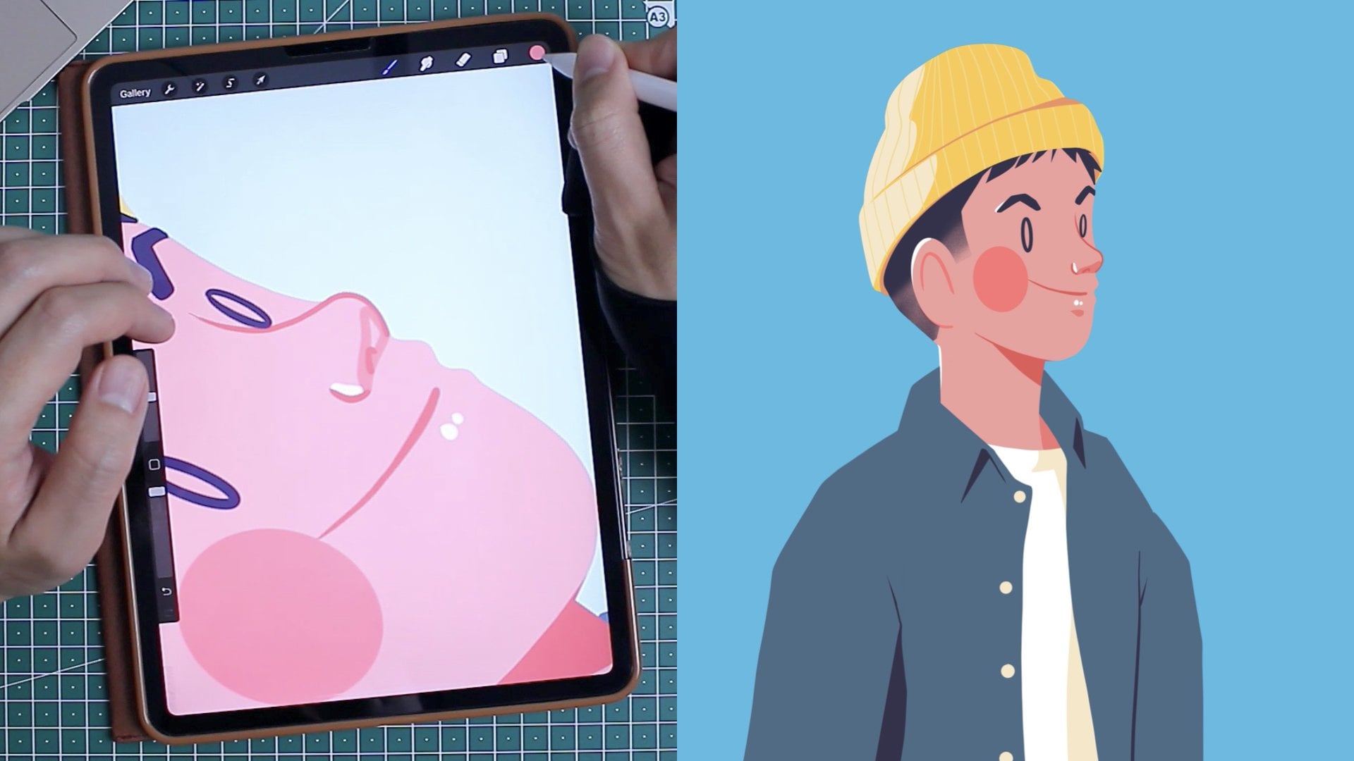
6. Setting Up Procreate: Procreate is a powerful
digital illustration app that's currently only
available for iOS. In my case, I use an iPad Pro 11 inch with an Apple Pencil
Second Generation. What I really love
about Procreate is how easy and intuitive it
is to draw with it. For more in-depth detail, if you're a newbie to Procreate, check out my previous classes. For me, I'm a big fan of
Procreate and that's mostly because first of all,
Procreate is affordable. It's only a one-time
payment of $10 US. There's also a
large community of Procreate user that's
how you can get a lot of brushes and tutorials online,
just like this one. The only con that
it have is that an iPad can be quite expensive, but it is an
investment well spent. You can see that
all my illustration done on Instagram have been done through Procreate and I'm going to show you how I do it. Before we draw, let's
set up our canvas for this specific
project or social media. I'm going to show you how
I do it step by step. Let's set up your canvas. Remember that for
your Instagram posts, Instagram has a
resolution of 1080 by 1080 pixels and your
story will have a vertical rectangle at a resolution of
1080 by 1920 pixel. To set up my Canvas, I go to the Procreate
gallery page and I click on the plus button
on the top right corner. You will see different new canvas options but don't worry, I'll tell you which one to pick. I usually pick a
square format of 2048 times 2048 pixel at a
resolution of 132 to 150 DPI. This is definitely large enough for Instagram
and gives you some leeway in case if you want to use this drawing
for something else. A quick tip is to
name your canvas so you can remember
how to use it. Click once on it and write a name that
makes sense to you. Click the square, and now
you're ready to draw. [MUSIC] In the
previous video lesson, we talked about the importance of documenting your
days with photos and how you could use these
photos throughout your illustration to
use them as reference. There are different ways to use your photo as a reference. The first one is to
upload it as a photo. To do so, go to Action, Insert a photo and pick
from your library, swipe right and you can even insert your photo as private. This means that during
your time-lapse, this photo will not show. Tap twice on the layer
to change the opacity, I usually go around 20
percent and swipe left, and lock it to make sure to
not accidentally draw on it. [MUSIC] Option 2, which is my preferred option, is to upload it as
a reference canvas. To do so go to Actions, Canvas, Reference, Image. You can resize and move
the image as you please. You can drag the corner to
change the size of the canvas. Leave your finger
for a second on the top bar and move to canvas reference
wherever it fits, pinch within the Reference
window to zoom in or zoom out. Tap once and a
menu will show up. Tap on the X on the right corner and close
your canvas reference. If this was your first time, you will see that with practice, setting up your Canvas and uploading your reference will become second nature to you. For me, this part is important. It's like when you're cooking
and you're prepping all of your ingredients before
throwing them into the wok. If everything is in place, you can really start digging
into the fun part without rushing any element and in
this specific instance, the fun part is drawing. [MUSIC]
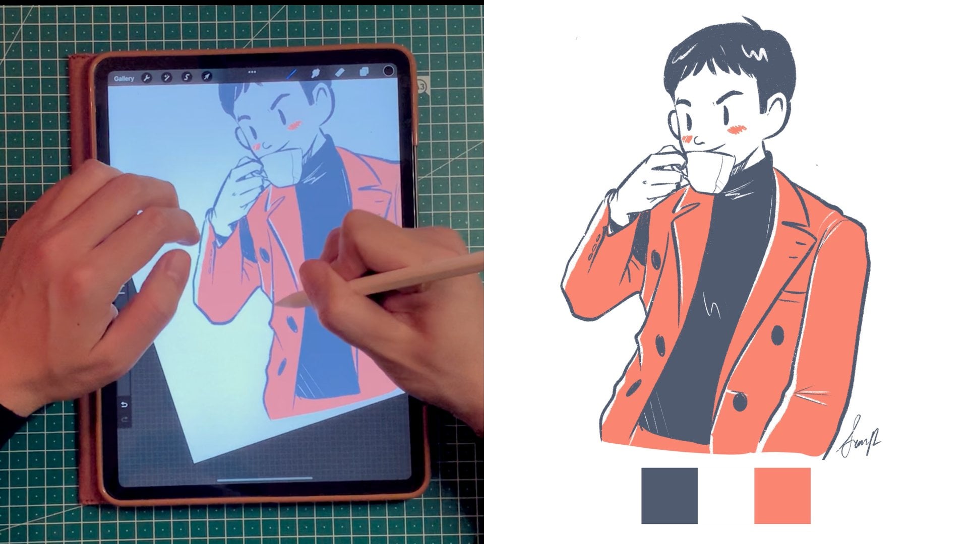
7. Drawing With Lines: A lot of comic strips
are in black and white and that's for two reasons. First, it's very time
consuming to color each panel. More importantly, it shows
that you can effectively tell a story with
simple line drawing. Now that we have our thumbnails, let's translate these
visual concepts into clean digital
lines on Procreate. First of all, setting
up your streamline. Streamline help you stabilize your brush stroke when you draw. It's just like having your
training wheels on a bicycle. The percentage
represent the amount of assistance needed to
smoothen your lines. For example the higher
the percentage, the smoother your
lines will become. For sketching, I usually use a streamline of zero percent, but this is mostly to not
impede the creative flow. Overall you can adjust the
streamline of any brush. You first access
the brush library, select your desired
brush, tap on it. Under Stabilization,
you will find brush to your settings and
here under Streamline, you can adjust the amount
to your desired level. For creating clean
lines over the sketch, I usually use a streamline
between 25-50 percent. For my clean lines, I also like to use a
technical pen brush. Here, let's get back to drawing. Here, I'm going to walk you a specific drawing on how I do it. Of course, you're
an artist as well, and you have
different processes. Feel free to use whatever
makes sense to you. This is how I tell
my particular story. Here you can see
that my boyfriend is relaxing and enjoying the sun. Because I want to
set up the scene, I'm going to use a long shot and that's why
you're going to see the feet of the character, full body lying on a long chair. I also have a reference photo handy to help me with
the proportions. In the close up middle shot, which is my second
and third panel, you can see that I
introduced a new character. I want to change your
perspective a little bit when I added the new character. In the middle shot, the two characters are in the same plane and
finally in the long shot, I reveal the final scene in the shower with
all the plants. Let's talk about the importance of weight line whenever we draw. Here, you can see
that I'm creating a different folder
for each panel, naming them 1, 2, 3, 4. Of course, you can use more elaborate title but
for me it makes sense and I think it's
more important to always name your
layers and folders. Let's go to Panel number
2 or Folder number 2. Here you can see that
I'm introducing myself as a new character
in the foreground. To give visual hierarchy, I also add thicker line around the character,
which is myself. This is how it goes. Remember that
object or people in the foreground are drawn with a thicker lines around them. I usually only control their outline with a
bigger stroke size. That means that you can see that I don't use the biggest
brush stroke to create the details
of your character, such as the nose
or the eyebrows. Otherwise, I will look weird and our visual hierarchy
won't work anymore. If you look at the lines
in the background, you will see that they
have the thinnest weight. In the same way for
elements in the background, I don't want them to
show up too much, so I use the thinnest
brush stroke. You can see in the
last panel that the TV and the cupboards are
using much thinner lines in order not to compete
with the character in front of it doing yoga. The man in front of the TV has a thicker outline to show that it's visually more important and it's closer to the
camera as well. Here's a technical aspect. In order to be consistent
with my weight hierarchy, I usually save the
different brush sizes. To do so, go on your
left hand side panel where the brush is and
press on the Plus button. In my case, I save three
different brush size, five percent, 10 percent,
25 or 30 percent. But this is my process and maybe it won't work for
you so play around, see what works and
remember to be consistent. Your line drawing must
be able to tell a story effectively without
any embellishment before we even
consider adding color. To draw your sketch and
for strong line drawing, you need to know when and
how to use streamline effectively and also what amount of streamline work for you. You also need to take
in consideration the different line weights
in order to establish a proper visual hierarchy
in your drawing and to guide effectively
the eye of your reader.
8. Adding Colors: [MUSIC] Coloring is not
only for kids and for me, it's one of my favorite step. It reminds me of owning
different colored pencils and coloring in my coloring
book within the lines. Remember that your color
palette is your box of crayons that you'll be using
to color your drawing. I personally like to decide on my color palette before
starting to color, and that's why I saved
my swatch beforehand. Adding color is a
great way to set the mood to your
illustration and to grab the attention of
the user as they're scrolling down your
feed on Instagram. For this exercise, I
would recommend you not going over seven colors. Usually three to seven is good. To find your color palettes, there is different
ways to do it. You can first of all go to a
color generator website like coolers.co and find a color
palette that you like. Please note that all new palette exported from apps such as cooler can be accessible
from new from file. You can also sample colors from illustration
that you like if you have something that
sets a similar tone. To save colors from photos, you can do it
automatically by clicking on the color dot on
the top right corner. Press the plus button next to the palette, New from photos. Then you can select
a photo that you'd like to extract the color from. You can also export a
color step-by-step by leaving your finger
on the color of your choice and
sample it like this. Now, there is different
ways to color, you can color using
a reference area. The fun part is re-coloring and there's a fun
and easy way to do it if you have
clear defined lines. Did you know that
you can simply drops your colors into the lines
of your illustration. Here's how. First, ensure that
all of your lines are in the same layer. If they're not, you
can select them. I like to duplicate them
in case I make a mistake, but you can select
them and flatten them. To flatten the selected layer, simply press them together
with your two fingers. Please note that once your lines are flattened, that's it. There is no turning back. That's why I like to keep a duplicate copy in
case something happens. Reference is a very
interesting function because it turns one of
your specific layer, in that case, the line layer, as your reference for
coloring, let's say. This function allows
you to drop colors on different layers without
impacting your line drawing. Remember that you can only have one reference layer at a time. Coloring using reference
is like coloring using Microsoft Paint
in the early 2000s. It means that you can easily drop your color
within the lines. But if the lines are
not closed properly, your color will bleed and
drop everywhere. Here's how. First, set your line
layer as reference. To do so you can just tap on the lines layer and
select Reference. Now, it's important to
create a new layers for the colors that you'll add. Please don't add your color on the same layer as
your line layer. Keeping your color layers separate from your
line layer will save you a lot of time in case
something bad happen, in case you made a mistake and you need to rectify your colors. Also ensured that all of your loops are popularly closed, otherwise your color
will bleed over. You can also adjust the color drop threshold by dragging your color to
your left or to the right. Just play around and you'll see. Sometimes it's also simpler to just color directly and not drop colors in case
there are little nooks and crannies that are not
being colored properly. In that case, I
will also recommend you to remove the reference of the line layer every time you want to color directly
with your pencil. Also make sure that your
streamline is quite low in order to not have
your line being modified when you're
trying to color. If something weird happens when you're coloring, remember, you might have forgotten to remove the reference
from your line layer. Always remember to deselect
your reference layer because otherwise some weird
and frustrating thing might happen to your drawing. Finally, add a background. Now you are drawing an
unlike comic or comic strip, and you need some type of cohesiveness towards
the different panels. Here are some example when I use a little bit more details
to the backgrounds. In this example, I'm
in the supermarket. I'm creating some vertical
and horizontal stroke to emulate the products
on the shelves. Here, I'm in the
kitchen and I use the thinnest brush stroke in order to draw the stove
and the kitchen counter. This is important as we discuss
about visual hierarchy, not to take too much attention
away from the main scene. Now I like to usually use the same background
throughout the story. But sometimes I like to mix up the colors of the
background a little because it add additional
detail to the panel story. Here you can see
for example that the three first panel
are using a warm color. In this case yellow, to show that we are
outside and we are warm. The last panel reveals
that we are in the bathroom cooling
down with the plants, and that's why I
chose a light blue. As a general rule, my
background are usually a simple square color
block, one color. I also used a grid on Procreate to help me make
sure that it's well centered. In my case, I like to have a simple color block
of a background and not much detail
because the focus is really on the character
and on the story. Make sure that your
background adds to the story, compliments the color
palette without taking too much attention
from the characters. I really loved this
step of adding color to my drawing because
they really can set the mood to your
whole comic strip. However, it's still
very important to put more emphasis and time on creating lines that makes sense. Also, don't carry away by adding too many colors
to your drawing. The focus of the construct is really how we tell the story, and the color is really
just the embellishment. Sometimes less and more and a very limited color palette can really help the reader focus on the right element
of the story. [MUSIC]
9. Laying Out Your Comic: [MUSIC] Some [inaudible] are self-explanatory and
they really don't need a lot of text in order to
tell the story effectively. I personally like to add some visual cues
like little icon, in order to better
tell the story. Like a heart or happy face or a bell to notify a ringtone. Sometime even adding the face of the character in a speech
bubble to really emphasize their emotion or their
frustration is a great way to show the resolution
of the last panel. However, using text is still an essential part
of comic strips and that's why I'm going
to show you my process on how I add text on Procreate. The first step is to resize and to reposition
the drawings. We all have a tendency to
draw a little bit bigger and we really want our drawing
to fit the frame nicely. We tend to forget to allocate space for
the speech bubble. Of course now we have to scale down our
drawing in order to give enough space to the text and let our
illustration breathe. Even though we mentioned
it in the thumbnails, we have a tendency to want
to fill up that square. But rest assured,
it's very easy to scale down our drawing
and to allocate some space for the
text in order to let the drawing breathe properly. [MUSIC] Here's how you can change the size of
your illustration. In your layer panel, select the folder of the
layers you'd like to resize. Select the Transform tool
on the top-left menu, you'll see it's a simple arrow. The selected image
will now appear in a rectangle with
marching ends. I call these little
dots marching ends. Make sure that Uniform at
the bottom is selected, otherwise you'll change
the proportion of your drawing and that's
not what you want to do. Now we can drag and reposition
the image as please. Taken in consideration
that you will need at least the top third
for your bubble. Sometimes even top half. [MUSIC] Sometimes I like
to write the text by myself using a calligraphic
brush from the brush library. This brush have a little bit of streamline to them already, and I could recommend a few. As an aid, I also toggle the Drawing Guide on that
you can find under Actions. Having the grid on will
help with your handwriting, making sure that
your letters are the same size and written
on a straight line. For those who do not
trust their handwriting, you can also type your
text. Here's how. Under Action, select, Add Text. The text will now appear
within a rectangle. [MUSIC] Tap on the box, then on the font
for more option. Here you can select the font, the size, and the attributes. To get back to typing, click on the keyboard
on the top left corner and start typing on your iPad. You can now access your
text via the Layer panel. To edit it, tap on it
and tap Edit Text. Just like any other layer, you can also tap on it and reposition it
and move it around. With the option of text, you can now create a
more impactful story. However, I will still recommend
you to use it sparingly, as most people have a very
short attention span, especially on social media. Now, all you have
to do is to export each panel as an
image. Here's how. You can do so by
making sure that each layer is in the right
folder and it's visible. You can do so by
making sure that the right panel
layer is visible. Then go to Actions, Share, and select JPEG. We're selecting JPEG
because this is Instagram default image format. [MUSIC] You can then upload your image to
Instagram in the right order. On Instagram, make sure
to add a fun caption, relevant hashtags to really capture the attention
of your audience. [MUSIC] Congratulations. Now your Instagram followers
can read your story. [MUSIC]
10. Let's Wrap It Up!: Congratulations! You made it
till the end of this class. To make it easier, I've compiled five key points to summarize the whole class. Let's go. Looking
for inspiration. If you don't know what to draw, look for inspiration
in your everyday life. You can do so by taking
pictures throughout the day and writing down
any potential ideas that come through your mind. Two, telling your story. Now, telling your story is
as easy as 1, 2, and 3. Your story needs, of course, a beginning, a
middle, and an end. The beginning will
set up the scene, the middle part will
introduce a conflict, and the end will
find a resolution to re-show the
character's character. The ending is also
a great opportunity for you to deliver
your punchline. Number 3 is how to
visually plan your comic. In an old sketchbook, sketch your thumbnails to see how each panel will
work together. Use a mix of different shots, including a wide
shot, a medium shot, a close shot and treat each panel like a frozen
moment in time from a movie. Number 4, don't forget
your line work. Line work is super important when you draw
your comic strips. When tracing your line work, you can even set
up the streamline to help you create
more confident lines. Use different weight
line to add dimension to your drawing and add
visual hierarchy to it. Number 5, remember
your final touches. As a final touch, you can add color inspired from a color
palette that you like. I personally like to add
a simple color block as a background and to tie
each panel together. Don't forget to resize your drawing also to
make sure that you have enough space for the text and that everything looks
harmonious together. A good composition is important. [MUSIC] Finally, remember to
upload your final project, your beautiful comic strip
under Project and Resources. If you have any
question or comments, or you would just
like to say hi, feel free to add them under the discussion of
this specific class. I'll make sure to reply to
every of your comments. Also, if you're interested in what I'm doing in
my everyday life, feel free to follow me on
my social media channels. I can't wait to read your
beautiful comic strip and to get to know you
a little bit better. Have a beautiful day
and I can't wait to see you also in the next class. Bye.
 Simon Ip, Digital Illustrator