Transcripts
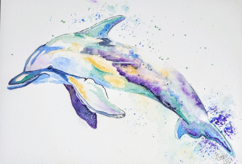
1. Welcome To The Class!: Hello, everyone.
I'm Will Elliston. And today, we're diving into the mesmerizing world
of watercolor dolphins. This class isn't just
about painting a dolphin. It's about embracing the
fluidity and grace of watercolors to bring these magnificent creatures
to life on paper. Dolphins with their sleek
forms and playful spirit, offer the perfect canvas for exploring the versatility
of watercolor techniques. We'll focus on achieving a
rich spectrum of tones from the gentleest washes to the deepest shadows to add depth and dimension
to our artwork. I've been a professional
artist for many years, exploring lots of different
subjects from wildlife and portraits to city scapes
and countryside scenes. I've always been entranced by the possibilities of watercolor. But when I started, I had no idea where to begin
or how to improve. I didn't know what
supplies I needed, how to create the
effects I wanted, or which colors to mix. Now, I've taken part in
many worldwide exhibitions, been featured in magazines, and been lucky enough
to win awards from well respected
organizations such as the International
Watercolor Society, the masters of
Watercolor Alliance, Windsor and Newton and the SAA. Watercolor can be overwhelming
for those starting out, which is why my goal is
to help you feel relaxed and enjoy this medium in
a step by step manner. Today, I'll be guiding you
through a complete painting, demonstrating a variety
of techniques and explaining how I use all
my supplies and materials. Whether you're just starting out or already have
some experience, you'll be able to
follow along at your own pace and improve
your watercolor skills. If this class is too challenging
or too easy for you, I have a variety of classes available at different
skill levels. I'd like to start off with a free expressive
approach with no fear of making mistakes as we create exciting textures
for the underlayer. As the painting progresses, we'll add more details to bring it to life and
make it stand out. I strive to simplify
complex subjects into easier shapes that
encourage playfulness. Throughout this class, I'll be sharing plenty of
tips and tricks. I'll show you how to turn
mistakes into opportunities, taking the stress out of
painting in order to have fun. I'll also provide you with
my watercolor mixing charts, which are an invaluable tool when it comes to choosing
and mixing colors. If you have any questions, you can post them in the
discussion thread down below. I'll be sure to read and respond
to every think you post. Don't forget to follow
me on Skillshare by clicking the Follow
button at the top. This means you'll be the
first to know when I launch a new class
or post giveaways. You can also follow me on Instagram at Will Elliston
to see my latest works. So get your brushes ready and let's embark on this
creative journey together as we learn how to paint enchanting dolphins
with war to color.
2. Your Project: Thank you all for
being here today. I'm thrilled to have you join me for this watercolor
dolphin class. Dolphins are such
fascinating creatures embodying grace
and intelligence, making them an ideal subject for our artistic exploration. Now, the beauty of
painting dolphins lies in endless possibilities
for expression. Similar to our
previous subjects, Dolphins offer a canvas where
your creativity can soar, and you can let your
imagination run wild. What excites me most
is that each of you can take your painting
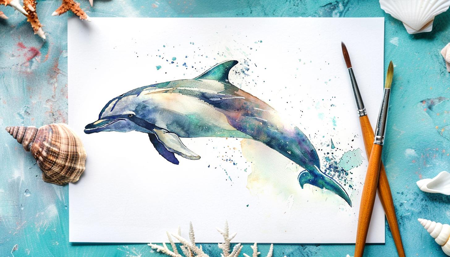
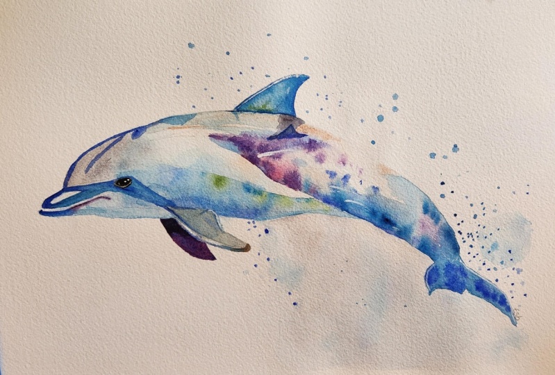
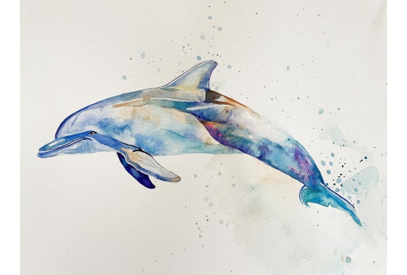
in a unique direction. In the resource section, I've added a high
resolution image of my finished painting
to help guide you. You're welcome to
follow my painting exactly or experiment with
your own composition. As we're going to be focusing on the painting aspect
of watercolor, I've provided templates
you can use to help transfer or trace the
sketch before you paint. It's fine to trace when using it as a guide for
learning how to paint. It's important to
have the underdrawing correct so that you can relax and have fun learning the
watercolor medium itself. Whichever direction
you take this class, it would be great
to see your results and the paintings you
create through it. I love giving my
students feedback, so please take a photo
afterwards and share it in the student project gallery under the project
and resource tab. I'm always intrigued to
see how many students have different approaches and how they progress with each class. I'd love to hear
about your process and what you learned
along the way, or if you had any difficulties. I strongly recommend
that you take a look at each other's work in the
student project gallery. It's so inspiring to see
each other's work and extremely comforting to get the support of your
fellow students. So don't forget to like and
comment on each other's work.
3. Materials & Supplies: Before we start the painting, let's go over the
supplies I generally use. Having the right materials can greatly impact the
outcome of your artwork. So I'll go over all the supplies I use for
this class and beyond. They're very useful to have at your disposal and we'll make it easier for you
to follow along. Let's start with the
paints themselves. Like most of the materials
we'll be using today, it's a lot to do
with preference. I have 12 stable colors in my palette that I
fill up from tubes. They are cadmium
yellow, yellow ochre, burnt sienna, Cadmium
red, Alizarin crimson, ultramarine blue, cobalt
blue, Can blue, lavender, purple, di black, at the
end of the painting, I often use white guash
for tiny highlights. I don't use any
particular brand. These colors you can
get from any brand, although I personally
use Daniel Smith, Windsor and Newton
or Holbein paints. So let's move on to brushes. The brush I use the most is
a synthetic round brush like this scota polar brush
or this Van goth brush. They're very versatile because
not only can you use them for detailed work
with their fine tip. But as they can hold
a lot of water, they are good for
washes as well. They're also quite affordable, so I have quite a few
in different sizes. Next are the mop brushes. Mop brushes are good for
broad brush strokes, filling in large areas and creating smooth
transitions or washes. They also have a nice tip that can be used for smaller details. But for really small details, highlights or anything
that needs more precision, I use a synthetic
size zero brush. All brands have them and
they're super cheap. Another useful brush to have is a Chinese calligraphy brush. They tend to have long bristles
and a very pointy tip. They're perfect for
adding texture or creating dynamic lines
in your paintings. You can even fan them
out like this to achieve fur or feather
textures as well. And that's it for
brushes onto paper. The better quality
of your paper, the easier it will be to paint. Cheap paper crinkles easily
and is very unforgiving, not allowing you to
rework mistakes. It's harder to create
appealing effects and apply useful techniques
like rubbing away pigment. Good quality paper, however, such as cotton based paper, Not only allows you to rework
mistakes multiple times, but because the pigment
reacts much better on it, the chances of
mistakes are a lot lower and you'll be more likely to create
better paintings. I use arches paper because that's what's available
in my local art shop. A water spray is
absolutely essential. By using this, it
gives you more time to paint the areas you
want before it dries. It also allows you to
reactivate the paint if you want to add a smooth
line or remove some paint. I also have an old
rag or t shirt, which I used to clean my brush. Cleaning off the paint
before diving it in the water will make the
water last a lot longer. It's always useful to
have a tissue at hand whilst painting to
lift off excess paint. Also, you never know
when an unwanted splash or drip might occur that
needs wiping away quickly. I also have a water dropper
to keep the paints wet. When you paint, it's
important to have them a similar consistency to what
they're like in the tubes. This way, it's easier to
pick up sufficient pigment. A hair dryer is useful
to have for speeding up the drying time and controlling the
dampness of the paper. And lastly, masking tape. And this, of course, is to
hold the paper down still onto the surface to stop it sliding
around whilst painting. Also, if you plan on
painting to the edge, it'll allow you to create a
very crisp, clean border. And that's everything
you need to paint along. I encourage you
to experiment and explore with what
works best for you. Now let's start the painting.
4. Tips For The Sketch: So let's get started
with the drawing. And I'm going to use this
thick lead mechanical pencil like I usually do to
start the drawing, and I'm going to
think about where the edge of the drawing
is going to be and start very likely as
light as I can to start off with just adding
these curve like shapes. Not thinking about details, just thinking spatially
for the time being. Because I can always come
back later with a rubber. As long as I'm using this soft lead and applying light pressure,
I can always rub out. And you can see how
I'm holding my pencil. I'm holding it in a
certain way like this. I'm not holding it the
same way I would if I was writing down sentences. I go over the same lines
again and again and again. I don't just do one line I
kind of do the best of a few. After using your pencil lightly and going
over the same area, you can see gets a bit darker, and it's that kind of
average that builds up, and that's where the
correct line should be. And then, of course, later on, we'll go back with this
other mechanical pencil with a sharper lead to really
define the lines. So now we can go back
with this final line. Now that we know where
everything is spatially, we can go in with some details. Now, of course. I'm
going to come back and scan this drawing so that it's available
for you to trace. And that means that
I'm going to add more lines than might be necessary if I was just
painting it for myself. But by adding as much
information as possible, it will make it easier
for you to paint and you can learn more by having the drawing as easy as possible for you
to get on your paper. So this is still a soft lead, but it's a thinner lead, so it's a thinner line, so I can still rub
it out if I want to, even if I'm applying
a bit more pressure. See, I'm leaving a little
bit of a gap here because I want there to be a kind of
break in the line there, a break in the anotomy. I want a bit of a watercolor
to come out of there. So that's why I
leave a bit of a gap there. I'm painting the mouth. So I generally try
and paint what's most obvious to begin with or draw what's most
obvious to begin with. So the strong outline in this is quite a
strong silhouette in this, this composition. And then I go in to do the
interior bits like this. Once I've used fluid lines
for the under drawing, the kind of loose lines
and go to this pencil. I'm a bit more confident. I'm a bit faster because I feel that helps
with the movement. You kind of used the
first pencil lines for ive circles and curvature
and spatial mapping, so to speak, and then
with this pencil, you're a bit direct and faster because you already had the lines underneath
to guide you. Painting the fin
drawing it out rather. Now you can give it to go. I think there's something
slightly wrong with that. Maybe too much of
an angle there, so let's smoothing that out. I'll come back to that,
I think. Before I paint. Let's continue with the
silhouette, the main silhouette. I think it needs to
come out a bit more. Let's paint the other side or
draw the other side first. Get the rubber, the
soft putty rubber because it doesn't
leave any residue. I have that other rubber there in the top corner to show you. But I never really
used that rubber. I only use the
mallable putty rubber. 'Cause you can squeeze it
into different shapes so you can be quite specific
of what you want to rub out and that best of all, it doesn't leave any residue, so it doesn't interfere with
your painting later on. Now, it might look like the dolphin is a bit
too close to the left. But I'm going to add
a few splatters or possibly some washes that go beyond the actual
dolphin itself, like a wave in the water
or something like that. So that will balance it
out compositionally. But I'll keep that
pencil line light. So I'm going over rubbing the first lines that
we applied lightly, just leaving the harsh line. We go back and forth until
we get it how we like. But that is pretty
much the drawing done, so let's start thinking about getting it onto the
painting board, taping it up, and starting
the painting process.
5. Expressive Splash: So the first thing that we're going to do for the
painting is actually pre wet the paper on the right
hand side of the dolphin, just underneath there,
using pure water because I don't want to just
paint the silhouette of the dolphin or
only the dolphin. I want to make it a bit more
intriguing and captivating by including some
wash or splash. So I'm just pre wetting
it to help me out. I'm going to use a
bit of lavender. But you can use a bit of blue, cobalt blue or ultramarine blue, and I'm mixing it with a bit of yellow cha and white like
I have premixed there. But it's just a yellow
ochre and a bit of white. But really, those
colors gray down, as you can see on my palette, so you can just use
a gray if you want. I just like to ratherthan
use a kind of bland gray. I like to use other
colors to create my grays because they're
slightly more unique. And I'm going to
warm it up a bit with a bit of burnt sienna. But really, it's just mixing a light gray because dolphins
are basically gray anyway, and any other color we add to it is just our own
interpretation, our own unique influence. So as you can see, is very diluted and adding
a bit of warmth to it now, a bit of burnt sienna. So that gray will mix with the burnt sienna
quite nicely, I think. A few light splats. Course this will
dry a lot lighter. So it'll be very
subtle at the end. I don't want it to capture
the attention too much. Then mixing a bit
of turquoise using vdi green and cerlian blue. But again, just because I use these colors, doesn't
mean you have to. Of course, you're welcome to. But if you don't
have that, color, don't go out and buy it just for this sake
unless you want to, you can mix your own colors. But I do find the
colors that I've got my palette I use for
all my paintings. I don't need any
other color, really. There are just 15 colors
really that I just use. Forever think, are
very adaptable. With them, you can mix
all kinds of colors. So you can see basically
what we've done so far. We've mixed light gray. At the top of it, we've influenced a bit of
warmth and at the bottom, we've added a bit of coolness, that, that turquoise green. Trying to just
fade out this bit. Extend it a bit, be a bit quite abstract with it in an
organic kind of way. Extending it a bit. Because
this is almost like a wave, I guess, the Dolphins
jumping out of the water may be flicking a bit more
of that brown in there. Sometimes I like to flick it rather than actually dab it with my brush because it's a bit more organic. It's
a bit more random. Sometimes if you physically
put it down yourself, it looks a bit too contrived.
It doesn't look natural. When you splatter, you don't know where the
slats will land. It's a bit more random,
and it means it looks a bit more
organic and natural. Now, going to the other side. Notice that I've been quite careful to not actually
paint that back fin. I've tried to avoid that
leaving the white of the paper. And I'm using that turquoise, which is closer to green
than blue turquoise, by the way, and I'm adding
more flicks, darker flicks. Going all the way
up there, they're kind of small flicks
rather than big flicks. But you can experiment with
the size of your flicks. If you hold the brush vertical, it makes it a lot more
easy to do flick or splatters because the water falls down due to the gravity, so it's more likely to drip off. If you hold your brush
up and try and flick, it's a bit more difficult
because the water isn't going towards the tip if you're holding the brush up
while you try and flick.
6. A Few Splatters: So I'm just thinking
about what else I can do to this abstract section before I dry it off and
go on to the next stage. I'm going to actually
get a bit more of this green a special pigment that I use called cobalt teal blue. You can technically
mix that with my vidian and cerian
which I do sometimes, but I particularly
like this pigment from the tube because it
has a lot of granules. It's thick pigments in there. So when it dries, it's
got a bit more texture. But that's just a
personal preference. You don't have to again
buy that pigment. Okay. With watercolor, you have so many options. You can just as easily
apply these slats at the very end rather
than the very beginning or halfway through the painting. If you see a lot of my classes, you can see I do them in all
different types of orders. And I'm drying it off now using a hair dryer.
Completely drying it. Maybe before it's
completely dry, I'll just stab with
a tissue the edge of here so that it has a nice transition to
the white of the paper, so it doesn't have a hard line. So that should be completely
dry before we go onto it, and I'm taking some
ultramarine blue and mixing it with some vidion
Just a hint of vridans. So again, it's a
turquoise color, but it's a darker
turquoise color now. I want to do a few more splats. So I'm really soaking up
that pigment onto my brush. Using my finger as a
object I can just tap onto I wanted to
be a bit thicker, adding a bit more water,
a bit more pigment. Tilting on its angle. It's easy to overdo
it with the splats. You see as we dried
that area before, instead of blending
into that wash, it's directly on top of it, so those splats are
going to be separate. Because you can
imagine if a dolphin is coming out of the waves, there's going to be
a lot of splashes, and this adds a bit
of depth and texture. Using the tissue just
to clean up the splats that have gone onto some of the areas that I want
to leave intact, like on the fin,
the top fin there. Also, sometimes I
like to wait for the splats to dry about 80%, and then I take a
tissue and dab them. That way, it leaves the
dry edge of the splat, and then you can soak
pull up the middle. So it looks a bit like a bubble, 'cause the edge of
the splat isarer it's dried and the
middle is wet. So dry that off again.
7. Starting The Underlayer: Now, I'm going to start
from left to right. I'm going to just pre wet
where I'm going to be painting the bottom
section of the mouth. This pre wetting it gives
us a bit more time, and it means we can just
dab in pigment like this. The green turquoise, and it'll
just blend out by itself. The water will just help
the pigment move along. When we're starting
off light, we're doing a underlayer
to begin with. Under lair is the
most enjoyable part for me because it gives
you more freedom. It means you can be a
bit more expressive because we go over this
later with more detail. So this is really to bring
out more exciting textures. So I'm trying to make a gray
took aways at the moment. So I'm using all types of colors because the more colors
you use and mix together, the grayer, it kind of goes. I'm almost trying to muddy it. But I'm using cool
colors to do it. So purples, greens, blues. And when I think
about mixing colors, I don't just do
it on my palette. I do it on the paper
itself while I paint. So as you can see
in this painting, we started off with
a bit of green, and then I mixed a bit of purple and applied
that on the paper on top of the green so that it blends nicely with
itself on the paper. Because if you mix all your
colors on the palette, there's a tendency for them
to be over mixed and they'll be quite flat and won't
interact with each other. But if you mix on the
palette on on the paper, Then they'll have
this unique feel about them because they
won't be perfectly mixed, but they'll be the right
kind of imperfection, a kind of nice imperfection, an intriguing
imperfection because they're not mixed thoroughly. The excitement is left in there. So I started with a bit of
warmth on the top of here, a bit of burnt
sienna with a bit of cadmium yellow. A bit of warmth. And then I add the purplish
blue on top of that. And there are complimentary
colors, purple and yellow. Now, I'm getting
a bit more green. So you can see looking on
my palette at the moment, that is basically
my color scheme. I've got a brownish
kind of orange. I've got a purplish blue, and I've got a turquoise green, and I'm just going
to be bouncing about those kind of colors throughout in different consistencies. I'm actually going
to squirt some of that teal blue Daniel Smith into my green pan there
because I'm going to use quite a lot of that. Okay.
8. Preserving Some Whites: There's a section
around the eye that I want to keep white. So I'm going to maintain and preserve the
paper around there. So if you're watching this
before you sketch it out, that's one of the areas you
can make sure to preserve and highlight when you sketch it out or trace it out
using the template. So I went in with
the pigment first, and now I'm drawing
it out with water. You have to work quite
quickly when you add the pigment first because
you don't want hard edge. So you could have come in
with that water quickly and scrub it about so that
no hard edges are left. And if I'm painting
a tricky area, like I'm painting now or I don't know where exactly
I'm going with it. I try and make sure the edge of this area is always pure
water so that if I stop, there's no hard edge that
it'll just dry invisible. Of course, I'm just drawing a
little section where I know where the pencil lines
are, it doesn't matter. I can just paint
right at the edge. But if I'm painting
something a bit more elusive and I don't
know where I'm going, I try to keep the edge
of the wash pure water, and I just add my
pigument in gradually. So you can see on
the left of this, you can barely see the edge
because it's pure water, and I'm just on the right of it, I have added pigments. And then blend them
into each other. Pure water again. Then Brown and blue are
complimentary colors and burnt brown and orange. So on the color wheel, brown and orange and
blue look good together. So that's what my
color scheme is. Really, many of the time is blue and orange purple and red and green technically
are complimentary colors, but purple is in
between blue and red, and I've already got blue. So the red aspect with the green and purple
look good together. They're tertiary colors. So they're not directly
complimentary colors, but they split down the
color wheel in three thirds. So they look together as
tertiary colors as thirds. So if I have a color wheel, handy that I look at
quite frequently. And you can just see when you're using a
particular color. You can identify it on the color wheel and just either look
directly opposite and see what it's complementary is complement or you
can split it into thirds and you can see what is on the one side of the third and the
other side of the third, and that's how you can
create nice color schemes. So it looks like I'm being
quite specific here. But the only thing I'm making sure I'm getting
right are the tones, and they're simplified tones. I'm just spending a bit of time creating a bit of texture, going back with
water in some areas, trying to get a bit of color
in a variety of color, rather, But this is
all underlay so far, so it can be quite elusive
and abstract, really. I'm just having fun
taking my time. I'm not rushing. Even though it looks like I'm
doing specific things. I'm actually just playing, having fun exploring the medium. Go back with this Burnt Sienna.
9. Thinking Ahead: Because I'm thinking
about my neck squash, my neck layer on top of this, and to keep it
dynamic, I'm thinking, if I put brown here, then I'm going to go back
over it with blue later. So when layered on top,
it'll look quite nice. So when I think about
finished piece, if I want an area to be blue, for example, as the main color, the primary color,
then in the underlay, I'll probably paint it
brown to keep it dynamic. And if there's an area
that I want green, then maybe I'll paint
it red or purple. Well, for me, personally, if I'm going to paint an
area, a specific color. For example, if I want this
fin to be blue in the end, then I'm not going to use blue for the first layer
because I may as well just use pure blue to
begin with for the end. One final h one
single wash rather, it's pointless
doing it in layers if I'm just going to
use the same color. So by using two layers, it gives us the opportunity to make it a bit more
dynamic because we can use complimentary colors
or different colors underneath to create a kind
of mixture of harmony. So the way I'm thinking
about my color scheme, the particular colors
that I'm choosing, I'm trying to think of colors that we associate with the sea because dolphins are basically gray anyway, they're monotone. So we can choose what
colors we add to it. And if you look at the
colors I've chosen, you've kind of got the turquoise tropical kind of sea look. You've got the deep
blue of the deep ocean, the Atlantic and you've got the brown that looks
like sand a bit. So Those are the color kind
of colors that I'm thinking about incorporating and
using as a color scheme. But again, painting can be open to
your own interpretations. You can paint it black or white if you
want, just using gray. You can keep it purely purple. You can make it extreme. You can add hugely vibrant
colors like pink. You can do whatever you
want. So now you can see I'm dipping my fingers into
the water bucket and just splattering it and flicking it onto that bit that
we just painted. Because by doing that, we're going to create
some lovely textures because as the paint dries, when we flip water onto it, it agitates the pigment and it just creates
a nice texture for the underlay and just
softening the edge of a bit there a bit before
we start to dry it. Because I want there to be a nice smooth transition out on that right hand side where I rubbed out the pencil line
on the edge of the dolphin. So I'm getting my hair dryer and just going to
dry it down a bit. And I'm not going to
dry it completely. Just enough so that we can create some harder
edges because, of course, the
wetter the paper is, the softer the edges will be. And in order to
create a hard edge, we need to dry the paper a bit, but I don't want to
be completely hard. So I'm just leaving it a bit damp the paper and adding
a bit more pigment here, create a slightly hard edge. Because if it's completely wet, then there will be no edge. It'll just fade out and follow the water
all the way along. And also here where the
fin meets the body. I want there to be a bit of
a harder edge there. Okay.
10. Finishing The Underlayer: Okay. Adding a bit more cerlian
blue bit of purple as well. I just dabbing it in. Dabbing it in the areas that
I want to be a bit darker. Because it's still a bit wet, you can see how it
just softens out. Okay. Maybe refine this
mouth area a bit. And now let's completely dry
it off with the hair dryer. Because now we're
going to go in with our second layer with
a bit more details. You can see there's not really that many edges on
this first layer, making sure we've reserved
the eye and the thin. But other than that,
it's pretty abstract. I want to soften this
edge a bit here. Because there are a
few little edges. I'm going to take
a bit of pigment out by wetting it
and using a tissue. Now, I need to make sure
that it's completely dry. Softening that edge a bit
because as it was drying, it was drying a bit too hard. Okay, I'm just touching
it just to make sure I can feel whether
it's dry or not. Dry to the touch at least. Now, I was going to re wet this paint I've
got in my palette. Still using the same brush, the number eight Vang brush. I'm trying to load my brush
with medium thickness. So it's not very diluted, but it's more diluted than
straight out of the tube. Then using the tip of my
brush now from the left to the right and using a
bit more precision. So I use the tip
of my brush just to paint the edge
to the pencil line. And then once I've
painted the edge, I apply a bit more force
and fill out that area. Because there's no
going back once you go over that pencil
line by mistake, it's very difficult to fix it. So just take your time to make sure you're painting in the
air as you're meant to, which should be kind
of straightforward. Maybe not easy. But if you sketch out the lines
in the right places, at least you can see
where you're painting to. It's straightforward
in that way. It might be technically
a bit technical, yeah, to use the brush work, but that's what these lessons are to practice these
kind of things. So I'm leaving a little bit
of the white of the paper there on the front,
a little highlight. But you don't need
to be so concerned. You can always come back at
the end with white guash to restore those areas
that you've painted over. But it's good practice to try and preserve them
whilst you're painting.
11. Using Your Colours: So, I started off
with a bit of blue, and now I'm going in
with a bit of green. Of course, everyone has their different preferences
for colors. And when you look at all the colors available
for water color, you can get very motivated. I get excited seeing all those different colors
that you can buy. And even though these colors I've chosen for this painting, I'd be interested to see how
your colors that you own, how you can implement
them into this painting. Now, I'm getting rid of
purple involved there. And if you squint
your eyes a bit, you can see even though I'm using different
colors in this section, they're all the same tones. So that green that I'm using in the purple that
I'm using now with the blue. It's all in the
same tonal range. The same mid tones. And if you look carefully at, I'm leaving a little bit
of a highlight there. I use that purple just for a fine line in
between the mouth, the top part of the mouth,
the lower part of the mouth. And now. I'm preserving
a little line there. Using a bit of water
just to re agitate the delay to get it
to merge in nicely. Getting a bit of ultramarine
blue with purple. I've got serian blue and
cobalt on my palette, and you can see that
they're the lighter blues. They're quite opaic colors. And if you look at my palette, that's the darkest they can get because they're thick
pigment in my palette. And with my ultramarine, you can see that it's
it's a very dark pigment because it's translucent and
there's very thin pigments, so the light doesn't
get through to it. And you can really use
those to make Okay. Your total paintings, very
captivating and dynamic. So I always try to reach the full potential of my
pigments before I use pure black because you can get very dark
with ultra marine just by itself by using the
thickest consistency of it. So I'm working up
the left hand side, the head at the moment, keeping to that edge, There's a few lines there
that I'm trying to follow. I'm just trying to consider
how I'm going to go about it. Because it's easy to get carried away and
lose where you're going. Of course, watercolor is
about being spontaneous, but you still have to have
kind of a plan an idea. Okay. Okay.
12. The Top Fin: Because I want to keep the edge on this side,
quite confident. Well, I decided to
paint the fin up here because it's actually a
separate wash. Of course, I try to connect everything all the different elements
eventually in the end. But the time being, I'm thinking of it separately
as a little check mark. And I want that to be green. So I've got blue on the left and then green
in the center. But then I might go
over it again later with a different
blue or a purple. So I'm always trying
to think of how I can incorporate fun colors
wherever I can. Trying to keep a hard
edge at the bottom there. I even added a little bit of cadmium yellow at
the bottom there. Just a little smdge of
it just to bring out the vibrancy of the green. But it's barely noticeable, and in fact, I'm pretty
sure at the end, it will be impossible to detect I felt like putting in
there for some reason. So I'm going in on the edge of this thin with a
darker blue pigment. So it's light in the middle
and dark on the outside, and it's got a nice
soft transition. So I'm not loading
the paper with water. It's not over saturated. If it's over saturated, then everything will
mix too quickly. By keeping a limited amount
of water on the paper, you can control your edges
and shapes a bit better. Mixing purple and then
adding green to it. And it makes an interesting
kind of turquoise. Almost a grayish kind of blue. Because red and green make gray, and of course, is in purple because blue
and red make purple. So you've got the
red and the purple mixing with the green
to make it a bit gray. But only slightly. Being very careful
here on the edge, Just these lines
every now and again, add a bit of clarity,
a bit of finesse. Because it you're using balance and contrasts to
make it interesting. You're using sharp edges with soft edges and
everything in between. Another sharp edge down here, a tiny little detail. It doesn't even really need
to exist in real life. It's just a little sharp edge that you're adding to
add a bit of intrigue. Trying to blend out this
transition a bit better. Okay.
13. The Left Fin: Just tapping it to feel the
dampness, how wet it is. See whether I can
go over it again. If I'm careful, I think I can. Following this
section along there, painting over the eye, but still preserving a
tiny little highlight at the top of the
eye there and then going either side of this fin. Although my hand
is obscuring it, I'm just using the tip, and I have to use the tip, I'm just using it
right on an angle. And I'm just painting in the
edge of the closest thin. With the second in
the thin behind, I'm going to go, so I'm not being so careful
on the edge there. Okay. Using even a bit of pure black just to
gray it down a bit. You have to use some
grays in your painting because those grays really help boost the vibrancy
of the other colors. Then it is trying to work out the edge on the
other side of the thin and connecting
them at the tip. Can you use the
burnt sienna again, actually. A bit of brown. Although it looks orange a
Brown is a burnt orange. And having it transition a bit, so you see it's brown
on the tip there, and then as it moves up, it transitions into a blue. Even dabbing a bit of green in there because it
was a bit too vibrant. Trying to refine it a bit more. Making it gradually by in a
bit more pigment each time.
14. The Right Fin: Now, I'm using cobalt blue with some ultramarine and I'm actually mixing my
own purple now. I'm showing you how you
don't have to buy a purple. You can just mix un crimson and one of your blues
like cobalt blue. And this back thin is a lot darker because
it's in shadow. And I didn't need to bother with an under lay for this part because I knew it would be dark, so I'm just going straight
in with some dark pigment. And I'm careful to
make sure that it doesn't bleed into the top thin. Adding a bit more cobalt
blue, thick pigment. I've got quite a lot of
pigment and water on there, so I'm going to have to take some of it out
eventually, I think. Just paint out that section, and then once I'm happy
with the shape of it, then I can work on
the tones within it. So I'm just cleaning my brush, and I'm going to actually add a bit of light
pigment in my lavender, which is a, which is basically a purple
but with white in it. And I'm not liking that so much. It's a experiment
that didn't work out. I just drew it out again. I'm sucking it out
with my brush. It's okay to try things and then decide it wasn't a good idea. In fact, I'm going to go in
with some green instead. I'm liking the look
of that a bit better. Cleaning my brush
and having a bit of a not rushing because at the moment, I
don't need to rush. There's nothing I need to do. So I just need to take a bit of a think before I move onto my next thing and then carry on. You'll find in watercolor, there's some moments while
you're painting that you can't stop because the wash is active and you need to finish
that area before it dries. But there's also many times when you can just take
a break when you've finished a certain section and you can just stand
back for it for a bit. Now, I'm drawing a bit
more pigment out of here because I want it to be a bit lighter at the bottom than
it is at the top. I'm actually going to use a
bit of pure black to gray it down and go back up to the
top with this dark pigment. Let me even extend
it along there. And that really helps give the
illusional form and depth. Now you'll notice I didn't add the black straightaway from the beginning because I
wanted a smooth gradient. But I didn't want it all to be. So if I added it black
at the very beginning, the black would blend all
the way down to the bottom and there wouldn't be a
transition like there is now.
15. Using Greys: So I'm mixing a gray
kind of color now to link the left part of
the dolphin to the thin. And you can see how this
grayer tone really helps boost the other colors
like that green on the thin and the blues underneath. Just agitating that
bit on the left where we're applying
the new wash to the dry bit that
we painted before, trying to soften out that edge. Starting to incorporate
a bit of green. It's damming it in. Daming it in at the bottom at the edge. And then you can see it's
starting to blend upwards. It's a bit too
strong. So damming it out a bit in that area. It was bleeding out
a bit too fast, so I had to dry it up a bit. And then cleaning my brush with the tissue and just absorbing the top so that it doesn't
reach all the way to the top. I want it to completely fade out before it
reaches the top. Now go back with some
brown underneath some burnt sienna and merge that in that greenish tone above. Creating a few sharp lines
now. So sharp edges. And the reason we've
got sharp edges is really to show the
form because you can see these lines follow the direction and curvature of the dolphin. And if you imagine a dolphin that's wet
jumping out the water, it would have some highlights on that curvature somewhere. And that's what that
white line that we're preserving kind of demonstrates. The glistening sheen of the
water on the dolphin's skin. Cleaning my brush. I often clean my brush while I think about
what to do next. Contemplating how I'm going to mix and merge the bottom
here with the top. Planning it all out
in my mind before I get on with it because I don't want to be lost
halfway through. You need to paint
with the end in mind. So I'm going to start here at the bottom and somehow
connect it with the top. I know there's a
hard edge down here. So I'm painting it
down to the bottom. Okay. And then softly connecting it with that
bit we painted before. We can also add
another hard edge, but with a lighter
tone right there. We're adding little
glazes onto that wash that we did before
and dry it out. Dry it out completely.
16. Bold Pigments: Before I add more to the right
hand side of the painting. I think I'm going to do a
bit more to this left side, particularly around the eye. I'm just going to wet my
brush with pure water, clean water and just
agitate and lift off some pigment to really make that highlight stand out
and use a tissue just to clean it off even more. And now I can start thinking
about this right hand side. I'm going to re wet where we
left off with pure water. And where we were
painting green before, I'm just going to take
some burnt sienna and merge it into that
green as we continue on this section and a bit
of purple to mute it a bit, make it less vibrant. So starting at the top, I'm just going to blend
this part in gradually. We use pure water over
here because I want to retain the white of the paper on this right
hand section here. All the way to the end, I
want to retain the white of the paper just
to keep a bit of interest so that it isn't a
pure template silhouette. Now I'm using very
strong pigment. It's very water down, but because it's
such a dark color compared to the other colors, it looks very strong. And that's going to
blend out nicely, and now I'm going to go over that with thick green
pigment as well, right next to and around the purple adding blobs into wet, so we're doing nice wet on
wet painting at the moment. And I'm trying not to interfere with it too much
once I put it down. I try to help direct it a bit, but I want it to do
its own thing because that's where the real magic
of watercolor comes about, allowing the pigments to do their own thing and mix and
mingle in an organic way. So I lead where it
goes with water, And I try not to interfere with it if I can I can help it. So you can see I'm
adding water there, and by doing that,
I'm encouraging it to move gradually
into that section. I'm not at the moment, directly putting anything there. I'm just allowing it to
blend out into that section. Now, there's a bit of
a hard edge there, a tiny little edge,
but like I said, I want it to be very smooth, so I'm rewetting that area
and going back in with it. Just a few dabs. Intermittently spaced out. And you can see even now
they're blending out gradually. Now, while the
area is still wet, I'm just dabbing a
little bit into it. Again, to help
influence some texture. I'm not directly painting, and I think I'm just
trying to distribute some pigment quite
intermittently with some marks.
17. Using Pure Water: I'm using pure water to
bring it down there. And even though you can't see on the screen where it's wet. I'm just preparing where
this wash will go, and then I'm going to
add some pigment to it. So it might not look like I'm doing
anything at the moment, but I'm just applying
water in important places. Using the pencil
lines to help me. You can see that the pencil
lines are quite faint. They're already disappeared
from the left hand side, which we've already painted. I tried to keep my pencilines quite light so that they're
not that visible at the end. So now I'm starting to
dab pigment in there, starting with the burnt sienna. Again, softening
that edge there, always trying to keep
an eye on that edge so that it's a nice
transition to white. You can see how this wash. It curves around. It starts at the top, and
it bends around clockwise, and I preserved a
bit of the white of the paper like a
little strip of white, a little high light going
stopping them from connecting. And then I wait a bit to see how they react
before I add anymore. And I'm just adding a bit of pink actually
opera pink I found. Adding a few dabs in there to explore what
that might look like. But when that pink mixes
with the burnt sienna, it's just like red, actually, so I may as
well have just used red, but you don't know if
you don't try, so. And now I'm using
very potent pigments. And even though they
look separate now, because that area is all wet in time they'll all mixed
together in an interesting way. If it was too dry, if
the paper was drying, then they wouldn't
merge so well. But because I made
sure to wet that paper thoroughly beforehand
before adding the pigment, they're going to mix
together quite nicely. Now incorporating
some Cerian blue. Some ultramarine blue. And you can see the first part of the painting
that we did before, that abstract splash underneath
is barely visible now. But it does add a dimension to it, adds a bit of interest. Even though it's
very subtle, Okay. Decided to paint that preserved
bit of light pipe paper. You can definitely see how
those colors are merging now. They're not so they don't
have the hard edges anymore. You can definitely see all the
different colors in there. But they're blending together in a interesting organic way. Now, extending this wash to
the edge of the tail here. I'm not going to paint
the tail fins yet. Being very careful about
keeping within the edge, not going over the pencil line, and I'm preserving
a bit of white at the end of the tail there,
the white of the paper. Again, flicking a
bit of water with my fingers for going back in and painting a bit of purple
in that bit we preserved. And then it blends out softly. So we've got purple
that blends into that green quite nicely. Okay.
18. Creating Intriguing Textures: Agitating that section a bit. Just to get the pigments
moving a bit more and to get ready for any
obvious hard edges. We're not overdoing it. I still want to keep it as organic and natural as possible. One of the nice things about
watercolor is it's kind of ealeling its essence. It's like it's beyond man
made kind of textures. Using some darker pigment
at the bottom here. Just damming it in
again on wet on wet so that it flows out in a nice way. When it's wet on wet like this. You don't have much control. So it's ironically I
wouldn't say it's easy, but you are allowing
watercolor to do it for you. You just have to experiment with how to allow it to do that. And you have to have faith
that it does do that because you don't know until
until after you've done it. So don't be too hard on
yourself if it doesn't work out the way
you like because you have to have
that faith anyway. Increasing the tones bit by bit. Okay. Sorry. Using
very thick pigment, just damming it in
while it's wet. When you add pigment like
this wet on wet style, it really pushes away the
pigment that was there before. So Unlike oil
painting or a critic, that if you paint on top
of it, it'll overlap it. When it's wet and wet on this, the water and pigments
push it away. So if it was green, like it was there before and you paint purple
on top of it, the purple will come through, That's only if it's
wet on wet, though. If it started to dry, then the pigments are
a bit more stubborn. I'm trying to distribute
the colors quite evenly. I noticed there wasn't much
green on the left hand side, so I'm just adding
a little bit of green there just to
help balance it out. Now, I'm going to make the
blow hole a bit darker, emphasize the shadow there, so I'm using a darker pigment, which is purple in this case. I'm just emphasizing the edge, and then filling it in. Dabbing it a bit darker. Quite subtle, but it subconsciously improves
the image a bit. Mixing even more
dark pigments on my brush and just
going to the eye, painting the eye black. Taking my time to make sure it's correct because I
don't want to have to scrub it out and
repaint that area. So it's good to
just take your time and have a little bit of finesse when you do
little details like that.
19. The Tail: Now, I'm taking some
dian green and painting the tail fins and I'm going to somehow merge
it with the section above. But at the moment, I'm
just filling that area in. We have just a base
pigment of green. Using the tip of my
brush to paint around the various angles a nice
pointy edge to that fin. And then just connecting
it with the tail. And then it will bleed
out quite nicely. Moving onto the other
side of the fin and extending it
with the same green. It's a kind of turquoise
spear mint kind of green. I. As is the case in
most paintings, as long as you have
the composition organized and the sketch
drawn out properly. A lot of the painting
is just filling in areas and connecting them. Of course, there's
other elements involved like getting
the tones as well. But a lot of times you can organize the tones
with the drawing as well. So I'm taking very
cerilian blue pigment here and dabbing it onto the edges so that
it just bleeds out. Dark and hard edge. Really pushing it
around with my brush. Don't be afraid to use very
thick pigment in some places. And now we've pretty much
done this section as well. And you have a few
more things to do. Just trying to make sure
that outline the silhouette of the dolphin is okay. Using that blue on that tail
to create a bit of a shadow. So now what I'm
going to do is I'm going to take a hard
brush and just use pure water to soften
the edge here and fade it to white because
there was a hard edge again. I didn't keep an eye on
it, but that's okay. With this cotton based paper, we can soften the edge and
have it blend out to white. And I'm not sure what it is. I think it is maybe a reflection of the sun glazing off
there or something. I just helps make it look
a bit more interesting, just a pure silhouette. Now, I'm very carefully going
back over some areas with dark pigment to help
the feeling of form, the curvature of the dolphin. And connecting it
with the fin up there because I want everything to
be connected in some way. And also, I felt like I
needed a darker tone. Because we've only got a few
dark tones on this painting. I've got a lot of mid
tones and light tones, but I wanted to add
another dark tone to it to help the tonal range.
20. Finishing The Painting: Just thinking about what next before we move on to the guash, or the white watercolor. I could call this
painting done now, but we know you reached
the final stage of the painting when
you have to take a few moments to sit back and see what
you have to do next, see if there's anything more
to add or whether adding anything else actually
makes it worse. Just drive off. I have a little. Yes, I'll go in with
the white wash now. I already have some
on my palette, but you can use it
directly from the tube. It's the same consistency. I'd like it to be very thick. I don't want it to be
watered down because then it'll look too transparent. And I don't want to
overdo it as well. I'm only going to be
putting it in a few places. We've preserved a lot
of the lights anyway. So I'm just going to use it for the little bits
that I missed out, like the little strip of
white along the mouth here. Using the tip to
be very precise. Fill my brush back up again, and then tiny little
outline along the eye here. Very tiny. Little dot
as well in the eye. Also need to distinguish
the flipper, where it comes out, where it comes out of the body onto the flipper that's
closest to us. Some of these things would be
too fiddly and difficult to do when we paint them
earlier in the painting. So it's best to
just continue with nice fun washes and then just come back at
the end to refine it. Emphasizes little
highlights at the top. Cleaning up the highlights
that we've already done really. You can use a pen. If you've found a pen
that is opaque enough and gives you enough control to put in these highlights,
you can do that. I haven't experimented
with that personally, so I won't be able to
give any suggestions, but I've known some students have done that
quite successfully. I didn't like that
highlight there, so I was using a bit of
tissue to correct it. A thick highlight here. Because I didn't want to stop the watercolor from
doing its magic before. So I'd rather just
come back with the white paint at the end just to do the highlights and allow the wash to do
interesting things. Because if we try to use
precision with the brush before, it would just inhibit
the watercolor from doing all those interesting
marks and textures. Then emphasizing where
that tail fin comes out? Cleaning up some
of the edges here, I think that's pretty
much done with the white. So I'm just going to
clean off the brush and maybe do some corrections, especially on that top thin. I don't like that
highlight there so much, so I'm just going to
make it a bit smaller. A lso think down at the bottom, I need to emphasize
the edge a bit better, so I'll very quickly just highlight it a bit
or darken it rather, add another fine line
along the edge there. Make it nice and crisp. Now the next and final part of the painting is up to you
whether you want to do it. It's to add some white
splatters with white guash, which It can be
very hit or miss, especially after you've
spent all this time painting a lovely painting. But I'd like to
add a few of them, a few small ones, just on the dark areas. Because we have the dark splats
on the white background. It would be nice to
have a few light splats on the dark areas. Again, to create a
few more dynamics. Take it easy, though. Start off, lightly. Don't push yourself. Don't overdo it. Take your time with
it, be cautious. And that's the painting done. Why don't we just go
over what we've done today and sum up
the class. Okay.
21. Final Thoughts: Welcome back and a
huge congratulations on completing this
Dolphin watercolor class. I really hope you found it both enjoyable and enlightening. If you haven't yet tried your hand at painting
this dolphin, now is the perfect moment to apply all that
you've learned. As we embarked on this
painting journey, we aimed to create something captivating by allowing
the watercolor to do its magic for us. And what's truly remarkable
is that each of you now holds the power to take this artwork in your
own unique direction. You can experiment with a
diverse pallet of colors, play with varied brush strokes, and explore an array
of techniques, making your painting an authentic reflection
of your creativity. Remember, watercolor painting is not just about technical skills, but also about expressing your creativity and
personal style. I encourage you to continue
exploring, experimenting, and pushing your
boundaries to create your own unique
watercolor masterpieces. As we come to the
end of this class, I hope you feel
more confident and comfortable with your
watercolor painting abilities. Practice is key when it comes
to improving your skills. So keep on painting
and experimenting. I want to express my gratitude for each and every one of you. Your passion for
watercolor painting is so inspiring and I'm honored
to be your teacher. If you would like feedback on your painting, I'd
love to give it. So please share your painting in the student projects
gallery down below, and I'll be sure to respond. If you prefer, you can
share it on Instagram, tagging me at Williston, as I would love to see it. Skillshare also loves
seeing my student's work, so tag them as well
at Skillshare. After putting so
much effort into it, why not share your creation. If you have any questions
or comments about today's class or want any specific advice
related to watercolor, please reach out to me in
the discussion section. You can also let me know about any subject wild life or scene you'd like me
to do a class on. If you found this class useful, I'd really appreciate
getting your feedback on it. Reading your reviews
fills my heart with joy and helps me create the best
experience for my students. Lastly, please click
the follow button up top so you can follow
me on Skillshare. This means that you'll be
the first to know when I launch a new class
or post giveaways. I hope this class has ignited your passion
for watercolor. Remember that this is
just the beginning. Now it's your turn to
give it a go until next time, happy painting. Okay.
 Will Elliston, Award-Winning Watercolour Artist