Transcripts
1. Introduction: Welcome to my newest Skillshare class, digitizing your artwork. The quick and easy way to scan and edit your artwork in Photoshop. My name is Priya from Petals by Priya Watercolor Designs and I'm a watercolor artist and surface pattern designer based in Honolulu, Hawaii. You can find my work on Instagram at Petals by Priya and online on my website at petalsbypriya.com. Inside this class, you'll learn my exact process for turning watercolor artwork into digital elements using Adobe Photoshop. Once you learn how to do this, you'll be able to turn your artwork into art prints or greeting cards, or turn them into repeat patterns for surface design, the possibilities are endless. I know firsthand how intimidating and at times frustrating it can be to learn Photoshop. That's why I've created this class with step-by-step instructions, specifically just for digitizing your artwork with no extra fluff or confusing tools that you don't necessarily need to know how to use right away. The skills you will learn inside this class include: scanning in your artwork, importing your artwork into Photoshop, removing the textured watercolor paper background, fixing minor mistakes using the clone stamp and healing brush tools, making color corrections and other edits using layers, and saving your artwork with a transparent background. We'll finish the class with a really fun project that I'm so excited about. You will get to create a greeting card or thank you card design in Photoshop using your very own piece of artwork. Also, I should note, if you don't have Photoshop on your computer yet, no need to worry, I've included a link to download a seven day free trial so you can learn this process and experiment a bit more before deciding to purchase. Thank you again for choosing to join me in this class. I'm super excited to just jump right in. I'll see you in the very first lesson.
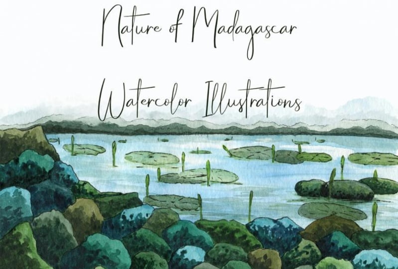
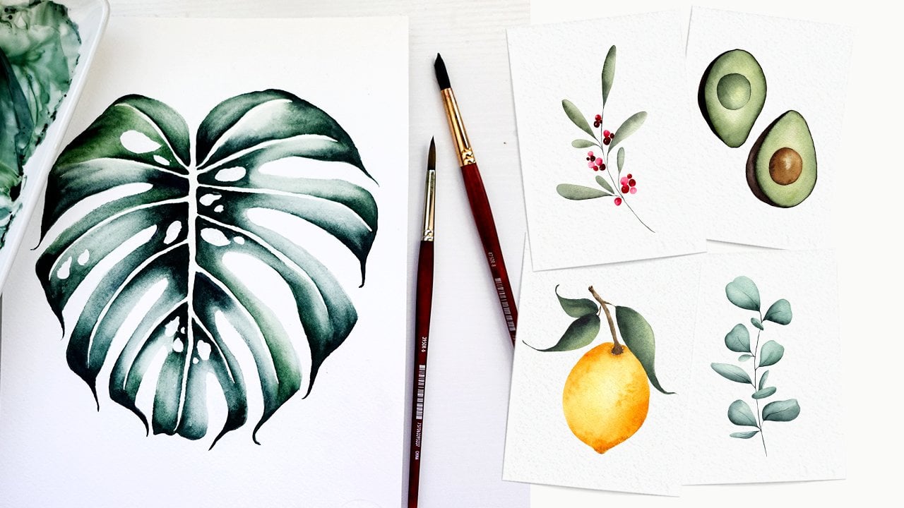
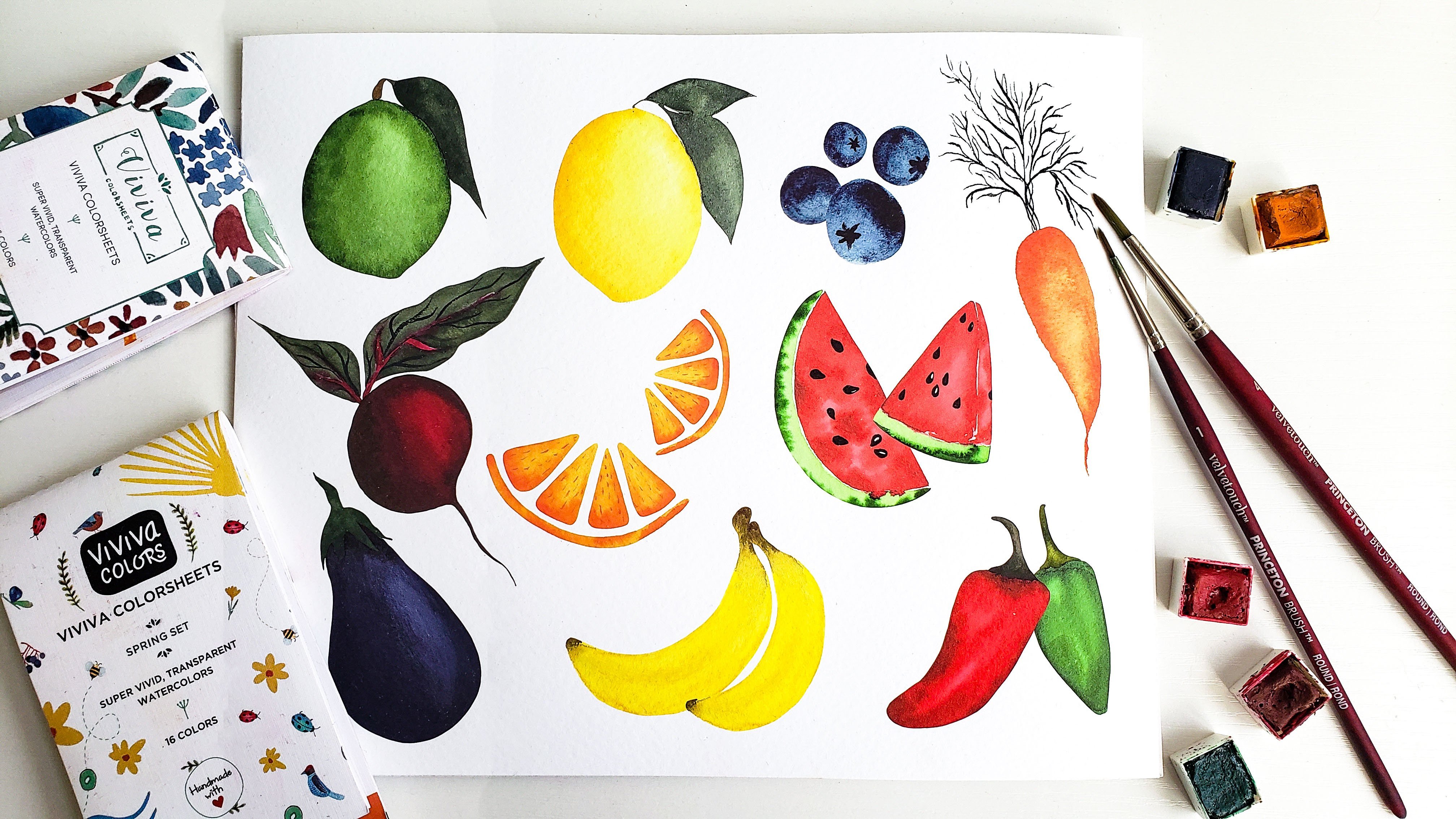
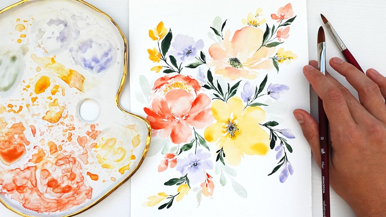
2. Supplies: Now that we're ready to get started, I'll go over some of the supplies that'll be helpful for this class, starting with Adobe Photoshop. Like I mentioned, don't worry, if you don't have Adobe yet on your computer, I am going to include a link in this class description for a seven-day free trial. That way you can learn this process, get a feel for things and just experiment a bit more before you decide to actually download it. You'll also need a scanner for this class. Now, if you don't have a scanner, you can just upload a high-quality photo of your artwork instead, but I do recommend eventually investing in a scanner if you're able to. This is a scanner that I'll be using, it's the Epson Perfection V39 scanner. I absolutely love it. I've been using it for 2-3 years and the quality has been amazing. It's also really lightweight and compact compared to a lot of the other scanners out there. Again, I'll include the link to this specific one and I highly recommend it. You're also going to need a piece of your very own artwork to start practicing digitizing with. It doesn't really matter what your artwork is. It can be as simple as a single leaf, or it can be a full composition or a landscape painting. If this is your first time using Photoshop or your first time experimenting with digitizing, I would recommend keeping it simple just so you can get the hang of things before it gets too complicated. For the purpose of this class, the example I'm going to be using is just this simple greenery leaves that I painted awhile ago. Finally, the last supply that you'll need for this class is a good amount of patience, as I said in the introduction video, learning Photoshop, especially if this is your first time using it, it can be really intimidating, really frustrating. There's just so many different tools and so many different ways to do things in Photoshop. I've done my best to break up this class into easy to understand step-by-step instructions. But just make sure to really take your time. Pause and rewind when you need to and just go at your own pace. Really the only way to get better at Photoshop is to spend more time in it, play around with things, and just practice, practice, practice. Try not to get too frustrated, go easy on yourself, and take it slow. That's about it for the supplies. Once you have everything ready to go, we'll start with actually scanning in our artwork in the next lesson, so I'll see you there.
3. Scanning your Artwork: We're going to start this video lesson with scanning in our artwork. Like I said before, if you don't have a scanner, you can skip this lesson and just upload a high-quality image of your artwork instead, but if you do have a scanner ready to go, I will start the scanning process. As I mentioned, I'm going to be using the Epson Perfection V39 scanner. That just hooks up to my laptop using this USB connector group. Before you scan, you'll just want to make sure that that connection is secure and good to go. One other thing I always do before I start my scan is I make sure the scanner bed is clean, free of any speckles, or dust, or hair that might have gotten in there. I just use a nice soft microfiber cloth that is meant for cleaning electronics and screens. I make sure everything is nice and clean on there. Then I'll take my piece of artwork here, place it face down on the scanner and close the lid. Now I'm going to hop over to a screencast so I can show you how to set up some of the basic scanner settings on your computer. I am opening up my scanning software, which is Epson scan. This will look probably a little different than the scanner that you use unless you get my same one, but for the most part it'll look similar. For the mode, I always put it on professional mode. These are just basic settings that I use. Reflective, I'm taking it from the scanner glass, and then I always scan on 720 DPI. I know it might seem really high, but I just always like to scan in the highest possible resolution. That way, if I need to create a pattern, or use the images for a surface pattern design, that's going to be blown up really big. I want to make sure I have high resolution. Yes, it takes up a lot of file space, but I just always feel safe for scanning in at a higher resolution. You can always definitely do 300 or 600 DPI, but I'm just going do 720. Those are the basic ones. Then before I actually hit "Scan", I'm just going to preview it. It does just a quick scan to show you what that's going look like. Usually it looks totally fine, but I always just like to do the preview just to make sure everything is looking good before I do the final scan. That all looks good. Hit "Okay" and then I'm going to scan it and since I'm doing 720 DPI, it's going to probably take a minute or two, but if you're scanning just something quickly with a low DPI, it usually only takes a few seconds. Here we go. It says time remaining 10 minutes, but it always starts out that high and it only ends up taking 1-2 minutes. I'll see you after this is done scanning. Now that it's all scanned in, you can see it automatically went here to my pictures folder and it is saved as image 072. You'll just want to make sure to rename it appropriately so that you can easily find it when it's time to embed it into Photoshop. I'm just going to name it Greenery Wreath Scan. That's about it for the scanning video. I will see you in the next one where we'll learn how to actually import our scanned image into Photoshop, and get a lay of the land of Photoshop and go over some of the basic tools that we'll be using in this class. I'll see you soon.
4. Importing Artwork & Learning Basic Tools: Now, that we have our artwork all scanned in, this lesson will be focused on how to actually import your artwork into Photoshop. I'll also go over the basic layout of Photoshop and some of the tools that we'll be using most frequently, as well as some keyboard shortcuts that'll really help make our workflow more efficient. Now that we have finished scanning our artwork, I'm going to actually import it into Photoshop. There are a couple of ways you can do this. You can hit the Open tab here, or you can go up to File and Open. Then you can see here I have the greenery wreath scan image that we just scanned in. I'm going to double-click on that. You'll see that it opens up here. You have the file name and you have the image. Now, I'm going to create another new tab that we'll actually be working off of. I'm going to go "File" "New." Then when this opens up, it has some of the custom templates that I've used in the past, but I'm just going to change pixels to inches and I'll just do a simple five by seven for this class. I'm going to keep the background white and hit "Create." Now we have two different files here. We have our scanned image and then we have this new artboard that we're going to be working off of. The reason I have these two setup is, I'm going to be grabbing the artwork off of here and then actually editing, and removing the background in this new file. That's just the way that works for me. You will notice when you spend more time in Photoshop, that there are a million different ways to do different things. There's tons of different tools. There's tons of different processes. This is just the way that has worked well for me and that's the way that I'll be showing you. Now, I'm just going to go over the basic layout of Photoshop just so you can get the way of the land before we start actually editing. As I said before, we have the two different tabs that we're working off of right up here. You can also drag and reorder them. But when I'm working, I like to have the original scan on the left and then the working file on the right. You also, here to the left, have all of the tools. There's tons of different tools and I'll show you which ones we'll be using in this class, but that's where those are located. Then we have our layers panel on the right. You can see here on the original scan, there's a photo that we uploaded and there's only this one layer now. But as we work through the class, we're going to be using more and more layers and I'll show you how that all works. I'm going to, just first, draw a little rectangle before I start showing you the tools. That way, I can have something to demonstrate with. I'm just going to drag that there and make it this little green rectangle. I'm going to drag this up. This, as I said before, we're going to be adding more and more layers. You can see now rectangle 1 is this layer with the shape on it. The very first tool we are going to be using is the move tool and that is this guy right up here at the top. The shortcut is the letter B. The move tool basically just lets you move an object around. It's pretty self-explanatory. Another tool that we'll be using is called the Lasso tool. This is third from the top and the shortcut is L. Lasso tool basically lets you click and drag to select a certain area. If you want to deselect, you hit "Control D." If you right-click on the Lasso tool, you can see also this Magnetic Lasso tool. If you click on that, the Magnetic Lasso tool basically just uses whatever object to help Lasso exactly on where you're trying to select. Instead of using the regular Lasso, I'd have to try to just have a really steady hand and outline this rectangle. Whereas if I use the magnetic one, it does a lot of that work for me. I don't have to outline it exactly, but it knows what I'm trying to select here. Then when you see those marching ants going across, that means you've selected that area. That's a really helpful tool. I'm going to just hit "Control D" there to deselect. Another tool we'll be using frequently is the eraser tool. That's what the basic one looks like. Then again, if you right-click on it, you can see the different options. For the basic eraser tool, let's see here, you can just erase certain parts of the file that you're working on on the layer. I'm just doing a little squiggle here to show you what that looks like. Then another shortcut I use all the time is Control Z, which is just undo. If you ever want to undo an action like this, just hit Control Z. When you're using the eraser and other brushes, you also want to change the size of it pretty easily. You can do that up here at the top and drag the size around, make it bigger and smaller or you can use the left and right bracket of your keyboard. If you hit the right bracket, it makes the erase much bigger. If you hit the left bracket, it's much smaller. I'm just again hitting "Control Z" to undo that. This is just for an example. I don't actually need all of those edits. If you right-click on the eraser, you'll also see the magic eraser tool. I'll be showing you how to use that when we actually get started removing the background, but that's how you access that. Another one we'll be using quite frequently is the transform tool. You will click on your object and hit "Control T." Then you'll see this blue box pop up around the object. If you just drag your mouse around and manipulate the shape that way, you can actually change the scale. But one thing that's very important is, if you're trying to change the scale of your actual artwork, you'll want to make sure you're holding down Shift while you make the object bigger or smaller and that keeps the same scale. If you're not holding down shift, you might accidentally stretch it out or ruin your artwork by not keeping that same scale. Just make sure you hit "Shift" and then make those edits. Then before you can move on to anything else, when you're using the transform tool, you'll just have to remember to hit "Enter" to make whatever edit it is that you just made. In addition to the transform tool, some other shortcuts that'll be helpful to know is Control C for copy and Control V as in victory for paste. It's the same as if you're working in a Microsoft Word document, Control C to copy and Control V to make a copy of that. You can see there, I just made a copy. Another way you can do that is by hitting Control J, which is duplicate in Photoshop. If I click on the rectangle and do "Control J," it made a second one. You can do that within the direct object here or you can hit the "Layer" "Rectangle 1" "Control J," and then you have rectangle one copy. Also, you'll probably use the zooming in and out tool a lot, and the shortcut for that is Control minus to zoom out and Control Plus to zoom in. Then finally, the last few tools before we actually get started, this T here, the shortcut is actually T, but you can click on that, click anywhere in your document and then that's text. Then you can start typing sample text. Since it's defaulting to this green, we can't actually see it because it's the same color as the rectangle, but there we go. I want to transform that to make it bigger. Again, doing Control T, holding Shift down, and then making it bigger. I just did sample text for the purpose of this example and I'm going to delete that. The last couple of tools we'll be using. Not right now, but I'll just show you where to find them is the clone stamp tool and the shortcut for that is S. That's what we're using to fix any mistakes in our artwork. We'll also be using the spot healing brush tool and the shortcut for that is J. Now, we know the basic layout of Photoshop and some of the most important tools that we'll be using during the class. In the next lesson, we'll start actually removing the watercolor paper, textured paper, background from our artwork, and getting started on that process. I'll see you there.
5. Removing the paper background: Now we're going to get started on actually removing the watercolor textured background. The paper part of this artwork so that we can have a clean final piece. I'm going to make sure I'm on this tab up at the top left of my artwork that we scanned in. I'm going to make sure that I grab the Lasso tool. If you are still using the Magnetic Lasso tool, all you have to do is right-click and then click the Standard Lasso. Just using your mouse, it does not have to be perfect, but just do a quick outline over the artwork we're going to be editing so it does not have to be perfect and then once you see the marching ants there, that means this area is selected. I'm just going to hit Control C to copy and then head over to my new document and hit Control V to paste. Now you can see it there I'm going to just make a little smaller because it's a little too big for this artboard. Control T transform, holding down Shift to keep the correct scale and then move it down a bit and always remember to hit Enter after you transform. Now you can see here Layer 1, I'm going to just double-click that and rename it greenery wreath artwork. Once you have it sized correctly on here, one helpful thing is to change the background color from white to something darker just for the beginning. I'm going to make it like this dark purple. It does not have to look good it's solely for the purpose of being able to tell if you have enough of your white paper background removed, if you have it as white, it can be a little tricky to tell. I'm going to zoom in here to tell the difference between these two. You might actually think that you've removed enough of your paper background but it might actually still be there. Whereas if you have it a different color like this purple, you'll actually be able to see. How you do that is you click on this second box, the one behind the top, and then choose a color, hit, okay. Then making sure that your background layer is selected hit Control Backspace. That's how you fill the background layer with a color. We're going to actually start removing the paper background. There are several different ways to do this as I mentioned, there are always going to be tons of different ways to do anything in Photoshop. But I'm going to show you the first tool that I always go to when I'm out this step in the process, which is called the Magic Eraser tool. Head over to the eraser, right-click, and hit Magic Eraser Tool. Now how the magic eraser works is it basically you'll hit one area, like one color that you want to remove, and then it erases everything in that layer that's similar to what you clicked on. It's a little hard to explain. But up here is where you'll be working the most, which is the tolerance level and I'll just show you an example here. If I go full tolerance, I'll put it a 100 that means it's not going to be very picky on what it erases. Even if I click on this bright white spot, it could even erase some of my artwork that's lighter because I don't have the tolerance very low. I'll show you what I'm talking about. I set the tolerance to 100 and I click on this whitespace and it gets rid of all the white, which is great, but it also got rid of some of my artwork, which I don't want that to happen. I want to save my artwork and now all of the light parts are gone. I'm going to Control Z to undo that. On the other hand, if I only set it to, let's say five, it's going to be very picky about what it erases. I'll show you what that looks like. I'll click here in the white, and it barely got rid of any of the backgrounds. I want to find somewhere in the middle, usually, the sweet spot is between 25 and 35. Thirty-five click are not actually looks really good, I got rid of most of the background, I didn't lose any of my artwork. There's still a couple of spots here, but it's not bad. Here's a good example. If I have the background white, I wouldn't even be able to tell that these spots were still here. I might miss that whereas now that it's purple, I can see everything. Yeah, that magic eraser is a great first step to just get rid of the bulk of the paper background. But as you can see, there's still some speckles here that we need to remove. Also, I just wanted to mention, I hope you will save this working document just in case your computer were to crush or something happens, you wouldn't lose your work. Just save it as a working document and Control S is a easy shortcut to save as you work. Now that we got rid of the bulk of that, I want to just clean up some of these. I'm going to use the standard eraser. However, where you were just using the Magic Eraser right-click and hit Eraser. Remember the left and right bracket, right bracket will make your eraser bigger and left will make it smaller. Control Plus to zoom in and I'm just going to quickly remove some of these speckles. Again, for this example, I'm just going over it very quickly. But in real life, I would do this process a lot more slowly so that I'm making sure everything looks perfect. But you get the point of it. Just use your eraser, clean up some of the edges. Many of the spots with the Magic Eraser didn't pick up. Also, if you have some rough edges like this on a leaf or a flower, you can always smooth it out by just dragging your eraser as well. When I'm doing this process, I usually don't like to make every single part of my artwork perfectly smooth because I think some of this edges or rougher texture is part of the magic of watercolor. I don't want everything to look like it was just digital art. But if there's major points like this that are sticking out, I usually do clean those up. Also if you see spots like this, you can go back to your magic eraser. Maybe make the tolerance a little higher, like 40, and then we can get rid of little sections at a time. I'll turn this actually down to 25 and then it'll get rid of sections like that rather than you having to manually do it. Just work your way through your piece of artwork and clean up any of those last few parts that need cleaning up. Finally, I'm going to show you one last way that you can also use to grab your artwork. I just created a new artboard just so I can show you. I'm not going to be working directly from here. Let's go back to the art scan. Another way you can select this artwork rather than doing a big selection and then using the erasers to get rid of the background, you can use the Magnetic Lasso Tool. Now I don't recommend this if you have a complicated piece of artwork or if it's something big, but if you're just selecting a small simple element a single leaf from here a little bit easier to just use the Magnetic Lasso, work your way around and then control C to copy and control V to paste. Then you don't even have to worry about getting rid of any paper background because all you selected was the artwork. For a single leaf or something very simple, that might be an easier way to go but if you're doing something like this, it would be very tedious to have to outline that entire thing with the magic wand. Just another way, depending on what your artwork is, you can choose your method. There's also different methods, but as I said, these are the three that I use most often and they seem to work very well. Those are the three methods I use most often and when you are happy with how it looks and you don't feel like there's any more paper background that you need to remove, then we'll go back to having the white background and see how that all looks. How you do that is you toggle between these two down in the bottom left, you have the purple and the white and whatever is the background here, not the foreground is going to be the fill color when you hit Control Backspace. I hit X there to make the purple in the background and this is the way that I did it initially. I hit Control Backspace and it filled the artboard as purple. If I want to get it back to white, I'll hit X. That made the white in the background and the purple in the foreground. Make sure you're selecting on your background layer. Hit Control Backspace, and it goes back to white. For now, this is looking really great. I don't see any paper texture in there and things are looking good. We will move on to the next lesson where I'll show you how to fix any errors or mistakes in your artwork using the clone stamp tool and the Spot Healing Brush tool, so I'll see you there.
6. Fixing Mistakes & Errors on your Artwork: Now that our artwork is looking great and our background is removed, I'm going to show you some simple ways that you can fix any errors or mistakes in your artwork. For example, if you have some harsh edges or if your scanner picked up any speckles of dust or hair. I always end up somehow getting cat hair in all of my scans. I'll show you how you can fix those using the Clone Stamp tool and the Spot Healing Brush tool. Our first up is the Clone Stamp Tool. You can find it over here. The shortcut is x, so I'm going to click on that. Just use the Clone Stamp tool. I'll zoom in using "Control +". This is very easy to use. I'm going to use the left bracket to just make it a little smaller. Here, for example, there's this white patch on this leaf petal and I don't want it to look like that, I want the whole leaf to be the smooth green. Using the Clone Stamp, basically what it does is that you can select an area like this right next to the error, and then you clone it and move it over to the area that needs to be fixed. I'll show you what that looks like in action. I'm going to hit "Alt" and click and then you can see it's pulling over this area that I just cloned. Then I'm going to hover over the part that needs to be fixed and click down. Now it's fixed and you would never know that there is a mistake there. Let me show you again. Say, for example, I need to fix this little patch and hit "Alt" click, hover over and click. There you can't even tell that it was fixed that way. That's a really easy tool that I like to use for mistakes like that. Let's do one more example and then hit "Alt" click, hover over this little white dot, and click. Next, I'll show you another very helpful tool that's pretty similar to the Clone Stamp. I'm going to move down to this lower branch. It is called the Healing Brush tool and the shortcut is j, so it's the Spot Healing Brush Tool so I'm going to click on that. Let's find another error to fix. I see this little white patch here. I'm going to just move my brush over that and then it automatically fixes it just by looking at the pixels around it and then it fills it in and does the guesswork for you. Let's say this little green dot, I want it to look like the rest of this light green here. I'm just going to click over it and it automatically fixes it. It's very easy to use. Let's see where else we can do that. Let's say, for example, I don't like this water edge, this little line that dried this way. It looks a little harsh. I tend to usually leave these because again, I like that natural watercolor look. But if you want to fix that, just drag your brush over and it smooths it out for you. It's a pretty handy tool to use. Between that and the Clone Stamp, it's pretty much all I ever need when I'm making all edits to my artwork like that. It's also nice to know when I'm painting if I know that it's just going to be turned into either a pattern or art print and I'm not worried about the original painting but I'm not too concerned if I make a mistake or if a paint splatters across the painting, you can always fix those things in Photoshop. I hope you found those two tools helpful. Next up, I will show you how to make color corrections and other edits using layers. I'll see you in the next video.
7. Color Corrections & Edits Using Layers: Welcome back. Now that we know how to fix errors and mistakes in our artwork, I'm going to show you how we can make color corrections and additional edits to our artwork, using the layers panel over here. Now, one thing that's going to be really important in this lesson is to remember to always duplicate layers before you make edits. What I'm talking about is, if you remember how to duplicate, I'll click on this artwork layer and hit "Control J" to duplicate. Now we have two versions of these layers. Say for instance, I was changing the saturation level; I would name it saturation and then make those edits. The reason I do it that way is because then you can always turn those edits on and off or you can delete the layer if you didn't like it. Whereas if you were to not make that additional layer for saturation edit, then just edit the artwork directly. Then later down the road, if you wanted to undo or you didn't like what you made, you wouldn't be able to do that. Each time you make an edit, make sure it's on a new layer. Anyway, I will show you some of the common edits that you can make. First, I'm going to duplicate, and I'm going to name these levels. Level for adjustment is something that I use fairly often. You'll go to Image, Adjustments and Levels and then these are different edits you can make. You can play around with them and see what works for you. Usually, I just like to drag this very left arrow a little bit more towards the middle and it just makes the colors a little darker, a little more rich. That's one. Now again, I'm going to Control J. The next edit I'll show you is brightness and contrast, so Image, Adjustment, Brightness/Contrast, and then you can play around with that here as well. You can make it really bright, you can make it dark, pretty much black. Just play around with what works well for your artwork. Don't make it too crazy. You can tell it's way overly edited if you make extreme adjustments, but these are just some simple ones that I use pretty often. Again, I'm going to Control J and I'll name it saturation. Image, Adjustments, Hue/Saturation so you can make it very saturated, obviously that looks horrible or you can make it pretty much black and white. For this one, I'm actually going to turn down the saturation a little bit because I like this more soft, muted look. Those are just some of the color edits and corrections that I use most frequently. There's obviously a ton of different ones that you can use, but these are just the simple ones. Again, just it's so important to use different levels because let's say for example, I'll edit my saturation again. Let's say I made it way overly saturated, then I saved it and I sent it off, and let's say a week later I wanted to edit this again and I did not like the saturation, it was too much, you can just click the eyeball and it hides whatever that edit was. Whereas if I were to make that edit right on my greenery wreath artwork direct layer, and didn't save additional layers, then it would be really difficult to go all the way back in your history of edits to change that. So you can just hit the eyeball to hide it or bring it back. Really important to make sure you're working in layers. I know it can be a little tricky to get the hang of it at first, but it will make your workflow a lot more efficient and organized in the long run. I hope you found that helpful and we're getting close to the end of the class. The next video will be about how to save your artwork as a PNG with a transparent background. I'll see you soon.
8. Saving Artwork with a Transparent Background: At this point, we have made all the edits that we need to make and we're ready to save our artwork. You could potentially save this as is with the white background if you're just planning to make it say like an art print or a greeting card with a white background. But I really recommend saving as a PNG with a transparent background. That way you can very easily place this artwork element onto a colored background for whatever project you're working on in the future. Also, just make sure you're constantly saving it as a working Photoshop file as well. Before I save, I'm actually going to just take one extra step that I like to do, just to organize my layers a little more neatly. We don't actually have too many layers right here. Sometimes if I'm making patterns, I have hundreds of layers so I like to keep it organized, but I'll show you how I do that. I want to create a group of just these color edits. I'm going to hit "Levels", "Shift," and then all the way up to "Saturation", and then I'll hit "Control G" to group it. You still have all the individual levels here, but they're in a group. I'm going to name that group color corrections, so then if I need to come back into this file later and make a color correction specifically, I can find all of those layers here. That's not a mandatory step, but that's just, again, something I like to do to stay organized. Then all you have to do to save it with a transparent background is hit the eyeball on the background layer, and then when you see this checkered gray and white in the back, that means it's transparent. Once you're there, hit "File", "Save a Copy", save as file type PNG, and then name it and hit "Save". That's about it. Next up is our class project, I'm really excited about it. We're going to use the artwork that we just created with the transparent background to make a greeting card or thank you card design of your choice. I'll see you in that next video.
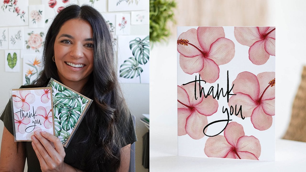
9. Class Project: Greeting Card Design: Now we're ready to get started on our final class project. I'm super excited about it. We're going to be creating a thank you card or greeting card design using your very own piece of artwork that you just worked on digitizing. I will be working on a thank you card but definitely feel free to get creative with it and make whatever you'd like, whether it's a mother's day card or a birthday card or even a holiday card. We're going to get started and also don't forget to upload your final class project into the project section of Skillshare. I'd love to see what you make and also if you share it on Instagram make sure to tag me @petals by Priya, that way I can share your work on my stories as well. We're going to create a new document in Photoshop. I'm going to hit "Create New." Then I'm just going to make a standard greeting card size which will be 5.5 inches by 4. I'm going to lower the resolution maybe to 300 pixels per inch and create. Now we have a new art board and we're going to import the artwork that we just created. You can do that by either embedding the PNG that we saved with the transparent background or the direct Photoshop file. You'll go File, place Embedded. Then I'm going to grab this transparent PNG that we just saved and now you'll see your artwork here with the transform box around it. Now remember to always hit ''Shift'' while you use the transform tool just to make sure that you're keeping the correct scale. I'll show you what it would look like if I wasn't holding shift. I could really distort the artwork which I do not want to do. I'm going to hit "Control Z" to undo. Then I'm just going to play around with the size and the placement of this. Again, this is just for my project. If you're using florals or a border or whatever your artwork is, just feel free to really play around with the transform Key and where you're placing it on this document. I'm just going to center mine here and then in the next part I will add the thank you text for this card. To have your artwork where you're happy with, you can add your text. Either use the T shortcut or hit this horizontal type tool and then you can start typing. I'm just going to do a simple thank you card. While you're typing all of the tools for your fonts will be up here at the very top. It defaulted to that purple that I used in the beginning. If you want to change, actually first I'm going to make the text a little bigger so you can see what I'm doing. You can either do that by changing it here where it says six point, or you can use the transform key, hold shift and make it bigger. I usually like doing that. I'm going to make it bigger and place it inside the reef. Now, as I said it's this purple. If you want to change the color, hit that color box and then you can either change the color directly in here and just find one that you like or you can use the eyedropper tool to select one directly from your artwork. I'm actually going to use that method and choose a green from one of these petals. I think I like that Seiji green. There we go. Then for the fonts, Adobe has their standard fonts here or you can visit Adobe fonts. There's tons of different font packs, font families that you can download for free or ones that you can purchase. I'm just going to use this luxus brut which is what I downloaded from Adobe fonts. It's actually my logo font. I like the way that one looks on here. I'm just going to play around with the placement here. Also instead of using the move tool you can also use your arrow keys to move left to right. I like to do that if I just want to move it slightly. I think I like the way that looks. That's going to be the end of it for me. I just encourage you to keep playing around with different fonts, different sizes, different texts that you're using whether you want it to be a mother's day card or a birthday card or if you don't want any texts, that's fine too. You can just have a blank greeting card that showcases your artwork. I'm going to call it there. I'm really liking how this looks. Once you're done, make sure you save it as a working PSD Photoshop file and then also you can do file, save a copy, and save it as a JPEG thank you card greenery. Here with your design, you can actually get your card design printed on physical cards. I think that's a really fun thing to do for holiday cards or special cards for your family and friends. It's always just so fun to see a design that you made on an actual product. Whether you're printing at a local print shop or if you have an at-home printer, that's great. Also there's a lot of print on demand sites like Vistaprint or Stationery HQ or Principle. There's just tons of options that you can choose from. That's basically it. Just make sure to really take your time, play around with different designs, see what you like. I will meet you in the next lesson for some final thoughts to wrap up this class. I hope you have a lot of fun designing your card.
10. Wrapping Up & Thank you!: We've made it to the end of the class, thanks for sticking with me. Now you know a quick and easy way to digitize your artwork in Photoshop. I really hope you found this class helpful and easy to follow. Again, I know I've said it before, but Photoshop can be extremely frustrating and intimidating at first, I know that. But I promise you the more time you spend in Photoshop practicing and just playing around with things and experimenting, the more comfortable you'll start to feel. I also just want to remind you one more time. Don't forget to upload your class projects into the project section right here on Skillshare. If you post it on Instagram also make sure to tag me, I'd love to repost your work on my account as well. Finally, if you do have a quick second, I would so appreciate if you could take a time to just have a quick review on this class. I always love hearing your feedback and seeing what you enjoyed or if there are any areas that I could have improved on. Thanks again for sticking with me. I'm so excited to see your projects and happy painting and happy digitizing from me to you.
 Petals by Priya Watercolor, Watercolor Artist & Teacher