Transcripts
1. Introduction: Hi, my name is Kent Noble and I'll be your instructor in this class. I've been working with Photoshop since the early 1990s and pass along some of the tips and tricks that I've learned along the way. This class is designed for beginners, and we'll be going through each technique step-by-step so that you can understand what's going on. Lower building scrapbook pages. You can use these same techniques to build anything, posters, postcards, flyers, invitations, anything you want. Let's take a look at some of the things that we're going to be learning in this class. We'll start out with a background from the backgrounds panel and combine it with a gradient. And we use a picture to make it background. And then we'll use a pattern combined with a solid color fill to make another background. We'll bring in some type and we'll use the warp to give it a cool effect, will change the font and the letting and the tracking will work if the colors even changing the color of every single letter. We'll add some layer styles which will add drop shadows and strokes and bevels to our type, will bring pictures into our scrapbook pages and create frames using simple strokes. And then we'll apply our layer styles to those frames. We'll use some frames and the frames panel will use shapes is frames add some color and some layer styles. We'll add some simple borders to our scrapbook pages and apply the layer styles to those borders. A lot of people like to use journaling and their scrapbook pages. We'll create some space to do some journaling. Will use a shape from the Shapes panel as a graphic element. And we'll use some type that I printed out on a sheet of paper. Take a picture of, brought that into Photoshop. We'll use those words as graphic elements. We'll use one of the default brushes that come with Photoshop bomb. So I'll make some changes to that brush. Using some of that brush options will make some changes to this balloon graphic from the graphics panel will make it look a little more around by using a gradient and the blending mode. And then we'll bring it into our scrapbook page. Will change the color of two of those balloons by using hue saturation adjustment layers. And then I'll bring in another graphic ribbon, and we'll make it look like one part of the ribbon is going behind the picture by using a layer mask. When we're done with this course, will have built three different unique scrapbook pages. And you'll be able to use those techniques and use those skills in creating your own scrapbook pages. Thanks for joining me in this class. Click on that first link and let's get started.
2. Open A New Document and Set Up Your Workspace: In order to do some digital scrapbooking, you need to have a document open. So in order to do that, come up under file, new blank file. Here you have a lot of different presets. You can use. A key is US paper. I'll give you an 8.5 by 11. He had these other choices as well. Can use International Paper. Changes this unit of measure, two millimeters. You have these different sizes. You have a preset here that's called scrapbooking. This will give you 12 by 12. You also have an eight by 86 by six preset. Or you can just type in whatever you want in here and you can change your unit of measure, two millimeters, centimeters, whatever you want, whatever you work with. I'm going to leave 12 by 12. 300 resolution is best if you're going to print your scrapbook paper out. So we're just going to leave it at 300. Rgb is fine and white background is fine. So I'm going to just leave all those same as the default. We're going to choose the 12 by 12 and click Okay. And that opens up or document and you can see by the rules appear that were 12 inches by 12 inches. You can change the unit of measure in those rules if you just hover your cursor over the ruler, and if you're on a PC, right-click. If you're on a Mac Control click right in that ruler. And you can change the unit of measure in your rulers. If you rulers are now visible, come up under View. Rulers. You can see here's the keyboard shortcut, Shift Command R on a Mac, it'll be Shift Control R on a PC. And that will just toggle those rulers on and off. Then here you have your different panels. You can see I have my Layers panel open right now. This is the effects, the filters, styles, that graphics and more, which gives you these other different panels. I like to have my Layers panel visible all the time because I used the layers all the time. In order to do that. You come down here under more, this little triangle next to more. Click on that and click on custom workspace. That puts all of those panels that we're down here at the bottom, period tabs. I'd like to just drag my layers panel out here. And now my layers panel is going to be visible all the time. And I have all these other panels that are available. That's how you open a new document and set up your workspace. In our next lesson, we'll go over backgrounds, how to get your background in. So I'll see you there. Thanks, Bye.
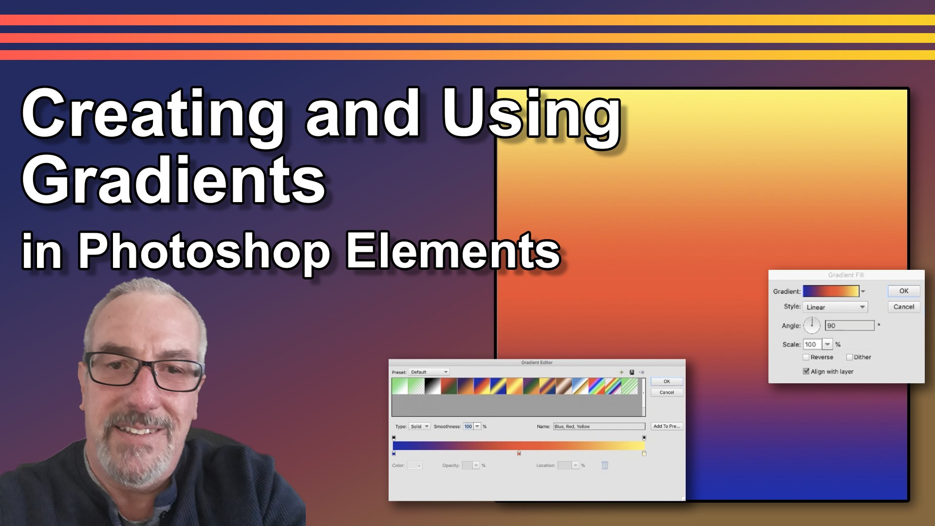
3. Creating Backgrounds: In this lesson, we're going to talk about backgrounds. Have three documents open here. We're going to make three different backgrounds. Now an easy way to make the background is have your background layer selected, hit Shift, Delete or shift backspace. And that brings up this fill layer dialog box. You can fill it with any of these options right here, the foreground color, the background color. Right now we have the foreground color is white, the background color is black ink. Fill it with a color. Click on Color. It opens up our color picker and you can just pick any color you want. Click Okay, click Okay. And it will fill that with that color Command Z or Control Z. To undo that, Let's do the same thing, shift delete or shift backspace. You also have a pattern. Click on this little arrow next to the pattern swatch and it will open up the patterns. These are some custom patterns that I've built. You also have these different patterns that come with Photoshop Elements. Says click on burlap. Click Okay. And that fills that with that burlap pattern. Command Z or Control Z. To undo that, you can also use the gradient tool over here. This is the gradient tool. Down here, your different gradients. These gradients come with Photoshop Elements. You have different sets of gradients here. You can choose from. Let's just pick one. Who pick this one right here. Just click and drag and you can go at different angles, have you on, if you want to stay straight up and down, hold down the Shift. Shift, we'll keep it at 90 degrees or 45 degree angle. Just drag it down to the bottom and that will create your gradient. I had the radial gradient selected, so I drew a radial gradient. I want to do a linear gradient. So let's Command Z on a Mac or Control Z on a PC. To undo that will select the linear gradient and start from the top, hold down the Shift and drag down to the bottom. You can't really control this. Once it's drawn, it's there. You can draw it differently. We can draw a real short line and that will make our transition very short. Or let's zoom out. Control on the minus sign is for on a PC command. And the minus sign, if you're on a Mac, you can start out here outside of your canvas and dry line, and it'll make that transition very long. Once you dry your gradient, it's there and you can't really control it after it's drawn. Command Z or Control Z. To undo all of that. I like to use fill layers. They give you a lot more control. This is the filum Adjustment Layer icon up here. Let's choose the solid color fill layer, and that opens up the color picker. And you can choose any color you want, and that will fill that background with that color. It also puts that on a separate layer so we can control it a little bit better. Let's throw away that to throw a layer, just click on it and drag it up to this trash can. This is the gradient fill layer. It opens up this gradient fill dialog box. These are different gradients. If you click on this arrow, it'll show you the same grace that we had where we used this gradient tool over here. This is pick on this gradient. Now our gradient is filled or artwork. Let's just click over here to close that window. You can change the different types of gradient. Let's just go back to linear. You can also change the angle of it. Moving this little dial around. You can change the scale. If you just hover over the word scale, your cursor turns into a hand with a double-headed arrow. You can drag to the left or you can drag to the right, change that scale. You can also use the slider or you can just type in a number. Let's go back to a 100 percent. And you can reverse it. For now. We'll just keep it aligned with layer check. So you have a lot more control over your gradients. If he's the gradient fill layer, Let's click Cancel. There's also a pattern fill layer. You have all your patterns here, the different sets. Let's go ahead and use course we've and because it's a fill layer, you can scale it up, scale it down. You can have a lot more control over it. Click Okay, and let's just delete that layer, just drag it to that trash can. Photoshop comes with a lot of backgrounds that are found in the graphics tab. There's a pull-down menu that has a lot of these different graphics. One of the menu items is Backgrounds. So you can just click on that background and it opens up Pauli's different backgrounds that are available in Photoshop Elements. Let's hit Command 0 or Control 0. Fit our work in the window to select a background. You can just click on it and then just fill in that background layer. Or you can click and hold down the mouse button and just drag it into your artwork. Every time you drag in a new background, it replaces the background that was in there before. I'm going to use this background like that. You can use that background as is or you can combine it with something else and just combine it with a gradient. Let's come up here and click, and let's create a gradient fill layer. Let's select that same gradient that we used before. Click Okay, now it covers up the entire background, but we can change that by changing the opacity of our field layer. And that will allow some of that background to show through. I'm up here under opacity. And your cursor turns into a hand with a double-headed arrow, click and drag to the left. And that will lower that opacity. Just give it a more subtle effect. We'll just go to about 50 percent. Now you can see some of that background showing through our gradient. And that's how you can combine a background and a fill layer to make you unique background. So let's just keep that as one of our backgrounds. It's kind of pinned or file. Save As we want to save this as a Photoshop document, that way it will save all of our layers if we ever want to go back in and change a thing, we can do that because we will have those layers. And we're actually going to use the backgrounds that we're building in this lesson for some of our other lessons down the road, Let's give our file a name. We'll just name it orange leaves for now, will probably change that name later. Save it as a Photoshop document. I've navigated to my folder already. It's under my digital scrapbooking folder in my Skillshare folder. Click Okay, and now that's saved. Let's go to a new document. Another way you can make it bigger and just by using a photograph down here in the photo B and I have one opened. This is a photograph that we took on vacation a couple of years ago. Just click and drag it into your Canvas. It doesn't quite fit. We have a lot of room at the top and the bottom. Let's resize it. Command T or control T will bring up these little squares around the outside. These little squares are called handles, and if you just click on one of the corner one hold down your mouse button and drag it will scale that pitcher and fill your art board. After you click on one of these middle handles, that will distort it, we don't want to do that. Just hit this cancel button down here, Command T or Control T to bring up those handles and just click and drag from the corner. Okay, now fills up our canvas. Let's just slide it over just a little bit and click the check mark to accept that. Because this is a background, I want this to be a little more subtle. Be hard to see any type or other pictures are things that we bring onto this background page. So couple of things I can do, I can change the opacity. We did this in our last one. You can just bring that data and kind of ghost it back. Okay, there's a background. Or what I'm going to do is come up here and get the marquee tool. I'm going to look at the rulers. If you don't have the rulers visible being come up under View, Rulers. And that will toggle the rulers on and off. You also have this keyboard shortcut that you can use, Shift Command, Shift Control R, if you're on a PC, will toggle those rulers on and off. This is the marquee tool. This will make a selection and you have the rectangular marquee tool and you have the oval murky tool. We're going to choose the rectangular marquee tool. Let's make a new layer because we want this on a new layer because we want to be able to control it. As I move my cursor into my artwork, you can see little line upon the rulers that shows me where my cursor is. When it come in one on the top and come down one on the side. Click and hold down the mouse button and drag. And I'm gonna come over to 11 on the top and 11 down the side. See now we have a dotted line and this is referred to as the marching hands. That's our selection. Whatever we do is only going to affect the inside of that selection. Now we have a new layer, I'm going to just fill that with white. We have white is the foreground color. Click on the Paint Bucket. Just click inside of that selection that will fill that selection with the foreground color, which is white. And now we can change the opacity of just that one layer that creates kind of a border around it. And we can bring our scrapbook page elements inside of that goes to the back area. I think that looks good. We'll leave that there. Command D or Control D will de-select those marching ants. And here's our second background. Let's just save that. Let's go to File Save As and we'll save it as vacation. And it's a Photoshop document. It save. Let's go to another new document. We're going to use one of the patterns to create some texture. It's going to append it to the fill layer, select pattern. And we're going to select, I'm going to select granite. And I'm going to scale it up a little bit. I want to see that texture in the background. Okay? Now I'm going to use another fill layer. Needs a solid fill layer. Let's select a blue color. Let's change the opacity of that fill layer. And you can see that texture start to come through. There's a textured background. Now you've got three options, 3 backgrounds that we can use and we're going to be using these during this course to build our scrapbook pages. Come up to File, Save As we're just going to give this a name, blue texture, and click Save. Okay, Now we've built three background. There are also other ways you can get it back ground. You can search the internet for backgrounds. This is Etsy. For example. People will make backgrounds and put them appear for sale. Let's just do a quick search for scrapbook backgrounds. You can buy these backgrounds and they come in sets. You'll get multiple backgrounds. And they're not very expensive. 240, $18. So that one's a little bit more expensive, but most of them are around 2, $3, something like that. And you get multiple files. Let's take a look back up here at the top. 135,307 results. So there are a lot of different sources on the internet that you can find digital scrapbook backgrounds. Just do a Google search and you can find some for sheep or some even for free. I like to build my own background. Now you have three backgrounds ready to go. In our next lesson, we'll talk a little bit about type. Thanks for joining me in this one and I'll see you in the next one. Thanks. Bye.
4. Working With Type: Let's talk about the type tool. Type tool is found over here in your tools panel. It's right here, the capital T. Click on that, it opens up your options down here, you have all these different type tools. Start with this first from this is the horizontal type tool. Let's just click up here and we'll type Horizontal Type Tool. Click the check mark to accept that. And as soon as you click on that check mark, your tools automatically default to the move tool. So you can move that around. Let's go ahead and click on the Type tool one more time. You can select the type by just clicking and dragging to select a word or a letter. You can click multiple times to select a word, a line, or the whole paragraph. Or you can just click once and hit Command a on a Mac or Control a on a PC and select all of your time. These are your fonts right now we're using Arial regular. You can change the font by clicking on this arrow. It will open a menu with all your different fonts that you have available on your computer. You can also just type something in here. Just type Helvetica. I didn't even get the whole word typed and it's showing me I'll Helvetica is available on my computer. Let's just select that one. You can select this font by clicking and dragging and easier up and down arrow keys to cycle through the different fonts that are available on your computer. Is your font styles. Some fonts have different styles, some don't. They don't have different styles. You can change the style over here. This is the same as in a lot of different word processing programs. You can pick bold, italic, underline, strikethrough. You can see that there are cumulative, so you can combine two or more styles together. This is your size. You can change the size of your type by clicking on this arrow. You have these different types sizes here it goes up to 72. You can also type in the size here. Let's just type in a 100 point. Here we go. Or you can hover your cursor over the word size that changes into a hand with an arrow going to the left and the right. You click and hold your mouse button down and you drag to the left. It will make your type smaller. And if you drag to the right, it will make your type larger. I used that most of the time because it's more visual. You can see exactly what types doing. Leading is the space between your lines and you have the same options, you have the presets here. You can type something in or you can hover your cursor over the word letting and drag to increase or decrease your lettering. And same thing with tracking. Tracking is the space between the letters and do the same thing. And I usually use this technique with the cursor and dragging left and right because it's visual and you can see what you're doing. You can see exactly what you're getting. These controls are the same as a lot of different word processing programs. You got to flush left of center and flush right. This will switch your orientation between Horizontal Type and vertical type. And we'll get to the vertical type here in a minute. This is your create Warp Text button. If you click on that, it opens up the Warp Text dialog box. Here you can choose between any of these different options that you want. Let's just try Hark. You can use these different sliders to control the warp. Each slider gives you a different effect. You can play with them until you get what you want. You can also just type something in here. Let's just go back to 0. I'll zeros is no work at all. And you have different options here. I like to use the flag or the wave or the arc, but you have other options here too. Let's try squeeze. And you can control it with the sliders. And hit Cancel on that. Click the check mark. Okay, That's the horizontal type tool. You also have the vertical type tool. Let's select that and come up in your artwork, your cursor is sideways. Now, let's click there and start to type. Click the check mark. And let's select the Type tool again. And let's select that type. You have the same controls as you have with the Horizontal Type as far as the size and the tracking and the letting, although there's only one line, so letting won't do much. You have the flush left, center and flush right controls. And again, you can toggle it, you can change that to the horizontal type back and forth. This is the Horizontal Type Mask tool. Let's go to a different document and I'll show you what it does. Let's make sure your type mass tool selected. I will click up here and we'll just type. Click the check mark. Now when you move that, you can see that it just cut out that picture in the shape of the type. So the picture is in the type, but you have no control. You can't move that picture around in the type. Once it's there, it's there. Let me show you a better way to put a picture inside type. Just undo this Command Z or Control Z. To undo that. Let's go back to our other document. Let's put a picture in this type. Let's make that type a little bit bigger. Go back to our type tool, get our horizontal type tool, select that type. Let's make it a little bit bigger. Down here by the size. Let's change the letting and a little bit, make it a little bit bigger that way. Let's click the check mark to accept that. Now let's bring in a picture. It's bringing that same picture. And the picture came in under our types, we need to move that layer. You can move that layer by clicking on the layer, hold down the mouse button and slide it up to see how it's moving. We wanted above that horizontal type tool layer. And as you move this up, you can see the line between that layer, between the Horizontal Type Layer and the vertical. It gets dark and thick and black does drop right there. And now our pictures on top of our type. And we want to clip that picture to our type. Knew that we're holding down the Option on a Mac or the Alt on a PC. And you move your cursor in between those two layers. And the cursor becomes a square with an arrow pointing down and click there. And now our picture is clipped to our type layer. That means that picture is only visible where there are pixels on the top layer. Now you have a lot more control you didn't have if you use the type mask tool in, come in here and you can move that picture around in your type. So I don't ever use the Horizontal Type Mask tool or the vertical mask tool. I just use the regular type tool and I'll clip a picture to it. It gives me a lot more control. The texts on the selection tool to show you how that works. Let's go to a different pictured as good a picture of a car. We have our texts on the selection. Let's go ahead and just drag inside of this car. Now I'll select this car. And we need to add two. And we have the Ad. See the little plus sign in santa, the cursor. I will add to our selection. If you don't have that, you can click on add down here or just hold down the Shift key. And that will add to your selection. If you want to subtract from your selection, you can just hold down the Alt on a PC or the Option on a Mac as you drag or you can just click on this little icon down here. This is the subtract from selection. Continue going around the car and adding to or subtracting from your selection until you get your selection the way that you want it. I think that looks pretty good. Let's click the check mark. And now our selection turns into a path. You see it's a solid line now. And as we move our cursor up, by that solid line it, our cursor turns into a I-beam, the curved arrow, that's where we're gonna start to type. You can just click right there. And that looks a little weird, but you can change that. Let's click on the check mark. Let's get the shapes selection tool that's in the shapes group. You might have a shape business area. If you do, just click on it, we want the arrow, that's the shape selection tool. Our cursor turns into an I-beam with the arrow pointing left and right. If you click and drag to the wards, the inside of the selection switches the type, the inside of the selection, and you can drag it around and place it where you want it. To slide it up here a little bit. And it'll switch it back to the outside. And we'll just move it a little bit and get it into position where we want it. Something like that looks okay. You can see how it's kinda messed up a little bit as it followed that selection around. You can fix that by selecting the text tool. And then we'll just select the L. And we'll just change the tracking a little bit to give a little bit of space between that Ale and the E. Let's select all of the type won't change the size just a little bit. We'll make it smaller so that it fits a little bit better on the top of that car. Something like that. Checkmark. It can be a little bit tricky, but with a little practice, you'll be able to get it down pretty good. Now with the move tool selected, you can just move that up a little bit so it's not sitting right on the car. And there you go. Texts on your selection. Let's go back to our other document. Let's go back to our text tool. Our next tool is text on a shape. You have different shapes here that you can use. We're going to use the oval. Click and drag to draw an oval. Or if you want a perfect circle, just hold down the Shift while you're drawing and it'll draw a perfect circle. Okay, there's our shape now I want text on the shape, the same thing. You move your cursor up here by the line and it turns into a high I-beam with the curved line on it. That's your text on a path. Click right there and you can start to type. Let's make this a little bit smaller. To begin with. Text on a shape. Click the check mark and let's go get that shape selection tool, the arrow. Come to this circle. We can move the type inside the shape or outside the shape. Or we can slide it around and move it to where we want it. Something like that. Let's go back to our type tool. Scary, her regular horizontal type tool. Let's select all of it. And we'll change that tracking a little bit. Bring it down. So it's a little more readable. Let's change the size a little bit too again. Something like that. Checkmark. There's type on a shape. Then our last one here is text on a path. Let's click on the text on a path in come up here and you can see that our cursor's turned into a pen tool. Now it's not the same kind of pen tool is in regular Photoshop, but it will create a patch. Let's draw path. Check mark. Now when we move our cursor up here, it turns into an I-beam, began with the curved line. Click right there. And we can just start type. This is text on a path, make and move that along the path if you want. Just click the check mark. Skip the shapes selection tool. You move up here, see how our cursor turns into the I-beam, and now it has one arrow. Because this is flush left text. This x is determines the beginning point of view text. This circle determines the end point of your text. We can move that along on our path. We can change it to the bottom of the path or the top of the path. This circle is the end point. If we move that end point to the left, it will start to clip part of that type. So if somebody who type is missing, make sure that you have that circle towards the end of your type. And then as you type on a path, let's move that down just a little bit. So those are the basics of the type tool. It takes some practice, especially with the text on a selection, text on a shape and text on a path. Those can be a little bit tricky, but with a little bit of work and a little bit of practice, you can get it down and pretty good. These two tools, I never, never use Horizontal Type Mask and the vertical type mask. I never use them. I always use the horizontal or the vertical type tool. And then I will clip that picture or something on top of it. In our next lesson, we'll put some type on our scrapbook pages. So I'll see you there. Thanks. Bye.
5. Adding Type To Our Scrapbook Pages: In this lesson, we're going to put some type on our scrapbook pages. Have this background open. Let's go ahead and put some type in here. I'm going to use Helvetica Neue Bold has just click right here and I'm going to call this arm fun. Okay, I'm going to click the check mark. You can select your type of different ways. You can select the type tool and click here you can hit Command a or another thing you can do is just go to the type layer and just double-click on the type layer and it will select everything on that type layer. Come down here to the warp. I'm going to give this a flag. So many. Click here and choose flag. That's just a little bit more than I wanted to go unless bring that down just a little bit by using the slider. Something about like that. Click Okay, click the check mark. Now it automatically goes to my move tool. I'm just going to move this over just a little bit, something like that. And that's how we'll type I'm going to put on now and let's save this. Go up to File. Save As, and I saved it before I saved it as orange leaves, I'm going to save this as autumn fun. Picture to Photoshop document going in my scrapbook pages. Click Save. We've got our first one, then we'll come back and fix that type so it looks a little bit better. In our next lesson. Let's go to our vacation scrapbook page. This is from a vacation we had a couple of years ago in Moab, Utah. Let's put some type up here to the top. I'm going to get the type tool, going to make this black. And I'm going to make this tap a little bit smaller. And then we'll come up here to the top and click and we'll start typing. Summer vacation. Still need to make this text smaller, so let's select it all and we'll come over here and put our cursor over the word size. And we'll just click and hold down the mouse and drag to the left to make that smaller, we'll just kinda visually give it the size that we wanted. I wanted to change fonts. I'm Graham, highlight the font here in the options. I'm going to use the down arrow to just cycle through some of the fonts that I have available on my computer. I kinda like that one, lithos Pro Regular think I'll use that one. Click the check mark, and I'm going to just slide that down here. Something like that. And maybe go a little bit smaller. So I'm going to double-click on that layer to select my type and I'm going to make it just a little bit smaller. I'm going to change it to center, then move it over into position where I like it. Chaos, get the type tool again and I'm going to type, I'm going to use all capitals and I'm going to type Moab Utah. And click the check mark. Slide that over. And I want that to be a little bit bigger. I want to use a different font. Make sure my Moab, Utah type layer selected. And I'm gonna come down here and I'm going to select the font. I'm just going to type in graphite standard worldwide. That's what I'm looking for. I'm going to make it a little bit bigger like that. I'm going to get the move tool. I'm going to center it a little better using my arrow keys. Bring it down just a little bit. And I'm going to put a rectangle between and we separate those two. Comparing get the marquee tool. We want this on its own layer, so we'll make a new layer. We're going to wind it up with this side of the M and this other side of the h is just click and drag until you have the size of rectangle that you want. Something about like that. And we're going to fill that with black, Shift Delete or shift backspace, or bring a perfect layer dialog box. And I'm just going to fill it with black click. Okay. Command D on a Mac or Control D on a PC, will de-select that. And there's our type and our vacation scrapbook page. I've already got this saved as vacation. I'm going to just leave it at that name. So File Save. Now, sometimes it wants you to rename it. I'm just going to leave it as vacation, PSD and save. And we're going to replace what's there. And that's fine. Let's go to our third scrapbook page. I'm going to make this a birthday scrapbook page. And I'm going to use a graphic and I need to put this graphic in first because I'm going to line up my type with the graphic. Let's go over here and choose the graphics panel. And I'm going to choose this graphic, this rainbow graphic. So let's just pull that in. Now these are vectors, so you can go ahead and enlarge these as much as you want. I'm going to enlarge it. I'm going to enlarge this so it fills up pretty much the whole page. So I'm going to pull this corner handle up towards the top corner of this slide, this side over just a little bit and I'm just looking at the top and the side. I want to get that in the right position that I want. And then I'm going to drag this bottom dam so the rainbow goes right off the bottom edge. I think that'll work. And I want to put my type inside this cloud. Skip the Type Tool. I'm gonna go ahead and use that helvetica that I used before. Helvetica. Helvetica new bold. And we're going to click up here, start to type Happy Birthday, checkmark. And let's move that over into position with our Move tool. Double-click on that top layer to select it. We're going to make some changes. Let's make that size a little bit smaller. Let's decrease the lead and let's bring the word birthday up a little bit closer to the word happy. I think that tracking is probably okay at 30. What I wanna do is make each letter different color and I'm going to use the colors in that rainbow to change the colors of the letters. Let's select the HTML, come down here and click on this color swatch. And if you click on this little icon in the corner, it will open up the color picker. When you move your cursor into your artwork, the cursor becomes an eye dropper. Click on that color, that becomes the new color for our type. So I'm just going to click on this purple color. That makes purple my color. Click Okay, at Hs now that purple color, let's make this T purple. Now, since I've had purple, purple shows up in my color swatches, so I can just click on that purple. Let's maybe make this p purple. And maybe the y purple. Let's select this a and we'll go back to our color picker. And we'll pick this green color. Now our a is the green color. Let's select this B. We'll make that the green color. And there it is, it's added to our Swatches, will make this d a green color as well. Let's choose that P. Click on the swatch and that little icon to open our color picker. And let's pick this salmon color. Let's make the eye the salmon color and salmon-colored and our swatches, we'll make a salmon color as well. Select the Y, and we'll go to the color picker. And we'll choose this yellow color. Click Okay. And we'll make the yellow color. I'll select the H. Let's go to our color picker and we'll pick this orange color. And that's the H. Click the check mark. Perfect. Now I want to give that an arc. So let's select that type and come down here to our Warp Text button. We'll select R. And that's little bit too much. I'm going to bring that down just a little bit. Something about maybe like that Click Okay, checkmark. Let's move that down a little bit. Something about right there. That looks good. Okay, That's good. My type tool, I'm going to put this is for a five-year-old, so I'm going to put a big fine right there. We'll make that a little bit bigger like that. And it brought it in at that color and that's okay. And you are you can change the color a few on. I'm going to leave with that color. I like the way this curve matches the curve and the clouds. I'm just gonna kinda tuck it in their battle like that. Let's go ahead and save that because right now it's just blue texture. I'm going to save that file, Save As, I'm going to save it as birthday PSD file, it's going in my scrapbook pages folder, click, save. And there we go. We have typed in all three of our scrapbook pages. In our next lesson, we'll come in and use some layer styles to make that type show up a little bit better. So I'll see you there. Thanks. Bye.
6. Adding Layer Styles: In this lesson, I'm going to talk about layer styles. Layer styles are found up here. Under Layer, Layer Style Style Settings. This style determines the angle of your lighting. Right now the lighting is coming from straight tap above. I like to have my light coming from the upper left that puts the shadow down here in the lower right. That's just personal preference. You can do whatever you want. This is a global adjustment, so this will affect everything on your page. This is the drop shadow. Let's turn down this arrow. Just click on the drop shadow. We have our type layer selected. So this is going to put a drop shadow on our type. Size determines how hard or how soft your shadow is. If you move this to the right, it becomes very soft. If you move it to the left, it becomes a hard shadow. Now you can't hardly see here. Let's give it some distance. Distance is the space between your image into drop shadow. So if you move this slider to the right, it increases the size of your drop shadow. You can see our drop shadow showing up on the lower right. That's because we have that dial set. So the light's coming from the upper left and you can go too far. She go too far. You can see you can go clear off the page. We're completely off the page now let's bring it back a little bit and see, there it is. So if you give it a shadow and then you can't see the shadow, should remember, you might have gone too far and just bring it back a little bit. Now you'll be able to see how the size affects the softness or the hardness of that shadow. If we move that slider to the right, it makes the shadow very soft. Move it to the left. It makes the shadow very hard. And the opacity determines how dark your shadow is going to be. You can move it to the left and it will almost disappear. You can move it to the right and it will become very dark. You can see how this dial effects that. It can move that shadow anywhere you want. Okay, let's take a look at Glow. Turn on the glow. You have two different glossary have an integral and an outer glow. Let's take a look at the Inner Glow. Let's check the Inner Glow and we move this slider to the right. You can see how it kinda shows up around the inside edge of our type. In increase the opacity on that too. We can change the size. You can make it almost disappear. Let's take it back down. Usually you want to keep these effects small and subtle. Now the Outer Glow, it's exactly the opposite of puts the glow from the image. How? So we can make that go out. You can't hardly see it because I have a white background. Let's put a color in the background. Let's hit Cancel. Select the background, shift, delete her shift backspace. Let's just put a background in here. We'll just go, we'll go with the color. Who will put will put this magenta color in the background. Gives us some good contrast. Get us go back to the Type. Go up to Layer. Layer Style Style Settings. Go to glow with the outer glow. And we'll just give it a little bit of an outer glow and you can see it start to show up there. Let's turn up the opacity. You can see how it glows. Now, glow will always lighten, even though you can change your color here. If you change that to black, it won't work. Same with the drop shadow. If you change the drop shadow tool white, it won't work. Drop shadow always darken. Glow will always lighten. So here's the Inner Glow again. So when envelope puts the glow on the incentive of the image, Outer Glow puts the glow on the outside of the image. Let's turn off the Geelong. Go back to our drop shadow. We lost your drop shadow and I cancel the layer styles to put in that background. We'll just move these sliders around and get the drop shadow that we want. Okay, Bevel, see what bevel does. Bevel gives you an image, a 3D effect or an embossed effect. And you can move this slider to give it more of an effect or less of an effect depending on which direction you move the slider you can choose up or down. And that just changes the position of the highlight or the shadow. I usually stick with up because the light usually come from above and that puts the highlight towards the top. Even go so far that it looks like it doesn't have any effect at all. I like to back it off and just keep it kind of subtle. I wouldn't be the most time and gone, something like this. It's got a stroke. Stroke just puts an outline around it. You've got your size right here. And you can go very big or smaller. You can also type in a value here, and you can do that on any of these. Type in a value where it says PXE, PXE or percentage. Here you can choose what color you want for your stroke. Click on this color swatch and it will open the color picker and you have all these different settings that you can use to select your color. Since our type is dark, Let's make a white stroke. You can do that by moving the cursor over here into the color swatches. Go up into the corner and just click and drag right up into that corner. It'll make perfect. She won't blacking, do the same thing down in the lower right corner. Just click and drag right into that corner, you'll get black. Let's change this back to white. Click. Okay, Let's zoom in a little bit and take a closer look at this. I used the outside setting that put that stroke around the outside of our letters. You can see that it kinda rounded off the corners a little bit. You can also use the inside which will make those corners nice and square. That'll make you type a little bit thinner because it puts that stroke on the inside of your type. You can also use center, which we'll just center that stroke. Here we are on the inside. And you can see how much thinner it makes that type look. I'm going to change it back to outside. I don't mind having those corners a little bit rounded off. Just be aware that that's the effect that you'll get if you choose outside. And you have the opacity slider, if you take it all the way down, that background's going to show through. If you take it all the way up here will be opaque. Okay, click Okay. Hit Command 0 on a Mac or Control 0 on a PC to fit that in the window. Once you get your layer style the way you want it, you can copy it to another layer. Just click with your mouse on that FX and hold down the mouse button and drag it here, the layer, and it will copy those layer styles to your other layer. You want to make changes. You can double-click on that FX and it will open your layer styles dialogue box and you can make changes there. I like to copy the layer styles from one layer to another. It gives me a good starting point because you can always go in and make changes. Now let's open up this FX again. And you can see on this dial, when I turn this dial, it affects everything, not just the layer that I'm on because this dial is a global change. How the other changes that I'm making here will only affect this layer. Critical K. Those are the basics of the layer styles. Let's go ahead and put Layer Styles on our scrapbook pages and still opened up the vacation one. I've got the rectangle layer selected. Let's go up under Layer, Layer Style Style Settings and that will open up the layer style dialogue box. Kinda come from the upper left, drop shadow. And I'm just going to visually put this in until I kinda like it. Make it a little bit softer. Something maybe like that. And I'm gonna give this a little bit of a bevel out a lot, just a little bit. Something like maybe like that click. Okay, That's all I'm going to do with that. Now I'm going to copy those layer effects to these other two layers. Her Moab, Utah hold down the Option or Alt and drag that tomorrow. Ibuka and hold down the Option or Alt if you're on a PC and drag that to summer vacation. And that one's done. Hit File Save. Let's go to our birthday scrapbook page. Select the happy birthday layer. Let's grew up under Layer, Layer Style Style Settings. Let's give this a drop shadow has well, coming from the upper left. I'm just going to move these sliders until I get something that I like. Something like that, looks good. And then I'm going to give it a stroke. I'm going to leave it a black stroke. And I'm going to give it I'm going to give it about 10. Hey, and that looks good. I'm going to leave that, I think right there. Click Okay, and I'm going to copy that to the number 5. Hold down the Option or Alt, click on this fx and slide it up to our number five. Okay, I like that. Hit Save, File, Save. Let's go to our autumn fun. With our autumn fun layer selected. Let's go up under Layer, Layer Style Style Settings. Let's give it a drop shadow. From the upper left. Click on drop shadow, and we'll move these sliders around until we get the drop shadow that we like. Okay, something like that. And I'm going to give this a stroke, but I'm going to give this a white stroke. I'm going to click on the color swatch. I'm going to come over to this corner and just click and drag right up into that corner will give me perfect white click. Okay? And I'm going to give this about a 10 stroke. Let's see what ten pixels looks like. Maybe I'll give it a little bit more. That's a little too much. I gave it 15 click. Okay. And there we've got our layer styles. One other thing I want to show you about layer styles. Let's come back over here to our practice document. We have a Styles panel right up here. And you can just grab this down, bring it in, and it will apply that style to your image. But one thing you need to know is these styles are cumulative if you don't like this one and just bring in another one and then bring in another one. I'm bringing in another one pretty soon. They build up and pretty soon you don't get anything like what you're expecting to get. Let's just undo all of that. Should bring one in and you don't like it. Hit Command Z or Control Z to undo. You can also hit you and do down here or go up under Edit, Undo. And then you can bring in nearly went Command Z or Control Z in another one. And do that and bring in another one. You can do as many as you want until you get the one that you want. The styles include some of the styles we've been working with earlier. Drop shadows and glows. Let's just pull this one in, see what it does. And you can combine different styles together to get different effects. Just be aware that there are cumulative and so it might not work out the way that you think it's going to. But sometimes they do. Let's just combine this one and this one a pair. And it gives you a pretty good effect. So experiment, play around and see what you can come up with using these different styles. Okay, That's the lesson on Layer Styles. We've got our layer styles are scrapbook pages. And next time we'll bring in some pictures. So I'll see you in that lesson. Thanks, Bye.
7. Adding Pictures and Frames: In this lesson, we're going to bring some pictures in our scrapbook pages. But before we do that, I want to show you one thing appearing in the graphics tab. There's a panel that's called frames. And this includes a lot of different frames that are available in Photoshop elements. The way they use these frames, you just pick one. Let's pick one and just drag it in. Brought that frame in on our background and we don't wanna do that. We want to have that on a new layer. So Command Z or Control Z. If you're on a PC to undo that, Let's go up here and hit the New Layer icon to make a new layer. And then we'll drag that frame over onto that new layer. Tells you right here, click here to add photo. Now this is already set up for you and you can see that it has different layers in here. If we just pull our picture in, it automatically puts that frame around it and you have these controls. You can rotate it if you want. You can make it larger or smaller. If you go to small, you'll be inside the frame. You can rotate it slightly by bringing your cursor up here to the corner, your cursor turns into a double headed curved arrow and just click and hold down the mouse button and drag to rotate that around slightly. When you get it the way you want it, just click the green check mark or you can just hit Return to accept those changes. You can resize the whole thing, picture and frame as a unit just by clicking on one of these corner handles, these squares in the corners are called handles. Just click and drag and resize it the way you want it. That's because this is all contained in a group and you can collapse this group if you want or in the layers panel. So I just wanted to show you that I usually don't use these frames. We will use them on one of our scrapbook pages though, but I wanted you to be aware of that. Let's go to our scrapbook pages. Let's go down here to our photo ban. We'll pick the vacation scrapbook page to work on first, to bring in a picture into your artwork. Just click on it in your photo been hold down the mouse button and just drag it into your art. You'll come in right in the middle. And from there you can move it where you want it. You can rotate it just like we did the frames just move your cursor up into the corner and it turns into a curved double-headed arrow. You can rotate that around or do you want it? And you can move it will just move this over just a little bit into the place where we want it. Click the check mark. Now let's bring in another one. Go to the photo been bringing this one. And when you bring it in and always comes in right in the middle. So let's slide that out a little bit. I want this to be on top of the other one. So I'm going to move this layer on top of the other layer. Just click and hold on that layer with your mouse and just drag it up but only see that line between the layers get thick and black. Drop it right there. And now that layer is on top of this layer. I'm going to rotate that in just a little bit also. Same wages. Move your cursor up into the corner. Rotate that around a little bit, and then I'm going to slide this over just a little bit. Something about like that. Quick check mark. Let's bring in our third picture. Photo been let's bring in this one. We'll bring it in the same way and it went behind everything else. Let's move that layer up. We're going to rotate it just a little bit and slide it over into position. Something about like that. Okay, I'm going to leave it like that. Click the check mark. Now we need to put frames around those pictures. I'm just going to use a stroke or rule to go around those pictures. Knew some layer styles. But I want to put that stroke roll on a separate layer and I'll show you in just a minute why. Let's make a selection of this picture. You can do that just by holding down the Command or Control and clicking on that layer. And you can see the marching ants around there. Who's, that's our selection. Let's make a new layer right above that layer. So we have our picture here. We have a layer there is come up under Edit, stroke, the outline selection 60. I'm going to make this white. So I'm going to come up right into that corner to get white. Click. Okay, we'll see what 60 pixels looks like. We might change that later. And we're gonna go with the inside because I want these to have sharp square corners. Okay, I like that. Command click on a Mac or Control click on a PC on our next pitcher layer. And I will make a selection. Let's make a new layer right above that pitcher layer, scope under Edit, stroke that selection. And we'll use the same settings that we used before. Click Okay. Click on our third picture layer to select it. Command or Control. Click on that layer to make a selection. Let's make a new layer right above that picture layer. Go up under Edit and stroke the selection. And we use all the same settings as we had before. I'm click Okay. Now if you take a look at our Layers panel, we have a pitcher and above each pitcher, we have a border layer. Now it's one of them selected. We've got this top one up here selected. Let's put a Layer Style on mass. Let's come up under Layer. Layer Style, Style Settings. Let's give that a drop shadow. Okay, we've got our same, same drop shadow. If we move that around, it's going to change our drop shadow up here because remember this is global, so we've got that just fine. Click on Drop Shadow. Give it some distance. Let's move this out of the way so we can see what's, what's going on. Let's give it a little bit of opacity. See it showing up down here. Let's give it a little more distance. Maybe make it a little softer and high like that. The reason I put those frames on a different layers because now you can see up here, there's a shadow on the inside of this frame. Makes it look a little more realistic, makes it look like a real frame. If we did just use Layer Styles and put a stroke around the picture, you wouldn't get that shadow. Let's give it a little bit of a bevel this slightly and just want to give it a little bit of a 3D look. So it looks like the frame. Okay, something like that. I'm going to click Okay. And now rather than do that all again, I'm just going to copy those effects to these other layers. So I'm just going to hold down the halt on a PC or the Option on a Mac. Click on that FX and hold down the mouse button and drag it up to layer 4 and then do the same thing up to layer three. And those layer styles are copied to all of those frames. So our summer vacation, That looks good. Let's save it File Save. Let's go to our birthday scrap page. For these frames. I am going to use some frames from our Frames Panel. Spring in this frame. Let's make it a little bit bigger. And I'm going to bring in my pitcher. Let's bring in this picture. It won't let me bring in the picture until I click on that checkmark, bringing this picture. And it just adds right into that frame. I'm not going to do anything with these controls appear. Think that looks perfect. I am going to rotate the entire thing just slightly. And I'll slide it up and over just a little bit into position. Mirror right there, looks good. Click the check mark and let's bring in our other picture, bringing the same frame. And then we're going to bring in this other picture. Picture with grandma. That looks good. Now I want to rotate that. And if I rotate it now it's just going to rotate the picture inside of the frame. Hit the cancel button, click outside of the frame to de-select everything and then click on the frame again to select the frame. And that will select the frame of the picture has an entire unit. And now I can rotate that. It's rotated a little bit. And let's enlarge it just a little bit. About like that. It will slide it over just a little bit. Perfect. Let's check mark. So how one's done now in already has the shadow and everything in it because I used the frame that's over here that's, that comes with Photoshop Elements. So that one's done, say File, Save. Let's go to our next one, hot and fun. And we're hair on graphics tabs. We have a Shapes panel. And in our Shapes panel that are actually some frames that we can use to frame up our pictures. Let's use one of these frames for our pictures. Just drag that frame in and we'll make it a little bit bigger. Something about like that. You make it bigger just by dragging on that handle, that corner handle. If you drag in the middle, it distorts it. We don't want to do that. Just click and drag on that corner handle and it won't distort. Will discuss something about her at their checkmark. Now on another one, but I want it to be exactly the same as that one. I could do that by just duplicating that layer. You can duplicate a layer by just dragging that layer up here to the New Layer icon. Or what's that layer selected? You can hit Command G on a Mac or Control J on a PC, and it will duplicate that layer. Now I have two of them, so I'm going to leave one up there and bring one down here. I'm going to overlap them just a little bit. Now I want to change the color of those. So I want the color to be about the same colors. Maybe this leaf up here, I'm going to select the background. Select my foreground color. That opens up the color picker. And you know, if I come up here into my artwork, I can just click on that leaf and that changes my color, my foreground color to that color. Click Okay. Now I wanted to just get the paint bucket. Select this layer and click and select this layer. This layer and click. Now those frames are colored. Come into that I want. Now I need to bring in my pictures. Score to my 40 band, and I'll bring in this picture. It comes in right in the middle. So let's grab the Move tool and move it down into position. Let's scale it a little bit so it fits in that frame. Just drag them was calmer handles. And click the check mark. Let's bring our other picture in. Let's move it into position and scale it a little bit so that it fits into our frame. You can use a combination of those handles and use your arrow keys to nudge it around to get it right and position where you want it. And I think about right there, that looks good. Let's click mark. For this to look right. I need to have each frame right on top of the picture layer. And it goes with since the picture of the two kids in the leaves. So let's grab that. Let's bring that right up underneath that frame because I want that to be on top anyways, I'm going to bring that up and I'm going to bring this frame down right on top of the hour and I've got this picture overlapping that picture. I've got each frame on top of the picture. It is supposed to be on top of. Now Commander layer styles because those frames on separate layers will get a nice shadow on the inside. It'll make those frames look a little more 3D. Okay, so if the frame layer selected, let's come up on your Layer, Layer Style Style Settings. We already have our angle for our drop shadow. So let's just click on drop shadow and we'll adjust these sliders until we get a drop shadow that we like. Okay, that looks good. Let's go ahead and give it a bevel. Just a slight bevel at the same as we did on that level 1. Let's go about 13. I like that. Click OK. Now let's copy that to that other frame. Hold down the Option on a Mac or the Alt on a PC. Click and hold on that FX and let's drag it up. Let other frame layer. Okay, we're done. We've got our pictures in. Let's hit file save. And our next lesson we're going to put some borders around the scrapbook pages. So I'll see you there. Thanks, Bye.
8. Adding Borders: In this lesson, we're going to talk about borders. So there's a couple of different ways you can make a border. Over here in the graphics tab, there's a graphics panel. There's a lot of things in here that you can use as border. Let's take a look at the stars. Click and hold down the mouse button and drag that into your artwork. Let's make it just a little bit bigger. Let's click the check mark. Let's draw some guides. A guide is a line that you can pull out from the ruler and it is just for reference only. These won't print. We can use them to line things up with I'm just coming down an inch and then down to the 11 inch mark and then across to the one-inch and across the 11 inch mark so that our border is it going to be one inch in all the way around? The slide these stars up. We'll put that first star right at the intersection of our guide. Now we need to make those stars go on across the top. When we brought in that graphic, it came in on a new layer. Can extend those stars across the top by copying that layer. One way to copy layer, just drag it up to the New Layer icon. Let's undo that. Another way sees the keyboard shortcut Command J or Control J. Sure, on a PC and that will make a copy. Let's undo that. What I'm gonna do it a different way. Spring our cursor over here and it turns into two parallel lines with an arrow going out from each side that indicates the year selecting the guide here, don't wanna do that, so move it off just a little bit enough that you get the arrow on a Mac. Hold down the command in the option on a PC hold down control. And the all, see our cursor turns into two arrows and black-owned and away one. That means that it's going to copy that graphic. Just make sure you get those arrows. So you're selecting the graphic, click and drag, and it's making a copy. You can drag it right over here into position. And you can see you can move it around. If you also hold down the Shift, it will constrain it to go straight across. So let's do that. Let's just drop it about right. Wants to snap into position against that other ones. Let's just drop it right there and we can use our arrow keys. Just nudge it over to where that gap looks right there. Good. Let's do the same thing again. Hold down the Command and Option on a Mac, Control and Alt on a PC, and just drag it over one more time. And we'll use our left arrow key. Just nudge it over the position. Now you have three layers. Usually I would not merge these layers together because you are keep your layers separate so that you can make changes if you want. But in this case, we have this graphic. If we want to do it again, we can just pull our graphic back in. So in this case, I'm going to go ahead and merge them together. He can do that by selecting all three layers. Just hold down the Shift and click the top layer and the bottom layer. And you can come over here and you can choose Merge Layers. You also have a keyboard shortcut there that you can use Command E or Control E if you're on a PC. Now we'll merge all three of those layers into one layer. I'm gonna make this just a little bit bigger by pulling on the corner handle. I want to put the star right on the intersection of those guides, this one and this one over here. Let's click the check mark. This time I'm going to grab the eraser to erase these two. There's the first side of our border done now we need to make a duplicate of that. Hold down the Command and Option if you're on a Mac or the control on the Alt, if you're on a PC, make sure you select the graphic and not the guide. And just click and drag, hold down the Shift middle, come down straight. And we're gonna do the same thing again. Make sure you get the arrows. I'm going to slide this up. I'm going to put this in the middle right now. I want to rotate that. So let's go up to image. Rotate. If I choose any of these options above the line is going to affect the whole artboard, my whole file. So I want to just affect that layer. So I'm going to use the options below this line. Since this just started, you can use 90 degrees left or 90 degrees right, doesn't matter, just click one. Grab the move tool. Just slide this over where it needs to go. Let's erase these bottom two and we'll see where we're like we needed nudge it up just a little bit less. Get the move tool and I'll just use the arrow key, the up arrow key to nudge data. Now we can do the same thing. Copy that layer over to the left-hand side. Now it looks like I selected the background. I didn't select the star, so I made a copy of that background layer. Let's select that top star layer. Let's just nudge that just a little bit to the left. In Azure border of stars. You also have shapes. Let's go to the shapes. Different shapes in here you can use for borders. I'm going to use this one. Let's do the same thing. Hold down Command and Option or the Control and Alt on a PC. To slide it over. You can see that it came, it snaps into position. Hold down the Shift to select both of those layers and let's merge those together. Command E or Control E if you're on a PC. Now let's duplicate that. Let's rotate that image, rotate 90 degrees. And we can slide that in. And this one's going to line up. Really good. Just like that looks pretty good. Let's go ahead and make a copy of that one. Bring it down. I see that corner is not going to work. Make a copy of this one. So some, some of the corners are working, some of the corners aren't working. If economists don't line up very well. One way to get around that is by using a shape on top of those corners. Let's get the shape tool. We've got the rectangle shape selected. Let's draw a square over one of those corners. Let's copy this shape, but it's a little bit different. Instead of getting the two arrows would get one arrow with a plus sign. Click and drag that the way we were doing our other ones and bring it down first on the same layer so that, uh, give me a separate layer. We'd need to have it on a separate layer so that we can control the positioning of that square. So I'm going to copy that layer by hitting Command J on a Mac or Control G on a PC to make a copy of that layer. Get the move tool and I'll just move that down, hold down the Shift so it'll go straight down. And I'll just put it in position or that other corner. I'm going to just nudge it down a little bit with my arrow key. And I'm going to select both these layers, Command J or Control J. Now I have four of them, will just tap to select it. I'm just going to move them over, hold down the Shift so they go over straight. And I'll just nudge him into position with the arrow keys. Let's add some layer styles to that. Come up under Layer, Layer Style, Style Settings, scheme, a little bit of a drop shadow, a little bit of a bevel. Let's copy that layer style to these other layers by holding down there option on a Mac or the Alt on a PC. And we'll just drag that FX, download those other layers. That makes pretty good looking border him. I want to make it a little bit smaller. Of course, take it out to the edges more. This was just a sample. So that's two examples of how you can make border, one using a graphic and one using a shape. Personally, I like to keep my borders very simple. I don't want the borders to overpower my image. I want the pictures in the typed stand out. And I want the borders to be more subtle, blending with the background Mar not stand out. So I keep my borders pretty simple. Scooter scrapbook pages. So for example, around some vacation, I'm going to just use a thin white border around this ghosted back area on the inside. Now have make a selection. I've got this inset goes to the area selected. Or you need to do is hold down the command or the control. If you're on a PC and just click on this layer and it makes us selection. You see the marching ants going around that selection. And then make a new layer. And I want that layer to be down here right above our background. This is our background, the picture and that ghosted back area. So I've got my new layer and I've got my selection made, come up under Edit, stroke, outline the selection. Click on the color swatch and that'll open the color picker. Just click and drag right up into that corner and you'll get pure white. Click. Okay. I'm going to go about 20 pixels. And click, Okay? And there's my white border. I don't want my white border to go behind the words summer vacation. It Command D or Control D to de-select that. That got rid of our marching ends. I'm going to use a Layer Mask. This is your Layer Mask icon up here. Let's click on that. The way a layer mask works is wherever it's white on this mask, this layer shows through right now everything is right. So everything on this layer shows, if I paint black on the layer mask that will hide what's on this layer. So I'm going to just come up here and get the paintbrush. Make sure black is my foreground color. Make sure my layer mask is selected. Discount that thin blue line around it. That means the layer mask is selected. I'm just going to come up here and just paint out, or I don't want that line. You can see that black on my Layer Mask and that's hiding that part of the layer. The reason layer masks are so valuables because it's non-destructive. I could use the eraser tool and get rid of that rule very easily. But then if I change my mind, I wanted to come back. I really can't. I can undo it right now, but if I save it, come back tomorrow, those pixels are gone with the layer mask. I can just covered up by painting black. And all that's doing is hiding it. And if I want to get them back, I can just paint with white. You can see I can go clear out here. And they're gone. But they're not gone there, only hidden. So if I want if I come back, I can come back tomorrow or next week or whenever and just paint with white on that layer mask and get that back. That's why layer masks are important. And we'll be using them a little bit more later. So that one's done. I'm going to save that file save or this corner atom scrapbook page. And this one, I'm going to put a thicker border around it and I'm going to put the vignette in it. Let's come up here and get our rectangular marquee. This is my background. Background consists of the background and this gradient fill layer. So right above the gradient fill layer, I'm going to make a new layer. I have my rectangular marquee tool selected. I'm gonna come in, I'm going to look at the rulers. If you don't see the routers can come up here under View, Rulers. And there's your keyboard shortcut that just toggles the rulers on and off. I'm going to use the rulers. You can see the little line that goes along the rulers that shows you where your tertiary is. Granted command one-inch across the top and one inch down the side. I'm going to click right there and hold my mouse button down. I'm going to drag down to the 11 inch mark across the top and the 11 inch mark down the side. I'll put my burger in one inch all the way around. We have our selection and we're on a new layer. Let's come up under Edit, stroke the selection. Because I'm going to use a gradient fill layer. It doesn't matter what color I use on this one. So I'm going to just keep it away. I'm going to make this about 60 pixels and I'm going to use the inside because I want get square corners. Click Okay. Now we have our border. I want to use the same gradient fill layer that we used in the background. So I'm going to just copy that gradient fill layer. Hold down the Option or Alt on a PC, and click on that layer and we'll just drag it up above our border layer. Now we have a gradient on top of our border, but it's going the same way. It's the same gradient. It's going from yellow to purple. I want to reverse that. So we're going from purple to yellow. Let's hit Command D or Control D to de-select that selection, double-clicked on that gradient and reverse it. You can see reverse terracing. That's because this gradient is going over the whole thing. We just want this gradient to be applied just to the border. We're going to clip that to the border. That means that the pixels are my fill layer will only show up where there are pixels on the layer underneath it. So hold down the Option or Alt on a PC. Move your cursor between those two layers. You'll see your treasure turn into a square with an arrow pointing down, click right there. And now this gradient fill is only showing where there are pixels on this layer. You see it just reversed our gradients. So we have purple appear and the yellow down here. Now I want to use the same layer style on that border that we used on the frame. So I can copy that, come up to another framed layers. Hold down the Option on a Mac or the Alt on a PC and click and hold on that FX and drag it down to the border layer. And now we have that same layer style on our border. We're done. The thalamus come up under File. Save. Let's go to our next scrapbook page, the birthday scrapbook page, for him to do the same thing with birthday. Her background consists of these three layers. I want to go between our fill layer. So there are blue fill layer and the cloud. So I'm going to do the same thing. Grab my Marquee Tool. Let's make a new layer. New layer right in between the background and our cloud and rainbow is come over one inch across the top and down one inch on the side. Click hold and drag over to the 11 inch across the top and the 11 inch down the side. And that makes our selection come up under Edit, stroke the selection. I'm going to use the same purple that we have in the rainbow. So I'm going to click on this color swatch and that will open the color picker. When I move my cursor into the artwork, it turns into an eyedropper. I can just click right there. And now my new foreground colors, that purple color. Click Okay, I'm going to leave it at 60 pixels. I'm using the insight because I want those corners to be nice and square. Click, Okay? And we're going to use the same layer styles as they have around the stack. And just like the one before, or we can just copy it from one of our other layers. Hit Command D or Control D to de-select our selection. Let's come up to this layer and we'll hold down the Alt on a PC or the Option on a Mac and click on that FX and drag it down to our border layer. And we're done with that one. And you can see that I kept on my borders fairly simple. I don't want them to detract from the focus of my scrapbook pages, which is the pictures. And the type, explains what's going on in the pictures. And you can do whatever you want with your scrapbook pages. You can use the shapes or their age or the graphics in do whatever you want. You're the artist, make it the way that you wanted. That's the lesson on adding borders. In our next lesson, we're going to bring in some areas where we can do some journaling. So I'll see you there. Thanks, Bye.
9. Adding Space For Journaling: A lot of people like to do journaling in their scrapbook pages, so we're going to talk about that in this lesson. One good thing about doing digital scrapbooking is that nothing's paste it down so it can move things around. So we're going to actually move this picture and frame up a little bit to give us a little more room down here to do some journaling. You can find out which layers we need to move by looking over here on the Layers panel, you can see the little thumbnail. It looks like it's this one. And this one. There's any question you can just click on the eyeball next to the layer and it will turn the visibility of that layer off. You can make sure you have the right layer selected. So I'm just going to get the move tool. I'm just going to click the up arrow key. As I click it, everything moves up one pixel. If I hold down the shift, everything will move up ten pixels. Every time I click the up arrow key, I'm just going to move it up and just tuck it right under that, be in Moab. Even though we've already goes to this back little bit, it still looks a little bit dark. It would be hard to read something if we put that over there. So I'm going to put a shape in there. And I'm going to color it white and then ghost it back a little bit more. Come on to our graphics tab and click on the Shapes panel. And I'm going to find a shape. I'm going to use the shape. Just going to drag it in. I'm going to make it a little bit bigger by pulling on those handles, the middle handles as well as the corner handles. And we're going to make an overlap that white border. And a little bit, I'm going to let it overlap that frame and might end up moving it underneath the frame. We'll see how it looks. Let's click the check mark. Now I want this to be white. Let's come over here and this little icon, this will switch your, your foreground and background colors to the default colors, black in the foreground, white in the background. Let's click on that. And this little curved arrow will swap those two colors. And that'll give us white in the foreground and skip the paint bucket. Let's just click on our shape. Now it's filled with white. Now I wanted to be white. I want to be able to see our type on there, but I don't want it quite that white. So I'm going to just change the opacity. I'm going to take this down using this slider to about 60. Okay, Now you can still see through it, but it's a lot lighter, will be able to type over that. Let's get the type tool. Let's change our color to black. Let's change our size to about 20. Let's change our leading to about 30. And our tracking, Let's change our tracking, the minus 10, being this click and drag and make a textbox. Now our text will be constrained within that area. I'm just going to click in there and start typing. And I'm just going to type lines. If you decide to type lines, you can print it out that way and then you can write on your scrapbook pages in your own handwriting, make it a little more personal. And we're just going to leave it like that. Click. Okay. Now I want to put a Layer Style on that and I'm going to use the same layer style as I used on our other type. I wanted to put the effect on this layer, our shape layer. And it come up here to the type layer hold down Option on a Mac or the Alt on the PC and click on that FX and drag it down or a shape layer. And that gives us that same effect, the emboss and the shadow that we have on the archive. And I'm not sure that I liked the emboss. I'm going to just double-click on that FX. And we're going to turn that bevel off. So we have the drop shadow and I'm going to make that drop shadow a little bit darker so you can see a little bit better. Click OK. Come up under File, Save. And we're done with that one. Let's go to autumn fun. Okay, I'm going to do the same thing with this. I'm going to move this one up a little bit to make some more room down here for journaling. So this picture includes this frame and this picture. I held the Shift key to select both of those layers. Now I'm going to hold the Shift key and hit the up arrow key. Oh, it's moving both dataframes. Let's go back Command Z or Control Z to undo that. So you have this little chain link symbol is yellow and it is on this other frame layer as well. That means those two frame layers are linked together. Click on that chain link and unlink those two layers. Shift, click to select our frame. Men are pitcher and we can start moving that up again. Hold down the Shift and hit the up arrow key to move that frame and the pitcher up. I want the word autumn to go on top of that frame. So I'm just going to click on that layer and just move it up to the top. Okay, perfect. And I want to copy this frame. Select that frame. Command J or Control J will make a copy of that layer. Let's move it down. We've got the move tool selected and click and drag it down. If we hold down the Shift, it goes straight down and power right there. And I'm going to make it a little bit talers by dragging this middle handle down. Something like that. Okay, check mark. Now I want to fill that with white. So I'm going to make a new layer. I'm going to drag that new layer underneath that frame. Now when I fill that with white, that frame will cover up the edges. So I can just get the marquee tool. Just click and drag to make our selection. We can go right to the middle of that frame because the frame will cover up the edges. Let's fill our selection with white shift, delete her shift backspace if you're on a PC, will bring up the fill layer dialog box. We're already got white click, Okay, now it's filled with white. I want to put the same gradient in there that we used for the border. So that's this one right here. You can click the eyeball them, make sure yep, that's the one. So hold down the Option or the Alt. And we can just click on that layer and drag it up right above that white layer. And that puts in that vignette with it puts it in networks. We need to clip it like we did these down here, hold down Option or the Alt, and move your cursor right in between those two layers, turns into a square with an arrow pointing down click. And that clips it just to that inside white area. I think that looks pretty good. If you want a little bit of the purple to show you, you can just double-click on that gradient fill layer. And we'll just change the scale a little bit. Just hover your mouse over the word scale and it turns into a handless double-headed arrow. Click both to the left. Now I'll change that scale. Let's go down about. Scroll down about. Yeah, we'll go okay, 31, That's fine. Click in here and let's just drag this down a little bit. Now we get our purple and our red and yellow in there. Okay, click Okay. That might be still just a little bit dark. So I'm going to change the opacity of that. Do the same thing, hover over the word opacity. I'm just going to change that down to about 30. That's fine. Command D or Control D to get rid of those marching ants. Let's get our type tool. We'll change the color to black, and we'll use the same settings as we used in our last one. About 20 pixels and about 30 letting and minus 10 and the tracking click and drag and here to make our text box. And then I'll just make lines again. Again, you can do lines or you can actually type your journaling in here. Whatever you prefer. That one's done. Click the check mark and go up to File, save a score or a birthday scrapbook page. For this one, I'm going to bring in the graphics. I'm gonna come over here to the graphics tab, to the graphics panel. Let's find a graphic that we can use. And we're going to use this one right here, pull it in, Let's make it a little bit bigger. I'm just dragging on those handles. And I'm okay with it. Overlapping lamp picture just a little bit like that. It's clicks checkmark. Here. We're just going to put our type in there. So let's go ahead and get the type tool. We'll use all the same settings we had before. Black type 20 for the size, 30 for the letting, and minus 10 for the tracking is come up here and make our textbox. You can see that we need to rotate this just a little bit. So let's rotate it and make it line up more orthographic. Okay? I like that. We've got centered alignments. We're going to start typing in the middle. And when we reach the end of alignment and hit return that way we can vary the length of our line to make them fit better. In that graphic. We see if we can get one more line on there. Yeah, we can, but it's kinda small. What we can do a select all Command a on a Mac or Control a on a PC, will just change the letting little bit. Let's make it 28. And I'll just bump those lines up just a little bit and we can finish up that last line. Click the check mark. I'm going to get the move tool and I'm going to just use the arrow keys and just nudge it down just a little bit. And maybe to the right just a little bit. So we have a little bit more room at the top to right. Now we have room to do some journaling on all three of our scrapbook pages. Next time we'll bring in some other graphics and put around here, kinda spruce it up a little bit, some embellishments. So I'll see you there. Thanks.
10. Adding Graphic Elements: In this lesson, we're going to bring in some graphics place in our scrapbook pages. We're going to start with this vacation scrapbook page. I'm gonna come up here to the graphics tab and I'm going to choose shapes. And I'm going to find the shape of a sudden. I like this shape. Let's bring that shape in. I want to call that shape yellow. So we've got yellows are foreground color. Let's grab the paint bucket tool and click on that sign. I'm going to put the same layer styles on it that we've been using for the type skim over here. Hold down Option or Alt, grab that FX and drag it down onto our sun layer. And there we go. I like that. Let's just move it up. Let's grab the Move tool. We'll just move it up a little bit. I like it gone behind the type, but over the picture. I like that more obvious scenario, new town that has to national parks, Arches National Park and Canaanites National Park. And it's known for its boating and it's hiking, and it's for wheeling. So I'm going to put those words across the bottom, but I don't want to use a follow-up time going to use my own handwriting. So I wrote out on a piece of paper. Then I took a picture with my cell phone. And here it is. Let's rotate this by clicking the little rotate button down her on the bottom. I think we're just use the hiking boating of forwarding. We won't use canyon lands and arches. First thing I need to do is prepare this file so that I can use it by making it as contrast as possible. And I can do that by using the levels adjustment. So I hit Command L or Control L. If you're on a PC. This little arrow down here, this controls your white point. If we move it to the left, will make the light areas lighter. This one over here, it controls your black point. If you move it to the right, that will make your dark areas darker. And the middle point is your mid-tones. You need to just keep sliding these things around, work in new file until you get the best file you can, which is black and white without many mid-tones. Now I've got the whites, whites and the blacks, black. It's good contrast to the Cauchy there. And we're going to just zoom in on this a little bit. Because what I wanna do is make a selection of our Black. Going to make a new layer because I wanted on its own layer. Let's get the magic one tool. Make sure contiguous is not checked. And click right on that black to select all of the black. Now everything that's black is selected, hit Command 0 or Control 0 on a PC to fit in the window. Now with my new layer selected, I'm just going to fill it with that foreground yellow color. Shift Delete on a Mac or Shift backspace on a PC. And that will bring up the fill layer dialog box. We can just choose foreground color. Click. Okay, and that fills all that with yellow. We can turn this layer off now. Command D or Control D to get rid of those marching ants. And there's our type and it's colored yellow. Okay, and I'm going to grab this marquee tool. And I'll just make a marquee around the word hiking. Make sure this layer selected, this is very yellow layer. Hit Command C or Control C. That will copy that. Let's go back to our vacation scrapbook page and paste it. Command V on a Mac or Control V on a PC, or paste it in there. Let's get the move tool. We'll just write it down here to the bottom. I'm going to rotate it just a little bit about like that and click the check mark. Let's go back to our other document, Command D or Control D to de-select that. And let's select boding that, the marquee tool, it's like boating Command C or Control C. To copy that, Let's go back to our scrapbook page. Command V or Control V. If you're on a PC to paste that script, the Move tool, and we'll just move down to the bottom. I'm going to rotate that this little bit like the other one and click the check mark. Let's go back to our other document, Command D or Control D. If you're on a PC to de-select that, skip the marquee tool will select for willing Command C or Control C. To copy that, Let's go back to our scrapbook page. Command V or Control V. To paste that in place. Let's get the Move tool. Let's slide it down. Okay, Good. Hold down the Shift and select all three of those layers. Let's move them to the top. Okay, now I'm going to use the same layer styles as I've been using on everything else. Will down the Option on a Mac or the Alt on a PC and just click on that FX and drag it up to those three layers. That will copy those layer styles to those three layers. I think I rotate it boating and hiking little bit too far. So I'm going to just rotate them back, select a boating layer and rotate that back a little bit. Click the check mark, and then the hiking layer. Let's rotate that back and click the check mark. Okay, that one's done. Let's go up to File Save. Let's go to autumn fun. For Adam phon, we're going to use a brush to get our brush. Let's come down here to the brushes. This selects the different brushes that you have. We have our default brushes that are lollies, different categories of brushes. Brush we want is in default. It's down quite a ways. It looks like a leaf. So it's this one right here. Click on that brush. Now that's our brush. We need to make that brush a little bit bigger so we can change that by the size. Okay, Let's go about that begging can see in this movie over here, you can see how big that is. Now, let's see what it does. How we want to cancel that. We want to make a new layer. Let's make a new layer so we can put these on their own layer. Let's take a look at our brush settings. This is the hue jitter. If you just hover over this, it'll tell you what it does. It will randomly go between the foreground and the background color and other colors in-between. Now if we want to turn that up, because we want it to do that between the L1 or read, scatter and spacing, or just the space between the different leaves. Let's see what these settings look like before we do too much. Just make it click. Okay, That's pretty big. Command Z on a Mac or Control Z on a PC. To undo that, Let's go back to 100 and see what that is. Okay, that looks pretty good. Can you can see how it's going between the yellow and the red with some oranges in there too. So let's just click. And because we're getting more than one, That's because of the scatter and spacing can increase that a little bit too. You can see down here what it's going to do. Going to scatter them out a little bit space Mao, scatter. Let's keep it about right there. Just make your adjustments and try it out if you don't like it and do it and go back and make some other adjustments. Okay, we'll just start clicking around in our work. And you can also click and drag. Get them up here. Let's get some over here. You can put as many of these in as you want. Just keep clicking or click and drag until you get it looking the way you want it to look. Perfect. I've got one in here in the picture. I can use a layer mask to get rid of that, but I'm just going to use the eraser and erase that one out of there. And maybe that one. Okay, I think we're done. Come up to File, Save. Let's go to our birthday scrapped. But page I like to use in this rainbow graphic, but I don't really like the coins down here. Coins at the end of the rainbow. I want to get rid of, I'm going to put a balloon over the top of the ofs, and we have balloons AT pair. Let's go to the graphics tab and the graphics panel. And there are some balloons up here towards the top. It's right here. If I bring that balloon in, Let's make it bigger just by dragging on those handles. And we'll move it into position. We want to cover up that coin. It looks flat, it doesn't look three-dimensional. Let's fix that. I'm going to throw that layer away. Let's make a new document come up under File, New Blank file. Three inches by five inches, 300 DPI. That's perfect. Click, Okay. Now let's bring in our balloon. Let's size it up so it fills just about the whole area. Like that click, Okay. Now it's flat. In order to make that look RAM, we, we need to have a highlight AT pair and shadows down here. We can do that with a gradient. Let's come up and get the gradient fill layer. Okay, right now we've got the wrong grading in there. So click on this gradient. We want this gradient array here, this is black to white. Let's click on that. The cookie. We want that to be a radial gradient. So change that to radial. We wanted to go from wide on the inside, the black on the outside. So let's click reverse. Let's change the size. We need to hover your cursor over the word size and it turns into a hand with a double-headed arrow. Just click and drag. To the left and that will make that smaller. We'll go about 25. We know it needs to be up here, but we can't really see where it's going. But let's go ahead and move it up there, close to where we need it. And click Okay. Now let's clip that to our balloon. We know how to clip it. Hold down the Option or Alt. Put your cursor right in between those two layers. It turns into a square with the arrow pointing down. Just click and now it's clipped to the balloon. Still doesn't look right. We need to fix that. These are our blending modes. Blending module determine the way one layer will interact with another layer. So this layer, we're going to change the blending mode of this layer to affect how it interacts with our balloon layer. So let's come up here and click on that pull-down menu. Let's go to overlay. Okay, that looks pretty good. We've got our highlight up here, we've got our shattered down there. That makes that look a little bit more round. I'm going to leave it like that. Never can double-click on that gradient fill layer. We can't just where that highlight is. Put it right up there towards the top. Something like that. Click OK. And we're done. If we bring that into our scrapbook page now it's going to bring in this white background as well. So let's turn the visibility of that white background off. Now you can see that it's transparent. It's got that checkerboard in the background that indicates that it's transparent. Let's go to our photo been scored our scrapbook page. Let's drag that balloon in. Okay, let's slide it down over one of those coined. It looks like it needs to be just a little bit bigger. I want that to be on top of everything. So let's take that layer and drag it right up to the top. Okay, Perfect. Now you can just copy that layer Command J or Control J on a PC will make a copy of that layer. We can slide it right down over one of those other coined. And let's rotate it just a little bit. Click the check mark. Command J or Control J will make a copy of that one. And we'll slide it over and cover up that last coin. And I'm going to rotate this one just a little bit to make sure it's in position. Perfect. Now I don't want them to all be red, will leave one red, but let's change the color of the other two. We can do that with a hue saturation adjustment layer. So with this layer selected, that balloon right there, scope and get a hue saturation adjustment layer. Now when I start to move this hue slider, it changes the hue of the whole thing. So I need to clip it to that balloon layer. In this case, there's a little icon down here that will clip it for us. Just click on that. I can't see it's the square of the arrow pointing down is click it. And now it's clipped turbulent layer. And we can just change the color and it will change the color of that balloon. And we're going to make it purple. Okay, I like that. Just close that dialogue box. Okay, Let's change the color of that one. With that layer selected. Let's go up and get a hue saturation adjustment layer. Clip it to that layer. Let's adjust the color will make it a dark blue color. Okay, perfect. Let's bring in one more graphic. I'm going to bring in a ribbon soon right here. Let's drag it in. I came in right on top. That's what we want. Let's make it bigger. And then let's move it up a little bit. And we love too big, I'm going to make it a little bit smaller, Something like that. Click the check mark. Now I want this part of the ribbon to go over the picture, but I want this part of the ribbon to look like it's going behind the picture. We can do that with a Layer Mask. We worked with layer mask in a previous lesson. Let's go up and get the zoom to zoom in so you can see what we're doing. We need to make a selection of this part of the frame. That way when we paint on it, it will protect the other part of the ribbon that we want to keep visible. We can paint over the part that we want to hide. So let's add a Layer Mask. Now the way the layer mask works where it's white, it shows what's on that layer. If we paint black on the mask that will hide what's on that layer right now everything is visible because our mask is white. School get our brush and it will paint with black on that mask and see what it does. Let's get a regular brush. I still have that leaf. Let's make it a little bit bigger. And we'll paint with black on our layer mask. It hides what's on that layer. After want to bring it back, I can switch to white. Let's switch to white and paint white on that mask. And it brings back, reveals what's on that layer. Everything's visible. So what I need to do is make a selection of this frame. So let's go down, find that frame. I believe it's this one. Yeah. I hold down the Command on a Mac or the Control on a PC, I can click on that layer, makes a selection of everything on that layer. Now I can paint with black on my layer mask. Let's go back up here. You layer mask is selected when you can see that blue outline around it. So I'm going to paint with black on the layer mask. And our selection is going to create the illusion that that ribbon is going behind their border. But look, it's not really working the way we want it to. It's it's hiding part of the ribbon that's supposed to be visible. That's because we made a selection or everything on that layer, which includes that shadow. Even our marching ads didn't show it that shadow was also selected. So that's not going to work. Hit Command D or Control D to de-select that, let's paint with white again, scoping, get the brush tool. Why is our foreground color? We'll just paint that in to reveal that layer. We need to make our selection in different ways. So let's select that layer 2. That's this one. Yep, that's it. Okay, let's get the magic one tool and just click in that frame. That will select the white area of the frame and not select the shadow so that one should work. Select our layer mask again. Paintbrush. Blacks are foreground color. Let's paint. Okay, Now if we go too far, see we're starting to get into, into this other ribbon and that shadow, just switch to white. And we'll bring that back. Just like that. Now we're starting to see a little bit of this edge against go back to black that are now. And that looks good. Command D to de-select, command 0 to fit in the window. And I just gotta get rid of all the rest of that. Let's make our brush just a little bit smaller so we can have a little bit more controls. We get this side edge. Need to mask out this edge of the ribbon without messing up the shadow on the part that we want to keep visible. Okay, I think that's good. Now I can make my brush a lot bigger hand get the rest of that. I'm going to make it a fairly hard brush. I'm going to go about 90. And then I'm going to just paint over the rest of that. And I can just paint up that list cool command 0 to fit in the window and make sure I get all of that, including the shadow, because that graphic came with its own shadow. Okay, That's perfect. Then let's save that one. File. Save. And we're done with those. Next time we'll talk a little bit about the class project and we'll wrap this class up. Thanks for joining me in this lesson, and I'll see you in the next one. Thanks, Bye.
11. Conclusion And Class Project: Now in this class we've got three scrapbook pages are completed. And we've been saving these as Photoshop document or a PhD document that saves all of these layers so that we can come back in and make any changes if we want to in the future. These files are pretty large, so in order to print them, it's better to save them as a JPEG, I will flatten all those layers, come up under File, Save As we're going with my same folder. I'm just going to change this name to final vacation final. And we're not going to save it as a PSD file. Instead, we're going to save it as a JPEG. Click Save. This will determine the quality of the JPEG. You take this down to high, medium, or low to start losing a lot of quality and makes your file lot smaller. But your quality goes down the way a JPEG is saved. It throws out digital information. So the lower the quality goes, the more digital information is removed from your picture, and the lower the quality is. So I like to just keep it right up at the maximum. Click. Okay, Let's do the same with the others. Let's go up under file save as we'll add final to the end of the name, will save it as JPEG, and we're already going into that folder. Click Save, give it the maximum poverty. And click Okay. And then our last one. Go to File, Save As add final to the end of the name. Going into that folder, choose JPEG, click Save. We've got the maximum click. Okay? Now if you want to make any changes, make sure you go back to the PSD file or the Photoshop file, the one that has all the layers and make your changes there. And then you can save that out as a new JPEG. Go make changes to your JPEG. If you make changes to your JPEG and save it out again is another JPEG. It will compress it and throw out some information in your quality is going to start going down, especially if you do that several times. So always go back to your PSD file. Let's talk about the class project. For the class project, I'll, I want to see is something that you create using some of the techniques that we've gone through in this class. It can be a scrapbook page. But if you don't want to do a scrapbook pages, you can do a poster or a flyer, or an invitation or a postcard, anything you want. Using these techniques we've covered in this class. I've tried to keep this class geared for beginners and I've tried to explain everything step-by-step, but if you have problems or if you have questions down below the video, there's a spot for discussions. And if you click on that link, there's a spot in there that says ask a question. Go ahead and ask a question. Don't hesitate. And I'll do my best to get back to you in that discussion area. If you have the question, there's a good chance that others have the same question. So it can help out the other students by asking the question if you need to. In the resources section, there's a downloadable PDF that has the notes for this class. There's also a downloadable PDF for both Mac and Windows of the keyboard shortcuts that I use most often. Thanks for joining me in this class has been great. I look forward to seeing your class projects. I hope to see you in another class that I teach soon. Thanks. Bye.
 Kent Newbold