Transcripts
1. Introduction: Hey there. If you're like me, you are absolutely captivated
by digital painting. And if you're new to procreate or new to digital
painting in general, you may feel a little
overwhelmed by all of the variety of tools, the brushes, just
all the layers. There's so much in digital
painting that can just feel really overwhelming for somebody who isn't
used to the medium. Does this painting
look familiar? It's a little hard
to pinpoint why this painting is
so representative, the novice or amateur
digital painter. But it's pretty easy to
notice when somebody is not comfortable with the
digital medium just by looking at the
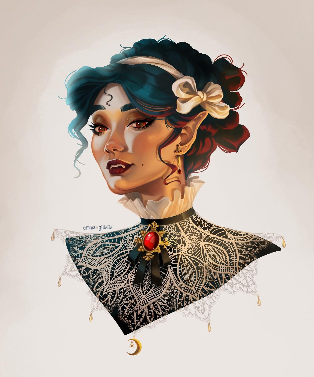
techniques they've used in their digital paintings. Today's class, I'm going
to show you how I take a painting like this and turn it into
something like this. Hi, my name is Emma Gillette,
and if you're new here, I am a full time
professional illustrator, mainly working in the
children middle grade and Y A genres. And I've been digitally painting
for about 15 years now. I have learned so much over
the course of just myself, taught practice the stuff
that I learned in college. Also by learning from
other artists on line, watching other artists paint
has helped me gain a lot of new tools and tips that I would love
to share with you. My personal illustrative
style is fairly rendered, but I like to keep a
little bit of magic and whimsy and a little bit
of stylization in there. If that's the kind of style
that you really like, then I hope that you'll
really enjoy this class. I'm going to walk you
through my process of digitally painting by sharing my favorite brushes
and how I use them and then how to find reference and use it for
lighting and color. And then how I begin a painting. Starting simple and then building and adding more
complexity as I go. Then some powerful hacks using layer styles to add extra
depth and interest. Lastly, how I add those little finishing
touches that make my illustration shine because
it's almost spooky season. At the time that I'm
recording this class, I'm going to paint
a Vampire girl. You can either download the under sketch and paint the same drawing
along with me. Or if you want to pick
your own reference and paint her differently than
I do, that's also great. Or if you want the extra
added layer of complexity, go ahead and draw your own
Vampire Girl and paint her. I'd love to see what
you come up with. Any of these options are great, and I want you to pick
whatever is going to feel the most fun
or useful to you. And I'm really excited
to see what you do when you finish your project. I would love for you to share
it in the project gallery. I love seeing what my students create and seeing the
growth that they have. And if you have any questions, you can also ask me in
the Discussions tab. I am so happy to give critiques
and advice over there. Also, if you share your
post on Instagram, go ahead and tag me
in using my handle. I love to see my students
works over there. The tips that I'm going to
share in this class are so easy and effective and while it takes lots of
years and time to become really proficient
in digital painting, I know that after this class
you're going to find that every painting that you do is going to look less and
less like this one, and more and more like this one. After this class, you will never digitally paint the same. Let's grab our pen and our ipad and dive
right into this class.
2. Digital Brushes and How to Use Them: All right, so before we begin, I just want to say that
even though I am using procreate in this class is geared more towards
procreate users. The principles and techniques
that I'm using and teaching this class are transferable to any
other digital program. Photoshop, Coral painter,
Clip studio, paint. All of those programs, you're going to get the same benefit out of
taking this class. The only that you're going to need to find brushes that match, similarly to what I'm
discussing in this class. But that's really not that hard. I'll tell you what
to look for when searching for brushes to
match what I'm using. Let's go ahead and pull up this beautiful
amateurish painting, which honestly is not that bad. What you are seeing though, that makes it this
more amateur painting is words that I would describe
this painting are muddy, soupy, chaotic,
undefined, formless. There's like weird shapes
you'll see getting created in the areas where the opacity
bump into each other. While it's overall not terrible, it just doesn't have that depth, the smoothness and
interest that is in the more rendered professional
illustrated painting. If you see here we've got these weird strokes and
especially here under the neck, you might recognize that if
you're a new digital painter, you are probably thinking,
oh, how do I blend? How do I get that
really smooth look? Other people's paintings
that I see all the time. What I'm going to
show you is that the problem that you
are facing is that you are using a round
brush on opacity. The reason why that
is an issue is that it's just really
hard to blend. Do you see what I'm saying? Right, It's just hard to get a smooth gradient
because you're going to keep adding these shapes that add unnecessary brush
strokes to your painting. That's how you get
that soupy look. Once you start
adding other colors in there, it just gets worse. It just gets, and
this is what creates that telltale digital
painting signature that amateurish digital
paintings have. You're probably
thinking, okay, well, how do I avoid this mess? It's all about the brush you use and the way that
you lay down your strokes. First off, my recommendation is instead of doing
a round brush, I would actually recommend
doing a square brush. I'm going to go more
into this later, but a square brush is a lot better for
carving out shapes. And you get more of
these hard edges. The angles, we'll go
more into that later. But first, I would
say square brushes are more preferable
to round brushes. And there's all kinds of
different square brushes like this brush right here is
technically a square brush, it's just not perfectly round. Something that's maybe even
more like oval is going to be better than just a
perfectly round brush. My favorite square brushes, most of them are going to be
in the max line brush packs. In Max retro pack, he's got lots of squarish
or oblong brushes. They come in so many different
textures and shapes, so you're going to
get tons of these. My favorite of are going
to be the guash flow. Gas flow. The Shah, this is from, I'm going to have links in my
description for the class, but this is the max
line retro pack. He also has his essential pack, the hard, the square uniform, and the Shaq. He also has the sad, grainy, I think this is a
really great all round brush. All of those are the
ones that I like to use from Maxie line, from just the regular old
basic procreate brushes. You've got the flat brush, this is in the painting. All of these you can see
are actually square circle. This one is a circle brush, but I like this one for its blending capabilities and we're going to talk about
that in a little bit. This is the ah,
brush in procreate, those are square
brushes that I like. Something else that I like
about a brush that I'm going to consider when choosing a brush for a
painting is texture. The reason I'm going
to say that is because when you're doing just your standard old round brush, you get that guy makes
weird shapes, right? We already discussed
this. The one work around is to use a brush
like the squash brush from the procreate standard brushes that has a lot of texture
and blends really easily. You can see that you're not getting as much
of those shapes. That's what I really like in the essential max pack shader. Grainy has so much texture
and it's so easy to blend, hardly any work, you can just keep adding layers and layers and they just
really blend on their own. All of the brushes that I've recommended from the max packs have that benefit
where they've got the texture and they
blend really easily. I like to have texture
in my painting. I prefer brushes
that have texture. That's what I love
about the max pack. My favorite right now
is to use the shader gray on the lichens
essential pack. I even will put down the
opacity a little bit and then I find that it's
even easier to blend. This is my number
one recommendation. But if you don't want
to buy anything, the quash brush and just the standard procreate really is a great alternative. It's great, it's not square, but I like the
texture on that one. You might then say, well, I really don't want texture, that's just not how I work. I don't want to use
a texture brush. What you're going
to do instead is you're going to get square
or your round brush. It's okay, round is okay,
but squares better. You are not going
to pick shader, you're not going to do opacity. You're going to pick the
uniform, no opacity brush. Let's lay down a
couple of values. We'll do this one
in a darker one. The best way to
get a smooth look is to take a really
great blending brush. You're going to blend
those together. You're going to say that that is a much better blend than if you were to attempt to do
that with an opacity. You see, it's just so hard to do it if you're
just doing opacity. Your blending brush is really
going to be your friend. Honestly, I still use
the blending brush. Even if I'm using
texture brushes, it's just such a really
powerful tool for being able to blend your
colors and your values. This is actually something
that is really great. If any brush you're going to want to lay
big strokes down. The other problem that digital painters who don't
quite know what they're doing yet is that they really small sizes
on their brushes. They just color like this. This is a very timid way of
approaching your paintings. If you go back and
look at this painting, you can see I used a lot
of small, skinny strokes, and that made those shapes A different and better
way to approach it is instead of doing the small timid
brushes to go ahead, turn that opacity off and have your colors, your big stripes. And you're going to slowly
build on top of each other. Blending where you need to, leaving edges where
you want them. But you're going to want
to get in the habit of working big and blending, cutting in where you want a new color and then
blending it out. You may even want
to practice this. Find some brushes that
work for you and practice adding in a big color,
blending it out. See what fun designs and
shapes you can make. The reason I want you to
practice this is because when we start painting on a character, we're going to start by
focusing on the large shapes, just to give you a small
little demo right here. We're going to start
by saying, well, where are the highlights
on our character? A lot of times
they're on the nose and up here on the chin, on the cheeks,
Sometimes you're here. Then you can add
in your shadows. Then we'll start
blending it out. That's going to be our process and we'll get more
into it later. But you're going
to find that doing this starts to get
something that looks more blended and interesting than the gluey mess you had by doing a bunch
of smaller strokes. And it goes by so much faster, I'm not even really
trying that hard, but we're already starting to get something that's
very interesting, looking just by
going in and adding, oops, these larger strokes. Then what you can
also focus on is sharps against soft edges. You're going to want to
start thinking about, well, maybe we want a more sharp
edge right here so we can blend out the side away from it, then you're carving
out your character. Things are a lot more interesting when
you have contrasts. If you can have your
sharp edges with some blurred out
areas opposite them, you get some really
interesting things to look at. I keep grabbing my eraser. Yeah, sometimes
you want to leave a little bit of a sharp
edge right there, but then blur out the rest. Before we move on to the
next portion of the class, I just want to encourage you to spend some time
with some brushes. This one, I mostly did the
hard brush with a blending, but you can also take a
texture brush like the gas, and practice making cuts
and then blending them out. It isn't so much the exact
right brush that you need, but finding a brush
that's square has a little bit of
texture to it or is just a plain old no texture, no opacity flat
brush that you can then use a good blending on it. Like I was saying, even though
I am using these brushes, if you really want to go and buy the Max Uche brushes, awesome. I love them, totally
recommend them. The procreate brushes
are really great. Yes, those are super awesome. But if you're in Photoshop, there are so many
brushes just already in the Photoshop roster
that match this. There's free ones that you can find, square textured brushes, squash brushes, anything
that you feel like. You don't have to really
fight too much to blend. A lot of people are like, well, what brushes do I need to use? What brush do you use? It really doesn't
matter too much, so long as you can
blend it or be able to make really
great shapes out of it. Those are my
thoughts on brushes. If you have any brushes
that you really like, you can go ahead and in
the discussions tab, I'm sure people would love
to hear other great brushes that fit this criteria
that I've stated already.
3. Using Reference for Lighting and Color: We've talked a little
bit about brushes, and we're getting ready to
paint our little vampire girl. But part of this class is
about using reference. The best way to learn such things like
color and lighting, those are really
complicated concepts. It takes a long time
to learn those things. Really, the best thing to
do as a newbie, honestly, I still often need to use reference as a
professional artist, is to go and find a
photograph that has very similar lighting
to what you your head. So we're going to go to
Pinterest and we're going to look for a reference
photo for this painting that I can use to help
me pick the colors and pick the lighting so that I can focus more on the
technique of painting. And not so much on the
decision making of what colors and how
the lighting is going to interact with the
planes of her face. Let's go to Pinterest and find something that
looks really good. Here I'm in my photo
reference board. I like to say photos that I think are really interesting
for future reference. I'm just going to quickly
scroll through this and see if I can find anything
that inspires me. I'm looking for somebody that
is the same direction as my character and has interesting shapes being made
with light on their face. I actually am drawn
towards this one. I think there's some really interesting
things going on with this warm light right here
and a cooler light up here. I'm going to drag this and
drop it into my canvas. Also, if you've decided that you are going to use a
different photo as reference, go ahead and pause the video
and go find your own photo. If you want to basically follow along with me
while I'm painting, that's totally fine too. And you can skip this step also, if you're drawing
your own character, you're going to need to
find some reference. So go ahead and take some
time, find some reference, and then we'll circle back
and come back to procreate. All right, we're going to paste this reference photo that I found on Pinterest
into the canvas. The first thing I'm going
to do is I'm going to pick about eight to ten colors
using the color picking tool. I don't want to pick
too many colors because that would just
be really overwhelming. And I want to keep this
as simple as possible. I want to go and pick a
couple highlight colors, a couple midtone colors, a couple shadow colors. You're even going to
see me pick a color and then kind of change it to be
a little more cool toned. Because I want to have a little more of like a
bluish hue on her. After I've color picked, I want to go and kind
of squint my eyes and look at her through my squinted eyes so I can see the bigger
shapes on her face. So I'm going to go and trace these highlights as large
shapes on her face. This is a great exercise
to start breaking down the painting into basic
shapes because really, that's how we're going to start building up our
painting is by starting simple and big and working
our way into smaller, more refined details after
doing the highlights. Now I'm going in shaping out, mapping out what the darker
shapes are on her face. So go ahead and do this. It's a great exercise, and this is really
going to prepare you to jump into the
painting process.
4. Building Up Layers: Okay friends, it
is time to start painting Our little
Vampire girl. We're going to start simple and slowly build up our layers. First we're going to start
with the background, just a simple little
background using the fresco brush and the painting basic
procreate brushes. I like this one because
it has a lot of texture. It's really easy
to get something looking good pretty quickly. All right? The next thing
I'm going to do is grab just a basic hard edged brush and I'm going to map
out the silhouette. I find that this is just
the easiest way to paint. Get the silhouette
first, fill it in. I'm also going to go and
refine some of the edges, especially around the hair. Get a little more definition. Then I'm going to
make a clipping mask. And you make a clipping
mask by making a new layer, double tapping it. And then whatever layer is under it when you
hit clipping mask, it will attach it to that layer. Now when I paint, it's
only going to paint or whatever strokes I make
are only going to show up on that silhouette
that I've made. I find that this is
just a really easy way to get results fast. I just work a lot faster if I don't have to worry about
coloring in the lines. And I actually will go and I'll, I'll go and make a different
clipping mask for every, I guess you could say like
object on the painting. Like her skin, her hair, her clothing each get
their own clipping masks. And I just find that faster and easier way to work for me. Now I'm doing basically what we just did
in the last video. I'm mapping out those larger
shapes of light on her face. I picked the warm, yellowy color because that's that light that's being
cast on her face from the bottom right of the screen and adding
some red on her hair. And I'm just going
to keep doing this. I'm going to start with
the highlights and then I'll go in and do
some of the shadows. And it's going to
look pretty at first, but trust me, trust the
process, it will work out. And you'll notice here
that the light on the other side of her
face is a cooler light. Instead of red on the left
side, it's going to be blue. The highlights are going to be a cooler shade on that side. Here, I'm remembering that I like sometimes to put a
little bit of a gradient. I grabbed a very soft airbrush and I just quickly added a little bit of a
gradient to her face. Now I'm going back
in and cutting in those shadows across her face. I'm adding that color that
I kind of shifted to be a cooler tone around her eyes and the corners of her
nose and under her lips. That's actually an
interesting thing about the human face is
that we actually do have a little bit of blue under our skin from our veins. So that's a really
great way to add some interest in contrast
to your paintings is having a cooler tone in
those areas where the skin is thinner and you're able to see more of
those blood vessels. Now we get to blend out
all of these fun shapes. Taking a blending brush
and starting to get these big shapes to
blend into one another. I'm keeping an eye out for
areas where I want to leave. Sharper lines, but I can
always go back in and add and cut in more sharp
edges where I need them. Just focusing right
now on getting a nice blend and going in
and cutting in other shapes. If I feel like I lost
some definition, the majority of the work on the painting is going to
happen in this stage. Just feeling it out. Seeing where I need
to cut and blend. Cut and blend, It's
a lot of noodling sometimes and zooming back and looking and seeing
where I need to add more. Always referring back
to my reference photo, it's really going to help me using your reference
photo is vital. So make sure that
you have that open somewhere so that you can
refer back to it often. And as you can tell, like my painting does not
look great right now. You really do have to
trust the process. Just trust that the more
that you work through this, the closer and
closer you're going to get to something
that looks really good. So don't give up.
Keep working at it. If you need to take
a break and go do something else and then
come back with fresh eyes, totally fine and try to
have some fun with this. This is a great
learning exercise and really try to stick to the principles of working
big and blending and, and not defaulting back to
using the small size on the brush and trying to
fidget with a opacity. That's really not going
to work well for you. I'm actually turning
off my sketch layer, which that is something that I should have
mentioned earlier. I like to keep my sketch layer on multiply using
layer styles over my painting so that I can see where I need to
follow the sketch, but I'm able to turn it
off and on when I need to. It's nice when I get far
along enough on my painting that I can turn it off
and be able to see, Okay, I'm starting to see the space is getting defined and
eventually gets to a point where I
don't need to sketch anymore because
I've really defined the face enough where I can
just the sketch altogether. I've reached a point in my
painting where it's actually starting to look
like not half bad. Now I'm going in and adding
some more definition, like adding in the lips and the teeth and working out
the hair a little bit more. The bandana, the bow. Pretty soon I'll go in
and add in the eyes. But this is where
I'm starting to feel pretty confident that I've got
this painting figured out. And I'm not as frustrated or worried that I'm working
on a piece of garbage. At this point I am
starting to work a little smaller
because I have really worked out a lot of
those bigger details and now I'm starting to want
to refine just a little bit. I don't want to get too small
or too lost in the details, but I'm noticing places where maybe my planes
aren't as defined, like here on the upper lip. So I'm trying to work that out. Especially in the nose. Noses can be very
difficult and do take a little bit
of more refinement. But just like keeping in mind like big shapes
like here in the chin. Adding a high light on
the nose, on the cheeks. Just remembering those planes. If you can remember that a
face is just made of planes. And if you can think well, where is the light going
to hit this plane and how is the shadow going to look when it's being
cast by this plane? That's really all painting
is, it's like sculpting. Painting is a little
bit like sculpting. If you just remember
or try to imagine your figure that you're painting as like a
little piece of clay. That cutting and sculpting and smoothing out and
turning into something that looks three dimensional
hair can be really daunting just because there's so many strands and how
does hair move and flow. It can be scary, but again, big shapes
think in big shape, start with big chunks. Where are the highlights? Where are the shadows? Start
small and work your way up. And that's what I'm doing here, blocking out highlights
and shadows. And I'm not really worried
about strands too much. I'm mostly trying to focus on the bigger shapes on the hair. Using the clipping mask for
hair is really great because I'm able to make this
little stand on her face. And I can still
paint under it if I want to define her
forehead a little more and not have to worry
about messing up this cute little loose hair
that's on her forehead. This bow is proving a
little tricky to me. Fabric can be really
hard as well. That's the same advice I
gave for everything else. If you just go back
and try and block out the bigger shapes and
ends up working out, I got a little fuzzy and blurry. You'll notice I was trying to noodle too much and
I remembered that. Okay. No, I just
need to go out and figure out where the
highlights are and where the shadows are and it'll solve itself and it'll
work itself out. I'm going in and
I'm trying to be more simple with this bow, just trying to figure out where the major folds are and
where the major shadows are. Satin is kind of a tricky fabric to paint because you've got lots of different values that
show up on satin fabric. So definitely a tricky one. But I found some reference of satin fabric and I'm
relying heavily on that. So don't be afraid
to go and find other reference that
you might need for different materials
on your painting. Use as much reference
as you need. I think eyes are some of the
most fun things to paint. I always really look
forward to when I get to do the pupils and the
irises on a character. I love to make them look shiny and they're the
windows to the soul. And it's really fun to give soul to a character
that you're painting. As we're wrapping up this
portion of the painting, I'm just going in and defining
the nose a little bit. It was looking a little Bobby. It's kind of the least define thing on her face right now. Before I kind of jump
into the final steps, I really want to
make sure I have a grasp of the form of the nose. Adding in some highlights where the light is hitting
it and getting those nostrils defined
are really going to help me in the final
finishing stages. She's really not
looking too bad. We've worked out most of
the major highlights and shadows and we really are starting to see how this
painting is going to look. There's still a lot
to do, but you know, you should be pretty proud of yourself if you've gotten
this far on your painting. So let's go ahead and move on to the next step
of our painting.
5. Layer Styles and the Liquify Tool: Okay, this is where we get to add a little bit of
pizazz to the painting. She's looking a little pale. I know she's a
vampire. She's dead. But I want her to have some
more life in her face. I'm actually going
to make a new layer. We're going to explore
with layer styles. As you see here, there are so many layer styles
to choose from. They all things you should go and practice and
just experiment. But right now I'm using overlay, which you'll see here
grabbing a warm color, I'm going to start adding
some blush to her cheeks. An overlay takes a color and just like adds that color on top of
whatever you're painting. It's a really great
way to add some blush, some high lights, or just some brighter colors into your work if it's
looking a little dull. I love the overlay layer. I use it all the time, you're seeing me
added to her cheeks, to her chin under her
chin under her jaw, on her eyelids, on her nose, even a little bit in her ears. You can already tell that
it's really added a lot. You can see I'm toggling
back and forth, I'm going to end up settling
somewhere in the 60% range. I'm really liking how that
looks now in my painting, I'm going to add another one, but this time I'm going to
make it a multiply layer. Multiply darkens. Whatever color you use is going to darken the layer
underneath it. I'm going to use
this multiply layer to add depth to my shadows. I want a little more contrast, a little more of that feel that where her chin
meets her neck, there is a shadow there
under nose, under her lips. It just is going to
make her face pop. You don't have to
only use overlay and multiply just because I did. You could go and experiment
with all the other ones. If you find a layer style
that really works for you, go ahead and use it if it gives you the effect
that you want. I just tend to like these two. That's mostly what I use. Sometimes I use like the
hard light or the ad layers. Those can be good too, but
for now I'm using these two. Don't take that as
that you can't use other ones because
it's your painting, you can do whatever
you want with it. I'm creating another overlay layer so that I can add some warm
high lights to her neck line. It was looking like it wasn't actually being lit by that
warm light down there. So I'm just going in
and warming it up. And as you can see,
it's so easy to add those warm colors
without having to individually paint every fold. It makes it so much faster. I do need to go and erase on her neck where the layer
kind of bled over. You still have to
noodle it a little bit, but still easier than going and repainting something that
you didn't like before. I'm also brightening up the blue high lights on the
other side of her face. All right? Something about
her eye is bugging me. I'm going to show you how I use the liquefy tool to move around a painting and get something to look a little better if something's
not looking right. Using the Liquefy tool up
in the tools menu up above, I'm just going to
around her eyes, sometimes I'm going to
make them big, smaller, push it up and down and around until it starts to
look right to me. Again, this is another
great tool where if you're in the middle
of a painting and you notice something is off, you don't want to
repaint the whole thing, just use the liquefy tool. Such a powerful tool. You can slide, you can
mess with the sliders to make it more powerful
or not as powerful. It's a great thing
to explore with. Just go ahead and mess
with it while you're painting and see what
you can do with it. This is already looking
a lot better to me now. I think her eye was
just a little too high and maybe a
little too small. I will go and make sure
that the sketch is altered so that you guys don't have to do this in
your paintings. All right? So those
are those tools. I think they're really
powerful and I hope that you'll experiment with them and see what you can do
with your paintings. So we're getting pretty
close with this painting. We just need to do
those finishing little touches that will make it sparkle and
really look finished. So let's go ahead
and jump into that.
6. Finishing Touches: Okay guys, it is
the home stretch. We're just doing all
the little details. We're refining. We're adding some pizzas. We're sharpening things up. We're blending things
a little better. We're adding some more color. We're adding the jewels. We're finishing the bow.
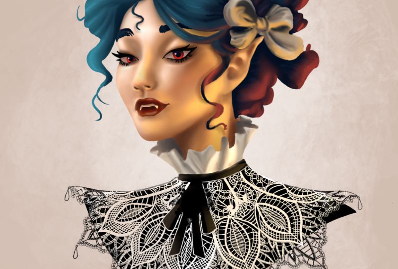
All the good stuff. Right now I'm making the lace
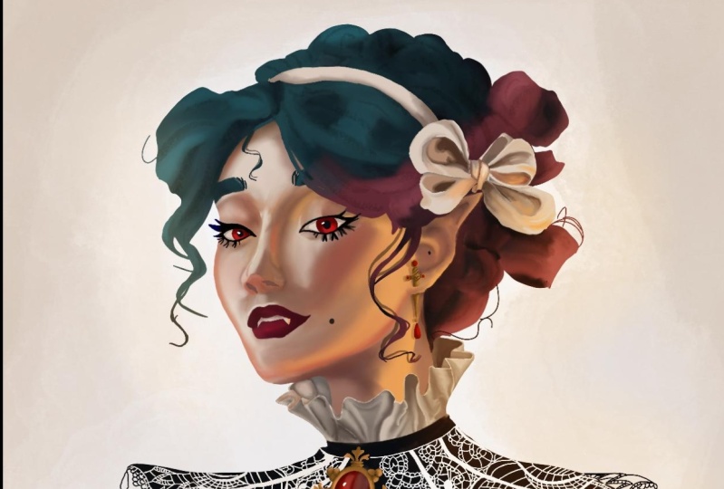
white. It was too white. I'm actually going in and making the eyes
not a solid color, making them look like
there's shadows cast by the lids in my paintings. I like a little bit of line art. Not everyone does do. I am going in and
adding some line art. I just think it helps add that whimsy that is pretty
integral to my style. It makes it a little
more stylized. I like it, I'm adding that
under the jaw, on the ears. I'll add a little
bit to the nose and the eyes for my line. I like to use the
narinder pencil. I don't know why it just,
I like the way it feels. It's got some texture to it. That's my personal favorite. But you can use any brush
you personally like. I'm now defining the lips a little more. They're looking a little
fuzzy and the teeth needed some highlights
and shadows going in and making those look like they're actually
under the lips and being lit by that warm
yellow light in the corner. I want them to be a little dark. Er, too. I'm going in adding that definition
in the corners. I'm also going to go in and
define those highlights and add some of those lip
wrinkles that we all know lips have just makes them
look a little more real. I'm also adding some
blue onto her nose. In the corner there by her
eye and in the shadow. I just think it adds a
little bit of contrast, especially up against all
those warm yellows and reds. It just looks really nice. I highly recommend doing that. Some line art here
on the edge of her face that just crips it up and makes her more stark against the background in her eyes. I'm adding the water line. I think a water line really helps to make the
eyes pop as well. You'll just see I'm going in and finding areas that just
need to be defined, that are too soft and blurry. That needs some sharpening, need more highlights,
more definition. What this phase is all about
is just looking around and saying what looks blobby
and how can I fix that? Going into shadows and deepening them really helps make
a piece feel finished. You really want to
have enough contrast that it looks like your
character actually has crevices or areas that just aren't
being hit by light. Now I'm actually going in
and adding some more details to little individual
strands of eyebrows or. What have you. And the way that I work is that I
jump around a painting. So I'll work a little bit on the nose and then I'll move on and do something else. And then I'll come back and
work on the nose some more. Just wherever I feel like
I'm inspired to fix, I go do that. And then I'll come
back and if something still looks off, I
come and work on it. Again, that's how
I personally work. Some people are a lot more
focused and they're able to work on one piece
longer than I am, but I'm a little
scatterbrained that way. So that's something
nice that you can figure out how you work. You know, we all work
differently and that's fine. Maybe you'll learn some things about yourself on this painting, like what a worker are you, are you scatterbrained or are
you dedicated and focused? Here, I'm defining
that hair some more. It needed more strands. It was looking pretty
blobby and undefined. Just going in and
sharpening up those edges, putting some more
individual strands in. I did not decide to go to rendered on the
hair for this one. I didn't feel like it needed it. You may decide that you
want to go more intense, but I felt like the more
graphic simple style really worked for this
particular painting. The fact that she's
got such dark hair also made it nice to be able to have such big
chunks of all black. I thought that looked
really interesting to have just some areas with some highlights
and then a lot of just straight on black
with no definition. I'm going in and adding some overlay layers
when I feel like I need to add additional highlights
or just some extra color. It's okay to go and add those
whenever you need them. I'm just going to
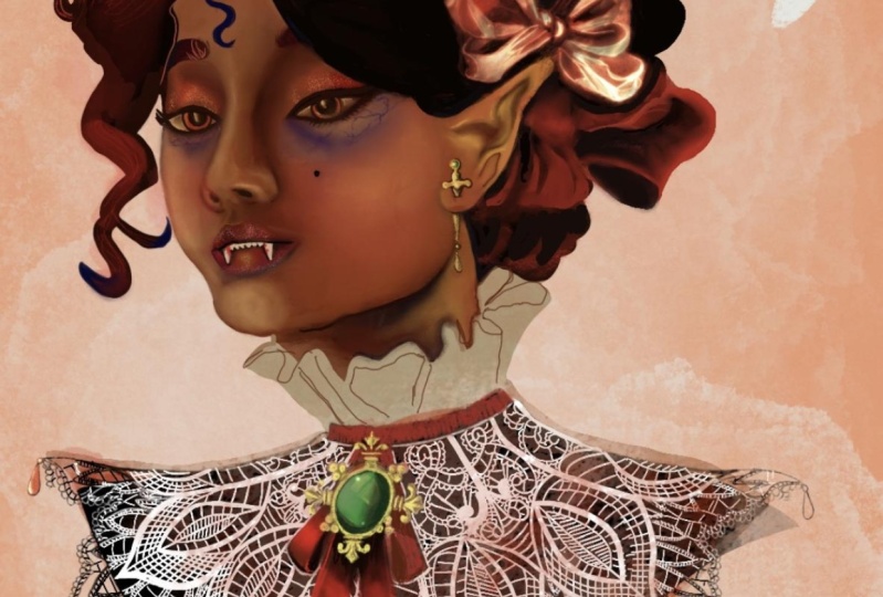
give the jewelry all the same treatment that I gave the other
parts of her face. Starting small, building
up with details, using overlay layers
to add pizazz. And of course, using
reference when I need it. If I need to know what gold
looks like with light on it, I go and look up what
gold looks like, Especially with the
jewels, the little rubies. I did need to go and look up how light interacts with rubies. There isn't really
anything that I do for the next little while that
needs much explanation. It's just doing all the things that I've already explained. So I'm going to go
quite a little bit and you can work along with me, listen to the spooky music, and work on your painting
while I work on mine, and I'll check back
in, in a little bit. Er. Here. I'm actually
adding an ad layer. I wanted her hair to recede a little bit
into the background. Some of that atmosphere
perspective, which is when things get
further away from you, the atmosphere clouds
them a little bit, makes them a little hazy.
I wanted some of that. I felt that that would add some cool atmosphere to this piece. I use the ad layer,
a letter color. I used that to help make my piece fade a little
bit into the background. I thought that was a cool touch. I also did it on the back
of her hair as well. Here it is, guys. My finished painting,
it was a lot of work. I sped this up at
like 500 times. For most of it, I am not a really fast painter and that's totally fine with me. I'm still learning, I'm
still growing as an artist, so don't think that just because you're not
pumping out paintings in just a few hours that you're not growing or that you're
not a great artist. It all takes time. It's okay to take a while on paintings. Anyway, congratulations
on finishing this class. I'm so glad that
you stuck around, and I hope that
you learned a lot.
7. Final Thoughts: Congrats on finishing
this class. I really hope that
you found watching my process to be
really helpful to you and that the tips
that I shared will really aid you on your
digital painting journey. The tips that I shared
are all very simple, but the more that you use
them and practice them, they will help you really
grow as an artist. And you're going to see
a lot of improvement in your digital paintings
from here on out. If you're looking to up your
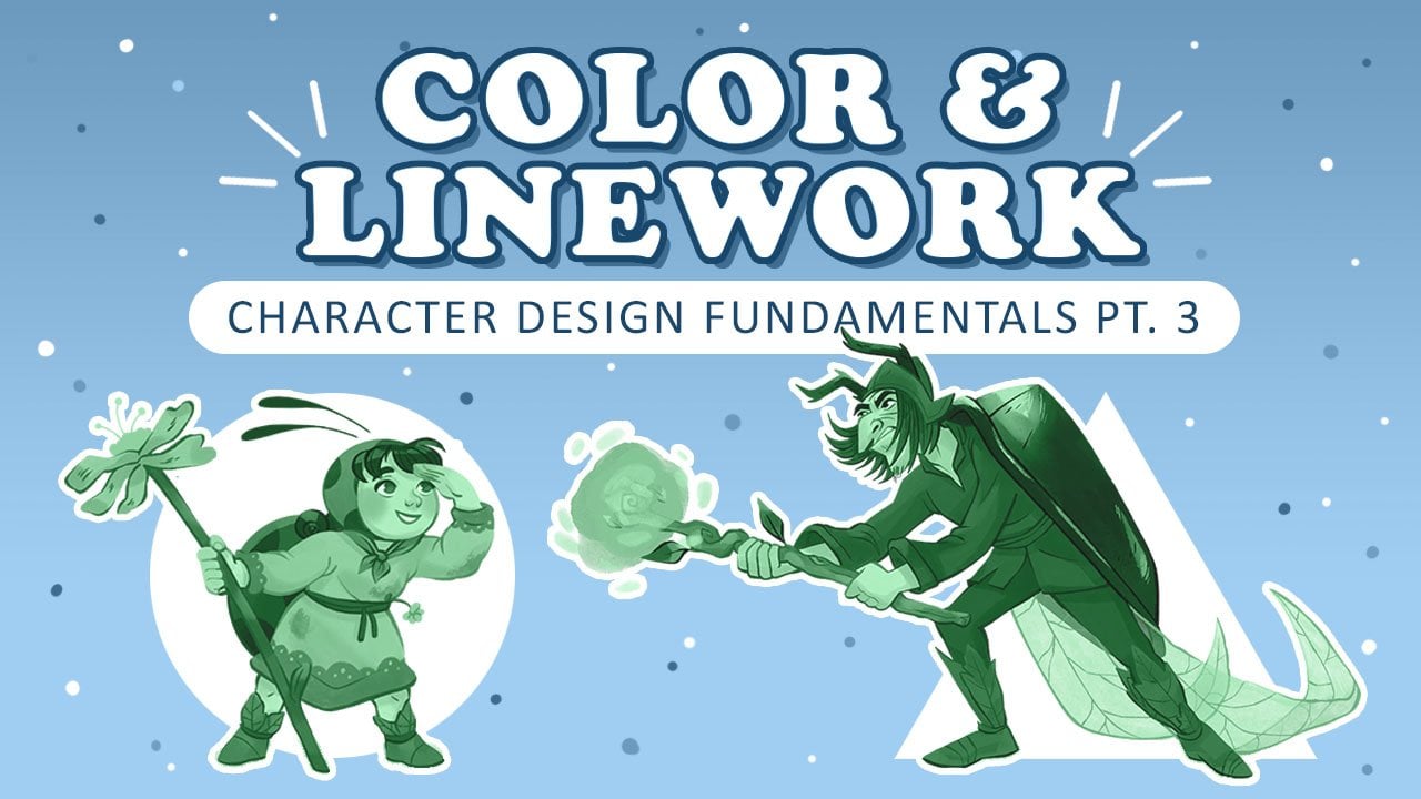
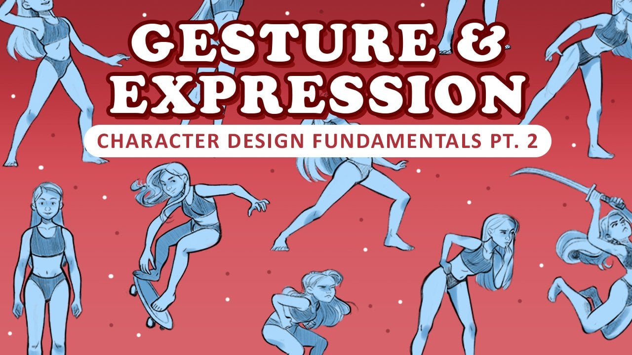
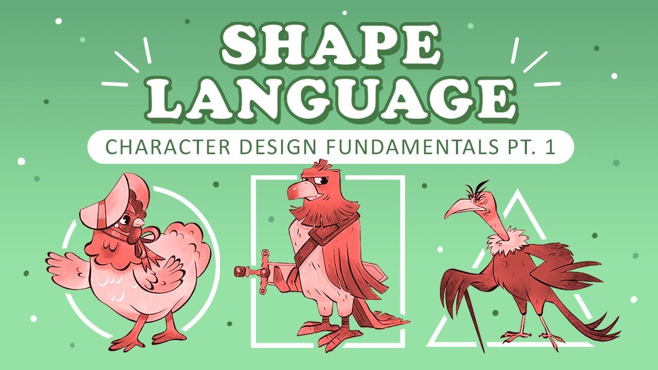
design and drawing skills. I also have a three
part character design fundamental series. In that series, we cover
things like drawing skills, shape, language, gesture,
and so much more. If you like this class,
please leave a review. This helps other
students find my work. You can follow me
here on skill share, so you can always
stay up to date on my new classes and
things like giveaways, which I hold every now and then. Also, don't forget
to follow me over on Instagram where
I have lots of behind the scenes
on my illustrations that I'm doing and my
professional work. I'm so happy that you
took this class with me. Thanks again and happy painting.
 Emma Gillette, Freelance Illustrator