Transcripts
1. Class Intro: Who doesn't love a
good character design, who isn't thrilled by a character on-screen
who is captivating visually and who really connects with the viewer on
an emotional level. The impact your designs
can have on others is something truly
unique and special. Almost like a superpower. Designing a character
is fun and exciting, but it can also feel a little daunting if
you haven't been taught the fundamental laws
of good character design. Welcome to the character
design fundamental series. My name is Emma
Gillette and I am a full-time professional
illustrator with experience in the publishing
and animation industries. I have a BFA animation
and art director at the student Emmy nominated
short film type t2. I have been working
as an illustrator for five years and my clients
have included Disney, random penguin house, and American girl among many others. This is the third and
final installment in my series on character design
fundamentals and basics. This series, I take
you through all of the foundational rules and principles that I
learned in art school. In the first-class,
you learned all about basic construction
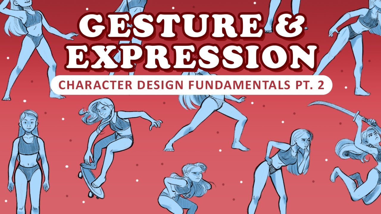
and shape language. You designed two characters, a hero and a villain. In the second class,
we learned how to put your designs into dynamic
and expressive gestures. Now in this third-class, we get to take all
those sketches from the previous two classes and make them sparkle
with liner in color. If you haven't taken the
other classes in this series, go ahead and hit pause, take those classes first, and then come back to
this one because you're going to need to
design your hero and villain characters in order to complete the class
project for this class, I also highly recommend
taking my second class. The series covers all of the basic and
foundational principles of character design. These fundamentals are
tools of the trade that every seasoned and experienced character designer
knows by heart. And soon you will too. In this third part of
my fundamental series, you will learn how to
polish your sketches, make them shine with
beautiful color and attractive line work. There is so much more that you can communicate to your viewer about your character designs just through the colors
that you choose. And by intentionally
using line work, you can take a mediocre sketch and turn it into a
beautiful piece of art, combined with the
principles that you learned in the
other two classes, when you're finished
with this series, you will be able to take an
idea from concept to sketch, and to finally a beautiful
piece of artwork that tells a clear
and powerful story. Today's class
project is to finish your hero and character designs
with line work and color. The style of liner and coloring techniques
will be up to you. So no two projects
will look the same. I'll be sharing different
styles, techniques, and tricks that you
can use when deciding how you want to
tackle your designs. If you are starting out on your own design journey or are looking to brush
up on some skills. This is the series for you. If you consistently apply these tools that you
gain in my series, you will be able to enter every new design project
with confidence, knowing that you
will be able to tell clear and powerful stories
with your designs. And that as you do so you will grow as an artist with every
new project that you enter. I am so excited to see your character designs
in their final form. So let's get started.
2. Your Project: At the end of this class, you will demonstrate
your knowledge of the use of line work
and the principles of basic color design
using the hero and villain that you
designed in part one, or the gestures that you
did for them in part to whichever drawings you
liked best from the two. You are going to take them
to finish with color and line work using the tools
that you learn in this class. If you understand
the course material, you will end up with
beautiful and Rick character designs that look
thoughtful and purposeful. The project for this
class is exciting because it is the
culmination of all of the hard earned knowledge and skills that you gained over
the course of this series, the goal is to have
a character design that is cohesive in its story, using all of the tools and skills that you've
gained over this series, from basic shape
language to gesture, and finally to color
and line work as you practice and use the principles that you've learned
in this series, you will continue to grow
and develop your craft as a character designer
for this class project, I will be using Procreate
on the iPad Pro. But you can use any
digital program or any traditional medium that feels most
comfortable to you. If you are curious
about the brushes that I use in my class project, you will be able to watch me do a demo of that at the
end of this class, I will be linking them below
in the description box. I'll also be going over them a little bit later in the class. The tips that I share, even if the brushes aren't the
same as in other programs, will be transferable to any other program like
Photoshop or Clip Studio Paint. Most digital programs have
the same flow as each other. I'll also be giving my
recommendations for aligning tools that you may use if
you're doing traditional. And those will also
be linked below. If you're curious, when
you finish your project, please share below in
the project gallery, I would love to
see your designs. If you were looking
for critique, please ask for that as well. Receiving critique as always, is the best and fastest
way to grow as an artist. So don't be shy in asking. Also if you share your piece
on Instagram or on Twitter, don't forget to tag
me with my username. I would love to share it with my viewers over on
those platforms. And I love to see any behind the scenes or sketches as you're working on your
projects there as well. And as always, I'm also available for critique on
those platforms as well. I like to give draw
overs and I've done it before on my Instagram stories. So let's talk about tools.
3. Digital and Traditional Supplies: There are so many great
digital art programs, but I mainly use Procreate
and sometimes Photoshop. Completed the class project and Procreate on the iPad Pro. You'll watch me color them
at the end of this class. If you are curious about
the brushes I used, you'll see that I mainly use the gouache flow and the flow rough brushes from
the retro max pack by Max you listening. I use these for the
bulk of my coloring. For lining. I use
the Narendra pencil, which is a basic
procreate brush. And for times where I
wanted to be able to communicate the
opacity of my colors better than what the max brushes allow me to
use the wash brush, which is also a basic
procreate brush. It just lets me change the opacity better
than the other ones. I personally like
the texture that gouache simulating
brushes provide, but you may not like them
for your personal style. So use whatever
brushes you like best. I'll leave a link in
the resources tab to Max's brush sets if you're interested in checking them out, I think there are
really great staple for any Illustrator using Procreate. For those of you who will be tackling your projects
traditionally, having good paper pens and coloring supplies will help you achieve the best
results possible. For most medians, a heavyweight mixed media paper
will work fine. Or if you plan on using
alcohol-based markers, a specially made
paper for a marker, brands such as Prismacolor or Copic will help you
avoid bleeding. Having a high-quality in Cancun, we'll make a huge
difference when doing the liner for your
character design. There are many options
to choose from, but I think that the
best and easiest pen for beginners is the Pentel
point liner series. These pens come in a
wide array of sizes, so grabbing a few
different ones will help you achieve pretty much
any luck you want. As you can tell, I have far
too many of these pens. I love them so much. If you want to try something
a little more skill based, you may want to try a
Japanese style brush pen. These are great
for getting smooth flowing lines that can
change thickness seamlessly. There are many brands
for these as well, but I like my Pentel brand just as much as any other
brand out there. These are cool
because you can also refill them with
new ink cartridges. Becoming accustomed to using a brush pen can take
many hours though. So just be aware of that. It might not be a great pen for this project if you
are just starting out. If you are hoping to do
colored line art instead of just plain black ink for
your traditional piece, you're going to have to
get a little creative. You can either use a colored pencil that
you keep very sharp, or you could use a fine
tip paintbrush and use acrylic gouache that you don't really
watered down very much. Or you could get fancy and use one of the really
nice India ink. And I'm thinking pens
that are out there, There's lots of different
options for you to choose from. Whatever mixture of those
works best for you. Experiment and have fun. Traditional mediums can be kind of scary to
approach at first, but they're really
fun and they helped me get out of my head and maybe a little
less perfectionist as I do with my digital art. So definitely recommend that for anyone who maybe wants
to push themselves. Or if you're doing
digital this time around, come back and do
the class again, but with a traditional medium. As with the digital brushes, all of the traditional tools that I have mentioned
will be listed below.
4. Line Quality and How to Use It: A common phrase that you'll
hear character designers use is line quality
or line weight. These are the same thing
and they simply refer to the thickness or intensity
of a line and a drawing. Thick lines have more visual
weight than thin lines do. The same can be said for dark
lines versus light lines. A drawing with no line
quality will have lines that are the same thickness
throughout the drawing. Do you see how bland and this this drawing looks
before you may not have been able to pinpoint why this drawing
seems lackluster. But let's now compare it to a drawing with
good line quality. The lines all throughout this drawing vary in
thickness and thickness. Each line having a
purpose and its weight. The eye moves
smoothly from place to place on the
forum seem to have real weight and even appear to move forward and
backward in space. Make no mistake. The decisions where to place a thick line and
a thin line were not made haphazardly
or arbitrarily. Let's look at the
same drawing with line weight done carelessly. As you can see, just because
you have a variation in line weight and a
drawing doesn't make it good or appealing. What differentiates
these two drawings? Well, the one on the
left understands that using thick and
thin lines does not add anything to a
drawing if they are not used in relation
to one another. Drawing a really thick line on a character's arm
without thought for why or what the other
lines surrounding it are doing in relation
to one another. It's just a spell for
disaster and chaos. The one on the left understands that liner
is a practice and organization using thick
lines to denote importance, proximity, weight and shadow. And thin lines to denote
unimportance, distance, light, knowing and understanding the
practical applications of line work is extremely important when
designing characters. I believe that there are mainly four ways to use lightweight, first-line way to emphasize
and de-emphasize. Second line weight to express
proximity to the viewer. Third line weight to
express form and wait. And lastly, line weight to give the impression of
light and shadow. First way that you can use
line weight is to either emphasize or de-emphasize
certain areas of your design. Just as we learned how to
direct our audience's attention using contrasting elements
in the previous two classes. The same can be
done with line art. When you establish a visual hierarchy within your drawings, you help your viewer to
know what is important to stop and look at
and what to skim over. Placing thick or dark
lines surrounded by light or thin lines
will create contrast. Because we humans are hard-wired
to seek out contrast. This will signal to your
viewer that this line is very important in relation to the
other lines surrounding it. By carefully deciding where to concentrate your thick and thin, light and dark lines, you'll be able to
establish a focal point or area of interest for your viewer to focus
their attention on. A little tip. In character design, you
typically want your audience to pay the most attention to your character's face and hands. However, this is not
a hard and fast rule. There may be many instances
where you might want to de-emphasize the face
for story purposes. Like if you wanted the identity of the character to be obscured, or you want the
viewer to focus on a costume element or an
object they're holding. Perhaps your character is
in the middle of an action. Maybe he's swinging a sword
and you want the action of the sword slicing through
the air to be emphasized. Always take time to think about the message
and story you are trying to communicate and
draw your lines accordingly. The second application
of line weight is to express proximity
and distance. Just as you can
organize your drawing from most important
to least important, you can create a hierarchy that conveys depth and perspective. Thick and dark lines
jump out to the viewer. Those lines will always
appear closest to the viewer, while thin light lines
appear to fade from view, thus giving the impression of being far away from the viewer. You can use this to
your advantage and give your character that feeling of existing in space and depth. Arms and legs that are
turned away from the viewer can be drawn slightly
lighter, pushing them back. This helps the
character look even more like they are turning
away from the viewer. Conversely, if you have a character reaching
out towards the viewer, drawing their hand in dark thick lines helps to
give the impression that he is punching through
the fourth wall and coming into the
viewer's space. This is a very
powerful tool that will help you to ground
your character in reality and make
them feel like a living being that exists
in the real-world. You will be amazed at how
this simple application can really transform and
elevate your drawings. Line weight can also be used to make a character
appear to have forum. Or in other words,
look like they are a three-dimensional beam. This is similar to the
previous application of proximity and distance, but it's used as a
little more nuanced. Let's start with
a simple example of how you can use
it to express for this cylinder already
appears to have form using basic construction
and the use of perspective. However, it can be up to a
notch by using line weight. The closest area of this
cylinder to the viewer is this section here in
the center and friend. While the center section in
the back and the lines on the outer edges
curving away from the viewer or the furthest away. We can help make that
curvature feel even more real by tapering
the lines so that the thickest point starts
here in the middle and slowly gets thinner as
a cylinder curves away. For added effect, we can
use shorter interior lines. Longer and spaced more
tightly together. The further they move along this curve away from the viewer. These smaller interior lines
can also be used to help express soft or plush farms that might have rounded corners. Instead of drawing a
hard line that would give the impression
of a sharp corner, these small, slightly hooked lines make this edge looks soft. These techniques are good
for drawings that won't be colored or that will have
minimal to no shading. Using all of these applications, we can now draw a very believable looking
cylindrical pillow. Take some time to practice
this exercise with a variety of basic
shapes and forms. Because as soon as
you've mastered this practice on simple shapes, it will now be easy to translate
it onto the human form. Human body is firm from
these basic shapes, you'll see where you can now emphasize the
curvature of limbs, the torso, the many features
of the face and more. This is a beautiful
and simple way to add a touch of sophistication
and beauty to your designs. Another way to make
your designs feel like real living and fleshy objects
is to give them weight. The magic of liner
is that we can mimic gravity simply with a thickness and intensity of our lines. Simply adding a little
thickness to the underside of an arm or where the body
rests on an object, will immediately give
the impression that that side of the figure is
heavier than the other side. Or make it feel like the character is
putting a lot of weight on the foot or hand as
opposed to the other. Do you remember the
hip Pop example from the previous class? Another way to emphasize this
pop is to make the lines of the load-bearing foot thicker than the lines of
the resting foot. This is a small but
thoughtful way to help communicate this gesture
even better than before. This technique really comes in handy if you are
drawing something big and hefty and really wants to make the viewer
feel that weight. It can also be used to make
something feel light and airy as long as the lines
used are thin and light. In contrast to the
lines below it, it will appear
feathery and late. The fourth way that
you can use liner is to give the impression
of light and shadow. Dark, thick and solid
lines will indicate shadow or a lack of
exposure to light. While thin light and
broken lens will appear to have high
exposure to a light source. This technique is particularly
useful for drawings that are liner unfocused or which will have
little to no shading. Some artists like Mike
Mignola will blackout entire areas in black to
denote areas of shadow. However, if that is too
extreme for your taste, you can use just a
few lines and the next and crevices
of your design. This character's
costume has lots of little places where
the costuming comes away from the skin, even areas that are
shielded from the light. There are also
places on her body like in your ears,
under her chin, and in her hand gesture
that can receive some small lines close together that can give the
appearance of shadow and form. This is easy way to add a layer of depth and
interests to your designs. If this seems like a lot to take in and you're not
really sure how you're going to apply all of these techniques to
your character designs. Maybe now's a good time to hit pause and practice line
work a little bit. For this purpose,
I've included in the resources tab five exercises for you to download and use. These files can be
either printed for traditional practice or
dropped into a digital canvas. First of all, have you
practice your ability to achieve varying thickness
and intensity of your light. And the second exercise, try to make the cluster of
shapes appear to move back in space correctly and
relationship to one another. The third exercise study where the lights are pointing
at each object, how close or far away they are. And add line art
that will match. And the fourth exercise, do your best to make
the different pillows look three-dimensional
and waiting. And then the final exercise, combine all four applications on the character design
for optimal results. Once you've finished the
characters start over from scratch and see if you can improve your technique
a second time.
5. Stylization: So now that you're familiar with these applications
for line weight, It's important to note
that not every line art drawing that you do
need to use, all of them. You can use all or
none of them really depending on what your project is and what your needs are, really the most important
thing to remember from all of this is that it's
all about hierarchy. You can get your
hierarchy sorted. Then no matter what
techniques you use, it's going to look intentional. This can help you in
your personal search for your own style or exploring
new ways of stylization, e.g. in this piece, the
hierarchy in place has only three or four different
variations and line weight. The biggest darkest lines are the exterior lines that trace the perimeter
of the character. Then there are the
second biggest lines which outline the
major shapes within. And then the small details are done in the smallest size line. This design does not really use any of the techniques
that we just discussed. And yet it follows
its own hierarchy, and therefore it looks
cohesive and interesting. Once you've decided on the
hierarchy of your line work, then really the
world opens up to you in terms of stylization and ways that your piece look unique and
interesting to you. There is no right or wrong way to do liner and you may be drawn to certain styles of line work
more so than other styles, you can go full on comic, black and white, really
intense shading line work. Or you could go for a more subtle colored line work for illustrative purposes. Or you may go somewhere
in-between those two. Or you may do
something similar to me where I start out with a block of color and then add lines in where I
think they look good. So it's like a mixture of
line art and mindless art. However you choose to stylize, your line art will
work out fine. So long as you are
consistent with the choices you make
in the beginning.
6. Lineart Tips and Tricks: Before we conclude
this section on line art and move on to color, I'd like to give a few
tips that will help you achieve better, more
confident strokes. And then also a few
tips for digital users that can help you achieve a few different looks
for your line art. I'll be using Procreate, but pretty much every
technique that I showed you is transferable to any
other digital platform. However, the first step that I'm going to share with you is applicable to both digital
and traditional artists. And it's to use quick and confident strokes
in your line art. If you are drawing
digitally control, Z will become your best friend. Drying quick,
confident strokes and redoing the same line
a few times before you land on the right one
is better than doing shaky, wildly timid lines. You're competent, shines
in your art when you are brave with your
lines, draw boldly. The next tip is for traditional
and digital artists, but the methods for doing it
will be a little different. My tip is to do
three total passes of your character design. The first will be your
first energetic sketch that works out the
line of action, basic shapes and general
feel of your design. This will be a very rough, energetic sketch
that aims to capture the general energy and
feel of your design. The second pass will be
your tightened up sketch. And this pass, you try
to get your design to 80% completion herself. Here you work out the anatomy, expression, and fine
details of your design. Basically, you want to make
sure that you don't have to do any guests working in
the final line art pass. As you'll want to
be only focused on the line art rather
than drafting. Then finally, in the third pass, you will complete
your design with beautiful polished line art. That may seem like
a lot of steps, but working through
a drawing and passes allows you to work through
each problem in phases. Instead of trying to work
it all out in one go. The last thing you
wanna do is to spend hours on a
line art drawing, having skipped over the
construction sketches and then realize that their construction is
all wrong and then have to scrap and do
it all over again. If you are drawing
traditionally it's not so easy. You're either going to
need a light table, which is a table that has a translucent material on
top with a light underneath. And then when you turn it on, you can put your sketch paper
on top with a new paper over that and the
light will allow you to see the paper
underneath your knee one. However, if you don't
have one of those, you can often buy
cheap light tables online for not too much in
the accents of a light table, you can always
paperclip your papers together and stand at a window
to get the same effect. My next few tips are going to be for digital artists only, and they're going to be ways to achieve different looks
with your line art. Line smoothing is
a function that a lot of programs
like Procreate use that will alter your
lines after you've drawn them to give
them a smooth defect. For some projects and styles, this can be very helpful. But for the purposes
of this class, I recommend that you do
not use your project. It is important to your artistic growth to
master line control. And you will not be able
to do that if you have a computer altering
your lines for you. So turn it off and get
used to the undo button. You will find that
the more you dropped boldly and unassisted that your precision and accuracy will slowly improve with time. The easiest way to
color your line art is to draw your liner
on an alpha channel. Alpha channels are layers but do not have a background color. It will appear to have this white and gray
checkered background. That means that
there's absolutely no pixel information
on this layer. So when you draw
your liner on it, the only information there will be the lines
of your drawing. This is what makes
it possible for you to layer different images on top of each other and still be able to see what's
on the bottom layer. All digital art programs
have this function. And all digital art programs allow you to lock
these alpha channels. When you lock your
Alpha channel layer, you lock the pixel information, meaning that you will
not be able to color outside of the lines
and colors that were on the alpha channel before
you locked and simply pick which color you want to color your line art width and
color it over your drawing. Look how simple that is. You can manually pick and
choose colors as you go, or for quick and
effective way to cover your line work when doing
a fully colored piece. Fill the linework all with one color, usually reds, pinks, and purples work best and set the layer
style to multiply. Now you have colored line, matches its interior colors. That's around with the opacity and color for different effects. And easy way to add a
beautiful effect to your line art is to first
duplicate your line art layer. On the first layer use a Gaussian Blur effect and set the layer style to multiply, adjust the opacity to. I also went and erased all of the blurred effect on
the outside of my lines. So you can mess around with that and
see what you like best. But now you'll see that
your line art will have a beautiful glowing
effect that will add a layer of depth and
interest to your drawing. You can play with the
color of this layer as well and see how it affects
the look of the design. This is a neat trick
that I recently learned. That is, for designs like this
one that I shared earlier, this design only uses three
or four line variations. I could try to eyeball it each time I needed to change my line. But if I really wanted to keep a consistent look
across my design, having a way to save the lines I want would be really helpful, which you can do just
that in Procreate. When I tap on the
slider for breast size, I can hit this plus sign and it will pin that
brush on the slider. I can add as many
as I need and then jump between them
as I have need. The workaround for
this in Photoshop would be to make notes
of the number of the size of my brush
and then type it into the slider when I need
to jump between sizes. I hope that these tips and
tricks are useful to you. Experiment with it,
different styles and techniques I've showed you and see what works best for you. And if you have a special
technique that you really like and didn't
see shared in this video. Share them in the
discussions tab. I'd love to see what
techniques you use and would love to
share them with the other students in the class. Now that we've learned
all about line art, Let's go ahead and jump
into color and see how we can use that to further
tell our character stories.
7. Color Schemes and Character Design: We now get to move on to the second part of
this class and learn how to bring vibrancy to your character designs with color. This will not be a comprehensive
color theory course, but we will go over the basics. By the end of this section. You'll have the tools
necessary to be able to make informed
and smart decisions about which colors
will best suit your needs for your
character designs. In order to make those
smart decisions, you're going to need to
understand the color wheel and the terms saturation,
hue, and value. Here is a basic color wheel. Each different
color on this wheel represents a different hue. You may be familiar with
the acronym Roy G Biv, which stands for
red, orange, yellow, green, blue, indigo, and violet. Here's what the color wheel
and Photoshop looks like. When we select a hue, we have this box
that has two axes. Value and saturation. Value is how light
or dark the color is with white and black
being at the extremities. And saturation is how pure
the hue is with its purest, most brightest form, and
gray at the extremities. This is how the color
wheel looks in Procreate, which is the same concept, but in, we'll form. As you play with these sliders, you'll quickly learn
that the varieties of color and value
are innumerable. You might be wondering, how in the world am I
supposed to pick any color for my designs when there
are so many to choose from, what colors look
good together and how will I know they're
the right choice for my character before you get swept away in a flood
of color confusion, Let's offer you a
branch to hold onto the form of a special tool
called color schemes, or otherwise known
as color palettes. A color scheme or palate, is simply a different
combination of colors. There are specific kinds of
arrangements that went under. A designer can plug colors into almost like a math problem
when done correctly. These color schemes
create palettes that look cohesive and appealing. There are many, many different
kinds of color schemes. But for the purposes
of this class, we'll just be covering six
of the most common ones. The first and simplest is a
monochromatic color scheme. To create one, all you do is select a single hue
on the color wheel. Colors by adjusting the
value and saturation, you'll see that
this creates a very cohesive and a one note, a motion for your paintings. So if you want to communicate a very strong message
or characteristic about your character than a
monochromatic scheme might be right for you to use an
analogous color scheme. Pick a hue and the two hues
next to it on the wheel. Many designers apply the 16th 3010 rule
to achieve balance. That means the main color
will be used 60% of the time, and the other two colors, usually the ones
on the perimeter, should fill up the remaining 40% as accent colors with one perhaps reserved for
small details and highlights, just as
in the monitoring. Again, all other color schemes, you are free with these hues to choose different values
and saturations. We'll cover how you might make those decisions a little later. But for now, let's continue to cover the basic color schemes. The complimentary color
scheme requires you to pick a queue and then choose the hue directly opposite
on the color wheel. The base color is to be used as the main color in the image, but they're complimentary
color used as accents. A split complimentary is
similar to its predecessor, but forms a little
triangle on the wheel, but the main color and two
colors balanced opposite it. A triadic color scheme is a variant of the split
complementary scheme, but the three colors are evenly split across
the color wheel, creating an
equilateral triangle. This one can be hard to balance, so it's better to let
one be the main color and let the other tube
work in supporting roles. And lastly, there's the tetrad, which can also be called the double complementary
color scheme. It has two pairs of colors which have an opposite
corresponding color, creating a rectangle
on the color wheel. This usually results in a bold vibrant pollen that can also come
off aggressively. So tread with caution
and aim to use one color mainly with the
other serving as accents. You'll notice that in
each of these palettes, There's a wide range of
values amongst the hues. Rarely will you ever see
a palette that has all of its different hues also have the same intensity
and brightness. Why? Well, let's pretend
that our colors are singing in a big course. If all of our colors were singing at the top
of their lungs. While we end up with is a very chaotic course
with nowhere to focus on. There would be no harmony. And said if our colors hushed their voices to be quieter
and less saturated, we already can see that
they are beginning to gel a little better
and even better yet, if we allow one voice to
sing louder than others, we have a much more
interesting result as now we have
introduced contrast. And as I've mentioned all
throughout the series, humans love to look at contrast. The real-world application
of this is to seek ways to introduce contrast
into your color palettes. By choosing some
colors to sing loudly and other colors two humps
softly in the background. This will help you achieve harmony within your
color palettes. Now that you know about color schemes and
how to create one, you might be thinking
this is so cool. I can't wait to pick
one for my characters, but how do I know which color scheme is
right for my character? This is where you get to
put your thinking cap on and think about your characters
through the lens of their stories and
their personalities. And then try to see if
you can extrapolate those stories are personalities through the different color schemes that you've
learned about, which color scheme matches your character's
personality the best? Are you designing
a OneNote focus, character and bodies,
a singular trait. Think of sadness from
Pixar inside out, she is the embodiment of a
singular trait, sadness. And so a monochromatic
color palette fits her personality perfectly. Or perhaps your character
is dealing with opposing beliefs or desires and
needs to make a choice. Maybe a complimentary color
scheme could help show that dichotomy within your
character's personality. You can get really creative
with how you interpret the different color
schemes and how you can interpret them through the lens of your character designs. When designing characters
for television or movie, character designers
will often have the entire cast share
a similar palette. Or at least makes
sure that there are two or three colors that run throughout the whole
cast so that they all look like they exist
within the same world. So simple way to avoid having any wine character and your cast look like they
don't belong in your story. Another extremely
important tool for you to use when choosing
your characters colors, is to remember the importance and power of color psychology. Character design is all
about storytelling. And storytelling is
in the business of manipulating your audience's
feelings and emotions and thoughts to most effectively get your viewers to relate and
feel a certain way about your designs is to know how your viewers
brain works and how you can use that to elicit those responses
that you're seeking. E.g. red is a color that
has been programmed into our brains to demand attention and can
also warn of danger. It's a passionate color and can evoke feelings of determination, love, power, and strength. This color is great for
protagonist and antagonist, but maybe not so much
for somebody who's lazy or who doesn't have a lot going on in their life,
or many passions. Each color has
associated qualities. And I've linked below
a resource that has each color and their
associated qualities. This list was made with
Western cultures in mind. It's very important to note that every culture has different associations
for different colors. In the United States, white is a color that's
often associated with marriage, purity,
and innocence. Where in India, yellow can be associated with very
similar qualities. If you're designing a character
from a specific country, you might take the
extra step and learn what colour associations
that country has for the colors that
you might be picking. Another way for you to look at color psychology
would be to look at categories of colors rather than individual colors
and some categories that you may want to consider. Or natural tones, jewel tones, pastel tones, and
warm and cool tones. Being familiar with
these categories can help point you towards the general direction that you want your characters
color scheme to go. Then you can narrow
it down from there. E.g. if I were designing
a king or queen, I might decide to look
at the colors that would be categorized
under jewel tones. And then pick my color
scheme from there.
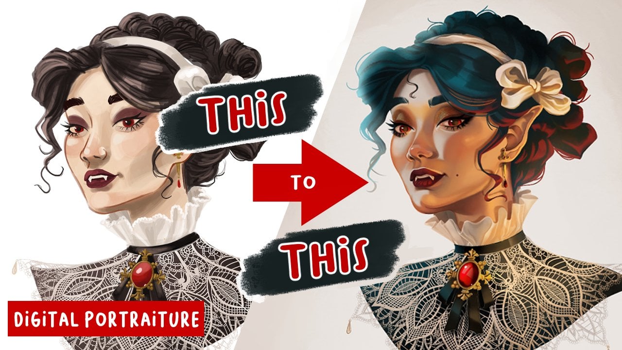
8. Shading, Texture and Patterns: Once you have completed
your line art, chosen your color schemes, lay down your flat colors. You're very close to being done with your
character design. The last step is to add texture, shading, and patterns to
your character designs. These little details will
make your design sparkle and add little bits of interests and storytelling
to your design. This is also where you get to
experiment with this style and methods for which
you will use shading. You can use Lasso
tool gradients or big soft brushes to gently
add layers of color. You may also choose to
do cel Shading and use hard round brushes to block
in large areas of shadow. These character designs
are not meant to be highly rendered
digital paintings. So try not to get lost
in attempting to paint every form in a beautiful
and realistic way. Let your line work, do
the heavy lifting for you and your shading and
color accentuate and support texture and pattern can also be really
powerful tools for adding additional layers of depth and interests
to your storytelling. Stickers and logos on a
school girls lunchbox can really tell a viewer a lot about her
interests and hobbies. Intricate patterns sewn
onto a Royals cloak can really give off the feeling
of luxury and decadence, as opposed to a dirty, muddy, dingy cloak that
a peasant might wear. Again, thoughtful and
careful planning of your characters and knowing
their stories inside and out allow you to make simple yet powerful
decisions through every stage of the process
when you're designing them all coming together to
make a beautiful design. A design who's working
parts all come together to tell a
powerful, clear story.
9. Demo: Welcome to the demo
portion of our class. I'm gonna be showing
you how I completed my villain and hero
character designs. So you'll see here that
I actually went and did some color thumbnails of
my characters just to make sure that the colors were
all going to work together. So that I didn't have to figure it out as I
was finishing them. It's like kinda
what I was saying about doing your
drawing and passes. Doing a color
thumbnail can help you do a lot of the heavy
lifting and thinking in concepting before you
actually spend a ton of time coloring and
then feeling like, Oh no, I pick the wrong color. Now I have to go back
and change it anyways. So I did a variation on the
split complementary scheme. I have my three colors on
more of the warmer side, and then I have a
cross from them, this bluish green color that I use throughout the
rest of the palettes. So that is the color
scheme I'm going for. And I'm going to use them for both my hero and my villain. The very first thing
I'm gonna do is line the larger areas of color. You'll see here
it's very simple. I aligned the area and then
I'm going to color them in with the gouache flow
brush from the Max pack. I'll just do this for every
color on the character. Because this brush is
pretty translucent. It does need a couple layers to get it to the
opaqueness that I want. So instead of going through and doing it
manually every time, I just duplicate the layer and then go into the patchy
spots and fill those in. It's an easy way to get it done. So now that I've got all
of the colors worked out, you'll see that I have them
each on a separate layer. And I do that because
it's just easier to lock those layers and then shade them
individually later. But for now I'm
going to start on the line art and I'm
doing it all in black. And then I'll come back and pick the colors for my
line art layer later. But here I'm using the Narendra pencil and I'm
just going in and here. Here you'll see that I was trying to find out
if I could add some more pressure sensitivity
to this brush because it's basically a round
brush with known variation. I did not succeed in doing that. And so I, you'll see that I don't
get those quick strokes, like I have mentioned
earlier in the class. I really like this brush, but it doesn't allow
me to do that. So I'm thinking I
probably need to make my own brush that feels
like the Narendra pencil, but allows me to have those quick and
confident strokes that you usually want
when you're doing liner. Now once my liner is complete, I'm going to start coloring it. I'm just gonna go and
lock my line art layer. And I'm going to pick the
local colors for each area. And I'll usually pick something that's a little
more saturated and a little darker than the area that it's going to brush up against. And I'm just going to start
filling in my line art to match the colors
that it surrounds. In my personal style, I prefer my line art
to vary in color. So it's not just
gonna be on her skin is not just going to
be this peachy color. I'm actually going to go in and the areas that would be
shielded from the light source. I'm going to make them darker, I'm going to make
them more saturated. I find that that
very shifts of color really adds up to
my, my line art. And so I really
recommend trying it. It's really fun to do as well. The liner is done. This is where I get to go
in and put in the flush the shading, shadows
and texture. I'm using again,
the max pack Retro, the max pack retro
gouache brush. And I'm just going in and
putting basic highlights, shadows, and blush
across the farm. Nothing crazy. But it does, as you can tell, I really brings it
to life and it just adds final bit of polish
that these designs need. I'm also going to
add in patterns, and you'll see in a
minute that I'm going to add things like dirt on her boots and on her dress that helps to give the
impression that this girl is an
adventure and she doesn't worry about
getting her clothes dirty. She's more in it for just enjoying life
and being in nature. I'm also going to
add a little bit of that dirt to the
villain as well. And I'm going to pay
special attention to his beetle shell
and make sure that there's enough
texture in my on it. So it looks like an iridescent,
shiny beetle shell. It wouldn't look like a bug
or come across as a bug if it didn't have that
texture and the highlights. So that's where texture
can really serve and help you get your designs to look and feel like the actual materials that
you're wanting them to wear. You'll also see that I added some magical effects
to the villain. And after that, my
character designs are done. So thank you for joining me. I hope that this was
helpful to see how I work and could possibly help
you with your workflow.
10. Final Thoughts: You did it. Congratulations on completing my character design
fundamental series. You really ought to give
yourself a big pat on the back. Or if you haven't taken the first or second
class in this series, I really encourage you to
go back and take those. There is so much to learn and process throughout
this whole journey. And I'm so proud of you
for sticking it through and doing the hard work to
grow your design skills. I'm so proud of
all your hard work and I hope you are too. I am so excited to see your
finished character designs. This has been such a journey, taking your characters
all the way from concept to finish. And I'm really hoping that the tools that you
gained in this series create a design
that you're really proud of and excited
to show off. I hope that you
feel a great sense of accomplishment and that you also feel like you are stretched a little bit in the process. Artistic growth is hard won through grit and determination. So let me give you
a round of applause for doing such good work. All of the techniques and principles that
you've learned in this series will be valuable tools in your
designer's toolkit. And when you review them often, you will continue to grow
on your artistic path. The artist's journey never ends. So if you ever feel like you hit a roadblock on your
journey ahead, make sure you come back and review some things
that might be able to live in your craft
again and help you take your designs
to a whole new level. Please share your
completed projects and the gallery below. And if you want to ask
for critique before that, asked for it in the
discussions tab, or asked me on
Instagram or Twitter, I love to give feedback. And if you share
them online, also, don't forget to tag me in
the post that you share. This was the third
and final part of my series on character
design fundamentals. Thank you so much for
joining me on this journey. If you would please leave
a review that really helps my classes get
out to future students. And if you want to stay
up-to-date on my future classes, make sure that you follow
me here on Skillshare and also follow me on my other social media platforms as well. Thanks again, and I'll be
seeing you in the next one.
 Emma Gillette, Freelance Illustrator