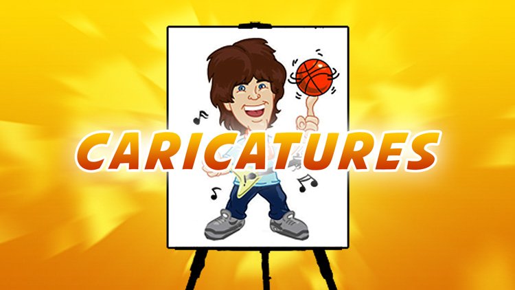
Transcripts
1. 00 Quick IntroPromo: It's nice to get out
and paint nature. But the supplies are
often a hassle to carry, and cleanup is a mess. I found a much easier way. I just use my iPad Pro tablet. Using the Procreate app, I can do digital
plan air painting, which is a lot quicker, at easier, and a lot more fun. Join me as I show you
my digital paintings from Central Park and other
parks and spots in the city. Also, I'll take you inside the Metropolitan Museum of Art and the American Museum
of Natural History. To draw rare sculptures
and artifacts. Sign up for this fun
course today to learn digital plan air painting
with Procreate. Sign up now. I need a ion.
2. 01 How to Create Your Own Brush in ProCreate: For a lot of the
drawings that I do, I use this brush here
that was created by the sky Minero brushes. So I just used this
because I don't know, I just wasn't in the habit
of creating my own brushes, but it's very easy and procreate to create
your own brush. And the most common
brush that I use, and sometimes I do use it for detail is the studio pen brush. So I use this a lot, I use it for my comic
book illustrations. But like I said, for
fine detail, I use this. So if you want to create your own brush,
you duplicate it, like you duplicate the
brush that you like best or the starting
point, basically. I could actually go
with the sy brush up here, but anyway, I'm going to go with the
studio brush and then in the corner, There you go. In the corner,
there was a little brush icon and you
click on that. And here you have all
the options to change. So if I change the jitter here, you see, I make it more fuzzy. So I'm trying to recall the effect of that
brush that I like, and I had a little
bit of a jitter. This is a fall off, that
means like it fades. I could have a
little bit a touch. Why not? I don't know. Okay Stabilization. I'm not sure quite
what that means. Pressure pressure. I usually don't want to change the pressure too much if I like the current pressure of
the brush, but here. So now we could
test the pressure. So I know the pressure is fine. High pressure. Low pressure. I don't know. There's not much difference
in this pressure thing. I think that's all right.
Let's go like that. Stabilization. What's this? That's like the control. It stabilizes the
curves and stuff. I I would rather more control and a little shaky than not. But let's go a bit like that. And I think like I don't know, I don't like as much jitter. Ale stabilization,
motion filtering. I'll see, yeah,
that's, like, it just, like it filters the
curves and stuff, and it kind of straightens
things out expression. I'm not sure what quite
what that means. All right. We'll keep it there, taper. You know, a lot of these
little differences are not that noticeable. To me, like the touch thing. So I usually, I mean, the brushes are so good that, you know, it's tempting
not to change much. But anyway, you can
make your own brush however you want it. It doesn't really start with such a fine tip. Oh,
there we go, tip. T less tip, more tip. I don't know, man.
Pressure. Yeah. So pressure is good
because you see, like I was doing
less pressure shape. Okay grain. Could add grain. There seems to be a grain. Rendering flow, whatever. Okay. Anyway, so there's a lot of options and you
could really match the pencil or the brush that you want if you want to create your own, and
this is how you do it. You start with a brush
as a starting point, and then you go from there. So let's go I mean, there's all these options to your properties,
dynamics, jitter size. Opacity, let's see, I think
this changes the opacity. Let's go done and see
what we created here. The only trouble is
it's not like that big, and that's one thing that was great about the other
brush. I was nice and big. But the good thing
is, this is solid. And, and this is solid. But let's say let's
say I started with the syrup duplicate
went in there, Jitter added a little
bit of jitter. Fall off, a little fall off, taper sizes maximum
with some opacity. L et's try that. Let's
see what that looks like. This is I feel like it's closer. But let's let's do that. You could also adjust the
opacity here like that. Merge. So I got the opacity
down on the actual brush. And then yeah,
that's essentially what the way that's set up. It's like the opacity on the
brush itself is adjusted. So it was in one
of those settings that the brush with like
when you create the brush, you can set the opacity that
it's like below like that. So, that's how you
create your own brush. But you can download
that one for free if you want from this guy Monero, you see it's on Gum Road, or you can make your own or you could use one of the many that are available from Procreate. All right. B
3. 02 Greyshot Arch, Central Park NYC Digital Plein Air: This is the gray shot
arch in Central Park. And this is one of the first
plan air studies that I did. I'm using a variety of
brushes here like the tamer, the painting brushes and
that flat hard edge brush. Also, actually, for
these fine details, I'm using the Niko rule, which is kind of
like a roller brush, I imagine, like when you're
painting your house. So I use that in a
really fine way to create the grids that you
see here. Rough it out. I want to get the
texture, basically. I also put down depth
and then I'm going back and forth on the detail. So a lot of the analysis that goes on in my mind is like
what's in the background, what's in the mid ground and
what's in the foreground. So I know that the background is generally what I put at the
beginning is going to stay. And the midground is pretty much going to stay
whatever is visible, but then the foreground is
what I'm going to cover. So whatever I put
in the background, I have to make sure that
it's got enough detail that I don't have to touch it later because it
becomes complicated, and I typically keep everything
in one or two layers. This on the right is one of my favorite parts is the rocks. I thought the rocks
turned out well. So I'm using this
you know, brush, and I'm just going
on on the detail now underneath the bridge, there was light coming in. It's kind of like a
grayish day with, like, breaks in the light. So when I'm observing this, I constantly am looking
for the best moments. And I grasp those with
my mind visually, and I try to recreate them. And this scene Although I didn't take a
picture at the time, but I can tell you already
that it's like it's a more Disney esque
sort of scene. It's, you know, fairy tale
like the way I depicted it, and that was on purpose. I always consciously
tried to sell the work, you know, to make it unique. And this is, I guess, like kind of a baroque
baroque style of painting, but I'm very conscious of this style of
trying to you know, make whatever scene
I'm drawing a brighter and more colorful
than it naturally appears. Also, the digital medium
tends to do that. So like a lot of the brushes, tend to be brighter. But again, it's a choice because you could really
go on the spectrum, the color wheel and pick
any color you want. So there's a lot of foliage
there in the trees, and you see, I haven't
added the leaves yet. On the trees. But I
added the branches and I'm building up to that slowly, but surely because again, I don't want to add those too early because what if
I have to add, like, branches later and then
I've done, you know, the overlay, the overlay
being the leaves. So okay, then there's
like overhanging things. Also, I sometimes compose trees, you know, in a certain light. Oh, this is interesting. This I use like this flare
and then the motion blur to create a light kind of
streaming in from the top left. And then I used
the blur as well. There a combination of
the flare on the blur and then motion blur to highlight
that light coming in. I think here I removed
the light just so I could work on the detail and I had it on a
separate layer. Now, it's the final touches, just the leaves remaining, and, you know, whatever
little detail that I see. There was a fence Here, like in the foreground, there was a really light fence, but I left that out
because, you know, it takes away from the
ambiance that this is a scene, not in Central Park, but maybe somewhere magical.
4. 03 Battery Park with the Statue of Liberty, NYC Digital Plein Air: For this battery
park illustration, I use the flat brush mostly, the Nico rule and the blur. Airbrush. But what's
most important about this is that I used photo
reference for the composition. This is one of the only
ones where I needed to use the photo reference to compose everything to the sizes
that I wanted. You see? Here, the statue of
liberty is larger. I've got this tree
in the foreground. This mid size guy is in
the foreground on a bench. There's the boat, the
right sizes, you know, everything is like a medium
size for the most part, except for the
over overlaid tree and the foliage in
the foreground. But I wanted something with everything sized properly
because originally, well, the statue
of liberty was too far away and it was
a different angle. So that's the beauty
of procreate. You can copy, you could trace. Now, I use this only as a compositional guide
in resizing the photos, and then from here, I
improvise and observe. So I look at the
picture from here. I just needed everything like
size to a certain point. And I don't go back to, you know, that photo reference. I used it only for sizing. Here I add the
water and all that. There may be some opacities
that I play around with, and I use about two layers, maybe three, but most everything is all on the same layer. And when you see, like the statue of liberty
illustrated there, I do zoom in on that. So feel free to zoom in. That's the beauty of
it, you pinch and zoom, and you get a close up view of the detail that
you're working on. Composition wise, you see I've included, like a speedboat, the buoy that I'm working on there, you know, the lamp post, the sailboats, you know, the big cargo ship, you know, the person looking off, ship, which these are, you know, photo reference. I mean, she moved. But I used that location
of her in this drawing. And in terms of time that I had, I had to work pretty fast like I usually do in most
of these pictures. In one way, that's
the beauty of it, because if you were working
with traditional paints, it could take quite a long time. But I naturally we quick. Uh, even with
traditional paints. So but with these
digital paints, I did this maybe 40 minutes
at the most that I had, and that's a long stint. So most of the pictures are around anywhere 20-45 minutes. Never longer. It's maybe an hour, once
or twice, but rarely. Most of these are quick So yeah, so I have to work quickly
to capture everything, and now here I'm moving
towards the foliage. Again, I keep certain things
in mind, like highlights. I leave to the end, and now
I'm blocking in things. I'm conscious now that
it's towards the end of that like 40 minute stint. And a lot of it a
lot of the time was taken up early on with the planning, with
the composition. So now, I'm very conscious that, whatever I put in the foreground has to be a little bit more detailed than everything else. Because that ship, whatever
detail you see on the ship, for example, has to look
like it's a bit blurry. You know, like,
everything is, like, less detailed than
the foreground, because I want to give
the impression of focus. So that's one thing. And then I switched
back there for a second to just kind
of gauge the detail. And that's all that
there was time for. I hope you enjoyed it.
This was a really fun one.
5. 04 Construction Worker Cartoon: This was another quick sketch, and I used only one
brush for this. There must have been
some sort of time limit. I forget exactly why this
was a shortened sketch. I knew I just had limited time to cover all the things that
I wanted to cover. Now, I started to draw
this guy and he moved. He was looking on
his cell phone, and this is a picture
I took afterward. You know, I just kind of
started to fill things in. And as you could
tell by the picture, by the photo, it was going to
be very busy and cluttered. So I left out the other people, and also the background I felt was going to be
very cluttered as well, and a lot of the detail might
be lost in the background. So what I chose to do was something a little
bit that I think in the end turned out
a little cartoony. Because also I used the pen. And this is the first time
I used this pen as well. So it's kind of
like an inking pen, and I treated everything like
like a drawing in a way, but blocking in colors. So it's like it's almost like
color blocking or flats, as they call it in the
comic book business. I try to again compose
everything in a nice way, where like the
character is isolated. Here I'm adding
some facial detail. And then to the right of him
is the rest of the park, and he's outlined
with the white. It's just a simple, fun sketch, and that's about
it for this one.
6. 05 The Vessel: This is one of my
favorite pieces, and I use just about
three brushes. You see, this is the reference. It's the vessel
in New York City, which people could
climb up onto. And they restrict that now. But this is interesting
because usually I do nature, but now I'm incorporating in the foreground a
steel structure. And you see, just
to be cautious, I split it into three or four layers.
There's a highlight too. But I separated this from
the background layer. In case I needed to adjust it
like the size or something. I put this on a separate layer. So I started with this. For me, it's like random in terms of, which item I start with. Because really I'm trying
to capture something. But also, I was aware
of the composition. I knew I wanted something
overlapping in the foreground, a mid ground and hopefully a background and
some obstruction, obviously. This is exactly
what I was seeing. I was like sitting
on the ground. There's like a
pavement area there and buildings and a
shopping mall nearby. And, you know, I was
applying these textures. And you see There is kind of like the gray and the white area and it
just kind of looks raw. Now, I blocked the background, the mid ground, basically. And this is a bit of a
somewhat tedious process. And there were periods
where I wasn't sure if I was going to get it right because you
see it's complex. Like, there's multiple levels. There's like the depth
that you see in between, and then later on, I'll have to go in and separate the light parts that you could see through the thing there
you go, like the blue there. So you see through the
vessel here at those spots. Then there's a little
bush in the foreground. So the metal and the
shine, the metallic feel. I try to copy that as
closely as possible. In terms of quick sketching. Also, you know, the group
that I usually draw with, most of these sessions
take about 45 minutes. So that's not a lot of time. And I knew I had to rush
to get everything right. Now I'm putting the background, and I already know that this background I'm going
to have to blur a bit. So I kind of keep that
in mind, but You know, before I get caught up in that, I decide to add detail probably
because of a time crunch, you know, which is
constantly on my mind. I'm not really rushing, and I'm not too nervous, but I'm conscious of it. And it still kind of looks
rough in some areas. But then now with
the bold lines. You see, those are
railings there. With the bold lines,
it's coming to life. And slowly around this point, I'm starting to have
confidence that I'm going to pull it through
because for a while, in between, I wasn't quite sure. So I jumped between, like back the mid ground and
the foreground because I uh I wanted to set that in stone because I knew the edges
here on the right. I knew I had to go
over the background. So now there's the depth
that I'm adding there. There's some shadows,
highlights with white, and I'm using that pen brush, and then this is on a
separate layer of that shine. The blur on the right
was done right after. Now I'm adding some
foliage on the right here. These are the final
touches, basically. So it's funny because,
like, during the process, it felt kind of rough, you know, the whole
vessel and the sketch. And but now, like, it's really one of
my favorite pieces. Part of the fun was drawing
and painting an object, like a city object,
a design like this, instead of just backgrounds.
So it was really fun.
7. 06 Whole Foods: This was an interesting
in between area. There was a whole foods on the left and some construction
on the right here. So I used the air brush
at the beginning. Then I use this roll brush like the roller brush as if
you're painting a house. I blocked in a lot
of shapes here. I mostly used this roller brush. For most everything, really. Later on, I use my traditional
pen brush for the detail, but I block in as much as I can. And you know, at
the beginning here, here I'm adding the
benches, in everything. Maybe I'm doing
some compressing, like in terms of
what's on the right, and that far building
that I'm working on here. I'm trying to create
the right distance. Then here with the orange
in the far distance, there's going to be
some trees in between, but I'm very
consciously putting in all those building details which likely like
this section here, I'm going to probably
blur a little bit, and then trees will cover it. But I have to add that
detail before I do the trees because this one is generally
done all in one layer. So not all of these plan
air pictures are layered. In most cases, I'll just go to town and do everything
all in one layer. This is nice on the bench. You see, I did some cracks. It was kind of like
a marble bench. Perhaps it was foam marble. It's hard to tell, but there
were some cracks in it, like that were on purpose. I was part of I also
gave it the shape. And then yeah, now I start
with that detail brush, but I only do a little
bit for the grass. And then later on, I'm going
to do more for the trees. And you saw I started to lay out a bit of the
construction area. That's actually now that
I'm looking at it again. Now I can see that the
construction area on the right with the
planks and so forth. That's a little bit
more compressed than it seemed
initially in the photo. But I'm squeezing everything in and making it work
with perspective. And I'm adding detail now to
the side of the building. It's tricky to know
exactly what to withhold, what's going to turn out good in the end
because it's like, not only am I copying things, but I'm layering things
with digital art. You do that with oil
painting or acrylic as well. But here there's a
specific consciousness. The beauty of it is that
it's more permanent. With oil, you might have to blend in these
trees, for example, earlier, and then just to kind of work
on things simultaneously. But here, it's like
they're flat layers, and there's a solidity to each layer of art
that you put on. So it's more fixed, and you can be more stern
with your decision making, but you have to plan more. That's the catch. You
have to plan more ahead of what not to put in and what to leave
until these last moments. So you see behind these trees, now that middle section, I did blur a little bit. So it gives some depth. And now I'm adding different highlights to
the trees to vary things. There's like two
different types of green on the trees alone and
then some yellow highlights. I'm fixing the bench now. And then finally, these pylons, that were shown earlier. Now, I wanted to
be true to this. I could have removed
them altogether. But I thought this
tells a story, and I thought that
was important. Sometimes in plan air, we leave out the people
and that activity. And yeah, I left out the people, but I kept the presence and the knowledge of people
through the pylons. Yeah. So there was very fun again.
8. 07 Brooklyn Bridge: This is the famous Brooklyn
Bridge from Dumbo. And I used just a
few brushes here. I tried to experiment a little bit and tried
some different textures. It was just one of those days. So you see, there was a
lot of foliage and a lot of overlapping trees and bushes. So I wanted to
roughly get those in. I didn't know where to
quite start to be honest. So you know, I thought like, maybe if I wasn't you know, in a rush and let's say, I had several hours
to do a painting, then I might plan
it more thoroughly, like I would only
do the buildings in the back on one layer, then do the bridge, then do the foreground. You know, so here I did
everything all together. And it's all, you
know, in one layer. So you know I'm
putting the buildings. I know there's some
wiring that will go, from the top of the bridge down. And so I'm not adding those yet. I'm holding out on
those. We've got the Freedom Tower
on the far right. And that looks fairly good.
There it is touched up. So I like the way
that looks a lot. I feel like it's recognizable, and that's important to me. And even when I took the photograph I made sure to
compose the Freedom Tower, so it's visible there,
and I did that, and I may have enlarged a
little bit from the photograph, which is a tendency
of mine to on purpose for the effect of, you know, the
artwork as a whole, to enlarge or play around with the sizing and
decomposition a little bit. But the bushes in
the foreground, I rough them in first, but now I'm putting
that branch layer, and then now again, on top of the branches, I'm adding some
extra texture to it. But in a little while I realize that some of this texture
is going to take too long, all those little leaves. So I will end up kind of blocking in more kind of you know, playing
around with that. And on the top right there, you see the texture that I'm
trying to cloak all that, you know, detail because it's like, it would
take too long. And, you know, the way I was doing it
with the fine detail, it just wasn't doing the job, so I really needed some
extra shadow there. And in fact, there is a
deep dark shadow among the overhanging tree branches and the places that I've put
it along the bottom there. That helps, that
those shadows help. Okay. Now there is a flag on top of the bridge
there, so I add that. I actually zoom in on that. And now I'm doing
those big wires. Now, typically procreate, you could hold down if it's like a big curve
and it'll smooth it out. I couldn't do that because the curves weren't wide enough. So I just had the eyeball it, but it's a nice loose painting. And then now, you
know, all the details, there's a little in between cracks with the light of the
bridge, and those are nice. That's a nice touch. And then there was like a
helicopter in the sky, and I add that as well. And that's the beautiful finale.
9. 08 Peter Park NYC Painting #1: This is Peter Park in New York, and I used just a couple
of brushes mostly. I'll show you layers later on. Basically, I had the
background layer. Then I went in blocking
in what I saw. I don't have a
photograph of this, but it's essentially this, and I mostly use, like the pen brush that has
a bit of a transparency, as you can see by the
varying green and, uh you know, other
areas like the tree. You know, the darker parts
are the areas that I went over twice because of
the transparency of the pen. So this one took a while. It was actually like scheduled
as a 45 minute drawing. And I definitely
used all the time. And I was rushing
because there's so much foliage in
everything and I tried to, you know, I resize the pen a
few times to block in areas. And there were some
background elements like this building on
the right hand side. I also grabbed it and did
a soft focus on it later. And then the foreground here. Well, actually, this
is the mid ground. There's kind of a little
hangout area made of stone and a couple of steps on the bottom right
left hand side there. So I'm putting that in. I'm trying to change up
the texture a little bit. So I did use that
roller type brush, and you know, the lamppost and the tree on
the far left are foreground. The veranda made of stone
is kind of midground. The foliage there that I'm highlighting now is background, but then there's like
a deep background that I'm going to add
in a few minutes, and that's like a city
scape beyond there. So it's quite interesting. This is one of my most
complex ones, I feel. And At start, it almost felt a little cluttered.
There was a lot going on. But at the time, I had
a lot of compliments on it from the group that
I was drawing with. So they really liked it. Maybe partially because I
was one of the few that was using a tablet to
draw with some. Yeah, there's like foliage
along the lamppost. I like this highlight
on the lamppost, the gray, and there was a fence. So that gray along the
bottom right is a fence. There's a little fountain. I'm adding contrast and shadows. And this is fun. I really like this one a lot. It keeps growing
on me because it's like complex and there's
so much going on. There's all these
little details like that branch that just overhangs
right there on the right. So, I'm doing my best with
changing bruh sizes to to fill in all that detail to
kind of just kind of get the illusion of detail by
putting in those textures. Then finally, on
a separate layer, you see on the left in
the deep left there, there's buildings, there's skyscrapers
and then the water, and I believe that's
the East River. So I put those in. I know in my mind
already that I'm going to blur them a bit and I did
blur them I think slightly, but not too much, and I played
around with the opacity. That's why I faded them. Give the illusion that what's in the foreground is
really in focus, and then they're super deep in the background
and out of focus. I did the same blur to the
building on the far right. Top right there, where you can see that it's
blurred as well because I want the focus to
be clear the foreground. Behind the land post, the
trees and the buildings there. I did some soft
focus there, too. So you know, you got to
go with the elements. Oh, yeah, and then there's
like the sun that I added a glow there in the
top left hand corner, and then I'm going to bring
it back at the very end. But that glow is
very, very subtle.
10. 09 Peter Park NYC Painting #2: This is another
angle of Peter Park. What's interesting about this
is the perspective is very, very evident in this. And I used a couple
of layers for this. I was conscious of the sign that's going to
appear on the left, so I made a point later
on to separate that. But, for the perspective, what's tricky is that you see the ground kind of opens
up on the sides here, it kind of curves,
and then on the left, there's going to
be some benches. So I'm it's not like
straight ahead, you know, it's not like
straight lines with a ruler. It's curved, it's like organic. So that was kind of tricky
to make that look good. And I don't know if I've totally
succeeded with this one. It's one of the pictures that
I feel like appears rushed, although it took me the same time as the others
around 45 minutes. But it just kind of I think it's like it was
hard to compose it. And I feel like with plain air, one point perspective
that's so evident like this with like
structures involved. I don't know. They don't look
like plan err, you know, because plan air is supposed
to be mostly nature. And there are also some examples
in my work here where I do incorporate structures
like design structures. But I don't know if
this was like the best one in that term, because it's like,
maybe too subtle, it's like, I don't know. It's just a feeling I have. But anyway, as I'm
adding the foliage in, you know, it's looking okay. I mean, you can be
the judge of it. You know, it's always easy to be self critical
as an artist. So the depth I
feel like is okay. There was, like, this light that was coming through
the trees onto the ground, and I try to capture
that in the foreground. I feel like the branches
top look really good with the foliage and the
hanging branches into that empty space
on the top left. I feel like that, looks good. I feel like some
of the highlights that I'm adding here
are pretty good. You know, there's like
this dark green, you know, mid ground and light leaves that add some color
to the whole scene. And the sun spots on the ground definitely
help. I love this part. This is probably
my favorite part. The leaves atop the tree on
the right there in the bush. Now, I think, I'm feeling a little bit better as I add
highlights to the tree there, the brush to a smaller one and the highlights
to the leaves there, that helps, again,
the light coming in. Basically, I was using
the same brush for most everything.
The sketch brush. This was like a tricky
one where when I added the bench and
there's a table here, I had to leave it to
the end because I knew this was going to be
darker and in the foreground, and I wanted to make sure that, I had a good grasp
of the background in the back before I tackled this. So I feel like the bench
looks okay, you know? Okay. And then now the sign, the sign I did on
a separate layer, as you can see here, And, you know, that helped just
in case I had to maybe enlarge it or in case I
screwed something up, I had things in the foreground, so I wanted to make sure
that that was going to work. Lastly, the background was
actually super bright. So there is a tone
to it, basically. It's not totally white
that you see there. And that's about it. So
right now in the end.
11. 10 79th St Boat Basin One Way Concrete: For this, I used the Niko rule brush
airbrush and a pen tool. So basically, those
were the three brushes, I start out with the layer for the background. This
is an interesting one. It was near the Hudson
overlooking the Hudson and it's an abandoned restaurant in
this park around 79th Street. And this is interesting because also I had some artist
friends with me, and one of them rode their bike and they
left their bike there. I tried to find this
perfect composition. I thought that told
a bit of a story. So what was interesting about
this was like the texture. You know, there's a lot of
texture and the angles were kind of a difficulty
because in procreate, you could hold down your pencil tool and it'll lock either a curve
or a straight line. But these curves were
kind of unusual. So I had to do those a few
times to get the right curves. And here there's like you know, some shadows that I'm adding in. And it was a bit complicated. Oh, yeah, this line
here is interesting because I drew it on
a separate layer, and then I go in and
erase it, you say. These are things you
kind of have to plan, because it's like for me to get the line across,
that white line, highlight across, I really had
to go on a separate layer. Otherwise, you could
risk, not, you know, drawing it too high or too low in continuing parts
between the poles. So the background there
was tricky, actually. I did that on a flat layer. It was an afterthought. The details of what is actually on the other
side between those posts, the green and everything that's across the Hudson,
that's New Jersey. So those were an afterthought
that I had to do flatly. Foreground was interesting. I like the bottom. And really,
there's a lot of bricks. At the beginning, I had some worries because
it was so much detail. I still only had about, like, 40 minutes for this, and I had to rush. Also, I like the
the time pressure because it forces
me to finish it. So here's the bike. Now, initially, I didn't
really draw it right. And then I just backtracked. I clicked on D to redo
it from the beginning. And you see, now with the bike, you know, in the Rle of thirds. Basically, it's on the left
hand side of the composition. Now it has I feel like a story. It's like, who owns this bike? Why is it abandoned there. It has this mystery to it. Now, above here with the sign, you know, there's this detail and there's like a
one way sign there. So I zoomed in on that. So what you're seeing here
is actually me having done that on the screen to
get that sign and the detail, and I shrunk down my pen nibs. So, yeah, that's
about it. And I feel this is one of my strongest
pieces, in my opinion, The concrete jungle in the park kind of gives
it a different feel. So I like that. Hope you do too.
12. 11 79th St Boat Basin Park: This was an interesting
illustration for a lot of reasons. One of them being that the composition was in such
a way that I had to make it interesting in finding this
place because it was like a wide area of the park and there was only really
benches on one side moly. So I wanted to get kind
of an angle because I feel like if it's too flat. I mean, the whole
picture looks flat. So I try to kind of look down down to the
left. Of the field. So so that was one
conscious decision I made. And you saw to start how I started with one layer
for the background. And then I built on top of that. This one had maybe
the most amount of layers out of the
illustrations that I've done. I wasn't sure how it
was going to turn out, and I think when I'm unsure, I try to separate the
layers just in case I make mistakes and I have to like
hide a layer or redo it. I was like, kind
of worried about, you know, locking those
in on a flat layer. So, you know, in the end, I feel like this is still one of my most interesting ones. But anyway, I love the tree
trunk underneath here, and now I'm putting
in the leaves. But the tree trunk that's
like the centerpiece, I feel like that's
pretty strong. You know, and also
there was like people passing
through here a lot. So I took those out and a lot of these scenes,
I don't include the people. Because I want to
make it more nature. Also, you see between the trees, I paint blue like
the background sky. I forget if those are
erased or or dabbed in. But at a certain point it
doesn't really matter. You could add those blue.
This is kind of interesting. Again, I'm observing the colors. And here, I realized that the railing I
should have added after. So then I redid it. Like I put the bricks and then
I added the railing again. And next, the ampost. These looked pretty good. I was happy with these. Here's another layer.
These branches that are in the foreground, which are actually on my side of the pathway,
the street there. I put these on a
separate layer too. You can see all the layers here. Then lastly, I used the luminous brush to
add that highlight. And then I'm Well, it's the sun. It's really the sun beaming
through that sun ray. So then I make some decisions
towards the end here, which layer I want
to have that sun ray on whether I wanted the branches
in front or behind that. So yeah, that's pretty much it. In the end, I feel like it
turned out pretty solid. Hopefully, everyone else agrees.
13. 12 Bow Bridge in Central Park, NYC: This is Bow Bridge
in Central Park, and it was a beautiful fall day. I worked in multiple
layers in this, maybe like the most
layers like five or six. I started with a blurry
airbrush background to fill, you know, these trees
because I didn't want to do those only by pen,
as you see here. If I add that extra back layer from a distance as
I'm building it up, those trees will look fuller. And that's what I was doing. And I noticed that my
brush was too small, so I try to use a
bigger brush right now. So I'm just really filling
it as quickly as I can. Since this was again, about a 45 minute painting. I wanted to get to the bridge, and here we are finally. This wonderful,
beautiful bridge, very famous in many films. I used the lock feature
in those curves, so you hold the i pencil down and lock the curve.
So that helped. There were some other examples where I couldn't lock it in, and it would just
create a straight line. Next is a special effect. I duplicated the bottom
part of those trees, and I added a motion blur. This is what created that
reflection in the water. Once that photo shop like trick, which can also be done in procreate was created
for the reflection. Now I can focus
on the fun stuff, like adding more color to the trees and finishing
the bridge and everything. But, you know, there's so
many fun details in this, and you see, I had a
little couple there, and even the branches, they kind of lead the eye to
the couple on Bot bridge, and they're just kissing there. It's a nice romantic
scene in the fall. There were a lot more
people, of course, but I chose to just
do this couple. Here's a tree in the foreground. Now, I purposely chose
this composition and I knew this big bush was
coming on the left hand side. I knew that was coming in
and framing the bridge, you know, the tree on the right, and the branches on the left. And now there was like, fun little overlay
light green tones over the darker green
among the bushes there. And I noticed too,
there were, like, little white dots of flowers. And those were wonderful. And it's amazing how nature
just creates its own beauty. You know, cause if
it wasn't for that and there was a purple, too. If it wasn't for those, like, they could look a little plain
and, you know, run down. But, man, you know, nature's like staying alive in
the fall, you know? It's still blooming. It's quite amazing. This was one of my
favorite ones, for sure.
14. 13 Quick Roman bust drawn at the Met: I came late to the met, and I only had 10 minutes. So I started quick with
the Niko rule brush, then the real incher. And I mostly use that. That was for the background
I blocked it in, and I try to match
the foreground color, like a creamy color with, like, a muted indigo that's
in the background. I just start blocking
in details and I switch brush sizes throughout. And now I move into
the highlights. There was a beam of light
above the sculpture. So I try to capture
that contrast. But I use into it slowly with
a creamy colors variance. And now I just pick
up the nuances quick, because I only have about
five, 10 minutes in this. And here I use this
brush, the airbrush. But just to kind of mute that area around
the neck, the shadows. But then I go in with the
pen again to finish it off. And then the background, I
add this nebula texture, which is this brush here, and this is what it looks like, and then I play around with the opacities to get
just the right texture.
15. 14 Slave girl sculpture drawn at the Met: This is a sculpture at the Mt that I drew in
my sketchbook as well. And I use mostly the pen, the blur tool, a couple of other textures
just for the back. And this one, I was
going for a more painterly look than the
illustration in the sketchbook. So in the sketchbook, I was doing line art, and now I'm kind
of feeling it out between kind of the
pen tool as a rough, which I love using because it's like
really kind of sharp. And then here, like,
the airbrush tool. And then I'm using the eraser now for, you know, the edges. To highlight the
contours of the profile. The profile is kind of like a big highlight of
this sculpture. Now, I think, like, there's
some questions in my mind about whether I got the angles of that arm the way
it's supposed to be. So I don't know. I it's not totally
perfect because it's like it's a one off painting. So what I like is
the cheekbones. Like the cheek bones there, those are really solid. The hair was a bit of
a pain on the butt. So I try to be as vague
as possible here. This kind of detail
requires an artist to take more time and
more concentration and slow down the
process a lot more than I could afford in the limited time
of 30, 40 minutes. Also, the forearm,
I should mention, now, I'm working on the forearm. That left arm is so nicely done. I really love it. I think I really nailed that
in the shoulder. You know, the feeling of
three D is nice there. You know, the necklace, it's
turned out our right here. At the Zoom in for this one. You know, that
helped a little bit. Mostly from this point
on using airbrush. I feel like that's the realistic way to
go is to airbrush. I want to mention here
that the background and even the sculpture itself
is not quite white. The sculpture was kind of like
ivory, really nice marble, and It was a lot brighter
in real life it felt like, but it's important to create
some sort of realistic feel. And so I chose a darker
background for the back. And I purposely not
super white colors. The purpose being to make a standalone picture
that looks great.
16. 15 Quick African bust drawn at the American Natural History Museum NYC: This picture, it's
just a simple, simple subject, and therefore, it was a very quick sketch. I think the whole thing was
maybe 5 minutes at the most, and then it's sped up
here to about 50 seconds. What's cool about it is that it's a lot of
shadows on the face, and I do try to capture
some nuance, as you see, I leave a little white
line for the jaw line. And here, right on the shoulder, I erase some cross hatching just to try
different effects. And this is mostly it. I erase there for the
dots along that hat. And that's about it. Simple little quick fun sketch.
17. 16 Mongolian Shaman American Natural History Museum NYC 1: This was done at the
Natural History Museum and its of Mongolian kind
of tribes person. And again, it's using the
Betty Betty Edwards method of drawing on the right
side of the brain, essentially, where I
just I just kind of, like, follow the cons. I gauge I jumped
to the arm here on the stick because I gauge
the distance between, let's say the chin to the stick and then I try
to connect everything. And a big focus of this
drawing was essentially making a nice little art piece of it because once I
had the colors, that's where it
becomes artistic. So I was using one simple
pen and then I just like quickly add
some highlights. And a greenish background that compliments this
foreground colors, and I put, like, a
big breast stroke through out there for fun.
18. 17 African Shaman @ American Natural History Museum NYC: I was done at the museum
of natural history, the American Museum
here in New York, what was tricky about this was that I wanted to fit
in the feathers in a nice composition that the feathers he's got
coming from his nose. I used the rule of
thirds generally. I put him in a little bit to the right of the center,
so you see his mouth. I'm gauging like the
mouth is kind of like the center because we're mostly going to look
at his expression. When there's people
in the subject, we tend to focus on the people. So I fit them in and it's just generally an illustration
approach that I'm using. I'm not really looking for
realism in a painterly way. I'm mostly treating it like a comic book illustration where I'm focusing
on the outlines, and then ultimately a nice, colorful design, which will
be seen once I add colors. So it's like composition,
illustrative technique, engaging the shadows and
such that I'm focusing on and the proportions of the
hands and things like that. And now the fun, colorful aspect of it. I am following the
colors that I see, mind you, but I'm
changing the background, and I'm adding that big brush stroke to
make it like a fun, you know, colorful and
stylish illustration as well.
19. 18 The Thinker by Rodin drawn at the Met: This is one of my
favorite sculptures and I even did it in my sketchbook
on that same day. I had a pencil version and I also did a different
angle for it. You know, for this
purpose to show the process because it's very
hard to film the other way. What's interesting about
this bronze sculpture is that sculpting, it's often unless you're
shading realistically, it's very difficult
to show the metal, you know, without showing
some sort of sort of texture. So I'm essentially
doing a quick study. Of the pose of the sculpture. I'm not trying to emulate
the actual texture, the actual feel, the
metal and so forth. I'm simply treating it like as if it's a
life drawing model, and I'm illustrating it. So a lot of these quick museum studies often are more illustrations
than they are paintings. And, you know, I'm
really just having fun with with the figure and, you know, and all of the figures that are available
on these museums. And you saw, you know,
at the end here, I do add some shading and some highlights to
give a little bit of the impression
that it's a bronze or that it's not just a figure because
without the shading, and actually, it could look
like I'm studying a figure. So adding that shading, that dark shading gives the
indication to the viewer, even though it's not realistic, it still gives the
indication to the viewer that This is a sculpture. It's not an actual person. Yeah, it's a quick study. I think this was maybe
like ten, 15 minutes. So very quick and sculptures
are perfect for this.
20. 19 T Rex drawn at American Museum of Natural History: Well, at the Natural
History Museum, I had to paint the T rex. And here it is. I don't know if
you'll be able to hear some of the noise there, but it was a lot of people, and usually it always is,
especially on weekends. So I chose to go on a Saturday, a lot of families and kids. So, you know, that's how the museum is and it's actually a lot busier than the met, typically, because,
you know, while, maybe the movies helped, like night at the Museum
and all that, you know, for kids, because parents can show the films to the kids
and then get them excited. And look, we're going to go to the museum where all these
things are happening. So that's a possible
explanation to the popularity. But, you know, there's so
many cool attractions here. You know, the dinosaurs on the top floor is
just one of them. And I'm definitely very thrilled
to be able to you know, to embark on these, to
have a privilege to, you know, get ahold of such an amazing
collection of artifacts. So right. So as you saw here
at the beginning, I put in, like, a rough
background foundation. I felt like that would
I'll make the piece look good to have a nice
colorful background, not just a plain white. It's a little tricky
because everything else on the skeleton is fairly light. I have to make sure
that it stood out. Towards the end, I'm going
to add highlights and those are tricky because
they almost blend. So I have to make sure that
it's like a solid 100% white. So I started with the face
pretty much in the center. The intent was, like,
maybe the hole for the eye socket would be in the
center of the composition. And that's for a reason. It's kind of using
rule of thirds. I took some liberties a little
bit with the spine here. I tried to follow the vertebrae
as closely as I could, and and then, you know, I tried to make my sketch painting as quick as possible because there
was so many people there. And, you know, people were complimenting
me and so there was, like, some distraction going on. And but if you have time on
a quiet day on a weekday, when you go to the
museum or any museum, to spend a long time
and maybe even come back to the piece and
spend a few hours. Then you can really get
a nice rendering going. So here, at the end, I'm just adding the highlights. Basically, also,
I should mention, I'm mostly just using one pen. On clear pen. I'm not using any
other highlights. So this is a quick fun
piece, and you know, it's a big T rex and you know, definitely at the museum, try to go for the big stuff. You know, even if
there's a crowd around.
21. 20 Torso drawn at the Met: This was a mishmash of the Pen
tool with airbrush tool in an effort to make this study of a bust at the Metropolitan
Museum of Art to make it more realistic. So I silhouetted the
image with the pen, and then I'm going in with
two different values like a mid brown tone and
a darker tone now. And I'm adding some
hatching as well, which makes it
look illustrative. But here at this point, I decide to try to make it
more realistic looking. So I take the airbrush tool in an effort to make
everything more realistic. I try to blur different
areas of the sculpture. Then I'm going around
the sculpture, the edges to try to refine those edges and add highlights, reflections, and I'm observing closely the actual subject, trying to add
different highlights. Now, those yellow marks, there were reflections that I actually saw on the sculpture. I don't know if they translate
well in the final piece, but this is really what
I'm trying to capture.
22. 21 Figurative sculpture drawn at the Met: This was a very fun
sculpture to study. It's a famous
sculpture at the Mt. And the figures are
really wonderful. And they're interesting to study from a life
drawing perspective, and that's why this one has
less of an attempt to be realistic and moly
studying it as if there were models,
real life models. So I'm studying the bend of the forms and the
muscles like in hips, the legs, the knees, the hands. There were some you know, complex things done with
the hand expressions. Including this one
at the bottom, was a very interesting one. There were these three figures and they're all grappling
with each other. Interesting note here, I was
trying to fit in the head. And in that attempt, I
couldn't get it right. You see? I try to shrink
the sculpture down, and then in the end I
decide, you know what? Just keep it as original
because sometimes, you start a picture somewhere and it doesn't quite
fit, just go with it. Don't try to force
the proportions. Just accept it and do it as
you see it from that angle.
23. 22 Native Bronze Sculpture drawn at the Met: This is a beautiful, and I believe pretty
famous little sculpture by James Earl Fraser, it was so fun to draw. Basically just used
the pencil tool. And then at the end, I added some shading. Again, it's tricky like
the bronze sculpture. It's tricky to shade bronze, especially this
approach, because again, I am studying it
like a life drawing. So I'm using a lot of
illustrative line work. As you can see by
the arm muscle here, I'm trying to figure
it out the best way. And I think that's
the arm muscles where I kind of tried to switch. I realized I was using too much line work and I
was trying to make it a little bit more filled in
and less chicken scratchy. It's enjoyable to
draw in those muscles in an illustrative way because This kind of subject also
comes from that history, that illustrative history of
Cowboy art and everything. This was interesting,
too, because I started in actually closer, and then I shrink it. But this was a well, definitely more successful than one of the other
sculptures that I did at the MT where when I tried to shrink
it and redo the face, it became difficult because resizing it in my head
became a challenge. This one was a
little bit easier. And you know, the challenges were like, let's say the neck, you see the mouth
there in relation to the spear and then the
negative space in the neck, between the neck and the spear between the spear and
the tip of the foot. Those distances were
crucial in my observation. Same with the legs, the empty space between the two legs and the tail and
the stomach and everything. These are life drawing techniques that can be
covered in other tutorials, but very important when
observing anything from life. Here, finally, at the end, I added some shading
and I nudged it to the center for
a better composition.
24. 23 Conclusion: Congratulations. You did it. You completed my digital
plane air painting with Procreate course. I hope I answered most of your questions
about the process. The key thing to remember is to use layers
whenever you can. T four layers, just in
case you make a mistake. And if you do make a mistake, you can always clear the layer. Although I have a
few brushes that I like to use that
come with procrate, if you do feel adventurous, feel free to create
your own brush. Digital painting with
procrate is a lot easier than traditional paints often
because you can, for one, mix different mediums
and techniques, and they blend more
easily than they would react if they were
traditional paints. Basically, it's just
a fun opportunity to try different techniques
within Procreate. It's also a great way to
travel light with your tablet. You can take your
tablet to museums, to the parks, wherever you like, depending on rain or shine. If I can answer any
other questions, please feel free to message me. And please don't forget to leave a review so others can
find my fun course. Thank you, and I'll see
you in my next classes.
25. 24 BONUS 01 Hercules sculpture drawn at the Louvre, Paris: This is another famous sculpture at the Louvre of Hercules. And the first thing
that I did was, like, I try to picture in my head the proportions
of the whole thing. So this is kind of just
an indicator of what's going on in my mind when I'm looking at a
sculpture like this. And then based on the distance
that I have from the work, then I decide, like, how large to make it. So I don't like force
my perspective. And at the beginning there, I'm trying to figure
out where to start. So then it ends up
centered enough. Once I start, I look for
the negative space in that spot of the arm
and the elbow there. Then I go in and I'm only using the six B pencil,
the digital pencil. It looks like a pencil drawing. The only thing that
makes it look digital at this stage is the very
bright white background. I'm using the side
of the eye pencil, and when you use the side, you could actually get it more gray. So that's kind of a
fun little feature. I'm observing the proportions
as well as I can. And I'm following the contours. It's fun to observe
the muscular ture on a subject like
this because yeah, I'm treating it like a life
drawing bottle in a way because it's so precise
and so figurative. I'm following contours,
but I'm trying to imagine the shapes underneath
those muscles as well. And here in the face, I'm basically trying
to get the proportions while not really defining
a grid for the face. So I'm considering,
like the eyes, for example, we were at a slant. So I wanted to make
sure that those were lined up properly that way. And so is the mouth that's
on that same slant. And here I adjusted it so
that I ded that it would be more centered. In the page. And the arm his left arm here was a little tricky because it hangs in
such an awkward way. But I try to follow it
basically the way I saw it.
26. 25 BONUS 02 Various studies drawn at Orsay, Paris: Series of studies were
from rsi in Paris. I started with some sculptures. This is a fun, easy one, where I'm mostly
focused on the contours. This next one is a painting, and I tried some different tools including the oil brush tool. It was just an interesting one. I was trying to do something
flat as a subject. This is back to sculptures. I feel the sculptures
are a funner study. I'm just using the six B
pencil for this study. This is a great silhouette. It reads really well.
It's a nice figure. Good, the upper forum. This one was a
complicated study, and it was hard to
make sense of it, and I kept looking at it over
and over and going, Okay, this is actually
what it looks like, like the face, the ways
the cheek bone is, and the nose and everything. That's what it was to
the best of my ability. Because of the odd angle, I feel the hand as
the highlight here. This last one
struggled with this, but what a lovely pose this was, and it drew it too big initially
and then shrank it down, made it fit within
the composition. Some shading was added at the end with the
side of the pencil.
27. 26 BONUS 03 Sculpture drawn at Philadelphia Museum of Art: It has a lot of great museums. And I didn't have too
much time left by the time I got back to their main museum
here, the Rocky one. So, you know, I just
kind of saddled up. It was like the last
hour before it closed. I found this great sculpture, and I decided to just
do like an ink study. The whole thing was maybe
less than 10 minutes. I'm showing you
here first the top and now like the bottom,
like the mid section. It was interesting to study folds and these sculptures,
these classical sculptures. They do such a phenomenal job of the cloth, everything,
including hands. So it's fun to study the hands. Just a beautiful piece here. Just a quick study. Lots of fun. One ink brush used
for the whole thing.
 Cristian, Masterpiece Art School