Transcripts
1. Introduction: Hello and welcome. My name is 3D takin
from Experts Academy. In this online course, you will learn how to
create two different illustrations step-by-step
from start to finish. These two illustrations
have something in common. And that is, they both combined vector and
raster techniques. But the wave vector
graphics are used in each of these illustrations
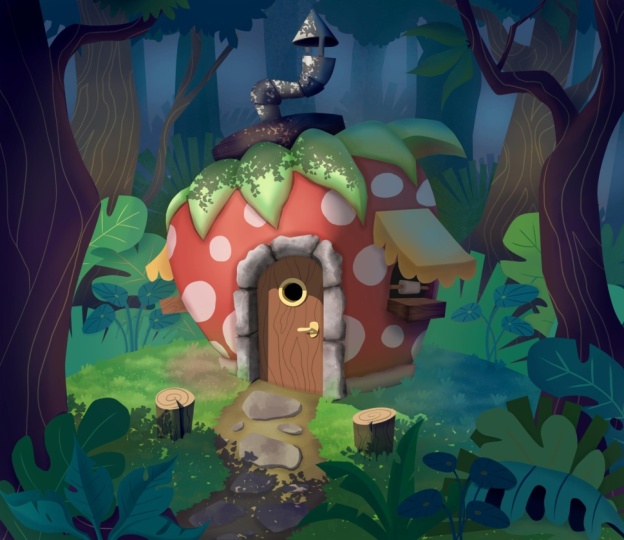
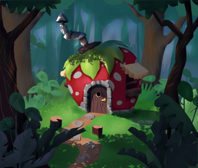
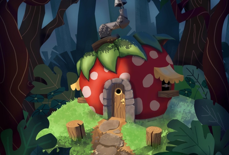
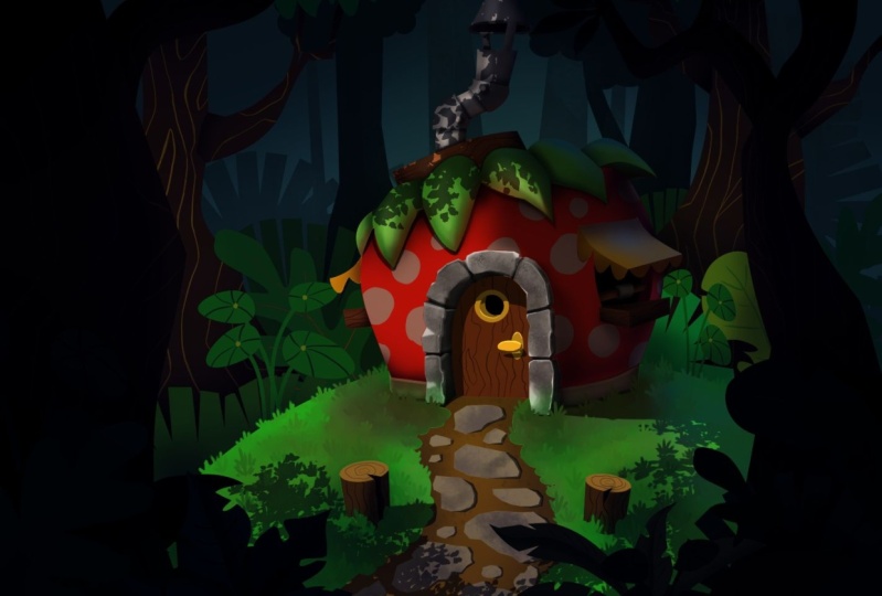
is very different. In the first illustration, which is a strawberry house, vector graphics are used as the base color
rostral techniques or the news on top of
it to add the shadings, highlights, textures, and so on. While in a second illustration where we will draw
a robot warrior, vector graphics are used to create the outline
or the line art. For the coloring process, we will explore a
different technique. That is, we will start with defining shading and
highlights in gray scale. Then we add colors to it using
the gradient map filter. And after that, we apply
various trust or techniques to add lighting effects and
finalize the illustration. Because there are so many
features and techniques involved in making these
two illustrations. Of course, we are
not going to jump straight into making
the illustration. You will be guided to
learn the basics first, then gradually move up to
more advanced techniques. In this course, you will learn various adverse
selection techniques, then loan vector techniques
in depth from creating basic primitive objects to being able to create custom
complex shapes. You will also learn thoroughly
the filter mask features. We will discuss various
filters such as HSV, levels, color valence, and so on, including how to access
hundreds of genomic filters. Then you will also learn
the gradient feature in detail from the process
of creating gradients, Presets, anything
new gradient colors, until applying gradients
using various methods. There are still many things you will learn from this course. It is impossible to explain
them all one by one. In this short video, please refer to the curriculum
section to learn more. But before you decide
to join your scores, I need to remind you that this
course is not designed for complete beginners who have
never used Krita before. The curriculum of this
course is designed as the continuation of the
basic level of course. So just to be safe, I recommend you to take
the basic level of course first before
taking this one. The second thing I also need to remind you is that you will need a drawing tablet to be able to learn from this
course effectively. A drawing tablet
is an input device which generally consists
of a board and append. This device is
equipped with sensors to detect how hard you
press the pen when growing. Although you can use the mouse
to draw an illustration, still, it will be
much faster and more effective if you
use a drawing tablet. I hope this course can
be helpful for you. Was solemn while icon.
2. Exercise files and other information: Before we start
discussing the lessons, there are so for
important things that you need to know for us
regarding this course, the force is where
you can download the exercise files or the
project files of these scores. You can find and download the files from the
following lean. Please pay attention
to the case of the letters because the
link is case sensitive. For convenience,
I combined all of the files and compress them
into a single zip file. After you download an
uncompressed file, you will see that the
files are already sorted a named according
to the lesson videos. Next is about the curriculum. I have carefully
crafted the curriculum for adolescents are
arranged sequentially, meaning that the
lessons you get from one video will become the
foundation for the next videos. That is why it is very
important that you take the scores according to the
order of the curriculum. Avoid learning by
jumping around randomly. If you do that, at some point, you might get confused. Indeed, sometimes I repeat previous lessons if I
consider them important. But of course, it will
be impossible to repeat everything over and over
again in every lesson. So again, by default, I will not repeat
the lessons that I have already explained before. The next thing I need
to remind you of this, that you need to practice. This online course is
not just about theory. Most of the lessons
are practical skills. So if you really want to benefit
from this online course, then there is no other way
but to do a lot of practice, at least for each lesson video, try to practice it yourself. Once. For this online course, I recorded all the lessons using a PC with Windows ten OS. So all the keyboard
shortcuts data. We'll be using R for
a PC or Windows. If you use Linux OS, it should not be a
problem because basically Linux uses the same hardware and keyboard layout as Windows. What might become an issue is if you use an Apple
Mac computer, since the keyboard layout is slightly different
from the PC, you should anticipate
some differences in the keyboard shortcuts. You may need to spend some time looking for additional
references on the Internet. In general, you need to
swap the control key on a PC to the Command
key on your keyboard. You may already
know from the start before taking this
online course. Krita is a free and
open-source software. You don't have to
pay anything to be able to download it and use it. Corita's official
website is krita.org. For safety reasons,
you do not want to download greta from
other unknown sources. In terms of Krita version, when I started recording
for this course, Greta was available in
version 5.02 and then midway, Greta version 5.1 was released, followed by version 5.1, 0.1 shortly after that. So some of the
early lesson videos in this course are
using version 5.02, while some of the later
lessons use Krita version 5.1, there are slight differences
between these two versions, but in terms of functionality, it is still the same. To anticipate any confusion, I've made an
additional short video to explain the changes. I placed this short video right after the effect
that lesson video. Originally, I recorded all of the videos and the
audios myself. But there are times when
I had bad flu while the production schedule is very tight and I just have
to keep moving forward, the videos turn
out to be alright, but the audios are
not quite alright. For these videos, I decided to use a professional
voiceover service. This is the voice
that you will hear. It is very different
from my voice, but in many positive ways, I'm not a native
English speaker. So compare it to my voice. I believe this voiceovers
articulations are way better. I hope you understand
my decision. And I also hope that
the voice-over can actually help you better
understand the lessons. The last thing that I need to mention gives the
copyright issue. Throughout this
course, I may show some pictures or
perhaps even videos. Some of these are
not made by me. I use them as references or
to help explain lessons. I never claimed that these images or videos
are made by me. If I can find the owner's name, I will put it on
top of the content. But if I cannot find it, at least I will put the URL of where I
got the content from.
3. UI customization and custom shortcuts: In this lesson video, we will cover how to customize the UI and how to create
custom shortcuts. We have already discussed this
in basic level, of course. So I am going to
review the techniques again quickly just to
refresh our memory. And also to make sure we
have the same UI layout. To start with. The first time
you install an open Krita, this is probably
what you will see. To see the complete UI of greta, we need to open or
create a new document. During this course, I will
probably be using the air for 300 ppi document
preset most of the time. Let's use the
landscape orientation. We have covered in detail all the parameters related to
documents invasive course. So we're not going to
discuss them again. Now, click the Create button
to create the document. After we have a document opened, we can see the
concrete UI of greta. This is the default
UI layout of Greta, but this is not the ULL I will be using
throughout this course. If you want to, you
are free to use this default layout or perhaps
your own custom layout. But if you want to match your UI layout exactly to
do and I will be using, you can follow these steps. First, click and drag the toolbox so that it
is located at the top. We want order to likens
to be in one row. Then I prefer this advanced
color selector broker to be on the left side
to move the Docker, since it is currently
attached to another Docker, you need to first
click on this button, then you can drag it
to the left side. The same thing with the
tool options Docker. We want to move it to the left, also, just below the
advanced color selector. We can adjust the width and also the height of the left
Docker's if needed. Finally, I want to
close this brush preset Docker because we can access it above via this button or by
using the F6 shortcut. The less UI element that
I want to change is the color picker model of
the advanced color selector. Currently, the center
area ship is triangular. I prefer to use the
rectangular model. To change it. We can click
on this little icon, then click here and just choose the color selector
model that you like. I prefer this rectangular type. Then click Okay to confirm. You can see that the
advanced color selector is now rectangular. Next, let's discuss
creating custom shortcuts. We all know that keyboard shortcuts are very useful to speed up the workflow. Throughout this
course, I will be using custom shortcuts a lot. Some of the shortcuts
were created earlier in a basic
level, of course, while some of them
are new shortcuts, which we will discuss
later when the time comes. For now, I just want to set
up two custom shortcuts, which we covered earlier
in the basic level course. For us, I want to set the letter Z for the free-hand
selection tool. Then the second, I want to set the letter q for
clearing the selection. The official name for
this command is dyslexia. Keyboard Shortcuts. You can open the Settings menu, then configure Krita, an open-door keyboard
shortcuts category. Here, you can find
certain commands by typing the name in
the search field, e.g. let's type in
freehand selection. You can see only the free hand selection tool listed below. Clicking this area, then press the button and then press the
letter Z on the keyboard. Then press OK. Next, for a second shortcut, we can use the search field
again by typing the slag. We can see that this command already has a default shortcut, which is Control Shift a. It is a hassle to
use the shortcut because we need to press
three buttons at once. Well, we need the
dislike command. Very often. We want a simpler shortcut, but also we don't want to
remove the default one. So we don't want to click here. We want to click on
the alternate column. Then click the non button and press bladder Q
on your keyboard. Click Okay to confirm. The final setting
that I want to do is to add a new brush preset
to the popup pellet. Previously, we set up the pop-up palette to use
a tag with a unique name. I use my own name, weedy. We've covered how to use the
brush tags and how to use the proper pellet feature in depth in the previous
basic level. Of course, just to remind you, let's say we want
to add a new brush preset to the papa pillar, e.g. this brush preset
called dry roller. Just right-click on it. So I assigned to
tag and then select the name of low-tech use
by the pop-up palette, in my case, the tag 3D. Now, if we use the Brush tool and we perform a right-click
in a pop-up palette. We can now see the dry
roller brush preset. So those are the
things that you can prepare before moving
to the lesson videos. Again, you don't have to do all of these things if
you don't want to. But at least if we have the same UI layout,
custom shortcuts, and Papa pellet,
it can help us to reduce the risk of
confusion down the road.
4. Basic selection techniques: Starting from this video and
the other next few videos, we will cover various advanced
selection techniques. But before that, just to refresh our memory, in this video, I want to quickly
review and summarize all the selection
techniques that we have covered in a basic level. Of course, if you feel
confident and already know all the basic techniques
for creating selections, you can skip this video and
go directly to the next one. Basically, we use selections to limit the area
that we want to edit. Krita provides many
tools for selection, and all of them are
located in this cluster. In general, you can find dotted
lines on our tool icons. This is for creating a
rectangular selection. This is for creating
a circle selection, and this is for creating a
polygonal shaped selection. To use this, we have to do a series of clicks
and release us. Then to complete the selection, we can double-click or we can press the Enter
key on the keyboard. Or we can also just click
again on the starting point. As for the free hand
selection tool to use it, we need to perform
a click, Greg, just as we draw
using the brush tool then released to complete
the selection process. Alright, next, there are some important shortcuts
for controlling selection. The forest is Control
a to select all auto, select the entire canvas area. Then we can press Control Shift a to deselect or
clear the selection. As I mentioned in
a previous video, because we will use this
disliked command very often, highest signed the letter
Q as the custom shortcut. And then glare shortcut. There is no less important
is control shift I for inverting the
selection region. E.g. if I make a
selection like this, then I press Control Shift I. Now this area is not selected. Instead, the area outside is the one that is
being selected. You can see the
dotted lines indicate the selection radian is
now onto Canvas border. If we press Control
Shift I again, the selection area is
reversed back to this region. In case you forget
all the shortcuts, just open the Select menu. Here. You can access all the commands and also see the shortcuts. Now, let's discuss the rectangular and the
ellipse selection tools. When using these tools, you can make use of
the modifier keys. What modifier keys
mean or Shift, Control and Alt
on your keyboard. E.g. if we click drag to
make a selection box, before we release
the mouse button, we can hold down the
Shift key to make the rectangular shape
a perfect square. If you hold down the Alt key, you can move the selection
process to another location. If you hold down
the Control key, you can change the center
of the selection scale. Again, besides the
rectangular selection tool, this modifier keys
techniques also apply to the circle or
Elliptical selection tool. The only difference is the
shape of the selection. Holding shift will make the
selection of perfect circle. Alright? So those were the basic
selection techniques that we discussed in a
forest Greta course. Make sure that you already
understand all of this S. We will cover more
advanced techniques in the following videos.
5. Adding and subtracting selection: In this lesson video, we will cover various techniques for revising the
selection radian. Sometimes after we
make a selection, we still want to
subtract it or edit. For this, there are three
methods that we can use. The forest is to use
the modifier keys. The second method is to use the action modes available
in the tool options Docker. And the third method is to make use of the global
selection mask feature. We will cover the first and
second methods in this video. Let's see how we can use the modifier keys to change
the selection tool behavior. Let's say we created the
rectangular selection like this. Then we want to add more
to the selection area. Notice if we hold down the Shift key while making
the selection again, instead of replacing
the entire selection, the new selection
area we create a will add to the previous
existing selection. And we don't need to
make the new selection radian intersect or touch
the previous radian. If linear selection
area is far apart, it will still walk. We can use this method with the other selection tools, e.g. while using a circle
auto selection tool, or using the polygonal
selection tool, or while using the free hand
selection tool and so on. Alright, next, the opposite of the
shift key is the alkene. If the Shift key adds to the selection
holding the Alt key, we already use the
existing selection. This technique also applies to various selection
tools in Krita. Please try it yourself and experiment with these
two modifier keys. After you are done, press Control Shift a,
Doppler, the selection. Or I usually just press Q, S, the custom shortcut for
the de-select command. The next modifier
key technique is combining the Shift
and Alt keys together. This will cause the selection
radians to intersect. Let's just see an
example of this. Suppose we have a rectangular
selection like this, then we use the Elliptical
selection tool. Now, if we hold
the Shift and Alt keys together while
making the selection, as you can see, the remaining
selection region is the result of the intersection with the previous selection, which is the rectangle with the new selection that
has a circular form. As before, you can also use this technique with other
selection tools, e.g. with the freehand
selection tool and so on. At this point, you
may be wondering, how can we combine
this technique with the modifier keys
technique for making perfect squares and
perfect circles. Just to refresh our
memory previously, at the basic level, we discussed that we can
use the Shift key to create a perfect circle
or a perfect square. We can also use the alt key
to move the selection process and use the control
key to switch the scaling center
of the selection. In essence, we also need to use the Shift key and the Alt
key for this operations. To solve this issue, what you need to
pay attention to is the timing or when
you press the keys. If you hold down Shift and
Alt before click dragging, then what you
activate is the mode for adding or subtracting
the selection. But if you hold
down the Shift okey after pressing the mouse button or while doing a click drag, then the feature you activate, it's making a perfect square or circle or relocating
the selection process. Just an example. Let's say we create a
rectangular selection. Then I want to create a perfect circle selection that adds to the existing
selection region. For this, we must first hold down the Shift key
and then click drag. While holding down
the mouse button, release the Shift key, then press and hold
the Shift key again. This will make the
selection a perfect circle. After their release
the mouse button, you'll complete the process. As you can see, we just created a perfect
circle selection, which is also additive to
the previous selection. You can also do this
hold and release technique with the
other modifier keys. If you want to. At this point, you
might want to complain. Why is it such a hassle to use and combine these
modifier techniques? We have to press, drag the mouse, then
release, then press again. What if we forget the sequence? Well, you don't need to worry because you can use
the second method. And it is by using the action modes in the
Tool Options Docker. If you use one of the
selection tools, e.g. the free-hand selection tool. In the tool options Docker, you can see these buttons
are icons called action. By default, the active
icon is the first one, which is the replace mode. Basically, in this mode, the new selection, we'll just replace the
previous election. If we activate this
icon called add, the selection region we
create will be in edit mode. This is similar to when
we create a selection. We're holding the Shift key. From here, you may
already see the pattern. This icon is the Subtract mode, which we already use
the previous selection. This is similar to
holding down the Alt key. Then this icon is
the intersect mode. This is similar to holding down Shift and Alt
keys together. Then last one is the
symmetric difference mode. Essentially, this is the
opposite of D intersect mode. It will keep all the selection radians except the
intersecting area. At this point, you may
be wondering what will happen if we use these modes together
with the modifier keys, but each contrast of the other, the answer is Krita. We'll prioritize
the modifier keys to give you an example, if we use the freehand selection
tool in a subtract mode. But when we create
the selection, we press the Shift key. You can see that
the selection area becomes additive rather
than subtractive. Alright? Now, if you have
the need to access all these icons are the
selection action modes. You may want to create custom shortcuts to help
speed up your workflow. For this, I suggest that you use the letter a
for the add mode, letter S for the Subtract mode. And lateral are further replace
mode or the default mode. This letter keys are positioned relatively close
to our left hand, while the letters also match the names of the
selection modes. Personally, I don't use these custom shortcuts
all the time. Sometimes I use them
when I need them. I don't need to use
vector graphics in Greta to set up the shortcuts, just as we discussed before. You can open the Settings menu, then open up configure
Krita window, select the keyboard
shortcuts category. What you need to type in a search field is
selection mode. And here are the commands. This is the add mode, the Subtract mode,
and replace mode. Again, you can assign this to a, this one to S, and
this one to R. For now, I don't want to create this custom shortcuts because later I'm going
to use the letter a and letter S for other things. So I just hit Cancel.
6. Global selection mask: In this lesson video, we will cover advanced
techniques for adding and subtracting
selection areas. Previously, we discussed
the modifier keys technique and also the action
mode technique. Now we will discuss the third technique using
the global selection mask. If we create a selection
box like this, the area inside the
selection will have a maximum selection strength represented by a value of 255. And the area outside the selection has no
selection power at all. Or in other words, it has a value of zero. We have discussed in
depth in a basic level, of course, why the
maximum value is 255. Now, if we imagine this
selection is a grayscale image, then the middle area, which has a value of 255, we look completely white, while the outer area, which has zero value, we look completely black. Now the question is, what if we want to make a selection with
gradual strength? Or in other words, in a gray-scale spectrum, not just black and white. One way to do this is by using the globalist
selection mask feature. With this feature, we can adjust the selection as if we are working with the
grayscale image. Given the global selection mask, we can open a Select Menu, then activate the show global, a selection mask option. We can see that our document is now filled with red color, too close or hide the
global selection mask, simply click again
on the same option. Apart from the menu, you can also access this feature by
right-clicking on a canvas. But remember, the
right-click method only works if you have one of
the selection tools active, we already know that we're clicking welder brush
tool is active, will open a pop-up
pellet instead. Alright. You can tell that the
global selection mask is active by the presence of
this red color overlay. Besides that, in
the layers darker, you will also see a unique layer called the selection mask. We can show or hide the red color overlay using
this layer's visibility icon. As you may already realize, this red color is basically just a representation of
the non-selective area. So again, strong red color
indicates that the area has a selection value
of zero or it is black. If we assume the selection
as grayscale image, while the bright or
non overlay area indicates the maximum
suction value of 255. It is considered white in
a gray-scale spectrum. Now we're in this mode. We can use the brush
tool with any brush preset if we want to
manipulate the selection area, if you color it white, e.g. then you basically
turn the value to 255 in the area where you
apply the brush strokes. And if you use black, then the value of
the area affected by the brush stroke
will turn to zero. If you use any of
the gray colors, can apply the color on a canvas. The area vector by the brushstrokes will
still be selected, but not at maximum strength. So this is what is
unique about the global of selection mask
feature we can use to gray-scale spectrum
instead of just black and white to the
final selection area. Next, half in red color in semi-transparent
like this allows us to see the image behind it. So it is easier if you need to trace the image when editing
the selection region. But sometimes we
just want to see the selection area F,
the grayscale image. To do this, you can hold
down the Alt key and then click on the name of
this selection mask layer. With this, Krita will hide the other layers
if there are any and only focus on showing the selection region
as grayscale colors. We can continue to
work in his condition, such as adding or subtracting selection
using the brush tool. Once you are done, you can restore the visibility
of the other layers by holding down the Alt key and clicking on the name
of this layer again. Then as before, to exit the global of
selection mask mode, you can open a
Select Menu again, disable the show global
selection mask option. At a glance, the
selection area is similar to regular
selection area. But notice, if we try to apply a brush stroke in
this reaction radian, in the area where a
selection color is gray, the brushstrokes do not
look very clear as it is being blocked or limited by
the strength of selection. In conclusion, the global a selection
mask technique is very useful if we want to add the selection just as we are drawing using the brush tool, the black color, we'll
clear the selection. The web color will
maximize the selection. While the gray color spectrum, we will produce selection
strength according to how close to the color
to white or black.
7. Raster vs Vector selection: In this lesson video, we want to discuss the types
of selection in Krita. One thing that
makes Greta unique, at least when compared to other
similar graphic software, is that Greta has two types of selection, raster and vector. What many Krita users don't
realize is that by default, the selection region
created by most of the selection tools is
actually a vector, not roster. Almost all of these tools
create vector type selections except the contiguous
selection tool and a similar color
selection tool. Only these two tools produced raster type selection. Just e.g. if we create a rectangular
selection like this, then we radically, you can see a command called Convert
to raster selection. This indicates that the
currently active selection is actually a vector. Then if we click on the
edit selection option, then activate the
Edit Shape Tool. We can drag this point to
just drawn corner radius. If we right-click
and select two path, we can even edit the shape
of this selection further, just like we added
vector graphics in a vector editing application. Another example is if we create a selection with the
Elliptical selection tool, then use the edit
shapes tool again. We can drag these
points to create a pie shape or a
Pac-Man shape, e.g. just like before, we can right-click and
select tool path. We can now add it the shapes further using vector techniques. For now, we need to skip discussing vector
editing as there will be a dedicated chapter where we will discuss
this in more depth. For the next several
lessons will focus only on raster
type selection. Alright? So how can we convert a vector
of selection to Raster? The first method is to it, the Convert Raster
selection command. Let's see, we created a selection using the
polygonal selection tool. This selection is a
vector type selection. To convert it to raster,
we can right-click, then choose the convert to
raster selection command. Or you can also
open a Select Menu, then choose Convert
to rostral selection. So that was the first method. The second method is to add a gray-scale spectrum
into the selection. Vector type selection can easily be edited using
vector techniques. But the drawback
is that it cannot contain colors other
than black and white. This is the reason why these two tools do not produce
vector type selections, because both produce a
grayscale selection. In a previous lesson, we covered selection
editing techniques using the brush tool and a
global selection mask. Whether we realize it or not, this technique actually converts a vector type selection into raster type selection
automatically. E.g. we can create a selection with the
freehand selection tool. If we rightly, we can see this option convert
to raster selection. Again, this indicates that the selection is
currently a vector type. If we activate the show global selection mask and
we use the brush tool, then choose a gray color and draw some brush strokes
to edit the selection. Currently, the selection has
turned into a raster type. To prove it, you can
open a Select Menu. You can see that the convert to rostral selection
command is not disabled, but the convert to vector selection
command becomes active. Alright, at this point, you may have a lot of
questions in your mind, such as why and when do we need a certain type of
selection, etc. Don't worry, all of these questions will be
answered along the way. For now. You just need to
know that in Krita, there are two types
of selection, raster and vector n. By default, the selection created by most of the selection tools
is a vector type.
8. Selection transformation: In this lesson video, we will cover
transformation techniques that we can apply
to selection shape. What transformation means
is everything related to changes in position,
rotation, and scale. At once, transformation
techniques even allow us to apply various
distortion effects. You need to remember that
what we are discussing now is the transformation
of the Thracians shape, not the image or the pixels
inside the selection. We will discuss
image transformation more in-depth in yard
one's level. Of course. The most basic selection
transformation is the movie e.g. we can start by creating
a circular selection. To move the selection area, we need to hover
the mouse cursor to the selection border until we see a four-way arrow symbol. Then click drag to move the selection area
to a new location. Remember, for this to work, you need to have one of the
selection tools active. If you try to do this while
using the Move tool, e.g. not only disruption
area we'll move, but all the big solace in your selection area
will move as well. Again, what we want
to discuss now is the transformation only on a selection region and
not on the image itself. Next, let's try to make a random selection using the
free hand selection tool. To further transform
a selection area, we can use the edit
selection command. You can access it through the Select menu and then
choose Edit selection. Or you can right-click and
choose edit selection. Now, if you do that, the global selection mask will automatically be activated. You can see the red color
overlay on Canvas as well as the selection mask
layer in the layers darker. Then you will find a bounding box around
the selection area. In this condition, you
can move the selection by hovering the mouse
Buddhist center of the bounding box. Then click drag to move
it to another location. To perform a scale, you can click drag one of the control points
in a bounding box. If you want to scaling
process to be uniform, you need to click drag while
holding down the Shift key. Then to rotate the
selection area, you first need to
move the mouse cursor until it is close enough to
one of the corner points, but not touching them. When you see a
circular arrow symbol, you can click drag to
rotate the selection. And Leslie, you can also skew the selection
shaped by moving the mouse until it
is close enough to one of the points in
the middle of a line, not the points at
the corners until you see the symbol of
two opposite arrows. In this condition,
if you click drag, you are skewing the
selection of shapes. So far, we have been using a tool called the
Select Shapes tool. You need to know that this tool is actually a vector tool. And the reason why
this tool is active is that the selection
is the vector type. Notice if I activate
DNA chips tool, we can edit the shape
of the selection just as we are editing
a vector shape. Now in terms of transformation, vector is more limited
when compared to raster. At least that's how
it is in Krita. When using raster. In addition to standard
transformations, we can also perform advanced transformations that can have
distortion effects. So how do we use the raster
type transformation? The method is quite easy. Just activate this
transform tool. You can perform standard
transformations as before with this mode. But more than that, you can also perform
perspective distortion. With this mode, you
can perform what? Distortion, etc. We will cover all
the features of this transform tool in your
advanced level course. For now, you should be aware that using this
transformation on a vector selection
will convert it to a raster type
selection automatically. If reopened the Select menu, you can see that the
active command is convert two vectors selection to complete the selection
editing process, just as before, simply turn off the global
selection mask option. The last thing they don't
need to mention is if the selection that we have
is roster type selection, clicking on the edit selection
command will take us to the Transform tool and not to the vector editing
tools as before.
9. Contiguous and Similar selection: In this lesson video, we will cover a slash and creation through
color of sampling. For this, we can use the
contiguous selection tool, or we can also use the
similar color selection tool. For this lesson. You can use the file I provided. The way the contiguous
selection tool works is similar to the magic
one tool in Photoshop. That is why the icon
is also similar, which uses a magic one symbol. Because I use this
tool very often, I assign the letter W as
it's custom shortcut. I choose the letter W from No.1. Basically, these two creates a selection area based on
the pixel that we click. It will calculate the color
and then expand the selection to the surrounding pixels if
they have similar colors. To try out this tool, to make things simple for us, makes sure you set this
option to all layers. This will make Krita take into account all the visible layers. For now, set the
fuzziness value to five. For the other values, you set them all to zero. Alright? If we click on this
yellow square, we can see that all of these Euro square area
becomes selected. Likewise, if we click
on this area and so on, the whole square area that has the same color as the pixel
we click will be selected also the most
important parameter of the contiguous selection
tool that we need to pay attention to is this
fuzziness value. Because this determines
how tolerant Krita with the color difference. E.g. if you right-click
here or middle click. And then we type in 20. In this condition, if we try to assemble this
yellow box again, now the box next to
it is also selected. Likewise, if we sampled
a box in the middle, we get three boxes selected even though the colors are
not exactly the same. You can also try on
this gradient color. Again, the point is, the higher the fuzziness value, the more colors
will be considered similar and swallow selection
area will be wider. Vice versa. If I set this to
five again, e.g. the smaller the fuzziness value, the less tolerant
Krita will be with the color differences
resulting in a smaller, tighter
selection result. Next, you can also increase
and decrease the size of the selection area by using these grow shrink
selection parameter. If we set this to ten, e.g. the resulting
selection area will expand outward by ten pixels. If we enter a negative
value, say minus ten, the selection area
will narrow down by ten pixels from the
original boundary line. For now, let's set this to zero. Alright? Next is the feathering radius. Basically, this
parameter will make the boundary of the selection
area become blurry. Higher the value, the further away the
blurring effect will be. To see the difference, let's use zero for now. Then create a selection
by clicking here. If we right-click and select
Show Global selection mask, hold the Alt key and click on the name of the
selection mask layer. As you can see, the color in the
middle is white, while the colour
outside is black. There is no gradation or
transition between the tool. To go back, you can hold the Alt key and then
click on the 01 layer. This will exit the
isolation mode and at the same time activate
the 01 layer. Now let's try to increase the feathering radius value
to a larger number, e.g. 20 pixels. Then we click again
on the same box area. At first glance, the result
is similar to when we use the groove parameter as it
seems to just expand outward. But watch as we press the Alt key and click on
the selection mask layer. This is the function
of feathering. It will make the selection
border become blurry. Or in other words, there is a color gradation from white in the center to
black on the outside. From here, you also
understand why the contiguous
selection tool produces laughter selection
N knot vector, because it can produce a
gray-scale spectrum selection. Let's set this to
zero again for now. Next, we want to discuss the reference small or
delay your options. If we set this to current layer, then under contiguous
selection tool will only care about the layer
that is currently active. E.g. if we are on the 01 layer and we tried to create a selection from
this gradient color, which is on the zero to layer. What happened is that this entire outdoor area
gets selected instead. This is because creator does not care about
the other layers. So this is what Krita see is when the current
layer mode is active. On the other hand, if the array or smoke is active. Then Krita will consider all
visible layers onto Canvas. Alright, now the question is, what if we want to select
a layer or layers, but they are not
the active layer. E.g. say we want to select
from the 01.02 layers, but not from the 03 layer. To do this, we have to make
use the layer color labels. We've covered how labels
before in a basic level, of course, just e.g. we want to color
this layer yellow. And this layer to yellow also. On second thought, let's
make this one red. In the Tool Options Docker, you need to use the third mode called color evokes layers. If this mode is active, we can click on the
drop-down list below it and activate any color labels of the layers that
we want to use as the reference for the
contiguous selection tool. If we activate the yellow
label and red label, even if we are on
a different layer, say on a background layer, we can create a selection
based on the pixels that exist in layers 01.0 too. But we won't be able to sample
the pixels in a 03 layer because the year
03 does not have any color label that
matches the tool settings. Alright. The last row we
want to discuss is the similar color
selection tool. Just as before, this tool create selections via Carlo sampling. What makes this different from the contiguous
selection tool is that it does not only detect pixels in the area
around the point weekly, but it calculates
all the pixels in a canvas that is
ineffective layers. Just e.g. if we assemble
these yellow box, again, we can see that not only does this box area gets selected, but also this area because
the color is similar. Likewise, if we sample
this green box, e.g. this area is also selected. We can try this under
magenta color and so on. Again, Krita will calculate the entire canvas area to find similar colors to
the one we clicked. That is why it is
possible to have multiple selection regions
that are far apart. We can also use the techniques for adding and
subtracting fractions. With this tool selection tools, we can use the shift
key for the add mode, use the alt key,
photo subtract mode, and use Shift and Alt together
for the intersect mode. Alternatively, you can also use the action icons,
interruptions, Docker. We covered all of these
in-depth in the earlier lesson. Just e.g. if we create a random selection with the freehand selection tool
that overlaps the yellow box, then reactive with the
contiguous selection tool. If I hold down shift.
10. Selection tools UI changes (Krita 5.1): In this video, I want to
explain the UI changes that affect the cost equals selection tool and a similar
color selection tool. Since Krita version 5.1 update. I need to explain this
because in a previous lesson, when we discuss these two tools, I was still using
Greta version 5.02. If you are using Greta
version 5.1 or above, when you use one of these tools, you will see some
UI differences in neutral option is Docker
will only explain the changes since the
functions are still similar to what we discussed
in a previous lesson. The first one is this parameter. Previously, this parameter
was called fuzziness. Now it is called
selection extend. The way we use the
parameter does not change. Essentially, the
higher the value, the more tolerant Krita
to color differences, thus making the threshold
result larger or wider. The next change is
this preference mode. Previously, we access these parameters
by a drop-down list. Now they appear in a form of radio buttons
with small icons. So this is the
current layer mode. This is the multiple
layers mode, and this is the color
labeled layers mode. It is only when we activate the last mode that the
color boxes below appear. Basically the scholar books
as alive check boxes. You can click on it to
activate it and break again. To disable it. You can turn on multiple
color labels if you want to. Again, in terms of how it works, it is still the same as what we discussed in a previous lesson, so we don't need to
discuss it again. What I need to
remind you is that later in a strawberry house
illustration project, because we're not recorded
the video at the time, Greta was only available
in version 502. So you will see that the
contiguous selection tool and a similar color selection
tool still have the old UI. The reference mode is still
in a form of drop-down lists. Meanwhile, when robot warrior
illustration project, because I'm already
using Greta version 501, you will see the new UI, which looks like this.
11. Select opaque: In this lesson video, we will cover how to
extract a selection from a layer using
the select command. But before we can discuss that, we need to first discuss one of the important concepts in Krita, which I call layer
encapsulation. For this lesson,
you can just use the file I provided
for a previous lesson. The layer encapsulation is probably one of my favorite
features in greta. And I think it already surpasses the layer
features in Photoshop. Essentially, if we
have a group layer, no matter how complex the composition inside
that group layer, from the outside the layer
group is considered, are treated as if it
is a single layer. E.g. this layer is
actually a group layer. If we expand it, we can see that it actually
contains six layers. If we use the contiguous
selection tool and we set the tool to use
the current layer mode. To select this color boxes, we need to be in
the correct layer. If you are not on
the correct layer, then we wouldn't be able to select the color
box that we won. But notice if we select their
parent or the group layer, Crito seems to flatten all the sublayers
into a single layer. Therefore, we can
create selections from these colored boxes even though the tool is in the
current layer mode. So again, in Krita, we can just close a group
layer and treated as a single ordinary layer for getting all the complexities
that happen inside it. Alright, let's move on to discussing the
select Copy command. Basically, we can use this command to extract
a selection from layer, or in other words, converts the alpha channel
of layer into a selection. There are several methods
to use this command. The fastest way is, of course, with a shortcut, you can hold the control
key and then click on the thumbnail of the layer
that you want to extract. Remember what you need
to click the thumbnail or be small image on the
left side of the layer, not on the name of the layer. You also need to
remember that we can be in any tool to
use this technique. You don't need to have the
Selection Tools active. So even if you are using
the brush tool, e.g. we can still hold down the
Control key and then click on the layer thumbnail to extract the selection from
its alpha channel. Next, we can combine
this technique with the layer encapsulation
feature we discussed earlier. So we can perform the select
command on a group layer. If it is a single
layer, just e.g. we can hold down
control and click on the thumbnail of
this group layer, or colored boxes that are inside each of the sub layers
will get selected. Alright? Furthermore, we can also combine this select Open command with the shortcuts for adding
and subtracting selection. That is using the Shift
and Alt modifier keys. E.g. we can create an
oval selection like this. Then if you hold
down the control key together with the Shift key, and then click on
this layer thumbnail. This will activate the add mode. So the selection will add to the previous selection.
Let me undo this. If you hold down Control and
Alt keys at the same time, and then click on
this thumbnail, these reactive with
the Subtract mode. So it reduces the
previous selection. Let me undo this again. And finally, if we hold down Control Shift and Alt
keys all at once, then click on this
layer thumbnail. This will activate
the intersect mode. Selection intersects with
the previous selection. Now, in addition to
using shortcuts, you can also access
the commands via the menu or through
right-clicking. Let's say we
right-click this layer. You can see the command
here, select opaque. And to use the menu, you need to make sure
that the layer you want to extract is selected first. Then open the Select menu and choose the command
select opaque. If you notice here, there are also a select operator commands
with the add mode, subtract mode, and
intersect mode. I personally prefer
the shortcut method as it is way faster to execute.
12. Selection mask: In this lesson video, we will discuss local selection, also known as selection mask. In a basic level, of course, we already discussed
what a mask is. As a reminder, basically, a mask in Krita is additional information that
we can attach to a layer. At first glance, a mask
looks similar to layer. What makes a mosque different
is that in general, it cannot exist by itself, but must be attached to layer. There are different
kinds of masks in greta, the selection mask
or local selection. Here's the mask that can store a selection to create a mask, the method is similar to
how we create layers. But first, we need to select the layer where we want
to touch the mask. E.g. we want to add a selection
mask to the 01 layer, make sure the layer is selected. Then click the
small carrot icon, another side of
this plus button. Note that all the options above this line are different
types of layers. While all the options
under this line are masks. Previously, in a basic level, of course, we discussed how
to use a colorized mask. Now we will focus on local
selection or selection mask. If we click this option, now the 01 layer has a selection mask
called selection one. You can rename a mask if
you want to deselect, you will rename a layer. Now, notice how the position of this mask is slightly
shifted to the right. And there is also an elbow line indicating that this mask
does not stand alone. But this bond order of 01 layer, we can add more selection masks. We do say method as many
times as we want, e.g. until there are three
selection masks. To save a selection condition or region into one of
these selection masks, we need to be in
the parent layer. Then we need to activate the mask by clicking
the circular icon. In this condition, we can
then create a selection. E.g. I. Can create a selection using the free hand selection
tool on this mask. Then, for the selection to mask, Let's create a
rectangular selection. And for the selection
three mask, we can create a
circular of selection. If you are done. Anytime you want to use
any of these selections, just press the
circular icon again. Next, you can also hold
Alt and then click on the mask name to enter
layer isolation mode. This will display the
corresponding selection in a grayscale color spectrum. Hold Alt, and click again
to exit the isolation mode. Furthermore, if you want
to clear the selection, you can also click
on the circle icon again until it becomes inactive. Or you can always use
the usual method, that is by pressing
Control Shift a. I personally prefer
pressing the letter Q F, So custom shortcut
for this command. The disadvantage of selection
mask is that it is local, meaning that all these
reactions can only be used if we are on
layer where it exists. If we are on another layer, then it doesn't matter which of these selection
masks is active. It does not have
any effect at all. But don't worry, there are at least three ways that we can do to transform selection from one layer to another layer. The first method, which
is the easiest one, is to use the select
opaque technique. So you can hold down control. Then click on the thumbnail of the selection mask that
you want to extract. We can do this method even if this reaction mass
is on another layer. The second method is by moving the selection mask to another layer where
we want to use it. Then select the layer, and then click on
the selection icon. So that is the second method. The last method that we can use, a smoothing the selection
mask to the top. This will turn the
selection mask into a global selection mask. Currently, it is not
feasible in layers darker because we need to display it for us
via the Select menu. So yes, this is what
makes the selection mask unique when compared
to other types of masks. And that is, it can exist on its own without being
attached to layer. In this condition, the selection mask turns into
a global selection mask. We've covered the global
selection mask in-depth before, so we don't need to discuss
it again in this lesson. If you no longer need a selection mask and
need to remove it, you can select it and then
click on the trash can icon. Or if you prefer shortcuts, you can press Shift Delete, just like how you remove
regular layers less than x we want to cover is turning grayscale images into sections. Or in other words, we want to create a
selection based on a value level of an
image. Just e.g. we can create a new layer, then fill it with black color. On this layer, we can add some brush strokes with
the air brush preset. Alright? Suppose we want to
create a selection based on the strength
of the white color. We can just use the contiguous selection tool or a similar color
selection tool. But these totals will
perform sampling. Essentially, it will not 100% correctly convert to grayscale
colors into a selection. If you have used
Photoshop before, you are probably
already familiar with the RGB channel
extraction technique. Unfortunately, in Krita, we cannot do that on
a general docker. At least not yet in a version
that I'm currently using. But we can achieve
a similar result in greater by converting the
layer tool selection mask. Now, because this is
the conversion method, if you still need the
layer for other purposes, for us, you will need
to duplicate the layer. For this, we can
press control J, then select the
duplicate that layer, right-click and choose Convert, then select convert
to selection mask. Now the previous layer is gone, acid is converted into
a selection mask. As you can see, the
resulting selection mask will attach to the
closest layer, which is in our case
the original layer. We can drag this up to convert it into the global
selection mask. In this condition, we can
use the selection e.g. to limit the area where we can perform brush strokes and so on.
13. Selection operations: In this lesson video, we will cover some
additional operations that we can perform on
a selection region. The first two operations or
the grow entering commands. If you create a selection, say a circular
selection like this, then as long as you are using one of those
selection tools, if you rightly then
select Transform, you can see these two
commands, grow and shrink. You can also access them
via the Select menu. This is the Grow command, and this is the shrine command. Let's try to grow
command for us. Basically, the Grow command
will make the selection area larger or wider as far as
the pixel value input here. Let's say we type in 30. Then to confirm, you can click the Okay button or just press the Enter key
on your keyboard. You can see that the selection
area is now expanded. Next, let's try to
shrink command. This command is the
opposite of grow. It will narrow down
the selection area as far as the value input, e.g. we can input 20, then Enter. And here is the result. Alright? The next selection operation
is the stroke selection. Essentially, this
command will draw a line or a brush stroke
along this direction border. Since we are going
to create a stroke, we need to make
sure that we are on regular paper layer and
not on a group layer. To access the command, we can right-click transform and then choose
Stroke selection. Or if you want to use the menu, you need to open the Edit menu, then choose Stroke selection. So yes, this one is
a bit different from the other direction commands
which are in a Select Menu. The stroke selection command
is located in the Edit menu. At least that's how it is in a version of Krita I
am currently using. If you click this command, the stroke selection
properties window will open. This type parameter is used
to define the line model. This is if you want to
use a plain, solid line. And this one, if you
want to simulate the Brush Preset that
is currently active. As you can see, if we activate the
current brush option, some of the parameters
below become locked. This is because Crito uses
the settings in a brush tool. For now, let's just use
the solid line option. Next. Here, you can use the color
that you want to use. E.g. we can just use
the foreground color. Then here we can set the
thickness of the line. Let's say we set
this to five pixels. Lastly, we can use this
option only if we want to fill the central area of
the selection with the color. We don't want to feel the
center area with any color. For now. Let's just leave this
setting to none. If we click Okay, Krita created a line along the border of the
selection region. Perhaps we need to clear the selection for us
to see it better. So here is the result. The next operation is
the border of selection. Basically, this operation will
remove the middle area of the selection and only keep the border by the thickness
that we can define. E.g. we can create a
selection like this. Then you can access
this command from this select menu, then
border selection. Or you can also
right-click Transform, then select border selection. Let's say we input our thickness value of 20
pixels and then Enter. And here is the result. We can use the
brush tool and make some strokes in the
new selection area. You can see that
with this method, we can actually create a stroke line just like
the previous drop method, but with more color variations. The last selection
operation that we want to cover is the
feather selection. To try this command for us, we need to create
a selection, e.g. a. Circle selection. As with the previous operation, we can access it
by right-clicking. That is, if one of those
selection tools is active or you can also access
it via the Select menu. In the earlier lesson where we discussed the contiguous
selection tool, we covered the
feather parameter. Just as a reminder, basically, feather is a blurring effect
on the border of reflection. It creates a smooth transition from the white selection area to the selection area to see the difference before
refactoring process. If I use a solid brush preset and row some brush strokes
in the selection area. You can see that the border of the selection area is sharp. Let me undo this first. To see this even clearer, we can activate the show
global selection mask option. Hold out, then
click on this mask. So this is the condition
before feathering. Now notice if we use the
feather selection command, then when both large
value say 50, then Enter. You can see how
this command of x, this reaction area, the
border becomes blurred. Now if you hold down Alt
and click on this layer, and we try to draw
some brush strokes. Again. It is the result because the
border area is blurring, the brush strokes gradually
become transparent.
14. Anti aliasing: In this lesson video, we are going to
discuss NP aliasing. Aliasing is not a feature
exclusive to Krita, but it is a general concept
in computer graphics. So you will find this feature on almost every graphic software
that exists in the world. You can even find this
feature scattered throughout different
sections of Greta. Just e.g. if you activate the
contiguous selection tool, you can see the option
here, n by aliasing. And if you have the
brush tool active, then open the brush editor
window by pressing F5 or by clicking on this icon
inner brush dip category. You will also find an empire
aliasing checkbox here. Another example is if you open the Configure Crito window
in the display category, in the miscellaneous tab. You can see to anti
aliasing options here also. There are still other
places where you can find the n Pi LLC
in options in Krita, but you get the idea that
this option is everywhere. So what is exactly
n by aliasing? Simply put, it is a graphical
feature that can smooth out sharp edges by adding
semi-transparent pixels. Mostly, you always want to
use or turn on anti-aliasing unless you intentionally
want to create sharp or pixelated
borders or jagged edges, such as when you are
making pixel art work. Just to show you the
difference really quick. If you use a solid brush
preset and make the graph size a bit bigger by holding Shift and
dragging it to the right. Then click on the canvas to
draw circle, oval shape. This is the default
condition where the anti aliasing
option is turned on. Now let's press F5 to open the brush editor window and turn off the anti
aliasing option. Press F5 again to
close this window. Then click to draw
another circle just beside the previous
one from a farm. They look identical. But notice if we zoom in, we don't any anti
aliasing effect. The border of this brush stroke looks Jackie or picks later. The official name in computer graphics for this
condition is aliasing. While the one we then by
aliasing effect looks much smoother because Krita adds these semi-transparent
pixels accordingly. So again, this is the LES in condition and this is the
anti aliasing condition.
15. Raster versus Vector: In this lesson video, we will discuss the
differences between raster graphics and
vector graphics. We have discussed this lesson
in a basic level course. So you can consider this lesson as a refresher
just to make things easier we need or we discuss more advanced topics
related to vector. If you feel you already
understand the topic, you can freely skip this video and move on to the
next lesson video. Alright. In the world of
computer graphics, there are many types
of image file formats. But in general, they
can be divided into two broad categories,
raster and vector. Force. Let's talk about Ross data. In general. Almost all images you'll see on money Doris auto screens
are raster images, including images captured by cameras, scanners, and alike. All of them are
raster type in ages. Some examples of raster
image formats or PNG, JPEG, GIF, HDR, the
XOR, and so on. What do you need to know
about raster images is that they are actually formed
by many small squares. When you see an image
at this zoom level, at first glance, everything
looks good or smooth. But notice, as we zoom in
to see the image up-close, we began to realize the
fact that this image is actually just a collection
of these small squares. These small squares
are called pixels. If the image is to building, you can think of the pixels as its building
blocks or bricks. The word pixel comes from the abbreviation of
picture elements. Each pixel contains
only one color. Since raster images are
a collection of pixels, quality depends on
the resolution. What resolution means
is the number of pixels contained by an image by measuring its width
and height, e.g. 100 600 image means it has 100 columns and
600 rows of pixels. So the total amount
of pixels contained in that image is 60,000 pixels. High resolution images can
store and display more detail, but we do consequence
of a larger file sizes. So again, the higher
the resolution, the better the
quality of the image. But at the cost of a larger
file size, vice versa, the lower the resolution, the more limited
the image quality, but the file size is smaller. The second type of
image is a vector. We rarely see this
type of image because it requires special software
to be able to open it. What we usually see on the
web or screens are mostly the results of conversion to
the roster version of them. Some examples of vector
image formats are AI, which can be opened with
Adobe Illustrator, CDR, which can be opened
with corralled row, DWG with AutoCad, and so on. All of these formats
are proprietary. But there is one upon whether
file format called SVG. For this one, you can simply use a web browser to be
able to view it. So what makes Vector Graphics different from raster graphics? A vector image
consists of points, the curves or lines
connecting the points, NFL area formed by
a closed curve. These points, curve and fields are all stored as
mathematical values, not as a grid of pixels
like raster images do. So the implication
is that in general, vector images have
smaller file sizes, then the raster image versions, vector images are also
independent of a solution. To see this more clear, here, I am using
Adobe Illustrator. Watch SE zoom in to see this vector image as
closely as possible. We won't see any pixel grid. We can change the size of
a vector image freely, be it small or large. There is no risk of
losing image information, like what can happen on raster images when
we scale them down. Working with vector images can also give us more flexibility. Why? Because we can edit them
easily and non-destructively. E.g. if we draw a circle
like this in Illustrator, at anytime, we can deselect it, change its shape, change
its color, and so on. This is something
that you cannot do with pure raster images. At this point, you
might be wondering, why don't we just use vector
types for all our images? The answer is, not
all types of imagery are suitable or can be
represented by a vector. Complex imagery such
as photographs, e.g. will be more easily represented
by the roster method. Vector graphics are more
suitable for simpler imagery. Those that only
have a few colors or gradations are
regular patterns. E.g. logos rather have designs, cartoony majors and the like. Next, if we compare the two from the perspective of
computer performance. Since vector images
are essentially a collection of
mathematical formulas, they need to be calculated for us to be displayed on a screen. So in general, vector images, especially complex
ones, will be more demanding on the computer
performance compared to raster. So in conclusion, in
terms of resolution, the quality of raster images
depends on the resolution. While vectors are not affected
by the image resolution. In terms of file size, vector is the winner because it is generally
smaller than raster. In terms of edit turbidity. Vector graphics are better
than raster graphics. In terms of software
availability, roster is superior to vector. This is because most vector
formats can only be opened by the software that
created them for displaying complex
photos or imagery, raster is better than
vector n. Finally, in terms of computer
performance, generally, vector requires
more processing than roster.
16. Vector implementation in Krita: In this lesson video, we are going to discuss how vector is implemented in greta. At the core, Krita is
raster based software. Vector is an added feature. That is why you cannot
compare or expect Krita to walk like specialized
vector editing software, such as Adobe
Illustrator or Inkscape, corralled row and so on. However, if you compare Corita to similar
raster based software, such as Photoshop, game, Clip, Studio pain and the like. There are features
in Krita are on par. And even for some of those software to be able
to use vector in Krita, you need a special layer
called the vector layer. You can create this layer as you would create any
other type of layer. You can press the
small arrow button or lose sight of
this plus button. Then select Vector Layer. Here you can see that the
shortcut is Shift insert. You may want to memorize
the shortcut S. We're going to work a lot with vector layers in the
upcoming lessons. Once we have a vector layer, you may notice the
difference in its icon. If you compare this with
the regular pin right here, you need to be
aware of this icon, as we cannot rely on the layer's name to tell
if it is a vector layer. As you may already know, the name of the layer can be changed to anything
that we like. So again, we need a vector layer to contain
the vector graphics. Alright? So how do we create
vector graphics? If you look at a toolbox area, these four tools are
special tools for vectors from the
Select Shapes tool to do calligraphy tool. While the three tools
that have no name brush behind them are tools
specific to Raster. They are freehand brush tool, dynamic brush tool,
and multi Brush tool. If you want to use any
of these three tools, you must use a pin layer, not a vector layer. Now, the rest of the
tools are unique. Why? Because you can use them as the Raster tool and
also as a vector tool. If you use them on a per layer, they will produce raster
graphics automatically. While if you use them
on a vector layer, they will produce vector
graphics automatically. These tools are the Line
Tool, Rectangle Tool, and so on, and the other
freehand pen tool, just e.g. if we select the ellipse tool, set this brush size
to five pixels. For the foreground color, we choose a light blue color. As for the background color, which was a light orange color. Remember, as we discussed in
a basic level, of course, to pick a color for
the background, you must use the
right-most button. Now, for autofill option, we can set this to
background color. And for the outline option, we can set this to
brush with this, Krita will use the
foreground color as well as the brush size setting
to create the outline. Alright, now let's try to draw a circle on a
regular paint layer. Click drag on the canvas
to create a circle. After that, we can try
drawing a circle again, but now in a vector layer, just click drag again. As you can see, the
Ellipse tool works perfectly fine on two
different types of layers, the upper layer, n vector layer. At a glance, the
results look similar, but these two circles are
fundamentally different because the image in a pain
layer is a raster graphic. We can use the Brush
tool to draw on it, erase it, blurry, smear it, or do various other
brush operations. As we already know, wild image in a
vector layer cannot be manipulated using
the brush tool. But because it is
a vector graphic, we can edit it using
the Edit Shape store, just like with any vector
objects in vector applications. We will go into more depth on Vector Editing in the
upcoming lessons. One important thing
that you need to know about vector
implementation in Krita is do a crystal displays
or random vector graphics. If you zoom in very close, you can see that this vector
image becomes pixelated. This is in contrast to
reappearance of vector graphics in vector software such as Adobe Illustrator
or Inkscape, e.g. so why is this happening? Well, because in Krita, even though behind
the scenes follow vector of features
work normally, what we see on the
screen or do canvas is the rough the representation
of the vector data. Vector data itself is independent of the
document resolution, but grassed representation
of it is dependent. You can e.g. freely scale the vector objects
smaller or bigger. The original vector
data will not be degraded due to
the scaling process. But if you make the
scale to small, since what we are seeing is the Roster representation of it, the image will look
more pixelated. The opposite also applies. If you scale it very large, the image will look
sharper because we have more pixels to
represent the vector data. You may think of this as a limitation to the vector
of features in Krita. But this kind of implementation
is actually very common on raster based software that also provide vector of features. You can find a similar
situations in Photoshop, Gimp, Clip, Studio
Paint, et cetera.
17. Vector transformation: In this lesson video, we will cover vector
object transformation. To start, we can first create a vector layer by
pressing shift Insert. Then we can create a random
shape using the polygon tool. Let's create two more. So that in total, we have three vector objects. We don't need to provide a vector layer for each
of the vector objects. Because in Krita, one vector layer can contain
more than one object. Alright? Previously, we have discussed
what transformation is. And briefly, we
have also discussed transformations in vector when discussing
selection techniques, the point is we need to use the Select Shapes
tool to perform transformation on
whether objects. We have also discussed
that you do not want to use this transform tool
on vector objects. Only use this tool
on raster images. When you force the stall
on a vector object, Greta will apply the
transformation to the whole layer and not the
individual vector object. Mostly, this is
not what you want. So again, use the
Select Shapes tool if you want to transform
vector objects, okay? To select a vector
object with this tool, simply click on the object. The selected object
will be surrounded by a rectangle that
has control points. This rectangle is known as
the transform bounding box. Previously, we have
discussed that we can move vector objects by clicking and dragging on the middle area. Then we can scale them by clicking dragging
on a control points. You can hold the
Shift key if you want to perform uniform scaling. And we can also rotate by moving the mouse cursor close
to a corner point, but not touching it. When you see a
circular arrow symbol, you can create Greg
to rotate the object. If you hover your mouse over the point in the
middle of the line, not the one in the corner. This will activate
the skew mode. We can use this
transformation mode, those skew or tilt the object. Alright? If you radically
transform sub menu, here, you can see
some common are frequently use
transform commands. Perhaps we don't need to
discuss each of them in detail as to the functions are quite obvious just by looking
at their names. This will rotate the object
90 degrees clockwise. This one will rotate the object 90 degrees
counterclockwise. And this will rotate the
object while 90 degrees. Then this will flip
it horizontally, while this one will
flip it vertically. And finally, we can use
this command to reset the transformation so that the object returns to
its original shape, at least in terms of orientation
and scale proportions. If a vector object is selected, the tool options
Docker will display various parameters
associated with that object. Created a vector object
parameters into three categories. Geometric, stroke, and fill. The parameters related to transformation are located
in a geometric category. So this is what
we are willing to cover for us in this lesson. These two fields
are used to display all set the location of the
selected vector object. This is the x coordinate and
this is the y coordinate. You can see if I change
the object position, the values in the fields
change dynamically. At this point, you
may be wondering this object has an
area or a dimension. So based on which reference point the coordinates
are calculated, the answer is this red midpoint. This is what Greta uses as a reference for calculating
the coordinates. If you want to, you can change
this reference point to another location by pressing
one of these arrow buttons. So in total, there are nine reference points
that we can use. Next, these two
fields on the right show the size of the
selected vector object. This is the width, and this is the height. Both of these values will change when we
scale the object. Now by default, these
values are local, meaning that even if
you rotate the object, these two values do
not change because the reference use to measure the width and height
also rotates. But if we enable this
global coordinates option, Crito uses static bounding
box to calculate its size. So the way it is always in line with the documents
horizontal line, aldehyde is always in line with the documents
vertical line. In this condition,
rotating the object, we also change its width
and height values. For now, let's just
turn off this option. Then we can use this
chain button to log ratio or the proportion
between width and height. When it is active, the current object can
only be scaled uniformly, just like we are
holding the Shift key. One drawback of
the vector feature integrated version I am currently using is that it doesn't have a
rotation parameter. Again, we can input the location precisely with these two fields. We can also input the size or scale precisely with
these two fields. But we cannot input precisely how many
degrees of orientation. Hopefully, this feature will
exist in future versions. So those are some
of the features related to vector
transformations in Krita. In the next lesson, we will cover how to control
colors on whether objects. To save time, I will continue
to be using this file. So you may want to save the file first before moving on to
the next lesson video.
18. Vector colors: In this lesson video, we will cover several
techniques for adjusting the color
of vector objects. But before we get into that, there is one parameter in the geometry category that
we haven't discussed yet, and that is opacity. As the name suggests, we use this parameter to
set the transparency. I'm discussing the
parameter now and not before because it has nothing
to do with transformations, but more to do with the visual appearance
of vector objects. You should note that this
parameter is different from the opacity parameter
in the layers darker. This parameter is used to set the transparency of
the layer as a whole. So this opacity value will affect all vector
objects in that layer. While the one in
the Tool Options darker is more specific, it only affects the currently
selected vector object. Alright? As I mentioned earlier, Vector Graphics
have two elements that we can color separately. The first is stroke, also known as outline, and the second is fill. To set the color of the stroke, we can open this tab. Currently, the active vector
object has no stroke. Or in other words, the parameter is set to no color represented by the
cross symbol icon. To add a stroke color, we can click on the second icon. Then we can choose the color by clicking on this color box. For the stroke element, we can adjust the thickness by setting the thickness parameter. Let's say we set
it to ten pixels. The larger the value, the thicker the outline will be. Then to set a solid color
on the fill element, it is basically the same. But what we need to
open is the Fill Tab. So this is the no color option useful to remove the
fill color area. While the second icon is for setting a solid color
to the fill area, we can click here and
choose a solid color from the provided palette or through
the color picker below. We already discussed
how to work with the color palette before
in the basic level course, so we don't need to
discuss it again. Now, one thing that bothers me, at least in this
version of critter, is the size of the color picker, which is too small. Unlike the color picker above, which can be enlarged if we press the middle
mouse button on it. The color picker below
does not do that. So is there a
better solution for picking colors on
vector objects? The answer is yes. And that is by using the foreground color
and background color. One thing that is unique
and critter in terms of vector coloring is that the foreground color is
linked to the fill color, while the background color is
linked to the stroke color. So if we choose a
foreground color, which is by using the
left mouse button when the foreground
color changes while you have a vector
objects selected, this will also change
its fill color. Likewise, if we choose
the background color, that is with the
right mouse button, this will automatically affect the stroke color of the
selected vector object. So with this method, we don't need to press
the color boxes in the Tool Options darker
to set the colors. The second type of vector
color is gradient. We will discuss more
complete techniques for controlling gradient
colors in a later chapter. For now, let's just look at the basic implementation of gradient color on
vector objects. You can use gradient color on both the stroke and
the fill element. Let's just focus on the fill area because
it's easier to see. First, we have to activate the gradient color type
by pressing this icon. Basically, gradient
is a transition or a spectrum of colors from
two or more key colors. You can choose the
gradient color from the presets that are
already available. E.g. let's select this
preset and if necessary, you can also adjust the
color of each point in the gradient by double-clicking
on the color point, specify the color you want. Then click the OK button. Again. We'll discuss this
in more depth later. In the version of critter
I'm currently using, there is some kind
of bug when using gradient colors for
vector objects. That is, it is very difficult to select the color
stop that we want. We have to triple-click
by holding down the mouse button
on the third click. Of course, this is an abnormal
condition and hopefully this bug has been
fixed in the version you are using when
watching this video. Critter supports two types of gradient distributions
on vector objects. The first is linear, which spreads the color in a straight line or
in one direction. And the second is radial, which distributes the color from a center point and then
spreads out to all directions. If you set this to linear, you will see two
yellow control points. We can use these
two points to set the orientation of
the color gradation. If we use the radial type, then you will see
three control points. This X-shaped defines the
center point of the gradation, which by default uses
the color on the left. Then we can use this to
set the farthest radius. This will define the
location of the right color. And while this point is in the same location as
the center point, by default, we can drag it to shift or bend the color
towards another location. In other graphics software, this color banding feature
is known as pinching. If we move the pinch
point to the edge, e.g. now the gradient color
looks like a spotlight emitted from this area toward the center point
of the gradation. So that's how you
add and control gradients on vector objects. The last vector coloring
technique is mesh gradient. This color feature
is only available on the fill element and is
not available for stroke. If you've used Adobe
Illustrator before, this feature is similar to the Mesh Tool feature
in Adobe Illustrator. Essentially, you
split a vector object into columns and rows. These column and row values
determine the number of ColorPoints available
on the vector object. Each of these points can
hold a single color, e.g. we can click on this point. Then we assign a bright
red color to it. Then we can click on
this point and we give it a dark red color,
slightly towards purple. Then this point, for this, we can assign a green
color and so on. You can also click on the points located on the border
to change their colors. Color gradations
are formed due to the color differences
between these points. Using this feature, you can create or simulate
complex shading. Personally, although
I occasionally use the mesh gradient feature
inside Adobe Illustrator, I have never used the
mesh gradient feature in credit for any real projects because there are several
supporting features that I think are important but not
yet available in critter. Hopefully, this feature
will continue to be developed so that one day
it can be easier to use. When creating a new
vector graphic. In the fill color category, there is one option
called pattern. We will discuss the topic of pattern later in the
advanced course. But even then, what we are
going to discuss is the use of pattern on raster
graphics, not on vector. Currently, the
pattern feature for vector is still in the
development stage, at least if you're still using critter version five and below, you may want to avoid using it.
19. Stroke appearance: In this lesson video, we will cover some parameters related to the appearance
of the vector stroke. To see the stroke component
clearly on this object, we can first remove
the fill color. Then for the stroke parameter, make sure you use a solid color. You may use any color you like, as long as it's not white. And for the thickness, we set this to 20 pixels. Later, we want to try
the arrow feature. Currently, the shape of this
vector object forms a loop. Or in other words, the ending point is connected
to the starting point. What we need now is a vector shape that
does not form a loop. For this, we can use
the Edit Shapes tool. Then right-click on the line. We want to delete, select the
command break at segment. Now, this vector object
is not looping anymore. We can reposition these
points if necessary. We will cover Vector Editing in more detail in a future lesson. Alright? If we have a
vector objects selected and the Select Shapes tool is active in the Tool
Options darker. In the stroke section, you can see these
three drop-down lists. We can use these to
create arrowheads. This is for defining
the starting point. This is for the
points in the middle. And this is for the endpoint. Generally, we only want to display the arrowheads
at the end of the line. Credit provides several types of arrowheads that we can use. I think the first
type is too big. Let's just use the small one. I think this will be great. You can see there is now an arrowhead at the
end of the line. Feel free to experiment with other arrowhead options and also on the other
types of points. E.g. we can try using
the circle type for the midpoints and also
for the starting points. Then we can use this
drop-down list to change the style or the
appearance of the lines. Unfortunately, in critter,
in the version I am using, there is no way to customize
the arrowhead size further. And also, there is no way to create a custom
dashed line model. For now, let's just
return everything to its default. Okay? The next parameter we
want to discuss is the cap or the shape of
the ends of the lines. We can access it by
pressing this button. If we choose this option, now, the line and shapes
look like a circle. Then the right and left
options are almost similar. Both make a flat shape. The difference is
that the one on the right will make the ends
extend a little bit more. Then the three options below can be used to
define the appearance of the joins are
the points where two lines meet and
form an angle. Basically, they are the points
other than the end points. The default option
is bevel join. This option will make
the joints look cut off. The second option will make
the joints look curved. While the first option will make the joints formed sharp corners. If the first option is active, we can set the maximum distance or how far the sharp
corners can be formed. This is important
for cases where the lines are joining
at very small angles. You can see if I lower
this to zero pixels, this is basically similar
to the third option, but as I keep
increasing the value, the farther and sharper
the corners will be.
20. Vector graphics management: In this lesson video, we will cover several techniques for managing vector objects. In this file, I have
created a vector layer and also created four vector objects with different
shapes and colors. At this point, I'm sure you
can create all this yourself, so there is no need to
explain the process. The first step in managing vector objects is
to select them. For this, you need to activate
the Select Shapes tool. If you want to select
more than one object, there are at least two
methods that you can use. The first method is to hold
down the Shift key and then keep clicking on the
objects that you want to select or add
to the selection. But please be aware that shift clicking on an already
selected object, we'll de-select it instead. So this technique
works like a toggle. After you have multiple
objects selected, you can perform a transformation on these objects all at once. Then to de-select or
clear the selection, simply click on an empty
area on the canvas. The second technique
for creating multiple selections
is using click drag. If you notice doing a
click drag from left to right will result in
a blue selection box. Meanwhile, if you do
it from right to left, this will produce a
green selection box. So what is the
difference between the blue selection technique
and the green one? If we click drag from left
to right or the blue method, we are performing a
window selection. What window selection
means is that only vector objects
that are completely inside the bounding
box will get selected. Meanwhile, if we click drag from right-to-left or
the green method, we are performing a
crossing selection. It means that the vector
objects do not need to be fully inside the selection
box to get selected. If it overlaps with
the selection box, even just a tiny bit, it will get selected. You can combine this
click drag technique with the Shift key technique. Say you created a
selection like this. Then hold shift and click drag. The new selection will add
to the existing selection. Alright? The last selection
technique that I want to cover is control-click. Suppose we have a
lot of shapes or vector objects that
are stacked like this. It will be very
difficult if we want to select a shape that is
blocked by other shapes. In this condition, you can
make use of the control key. To do this, just hold the Control key and keep
clicking on the same location. If we do that, each
time we click, critter will cycle
through the selection of all the vector objects that are directly under the mouse cursor. But you need to be
careful when doing this. You don't want to
perform clicking too fast as that will trigger a double-click and
double-clicking while using the select Shape tool will
activate the Edit Shapes tool. We will cover this tool in
more depth in a future lesson. Essentially, we use this tool to edit the shape of
the vector object. To return to the
Select Shapes tool, you can click on the tool
icon in the toolbox. Or you can also
double-click again. So essentially, double-clicking can be
used to switch between the Select Shapes tool and the Edit Shapes tool
back-and-forth. We already know that
doing a double-click is rather difficult when we
are using a drawing tablet. It is a good idea
to switch to using your mouse first when you
need to edit vectors. Later, you can go back to the drawing tablet
after you are done. Or if you often use
the vector features, you may want to assign custom shortcuts for
these two tools. I suggest that you
use the letter a for the Select Shapes tool and the letter S for the
Edit Shapes tool. But if you are left-handed, you may want to use
other letters that are closer to your
right-hand position. As with other graphics software, the vector objects
and critic can overlap or stack on
top of each other. There are at least two ways that we can manage
the stacking order. The first method is
the local method, which means we are doing
it within one layer. The second method is by making use of additional vector layers. Let's take a look at
the first method. Let's say we want to move
this green box to the top. You can right-click
on the object, then select Bring to Front. If we want to move
it to the bottom, we can right-click again and
then select Send to Back. If we want to pull an
object one level up, we can right-click and
then choose raise. If we do this multiple times, the object will
eventually be at the top. The opposite of the
raise command is lower. With the lower command, the object will drop down
one level at a time. Now, we can combine
this technique with the previous control-click
technique, e.g. this red circle object is
blocked by other objects, but we want to select it
and bring it to the front. We can hold down
control and click several times until
the shape is selected. Then right-click and
select Bring to Front. So that is the first method for managing the stacking
order of vector objects. Sometimes we have too many
vector objects in one layer, so it's difficult to manage. In this case, you may want
to reduce the complexity by separating some of the objects into
another vector layer. For this, you can use the
cut and paste method. Suppose we want to move these two objects to a new
layer above this layer. Select both of them, then press Control
X to cut them. Then press Shift, insert to
create a new vector layer. Make sure we are
on the new layer, and then press Control
V to paste them. Now, these two vector objects
are on a separate layer. Please keep in mind
that if you have many vector objects spread
across multiple layers, you need to be on the
appropriate vector layer to be able to select
or edit the object. For now, we can undo so that everything returns
to the same layer. The last vector management
technique is grouping. To create a complete
image using vectors, most likely you will need
more than one vector shape. The problem is, the more
vector objects involved, the higher the risk of
accidental changes. Such as sometimes we want to click drag to create
a selection box, but we end up moving some
objects unintentionally. To reduce this kind of risk, we can make use of
the grouping feature. To create a group,
we must first select all the vector objects
that we want to group. Then right-click
and select Group. Once they are grouped, each of them is protected. And we can handle them all as if they are a single object. We can select the group
with just a single click. Then we can also perform
transformations on it. Unfortunately, in the version of critter that I'm using now, there is no group
editing feature. So the only way to edit
the contents of a group is to break it down back
into regular shape objects. If you want to ungroup, just right-click and
then select Ungroup. Besides grouping, one
alternative method to protect vector objects from
accidental changes is to lock the vector layer. Of course, first,
you need to move the vector objects that you want to protect inside the
same vector layer.
21. Primitive shapes: In this lesson video, we will discuss
primitive shapes. Before we begin, I need to inform you that starting
from this lesson, I will be using custom
keyboard shortcuts for these two tools, the Select Shapes tool
and the Edit Shapes tool. Just so you know that when
later one of these tools activates itself without
me pressing the tool icon. That is because I am pressing the shortcut on the keyboard. Alright? So what is exactly
a primitive shape? Basically, they are special
vector objects that still maintain their
basic parameters when they were created. In critter, there are only two tools that can
create primitive shapes. The rectangle tool,
the ellipse tool. Let's first discuss
the rectangle tool. We covered these parameters already in the
basic level course, so we don't need to discuss
them again In this lesson. For now, let's set the
field parameter to foreground color and then set the outline parameter to
brush background color. Next, we can set the brush
size to five pixels. Only. Choose a color for
the foreground color, and also choose one for
the background color. It doesn't matter
what color it is, as long as it's not white, makes sure we are now
working on a vector layer. If you are ready,
you can click drag on the canvas to
create a rectangle. Alright? Now activate
the Edit Shapes tool and then click on
the Shape object. Notice that instead of seeing four points that we
can move around, we only see this one point. If we click drag the
point to the left, it turns out that this point is not an ordinary vector point, but a special control
point that we can use to adjust the
roundness of the corners, also known as the corner radius. You can also change the values
from here if you want to. Essentially, the control points
you see on the object are visual representations
of the parameters in the Tool Options darker. If you want to use
credit to make charts or diagrams, etc. You may want to keep the
object in the current state, which is a primitive shape. As this will make it
easier when later you need to adjust
the corner radius. But if you need the shape
for making illustrations, most likely that primitive shape condition will
be too limiting. To convert this object into
a regular vector object, we can use the two
paths command. You can do that by
clicking on the convert to path button in the
Tool Options darker. Or you can also
right-click and then select two path the object. Now an ordinary vector object, or what is often referred
to as an editable path. One thing you need
to keep in mind is that once the object has turned into a regular vector
object or an editable path, it can no longer be able to change back into a
primitive shape. Well, except if you press
Control Z to undo the process. That is if the undo
history still exists, you can tell if a
vector object is an editable path by looking at the parameters in the
Tool Options darker, you can see different icons
related to vector editing. We will discuss all of these
in the upcoming lessons. Let's try creating
another primitive shape, but now we use the Ellipse tool. Let's set this to foreground
and set this to background. Then you can pick any color you like for the
foreground color, for the background color. After you are ready, just click drag on the
canvas to create the object. Now, if we activate
the Edit Shapes tool, you can see two
control points here. There are actually
three control points. It's just that the two of them
are at the same location. If we click drag this up. Now we can see all
the control points. We can use this one
to set the end angle. And we can use this one
to set the start angle. And this one is for
changing the mid point. Basically, the position of this midpoint will determine
the type parameter. Currently, it is set
to the archetype. If I drag this point
to the center, then the type parameter
changes to a pie. And if I drag this point
to the connecting line, the type parameter changes to chord to quickly return the
shape to a perfect circle, just click on this
button, closer lips. And just like before, we can convert the object
from its primitive state to an editable vector by right-clicking and then
choosing two path. Or you may also click this
button, convert to path.
22. Vector elements: In this lesson video, we will get to know
different types of vector elements and then
learn how to select them. We can start by creating a
rectangle primitive shape. Then we convert it into a
regular or editable path. Alright, let's first discuss the standard naming of
vector elements in critter. These dots are called points. While the lines connecting the points are called segments. Sometimes a point has
handles attached to it. To be able to see the handles, we can try click dragging
this segment up a bit, and also click dragging this
segment to the left a bit. You can see that this
point has two handles. It is possible for a point
to only have one handle. The function of
these handles is for controlling the curvature
of the connected segments. The full name of these handles is actually Bezier handles. The term Bezier was
originally a person's name. He is a French
mathematician who invented the algorithm to control
curves using points. As a tribute to his work, we use his name for features or tools that use the algorithm. That is why this tool, as well as this selection tool, has the word Bezier in
front of their names. So again, to recap, these dots are called points. The lines or curves connecting the points are called segments. And finally, the
handles that attach to the points are
called Bezier handles. Okay? Next, let's discuss how to select vector points
and segments. To select a point, you can just click on it until the color changes to light-blue. To select multiple points, you can hold down the
Shift key and then just click on the points that you want to add to the selection. If you perform Shift-click on
an already selected point, it will make a de-select. So at a glance, the technique for selecting
vector elements is similar to how we select vector objects using the Select Shapes tool. You can also perform a click drag to select
one or more points. In point selection, the
crossing method does not apply. So click dragging from left
to right or from right to left is considered the same and will behave
like the window method. The points need to
be fully inside the selection box
to get selected. Next, let's discuss
segments selection. You can click directly on
the segment to select it. The problem is, in the critter version
I'm currently using, there is still a small bug. Sometimes credit doesn't want to select the segment
that we click on. Hopefully, this bug
will already be fixed in the version of
query you are using. But if you still
experience this bug, one workaround for this is to select the points that
make up the segment. E.g. we want to
select this segment. Instead of clicking
on the segment, we can just click drag to
select these two points. In critter, selecting
two points like this is considered the same as selecting the segment
that connects the two. Alright? The selection techniques for points in segments that we have just discussed will be very important in
the future lessons, where we need to
convert points in segments from one
type to another.
23. Vector element types: In this lesson video, we will learn about the
different types of points, as well as different
types of segments. In critter, vector points can be divided into two categories, line point and curve point. What line point means is a point that does not
have any Bezier handle. While at the opposite, a curve point is a point that has Bezier handles to change a point from a
line point type to a curve point type
or vice versa. You can use the
right-click method, makes sure the
points are selected. Otherwise, you need
to right-click on the top of the point that
you want to convert. This is to make it
a curved point, and this is to make
it aligned point. We can tell that this
point is aligned point because the line point
option is not active. And also, of course, visually, the point doesn't
have any Bezier handle. If we change this point
to a curve point. Now we can see Bezier
handles on that point. Also, if we right-click again, the curve point option
becomes inactive. Apart from the
right-click method, we can also use these two icons in the Tool Options darker. This is to change the selected
point to a line point, and this is to convert
it to a curve point. But remember to be able
to use this method, you have to make
sure that the points you want to convert
our selective. Next, the curve point type can further be divided
into three sub types. They are corner,
smooth, and symmetric. You can switch between
the three subtypes using these three icons in the
Tool Options darker. This is corner, this is
smooth, this is symmetric. Alternatively, you can also
use the right-click method. This is corner, this is
smooth and this is symmetric. So what is the difference
between these three types? Let's first look at
the symmetric type. This point type has two Bezier handles which
are always symmetrical, both in length and orientation. So this type of point always produces a smooth
curved surface. The second subtype is smooth. This type of point has two handles that are
almost symmetrical. That is, they are only symmetrical in terms
of orientation, but not in terms of length. One handle can be longer
or shorter than the other. But if we try to rotate
one of the handles, the other will follow. So they always form
a straight line. The last type of point
is the corner point. This type has Bezier handles, but each is completely
independent of the other. It means we can
adjust the length and orientation of one handle without affecting
the other handle. Due to this behavior, corner type points can
form sharp angles. Now, the corner type also has another unique
characteristic, and that is, it can
have only one handle. So if you ever see a point that has only
one Bezier handle, you can be sure that it
is a corner type point. In conclusion, vector points can be divided into two types. Lyme point, which does not
have any Bezier handle, and curved point which
has Bezier handles. Then for the curve point, we can divide it again
into three sub types. Corner points have handles that are independent
of one another. Smooth points have
two handles with uniform orientation but
non-uniform lengths. And lastly, the
symmetric point has to Bezier handles that are
completely symmetrical, both in orientation, in length. So those are the types of
vector points in critter. Next, let's discuss the types of segments that
exist in critter. Segments can be divided
into two types. Curve N line. Curve is a segment type
that can bend or turn. While line is a
segment that can only go straight to change
the segment type. The methods are similar to how we change the pointer type. We can do this via the right-click menu or via
the tool options darker. If you want to use the
right-click method, you can simply right-click
on the segment. This is to make the
segment a curve type, and this is to make
it a line type. Meanwhile, if you want to use the tool options darker first, you need to make sure
the segment is selected. As we discussed earlier, selecting the segment directly is difficult because of a bug. The workaround for
this is we can select the two points
that make up the segment. In this condition, the
segment is already selected. After that, we can use
the tool options darker. This is to convert the
segment into a line type, and this is to convert
it into a curve type. One thing you need to
keep in mind though, is that changing
the type of segment can affect the types of
points connected to it. Vice versa, changing
a point type can affect the types of
segments attached to it. Just e.g. if we
right-click on this point, then we convert it
into a symmetric type. This will automatically change the two segments attached
to it to a curve type. If we right-click
on this segment, then we change it
to a line type. This point just changed to a
corner type automatically. And if we right-click
on this segment, then converted into a line type. Also. This point is now aligned point type and therefore does not have
any handle anymore.
24. Vector editing: In this lesson video, we are going to discuss various vector editing
techniques available in critter. The first technique
we want to focus on is adjusting the
curvature of a segment. I have shown this technique
several times before, and so you might already
be familiar with it. There are two
methods that you can use to change the
shape of a curve. The first method is
by moving the Bezier handles at the points
connected to the curve. Because every curve
has two points. Therefore, there
are two handles at maximum that we can use
to adjust the curvature. So this is the first method. The second method is to click drag directly on the segment. This method will
automatically change or move the Bezier handles
of the current segment. It's important to remember that the position of the
mouse cursor when we click drag determines how it affects the
surrounding handles. Essentially, the closer
we get to a point, the stronger the click drag influence on the
handle of that point. Feel free to experiment with
this technique yourself. You can try combining
both techniques. Moving the Bezier handles and click dragging on the
segment directly. Next, let's discuss how to
insert and remove points. To add a point, we can use a
command called Insert Point. As with other vector techniques, there are two ways to do this by right-clicking or via
the tool options darker. If you move the mouse cursor on any location in a segment, then right-click and
select Insert Point, critter, we'll place a new point at the mouse cursor location. So this right-click
method is more suitable if we want to place a new
point at a custom location. Now, if what you
need is to place the new point exactly at
the center of the segment. It might be difficult to rely
on the right-click method. For cases like this, you should use the tool
options darker instead. To do this, first, make sure the
segment is selected. Then click on this icon
called Insert Point. I will place the new point in the middle of the
selected segment. The point may seem not
exactly at the center. If the segment is a curve that bends towards a
certain direction, the alternative method to insert points is to double-click
on the segment. To be able to do this first, make sure the mouse cursor
changes to a hand symbol. Only in this condition, you can double-click
to add a new point. Honestly, I prefer not
to use this method. Why? Because double-clicking is very difficult to do when we are
using a drawing tablet. And even if we switch
to using the mouse, the segments selection bug we discussed earlier
often gets in the way. Sometimes the mouse cursor does not want to change
to a hand symbol. And if we keep
double-clicking on a segment, instead of adding a new point, we activate the
Select Shapes tool. So again, you need to be extra careful if you want to use
this double-clicking method. Alright? The opposite of the
Insert Point command is removed point. Essentially, we use this
command to delete points. We can use the
right-click approach. That is by right-clicking
directly on the point that we want to delete and then
choose remove points. Or you can also select
the point first. Then click on this icon in
the tool options darker. Next, we will discuss the
break and merge commands. We can use the break at
point command to break a vector shape at a
certain point, e.g. let's right-click on this
point, then select breakpoint. At first glance, nothing
seems to have happened. But pay attention when
I move this point. It turns out that the previous point has
been split into two. This also causes the
vector line to break. Perhaps we can see this clearly if we remove
the fill color. Notice how the vector shape
does not form a loop anymore. As this part is detached, this command is different from the previous
remove command. If you remember, the remove command only deletes the point. It does not break
the vector shape. While the break at point
command does the opposite, it does not delete the point. In fact, we ended up
with more points, but the vector shape breaks. The opposite of the
break command is merge. Basically, the merge
points command will reunite two
separate points. To be able to use this command, of course, you must select two
points that are separated. You cannot apply this command to points that are
already connected. E.g. we can select
these two points. Then right-click and choose
this command, merge points. As you can see, the two points moved and merge at
the center location. Just as before, you
may also access these two commands via
the tool options darker. This icon on the far left is
the break at point command. While this icon at the far-right is the
merge points command. Besides using the points, you can also break and join vector shapes using
the segments. I have shown this
technique before briefly. Let's say we want to break this vector shape
at this segment. Just right-click
on that segment, then choose break at segment. Or you can do it via the
tool options darker. That is, by pressing this
icon break at segment. To reconnect the vector
shape with a segment, you must first select
two separate points. Only then can we right-click and choose this option
joined with segment. Or you can click on this icon. What makes this
command different from the previous merge
points command is that the merge points command will move the points
to meet at the center. While the join with
segment command will not cause the
points to move. Critter, we'll just create a new segment to
connect the two points.
25. Align, Distribute, and Spacing: In this lesson video, we will cover the
arrangement features for vector objects found
in the Arrange darker. If you want to follow along, just download the file I
provided for this lesson. You may also use your
own file if you want to. First, we need to open a
darker called Arrange. You can position this darker
anywhere that you like. Then make sure you are currently using the
Select Shapes tool. If you use other tools
than the arranged darker, we'll have nothing
to show. Alright? In this darker, you
can see a lot of commands which are grouped
into four categories, align, distribute,
spacing, and order. If you notice, we have
discussed all the commands in the order category before
using the right-click method. The icons here are for
managing the stacking order, such as bring to front, center, back, and so on. Then this is group and this is ungroup because they are
practically the same as before. In this video, we will only focus on the three
categories above. Let's first discuss
the align commands. As the name implies, we use these commands for
aligning vector objects. To use them, you can start by
selecting several objects. The three icons on the left will align the
objects horizontally, while the three icons on the right will align
the objects vertically. With this icon on the far left, we can align objects using their left borders
as the reference. Let me undo this. This one is for aligning the objects based on
their center lines. Let me undo this again. While this icon will align the objects based on
their right borders, you may already see
the pattern here. This is for aligning vertically using the top border lines. This will align vertically
using the center lines. And finally, this one is for aligning based
on the bottom lines. Alright? One thing you need to remember
is that you can also use the align commands only
on a single object. If you do this critter, we'll use the canvas area as the second reference for
the alignment process. So this can be useful
when we need to align a vector object
against the canvas area. E.g. we want this object to be exactly at the
center of the canvas. Make sure only this
object is selected. Then you can click on this icon to center the
object horizontally, and then click on this icon
also to center it vertically. The next commands
we are going to discuss are the ones within
the distribute category. Basically, these commands will distribute vector objects so that they have uniform distances horizontally or vertically. To see them in action, I have prepared a vector layer. You can see that the shapes are size ratios of these
boxes are different. If we select all of them, then press the icon on the left. Now, the distance from one
object to another becomes uniform based on the left
boundary of each object. Let me undo this first. If we press this
icon at the center, the objects are also evenly distributed in a
horizontal direction. But unlike before,
critter now uses the center lines of each
object as the reference. From these two examples, I believe you can already guess the functions of
the other icons. This is to distribute the
objects horizontally, but using the right border
lines as the references. And these three icons are similar to the
previous three icons, but for the vertical directions. The last two commands are the ones located in
the spacing category. At a glance, these commands are similar to the
distribute commands in that they are also used for uniformly distributing
vector objects. The difference is the
Spacing Commands do not use any lines to
reference the distance. Instead, they used the
gap lengths between objects as the reference for
distributing the objects. So if we select all
of these objects, then press this icon. Now, the gaps that exist between these vector objects
become uniform. The last icon is
almost the same. It will perform spacing also, but in a vertical direction.
26. Logical operations: In this lesson, we will
discuss logical operations. If you used other
graphics software before, you have probably heard the
term boolean operations. Well, logical operations is just another name for
Boolean operations. I don't understand why Credit developers prefer
to use this name. Essentially, with
logical operations, we can perform various math
operations on vector objects, such as adding, subtracting,
and intersecting. To perform logical operations, make sure that you use
the Select Shapes tool. Then you need to select to vector objects that
overlap with each other. Then right-click and choose the logical operations sub menu. You can see that
critter provides four types of
logical operations. Let's try the one called Unite. Now, the two objects that we selected earlier have
merged into one object. Please keep in mind that this unit operation is very different from
the group command. If you remember, group
only binds or wraps vector objects so
that we can handle them as if it is
a single object. But each of the vector objects still exists inside the group. We can access them again
if we perform ungroup. Meanwhile, logical
operations will delete both vector objects that we select it and then create a new vector object
that has a new shape. You can see if I use
the Edit Shapes tool, this vector area has
become a single unit. So we can conclude that
the Unite operation will add or combine the
areas of two vector objects. Let's undo this first. The second command is intersect. The result of this command is the intersection area of the two vector objects
that we selected earlier. Let me undo this again. The next operation we want
to discuss is subtract. Now, this operation is a bit different from the
previous two operations, because the order
in how we select the objects will
affect the outcome. If we select this object first, then hold shift and
click this object later. The last object we selected will reduce the area of the
object we first selected. Let's just see it in action. Right-click. Choose
logical operations, then choose Subtract. And here is the result, just as we expected. Let me undo this again. Now let's try the opposite. We can first select this one, then hold shift and
click this one. If we try to do the
subtract command again, this is the result we
are going to have. So again, the object we selected last will reduce the
object we selected first. The last command is split. Basically, we use this
command to break down a compound shape into its components or
regular vector objects. Now, you may be wondering, so what exactly is
a compound shape? Compound shape is a
vector object that contains two or more vectors
structures inside it. There are several operations that can generate
compound shapes. First, because we perform
the break at point or break at segment commands
in more than one place. Second, it is because we perform a subtract operation on a vector object which creates
a hole in the middle. And third, it could also
happen because we perform the Unite operation on to vector objects that
do not overlap. To make things clearer, I will give an example
of each one-by-one. If we select this object, then switch to the
Edit Shapes tool. We can break this segment and then also break
this segment. When we return to the
Select Shapes tool, you can see that
this vector object is still considered as one object even though it contains two separate
vectors structures. This is the first example
of a compound shape. The second example, we can
copy paste this circle. Maybe we can give it a
different color first, just so we can differentiate
the two better. Make the new one smaller, and then position
it so that it is inside the area of the big one. Because we're going
to perform subtract, we need to pay attention to
the order of the selection. Make sure we first
select the large object, hold Shift, and then
click on the small one. Next, we can perform
the subtract operation. As you can see, the result is like
a doughnut shape because the center
area is hollow. This kind of object
is also considered a compound shape because these two circles by
separate structures, there is no point or segment
that bridges the two shapes. The last example, if I
select these two shapes, then perform the
Unite operation. This will also produce
a compound shape. It is a single vector object, but consists of more than
one structure. Alright? Only if we have compound
shape objects like this, can we perform the
split operation? If we choose this one, then right-click and then
choose logical operations. As you can see, the split
option is now available. If we click on it, the two structures that made up the object now becomes
separate vector objects. We can do the same for the
other compound shape objects. First, select the object and
perform the split command. You may notice that although the colors still looks the same, they are already
separate objects. So we can adjust the color independently from
the other object.
27. Bezier curve tools: In this lesson video, we are going to discuss
Bezier curve tools. In critter, there are
two Bezier curve tools that use similar methods but
produce different results. The first is the
Bezier curve tool, which we can use to
create or draw shapes. While the second is the
Bezier curve selection tool, which we use to
create selections. Because the way they
work is similar. If you master one of them, you automatically
master the other. In other graphics software, such as Photoshop and
Adobe Illustrator, the Bezier curve tool is
known as the pen tool. While in 3D software, this tool is usually known as the spline tool or Curve
tool, and the light. In general, all of these
tools work similarly. So if you have prior experience with
these tools in shallow, you will immediately
be able to use the Bezier curve
tools in critter. Like the other drawing
tools and critter, the Bezier curve
tool can work on raster layers as well
as on vector layers. The tool automatically produces different graphic
types depending on the type of layer
it is currently on. For now, we're focusing
on Vector Graphics. So makes sure we have
a vector layer active. Then use a small brush
size, say five pixels. If the Bezier curve tool is active in the Tool
Options darker, you will see parameters
similar to other vector tools. Let's set the fill
perimeter to not filled and set the
outline to brush. This option will use
the foreground color. Pick a foreground
color that you like. For now, I choose green. Before we start, first, make sure the auto smooth and angle snap options
are turned off. We will discuss these
options later. Alright? If we click and release on
the canvas using this tool, then we are creating
line point types. Or in other words, these points do not
have any Bezier handle. Therefore, they can
only form sharp angles. Now, if we do a
click drag instead, what we are creating is a curve point with a
subtype of symmetric. To end the creation process, you can click again on
the starting point. Or if you prefer an
open-ended curve, you can double-click or
press Enter on the keyboard. Sometimes after we make a lot of points or segments with
this tool halfway, we change our minds. We want to undo the last point, or perhaps several
points we just created. For this, we can right-click. The more we perform,
right-click, the farther we move back, or the more points
get cancelled. If you want to
cancel everything, just press the Escape
key on your keyboard. So those are the
basic techniques of using the Bezier tool. The more advanced technique that may require some practice is creating corner
type points using the Alt and Shift
keys on the keyboard. Let's first focus on
the Alt key technique. There are two ways
to use the alt key. The first technique is you
hold down the Alt key first, then perform click drag. Or secondly, you
perform click drag first and then hold
down the Alt key. The difference is if
you do the first method which is holding out first
and then click dragging, you will create a corner point which only has one
Bezier handle. But if you perform the click drag first,
and while doing that, you then hold down the Alt key, you will create a point that
has two Bezier handles. The second method is the
one I use most often, and this is also the
most common method found in other
graphics software. The last technique is to
use the Shift key to lock the position of the handles and free up the
position of the point. E.g. after I click here once, I want to make the point
handles of the next point here. And here. For this case, we can
just use the old method. That is, we can click
drag like this, hold down Alt, and drag the
mouse to this location. Then release the mouse and the Alt key and just
continue the process. So this is the first approach. If we want to use the alt key. For now, let's right-click a few times to return to
the previous point. Now, let's see how we can do
this using the Shift method. Hold down the Shift key, then click drag to position
the two Bezier handles. After both are in the
positions that we want, release the mouse and
also the Shift key. Now you can see
that the locations of the two Bezier
handles become locked. What we need to do
now is to determine the location of the point, e.g. we can click here and we can
continue the process again. Honestly, I hardly ever use this technique and prefer to
use the alt key technique. But you may prefer
this technique, especially when
you need to create symmetrical pointed
shapes like leaf tips, rocket heads, and so on. Now, let's focus on the
Bezier curves selection tool. In general, you can apply
all the techniques we discussed before to the Bezier curves
selection tool also, except for one technique
which is using the Shift key. So if we perform click releases, we create line points. If we click drag, we create curves
symmetric points. If we use the Alt key, we create corner points either with one handle or
with double handles. But if you try to use the shift
technique, it won't work. At least that's how it is in the version of critter
I'm currently using. I'm not sure whether this
is considered a bug or not, but hopefully in the version
of critter you're using, this problem has been fixed or at least becomes
more consistent. This is also one of the
reasons why I prefer to use the old technique
over the shift technique. In both the Bezier
curve selection tool and the Bezier curve tool, you can see an option
called auto smooth. Basically, if this
option is active, when we do a click
release on the canvas, instead of making a line point, Criddle will make a
curve smooth point type. So while this option is active, it's difficult to
make sharp corners. This option can be useful
if you're creating organic shapes that do not
have any sharp surfaces. For now, let's turn
this option off. The second option we want
to discuss is angle snap. When this option is active, we can easily create
a line that forms certain angles to set how many degrees
the line will snap. We can use this field. Suppose we increase
this value to 45 degrees when we click on the canvas and then try
to create the next point, you will see the lines turned
to red and the line also gets a bit sticky at every
45 degrees increment. With this snap feature, you can easily create straight
lines vertically, e.g. or horizontally, or add
a perfect diagonal. Remember, if you don't
need the feature anymore, you should turn it off
because it will get in the way if you are trying
to draw a free form shapes.
28. Vector drawing exercises: In this lesson video, we are going to practice creating simple
vector drawings using the Bezier curve tool along with other vector techniques we
have already covered before. We will start with
a heart symbol, then a scissor,
and lastly a duck. As usual, we need to
prepare a vector layer. We can press Shift
insert for this. Then for the Bezier
curve tool settings, we will use the same settings
as in the previous lesson. That is, set the brush
size to five pixels, set the fill option
to not filled, and set the outline
option to brush. We can start from
the bottom point. Click release here. Click drag here. Click release at the
top center area. And click drag again here. Then click again at the starting point to
form a closed shape. If the shape still
looks ugly, no problem. Since this is a vector object, we can still edit it. Activate the Edit Shapes tool. First, click once to
select the shape. Then for the bottom point, we don't want it to
have any Bezier handle. So makes sure we set the
point type to line point, makes sure the point above
is also aligned point. As for the points on the
right and on the left side, we set them as smooth types. This is because we
want the handle at the top to be shorter than
the handle at the bottom. Then adjust the location
of the points or the handles until you are
satisfied with the shape. Next, activate the
Select Shapes tool. Choose red for the fill area. As for the stroke, we
set it to no color. The basic form is complete. Next, we want to add ellipses
for the specular effect. For this, we can activate
the Ellipse tool. Just use the same settings as
the previous Bezier curve. Then create an
ellipse like this. Use the Select Shapes tool. We can create a second ellipse by duplicating the existing one. Press Control C, then Control V. Or you can also just create a new one with the ellipse tool. If you want to make the second ellipse a bit
smaller and slightly tilted, then position them so that
they are close together. Hold down shift and
select both of them. Move them so they are
above the heart symbol. Remove the stroke color. For the fill area. Choose an off-white color
slightly towards the red, and just make all the
adjustments that you need. And here is the result. Next, we are going
to draw a scissor, press Shift insert to
create a new vector layer. Make sure we use the
Bezier curve tool and set the foreground
color back to black. Click here. We want to create a corner
point with one handle. So hold down the Alt key
and click drag downwards. Release. Then just continue
the vector line to form a single blade
for the scissor. Then use the Select Shapes tool. Select the object, remove the stroke color and change
the fill color to gray. Then copy paste the object. Flip the new object vertically, make the color a bit brighter. We also make this one bigger. Adjust the position as needed so the two blades overlap
at the pivot point. Then activate the Ellipse tool. Make sure the foreground
color is black. Make a small circle
for the bolt. Then make two more circles
for the finger holes. We can position the small one at the pivot point where the
two blades intersect. Remove the stroke color, then change the
fill color to gray, but make it lighter than
the color below it. Next, we want this small circle to form a hole within
the big circle. For this, we can use
the subtract command. Remember, you need to
first select the big one, hold down Shift, then
select the small one. Next right-click and select
the subtract command. Now, the inner circle
area becomes a whole, but we need to change the fill color so we
can see it better. Let's just use blue. Alright, next, we can
duplicate this object. Then do a vertical mirror. Make this one a bit smaller just to give the
drawing some variation. Then adjust the position and
also the rotation as needed. Basically, we want to make the finger holes look
connected to the blades. It is okay if now the blade
penetrates the circle, we can edit the points later. Alright. Now activate
the Edit Shapes tool and select these two points. Drag them until they
are behind the finger. Whole shape. Just do the same
with the two points below. And the scissor drawing is done. For the next exercise, we are going to create a duck. As usual. We're going to create it on a new vector layer so that later it will be
easier to manage. We can hide the
scissor layer first, use the Bezier curve tool
and use black color. We can start at the
bottom of the neck. Click release here. Click release again. Then for the bottom
part of the body, we can click drag
to form a curve. Then for the tail, we can just click and release, then click release and so on
until the back of the head. Click drag to make it curved. Click drag again. Finally, we click on the starting point
to close the shape. It is okay if the
shape still looks off, we can activate the Edit
Shapes tool and drag the points as needed so that the vector shape looks
more interesting. For this point, the type
should be smooth or symmetric. Now, for the segment
that is above the body, we can just click drag directly to make it slightly
curved upwards. Alright. Next, we can focus on the beak. Click here, click drag, then click drag
again, and so on. You can just follow
what I'm doing here. As before. Don't worry too much if
the initial shape doesn't quite fit because we can
still edit it again. Use the Edit Shapes tool. Then just drag the points until the shape of the beak
looks the way we expected. This point should be a smooth point type. Alright. Next, we can create the legs. Since I'm not using
any new techniques. Speeding up the
video to save time. To make the foot's
web slightly curved, we can select these two points, then change it to
symmetric point. Do the same for the
leg on the left. Yes, they do look
like frog legs. But that is okay. We're just making these
drawings for practice. Alright? After you are satisfied
with the shape, it's time to work on the colors. Select the body part, remove the stroke and change
the fill color to yellow. Then select both the
legs and the beak. Let's just give them
a same orange color. Remove the stroke color also. Next, we want the legs
to be behind the body. So select both objects and
use the center back command. You can consider this done, but I think the shape of the head is still
not quite right. Again, this is one of the advantages of
working with vector. We can easily edit
it whenever we want. We can move all the points on the head slightly to the right. And for this handle, we
can move this a bit to the left to make the
head shape more rounded. Next, we can use the Select Shapes tool again
to reposition the beak. Alright, I think this is enough. So in total, we have created three vector drawings
on three vector layers. To make them less clustered, we can move the layers. For this, we can use the Move
tool or the transform tool. Move the heart symbol layer to the left and move the
duck layer to the right. Lastly, move the
scissor layer up. So here is the final
result of our exercise. I hope that these simple
drawings can inspire you to practice and create
more complex drawings.
29. The basics of Filter: Starting from this lesson video, we are going to discuss filters. So what exactly is a filter? In short, a filter is
a graphical operation that we can apply to an image
to change its appearance. E.g. to make the image
brighter or darker, or to make certain color
elements stronger and so on. If you open the filter's menu, you can see that critic
provides many types of filters. There are even more filters
hidden in the GI QT window. Now, to apply filters, credit provides three
different methods. You can apply it
directly to an image. You can use a filter layer or
you can use a filter mask. We will discuss each of
these methods one by one. For this, we will need an image. You may use your
own file or you can also use the file I have
prepared for this lesson. This image is actually the illustration project from the older version
of this course, which is still using
crate aversion for the original file has a very
complex layer composition. For this lesson, I've flattened the layers into
just three layers. The first method is to apply a filter directly to the image. This is a destructive method as the original image will
be changed permanently. I usually avoid using
this method unless I'm absolutely sure that there won't be any further revisions. Or at least I've backed
up the layer or the file. Using this method is quite easy. E.g. we can select
this pineapple layer, then open the filter's menu, go to the adjust category. Now we will try a simple filter
first called D saturate. Because this is a
commonly used filter, credit provides a
shortcut for it. That is Control Shift U. If you click this, critter will open a
window to set the filter. Essentially, D saturate will convert a color image
into a grayscale image. Here you can select the algorithm used by
critter for the process. Now, because the Preview
button below is active, the changes we make to
the parameters will be immediately
reflected in the image. But keep in mind that in
complex filter types, this preview process
may not be instant. Sometimes it can
take a bit longer, 3-5 s, depending on the size of the image and also
your computer performance. To confirm or apply the
filter to the image, you can press the OK button. As you can see, the image on a pineapple layer has
changed to gray scale. For now, let's undo this first. So that is the first method of applying filters
directly on images. We will cover the
nondestructive methods, which are the second
and third methods in the upcoming lesson videos.
30. Filter layer: In this lesson video, we will continue discussing the method for applying filters. Previously, we discussed
the first method. Now we will focus on
the second method, which is using a filter layer. Essentially, a filter layer is a type of layer that
can contain a filter. A filter layer only affects
the layers below it that are at the same level
or inside the same group. As I mentioned earlier, the filter layer method
is non-destructive. We can easily show
or hide the effect without permanently changing
the image or the document. To create a filter layer, we can click on the
small arrow button at the side of the
big plus button, then choose filter layer. Credit will prompt us
to choose the type of filter that we want to use. For. Now, let's use the D saturate
filter just like before. Press Okay, to confirm, you can see the entire
image turns to grayscale. This is because the filter layer is positioned at the very top. If we move this filter layer
below the pineapple layer, now, everything looks great except for the pineapple layer. And if we move this
below the toaster layer, only the bottom or the
environment layer looks gray. So again, a filter layer affects all other layers below it and does not affect
those above it. Next, since a filter layer is
basically a type of layer, we can turn on or turn off the filter effect simply by
showing or hiding the layer. We can also adjust the strength using the
opacity parameter. And whenever you need to
access the filter parameters, you can do so by accessing
the layer properties. For this, you can right-click
then select properties. Or you can also press
F3 for the shortcut. So those are some of
the advantages of using a filter layer compared to applying it directly
on an image. At this point, you
may be wondering, what if we only want the
pineapple and toaster layers to be gray while the environment
layer remains in color. For this case, we can make use of the group layer feature. We already covered group layers before in the basic
level course. So we don't need to go into the details again
in this lesson. Just e.g. we want to
group these two layers. First, select the layers, then press Control G. Now, if we move this filter
layer so that it is on top, but still inside
the group layer. As you can see, only
layers that are in the same hierarchy level can be affected by the filter layer. Furthermore, the stacking order also still works inside a group. It means if we move this filter layer to be
below the pineapple layer, now only the toaster layer gets affected and becomes gray. Alright? At this point, you
might be thinking, why is it so inconvenient to apply a filter to a
single layer only. We have to create a group layer, then create a filter layer, then positioned a filter layer just above the target layer? Well, the answer is, if you only want
to apply a filter to a single layer
non-destructively, you should use the
filter mask instead. We will discuss Filter masks in more detail in
the next lesson. For now, let's finish up discussing the filter
layer feature. Basically, the
techniques for deleting a filter layer are the same
as deleting regular layers. We can do this with the
right-click method, then select Remove Layer, or with the shortcut
Shift Delete, or simply by pressing
this trash icon. Then to delete a group layer, the techniques are also similar. You can use one of
the three methods I mentioned before for
deleting layers. But when the leading
group layers, you need to be extra careful. Why? Because if you delete
a group layer, all the children layers
inside it will get deleted. Also. If you still need
the children layers, then you need to move them out first before deleting
the group layer. Or a faster way to do this is by using the quick
ungroup command. For this, you can right-click
on the group layer. Select group, then
select Quick ungroup. Critter also provides a
shortcut for this command, which is Control Alt G. As you can see with
this special command, the group layer is deleted, but all the children layers
that were previously inside it are automatically
secured or not deleted.
31. Filter mask: In this lesson video, we will cover the third
method of applying filters, and that is using a filter mask. As I mentioned earlier, this method is suitable for
you to use if you want to apply a filter to only a single
layer non-destructively. We have discussed before that
a mass cannot stand alone. It needs to attach
to a parent layer. Just as an example, we want to apply the D
saturate filter again, but only on the toaster layer. Select the layer, then click on this small arrow icon
and choose filter mask. Remember not filter
layer but filter mask. Make sure that we select
the D saturate filter. Then click Okay to confirm. And here's the result. As you can see, the other
layers are not affected because this filter mask only attaches and effects
the toaster layer. Next, as with other
types of masks, you can show or hide a
filter mask as needed. You can also move a mask from one layer to another
by click dragging it. Or you can also use the up and down arrow keys
in the layers darker. Then you can also access
the filter parameters by right-clicking and
selecting properties or by pressing F3. One thing that filter mask
lacks when compared to filter layer is that it doesn't have any
opacity parameter. So we cannot control the strength of the
effect gradually. At least, that's how it is in the version of critter
I'm currently using. For now, let's delete this mask. Apart from using this
small arrow icon, you can also apply a filter
mask from the Filter menu. As an example, we
want to apply the D saturate filter mask again
to the pineapple layer, makes sure the
layer is selected. Then open the filter menu, adjust, and then D saturate. We've done this in
a previous lesson. But before we just
hit the Okay button, which is a destructive method, what we want to press now is this create filter mask button. With this critter, we'll apply the corresponding filter as a mask to the pineapple layer instead of applying it directly. So far, we have
agreed that there are many advantages to using
nondestructive methods, be it through a filter
layer, filter mask. However, there is
one drawback of the nondestructive method
that we need to be aware of. And that is, this method will burden your
computer performance. Indeed, being a burden or
not, is very subjective. It all depends on the
computer you are using. But in general, the more filters you use in the
layer composition, the more process
needs to be done by your computer to display the
final image on the screen. If your document
already feels heavy, you might want to
consider applying some of the filters that were
previously non-destructive. To be destructive. It's not an ideal condition, but at least your computer will feel more responsive to use. To do this, you can use the
flattened layer command. Just right-click
on the layer that has the filter mask
attached to it, then select flattened layer. The end result will
be exactly the same as if we apply
the filter directly. Let me undo this first. For now, let's create a filter layer and choose D
saturate for the filter type. And make sure it's between the pineapple layer
and the toaster layer. Now, if we use the flattened layer command
on this filter layer, this is what happened. Flattening a filter layer will duplicate all the
layers below it, merge all of them
into one layer, and then apply the filter. The result is an
ordinary paint layer. Since this single
layer represents the appearance of all
the layers below it, you can hide or even
delete those layers. This will make your
document less complicated. But again, this is a
destructive method. Therefore, I recommend you to backup the file first
before doing it.
32. Invert, HSV, Color balance, and Dodge: Starting from this video. And so for our videos ahead, we will cover some of the
filters available in Krita. For this lesson, we
will cover invert, HSV adjustments, color
balance, and dodge. For us is the invert filter. The default shortcut for
this filter is control eye. We can see that this filter does not have dots behind its name. Unlike the other filters, DAC is because this filter does not have any
parameters at all. If we click on it, the filter will be applied
to the image directly. As the name suggests, the function of this filter is to invert the colors
in the image. The black color
will become white. And what color
will become black, while the other colors will
change to their opposites? E.g. red becomes cyan, green becomes purple, and so on. Alright, I'll undo this first. Next is HSV adjustments. The shortcut for this filter is controlled you in a basic level. Of course, we have discussed
in depth what HSV is. Other graphics software
may call it HSL. Hsv. Basically, with this filter, we can change the color of
the image using the hue, saturation, and
lightness parameters. Before we continue. If you have limited
screen space, you may want to hide
the filtered list on the left by pressing
this button. Alright, let's take
a closer look at the parameters or the
sliders in this filter. We can start from the very
bottom called lightness. Essentially, we can use this slider to adjust the
brightness of the image. Then we can use the saturation slider to
adjust the saturation level. If we move this to the
far left position, the image will
become gray scale. In this condition,
the result will be similar to the
researcher at filter. To return all the sliders
to their default positions, just press the reset button. The last slider is, he'll, we can use this to
shift all the colors in the image as if we are
turning the color wheel. Red color will become orange, yellow, green, and so on. Alright, one unique
option is filter has, is the colorize option. If this option is active, DHS we just want to filter will walk like a
monochrome filter. In this case, the
two sliders below, which are saturation
and lightness, more or less the same as before. What is different
is the hue slider. Instead of shifting all
colors into other colors, it will redirect it
towards a specific color. The result will be
a monochrome image. Or in other words, an image that has
only one color tone. I don't need to
apply this filter, so I'll just hit Cancel. The next filter
is color balance. You can use the shortcut
Control V to use this filter. Basically, this
filter will group all pixels in an image into
three main categories. Shadows for bright colors, mid-tones for mid colors, and highlights for
bright colors. In each of these categories, colors are further divided into three spectrums with
opposite colors. We can control each
of these spectrums to make the color a shift
to a certain direction. Just e.g. for the shadows area, we want the blue
color to be stronger. We can move this
slider towards blue. Now, because blue is the
opposite of yellow, of course, making an image more blue will automatically make
it less yellow. This also applies to the rest of the color spectrums, e.g. we can make the mid-tone
colors more towards magenta. Then for the highlight colors, we can make them more red, etc. Suppose you change
your mind and want to return all these sliders to
their default positions. You don't need to
enter the zero values individually into
each of these fields. You can do this faster by just pressing the reset buttons
on the right side. The last filter I want to
cover in this video is dodge. This filter is not as popular as the three filters
we discussed before. That is why Krita
does not provide any default shortcut
for this filter. The function of this filter is to make the image brighter. But we can wait
more specifically, where the rebound effect, the shadow colors, mid-tone
colors, or highlight colors. E.g. if we activate
the highlights option, then increase the
Exposure slider. You can see only the bright
areas that get even brighter.
33. Levels and Curve: In this lesson video, we will discuss two filters
that people often use to adjust the brightness and
contrast levels of images. They are levels and
color adjustment curve. Let's first discuss
the Levels filter. As usual, we can access the
filter to the filter menu, then adjusts, and then levels. Apart from the menu, you can also use the
shortcut Control L. To fully understand this filter, we need to understand the graph that we can
see in this area. This graph is called
the color histogram. Basically, a color histogram is a statistical graph that shows how many pixels of a certain
color appear in image. The far left point
shows the number of pixels of the darker
scholar or the black color. Further to the right, the graph shows lighter colors. The far right point shows the
number of pixels of white. Now, for image on
this pineapple layer, you can see that the bar
on the left is a bit high. This is likely the number of black pixels in the
pineapples eye area. The second spike seems
to be the number of drug gray pixels are no hands and
the feet area, and so on. From this color histogram, we can find out the
color distribution that occurs in the image. If it is going
uphill to the left, it means it tends to
have more dark colors. Meanwhile, if the graph is
going up hill to derive, it means that the image tends to have a lot more
bright colors. Alright? To control the levels, we can rank the three control
points on input line, or the two control points
on the output line. The way it works is as follows. In input section, this leftmost control plane
is the darkest color. This control point is
sort of medium color. And the control point on the right is for the
light of Scholar. If we move this dark
point to the right, e.g. what happens is all pixels to the left of the control
point will become black. If we move this right
point to the left, then all pixels in this
area will become white. Then we can use this
middle control plane to shift the image brightness
midpoint to be darker. That is, if we drag it to
the right or to be brighter, if you drag it to the left. Sometimes we have to adjust
the levels of lots of images, but our time is very limited. In such conditions. You can use the
auto levels button. For now. We can just use the default settings and
click the Okay button. Basically, with this feature, Krita will automatically
detect the highest number of bright pixels and place the bright color point
at that location. Like wise photo dot point. It will be placed
in a position where the highest number of
dark pixels exist. In addition to
dragging the points, we can also control
the input levels by tapping in new values
in all fields below. For the dark point, the default is zero. For the light point, the default is 255 S
for the middle point. It uses arrange of relative values from negative
ten to positive ten. The default value is one. In this condition, the
midpoint will always, automatically be at
a central location between the dark point
in the bright point, no matter where the
two points are, where new enter values
in these fields, be careful not to press Enter, because by default,
Krita will awesome. We hit the Okay button
of the filter window. At least that's how it is
inversion I am currently using. Now, what about the output line? Basically, the image
data that we have set in input line will be mapped
to the output line, e.g. if we move this left
point to the right, then the darkest color will be mapped to this area
of brightness, causing the black color
to become a light gray. The same concept applies
to the point on the right. Suppose we'd read, write
point to the left. Then the writer scholar in input line will be mapped
to this brightness level. So that's how we use
the Levels filter. Next, let's discuss the color
of just one curve filter. In other graphics software, this filter is also
known as the curve. The shortcut. You can press Control M. So how exactly does
this filter work? Simply put, the horizontal axis is the current
state of the image. This is the darkest color, and this is the lightest color. While this vertical axis shows the output are the colors that
this filter will produce. This is the darkest color, and this is the lightest color. The line or the curve in the middle determines
the color mapping. By default, the line
is a perfect diagonal. So black will stay as black, gray will stay as
gray and white. We will stay as wide. If I drag this left point up. Now, the black pixels in
the image will turn gray. If I drag this point
all the way to the top, then all the output
colors will be white. And if you'd read dry
point to the bottom, the result will
be the same as if we are using the inverse filter. We can press the reset button to return the curve to
its default condition. To really make use
of this filter, you can add custom points on the curve and then
adjust them as needed. You can click anywhere along this curve to create
a new control plane. With this, you can adjust the brightness level in
certain areas more precisely. If you need to erase a point and just drag it out
of the graph area. Again, we're using this filter. We can be more specific
about which part of the image gets
brighter or darker. Although you will see that
most people just placed one control point in middle and then move it up to make
the image brighter, or move it down to
make it darker. This is understandable as smooth images already have affix black point
and what point?
34. G’Mic filters: In this lesson video, we will cover the Jimmy filters. We can access these filters
by opening the filter's menu. Then select Jimmy QT. But before you do this, you need to understand that all Jimmy filters can only be applied directly
to the image. Or in other words, it can only be destructive. So if you are doing
an important project, you should save the
file as tobacco. Or you can duplicate
the layer you want to use just in case you
change your mind later. To duplicate layer, you can
press Control J. Alright, now let's open the filter menu again and select the
genomic menu item. Jimmy filters has a
special window that is different from ketose
default filter window. If you open the above
list item here, then select about Jimmy. You can see that Jimmy
actually stands for graces, magic for image computing. Basically, it is an open
source project that develops various types
of graphic filters. Now, one drawback of Jimmy is that it is not available
for Apple Mac computers. Jimmy filters are only
available if you are using the Windows version or the
Linux version of Greta. At least that's how it was
when I recorded this video. Hopefully in the future. It will also be available for
the Mac version of Greta. Next, because you make is
constantly being developed. The version you
are using now may not be the most recent
version available. If you want to update all Jimmy filters on your
computer to the latest version, you can activate these
Internet check box. Then click this button, Cretan or pulls data from gimmick surfers to
perform an update. You can access Jimmy filters
through various lists, Deloria, both lists group. You can open and close the list by clicking on this
small arrow icons. Or if you want to open
everything right away, you can press the expand
collapse all button below. As you can see, there
are hundreds of filters available here
that you can make use of. The filter that you select in these ways can be previewed in a left area while the parameters will
appear in the right area. Just as an example, we can activate this
filter called SQ3R. This filter is unique
because it will make our image look like being constructed by a series
of digital texts. If we change this drop-down
list, two digits, e.g. as a result, we will
only get numbers. If we just math symbols. Now, only mathematical
symbols appear in image. We can scale the size of
the characters here, etc. To return the parameters
to the default settings, you can press the
reset button above. Sometimes we want to
see the effect of the filter on a certain
area of our image. We can perform navigation
inside the preview box. To do penning, we
can click Gregg with the leftmost button or with
the middle mouse button. Then use this
button to zoom out. And use this button to zoom in. You can also type the
zoom value directly here, or choose a value from
this drop-down list to return the zoom value as well as the focus area
to the defaults. You can press this button. Please keep in mind that because some gimmick filters are very heavy in terms of
processing or computation, not all of them support
navigation in a preview box. There are even some filters, cannot show any preview at all. E.g. if we select the
hexagonal grid filter, this filter still
shows a preview, but it does not support
painting or resuming. After experimenting with
different geometric filters, you may have some
favorite filters that you want to use often in the future to make it easier to find our
access them later. You can collect all your
favorite filters in one place, and it is by pressing the
add favorite button below. When you select a filter, then press this button. Krita will duplicate the
filter item and place it above inside a new
category called phase, which is sought for favorites. If you want to remove a filter
from the favorites list, you can press this button, we move, pay for it. If there are no
more filters that exists in a favorite category, creator will then automatically
hide the fifth category. All right, Finally, to apply
the filter to the image, you can press the OK button or you can also press
the Play button. The difference is d Okay button. We'll close the window
after applying the filter. While the Apply button will apply the
filter to the image, but will not close the
Jimmy Filters window. So the Apply button is more
suitable one to apply. So for a gimmick
filters to an image, and if you want to cancel, just press the cancel button. So there is, so we can
apply filters in Krita. Indeed, there are still many filters that we
haven't discussed yet. But until this point, I believe you should be able
to explore them yourself.
35. Transparency mask: In this lesson video, we will discuss the
transparency mask feature. So what is a transparency mask? In a basic level, of course, we have already covered RGB channels as well
as alpha channels. In each pixel in
an image or layer. There are four slots
of information, commonly referred
to as channels. Three of them are RGB channels used to determine the
color output of the pixel. While the other one channel
is the Alpha channel to determine level of transparency
of the current pixel. Now, the transparency
mask is basically an additional Alpha
channel that we can attach to an image or layer. At this point, you
might be wondering if the original image already
has an Alpha channel. Why do we add a
transparency mask? Again? The answer is to have more flexibility and a
non-destructive workflow. Let's just look at the
following examples. Suppose we want to add a transparency mask to
this pineapple layer, make sure the layer is selected. Then to create a
transparency mask, critter provides at least
three different methods using the add method
to the layers darker, using the Convert method. Finally, using the split method. Let's look at the first method, which is the add method. Basically, we click on
a small arrow button either side of the plus
button in layers Docker, you can see the transparency
mask command here. If you click it. Now, the pineapple layer already
has a transparency mask. The mask is selected. We can use the free hand
brush tool or other tools to edit the transparency
inside the transparency mask. If we use a solid black color, then the result will
be fully transparent. If you swipe, then the
result will be fully opaque. While the gray spectrum will produce
semi-transparent colors, essentially the
white or the color. The more opaque the
pixels will be, while the black or the color, the more transparent
pixels will be. If we isolate the mask. There is by holding down the Alt key and then
clicking on the layer. Or you can also right-click and choose
this isolated option. We can see the
original appearance of the transparency mask. You can continue to grow in saturated mode if you want to. To exit this mode, simply right-click and select
DI solid option again. Or it could be by
holding down the Alt key and then clicking on those
same mask or another layer. Because transparency mask
is two type of mask or a mask behaviors are
features that do have discussed also apply to
the transparency mask. We can show or hide defects. We can move it to another layer. And if we delete the mask, it will not damage the
original image or layer. The second method of creating a transparency mask is
using the convert command. Basically, this
method will convert a regular pen layer
to transparency mask. So for us, we need to
create the pin layer. In general, you want to put the pen layer just below the layer that will
become the pattern. But for the layer at the
top, it doesn't matter. If we put the pin
layer above it. Then any span layer, you are free to
draw anything using the brush tool or
with other tools. What really matters in this process is the
color that you use. Just as before, y will become opaque and black will
become transparent. Now, you need to remember
that all areas that are empty or transparent in its image will later be considered black. Therefore, you don't need
to make any brushstrokes or fill the area if what you really want is
adding black color. The second thing you need to
remember is that when you use a color other
than gray scale, e.g. red, green, blue, and so on. Corita will
automatically convert these colors to gray scale. When we do conversion, after you are finished
with the image to convert this layer to
transparency mask, simply right-click on the layer, then choose Convert, then select Convert to
transparency mask. And here is the result. Though pay layer that was originally at the
top has now changed to transparency mask and it's attached to the
pineapple layer. You don't have to worry. If the transparency mask
attaches to the wrong layer. You can just move it
to look like one, as we have discussed earlier. For now, let me
delete this mask. The last method is using
split command, e.g. if we use an eraser brush, then erase some areas of the image on his
pineapple layer. What happens is we change the information in
the alpha channel. Wild information on
the RGB channels is actually still there
inside each of the pixels. Krita provides a special command called split off into mask to transfer the alpha channel of an image into a
transparency mask. The method is quite easy. We can just right-click
on the layer, then select Split Alpha, and then just alpha into mask. And here is the result. To see the original appearance, we can use the isolated mode, hold Alt and click on this mask. To go back out, we can hold
down Alt and click again. If you hide this mask, this is what the pineapple
layer looks like. As you can see, Krita replaced the previous returns per an area with a
solid black color. We can combine the
selection technique with the transparency
mask technique. For us, we can use the transparency mask
to create a selection. E.g. we want to extract the selection from this
transparency mask. The method is the
same as we extract selection from a regular layer. And it is by holding
down the control key and then clicking
on the thumbnail. And this is the result. We have a selection area
extracted from the mask. Alright, I am closing and
reopening new file now. The second selection
technique that deals with the transparency mask is to define the area of transparency before
it is created. E.g. we can create a
selection like this. Well, we have an active
selection area and then we use the add
transparency mask command. Krita will create a
new transparency mask using the selection
area as the reference. So the area inside the selection
will be white or opaque, while the area that is outside the selection will be
black or transparent.
36. Alpha channel on Filter: In this lesson video, we will discuss how the alpha channel works on a filter layer, as well as on the filter mask. In short, the alpha channel attached to the filter
layer or filter mask has a unique
feature that makes them behave like a
transparency mask. Basically, you don't need to add transparency mask again on a
filter layer or filter mask. And you can also
use the Brush Tools directly to control
their transparency. Just as an example, we can create a new filter layer using the D saturate
filter type. Again, to control which areas
are transparent or not. In this filter layer, you don't need to add
a transparency mask. Although you can, it
is not necessary. Just use the brush tool
or other drawing tools, just like we edit a
transparency mask, white color to make it opaque, and black color to
make it transparent. Let me make the
brush size bigger. This is an example of
a black brush stroke. And this is an example
of a white brush stroke. This is an example
if we use gray color because the filter layer
does not contain any images, the alpha channel of a
filter layer is used to control the strength of the effect on the
layers below it. Alright, let me first
delete this filter layer. We can also edit
the alpha channel attached to a filter mask, e.g. we can select this
toaster layer. Then we add a filter mask. Just use the D saturate
filter again as before. To adjust the transparency
of a filter mask, you need to first
select the mask. Then use the brush tool to further control the transparency or strength of the filter in terms of how the colors work, it is the same principle as
the other alpha channels. Let me delete this mask. Furthermore, we can also
combine selection techniques to define the Alpha area of a filter layer and
a filter mask. E.g. if we create a
selection like this, then we create a
new filter layer. Choose the D saturate filter. Again. As you can see, the
shape of the Alpha area follows the active selection when the filter
layer is created. You can also use
this technique on a filter mask if you want to.
37. Transform tool and Transform mask: In this lesson video, we are going to
discuss Tromso mask. If you press the
small arrow button on the side of this
big plus button, you can see that we have covered most of the mask
features and Krita, we already covered
the colorized mask in a basic level, of course. We have also discussed logos selection in the
earlier chapter. In this chapter,
we have discussed filter mask and
transparency mask. What we haven't discussed
is the transform mask. So what exactly
is a Tromso mask? Basically, a Tromso
mask is the type of mask that can store
transformation information. With the Tromso mask, we can perform nondestructive
transformations on layers. If you are familiar with
smart objects in Photoshop, you can use this transform
mask to simulate the effect of it's
non-destructive transformation. Although in greeter,
there is actually a more advanced feature that resembles a smart object
called the file a year. But we will cover this later in the advanced
level course. For now, let's focus
on the transform mask. Because basically a Tromso mask is a container for
a transformation. In order to use the terms of
mask to its full potential, we must use it in conjunction
with the transform tool. If you activate the
transform tool by pressing this icon or by pressing
Control T on your keyboard. You can see that this tool
provides lots of modes. We will cover off this in-depth in the
advanced level course. For now, we will briefly discuss the first two modes called the free mode and a
prospective mode. In the free mode, the Transform Tool
works like this, select Shipped stole
on vector objects. Essentially, we can move
the image by clicking, dragging in the middle area. We can adjust the scale by click reading on the control
points in a bounding box. We can hold down
Shift while doing this to make those
scale happen uniformly, we can move the mouse closer
to the control points, but not touching them. Then click drag to
rotate the image. And we can click Gregg on the outlines to perform a skill. Again, all of these
are similar to vector transformations using
the Select Shapes tool. What is not available in vector, at least for now. Our distortion features
like the prospective mode. With this mode, we only
get four control points. The function of these control
points is not for scaling, but for distorting the image. With this mode, we
can easily create a prospective distortion
effect on the image. If two control points
are close together, you will see an
additional point. We can use these points to
determine the vanishing point. Alright? Now, sometimes we don't want to turn some the entire
image on the layer. We only want to transform a
certain area of the image. For this, we need to create
a selection for us, e.g. we can create a
rectangular selection on part of this toaster image. Make sure the layer is active. If we press Control T to
activate the transform tool, you can see that the
bounding box area only covers the fraction area. All transformation or
distortion effects will only affect the pixels that are
inside the selection area. The disadvantage of
applying transformation directly on an image is
that they are destructive. If you need to do it
non-destructively, then you have to use
a transform mask. Let me close the file
force and reopen it again, so we have a fresh start. Just as an example, I want to make this
pineapple image as if it is a flat sticker that sticks to the surface of the floor
or your kitchen table. Instead of directly using the transform tool
on this layer, we need to first add
a transform mask. After that, make sure
this mask is active. Only then we use
the transform tool. You can press Control T on your keyboard if you want
to use the shortcut. So again, we're applying the
transformation to the mask, not directly to the layer. For now, let's use
the perspective mode. Regular control
points to the bottom. Adjust them until
the pineapple image looks flat on the floor. Alright, since all our
transformations are stored in a mask whenever we want to re-edit D-major know
pineapple layer, just hide the transform mask. Make the changes that we want. Let's say we want to
add around red nose, moustache, as well
as thick eyebrows. If we show the transfer
of mass, again, all these changes
will automatically get distorted along
with the layer. Another advantage of new towns, so mask is that it
is basically a mask. So it has all the common mask features that we already know. E.g. we can lubricate n or
move it to another layer. You can see now the toaster
layer is threatened. If you return this mask
to the pineapple layer, the pineapple layer returns
to being threatened. Now, there is one
drawback of protons. So mosque, which makes it not suitable for all conditions. And that is, it can only
work on a whole layer, cannot walk selectively
only in certain area. E.g. we can delete this mask
by pressing the brush icon. Then create a selection
in this area, we can try to create
a new transform mask. Again. While we have the Mask active, if we use the transform tool and make a transformation
or a distortion, the whole area of the
layer will be affected. And the selection area that
we have created is ignored.
38. Strawberry house project preparation: From this video to the
next shift in videos, we will be making an
illustration of all house in the middle of a forest
that looks like a strawberry. This is the final
result of the project. When I started this project, I have no idea what the
outcome will be like. I can show you this image at the beginning because of
the video editing process. For this project, I have
gathered five reference images. The force is an illustration of a tea pot house made
by inactive ANOVA. This is perhaps
domain inspiration for our current project. I like the shape of the chimney, the window bar, and also
the word grains on a door. The second image is
by David Lumera. This is one of your cancer
power that he created for a game project titled
super lucky it's tails. I let the stone formation around this door and aggressive style. For the third image, I cannot find the
name of the artist, but I don't load the image from a software company website
called loss marble. They use this image as the promotional image for their 2D animation
software called Moho. What I like about this image
is the style of the plans, both in the background
and foreground. Then the last two images
are made by Amanda Lee. These two are part of
Dominicans reports she created for Disney animated
series called tangled. What I like about these images is the design of the trees, as well as some of the small
plants in the foreground. So those are the
images that we will be using as the reference
for this project. To speed up the workflow
in this project, I am going to rely a lot
on custom shortcuts. Later, I will try to
always explain what I press or explain the name of the feature or commanded I use. But still in this video, I have to explain all the custom shortcuts
so that later you can always come back to this video whenever you need to see
the list of the shortcuts. The first custom
shortcut is Shift G. I said this to do Show Global
selection mask option. This is useful if we want to quickly exit the
selection editing mode. This can save us time from having to open the Select
menu all the time. The second is Shift C
for Bezier curve tool. And the third is the letter C for basic of selection tool. You can see that they
both use the letter C, which I chose from noaa curve. The difference is the one with
the Shift key for growing. Well, the one without
the shift key is for creating
selection radians. I use the Bezier curve
selection tool more often. That is why I chose the letter C only shortcut for restore. The next shortcut is W for
contiguous selection tool. As I explained earlier, I use the letter W because it is similar to the magic
one tool in Photoshop, which also uses the
letter W from node one to the fifth shortcut is the letter a for the vector
select Shapes tool. N6 is the letter S for a
wetter and it shapes tool. I choose this letters because of their close position
to the left hand. Then I also use the letter Z for the free hand
selection tool. And last one is the
shortcut that I always use, which is the letter Q for
clearing out the selection. The official name for
this command is dislike. During this project,
you may often see the mouse position suddenly
jump to another place. This is because I will
often go back and forth between using the mouse
and using the drawing pen. Sometimes I need to use
the mouse because it is more convenient to
use for vector editing. And also sometimes we now need to draw a
thick brush stroke outside of this
scenario where I'm sketching or painting and so on, I always use the drawing
pen later in his project. I will also do yellow
circle that you often see the mouse
cursor location. This yellow circle is
actually generated by a paid software
called painter focus. The circle is useful
when explaining lessons so that you can see the mouse cursor position more clearly. But when drawing or painting, this yellow circle becomes a bit annoying as it covers the
area that I want to draw. That is why I have to turn it off during the project videos.
39. Reference images and sketching: Let's start our
illustration project by creating a new file. I want to use the
A4 300 ppi preset, make the orientation landscape. Then for the content options, we can set the
number of layers to, to this is so we have a separate layer for
sketching at the start. Next, we want to insert all the reference images
into this document. We covered reference tools in depth in the basic level course. So in this video, we don't need to cover
everything from scratch. Click the Plus button here, then select the first image. We can just double-click
to quickly import it. Then we can position the image to the left side of the canvas. For the other reference images, it is basically
the same process. So I'm skipping the
video to save time. Alright, next, we enter
the sketching phase, just like our
previous project in the basic level course for
the sketching process, we use the pencil brush preset. For the sketch in
the midground area, I want to use a
light brown color. You can just draw the sketch manually with the brush tool. But I want to show you how we
can make the basic shape of the strawberry using a selection in vector editing technique, we can start with a
circular selection. Remember, by default, the selection in credit
is actually vector. We can make the most of this right-click and
select Edit Selection. Use the Edit Shapes tool. This circle is still
in primitive shape. We need to access the points, so we have to convert it first to a regular
editable path. Select both the top
and bottom points, then drag them while
holding down the Shift key so that the direction
is straight vertically. And we've got the basic
strawberry shape. We can return to the
Select Shapes tool to make the shape
look more attractive. We don't want it to
be perpendicular. If we look at the teapot
house in the reference image. One of the things that
makes this teapot interesting is it's
tilted condition. It makes it look like it fell
accidentally into a forest. Then it turned into a house by the tiny creatures
that now live in it. We can copy this
slanted condition for our strawberry house. Basically, we can just
rotate the shape a bit. After you are done, we can exit the
selection editing mode by disabling the
global selection mask. I am using the custom shortcut
Shift G for this command. Next, we want to make a stroke along the
selection border. To do this via the
right-click menu, we must use one of
the selection tools. I can press the letter
C on the keyboard to activate the Bezier
curve selection tool. Then right-click select
Transform and then choose Stroke selection
for the type parameter, just use the current
brush option. This option will
use the settings from the currently
active Brush Preset. For the color parameter, we can use the foreground color. Press Okay to create the stroke
and press Q to de-select. Now we have the basic shape
of the strawberry drawn. Next, we want to
cut off the bottom so that it looks like it's
sunk into the ground. We can use the same technique, but now with a square shape, makes sure the top-left and the top-right corners touched
the strawberry outline. Right-click and
edit the selection. Activate the Edit Shapes tool. Right-click and use
the path Command. Click, drag this segment down
and slightly to the right. Once we are done, we can return to normal
mode by pressing Shift G, press C to use the Bezier selection tool and use the stroke
selection command again. For the lines that
we don't need. We can erase them using
the Eraser Brush Preset. Alright, next, we can use regular drawing techniques
using the pencil brush preset. For the chimney part, we basically want to copy the chimney in the
reference image. But for the top part, I prefer a cone shape. You can imagine that
this chimney is the branch or the stock
of the strawberry. If you feel the
chimney is too big, you can select the chimney area, then use the transform
tool to make it smaller. You may also use other types
of transformation if needed. Next, we can draw
the green leaf area, which is usually
above the strawberry. There's no new technique
to cover here, so I'll just speed up
the video to save time. Okay, now we need
to draw the door. We can use the edit
selection technique again, so that later we can
use the transform tool. For now, we need to create
it on a separate layer. Then make sure we use
the pencil brush preset. Draw a rectangular selection as wide as the door that
we want to create, but make it a bit
higher, just in case. Avoid making the door
exactly at the center. Make it more interesting. We can make it
slightly to the left. Then use the edit
selection command. Press S for the
Edit Shapes tool. Now, while it is still
a primitive shape, we can drag this
control point to the left so that it turns
into a capsule like shape. Press Shift G, then press C.
Then use the Stroke command. Press Q to de-select to create a prospective
effect on this door shape, we can use the transform tool, use the perspective mode, and make the left side
smaller than the right side. Once it is done, we can use the eraser brush
to erase the excess lines. Next, we can merge the two layers by
selecting them first, then press Control
E. After that, we can continue to draw
the sketch manually. Since I don't have any
new techniques to cover, I'll just speed up the video. This is the result of
the sketching process. I did part of the
drawing off the record. You can see that I created
three separate layers. For the foreground.
I use blue color. For the midground. I use the brown color
as I showed earlier. And finally, for the background, I use green color. I also named each of these layers with a
different letter. B is for background, M is for midground, and F is for foreground. To make these layers
more organized, we can select them, then press Control G to merge
them all in a layer group. We can rename the
layer group to sketch. The last step we need to do is to revise the document size. As you can see, we're not really using the whole area
of the document. We can activate the crop tool and then click on the image. I think we should reduce
the left border just a bit. And reduce the right border
quite a lot to about here. After we are done, we can press Enter to confirm. In the next video, we will start
adding basic colors to our illustration
using vector.
40. Midground base colors: After sketching, we now want to add base colors to
our illustration. Unlike previous projects
in the basic level course, in this project,
we want to explore using vector for creating
the base colors. So press Shift insert to
create a new vector layer. Position it so that it is
below the sketch layer. We can use the multiply
blending mode on the sketch layer group and perhaps lower the
opacity a little. So it's not too distracting. Alright? The approach that
I like to use in drawing vector shapes to start from the one at
the back and then gradually create the
shapes at the front. We can start by
drawing the Hill. Press Shift C to activate
the Bezier curve tool. We don't need the
outline and we can use the foreground color
for the fill option. Choose a light green color. Click here, then click
drag here, and so on. Make the shape close. Then for the road in
front of the house, we can use a light brown color. Click, then click,
drag, and so on. Make the shape close or loop
back to its starting point. If you think the shape
is still not right, just activate the
Edit Shapes tool. You can change the points
or Bezier handles, as we discussed earlier. For the tree stump, we can use the Ellipse tool. Use a slightly different brown
color from the road area. Don't forget to set the fill and the outline parameters so they are similar to the
previous settings. Click drag here. Then press a to activate
the Select Shapes tool. Rotate this ellipse slightly, and also set the scale. For the trunk part, we can use the Bezier curve tool again, use a darker brown color and use the click release
method to create the shape. We should have created
this shape first before the ellipse,
but no problem. Press a and select this shape. Right-click and select
Bring to Front. For the tree stump on the right, we can just duplicate the
shapes on the left with Control C and Control V.
Then adjust the position, scale and rotation again so that it matches
the sketch drawing. If it still doesn't fit, you can use the Edit Shapes tool again to move the
points and the handles. Alright, next, we want to create some grass blades
in circular forms. So use the Ellipse tool again. You can pick the color from the color history if
it is still there. Or you can also hold
down control and click on the Hill area to
sample the green color. Then just click drag
to make grass shapes. We can also add
some grass circles in front of the tree trunk. So this is the base
color for the Hill area. Now let's move on to creating the base
color for the House. Press Shift insert to
create a new vector layer. Let's first rename
the previous layer to kill wild for this new layer, Let's name it house, unhide the sketch layer. And I think it is better to
hide the hill layer for now. Alright, we can start
with the basic shape. Use the Bezier curve tool. Choose a red color. Click here, then
click drag here, click again, and so on. For the areas that will be
covered by the other shapes, we don't need to draw
any detail on them. And here is the result. Next, for the hat
area or the leaves, we need to choose a green color. Click here, click drag, then hold down Alt
and drag it to another direction to
make it a corner type. You understand now why mastering the Bezier curve tool
is very important. With this skill, we can create complex shapes
quickly or in one go. Indeed, we can still edit it again later with the
Edit Shapes tool. But in general,
the better you can create shapes using
the Bezier curve tool, the less extra work that
you need to do afterward. Essentially, the faster
you can finish your work. The top leaf shape
is now complete. Next, we want to create
the base for the chimney. I want this area to
be made of wood. So choose a brown wood color. Use the Bezier curve tool again. Click, then click, then click, drag, click, and click, and close the shape. We need to push this
shape to the back. Use the Select Shapes tool, right-click and use the
center back command. At this point, I'm sure you already understand the workflow. Basically, we create
a vector shape using the base color
that we want to use. Then if needed, use a
depth sorting command such as center back or bring to front to
adjust the depth. Since there is no new
technique for us to cover, I'll just speed up the
video to save time. Once we created all of the shapes for the
house base colors, we can select both the
hill and the house layers. Then press Control G to contain both in a
new group layer. Change the name to CB, which stands for color base. Then press Control
G again to wrap the CB group layer into
another group layer. Rename this new group layer to midground or just mg
to keep it short. In the next video, we will add base colors for the background area and
the foreground area.
41. Background and Foreground base colors: We will continue our strawberry house
illustration project. Now, we want to create
the background area. For us. We can unlock the
background layer. Choose a light blue,
sky blue color. Make sure we don't use an
eraser brush or eraser mode. Then press Shift backspace to
fill the background layer. Next, use the airbrush preset. Just lighter color. You can unhide the sketch layer. If you need reference, then make some brushstrokes. Basically, we want to
make the lower part of the background look like
it is covered in fog. Alright, Next, create a new vector layer to color between green and
blue sky background color. So around with cyan color. Use the Bezier curve tool and start making the shape of
the trees at the very back. We can create more than we need. Leader, we can list some of them if the background
becomes too crowded. Alright, Next, create a
new vector layer again. Now, we are going to create trees that are closer
than the previous. Just a color that is greener
and darker than before. Perhaps we can hide
this layer force. Then create the three shape
using the basic of dual. Create the 3D shape also on
the left side of the image. For the leaves, we can
use the Ellipse tool. Click dregs of rho times to create the authorship
of the leaves. The technique is
similar to how we create the grass
shapes are no helium. Alright, I think this is enough. Next, we can press shift, Insert again to create a new vector layer for
the threes on this layer. Because they are
closer to the viewers, the original colors of the surfaces should
be more dominant. So we can choose brown
for the trunk color. We can hide the other
layers for now, if you think they
are interfering. Press Shift C for the
Bezier curve tool. Click here, click
drag, and so on. I speed up the
video to save time. Once the trunk is done, we want to create the leaves, just a black green color. And create the shape of the leaves using
the basic of dual. Tried to make it more detailed than the
leaves at the back. Let me speed up the video again. And here is the results so far. For the small plans, we will add them nadir after
we create the library first. For now, we can rename
this layer to 01, then rename the
middle layer 202. And of course there's 1203. You can use a different naming
convention if you want to. Then select all these layers along with the background layer, then press Control
G to group them. Rename this group layer to Vg, which stands for vagrant. Okay, next, we want to repeat the process for new trees
in the foreground area. Press Shift, insert to
create a vector layer. We can increase the
sketch layer opacity to make it look clearer. Then choose a
darker brown color. We can create the
shapes by following the sketch using the
Bezier curve tool. Again, basically, we are doing the same thing as we did
with the background layer. I speed up the video for now. So it is not too boring for the leaves on
this layer because in theory they are position
is very close to our eyes. We need to make them even more detailed than the
previous layer. Alright? To make
layers more organized, we can rename this one to 01, then press Control G, and then rename this group
to F, G for foreground. So this is what we have so far. I will probably make
some minor changes or improvements here
and there of record. But I won't be using any new technique that
we haven't covered yet.
42. Creating the small plants: In this video, we will create
a library of small plants. We will use these plants to populate the background
and foreground areas. We can start by pressing
insert to create a pin layer, then press backspace to
fill it with white color. Function of this
layer is just for blocking the layers beneath
so they don't interfere. After that, we can press shift, Insert to create a vector layer. We will start by creating
a fan shaped plant. We will create three
variations for this plant. As a starting guide, we can force, use
the Ellipse tool. We can choose a gray color, then make an oval shapes
slightly vertical, and another that is
slightly horizontal. And let's make a
double type like so. Next, activate the
Bezier curve tool. Choose a green color
that is close to yellow. We can start from the
middle point and just make the outer area by
performing click releases. So all the points I'm making
now, our corner points. For a second and
third variations. The process is
basically the same. We can use slightly
different colors for each of the plans to have some variations and to
avoid looking too generic. For the third plant, I make the color
slightly towards blue. If you are still not
satisfied with the shape, you can still edit the points
using the Edit Shapes tool. If you are done, you can relate the gray circles. So the first type of
small plants is done. Next, we can create
another vector layer, hide the force plan layer. Now, we want to
make this kind of plant use a different color. Activate the ellipse tool and make four circles
with various shapes. Activate the select Shapes tool. We can move, rotate, and scale them so they form a clump or look like they
belong to the same road. If you want the base of the
leaf to appear shorter, you can use the
edit shapes tool, change the shape
to regular path, then drag the point at the
base slightly forward. And we can also do the same
with the lift, the point. Alright, Next, for the stems, we can use the basic of tool, but we need to change the
outline option for us to brush and set the
fill to not fill. Let's try to set the
brush size to ten pixels. Then click here, click
drag, then press enter. I think the brush size
is not big enough. Let's increase this to 15 pixels and just draw some stems for
the remaining lives. After you are done, we can move on to creating the second variation
of this plant. We can just duplicate
the variations you sue to Control C
and Control V method. Move the duplicate results
to another location. Then with those
select Shapes tool, we can adjust the transformation
of the leaves and the stems to make them look
different from refers. To make the third variation. The process is
basically the same. But I want to make it
only have three lives. Alright? To make it easier to select
and position the plants is a good idea to combine each of the variations as
a group object. Next, we want to create the plan type with
big leaves like this. It's a bit difficult to create the shape directly
without any reference. So let's press insert
to create a new layer, choose a light color. We use this layer to
sketch the plans. First. I am drawing the bonds are the structures as a guide for creating
leaves details. For the second variation, the curves only if details to be different
from the first one. For the third and
fourth variations, I want to make a plant consisting of only
one larger leaf. After we are done sketching, we can start creating
new vector shapes, press shift, Insert, then
use the Bezier curve tool. We can choose a green color. There is more toward yellow. Returned to fill option
to foreground color. And the offline option
to note outline. Click right here,
click drag again, then hold down Alt and drag
to this direction, and so on. For now, I am splitting
up the video. The process of
making the second or the other variations is
essentially the same. It's just that we use slightly different colors to
make them look more natural. Since these are all
vector objects, you can easily change the
color later if you want to. Now, for the third
and fourth plants, I want to use the subtract
logical operation. So after the main
leaf shape is done, we can create the shapes
for the ribs and the holes. Maybe we should
give this shapes or different color so that
we can see them clearly. We can first join all these shapes with the
Unite logical operation. Only then can we select the
leaf shape, hold, shift, and click on red shape, then apply the subtract
logical operation. Honestly, if I have a choice, I would avoid the logical
operation in Krita because the results usually
have a lot of points. It will be a nightmare
to edit them again. Or in other words, only use the logical
operation as the last step. After all the shapes are fixed. For the last small plant, the process is similar
to the third plant, is just that I chose a
color closer to yellow. We can use caught
Dupain layer containing the sketch drawing as you
don't need it anymore. Feel free to create
more plants if you want to keep this project
from becoming too long, I'll just stick with
these three types of plans along with
their variations. Before we end this video, we can tidy up the layers first. Let's rename this layer to 01 and this one to zero
too. And this 1203. Then select all the layers along with the paint
layer below them, and press Control G
to group all of them. Maybe we can rename
this white layer to Vg. And lastly, we can rename this layer group
to library plants, or we can shorten
it to L plants. As usual, I will probably
make some minor changes or improvements of record
using the Edit Shapes tool.
43. Background plants: In this video, we will put the small plants we created earlier into the
background area. First, we can place the fan-shaped plants
around the distant trees. Select the plant,
then press control C, we can hide this plant
library group for now and open the BG Group layer. Activate the last layer, which is called zero-one. Press Control V to paste, adjust its position, rotation, and scale using the
Select Shapes tool. We can duplicate it
again and repeat the process to cover the other parts of
this background layer. Alright, now we can
copy another plant. Let's say the third
variant of the fan plant, hide the group layer again, reactivate the 01 layer and press Control V to paste the plant vector object
into this layer. Adjust the position, scale, and rotation as you see fit. So basically, that
is the process of placing the small plants
into the illustration. Since vector objects are
our resolution independent, we can scale the objects
without any worries. For the bottom part
that's still looks empty. We can cover it using the Bezier curve tool,
hold down control, and click on the
background tree to sample its color and just
make a vector shape. Like so. Next, we want to
adjust the color of this 01 layer further
with the brush tool. For this, we can use the
quick clipping group command. You can also press
Control Shift G for this. Basically, the quick
clipping group command will group the selected
layer and additionally, a new paint layer
that already has the inherit alpha
option turned on, rename this new
group layer to 01, and rename the
paint layer to CV, which stands for
color variation. The first step, we can press Shift backspace to fill this entire layer
with only one color, which is the cyan color
of the distant trees. Use the air brush presets, hold down control and
sample the sky color above. Then draw some brush strokes in the area under the trees
to make it seem like there is fog up here. I think the tree on the
right is not visible enough. So I am selecting the 01 layer, press a to activate the
Select Shapes tool. Select and drag this tree
shape slightly to the right, just so it becomes more visible. Alright, we can return
to the CV layer again. Next, we want to give a texture effect to this
area on a 01 layer. Just like what we can see
in the reference image, we can choose a brush preset that has a pronounced texture. E.g. we can use this
crayon brush preset. Sample the sky color
with a control-click, and then draw some brushstrokes. Essentially, we want to
create the impression that this tree layer is made of
crayons or dry brushes. Okay, next, we want to focus on the zero to layer from the
background group layer. We can start by placing the second variant
of the fan plans, press control C to copy, hide this layer first, select the zero to layer, and then press
Control V to paste, adjust the transformation again. Then we can duplicate
this shape. To add more variation, we can mirror this
plant horizontally. Next, I want to
use another plant. We can press control C to copy, select layer zero to again. Then press Control V to paste, mirror this plant horizontally and place it on the
bottom right side. Next, we can choose
another plant, e.g. this one, we can copy it and then paste it
on a zero to layer. Apply a horizontal mirror. It seems that this plant is more suitable if we place
it on a 03 layer. So press Control
X to perform cut, select the 03 layer, then press Control V. Next, we can set the
transformation again. We will work on a 03
layer again later. For now, let's focus
on the zero to layer. Looks like we already have enough small plants
on this layer. We can add a solid area
with a color that is closer to the green color
of the trees in this layer. But we move it slightly towards yellow to add some variations. Use the Bezier curve tool
to create a solid area. Then use the Send to Back command so that it
is at the very back. Alright, as before, we can press Control Shift G to create a group layer with the
addition of a new paint layer. Rename this layer to Cv
for color variation, makes sure the inherent
alpha option is active. And we can rename the
group layer to zero to re-select the CV layer. First, we want to make the
color of the small plants closer to the green color of the big tree on
the zero to layer. After we sample the colors, we can use the air brush preset to color
the small plants. For the areas that are
closer to the viewers, I think we need to
darken the color again so we can see
the difference better. Okay, Next, just
like the 01 layer, I also want to add
the impression that this layer was drawn with
crayons or a dry brush. We can just use the crayon
brush preset from before. Hold down control, and click on the area behind to
sample the color. Then make some random strokes. Basically, we want to fade out the silhouettes border
of the objects. Alright? Lastly, because there are no
new techniques we need to discuss for the
process of adding small plants to the 03 layer. I'll just skip the video. Again. You just need to copy and paste the plant shapes
from the library, then apply some transformations with the Select Shapes tool. I'm sure in sharp hour, you can already
do this yourself. And here is the final result
of the illustration so far.
44. Foreground plants: In this video, we will continue our strawberry house
illustration project. Now, we will focus on putting the small plants in
the foreground area. After looking at the
reference images, I changed my mind and
decided to create three more plant types specific
to the foreground layer. So let's open the library
plants group layer. And for the new plants, I think I need to
sketch them first. Create a new paint layer. Use the pencil brush preset, and then choose a color close to white for the rest
of the process. Since I'm not using
any new techniques, I'll just speed up the video. After the sketch is complete, we can start tracing the vector. Of course, we need a
vector layer for this. Then we can use the
Bezier curve tool to perform the tracing. For the first plant, we want to tear the leaves using the Subtract logical operation. So after the main leaf
shape is complete, we need to create the shapes
for the tearing areas. We should use a different color, such as red, so we can
see the shapes clearly. After that, we can join all the tearing shapes
with the Unite command. Then we use the resulting shape to subtract the leaf shape. We can repeat the same process
for each of the leaves. After it is done, we can group all of the shapes and move the resulting group to another location to avoid interfering with the
next tracing process. For the second plant, it is basically the same. The difference is
that this plant exposes the back
area of the leaf. We can use a darker
color for that area. Then use the Send to Back
command to push it back. Then we can group them
just like before. For the last plant, we should use a slightly
different color than before. In general, the tracing process is similar to other plants. But here I want to show
you that we can create the tearing effects without
any logical operations. We can create them directly
using the Bezier curve tool. As with the second plant, this plant also exposes
the backside of the leaf. We can use a darker color again
to indicate the backside. I'm skipping the video
now to save time. After all the plants are done, we can delete the paint
layer we used for sketching. And we can rename this
vector layer to zero for. Next, for the process of placing the plants into
the foreground layer, the method is the same as how we place the plants on
the background layer. We can select the
plant group object, press control C, hide the
library group layer first, then open the FG group layer, select the 01 layer, then press Control V, adjust the position, scale
and rotation as needed. Repeat this process until all the plants that we want
are on the foreground layer. I'm skipping the video
again to save time. I'm sure by now, you already know how to do this. Alright? After all the plants
are positioned correctly in the 01 layer, makes sure the
layer is selected. Then press Control Shift G
for quick clipping group. Rename this layer group to CB, which stands for color base. And for this paint layer, we don't need to give it a name because we are using
this layer only temporarily just to make the whole foreground
layer look darker. We will deal with this later. For now, just fill
it with black color, but reduce the opacity
so we can still see the colors of
the plants or trees. And this is the condition
of our illustration so far.
45. Main shadow: We will continue our strawberry house illustration project. In this video, we will
add the main shadow, which is the shadow form
directly from the sun's rays. But before that, I want to revise the image a bit and also set the contiguous
selection tool to make the shading
process easier. If you notice this
chimney silhouette is overlapping with the
tree branch at the left, it would be better
if it bends to the right to an empty area. Also, these two tree stumps now overlap with the
plants in the foreground. We can open the mg group layer and select the house layer. Then with the
Select Shapes tool, create a selection
box by clicking, dragging from left to right. Make sure only the chimney
objects are selected. Use the mirror
horizontally command. And just set the rotation and position until it looks fit. Alright, Next, for the
tree stumps below, we have to select
the hill layer, which is in the
mid ground group. Then click drag
from left to right. Sorry, in critter, we have to start click dragging
from an empty area. If we want to make
a selection box, then move it to a
new location so there is a space from the
plants in the foreground. We can do the same with the
tree stump on the right. Click drag from left to
right from an empty area. Hold shift, and click on the shapes that we
don't want to include. Then move this up a bit. Before we continue to reduce
the burden on the computer, I want to hide all the
reference images first, open the view menu, then disable the show
reference images option. And then this is very important. For the next global shading and ambient occlusion
shading processes, we will rely a lot on the
contiguous selection tool. For now, we want this tool to work only on the CB layer group. We have discussed this
technique before. Essentially, we need to add a color label to the
CB group layer, e.g. we can pick green. As you can see now, the CB group layer
is colored green. Next, activate the
contiguous selection tool and make sure this tool works in the color labeled
layers mode. Also makes sure that
the green label is active with this setting on
whichever layer we are on. If we use the contiguous
selection tool and click on the canvas critter, we'll only use the
CB group layer as the reference for creating
the selection region. Alright, for the main shadow
or the global shadow, we need to create
a new paint layer. Makes sure the inherent
alpha option is active. Rename this layer to SG, which stands for shadow global. Since we are using this
layer for the shadows, we need to change its
blending mode to multiply. Alright? There are at least
two approaches we can take in making the
global shadow. The first is to
directly use the brush, or the second by
making a selection. First, either with the Bezier
curve selection tool and, or with a contiguous
selection tool. Let's first look at
the direct method. Essentially, we are
using a solid brush preset and black color to
cover the shadow areas. I know it looks really
thick right now. But don't worry, we can control the shadows strength by changing the opacity
of the layer. Let's just set this to 35. We can change it
later if needed. Let's continue first,
defining the shadow areas. Assumed that the sun's rays are coming from the
top-left direction. Due to that, the
shadow of the object falls almost in a straight
line to the right side. Just imagine where the borders
of the shadows will be. Once they are defined, we can cover the rest of the shadow area with
more brushstrokes. So this is the first approach. As you can guess,
it's kind of hard to create neat shadow
borders with this method. The second approach is with
the help of selection. E.g. on the area of
the stone frame around the door to define which part of it is
covered by shadows. We can create a selection using the contiguous selection tool. As I mentioned before, I use the letter
W for this tool. Just click on the area
to create the selection. As you can see, this technique
can save us a lot of time. Press Shift backspace to fill the selection
region with black. Then for the shadow of the stone frame falling
on the door leaf, I want to show you
a combined method using the Bezier tool
and the contiguous tool. First, create a selection with the Bezier selection tool to define the shadow shape
on the door leaf. For the outer area. Just make it as
simple as can be, as we are going to remove it. Then press W for
contiguous tool. Hold down Alt to enable
subtract mode and click here. After the selection
region is fixed, we can press Shift backspace. Going forward, I'll be using the brush technique and
selection technique back and forth until all of the global shadows in this
illustration are done. Since there are
no new techniques that we need to discuss, I'll just skip the video. And this is the final result of the global shading process. This is before,
and this is after.
46. The leaves' shadows: In this video, we will add shadows that are
emitted by the leaves. You can create a new
layer for this shadow, but I want to use the
existing SG layer we created earlier. For this process,
we can use critters default brush preset
that resembles leaves. If you notice this
brush preset uses pen pressure to control
the brush opacity. That is why sometimes the brush strokes become a
bit transparent. Generally, we want this
feature to be active. But for now, what we need is consistent thick brush strokes. As I mentioned before, we can just use the mouse
to achieve the effect. But I want to show you how to do this while still
using a drawing pen. Basically, we need to disable the pen pressure feature in the Opacity category
of this brush. You can press F5 or click this icon to open the
brush editor window, then open the opacity category. So this is what we have now. If we disable that enabled
pen settings option, now the brush tip will always produce full opaque strokes. Press F5 to close the
brush editor window, we don't need to adjust the transparency
through the brush because we already controlled
via the layer's opacity. Then make some random brush
strokes at the top of the house that is around
the chimney area, and also on the large
green leaves area. Alright, then to add leaves shadows on flat surfaces
such as grass or road. If we do it directly like this, the shadow looks too fake as it doesn't align
with the surface, but it's more aligned
with our point of view. Basically, we need to
make the shadow appear flat so it follows the
hill surface better. For this, we can first create
a temporary paint layer. Then draw some brush
strokes in this layer to define the shape of
the shadow. Like so. Then press Control T to
activate the transform tool. Use the perspective
mode and drag the control points to make the shadows seem to
flatten on the ground. Once you are done, you can hold down
control and click on the layers thumbnail to
extract the selection from it. Select the SG layer again, then fill it by pressing
Shift backspace. So that is the process for the shadow at the grass
area on the right. We can adjust the transformation
of this temporary layer again until we get the
shape that we really like. Then hold Control and click again to extract the selection. Go back to the SG
layer and press Shift backspace to fill
the selection area. Next, we can smoothen
the shadow further with the brush tool or
by making a selection first with the Bezier
curve selection tool until we are satisfied with
the shape of the shadow. For excess shadow areas, you can erase them using
the brush eraser mode. Or you can also make a selection first and
then press delete. I'm sure you can do
this all yourself. So I'll just skip the video. After you are done, you can delete the
temporary paint layer. The final step of creating the global shadow is to
blur out some of the edges, especially on a smooth
curved surface, e.g. around this area of
the strawberry house. As with the previous projects
in the basic level course, we can use the blender
blurb brush preset to smooth out any
sharp shading borders. After the walls. We can also refine the
shadows at the tree stumps. So here is the results so far of our strawberry
house illustration.
47. Ambient occlusion: In this video, we will
add Local shadows, or commonly known as
ambient occlusion. We already discussed what ambient occlusion is in the
previous critic course. Essentially, they
are subtle shadows that usually appear in corners, halls, or in areas where objects intersect
with other objects. For this type of shadow, we can create a new paint layer, rename this layer to A0, set the blending
mode to multiply. And finally, we need to enable
the inherent alpha option. Then for the tools besides
the Air Brush Preset, we are going to rely a lot on the contiguous selection tool. Make sure this tool is in
color of labeled layers mode. And also that the green
color option is active because before we set the
CB group layer to green, then if you click on a point, but the selected area is too wide or exceeds the
area you are targeting. You may want to reduce
the fuzziness value, e.g. to five. You can see that I also set the
grid parameter to one. As we discussed before, this will make the
selection region a bit expanded for one pixel
just to play safe. Once we have the selection area, we can use the air brush preset, adjust the size as needed. Since the chimney area is gray, we can just use black
for the shadow color. Draw some brushstrokes on the areas where you think
subtle shadows exist. Alright, next, press W for the
contiguous selection tool. Click inside another area. Press B for the
brush tool again, and make some brushstrokes. Press W again and
click in this area. Press B. Then create a shadow
for this screw circle. If you are bothered by
the global shadow color, you can hide the layer for now. So basically, those
are the techniques. We create a selection with the
contiguous selection tool. And then we add the shading
color with the brush tool for areas with
different colors, e.g. this wouldn't brown color. You want to sample the color first using the
Control Click method. Then press K to make the
color one-step darker, and then use that color as
the ambient occlusion color. If you need a custom
selection shape, you can use the Bezier
curve selection tool, e.g. we can create a selection in the area of the legs
of this chimney hat. Then press D for the default color and use
the air brush preset. Alright, for more complex areas, we can combine the Bezier
curve selection tool with the contiguous
selection tool. We have discussed and
use this technique before when creating
the global shadow, e.g. for the area to the
left of the leaves. Press C for the Bezier
curve selection tool. Then create a
selection like this. To make the selection only
exist inside the green area. We can press W and then hold Shift and Alt together to
activate the intersect mode. Then clicking the
green colored area. This is the selection result. Then we can press B and Control click to pick
this green color. Then press K to make it darker, and just make some brushstrokes. Something like this. Let me give you another example. Press C. Then click here, click drag here, and
close the selection. Press W, hold down
Shift and Alt, then click in this green area. Use the air brush
preset again and draw some brush strokes
to add the shadow. Going forward, I will
just be repeating the same techniques over and over again in the other areas. To save time, I'll
speed up the video until this point. I'm sure you already
understand all the techniques, so I am skipping the video. So this is the final result of the ambient
occlusion process. This is before and
this is after.
48. Finishing the background: In this video, we're going to finish up the
background layer. Now that the shadows exist
in the mid ground layer, the background condition
looks too bright. To fix this, we can open
the background layer. Then in the zero to group layer, create a new paint layer. We can name this layer SG, which stands for shadow global. And we change the blending
mode to multiply. As the first step, we can just fill everything
with a solid black color. But let's reduce the opacity
to around 50 per cent. Previously, we created a layer called CV to unify
the color tone, I want to reduce this
layer effect to only 50%. The goal is that we want to see more color variations between the large trees and
the small plants. Making this small plants
seems to get more sunlight. Then we also want to
add a bit of light that looks like it's coming from the upper area of
the background sky. For this, we can use a
light blue or cyan color. We can directly apply this
color to the SG layer, which is now just a solid black. Basically, for every gap
where we can see the sky, we add some brush strokes there to make the area brighter. Keep adding the lights until you are satisfied with how it looks. Alright. Next, we want to focus on the front background
layer, which is 03. First, we need to wrap this layer into a group
layer by pressing Control Shift G. Rename
this new paint layer to CV, which stands for
color variation, and rename this group layer 203. Later, we will use this layer as a reference for the
contiguous selection tool. So we need to right-click on it and give it a color
label, say blue. Just make sure that it
is now colored blue. Next, don't forget to set the contiguous selection tool so that it uses blue
as a reference. We can return to the CV layer. Again. In this layer, we want to
add some color variations. We want to add line details on the tree barks and also
on the small plants. If you need a reference, you can show the
reference image again and try to copy the appearance
of the lines on the trees and plants
in this image. Now, let's focus on the
small plant on the left. Use the contiguous
selection tool and create a selection area. Press B, and use a
solid brush preset, hold down control and click
to sample this green color. Make the color darker. Sorry, I think for
the Brush Preset, it would be better if we
use this one instead. The brush tip has a real pen
characteristic that I like. Then draw several leaf veins that are centered at
the stem location. If you notice, I use the weighted brush smoothing
mode for this process. The goal is to reduce hand vibration so that the resulting line
can be smoother. Then for the center point, I chose a lighter green color,
slightly toward yellow. I'm using the solid
brush preset again. And make a circle at
the center of the leaf. Press Q to de-select. Let's add the small circles also on the plants at the left. Let's move on to another plant. Press W and click on
this planet area. Use the pen light brush preset. I think for now, we should assign
this brush preset to the tag that we use for
the pop-up palette. So later, we can quickly access the brush preset from
the pop-up palette. Sample the color,
but then shifted toward yellow and make
it a bit brighter. Then draw the veins of the leaf. Something like this. For selecting the
leaf at the back. After pressing W, We
can hold Shift and keep clicking to select more
areas for the color. I want to try something
more red just to give some variations
to the illustration. Lastly, for the small
plants on the right, as well as the bark lines
on the large trees. The process is
basically the same. So to save time, I'll just speed up the video. Alright, next, we want
to add local shadows or ambient occlusion
colors to the trees and plants that
are on a 03 layer. We can create a new paint
layer above the CV layer. Rename this layer to A0, enabled the inherent
alpha option, and make this layer have
a multiply blending mode. First, we will focus
on the large trees. Assume that no sunlight
touches them directly. Most of the lights
they receive are reflected from the grass
area in front of them. So the shadows will be mostly at the top surface and ones that are emitted from
the small plants. Press W and hold down shift
to select multiple areas. Use the airbrush preset, sample the color
of the tree bark, then press K to make it darker. Make some brush strokes
at the top surface. And also in the areas
covered by the small plants. Then for the base of the branch, we can use the Bezier
curve selection tool. Press W, hold down
Shift and Alt, then click in this area. Only then will we
use the air brush preset again to
darken this area? Since the next
process is the same, I'll just speed up the video. This is the result of the
ambient occlusion process. This is before and
this is after. Going forward, I want
this 03 sub layer to be slightly covered in fog that is similar to the blue
sky color behind. For this, we can create
a new paint layer, rename it to fog. And for the blending mode, just let it be normal. Next, we can pick the color
of the sky at the back, but we need to make it darker. Then press Shift backspace
to fill the color, reduce the opacity a little
maybe about 25 per cent. We can see the difference. If we enable or disable
the inherit alpha option, make sure we turn it on so
it does not look too dark. Lastly, we want to make
this front area a bit brighter as if they
receive lights reflected off from
the grass surface. For this, we can use the
air brush preset again, but in eraser mode, we need to estimate where
the reflected light will be. Then erase those areas to
make them appear brighter. Alright? If you hold down Alt and
click on this layer, this is what the original
five layer looks like. Feel free to experiment further with the techniques
we just discussed. I may also do some minor changes to the illustration
off the record.
49. Finishing the foreground: In this video, we will finish
up the foreground area. For now, we can hide the BG
and the mg group layers. Then open the FG layer. Let's first tidy up
the layer composition. Move this 01 layer up, rename the layer to cb. We don't need this
black layer anymore. So let's just delete it
along with the layer group. Alright? The first thing we need to
do is reset the base colors. If you notice, the color of
the large trees looks way too dark compared to the color of the small
plants below them. We can change the color
of the small plants, but it will be much
faster and easier if we change the
color of the trees. Later, we can make everything
dark at the same time. Select all the tree objects, then change the color
to a lighter brown. Then we also need to
fix the leaves colors. First, select all
the leaves objects, make sure no other
objects are included. Then choose a
lighter green color. Next, we want to add
bark lines to the trees. We need to give this CB
layer a color label. Let's just set this to
red so it is different from the other color of
labels that already exist. Don't forget to also set the contiguous selection tool to use the red label
as the reference. Press. Insert and rename this layer
to CV or color variation. Then turn on the
inherent alpha option. Use the brush tool and use the pen brush preset
just like before. Because these trees are theoretically closer than
the trees in the background, the veins or the bark
lines should be thicker. We can increase the
brush size with the closing bracket
key on the keyboard. I think ten pixels is enough. Hold down control and
click to sample the color, make it brighter and
slightly yellow. For this process, I also use the weighted brush
smoothing mode going forward because the
process is similar to how we add details on
the background layer. I'll just speed up the
video to save time. Alright, next, we want to add ambient occlusion
to the foreground, create a new layer, change the name to A0, enable the inherent
alpha option, and set the blending
mode to Multiply. We can start from the
branch on the top-left, press C and create a selection from the
base of the branch. Then press W and then hold
Shift and Alt together. Then click here, press B and
use the air brush preset. Sample the brown color, then press K to make it darker. Then draw some brush strokes. As you can see, the technique
is basically the same as how we create ambient
occlusion on the other layers. I'm speeding up the video
again to save time. For the small plants, the selection area is
much more complicated. But basically, we have discussed all of the
techniques before. We can combine the contiguous selection tool and the Bezier curves selection tool or with any other
selection techniques. Once the ambient occlusion
process is complete, we can unhide all layers. Now, we want to make the
foreground area dark again. For this, we can create a new
layer above the EO layer, rename the new layer to
SG, foreshadow global. Set it to multiply and also enable the
inherent alpha option. Previously, we only
used solid black. For now, let's use another
color, say dark purple. Press Shift backspace
to fill the color. Lower the opacity value a bit. It seems like 80% is enough. I think the top
area will look more interesting if we
make a greener, choose a green that
is close to cyan. Set the brush size. Sorry, I often forget to turn off this brush
smoothing option. Then make some brush
strokes like so. It looks like the green
isn't dark enough. Alright, next, we want
to make it as if there is light bouncing off the
grasses onto the large trees. For this, we can use a yellow
color that is not too dark. Press W and make a
selection of the tree. Sorry, it shouldn't be
in the Subtract mode. Set the brush size, and just make some brush strokes on the areas that are
exposed to the light. For the right side tree, the process is exactly the same. We can create a selection first, then draw some brush strokes in the area where the surface
is facing the light source. Don't forget to also add this bounce light
effect to the leaves. Again, there is no new
technique that I use. The point is we need
to create a selection, then use the air brush preset. And here's the results. So far. As usual, I may revise or make minor changes to the
image off the record.
50. Adding textures: In this video, we want to add textures and other details
to the illustration, specifically to the
midground area. But before we do that, I don t think we will need
the reference images anymore. So from this point forward, I will remove all
of the references. For this, we need to
activate the reference tool. Then click on this
trash can button. Then I also want to
delete the group layer that we use as a library
for the small plants. If you still need the
reference images and, or the plant library, don't worry, you can
still access them from the project files of the
previous lesson videos. The first texture
that we want to add is for the woods surfaces. As before, we will rely a lot on the contiguous
selection tool. Make sure now it works
on a green color label. Because if you remember, the CB, or color base layer in the mid ground is labeled
with green color. Create a new layer above the CP layer and
change the name to CV, which stands for
color variation. Then we can sample the
color of the wood. But let's make it a
bit red and darker. Use the pen brush preset. Press W and make a selection
on the word area above. Press B. And draw the wood grain. Press W and click here. Also add the word
grains in this area. As you can see, we're just using the same
technique as how we add bark lines to the trees on the background and
foreground layers. I'm speeding up
the video for now. Now, for the tree
stump at the left, I want to add some kind
of a crack or split. We will fix the
shading in a moment. For now, let's first make a wooden circular stripe
on the top surface. Now, we can fix the shading. First. For the global shading, we can use the smear brush preset to remove
the sharp border. Then create a selection with the Bezier curves
selection tool. Select DAO layer. Use the air brush preset. Choose the black color, adjust the brush size as needed, and draw some strokes on the left side to give
the impression of depth. Next, we can select
the CV layer. We want to remove the line
that crosses the crack area, sample the dark brown color, and use it to cover
the line. Alright. For the tree stump on the right, the process is exactly the same. So I'll just speed up the video. Next. We want to add white circles to the walls of the
strawberry house. We can show the sketch layer as a guide and hide all
the shading layers. First, we can sample
the existing red color, but then we move it
very close to white. Use the solid brush preset, press W and create a
selection from the wall. Press B again, then draw
some white circles. I intentionally avoid using
the Ellipse tool as I want to give the impression
of hand drawing style on the white circles. I know that the circles
on the real strawberries are smaller and slightly
indented inward. But I prefer this style. Apart from that, it is
also easier to create. Alright, so here's
the results so far. However, after
adding the texture, I started to think that the global shadow
is not dark enough. We can try increasing the
opacity to 40%, or perhaps 45. I think this looks better. Next, we want to add texture
to the stone surfaces. Press W, hold, shift and click on all areas of the
stones are the rocks. Choose a brush preset that
can produce a rock texture. E.g. this one. Let's try it first with dark colors to see the
texture more clearly. I think the texture is too
uniform or monotonous. I want something that has
a more painterly style. To change the brush tip, you can press F5 or
click on this icon. This is the currently
active brush tip. Let's just use this one. We can see that this brush
tip looks more stylized. This is just my opinion. You are free to experiment
with other brush tips. If you want to press F5 to
close the brush editor window, we can hide all the
shading layers, sample the stone color, and let's make it a bit darker. Let's try again to draw
some brushstrokes. Sorry, this is too thick. We can reduce the brush
opacity to around 60 or 50%. Also, try not to press the pen too hard when applying
the brushstrokes. Repeat the process until all of the stone surfaces
are covered. We can show the shading layers again to see the overall result. If you think that the
texture is still too strong, you can set the
brush to eraser mode and delete or reduce
the texture opacity. Again, you can repeat the process until you are
satisfied with the result. Next, we want to vary the
color of the ground and, or the grass areas. In general, the process
is the same as before. Press W, then click
on the ground area. Use the air brush preset, sample the ground
or the dirt color. Then change the color to
be redder and darker. Then apply some brush strokes in the border areas that
are close to the grass. If you want more texture, you can try other brushes, e.g. this brush, you can also give it a different
color if you want. Personally, I prefer not
to add too many details in the ground area as it will compete with
the rock surface. Alright, next, we want to add color variations
to the grass area. Create a selection with the
contiguous selection tool. Perhaps we should hide the
foreground layer first, use the air brush preset, sample the color, then
make it a bit darker. You can add the color
at random places. Again, we're doing this
to add color variations. In some areas, we can make
the color more yellow. If you want the
impression that there are small flowers in the grass area, you can choose a brush preset
that looks like a flower. E.g. this one. Make the color
more yellow again. Then just draw some
brush strokes randomly. If you think the yellow
spots are too strong, you can refine them again
with the smear brush preset. Feel free to experiment
with other colors or brushes until you are satisfied with the appearance
of the grass area. This is the final look of our strawberry house
illustration after the texture or color
variation process.
51. Highlight colors: In this video, we will be
adding highlight colors, as well as improving some of the shading areas for
the highlight color, we need to create a new paint
layer above the CV layer. Enable the inherent
alpha option, and change the name to LH, which stands for
light highlight. Since its function is to
make the image brighter, we have to change its
blending mode to screen. Before we continue, I want
to revise the position of the EO layer so that
it is below the SG layer. Visually, we won't
see any difference. But I just wanted to make
the layers below for localized effects
and the upper layers for effects that
are more global. Just like before, make sure that contiguous selection tool works
on the green color label. This is because the CB layer in the mid ground
is colored green. Alright, we can start
with the chimney. Press C and create a selection of where the
highlight color will be. Press W. Then hold Alt
for the Subtract mode, and click here and also here to refine the
selection area, press B and use the
air brush preset. Make the brush size approximately as thick
as the selection area. The color. I just use white. Try not to press the pen too hard when applying
the brush strokes. Reduce the brush size and make the center
area even brighter. Then use a blue brush preset to smooth out
the color gradation. For the highlight color in the
metal part of the Chimney. We can consider it done, but I think we can improve
the shading colors. First, on the SG layer, we can cover this
small bright area with a solid black color. Then in the AO layer, we can make a selection at the
bottom or inside the comb. Use the air brush preset to
make the top area darker. I also think that
the right side of the chimney is still too bright. We can create a selection and draw some brushstrokes
on the right side. Remember, we are doing
this on the EO layer, not on the LH layer. Next, for the wood area, we can create a
selection and add some brush strokes again so that the right side
is a bit darker. After that, we go back
to the highlight layer, sample the brown color, and make it a bit lighter. Then draw some brushstrokes
at this center area, slightly to the left. Alright, for the
green leaves area, I want to use the
freehand selection tool. As I mentioned before, I use the letter Z as the
custom shortcut for this tool. Hold down Shift and
just click drag over the areas where the
highlights should be visible. Press W, hold down Shift
and Alt, then click here. Use the air brush preset. Sample the color and make
it yellower and lighter. Draw some brushstrokes
using a large brush size. Then reduce the size and make
the center areas lighter. Then use the blur brush preset to make the color
transition smoother. I'm sure by now, you already understand
all these techniques. Just like before. We basically use selections
to limit the editing area. And then we use the air brush
preset to add the color. Sometimes we also
use the blur brush preset to smooth out
the color gradation. What makes the current
process different from the previous shading
process is how we select the color and also
how we choose the area. We need to create the selection on the bright area
of the surface. As for the color, we choose a lighter color than
the base color. I'm speeding up the
video because there's no new technique
that we can discuss. Alright, so this is the result so far after
the highlight process.
52. Reflected colors and sky color: In this video, we
are going to add reflected colors as well
as colors from the sky. First, we can create
a new paint layer. Change the name to CR, which stands for
color reflected. The function of this
layer is to change the color produced by
the layers below it. That is why we use a blending
mode type called color. Don't forget to activate the inherent alpha
option for this layer. And just as before, make sure that the
contiguous selection tool uses the green color
label as the reference. This is because the CB layer we want to refer to
is colored green. Alright, let's focus on
the chimney area above. Now, you can imagine that in the areas covered in shadows, the only source of
light is the blue sky. And theoretically, the
color of the sky can be seen most clearly on
surfaces facing upwards. Indeed, the skylight also exists on surfaces exposed
to direct sunlight. However, it is difficult
to see the skylight effect because it is too weak compared to the intensity
of the sunlight. So we're only going to add skylight effects on surfaces covered by the global shadow. Technically, the
process is similar to how we add shadings
or highlights. We can use the air brush preset. Then choose a blue color
that resembles the sky. And just draw some brushstrokes on the surfaces that are facing up or facing slightly to the right to complement
the sunlight. If we added too much
of the sky color, we can reduce the effect using
the brush or eraser mode. Now, for this area, the strongest color here is not blue that is coming
from the sky, but it should be brown, which is reflected from the
woods surface underneath. We can first create a
selection region to constrain the brush strokes from affecting the other areas. Then choose a light brown color and make the brush strokes. Then for the woods surface at
the bottom of the chimney, we can create a selection with the contiguous selection tool. Select the sky blue color
again from the color history, and use the airbrush
preset to draw some brush strokes
on the right side. Next, we will focus on
the top green leaves. Press W and click to
select all of them. Then press C, activate
the intersect mode, and create a selection area. Again, we only have the parts that are
covered in shadows. Then use the subtract mode. We can remove this
selection area. And also remove this
selection area. Use the air brush
preset again and draw some brush strokes inside the selection area
that we have prepared. Alright, for the lower
surface of this leaf, imagine that it receives a strong red reflection
from the wall below it. Press see. Make sure this
tool is in the default mode. Then create a selection following the shape of
the bottom surface. Press W, hold Shift and Alt. Then click here. Press B again.
Choose a red color and make some brushstrokes. Alright? I think we also need to add some blue sky color on
the surface of this leaf. First, we can use the Bezier
curve selection tool. Then press W and use the intersect mode to further
refine the selection area. Take the blue color
from the color history, and apply some brush
strokes like so. To smooth out the
color transition, we can use the blender
blurb brush preset. As you can see in general, the techniques are similar to the shading or the
highlight process. The difference is
that in this process, we use a layer with a
color blending mode. To save time. I'll speed up the video and we'll
also skip some of it. And here is the result so far, after adding the reflected
colors and the sky color.
53. Paint over and Filter: In this video, we will finish
up our illustration by performing several paint overs and also adding some filters. First, we need to create
a new layer at the top. Rename the layer to P0, which stands for paint over. Because the function
of this layer is to overwrite the
layers below it. Just let the blending
mode at normal and you don't need to turn on
the inherent alpha option. Alright? The first paint over process
is to add the grass blades. For this, I only use the solid brush preset or one which is called basic A5 size. However, the default
condition of this brush, not quite ideal for the grass style that
I want to create. We need a more
uniform brush size. In other words, the difference
is not too big between the large version when we press the pen and the small version
when we loosen the pen. For this, we can press F5
or by pressing this icon, go to the size category. Then click drag this
point out of the box to remove it and move this
left point up a bit. We will discuss
brush settings in more depth in the
advanced credit course. For now, we will cover
only a few of them, just the ones needed to complete the
illustration project. As you can see now, the difference in the brush
size becomes less extreme. Press F5 to close this window. To draw grasses
behind the house, we can press W and create a
selection of the house area. Then press Control Shift I
to invert the selection. Then Control click to sample
the grass base color. Then draw some brush strokes
to create the grass blades. Sorry, I think the brush
size is still too big. Let's try 20 pixels instead. Okay, this looks better. Sample the color first, then draw some brush strokes
to form the grass blades. Now, we want to add grass
in front of the house. We can press Q to de-select, basically to create
the grass blades, we first need to sample the color from the point
where it will grow. Then make sure we draw the brush strokes from the point where we
sample the color. You need to keep in mind
that we don't need to draw the grass blades covering
the entire Hill area. We only need to add them in
some of the areas randomly. Basically, we're just trying to suggest that the heel area
is filled with grass. Since I will be just
repeating the same technique. I'm speeding up the
video now to save time. Alright, here is the result so far after adding
the grass blades, the next paint over
process is to fix the color transitions in the
stone area around the door. As you may notice, the difference
between the light and dark colors in the stone
area is still too sharp. For this, we can use the
dry roller brush preset. We need to find the
middle color by sampling the dark color first to see its position in
the color picker. Then sample the light color. After knowing the positions
of the two colors, we can choose the middle point. Then draw some brush strokes to overwrite the sharp areas. So that is basically
the technique. We just need to apply
this technique to the entire stone surface where we see sharp
shadow borders. I'm speeding up
the video for now. And this is the result after we paint over the
stone surfaces. Lastly, we want to add filters to color correct
the illustration. First, we want to adjust the
contrast and brightness, create a new filter layer above all the composition
Group Layers. Select the levels
filter, then click Okay. After that, we can
further adjust the filter by right-clicking,
then choosing properties, or simply by pressing F3, we can see that the
color histogram is going uphill to the left. This shows that our image
has more dark colors. We can move this point to the
left a little bit to make the upper threshold lighter and also add more contrast
to the image. Then we also move the
middle point to the left a bit so that the gray point of
the image becomes brighter. I think this is enough. Next, we want to limit this Levels filter effect to only affecting the
center of the image. We want to reduce the effect on the background area as well
as the foreground area. For this, we can
use the air brush preset and use black color. Zoom out, make the
brush size bigger. Then just draw
some brush strokes in the areas we want
to reduce the effect. Alright, I think we are done. This is before and this is after adding
the Levels filter. Next, we want to make the background and
foreground colors to be more blue and also slightly red. For this, we can create
a new filter layer. Select the color balance filter. In the shadows category, we want to move
this third slider slightly towards the blue. You can see the preview of how the filter affects
the illustration. Then for the mid tones, we can move this slider
slightly toward the red color. I think this is enough. We can click the Okay button. So this is before
and this is after. As a final touch, I want to reduce the
color balance effect from the center area or
the strawberry house. Just like before, we can use black color and using
the airbrush preset, draw some brush strokes on the area where we want
to reduce the effect. Alright, so here is the final result of the
strawberry house project. You can add other filters or add more paint overs to this
illustration if you want to. Since there are no new
techniques we can cover, I consider this
illustration done.
54. Gradient tool: Starting from this video
and the next few videos, we will discuss
various features and critter that relate
to gradients. In critter, you can see the active gradient color from the appearance
of this button. If you click on the button, you can choose a gradient
color from this list. We will cover how to
create and adjust gradient colors in more
detail in future lessons. For now, let's just choose a gradient color, e.g. this one. You need to know
that in critter, we can use a gradient
color in several ways. We can use it to fill the
color of vector objects. We can also use it as a color source for
several types of brushes. But the most commonly
used method to apply a gradient color to the canvas
is with the gradient tool. You can access the tool
by pressing this icon, or you may also press the
letter G on the keyboard. Then to use it, just click drag on
the canvas like so. We can see that the first
point where we click will be used to position the first
color or the one on the left. And the location where we
release the mouse will be used to position the last
color or the one on the right. For now, let's press Delete to clear all the pixels
in this layer. If you want to make
the gradient line straight vertically
or horizontally, you can make use
of the Shift key. You need to hold
down the Shift key while dragging the mouse before. So e.g. we can click drag here. And then without
releasing the mouse, hold down the Shift key, then release the mouse button to confirm the orientation of the
gradient will be straight, vertical, or horizontal,
depending on which one is closer to the
click dragging direction. Next, we can also limit the area filled by the gradient
tool using selection. As an example, say we create a circular
selection like this. Press G for the gradient tool, then click drag like so. Here is the result. Only the selection area is filled with the
gradient color. So that is the basics of
using the gradient tool. Now, let's discuss
in more detail the various parameters
that this tool has. The first is the
shape parameter. Basically, this parameter controls the color distribution. The linear option will create a straight, one-way gradient. While the bi-linear option will create a straight
gradation as well, but in two opposing directions. One is aligned to the
dragging direction, while the other is the
opposite or the mirror of it. Then the radial option
will distribute colors from a center point and spread out in the
form of a circle. The square option, we'll also spread colors from
a center point, but in the form of a square. Feel free to try the
other options here. One option that I think is
unique is the shaped option. To see the effect, we need to create
a selection first, let's use the Bezier curves selection tool and just
make a random shape. Now, we can activate the
gradient tool again, then click drag on any location. And here is the result. So for the shaped mode critter, we'll only care about the
shape of the selection. The location where you perform click drag does not matter. Okay, For now, let's return
this to the linear option. The next parameter is repeat. Its function is to repeat the gradient colors when the gradient length
is shorter than the area that needs to be filled in the default condition,
which is none. If we make a short
click drag like this, the area before and
after we click drag will be filled by the first
color and the last color. But if we set this to the forwards option
and then try making another short gradient will fill the area after and before by repeating the
gradient colors. We choose the
alternating option. Basically, critter
will also fill in the before and after areas
with gradient colors, but alternately using the
mirror version of them. So with this option, the boundary line
between one gradient to another gradient
becomes a noticeable. For now, let's set this parameter
to the forwards option. The anti-alias threshold
parameter is used to determine the
transition smoothness between the repeating
gradations. We can only see the effect
when the repeat option is active and also when the gradient orientation
is slightly tilted, you won't see the
difference if the direction is perfectly vertical
or horizontal. If this is set at zero, we create a slightly
tilted gradient. Then we zoom in to the boundary area
between the gradations. You will notice
that the border is very rough or pixelated. If we set this to the
maximum value, which is one, and try to make a
slightly tilted gradient again, zoom in. As you can see, now, the border line is smoother. The pixelated effect
is reduced because critter mix the pixels from one gradient to the
gradient next to it. Then this reverse option is used to reverse or
flip the color order. And lastly, the dessert option
is useful for smoothing color changes that occur inside the gradation using a
technique called dithering. It might be hard to
see the difference, especially because
you are looking at a video that has gone through
a compression process. But if you zoom in close
enough on your own monitor, a gradient without dithering will only form straight lines. But if you activate
the dinner option and zoom in very close, you may notice scattered
pixels instead of just straight lines
from far away. This can help smooth out
the color gradation.
55. Special gradient: From the previous lesson video, we already know that to
access the gradient color, we can press this button. You can see that by default, critter already provides
various types of gradient colors or
gradient presets. We can tag these
gradient colors. We can perform filtering
using the tag and also searched the gradient
colors by their names. The way this gradient management works is similar to how we manage the brush presets that we discussed in the
basic level course. So we don't need to
go over it again. In this video. At a glance, it
seems that each of these gradient colors
works the same way. They are not. Credit provides three
types of gradient colors, each of which works differently. The first is the special
or dynamic gradient color. The second is the
stop gradient type. And the last one is the
segment gradient type. In this lesson video, we will focus on the first
type of gradient color, namely the special
or the dynamic type. In this list, there are two
special gradient presets. This one and this one. Both are considered special because the colors
inside these gradients automatically change based on the active foreground color
and background color. If we click on the first one, we can see that the name of this gradient preset is
foreground to background. Essentially, this gradient
preset always sets the first color or the color on the left side to follow the
active foreground color. While the last color or color on the right side follows the
active background color. Currently, the
foreground color is black and the background
color is white. If we use the gradient tool and click drag like
this on the canvas, we have a gradation
from black to white. Now, let's say we pick
a green color for the foreground and red
for the background. Remember, you need to press the right mouse button to
pick the background color. You can see that
the gradient color above changes from green to red. And if we use the gradient tool again and click
drag on the canvas, the resulting color
gradation is green to red. Now, there is one drawback
of the gradient feature, at least in the version I used
when recording this video, which is that there
is no color update in the gradient preset list. As you can see, this gradient presets still looks
black to white, although the active colors
are now green and red. You can force credit to update the color preview by clicking
the Edit button first, then clicking the OK button only then can you see the latest
colors in this list. Hopefully, this flaw has been fixed in a version of
critter you are using. If not, for the time being, you don't want to use
the color previews in this list as your reference, but use the colors shown
on this button instead. Alright. The second special
gradient preset is called foreground
to transparent. As the name suggests, this gradient creates a
color transition from the foreground color to a
transparent black color. We can try this preset using the gradient tool and then
click drag on the canvas. Maybe we can hide the
background layer first so that we can see the
transparency effect much clearer. If we press Delete and then replace the foreground
color with blue, e.g. then click drag again
using the gradient tool. The resulting color gradation is now from blue to transparent. Okay? Now let's discuss
the inner workings of the dynamic gradient presets. If you activate the foreground to background gradient preset, then press the edit button. Click on this point
to select it. You can see that this point is using the foreground
color option. Meanwhile, if you select
the point on the right, you can see that the active
option is background color. These are the reasons
why this gradient preset always follows the foreground
and background colors. Essentially, you can also create your own dynamic gradient
preset using these two options, we will cover more
about how to edit or create gradient colors
in the upcoming lessons. For now, let's
just press cancel. The last reason why these two gradient
presets are considered special is because if we edit and change the
gradient colors, the changes will
not be permanent. Both will return to
their original state when you close and
reopen critter. While the other gradient presets on this list are not like that, changes that you make through the edit window
will be permanent. This is not always the case in cruder version
four and below, the changes you make to all of these gradient colors
will only be temporary. Every time you close
and reopen critter, everything will be reset
back to its default state. Since cruder version five, all the editing changes
will be permanent except the changes on these two
special gradients above. Because of this condition, when later we practice
gradient editing, we will not be using any of
critters default gradients. Instead, we will create a new gradient preset
just to play safe.
56. Stop gradient: In this video, we will start discussing how to create
and edit gradients. Previously, I mentioned
that there are three types of
gradients in critter. We have already
discussed the first one, which is the special
or dynamic gradient. And now we will focus on the second type of gradient
called the stop gradient. To create a new
stop type gradient, you can directly press the Add button or you can
press the small arrow button. Then select Stop gradient. You can resize this
window if you want to. In this field, you can provide a name for
the gradient preset, Let's say blue to green. Then the most important elements of a stock type gradient, or these colored points, which are officially
called stops. Each star represents a color. To select a stop, you can click directly on it. Or you can also do that by pressing the right and
left arrow buttons. The selected stop will be highlighted by a light
colored outline. The selected stop will display its parameters.
At the bottom. You can see that this top is
yellow and this stop is red. To create a new stop, just click inside this
gradient box area. Or you can also click on the area below it where
the start points are. If you want to remove a stop, just click drag it away from the gradient box area or from the area where the
stops are located. You can also remove a stop
by selecting it first, then clicking on
the trash can icon. If you only have two stops left, you can no longer
delete any of them. Why? This is because a gradient requires two colors at minimum. We won't be calling it a gradient if it is
only a single color. Now, suppose we want to change the color of this gradient
from blue to green. For this, we can select
this top on the left. Make sure this will
icon is active. As we have discussed before, these two icons are for
the dynamic colors. This will make the stop always follow the active
foreground color. And this will make it always follow the active
background color. If you want to use a custom
color that doesn't change, then you have to activate
this third icon. You can pick the
color you want to use by clicking on this box. E.g. we pick a blue color. Click Okay to confirm. Then you can also adjust the transparency level of the stop using the
opacity slider. And finally, you can set the position of the stamp
on the gradient line. So besides dragging the stop
directly using the mouse, you can determine the
position by using a percentage value
in this field. Indeed, this is
more troublesome, but sometimes it is
needed if we want to have more precise control
over its location, e.g. we can type 50 and Enter. Now, this stop is exactly at the center
of the gradient line. Let's return this value to zero. For now, let's select
the stamp on the right, then change the color to green. Alright, before we
click the Okay button, I want to discuss some of the
buttons on the top right. This button is used to mirror or reverse the stop sequence. Then, to discuss
these three buttons, we need a few more stops to
see the effect more clearly. And we can try to
randomize the order a bit. Okay? This button will sort the stops automatically according to
their brightness level. Then this button is for
sorting the stops too, but based on the hue. While the last button
is for distributing the stops positions by making the distance between
them uniform. Now, we can remove
the two stops in the middle and then
also mirror the order. So blue is on the left and
green is on the right. Alright, after that, we
can click the Okay button. Now, if we click
this button again, we can see that the gradient we just created called
blue to green, is now listed here.
57. Segmented gradient: In this lesson video, we will discuss the last type of gradient called the
segmented gradient. For your information previously in version three and below, credit only had one
type of gradient, which was that segmented
gradient type. Originally, this
gradient method was used by an open-source graphics
software called GIMP. So if you're a gimp user, you are probably already familiar with this
gradient type. To create a segmented gradient, you need to press this
small arrow button, then select segmented gradient. Unlike the stop gradient, the segmented type
has three elements. The first is stop, similar to the stop
gradient type. The second is the midpoint
that exists between two stops. And the third is segment, which we can select
by clicking on the bar area between the stops. Besides clicking on
the bottom area, you can also use the left and right arrows to select
the existing elements. So again, this is a stop. This is a mid point, and this is a segment. Now, creating a new
step in this type of gradient is not as straightforward as clicking
in the gradient box area. Because in the segmented type, what we can create or delete is the segment, not the staff. To create a new segment, you must first select a segment. Then you can cut this
segment or duplicate it. Let's try the cutting
technique first. Click on this scissors icon. The previously selected segment is now split into two segments. This is the first and
this is the second. Let's try the next method, which is the duplicate method. You can do that by
pressing this icon. As you can see,
this third segment is a duplicate of
the second segment. Now, if you have more
than two segments, you can drag to move the
segment in the middle. You cannot move the segment on the left edge or the
segment on the right edge. For these segments, we can only move the stops and
the mid points. Even then, you cannot move the stops on the far left
or on the far-right. Alright, next, let's discuss the parameters
belonging to the elements. When you select a midpoint, you can see this element
only has one parameter, which is the
position relative to the points on its
left and its right. Zero means it will be at the
position of the left stop. 100% means it will be in the
position of the right Stop. And as you may have guessed, 50% means it will be
exactly in the middle. Next, if we select a stop, you will see two-color
parameters below. You might be wondering, why are there two colors here? Well, this is because in
the segmented gradient or stop is basically a meeting
point between two segments. So what we see as a single-step actually
consists of two stops, except for the stops on the
far left and the far right. I stopped can form a sharp
color border like this. When we set the first color differently from
the second color. If you want to match
these two colors, automatically just
press this chain icon. In this condition, if we change the first
color to red, e.g. the second color
will automatically change to red also. Alright? The last one is the
segment parameters. Here, you will also
see two colors because basically a segment is
formed by two stops. So this is the color
of the left side stop, and this is the color
for the right-side stop. What makes a segment unique
by these two parameters? Essentially, we can use this parameter to set the
color transition method. While this parameter is for
setting the transition curve. To see this more clearly, I can change the second
color to purple. In the RGB mode, the color will directly change
from one star to another, because each of the channels R, G, and B changes simultaneously. While in the HSV mode, the color will traverse
around the color wheel. If we set this to clockwise, the red color will
rotate around as far as 270 degrees until
it reaches purple. That's why we can see the rainbow spectrum
in this segment. In contrast, if we set this
to the counterclockwise mode, traversing from red to purple will only take about 90 degrees. Alright? Next, for the interpolation
parameter, generally, you don't need to bother with this parameter because
the default option, which is linear, will
suffice most of the time. But if you are still
curious about the details, I will try to explain this
as briefly as possible. Imagine if the color transition
is described as a graph. The horizontal axis is the
length of the gradient line, while the vertical axis is
the color distribution. The one at the bottom
is the first stop, and the one above
is the second stop. The linear option will
form a straight line, while the curved option will slope horizontally
in the middle, then the sine option is
similar to a sine curve. Essentially, it is rather straight vertically
in the middle. Then for both sphere options, that curve is similar to
a quarter circle shape. The difference is that the sphere increasing
mode is more inclined to the color
of the second stop. While the sphere
decreasing mode is more inclined to the
color of the first stop. All these options are
great, but in practice, the differences in
the resulting colors are barely noticeable. So I usually just use
the linear option. And if I need further control
for the transition curve, I just slide the
midpoint around.
58. Gradient Map filter: In this video, we will discuss a filter
called Gradient Map. For this lesson, I have prepared a file that
you can download. These are just images from the projects in a basic
level, of course, I flattened each of them and place them on
separate layers. Alright, so what is a
gradient map filter? Basically, this filter will
list all of the colors in the image from dark to light and then map them to
a gradient color. The reason why we are discussing
this filter now before, when we discuss filters, is because in order to be
able to use this filter, we first need to know how
to work with gradients. Just like any other filter, you can apply this filter in three methods via
the filter menu, using a filter mask or
using a filter layer. Let's see how we can
apply this filter menu. Select the sub menu, and then just gradient map. As you can see, the skull image has now
turned into a grayscale. This is because the
darkest color of this skull is mapped to the color on the
left, which is black. And the lightest color
is mapped to wipe. If we mirror or the gradient, the color on the image
looks like a negative film. For now, we can press
the cancel button. By default, the
gradient map filter will use the active
gradient color. Indeed, you can still change to gradient color leader
when applying the filter. But just to give you an example, we can achieve with the
gradient preset that we made earlier
called blue to green. Now, we want to use this gradient inside a
gradient map filter, but as a filter mask, make sure the active filter
is the gradient map. You can see how the blue-green gradient colors of the image, loader color in the
image is now blue. Wildlife color is now green. We can create a new stop
in the central area, then change the color
to a bright yellow, e.g. etc. Essentially, you can
use all the techniques for controlling the gradient
we discussed before. If you prefer to use a
segment type gradient, you can convert this gradient to a segment type by
pressing this button. You need to be careful with
this save button because any changes you make to
the gradient will be saved permanently to
the gradient preset, currently active, in our case is the blue-green
gradient preset. Then you can also use other gradient presets
by pressing this button, just use the gradient color
that you want to use. E.g. this one or this one, etc. After you are done, you can click the Okay button to confirm and create
the filter mask. One of the many Gradient
Map applications is to remove the background
or to make it transparent. Imagine a scenario where you sketch on paper and a new drew, a line art with a pen on it. After that, you scan the paper, you then open the
image in Krita, more or less, you will
have an image like this. The line naught is fine, but the area around it
is not transparent. Basically, the challenge is to make the light gray color in this image become transparent while keeping the black
line art stay opaque. There are many ways that
we can do this in Krita, but for now we will focus on using the
gradient map filter. For us, we can apply a filter mask just Gradient
Map as the filter type. Then we want to stop on
the left to be black. Then we also want the
stock on the right to be black, but
perfectly transparent. In other words, we set the
opacity value to zero. Now because the
background color that we want to remove is
not a perfect white, but rather light gray color. We need to move this
transparent stop to the left until we see the background area becomes completely clear. And if the color of the line
art is not a perfect black, you may also need to move this Blackstock
slightly to the right. Just play around with this top positions until
you like the result. If you are done, press the OK button. And here is the result. If you prefer to work with a regular layer without
any filter mask, or if you want to reduce the burden on
computer performance, you can flatten layer. You can do that
by right-clicking and then choose flattened layer.
59. Robot warrior project preparation: Starting from this video, we will be working
on a final project, which is an illustration
of a robot warrior domain. Inspiration for this
illustration is the robot design in a
video game called string. Meanwhile, in terms of
close sword and gun, I was inspired by the character inside another video
game called bio mutant. For lighting effects. I was again inspired by
this tray video games, specifically this
screenshot image. What is unique about this
image is that if you notice, it doesn't have any key light. There is only about MEN light
or the environment life. Then there are two
very strong backlight coming from two
opposite directions, each with a very
different color. So it is a unique challenge
to create this illustration. Alright, next, from the
technical standpoint, there are a few different things that we're going to
do on this project. For us, we will
create the line art or outline for the illustration, the basic level, of course, we have also created
illustrations that use outlines. In fact, we discussed various
methods to create them, but they are all
raster techniques. What makes this project
different is that the outlines will be created
using vector graphics. The second technique
that we are going to explore is in the
current process. In this project,
we will not create by scholars like we usually do. Instead, we will
start by creating shading and highlights
in a grayscale color. Then after that,
we add colors to the image using the
gradient map filter. Personally, I rarely
use this technique, but you may like this technique
as there are many artists who prefer to work with value or the brightness
of the image. First, only then they will
think about the colors. Apart from these two things, there are still
many new techniques that we will discuss
in this project. But in general, we will be
using a lot of selection, filter and gradient techniques in this illustration project. To get started, we can create
a new A4 sized document. Let's make the
orientation landscape. And for content, we can create
two layers from the start. Next, we can import
the reference images active with the
reference images tool. Then click on this
plus button to select the file and then set the
position and size of the image. Just repeat this process until all the images are
inside the document. Alright, next, we can
start drawing the sketch. Use the free hand
and brush tool. Activate the pencil brush
preset to solid color, e.g. a, light brown color. We should avoid black as leader. We will use black for the
outline or the line art. We're going to start
with the head. Basically, the robot's head is just a simple box with a
screen in front of it. Similar to all
computer monitors. This is his bag or a shoulder
and this is the stomach. I want to add a large round
joint on his shoulder. Then these lines
will be the legs. You can press T
for the move tool. If you want to move the layer, then this will be the arm in his left hand or our right side. I want to add a hand gun. While on the right arm or hand, I want to add a very
large and heavy sword. So heavy that it makes the robot slightly bent forward
to be able to hold it. As usual, you already see the end result of
the illustration. We're watching this video, but we're not record this video. I honestly don't know what the illustration
will look like. I just have a
picture in my mind. I will skip the video
because there is no new technique that I am using in the sketching process. Also, because the
sketching process turned out to be taking
longer than I anticipated. This is mostly because
I will sketching while experimenting with
different design ideas at the same time. And here is the result of
the sketching process.
60. Creating vector line art: In this video, we will create the line art or the outline
using vector techniques. Currently, I don't think I will be needing the reference
images anymore. To delete all of them. We can activate the
reference images tool. Then press the trash
can icon that says all. Next, we can crop
the document to make it more suitable
with the sketch size. Use the Crop Tool. Click on Canvas and just drag the boundaries to
fit the sketch area. Then press Enter to confirm. Next, we can rename
this layer to sketch. We want to be able to see
the outline more clearly. So we need to reduce
the opacity of the sketch layer to
about 20 per cent. Then we can create a new vector
layer by pressing shift, Insert, move the layer soil
is below the sketch layer. Before we start tracing. Press B for the brush tool, make sure the race
or mode is off. Then use a solid brush preset. My strategy for Luther, meaning the thickness of the
vector lines is as follows. For the outer border or the line that forms the silhouette
of the object, we can give it a thickness of seven pixels for lines that separate objects
from one another, but do not belong to
the silhouette lines, we give them a thickness
of five pixels. Then for the detail lines
are the rest of the lines. We can give them a
thickness of three pixels. So that is basically the
strategy we will be using. Of course, this is
not a dead end rule. Sometimes we need to tweak
or bend the role of bit here and there to make the drawing looks
more interesting. For the first stage, we will focus on the outline
of the objects you have. Therefore, we need to set the
brush size to seven pixels. Then press Shift C to activate
the Bezier curve tool. And then set the
fill option to not fill and set the offline
option to brush. Again because of
this brush option, the Bezier curve tool now uses the brush size value to
control the line thickness. Finally, make sure our foreground
color is set to black. After all the
preparations are done, we can stop the tracing process. Let's start with the
point at the tip of the swarm and just continue to draw modal vector
lines to form the silhouette of
this robot character. Ion speeding up the video, as all I am doing now
is just repetition. Alright? After the silhouette,
outline is complete, we can now focus on
the lines between objects or between
different colored areas. Remember, for this, we need to change the brush
size to five pixels. If you want to use a shortcut, you need to press B
for the brush tool. Then press the open bracket
key on your keyboard. After that, reactivate the
Bezier curve tool by pressing Shift C. Then start
making the outlines. I am skipping the
video because again, I'm just repeating
the same technique. Alright? The last type of vector line that we want to
create is the detailed one. So don't forget to change the
brush size to three pixels. We can start from the top, which is the central
line of the blade. Then on the area of the head. You may notice that the lines on your head aren't
exactly accurate. This is not the problem. Since all of these
lines are vectors, we can correct them leader
using Edit Shape stole. I may have to do
that off the record to save time. Sv40. I am skipping the video because there are no new techniques
that we can discuss. So this is the final result of the vector tracing process. We will refine these lines
further in the next video.
61. Refining the line art: Previously, we
created the outline or the line art using vector. In this video, we will refine
the line art even further. Basically, we are going to sharpen the edges of the lines, thicken some of the corners, and also remove
any excess lines. We have done something similar
in the basic level course, but using raster techniques. In this project, we
will try to keep all the line art
processes in vectors. But before that, let's
first name this layer OB, which stands for outline base. Then press Shift
insert to create a new vector layer
above the OB layer. Rename this layer
to OR which stands for outline revision
or outline refinement. Just as before,
the main tool for this process is the
Bezier curve tool. But now we only need the fill area and do
not need the stroke. So let's set the fill option to foreground color or
background color, and then change the outline
option to no outline. Essentially, what we are
going to do now is create a weight vector area to cover the black outline
that we don't want. E.g. we can create
a white area here. And also here. Indeed, the resulting
areas are not transparent. If we hide the background layer, we can see the shapes
that we created are actually solid
or opaque white. For now, you don't need
to worry about this. Later, we can easily
convert all of the white colors to transparent using the gradient map filter. Just continue with the
process of patching the line art with white shapes
with the same technique. We also want to make the
loose ends look sharper. Just create a white vector shape around a line end to
form a sharp shape. That is basically the technique
for refining the outline. For now, I will skip
the video because there are no new techniques
that we need to discuss. Alright? After we make all the line ends become sharp, we can add curves, shapes on the area
where two lines are intersecting or
forming junctions. For this process, what
we need is black color. Just press X to swap the foreground and
background colors. E.g. we can start with the intersection at
the base of the blade. Then we can fix the
one at the bottom. If you want to remove
the black area, don't forget to press X to swap the foreground and
background colors again. So again, just use the shortcut to switch between adding or
removing the outline. Use this method to refine
the whole line art. I'm speeding up the video
because for the rest, I'm just repeating
the same technique. One final touch
before we move on to the next process is to fix the lines in
front of his head. We want the lines to
look like speaker holes. Select the OB layer first because the lines are
inside this layer. Then press a to activate the Select Shapes tool and
just select the lines. Now, if you can't select them, this is because
they are blocked by a larger vector shape
in front of them. If you remember, we have
discussed this before. To be able to select a vector object that is
behind another object, we need to hold
control and click at the same place multiple times until the
shape gets selected. Then we lift up the shape to the very front using the
Bring to Front command. Just do this method
for all of the lines. Control click to select it, right-click, then
bring to front. After they are all at the front, we can easily select them by
holding down the Shift key. Then in the Tool Options
darker in the strokes tab, we can increase the
thickness value to around eight pixels. Then click here, sorry, it should be this button. Then change the tip type
to a rounded model. Now, these lines look like
holes with a capsule shape. So this is the final result
of the refining process. There are still many areas
that need refinement, but I will do it
off the record to keep the video duration
from becoming too long.
62. Adding background and shading preparation: In this video, we will add colors to the background
and then we will prepare the document for the next shading and
highlighting processes. But before that, let's tidy
up our document first. I don t think we will need
the sketch layer anymore, so let's just delete it. If you need the sketch image, you can still access it from
the previous lessons files. Then we can select these
two outline layers, then press Control G to contain them inside
a group layer. Rename the group layer to Ohio, which stands for
original outline. As usual, before giving any
color to an illustration, it is a good idea to
add some colors to the background and avoid
a perfect white color. At least something that can represent the final
background image. If you plan to create a more
detailed background later, unlock and select the
background layer, then we can start with
a gradient color. Remember, when editing a
gradient from this window, the changes will become permanent unless that
is what you want to do, it is better to use our
custom gradient preset that we created earlier
just to be safe. So select our gradient
preset called blue to green. Click the Edit button. We want to create a
gradient color similar to the environmental condition that we saw in the reference image. We can set the color
at the top to purple, or a bright pink color. As for the color at the bottom, we want to have a
dark red color. Create a new stop
around this position. Perhaps we need to move
this color slightly to the left so that the center
area becomes darker. Alright, press G for
the gradient tool. Click drag from top to
bottom while holding down shift so that the orientation
is vertically straight. Then press B. Select
the Air Brush Preset, control and click to
sample the color above. Then make some brush strokes to add some randomness
to the background. Then I also add
orange or yellow. We want to create the
impression that there is a bright yellow light
source on the left side. After you are done, you can lock the layer again. If you notice the
outline that we have now still has a lot
of white patches. To make all these white color
areas become transparent, we can use the
gradient map filter. We covered this
technique before in the last lesson in
the gradient chapter. Since the image
is a group layer, you can apply the filter
either as a filter layer inside the group
above the ORM layer. Or you may also
apply the filter as a filter mask that attaches
directly to the group layer. For now, let's just
use the filter mask. Make sure we are using
the gradient map filter. We only need two stops. Change the color of the
left stop to solid black, and change the color of the
right stuff to black also. But we set the opacity to zero, slide the start to the left
a bit just to be safe. So again, this is before
and this is after, later. During the shading,
highlighting, and coloring processes, we will rely a lot on the
contiguous selection tool. For the tool's reference, we should use the
OH, group layer. Basically, we need to give
this layer a color label, e.g. green, then activate the
contiguous selection tool. Now, since cruder
version 5.1 and above, the tools reference mode
moved to the bottom. The features are
exactly the same with version 5.0 or below, Only the UI is a bit different. So this is the
current layer mode. This is the multiple
layers mode, and this is the color
labeled layers mode. Just make sure we
are in this mode. And then the green
color is active. If we create a new paint layer. Now, even though we
are on another layer, if we click on the canvas while using the contiguous
selection tool, the selection area is created based on the
row group layer. But we still have a problem. If you look closely, it turns out that
there are still areas not being selected. These incorrect
selection areas are the white patches
we created earlier. Why is this happening? Well, this is something
that you need to remember. You see, if you give a color label to a
group layer by default, all of its children layers will also be labeled with
the same color. For our case, we want the contiguous
selection tool to only detect the final result
of the group layer. In other words, the
condition where the white patches area is
already considered transparent. To fix this, simply select
these three layers and masks, right-click and then clear
the color label assignment. So now only the main group
layer is colored green. The other layers
inside it or not, we can try to
activate this layer again and use the
contiguous selection tool. Then click here. As you can see, now, the selection area is
accurate because it respects the transparent area produced
by the gradient map filter. Next, we can hold down shift and click on
this middle area. Now we can invert the selection. But sorry, I forgot to mention before that I set
the parameter of this tool to one pixel so that the selection result is one pixel wider
than the original. Alright, let's
invert the selection by pressing Control Shift I. Then we want to fill
the selection area with a gray color whose
value is exactly 50%. It's a bit difficult
to choose a color with specific values in
this color picker. For this purpose,
it is better to use the foreground color box. Then you can input 128 for
each of the RGB channels, but it will be faster if we
just use the HSV color model. And then input 50 per
cent in the value column. Click Okay. And now we have
exactly 50% gray. Next, press Shift backspace
to fill in the color. Then move this paint layer that it is below the
outline group layer. Now we are ready to move
on to the next stage, which is shading
and highlighting.
63. Shading and Highlight: We will continue our robot
warrior illustration project. In this video, we will add
shading as well as highlight. In the previous lesson, we created a gray silhouette
on a paint layer. Let's first rename
this layer to GB, which stands for gray base. Press insert to create a new paint layer
above the GB layer. On this layer, we want
to create the shading. So we can name this layer G, S, which stands
for gray shading. Change the blending
mode to multiply. Then select these two
layers and press Control G. Rename the new
group layer to TSH, which stands for gray
shading and highlights. You are free to name your layers with
anything that you like. As long as you use a consistent naming convention
that you can understand. As your file becomes
more complicated, naming your layers becomes
increasingly important. Make sure the Alpha
inheritance option of this shading layer is active. Alright? Now we can start the
shading process. For the initial stage, I want to define the dark areas globally using the
airbrush preset. For the whole shading process, we will be using
only black color. Later for the
highlighting process, we will be using
only white color. To make things simple, we can just set
the foreground and background colors to
their defaults by pressing this small icon or by pressing the letter
D on the keyboard. As we discussed earlier, apart from the ambient light, on the left side, there will be a yellow light. From the right side, there will be a pink
or magenta light. From this information,
we can imagine where approximately
dark shadows will form. I think this area
should be dark. Then this middle one
should also be darker. Then this area of the body will be covered by the shadow
from the cloth above it. Alright, after that, we can move on to the more
detailed shading stage. We can use the contiguous
selection tool. Click here, hold down
Shift and click here. Press B again, reduce the brush size and make a stroke at the
base of this sword. Likewise, for the area
below, press W again. Click here, then Shift
and click here, and here. Then use the air
brush preset and make some brush strokes where roughly the shadows
will accumulate. Press W again, click
in this circle area and make some brushstrokes on the right side and
a bit below it. This is because there will be a strong light from
the left up until now. You can see for yourself that the shading process
is technically similar to how we add ambient occlusion or shading
in our previous projects. The only difference is that in this project we are only
focusing on gray scale colors. Since we don't have any
new techniques to discuss, I'll just speed up the video. I'm skipping the video here
because the total time required for this shading
process is quite long. Alright? So this is the result
of the shading process. This is before and
this is after. Next, we can move on to
the highlighting process, create a new paint layer and
rename this layer to GH, which stands for gray highlight, enable Alpha inheritance and use the screen blending mode. Again, for the highlights, we will only be
using white color. So press X to swap the colors. So we have white for
the foreground color. We can start from
the top area first, which is the sword or the blade. Press C for the Bezier
curves Selection Tool, create a selection on the
top end of the blade. Press W, then hold Shift and Alt and click in this area to
refine the selection region. Use the air brush
preset again and draw some brushstrokes,
something like this. Next, we want to create the impression of depth in
the center line of the sword. We can simply
repeat the process. Press W, then Shift
Alt and click, and then use the
brush tool again. Then we can press W
again, click and shift, click, press B, and make
the top part lighter. Press W again. Select this circle area. Use the air brush again and make some strokes with
different brush sizes. Try to make the light colors concentrated in the
middle and so on. I'm sure in Shao law, by now, you already understand all the techniques
that I showed here. I'm speeding up the
video now and later. I will skip it to save time. Alright, so this is the result
of the highlight stage. This is before,
and this is after. In the next video, we will turn this gray
scale illustration into color using the
gradient map filter.
64. Coloring with Gradient Map: In this video, we
will add color to the robot warrior illustration using the gradient map filter. As you already know, we can apply filters using
nondestructive methods, namely using layers and masks. Or you can also use the
destructive method, namely by applying it
directly to the image. We will try to explore
these two methods. For now, we will try to apply a gradient map non-destructively
using a filter layer. First, we need to
create a selection to define the area
we want to colorize. We can use the contiguous
selection tool for this, e.g. we want to give a red color to the cloth that covers the neck, then also to the
cloth at the belt. If there are still
areas not included, you can use the Bezier
curves selection tool. Just an example. First set this tool to add mode and make a
selection as needed. Essentially, you can
take advantage of all the selection techniques we discussed before
in this process. After the selection is complete, we can create a
new filter layer. Make sure the gradient
map filter is active. Then for the color
previously we chose exactly 50% gray
as the base color. So drag or create a new star exactly at
50 per cent position. Then choose red as
the base color. Next, use the stop on the left as the
darker shading color. So we make this a dark
red, close to black. You may want to move this
slightly to the right because the darkest shading inside the selection area
is a dark gray, not a perfect black. And finally, to
quickly duplicate that color in the middle
step to the right stop, we can just remove
the right stop, then click drag to
create a new stop. With this, we can choose the lighter version more easily
for the highlight color. The advantage of using a gradient map is that
you have more freedom to experiment by adjusting
the stops locations and also changing their colors. You can see the preview of
the result on the Canvas. Let me close this
filter list first. Feel free to play around with the gradient until
you like the result. After you are done, you can save this gradient as a new preset to make it easier. If later you want
to use it again. To do this, you need
to give it a name first, say robot read. Then click this Plus button. Now, the gradient robot red
has been saved as a preset. To confirm the gradient map, we can click Okay, and then press Q to
clear the selection. Alright? Because we are using
a layer filter, the selection we made
earlier actually defines the Alpha condition
of the filter layer. You can still edit the alpha
channel if you want to, using the free
hand brush tool or other drawing tools using a
grayscale color spectrum. We have talked
about this before. As an example, we want the grip of this sort
to be read as well. We can use the Brush tool, or in this case, the fill command will be faster. Create a selection first using the contiguous
selection tool. Then press Shift backspace
to fill the area with white. Remember, white in the alpha
channel means 100% opacity. This causes the red color or the filter effect
to be maximized. With the same concept. We can also do the opposite. E.g. we want to reduce the
color effect on the belt area. Create the selection
first to make the color on the belt slightly different from the
cloth on the neck, we choose a color other than
white or more towards Grey. Then we can just
use the Brush tool. But as before, for now, the fill command will be faster. So that is basically
the technique. If you prefer to
use this technique, it's a good idea to name the filter layer with a name
that's easier to understand. E.g. we can name
the layer GM read. Gm stands for gradient map. Let's look at another example. Let's say we want to color the main area of
the shirt green. We can use the contiguous
selection tool and select all the areas. Then create a new filter layer. Make sure we use
the Gradient Map. First, we can use
the preset from the previous one
called the robot read. Let me hide the
filter list again. Then we want to
change the color in the middle to a
dark green color. For the stop on the left, we want the color
to be green also, but slightly towards blue and darker than the
stop in the middle. Lastly, for the
stop on the right, we can change this to
a dark green also, but slightly yellow and
lighter than the middle stop. You can immediately see
the changes in the canvas. If you want to, you can rename this gradient to
robot green, e.g. then press this Plus button
to save it as a preset. For now, I just press Okay. Rename this filter
layer to GM green. You can just repeat
the process for the other colors in the
illustration. Alright? The advantage of
this approach is that it is non-destructive. Whenever you want,
you can change the area or edit the color, e.g. for the green color, it turns out that there
is an area that I missed. Previously. We use
the Fill command. Now, I will try to give
an example using a brush. Choose a solid brush preset. Makes sure the active
color is white and just draw some brush
strokes to cover the area. Another example, suppose we want to change this green
color to another color. We can do that by selecting
the filter layer. Then open the properties window, or you can directly press
F3 on the keyboard. We can change the basic
green color to red, or yellow, or purple and so on. Again, the point is
this approach provides the most flexibility
when you need to do multiple color revisions
to the illustration. However, the drawback
of this method is its high demands on
computer performance. Imagine if you have 100
different colors in your image, then you will need
100 filter layers stacking up inside
your document. If you have a very
powerful computer and you need this
maximum flexibility, then feel free to
use this approach. However, for those
of you who need less flexibility and are more concerned with
computer performance, you may prefer to use
the next approach. Basically, we will apply
the gradient map filter directly to the image and
not through a layer or mask. Because this method is
destructive, just to be safe, we should duplicate
the G SH layer first by pressing Control J. Once we have the duplicate, we can move the
original layer down, then hide and also
lock the layer. Again. This will be our backup. In case something goes wrong
with the coloring process, we can restore the greyscale
color from this layer. Then for the three layers above, we can merge them into one
using the merge command. But remember, the nature of the filter layer is that it affects all the layers below it. This includes the
background layer as well. So if we merge everything
by pressing control, as you can see, this process will also include the
background layer. We don't want this to happen. Let me undo this first. In conclusion, if we want
to merge the filter layers, make sure all the layers that we don't want to be
included are hidden. Only then do we press Control E or perform the
merge layers command. With this, the background and the robot character
remains separated, each in their own layers. Okay, Next, we will use a gradient map directly on
the image in this layer, e.g. we want to color the edges
of the shirt, Yellow. Press W, then select
all of the areas. Then we can apply the gradient
map via the filter menu. Change the base color to yellow. E.g. this one. Then choose a darker yellow
for the shading color. Make it close to black. And finally, choose brighter yellow for the
highlight version. Make it close to
white. Click. Okay. And here is the result. Another example, Let's say we want to give this area
or leather brown color. After we create the selection, we can apply the gradient
map filter again. For the stop in the middle, we can set it to dark brown. For the stop on the left, we can find a darker brown
color that is close to black. And for the right stop, make it lighter,
closer to white. To give the color or
more glossy effect, you can experiment with
the location of the stops. Maybe this is too extreme, but this is okay for now. Another example. We want to add a
yellowish metallic color, something that looks like gold. Just create a selection area on the surfaces we want
to add the color. Then open the
gradient map filter. Change the color of the middle, stop to a golden yellow. Then for the highlight color, choose a very light color
that is close to white. As for the shading color, we can choose a dark yellow
color, close to black. Click Okay, to confirm. Up until this point, I'm sure in Shao law, you have understood
all the techniques. One more thing I want to
mention is that you can also apply a solid color
directly on this layer. Let's say we want to
change the color of the monitor screen in front of the head to a light cyan color. After we select the area
and then select the color, we press Shift backspace
to fill in the color. I am skipping the video
here to save time. After the coloring
process is complete, you can change the name
of this layer to COSH, which stands for color
shading highlight. This is one of the things that makes the current
project unique. That is, if you choose
the destructive approach, we have color, shading and highlight all in a single layer.
65. Lighting effect: In this video, we will add lighting effects from the right and left sides of the image. We can start by pressing insert to create a
new paint layer. Rename this layer to VFX, which stands for visual effect. For this layer, I want
to use a blending mode which is stronger than
screen called Color Dodge. Usually, we activate the
inherent alpha option and put all the layers
inside a group layer. But in this project, I want to show you
a different method and that is using a
transparency mask. First, hold down control and
click on the thumbnail of the COSH layer to extract the selection
from its alpha channel. Then, while the VFX
layer is selected, create a new transparency mask. The active selection is
automatically converted into a transparency mask and it is
attached to the VFX layer. With this transparency mask, we no longer need to use
the inherit Alpha feature. Just to prove this. If we use the Brush tool and draw some random
strokes on this layer, the resulting brushstrokes
are constrained inside the area defined by
the transparency mask. Alright. Next, you can just add
the lighting color directly to the image
as we did the shading. But for now, I want
to make some kind of rough sketch to help determine
where the light will fall. We will start with
the right side first, which uses a pink magenta color. Then we will work
on the left side, which uses an orange
or yellow color. For this process, we can
use a solid brush preset. Pick a color that has
a strong saturation. Then draw some brush strokes on the right side of
the robot's body. There's no new technique
in this process. So I'm speeding up the
video to save time. Again, the function of these brush strokes is only
for the initial sketch. And so at this stage, we are free to experiment with various possible
appearances of the light. If you make a mistake or
you change your mind, just use the eraser mode or use the eraser brush preset
to erase the mistake. After the pink color
light is finished, we can continue with
the orange color. Just do this process until you are satisfied with the
lighting condition. Alright? So this is the result of the sketching stage for
the lighting condition. Before we go to the next step with the lighting on
the right and the left. I think that the image of our
robot now looks too dark. Basically, I want
to make everything brighter except the
monitor screen area. First, select the
monitor screen, then invert the selection by
pressing Control Shift I. Then select the COSH layer and add a filter
mask on this layer. Use the Levels filter. Then we can move the
white point to the left until we are satisfied with
the brightness of the image. I think the value of
200 is bright enough. Click Okay to confirm. So this is before, and this is after. Alright. Now we can close this layer
and go back to the VFX layer again to tidy up or finalize the light sketch
on the right and the left, we're going to use various shading techniques
we already know. Plus we will also make use of the gradient technique, e.g. we can start from the
bottom right side first or the handgun part. Press W, click in this
area and press Delete. Create a selection for the area that will be
filled with light. Make sure the
eraser mode is off. And also make sure the pink color of the
right light is active. Then press Shift backspace
to fill in the entire area. Now, let's focus on
the bottom area. Use a regular solid brush
to erase these areas. To make color gradations
from right-to-left, we can start with the Bezier
curve selection tool. Make sure the active
gradient color is the second special gradient called the foreground
to transparent. We can see the preview
on this button. Also, make sure the
eraser mode is off. Then press this icon or press
G for the gradient tool. Click drag from this
point to the left. Here is the result. It's the same for
the bottom one. Let's create the
selection first. Press G, then click drag
from this point to the left. Next, we can focus
on the wrist area. Make a selection like this. Then press Delete. Create a more detailed selection following the contour
of the object. To smooth out the color, we can use the gradient
technique again. Create the selection. Press G, and click
drag to the left. And here is the result. If you look closely enough, our image contains a
lot of white dots. This happens because
when we create a selection with the
contiguous selection tool, the selection area
is too narrow, also due to the
anti-aliasing effect. To fix this, we need to go
back to the COSH layer first, use the brush tool with
a solid brush preset. Hold down control, and
sample a color here. The point, then just draw some
brush strokes to cover it. I will be doing all of these minor fixes off
the record to save time. For now, let's focus
on smoothing out the light colors for
the forearm area. We can create a selection with the Bezier curves
selection tool. Then press Delete. Then if there is a hole
in the light area, we can just cover it
using the brush tool. Sorry, we should
use the pink color. Then create another
selection area. Press G and click drag from
the color border to the left. I'm speeding up
the video for now. Of course, in addition
to the gradient tool, we can also use the blur brush preset to smooth out
the color transition. This technique is more suitable for us to use in narrow areas. We can also use the
air brush preset to erase the color
in the curved areas. We've used these
techniques before in the previous project and
in the basic level course. Basically, you can use all the techniques
you have learned to complete this process. For smoothing the light
color on the left, the process is
basically the same. The only difference is that now we use orange instead of pink because there is no new
technique that we can discuss. I just skipped the video. And here is the state of
our illustration so far.
66. Reflection and glow effect: In this video, we will add a reflection
effect to the sword, as well as a glow effect
around the money, their area. But before that, I want
to change the color of this button and also the
area inside the neck. We can use the gradient
map filter again for this. But I think it will be faster to just do it directly
using the brush tool. Select the COSH layer, press W, and create
the selection. Press V, and use the
solid brush preset. Then pick a red color. Since there is already
a color in the area, we need to enable the brush
multiply blending mode. You may also use
the shortcut Shift M. Then make some
strokes to cavalry area. It is the same for
the neck area. Create a selection for us, then cover the area
with the brush tool. I think this is not dark enough. While edit, we can also patch some of the white
dots in this area. Use a smaller brush size. Sample the color
from a nearby area, then make some brush
strokes to cover it. And here is the result. We can reactivate the VFX layer. Now, I think this
is light in color, is a bit too strong. Maybe we can reduce the
opacity to around 65 per cent. Alright? Then we can return the brush blending
mode to normal by pressing the shortcut Alt
Shift N. So up until now, we have briefly discussed two shortcuts for changing
new brush blending mode. We have already covered what the blending mode is
in basic level course, but we have never used a shortcut to access the
brush blending mode. If you tend to use
this feature a lot. You may also want to use the shortcut photo
screen blending mode, which is Alt Shift S. I may
use the shortcut leader you, so you know in advance, there are other brush
blending mode shortcuts, but these three modes are
the most commonly used. Alright. Now we move
on to the next phase, which is adding additional
effects. Force. We want to add a light
reflection effect to the shop area of the blade. You can directly apply
it to the VFX layer. I prefer to use a
separate layer for this. For the layer blending mode, we can use Color Dodge as well, similar to the VFX layer, press C and create a
wave-like selection area. Something like this. Press W. Then Shift Alt
and click in this area. Then press V and use
the air brush preset tools light blue color
that is close to y. Then draw some brush strokes are no bottom and left
borders of the selection. I think we also need to add a reflection effect
in this section. N here is the result. Next, create a new layer. For this layer, we can set
the blending mode to screen. Essentially, in each layer, we want to create a glow
effect that seems to come out of the screen in front
of the robot's head. Control. Click to
sample the color, but make it a bit brighter. Then just add some brush strokes in a circular form
around the screen area. Now, if you pay attention, the outline or the line art is currently in front of
the glow effect layer. I prefer the glow effect
to be above the outline. So we can move this layer
to the topmost position, rename this layer to glow. And it seems it would be better if you reduce
d of x to 50%, or perhaps 60 per cent. Okay, we haven't named
the reflection layer. Let's just name
this layer REF L, which stands for reflection. And here is the current state
of our illustration so far.
67. Line art coloring: In this video, we will
complete the robot Warrior Project by varying
the color of the outline. Currently, the outline
is inside a group layer. We are going to use a
destructive approach, sort of burden on the computer, women's flow to play safe, Let's duplicate the
layer and then the flap and lubricate result with
the Merge Group command. Then for this new layer, we don't need any color labels. Renamed layer two or C, which stands for outline colored for the
original earlier. We can just hide it like this. Or you can also
direct layer down. We are going to add
different colors to this oscillator to limit the editing area to a
preexisting pixel areas only, we need to enable the
Alpha Lock option. Alright? Basically, the strategy
we are going to use for this offline coloring is that we want to strengthen
the surface color, the outline initiating area, or the dark area. We will follow the dark color
of the surrounding surface, but it's slightly darker. The same concept applies
to the highlight areas. We will make the
outline color are similar to the
surface, bright color. What do you make it even
brighter or closer to white? Activate the brush tool. We can start with
this hand area. For us. Sample the
surface color, make it lighter,
closer to white. Then make some brushstrokes
on the outline. Sorry, the brush blending
mode should be normal. You can also press
Alt Shift N for this. Since the outlines original
color is solid black, the multiply mode will make the brush strokes seem
to have no effect. Okay? So again, we need to
sample the lighter color. Then we make it even brighter. And then we draw
some brush strokes to colorize the outline. For now, I'm speeding
up the video. You can see at a glance
this outline colors look like the rim light effect we discussed earlier
in a basic level, of course, for this
coloring process, use the airbrush preset
most of the time. This is because I want the color to transition
to be smooth. Although indeed, for some areas, we need to make the color
transitions look sharp. E.g. in areas with
many branches. In this case, we can use
the solid brush preset. Or you can still use
the airbrush preset, but create a
selection area first. Now let's look at an example of coloring the outline
initiating area, hold down control and click to sample the dark color
on the surface. Make it even darker. Then throw some brush strokes. For assault grip area. We can sample this
dark red color, make it even darker. Then make some brush strokes
to cover the outline. Basically, we want to replace as much of
the black as possible in the outline with
the color that is closer to the color
of the surface. At this point, I am sure in the shower you have
understood the process, so I am skipping the video. And here is the result of the
outline coloring process. As I mentioned earlier, if we hide the VFX layer, you can see how the colors
in the outline create a kind of rim light effect
on our illustration. I think this looks
more interesting than just having a plain
black colored outline. I'll have medulla with the
outline coloring done, we can assume our robot worry or illustration has been completed. Here is the end result. You may notice they don't meet some minor revisions here
and there of record, but I can confirm that all these revisions only use techniques we already discussed. I hope that this
course can be useful. And I also hope you
can join me again. Foreign excreta,
advanced level course.
 Widhi Muttaqien, CG expert & entrepreneur