Transcripts
1. Introduction: Epsilon. Welcome, I am medium attacking
from Experts Academy. There are many projects and
exercises in this course. The two major projects are
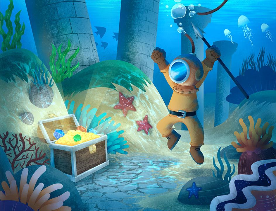
creating an illustration of a deep-sea diver and digital
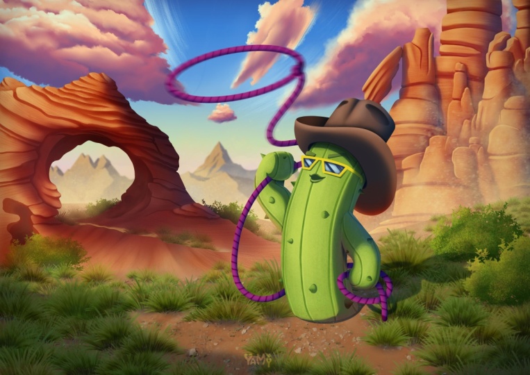
painting of a cowboy cactus. You often see this
illustration style in lot of children's storybooks. Essentially, this
illustration utilize those patterns and textures to define the shapes of objects. The style of the second
project is quite different. In this project, we will use
a painterly style approach. Since both of these projects involve lot of
advanced techniques. Before you get into the
projects, of course, you will first learn
the basic concepts and master all the techniques
require step-by-step. As the macro overview, I divided this online
course into eight chapters, apart from the
introduction chapter. In the first chapter, you will learn about
various transformation and distortion techniques, such as prospective, warp, cage, liquefy, mesh and so on. Then in chapter two, you will on our layer features, namely Layer Style, cloned
layer by layer and fill layer. Next, in Chapter three, you will learn
various techniques related to patterns
and textures. You will use various
pattern generators, such as multi-grade,
screen tone, SEX, butter, and so on. Then learn to create seamless repeating images using
the wraparound mode. Then in chapter four, we will discuss before
washing techniques. Basically, they are techniques
of utilizing photos or external images to speed up the illustration
creation process. Chapter five will be our
first big project chapter. Here, you will want to create an illustration of a deep-sea diver
looking for treasures. Initial law, you will master all the process in
detail from a to Z. In chapter six, you will
learn the ins and outs of the brush system in greta from the types of brush engines, sensors to help to create your own brush presets
and brush steps. With this, you will be able to create unique brush presets, such as creating C plans
or anemone is on-the-fly, growing rope in a single stroke, producing a grass field
in a matter of seconds using plants that you
designed yourself and so on. In chapter seven, you will on Pinterest style
growing techniques, or in other words,
digital illustrations that look like they were
created with a real brush. In this chapter, you will also learn various
cheating techniques. These are techniques
that can help you create illustrations
even faster. In chapter eight, for
the last chapter, you will utilize everything
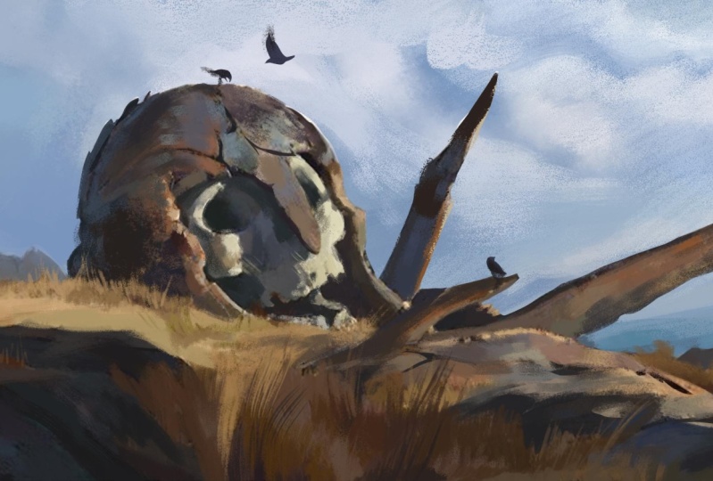
you have learned from the previous chapters to create a cowboy cactus illustration. Domain challenge of this
project is to create a painterly style illustration
as quickly as possible, but also be as flexible
as possible so that it is still easy if we have to make revisions to the
drawing in the future. Before you decide to
join this course, I need to remind you that this
course is not designed for complete beginners who have
never use Krita before. The curriculum. And new scores is designed
as the continuation of the basic level of course and intermediate
level of course, which I have realized before. So just to be safe, I recommend that you take two basic and
intermediate courses for us before taking this one. I hope this course can
be beneficial for you. Sell unwelcome.
2. Course information: Before we start
discussing lessons, there also for
important things you need to know for us
about the course. The first is the location where you can download
the exercise files. You can find and
download the files in the resources section
of this video. In case there is an
error or problem, you can also download the
files from the following lean. Please pay attention to
the capitalization of the letters because
Ling is case-sensitive. For your convenience,
I have combined and compress all the files
into a single zip file. Once you download an
uncompressed file, you all see that they
have been sorted and named according to the
name of the lesson videos. Next is the curriculum. I have structured the curriculum of the scores very carefully, less than us that you
learn from one video. We will be the foundation
for the next videos. That is why it is very important that you
take this course in the order avoid learning by
jumping around randomly. If you do that, at some point, you will get confused. Indeed, sometimes I repeat past lessons if I
consider them important. But of course, there
is no way I can repeat everything over and over
again in every lesson. The next thing that I need
to emphasize is that you need to practice
this online course. It's not all about theory. In fact, most of the lessons
are practical skills. If you really want to
benefit from this course, then there is no other way
but to do a lot of practice, at the very least, for each lesson video, try to practice it
yourself at least once. For this online course, I recorded all the lessons using a PC with Windows ten
operating system. So all the keyboard
shortcuts you will see in the videos
are for Windows. If you are using Linux, it shouldn't be a problem. S basically, Linux uses the same hardware and
keyboard layout as Windows. What might become an issue is if you are using an
Apple Mac computer, since the keyboard layout is slightly different
from that of a PC, you should anticipate
some differences also, keyboard shortcuts. At the very least, you may need to spend
a bit more time looking for additional shortcut references on the Internet. In general, you'll need
to swap the control key on my PC with the command
key on your keyboard. By now, you probably already know that Greta is
free and open-source. The official Krita
website is crito.org. What I want to stress
now is that you need to avoid downloading greta
from other unknown sources. Because it could be that the
software you download from other sources contains malware that can harm your computer. In terms of software version, when I started recording
for this course, creator was available
in version 5.1, 0.3, and then halfway version
5.1, 0.4 was released. So throughout this course, we'll be using create
our version 5.1, 0.3 and also what
Ocean 5.1, 0.4. This means that
all the features, DUI and also software bugs and limitations are relevant to the two versions
that I am using. If you find any differences
in lucrative you are using, most likely this is due
to the software updates. If the changes are
not so extreme, I might make an update video after the effect
that lesson video. But if the changes
are too extreme, I may have to save
them for later to be released as a new
separate course. The last thing that
I need to explain is regarding copyright issues. Throughout this
course, I might show some images or even
videos which are not. Mine, are created by me. I use discontents simply for reference or to help
explain lessons. Even if I use them, intercourse projects
or exercises, I already make sure that the
contents are royalty free. I never claimed that
these contents are mine nor were created by me. If I can find the
name of the owner, I will place it on top of
law corresponding content. But if I cannot, at least I will
put the URL offer. I got the content from.
3. Custom UI and shortcuts: In this video, we will
go over the UI layout in custom shortcuts
that now we'll be using throughout this course. We have already
covered the techniques in-depth in a basic
level of course. So I am going to review them quickly in this
video just to make sure we are on the
same page when it comes to a UI layout
and keyboard shortcuts. The first time you
install an open Krita, this is probably
what you will see. Two fully view the Crito UI. We need to open a
document or create a new one throughout
this course. Besides using a full HD
document or solution, or 1920 by 1080 pixels, I will also often
use the air for 300 ppi document preset
in landscape mode, especially for the two major
illustration projects. We have already
discussed in detail all the parameters related to documents in a basic
level, of course. So we won't go over them
again in his video. Click the Create button
to create the document. Once we have a document opened, we can see the
complete uy of Corita. What you see now is
the default UI layout. This is not the UI layout data we'll be using in your scores. If you want, you are free to use this default layout or
perhaps your own layout. But if you want to match your UI layout exactly to the layout that I
am going to use. You can follow these steps. First, click and drag the toolbox so that
it is at the top. We want all the two
ligands to be in one row. Then I prefer this at once
color selector Booker to be on the left side to move rocker because it is currently
stuck with another Docker. You need to click
this button first, then you can drag it
to the left side. Same thing with the
tool options Docker. We want to move it
to the left as well. Just below the advanced
color selector. We can adjust the width and also the height of this
broker if needed. Finally, I want to close this glass preset
Docker as we can access it above via this button or by
using the F6 shortcut. The less UI element
I want to change is the type of the Urban
Scholars selector. Currently, the center
area is triangular. I prefer to use the
square root type. To change it. You can click on
this small icon, then click here and just
use your preferred style. My favorite is the square one. Then click Okay to confirm. You can see the central area of the urban scholar select
data is now square. Next, let's discuss
the custom shortcuts. We all know that
keyboard shortcuts are very useful for
speeding up workflow. Throughout this course, we'll be using custom shortcuts lot. These are the ones that I
have set up and explained in a beginner and
intermediate level of courses just to
refresh our memories. Let's say you have
just installed Krita. I need to set up your
own custom forecasts. I'm going to show
you how to create just two of them in his video. For duress in Shallow, you'll be able to
do them yourself. Force, I want to set the letter Z for the free-hand
selection tool. Then secondly, I want to set the letter q for
clearing the selection. The official name for
this command is deselect. To configure a
keyboard shortcuts. You can open the Settings menu, then configure Krita, unopened keyboard
shortcuts category. Here, you can find specific commands by typing
the name in the search field. Let's try typing
freehand selection. Now the list is filtered to only show the free-hand
selection tool command. Click in this area, then press the button
that says none. Press the letter Z on
your keyboard and press. Okay. Next photo,
second shortcut. We can use the search field
again by typing disliked. We can see that this command already has a default shortcut, which is Control Shift a. It is a bit troublesome to use this default shortcut because we have to press three keys at once while we will need to
deselect command very often, we want a simple shortcut, but also don't want to
delete the default shortcut. So you don't click here, but weakly in the
alternate column area. Then click None button and press the letter
Q on your keyboard. Click Okay to confirm. It is. So you create custom
shortcuts in Krita. Again, this is the latest
of custom shortcuts. They die, we'll be using
throughout this course. In the future videos, I will probably only
mentioned the letters of the shortcuts are only
mentioned the command names. If you forget or get confused, just go back to this video
and look at this list again.
4. Transform tool free mode: In this lesson video, we will discuss the
transform tool. Previously in our basic and
intermediate Krita courses, we discussed how to
move Radius using the Move tool and also discussed the basics
of the transform tool. Just to remind you, these two tools are similar. Abba glands on the
shortcuts are similar. We can press T to activate the Move tool and Control
T for transform tool. But as the name suggests, the Move tool or feature
is only limited to move into layer or image
inside the selection area. If you want to do
a transformation that is more than just
moving the image, such as doing a
scale or rotation, then inevitably, you will have
to use the transform tool. For this lesson. You can use the file
I have provided. If you use the transform tool
with no selection at all, it will work on all pixels
in the active layer, e.g. we can select this layer and then press the
transform tool icon. We will get a bounding box that surrounds the entire
image on this layer. In this condition, we
can click drag inside the bounding box area
to change its location. Now, if we make a
selection force, e.g. with the rectangular
selection tool, then make the selection on just a portion of
the available image. When we have T with the
Transform tool again, you can see that the size of the bounding box becomes
smaller than before. And if we click Greco again, our transformation
now only affects the pixels inside
the selection area. I am sure you already
understand this concept. If you like to changes, you can press the Enter key
on your keyboard to confirm, or you can press
the Apply button in the Tool Options Docker. But if you change your mind, one to cancel the
transformation, you can press the Escape key on your keyboard or press
the reset button here. After you press the
Escape or enter key, you may find that the
bounding box disappears. You don't need to worry as long as the Transform tool is active, just click once
on a canvas area, then the bounding box of the transform tool
will reappear. Alright? You should know that the transform tool actually consists of six different modes. You can see this six modes
in a tool options to occur. This mode is the default mode, which is named free. The second mode is
called perspective. Then this is the warp mode. This is the cage mode. This is the liquefy mode, and the last one
is the mesh mode. Let's discuss each of
these modes one-by-one. Let's start with the
first mode called free. As I mentioned earlier, this is the default mode
of the transform tool. In this mode, apart
from moving the image, you can also rotate it. To do that, we need to
bring the mouse cursor closer to the control point
area in a bounding box, but not touching it. And they will see a
circular arrow symbol on a mouse cursor. In this condition,
we can click drag to rotate the image. Okay? If we move our mouse
cursor until it touches one of the lines
in a bounding box, you will see the symbol change
to two opposite arrows. In this condition,
if we click drag, then we are assuming
the image by share, I mean tilting or
skewing the image. I can press Escape to cancel
out the transformation. Then the last one is scaling. If we move our mouse
cursor to one of those square control points in a bounding box and
then click drag. We will scale the image. Alright? When changing the position,
scale and rotation, you can utilize the
Shift key to get more control over the
transformation process. Where new click drag to change
the position of the image. Pressing the shift
key will constrain the image to move vertically or horizontally depending
on which direction is closest to the
mouse cursor position. If you perform rotation while
holding down the Shift key, the rotation will
snap for 7.5 degrees. With this, we can
rotate the image by exactly 45 degrees
or 90 degrees, e.g. and finally, if we hold
down Shift while scaling the image proportions
or the ratio between the width and height
will always be fixed. This means that the image will not be stretched or squashed. Besides controlling it visually with the bounding box also provides various parameters of the transform tool in
the tool options darker. This will be very
useful if we need more detailed control our
transformation process. First, let's discuss
the filter parameter. Basically, this is to
determine the algorithm used by Krita only affect the pixels when
transforming the image. It will be too long
to discuss in detail the mathematical differences
of each of these algorithms. You can look up references online if you want to know more. In general, the
default filter by cubic is suitable for
almost all our needs. So you don't need to change it unless you are
making pixel art work. In this case, you
might want to use a filter code nearest neighbor. Next door radio buttons
on the right side will determine what
transformation and private torus will be
displayed at the bottom. If we set this to position, we can set the x and y
coordinates of the bounding box. The changes we make visually
on a canvas will affect the value of radius two
parameters, vice versa. The changes we make to
these two parameters will also affect the location of
the image on the canvas. Now, if we set this to share, then we can adjust dx tail
and also the white tail. If we set this to scale, this parameter is the scale for the width are
horizontal direction, and this is the scale for the height or
vertical direction. Now of all these
transformation types, the most unique one is rotate. Because apparently in Krita, the transformation for
rotation is calculated in 3D. So the rotation that we
have been doing with Juliano Canvas is actually
just using the z-axis. If you want, you can
try rotating using the y-axis as well
as the X axis. You can also try
this camera height parameter when
using 3D rotation. This will change the perspective
distortion of rotation. Personally, I find managing 3D rotation with this mode more difficult or troublesome when compared to the second
mode called prospective. Especially e.g. if we want to apply a texture to the
surface of an object, we will discuss this
more in a future lesson. For now, let's finish discussing the parameters
of the free mode. We can press the reset button to return everything to
its initial state. We use these buttons
to determine the location of the pivot point. The pivot point
is the point that serves as the center
of the transformation. If you notice in the center
of the bounding box, there is a point that looks
like a sniper of scope. This is what is called
the pivot point. If we want to move it, hover the mouse cursor
on top of it until the cursor turns into a
pointing hand symbol, then you can click record to relocate it to another location. Now, if we try to
rotate the image, we can see that the rotation is centered on the new
pivot point location. If you want to
read the new pivot point default location
of the center, just press this button. You can also position to pivot, point to eight other points around the bounding box
with these buttons. Now, you might be wondering, what is the benefit
of this button. This button will be useful when we are using our
scale transformation. The scale process is a bit
different because by default, the center point of
the transformation is the point opposite to the control point
that we click drag. So if we click this one, this point will be the
center of the scale. Likewise, if we
click drag this one, then the center of the
scale will be this point. But by activating this button, we will consistently use reactive pivot point location
as the center of the scale. If you prefer a shortcut, you can use the alt key
to activate this feature. So even if this button is off, scaling we're holding all, we will make the scale
process always use the pivot point location
as the reference. You can also use Shift and Alt together if you under
scaling to be proportional. Alright? Finally, the four buttons at the bottom from Luke
of the symbols, you might have guessed
their functions. This is for mirroring
the image horizontally. And this one is for mirroring
the image vertically. Then we can use this
button to rotate the image 90 degrees
counterclockwise. While this button
is for rotating it 90 degrees clockwise.
5. Perspective and Warp mode: In this video, we will continue our discussion on
the transform tool. Now, we will focus on a
Perspective mode and the mode. For this lesson, we will use the file from the
previous lesson. In the intermediate
level, of course, we actually already discussed anyone used this
perspective mode. So let's just assume that
this lesson is a refresher. As the name suggests, we use the perspective mode to create perspective
distortion in the image. At first glance, the bounding box is
similar to the free mode. However, the only thing
that is the same as before is the click drag
operation for a moving image. The essence of the
prospective function lies in the four control points
located at the corners. We can use these control
points to distort the image. We can also utilize the
points in the center of the line to move to
corner points at once. You can see that by using
the perspective mode, you can easily apply a texture to the surface of a wall, e.g. or create shadows on
the ground as we did in the intermediate course
or other similar tasks. What is unique about
this mode is that if we position two control
points close enough, then we will see a vanishing
point colored in red. We can move this vanishing
point to any location we want. If we bring this control
point in closer also, then we will see two
vanishing points at once. While the image is distorted, we can still scale and
share with the help of the parameters in the
tool options Docker. Well, we cannot do is rotation. Let's say we want to reduce the size of the image
proportionally. First, we need to enable
the scale parameter. Then turn on this
chain icon so that the scale is uniform
or proportional. Then move the mouse cursor to
the width or height fields, and then spin the
scroll wheel up or down until we get the
size that we want. N as before, you can press the Apply button or press Enter on the
keyboard to confirm. Otherwise, you can also
press the reset button or the escape key on
the keyboard to restore the image to
its original state. The next mode is the warp mode. As with the perspective mode, this mode also distorts the image by utilizing
control points. However, instead of having
only four control points, we can set the warp mode to provide as many control
points as needed. In the warp mode,
these control points are called anchor points. Now, you should know that distortion mode can walk
into different sub modes. The force is the grid mode, or what is called sub-divide. And the second is
the custom sub mode, or what is called the Draw mode. But before we discuss
these two modes, Let's first discuss
the functions of these two parameters. If we move this point
to the right, e.g. and we try to change
these parameters. Each option here uses a slightly different
algorithm to distribute the strength
of the anchor points. In general, the default
option is the most flexible, while the strongest
option is the most rigid. Although the terms flexibles and rigid or not very precise, either unit or CD
effect yourself to determine which algorithm is more suitable for your needs. For now, I will use
the default algorithm. Then this flexibility parameter determines how much elasticity
is applied to the image. E.g. if I move this
anchor point to the left, now the image still
looks normal. But if I increase this
flexibility value gradually, at a certain point, the image will look
like it is folded back. Generally, I never use
a value above 0.2 for this flexibility parameter to avoid image from
being folded back. For now, we can press the reset button to restore
image to its original state. Next, let's discuss the grid
or sub-divide sub mode. In this mode, we can determine the number of anchor
points in image. The higher the sub-divide value, the greater the number
of anchor points. And a more detailed we can
get in distorting the image. But of course, we
do consequence that there are more points that
we need to fine tune. The second sub mode, custom or Bro, we're in
this mode is active. We can position the
anchor points freely. Just click on an image to
add a new anchor point. Click drag on the
existing anchor point to change its position. Repeat the process
until the number and position of the anchor
points suit your needs. After that, you can
activate or lock the anchor points to the image by pressing the
lock wins button. When this button
says unlock points, in this condition, we can move the anchor points around
to distort the image. If you want to rearrange the position of
the anchor points, you need to press the
unlock points button. Then just make the
changes that you want. You can press block
points button again. We want to go back to
distorting the image. You can also delete
all the anchor points you have created by pressing nuclear
points button or simply switch back to
the sub-divide mode. This will also automatically delete all the custom
anchor points. We create a integral mode. Alright? At this point, you
might be wondering, can we also do standard
transformations such as move, rotate, and scale interval mode? The answer is yes. We can weather in the sub-divide
mode or the Draw mode. If we need to move the image, just click drag within
the Anchor Points area, but not touching any
of the anchor points. Next, to perform rotation, you can hover the mouse
over the area outside the anchor points
until the cursor becomes a circular arrow symbol. Then click drag to
rotate the image. And finally to scaling. Well, the cursor looks
like a circular arrow. Hold down the Control key. This will make the curves look like an up and down arrows. If you click Greg
and his condition, we are performing a scale. Now, it is important for you to know that scaling in warp mode, we are actually minimizing or enlarging the distance
between the anchor points. This is different from the ordinary scale operation
inside the free mode. You can see the effect better. Wellness scale is overly large
or when it is too small.
6. Cage mode: In this lesson video, we will discuss the next term. So I'm tool mode called cage. To use the cage mode, the method is similar to how we use the Warp mode
into drove sub mode. So we need to first
add or refund anchor points around the
image that we want to reform. You need to be careful though, because if there are pixels not enclosed by
the anchor points, they will not be
deformed. Just e.g. I. Deliberately left out the
bottom part of this image. To stop deforming the image, you can click again on
offer us anchor point. Or you can simply select the D form selection
option here. Now, we can move the anchor
points to deform the image. You can see that the
pixels at the bottom area that we intentionally
left out or not deformed. If you want to edit the
anchor points again, simply in a body and edit
anchor points option. However, you need to keep
in mind that by doing this, older formations you made
earlier will be lost. Also in Krita D add, edit anchor points mode. Can only add and
reposition anchor points. There is no feature yet. Specific anchor points. At least this is the
case in a version of greta that I am
currently using. If you want to delete
anchor points, you can only delete
them all at once by pressing the Escape
key on your keyboard. Next, this granularity
parameter determines the deformation quality of blue pixels performed
by each mode. But the value is
inversely proportional. It means that the
smaller the value, the better the
quality of the pixels deformation with the consequence that the process
becomes longer or more demanding on your
computer's performance. Whereas a large value will
result in a lower quality, less demanding on
computer performance. Now, this granularity
parameter is divided into two values,
preview and real. The difference is that the preview value is
used to determine the quality that
we see directly on Canvas when we move
the anchor points. Whereas the real value is the final quality
when we press, Enter or press the Apply button. So generally, we want to preview value to be larger
than the real value. In practice, you
don't need to change these two values except when the image you want
to do form is very complex and the
result looks poor. You may want to erase this real value to
a maximum of four. At this point, you
might be wondering, how is the cage mode different from the
previous warp mode? That is, where we use
the draw sub mode. The first difference is
that the anchor points of each mode must
form a closed loop. As for the warp mode, you can place the anchor
points anywhere freely. The second difference is that the distortion effect of the
cage mode is more localized. It will not affect
pixels outside the enclosed area formed
by the anchor points. Whereas in a warp mode is
more widespread or global, changes to an anchor
point will more or less effect all
pixels in an image. Just e.g. let's say we want
to change the position of the arm so that it
points slightly downwards. If we do this with the warp
mode in a row sub mode, we can create anchor
points in a middle of the hand area like this, e.g. we can try to lock the points and then drag
the anchor points around. You can see that the
head and rest of the body will try
to follow along. We can try to localize
the effect by pressing the unlock bonus button and then add anchor points to
the head and body area. Then try turning on
the lock points again. If you want to move several
anchor points at once, you can hold down
the Control key and click on the anchor
points, the T12 slack. This rapid anchor points
will appear in red. You can try rotating all these selected anchor points and also try to move them. But you can see for yourself, it is difficult to create a localized effect
with the warp mode. Now, let's try this challenge
with the cage mode. Makes sure all the pixels that we want to deform or inside the enclosed area formed by the anchor points and pixels that we don't want
to deform or outside. Click again on a
starting point or enable the selection option. Just like before,
we can hold control to select multiple
anchor points at once. Lived with two anchor points at the base of the unselected. After that, we can rotate all these anchor points
or change their location. Yes, this area looks a bit
messy, but in general, the result is much more workable then what we
get from doo-wop mode, at least if we need a
more localized effect.
7. Liquify mode: In this lesson video, we will discuss the next
Transform Tool mode called Liquify. In short, liquify is
an image distortion of feature that we can control as if we are using
the brush tool. If you have used
Photoshop before, this feature is similar to the liquify filter in Photoshop, there is probably why the
name is also similar. To use this feature next year, the layer you want
to add it is active. You can also limit
your work area by first making a
selection if you want. Make sure the transform
tool is active. Then click on the liquefy mode whose symbol is similar
to a water drop. On the left side. We can see that liquefy provides various types of sub tools. The first tool, which
is called move, can be used to shift the
pixels in the image. Let me click the
reset button first. The next tool is scale. We can use it to make the pixels inflate a balloon
filled with air. To reverse the effect, you can enable the
reverse option here. Or if you prefer a shortcut, you can hold down
the Control key while applying brushstroke. With this image will appear to be shrinking
towards the center. Then the next tool is rotate, which we can use to rotate the pixels as if we
are steering them. Just like before. We can add the reference
option by holding down the control key to change
the direction of rotation. Next door is offset, which we can use
to shift pixels to the right side of the cursor
moves in one direction. E.g. if I click drag
from top to bottom, all pixels in a brushstroke area will be pushed to the left. If I click Gregg
from bottom to top, then the pixels will be
pushed to the right. You can also reverse
the direction with a reverse option by
using the Control key. At first glance, this tool
is similar to the Move tool, but it is more
suitable for shifting many pixels at once
in an elongated area. The last tool is undo, whose function is to remove the distortion effect
that we have created. Or in other words, return 0 pixels to
their original state. Now, let's discuss the parameters
on the right-hand side. The first thing that we
need to realize about all these parameters is
that they are contextual. This means that not
all tools can have all the parameters
active at the same time. E.g. all these tools
have the mode parameter. But if we activate
the undo tool below, the mode parameter is not
available for this tool. What we're going to discuss
first is the size parameter. Because this is the parameter that you will most likely
change frequently. As the name suggests, the size parameter
determines the size of the brush or circle that you
see on the mouse cursor. The smaller the value, the smaller the area of this source that
will be affected. And larger the value, the wider the area of pixels
that will be affected. The shortcut to
change the size value is similar to the
freehand brush tool. So you can hold
down the Shift key, then click the mouse
to the right or left. You can also utilize
the pen pressure to affect the size value by
activating this button. Next is the amount parameter. This parameter is closely related to the mode
parameter above. The amount parameter
controls how far the pixels will move when we
drag to brush on the image, you can set this
value very high. But I recommend that you don't use a value of more than 0.1. That is, if you are using
the built up mode here. Why? Because in built-up mode, you can apply brush
strokes multiple times 2D image and a distortion effect will also be
continuously edit. But if you set the mode
parameter to wash, then Krita will use the amount
of value here differently. E.g. I. Set this to one. Basically, now, this
amount value determines the maximum distance the pixels can move from their
original location. So in wash mode, we cannot keep adding distortion
effects to the image. There is a maximum limit at
which the pixels will no longer be able to move away from their
original locations. There is y, generally, you should set them
on value here. Smaller when we are
in the built-up mode, and larger when we
are in the wash mode. Now, because in wash mode, demand parameter is to determine the maximum distance
the pixels can move. This mode needs an additional
parameter to set how far or how fast the pixels move each time we
make a brush stroke. That is the function of
this flow parameter. So again, this flow parameter only appears when we
are in watch mode. And its function is to
determine the strength of each brushstroke that
we make on the image. For now, I just use the built-up mode a nicely at
the amount of value to 0.1. The last parameter is spacing. Basically, when we do
brushstrokes on the image, creator does not
continuously this toward every pixel in the
image without pausing. Instead, Krita doves it
at certain intervals. You can imagine the brush
engine and Krita machine gun. This spacing value determines the time interval between bullets ejected by
the machine gun. The smaller the value, the more bullets it
spits out for a second. In contrast, the
larger the value, the longer the interval between
one bullet to the next. Therefore, the number of bullets fired per
second will be less. E.g. if I use a value of 0.2 and make a brush
stroke like this, you can see the effect
has almost no pulses. But if I reset it and set
the spacing to the maximum, which is three, e.g. then click drag again. You can see that
there is a pulse or interval each time Krita
applies to the distortion.
8. Mesh mode: In this lesson video, we will discuss the transform
tool mode called mesh. At first glance, mesh more a similar to wrap mode
or perspective mode. The difference is that the control points
have Bezier handles. In the intermediate
level course, we discuss vector,
anything in depth. So you already know what
bathes the handles are. Just to remind you, basically, handles are extended
control arms attached to the
main anchor points. We can use basically handles to adjust the curvature
of the segments, connect up to the points. Apart from regular handles, we can also adjust
the curvature, Berkeley dragging
directly on a segment. This technique will
also affect the Bezier handles attached to
the segment automatically. In fact, you can click
anywhere within the mesh area to affect the hand-offs and segments near the
mouse cursor location. Then, similar to
the previous mode, you can also perform rotation
by clicking, dragging out. So like the mesh area. You can also scale by
holding down the control key and click
dragging up or down. At first glance, the mesh feature is
similar to vector objects. Both mesh has an advantage over ordinary vectors is that
the points can be branched. If we increase the column and
row values to three, e.g. you will see branching points
that have three handles. Some even have four handles. If you want to control
multiple points at once, you can hold Control and just click on the points
you want to slack, the selected points
will appear blue. In this state, you can rotate all the selected points by click reading outside
the mesh area. You can also scale the
selected points by holding Control and click
dragging up or down. Then if we want to move them, you can hold Shift and click
drag outside the mesh area. Besides using these
columns in row parameters, you can also utilize the Control and Alt keys
on your keyboard to add, subtract, and even slide the row or column
lines in a mesh. To do this, you need
to hold down control. And at the same time. While in this condition, if we click or
click on a segment, Krita will create a new line perpendicular to this segment. So you can add rows or
columns using this technique, depending on which
segment you click on. If you hold Control
and Alt and then click Gregg or no point
in the boundary area. You can move the entire line, connect up to the point. And finally, if you
click and drag out a point on a border
beyond the mesh area, Krita will erase the whole line. So again, Control Alt and click on a segment to
create a new line. Control, click drag on the
point in a border line. Those like the position
of the line and Control Alt Click
drag to the outside of the region to
delete the line. Now, let's take a look at
these three check boxes. The first one is to
show or hide the base, the handles in the mesh. The second one is to determine the default behavior
of the handles, whether they move
symmetrically or not. When this option is on, moving one handle
will automatically move the other handle
on the same line. If this option is off, they're moving or handle will not affect
the other handle. If you prefer to use shortcuts, you can hold down shift to reverse the condition
of this option. So if this option is on holding Shift while
clicking on or handle, the movement will not
affect the other handles. But if this option is off, holding Shift and
moving the handle will also move the
neighboring handles. All right, in a current version of pre-taught in I am using, there is a slight bug that makes this less option not work. Increase our version
of five beta, this picture walked
in version 5.1, 0.3 that I am using now, it doesn't work anymore. But don't worry, because this feature is actually
not that important. Basically, if you have two handles that are in
extremal position like this, the segment line that is
affected will not be broken. It seems that this
feature is now active by default without us having
to enable the option. So for now, you don't need
to fiddle with this feature. Seems it has no effect.
9. Transform mask: In this lesson video, we will discuss the Tromso mask. You can use the file
I provided or you can use your own
file if you prefer. Before we discuss
the transfer mask. For us, you need to realize that all the transformations
and distortions that we do using
the transform tool directly on an image
or destructive, meaning the original
information of the image may be lost or
the quality may degrade. Indeed, Greta has
a unique mechanism to preserve the original
quality of the image. E.g. if we rotate and
minimize this image, then click the Apply
button and then we scale this out again and
rotate the image again. Krita is able to restore the image quality to
its original state. But this mechanism only works
if we haven't performed any other operations
on the layer or haven't saved and
close the file. Just for another example, if I scale this image
again and then rotated. But now I draw a few brush
strokes on the image. At this moment,
creator no longer preserves the initial
state of the image, except for the one in
the annual history. So if I try to enlarge
the image again, you can see the image has been degraded from its
original quality. For now, you can still undo it, tourist or the image
to its original state. Now, if we want to transform or distort using the
transform tool, but non-destructively, we
can use the transform mask. We already know about masks from the basic and
intermediate courses. Essentially, masks or
additional information that we can attach to a layer. Whereas a transfer mask, he is a type of mask. You can hold transformation or distortion information
from the transform tool. The way to use it is as follows. Force makes sure the
layer we want to apply the transformation
tool is active. Then press the small arrow
button on the side of this plus button,
Select and Mask. Now, when we want to
use the transform tool, instead of selecting the layer, what we need to select
now is the Tromso mask. In this condition, we can use the transform tool as usual. We can also perform the various distortion modes provided by the
transform tool, e.g. we can apply perspective
distortion to the image. Because we apply the
transformation to the mask, the original image on
this layer is not harmed. We can turn this mask on or
off according to our needs. And like any other mask, we can move it from
one layer to another. Currently, the
perspective distortion has moved to this layer. If we drag it back with the mouse or with the
down arrow button. Now the image on the first
layer becomes distorted. Again. You can also duplicate the Tromso mask as you
will duplicate the layer. And that is by
right-clicking and selecting the duplicate
layer or mask command. Or with the shortcut Control J. You can move the duplicate
result to another layer if you want to delete the
transfer of mass, it is also the same as deleting
a layer mask in general, you can press the trash
icon or you can also press the shortcut Shift
Delete after we discussed the various features
related to the thumb. So mask, we also need to know it drawbacks
or limitations. The first drawback is that
a transom mask can only accommodate one type of
transformation or distortion. If e.g. you want to apply both worlds and
cage two or layer, then you will need
to create one term. So mask for the warp mode, another term, so mask
for location mode. This applies to
other modes as well. The last drawback
you need to consider is the computer
performance issue. As with other non-destructive
techniques, thumb, so mask will put more burden on your computer performance compared to destructive
techniques, especially if you
use many trans so masks stacked on
top of each other. And also use complex
distortion modes, such as smashed a
liquefy, just e.g. if we add a chromosome
mask to this layer, then we apply the
liquefy distortion. We can break some
pixels around e.g. like this when we hide and
try to unhide these terms. So mask. Sometimes creditor needs a few seconds to
display defect again. So those are some
considerations if you want to use a brown
so mask on the layer.
10. Deform brush engine: In this lesson video, we will discuss distortion or deformation techniques
using the brush tool. Besides using the
transform tool, we can also perform this torsion similar to the
liquefy feature using only the free hand
Brush Tool for this crater provides
three brush presets. By default, they are
distort move this thought, grow and shrink.
This thought move. Brush Preset allows us
to track pixels around. This is like the move more
into liquefy feature. Then we can use the
distort grow to inflate the pixels as if they are
a balloon filled with air. And finally, with
the restored string, we can shrink the pixels as if they are being pulled
towards the center. So both grow and shrink. I would like to scale mode, you know, liquefy feature. At this point, you
might be wondering, what about the liquefy mode
that spins the pixels around? Is this also available
in the brush tool? The answer is yes. But we need to
activate it manually through the settings inside
the brush editor window. We can open the brush
editor by pressing this button or by pressing
F5 on your keyboard. We will discuss how to set the brush parameters more
in-depth in a future chapter. For now, let's just focus on how the deformation
brushes work. If we click on this button, it will open the
brush presets list. You will see a pull down
list called engine. If we click on it, we can see that Greta has different types
of brush engines. The number is constantly changing from
version to version. Integrated version 5.1, 0.3
that I am currently using. There are 16 types of brush
engines that we can use. Now, if we select
the D form engine, I will filter the list
to only display the brush presets that use
the deform engine. And as expected, the three brush presets we
discussed earlier appear here. Now, if we select the
default brush again, let's close this list to free up some space in a deform
options category. In addition to the Move, grow enshrined is torsion modes. We can also see the other modes. Let's take a look
at these modes. The swirl CCW mode is for rotating the
pixels counterclockwise. While swear or C W is for
rotating the pixels also, but in a clockwise direction. Then the rest are
additional modes that we cannot find any liquefy
transform tool mode. The force is the color
deformation mode. This mode is similar
to blurring, but by randomizing the
position of the pixels. Then the lens zoom
out mode is like duplicating the pixels and scaling them in multiple times. In contrast, the lens
zoom in mode will duplicate the image and scale
them out multiple times. So those are the various modes that the D form brush
engine supports. You should keep in mind that although using this brush engine feels more
instantaneous compared to using the liquefy feature, the final quality of
the brush deformation is lower than what you
can get from liquefy. The results of the
brush method tend to look more blurry than
the liquefy method. The second row vec
is that since we can only apply it
directly to the image, the brush deformation
method does not support
non-destructive workflow. Inevitably, the image
quality will be degraded.
11. Layer styles: In this lesson video, we will learn about layer
feature called Layer Style. What layer style? The first two are especially visual effects
attached to layer, such as drop, shadow in Roseto, outer glow and so on. If you have used for osha
Affinity Photo or GIMP before, the concept is
exactly the same as the Layer Style in the software. To access this feature for us, makes sure the layer you
want to use is selected. Then you can open
the Layer menu. Choose Layer Style. Or a quicker method that I recommend is to
right-click on the layer. Then select this
option layer style. Crito will open a window
called layer styles. You should note that in
Crito version 5.1, 0.3, which I am currently using, some features of the layer style are still under development. E.g. we cannot use the
Blending Options category yet. Likewise, there are
some parameters in some of the styles. They're still don't work. In this lesson, we will only try to customize the drop
shadow parameters because to discuss
all the parameters of all the existing styles will
be very time-consuming. At least understanding
the work in concept, you have enough fundamentals to export the other
styles on your own. So let's try activating
the drop shadow style. You can see that
the star image on the raster layer now has a shadow that falls
towards the bottom right. Now, active reading
an effect doesn't necessarily open the
parameters of the effect. You need to click on the name of the drop shadow style force
to open its parameters. We can set the type of
the blending mode here. Then we can set the
color virus box, e.g. let's make it a dark blue color. The opacity parameter
is probably obvious. Basically, it is for adjusting the transparency
of the shadow. Then we can set the light
direction in this area. We can flip the
direction horizontally, flip it vertically, or flip it horizontally and
vertically at the same time. If you enable this Use
Global Light option, then all other styles that
use a global light source will also change according to the light direction
we've said here. But if we turn off this option, then ruptured or style
of this layer becomes independent from the settings of other styles in
the same layer. Styles on other layers. Then this is for setting the distance of the shadow
from the image object. The spread value is
used to determine the area of the shadow that
is sharp or not blurry. If it is zero, then the shadow gradually
becomes blurred from the start. If it is 50 per cent, then the shadow will
start to become blurry. Halfway of resistance value. If it is 100%, lineages of the shadow
will be fully sharp. The size parameter
determines how strong the blurring effect
is supplied to the shadow. As for the parameters
in this area, they are all still
under development. So let's just skip them. This option also does
not work properly. Originally. If we activate this option, the star image will disappear, but the drop shadow color will
still be visible or right. We can enable multiple layer
styles at the same time. If we want e.g. we can enable Bevel and Emboss, texture, stroke, and so on. Now let's turn off the stroke style and
then we click Okay. If you notice layers that have styles will have an
additional icon that says fx. You can press this icon to
show or hide the layer styles. Pressing the fx icon is the same as opening Layer
Styles window again. And then turning on or off
the nipple effects checkbox. Alright. What is unique about layer
styles is that you can copy, paste them from one
layer to another. We can also apply styles
to vector layers, e.g. we can right-click
on this layer, then select copy layer style. If you notice this layer is
actually a vector layer, we can right-click
on this layer, then select Paste Layer Style. Now, this vector layer uses
the same layer styles as this paint layer to edit
the layer style of layer, just right-click on the layer and then select
layer style again. For now, let's turn off
the drop shadow style, and let's turn on the
inner shadow style. Don't forget to click
on the style name also to reveal the parameters. As you can see, all
these parameters are similar to the drop
shadow parameters. Do only difference is that
the shadow effect is now applied inside the image
area instead of outside it. This makes it look
as if the starship is a hole that goes
inside the surface or it makes it look as if
the background layer is white paper that has been cut
out to form a star symbol. The last thing that
I want to show you is that the effects of this layer styles are
dynamic and non-destructive. E.g. if I select this
yellow star vector shape, then I rotate it with
the Select Shapes tool. Or even edit the points
with the Edit Shapes tool. All these changes automatically
affect the layer style. Indeed, sometimes
script that takes a few seconds to
refresh or update. You can also e.g. use the brush tool and
draw on this raster layer. The styles of the corresponding
layer will change dynamically according to
the condition of the image.
12. Clone layer: In this lesson video, we will discuss
the cloned layer. Essentially with this feature, we can duplicate one
layer into many layers, but the duplicate
layers are still bound, are related to the
original layer. This means that if you've
changed the original layer, all of the duplicate layers
will change automatically. We can vary the duplicate layers non-destructive free with the help of Thomson mask or
other nondestructive methods. At this point, you
might be wondering, what do we need
this feature for? Indeed, if you are alone
creating an illustration, this feature is
not too important. But if you are working in a team or in a production process, e.g. making a video game or
making an animated movie. You will see and appreciate the importance of this
feature. Just e.g. what you are looking
at wipe now is a screenshot of a mobile
game called odd model. You can see lot
of image elements that are used repeatedly. Sometimes the repetition
is very obvious. Like this wooden platform, e.g. sometimes the repetition
is sub-total. For instance, this grasp
pattern is actually repeated. The same goes for these bushes. The one at the front is actually the same as the one at the back. Only Barker, sometimes
the same element is made squash or stretch to
make it look less uniform. Other times, they are flipped
like the plant at the back. Technically, the
image element is created only ones using
a graphic software. Then in a game engine, the image is mapped as
a texture on a polygon. We can duplicate the polygon and tweak the vertices
to vary the shape. And we can also apply certain
shaders to vary the color. With this technique, the time to develop the game
can be shortened. In addition, the performance
of the game can be improved because this will
minimize the need for memory. It can also reduce the size of the file that the player
needs to download. Another example is this
game called Raman. You can see that
the two elements of the fisherman's house at the
back are actually the same. They are just made slightly
different in size. This screenshot is also
from the game ramen. If you pay attention, these columns or pillars are
actually the same image, but with the size and
color effects of variable. Apart from games,
you can also find this duplication technique in the movie or animation industry. A good example is the movie
series called Puffin rock. You can see that these
flowers are actually the same image to three. To three. While this one is the flipped
version with this flower, n is one removed so that
they don't look too uniform. The point is, this
duplication technique is commonly used in the
professional world. And to simulate it, we can use the clone layer. Let's see how we can
use the colon layer. In his file that
I have prepared. There is one background
layer, two layers, each containing a pillar image
with a different design. We can hide the spirit
to layer for us. Let's assume that now we want to create three layers
from this pillar. One layer, we want to place
them on the left side of the image as if they are lined up further away from our eyes. For this, we can select the
layer we want to duplicate, which is pillar one. Then click on this
small arrow button and then just clone the year. We have just created a new layer right above
the original layer. Let's just change
its name to C1. You can distinguish
a colonial from other types of
radius by its icon, which looks like two pieces of paper stacked on
top of each other. The clone layer is unique, is that we cannot grow on it. To move it directly, we can only use the Move tool. If we want to transform or distorted with the
transform tool, you need to apply a
transform mask first. Once there is a ton So mask, then we can use the
transform tool. Let's set the scale
while holding down the Shift key and place
it on the left side. Next to create the second
and third pillars, we can simply duplicate this
layer by pressing Control J. Move it so that it is below C1. Rename it to C2. Then select the mask,
and then click. You've seen the transform tool make this layer of smaller n, position it so
that it appears to be further away
than the first one. Next, we can repeat the process to create
the third pillar. Just duplicate this C2 layer, move it to the bottom, named this layer of C3. And we can set the scale
and the position as well. Right? Now, even if we
hide the original layer, the duplicate layer, auto clone layers will
still be visible. Besides terms of mask, we can apply various other
non-destructive techniques to do colonials. E.g. we want the
two pillars to be covered in a fog or
some air particles. The farther away they are, the more subtle we want them
to look for these ions. To show you two
different methods. Follow second
pillar array of C2, we will use a Layer Style. So right-click on the layer, then choose Layer Style. David unopened a color
overlay style parameters. Change the blending
mode to normal. For the color. We want to sample this bright
blue sky color. Click the color box, then click the button
for color sampling, and then click on the area of this guy that we want to sample. Click Okay, change the opacity
of strength TO about 25%. I think this is enough. For the second pillar. We want to try and explore
a different technique. We will use a filter mask. So makes sure the
layer is active, then create a new filter mask. We want to use a filter called
the slope offset power. For your information,
this filter is mainly used for
color grading. Simply put, slope
controls Dr. colors, offset controls the dark colors, and power controls the middle
of colors, but in reverse. For now, we only want to
utilize the offset parameter. We can click on
this box and sample the color of the sky
behind the pillar. The goal is to get the
color or the hue value. Originally, the darkest
shade or color is black. So starting from the black point slightly and drag it
towards the color we've sampled earlier until you are satisfied
with the appearance. Then click Okay, and
click Okay again. Now, because the color layers are still connected to
the original layer, if we edit the
original layer, e.g. we draw some random
brushstrokes. You can see all the Coronavirus
change automatically. The last feature
of the color layer that you need to know
is set copied from. Let's say, we want to
change the design of these pillars to match the design of the
pillar two layer. We can do this easily by selecting all the clone layers
that we want to change. Right-click on one
of these layers, then choose Set copy from. Remember, this command only appear if we right-click
on nuclear layer, then we can select
the layers name that we want to reference
from this list. Choose pillar of
two and click Okay. And here is the result. You can see that even though
the pillar resign has now changed to follow the pillar two layer all
the transformations. Another non-destructive
effects that we created earlier, arrow
still preserved.
13. File layer: In this lesson video, we will discuss the
file layer feature. In short, the
function of the layer is very similar to that
of the Cologne New Year. We use both to create multiple duplicate
layers which are still related to
the original image. What makes them different
is that occluding ear works locally or only within the
scope of a single document. Whereas layer works externally, or in other words, it references an image that
exists in another file. This file layer
feature will be very useful when we are
working in a team. E.g. an artist is assigned
to work on the background, another on a foreground, another own plants
or trees, and so on. Each artist creates
their own files. These files can be
dynamically combined into the final composition
utilizing five layers. When there are changes
to the original files, they will be automatically reflected in the final
composition file. To try out the fire
layer of feature, we'll be using the file
from the previous lesson. In addition, I will also use this file which
contains an image of large rock with a bit of
snow on some of its surface. Let's assume that
we want to place this rock image into
the first file. Open the file. For now, we can hide all
these pillar layers. To create a file layer, just click on this
small arrow button. Then choose for our layer. We can specify a name for
the new layer, e.g. rock. Then press this folder button
to open the file browser. Select the Crito file, did I prepared earlier? Now, you need to
remember that besides the Crito file ordered
of craft format, you can use any image
file format supported by Krita reference photo layer. You can use Photoshop format
files such as PSD and PSB. You can also use
the file formats. You can even use vector
images in SVG format. After we select the image file, click the Open button. The last step is to determine
the scale of the image. We imported essays or do we auto scale it to
fit the canvas area? Or do we adjust it based on its resolution or
pixels per inch value? Either option is
actually fine because later we can freely apply the
scale using transform mask. So just click the OK button. And here is the result. We can tell a PHY layer by
its icon that looks like two circulating
arrows. Going forward. Although clone layer
of features we discussed in a previous lesson, can we apply it to
the file layer e.g. you can move it directly
with the more full. And to use the transform tool, you need to apply a Tromso mask. First. You are afraid to use any transformation
or dispersion mode. For instance, I use perspective distortion,
forest fire layer. You can also duplicate it
into multiple layers or apply a filter mask
layer style if you want. Alright, now if we open the original file and then we make some
changes to this file. Let's say some brushstrokes or perhaps just hide or
unhide of certain layer. The changes will
automatically be reflected in all of our layers. Deduce this file
as the reference. But remember, you have to save the file first so that
Krita can read the data. After we save it, we can go back to the main file. And as we expected, this bolder image no longer
has snow on its top surfaces.
14. Fill layer: In this video, we will
discuss the fill layer. Basically, fill layer is
a dynamic layer there procedurally display's
color, pattern or gradient. By procedural, it means
that the process is done by the software
and we, as users, only need to set the parameters
to create a fillet here, the method is the same as we create other types of layers. You can click on this
small arrow icon and then choose Fill layer. But before we continue, if you notice from
the basic level, of course until now, we have covered all types
of masks and layers, except for one Duffy layer. So after this lesson, we have officially covered auto mask and layer
types in Krita. Alright, if we click on
his fellow eruption, Krita will open a window
called Fill Layer Properties. We can specify a name for
the new layer in his field. But this is not too
important because we can change the name
leader in layers darker. Domain function of the fill
layer lives in his list. Here we can specify the type of image generator or the program that will generate
the major way. The color option
is the simplest, as it will only fill the
layer with one solid color. The gradient option, fill the layer with
a gradient color. Then this is multi-grade. This is pattern. Then this screen tone. Next is SEX borrow. Unless one is simplex noise. A few versions ago, created only had three
options for the fill layer, namely color, python,
and simplex noise. Due to rapid development, there are now seven types of image generators
that we can use. By the time you
watch this video, there might be more added. In this lesson, we will only explore the color and
gradient options. We will discuss the
other image generators in the next chapter. For now, let's use a solid color and we can change the
color e.g. to orange. Then click Okay. You can see that the icon of the fill layer has a symbol
similar to a diamond. Just like a regular layer, you can adjust its
blending mode and opacity. If you want to change or
adjust the content again, you can right-click
and select properties, or you can simply press
F3 on your keyboard. E.g. we can change the
color to something else, or we can change the
file type to gradient. If you notice the contents of the General tab similar to the parameters
in a gradient tool. Meanwhile, the parameters
in a gradient color of stab are similar to those
in a gradient editor. We have already covered both of them in-depth in
the intermediate level. Of course, there is no need for us to repeat
the lessons here. What is unique is this tab, which is called position. If you remember, dweller use the gradient tool is buckling,
bragging canvas area. The point where we click
Enter point where we released the mouse will be used as the reference for the
gradient direction. Now, since we cannot use the gradient tool directly
on a fillet here, instead of click bragging on it, we can type in new
coordinate values of the starting point
and the ending point. Let's say we want to have
a diagonal gradation, the brands from the
upper-left corner to the lower right corner. By default, these coordinate
values use percentages. For each x value, the far left is zero, and the far right is 100. For the y-value, the top one is zero and the bottom one is 100. So we can set these coordinates
to x zero and y zero, or the point at the top-left
corner of the image. While the second
coordinate, x 100, 100, point at the
bottom right corner. Yes, this is not as convenient as using
the gradient tool. Both at least Krita provides
parameters to control the coordinates
of the points and not just the degree
of rotation value. We can click the Okay
button to confirm. And here is the result. Because the content of
the layer is procedural, or in other words, generated by software
or a program. We cannot draw on this layer, like we draw on a
regular painterly or its RGB channels are locked or controlled by the
image generator. However, the alpha
channel is not locked. We can edit it
just like we added the transparency mask layer
or global selection mask. If you remember the lessons in the intermediate
level, of course, growing on the alpha channel can only be done with
grayscale colors. Black will make it
completely transparent. Gray will make it
semi-transparent. And white will make
it fully opaque. We have covered the
transparency mask, filter layer and global
selection mask in-depth before. So I am sure in shallow, you already understand
how they work. Again, growing on a
few layer is only useful for controlling the alpha channel or
its transparency. And so we can only
use grayscale colors. The last one is about
transformation. Obviously, you cannot use
the move tool ANOVA layer. If you tried to do so, only the alpha
channel is affected. The RGB channel is
not affected at all. Then if you want to use
the transform tool, you need to add alternate. So mask first, only then use the transform
tool on the mask. This is how you can perform transformations or
distortions or no fill layer. So in terms of using
the transform tool, the case is similar to
the color layer by layer.
15. Multigrid: Starting from this video
until the next few videos, we will discuss
various features in Krita related to
patterns and textures. In this video, we will
discuss multi-grade, which is one of the image
generators interfere layer. So to access it, we need to create
a fillet or force. Then select the
multi grid category. You may not be interested in the theory
behind multi-grade, but to really understand
its parameters, knowing the theory behind me, it could be helpful. In short, multi-grade, it's a multi-dimensional technique for generating Penrose tilings. It is the name of an
algorithm created by a British mathematician and
physicist Roger Penrose. Essentially, the algorithm is capable of generating
repeating patterns, but not just based on square shapes like most
repeating patterns. Penrose tilings utilize this
reflection based symmetry as well as rotation
based symmetry. The multi grid technique in greta creates Penrose tilings in multiple dimensions
and the result is then projected onto a
two-dimensional plane. The implementation
of multi-grade Greta will always produce
rhombus, rhombus shapes. In other words, for
sight of shapes where each of the sides is
exactly the same length. Now, let's discuss
the parameters. The first parameter is
the number of dimensions. If you notice, the
dimension value is directly proportional to the number of branches in the
center of the layer. If the value is three, then there will be
three branching lines. If the value is four, there will be four
branching lines. And if the value is five, there are five branching
lines and so on. Next, we can think
of the divisions parameter as the zoom
level but inverted value. That is, if the value is large, we seem to be zooming way. And if the value is small, we seem to be
zooming closer than the offset parameter is for shifting the pattern to
the nearest tiling point. Imagine that we
have a pattern in the center and there are
many mirrors around it. If we shift this point to the side until this point
becomes the center. This is what happens. As you can see, this was
the center point before, and this point is
not a center point. Simply put, we can
use this parameter to toggle the type of
the pattern variation. Alright. Next, in the line step, we can find parameters to control the line
elements in a pattern. Width is for setting the
thickness or the primary lines. In addition to the
primary lines, we can also enable
secondary lines are what is officially
called connector lines. You can try each type
of the connector lines yourself if you are
interested in using them. The last one is for setting the thickness of the
connector lines. Next, in the color step, we can customize the
colors of the pattern. These two parameters are
for the line scholars. This is what a primary lines and this is for
the connector lines. Then we use this gradient ribbon to adjust the color
of the rhombus. We can shift the
position of the stops. We can create a new stop by clicking on these
three bone area. We can change the color of
the stops by double-clicking. And to delete a stop, we can just click, drag it
out of the ribbon area. The last is the color of
factors parameter group. Here we can adjust the color distribution of
the gradient ribbon above. We can use the ratio
parameter to rotate or a cycle the colors based
on the shape of a rhombus, thin or sharp elongate, the thrombus is considered
to have a small ratio value, whereas a rhombus that forms a perfect square is considered to have the
largest ratio value. Now, by default, when
the ratio is one, the rhombus with a
large ratio value will be given the color on left. While the rhombus with
a small ratio value will be given a color that
is closer to the right. We can cycle this
color distribution by changing the ratio parameter. Next, D intersect parameter determines the color of
rhombus according to which direction of the
plane is facing when it is not yet projected onto
the two-dimensional plane. To see the effect,
it is easier if we use a three-dimensional
multi-grade e.g. you set the ratio
value to zero and we set the intersect a
value to positive two. This is the result. Then this index value determines the color distribution with respect to the center
point of the image. When it is zero, the colors will be
distributed evenly. If you set it to minus, then a second color
will be more focused toward the center
point of the image. Meanwhile, if we set it
to a positive number, the colors on the
left will be more focused towards the center area. Therefore, the car on the
right will be pushed outwards. You can mix and match
this color gradations and parameters to get
unique color variations. So feel free to try
them out yourself. A side note for this multi
grid pattern is that out of many possible numbers for low-dimensional parameter, only the values of
34.6 are periodic. What periodic means is that we can tell
them continuously. Indeed, the dimension value of four is not that important, as it's rectangular shape
can be easily created using other tiling techniques for the remaining
dimensional values, namely 57 and so on. They are all aperiodic. Or in other words, we cannot file a repeat
them continuously. And if you notice, the larger the value, the more pattern becomes circle centered on
a single midpoint. Alright? So the practical conclusion is that you can utilize patterns of dimensions 3.6 to
create repeating patterns. Whereas for dimension
values of seven or above, you can use them to
create circle or flow patterns, e.g. a. Lobby or foyer floor, which usually has
a circular design.
16. Screentone: We will continue discussing the image generator
endothelial layer. In this video, we will focus
on one called screen tone. To be able to perform zooming, we need to click the
Okay button first. Then we reopen the
properties window again by pressing f
three on your keyboard. Essentially, screen
tone will create a simple pattern
consisting of two colors. In the screen tone type tab, we can set the shape
of the pattern. In general, screen
tone is divided into two types, dots and lines. The option we chose in a
pattern parameter will determine the option that
appears in a shape parameter. If we set these two dots, then these are the options, the appeal of inertia parameter. If we set these two lines, then this is what will
appear in Russia placed. You can experiment with
each of these options. But to save time. Here is the list of Python types that you can
get from screen tone. The top row is the dots type, and the bottom row
is the line style. You can get even
more variations by utilizing the parameters
on the other tabs, which we'll discuss in a moment. Alright? The interpolation
parameter is useful for determining how to color
changes from black to white. The linear option
makes the change straightforward or
in a straight line if we make a graph out of it. Meanwhile, the
sinusoidal option, we are sloped slightly at the
beginning and at the end. The effect is not very
visible online pattern. But if we change this to dots and change the
shape to ellipse, we can see the
difference more clearly. The linear option has
a smaller area border. Well, the sinusoidal
option seems to be wider so that one shape can
be touching another shape. Perhaps it will be more obvious if we increase
the size, e.g. we can set the
size to 20 pixels. We will discuss transformation
in just a moment. So this is the
sinusoidal option, and this is the linear option. The last one is the
equalization parameter. Simply put, this
parameter specifies an additional process to improve the quality of the
anti aliasing. We have already discussed NYLS thing in the
intermediate level. Of course, essentially anti
aliasing is the technique of adding semi-transparent
pixels to the borders of an
image to soften it. The non option means that there will be no
additional processing. This is the option that has the lightest impact on
computer performance. Meanwhile, the further
we move it to the right, the better the anti
aliasing quality will be. But it also puts more burden
on computer's performance. For now, let's just set
this to the second option, which is function
based. Alright. Next, inner transformation tab, we can access various
features related to transformation for scaling
or resizing the pattern. We can use two approaches. The resolution approach, or directly using the pixel size. With the resolution approach, there are three
parameters that you should pay attention tool for us is how much the PPI or pixels per inch value
you want to use. Then how many frequencies
of the pattern in the horizontal or
x-axis direction, and how many frequencies are in a vertical or y-axis direction. The chain icon is active. The x and y values will
change simultaneously. The second approach, auto
pixel-based approach, is more straightforward
to adjust. Essentially, we can set
the width and height of a single pattern
in pixels, e.g. we can set this to ten pixels. Then these two parameters are
for setting its position. This is for the x coordinate, and this is for
the y-coordinate. The shear parameter
can be used to tell, auto-scale your pattern image. Now, if you notice, it turns out that
we have been using rotation value of 45 degrees. That is why if we set the
shape option to diamond, we get a square instead. Meanwhile, if we select square, diamond shapes appear instead. All these shapes will
become what they are named. If we set the rotation
value to zero degrees. Alright? Then this is for flipping
the pattern horizontally. This is for flipping vertically, and this is for flipping both
direction simultaneously. The transformation
option align to pixel grid is for snapping a pattern to
the nearest pixel grid. This option we will reduce the anti aliasing effect is
too strong on the pattern. Defect is not very visible where we've
changed the position. But it will be very obvious if we perform a rotation, e.g. when this option is on, if we tried to
increase the degree to one or two, no changes occur. If it is three, then there is a change. Value four and so on. There are no changes, again, value nine, there is
a change, and so on. The conditions of these
numbers depend on the shape of the pattern
as well as its size. But if the snap option is off, every degree value will rotate the pattern despite the
strong anti-aliasing effect. Then we can also specify
how many cells are, how many units of pattern the snapping will occur. If e.g. we increase this value to five
and try rotating it again. You can see that for
every five squares, there will be an
area that is forced to snap at the
nearest pixel square. For now, let's just
turn this option off the degree to zero again. At this point, you
might be wondering, what is the function of
the circle or checkboxes. We can enable these
checkboxes if we need a wide range of values than
what is available by default. The off condition
is called range, and the condition is called
full range. Just e.g. if I move this size
value to derive the maximum value is 100 pixels. But if I enable this checkbox, now we can set the value to
a maximum of 1,000 pixels. This is too big for
our documents size. So I turn off this option and return the value
to 100 pixels. Another example, currently,
the shear parameter has a value range from minus
two to positive two. If we enable this option, now we can set it as far as
minus ten to positive ten. As you can see, we can produce unique patterns by
combining these parameters. Let me return this
to zero for us. Alright. The last step is
post-processing step. We can adjust the color, transparency, and so on. We can change the foreground
color to red, e.g. Oral change the background color to another color if you want. For this opacity sliders, you might have already
guessed what they do. Next. We can invert the color
with this check box. And what I think are the most unique
parameters in this step, or the brightness and contrast. The roughness parameter sets the coverage ratio between the foreground and
background colors. The higher the brightness value, the wider the background
color area will be, which automatically narrows the foreground color
area. Vice versa. The lower the brightness value, the narrower the
background color area, and wider the
foreground color area. Then if we decrease
the contrast value, the ages of the foreground
area will become more blurry. If you set it too low, then all the foreground
areas will become blurry. If we set this to zero, the pattern disappears
completely, making it useless. Generally, you want
to set this at the high number between
100% and 98 per cent.
17. SeExpr and Simplex Noise: In this lesson video, we will use gas to image
generators available in the forest is SEX bar. And the second is simplex noise. Sex powder is a
programming language specifically made for generating various patterns
and visual effects. Originally, SEX
bottle was created by Disney animation to support the production of
their animated movies. Since 2011, Disney decided to make it an open
source project. If you open up the layer and select the extra
X bar category, you will see that there are
many patterns in this list. Since these patterns are
basically pieces of codes, not pre-made images, creator will need some
time to execute them. The time varies depending on
the complexity of the effect and also the size
of the document that needs to be filled
with the pattern. If you notice, this list
of pattern presets uses the same management
techniques as the brush presets ingredients. We can use tags and
also named filtering. We have already
covered this type of preset management technique
in-depth basic level. Of course, there is no need
to go over it again here to customize the parameters of the pattern preset that you
select in the script tab, we can open the Options tab. So again, what do you see? Any option tab depends on
the pattern that you select, the New Script tab. This tab is divided
into three sections. The top one is useful for
managing the precept name, creating a new preset
by duplicating the active preset of writing the changes we make
to the preset file. And reload button can be used to reset all the settings
to their initial state. Then in the second section, we can tweak the parameters
associated with the pattern. It is impossible to discuss all of these parameters because each preset has its own set of parameters that are
different from the others. It will be too long to review
all of them one-by-one. So for this unit to
try them out yourself, then at the bottom we can see or access the actual
program or the codes. Notice that all the
parameters you see in this section are actually variables defined
inside the program. Just e.g. if I type
here, dollar sign, myVar equal one semicolon, this is what happens. We've just created a new
parameter called myVar. But this parameter
doesn't do anything because we didn't connect it
to any part of the program. Honestly, I have never studied this SEX per programming
language in depth. And also discussing
it will probably take more time than the duration
of discrete or course. If you are interested
in learning it, you can start by opening the documentation website
or the following link. The next thing we want to
discuss is simplex noise. Basically, this
image generator will generate a noise in a
grayscale color spectrum. We can use this to
create smoke, e.g. or patterns of holes
in the ground, rock textures as both
services and so on. We can use the ratio of value to change the width and
height of the pattern. This is for setting the
width or the x-axis value. This is what offsetting the
height on the y-axis value. If we set this to two, e.g. and we lowered the x ratio, we can get a pattern that looks
similar to water surface. Then the custom said is useful for creating a
consistent random pattern. It means if we
input characters a, S df12 34, just e.g. Krita. We'll create a noise
pattern based on this arrangement of
letters and numbers. If we open credit on
another computer and input the same characters as
the seed a, S, df12 34. I noise pattern you get
will be exactly the same as the one on
the first computer. Of course, you are free to use any arrangement
of characters, not necessarily a S df12 34. The point is, as long as
swap input is the same, the noise result will
also be exactly the same. Now, if you live
this value blank, what actually happens
behind the scenes is there uses a set of
characters also, but they are randomized each time we create a new fill layer. And the last one is
this looping option. Essentially, when this is on, Krita will create a
seamless pattern. In other words, the pattern
on the right side will match the pattern on the left side
without any visible border. Same goes for the top border
against the bottom border. Just to prove this, if we open a View menu and
activates Rap Brown mode, this mode will repeat or
document in all directions. Without the looping feature, we can clearly see the boundary
lines of the document. But with looping enabled, the boundaries that were
visible earlier now disappear. This feature is useful
if we want to create a vector that is
repeatable or payable. For instance, for
3D applications, games, or website
backgrounds, etc.
18. Wrap Around Mode: In this lesson video, we will discuss a feature in Krita called the
wraparound mode. As we already know, Corita is capable of creating a wide variety of
residual patterns. However, there is always a special need to create
custom patterns or textures. This is where the Rap Brown
mode can be very useful. In a previous lesson video, we have seen how the
red brown mode can make our document tile
horizontally and vertically. However, the function of the red brown mode is not just limited for viewing purpose. When it is active, the Rap Brown mode
can also affect how the garage doors Move tool work. In short, this mode is very important if we want to create payable images where the red
is a pattern or texture. In this lesson, we
will see the use of the wraparound mode in
creating tile bot patterns. And in the next lesson, we will discuss
creating textures. The basic idea of a
parallel pattern is that we want to cover a large area with a small image
by repeating it. Therefore, to get started, we don't need a
large image size. Let's just make it 256
pixels by 256 pixels. Then click the Create button. Currently, the image
looks big because the zoom level of the document is set to
fit the screen size. Tourist set the zoom
level back to 100%. You can press the number
one key on your keyboard. Now, create a new pin layer. If you don't have one already, then use of solid brush preset. Just a brown color and activate the brush
smoothing feature. If we try to create an H to
H brush stroke like this, it is difficult to
make the left side of the drawing matches
the right side. Now, if we open the view menu and click on
a wraparound mode option, or by pressing the
shortcut Shift W. It looks like the
document is infinitely wide. This is because Krita
is repeating it. In this condition. We can draw on a canvas
as soon as well. Interestingly, the
line that we draw to the right will automatically
appear from the left. The opposite also applies, and this also applies to
the up and down directions. Right now, I am trying
to create a simple, but the pattern, you can make
other patterns if you like. Your short note that
you can also use this technique with other tools. It is not limited
to the brush tool. Once you are done, you can press Shift W to
disable the Rap Brown mode. So here is our
actual drawing with, is we can create a terrible image by utilizing
the Rap Brown mode. Another advantage of
using Rap Brown mode, if the ability to work with multiple layers and
also transformations using the move tool. Just e.g. we can press
insert to create a new paint layer on top of the previous pin layer
enabled Rap Brown mode. Again. Now choose a green color and draw some leaves
with the brush. Yes, this is not perfect, but this is enough for the purpose of
explaining the lesson. Now, watch as I activate the Move tool and then move the layer that
contains the leaves. The layer and all its
repetitions move simultaneously. As usual, you can press
Enter to confirm. I'll press Escape to cancel. Now, you need to remember that the styling feature only
applies to the move tool. I'm not totally transform tool. If we tried to use the transform tool and read the image out of
the canvas area. Instead of appearing
from the other side, the image seems to be covered, are blocked by the outdoor
area of the canvas.
19. Tileable texture: In this lesson video, we will discuss how
to create textures or what is often referred
to as seamless textures. Previously, we'll talk about how to create terrible patterns. In essence, both are images
that can be tiled repeatedly. So we can assume that these two terms actually
refer to the same thing. I deliberately
differentiate the two for convenience in classifying
their creation techniques. So for a thiol bolt pattern, we create it from
scratch by drawing it. Whereas for a thiol
ball texture, we start with a photo and
then further processing. E.g. let's say we
take a photo of this marble surface and we want to make it
parable or seamless. Quick disclaimer, I didn't take the photo of
this marble myself, but I download it
from textures.com. You can see that this site
actually provides payable are seamless versions
of the marble photo that we're going to use. You might want to download the seamless version
if you are in the process of working on
a project to save time. But since our goal
now is to learn new process or intentionally downloaded the
original marble photo. It is not yet available. You may use this image file, or you may also download
another file if you wish, of three open image
file and Krita, generally available texture
has the size ratio of one. Or in other words, it is perfectly square. For this, we can
activate the crop tool. Make sure Doris, your
parameter is one, and activate the lock
icon on its right side. With this, the crop area we create will always
be a perfect square. Denham press Enter to confirm. After that, we can activate
the Rap Brown mode. You can see that currently the image is not
perfectly seamless. We can still see the boundary
lines between repetitions. Now, the key to
making on texture tolerable is to remove or
to blend is boundary lines. But before we proceed, sometimes we need to know the location of our
actual canvas boundary. Well, in the wrap
around mode, for this, we can utilize the grid feature or we can also use
the ruler feature. You can open the view menu and then enabled or show
grid option here. Or by pressing the shortcut Control Shift single code
with the grid active, we can tell that
this square area is the original canvas border. If you are annoyed by the lines, you can utilize the ruler
of feature instead. Let's hide the grid first. Then in the View menu, you can enable this
Show Rulers option. The intersection area of
the horizontal ruler. And a vertical ruler indicates
the origin or canvas area. Alright, then we need to duplicate this layer
by pressing Control J. You will know later why
we need to duplicate it. Then use the Move tool and
drag this new layer until it's top-left corner is at the center of the
original canvas area. It is okay if it is
not exactly centered, then press Enter to confirm. Next, duplicate
this layer again. On the little arrow total of three layers with their
borders centered. We need these three
layers because there are three methods that
we are going to discuss. For now, let's hide
the two layers above. The first method is to remove the pixels along
the boundary lines. For this lecture, we showed the first layer as its function
is to fill the holes we will create on the second
layer and then use an eraser brush preset or any brush preset with the
eraser mode enabled, makes sure we are working
on a second layer and just erase the
boundary lines that are clearly visible. We can press Shift W to temporarily disabled
the web brown mode. Alright, so this is the result. If we hide the first layer, we can see that the second
layer has holes in it. But the holes are not visible because we have the first layer. And if we press Shift W again, we can see that the texture
is already tile ball. The second method is to cover the boundary lines by utilizing
the clone brush preset. If you have used
Photoshop before, you might be familiar with
the clone stamp tool. Well, in Krita, there is no tool called the
Clone Stamp tool. However, you can simulate its function using a brush
preset called the Clone tool. Again, the name is tool, but this is actually
a brush preset. As the name suggests, this brush preset serves
to clone pixels from a certain location to where
the mouse cursor is located. You can see that this brush
preset has two graphs, tapes. The brush step that
has an X symbol is the actual location
of the mouse cursor. The second brush tip, which doesn't have an AC symbol, is the point where
it copies the image. To use it, you don't need
to have another layer. So we can hide all layers except the
one we want to work on. Let's say we want to cover this area with the
pixels from this area. Hold Control. Then click on the
area we want to copy. Then hover the
original brush tip to the location
we want to cover, and then click drag to
make some brush strokes. You can see that the
area we swept will be covered by this N pixels and the second
blast, the position. Just repeat this process until all the boundary
lines disappear. So again, control
click to define the copy location and click drag to apply the copied
pixels onto the image. The last method is to
manually patch with pieces of images from the original file or from other files
that are of similar. The advantage of this
method is that it can produce more varied
texture elements. For now, we'll just use the original image or the
image at the bottom layer. Create a selection. Then press control C to copy. Next, select the topmost layer, press Control V to paste to
make the texture elements. Moreover, it, we can transform them using
the transform tool. You can rotate, mural, scale or even distorted
if necessary. Then position it so that it covers the boundary line
that we want to remove. Press Enter to confirm. To tidy up further, we can use the borders using the eraser brush or other brush preset with the rest of mode on. So that is basically
the process. We can keep repeating it until all the border lines
are no longer visible. To recap, there are three methods that
we can use in Krita. Do create a thiol bokeh texture, do erasing method, the covering method
and patching method.
20. Applying patterns: In this lesson video
and the next one, we will cover more
about patterns. At this point, I am sure you already know what
the pattern is. Essentially, a pattern is an image that is repeated
over and over again. In Krita, we can access pattern
by pressing this button. Then select the pattern
preset we want to activate. As you can see, pattern
presets management is similar to brush presets and
gradient presets management. We can use tags. We can also use
filter and so on. We have already discussed this inner basic
level, of course. So there is no need to go
over it again in this video. If you select a pattern
such as this one, the pattern button at the top
will automatically change its appearance to indicate
the currently active pattern. So until this point, we can conclude that in Krita, there are three types of fields. The first is solid colors, the second is gradient, and less one is pattern. So how do we utilize pattern? Well, there are at
least seven ways that we can utilize
patterns in Krita. The first one is to use the Fill pattern
command on layer. The second is using the field pattern
command on a selection. Then by using the
fill tool next, field parameter
for a vector shape or raster primitive shape. Then as an image generator
inside of the layer. And finally as a texture
effect of the brush tool. Let's go through all
of these one-by-one. If we select the pin layer, then open the Edit menu, you'll see an option
called fill with pattern. If you click it,
the entire layer will be filled with the
currently active pattern. To click the layer again, we can perform undo or we
can also press Delete. Now, if you make a
selection first, let's say a circle. Then open the Edit menu again and use the fill
with Python command. Only the selection
area is filled with the active pattern
that's unweighted. Again. Next, we can apply a pattern
using the fill tool. This tool has a symbol
that looks like a bucket in the Tool Options darker in
the field width parameter, you can see three options. The first is the
foreground color, the second is the
background color. Unless one is the pattern. Within a pattern
option is active, and then we click
on an empty layer. The entire layer will be filled
with the active pattern. But if we first
create a selection, then click inside
the selection area. The resulting pattern will only be inside the
selection area. If the layer is not empty. Let's say there are lots of brushstrokes with
various colors. Using the fill tool on a certain
color will automatically fill the area covered by the color with the
active pattern. Next, if you activate
any of these six doors, that is from the
rectangular tool to the freehand pen tool. In the tool options Docker, you'll see the
parameter if you open a pull down list in addition to foreground and
background options, which we have discussed before, there is also an
option called pattern. With this, if you create
a shape on a canvas, then that shape will be filled with the currently
active pattern. Now, in theory, this also
applies to vector objects, but unfortunately
increase our version 5.1, 0.3 that I am currently using. Pattern fill feature for a vector objects is still
not working properly. So we have to skip
this one for now. The next example of utilizing pattern is by using
a fill layer. For this, we need to
create a new layer. We have covered all
the image generators in this list except
for one pattern. In the pattern
tab, we can select the pattern preset
that we want to use. Now, what is unique about
the pattern image generator inside of the layer is its
transformation of feature. We can adjust its rotation, perform various
types of mirrors. We can also scale the pattern, position it, even
apply shear to it. I actually don't need
the fill layer for now, so I'll just hit Cancel button. Less method of utilizing pattern is as the texture
for the brush tool. There will be a special chapter covering brush
parameters in depth. For now, we will only focus
on its pattern feature. If we use a solid brush preset and enroll some
random strokes on Canvas, this is what we get as
the default result. Now, if we open the brush
editor or by pressing F5 on your keyboard in
the texture category, you can see that there is
an option for pattern. If we activate this option, then choose a
pattern preset, e.g. this one, it is condition. We can try brewing some brush
strokes again on Canvas. And here is the result. The opacity of the
brush strokes. It's the only emitted by the pattern that
we chose earlier. So those are the cellphone
techniques that we can use to utilize
patterns in Krita. In the next lesson, we will discuss how to create
our own pattern presets.
21. Creating custom patterns: In this video, we
will discuss how to create our own
custom pattern preset. Currently, I have
two files open. This is an empty file
with a full HD size. Well, this is a file that
contains a Powerball image. We have already discussed how to create it in the past lesson. Now, let's say we want to apply this tolerable image as a
pattern in the empty file. For creating a pattern preset, you don't actually need to
create it in a separate file. You can just create them
directly in the same file. But it is best that you create
them in a separate file. Why? Well, there are at least
three reasons for this. For us. If we create them
in a separate file, we can adjust the
document size to fit the target size
of the pattern. That way, we can utilize
the wraparound mode, which is not possible
if the document size is larger than the size of the
pattern we want to create. The second reason is when we
want to create a pattern, if the document size is
larger than the proton area, we have to make a
selection for us. This is not necessary if the document is already
at the appropriate size. The last reason is to
data management issue. It will be easier
to find the data of the original pattern if it is
stored in a separate file. Since the size of
this document already matches the target
size of the pattern, we don't need to
create any selection. Then open the Python
Window by pressing this button and open
a custom pattern tab. If we click the Update button, only the leaves layer
is being read by Krita. In order for the twig layer
to be taken into account, we need to change these
parameters to entire image. Now, all layers are taken
into account by Krita. However, we don't want a
background layer to be included. We need to first hide
the background layer, which contains a
solid white color. Now, if we click update again, the background area
becomes transparent. So yes, you need
to remember that the pattern feature in Quito
supports transparency. Next, there are
two options here. Use as pattern and add
two predefined patterns. What is the difference? The difference is,
if we press use S Patton Dennis custom pattern will become the active
pattern temporarily. By temporarily, it means that as long as we haven't
selected another pattern, or as long as we
haven't closed Greta, then this pattern will
always be active. We can even open
another document and use the pattern
in the document. E.g. I. Can create a circle with
the pattern option as the field or use any other methods we
have discussed before. Again, this pattern
is temporary. If we choose another pattern, oracles Krita and open it again, the pattern will be gone. Now, if you intend to use this custom pattern
over and over again, you need to save it permanently. This is the function
of the second button. Add two predefined patterns. If we click on it, Krita will save the pattern. So file in the resource folder along with the other
pattern presets. So we need to give the
file name that will also be used as the
name for the preset. Let's just name these,
but it zero-one. If you notice the file format for a pattern preset
is dark path. Once you have done that, you can press the Save button. Now, if we go to the patterns tab and
scroll down this list, we can find our pattern preset
named, but the zero-one. If you already know
the exact name, you can utilize
the search filter. You can type bed. And here is our pattern preset. Click this icon to
clear the filter. Now, if you want to
delete a pattern preset, you can manually delete the file from greatest
resource folder. Or the easier way to do this is by selecting
New Preset force. And in pressing this button.
22. Texture effect with brush: In this video, we will discuss an alternative method
of adding textures, which is by utilizing so for
all types of brush presets. At this stage, I am
sure you have already experimented with a lot of
brush presets in Krita. We have also used brush
presets to create textures in opus projects in a basic
and intermediate courses. So let's just
consider this lesson as a refresher on some
of the brush presets. First, harder brush presets which fall into the
texture category. If you open a brush
presets window by pressing this icon or by pressing
F6 on the keyboard, you can use the search filter by typing texture in
a search field. But since Greta has given
his category of special tag, we can just activate the PEG, which is called Textures. Now we can see all the brush
presets belonged to the texture category, e.g. this is a brush preset
that we have already used. Let me use another color
for us, like purple. Then adjust the brush size a bit and make some random
strokes on Canvas. We can see that this
brush resembles a stone texture or other
common rough surfaces. Now, if you look the behavior of the brush but are not quite
happy with the brush tip. You can create here to Open Brush editor or by pressing
F5 on your keyboard. In the abrupt steep category
into a predefined tab, you can choose another brush
tip provided by Krita. Let's just this one, e.g. then press F5 to
close the window and we can try drawing some
random strokes on the canvas. Now, the result look more
like smoke or clouds. There are still many
presets that we can try. For instance, Brush Preset can be used to create a
crack effect on walls, rocks, or a soil. Then this one can
be used to create muscles or flowers in
a metal and so on. Next, we use this one in the
skull illustration project. Essentially, we can
use this brush to create organic spots
such as on fruits, skins, coral, porous, and so on. Then we often use this brush to create lives and their
shadows as well. Then you can use this brush to create bushes are of
small plan types. Next, our new brush
presets that fall under the category of charcoal
and also chalk. For these categories, creditor does not provide
any special tags. You can create your
own tags if you wish. For now, we need to return this tag parameter
to the all option. And to filter the
brush presets by name, we can just type char
in a search field. These are little brush presets that have the word charcoal, as well as chalk in their names. Feel free to try this brush
presets on your canvas. You can see that they
are fairly similar. There is the edges
of the brush stroke. Slightly random. And inner areas
sometimes has holds similar to when we draw with
real charcoal or chalk. We can make use of this
brush presets to create the impression of rough
surfaces on the drawing. Do next category of brush
presets is watercolor. To access them, we can also make use of the search filter. So click on this X symbol
to clear the search field. Then type in water. And here are the
brush presets, e.g. we can try this one. This brush preset
feels quite natural. It's just that you need to
press the pen on bit hard. Then we can try this one. This brush preset has strokes that resemble
or wet watercolor. Then the one next to
it is also similar. The difference is that
it has a feature that simulates how the paint
dries after being applied. Now, if you see a
spinning arrow symbol, this indicates that the corresponding Brush
Preset supports tilting. We can try this one. D orientation of
the brush tip will change according to the
tilting direction of the pen. Keep in mind that
not all drawing tablet products
support pen tilting. This brush preset is
unique in that it also has the effect of
watercolor drawing on paper. The brush preset next to
it has a similar feature, but the behavior is
slightly different. This one is thinner but can
be overlaid continuously. Next, this brush preset looks like an airbrush that
is slightly stock. So it makes random
splashes of paint. This one also makes
splashes on Canvas, but with slightly
different behavior. Then this brush preset
has an effect of overlaying water on the paper with very little
paint mixed ten. This is a unique technique, often use watercolor
painters in the real world. Then this one is similar
to the previous one, but it is on a canvas
instead of paper. Alright? Now, if you see a water drop symbol
on the Brush Preset, this indicates that
the Brush Preset has a smudge or bending feature similar to the
blender blur brush presets that we regularly use. In other words, they will take into account
the color of that already exists on Canvas
during the coloring process. Uniquely, this
brush preset makes us the colors on a canvas
by producing tiny spots. Sorry, perhaps I need to provide a more contrasting color for us so that effect is
more noticeable. You can try reactive
wedding Brush Preset again. You can see how it makes us the colors by making
random small spots. Then this brush preset is
similar to the previous brush, but the graph step
is a bit different. This one is more like puddles. Last category of brush
presets is the dry brushes. To access them, we can also
utilize the search filter, just type in dry. The brush presets in this
category are among those that I often use when I want to achieve a
painterly style. For the first example, we have one called dry roller. The strokes from this brush are similar to applying paint
with rolling brush. Next is the bristles. This brush producers are quite strong and distinctive.
Bristol effect. Next is the dry bristles, your order of all
the dry brushes. This is the one I used list. But it might be useful
when you want to create a rock or a tree
trunk texture, e.g. the next one is dry brushing. This brush preset is
perfect for creating fibrous or hair or even grass. Let's try the last one
called texture decreases. This brush is unique
because it is like a combination of dry
bristles then dry brushing. You need there are still many Brush Preset that
we have uncovered. But at least with this
brief explanation, you will be more eager to
try and experiment with the various bras
presets provided by Krita for creating
custom brushes. Initial law. We will
discuss this in greater detail later in
a dedicated chapter.
23. Photobashing workflows: After we have learned various techniques for creating
patterns and textures, we also need to learn various techniques for applying
them to illustrations. In general, the technique for applying affordable
or other types of images onto an illustration
is called photo bashing. So this technique is not limited to only
patterns and textures, but applies to all
types of images. In general, there are ponds
of approaches that we can use to perform photo bashing to make it easier to understand. I have broken them down
into three stages. They are Preprocessing,
transformation, and application. In the pre-processing stage, we first prepare the image
we want to use so that its condition is more
suitable for what we require. In this case, we can divide it into three types of approaches. The first is without any
pre-processing at all. In other words, we use
the image as it is. The second is by utilizing
various types of filters. The most common example
is using a gradient map. Besides that, we can
also use threshold. You saturate, invert
levels, and so on. And left approach is
to edit the image manually using the various Brush tools
available in Krita. Now, the results of this
first stage can vary. It can be regular
color image without transparency or an image
with only RGB channels. It can also be a
color image with transparency or an RGB image
plus an alpha channel. Then it can also be
a grayscale image. Or it can also be a grayscale image plus
an alpha channel. Finally, it can also be just one solid color plus
an alpha channel, e.g. in a form of a
silhouette and so on. Then, in the
transformation stage, we apply various
transformation techniques to the image produced
by the first-stage. Essentially, we want
the image to stick to the target surface
using the transform tool. We have discussed all these
techniques before, e.g. we can use prospective
warp cage and so on. The left is the
application stage. For this, we can divide it into three different approaches. The first approach
is super imposing. Basically, it is the process of overlaying an image on
top of another image. For this approach, we can
play with the opacity level. Alternatively, you can also make use of the blending mode, e.g. using overlay, multiply
screen, and so on. The second approach is to convert the image
into a selection. For this, you can use the convert to
selection mask command, or you can also use
the select command. And less approach is to convert
the image to transparency or alpha channel by using the Convert to
transparency mask command. So here is a map that shows all the possible workflows
in a photo bashing process. Technically, we
have covered each of these items in depth before, both in this course or
in the earlier courses. But we have never done it for obesity in
specific workflow. What you need to keep in
mind is that we can combine two techniques in each of
these stages as needed. For instance, after reapply
the researcher and filter, we can apply the Levels filter. And then we can still edit again with the brush
tool manually. In fact, we can even reverse the order of the
stages if we want. E.g. you can perform
transformation for us before
preprocessing and so on. Therefore, as you can imagine, there are so many
possible combinations of workflows and it will take too much time to cover them all. In a following lesson videos, we will only cover three examples of the
photo bashing workflow. Hopefully, with these examples, you will have enough
foundation and insight to experiment
further on your own.
24. Photobashing a wall texture: To practice the photo
based in workflow that we discussed in
a previous video. I have prepared a file that
you can use right away. In his file, you can
see many layers, but there are three layers that contain the main rowing objects. The force is dual layer, which contains a
wall brewing object, then TV layer, unless
one is the stone layer. In addition, you can also see that there are
two hidden layers. This image, one layer contains
a photo of our other wall. While an image to layer, you can see a photo
of a rock formation. As a disclaimer, these
three majors, the rocks, the wall, and the leaves inside the monitor screen
are not made by me. I downloaded them
from textures.com. You can use this website
if you ever need to find photos for photo
bashing purposes. In this video, we are
willing to pay the photo in image one layer to the
whole object on the right. As the first step,
we need to make this image grayscale by using
the receipt to read filter. Just use the default
option and then click Okay to make the dark areas more black and white ones more white. We can utilize the
Levels, filter. The black point to the right, and Reg Dwight
pointing to the left. Under this light area
looks completely white. Click Okay, to confirm. To make white area
becomes transparent, we can utilize the
gradient map filter because by default, Crito uses the foreground
to transparent preset. This tab on the right
is already transparent. For now. We don't want to stop on
the left to be black, but rather dark brown. Dislike the shading
color of the wall. So wild stuff is active. Select custom color. Then click on the
color box and use this eyedropper icon to
sample the dark brown color. But we make it a bit darker
and slightly to the right. After that, we can still
adjust how strong the drug is and how strong the light is by shifting the location
of the stops. Then click Okay to confirm. This is the result. An image with a transparent area with the color that we need. Next, we can use
the transform tool by pressing Control T. First, we can look at the image 180 degrees by holding
down the Shift key. Press Enter to confirm. Then use the prospective mode. Move it closer to
the wall force, then position the control points until they match the
surface of the wall. Once that is done, we can press enter
to keep this image from going outside the Alpha
area of the wall layer, we can for a smooth layer so that they are close together. Then select both and
press Control G, then activate the Alpha
inheritance option. Sorry, There seems to be an area that is still
not quite right. We can use the Transform
tool again to fix it. Okay? If you don't like the
excess area at the top, you can remove it manually with the brush tool and
the eraser mode. You can also make
a selection for us and then press Delete. The benefit of using
this technique because the image is already
basically transparent. We can, I think
the Alpha Lock and easily change the color
to another color. Let's say we want to
make the impression that this texture is made of blood. We can select a red color. Then press Shift workspace. Or we can use green, e.g. to make the impression
that the wall is mossy. Let me undo this first so that it returns to the brown color. For the final step, if you feel that the
texture is too strong, you can easily reduce the effect using
the opacity slider. So that is the first example of the photo bashing process.
25. Photobashing a TV screen: For the next photo
bashing example, we are going to create a screen
effect on his TV object. For us, we can create a new
layer above the TV layer. But what we want to create now
is not a normal pen layer, but rather Alfie layer. Then for the field type, we want to use screen tone. Choose the lines option
for the pattern type. The transformation section,
set the rotation to zero so that the lines are perfectly straight
horizontally. Remember, we cannot run some of the layer directly using
the transform tool. We need to add a
transform mask or just convert the layer for us
into a normal pen layer. For this, we can use the
flattened layer command, or we can also use the
convert to pin layer command. In our case, both
commands are fine. Now, this layer has become
a regular pen layer. We can tell this by the Layers icon that looks
like any other pain layer. Next, we don't want to
see the whole image. We won't be able to see
the details anyway. So let's create the
rectangular selection for us to define the area
that we want to use. Then press Control C
and then Control V. We can hide this layer for
now just for backup purposes. Next, we can use the
transform tool in prospective mode to run this Python image to the
surface of the TV screen. Move this down first, then drag the control points to fit the shape of the screen. If necessary, you
can zoom in to get a closer look at the
control points position. Once you are done, press Enter to confirm. Now for the excess area, you can lower the opacity a bit so the image behind
it is visible. Then create a selection with
the Bezier selection tool. And then press
Delete to remove it. Alright, for patterns that only consist of black
and white colors, the most suitable blending
mode WE can use is overlay. Why? Because if you screen, the white color will become too opaque, envelope the image. Well, the black we'll
totally disappear. Likewise, if we use Multiply, black becomes overly opaque,
worldwide disappears. But if we use overlay, as we discussed earlier, in the basic level, of course, dark colors will have
a multiplier effect, while bright colors will
have 0 screen effect. Both are equal in strength. So if you feel that the
effect is too strong, you can simply adjust
the opacity value. Next, we can group this layer
together with the TV layer. For the layer that contains the original screen
tone pattern, we can safely delete this. You don't need it anymore. So here is the final result.
26. Photobashing with transparency and selection 002: For the last exercise of
photo bashing techniques, we are going to
apply drop image in image two layer to draw
object on the left. As before, we won't be
using all the rural areas. So let's use the polygonal
selection tool to define the area that we want
to extract from the image. Then press Control
C and Control V. We can hide the
original layer for now. If previously we used
several filters. I want to show you now that
we can just use one filter, which is the gradient map. We use the single filter for converting the image
into grayscale, inverting the color and
adjust the contrast level. First, we need to change
the color to white, then adjust its strength by
sliding location of the stub. For the right stuff, we need to change it to solid black color. We can adjust the contrast again by dragging
this top location. So this process is similar
to using the D saturate, invert and levels
filters on one goal. Now, if you are wondering
why we flipped the color, this is because we
are going to convert the image leader
indoor selection or into an alpha channel. Meanwhile, in the
conversion process, Y will be considered as solid, while black will be
considered as transparent. So the color area that we want to keep must be
converted to wipe. Next, follow safety. I duplicate this layer for
us by pressing Control J. We keep this layer
only for backup. Then press Control T
for transform tool. For now, we are
using the mesh mode. Remember in the mesh
mode to move the image, we need to hold Shift and click black outside the bounding box. Then just adjust the control
points and the handles make the top side of the
image curved to match the shape of the object
that we want to cover. Alright, I'll throw the
transformation process. We are going to discuss two different techniques
for applying the image. In the first technique, we want to convert it to an Alpha channel or rather
a transparency mask. And in the second one, we are going to convert it to a selection to play it safe. We can duplicate the image. Again. We're Control J. So currently we have prepared a layer for each
of the techniques. Let's take a look at
the first technique. We're just using
transparency for us, create a new layer
above the stone layer. We will use this as
a shading layer. So we need to change the
blending mode to multiply. Next, move one of these layers, so it is below the new layer. Right-click, choose Convert, and then select Convert
to transparency mask. Now, this layer has turned into a transparency mask and it's
attached to this layer. We need to hide
the layer above so that it doesn't walk
our working area. Again, the transparency mask is no controlling the alpha or
condition of this layer. We can try using the brush tool. Make sure layer is active, simple the base color, but make it darker. If we draw on this layer. This is what happens. Now. If we want this layer
to also be limited by the Alpha or condition of
the stone layer below it, we need to select
these two layers, then press Control G to
group them together, enable the Alpha
inheritance option. To further adjust the
strength of this layer. We can adjust its opacity, or we can change its
color or manually erase part of it using the
brush tool in eraser mode. You can also edit the
transparency mask with the brush tool if you want. We have already covered the transparency mask in
depth in a previous course, so there is no need to repeat
the rest and in his video. Okay, next, we want to explore the photo bashing
technique using selection. Let's hide this layer for us and create a new
layer on top of it. Also change the blending mode to Multiply because we will
use it as a shading layer. Then move to the second
layer at the top that we had before so that it
is inside the group layer. Now, to turn this layer
into a selection, we can right-click on it
and then choose Convert, then convert to selection mask. Now, this layer has turned
into a selection mask, but it is attached to the group layer
instead of this layer. In our case, it doesn't matter where this
mask is attached to. We can even hide this mask. We have discussed
the selection mask in-depth in a previous course. Essentially, even though
we are on this layer, we can hold down the
Control key and click on the thumbnail to extract
a selection from it. And to make sure that
this layer is also constrained by the alpha
of the stone layer. We can enable the Alpha
inheritance option. We can now use the
brush tool again. Make sure the
eraser mode is off, and then draw some brush strokes to add the shading color. You can see that we can
easily ship the texture of the stone with the
help of the selection. So those are three examples
of photo bashing techniques that you can utilize to speed up the illustration
process in Krita. As I mentioned earlier, there are so many
combinations of techniques that make it
impossible to cover them all. But athletes, these photographs in workflow map can give you some ideas of what techniques you may want to explore further.
27. Atlantic Treasure project preparation: In this chapter, we will
create an illustration of a diver looking for treasurers at the bottom
of the Atlantic Ocean. The style that we
are going to use is very common in
children's storybooks. Astonishingly, we will mostly
rely on just two colors, the base color and shadow color. Only some of the surfaces will have additional
highlight colors, such as metal or glass surfaces. What makes this
style unique is that the shadow and
highlight colors are internationally in
up smoothly applied, both rather grainy texture, making it look like it
was drawn with crayons, colored pencils, and
other similar media. Now, when I started
this project, I certainly didn't know what the end result
would look like. I did not have the
illustration that you see now. I can only see this image
at the end of the project. You can see it now because of
the video editing process. Because the end result is
still an abstract imagination. Every time I start a project, I always collect a lot of references to help
solidify the vision. I solely eliminate the images. Did I don't like until finally, there are only five
images or a fever left. For this project. There are three majors, or rather two images in one
book did I use as references? The first is this illustration created by Melanie Mencius. It can be consider
that this image is the main inspiration for
our project this time, I really liked blue shading
technique used by Melanie. You can see how she utilizes wide variety of textures
in her illustration. As for the mood or lighting, I am more influenced
by this image. This illustration is part of a board game product
called lost Atlantis, designed by MSSA Game Lab and published by our direct
Entertainment Group. You can see that the
majority of the color is blue except for focus
areas that are yellow. Then, for the design
of Lucy plans, I took a lot of inspiration
from this book called Explorer's sea creatures,
published by Campbell. I can only show you
the front cover. But if you have the book, there are many
variations of sea plants in it that you can
use as references. Back to the
illustration concept. I want to create an illustration
that has two stories. Domain story, which
is clearly visible, and a second story which
is somewhat hidden. At first glance, we will
see a happy ending story, or deep-sea diver
finds a treasure in the ruins of loss
continent of Atlantis. But with a close
look at the image, you can see that there is a second story with a
more tragic ending. The diver was so excited
that he jumped and accidentally cut off
his oxygen supply. So the one thing that had
been his life's goal, finding a treasure worth the very thing that
ended his life. But whether it's diverted, will survive or not, is left to the
viewer imaginations. This is the sketch that
I made for this project. After working on new projects
in your previous courses, I am sure you can
draw a sketch like this without needing
any guidance. So to save time, I just skipped recording
the sketching process. If you are curious about
the document size, I use the A4 paper
size preset with 300 people have a solution
and landscape orientation. But then after I
finished sketching, I cropped the image later
using the crop tool. Next, you can see that I use different colors for the sketch, similar to those sketches from the strawberry house project in intermediate level course. And not only did I separate
the sketch by color, I also used multiple layers. So if we look at
the sketch layer, this is actually a group layer. Inside. You can see layer
for the plants, layer for the treasure chest, layer for our character. And there is also a layer
for the environment.
28. Main objects’ base colors: In this video, we will add these colors to the
two main objects, the diverse character
and a treasure chest. Let's talk with the
diver character. Create a new layer above
the background layer, then change the blending mode of the sketch group layer
to multiply and reduce the opacity a bit
to make it less distracting active with
the paint layer again, for the base color process, I will use the Bayesian
selection tool a lot. I have set the lateral
C on your keyboard as the custom shortcut for a tool for recolor of
the diverse primary. So we can choose orange. Then we can trace the area of the suit with the
Bezier selection tool. All techniques I am
using right now are already covered in depth in the intermediate
level of quarters. So there is no need to repeat
the details in his video. In essence, dual-use
to base your selection tool is similar
to the Bezier tool. The only difference
is the result. The waves, your
selection tool only creates a selection,
not a drawing. In this process, we should
already think about which elements will be on top and which will
be on the button. As soon example, for the shoes, we can create them later on, a new layer under
the suit layer. But for the gloves, we will create them leader
on top of this layer. Once you are done, press Shift big space to fill in the color. Then disliked. I usually use the
custom shortcut letter Q for the dislike command. Next, photograph area, we can create a new layer
above that layer. Then we can trace the shape
again, following the sketch. For recolor, let's
just use brown. Then press backspace
to fill the color. We can repeat the process for left-hand glove or
a right-hand side. Next, for the shoes, we can create a new layer
under the suit layer. Don't worry, if you end
up with too many layers. We can merge them all
later into earlier. We can use the same
color as two gloves. Repeat this process for
the shoes on the right. Then for rebel, we can
use the layer on top. Choose a color that
is close to black. At this point, I am sure you already
understand the techniques. Solve speed up the video. Next photo helmet area, we can use the Elliptical
selection tool. Click drag while holding shift so that we have
a perfect circle. We can move the selection
around again if necessary. If it is still not quite right, you can redo it again, or you can use the edit
selection technique. We have covered the
added stress and panic in-depth in intermediate
level, of course, you can review,
read chorus again, if there are still many techniques seem
confusing at the moment. After that, we can
go back out by turning off the show global
selection mask option. Or I usually use a custom
shortcut which is Shift G. I think this still needs
to be shifted a little bit. Okay, for recolored
off the helmet, I want to use the
same shade of orange, but we move it a bit. Thorpe read, press, Shift, backspace, press Q, then press C. We can continue
with tracking the neck. Fill it with the same color. For the base of the host. We can draw it on
the layer below. As full color. We can match the buckle color. We can just pick it from
the column history. For your cover area. We can use the Elliptical
selection tool again. Then use the edit
selection mode again, rotate and position
it to match a sketch. Then press Shift G to exit. Make sure we are on top
layer for the color. We are still trying to
use shades of orange, but with a slight variation. For this round bolts, it will be faster if we utilize
the solid brush preset. You should know that from
the very start until now, I have only use a mouse
and not a drawing tablet. This mainly helps to avoid
variable Pen Pressure. Control. Click to
pick the color of your helmet and make
the color lighter. Then just keep clicking on a bolt locations
based on a sketch. For eyeglass frame, we can just create a new layer
to play it safe. Create a selection in
the shape of a circle. Control-click to sample
this gray color. But we make it a bit lighter
and slightly towards blue. Fill it with Shift Backspace. Now to render the glass, makes sure one of those
selection tools is active. Then right-click on the canvas. Just transform, then
just shrink selection. Let's try 25 pixels first. It still doesn't look right. And do it. And try
again with 27 pixels. I think this is just right, shifted slightly as necessary. Then just a blue color. It is slightly towards cyan, and then fill in the
color photosphere area. There are no new techniques
that we need to cover. So I'll just speed up the video. Next. For the oxygen hose, we can utilize the Bezier tool. But before that, we need
to set the brush size so that it is as wide as
loose sketch of the hose. Let's throw new
value to 30 pixels. This should be enough. Create a new layer and position it below
the helmet layer. Active with the Bezier tool, set the field parameter to
not feel an outline to brush. This setting will make use of the brush size we set
earlier for the color. We can make it similar
to the gloves, but more towards the red color. Make sure the Bezier
tool is active again. Then click here, click
here, and so on. For now, let's
make it connected. Press Enter to confirm. Next, to cut off the host, we can press C again,
create a selection. Then press delete. The
bottom one is the same. Alright, for the rest, I didn't use any new techniques, so I'll just speed up the video. Once you have done that, you can select all the layers. Then it is up to you. If you want to combine
them all into one group, you can press Control G. But if you want to flatten
them into a single layer, you can press Control E, or you press Control a to
make the file size smaller. Rename the layer to BC or CB, which stands for color base. Then press Control G to wrap
it inside a composition, grow and rename this
group layer to divert. Next, we want to create the base color for
the treasure chest. Create a new layer. Select a word, brown color. Then used to base your
selection tool again. Entries reward area based
on the sketch drawing. Then fill it with a
color we chose earlier. For the metal area, we can create a new layer. Let's hide this
layer temporarily. Then trace a silhouette of the metal area using the
Bezier selection tool. Choose a gray color that
is slightly yellow. Then press Shift big space. Next, we need to punch a hole in a metal surface so that the color underneath
becomes visible. Create the selection false. Then press Delete. Just repeat the process until all
the holes are formed. After that, we can show the
wood layer again for rest. I don't think there
are any new techniques that we need to discuss. So I'll just speed up
the video for now. Basically, we need to
determine whether the area we want to draw will be above
or below the other images. Create a new layer if needed, to make the process easier. Then create a selection and fill the selection area with
the color we choose. For the gold pile area, we can just create it with
the Bezier selection tool, but it will be faster If we
utilize a solid brush preset. The problem is that by default, the brush tip is
a perfect circle. It will be better if it is
an ellipse that stretches horizontally so that it better represents the shape of a coin. For this, we can press F5
or we can press this icon. In a brush tip category. In the auto tab, there is
a parameter called ratio. If we reduce this, the shape of the brush tip
will be more threatened. We can pass the brush
on the right side. Once you are done, you can press F5 to
close this window. Next, select the yellow color that more closely
represents goal. Then drove some brushstrokes to form a pile of gold coins. For your information, I
am still using a mouse, not a drawing tablet. Again, this is so that the brush tip size
does not change. After that, press C. Make a selection following the metal border in front of it. Then press Delete. Next, we
want to create the gemstones. We can create a new layer
for gemstones in front. But for gemstones and the back, we can just use the existing
layer at the bottom. Then S before you can
merge all of these layers into a group per year or
flatten them into one layer. I prefer to flatten them
by pressing Control E, then rename it to CB, which stands for color base, press Control G, and rename
the group layer to chest. So now we have to group layers test and driver that only
contain the base scholars.
29. Background base colors: In this video, we will create the base colors for
the background area. We can start by selecting
the background layer. In this layer, we want to apply an ocean color using
the gradient tool. We need to choose
the color first. Use the left mouse
button to change the foreground color
to a light blue color. This will be the
color at the top. Then use right-click to change the background color
to a dark blue color. This will be the
color of the button. Next, open the gradient window and activate the foreground
to background preset. Make sure you can see the active gradient color on this button. Activate the gradient tool. And when you click
and drag the mouse, press the Shift key to make the distribution direction
vertically straight. Sorry, This seems
to be too long. Let me repeat this again. Basically, I want
a deep blue color to be visible in the background. Next, we will focus on a
hails NSF or rough surface. We can create a new layer. And for the time being, let's hide the chest
and over layers. If you look at the sketch layer, there is a hill
visible in a distance. Use the selection tool. Make sure we are on a new layer. Create the shape of the hill. For color. Choose one, it looks like CSN. And for four color or the
atmospheric depth effect, we will take care
of that leader. Shift back space to
fill in the color, then press Q to clear the
selection. For a second. Here, we can use
a separate layer, create a selection again using
a Bayesian selection tool, then fill it with
the same cyan color. Repeat this step
for the next heels. Make sure each hail
uses a separate layer. Okay? So this is the condition of our
illustration so far. The last one is the
rock floor area. We can imagine that
the diver character is actually standing on the ruins of an ancient city that has disappeared
into the ocean floor. Even though almost everything
is covered with sand. Sometimes there are areas where the sinus lift that exposing
the structure underneath. Next, we will focus on a
large pillars at the back. We can start by
creating a new layer. Use the rectangle tool. Make sure the field setting uses foreground color and no outline. It just so happens that
the active color is still the color of
the ruins floor, the same color we want
to use for the pillars. Click drag to create a rectangle on the right side
of this pillar. Now, there are many methods to make the spill or
image symmetrical. In a previous course, we discussed the mirror tool and we also discussed
the multi-branch tool. Now, I want to show you
another technique for creating symmetrical image
utilizing the color layer. So while this layer is active, create a new layer. Remember, we cannot directly use the transform tool
or nuclear layer. We need to apply a mask first. Now that the layer
has a Tromso mask, we can use the transform tool. Then in order for
this layer to be mirrored using the
point on left side, we need to click on
his left arrow button. And also make sure this pivot
point option is active. Now, if we move horizontally, we can see that the
layer is mirrored using this side of
the pivot point. Remember that these two
layers are off simulator. If we select the original layer and we tried to
do on this layer, the clone layer on the left will also change automatically. So in this situation, we can just focus on
adjusting the shape on the right side used to
base your selection tool. Inmates of silhouette of
the top part of the pillar. Then press Delete for rest because the shape
is vertically straight, we can just create a
rectangular selection. Adjust the position
again, then press Delete. You can see how the new year on left side updates automatically. Finally, for the top part
that is slightly curved, we can utilize the
Elliptical selection tool. Move the location of the
selection area so that the ends of the pillars meet the boundaries of the
elliptical shape. Then we can use the rectangular
selection tool again, hold out while making the selection so that
it is subtractive. Remember, it's the
right side that matters, not the left one. Then press backspace. And here is the result. We can hide the
sketch layer so we can see the pillow
shaped more clearly. There are still some issues. You can keep refining
the silhouette of this pillar until you are
satisfied with the shape. Once you are done, you can select these two layers, then press Control E to
merge them into one layer. After that, we can show
the sketch layer again, reposition the
pillar if necessary. Move the pillar layer. So already this below the
second He layer from the back. For our next pillar, we can start by
pressing Control J. This will create a duplicate of the existing pillar layer. Then use the transform
tool, set the scale, position, and also rotation to better match
the sketch image. Okay, for two pillars in front, these are much easier to create because they don't have
the top parts visible. We can just use
the Rectangle tool or use the selection tools. Make sure that we create them on a new layer behind the big hail. Alright, next, unlikely
chess or dive layer, where we flatten the base
color layers into one layer. For this background layers we've showed keep them as
separate layers. This is to make the
following processes easier, such as adding four color, placing plants and so on. So we can select
all of them first, then press Control G and rename
this group layer to Biji. Next, you can give this layer a more meaningful
name so that they are easier to read or
search for later. Just e.g. we can rename
the bottom layer to see. Then follow layers. We can use the letter
H from the word, He'll, for instance,
William, this one H1. Next, photo, pillar layers. We can set the first
letter to p of the word pillar named
the second hill H2, then the top pillar
to B3 and so on. For the ruins for linear, we can just call it
f from the floor. Again, you may use your
own naming convention. I may also change the names
leader in the future. But at least for now, we can quickly figure
out the functions of each layer just by
looking at its name.
30. Shading the diver: In this video, we will add shading color to the
diver character. We can start by creating a new paint layer above
the base color layer. Rename it to SL, which
stands for local shedding, set its blending mode to
multiply and also enable the Alpha inheritance
option to constrain its alpha condition to the
CB layers alpha channel. For the shading process, we will mostly use look contiguous selection tool
that references the CP layer. So right-click on a CB layer for us and use a color label, e.g. blue. We can see that now
Gloria is colored blue. Then activate the
contiguous selection tool. Let's just set this to add mode, because this is usually the
mode we need most often. Then photograph parameter, we
can set this to one pixel. Also, make sure that the
NPV aliasing option is on. Last but not least, is the reference parameter. We do not want to use current
layer or multiple layers, but instead, we use
color label mode. Activate only the
blue color to match the color of the CP layer
that we set earlier. So even though we are
active on the SLA, the contiguous store will keep
referencing the CB layer. After that, we can hide
the sketch layer above. Alright, for the shading
process of the diver character, we will rely heavily
on the brush tool. There are two brush presets
that we'll use frequently. The first is the one
called chalk grainy. This is for adding
rough texture effect. The second is this brush
preset called dry bristles. This is for adding a
smooth airbrushed effect. You can experiment with other
brush presets if you wish. E.g. you may use ones that
look like watercolors, as we discussed in
the last chapter. We can stop with
glove and arm area. On the left side, I use letter w as a custom shortcut for a
contiguous selection tool. Then click and click. Press B for the brush tool. Make sure that we use the first brush
preset hold control, and click to sample
the color of the suit. Now, for the light
direction, generally, the light will come from the top right or the
surface of the water. But we also want to make it as if the treasure is
emitting light locally. I know it doesn't make sense. But let's just say
that a beam of light coming from a surface and
illuminates the treasurer. Because there are so
many shiny objects, it reflects bright yellow
light in all directions. Some of red light
shines on a divertor, making the right side of the
diverse body appear darker. That is why we tend to draw more brushstrokes
on the right side. Then there is also a bit of shadow from above onto
the helmet object. Press Q to disliked. Then press W and make a
selection of Japan's area, including this small hole. Abnormal brush strokes with a stronger brush pressure
towards the right. Okay. Repeat the process
for the arm on the right. For this area, since most of the light will be
blocked by the helmet, we can make almost all of it covered by the shading color. Then we can use the
second brush preset, which is why bristles. This is for adding smoother variations
of rotating texture. If it looks too much, you can press E for the
eraser mode and just erase the excess brush strokes until we are satisfied
with how it looks. Some actually, we are combining two types of brush presets by applying and also erasing to create an interesting
looking texture. Next, we can select
this area and apply some brush strokes to add shadows falling
from the gloves. For the rest, there are no new techniques that we
haven't covered before. So I'll just speed up the video. And here is the result of the shading process
on the divertor. In the next video, we will focus on the chest
or the treasure area.
31. Shading the treasure chest: In this video, we will add shading colors to the chest
and the treasures inside it. I'll say initially,
the process is similar to shedding
process on a dive or character before
we first need to create a new layer on
top of the CP layer, rename it to S L, which stems for shedding, local or local shedding, enable Alpha inheritance and use multiply for blending mode. Now, we want the
contiguous told to reference the CP layer
in a chess player group, not the one in the
diver layer group. So right-click on the layer and assign another color
label, let's say green. Activate the contiguous
tool and set this to only use the green color label and
not the other colors. Make sure we're on
the SLA you are. We can start with
the metal surface. Press B for the brush tool, Control, click to
sample the metal color. Then press C, create a selection on the left
side of the chest. Press W, hold, Shift and Alt to activate
the intersection mode. Then click on a metal area. Next, use the drive results preset to add the shading color. This repeat the process for all the metal areas
on the chest. We can also use the same
technique for Louisville or metals at the log
part of the chest. Next, photo surface
area of the pile, we can start with
the same technique. That is, we can create a selection with the
contiguous stall. Then we use the Brush tool
to add the shading color. Make it so that almost all
the gold area is covered, but with the bottom area slightly darker
than the top one. Next, use the solid
brush preset. You can see that the brush
is still a bit flat, just like the last
time we used it. Active with the eraser mode and create a shape similar
to gold coins. It might be easier if we just use the mouse
for this process. I am already used in
a drawing tablet, so I'll just continue using it. Alright, for the gemstones, the technique is
basically the same as the previous
shading technique. We first need to create a selection and then
apply the brush strokes. However, because
the gemstones are naturally transparent
or translucent, the dark and light areas
are more irregular. For a few final touches
on a gold coins, we can use the solid
brush preset again, set it to a smaller
size and create curved strokes to indicate the shadow areas formed
by the coins piling up. We don't need lots
of this effect just enough so that the viewers understand that
this is a pile of coins for Bulaq direction. Just imagine that it is coming
from the top center area. Alright, next, we want to add
textures to the word area. We can utilize the
pattern feature for race. For us, create the
temporary layer above DSLR, then create the
rectangular selection. Open the Python window, select the pattern preset that
is similar to what grain. Then open the Edit menu, just the field with
pattern command. Perhaps this pattern is
too big for our purpose. Let's just make a small
rectangular selection. Position it as necessary to get the pattern
that we want to use. Then press control C
to copy the image. Control V to paste it. Let's hide this layer for us. And for our new layer, we can press Control T to
active with the transform tool. Use the prospective mode, position or control
points so that they aligns with the front
surface of the chest. Make it a bit wider. Then press Enter and press
Q to clear the selection. For the other wooden surfaces. Due process is exactly the same. So we can show the layer
containing a large pattern, again, create a selection of
the area we want to capture. Press Control C and then Control V. Hide this layer for now, activate the transform
tool and use the prospective mode position
control points so that they are aligned to the edges of the woods surface
on the left side. Then press Enter. We now have two layers
for loop pattern. Select both layers,
and then press Control E to merge
them together. For the next one,
I'll just speed up the video because the process
is basically the same. Alright? We can delete this layer as
you don't need it anymore. Before we move on, I think the color of the wood patterns still
needs more contrast. We can fix this by using
a filter called levels. The black point to the right and then move the white
point to the left. Once you are done, press Okay to confirm. Next, to utilize this layer
in the shading process, we are going to use the
selection mask technique. So right-click on a layer, select Convert, then just
convert to selection mask. Now it has become a selection mask that is attached to the
chest group layer. We can just hide this mask. We have discussed the
selection mask techniques in detail in intermediate
level of quarters. You can review drafts and in headquarters again, if needed. To use the selection mask, we can extract a
selection by holding Control and clicking
on the thumbnail. Then we want to intersect the selection with
all the wooden. Call it us enough CB layer. For this, we need to use
the select similar tool. Make sure it is in
a intersect mode, and also make sure it is operating in a
color labeled mode. And the color is set to green, which matches the
color of the CP layer. Then click on the brown area. And so here is the
selection result. For the next step, we can
apply brush strokes using the second Brush Preset control click to sample the brown color. Now, if dislikes
and looks annoying, you can open a Select Menu. Turn off the display
selection option. You can also use the shortcut
Control H. So again, the selection still
exists and it's active. It's just that it is hidden. Next, just add
some brush strokes to apply the shading color. Apply more pressure to the areas that
should look blocker. If it looks too much, you can use the eraser
mode to reduce defects. Then remember, this reaction
is actually still active. So we need to clear the
selection by pressing Q. As a finishing touch, I want to add a
long wooden veins. We can use the
solid brush preset or you can also use this one. Choose a slightly
darker brown color. Press W to use the add
mode to play it safe, we can create a selection first, press V again, and then we can start growing
new word veins. You can utilize the
graph smoothing feature for this
process if needed. Once it is done, you can press Q to disliked. We don't need this
selection mask anymore so we can
safely remove it. And here is the state of
our illustration so far.
32. Outline and Highlight: In this video, we
are going to add outlines and highlights
to our illustration. We can stop with the
diver character. Create new layer above DSLR. Name this layer oil
from the word outline. Leave the blending
mode abnormal, but in a bar for inheritance. As a guide, we can
show the sketch layer. For our current
illustration style, we use outlines only in certain areas just to
strengthen the shape of the image that looks unclear because the area has
a similar color. E.g. the fingers
integral of area. The border between the
top helmet and neck, defaults of the suit, et cetera. For this, I want to use a brush preset called inquiry G pen. To make the lines smoother. We've showed activate the
brush smoothing feature. As usual, I am using weighted
mode in terms of color. The strategy is that we assembled the darkest
shading color. Then we make it even darker
so that the line is visible. Then draw the line based
on a sketch drawing. If you make a mistake, just undo it and
start over again. I'm speeding up
the video because there are no new techniques
that we need to cover darker areas in a basic
level, of course, we have already discussed how
to use the Assistant tool. Now, we will utilize
the Bezier curve tool. Click here, click drag here, and then click here,
and then press Enter to smoothen or omega line look
more like a hand drawing. We can use the brush tool again, activate the eraser
mode and just erase some of the
lines we made earlier. Besides using the brush tool, you can also erase some
of the lines by making a selection for us using
the Bezier selection tool. At this point, I think
this bold shapes will look better if they use the same color as blue,
your coverage area. For this, we can first hide the other layers except
for the CP layer. Then use the contiguous
selection tool. Make sure all the circular
areas are selected. Symbol the metal
color in your area. Make sure we are
working on a CB layer. Fill the selection area
using shift, backspace, shortcut, or manually
with brush strokes. Alright, after that, we can continue adding the
outlines on a diver suit. Next, we want to add highlight colors to
divert character. We can create a new
layer above DSLR. Let's name it H L or LH, which stands for
local highlights. Enable the Alpha
inheritance feature and use screen as
the blending mode. Again, for this illustration, we will not create
highlights on every surface. We will only add highlights on a metal area, the glass area, and perhaps a little
bit on your belt area, since it is made of
slightly glossy leather. We can start with a helmet area. Sample the color, make
it a bit lighter. I am going to try using
a different brush preset called Basic Six details. We don't eat brush
smoothing for now. Press W and make a selection
of the helmet area. Press B again and make some brush strokes on
the top of the helmet. Assumed that the
highlights appear due to derive source from above
the water surface. Then we also create a brush strokes at
the bottom as soon. But this one is due to light coming from the direction
of the treasure. To soften the edges
of the brush strokes, we can use a blender brush that mimics watercolor splashes, cold water or seawater pattern. You can see how the edges of the highlight colors
become more subtle, but with a speckled effect. Then for the bottom
of the helmet, we can use another
brush preset, e.g. this one called dry roller. Then we refine it again. We do see a pattern
blender brush. Next, we can select
the circle or areas. Sorry, I want to send to
grow value to zero for now. Okay. Press V again, sample the color,
make it lighter. Let's use the driving
source base app. The point is, you
should not be afraid to experiment with the various blast presets
provided by Corita. Sometimes we find unique and
interesting brush effects that we didn't expect. I am speeding up the video because there are
no new techniques, they don't need to explain. And here's the result after the outline and
highlight process on a diver or character. Next, we will focus on the
chest and a treasurer. Similar to before, we can create a new layer
on top of the SLA. Name this OL from
reward outline, enable Alpha inheritance and lift the bending mode abnormal. For us, we're going to add
outlines to gemstone area. Just like before, I want to use a brush preset called a G pen. Make sure the brush
size is at five pixels. Sampled light blue
color. Make it lighter. Now to create a straight line, besides using the
line tool manually, we can still be enough. We hadn't brush tool, but we press and hold
letter V on your keyboard. Notice that when we
press the letter V, the line tool will be
activated temporarily. And when we released
the latter, Vicki, the brush tool will
be reactivated again. This technique is very useful
when we have to go back and forth frequently between the
brush tool and align tool. Similar to the line tool we are using this
lateral technique. Creatable still detect
the pain and pleasure. Provided the active Brush
Preset support set, the thickness of the
line we create will vary depending on how
hard we press the pen. There are no new techniques
did I need to explain? So I'll speed up
the video again. After the gemstone area, we can move on to the
metal area of the chest. Again, the function
of b outlines in our current
illustration style is to strengthen the
shape of the objects so that they are easier to read by the viewer. Okay? After the outline process, we can proceed to
highlight color. Similar to the hybrid process
in a diver or character, we can create a new
layer above DSLR. We can name this layer LH, which stands for local
highlight your screen as the blending mode and enable the Alpha
inheritance option. For the rest, I don't
use any new techniques, so I'll just speed up
the video to save time. Here is the state of
our illustration. After reading the outlines and highlight colors to
the diver character and the treasure chest.
33. Water surface and the pillars: Starting from this video, we will tidy up the
background area. Then we will gradually tidy up the midground area and
then the foreground area. For us, I want to add
a bright light effect that seems to come from
above the water surface. For this, we can
create a new layer. Use the simplex noise
image generator. Currently, we need a
more squashed button. We can maximize the y value to two and we lower reacts
value to about 0.5. Next, to be able to
transform the image freely, we can convert it into a thin layer using the
flattened layer command. Or we can also use the
convert to pay layer command. To increase the
contrast will first apply the Levels
filter to this layer. I want the black color to dominate more than
the white color. Then press Control T to
make the image flatter. Press Enter to confirm. Make sure the layer is inside the BG Group layer
above this C layer. Then create a new paint
layer on top of it, set its blending mode to screen. Next, we want to
turn this layer into a transparency mask for
the layer above it. Right-click and choose
Convert to transparency mask. Now, we already have
a transparency mask, but it is applied
to the group layer. We need to move it so that it is attached to the new
layer above it. This way, anything that
we put in this layer will always be limited visually
by the transparency mask. For the color, we can use a bright blue color
or cyan color. Then use the air
brush preset and add subtle brushstrokes
at the top area near the right side
stronger than the left. You can also combine
it with a dry bristles preset or other brush
presets, if you like. If it looks too strong, we can reduce it using
the eraser mode. After you are done, you can close the layer and use the flattened layer command to convert everything
into a single failure. Next, we can add a dark color variation around lower part of this
ocean background. Just create a new layer. And we can use
this brush preset, sample the dark blue color, but make it even darker. Then mix some white brush
strokes on this layer. Feel free to experiment with other brush presets if you want, until you are happy
with how it looks. Once you are done, you can merge these
three layers by pressing Control E and rename
the layer to see. Next, we will add texture or shading colors to
the pillar objects. For the texture. I have prepared an image file called
medieval blocks 03. I download this image from poly heaven.com to open
this file in Krita. This Click drag it from the file browser to
the Crito window. Then select the open a
new document option. I think we need to
strengthen the black color. Likewise, Dwight also
needs to be wider, so the leader becomes
perfectly transparent. For this, we can apply
the Levels filter via the menu auto press Control
L for the shortcut. Select the black boy in far to the right and slide the white
point slightly to the left. We can also adjust the
center point if needed. Basically, we want a black
brick lines to appear solid. Well, we make the
other areas white. Next, we want to turn this
image into a pattern. You should know that this
image is provided by probably haven't dot com already in a seamless or pilot form. So we don't need
to edit it again. Just open the Python window, then open-door
custom Python tab. Press the Update button
and press use S Patton. The image is now
the active pattern. You can go back to
the first document where our illustration is. Before we apply the pattern. I don't think these pillars
need to be placed on a separate layer because they can all be placed
behind this hill. So just like auto pillar layers. Then press Control E, Make sure this layer is
behind the second heal. Then change its name to CB
from the word color base. Then press Control G to
put it into a group layer. After that, we can name
the group pillars. Alright? To apply the texture, we can create a new layer. Use the rectangular
selection tool to create a poll rectangular
selection area like this. Then use the command
fail with pattern. Next, we can make
the white color transparent by utilizing
the gradient map filter. Set the left stop to
black for the time being. They'll stop on the right
is already transparent, so we just click
Okay to confirm. Before we continue, we can press Control J to duplicate
the layer first. We will use this later
for the second pillar. Alright, select
this layer again. Press Control T for
transform tool. Use the mesh mode. We can drag the points. Or if you want to
move them all, hold, Shift, and click drag the image towards
the products pillar. Next, we can position
all these control points so that the texture orientation matches the pillar object. Also set the handles auto segments so that the texture is slightly
curved upwards. This is to give the
impression that the pillar is
indeed cylindrical. Once that is done, you can enable Alpha
inheritance to create additional shading on
the left side of the pillar, we can use the texture
type brush preset. It might be a good idea to create it on a new layer for us. We can merge them
later if needed. Press D for default colors, enroll some brushstrokes on
the left side of the pillar. Sorry, I want to use another
brush preset instead. E.g. this one. I think this looks more interesting when compared
to the previous one. We might as well
apply this brush to all the pillars because they
are all on the same layer. I am speeding up
the video because there are no new techniques
that we need to cover. You can hide the diver character temporarily so that it
doesn't get in the way. After that, we can show the
second texture layer again. You use the transform tool
and activate the mesh mode. Then, similar to the
previous process, we adjust the orientation
and curvature of this brick texture to match
the second pillar object. Alright, Next, we are
not going to apply to brick texture to the third
and the fourth pillars. And for the second texture, Let's make it more transparent. Then we can merge all
these layers into one. Change the blending
mode to Multiply. We want to shoot in color to be similar to the gray base
color of the pillar. You should lock the Alpha first. Then reassemble the gray color. Make it a bit darker. Then press Shift big space
to fill in the color. Next, we want to give the shadow area a group backlight
or of Skylab effect. In previous projects, we usually use of separate layer
for this effect. For these pillars,
I will just utilize the existing shading layer used to drive roller
brush presets. You can use any
other if you prefer. Hold control and click on the navy blue color at the back, make it slightly lighter. Then rho, some brush strokes on the left border of the pillars. I am speeding up the
video to save time. Once that is done, we can call this layer S L
from the word shadow local. The rest step for these
pillars gives ending the atmospheric perspective
effect of essentially, the further away
the pillars are, the more similar they are. Color should be to
the background color. For this, we can just
create a new paint layer. Name this layer of fog, enable the Alpha
inheritance option. Then use the air brush preset, sample this dark blue color. Then make fairly strong
or opaque brush strokes on a pillar at the very back. For the third pillar, we can reduce the intensity
of the blue color. And for the second pillar, we add the blue color, just a little heads
for the first pillar, we can just leave it clean. And this is the result so far.
34. Shading the hills: We will continue
the illustration by tearing up the hill areas. But before that, if you notice, there is a small
area of the hair visible at the right side
behind a diverse character. At first glance,
this area looks like a highlight color
belonging to the diverse. We should avoid this condition. So we can select a
diverse group layer, press T for the move tool, and shift it slightly
to the right. Next, I also want to push the large halo objects or layer h three further to the left. Initially, as much as possible, we want to reduce the
risk of people mistakenly interrupting our growing
due to bad objects layout. Alright? Because we pushed
this hill for enough, it leaves a blank area
that we need to fix. Just use the rectangular
selection tool to make a selection
in this area. Sample the color of the sand, and fill the selection area. Then press C and make a slightly curved
selection. Press Delete. Next, we can focus on the H1 layer or the
hail at the back. We can hide the diver character first so that it
doesn't interfere. Press Control Shift G for the quick clipping group
command and change the blending mode of this
new layer to multiply. Now, I want to try a brush preset called dry
texture creases. Imagine that the light is
coming from the top right. So we need to make
the brush strokes more concentrated
on the left side. Okay? Create another
layer above it for the fall or atmospheric
perspective effect. Symbol this blue color. And use the airbrush preset. Then just cover this hill
until it looks dimmer. Next, we can rename
this layer to fall. Then rename this layer to SL. Or, sorry. I'll just merge these
two layers into one because it is unlikely that that will make changes
to them again. Then named layer of CB. Before we continue, I think I want to reverse
the naming order. So we renamed the bottom one to H4 and renamed the top
one to one and so on. For the other hills, the process is basically
the same. For us. We select the layer, then press Control Shift G. Change the new layers
blending mode to multiply. Symbol the color of the sand, make it a bit darker. Use the dry texture quizzes, Brush Preset, and then
apply the brush strokes. You can also use other
brush preset if you wish. To reduce the shading effect, just use the eraser mode. Okay? Next, we want to add a grass
area on top of this hill, create a new layer. We're going to show the
sketch layer again if needed. Then I press the letter Z. This is the custom shortcut for the free hand
selection tool, Greg, Greg, to go
to grass shapes. Select a green color,
slightly towards blue. And press Shift backspace
to fill in the color. Press Q to clear the selection. And we enabled the Alpha inheritance option
for this layer. Press V again for a brush tool. For now, I want to use
this brush preset. As for shading the grass, you can just create a new
layer on top of this layer. But for now, I want to apply it directly on the
base color layer. So to limit the brush strokes, we need to enable Alpha Lock. So green color that is
bluer and also darker. Feel free to experiment with other brush presets to achieve different
kinds of textures. Once you are done, you can create another
layer for the fog effect. You enable the Alpha
inheritance option. Use the air brush preset and simple the ocean blue
color at the back. Make some light strokes
so that the fault is not as intense as the
hill layer at the back. Then rename this layer
to CB and this one to L, and then rename this layer to grass S photo group right here, we can change its name to H3. Again, this is because we want to reverse
the naming order. Alright. For the next process, which is for the last
two hills in front. There are no new techniques that I haven't explained before. I'm sure in shallow, you already understand them. So to save time, I'll just speed up the video. One thing that I want to
emphasize again here, as I have said
many times before, is that you shouldn't
be afraid to experiment with
different brush presets. For me, this is where the
fun of rho income seen. Sometimes we make
unintentional mistakes that actually make our province
look more interesting. Or what Bob Ross used to
call happy accidents. For the two hills in front, I decided not to apply
the fog effect at all. I want them to be
clearly visible. N here is the result after
the shooting the hills. You can see that I have
reversed the naming order of lugubrious so that the top
one has the smallest number. In the bottom one has
the largest number.
35. The floors: In this video, we
are going to add texture to all the ground
or floor surfaces. We will start with
the stone floor area. I have prepared a file called road cobblestone meaningful 08. I downloaded this file
from textures.com. Just click the
file directly into Quito window and choose the
opening new document option. As usual, we want to make
the image more contrast. We can apply the Levels filter, make the blacks much stronger. The same goes for the whites. After that, we can apply the gradient map filter
for the slope on the left, we want to change the color to a dark brown that
looks like soil. We don't need to
change the stop on the right because it is
already transparent. Press Control a to
select everything, and press control C to copy. Open our illustration
document again. Select the floor layer and
press Control V to paste. Then press Control T
for transform tool. Rotate the image
negative degrees, we're holding down Shift key, move it downwards, then
press Enter to confirm. Next, active with the
perspective mode. Make the bottom side wider. While the top side is narrower. Keep adjusting until you feel that the prospective
effect looks fit. Press Enter to confirm. Alright. Select
these two layers. Then press Control G
to group them together and enable the Alpha inheritance
option of the top layer. Next, we also want
to add shading using texture brushes to
this pleural surface. As usual, we can add a new layer, enable
Alpha inheritance. And it's the multiply
blending mode. For a brush preset. I want to use something
similar to crayon or chalk, assemble the color of the stone
and make it a bit darker. And then Bruce, some
brushstrokes lightly around the treasure chest area
and under the diver, and also around areas
where there are likely to be shadows. Okay. Next, we want to
make it look as if the gaps between rocks
are filled with sin. Previously, we discussed
the photo bashing technique with selection and
transparency mask separately. Now I will show you how
to make use both at once. The point is we create a transparency mask and then edit it with the
help of selection. For us, we select
the group layer, then we create a new
transparency mask. Currently, the entire
transparency maps contains a solid white color. As a result, the group play
it look solid or opaque. We will gradually add black
to this transparency mask, create a selection of the floor gaps we're
holding control. And then clicking on
the layer thumbnail, press D to activate the black color to
hybrid selection border. We can press Control H, or we can go to the Select menu and disable
the display selection option. So right now there is
actually an active selection, but it is not visible. Then rho, some brushstrokes
on the age of the floor area. Try to make the
strokes a bit random. Again, we want it
to look like some of the sand is trapped
between rocks. If you think this is
still not enough, you can clear the
selection first. Remember, there is still
an active selection. So I am pressing TO
first to clear it. And let's add some brush
strokes at the border of the stone floor area to make the transition
look more natural. I think this is enough. We can tidy up glare
composition by renaming this group
player to floor. Rename this bottom
one, those CB. This one becomes S L. And
this one we change to grout. I think the color of this for gaps is taking too
much attention. I don't want this
floor to compete with the diver character
and treasure chest. So let's reduce its
opacity level a little. Next, we want to add textures to the surface
of the sea floor. For this, I have also prepared
a file called PROC round. I downloaded this file
from the website, probably haven't dot com. As before, we can click drag
to file to the Crito window, and then choose open
a new document. If you see a gray scale profile
selection window appears. This indicates
that the file does not have normal RGB channels. Instead, it only has one channel that
controls the gray color. In our case, either
option is fine as we will adjust the
contrast level again leader. But unlike before,
for this file, we will only rely
on a gradient map. Press D for us, or click this small icon to make sure the black
color is active. Then apply the
gradient map filter. Move the left stop to make
the black areas stronger. The right stop is
already transparent, so we can just click Okay. If we zoom in, we can see that the white color has
done transparent. Next, press Control a
to select everything, control C to copy. Then press control tab to open our illustration
document again. Remember that the sea
floor, if that layer H2, so just select the top layer
inside this group here. Then press Control V to paste. Press Control T for
transform tool. Make it wider. And also short-term. Press Enter to confirm. Now we can activate the perspective mode and make the bottom part much
wider than the top part. Once you have done that, press Enter to confirm, to play it safe, we can create a new
layer on top of it, change the blending mode to multiply and enable the
Alpha inheritance option. We can hide this layer for us. Then hold Control and click on the thumbnail to extract the selection from
the alpha channel. Press Control H to hide
the selection area. Next, we can select
a brush preset that looks like a crayon.
For the color. We can sample the base
color of the sand, but we make it more
towards black. After that, we can apply
some brush strokes. As always, you can experiment with other brush
presets if you wish. For instance, using
the air brush preset, or by combining it
with the eraser mode. I'll skip the video
to save time. When you are done, don't
forget to clear the selection. The last step is to tidy
up the layer composition because the function
of the layer above layer is the same, which is what I'm shading. We can select these
two layers and then merge them by
pressing Control E, we can rename the layer back
to S L S. For this layer, we can just discard it. And here is the condition
of our illustration so far.
36. Stone elements: We will continue with the
illustration project. Now, we will focus on creating elements in
the foreground area. We can start by creating a new layer on top
of the chest layer. Press C for a Bezier
curve selection tool to dark gray color that
still has shades of yellow. Create a selection that follows the shape of the stone
on the far left. Then press shift back space. Next, we can create another layer of slightly
different color. Perhaps we can make
this one red or bluish. Click here, click
drag, and so on. Then fill in the selection
by pressing Shift backspace, choose the previous color. For the next 2 st due process is basically
the same as before. For us, we need to
create the selection, then fill in the color. Alright, next, we can
combine these two layers. I think the stone
color is still too dark to make it brighter. We can apply the HSV
adjustment filter. Then set the lightness parameter
slightly to the right. After that, we can group
layer by pressing Control G, renamed regroup way up to F, G, which stands for Foreground. Next, photo-sharing
or texturing process, we can combine four or
Bayesian techniques with brush techniques. I have prepared an image file called metal bare zero to seven. I downloaded this file
from textures.com. This image is actually a
photo of metal surface. But because of its
unique pattern, it may rule in thrusting if
we use it as stone textures. As before, we can open this file as a new
document and Krita, we are going to use the
gradient mesh filter. Let's first determine your
foreground color as it will be used as the default color
of this top on the left. Then we can apply the
gradient map filter. We can see that the
color already matches the foreground color
we chose earlier. We just need to shift to stop to the right to make the
dark color is stronger. Then click OK. Next, create a rectangular
selection to define the texture area that
we want to capture. Press Control C,
uncontrolled tab. Select this layer
and press Control V. Change the blending mode to multiply that enable
Alpha inheritance. Now the image becomes invisible, but there is okay. Press Control T, then drag the image so that it is
on top of the stone area. We can adjust the
scale and rotation until we are satisfied with
how the texture looks. Once you are done, press Enter. For the next step, we can use the Brush tool under
duress or mode and remove some of the areas that in theory are exposed to delights. So we can erase the top
right area of the stone. For the texture we had spills
over to the left area. We can just delete it. You can also add more
brushstrokes if necessary. Next, to add variations
to the texture, I want to use a brush
preset that produces splatters are spots. For race. We can use the eraser mode
and create brushstrokes. Particularly, I do
transition area between dark and light. Then we can add a crayon type brush stroke to make it look
more interesting. Okay, for our finishing touches, we can use this brush
preset or maybe this one. Set it as an eraser. Make alone curve line that
goes across the stone. You can keep adding
more lines if you want. I added a total of three
lines to the stone. Next, if you want to use the
contiguous selection tool, don't forget that
what we want to reference now is this layer. For us, assign a unique
color label, e.g. red. And in the Tool
Options Docker, we need to turn off all the
color labels except for red. Now, we can go back to this layer and click on
stone area on the left, those selected for the
rest of the process. I don't think there
are any new techniques that we need to cover. So I'm speeding up the
video to save time. After you are done, you can rename the
shading layer to S L and rename the
layer below to CB.
37. Clam, jellyfish, and fish: In this video, we will add some ornaments in
a background area. For us, we will create
a large claim like objects and then behind it
some kind of seaweed plant. This claim should be positioned
below the third hale, all your age three. So create a new
layer just below it. Then press C for a
Bayesian selection tool. Create the clamped shapes selection using the
sketch layer as to guide. Select a purple color. Then see if backspace
to fill in the color. Block the alpha condition, then we want to create the
vein lines are new column using this brush preset
called in three G pen. A much lighter purple color
and rho lines that seem to emit from the
bottom center point to the outer or upper border. Something like this. Next, we want to add
shading or texture. For us. We can use
the chalk granting Brush Preset and set the
color to a dark purple. Please note that I made all
of these on a single layer. We can also combine the brush stroke effect with the dry bristles, please add. Currently, the vein lines
become less visible. We can redraw them using a light purple color
from the color history. Perhaps you should
have made these lines as the last step or after
the shading process. Alright, next, we can
create a new layer. Move it so that it is below
the Auckland New Year. On this layer, we
are going to draw some seaweed. For this. We can just use the
multi brush tool as we discussed in
the earlier course. But I want to show you
another method which is using a unique brush preset
called textured hair. Enlarge the brush size, little n, select a green color. Create the brush stroke. As you can see at a glance, these Brush Preset looks similar
to the multi brush tool. I don t think this
seaweed needs initiating color because the size
is just too small. But if you still
want to add shading, you can enable the
Alpha Lock force. Use a texturing Brush Preset
such as this chalk type. Pick a darker green color and apply some random strokes
in the lower area. After that, we can merge
these two layers into one and change the name to on 01
from the word ornament. If you don't want to merge the
two layers, there is fine. Also. Next, we want to
create some jellyfish. Basically, the process is similar to how we create
the other objects. In this illustration. For us, we need to
create a new layer, use the Selection
tool and create a selection that forms
the body of a jellyfish. Then activate this brush
preset called glyphs. Choose a blue color, shade, but very close to y, then create a brush stroke. Something like this. Press Control Shift. I will invert the
selection area, use a solid type Brush Preset, and then make long and winding strokes to draw two tentacles. So here is the first
jellyfish drawing. For a second and a third. The process is exactly the same. Only now I use the free hand selection
tool to make it faster. Invert the selection. Then use the solid brass
preset to dodo tentacles. Alright, to keep things tidy, we can rename this
layer to on zero to. Lastly, we want to
blow silhouettes of fish swimming on the left
side of the background, create a new layer. Use the Selection tool. Didn't make a selection
in the shape of a fish. Next, for the color, we can sample the darkest
color of the ocean. Democrats safe space. Now, unlikely jellyfish
for the fish, I'm just going to duplicate the layer to make
the process faster. So press Control J to
duplicate the layer. Next, press Control T
for transform tool, you can adjust the position, rotation, and also the scale. You may also mirror
it if needed. And you can also use the brush tool to
manually edit the shape. So it looks different
from the first one. I am skipping a video now
because I am sure in shallow, you already understand
the techniques. Once you are done, you can merge all
the layers into one and then renamed layer 203. I think this fish are
positioned too high up. We can lower it down and adjusted again until
it looks good. I also think that the
color is still too strong. Perhaps we should reduce
the opacity to around 70%.
38. Seaweed: In this video, we are going to create some
seaweed plants again, but this time in more
detail as they are larger and theoretically
closer to the viewer. For initial step, we are going to make the seaweed
grades individually. Then we duplicate them
and combine them into a clump and then place them
into our illustration. First, we can create a new layer to serve as
a temporary background. Press D for default colors, then press backspace to
field layer with white, then create another
layer on top of it. Used a solid brush presets are due on called Basic file size. Choose a green color
that you like. Then rho brush stroke on
the canvas like this. If you feel that your hand
is not steady enough, you can make use of the
brush smoothing feature. Make sure you smooth
pressure option is on. Create several variations,
as many as you need. Try to make some of them
long and some of them short. Alright? After that, we can add a line or a vein in the middle
of each blade. A lighter yellow Watercolor. Make the brush size smaller. Or, sorry, maybe we should
draw the line leader. For now, let's make the borders
of new grass blades wavy. For this, we can press Control T for active
with the transform tool. Use the liquify mode and
activate the move sub mode. Make the brush size
smaller and read the pixels at the border
area in a zigzag motion. Apply this to all the
existing seaweed braids. I'm speeding up the
video to save time. Once that is done, press Enter to confirm. Next, turn on the
Alpha Lock option and reactivate the brush tool. Now we can start drawing the
center line or the vein. Okay? After that, we want to add shading colors to
the seaweed beds to prevent the
color from covering the existing lines
that we have created, we can use the multiply mode. So create a new layer and put these two
layers into a group. Use the multiply blending mode and enable Alpha inheritance. Then use one of those
shading brush presets. Choose a slightly darker
green color and apply some brush strokes
on the areas that are supposed to be
covered by shadows. Next, we can merge
everything into one layer by right-clicking on a group layer
and inducing Merge Group, hide the white layer. Next, we can use the copy paste technique to
assemble the seaweed blades. Press Control R to activate the rectangular
selection tool. Make the selection. Then press Control C
and then Control V. Press T for the move
tool and position the new layer to the
location that we want. Then select the bottom layer again and press Control R again. Make a selection on
an X grass blade. Duplicate it again. Press T for the move tool. And now we press Control
T for transform tool. Rotate them slightly
to make it look like they're roots are attach
and form a clump. Repeat this process
until you get at least four or five
blades clumped together. Then we can merge all
these layers into one. Press Control T, and adjust
the position and scale so that it looks like it is
growing on top of the hill. Then we can reposition the layer so it is
just below layer H1. Rename the layer to zero for or feel free to use another naming
convention if you like, for creating the second clump. The process is exactly the
same as the first one. So I'll just keep the video. Here is the result of creating the second column and the state of our illustration so far.
39. Anemones using custom brush: In this video, we will focus on creating anemone is using
custom brush parameters. We will start by creating
an anemone behind the treasure chest or
rather behind for us here, we can start by creating a
new layer beneath your H1. Later, we will set
the brush to use a gradient from the
foreground color to the background color. So let's select
the colors for us. Use the left mouse button to
select a dark blue color. This will be the
foreground color. Then use the right
mouse button to select a lighter cyan color,
slightly toward green. This will be the
background color. Next, open a gradient window and activate the foreground
to background preset. You should see that the
active gradient color is now rock blue, cyan. After that, make sure you use a solid brush preset or the
one called basic A5 size. We can test the
brush size for us. I think we did brush
size of about 50 pixels. You can press the
closing bracket key on your keyboard to
increase the brush size. Then open the brush
editor window. You can press F5
as the shortcut. To have the Brush
Preset use gradient, you need to open
the color section and in the source category, change the setting from
plain color to gradient. For now, the Gradient option
seems to have no effect. This is because we need to
enable the mixed parameter. By default, the mixed parameter
defects the pen pressure. So if we press the pen hard, the color becomes
psi n. Otherwise, the color becomes blue. In our case, we want the color to change along the
stroke distance, not based on a pen pressure. If you notice in the
thumbnail at the top or if we try directly
on the right panel, the color gradation already
appears but is repeated. We don't want this
repetition to happen. To avoid this, we can select the distance option and turn
off this repeat checkbox. Now it no longer repeats. However, degradation
distance is too short. We can try increasing the
distance to 150 pixels. Now, we can see the color
gradation from blue, cyan along the brush stroke. Last thing that
we need to set is the brush size, dynamics. We do not want the
brush strokes to become plenty of Putin. For this, we can go
through the size category, then move the point on the left and just make
the curve like this. Now the brush strokes
or not to taper. And so it looks more
like a hose hollow tube. Once you have satisfied, press F5 to close the
brush editor window. Then start proving the anemone by first making the
ones at the back. Then agreed, Julie,
create the front ones. If you make a mistake, just undo it and try again. You can also use many
yellows if necessary. I'll just make it
all in one layer. After you are done, you can rename the layer to 206. Next, we are going to create an anemone on the right
side of the divertor. For this, we need to open the F, G group layer, create a new layer at the
topmost position. Whereas C and make a selection
with the rounded shape. Select a red color slightly towards magenta there
and press Shift, make space, rescue, and create another
layer on top of it. Use the Bezier Selection Tool. Create a selection in the
shape of a flower petal. Choose a lighter
color than before, then fill in the color. Next, we can create another
layer on top of it. Create a selection
for the whole shape. Choose a dark color
that is close to black, and then fill in the color. Alright. Select the
first layer again. We need to enable the alpha lock because we want to apply
shading on the same layer. We have created shadings like
this so many times before. So I don't think I need
to explain it again. Okay. Next, we are going to use the custom brush technique
again to create the anemone. But now we want to use
a different color. We can use orange for the background color to red
for the foreground color. Activate the basic A5
size brush preset again. As long as you have
unclosed Krita, all the brush settings we made earlier are still
active, are available. Create a new layer on top. We can test the brush force
by making some strokes. I think the gradient
distance is not far enough. We can open the brush
editor window again. In the next category. In a distance option, we can change the length
value to 200 pixels. Let's try again. With this value. It looks like the orange
color is two dominant. I want the orange top here. Just a little bit at the end. For this, we can open a
gradient window, click Edit, and drag this left, stop more to the right so that the red color becomes
more dominant. Then I also want to change
the red color a little bit. Okay, let's try this
brush preset again. I think this is
already looking good. After the first stage, I want to add some
shadows so that there is a sense of depth in
your name only drawing. Just use the air brush presets. Since we want to add the shadow
colors on the same layer, make sure we set the brush
blending mode to multiply. And don't forget to activate the Alpha Lock option as well. Mix some white brush strokes in the lower area until
it looks dark enough. Next, we can go back to
using a solid brush preset. Turn off the Alpha Lock option, and we can continue
to create anemone is on top of the previous ones. After that, we can just
trim the bottom areas to make it look like the anemone
is coming out of the hole. We can use the Bezier
selection tool, make a selection on the access
areas, then press Delete. If necessary. You can also patch the area. We have another brushstroke. Yes, you need eventually the whole enough
orbital shapes are covered by the
anemone is you might want to revise or
resize DNA monies, but I'll just leave it at that. At least you already know the techniques to tidy up
the layer composition. You may want to keep
everything inside a group. This can be useful if you
want to make changes later. Personally, I probably will not make any more revisions
on this anemone. So I just merge everything into one layer and then
rename the layer to 07. Finally, we want to
create another name, Mooney, at the bottom-left
area of the image. For this one, I want
it to look like it is growing from between the
shells of a dead claim. Since the whole process is
similar to the previous one, how to speed up the
video to save time. Essentially, for each
part of the shell, we need to create
a dedicated layer, then make a selection and fill in the selection
area with a color. We can add shading colors
or other details if needed. Next, 40 anemone part of the process is also similar
to the previous one. What is different is the
color and also the size. Because in theory, it
is closer to our eyes. I use a brush size
of about 90 pixels. As for color, I use a
gradient of orange to y. And for the distance parameter, I change the length
value to 300 pixels. Once you are done, you can merge all
the layers into one, then give it a name. On 08.
40. Other ornaments: In this video, we will add more ornaments to
our illustration. We are going to add large
claim or dried plant, starfish and so on. Since most of the
creation process of these ornaments does not
use any new techniques, I will often speed up the video while providing comments
when necessary. Except perhaps reader,
we're making a dry plant. Since I use a slightly
different technique, I will go into more
detail about the process. Alright? The first thing we want to make a large claim in the foreground, at the bottom right corner. We want to create a
different type of claim from the previous one. As usual, we can start
by creating a new layer, then create a selection using
the Bezier selection tool. Then fill the selection
with an orange color. Use the air brush
preset or other brush preset to add some
purple colors. This is all that we have
some color variation. Then add some crops in lines
and also add white circles. Use, you know, detailing brush
called Basic Six details. Next, create a new layer on top and make the clamps lip shape using a
Bayesian selection tool. Fill in the selection
with a cream color. It is close to white. For the whole area, we can create a new layer
again, make the selection, then fill it with a
dark purple color. On the lip layer, we can draw some dark colored vein lines
using the detailing brush. And in the whole area, we can apply a darker color at the lower region to give
the impression of depth. Then select your
texture brush preset that has speckles effect. Choose a color close to white. Essentially, we want
to make it look like there are stars
inside the hole. Then we can go back to
the ellipse layer again. And we can add shading colors or textures with the
dry brush preset. You can also make use of the
other texturing brushes. Finally, we can merge
all the layers into one. Next, we want to create
a plant that looks like a dry twig in
the lower left area. I don't know the official
name for this type of plant, so I'll just call
it a dry plant. Although of course, we know that there are no dry
plans underwater. For this, we can create a new layer at the
bottom of the F G group. We will use this
layer as a guide. A quarter circle shape, where we want to put the plant, then create a new layer above it where we will
draw the branches. For this, we will use a solid brush preset
or basic A5 size. Right now, Nebraska parameters are still modified because we set them earlier
to make an amine is to return a brush
to its default state. You can press this reset button. But for the creation
of the dry plant, we still need a more
stable brush size. So we can change the
pressure curve of the pen, just like when we
create the anemone. Essentially, we still
want this brush preset to detect operon pleasure
and control the brush size. But we need the sensor
to be less extreme. The brush size to match
the size of domain branch. And for the color, we can try using a color
that we rarely used before. I think I'll drop red color. We look interesting. Then we can start by drawing
the three main branches. Next, we can reduce
the brush size a bit and start blowing the
smaller ventures or twigs. Then reduce the
brush size again. And now we can draw
the smaller tweaks. So there is basically
the process. Once you are done, you can still adjust the
transformation if needed. I am trying to keep the plants from covering the
treasure chest. After that, we can
rename the layer on ten and just delete
the guide layer. Next, we want to
create two starfish on this hill and in
one more on this rock. Let's start with the
one on the rock for us. Create a new layer
in E, F, G group. Since there is no skate
for the starfish, I need to create one for
us just for guidance. Approximately. This is what it will look like. Then create a new
layer on top of it. And use the selection tool
to create the starfish shaped for a color. We can use blue and fill
the selection area. Once we have the silhouette
and a base color, we can add the shading
color of the texture. We are only going to
use the same layer. So enabled the
Alpha Lock option. Select one of the
texture brushes and choose a darker
version of the blue color. Create strokes on the border, but make it stronger on
the bottom right side. Then use the solid brush
preset to color that is close to y and add spots on
top of the starfish body. For now, we don't need the
brush smoothing feature. Ad spots from the center point and then along
each of the hands. Alright, to add some
contact shadows, you can use the texturing
brush as usual. But this time I want to utilize
the Layer Style feature. So right-click on the
layer, like Layer Style. The negative with the
drop shadow effect. Currently, the shadow
is too far away, making the starfish look
like it is floating. We can fix this by setting the distance value
to just one pixel. After that, click
the Okay button. For the other starfish, the process is exactly the same. The only difference is that we create them inside the BG layer. We use red color
instead of blue. Since there are no new techniques
that we need to cover, I'll just speed up the video. Okay, next, I want to create this
stone and also this small claim or norman
S For this one, we need to skip it because the illustration is
already too crowded. After that, we will add some seaweed that
are smaller in size. For all these ornaments, I will only use techniques
that we already know. So I'll just speed up
the video to save time. And here is the state of
our illustration so far.
41. Shadows and fog: In this video, we
will add shadows on objects due to light emitted
from the treasure location. Then we will also find tune the fog or the atmospheric
perspective effect. Before we get started, I want to make it
clear that I tidied up the naming of the layers in
this document of record. This is so later you can
read the file more easily. First, I changed the
way of numbering order for the foreground and background to
be independent. Then I divided the
ornaments into three types. For any more ornaments, such as starfish or fish, I call them clear from
the word creature. For in intimate ornaments, I still call them on
the word ornament. As for the ornaments, I call them blend, I have made the numbers
behind the names sequentially based on layers
position from top to bottom. The same applies to the
background group layer. Again, the numbering is independent of the
foreground group layer. That is, everything is
start from number of 01 and then continues to increase the further
down the layer goes. Alright. Now we want to add shadow effects
from the life that seems to be emitted
by the treasure. But before that, I got to thinking if this diverse
character jumps, his ground point or the location of his shadow will
be right here. It will be better if
the ground plane or shady location is here aligned with the location
of the treasure chest. So select the group layer, press T for the move tool and move it up a bit while
holding down the Shift key. To accommodate the shadow, we need to create a new layer, place it at the bottom and
changed its name to SD, which stands for shadow drop. Change the blending
mode to multiply. Now, you need to remember that the blending
mode only 0 for x, the layers below that are still in the same
hierarchy level, or at least the
descendant levels. So the multiply effect
of layer inside the diaper a group will not affect the BG Group
layer below it. But in our case, it doesn't matter because
the shading style of our current illustration
is looking more like a picture rather than an
actual shading color. This is different from the shading techniques we use
in our previous projects. Alright, choose a dark gray
color, slightly blue ones. Then you can just
create it directly with a texture brush and refine it further
with the eraser mode. Or an easier method is to
create a selection for us. We can make an elliptical
shape for this, move, the selection slightly
to the right side of the diver because in theory, the light source is coming
from the treasure chest, which is located above
and to the left. Use the texturing
Brush Preset again and draw some rough strokes
inside the selection area. To soften the edges. We can use the water, see a pattern blurring brush. After that to create
another drop shadow, the technique is
basically the same. E.g. we want to add
drop shadows on these rocks because they are
in the F to G group layer, we can create the layer inside that group below drops layer, change the blending mode to multiply and use a texture brush preset to draw the shadow. If it looks too much, you can use the eraser mode
to erase it or use the water, see if pattern preset
to blur it out. I'm speeding up
the video because basically I'm just repeating
the same technique. Next, we want to reinforce
the full effect or the atmospheric perspective on large clam area at the back. Create a new layer on top of it, rename it to fall. Then Control click on
acclaim layer thumbnail to extract a selection
from its alpha channel. Use the air brush preset. Make sure the
restaurant mode is off. Then assemble this
ocean background color, but make it darker. If you are disturbed
by the selection, you can press Control
H to hide it, purse and make gradual light
strokes on his claim area. It looks like a right, that blue color is more
suitable for the lower area. After that, we also
want to strengthen the fog effect on this hill
or the edge three layer. Now, because inside
this group layer, there is already a fog layer. We can just use that later. Don't forget that we still
have an active selection. So make sure we clear
the selection for us. Then we can add the four
using the brush tool. Next, photo pillars, we can also select
the formula you're inside the pillars group layer and draw some brush
strokes here. I think the color
is not dark enough. Alright? Lastly, we want to make the ornaments in the front or
the foreground area darker. For this, we need to open
the F, G group layer, create a new layer at
the topmost location, changed its name to SG for shedding global
or global shedding. Set the blending mode to multiply and enable
Alpha inheritance. Then, while still using the
active Air Brush Preset, we can apply brush strokes in the bottom right corner
to make it darker. We can also do the same with
the bottom left corner. Just imagine that there
is a strong light coming from the treasure
chest location. This causes all the
surfaces opposite the direction of the light
source to become darker. Extract the red,
namely plan selection and add brushstrokes
on its right side. The next threat of
selection from rocks. But we don't want the brush
strokes to cover DNA, money or clan in front of it. To avoid that, we can hold Control and Alt
and just click on Layers thumbnail of the objects that we want to take
out from the selection. After that, we can make some brush strokes to
add the shadow colors. Again, makes sure we do this on surfaces opposite direction. So here is the condition of
our illustration so far.
42. Lighting effects: In this video, we will add various lighting effects
to our illustration. For us, we want to make
the entire image darker, as in the case with the
ocean floors in general. For this, we can create a new layer above the
F to G group layer, rename it to SG, which stands for global shadow. Then change the blending
mode to Multiply. Choose a blue color that
has strong saturation, tends to be bright. Use the air brush
preset and create strokes on the
boundary of the image. We are trying to make the
entire environment dark, except for the center area
where the Treasury exists. Because this layer is at the
root level or not inside of any group is multiply effect will influence all
the layers below it. Okay, next, we want to give the gold in a treasure chest
the yellow glow effect. For this, we can create
another layer at the top most position
changed its name to hCG, which stands for
Global highlights. Because we want to make
the image brighter. We showed you the
screen blending mode. Then just a bright
yellow or orange color. And then with the
air brush preset makes some might strokes
around the gold pile. After that, press C photo
Bayesian selection tool. Make a selection like this. Then use the airbrush again, but activate the eraser mode and erase some of the colors. To create a stronger
light effect that seems to be
emitted by the gold. We can create the shape of blood volume using a selection. I use the add mode so that every time I create
a new selection, it does not replace the
existing selection. Instead, it will just add to it. Use the air brush preset again, makes sure the reps
or mode is off. Then make some white
strokes on the outer part. And as we go towards the
center area of the pile, we apply stronger brush strokes. If you feel that the lines of the light shape
are too sharp, you can use the water see Pattern Brush Preset
to blur the edges. Next, we can focus on
OneDrive or character force. I want to revise the
highlight colors a bit. So make sure to highlight
layer is active. Use the dry roller brush preset, but under duress or mode, and erase or reduce the highlight colors
on top of the helmet. Then press W for the
contiguous selection tool. Now, we want to use this
blue layer as the reference. So we need to change the
active color label to blue. Select the helmet glass area. Use the brush tool again. Essentially, now
we want to erase or reduced to highlight
effect on the helmet glass. Then turn off the eraser mode. Choose a yellow color. Then make some brushstrokes
on left end of the glass to make it look like there is a reflection
from the gold. Alright. Now we want to add global shadow effect to
the diver character. We can create a
new layer on top, rename it to SG from
rewards global shadow. Then change the blending mode to multiply and enable
Alpha inheritance. Use the air brush preset
and choose a blue color similar to the
global shading color we apply to the
environment earlier. Make some light brushstrokes on right surface of the
driver character. The point is, we want to work
on all surfaces that are facing away from the light and all are blocked
by other objects. Next, we want to add
a skylight effect. We have discussed the concept of skylight or ambient
light before. In intermediate
level, of course, we can start by creating
a new layer on top, then change its name to HPG, which stands for
Global highlights. For now, I want to use color as the blending mode and
enable Alpha inheritance. Choose a blue color
with strong saturation. Use a texture brush presets
suggests the dry roller. The areas that we want
to add blue color are those inside shadows and
tend to be facing upwards. We can use the contiguous
selection tool for us to limit
the editing area. You can see how the
coloring effect is produced by the
color blending mode. Basically, this blending mode will change the
color of the layer underneath so that it matches the hue value of reactive color. Going further, there are no new techniques
did I use swatches, speed up the video? And this is the result, auto-completion of our
illustration so far.
43. Air bubbles: In this video, we
are going to create air bubbles in the area
we are too diverse. Hosts is cut off by his spear. Since this is the
part of the diverse, we will create it in a
diverse group layer, create a new layer at the
very top inside this group. For now, let's name it bubble. We will use this layer leader for the outlines and highlights. Now to create the color fields, we can use a separate layer. Select the white color, and use the detailing
or the solid brush preset to form the silhouette
of the air bubbles. Basically, in this layer, we can really experiment with
this shape of the bubbles. You can try out different shapes until you like the look of them. Once we are done, we can reduce the
opacity a little bit and move this layer so that it is below
the bubble layer. Alright, next activity,
the bubble layer again. Currently I am still using
the solid brush preset. Since we are going to create
some sort of outline, we should use the brush
smoothing feature. Then draw a line by following the silhouette that we created
earlier on layer below. After that, we can draw circles for the highlights
or specular effects. Just repeat this process
for all the air bubbles. But for the small ones, we might not need
to add outlines to them because they will
not blow as obvious. As a finishing touch, we can reduce the density of the field colors to
make them less uniform. So just the bottom layer. I am currently using
the Air Brush Preset. Make sure the eraser mode is on. Then erase some of the lower part of the
air bubble areas. We only need to do this
on the larger bubbles. Once that is done, we can select these
two layers and then press Control E to
merge them into one. Lastly, we changed the
name back to bubble.
44. Caustics and color transfer: In this video, we will add
a caustic effect and then discuss an automatic color
correction technique called color transfer. For us, let's focus on
adding new caustic effects. In short, caustic is lighting effect caused by
water surface repulse. When sunlight or
otherwise sources pass through the wavy surface
of water or liquid, the light rays get
bent and scatter. This phenomenon is also
known as refraction. There are many ways to create caustic effects in
a 2D illustration. Probably the most realistic way is with photo
bashing techniques. But in our case, we are going to
utilize the SEX per image generator to create
the caustic effects. So we need to create
a fillet or false, then select SEX borrow
for image generator. We can just use
the forest preset for the size or the scale. It looks like the
pattern is too big. We can try changing
this value to three and then press Enter. Now it looks too small. Press F3, and let's
try 1.5 instead. Seems to be enough. Next, so that we can dance
on the pattern freely. We can convert this layer
into an ordinary paint layer. You see, you know,
flattened layer command. Next, we won't put turned
black color into transparent. For this, we can use the
gradient map filter, stopped by swapping the stops so that the town sperm one
is on the left side. Then adjust the position
of the stops so that the dark areas are visible
enough but not too dominating. Alright, next, before we
do the transformation, we show press Control J. To duplicate the layer. We can hide the
original layer so that we can use the
later, if needed. Press Control T and
D major factor. Position it so that it is on the bottom surface between
the test and a diver. Basically, we only want to use this layer for
selection extraction. For accosting effect itself, we will need to create a
new layer on top of it, renamed layer to cost stakes. Use the air brush preset and make sure that the
eraser mode is off. Just like cyan color
that is close to green. For layers blending mode, you can use screen or you
may also use color dodge. Hey, if you want
a stronger effect to extract a selection
out of this pattern, hold control and click
on the layer thumbnail. We can hide the
layer for now and press Control H to
hide the selection. Adjust the size of the brush, and make like brushstrokes. Something like this. After that, we can press Q to
clear the selection. Next, we want to remove
recap stick effect covering legs and the
ornaments in the foreground. For this, we can hold Control and click on the thumbnail
of your diverse group layer. If you don't see the selection, this is because we set the selection to
be hidden earlier. Press Control H
to show it again. Then press Delete. The same goes for
the f, g layer. Hold control and click on the layer thumbnail,
then press delete. So that is basically
the process. We can repeat this
for the other areas. Let's say we want
to add knockoffs. The effect on the
treasure chest. Move this layer to trace your area and
rotate it slightly. Then Control click to extract a selection from
the alpha channel. Then Control H to
hide the selection. In the next layer, we can apply some brush strokes using the airbrush preset. If defect looks too strong, we can just use the
eraser mode to reduce it. Next, for caustic effects
attached to the second hill, we can duplicate the pattern
from the original layer. Now we don't want to
make it too flat. Something like this
should be enough. Then we can use the
Warp mode and pull this control plane up a bit
so that the image is curved. Once that is done, we can hide the layer and also the selection back to
glucose, the next layer. Here, we can use the
air brush presets again to apply the color. Okay? Since there are no
new techniques to cover, I'll just speed up the
video to save time. The last technique that
we want to cover in this illustration project
is Scholar transfer. Basically color
terms to our case of filter that will analyze
an external image file, create a color of
skin from the image, and then apply it to the
current image or reactive free. You can access it through this filter's menu,
then collars. And here is the filter
color of transfer. You need to remember
that this filter can only be applied destructively. We cannot use it as a filter
mask or a filter layer. Therefore, there are at
least two approaches that we can take to
apply the filter. The first approach is that we flatten everything
into a single layer. Or the second approach
is to duplicate all the layers first and
then we flatten them. This is the original layers inside the document
can be preserved. Now, for the second approach
provides a quick solution, which is the new layer
from visible command. You can access this command by right-clicking on
the layer at the top. Then select this new layer
from visible command. And this is the result. Crito has just created a
new layer called residual, which is the result of
duplicating and flattening all the layers in the document provided that the
layers are not hidden. That is why if we hide
or show this layer, nothing seems to change. This is because the
image on this layer is exactly the same as the
composition of layers below it. In this condition,
we can safely apply the color terms for a filter to the image in the new layer. As you can see, this filter
doesn't have many parameters, except for a button to
open the file browser. We can't use the image file that we want to use
as a reference. As I mentioned earlier, in terms of color, we want to use this
second reference image. You can also experiment with other image files if you wish. Click Open and then
click the OK button. And here is the result. If you feel that the
effect is too strong, N12 display more colors
from the original version. Simply adjust the opacity
value of this layer. It's up to you
whether you want to use just the original version or just the color
transfer version, or something in-between.
45. Brush engines: Starting from this video
and the next few videos, we will discuss in-depth the various parameters
related to brushes. As we discussed before, the brush settings in greta not only affect the
free hand brush tool, but also affect various
other drawing tools. That is, if we enable the brush option in the
Tool Options blocker, the first thing that
we need to know about the brass parameter is
its score or formulation, and that is the brush
engines are essentially the brush Indians or
domain programs in charge of controlling the
behavior of the brush. There are many types of
brush engines in Greta. To see the list of them, you need to open
the brush editor. You can do that by
clicking on this icon or by pressing F5
on your keyboard. If you notice, there is a small arrow button on the
top left side of the screen. If you click on it, Krita will display a
list of brush presets. And above you can see a pull
down list that says engine. This is where you
can see the list of all the brush engines
available in Krita. By the time I recorded this video, integrated
version five, Greta had a thin brush
engines available, while previously in
Greece or version four, there were only
15 brush Indians. It is possible that in future version the number
will increase again, or it may also decrease depending on
the developers decision. You will need to know
that the function of this pull-down list is
actually for filtering. If we select colors much,
then analysts below, Krita will only display
brush presets that are based on a color
smudge brush engine. If we select Sketch e.g. then all we see in a
list or a brush presets that use this sketch,
brush engine, etc. Now, the list of parameters
that you see here is actually determined by
the type of brush engine. Or in other words, the brush presets
of leucine bras engine should have the
same set of parameters, although they might
not all be activated, are used in the same way. For instance, if we
filter the list of brush presets to show only
the spray brush engine. Each of these brush presets
should have the same list of parameters as they all use the same brush engine,
which is spray. However, if you look closely, this first Brush Preset
has the parameters spray, shape and rotation turned on while airbrush and
rate are turned off. Meanwhile, if we are active
with this brush preset, we can see that spreadsheet
and rotation are off, but airbrush and red are on. So again, the brush engine determines the list of
methods available here. However, it is the
Brush Preset that determines which parameters
are used and which are not. From this explanation. You can imagine that
there are so many types of brush parameters in Krita. If we take into account all
the brush engines that exist, it will be too
time-consuming and probably too boring to go through
all of them one-by-one. Our approach to learning
them is that we will only discuss the most common and
widely used brush engine, which is called pixel. You can see that almost
90% or 80 per cent of the brush presets in Krita
use the pixel brush engine. This brush engine also has the most parameters
when compared to greet us other brush engines. So if you have mastered the parameters in the
pixel brush engine, chances are you will be able to understand
similar parameters. Another brush engines,
or at least you will be able to find out
their functions foster. Even if the brush engine is important for mothers
software, e.g. the my paint brush engine was not initially
created in Krita, but it is an adaptation
of brush engine inside another graphic
software called my paint. The purpose of this brush
engine is to make it easier for people who are used to using my paint to migrate to Krita. You can see that this
brush engine has almost as many parameters as we see in a
pixel brush engine, but you don't need
to be confused. Most of these parameters
only differ in name. E.g. this logarithmic radius and hardness parameters are also present in a pixel brush engine. Logarithmic radius is
basically another name for the remainder of size
that we already know and use. And hardness parameter into
my paint brush engine is basically the same as the fade perimeter in
a pixel brush engine. Less than it down into x
plane is parameter grouping. You can see that the
pixel brush engine separates its parameters
into four groups, namely general, color,
texture, and mask brush. Then we can split the brush parameters in
Krita into two types. Some that have checkboxes on their left side and
some that do not. If a parameter has a checkbox indicates
that it is optional, you are free to use
it or not to use it. Meanwhile, the parameters,
they don't have a check box on the left side indicate that they are permanent or mandatory. They need to exist in order
for the brush to work.
46. Size, Opacity, and Flow: In this video and the next, we will cover some of the
basic brush parameters. Indeed, we covered
most of them in the earlier course,
but not totally. So. Think of this lesson
as a refresher as we also learn new things that
we might have missed before. Make sure you use the freehand
brush tool and choose a solid brush preset order one that is called BUC F5 size. The first parameter we
want to discuss is size. We already know that we
can use this parameter to adjust how big or how
small brush step is. Besides using the
slider on the toolbar, you can also set the size using the open bracket key and close bracket key
on your keyboard. Or what I use most
often is to hold down the Shift key and then
click Gregg to left or right. If you press F5 to open
the brush editor window, to access the brush size, you need to be in a
general parameter group. In Nebraska perimeter category. Basically the size
slider in your toolbar. We'll set this diameter value. That is, if the active brush
tip is off the output type. But if reactive brush tip
is of the predefined type, then a parameter that
will be affected is the same as the one on the
toolbar, which is size. So again, the brush size setting on a toolbar will automatically
control the size, value or diameter value depending on the type
of brush tip used. We will discuss more on Brush
steps in later lessons. Next is the opacity parameter. We already know that this brush parameter controls the transparency of the brush. If you prefer to use a shortcut, you can press the letter I and letter 0 to set
the brush opacity. If you are in a brush editor, just go to your positive
parameter category. Here is to slider to adjust it. So this parameter and a slider on the
toolbar are connected. Now we know that the basic A5 size brush
preset has a dynamic size, meaning that the brush size changes based on
the pen pressure. Meanwhile, the
opacity is static. If we want the opacity of this brush preset to be dynamic, we can enable this option,
enable pen settings. You can see the tree that
provides lots of ways to dynamically control
the brush parameters. The default option pressure, We will cost the pen
pressure to control the opacity level of
this brush preset. For now, let's turn
this option off. Now, if you notice under
the opacity parameter, there is another
parameter called flow. We have already discussed the difference in
the earlier course. Just to remind you again, both the opacity and flow parameters will affect the
transparency of the brush. The difference is
that opacity affects the stroke for the entire
brushstroke at once, whereas flow of x, h of the Debs. So what is the difference
between stroke and Deb? If you make long line like this, this single line is the brush stroke or
just stroke for short. Although at first glance of stroke looks smooth
and continuous, what actually happens is
that Crito creates it by firing lot of brush
steps onto the canvas. Each brass table stamped onto the canvas is what
is called a dab. The brush stroke
looks smooth and continuous because there are a large amount of labs and also they are very
close to each other. Again, we can conclude that a stroke consists
of many depths. In order to see the depths, we need to widen the
spacing between them. But before that, we
first turn off this size parameter so that the size
of the brush is fixed, making it easier to read. To widen the distance
between depths, we can open a branch
state parameter, then spacing section, turn off this auto option and
increase the value. You should know that this
spacing value is relative. If we set the value to one, then each deb will be created right after the previous depth. H nu depths border
will be attached next to the border of
the previous step. If the spacing value is 0.5, then each step will overlap. In the middle of the day
before and after it. In this condition,
we can clearly see the difference between
opacity and flow. If we reduce the opacity value, can try drawing a brush stroke. You can see that
the entire stroke becomes semi transparent. But if we restored the
opacity to the maximum, and now we reduce
the flow instead, then make another brushstroke. This is what happens. Instead of applying transparency
to the entire stroke, each of these steps will
become semi-transparent. So we can see overlapping
areas that have thicker color. To set the flow value other than through
the brush editor, you can actually also set
it in the toolbar area. You can do that by pressing
this small arrow button. Then set the flow value
using the slider. If you press the plus button on the right side of
the flow of slider. Now, it is the flow
parameter that is displayed on a toolbar replacing
the opacity slider. Some artists prefer to use flow, but I personally
prefer to use opacity. So I change the slider
above vector opacity. To keep this video
from getting too long, we will continue discussing the other basic brush
parameters in the next video.
47. Other basic brush parameters: In this video, we will continue our discussion on a
basic brush parameters. We're going to cover the reload
original preset command, then pattern scale, alpha
lock and blending mode. If we open the brush editor and make some changes to
the brush parameters, that displays an exclamation
mark symbol at the top. Also, you will see a small pen icon on New
Brush Preset thumbnail. These let us know that the current reactive Brush
Preset has been modified. Or in other words, its parameters have been changed from their
original state. You need to know that as long as you have
one close Krita, your changes will
always be preserved. Even if you switch from one brush preset to
another critter. Remember us all the parameters in the associated Brush Preset. This happens because by default, the option below tempo rarely safe to x two presets is on. You should never turn
this option off. Because if it is off, every time you switch
brush presets, the parameters will
always be reset. Now, if you do, I'll reset all the parameters
to their original state. You can use the reload
original preset command, that is by pressing this button. Or if you are on the main UI, you can press this
button on the toolbar. The next brush
parameter we want to discuss is the pattern of scale. Specifically for each parameter, we have not discussed
it before in either a beginner or
intermediate level courses. To access the pattern
scale viral toolbar, you can press this
small arrow button then just directly as pattern
scale of slider around. But you need to keep in mind
that the bathroom scale only applies if reactive Brush
Preset uses pattern. If you press F5 to Open Brush editor and try to
select some brush presets. You can see that not all of them used to the
pattern parameter. Even this chalk
brush preset, e.g. which looks like
it has a pattern, doesn't actually use pattern. But if we select this screen phone regular brush preset, e.g. this brush preset actually
uses the pattern parameter. This is the type of brush
preset for which we can set the pattern scale value
apart from the toolbar. If you are in the brush editor, you can set the pattern
scale value by opening the Options tab and then just
adjusting the scale slider. The larger scale value, the larger the size
of the pattern. At this point, you
might be wondering, then what is the function of the pool on lease
on white side? The function of this
podium list is to set the range of values that
the rider can reach. Any X1 condition. The slider on the left
can reach values 0-2. If receptors to x2, then the value range of
the slider can be 0-4. And if we set this to expand, the value range can be 0-20. So there is the function of
the pattern scale parameter. We already know about layer
feature called Alpha Lock. Basically, if this is on, the Alpha condition of the
layer will be protected. But we haven't discussed
yet is that we can also apply the Alpha Lock
feature at the brush level. We can do that simply by
turning on this icon. Unlike the alpha lock that
exists in layers darker, this alpha lock
effect is global. This means that if it is active, creator will implement
the Alpha Lock feature to all layers when we are
using the brush tool, it doesn't matter whether the actual layer has the
Alpha Lock option active. So again, in this condition, no matter which layer we are on, we can only draw
the brushstrokes, only area where there is
already an existing image. We cannot create brushstrokes on an empty area or areas that have zero alpha
channel value. The last feature I want
to cover is bending mode. We have already discussed many more in-depth in
the earlier course. Essentially, in a
normal condition, the brushstrokes will cover or replace the existing
image of the same year. But if we use bending mode
rather than a normal mode, the color of the brush strokes we create will be mixed with the preexisting image using
various types of algorithms. For instance, in multiply mode, the existing colors
will be made darker. With the screen mode, the existing colors will be
made lighter, and so on. Now, if you are in a brush editor to change
the blending mode, simply open the blending
mode parameter category. Then select which blending
mode you want to use. From this list. We can tell which blending
mode is currently active by the name
displayed above.
48. Brush tip basics: In this lesson video, we will discuss the
various parameters related to the brush tip. If you open a brush editor, then open Nebraska category, you can see that in Krita, brush tips can be divided
into three types, auto, predefined and text. But before we start
discussing them, make sure you use the basic A5 size brush preset and turn off the size option for
us so that we can see the strokes and
ordered EPS clearly. Alright, let's
discuss the text type for us as it has the
fewest parameters. Basically, this type uses
text as the brush step. We can select the
font type here. Then we can type the
text in this field. E.g. I. Can type sample. Then this is for spacing or the distance
between the depths. And what I think is
unique is this option. If this is on instead of the whole tax credit
aspects, the depths, letter by letter, there are very few cases where we
may need this feature. Just e.g. you can create a calming effect of
sleeping character. For us, you need to
change the text to random collection of small Z's. Z's. Then make a wavy
brush strokes from the top towards the mouth of
a character who is asleep. Again, this is just an example. Perhaps you have many
other creative ideas for mechanicals off
this brush tip. The next one that
we are going to discuss is the auto type. Basically, Quito generates
this brush the procedurally. In other words,
through programming. The advantage of being
procedural is that there are many parameters that we can tweak to adjust the
brush tip shape. The first thing we need to discuss is the shape parameter. Krita provides two shapes,
circle and square. For now, let's activate
the circle option. Next, we already know the
function of diameter, which is to determine the size. Meanwhile, the ratio parameter is to set the proportion value, which when its width and height, essentially the lower the value, the flatter the
brush tip will be. We have also used this
ratio parameter before in a strawberry house project in intermediate level course. Next, the fade perimeter is closely related to the mosque
type parameter on the left. Essentially, we use
these two parameters to blur the edges
of the brush step. If you want to
blur the brush tip differently between
vertical and horizontal, then you need to turn
off this chain icon. So now we can adjust each
a value independently. Let me maximize
the two values for us and turn the
chain icon back on. Now, if you use the soft option, instead of using sliders, the radio opacity of the brush tip is not
controlled by this curve. This is to center point
of the brush tip. And this is the outer border. We can tell from
the curve that area towards the border has
less and less opacity. If we make the curve wavy, perhaps we show enlarge to slice for us so we can
see it more clearly. You can see the wave effect that we made in Nebraska,
the preview. We can also test drive new brush in a scratch
pad area on right. Keep in mind that these
sophomore is more demanding on a computer performance gender
default option. But the most demanding of all is the third option, Gaussian. At first glance, this option is similar
to the default option, as it uses horizontal and
vertical feet sliders. But behind the scenes, crater processes it differently. If the ship type is a circle, the difference is
less noticeable. But if we change this
shape to square, and then we'll drag
these sliders to zero. This is the default option, and this is the Gaussian option. We can see the
difference more clearly. The Gaussian shape
looks smoother. But again, with the consequence of more burden on your computer. For now, I'll just
use the default mode and return both fades to
their maximum values. Next, we can use this angle parameter to
rotate the brush tape. Then this is for flipping
the brush tip horizontally. This is vertically, and this is both vertically
and horizontally. The spikes parameter is for adjusting the
number of sides. You can create a hexagonal shape with this option if you want. Next randomness parameter, we will create random dots
on the brush tip area. And then the density
parameter will adjust the density of the dots. So with these two parameters, we can create a brush tip
that appears to have texture. Alright? The spacing parameter determines the distance between the depths. We covered the concept
in a previous lesson. What I haven't explained
yet is the auto mode. In auto mode, we'll use a slightly different
algorithm in calculating the distance
between depths. Simply put, with the auto mode, the smaller the brush tip size, the further apart they are, the larger the brush tip size, the closer the distance will be. E.g. even though I increase
this to maximum of ten, if the brush size is large, such as 200 pixels, the depths, we will still
be close to each other. But as we reduce the brush size, let's say ten pixels, the distance between the depths will become farther and farther. Next is the anti-alias option. We discussed anti alias in
depth in the previous course. Essentially, this option
will make the edges of the brush tip smoother by
adding semi-transparent pixels. And left is the
precision parameter. Simply put, this parameter determines the quality
of resulting brush tip. The higher the value, the better the quality, but also more demanding on
your computer performance. Vice-versa, lower the value, lower-quality, but less demanding for
computer performance. Generally, if you are making an outline or blind are growing, you'd want this value
to be f psi S5. But if you are making
large brush strokes, it is okay to set it to one. Essentially, this is the
function of the auto option. With this option, create
automatically changes the precision value
depending on the brush size. Brush size is small, the value will be
increased to five. We're not. Brush size is enlarge, the precision value is gradually reduced to ease the
burden on the system.
49. Creating brush tips: We are continuing our
discussion on Brush steps. We will discuss the
last type of brush tip which is predefined and also
learn how to create it. Basically, this
type of brush tip, it's an image file. It is not procedural
like the auto types. So you need to create or
provide the image for us if we want to have a
custom predefined brush tip. Before we learn how to
create a custom one, we need to first discuss
its basic features. If you notice this brush, the place has to take feature
as well as a search filter. This is similar to how we manage Brush Preset and gradients
or other assets in Krita. We already discussed this in
a basic level. Of course. There is no need to go over
it again in this lesson. Then, in terms of parameters, you can also see a lot of similarities with the
auto type brush step. This is for adjusting the size. This is for setting
the rotation. This is for setting the spacing, and this is for
precision parameter. We will discuss this
brush mode parameter in depth in the upcoming lesson. Two parameters
that are unique to the predefined type of brush settings option
and is reset button. The function of the preserve Brush Settings option is to keep the settings we make here to be global or affect all
the other brush steps. E.g. if we set the
size to 100 pixels, then we choose another brush. Size value will always
remain at 100 pixels. But if you turn off this option, every time you
select a brush step, size setting always
get reset based on a default value
of each brush step. Now, this reset button
only applies if we change the brush settings
from their original state. We'll preserve Brush
Settings option is off. If the preserved brush
settings option is on, then pressing this button
will have no effect. Alright? Now, if you look at
the brush they placed, there are abrupt steps that
do not have an alpha channel. And those that do have
an alpha channel. You can see the checkered
pattern in the background. If the brush tip has
an Alpha channel, for robust steps, they do
not have an alpha channel. We cannot change
their brush mode. They can only use
the Alpha Mask Mode. So from these examples, we can conclude that
if you want to have more options in
controlling the brush tip, you should use an image
that has an Alpha channel. We will see in examples
of this in a moment, we're learning to create
custom brush steps. To create custom brush tips, there are three ways
we can go about it. The first is to import method. Essentially, we are bringing in external files into Krita
to be used as Brush steps. You can input raster images in PNG format and vector
images in SVG format. In fact, you can also utilize various files from
other software, such as ABR, which is
Photoshop's format, and various types of
brush files from GIMP. But you should keep in
mind that especially for the ABR and GIF formats, although Crito supports
almost all of their features, there are still some
advanced features that are not yet
supported by Krita. This may change in
future versions. Excreta continues to develop. The next method is clipboard. Basically, Krita will use
the image in a clipboard or the image copied into the memory to be used
as a brush step. Now, what is unique about this method is that
the image doesn't have to be in the same document or even inside the decree,
the application. You can also make use of images in other
graphics software. Just to prove this, we can open the
windows Paint app or any other rowing software
on your computer. Let's say we draw a
shape of a flower using a red color and then using an orange color for the center. Then create a selection. And this is important. You need to copy it by
pressing Control C. Now, let's go back to Krita. Press this Clipboard button. We can see the flower
image that we drew in paint is now ready to be
converted into a brush tip. We can set the name here. We can also set the
default spacing value. Now, you need to
remember that if your image does not
have transparency, then you do not want to activate these series
of alpha option because this entire white box will be used as the
shape of the brush tip. Then if the Create Mask from
color option is active, Krita will ignore the color
information in this image. All colors will be
converted into gray scale. And then the transparency
of the brush step will be taken from the
greyscale color is. So y will be transparent, black will be opaque, and the other gray colors will
be converted accordingly. Let's try surfing this
brush tip using the name 001 so that it will be
positioned on top of list. You may already know absolutely, it's in Krita are sorted alphabetically and
numbers usually come for us before letters. Click, Save. And here is the brush tip. We can press F5 to return
to the Create menu. Why? And we can try to New Brush step using
different colors. So there is how we can
use the clipboard method. The list method is stamp. This method is the most
advanced as it can detect multiple layers
provided they are not hidden. However, the drawback is that because it has to
read the layer stack, you can only create it inside
the Crito application. You cannot utilize images
from other applications. E.g. create a three
polygonal if images in three separate
layers like this. To make a brush tip
from this leaf images, we need to make a
selection for us. If we don't provide a selection, then the entire document will be used as the brush tip area. Of course, the shape will
not be ideal and will be too demanding on your
computer's performance due to the excessive size. So active with the rectangular selection tool force hold Shift to make the selection
perfectly square. Please note that
you don't have to make the brush a
perfectly square. It will work fine with any other size,
ratio, or proportion. It's just that leader. The cursor position will always be in the middle
of the brush tip. So if the shape is to
stretch or elongated, they're ruby adept area located far from
the cursor point. Then this is also important. If we want to create a brush tip that has an Alpha channel, make sure you hide to
add background layer. Because otherwise it
will also be taken into account by Krita when
creating the brush tip. Once you are done, press F5 again and
then opened up predefine tab and press
this button for the name. We can give it the same name
as before, which is 001. We will see what
happens if we do that. Now, if we want to preserve the green
color on abrupt step, you must turn off this option, Create Mask from color. Because remember, this option we will
convert the image to grayscale and used to grayscale level as the alpha value
off the brush tip. And since the color is
not respected by Krita, what will determine
the brush tip opacity is no longer the
greyscale color, but the original alpha channel
condition of the image. That is why this option
is not applicable, because right now, creator has no other choice but to
utilize the alpha channel. If we click Save, greta will give a
warning that the name is already being used
by another brush step, which is the brush
that we created earlier from the
pain application. If we click yes, the old brush tip
would be deleted and replaced by
this new brush tip. You can see that this brush step is different from
the previous one because we can access the various options in
reverse mode section. Since this video is
already quite long, we will cover the
different types of brush modes in the
next lesson video.
50. Brush tip modes: In this video, we will focus
on the different types of brush modes that exists
in a predefined brush tip. To be able to understand
this brush modes better, we need to create a
brush tip that has all the grayscale colors
as well as other colors. For this, I have prepared a file that you can
use right away. In this file, you can see two
strips or two rectangles. They are contained
gradation of colors. One is a gradient
from black to white, and the other one contains blue, red, and green colors. We want to turn both of them
into a single brush tip. But before that, I
need to first select the foreground color so that
it is not black or white. E.g. this purple color. And I also need to choose
a gradient preset. E.g. this one, which looks
like the color of fire. You can actually select
colors are gradients. While opening the brush editor, I needed to do it at
the beginning because my monitor screen was set to 720 pixels for
recording this video. Okay, to turn this to color
strips into brass table, just like before, we can
hide the background layer. Then create a selection. Press F5 to open the brush editor and
inner predefined tab. Press the stamp button
named this new brush the zeros zero to make sure both of these
options are off. Then click the Save button. Now we have converted the
image into brass tape. If we select the brush step, we can see that we
can access all types of the brush modes from
the pull-down list. Alright? The first mode I want to
discuss is color image. Basically, this mode we'll use the colors of the original
brush tip image SDR, including the alpha
channel condition. You can adjust its size, rotation, and also the spacing, but you cannot change the color. So the foreground color, which is currently purple, has no effect at all, only appearance
of the brush tip. We can still very new color
with the color parameter, but we will discuss
this later time. Next is the alpha mask mode. This is the only brush mode that can be used
by brands steps. They do not have an alpha
channel of cell initially, the image contained
in the brush tip will be converted
into a gray scale. And then the darkness level of grit scale colors will be used
to determine the opacity. The active foreground
color will be applied evenly across
the brush tip area. So the variation that exists in Nebraska is due to its opacity. Because of this behavior, the active foreground
color can only truly be produced in the area where lubricity of color
is solid black. Again, this is how most
Brush steps in Krita work, and even most Brush steps in
other graphic software walk. The next mode is
the rightness map. This mode will also turn
Nebraska image into grayscale, similar to the alpha mask mode. However, it will still utilize the original
alpha channel condition. And what is unique
is that instead of focusing the foreground
color on the black point, this mode focus on
a mid gray color. So black will remain black. White will remain white, but the middle gray color will turn into the active
foreground color. We can further adjust where the gray mid point that will
become the foreground color. If we slide this neutral
point value to the right, then the mid point of the foreground color will
be pushed toward white. If we push this to the left, then the mid point will be
pushed closer to black. We can use this slider to make the color
darker or lighter. And we can use this slider to determine
the level of contrast. To quickly return the
settings back to the default, simply press this risk
adjustment button. The last mode is
the gradient map. This mode is very similar to how the gradient
map filter works. We have covered this filter in-depth in the intermediate
level, of course. You can also use it for
overseeing process. Basically, the brush tip image will be converted
into gray scale. Then the black color will be mapped to the leftmost
gradient color. And what color will be mapped to the rightmost
gradient color. Please note that the
gradient we're referring to here is the currently
active gradient preset. To further adjust the
behavior of the smooth, we can use these
three parameters. Let's turn off this
auto option for us. If we move the neutral
point to the right, then the color on the left
stop will be more dominant. Vice versa. If we move this to the left, then the color on
the right stock will become more dominant. Next, these two parameters have the same function as
the previous mode. This is for adjusting
the brightness, and this is for
adjusting the contrast.
51. Brush Sensors basics: In this lesson video, we will discuss the
various Brush sensors available in Krita. For now. To make our brush
settings uniform, make sure you use the basic
file size brush preset. And also make sure that this brush preset is
in its default state. Choose a color other than
black, such as green. Then press F5 to
open a brush editor. If you notice, almost
all brush parameters have enabled pen
settings option. And if this option is on there, you can choose the
method you want to use to control the current
parameter from this list. These are what we call
the sensors in Krita. Essentially, they are methods
to dynamically control the brush parameters to make it easier for us to
discuss the sensors. I have grouped them
into five categories. Dr. Pen, pressure sensors,
space and time sensors till end
rotation sensors, random sensors, and
spatial sensors. But before we get into this, we need to learn the basic parameters and
hold of sensor curve works. Let's take the
most basic example first, the size parameter. Currently, the
size of the brush, is controlled by the
pressure sensor. Basically, the brush size will change depending on how hard
you press the brewing pen. Now, we can see the mapping
of the pen pressure of strength against the
brush size in this curve. If our opening pressure
is weak or non-existent, then the brush size
would be zero. If our open procedure
is at maximum, then the brush size
will reach 100%. You can change the
shape of the curve manually by moving the points. To add a new point, just click drag on a curve
line and to delete a point, just drag it out of lookup box area decides
setting it manually. You can also make use of the curve presets
available above. The default curve
precept is this one. If you want to adjust
the overall size effect, you can use the
strength slider above. Increasingly slider is like lowering all the
points on the curve. One thing that I need
to emphasize here is the option called Share
curve across all settings. When this is on, the curve, becomes global or will be applied uniformly
to all sensors. So no matter where we
are at the moment, changing the shape of the curve
will affect both sensors. You need to be careful
when this option is off because you can be in a certain sensor when
adjusting the curve. Although the sensor is
not active, instead, it is another
sensor that actives and controls the
brush parameter. Of course, the curve, you said, will have no effect because each sensor has an
independent curve. So again, if in the future lessons you see me changing the
curve of a sensor, but it is not active. There will not be a problem as long as this
option is active. Okay? The less basic
parameter that I want to cover is the curves
calculation mode. This option only
applies when you have two or more sensors
active at once. In the default mode order
multiply mode, creator. We will combine all
the strengths of reactive sensors to control the corresponding
brush parameter. In our case, it is the size. There are many other
modes besides multiply, but this is generally
all that you need. Alright? Now we are going to discuss
the first type of sensor, and it is the pen pressure. We already know the function
of the pressure sensor. What might become a
question right now? Is this pressure in sensor? So what is the
difference between the pressure and the
pressure sensors? Pressure reads the pen pressure as it is throughout the stroke. Pressure in, however,
only detects when there is additional pressure
from the previous pressure. In other words, the pen pressure will appear to be
constantly increasing. Or athletes, it remains static. It will never weaken
or be reduced. If we try the pressure sensor on the size parameter
growing along stroke, while very independent
Bridger along the way, we'll make the stroke
thickness or depth size vary. But if we use the
procedure in sensor, rowing along stroke with the
same technique will only result in a stroke thickness
that gets bigger and bigger. After it reaches a certain size, it will never be
smaller than its size. So again, this behavior is suitable if you want to
make a comment, shape, e.g. shooting star, or an engraving, ornaments shaped, they're
constantly gets bigger. Next, we will
discuss the types of sensors related to
space and time. The force is the time sensor. Basically, the sensor uses do duration value to control the change in the
brush parameter. Let's just use a
straight curve for now. If we set this to 1 s, e.g. then the brush size
will grow larger within 1 s. Because the repeat option, it's active when brush
size reaches 100%, it will shrink back to
0% and so on repeatedly. The next sense that it is almost similar to time is distance. The difference is that
instead of using time, the distance sensor controls the brush parameter by
measuring how far the brush, the prevalence in pixels. We have discussed the sensor before in the Atlantic
treasure project. That is, when we made the
anemone ornament, e.g. if we set this to 200 pixels, within 200 pixels, the brush
tip will reach 100% size. Just like before. If the repeat option is active, when it's isolate just 100%, it will shrink back to 0%. The next sensor is fade. The sensor is almost
similar to distance. The difference is that
fade will take into account the size
of the brush tip. For instance, if we
set this length to 100 pixels and make
along brush stroke, this stroke reaches its
maximum size at this point. But if we change the brush
size to 30 pixels, e.g. and then make another
brush stroke. You can see that it finishes
faster than before, even though we didn't
change blank value. Alright, in order to see clearly the next
sensor, which is speed, we need to set the
brush size to be quite large, say 300 pixels. And as the name suggests, speed will measure the
speed of the pen movement. If we move the pen very slowly, the brush will get smaller. But if we move it quickly, the brush size will increase. So those are the first two
categories of brush sensors. In the next video, we will discuss the
other three categories.
52. Brush Sensors advanced: In this video, we will continue our discussion on brush sensors. We have previously discussed the first and second categories. Now we will discuss the
other three categories. Force, we will discuss sensors related to Penn
tilting and rotation. To see the effect more clearly, we can select the Auto brush tip ends at the ship
type two square. Then load ratio
value to zero point to change to Demeter
value to 100 pixels. Then turn off the
size parameter. For now, we will focus on the rotation
brush prime matter. Okay? The first sensor of this
category is x tilde. Makes sure that the
other sensors are off. Technically, what tilde
means in general is where new pen and I'm
drawing pad form an angle less than 90 degrees. You should note that not
all drawing tablet products support this feature or are
able to detect them tilting. Then for the x tilde sensor, this is the type of
tilting that occurs site-to-site or in the
right and left direction. Since we are in rotation,
brush parameter, tilting the pen to
the right and left will affect the rotation
of the brush tip. Then for the y tilde sensor, this is almost the
same as x tilde. The only difference is
the direction as it detects the forward and
backward tilting directions. Next is the direction sensor. This one does not care about how much angle degree
is formed by the pen. It only detects the direction
in which the pen is Delta, where the loop pattern is
still two towards the front, right, back, or left, etc. Then the tilde elevation
sensor is the opposite. Does not care about which
direction the pen is tilting. It only cares about
the amount of angle formed by the pen
against the drawing pad. Next is the rotation sensor. Unfortunately, the drawing pen product
Did I am currently using, does not support
this type of sensor. In short, the sensor reads the
local rotation of the pen. Or in other words, when a pen is twisted in place. The last one is
the drawing angle. This is a very unique
and very useful sensor. Essentially, it
detects the direction of where the pen is moving. To see the effect more clearly, we can change the brush
size to 30 pixels. For the ratio, we can
change it to 0.3. And four the angle, let's change it to 90 degrees. We don't do rotation parameter. The brush stroke
will look like this. Now, if we set the rotation parameter to use
the drawing angle sensor, the orientation of
the brush tip always follows the direction of
where the cursor is moving. Next, you can use this option
if you want the rotation to only follow the force or
the initial brush direction. Then the fan corners option
will smooth the transition of the brush step rotation based on this threshold value
of 30 degrees. Simply put, if the stroke
turns sharper than 30 degrees, the firm corner effect
will be applied. To see the difference, we need to make an
extra zigzag motion. You can see that there
are noticeable gaps between the depths in a
sharp cornering areas. Now, if we activate the firm corner option and try to make another
of zigzag stroke, the gaps disappear or at
least are much reduced. The last one is this
angle offset parameter. You can use this if you want to add or reduce the amount of angle from the
original angle value in brush the parameter. So those are some of the sensors related to
Penn tilting in rotation. The next category, if stem cells that can
generate random values, they are fuzzy, Deb
and false is true. So we can conclude that the word fuzzy in Khrushchev's
term means random. To try to sensors, it might be a good idea to reset the brush settings first and
turn off the size option. Now, we want to focus
on changing the color. For this, we can enable
the hue parameter. Basically, the hue parameter will create color
variations in the brush. If we associate this with the fuzzy depth sensor and make sure the other
sensors or off. If we draw along brushstroke, you can see that each step has the color that is
randomly picked. Now, if we turn on the stroke instead and just turn
off the other sensors, Krita will also
generate random color, but it is applied for a stroke. Not. So every time we
draw a brush stroke, the stroke will have random
color with the color of each step inside the
stroke stays consistent. Lifts category is
the special sensors. The first sensor in this
category is tangential pressure. In short, this is a
special sensor that exists only in airbrush
shaped growing pains. An example of this drawing pen is this product
released by webcam. If you notice, these type of pen has a special
scroll wheel on it. This is the input
device that will control the tangential
pressure sensor. Unfortunately, I don't have a product such as this
that I can show you. The left sensor is prospective. The sensor works in conjunction
with the Assistant tool, specifically the
prospective type, e.g. we can reset this brush first. Then in a size parameter, we can change the
sensor to prospective. You can see that the
curve saves far and near. The Forum value will match
zero per cent output. Engineer value will produce
100 per cent output. To see an example of this, let's just use a
straight line curve. Then press F5 to return
to Decretum in uy. Activate the Assistant tool, then create a prospective
type of cyst, an object on a canvas, e.g. like. So. After that, press B to return
to the brush tool, then make sure the snap two
ERP systems option is active. Now, if we try to create lines along this
prospective guide, the thickness of the
line automatically decreases as it
gets further away. So that is the explanation of various bluffs themselves
supported by Greta.
53. Adding randomness: In this video, we will discuss various techniques to make the brush stroke results
look more random. This is important because
the most common problem when creating custom brushes is that they look too uniform. There are many methods
that we can use, but we will only cover the
most commonly used methods. To start, we can again use the basic A5 size brush preset. Choose a color other than black, such as this purple color,
opponent brush editor. For now, we will use
Crete as default brush. They're called
Abominable Snowman. Before we start, perhaps we should change the
size to 90 pixels. Then for row spacing, we need to turn off the auto option and
set the value to one. Hopefully with the settings, we can see it more clearly. As you may notice, currently, they look too uniform. The first technique
to make them look more random is to
vary the scale. We've underbrush step to get
bigger, sometimes smaller. And the other times for this, we can utilize the
size parameter. Currently, you can indeed see variations in
the brush size, but that is the result of the different pressure I
applied to the pen or a stylus. It does not happen randomly. The point is now, in addition to the
pressure sensor, we also need to enable
the fuzzy depth sensor. So even if I apply a uniform
pressure along the stroke, the resulting depths will
always be randomized in size. But if you notice, the size sometimes
becomes way too small. We don't want this to happen
on the first Z depth curve. All brush sizes from 100% to 0% are possible
or accommodated. Assume that we want the size
to be randomized between a value of 100% to
around 40% only. Remember, at the moment, the curve gives in
a global state. To prevent the curve from
affecting the pressure curve, we need to turn off this shear
curve across all settings. Option first, let's make it straight and then drag
left point to 40%. You can also type in a value here if we want to
be more precise. You can see that now the pressure sensors
have different curves. We can try making
brushstrokes again. And here is the result so far. Even if we turn off
the pressure sensor, the brush size will
still be varied. You can turn on the pressure
sensor again if you want. But for the sake of being able to see the rest
of the settings, I am keeping the
pressure sensor of. Okay, next, we want to add randomness to do
rotation as well. So enabled the
rotation parameter. Use the fuzzy depth sensor and turn off the
pressure sensor. Now, the orientation
of the depths is random or no longer
uniform as before. However, even though they
rotate, if you notice, the depths never flip or mirror vertically,
not horizontally. To make the depths
sometimes flip or mirror, we can enable the mirror
parameter, as before, use the fuzzy depth sensor and turn off the other sensors. Here, we can set whether
we want to enable mirroring only in
horizontal direction, are only in the vertical
direction or both. The next randomization
technique is scatter. As usual, we need to activate the policy depth sensor and
turn off the other sensors. Basically scatter. We randomize the
depth location from its original point to
see the difference. Let's lower this
string value to zero. And we can temporarily
turn off the size, mirror and rotation parameters. You can see that
currently the location of each deb is exactly
a new stroke, central line, or the line where
the mouse cursor travels. We can also test this
on a scratch pad. Now, if we activate only the y-axis and gradually increase
the strength value, you can see that the position
of today becomes more random perpendicular to the
direction of the stroke. So we can conclude that
the y-axis here is the direction perpendicular to the stroke bragging direction. As for the x-axis, you might have
guessed it already. It is the direction
that is parallel or in line with the
direction of the stroke. If you turn on
these two options, random effect will be stronger. For now, I just set the
string at 60 per cent. And we can again enable the size mirror and
rotation prime enters. At this point, the
depth generated by the Brush Preset
are already very random in terms of
transformation. The next step is
randomizing the color. There are many color
related brush parameters that we can randomize. For now, we will only
focus on two parameters, namely hue and value. For the hue parameter. We already mentioned this
in a previous lesson. Basically, if we use a
fallacy depth sensor on hue, then the color of each
depth will be randomized. The thing is, we don't
want the colors to be enough full rainbow
spectrum like this. Let's say we only want
it to be slightly shifted from the original or from the active
foreground color. If you remember the lesson on color in the earlier course, we already know that hue is
basically a color wheel. It rotates 0-360 degrees. If you look at this curve, its minimum value is minus 118 and its maximum
value is positive 118. Or in other words, it will rotate and cover entire color spectrum to
make the color closer to the original color unit
to limit the range more towards the middle
or zero degrees. So we can push this point up, maybe around -20 degrees. While this one is the opposite, we make it positive 20 degrees. So again, we just set the color, the affiliation totally between -20 degrees to
positive 20 degrees. Now, the resulting
color variations are still close to
the original color, which is currently
a purple color. If you are too lazy about
Jeff seamless curve, as I explained earlier, you can just utilize these
strings slider above. So we can just have the
default curve as before. But then we lower string
value TO both ten per cent. You can see that random colors are not too extreme as before. It's important to remember that the slider has
a global effect. It will affect all sensors
in his prime matter. As for the curve, we can make it local by disabling the shear
curve option below. Since we are only using
one sensor at the moment, it to be fine to
rely on a strength slider right after heel. We also want to add
randomness to do color value. Remember another name for
a value is brightness. If we use a sensor
on this parameter, you can see in a curve, the brightness can
be increased by 100 per cent and can
be decreased by -100%. That is why sometimes
the color turns black. We can adjust the curve
just like before. Ended is by bringing the
points closer to the center. Or since there is only
one sensor active, we can just use the
string value above. For instance, we can reduce
it to about 20 per cent. Currently, the spacing
is still too far apart. Let's reduce the value to 0.1. And this is the result so far. Because the mode of this
brush step is alpha mask. If we change the foreground
color to another color or two settings we made earlier
will still work. Just e.g. we can draw some bushes
with this brush preset. Now, even though we have used many parameters to
randomize the brush, the brush step consists
of only a single image. In the next video, we will learn a more
advanced technique to randomize the brush further by making Nebraska step consists of multiple images.
54. Animated brush tip: In this video, we will discuss the multi image brass
tape or what is officially known as the
RTD brush in greta. To create this type
of brush tip for us, you need to prepare us for images arranged in
separate layers. It is recommended that you create at least three images or more to minimize
the repetitive fill of the brush strokes. To save time, I have
prepared this file, which contains three
different stone images spread across three
overlapping layers. As a disclaimer, I did not
create these images myself. I don't look at them from
the website textures.com. Once you have stack
the images like this, you need to crop them. These cropping
process is necessary because when I was
recording this video, creator version 5.1
point for the die was using always left
a large, empty area. If I just use a selection, hopefully this bug
only mutation has been fixed in a version you are using now to crop, to document. Besides using the crop tool, you can also use
the trim command, more specifically
frame to selection. To use it, we need
to first create a selection that includes all
the images we want to keep. We can just make it with the
rectangular selection tool. But if we want to
be more precise, we can hold Control
and Shift and then click on each of the
layers thumbnails. Alright, once we
have of selection, but pulling the image menu, then select trim tool selection. We don't need a background
layer this time, so we just deleted. As before, we can start with the basic A5 size brush preset. Then choose a color that
is similar to rocks, e.g. this brown or orange color. Okay, press F5 to open
the brush editor. For now, Let's turn off
the size parameter. This is so that later we
can see the depths more clearly than in the
brush, the parameter. In a predefined tab. We can press the stamp
button for rename. Just use 003 because we want to retain the
color of these images. We need to turn off the Create
Mask from color option. Then this is important. You need to change the
regular option to any meter. This option will make
your brush tip have multiple images taken from
each layer in the document. Next, you need to specify
the selection mode. What selection mode means is the method that will create a leader uses in choosing the
image to be fired as a DAB. We'll select incremental. Then the images will be fired sequentially from the topmost
layer to the bottom one. And after reaching the
bottom layer image, it will loop back to the
top layer and so on. If we choose random Corita, we'll select the image randomly. Then the interruption
will detect the pressure of our pen
when choosing the image. If the pressure is low, the layer on top
will be selected. If we add more pressure, the harder it is, the lower
image selection will be, then the angular option
will use the direction of the pen movement in determining
which image layer to use. Essentially, the angle of the pen movement will be mapped to the number of
layers available. Let's say there are four layers. The first layer is for the East. The second follows salt
tray for the West, for the North, et cetera. Whichever direction
the pen moves, the layer with the closest
angle will be used. An option and I find weird
is this constant option. I don't understand
why Krita provides this option for an
unlimited brush. Because basically this
option will only use the image on our first layer
and ignore the other layers. It will be useless to
create and animate the brush if only one
layer is used in the end. Instead of using the
constant option, we should've just create a regular brush step that
only uses one image. I speculate or hope that perhaps in future
versions there will be an additional parameter in
the brush editor where we can directly select which image
we want to fire as the depth. That is, if we use
the constant option, but for now, their
future does not exist. So this constant
option is of no use. For now, let's just choose random option so that the
results look less uniform. Then press Save. And here is the brush tip. At first glance, there is no difference from the
other brush steps. But if you've selected the name, says any mental image. To be able to see the
depth more clearly, we can resize it to 100 pixels. Turn off the auto option
and set this to 0.9. This is the result of the brush strokes when using
the color image mode. And here is an example where new seeing, lightness snap mode. You can see how reactive
foreground color is mixed with the lightness or a value condition
of the brush step. Now, if we want to make the
brushes look more random, of course, you can combine this technique with the
previous techniques, e.g. you see the depth
sensor on size, mirror rotation, and so on. A little note on New Color
random musician technique. In a version of credit
it I'm using now, I can only apply the color randomization technique when new brush modes or lightness
map and offer mask, I cannot apply it to the color image in
Gradient map modes. Hopefully, in future version of Krita or the
one you are using, this limitation will be fixed.
55. Creating custom brush preset: In this video, we will discuss how to create
a custom brush preset. Please differentiate
between the term Brush Preset and brush tip. Brush preset is what we'll see in this list when we press F6. Whereas a brush tip is what we see inside the brush editor. In a predefined tab. We have already discussed how to create a custom brush tip. What we want to discuss now is creating a custom
brush preset. To create a new brush preset, you should always start from
an existing brush preset whose behavior is more similar to the Brush
Preset you want to create. Let's say we want to utilize the stone brush tip that
we created earlier. So stamp brush. So for us, we can choose a stamp brush. We can start with this brush
preset called Texture be. Go to the brush tip category. In a predefined tab. Choose the Brush Preset 003, which contains a raw image. Let's test it for
us on a scratchpad. The color is too dark
because we use black. Press F5 first. Just a cream color
that is slightly gray or another color
that is similar to rocks. Okay. Press F5 again. You don't actually need to close the brush editor window
to pick a color. If your money, a lot
of screen is large. Let's set the size to one-fifth. They picked sauce and
the spacing to 0.7. For the brush mode parameter, we just leave it at
the lightness map. Then we also want a mural variation active
with the Z depth sensor. Turn off the other sensors and enabled horizontal
and vertical options. Feel free to add more
parameters if you want. For now, I think this is enough to save this as
a New Brush Preset. We need to press this button. Remember, do not press
this Overwrite button. This will override default, fresher, big brush preset. But before you
press this button, I want you to take a look at
the scratch pad area force. All this time. You might be wondering
why is there a square at the top of
the scratchpad area? Well, this is not
an error or a bug, but this is a feature to create the thumbnail
for the Brush Preset. Basically, the image you create inside your square
can be used later. Thumbnail creation process. This is not mandatory
as there are other methods that you can
use to create the thumbnail. But just e.g. let's make a scribble like this. Usually what you want
to add in this area is the preview or
something that best represents the brush preset
that you want to create. Next, you can press this safe
New Brush Preset button. By default, the name field will follow the original
brush preset name, which is pressure B plus
the word copy after it. Since this is just e.g. we will name this
zero-zero, my brush. The image in a square will be the thumbnail for our
Brush Preset leader. We can draw some strokes here. We can clear the image
with the button below. We can reopen the original
thumbnail with this button. Previously, we
created a scribble in a scratchpad inside
the square area. This is the button
to load the image. Now, if you have a thumbnail
as an external image file, whether you create it using Krita or perhaps other software, you can use that file by
pressing this button. Just make sure the image
size is 200 by 200 pixels, or at least have a
perfect square ratio. What is unique is this button. With this, we can utilize
the tool icon library, and I've already
exists in Krita. Since the nature of this brush
is similar to a stem type, we can just use an icon
that is similar to a stem. You can change the color, value and saturation of the
icon using the sliders above. We can also add small icons or what is
officially called the emblem icon to show the specific features that
are Brush Preset has. If you don't need it, just click on the empty box
in the upper left corner. Then click Okay. Please note that there is one limitation of the
Icon Library feature. And that is it does not
use any alpha channel. And so the image below the form of Scratchpad
will get erased. But no problem, we can just draw a new one
directly on top of it. If you are already
happy with the look, you can click the Save button. Now, if you open
your Brush Preset, we know we can see our custom
brush preset at the top. So that is how you create a
custom brush preset in Krita.
56. Deleting, exporting, and importing brushes: In this video, we will discuss various techniques for managing
brush assets in Krita, namely how to delete, export and also import them. But before that, let's discuss various file formats associated
with the brush tool. We already know that in Krita, brush assets are affected
by three things, or rather three different
types of files. The force is the brush preset. This file type is mandatory or required for
our brush to work. Then the second one
is the brush tip. Unlike the brush preset, the brush tip is optional. That is, it is only
needed if we set the brush preset to use
the predefined brush tip. If the Brush Preset only uses the text type
or the auto type, then there is no need for an
additional brush tip file. The file is pattern. Again, this is also optional, that is only if the Brush
Preset uses pattern. Alright? In terms of our formats
for our brush presets, Crito uses of Alpha
Matte called the KP PI. There are other formats too, such as dot MIB, but they are not
native to Krita. One interesting fact about
the road KPB file is that it is actually just
a regular dot PNG file. Essentially, it is
a PNG file that has a size of 200 by 200 pixels. And the data contained
in a file is just the thumbnail image
of the brush preset. That is why you can
change or rename KP PI extension to dot
PNG without any problems. Krita utilize this D
additional information slot, also known as the
metadata Flu PNG file, to store the Brush
Preset information. Information like the type
of brush engine being used, which brush parameters
are active, the sensors and your
curves and so on. Including information
pointing to the brush tip file
into Python file. That is, if the Brush
Preset uses them. Now for a brush tip, Crito can store it in
two types of formats. Gbr format consists
of only one image, and the GIF format, if it is, consists of multiple images, or in other words, if it is an animated brush tip. Originally, these
two file formats were adapted from noggin
graphic software. Then for patterns, Krita officially only supports
the dot PNG image format. Although some pattern assets
still use the dot format, which is a legacy
format from Photoshop. In the future, it is likely that the dot PDF format will
not be used anymore. Now, let's discuss how to
delete a brush asset in Krita. To delete a brush asset, you first need to determine what type of assets
you want to delete. If you want to delete
a brush preset, you can open a Brush
Preset window, then select the preset and
press this trash button. For instance, I want to delete the custom brush preset
that we created earlier. If what you want to delete
is a pattern or a brush tip, the technique is basically
similar to reopen the list, select the one you
want to delete, then press the trash icon. Let's say I want to delete
brush tip 00100 to. One thing you need
to keep in mind is that deleting an asset by pressing the trash can icon is only temporary, not permanent. What I mean by this
is that the files are actually still inside
Khrushchev's resource folder. They are just being ignored and therefore not shown
in the US, at least. To prove this, you can
open the Settings menu, then select manage resources. You can filter what types
of assets you want to see. E.g. we can choose brush tip
because the second option is local resources shows
custom brush steps are those that are not part of Corita's default brush steps. If we activate this showed
limited resources option. You can see that
the brush steps we deleted earlier are still here. They are still stored
nicely in your computer, specifically in pre-task
resource folder. If you want to restore
or delete data set, you need to select it first, then press D underneath
Resources button. The next question is, what if we want to delete
an asset permanently? Well, to do that, after we delete the outset
using the trash icon method, we also have to manually delete the file from the
resource folder. To avoid deleting
the wrong file, you need to carefully check the file names from this list. The ones we want to
delete our 001 book, GPR and zeros, zero
to two of GBR. Once we know the exact names. We can click the Open
Source folder button. The file browser will
open and we will be brought directly to
greatest resource folder. This is the folder where
Crito stores its resources. You should note that for
Brush Preset assets, the files are stored in a
pinch of presets folder. For brush States, they are
stored in the brushes folder. As for the patterns assets, they are stored in
the Patterns folder. Now, since we want to
delete the brush step, what we need to open
the brushes folder. We can see the two files
that we want to delete here, which are 0010 GBR and
zeros zero to the GBR. If you previously
overwrite a brush step, you will find a file names have additional version numbers, e.g. after the name zero-zero one, you will find adult
symbol and then the additional of
Russia number 0002, then 00030004, and so on. The file with the largest
number is the latest version. Make sure you select
all the files and delete them by pressing the
Delete key on your keyboard. After that, you can close Greta
force and then reopen it. If you are working in a team, sometimes you need to share brush assets with
your colleagues. You can just send
KPB file directly. Again, you can find New Brush Preset files in
the pain of presets folder. But remember this menu
or method only works if the Brush Preset is not bound to any brush tip
or pattern files, if it is associated
with other assets, then you also need
to send those files. Otherwise, the Brush Preset
will not work properly. To help with the
transfer process, creator provides an easy to use resource bundling feature. It is advisable that you use this feature instead
of the manual method. For this, you can press the
Create abundance button. The Create resource
bundle window will open. You can give the
bundle file name, provide a description,
and so on. You can also give it
a thumbnail image and also specify where
the file will be saved. The file format of a
resource bundle is bundle domain process of asset bundling lives in
these two columns are lists. Delays on the left contains the various capital assets
that exist on your computer. While the one on the
right is the list of assets that will either be merged into the bundle of file. We can feel the real set type. Then select the asset, then press this
right arrow button to include the asset in bundle. Just repeat the process
until all the assets you want to transfer our
list up on the right side. Once you have done that, press the Save button, you will find the bundle file in the folder you
specified here. You can then send a file
to your colleagues. Now to import a bundle file, simply open the Manage
Resources window again. Then press the Import button, select the file, and then
press the Open button. Krita will automatically
move all the assets inside the bundle of file to
the corresponding folders. So that is how you export
and import assets in Greta.
57. Painterly style basics: Starting from this video
and an XOR for all videos, we will discuss Pinterest
style techniques or illustration styles
that look like they were created with real
paints and brushes. To start, you can compare
these two images. The one on the left uses
the shading technique, which we have covered
many times in a basic and intermediate
level courses. The color transition
looks smooth because it relies heavily
on the air brush preset, as well as the
vendor blur preset. The image on the right,
on the other hand, does not look as smooth and
even seems more chaotic. However, it is exactly what
makes this style Interesting. Please note that I
never claimed that the style on the right or
on the left is better. Dennis tile next to it. To seeing of style. It's a matter of
personal preference. And too often it is driven by the demands of the
job, not by ourselves. I am here simply to explain
all the techniques available, at least the ones who did I
know to broaden your horizons as much as possible as for
which style you choose. I'll leave that up to you to create a
painterly style effect. Many artists come up with a
variety of different rules. It will be great if you
can learn them all. However, for our convenience, there is only one rule that I think is the most important. And that is always use brush presets that mimic real-world brush
stroke behaviors. In other words, you need to
avoid using brass precepts. Who's brush tape has a
generic shape like a circle. This applies to
shedding, highlighting, and blending colors in general, you should avoid using
the airbrush preset. Instead, you can do more incremental or
gradual brush strokes. You're seeing other presets
that are more brush like. You should also avoid the
blender Blur Brush Preset. You can replace it with other bender brush
presets that have fractures such as blender or texture or rather
of Z, pattern, etc. Initially, you are
free to use any brush presets as strong as the
stroke results look natural. I understand that we cannot
completely avoid using the airbrush or other presets
with generic brush steps. But if you want to pursue
a painterly style, try to use them only
as the less resource, such as vendor is no other pre-set can create
the effect that u1 quickly. Next, we are going to
discuss the workflow. There are many
different variations of digital painting
workflows involved. Following videos, we will try out six different workflows from workflow we already know and use their new workflow that
only uses a single layer, two workflows that are
considered cheating. But before we discuss the workflows are
new practical level. I need to first explain the general workflow
or the basic concept. This concept actually applies
to any type of style, but becomes especially important when we are trying to
create a painterly style. The first step is to create a silhouette of the object
that we want to draw. You can do this by
using the base color, or we can also use
the shadow color. The second stage is to determine the main boundary line
between dark and light. If you previously
use the base color, then in this stage you
add the shadow color. But if you made a
silhouette with a shadow color than what you add in this stage is the base color. This stage of determining
the boundary line between life and rock
is very important for the subsequent processes
because it is this line that will determine how
the viewer to see or understand the image
you are creating. This shadow line that you create must fulfill three criteria. The first is that
it must make sense. The position of the shadows must relate to the direction
of the light sources. Is it physically
possible or is it not? If you make the shading
shapes incorrectly, this relate to people
misunderstanding you're robbing. The second criterion is that the shadow lines must
be easy to read. Imagine that you can only
draw using two colors, light color and a dark color. In its condition,
you need to make the best decision
as to where you put two colors so that
people understand the shapes quickly just by
glazing on the drawing. The last criterion is that the shadow lines you create
showed also look interesting. If they don't or it is difficult to make
them look attractive, you might want to move the light source to
another location. These three criteria are
all important and must be taken into consideration if we want to create
quality artwork. After the second stage, you have basically divide the
image into two main areas, the light area and abrupt area. So in the third stage, you need to add details to either the light area
or too dark area. Whichever you want to
walk on, force lifts, awesome, that you want to add
detail to do light areas. You can basically add
more levels to highlight colors and textures, and so on. Fourth stage, you can then add more details to do dark areas. You can add more levels
to the shadow colors. You can also add textures. And usually you add various effects in areas
such as backlight, skylight, and reflected light. So that is the general workflow. We will see. More practical examples are technical workflows in
the upcoming videos.
58. Multi layer workflow: In this video, we will
cover the first workflow, which is using multiple layers. This is basically a
workflow that we have used many times before
since the basic level, of course, I'm sure you are
familiar with this workflow. The only difference is that
we are not going to rely on airbrush or vendor blur in creating transition
between colors. Instead, we will try to rely on incremental
brush strokes. Here is a brief explanation of the strategy did I normally
use for your composition? Just to refresh our memories? Usually, I divide layers
into four categories. The bottom one is two
color layers category. I usually use the letter C from reward color to named
layers in this category. If the color of the object is complex or has many variations, I divided again into two layers. There is the CP layer, which stands for color base, and there is the CLV layer
for color variation. At this point, you may
probably understand why I mostly reinforce the spelling
or reorder of rewards. I don't use the
words base color, but color base instead. This is because I want letter
of c to stay in front. Solid layers are
easier to recognize. Next is the shading category. I usually use letter S
for the resource names. Players in his category. Namely use the multiply
blending mode. If the shading color is complex, I divided again into two layers. The first one is DSLR from
towards local shedding. Sometimes I also
call this layer A0, which stands for
ambient occlusion. Then the second one is the S D layer from
rewards global shedding. Use this layer to
accommodate shadows that are relatively large in size or the cover multiple
objects at once. On top of the shading category, layers are usually at layers that belong to the
highlight category. I use letter H for
this category. Just like before, I sometimes divide this category
into two layers. Layer HL for local highlights and hg for global highlights. The last layer category
is for color correction. This is where I put the
paint overlay layer. I usually just name it p or p, or we can use this layer to pitch up
the image underneath. In this category, I also
sometimes add a layer called V or VFX for
official effects. And if I ever need
to add layers, this is also where I add them. I must remind you that
these are only guidelines, not something set in stone. You are afraid to subtract or add to the composition
as needed. Because as we all know, every project has its own
uniqueness and challenges. We can start by
changing the color in the background
layer, darker color. Then we can create
a new paint layer. We're going to draw a simple
egg-like shape object. So let's just use
the ellipse tool. Make sure we set the
field parameter to foreground color and no outline
for the color of the egg. We want it to be unique, e.g. green. Click drag to
create the egg shape. What we're making now
is for base color. So name the layer C
from the word color. You can also name
it CB if you want. Press Control Shift G to create a group layer and
also a new layer with offer inheritance enabled rename the new layer to S from the
word shading insurance, the blending mode to Multiply. As usual, to create shading, we first need to determine
where the light source is. Lips and light is coming
from the top-left direction. For the shading color, you can choose to color
with a certain nuance, such as green, similar
to the base color, or other shades that are more in line with
the environment. But one of the advantages of the multiply blending
mode is that we can make use of
neutral colors, or in other words, the gray color spectrum, e.g. here in the center,
a little bit up. Don't forget to use a
painterly style brush preset, e.g. this dry roller. And then create the initial line that separates light and dark. Then fill in the dark areas. Again, this is the
stage where we determined the main boundary
between light and dark. This is a very
important stage to make or break the
subsequent processes. The next step is to add details to dark areas and light areas. Since we are still on
the shading layer, Let's just focus on areas force. Use a darker shade
of gray and make gradual brush strokes with light pressure to make the color blend with
the previous color. Feel free to experiment with
different brush presets. Use the regular mode
to add color and use the eraser mode when we
want to reduce the color. Just repeat the process until
you see the color blends. If you want to use
a blender brush, you can utilize the blender
textures of preset. Or you may also use the
water of Z pattern preset if you want to blend
the color with a bit of speckled texture. Sodas, pretty much
product process goes how photograph areas, we can add details
in the light areas. For this, we can create a new
layer by pressing insert, changed its name to
H for highlight, enable Alpha inheritance and use the screen blending mode. Let's try use the nucleus
brush preset for now. Just like with the
shading color, you can use certain shades
of color if you want. But if you don't want to bother with color
selection for now, you can just use a neutral
or a grayscale color. E.g. at this point, makes some brush strokes in the area where you think
the highlight should be. To make the colors blend, we can use two methods we
used earlier for shading. It looks like we need more highlight colors
at the top area. Reps, add more water and soften it again
with the blender brush. Okay. One of the techniques for
adding detail to Brock areas is to apply light effects
such as backlight, skylight, and also
reflected light. Since these are all light, we can do this in
the highlight layer. We can also make a
special layer for this. And we can even just make it right inside the shading layer. But of course, the
results won't be as bright as the
highlight layer. Let's assume that there is light blue or cyan light source at the back to do right
off the egg object. Use the eraser mode when
you want to reduce it. So that is the technique. And this is the results so far. Next question is, what if the object surface has many color variations
or textures, e.g. for this, we can directly utilize the existing
color layer, or we can also create
a separate layer. E.g. if you want to use the
base color layer directly, you need to make sure
the L4 is locked, and also make sure that the brush is not in
your eraser mode. Let's say we want to add a red color to the
object surface. We can draw zigzag color
ornament like this. Then imagine that this is a dinosaur egg that has a lot of spots all over its surface. Let's assume the
spots are yellow. All we have to do is draw
the circles on this layer. So there is, so you add color variations directly
on the base color layer. Let me undo with force until all the color
variations are gone. The second method is to use a new layer that we place
above the base color layer. Let's name this CV from
new word color variation. Enable all for inheritance. And just repeat the
process as we did earlier. Broad red line. Then add the circles
are the spots. You can see that the
result or the effect is exactly the same as
the previous one. The only difference is
the layer structure. So this is the approach to creating a painterly
style drawing. You see multiple layers.
59. Single layer workflow: In this video, we will discuss
an alternative technique for creating a painterly style that relies on just one layer. This technique is actually very popular among many artists us, probably because they don't
want to hassle of creating multiple layers and it can
be quicker to get started. What you need to consider
is this U of flexibility. Because everything is
created on one layer, this technique is destructive. So it will be more difficult
to make revisions. That is why I avoid using this technique
on domain rowing. Objects can only use it on background or
foreground objects or those that are less likely to change or be revised
in the future. To try out the techniques, we will be creating a
green egg shape again. If previously we use the base color for
the silhouette shape. Now, we will try to start
with the shadow color for us. So we choose a dark green color. Use the Ellipse tool. Make sure the layer is set to foreground and there
is no outline. Then click drag on the
canvas to create the shape. Next, we need to add
lighter color area or the green base color of
the object to be precise. Press B for the brush tool. For now, I am using the
glazing brush preset. Then to lock the
Alpha condition, you can activate the
Alpha Lock on the layer, or you may also activate the
Alpha Lock on the toolbar. The result is the same. Next, create a
brush stroke while determining where domain
shadow line will be, and then fill in
the remaining area. To smoothen the
color transition, we can apply like
brushstrokes repeatedly. Once we have the boundary
line between light and dark, we can start adding
more details to the shadow or to
the light areas. Let's start from the dark area. Sample the color and
make it even darker. Then make a solid stroke
in the right bottom area. Then agreed, Julie, make the color blending
towards the top left. To make the blending
process faster, we can make use of
the blender texture, soft brush preset or
water sea pattern. After the dark areas, we can focus on the light areas. We can use the
glazing brush preset. Just pick up the color from the color history but
make it brighter. Then apply some brush
strokes in this area. Light, dark color again, and make rounder and smaller
brush strokes in this area. As usual, we can use
the blender texture, soft, underwater sea pattern to smooth out the transition. At this point, I believe
you already understand the process of bending colors to achieve
painterly style effects. Just like before, we
want to add some sort of backlight effect at the
edges of the dark area. We can use the chalk preset, a cyan or light blue color. It makes some light strokes
in normal right border area. Now to reduce defects, remember that we're only
using a single layer. Therefore, we cannot
use the restroom mode. What we can do is to sample
the closer scholar and leave some strokes to cover the color that we
want to reduce. Just repeat this process until we are satisfied
with the results. So indeed, this technique will require us to do color
sampling more often. The toughest challenge of
the one lawyer tetani, is when we have to create color variations in
a drawing object. Just like before, we will create a zigzagging line and
then some yellow spots. We can choose the
red color first. There are many methods
that we can use to change the color of an image that already has shading
and highlights. If you remember, in the
intermediate level, of course, we use the gradient map
technique to change the gray scale shading
color to another color. Now, since we are trying to create everything on one layer, we have to limit ourselves to using only the
brush blending mode. Most artists usually use the color blending
mode for this purpose. But you may also use overlay
or a few other modes. Just as an example, if we use the color
blending mode and make a zigzag
throat like before. Here is the result. The red color did not
over mix with the green, but I think it came out too bright and let that
inner shadow areas. Let's undo it. And now we can try the
overlay blending mode. As you can see, the overlay mode mixes the red with the green, resulting in more orange color. You can just keep adjusting
it to suit your needs, such as using filters. Or you might see a
red color to purple. So you end up with the
red color you expect. But I found one type of blending mode more
suitable for this task. And that is the color HSL. It is not a popular
bending mode, so it is not visible in
the list by default, you need to first open the HSL category and enable
this color HSL option. Remember, pressing this checkbox does not automatically change
the brush blending mode. It will only show the mood
option in the list above. After that, we can activate
it by clicking on it. Once the color HSL
blending mode is active, we can try making
those exact strokes. Again. You can see for yourself that the
resulting color is closer to the original red color or the active foreground color. Personally, this is my favorite blending
mode when it comes to changing the
color for applying color variations to an image. That is, if I am restricted
to only using one layer, we can continue adding
the yellow spots. You can see how the
yellow color darkens automatically inside
the shadow areas. Now, the drawback of this
method is that it will cover or override
lighting effects that have strong colors, such as the backlight. This is inevitable in a
destructive workflow. So unit of flips it every
time you do a color revision.
60. Cheat methods basics: Starting from this video, we will discuss various
painterly style techniques that fall into the category
of quote-unquote cheating. What I mean by cheating
is that we don't create every aspect of the
illustration from scratch, but instead we utilize photos or other types of
external immediates. This cheating techniques are important to master
as they are actually used in the professional
world and can help us speed up the
work considerably. There are at least
five approaches that we can take in your loss in photos or images inside
for digital painting process, the first approach
is to use all parts of the photo to be turned
into the final image. We can call this
technique paint over. The second approach is
to use the photo as a texture or S and edit color variation to
the drawing objects. This is basically what
we did earlier in affordable housing chapter and also in the Atlantic
treasure project. So for this second approach, we don't need to
discuss it again. The third approach is to
extract domain shadow line from New Photo and then we do dress of the detailing work manually. We have already discussed
the importance of domains shadow line in determining the shape
of a drawing object. The fourth approach is to use a photo as the
color palette, or in other words, as a reference for
color assembling dress. One is to use the photo to define a silhouettes
of brewing objects, and then we do dress manually. This technique is generally applicable if the
photo already has the background
removed or has been converted into a vector format. In the upcoming videos, we will look at examples of each of these approaches
in more detail. Except perhaps for
the second approach, as we have already
discussed and use the technique many times
before in the past lessons.
61. Paint over technique: In this video, we will
discuss the first approach or what we commonly call
paint over or semiannually, we are making use of
the entire part of the photo and turning it
into a hand painted look. For practice, I have
prepared a file containing an image of
a yellow bell pepper. Just for a quick disclaimer, I did not take or
creatives photo myself. I downloaded it from
textures.com website. Alright, ES1, initial
or preliminary step. We want to avoid the
colors from looking to real estate and then also
reduce the amount of detail. Press Control J to
duplicate layer. We will work on a duplicate
layer to play it safe. And also so that later we can compare the result with
the original photo. There are many ways to
modify colors in Krita. For now, we will use filter, select the adjusts category, and then select Color Balance. Let me arrange
this window for us so you guys can see
the preview better. Let's say we want to make the shadows AutoDock colors bluer. For the mid-tones, we
can shift it a bit towards red and also
towards yellow. And for the highlights area, we can shift it towards green. Okay, Next, to reduce the
details of the image, we can make use of the various filters in a
gimmick Filters window. One filter that is suitable for this purpose is sharp abstract. The default parameter
settings seem to be good enough,
so we just press. Okay. And here is the result. This is before the
original photo, and this is after applying
the color balance filter, a new shop abstract filter. As the final touch, we want to add a few more
colors in this layer. Manually. Activate the Alpha Lock option, then use the air brush preset photoshop
area on the right, we can add more red color. It seems that the red
color is not dark enough. Then we can make
the specular color to be more blue or cyan. We can also add some green. I'll essentially, we are applying additional
color variations. The burnout present in
the previous photo. Alright, before moving on, it's a good idea to save the file for us just
for precaution. Next, we are going to apply various types of
brushstrokes to this image. We can divide or categorized the plane of our brushes
into five types. They are glazing, smearing, we're painting, line
detailing, and dry brushing. All these techniques are common painting techniques
used in real-world. So basically, we are trying to simulate the
process digitally. There is no definite order
to any of these processes, and you are also free to combine them according to
your taste or needs. The first one is grazing. The grass precepts suitable for this process is the
one called bristles for Blaze symbol the color. Then make some brushstrokes
on image of Serrano chili. In this process, we
want to strengthen or eliminate certain
areas of the image. E.g. I. Want to strengthen the specular on the left
are another example. I want to remove all the
specular colors from this green stock area y because they make the
image look too realistic. Something that we
currently want to avoid. This concept also applies
to the other areas. Everything that is
difficult to paint by hand. In reality, we should
just discard it. For the ages on the right
side of the object, I want to add a stronger
backlog effect. This is to make the image
look more interesting. The next technique
is smearing of essentially we use vendor
presets such as vendor or texture or water
sea pattern to make lines that look too
sharp to be more chaotic. We have already
done this technique in the previous lessons, so I'm sure you are
already familiar with it. One thing that might deserve
our attention in this video, as this is the first time we are discussing it, is
we're painting. For this, we can use a brush
preset called wet knife. At first glance, this preset, if similar to the
blender presets. But the difference is that
it has a coloring ability. So if we've set the foreground color to
this dark color, e.g. making strokes in light-colored
areas can ruin image. To use these three set properly, you need to diligently sample
the color in the image. Then the last thing
you should know about this brush preset is that it
usurps the direction sensor. Basically, we can adjust
the orientation of the brush tip by tilting the
pen in a certain direction. Honestly, using this preset gives me a lot of satisfaction, especially if I want to give
a painterly style effect. Now, for those of you whose drawing tablet does
not support tilting, you can change the
rotation parameter to use the drawing
angle sensor instead. That will make the
orientation of the brush tip always follow the direction
of glucose or movement. Next up is line detailing. Basically, we use a raspberry
set with a sharp tip, such as Inception brush rough. We use this to add small details or some kind of
hedging to the image. E.g. adding veins are a
small lines on stem area. Alternatively, we can also use this brush preset to draw
additional specular lines. If it feels too much, we can use another brush
preset to cover it up. Before moving onto
the next step, I think I want to
strengthen the backlight or the rim light effect on the right side using the
blades in Brush Preset. Alright. The next brush type
is dry brushing. For this, we can utilize
the child preset. Essentially, we want
to make it as if there are dry brush strokes
applied to the image. This will make our drawing look more like a hand painting. But you need to be careful with this technique as it will make the surface of the object
appear texture or rough, follow Gaussian surface
part of the pepper. We should not use too
much rough texture on it. So that is how the process goes. You can repeat all the
brushstrokes techniques according to your liking. This is my final result. And this is the original
image or photo. And here, if you want to compare the two together side-by-side.
62. Shading area extraction: In this video, we will discuss the next
cheating technique, which is to extract
shadow areas from photos. Technically, this is similar to the photo bashing technique
that we discussed earlier. That is, we will make use
of the gradient map filter. What is slightly different
is that we will use it as shading, not as texture. And we will also briefly
discuss some gimmick filters. They can simplify
complex images. For this lesson, I have
prepared a file with a photo of a three
trunks inside it before. I did not create or
take this photo myself. But I downloaded it from
the website textures.com. To keep the original
image as a backup, we can press control J twice, so we have to
duplicate the layers. We can hide the top layer, while for the one below, we can rename it to see
from the word color. We will use this layer as the base color
or the silhouette. Activate the Alpha Lock option. Then choose a color
for the tree trunk. Let's say this brown color. Next, we can reduce
the opacity of this layer so that the original layer
underneath is visible. Then press Z to
manually activate the free-hand selection
tool and make a selection we are inside
of reward, will be visible. Light brown color. Then press Shift Space. After that, we can increase
the opacity value again. So now we have the silhouette of the object using
the base colors. What we want to create
next is the shadow area. This is where we will need
the photo image again. For the first step, we want to reduce the complexity
of the image. We can open a Jimmy field
for us window again. Previously, we use a filter
called sharp abstract. Besides this filter, there are other filters that we can
use to make an image. We have complex. For instance, you can use this
posterize filter or a few browse to
the latter of see. There is a filter
called cut-out. And there is also
a filter called cartoon for the
curve to unfilter. The preview doesn't look
very good at first glance. This is because by
default it applies outlines similar to the
line art effect in comics. If you turn off the
outline effect, that is by zeroing or minimizing all the
parameters, let's say age. The result will look cleaner. But I think this still
looks too sharp. We can lower our sharpening
parameter to around 100 and rise the
smoothness value to five. You can also determine
the number of colors that appear
with this parameter. We can lower this to around
six. Then click Okay. This is the result of
the cartoon filter. Moving on, you can smooth the law color transitions in
image with brush strokes. To make our work easier, we're going to first apply
the sharp abstract filter. So reopened regime
a filter window. And activate the shop
abstract filter. Just use the default
settings and click okay. For the rest, we can use all the techniques we
discussed in pain over lesson. As financially, we want to
make the border between the dark and light
areas look more interesting and more
like hand painting. Remember, what we are going to extract later is the dark area. We will turn the light
areas into transparent. In this process, we only
need to focus on hold. We share a border
or dark area looks. We can ignore the shape
of the highlight area, except for those that are in direct contact with
the shadow area. How do you speed up the video? Because all the
techniques are used are similar to the ones we
covered in a previous lesson. Okay, there is still a
lot we can improve on. But let's just say that this
is already looking good. To extract the shadow area, we can apply the gradient
map filter for stop color. On the left, we can change
the color to 50% gray. We can adjust the position of the stub to determine
how dark we want to go. We can also adjust the position of the
time spent on stop on right to determine how far we want to remove the
highlight area. Once that is done, we can press OK. Next, we can change the layers
blending mode to multiply, rename it to S from
the word shading. Then we can merge these two
layers into a group layer. Enabled the Alpha
inheritance option of the shading layer. At this point, we already have the border between
dark and light colors. For the next step,
It's up to you whether you want to add
details to the light areas, the dark areas. Just e.g. we want to add a few more
levels to the dock area. We need to lock the Alpha force. For this case, it will be faster if we use the
air brush preset, chose a dark gray color
that is close to black and mix some brushstrokes along the bottom area of the throne. So that is basically
the process. You may continue working
on this image by adding a backlight effect for
reading highlight colors, or perhaps adding more
color variations such as green to simulate
Moss, et cetera.
63. Color sampling technique: In this video, we will discuss the next
cheating technique, which is to use a photo to
serve as a color palette. For this lesson, I
have prepared a file containing landscape
photo as a disclaimer. I don't know that this photo
from the website pexels.com. To save time, we
are not going to use the whole area
of this photo. We will focus only
on just part of it. We can create a selection
on the right side area, press Control C,
and then Control V. This will generate
a new layer. One thing you need to know when sampling colors in photos is that most photos have
complex color variations. Sometimes when we intend
to sample a color, e.g. this dark color, another pixel that has lighter
color gets picked up. Instead. To avoid this mistake
we showed for us to reduce the complexity
of the photo, e.g. we can apply the
Gaussian blur filter. Depending on the
size of the image, you can increase this
radius value as needed. The point is, we want
to make the colors in the image look more clustered
together or more uniform. Besides applying the
Gaussian blur filter, you can also use
the Jimmy filters that we discussed earlier, such as posterize, cutout, cartoon, and my favorite
of all sharp abstract. So this is the result. After reducing the details. The second step is to
determine in what format or in what form we want to
provide the color reference. There are at least three
formats that we can use. Technically, we have
discussed all of these three in detail in the
previous Greta horses. So I'm going to go
over them briefly in this video just
as a refresher. The first method is to use
a normal layer like this. The disadvantage of
this method is that your reference layer may block the visibility of the
layers you are working on. The second method is to turn the image into reference object. For this, we first select the entire image by
holding Control. Then click on the
layer thumbnail. After we have the
selection press control C to perform a copy. Currently, we have pre-made stored in a system
memory or the clipboard. We can activate
the reference tool and then press this button, base reference image
from system clipboard. Krita Mike asks you
about the color profile. To play safe, just use
the default sRGB option, which is the one at the top. As you can see, Crito just paste the image into memory to
a new reference object. The advantage of this
method compared to regular layer is that we
can place it anywhere. If we try to place layer
outside the canvas area, DNase will be covered. Whereas if we use reference, while the reference
tool is active, we can move the reference
image anywhere, even outside the canvas area, the image, we will
still be visible. So this method is more
suitable if you want to work on for cannabis area
without any distractions. The third method is to
use the pellet feature. For this, of course, we need to display the
pellet Docker force, open the Settings menu Docker. Then to spell it, you can see that
my pellet Docker is already attached
to the F side. If you have the Docker
faulting like this, just drag it and drop it
to any area you want. Personally, I prefer to
dock it to the left side, sometimes on top or other times below the color
picker blocker. We have covered UI
customization as well as the pellet feature in-depth in a basic
level, of course. So I don't think
I need to go over them again in this lesson video. Basically, to use the pellet, we need to assemble the colors first using the
color sample tool, or just use the brush tool
plus the control key. E.g. you can hold Control
and click on a sky color. Then click on the empty
swatch in the pellet. Then we can use a
lighter sky color. Say this one. You may revise the color
for us if you want to, then click on another empty
swatch to register the color. Basically, in this process, for each drawing objects, we generally need to select
at least two colors, the dark version and
the light version, except for this than objects which appear to only
have one color. Alright? So this is
the resulting pellet. After we sample all the colors
we need from the photo. To recap, there are at least
three methods that we can use to make a color reference
out of order or an image. Force is using a regular layer. The second one is by
converting it into reference objects
using reference tool. And the third is by
utilizing the pellet Docker. Remember, you don't need to do all these methods at
once are simultaneously. Just pick one of
them that you like. Since the total duration of this video is getting too long, I decided to break
it into two parts. So for the demo part
where I actually use the color reference in
digital painting process. You can see that
in the next video.
64. Painting a landscape: As a follow up to the
previous lesson video, where we prepare a color
reference from a photo. In this video, we will use that color reference to create a simple
landscape painting. You should note that
in this small project, I will be using the
one layer technique, meaning that for every
object in a drawing, I will put the base color, shadows and highlights
all on a single layer. Let's begin with the
sky and the clouds. We can hide this layer for us. As this project is
mainly for practicing, we will just focus on a small area on the left
side of the canvas. Create a new layer. Use the rectangle tool. Make sure the field parameter
is set to foreground color. For the initial step, we can fill it with
a dark sky color. Click back onto Canvas
above this size. Then to create a gradation from dark to light
for the sky color. We can swap the foreground
and background colors. Then click on the swatch
that contains the sky color. So now we have both of
those sky colors active. Next, we need to set
the gradient to use a spacial preset
foreground to background. Press Escape, then press G, or click on the
Gradient Tool icon. Make sure the Alpha
Lock is active. Then click drag and hold shift until approximately
at the spine. And we have the sky color. To create the clouds. We can start by pressing Control Shift G. This will create a new group layer
as well as layer with an active alpha
inheritance option. There are lots of techniques
for proving clouds. The approach we are going
to take now is to grow rough shapes first and then smooth them out using
the blur presets. Let's start with the texture big brush preset. Set the size. Simple Cloud-based
scholar from reference. Or you can use the
palette if you want. Create some
brushstrokes on Canvas. For wrinkled shape, I want
to create two separate box, one at the top and the
other one at the bottom. Indeed, the texture of this brush is more like
a stone or a wall, but that is okay for now. After that, we can choose
a lighter cloud color. It looks like it's still
not bright enough. Loves just pick white. Instead, we can assume that the sunlight is coming
from the right side. These courses, the closed surface facing to the
right to be bright. And the opposite
called surface waves that are facing to
the left become dark. We need to realize that clouds are different from
solid objects. They are a collection
of particles whose shape or volume
can be very random. That is why the shading and highlights can also
look very random. Alright, next, we can tweak the shape of the clouds
with the blender pressures of preset to give the impression that the clouds are
moving or bone by Duane. Also, to make the clouds look less like stones
or wall textures. Once that is done, we can smooth and
low clouds again using the vendor
blood Brush Preset. It looks like the color
is still not dark enough. We can use the Airbus preset
to make some areas darker. If you notice, I made the
clouds to smooth or soft. So as a finishing touch, I use the chalk brush to reduce the smoothness
of the clouds. This bus reset also adds a
dry brush feel to the Clouds. Use the eraser mode to reduce
the access Cloud area. And use regular mode to
add more clouds if needed. We can also strengthen
the borders of the dark areas
with this brush. This is the result so far, after adding the clouds. Next, we are going to
create a curve plane. We need to create a new layer. For this, use the
glazing brush preset. Apply some thrombotic strokes to define the silhouette area. You can see that I am using
the shade or color first. Once the shape or the border
of the plane is clear, we can fill in the
rest of the area. After that, we can achieve with the Alpha inheritance to a slightly lighter
color formula here. And just to play it safe, we can activate the
Alpha Lock force. Basically, we are now defining domain boundary line between
the dark and light areas. For the rest, we can select
and apply the lighter, the color of the hill. From here, we can add
more color variations to the light areas and
also to the dark areas. We can utilize the chalk
brush preset to add texture or a dry brush
effect to the painting. Alright, next, we want to
add some hills in distance, create a new layer. Then sample the color
from reference. We can also pick it
from new palette. For now, I am using
the dry roller brush. Create the shape of the hills
with strong pen pressure. Don't forget to enable the
Alpha inheritance option. We can also create some
hills on the left side. To tidy up the shape further, we can use the eraser mode. Do this until we are
satisfied with the shape. To add a sense of depth or
atmospheric perspective, we can utilize the
Chalk Brush Preset, use the eraser mode, and use light pressure
strokes to erase some areas of the hill that are
theoretically further away. To add a fog effect at the
bottom part of the hills, we can use dir Ross preset, sample the color of the clubs at the back and make some white brush strokes at the lower area of
this distant hills. So this is the result after creating the plane
and a distant hills. Finally, we can add some
rocks to our painting, similar to drops in reference. We can start by creating a new layer on top
of the plane layer. I want to use the glazing
brush preset for now. Just like the workflow
we discussed before, we can start by creating
the silhouettes for us. I am currently using the
shadow color of the stone, which looks very dark. This makes up for all
variations of the rock shapes. Some big and some
small, randomly. If you feel that you've
added too many rocks, you can use the eraser mode to reduce or correct the shapes. Next, we can activate
the Alpha Lock option. Select the light color
version of rock, and make some brush
strokes on a surface that is theoretically facing
towards the light source. To add a texture effect, we can use the chalk
brush preset again. So there is basically
the process. For the rest are refined
the plane layer by making the altar area a bit darker
using the airbrush preset. Then I pick up the
small holes in a plane layer and also make the shadows darker in the area where the
objects are mounted. This is the final result. Indeed, the painting
still looks a bit empty. If you want, you can
add up our object, e.g. or perhaps a floating
island, et cetera. Just use your imagination
to expand painting. Since there are no
new techniques, they don't need to explain
by amending new video. Now, we may revisit
this painting again after discussing
the silhouette technique.
65. Silhouette technique: In this video, we will discuss the less
cheating technique, which is to utilize an image
or photo as a silhouette. To use this technique optimally, you should use images
that have been cut out. Or in other words, the background
area has been removed. E.g. these two images data is downloaded from a
website, pixabay.com. We have this stuff's
image file formats in depth in the earlier course, we already know that the popular image
format they can contain an alpha channel is PNG. Of course, many
other image formats support of our channel, but the PNG format is
currently the most popular. In addition, you can also find many silhouette images
provided in vector form, e.g. in the SVG format, you can also make use of
this vector format in case the codon images or vector images that unit
are not available, then there is no other way but to cut off the
image yourself. Essentially, you need to create a selection of the background,
area and unlimited. I am sure by now you already
understand the techniques, so I don't think I need
to explain them again. Now, utilizing a photo
or a vector image as a silhouette is generally useful if we want to place
it in overgrown area, such as objects that almost
disappear inside the fog. Or it could also be for objects in the foreground
area that look dark. Using a zero Athena
midground area is usually not suitable because there are other pieces
of information in the image that can be
more useful to utilize. For instance, the texture,
the shedding line, et cetera. Just e.g. we can open a landscape painting we created in a previous lesson. Let's also want to
apply the silhouette of a fortress image to the
background area of this painting. Just drag the image from
the file browser window, then select, insert new layer. The size of this
image is quite large. We can press Control T, then rector scale control point. We're holding down the Shift key so that the image
is not distorted. Position it so that
it is slightly above the heel on the left side. You can adjust the
transformation again on the loo,
like how it looks. Now, we want to fill this entire fortress image with the color of
the distant hill. We can press B, then Control click to
sample the hair color. Don't forget to enable
the Alpha Lock option. Press shift back space
to fill in the color. We can turn off the
Alpha Lock again. You'll notice some areas look weird after the image
becomes a silhouette. To fix this, we can use a solid brush preset and just erase the areas with
the eraser mode. And to add more of
the silhouette area, we can use the
Brush regular mode. Do this process until you are completely satisfied with
how the silhouette looks. We can add a ground
area at the bottom of the fourth class by using
the glazing brush preset. To add the full effect, we need to enable Alpha Lock. Again. Use the airbrush preset, select the color of
the sky at the back, and make some light brush
strokes at the bottom. This is actually enough for
objects that are far away. But if you want to add a bit of shading or highlight effects, you can select the
glazing brush preset, sample a color that
is slightly brighter, blue to Hayes and
make some strokes on the surface that in theory
should look bright data. So that is the first example of using a silhouette
in a painting. For the next example, we want to make use
of this tower image. Click and drag the
file into creatine. Then choose, Insert new layer. Press Control T, and adjust its size and position as needed. Basically, we want it to be in the center of the image
behind the new year, but slightly above
the planes curve. We can sample the darkest color, activate Alpha Lock, then
press Shift backspace. Before we move on, I own verifies the zero, add just a little. I want to remove the
detail on the left. I also want to remove
the status on the right. We want to add small bumps
at these two points. Make sure the alpha lock is off. If we want to add more areas
to the silhouette to make it look like we're looking at
the tower at a lower angle. We can make the ornament
lines curve downwards. Essentially, we are trying to
create prospective effect. Alright? I think the
silhouette shape already looks good
for recoloring. We already have a shadow
color as the silhouette. What we need to add now
is the lighter color. For this. I'm just going
to use blue chalk preset. Make the color
lighter about here. Don't forget to activate
the Alpha Lock. It makes some brush
strokes on the right area. And only areas that theoretically
phase the light source. Okay, for smaller details, we can use the glazing brush
preset darker color again. Make some strokes like zone or new lines that match the shape of the bumps
on the silhouette. We can add this to the bottom
area of the roof as well. To add more detail
to the shadow area, we can use darker version of the previous dark color and make some brush strokes at the
bottom area inside the roof. We can also add more
details that are in line with the bumps and
at the platform on life. Once you are done, you can use the
airbrush preset symbol, this white sky color. And mix some white strokes at the lower part of the tower. And also on the far left side, NO far right side. This is for adding some
atmospheric perspective effects on surfaces that are further away from the center
of the corner. Here is the result from
these two examples. I hope you can understand how
we can use silhouettes to speed up the process of
creating a digital painting. I need to remind you again
that the closer the object is, the more details and color variations we need to
add on top of the silhouette. So generally, if the object
is located in the mid ground, apart from the silhouette, you will also want to make use of other information in a photo, such as the textures
and shadows. In the next video, we will discuss a more
advanced techniques to speed up the process of picking
and applying silhouettes.
66. Symbol Library: In this video, we will
discuss how to self silhouette images inside
the library so the leader, we can access them easily. This is important, especially
if you are working in the gaming industry and
emission or comics, e.g. where you are expected to complete lots of
drawings weekly. There are at least
three ways that you can use to save and manage
silhouette images. Forrest is the manual method, which is by collecting new
files inside the folder. If you are working in a team, you might want to
use a public folder. In other words, a folder there is shared across your teammates. The second method is to turn the silhouette image
into a custom brush tip. So whenever we need it, we can open the brush editor and look for the silhouette
university placed. Many artists do this
technique so much so that if you open
the brush tip list, you will see a hundreds of
silhouette images there. We already discussed
the technique of creating custom brush steps
in a previous chapter. So there is no need to
repeat the lesson here. What I really want
to cover in depth in this video is less method. That is to convert the
silhouette image into a vector and store it
inside the symbol library. So what is a symbol library? In short, it is a spatial
Docker and Krita, which provides a variety of
ready-made vector images. To open a symbol library, it is basically the same as
opening any other broker. You can open the Settings menu, then Docker's and
inches symbol library. The Docker will appear
at the bottom right. You are free to change the
location of this darker, just like with any
other blocker. At the top, you will find a pull down list of the
laboratory categories. You need to know that
each of these categories is actually a vector
file in SVG format. We can select the file or
the category in this list. And then to use
the vector image, simply click drag it
onto the canvas area. Since the symbol
is a vector image, Krita will automatically create a vector layer to contain it. We have already covered vector graphics in
intermediate level, of course, if you want to convert it into a layer or a regular
raster image, we can right-click on the layer, select Convert, and then
just convert to pin layer. Now, this layer just turned
into a normal raster layer. Therefore, we can activate the Alpha Lock option and
affiliate with a certain color. You can also grow on it
with the brush tool. The next question is, how can we create our
own symbol library? Unfortunately,
increase our version 5.1 point for which I
am currently using. There is no feature to create
a custom symbol library. We have to rely on vector graphics software
such as Inkscape. Yes, it's a bit weird. There is a feature in greater
birth to fully utilize it, we need to rely on
other software. Hopefully, this will get
better in future versions. For now. In order to give you
a total workflow, I need to opening scale. For those of you who don't know, Enscape is a free and
open-source software which you can download
from inkscape.org. Alright, Let's assume that we want to put this store
image into the symbol library. Click drag the image
into Inkscape window. If this Options window pops up, just use the default one, and then click Okay. The first step is to convert this image into a silhouette
in vector format. For this, we can use a
feature called Trace Bitmap. You can open the panel by
pressing this arrow button. Then activate Trace Bitmap. It will appear as a new tab on the side of the
existing panel. We can preview the result below. The Trace Bitmap feature can actually walk
in Sephora modes. In our case, we only
need one color output, so the single scan
mode is sufficient. The only thing we need to
set is the threshold value. You might be tempted to set
this all the way to one, but this will cause
everything to disappear. Just lower it by one step
so that the value is 0.99. Then press Apply to have
the image processed. The resulting vector
will be placed exactly on top of the
original raster image. We can safely delete the raster image as you
don't need it anymore. When scaling a vector
object in Inkscape, you need to hold control so
that image ratio is locked. We can place this in
the upper-left corner. Please note that
it doesn't really matter where you place
the vector object. It will convert into a symbol
regardless of its location. We do this just so that it doesn't overlap with
the next image. Open a file browser
and click record the second image or the fourth
rest image into Inkscape. I forgot to mention before that you can
zoom in and out in Inkscape by holding Control and turn into mouse scroll
wheel up and down. Or you can also press the plus and minus
keys on your keyboard. For opening. It is similar to Krita. You can click using the
middle mouse button. Currently, the threshold setting is still the same as before. So we can just press
the Apply button, move the result to
the site of bit so we can select and delete
the original raster image. Make the vector objects smaller while holding
down the control key. Okay? Before we continue, if
you open Krita again, you will find that each image in a symbol library has a name, these names optional
and not required. However, I still recommend
you've seen them to make the silhouette
library more organized. To give a name to
a symbol for us, you need to apply the
name to the object before it is converted
into a symbol. For this unit will access the object properties
panel in Inkscape. You can open the panel via the Object menu and then
choose Object properties. Or you can also access it. You're seeing this arrow button. Then choose Object properties to avoid having too many
tabs or panels open, Let's just close
the other panels. If we select a vector object, we can see its properties
in this panel. The symbol name, the
only important parameter is the title of failed. Everything else
is just optional. Let's name this one taller
than this is important. You need to press the reset
button below to confirm. Otherwise, the changes that
we made will be discarded. Next, let's select this one. We can name it for,
press just e.g. and then click the Save button. So now each of these vector objects has
a unique title data. Once that is done, it's time to turn
them into symbols. For this, we need to open
a panel called symbol's. Select the total
silhouette object. And then press this Plus button. Next, select the fourth
rest silhouette, and then press the
plus button again. Now, they are both already registered as symbols
in use condition, it doesn't matter if you delete the drawing objects
from the cannabis, because the whole point of symbols is that they
act as blueprints. So they are actually safe
within the document. Whenever we need to use them, we can just drag them
out into the Canvas. After Lewis symbols
are registered, we need to save the
file in SVG format. You can name the file
to anything e.g. example, SVG library. Alright, Next, to use
the file in Krita, we can manually move the
file to the symbols folder, which is located in the
Crito resource folder. But it will be way easier if we utilize the input
resources command instead. So in Krita, we can go
to the Settings menu, then choose manage resources, and then press this
import resources button. Browse to the folder where
the file is located, and then select the file. Press the Open button. Creator will ask What we want
to do with the vector file? Do we want to use it
as the brush tip, absolute gradient or
as a symbol library. Make sure you select the
symbol library option. Then click Okay. After that, mechanically close. Now if we open this
pull down lists again, the SVG file name that we imported earlier
is already here. And if you click on it, we can see the two vector
images with their names. This is the power image, and this is the fortress image. We can click and drag any
of them onto the canvas. You can scale them or
adjust their position. You can turn them into
layers if you want. So they live so you can store and manage
silhouette images in Krita buy you love seeing the symbol library with
the help of Inkscape.
67. Cowboy cactus project preparation: Starting from this video
until the last video, we will do the final project. We will create a
digital painting or a painterly style
illustration of a cowboy cactus spinning
left so in the air, complete with a background of desert scenery and
some rocky cliffs. The main reference for this
project is actually this toy. Perhaps you have
already seen it or even own one photo background. I was inspired by some photos that I don't know
that from pexels.com. The first one is this
photo of rock cliff. The majority of the colors in the painting will be
based on this photo. More specifically, the
colors of the rock, cliffs blends ground, and the color of mountains
in the distance. However, for the clouds, I prefer the colors
from this photo. Indeed, the two photos have
different time settings. Usually a purple
or pink sky color, a chorus at sunrise, whereas the time setting off
the cliff photo is known. We will try to combine
the two in this project. The next reference
is this photo. I like the texture
of the ground and the color also happens to
match the first photo. Lastly, I will also
use this photo for the silhouette of the large
shrubs as a disclaimer. I don't know that this
photo from textures.com, in terms of the document size, originally, I use the A4 paper preset 300 PPRF solution
and landscape orientation. As usual, I always thought an illustration project
by drawing a sketch. First. This project is no exception. However, I made it off record. The process is quite long, so I don't think it is
suitable for less than video. The point is, I did
a lot of trial and error in his process to find
the most suitable design. Technically, there is nothing new in the sketching process. So in shallow, you won't have any problem creating
your own sketch. I also provide the sketch file that you can use right away. That is, if you want
to go straight to painting without the
hassle of sketching first, one thing you will notice any sketch file is that
I am using layers. I did this to make
each drawing object easier to move or
transform when needed. Once the sketch was completed, I cropped the document to better fit the size
of the sketch. So in the end, the size
of this illustration is slightly smaller than
A4 size 300 DPI.
68. Thumbnailing: In this video, we will discuss
the thumbnailing process. Many artists do this regularly before creating
any illustration. So what exactly is thumbnailing? Thumbnailing is the process
of creating a small version of the illustration to experiment with
different color schemes. In this process, you can try different
lighting scenarios, such as whether we want to create a scene or a night scene, or perhaps try
different seasons, such as winter or summer, etc. Ideally, you should create at least three to six
different thumbnails. Once you have determined
which thumbnail is the best, you can then work
with the larger size or the real size of
the illustration. This thumbnailing process
can be very useful to avoid you from coloring mistakes or failures from
the very beginning. For this project
will only show you how to create one
thumbnail to save time. To make more thumbnails, you can just repeat the process. For the first step, we can
use the reference tool. Click on this plus
button to import the Cloud photo as
a reference image. Set the position. I think we can just
put this one on the left side next before we import a photo that supply the shop abstract filter
force so that reader, we can sample the colors easier. Drag this photo into Krita, then select the opening
new document option. Open a genomic Filters window, and select the shop
abstract filter. Just use the default settings and then press Okay to confirm. After that, we can press
Control a to select all, and press control C to copy. We can switch back to the
sketch document again. Make sure the reference
tool is active. Then press the second button to use the image,
the nuclear pore. So new reference image. Select the sRGB option. Then click Okay. We can place these
reference on right side L, adjust the size if needed. Alright. The reason it is
called a thumbnail is because of its small size. We use it just for
color experimentation. Using a large image size is not suitable for this process as it will take too long
to work with and also will burn it on a
computer unnecessarily. Doris starts the document. We can open the Image menu. Just scale image to new size. We can change the width
value to 500 pixels. Since the chain icon is active, changing the width value will automatically change
the height value. Also, click Okay. And this is the result, as you can see, resizing
an image or a document. And Krita will also resize the reference images
inside it automatically. From here, you should save the document using a
different name, e.g. thumbnail 001, the CRA. Next, we can flatten this entire sketch image
in those single layer. To do this, we can
right-click on one of the layers and interests
prep an image. Once it becomes a single layer, we can change the
blending mode to multiply all the white
colors in a layer, becomes transparent, then
create a new layer below it. Let's rename the one above to sketch so it is
easier to identify. For the other layers, we can give them names later. Alright. The first step is to sample the beef sky color from
the photo on the right. The process is the
same as the color of sampling technique we discussed
in a previous chapter. We can sample the blue
color of real pro sky, but I want to make
it a bit lighter. Swap the foreground
and background colors. You can also press the letter
X on your keyboard for swapping the colors than
simple, the light blue color. Now we have both sky colors, dark and light active as foreground and
background colors. Open the gradient window and select the foreground
to background preset. Press Escape, and inactivate
the gradient tool. Click drag from top to
bottom while holding shift until it is approximately
at the horizon line. Next, let's create a new
layer for the clouds. We want to sample the color
from the photo on the left. Plus b. I am currently using the glazing brush
preset hold control, and click on the light
area of the cloud. The hue value of this
club color is very red. We want the color to shift
slightly towards blue, just like the photo
on the right. So Greg, do you point until it is roughly in the middle
between the two colors? And let's make it slightly wide. Then we can start adding some brush strokes are new canvas following
the sketch, drawing. After that, for the dark color, we know that the sky
is in the blue area. So we shift the hue slightly towards blue and make
the color a bit darker. We can test the
color on the canvas. It looks like it's
still not dark enough. After we have the color, right, we can apply the color
to the other clouds. I think the clouds
already looked good. But now I feel that the color of the sky at the bottom area
is not yellow enough. So select the sky layer again. Simple lives, orange
in sky color. Then use the air
brush preset to make the bottom area look
more yellow or orange. Next, create another layer
above the cloud layer. We will create a horizon
line on this layer. Sample the blue color of
the distant mountain. You can adjust it
again if you want. I am using the
glazing brush preset again and then make the
brush strokes on the Canvas. Next, create a new layer. Now, we want to grow or
Rocky Hill at the bag, sample the color
of this mountain. Let's try it for us and
see how it turns out locally off or condition. And use a lighter color. Mix, some grass strokes
on the left side of the hill to simulate light coming from the left direction. So this is the result so far. At this point, I am sure you already
understand the workflow. Again, the technique is
similar to how we created the landscape and the tower
in a previous chapter. Essentially, we build the
composition from back to front by keep adding new layers on top of
the previous ones. As for the colors, we can just sample them
from the reference photo. Since I don't have any new
techniques to show you, I'll just speed up the video. After experimenting with the
floor color alternatives, this is the color
scheme that I chose. In the end. I have saved this
file as thumbnail zero-zero toward the crown
in case you need it. For your convenience. I have also given
each layer a name to utilize this thumbnail
image in other documents, you can just import the dot class file as
the reference image. You don't have to bother converting it into
another format. However, if you plan to use
software other than Krita, we know that not many
major browsers or graphics software support the
dark craft file format to play it safe, we can export this document
first into a PNG file. To do that, simply open a
file menu. Choose Export. You can name the file
thumbnail dot PNG, e.g. and just turn off
all these options. Then click the OK button.
69. Base colors: Starting from this video, we will stop working on a convoy cactus illustration at the original document size. In terms of process, the steps are similar to when
we create the thumbnail. So we will start from
the back and then gradually move on to
the layers in front. As the first step,
we need to import the thumbnail image that we have created before as
reference image. You can import the Crito
file or the thumbnail 002 dot craft file
if you want to. Or you can also import
the PNG version of it. Placed this reference
image at the side of the canvas area so that it
doesn't get in the way. We will use this reference
image for color of sampling. Next, we can select all layers except the
background layer. Then press Control G to combine them all into
a new group layer, rename it to sketch. Now, if you want, you can also flatten
this group right here into a single pill layer. That is by right-clicking
and selecting merge group. But I'm going to leave
it like this for now. Just in case you want to see the sketch layer composition. Once we have the group, change the groups
blending mode to Multiply and reduce
the opacity a bit. Alright, on the
background layer, we can create the sky. Again. The method is similar
to what we have done before. Sample the color
of the sky above, then swap the colors. Next, simple the lite
version of the sky color and set the gradient to use the foreground to
background preset. Use the gradient tool. Then click drag
while holding shift from the horizon line upwards. We dragged it upside down because we didn't
swap the colors. Next, change the
layer name to sky. After that is done, press insert to
create a new layer. Name, this layer of clouds. Presby, and use the
glazing brush preset, sampled light coat color, and make the brush strokes
by following the sketch. You will notice that I
make a circular motion. We're making no bluff strokes. This is to give the clouds
are lumpy or blobby effects. We also add clouds in your area below or close to
the horizon line. To create a sharper
point, a cloud shape. Just use the eraser mode and remove the areas
that we don't want. Next, sample, a dark cloud
color and make brushstrokes on a surface area that is theoretically facing
to the right. Just imagine that the sun is on the left
side of the image. Even though it is not visible. After that, we can
hide the sketch layer. To make the cloud colors blend. We can use the
blender brush preset. You can see that I didn't
use any new techniques here. They are all techniques
that we have covered and used
many times before. So I am speeding up
the video for now. You can also make use of the regular vendor blur if you undo clouds
to look smoother. To create the horizon
line and area around it, we can start by
creating a new layer, the horizon color
from the thumbnail. To make it faster, we can start with the
rectangular selection. Then press Shift backspace, rename the layer to horizon, then block the alpha channel. Use the airbrush preset symbol, the color of the clouds. Set the rough size as needed, and make the brush
strokes so that the horizon line
looks more subtle. Okay, for the wrist
than rock cliff, we can create a new layer. Name this layer rock three. Press C for the waves
Yaakov selection tool and make a selection to shape the silhouette of
the cliff object. You can also prove it directly with the brush
tool if you want. As usual, photo color, we can sample it from
the thumbnail image. Then press Shift backspace, press Q first to clear the selection and
enable Alpha Lock. Sample the bright
version of the color. Activate the grid zig Brush
Preset and make some strokes. They tend to be stronger
on the left side. Just follow the
guidelines in a sketch. You can also use other
brush preset if you one. After that, hide
the sketch layer. We want to further tidy up
the colors on this layer. Remember, we are currently using the single layer painting
technique for this cliff. So to erase a certain color, you do not want to
use the eraser mode. Instead, you can sample the
apple seed color and make the brush strokes to cover the area that we want to reduce. As I explained earlier, the main boundary line between
dark and light is very important in
determining the viewers perception of the drawing. This concept becomes
even more important with this than objects
that have limited colors. Next, we are going
to focus on it too. Rocky cliffs that are close
to the main character. Now, unlike before,
for these two clips, we're not going to use
the warm layer technique. We will separate the
base color layer from the shadow layer. We will even separate
the shaders into two types, global and local. For now, we are going to create the silhouette of the object
using the base color. We will add the
shadow colors leader. As usual, we need a new layer. Let's just name this layer drop to use the Bezier
curve selection tool and make the silhouette of the rock following
new sketch drawing. Once you have done that, sample, the color of the rock. Press backspace to fill in the
color for the hollow area. Just make another selection
and then press delete. And this is the result so far from here to the n of
the base color process. In shallow law, you
are already familiar with all the processes
and techniques. So I'll just speed up
the video to save time. The point is, we start
by creating a new layer. Then create the silhouette
shape with the selection tool. Sample the color
from the reference, then a fill in the color. If you want to add color
variations to the same layer, make sure you turn on
the Alpha Lock option. Or you can also create a
separate layer for this. For a cowboy character, the process is
basically the same. We will also separate the base color layer
from the shadow layer. In fact, because
this character is the main focus of
the illustration, I split some of the elements
in those separate layers. With this, it will be
easier when leader, we need to create
selections such as during the shading
and highlights process. So the body and hence R1 layer, the glasses are a
separate layer. And we have this also
on another layer. If you want, you
can also split it into more separated parts, e.g. the left-hand, the body, the right hand, and
even the mouth, each on a separate layer. The more we split
up the drawing, the easier it is when leader, we need to make selections. But of course, with
the consequence of a larger file size and a more
complex layer composition. This is the result after the silhouette or the
base coloring process. Indeed, we have not yet given color to the foliage
and also the rope. This is because we will be using different techniques which need more detailed explanations.
70. Global shadows: In this video, we will add global shadows to
the illustration. We can create a new layer
above the cactus group layer, rename it to SG, which stands for Global Shadow. Set the blending
mode to Multiply and reduce the opacity totally
about 40 per cent. We can show the sketch
layer for guidance, hold control, and click on rock one thumbnail to
extract the selection. To make it less distracting, we can hide the selection by
pressing Control H. I will be using the glazing
brush preset for this shadow
creation process. Now, for a color, you can just use black. But since the sky is blue
while the clouds are paying, I want to use a blue color. There is slightly purple. Chose a strong color saturation, and value around
a central point. Then we can make some
brushstrokes with strong pressure in the area that will be covered
by the shadow. Once rock one is complete, we can move on to
rock to remember, we still have a selection, but it is hidden. So press Q for us to dislike. Then hold Control and click on the thumbnail of the rock layer. You can see the selection
if you press Control H, but let's just hide it again so it doesn't get in the
way. From now on. I probably want to explain this selection
technique again. Basically, if you see
my brush strokes, area becomes limited or two strokes won't go
out of a certain area. Even though the layer is
not inherit alpha state, chances are there is because there is an
active selection, but hidden neuron cliff on the left is almost
completely covered by shadow. This is because its
surface is theoretically facing to derive side or
away from the light source. Once you get to the bottom, you can press Q to
clear the selection. Then proceed to cast a
shadow on the ground area. We want to make the shadow on
the ground seem to fall or be emitted from a large rock
cliff on the left side. But out of view. If you think the shadow
area is too much, you can erase it using
the eraser mode. You can also make use of
selection if necessary. Okay, Next, we will add global shadow to
the cowboy character. Hold control and click
on layer thumbnail. So currently there is actually a selection from
the null character. We just set it to be hidden
so it doesn't get in the way. Then create brushstrokes on the right side of the character. As always, in this process, you need to play with
your imagination. Where do you think the
shadow will fall if the light comes from
the top-left direction. Before you can activate
the eraser mode, if you want to erase
excessive shadow areas. And this is how
the shadow looks. If we hide the sketch. Once we have determined where the boundary
line should be, we can refine it further. There are no new
techniques did I need to explain for this process? Basically, I use
the glazing brush preset to add or subtract
the shadow area. Then I also used the vendor capture soft brush
preset to smooth it out. Sometimes, I also utilize selection to limit the
area that I want to edit. Indeed, the results are
still not very polished. We will work on the details, again leader when adding local shadows for
drawing objects. As the final step of the
globe overshadow process, we want to create a shadow of the cowboy character that
falls onto the ground. We can show the sketch again, use the basic of selection tool and make the shadow shape
following the sketch image. Then press Shift backspace
to fill the selection area. Boc is how the shadow looks
without the sketch lines. To avoid it from
looking too sharp, we can use the
glazing grasp reset again to add some random
strokes on the edges. You can also reduce them with
the eraser mode if needed. So here is the result so far.
71. Bushes custom brush: In this video, we will
create a custom brush for those small bushes or
aggressors in the illustration. To make it easier, we should create it in
a separate document. Create a new file. We don't need a large
image size for this. I think 500 pixels by
500 pixels is enough. Create a new paint layer. Choose the Brush
Preset that can create sharp or point the strokes, e.g. In cellphone Brush Preset. Now for the color, because later we will utilize
the lightness map mode. The foreground color will be applied at the 50% gray level. So we need to choose 50%
gray as the base color. We can just approximate
it in the color picker. But if you want to
be more precise, you can open a
foreground color window, use the HSV color model, and enter 50 per cent
in the value field. After that, we can draw
some brush strokes from strong to weak pressure to
make the author ends pointy. Try to form grass blades that
gather at the center point. Once it looks dense enough, you can create a new layer. Use another brush preset, such as the chalk preset. We want to give
more thickness to the Bush while adding a
hand painted style to it. You can use eraser mode to erase or trim the
excess strokes. And you can also use
other brush presets, such as glazing to
give it more variety. Once we complete the first Bush, we can repeat the process
to create two other bushes. We do this because later we will use the anemia
thick brush feature. Essentially, we want to create
a brush tip consisting of three different
images that will be fired onto the canvas randomly. Since the process is exactly the same as
the previous one, I'll just speed up the video. Indeed, making our
custom brush like this is quite laborious
and time consuming. But when it is done, it can help you speed up the painting woeful
considerably. And not only you can use
it in this one project, but also in many other
projects to come. After all three variations
have been created. Currently, each
variation consists of two separate layers. We should just merge each
of these two layers so that Indian one variation only
consists of one layer. After that, press T
for the move tool and position each layer so that
the buttons are the basis, are aligned at the
same level and also so they are
centered horizontally. To create a custom brush preset, you don't actually need
to name the layers. But since I'm going to provide this document
for you to download, I need to tidy up the
layers names for us. Alright, if you remember the lesson on
custom brass tapes, the lightness map mode, we will make use
of the black color to add shading effects
to the brush tip. This feature can save us time from creating
the shading manually. We can apply this now by
enabling the Alpha Lock option. Then use the air brush
preset tools, the bay color, set the brush size accordingly, index some light strokes so that the lower area of
rubbish becomes darker. Repeat this process
for all of the layers. Once you have done that, you can use caught
the background layer. Next, hold down
control and shift and click on each
thumbnail of all layers. This will create
a selection that includes all the
images in each layer. Next, Open Image menu. Then choose Trim to selection. We have just crop the image according to the active
selection condition. Before continuing, I want
to save this file for us and name it brush
desert graphs dot CRA. Now we will convert these
images into custom brush tip. We have covered this
process in detail before, so I'll just go through
it quickly in this video. Open the brush editor
in a predefined tab. Click the step button. Name this desert grass to make sure it will be
on the top of the list. Thus, both zeros, zero numbers
in front of your name. Then turn off the mask
from color option. This will preserve the
transparency condition. Then make sure the
style parameter is an emitter and the selection
mode is set to random. After you confirm, you will see the brush tip appears
at the top of the list. To set the other
brass parameters, we can stop with the preset that best matches the
behavior we need. E.g. let's just
this grass precept. There are still many
things we need to improve from this brush preset. For us. Of course, we need to change the brush tip to do
what we just created. This is the current
state of the brush. Make sure we use the lightness
map brush mode so that we can utilize the foreground
color in this brush reader. Next, we want the mirror
parameter to be active. Use the fuzzy depth sensor only, an integral only the
horizontal option. This is because if we
enable a vertical option, the result with sometimes
become upside down. Then we also want a slight
variation in rotation. Use the fuzzy depth sensor
and turn off the others. We want the value range
to be from a minimum of minus five degrees and a maximum of positive
five progress. For some reason, Krita rotates the brush tip upside
down, but no problem. We can just change the default rotation
value to 180 degrees. For spacing, we can
set this to 0.6. Next to create color variations, perhaps we've showed first, choose a color other than black. Let's say this green color. With this, we can see the lightness map color
effect on the brush tip. Currently, the color
still looks uniform. We can add variation
to the hue value, use the fuzzy depth sensor. But the effect should not
be too strong that it makes rainbow colors reduce
destroying value to around 10%. There seems to be enough. Then we also want some
variation in the color value. Use the fuzzy depth
sensor again. By default, the
effect is too strong. Let's reduce the string
value to around 10%. Now, the variation
becomes the week. Let's try 20 per cent. Feel free to experiment further with the other
brass parameters. If you are satisfied
with the brush behavior, you can save it as the
New Brush Preset by pressing the safe New
Brush Preset button. We can call this
stamp grass desert. Clear the thumbnail
image for us. Then select the stamp
icon and click Okay, create some strokes of Debs at the bottom left
corner for a preview. Click the Save button. And now if we open the
brush presets list, we can see that our Brush
Preset is already listed here. Since the video is
already quite long, we will apply this
custom brush preset to our illustration
in the next video.
72. Adding foliage: In this video, we will add plans to our cowboy
cactus illustration. We will start with
the large shrubs using the silhouette technique. And after that, we will add
a small bushes or aggressors using the custom brush preset we created in a previous lesson. As I mentioned earlier, we are going to use this
photo for the large shrub. Again, I did not
create this image, but I do know that
from textures.com. Just click drag the image
into greta and then select, Insert a new layer for
the color profile. It doesn't matter
which option you use because we will be only using
this image as a silhouette. For us. Let's focus on the
closest sharp, which is the one
on the right side. Use the transform tool to adjust the scale
and its position. Press Control J to
duplicate layer. Place this one at the
center behind rock to heal and then just
adjust it as needed. Next, select the
first layer and then press Control J again
to duplicate it, use the transform tool to place it on the left
area of the image, right in front of
the rock to heal. You can mirror the photo
horizontally if needed. Alright, after
that, we can merge all these layers into one
by pressing Control E, activate the Alpha Lock option, and then sample the color
of the plant in reference. Then press Shift big space
to fill in the color. Now for the plant at the back, we need to delete
part of it to make it look like it is
behind the rock cliff. We can extract the selection
from the rock to layer, use the brush tool. Then with the ribs are mode, we can erase the area of the plant that is
theoretically invisible. Do the same for the
plan on the left side, because it is supposed
to be behind rock one year after extracting the selection of the
rock wall layer, we can delete the lower part
that should be invisible. Name this layer bushes. Simply praise just
to differentiate it from the next plane type
that we are going to create, which is smaller in size. Move this layer so that it
is below the global shadow. If there is a part
of the global shadow covering the wrong area
of the shrub land. We can use the same
technique as before. That is, for us, we extract a selection
from layer active with the SG layer and just remove the global shadow
that we don't want. N here is the result so far. To add small bushes to
our illustration for us, makes sure to desert
grass brush preset that we created
earlier is active. Let's first create the
ones near drop poor area. Create a new layer. Sample the color of this bush, but make it greener
and a bit lighter. To use this brush preset, we need to apply it
from back to front. Meaning we have to create
the furthest bushes first and then gradually
create the closer ones. And don't forget to change the brush size while doing this. The closer the bushes
are to the viewers, the larger the brush
size, the mutual use. For the distant bushes. Due to atmospheric perspective, we want the colors to be more
uniform. I will Alpha Lock. Use the air brush preset emits some light strokes for the
color becomes more uniform. Okay, next, let's
create a new layer. Again. We want to add small bushes to the area
in front of block one. Active with the desert
Grass Brush Preset. Sample the color of this bush, but shift the color to make
it greener and also lighter. Then start creating
new brush strokes on the upper area for us. As before, we need to start
with the least ambitious for us and then gradually make the ones that are more in front. Again. Don't forget to increase the brush size to add
a prospective effect. Next, for the bushes
on the left side, the process is
basically the same. Use a small brush size first, then slowly overlay
the bushes in front of it while
increasing the brush size. Because this brush
preset uses a lot of fuzzy depth or
randomization techniques, there is a chance
that you might not be satisfied with
the initial stroke. If that happens,
simply undo it and Roto Brush stroke again until you are happy
with the result. And here is the state
of our illustration. After adding the foliage. Indeed, for the big shrubs, We haven't put initiating yet. We will work on that later
in the upcoming videos.
73. Rope custom brush: In this video and the next one, we will focus on a lesser rope. To make the process easier, we are going to
create a custom brush preset for the rope. Just as before, it
is better that we create a new brush tip
in a separate document. Just set the image size
200 pixels by 200 pixels. After we have new document, create a new paint layer. In this layer, we want to create a capsule shape using
the rectangle tool. Because later we will be
using lightness map mode. We need to set the base
color to 50% gray. To create the capsule shape, we need to increase this wrong
value to a large number, such as 50 pixels, then create the
shape on the canvas. More or less like so. Press Control T for the transform tool and that's
tilted or a shear rate. Press Enter to confirm. After that, we can
use the air brush preset and lock
the alpha channel. Choose a dark color
that is close to black and mix some light strokes on the left side and
also on the right side. Next, we can create
a new layer for now, just to play safe. Create a rectangular selection. Sample the dark
color in a border, and then press Shift backspace, move this layer to the bottom to make the
shape look more organic, we can use a solid
brush preset and add curves to the top
and bottom corners. Also make the border on the
right side a bit curved. It is okay if it looks
a bit messy because this area will eventually
be covered by the next Deb. Okay, Next, we can
hold Control and Shift and click on your
thumbnails of these two layers. Then use the trim tool
selection command. Hide the background New Year. We don't need it
for the brush tip. You can combine
these two layers. Once that is done, open the brush editor. Before setting the brush tip, we can start with
the brush preset. Brush tips orientation follows the direction of the
most movement, e.g. this dry roller, a preset. After that, we can create the brush tip by
pressing the button. Name this zero-zero row. For the style option,
we choose irregular. This is because we only need
a single image, rough step. Then click the Save button. If we test this brush, we can see that it has a
texture. We don't need it. So in a texture category, turn off the two parameters,
pattern and strength. Then furrowed brows, step size, we can try to set it
to about 30 pixels. For spacing, we can
set this to 0.5. Now, this brush is already
starting to look like a rope. But I think it will
be better if we set this to 0.6 instead. You can see the preview above. For our brush, we don't want
the size to be dynamic, and we also want the opacity
and the flow to be static. Let's try the brush again. I've changed my mind. Let's try setting the size to 20 pixels and the
spacing to 0.4. Alright? I think
this looks better. At first glance, it
looks like a real rope. If you are satisfied with
the brush characteristics, you can save it by pressing the safe New Brush
Preset button. Let's name it robe. But we can add
letter Z in front so that it will appear at the bottom of the
brush presets list, just so it is easier to find than clear the
thumbnail image. Select the roller image
again from the icon library. In make a brush stroke at the bottom-left area
for the preview. Let's save it for now. We may change the
parameters again after we prove it
directly on Canvas, back to our main document. To safely test the
rope Brush Preset, we need to create a new layer. Position it above the ASD layer, make sure the brush preset
is currently active. Then select a purple color roughly in the center, like so. And we can start
doodling on a canvas. This rope already looks good. It's just that the
size is too small. Let's try changing
it to 40 pixels. I wonder if stands
for there to be bigger so that it is
clearly visible from afar, at least compared to
our illustration scale. Let's try it at 90 pixels. I think life and rock
distance is just about right. The problem is that the
rope now becomes to take. Also, if you notice when those
strokes take a sharp turn, the brush steps or the
depths look broken. They are not
transitioning smoothly. So those are the two
things that we need to improve on the
rope brush preset. Press F5, the size of 90
pixels is just right. To reduce the width
or the thickness, we will need to use the
mask brass feature. But before that, let's fix
the rotation for us to meet the brass tapes or depths in the corners look
smoother when turning. We need to reduce the
threshold value for this firm corners
though both 30 degrees. You can see that
the corner depths now look better than before. Next, let's focus on
the mask brush feature. We haven't discussed
this parameter before. Basically, this
feature will allow us to use to brush
steps at once. It is called a mask
because by default, the second brush step works
like a transparency mask. For the first or
domain brush step. You can see that cellphone
pixel size is too small. Let's try increasing the value. I think 30 pixels is
enough for our needs. But if you notice the opacity of the brush changes depending
on the pen pressure. Also, the h or the border of the brush tip looks too blurry to make the
border a sharper. Just increase this hardness
value to around 0.9. Then to adjust the opacity. Remember, the opacity or the flow parameters above
are for domain brush tip. For the second brush step, we have to set them in the
section below of the nib open Settings option in
the Opacity parameter and turn off the
flow parameter also. Alright, let's test
drive the brush again. It looks like everything
is good to update the brass parameters so they are permanently saved
into the preset. We can press this button, overwrite brass presets,
then click the Save button.
74. Creating the lasso rope: Now that we have
the custom brush to create the lasso rope, in this video, we will use it in our cowboy cactus
illustration. Makes sure we are currently working on the new
layer that we created earlier to road less so on
Canvas, there are athletes. Two methods we can use. The force method
is that we draw it directly using the
free hand Brush Tool. For this method, you should enable the brush
smoothing feature. I usually use the
weighted mode, just e.g. I. Can draw a circle shape
for the spinning Lysol. Then row another long stroke
and build the right hand. Finally, another
circle or stroke. Once you have
something like this, you can tidy up again using the brush or
the selection tools. So that was the first approach. Yes, it does require a stable
hand to be able to do it. That is why the brush smoothing
feature can help blood. The second method
is the one that I personally feel more
comfortable with. Basically, we'd road
rope with the help of the Bezier tool or rather
primitive growing tools, e.g. for a circle or lasso on top, it will be easier if we
use the ellipse tool. The important thing
is that we've set the field parameter
to nap field, and we set the outline
parameter to brush. With this, the outline will be drawn based on reactive
brush parameter. Let's create a circle or
ellipse directly on Canvas. Try to make the shape as close as possible to those
sketch drawing. To adjust it further, we can press Control
T for transform tool. Then press Enter to confirm. For the remaining rope, we can use the Bezier curve
tool to play it safe. We can create it on a new layer below the previous circle
or lasso row player, active with the
Bezier curve tool and make a curve following
the sketch image. We have already covered
vector graphics in detail in the intermediate
level of course. So we won't go over it
again in this course. Press enter, and
this is the result. Last one is the circle
Rope on the right hand. Just create a new layer
below the previous one. Click drag again, and so on. Then Enter to confirm. I think this one is too far down because it is
on a separate layer. We can adjust it easily using the Move tool or
the transform tool. Alright, the basic
shape is done. Next, we can finalize the silhouette with
several improvements. We can stop at the node where the circle uracil is connected to the long
rope that goes down. Use the solid brush preset for the one called
Basic Six details. Sample the color of rope. Didn't make a circle or a shape
that looks like a naught. And then also a
circle in the center. Then sample the drug group
color, a simple shading. If you want. You may also use
selection for this process. I just draw this manually because this area
is actually small, so it's not very noticeable. Plus we will apply the
blur filter later on. Next for the rope
close to the hand, make sure we are on
the correct layer. Extract the cactus
character of selection. Use a solid brush preset. Makes sure the eraser
mode is on and just erase the area close to the
upper motor off his hand. Then also the area
near here, stomach. Unless one is
beloved right-hand. Next, sure. We're on
the correct layer. After that, we can
clear the selection. You can use the Bezier
curve selection tool, create a shape that
follows the folds on the hand according
to the sketch image. Then press delete,
active the second layer, and press Delete again. The area on the left side is the same nickel selection for us using the Bezier
curve selection tool. And then press Delete. Just keep trimming or tweaking drop shape until you are
satisfied with how it looks. Haven't ruler the base
colors for the root. Growing objects are complete. Indeed, there is
still no shading yet the complies with
the light direction. We will add that leader. For now, we can merge all
these layers into one by pressing Control E and then
change the name to rope.
75. Finalizing the background: In this video, we will tidy
up the background area. By now, we can say that
our illustration has all the base colors
and also most of the boundaries between
light and dark areas. Now we move on to adding more details for the
light and dark areas. To keep the order
more organized. We will start from the back and gradually move to the front. That is why we finalize
the backroom area for us. Basically, the bare
ground is wet sky, the clouds, and it is done
broccoli if are located. For us, we can select
all the layers below until the
rock three layer, then press Control G
to group them all. Let's name this group layer
BG from Nevada background. Alright? So like the sky layer, we want to add more color
variations to the sky. Use the air brush preset, simple, the sky color
in the opera area. But we make it even darker and make some strokes in
the upper right corner. This will strengthen
impression that the sun is on the left
side of the image. Then sample the
lighter color as well. But make it more white. And just make some
white brush strokes in the lower-left corner. Next, for the clouds, we first select the layer, then enable the
Alpha Lock option. Just like before, we can
sample the dark cloud color. Then we make it a bit darker. And just make some
light strokes on a surface fits into
what drives side. Next, we want to add a back
light effect to the clouds. For this, I want to use
the N7 Brush Preset. Select an orange color. There is very close to y. Then make small curve
brushstrokes on right border of the
clouds within Iraq area. We have discussed what make life is in your earlier course. So Insha'Allah, you already
understand what it does. Once we have rough
strokes like this, we can refund left side
with another brush. Let's say with the
glazing brush preset. After that, we can use the vendor burpees
said, essentially, we want the right
border to be sharp, but the left border that
goes in to be more blurry. And finally, I use the glazing preset again
to produce the effect. Remember, we are using one little technique
in his fault layer. So don't use the eraser mode, but sample the dark
cloud color and apply strokes to cover
the light colors that we want to produce. After that, we want to add a skyline effect at
the Rockhill area. Select the rock tree layer. Then select the sky blue
color around this point. You can see that this layer has its alpha lock condition still active mix some might brush strokes on the right
side of the rock. You can use the
glazing brush preset. Or we can also use the airbrush preset if you want
a smoother result. For the left side, I also added some brush
strokes in a color of blue sky close to the horizon
to give it a fog effect. You can keep refining the colors until you
are happy with them. For now, I consider this
background area complete, or it may improve it
again here and there of record using the techniques
that we already know.
76. The cliffs shading and highlight: In this video, we
will add shading and highlight colors to the
two closest rock cliffs. To make it more organized, we can first select the rock to layer up to the grass one layer, then group them all together to differentiate it from
the previous group. Let's name it mg from
reward midground, we will start adding shading
color to the rock to cliff, but we will use the same shading layer
for both rock cliffs. So create a new layer
above the rock, one layer and name this layer S L from rewards
block overshadow. Use the multiply blending mode and enable the Alpha
inheritance option. For this shading process, we will use a slightly
different strategy compared to the
previous project. That is, to determine the
strength of the shading colors. We're not going to utilize
the transparency level. Instead, we will utilize the
difference in the value. And we only use
grayscale colors. For this technique to work well, we need to set the
opacity value of the layer to a low
number, such as 30%. Then to make it easier
to choose colors leader, we will rely on
the pellet Docker. If you don't have it opened yet, you can go to the Settings menu, then Docker, and
then to spell it. Next, we can just use a pellet provided by Krita
called default. If you notice in the
second row of this pellet, leftmost swatch is 50% gray. Swatch from the
right is 20% gray. I am showing this
because we will be using the 50% gray for the
lighter shadow color. And we will use the 20% gray
for the darker shadow color. You are free to use
other levels of gray, but I will be using these two gray values
as the starting points. E.g. we can start
with 50% gray color. Use the glazing brush preset. You can display the sketch
layer if you need guidance. Well, we want to do now is
to emphasize the lines in your sketch by creating the
shadow areas around them. We thicken them in a certain direction depending on where within the
shadow will fall. If you are confused about which direction to
draw the shadow, just use the ambient
occlusion theory that we discussed in a
previous two courses. Basically, we add shadow colors on surfaces that form holes, crevices, corners, or
were objects intersect. Indeed, this concept is just a guidance so you
can modify it as needed. As long as the location of the shadows make sense
and looks interesting, you can put zeros in
any area that you want. So this is how it looks. If we hide the sketch drawing. Next, we will add an
even darker color, which is 20% gray. For this process, I want to
use a sharper brush tip, e.g. this cell phone preset, the strategy is from the
previous shadow brush strokes. We need to determine
this a portion of it, or just pick one side of the area that we want to
strengthen the darkness. The purpose of applying these
brush strokes is to build up the base for the next
process, which is blurring. If you remember the
previous basic exercise where we add the
shading on an object? Well, we are applying all the techniques from that
exercise in his project. You can show the sketch
layer again if needed. Once that is done, it is time to smooth
out the colors. For this step, we can make use of the blender brushes, e.g. or this one, or
this, or this one. Alternatively, you can also use the glazing
preset if you want. For now, I will first use the blender or a
texture soft preset. The strategy is that we need to look for a sharp shadow line, then make some strokes there to soften the color transition. Now, for a corner areas are areas that are supposed
to look sharp. You don't want to add
brushstrokes there. If you smooth out all
those sharp lines blindly. Then this will make all the
rock surfaces low grounded. In the earlier course, we talked about how different
shedding smoothness can give different
surface perceptions. N here is the result of the details shading process
on Radcliffe number two. Next, we can move on
total highlighting stage. But before that, it looks like we will need this
reference image anymore. So active with the
reference tool. Then click this
trash icon that says all press B to return
to the brush tool. To contain the highlight color, we can create a new
layer, rename it HL, which stands for
highlight local, enable Alpha inheritance and
lower the opacity to 30%, similar to the condition
of local shading layer. The sheer variety, I use blue
chalk brush preset for now. Unlike the shading process, where we've stopped
with 50% gray, because the effect of highlight is the
reverse of shading. We are going to
start with 20% gray. Sorry, I forgot to change
the blending mode to screen. Okay. We can add brushstrokes in the area where we think
the light effect is stronger. Indeed, the highlight
color is almost invisible. This is quite natural
for non-blacks, these surfaces, such as rocks. But if you keep adding the
highlight colors to the image, the overall effect
will accumulate. So you will notice
the difference. After that, we can rise to
the color level to 50% gray. We can use a smaller
brush size and apply the brush strokes to
the lightest areas, only. Foremost surfaces that are
inside the global shadow area. I don't think I want to add 50% gray highlight colors there, but feel free to add
them if you want to. So that's pretty
much how it goes. After rock two is finished, we can now focus on rock one. But before we get into the detail shading and
highlighting process, I want to revise the global shadow in
Rogue One area a little. Make sure you are
only S D layer. Remember, the original color
of the global shadow is actually propel to be
able to sample the color. It is not enough to
just press Control and click because this method will take the color
that is visible on the screen or the result
of the layer composition. In our case, what we need
to press Control and Alt, and then we click
on a color area. With this technique, the
color but Khrushchev samples is the original pixel
color in a current layer, not the color as a result
of the composition. Next, we also need to remember that this layer does not use alpha inheritance to keep the brush strokes from leaking
out of rock one layer. We need to make the
selection for us by subtracting it
from rope one layer. Or you can also extract it
from the empty group layer. Alright? I am using
glazing brush preset for us and we can press Control
H to hide the selection. Process is exactly the same as the process of adding new
global shadow before. Use the regular
brush mode to add the shadow area and use the
eraser mode to reduce it. I want to shadow
from the boulder on top-left to fall onto
the surface below. I am trying to make it look
more of sunken inward. Okay? Once the global
shadow is complete, we can start adding
more detailed shadings. Make sure we are
on the SLA year. We can start with
50% gray color. Use the glazing brush
preset just like before. In some brushstrokes on areas that theoretically
look darker. From here onwards, the technique
is exactly the same as the one we applied
to the rock to Cliff earlier to save time, I'm speeding up the video. After a blind detail, shading and highlights
to the total cliffs. This is what our cardboard cactus illustration looks like.
77. Light effects on the cliffs: In this video, we will apply
light effects to the rock, to Cliff as well as
Rogue One cliff. The light effects report to hear our sky color reflect that
light and also a fog. We can start by creating a new
layer on top of DHL layer. You can name this layer
CSR from rewards, color, and this guy and reflect that light, enable
Alpha inheritance. Now the key to the right, if x is in layers blending mode, which we set to
color for the brush, we will be using the
Air Brush Preset. We start with the
sky color effect. Sample the sky blue color, then maximize the saturation. After that. Next sunlight brush strokes in the shadow areas try
to make the blue color stronger on surfaces that are facing upwards towards the sky. Next, we are going
to add reflect the colors that are
emitted from the ground. For this, we choose a red
color, slightly orange. We need to apply this color
to rock surfaces that are facing downward or at least near underground location. If necessary, you can
create a selection for us. Then make the brush strokes
inside the selection area. You may notice that the
color is reading out. This is because I
temporarily turned off the Alpha inheritance of
those years or layer, two smooth or sharp
color boundaries. You can make use of the
blender blur presets. Then we can go back to
the air brush preset and make some more light strokes on the other areas of broccoli. If next, we move on to the
rope one cliff area, no process is
basically the same. We look for surfaces that are theoretically facing down
oracles to the ground. And then we add brush strokes
to make them look more red. Alright. Next, we want to add
a fourth effect, create a new layer above
the CFS or linear, then changed its name to fog,
enable Alpha inheritance. Now, for the fog effect or
atmospheric perspective, my favorite blending
mode is lightened. You can also experiment
with other blending modes. If you like, sample a light blue sky color that
is close to the horizon, then using airbrush preset, make light brushstrokes on the edges of the
Radcliffe silhouettes. After that, we also want some fog at the
bottom of the cliff. We can sample this pink color in the sky to make the color
only cover drug book Live, we can extract a selection
from the rope one layer, but then we invert it by
pressing Control Shift I. Perhaps we show hide the
brand new layer for us. Okay, next, we add a form using the same color at the bottom
of the rock, one cliff. So this is how our
illustration looks so far.
78. Finalizing the foliage: In this video, we will finalize all the plants
in the illustration. For us, we will focus
on the large syrups. Previously, we combine
these three plans into a single layer. Well, I changed my mind. Now. I want to separate
them again, soda, each of them is located
according to its depth. Let's hide all the
small pens force. Then use the freehand
selection tool. Make a selection on a
sharp bend at the back. Sorry, the selection in my
Krita is currently hidden. If this happens to you, just press Control
H to show it again. Then press Control X to cut it. Select the rock to layer, then press Control V to paste. We want this new layer
to be below rock too. You can see that Krita
automatically named the new layer with the same
name as the original layer. Next, we can go back to
the tourists layer above, create a selection around
new syrup on the left. Press Control X,
select drop two layer, then press Control V. Alright, now let's work on the
back most shut up for us. Make sure we're on
the correct layer. And also make sure that
the alpha lock is active. We can sample the
original shrub color but make it darker. You can use a brush that looks
like leaves if you want. But I am using chalk
brush preset for this so that it has a stronger
hand painting impression. Basically, we want more
color variations in a shrub. After that, we can focus
on the shrub on left. Make sure we're on
the correct layer. If you notice, right now, there is a shared or
covering the plant. After I checked, it turns out that this is not from
the global shadow, but from the local shadow. To remove it, just extract the selection problem
with shrub layer. Make sure the layer is active. And then press Delete. Select
the shrub layer again. It makes some rough strokes
to add color variations. Next, we can focus on new
shrub. On the right side. You can see that this shrub
is also covered in shadows, but this one is from the
global shadow layer. To fix this, simply extract a selection from
the shrub layer, select the layer,
then press Delete. Go back to the shrub layer, make sure the Alpha Lock is on. Then apply a brush strokes to
add some color variations. ***** right side darker to simulate the shadow
from the sunlight. We can also choose a
lighter green color and create a highlight
color effect on this blend. This will give it more detail compared to the other shops
that are further away. I think this is enough. Next, we will focus on a
small bushes or aggressors. Currently, the small
bushes consists of two layers with
the name grass. We can move this grass to layer, so it is behind rope one layer. I think that at first glance, the color already looks good. We only need to
improve it this later. First, we can delete
this area so that it looks like some of the
bushes are behind rock. Then these graphs at the back is currently not covered
by the global shadow. We can extract a selection
from grass to layer, then select the S D layer, hold Control and Alt, and then click on new drug area to sample the purple color. Then we can use the glazing brush preset
to cover this bush. Again, this is to
make it look like it is covered by the
shadow from the cliff. Now, this area looks a bit weird because it seems as if the
small Bush is glowing. We can try to fix this by selecting the
large shrub layer, use the airbrush preset. Then sample the
dark green color, and then make some strokes so that part of the
shrub becomes darker. Next, we will focus on
global shadows that fall, although small bushes in front select the
S D layer force. We don't want to
global shadow to cover the entire graphs area on the right side of the character. Use the Brush Preset in seven or another preset that
has a pointy tip. Then with the eraser mode, we can remove some of the shadow colors from
this small bush area. Basically, we want
it to look like the shadow is falling
between a grass blades, thus creating a perception
of lab in the illustration. Alright. Well we are
still on the SDN layer. If you notice, there is a global shadow covering
the full area on the right. I want to reduce
the shadow effect by using the airbrush present. Make sure it is in user mode and apply some white brush
strokes to remove the shadow in lower area of
draw cliff. Okay. Next, we want to add some context shadows
under a small bushes. We will still be using
the airbrush preset. It is just that we want to
make lubricity flatter. So in Nebraska tip section, produce the ratio
value and there it is, roughly down to 0.4. This should be
enough. For layer. We can just use
the existing SLA, but let's create a new layer. Under aggressive one layer, we can give it the same name, SL, and make sure it is also using the
Multiply bending mode. The reason I am using a separate layer is
that I want to control the shadows on this layer using the opacity variation rather
than the color Roughness. I also wanted to give the
shadows a bit of a green ones. Again, you can just use an
existing SLA or if you want. The important thing
is that you need to apply more pressure
to the layer. Opacity level is
only 30 per cent. Then we can use the
chalk brush preset to erase some of residual
areas that we don't want. Finally, before we move
on to the next step, I want to tidy up the
global shadow border area. I am using the
chalk brush preset to erase or to add shadows. This Brush Preset can
help lot in adding more texture and also give the impression of hand painting. So this is how our
illustration looks so far.
79. The ground texture: In this video, we
are going to work on the details of the
foreground area in front. For this, we don't want to grow it manually, like Bro cliffs, we are going to use a
cheating technique, which is using a photo
photo ground texture. We will use the
desert photo I showed earlier which I downloaded
from pexels.com. Just click Record is
photo into Krita. Then select open a new document. We only need the bottom area. So use the rectangular
selection tool and create a selection
above this size. Then press control C to copy, press Control Tab to go
back to our main document, select drop one layer, then press Control V
to paste the image. Press Control T to active with the transform tool
and just adjust the transformation for the image fits nicely on the ground area. After that, press Enter
to confirm currently, the ground texture looks too
detailed or to real estate. As in the previous examples, we can apply one of the gimmick filters suggests
the sharp abstract water. You can also use
other filters like cartoon or a posterize
if you want. Basically, with these filters, we want to reduce the
complexity of the photo. Next to remove the
excess if area, we can extract a selection
from Brooklyn layer. Then press Control Shift I
to invert the selection. Then you can press Delete, or you can also delete it
manually with the brush tool. After that, use the
air brush preset. And while in the eraser mode, we can erase the top part
of the texture so that the transition
from the opaque to transparent area looks smoother. Next, we can use the
paint over technique on a texture image to make it
look more like a hand drawing. E.g. we can use the vendor textured soft reset and
make long strokes there, follow the pattern in image. This will smooth out the
details that are too small. We can also use the glazing
brush preset to pitch up colors are parts that
we don't want to see, such as these black spots. Just repeat this process until you are satisfied
with how it looks. Once you are done, you can rename the layer to CV from the words
color variation. And you can only use the
opacity of the layer. Probably around 70% is enough. And this is how our
illustration looks so far.
80. Cowboy cactus shading: In this video and the next one, we will finalize our
cardboard cactus character. For now, we will focus on fixing the color of the hat and
then add more details. Shadows are local shading. We can start by opening the
ketose group right here. For your information
earlier of record, I slightly improve the
global shedding in the hip area and also the
shadow border in front. There were no new
techniques that are used. I don't think it's too important
to explain the process. If you notice the colors of the head parts look
very different. I want to color on
the bottom part to look more similar
to the top part. For this, we can
select the top layer, press W for a contiguous
selection tool. Make sure the tool is set
to the active layer mode. And at the gross
value is set to zero. Click here to select only
the bottom part of the head. Then press Control X to cut
and press Control V to paste. Then we can sample the
color of the Top Hat, make it a bit darker. Then press Shift backspace
to replace the color. So now the colors
look more uniform. You can combine these two
layers again later if you want. But for now, I think
I want to keep them separate and give
them different names. E.g. we can name this one hat
b with b from the bottom, while this one is t with
t from the world's top. Alright, next, photo detail, shading or the local
shading process. We will use the same approach
as we draw cliff layers. Essentially, we are going to use a shading layer with
a low opacity value, then we will use only
two base colors, which are 50% gray and
doing the process and gray. To make the two colors blend, we can use the blender
blur brush presets. We can create a new layer named layer F cell from the
words look over shedding, enable the Alpha
inheritance option, and change the blending mode
to multiply S worry opacity, we can lower this to around 40%. This is so that the
cactus will have more contrasting colors if
compared to the rock cliffs. To start, we can activate
the glazing brush preset, use a gray color of 50 per cent. Let's focus on a top hat for us. To make the process easier, we can extract a
selection from layer. Type the selection by
pressing Control H. Make some brush strokes on
the right area to darken it. Then use 20% gray and make
derived agents even darker. For this area, it looks like we don't need to smooth
out any further. Next, for the bottom part of
the head, we can, for us, perhaps q and n extract a new selection from
the bottom layer. Just like before, we'll
start with 50% gray. Make rather large strokes. Like so. Then select 20% gray and make
more brushstrokes in a smaller area closer to the
center and the lower age. After that, we can make use
of the blender texture, soft brush preset to soften the color
transition even more. That is basically how
the process goes. Again, this is similar to the previous shedding processes. Next, we want to focus
on the eyeglass area. Press Q, then extract the
selection from layer. Since the surface is flat, we can just use 20% gray. Then make some strokes at
the edges of the eyeglasses. The goal is to give the impression that the
eyeglasses have thickness. Remember, the main light
source is on the top left. So what we need to darken or the surfaces that are facing
the bottom right direction. We also add shading to the
top of the whole area. If you need to remove
any excess colors, you can do so using
the eraser mode. Next, we will focus
on a green body area. Press Q to de-select their needs track of selection from
the cactus body layer. So currently there is
actually a selection. However, if you notice
disruption goes through the glasses area as well as
the half area to fix this, hold Control and Alt, and then click on the thumbnails of the glasses and her prayers. So now only the green
body area is selected. Press Control H again, to hide the selection. For the next process, the technique is exactly the
same as the previous local shading technique on your head and also the trochlea
three years, we use 50 per cent wafers to create white brush
strokes and then use 20% gray to make smaller brushstrokes
are in a tighter area. To help with the
shading process, we can utilize the
selection technique. Once that is done, we can use the blurring
brush preset to further soften the
color transitions. Since we have covered
all the appendix before, I am speeding up the
video to save time. This is the condition of
our illustration so far. After adding local shading to the cardboard
characters, character.
81. Cowboy cactus details and highlights: In this video, we
will go through the process of adding details
through cowboy cactus. We will add stripes as well
as spikes in green skin area. After that, we will
add highlight colors. Let's start by
drawing the stripes active with the sketch
layer for guidance. Use the basic six
details brush preset. It looks like the size
is not big enough. Brush size of 16 to 17 pixels seems more suitable
for is process. Let me undo this first. We can start with the
hand on the left side. To keep the line from going
outside the green skin area, we can extract a selection
from this layer, hold Control and then click on the thumbnails of the glasses
and about them had layers. We should use the brush smoothing feature
for this process. And we can start
with 50% gray color, then draw a line following the
sketch drawing, and so on. For areas that are already
darker or have 20% gray color, to make lines visible, we have to use an even
darker shade of gray, such as 15 per cent. For what areas, we can
again use 50% gray. And for some very dark areas, we might need to use solid black color so that
the lines are visible. Alright, those stripes look more refined or have more depth, we need to add highlight colors. Let's first create a
new layer above SL. Name it H L from the
words highlight local, change the blending mode to screen and set the
opacity value, but only around 40 per
cent, similar to DSLR. Next, use of 50% gray
color and draw lines, longer brown stripes. Imagenet, the light
is coming from the top-left direction
we are using. The highlights will
be if these lines formed holes that go
into the surface. If you notice, mostly I added the highlight scholar of the stripes only in
the light areas. In the shadowed areas, I did not add any highlights, even if I edit them, I use very light pen pleasures. Next, we want to add
highlights on the hat, glasses and a little
bit on the mouth. We can start with the top hat. Use the chalk brush preset and
set the color to 25% gray. Sorry, I forgot to enable
Alpha inheritance earlier. Create strokes in
the area where you think the light will
appear the strongest. Extract the bottom
head layer selection. Apply a bit of highlight color
to the top left edges of the head and just remove any
excess highlight colors. The eyeglasses area. The process is
basically the same. Extract a selection
from layer of force, use a 50% gray color. Since this is the glossy object, we can set the color of
very close to white creates some rough strokes in the opposite location of
the previous shading area. For the whole or
neglect same region, we can use the contiguous
selection tool. Make sure we are on
eyeglasses layer, hold out and click
and drag less area. Then we can continue
applying the brush strokes. Finally, for the dark places, we can select only this parts. Then use the glazing brush preset and sample the
light blue sky color. We use the sky color
because we want to add a sky reflection
effect on eyeglasses. Okay. Next is the mouth area. We can use a 50% gray color. And make light brush strokes
at the bottom of the mouth. For the shadow, we can select DSLR and apply brush strokes
at the upper area of it. Next, we want to add spike details all
over the cactus body. For this, we can create a
new layer above the HLA-DR, then changed its name to B0, which stands for paint over. We can show the sketch layer to see where those
spikes should be. We can start with the
spikes. On the left hand. We're going to use the single
layer technique for this. Sample, the dark color force,
create the silhouette. I don't think the glazing
brush preset is suitable. Let's change it to
six details for us and sample the
closest dark color. After that simple, the light
version of blue-green color, it makes some strokes
to form light area. If the silhouette is too wide, we can remove it using
the eraser mode. So that is basically
how the process goes. We can first take a
look at the location of the spikes in
a sketch drawing. Then draw the silhouette of the spike with a
dark green color. And then add a light color at the location where the
light is coming from. To prevent a global
shadow color from interfering with the color
of sampling process, you can temporarily
hide bilayer. There are no new
techniques to cover. I'll just speed up the video. Lastly, we want to
continue adding the highlight colors to the green skin area
of law cactus. Extract the selection
from nobody layer, but we subtract it using the
glasses handle hub areas. Also, we want to subtract them off area from the selection. For this, we can use the
contiguous selection tool, hold Alt and click
on the mouth area. Alright, let's go back to the HLA-DR. Use the brush
tool with the chalk preset. Perhaps 50% is too
light plus juice, 40%. Then make light brushstrokes in the area that is theoretically
the brightest spot. If you've seen the brush
border is too rough, you can use the vendor brush
preset to smooth it out. To remove highlight colors that bleed into the dark
stripe variants, we can use the
glazing brush preset. And using the eraser mode, we can just erase the areas
that cover the dark stripes. So here is the result so far.
82. Light effects and Filters: In this video, we will apply like effects through
a cowboy character. Then finalize the last ropes, and finally adjust
the brightness of the image using a filter. For us, we will add
a skylight effect in the shadow area of recovered
work at those character, we can create a new
layer above the layer. Name this layer CSR from
rewards, color, sky, reflection. Change the Blending
Mode to Color and then enable the
Alpha inheritance. Activate the Air Brush Preset. Choose a blue color with
maximum saturation, and mix some light strokes
in the shadow areas. Finally, surfaces
on your head or on a body areas that are facing upwards or at least surfaces
there do not face downwards. For the ones that are
facing downwards, we are going to apply reflect the colors or color of
bones of off the ground. For that, we can use a red
color that is slightly orange. Mix some brush strokes on
the lower part of this hen, and also at the lower
part of the head. And then on surfaces that
are close to the ground. We can hide the Rope layer temporarily if it
is distracting. Next, we will add shading
to the left so rope, create a new layer
above the row player, rename it to S L, then combine both layers
into a group layer. Just rename the group
layer to rope again. To make it uniform with
the other shadow layers, we can set the blending
mode to multiply, lower the opacity to
around 40 per cent, enable the Alpha
inheritance option. Then use the glazing
brush presets. Choose a gray color and mix some rough
strokes in the area where you think the shadow
from the sunlight will be. I think this is not dark enough. Let's just use when
the proofs and gray, since there are no
new techniques, they don't need to explain. I will speed up
the video for now. In the area where the
rope with the cactus hen, we can use black to
make it look darker. We can also revise
the local shedding of lactose so that the rope
does not look floating. Alright. Next, we want to add a motion blur
effect to drop. For this inside the
rope group above DSLR, add a new filter layer,
choose Gaussian Blur. Let me close this for us so we can see the
preview better. Unlock these two
parameters so we can adjust each
value independently. For the strength of
the horizontal radius, we want the value to be larger, Let's say 60 pixels. As for the vertical one, we can just set it to
around ten pixels. At first glance, the Bohr
effect already looks good. The problem is that all areas
of the rope look blurry. In our case, we want
to talk the area where the rope is spinning
to have the maximum blur. But as we go down, the line, number in
fact fades away. Let's click Okay for us. Now, remember the lesson
about filter layer. We can control its strength by applying different
grayscale colors. White will make the filter
at maximum strength. And black goo McNeil
fact disappear. So just use the
air brush presets. Choose the black color. For all the areas below, we can just set them
to be solid black. Whereas for the roof area
just under the spinning left. So on the other hand, we can make the color of grades, will it change from
white to black? Approximately like this. As the last step of
creating the illustration, we want to adjust the
brightness of the image, especially in a central area. For this, we can create a new layer above the
rope group layer, then use Levels filter to make
the window looks smaller, inner covered the image. We can click, Okay, for now. After that, we can press F3 to open the
filter window again, then move towards stop on
right, towards the left, a little to run 222, and then click Okay. Currently all areas of
the image become lighter. We only want to make the
center area brighter, which is the area around
the cowboy cactus. I think the sky was already
bright enough before. Use the airbrush preset. I seem to have forgotten to
turn off the bluffs smoothing option since throwing the
stripes on new cactus body. Because we want to remove
the filter effect, we need to use black color. Then make some brush
strokes in the sky area, as well as other areas that
we want to darken again. Vice versa. If you want
to keep it bright, just use the white color. Alright? So this is before, and this is after adding
the Levels filter. Feel free to use other filters. Everyone. Personally, I am
already happy with the result, so I declare this
illustration complete.
 Widhi Muttaqien, CG expert & entrepreneur