Transcripts
1. Digital Illustration Intro: So in this tutorial,
I'm going to show you guys how to create
a digital painting. Of course, there's way more
to digital painting than just the stuff that I show here in this
course or this class. It's a basic run through. I'm going to try to be brief
about all these parts. Definitely, things
like lighting, coloring or costume design,
posing and all of that. Each of those things
could be their own, like, entire course, basically. So I hope you enjoy
this tutorial.
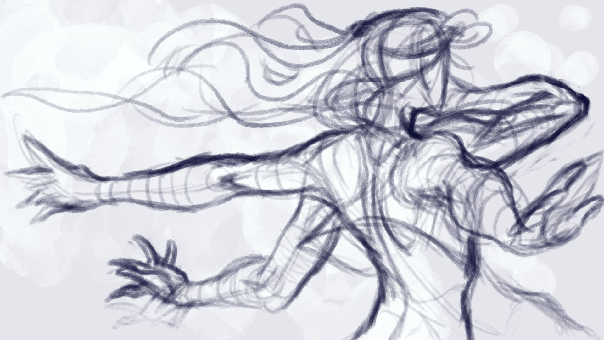
2. Thumbnailing: The first step I
would recommend for illustrating something
is thumbnailing. I mean, thumbnailing
is more for, like, if you're feeling like, really committed
to an illustration and you're trying to think more thoroughly about
possibilities of how to execute an idea visually, you could just do it all. I mean, this is definitely
not a required step, or I wouldn't put
it on top priority, but I definitely would
do this more for, like, client work or any kind
of important assignments. And of course, if it's
a personal project, then anything you do is however
important it is to you. So you want to first figure
out what do you want to draw? Who do you want to draw?
What are they doing? What is going on
in your picture? I just kind of, like, threw together an idea. Like, I didn't really plan it. I decided on fancy
lady drinking tea. So what is thumbnailing? Thumbnailing is usually
sketching, very non committal. Like, you don't want
to invest all of your time in the
sketch that I mean, if you're really invested, you're pretty much drawing, but you want to do
rough lines and just mostly explore and focus more
on getting entire shapes, entire subjects down, like the entire person or the most important
objects in the image. If it's a portrait, then make sure that we have
the angle clear, whether or not this
person has eyes, if it's a side view, and probably there's
just one eye. If there's a hat, if
there are any props, if it's a full body,
then what pose? Stuff like that. But I would spend at most 15
minutes per thumbnail. I mean, I draw pretty fast. I mean, I've been
doing this a while. So then I might spend up to
5 minutes per thumbnail. But you could spend
however much time, but I would advise
against trying to perfect the thumbnail because that destroys
the whole point. It's basically a
preview of your idea, and it'll give you the most basic scaffold of
where things are going to be, how people are opposed and objects are going
to be placed and so on. And so when you do
your thumbnail, you want to think
about, same idea. So I have some fancy
lady drinking some tea. Am I gonna do a
portrait, a full body? Or am I gonna do a half body? Am I gonna make her sit down? How is she gonna drink that
tea? What is she wearing? Stuff like that? There are a bunch of different ways
of doing this, of course. And usually this is what thumbnailing is
for is for exploring different ways of executing the same idea or
telling the same story. You are, of course, not required to choose just one kind
of canvas size or, like, whether your canvas
is square or wide, like landscape orientation
or portrait orientation. That's all up to you, whatever feels better to you or whatever fits best for your
presentation of your idea. It's helpful to put the
thumbnails on the same page and then compare all your thumbnails next to each other
and ask yourself, which one do you like best? Which one are you feeling
more excited about? Like, which one really
motivates you to get on this project and get it finished and
show it to people? I would recommend choosing
something with personality. I mean, that's assuming you
want to draw some attention, like, on social media, but,
of course, you don't have to. It really depends on what
your original goal is. So if you're doing
this all by yourself, well, you can do
whatever you want.
3. Layout: So in this step, what I'm
going to call layout. I mean, I'll just
call it layout. I'm not entirely sure what
the industry calls it. I most of my
experience is actually in teaching,
Illustration or drawing. But you take your
thumbnail and you put some more detail to whichever
thumbnail you choose. And you don't want to go into, like, the fine fine details. I highly recommend staying
zoomed out because zooming in is
mainly for details, which you definitely
want to do later. Again, it's about refining or putting definition to parts that are important in the image, making things look
more clear so that the audience can tell what's
going on in your piece. A huge reason why
you want to stay zoomed out is because
most of the time, when people first engage with this image that
you're making is in, like, thumbnail view or probably it's going to
be small on their phone. So you need to be able
to tell what's going on while this image is
totally zoomed out, and people are taking it
in as a whole image rather than just the eye or just the hand or just
the hat, whatever. It's all of these things
combined to tell a whole story, combine to create one image that means
something to people. I'd recommend going from bigger
shapes to medium shapes. Again, leave details or
small shapes for later. Remember, that nothing is final. Most definitely edit. This is still very early on
in your illustration process. You can change stuff later. But if you've already rendered or detailed
a bunch of stuff, it is probably going to be more of a pain in the butt to do it because you probably
invested a lot of time into detailing stuff. So I would say earlier on is a better time to make fundamental
changes to your piece. But remember, you don't have to hold your breath
and tell yourself, This has to be perfect now
before I move on with any. Try not to take
it too seriously. Just go Willie Nilly and think more about the story you're telling or the cool image you're trying to
show us rather than any small imperfection that
at the end of the day, most of the time, you're
gonna be the one who hyper focuses on
any imperfections.
4. Shapes: So now we're going on
to the step of shapes. Shapes are really important. They actually
communicate quite a bit. The lines keep things together and clearly define the
subjects, but shapes, the biggest shapes are going to be the first thing that your
viewers process if they are looking at your image either in thumbnail view or
it's just if you put it on a social media post or if it comes up in
Google Images or whatever. Think of it this way. Road
signs heavily use silhouettes. They certainly
communicate a lot, whether it's showing, you know, there are kids crossing the
street or the road is sloped, so the truck needs to be
careful or something like that. So that is, like, a huge example of how silhouettes
being really distinct, they communicate a lot. They don't have to
be that detailed. The road signs don't need to indicate every single finger of the person
crossing the street. The road like a winding
road on the sign, it doesn't need to show
grass and stuff like that. So this is what I mean by shapes and how the biggest
shapes communicate. And especially like, in
the case of road signs, they communicate
from a distance. You want to do the same
thing with your piece if you want to be showing it to people and leave some
kind of impression. So be mindful of silhouettes. Like, for example, there
are multiple ways of having this same figure look
like she's drinking tea. You can make it so that her right arm or right
hand her right hand, so our left is
holding the teacup. From this angle,
you could also try her left hand or our right. But the silhouette
is all bunched up, and so the arm is
not very distinct. The arm is not distinct from
the rest of the silhouette, so you can't see it as the separate object that it
could be interpreted as. So if we have her right hand holding the
teacup with this silhouette, where you can distinguish
her shoulder and her elbow and her
arm, and her hat, those things deliver the
message much better than when the whole silhouette
is all bunched up and the parts are not
distinct, separate and clear.
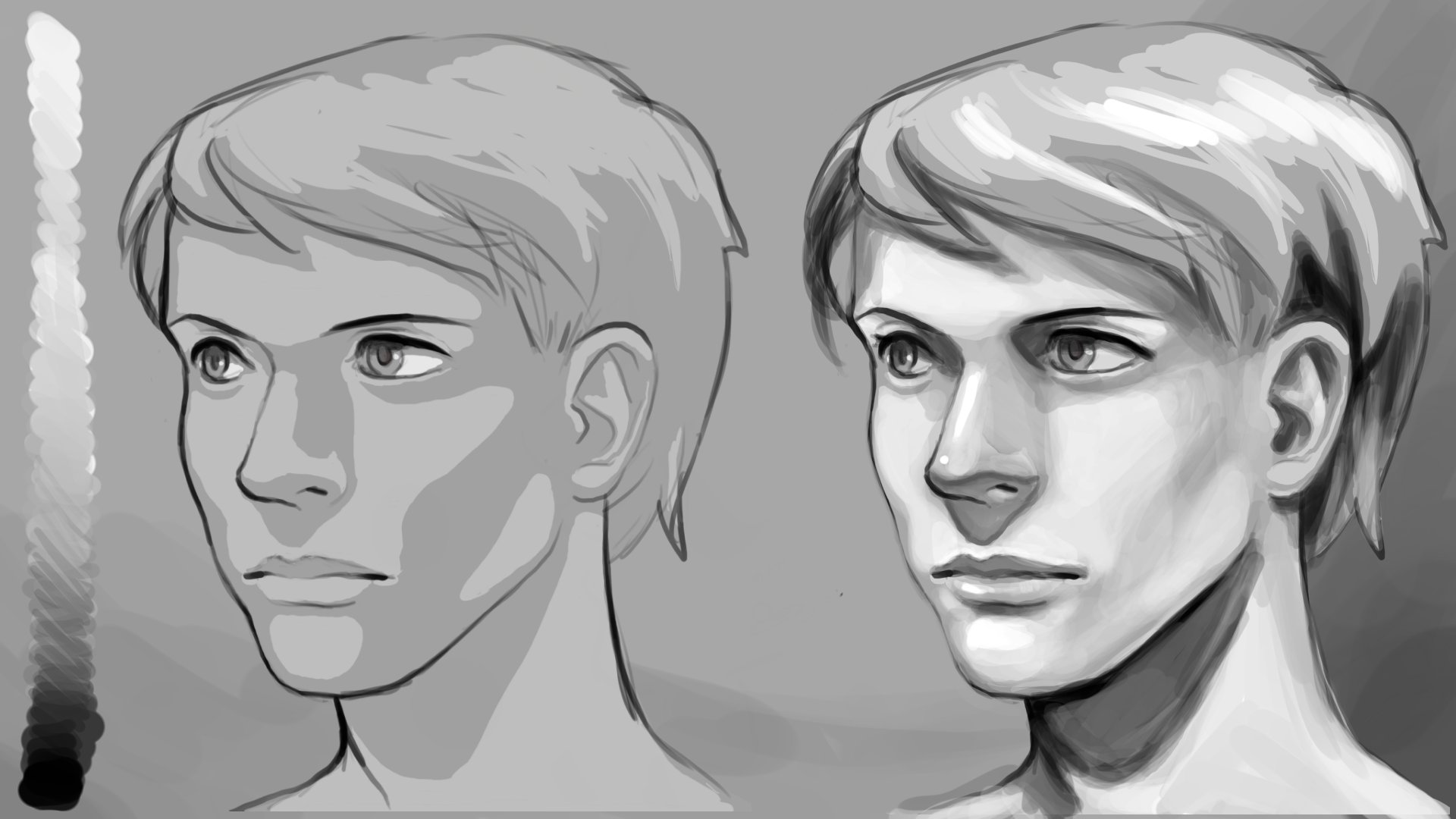
5. Value: Let's go over value. Value
is lights and darks. So that includes basically black all the way through the gray
scale to white, pretty much. I've kind of already put in value in this
illustration because I just needed to find a way to distinguish the silhouette
from the background. So lights and darks, all
the grays in between, from black all the way
to the brightest value. Here, I'm kind of
using my background as a midtone. So I'm not using complete white. I might not even be
using black necessarily. Kind of, as a rule, I don't ever use pure
white or pure black. It's kind of
complicated to explain. But I would say you will
get more pop and realism if you stick to tinted
grays or black or white, like the white of the teeth
or white of your eyeballs. It's never going
to be pure white. So value is basically how
you're defining the lighting, which is going to also put more definition to your subject. You want to play
around with contrast. Contrast means bigger
difference in values. If you have higher contrast, it allows for more
depth in your image. So you can portray distance by the values or the
level of contrast. So farther away, I just
have it more faded. Closer to us, I have it darker. By this, I mean the
different levels of depth, like foreground, the
things closest to us, midground, the things
farther from us, and background or backdrop, the things that are farthest
away from us in the image. So if you have a given value and there's a bigger difference, like, it's much brighter or much darker than that first value, then that's high contrast. And then given one value and then another value that is
not that different from it, it's gonna be lower contrast.
6. Colors: Colors are a whole
other ball to juggle. To combine colors and value when you are
doing illustrations, it can get messy real fast, but you can isolate
these things. Of course, you could
do value studies, as in just like black
and white or gray scale illustrations
for a while at first. And then later, you could ease yourself into colors or
just do color studies. So the way I would recommend you start out when
you choose your own colors. Values, like the
lights and darks, they contrast lights
versus darks. With colors, they contrast
between warm versus cool. When it comes to
color combinations, you're kind of just
going to have to figure it out or look at
what other people do. And see what works. This is kind of a matter of
taste or just making it work. For example, I myself am a lot more partial
to tertiary colors. So if you look at
the color wheel, it's the colors that
are mixed twice. Primary colors being
red, yellow, blue, and secondary being
orange, green and purple. And then when we mix
all these colors again, then you get your
tertiary colors. Really like the cyber
punky pastel colors. And just because I myself
as a personal preference, would prefer to stay away from
just primary colors, like, pure unmixed, like,
primary colors, doesn't mean you
shouldn't try using them. You can use whatever
colors you want. And any rule that
anybody ever tells you, there's usually an exception, or there's usually a
way to break the rule, and then people are just
like, Wow, that works. Or I really like that. Like in the lighting here, you do not have to
have cool colors in the darker shaded areas and the brighter
colors being warm. You don't have to have
light just be warm. You can have lighter areas be cooler colors and darker
areas be warmer colors. It's a different effect. It really depends on what
you're trying to do, what kind of vibe
you're going for. For now, if you're not that
experienced with colors, I recommend doing studies. Look at what other
people have done if there's something about their palette that
really impresses you. You can copy what they did and study which
colors did they use? Where did they put it? What
is the color serving as? Like, is it in the bright areas? Is it in the midtone areas? Like, not highlight,
but not shadow, either. When does skin color look
like actual skin color. Like, where does a
white tablecloth really look white instead of, like, bluish or a
darker blue, whatever. But just to start, I would say, go with warm versus cool, warm being the brighter values, like light sources being
warm, like the sun, and then shadows or shaded
areas being cool colors. You can also choose
complimentary colors. Complimentary colors you just take a given color
on the color wheel, and its complimentary color is straight across
the color wheel. And there's your
color combination that you can try working with. So like, basically
yellow and purple, green and red and
orange and blue. Those are examples of
complimentary colors.
7. Saturation: I would say saturation
is more a term that comes from digital art
or digital visual media. But it is important because
the richer your color, the more likely whatever
color has, like, the richest version of that
color is going to look flat. In real life or in more
photographic imagery, you definitely have a
wider range of saturation, or I would say it's probably
far less saturated than, let's say, cartoons
with flat cell shading. Like, think about Disney
or Warner Brothers cartoon like old Toti animations that
have all these flat colors. The orange of a duck's beak is just orange and
grass is green. Green green. But in real life, you wouldn't only
use just one green. You would probably
have some parts of, let's say, a blade of grass, be more saturated
or richer green, and then you might dole it out in shadier parts of the grass. And then you might
want to rotate on the color wheel towards yellow or lime if it's lit up by sun, and you probably want
to fade the colors a bit if it's being
lit up even more. Saturation also helps in
giving a sense of depth. You can have things look
more saturated as a way of focusing the viewer onto a part of the image that
you want them to focus on. I would say that mastery
of saturation is what distinguishes beginners from more advanced artists
in the use of color. Like grass shouldn't
just be green, a school bus shouldn't
only be yellow. A fire truck shouldn't just be red, like
completely saturated. Like bright rose red. There's probably a bunch
of other shades or perhaps some parts
of it could even be bluish or purple ish. Skin color is another
really great example. Skin color can be a wild crazy
range of yellows, browns, even greens as well if you really want to get into
the details of, like, your blood vessels
or your veins, whatever, in your hands, arms, or even, like, the neck and stuff like that. But, of course,
like anything else, it just takes time and
a lot of studying. So don't worry too too
much about saturation. If you're a beginner, if you really want to get
into mastery of saturation, like when it comes to color use, I'd recommend doing
a bunch of studies. Study how people
use faded colors. Where do they put
the faded colors? Where do they put
the darker colors and where do they put the
most saturated colors?
8. Edges: Now we're going
to go over edges. Edges are pretty important. I found that over the years, if I have students who are unfamiliar with edges,
soft versus hard, either their illustrations
look too cartoony, as in they only know how
to draw with hard edges or they're not sure when
to use harder edges, and everything is soft and
everything looks, like, equally blended or all
shadows are equally blended. So in edges to contrast, it's soft versus hard. Are the building
blocks of rendering. So you want to be able to render shapes like
cubes, cylinders, and spheres so that you
understand the relationship between the different components of these shapes or objects. So like a cherry or an
apple, whatever I'm drawing. Has a bunch of different
things going on with it. And there are different
ways of defining Well, there are definitely areas that are going to be hard edges, like an object being
completely, like, separate, like the stem of the fruit, being totally separate
from the actual fruit, like the skin or the
flesh of the fruit. So when you're
illustrating, let's say, a character and
they're wearing a hat, most likely you're going to have hard edges between the hat, the face, and the hair. I think the only times you would have those objects
have softer edges against each other is if it's blurred or
it's not in focus. I'd say the most difficult
thing about edges is judging how soft you
want the edges to be. Like when you're painting
a portrait and you get to, like, the forehead
or the cheeks, there is a certain softness, and you want to capture the
subtlety of the cheek bones, mouth muscles, or the
temples of the forehead. Can get tough real fast, and you might find
yourself recalibrating, like, making the edges harder, but then you maybe make
the cheek bones, like, too sharp or you
kind of make them disappear if you blend
it back too much. So it definitely does. Again, like, it takes
a lot of practice, and your pieces
with more mastery and edges will reveal a
bunch of details that, of course, are ordinarily, like, much harder to get, like, the things that I
just mentioned. Like, noses protruding out
of the face and brow bones, the depth of the eyes, skeletal muscular
structure of a character. Edges most definitely can help with the definition of these things in your
digital painting.
9. Rendering: Rendering is often what a lot
of the painting involves. Like, the bulk of the time in a given illustration is
it's going to be rendering. So this gets into the
details and definition. So here, hopefully you've mostly committed the important parts
of your illustration. And I would say you
can go ahead and put in all the
details and zoom in. I would say gradually zoom in, because if you zoom all
the way in on, say, like, the hand or the tea cup
here or the I too quickly, then you're not going to be comparing the
proportions very well. You want to make sure the
teacup is not humongous, but is not super tiny. So at first, I would recommend
staying more zoomed out. If you're a good as zoom in, then make sure the objects
that are in similar areas, they make sense proportionally. So I'm kind of aware that, like, this part of the
tutorial makes it seem like I just gave
you the first two steps, like how to draw an owl. Okay, make a U shape. Now make a V shape over here. Step three, draw the
rest of the owl. Rendering here,
rendering is a lot. There are different textures. You could see that I've
studied figure drawing or I've studied portraiture
and clothing. Like, I'm not really looking
at any references because I drawn a bunch of dresses
before in my life. But usually, what remedies this kind of cluelessness
as to, you know, like how to paint
jewelry versus skin versus fabric or porcelain,
stuff like that. It's just the skill of observational drawing
or illustration. If you're able to look
at a reference and extract from it the aspects of that subject that you want, like how shiny silk is
versus how shiny jewelry is or how dull the tablecloth is compared to maybe
the skin or something. If you can study and then copy behavior of the
different aspects that you're trying to
portray in your piece, you'll have a much easier time. And if over time, you specialize in
particular things, like if you draw lots of horses, then you'll probably be pretty
good at drawing horses. I think a particular
subject matter that's pretty tough for perhaps
most people is guns. For example, like, it's
a particular thing. Like, if you draw them rarely, then of course, it's
gonna be pretty tough. Like, drawing it
and painting it and lighting it up and making sure
the perspective is proper. But if you draw a lot
of guns and a lot of your characters or you just
love illustrating guns, for example, it's no sweat. It'll probably be not a
big deal to you anymore. But I would say most people are far more comfortable drawing or illustrating
portraiture than they are full body figures, let alone full backgrounds
with that figure. And it all comes down to
familiarity and basically, like how much time
you've clocked in studying this stuff or trying to illustrate
the stuff yourself. And again, I wouldn't
try to motivate yourself primarily
through, like, Oh, I got to make sure
that this hair is correct or this flower really, really looks like a velvety, dewy petaled flower and this lace material on
this lady's dress really, really looks like lace
and stuff like that. That I feel like
is going to come if you are more focused
on the excitement of showing us what you're
seeing in your own head and trying to make sure
that the window into your mind is just more vivid. Remember that your
artwork earlier on, if you're trying
something new is probably not going
to look that great. Unless you're already good at observational stuff
and extracting the essence that you
wanted from reference. So don't be afraid
to use references. Professionals do
it all the time. Don't take your work
way too seriously. I mean, it is another thing if your life kind of depends on
it because it's your job. But even then, it kind
of destroys the point because don't we make
art for enjoyment? So focus more on your
average skill level rather than every individual thing that might be bugging you that you're going
to tell yourself, Oh, you have to
still work on this and you can't move
on until you nail anatomy or lighting or
colors or poses and stuff.
10. Tips for Art Direction: Go with the flow, and if you
want to explore something, go do what you want to do. Don't have your art regimen, your art creation process be dictated by what you
feel like you should do, especially if it's a hobby. Try to get a sense
of the flow of what resonates with you
rather than doing what you feel like other people
are expecting you to do. I've lived that experience. I've lived that
discrepancy in art school, I remember pretty
much hating all of my work because I was
checking a checklist, an invisible
checklist, basically, to try to get a grade, which is a terrible source
of motivation for an artist. Grades don't matter
in the art world. I would say in the way that I have always
wanted to master, are the goal is connection. Technical skill can be important could really depend on the kind of audience that
you're trying to appeal to. But I would say the primary
goal should be connection. Is your image clear? Like, not just on
a technical level, but also the expression, the energy, the story. You fascinated or
more curious at this character or illustration
that you're seeing? I mean, think about
all the things that illustrations can do. People say, don't judge
a book by its cover, but who are we kidding? People definitely buy books
just for the cover art. Probably. And people
read comic books. People like buying
picture books. I mean, especially these
days, like, come on, people are reading less
and less long form stuff or consuming less
long form stuff. And probably what stops people
from scrolling wherever, whether it's social
media or whatever is pictures or even
better videos. So I want to emphasize as
a digital illustrator, you do not need to overwork. You don't need to render every
single bit of the image. Mostly focused on rendering areas where the viewer should be most focused or the area that you want the viewer
to be most focused. Because think of it this way. If you're watching a movie, don't want a ton of noise or a ton of detail
all over the place. Usually, you want in
clear view the character or the subject of focus
in clear storytelling. So in an illustration like this, I would just focus on, like, the face and you know, the torso and any important
stuff like the teacup. And keep in mind,
from a distance, details tend to fade. So unless the camera is focusing on the distance and
blurring out the foreground, the background should not
have a ton of details. Usually, your eyes are not
going to be able to tell, like, exactly, like, the threads of this person's hat
in the distance. You don't need to
do all that work. And it's just like
trees in the distance. Don't see the individual leaves. You just see, like,
blobs of tree. Now, as for what
level of rendering, like how detailed, how crisp, that I would say is
really up to you. I would say at least render
parts enough that objects and or the actions
are recognizable. They are clear to the viewer. Your message is very clear. Your image is self explanatory
and you don't need to stand next to your image to
explain what's happening. If you decide to render and
spend a ton of time on, like, every strand of hair or every drop of tea or every petal on all the
flowers and stuff, that's really up to you, and hopefully you're doing
it because you want to, and you find it
fun, I would hope. But otherwise, I would say
the bare minimum, like, depending on what your goal is, if it's a commission or if
it's your personal project. If it's your personal project, you don't even have
to finish a thing. And especially as
a hobbyist, like, your unfinished work could
definitely still have value. Like, even as a professional,
but as a professional, definitely finishing your
work is a lot more important. But, yeah, trying to make sure you have fun and don't
take it too seriously. Don't work hard just
for the sake of it. If you're not feeling good
about it, then don't do it. You don't have to render
every thread on the clothes. You don't have to render, you know, every vein
in the flowers leaves. Just work on the parts
that bring you joy. Thank you so much for
watching this tutorial. And please remember
to have fun. I
 Emily So, 2D Artist